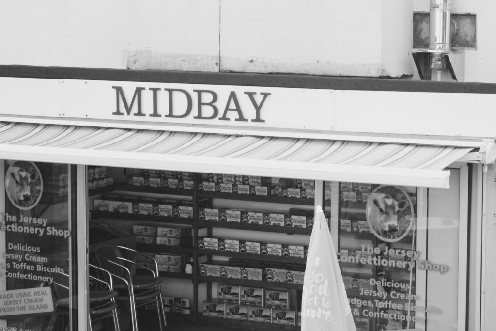
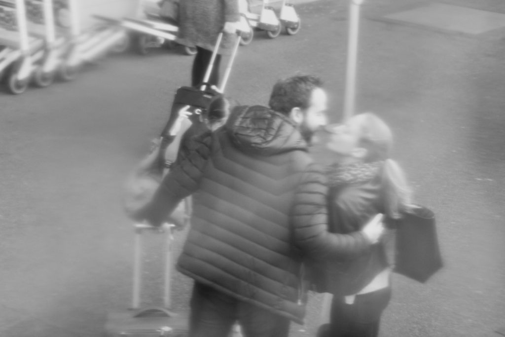
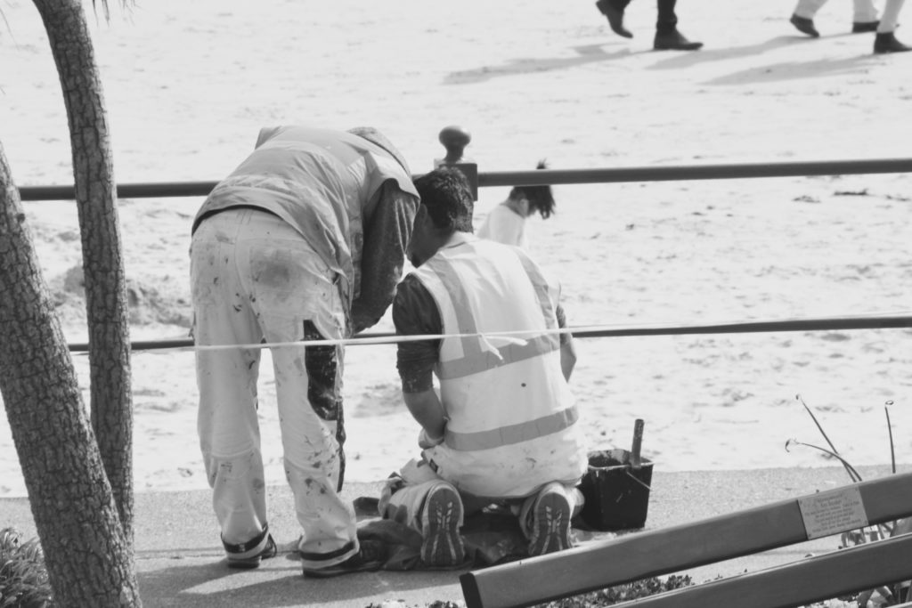
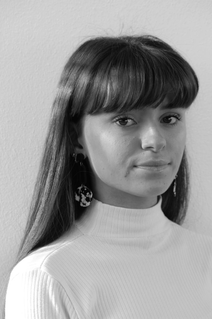
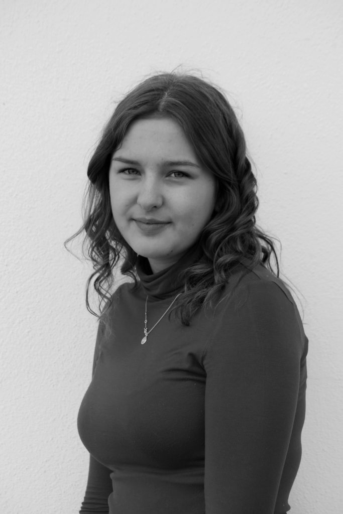
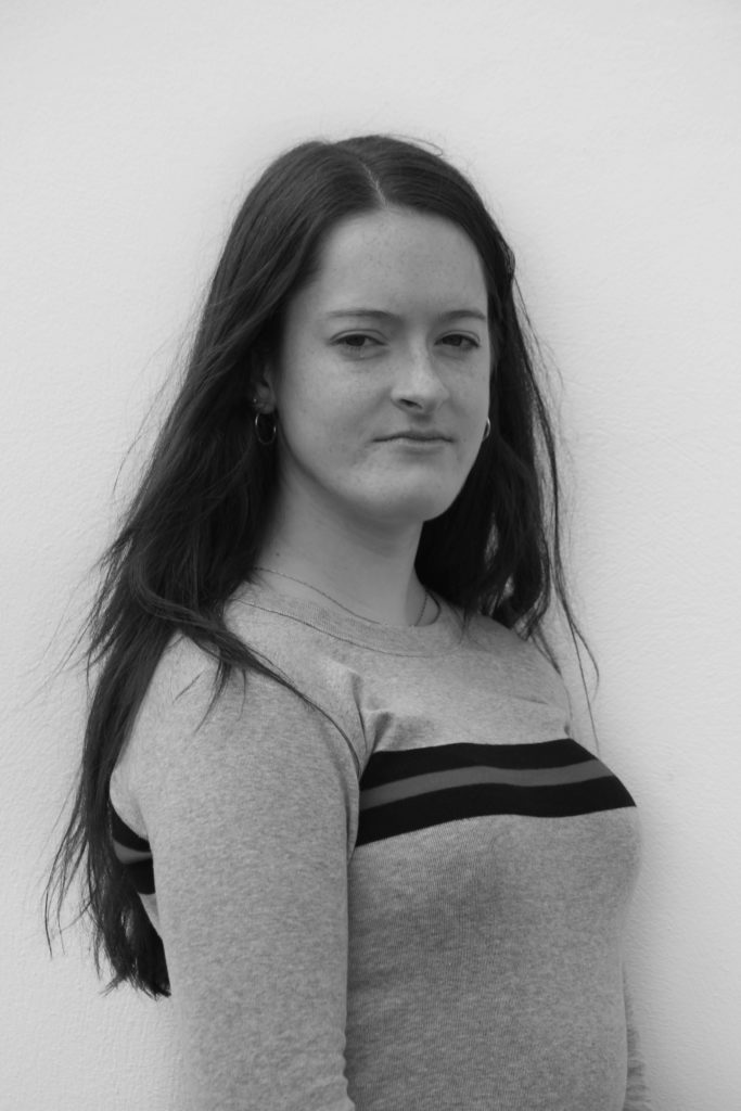
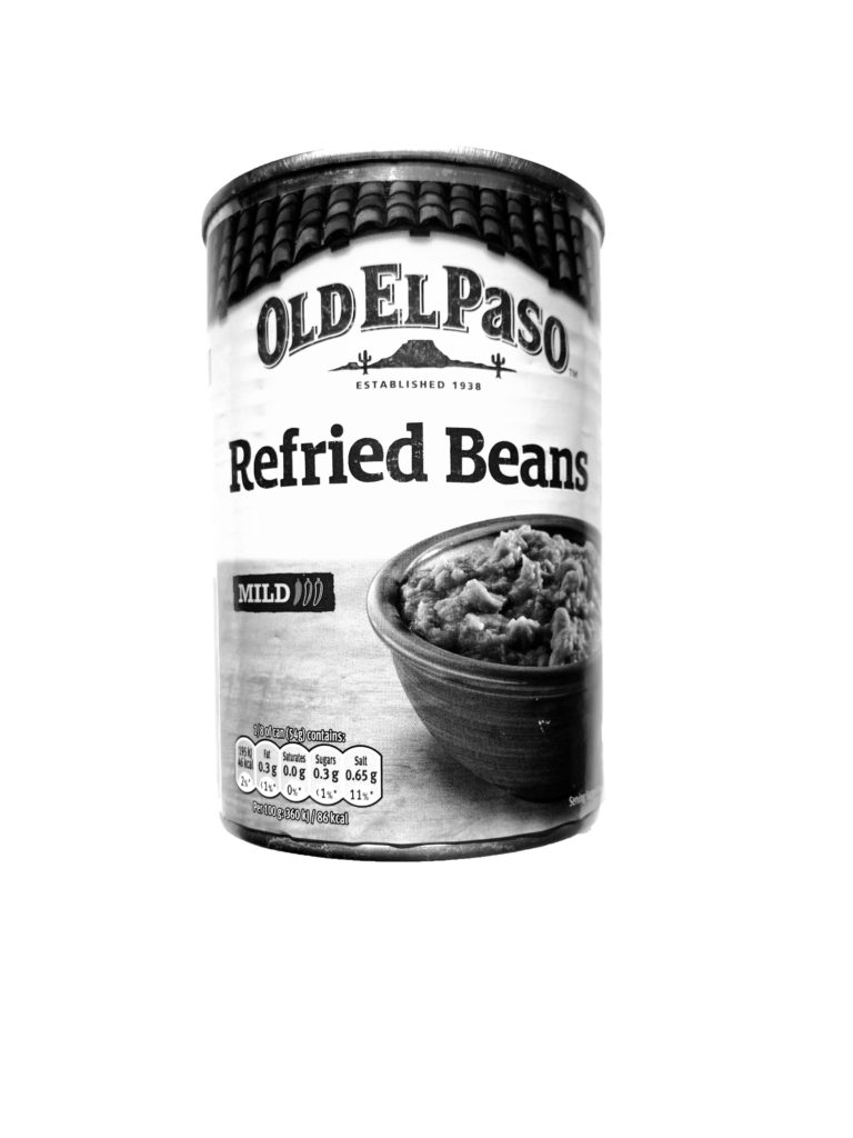
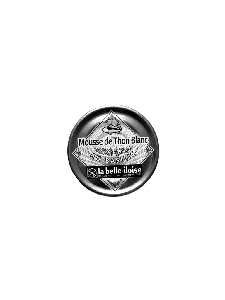
I decided to experiment with some black and white edits with some of the photos from my first shoots, I was inspired by Walker Evans series of black and white subway images and I wanted to see how editing by images in black and white would manipulate them and create a different overall atmosphere within the images. I also thought that pairing my own photos in black and white with some of the coloured postcards from the photo archive could create an interesting juxtaposition.
Category Archives: Uncategorized
Filters
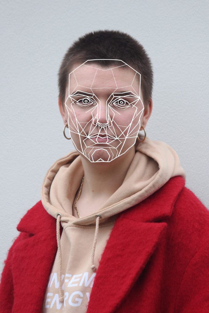
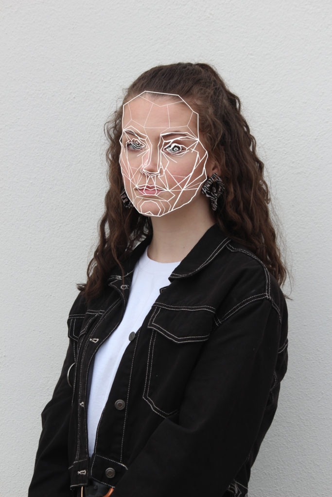
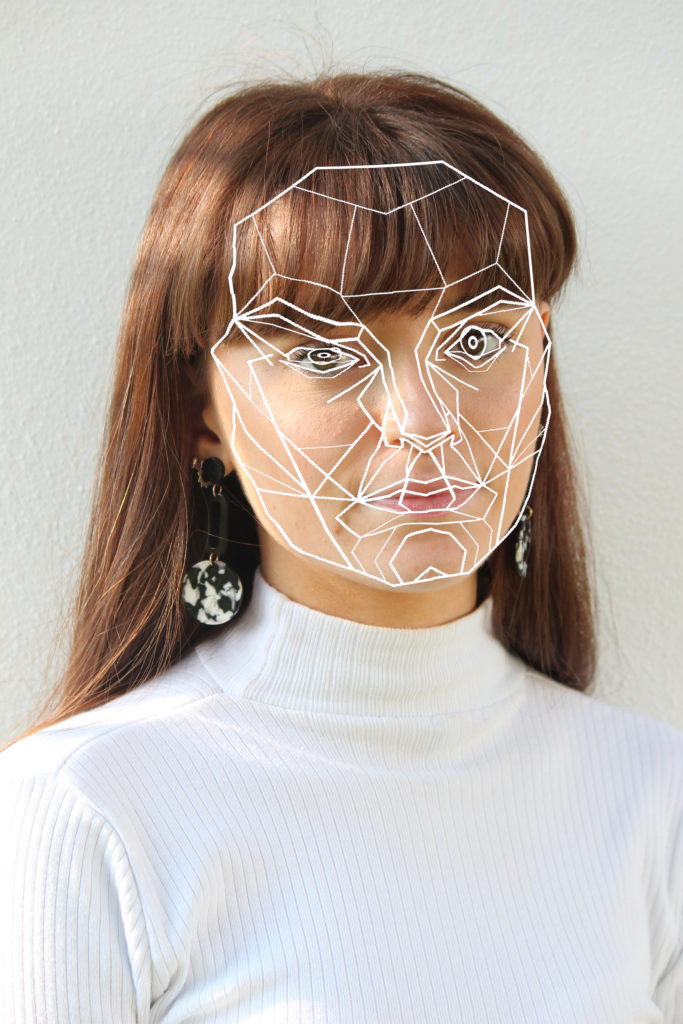
Editing with the ‘perfect’ face
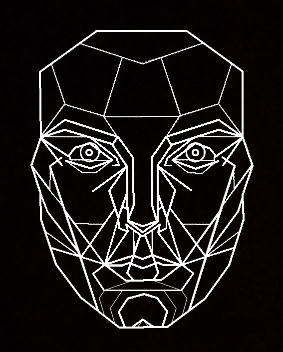
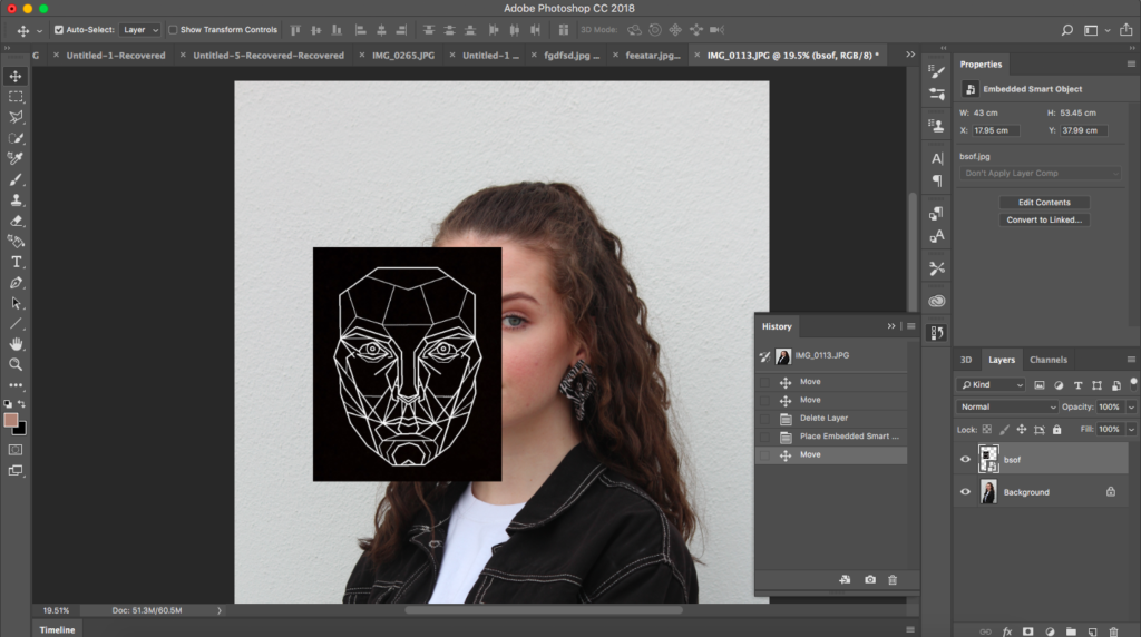
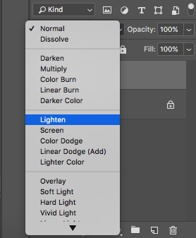
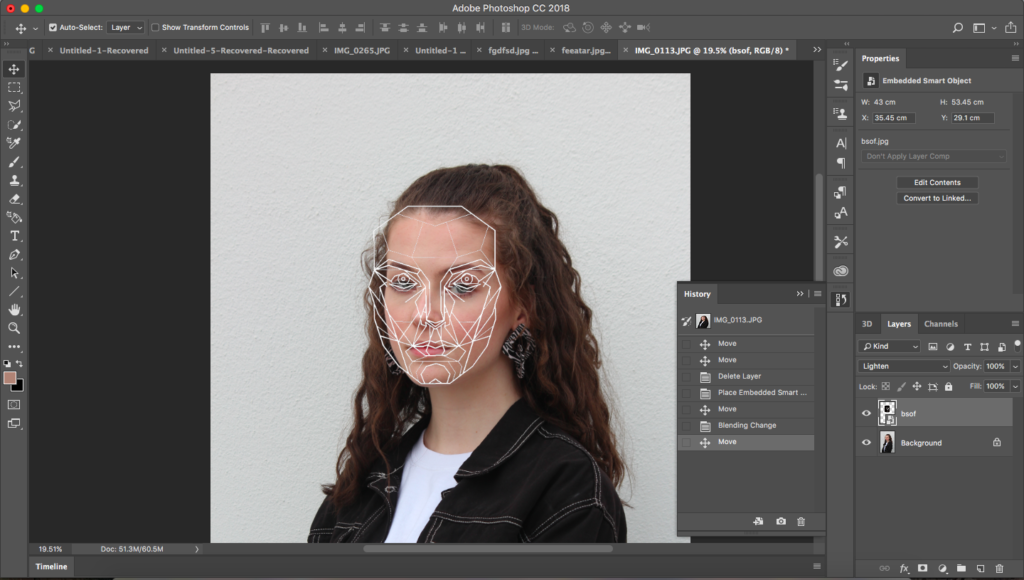
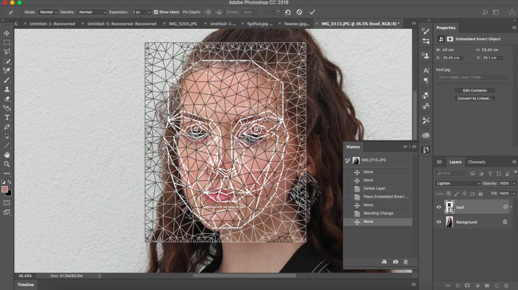
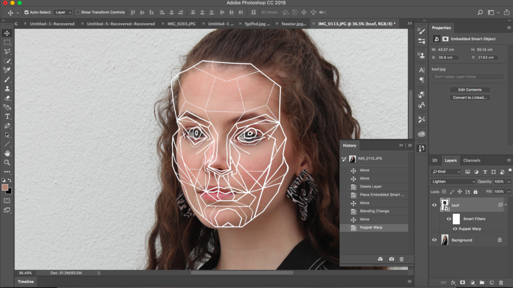
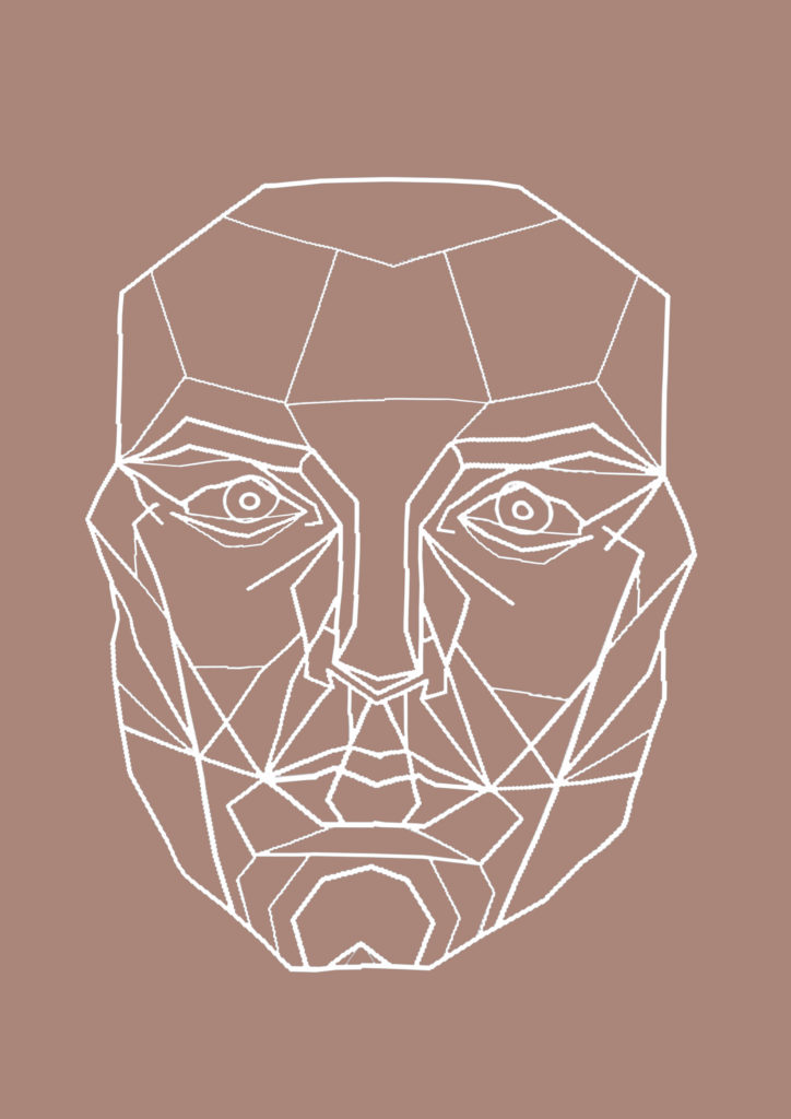
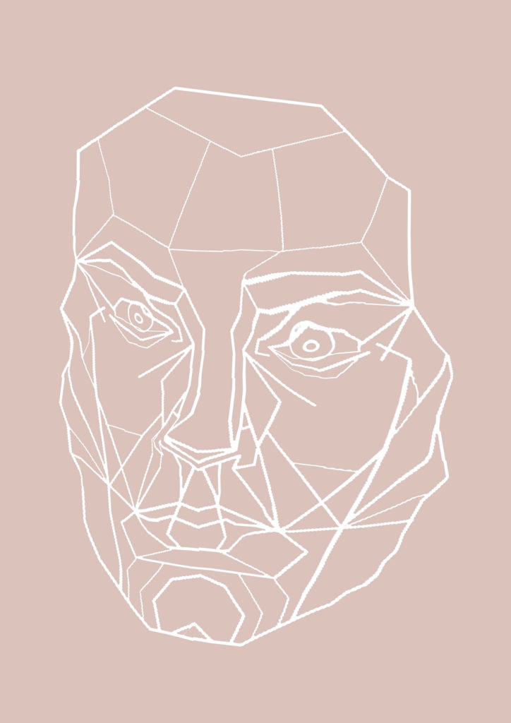
This is a structural plan developed by Dr Stephen Marquartdt of the ‘perfect face’ used by modelling agencies and plastic surgeons to re structure facial features to create a pefectly symmetrical face shapes and spacing. It is called a facial mask which aims to display classic beauty in the form of triangles and geometric shapes. People such as Angelina Jolie share similar facial proportions to this mask. I want to use this mask as an overlay on my portrait photographs, instead of adapting the face to meet the perfect proportions of the mask I want to warp the mask to meet realistic images of beauty showing that people should not have to conform to these guidelines.
After adding and warping the mask I then copied it to a new page and changes the background to a colour found in the corresponding portrait image. I want to put the photograph alongside the mask image on a double page in the final magazine.
Editing Printed Photos
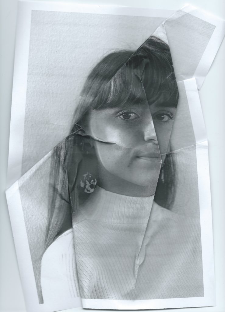
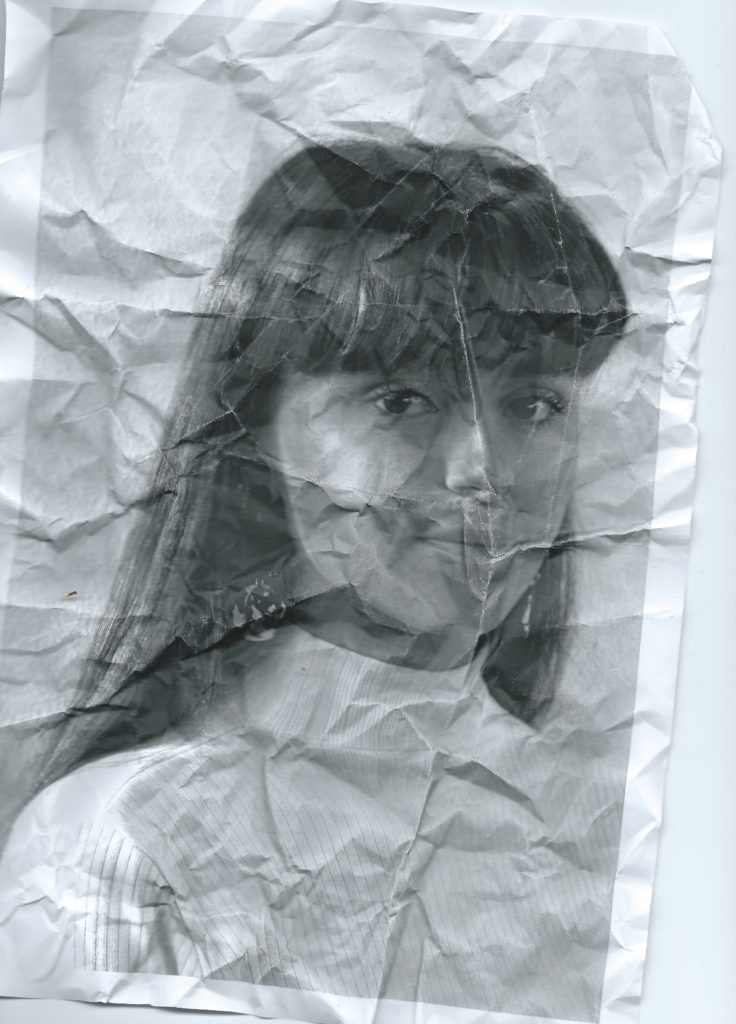
I want to edit some of the images i have taken by hand, to do this I started by changing some of them to black and white. This will help the colours in each image match and will make certain parts of the images stand out. I then printed out the photos on A4 pieces of paper, the quality wasn’t great but I like the way this looked, it deconstructed the perfect style that glossy high quality images have, this goes with the idea of challenging stereotypes on beauty.
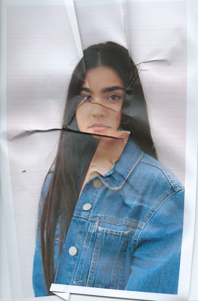
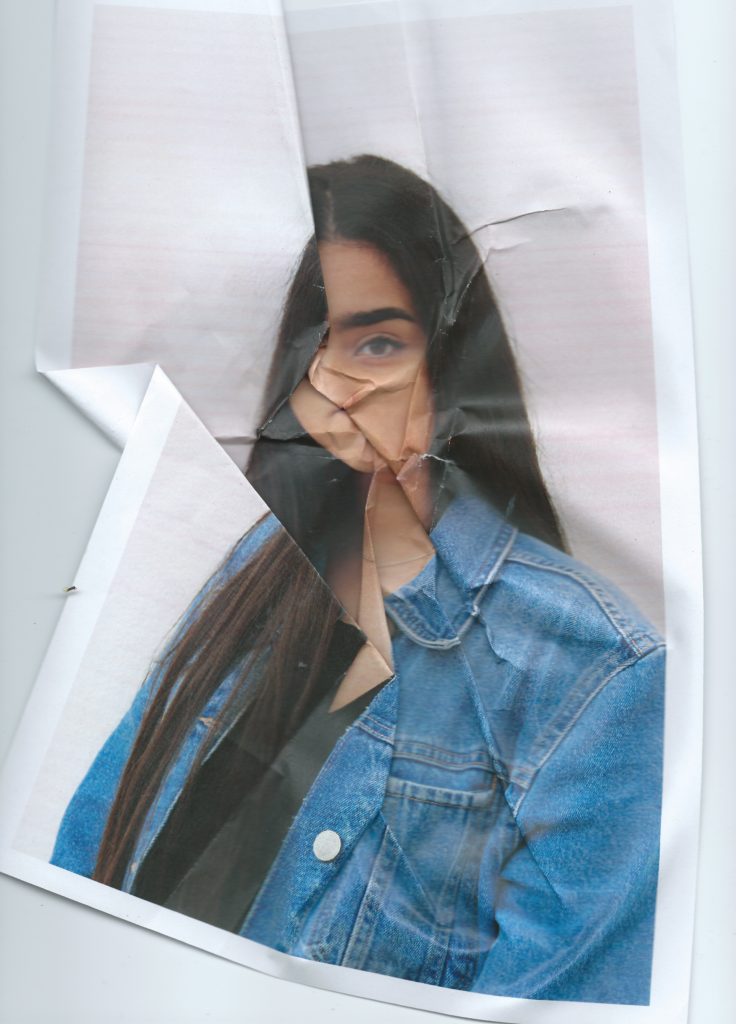
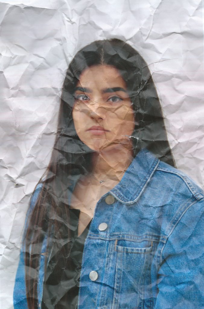
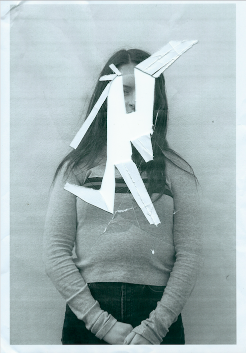
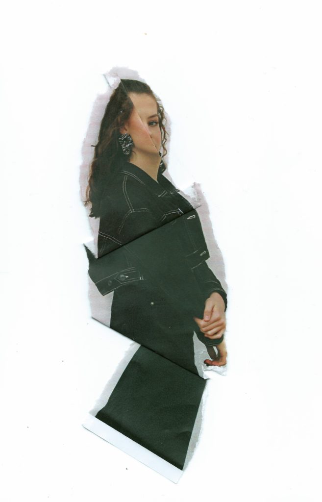
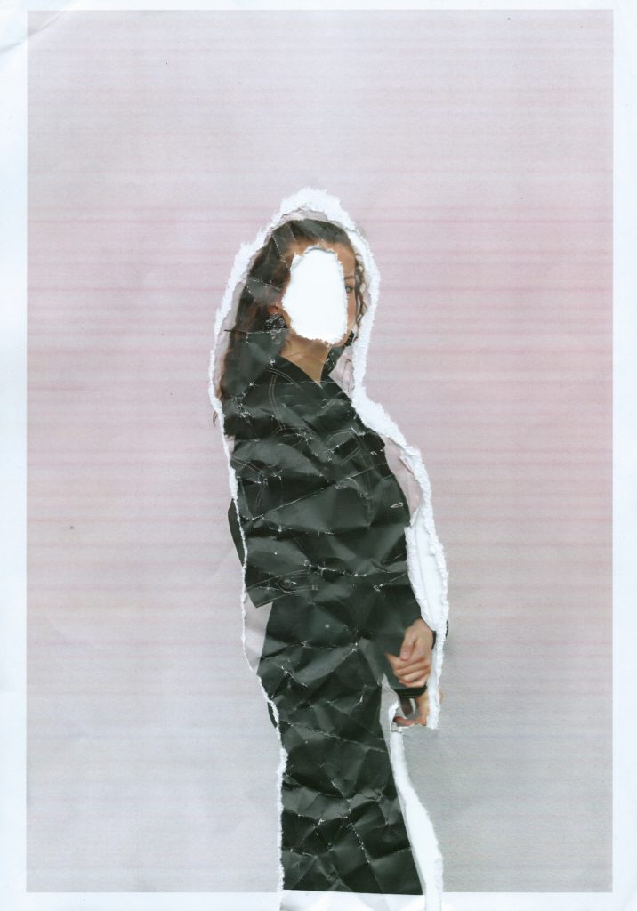
I then begun to manipulate the printed images in the style of Nigel Tomm by folding and crumpling sections to distort the facial features, I started by doing this subtly, choosing where the folds went and gradually became more destructive, crumpling it into a ball and then faltering it back out to create a textured effect. I then scanned the prints which I had manipulated back onto the computer rather than re photographing them, this shows images depth and manages shadows better. I did this with black and white and coloured images, the coloured prints were slightly discoloured and when scanned this happened more, I like the effect and colours this creates, with the pink toned background which creates a more stylised effect.
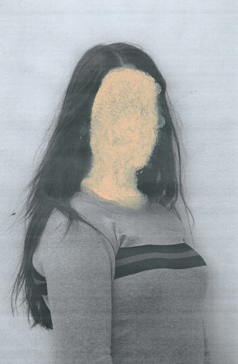
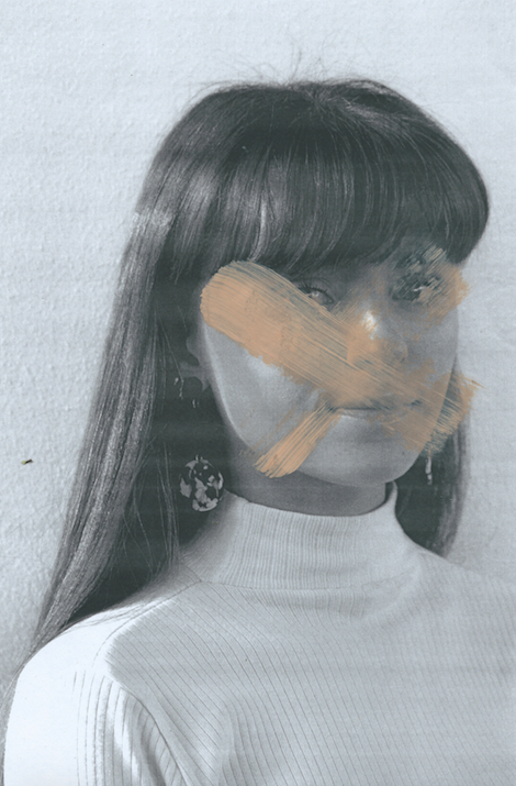
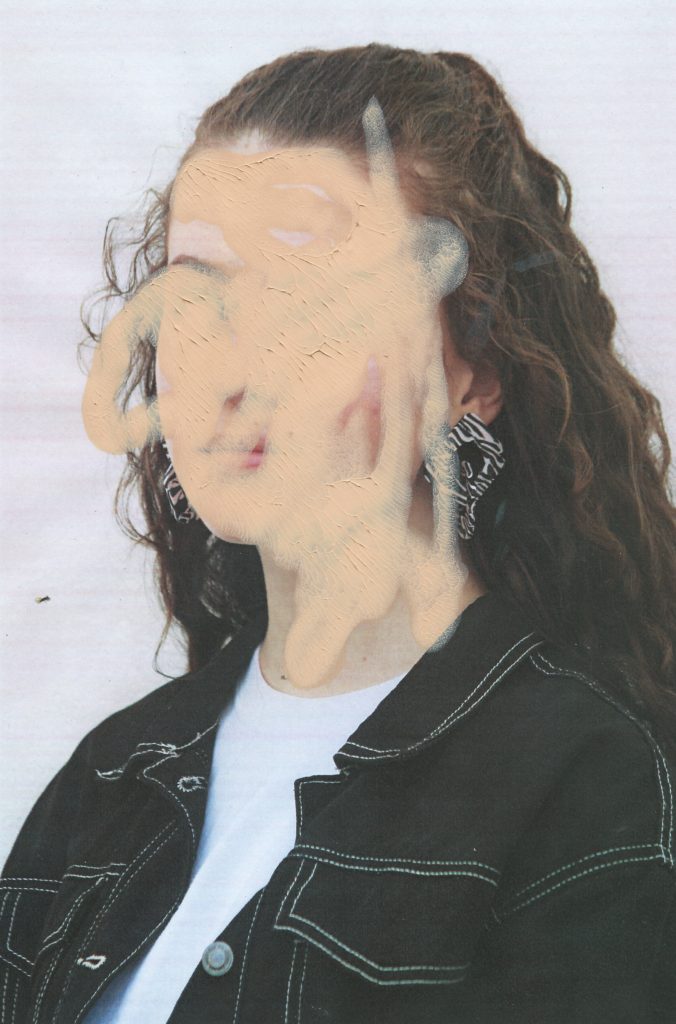
With some of the prints I decided to manipulate them using makeup, the idea being applying makeup to the image rather than the models face. This targets the idea of people using products to erases and mask their natural imperfections, many people use and wear makeup as an art form however their is no doubt that its origin is to enhance or change appearance. It is known that people use makeup to make themselves more confidant some people are even too self conscious to leave the house without it on. I think this concept is interesting to incorporate into my images because it is something that a lot of people can relate with in some way. I have used this idea to edit my prints, I wanted to make it dramatic to obviously show the message. For the first image I applied different makeup products to the relevant parts of the face to create a messy effect reminiscent of when young children try copying their mothers putting on makeup. This shows how children can be influenced by the idea of perfection and beauty from a young age from their own parents. I then continued to use foundation as a paint on top of them prints, using makeup sponges and brushes to cover parts of the face. For one of them I squeezed the foundation on to the photo and pressing it against another piece of paper, this left a textured, caky finish. I then waited for it to dry and scanned them onto the computer.
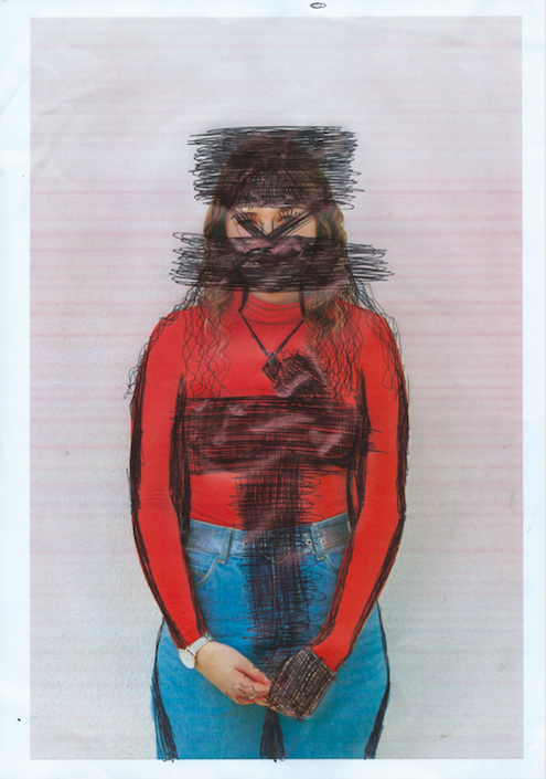
I also wanted my model to edit and destroy their own images, I printed out one photo of each model in low quality giving them discolourations and distortions. I then instructed each of the girls that I photograph to remove their insecurities or destroy the image in any way they wanted. Some of them grabbed a pen and started scribbling on parts of their faces and bodies covering and changing different aspects, other people cut, ripped and crumpled the paper. I then reconstructed the pieces and scanned them in as new photographs.
Final A3 Prints Selection
As well as my postcard display I have decided that I would also like to make an outcome of some larger A3 sized prints. My idea behind this is that it will show some of the finer details within my photo-montages which may be harder to see in the postcard format. 6 of these prints would be a good idea as I believe threes work nicely in a layout so as a multiple of 3 I think 6 prints will be will be overall aesthetically pleasing. Therefore I also want to have 3 portrait prints and 3 landscape prints as this will balance out the composition of the display. The 6 photo-montages which I have chosen to print in the A3 format are ones which have a lot of intricate detail which I feel like will look great once scaled up. Here are the 6 which I have chosen…
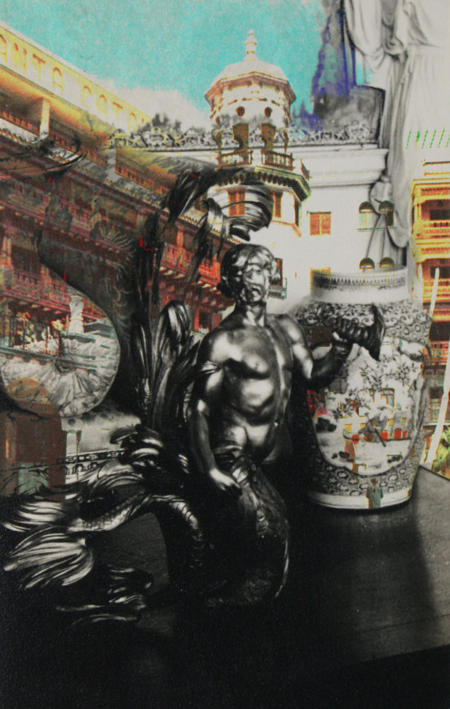
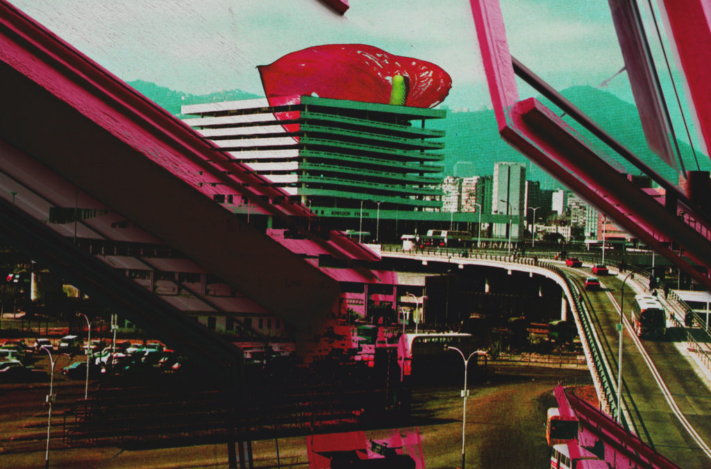
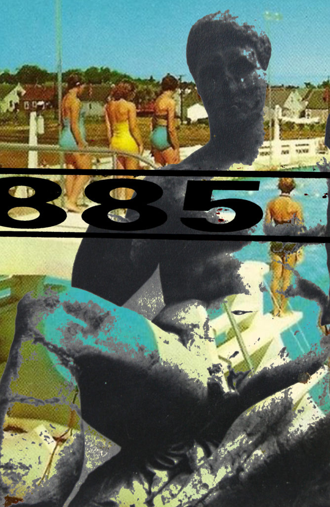
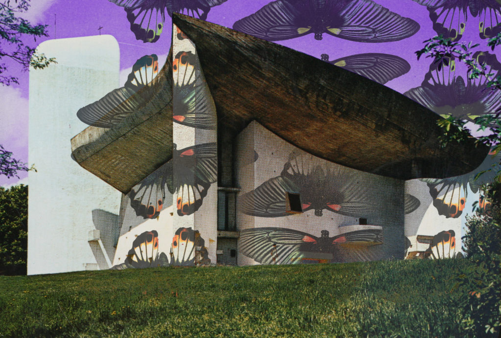
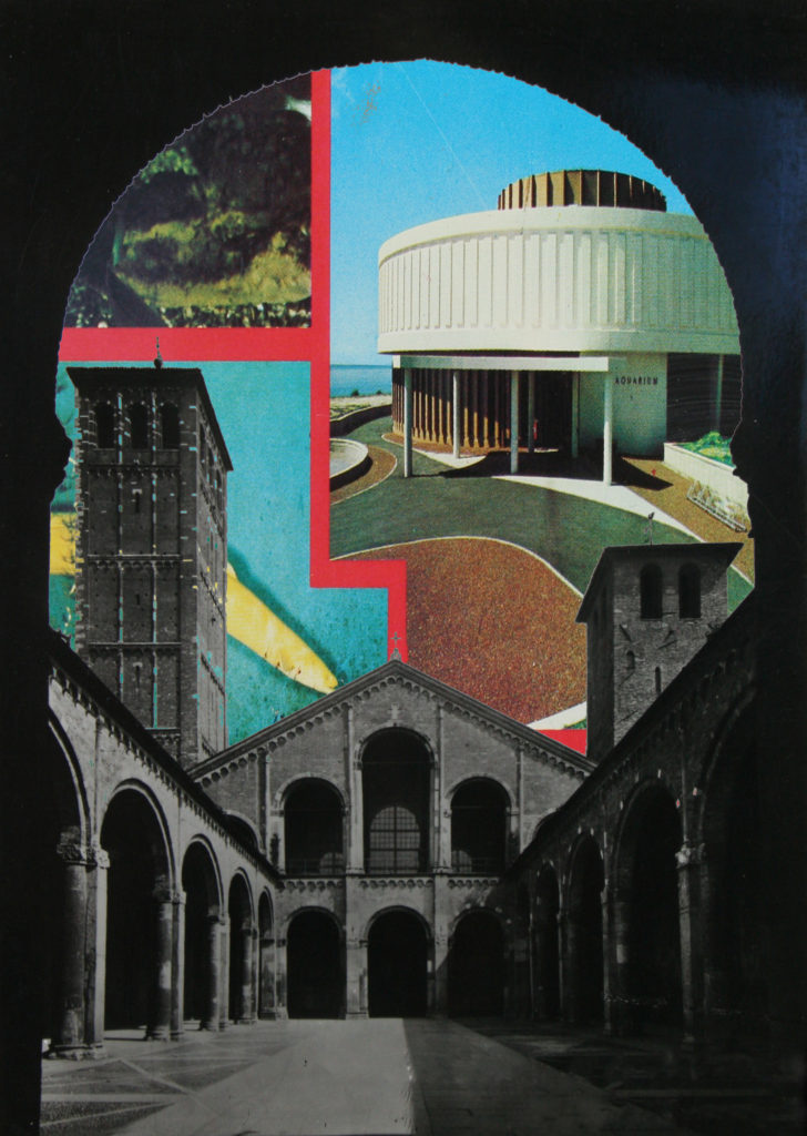
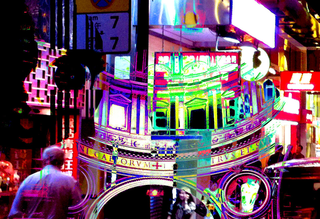
In a following post I intend on planning how I will display these prints as a final outcome.
Archive postcards
These are a series of postcards from the Societe Jersiaise photo archive that show the seaside and popular locations from the past that must have been printed to promote jersey tourism, I intend to use some of these postcards within my book with some of my own photos of popular tourist attractions such as the seaside.
Consumerism Shoot- POP ART EDITS
For these images i wanted to create images similar to Andy Warhol’s Screen prints like his Campbells soup cans. When creating these images I wanted to produce a printed like effect.
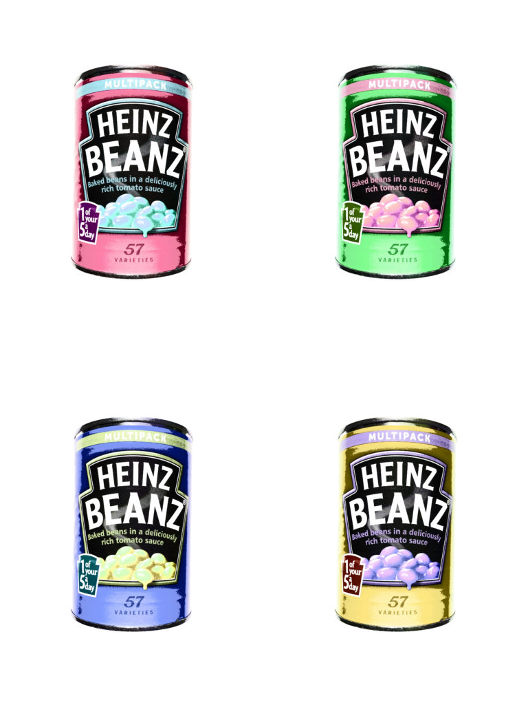
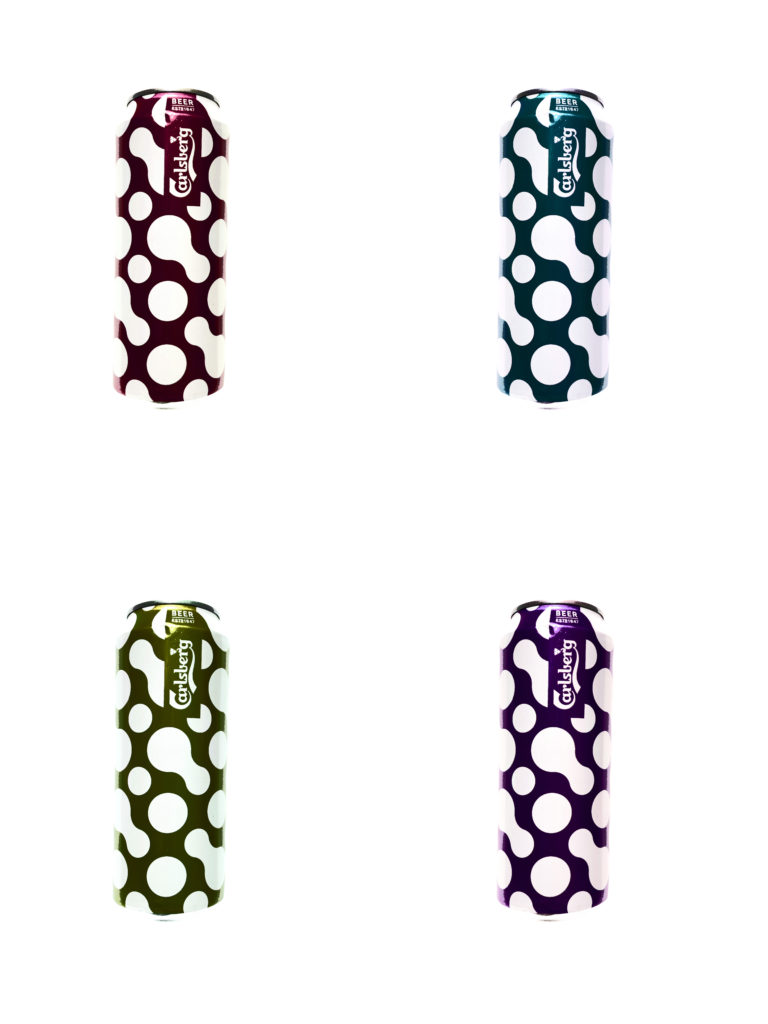
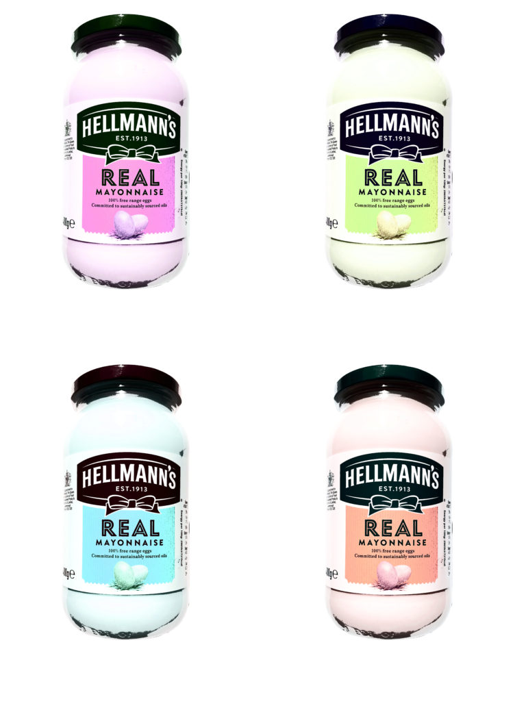
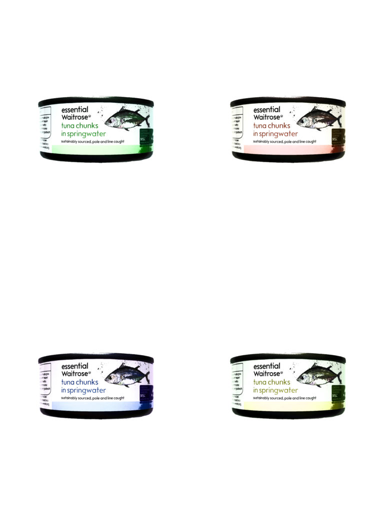
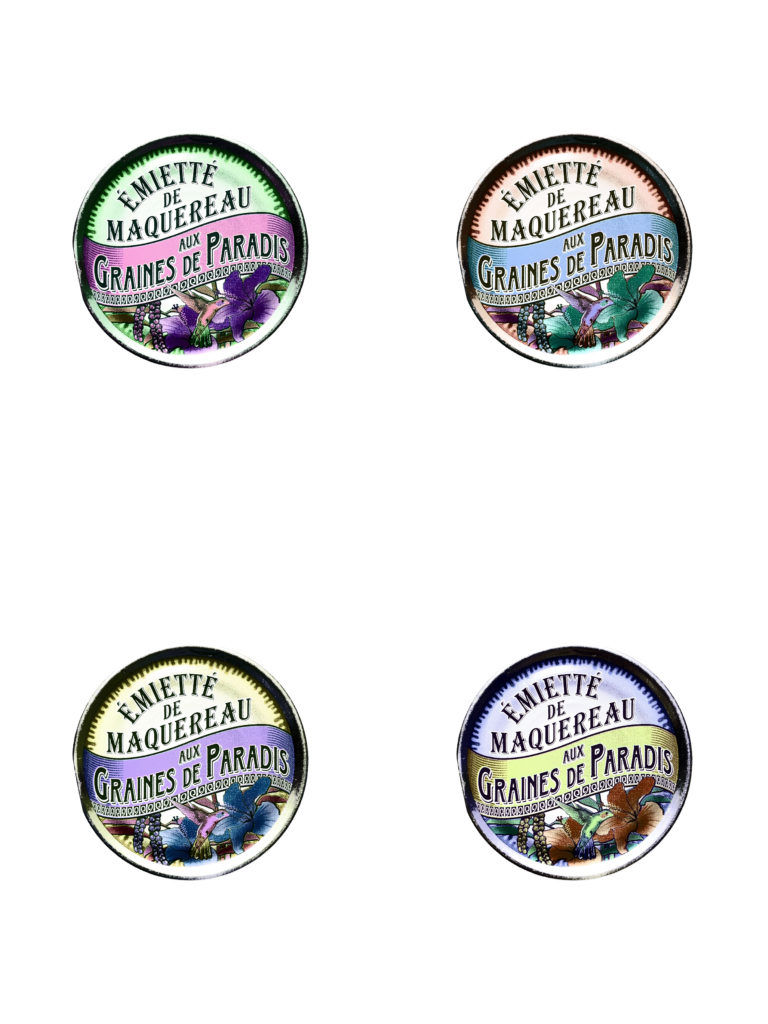
Steps to Create this effect:
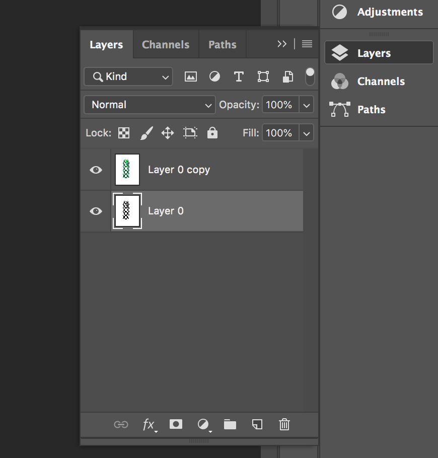
Start by turning the image into a layer and then Duplicating the image. 
Select one of the layers, then click on Threshold 
Then adjust the threshold so that the main features are still intact
(text or shapes)
Finally select the other layer which is the original image. Then click on opacity bringing it down so that there is a faint colour.
Noemie Goudal – Artist Study
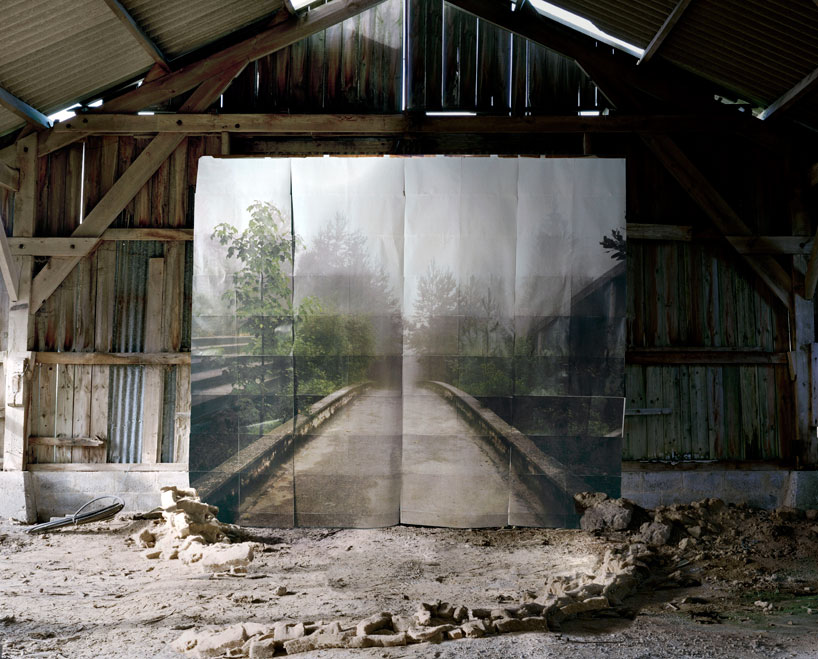

Noémie Goudal is a French artist who graduated from the Royal College of Art in 2010 with an MA in Photography and lives and works in Paris. Noémie Goudal’s practice is an investigation into photographs and films as dialectical images, wherein close proximities of truth and fiction, real and imagined offer new perspectives into the photographic canvas. The artist questions the potential of the image as a whole, reconstructing its layers and possibilities of extension, through landscapes’ installations.
Noemie Goudal works on the land, setting up large paper backgrounds that are deliberately distinguishable. She superimposes them on the landscape, creating an image that sits on the borderline of reality without ever really forsaking it.

Book development, narrative and presentation
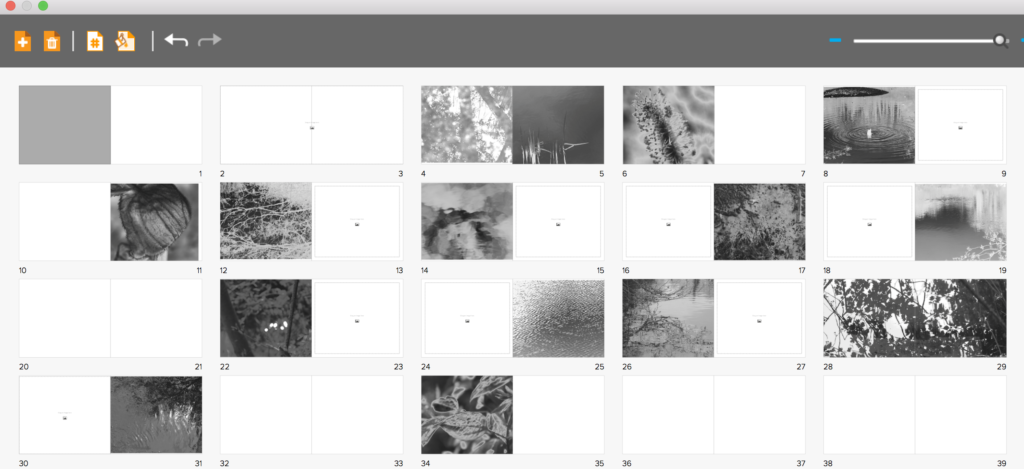
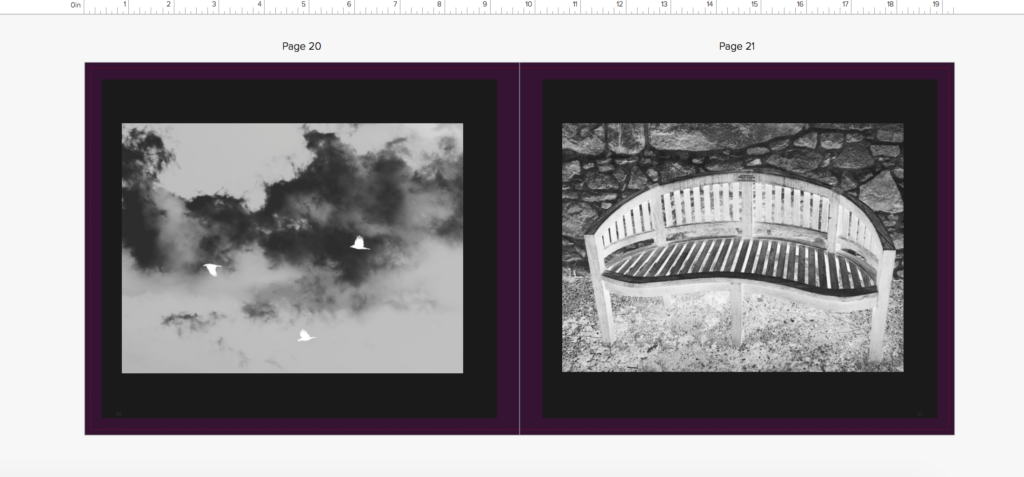
I first started off the development of my book with the inspiration of three artists who all used silver and black ink and focused on a abstract and vivid interpretation of the world. I believed all of their books had an essence of life and a narrative journey within them. I started off my shoots for the book by concentrating on the beauty and birth of life itself in a religious manner. I took around 5 shoots inspired by the beauty found within nature, and placed these images at the beginning of the book as this will be the start of my narrative journey. I wanted to place the images next to another which had a contrasting and oppositional colour inversion, so a light and a dark tonal image next to each other, I believed this attracts the same attention to each image and creates a nice flowing narrative to the book itself.
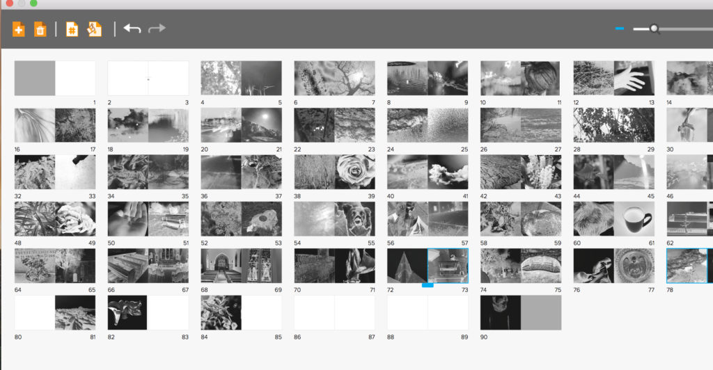
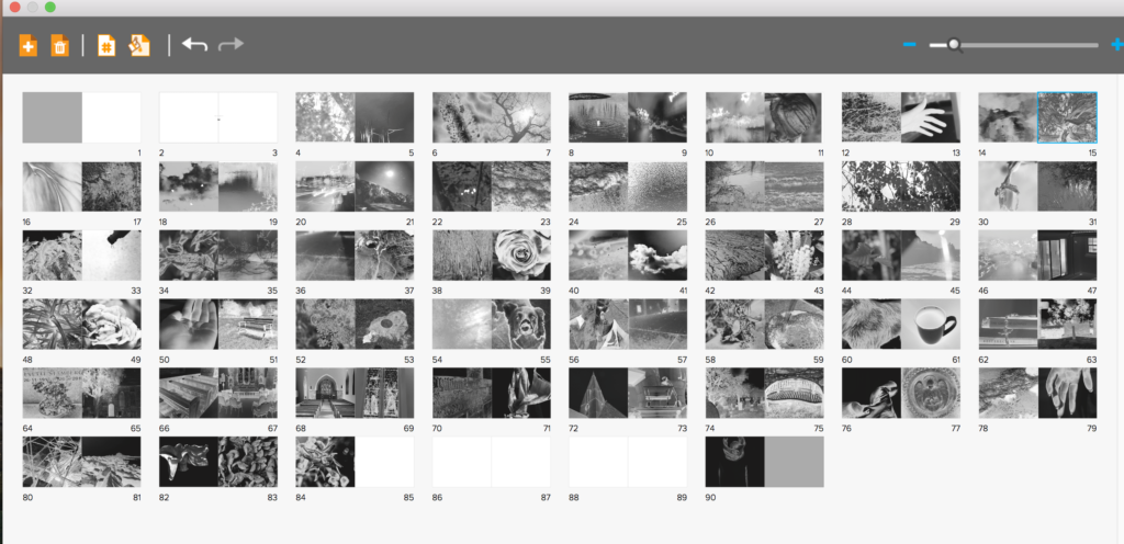
I had soon filled the first part of the book with images of life, I then wanted to show more abstract elements of religion that god was said to create, so showing direct imagery from underwater, animals, and light itself in a more creative manner. I not only wanted to show the world, But too wanted elements of myself to show the human chaos and soon destruction of the world, and the self growth and deterioration throughout the book. As the narrative is about the journey of life of people created and given by god. I decided to add objects which symbolised a life cycle and journey, such as houses, benches and mugs of tea, doing this also constitues a narrative of isolation and loneliness, and presents a sense of abandonment and getting towards the end of life itself. I soon added images from outside and in a church to not only symbolise the end of life, but an evolution of combining the end of life with the original creator itself, reflecting in both the individuals journey of life and religion itself. I also edited the images so they get darker throughout the church imagery towards the end, showing the tonal navigation of light to dark throughout symbolises a pathetic fallacy of death and foreshadowing the gradual end and decay of the book itself,.
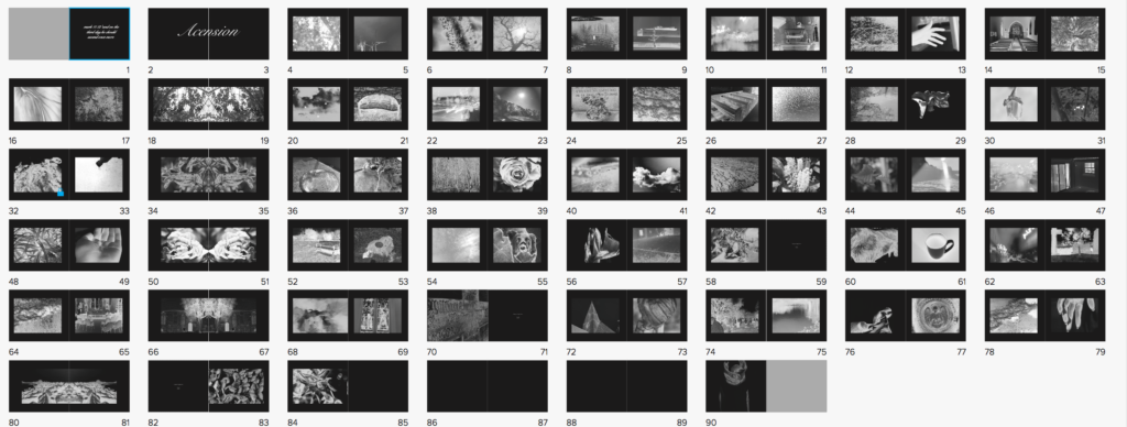
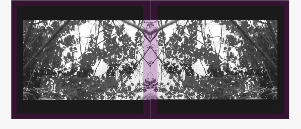
I had soon Finished applying all of the images to the book itself, having both people, nature, objects and a clear narrative both emotional, and chronological. However, after discussing with teachers, we decided to have the book this segregated wasn’t the most successful way in order to show the images, So I re arranged the narrative to show contrasting images, so rarely two nature images are together. I decided I wanted my book to be long in order to have such a strong effect, I also wanted this effect to be heightened by the image on every page always being the same proportion. I believe if you are going to do a book with such a strong concept colour-wise and story wise you need to carry on this strength and not stop the narrative at any-point. However, I thought it would be successful if like two of my artists I showed a continuous black border, which not only exaggerates the colour in the images themselves, but shows a clear narrative colour scheme throughout the book, and doesn’t make the images over-bleed continually on each page. The book itself has the layout of more of lexicon of life, and a clear chaotic feel, as life is not a simple route to the end. I the wanted to show a separating indexical icon throughout, so repeated one image across two pages every 8 pages, to segregate and keep attention throughout the length of the book itself.
Book Design Experimentation
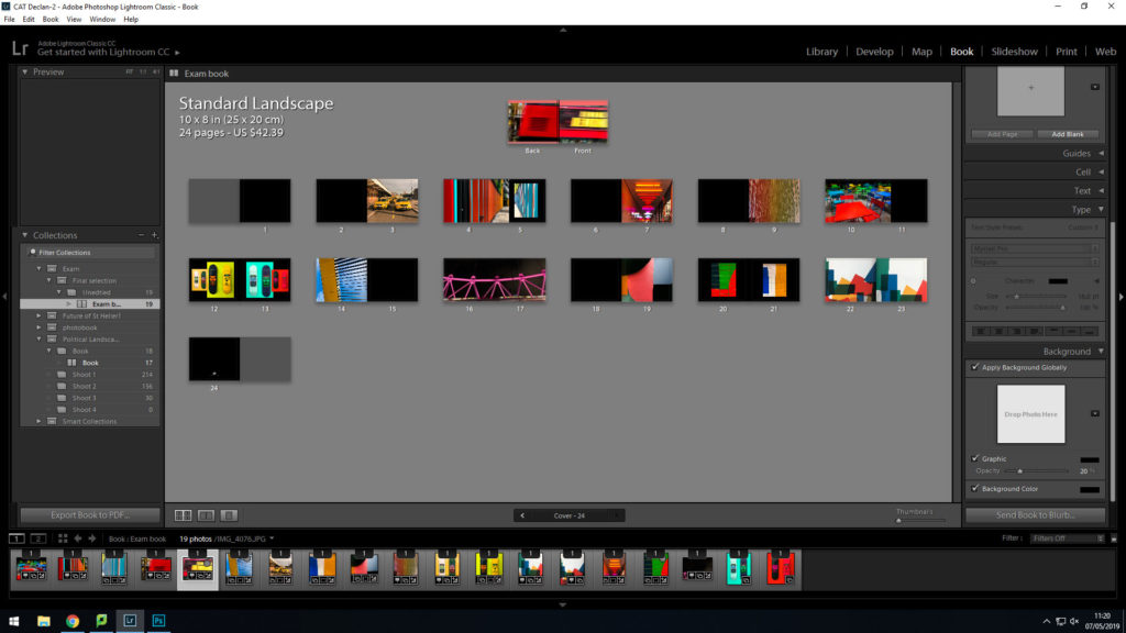
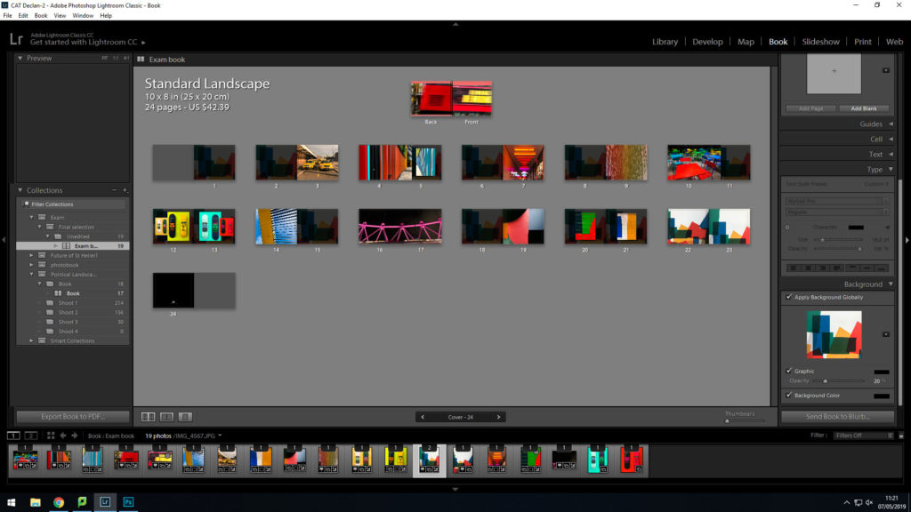
I have decided to make a photobook using lightroom to present my images as i feel that this is the best way to display and collate the images i have produced, focusing on colour photography. I am focusing on including vibrant, saturated and a contrast between dark and light.
From my artist reference on
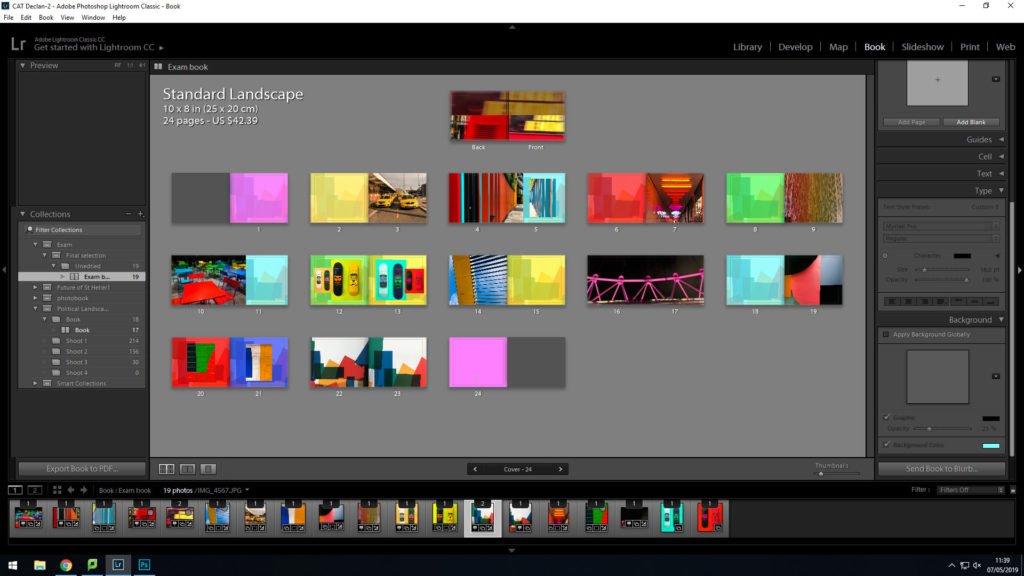
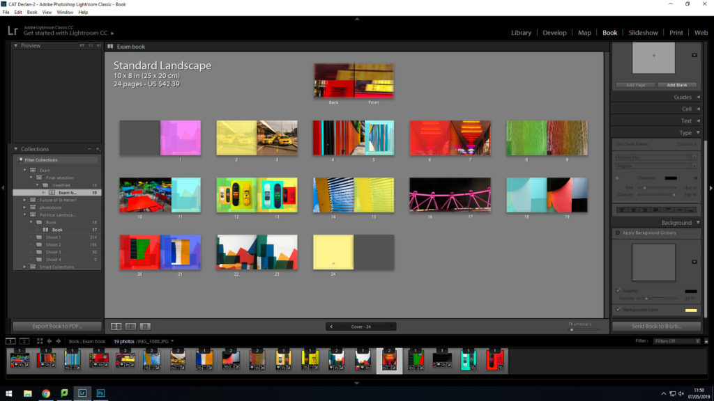
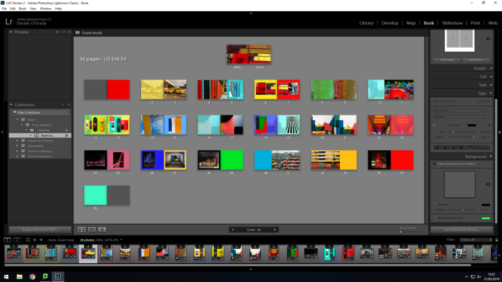
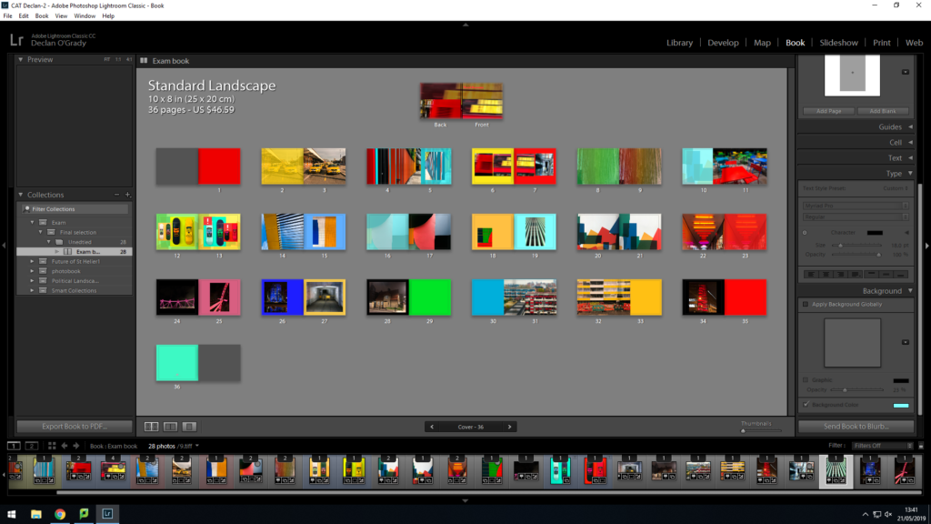
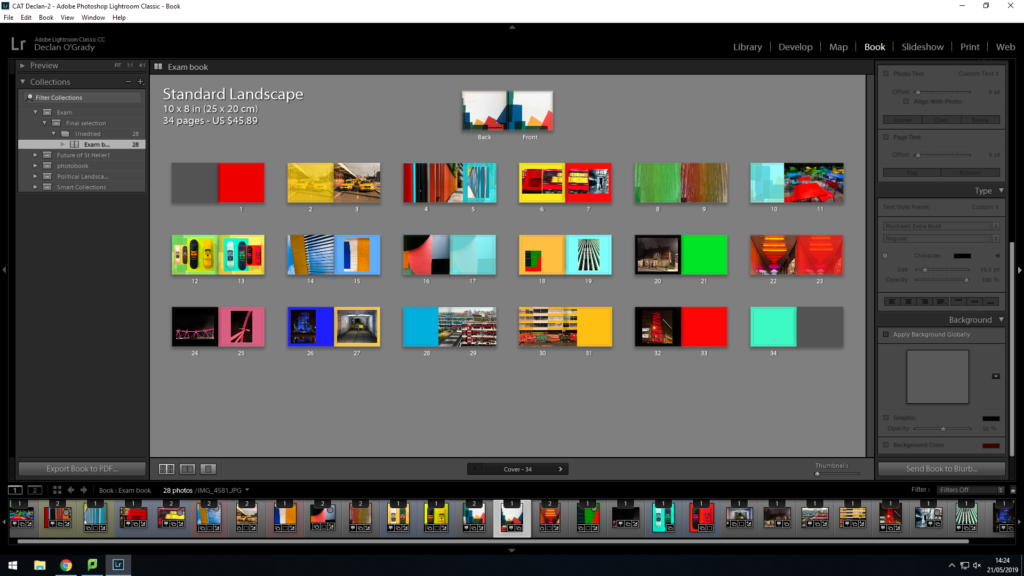
This is my final design:
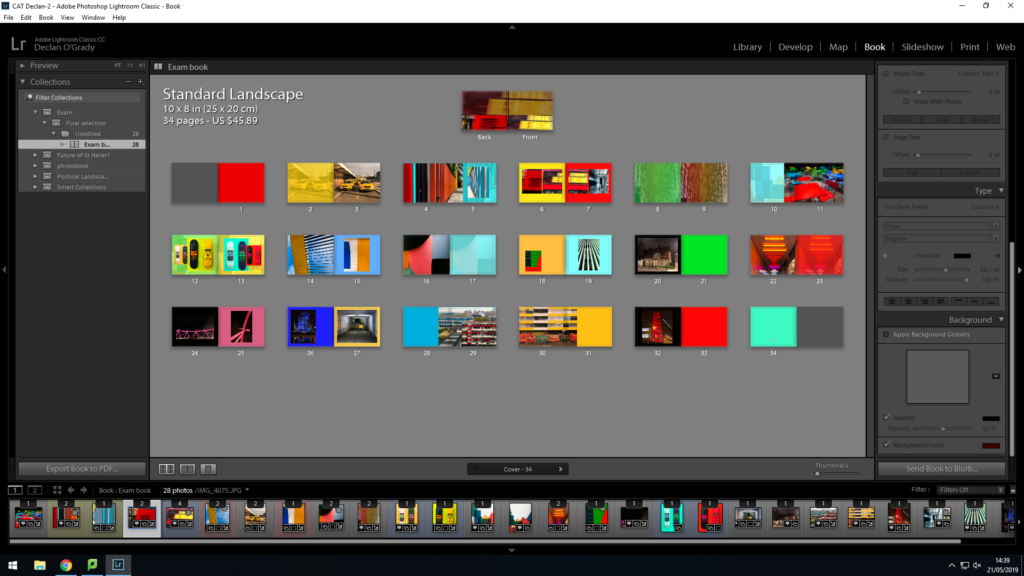
This is my final outcome for my book design. I think this will be the most suitable design as it meets my book specification.
Consumerism Shoot- B&W Edits
For the editing of these images I wanted to create focus on the tone and shade of the images which gave a different view of these products removing the colour and it meant the focus was more on shape and illustration used in the products. I think the images worked well in black and white as it took back from the vibrant colours which are used to draw people in to buying these products. This meant that the focus looked more at the objects themselves rather then the products they contain.
TYPOLOGY EDIT B&W:


