Category Archives: Uncategorized

Filters

Author:
Category:

Using an easel (Photo shoot 5) – Editing

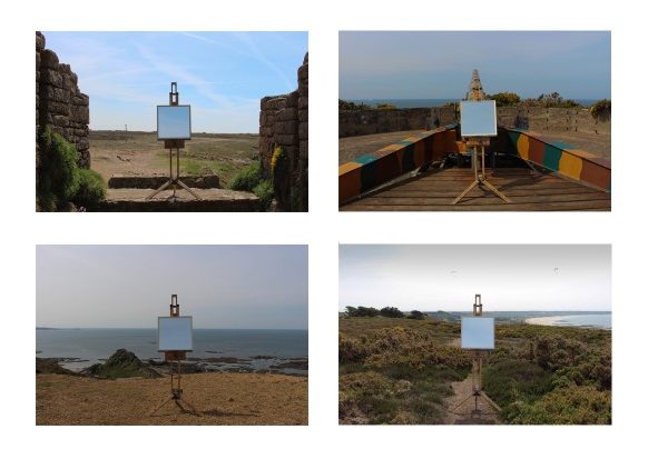
These are the images I edited from my Photo Shoot 5.

I firstly edited all the photos to make the easel and mirror be symmetrically in the middle in all the images. I also altered the lighting and contrast of the images to get them all to a consistent level.

I then experimented with laying the images out in a typology style in different formats to show how their appearance could change. I also changed the images into black and white to see how their look changed. I preferred the images in black and white as I think it adds to the old feel of the images as they do not contain any modern objects.

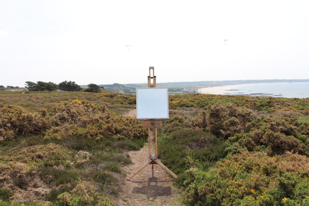
This image has an empty alt attribute; its file name is IMG_0711-2-1024x683.jpg

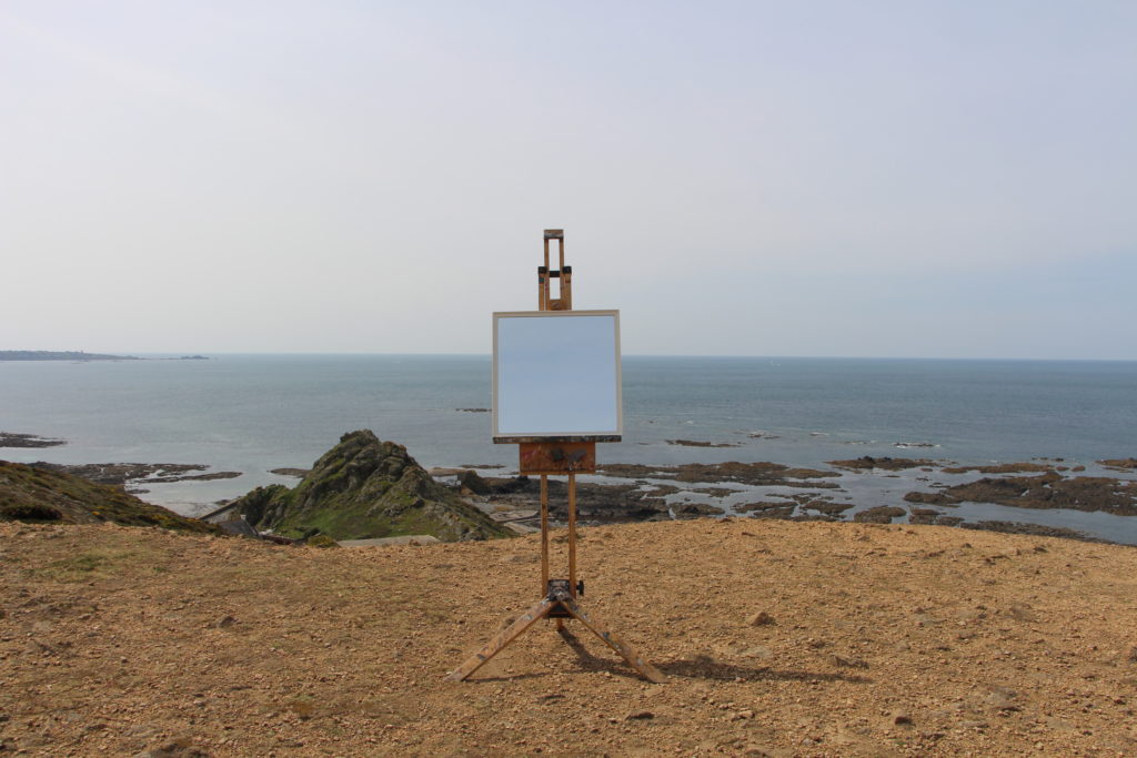
To take this image I went to my desired location of the rural cliff-paths and found a area with a backdrop that I liked. Once in this area I located the easel in a flat place where it was stable and horizontal to the horizon. Once I was happy with this, I locked the mirror in place so it couldn’t fall out or be blown over by the wind. I chose to take this set of images without a tripod as it would be easier to position and angle the camera like this. If I had to categorise this style of it would be a conceptual landscape as it is not oblivious as first the meaning of the image.

Experimentation/colour: Photoshoot 3

I have chosen a select amount of photographs from photoshoot 3, landscapes/model, to experiment on using different processes and methods in Photoshop.

Original Photographs:

Edit 1:


To create this effect I used gradient map, an effect in Photoshop, I edited each photographs so that they matched as a complete uniform set, using this eye-catching, vibrant filter.

Best outcome: I have chosen this as the best outcome because of the frame effect created by the way I edited this photograph, the greens have turned purple and the rest of the photograph is basically completely red with small details of yellow, the fact that each section is almost one colour, creates a massive divide and the trees surround the model and the outer section of the photograph creating a border around the model.

Edit 2:

To create this effect I used ‘threshold’ in Photoshop, I edited them all so the intensity of the black to white, etc was as equal in each photograph.

Best outcome: I have chosen this as the best outcome of the set, because I like the way the black and white effect, breaks the photograph into sections, the sky is broken into a black and white section due to the blue being two different tones in the original photograph and the sea and sand contrasting and lastly the model features being a bright white but the rest of the hair and clothing block black, created further contrast and allowing the model to be the focal point of the photograph contrasted directly against a massive sections of white. Also the fact it completely changes the entire feel of the photograph, for example this photograph was taken at the beach, in natural daylight, on a bright sunny day, but this effect creates a dark cold feeling.

Original Photographs:

Edit 1:

To create this effect I used Photoshop, and used the gradient map to chose the most interesting filter, editing the levels until I was happy with the outcome.

Best outcome: I have chosen this as the best outcome because I like the fact that the photograph has more going on at the top and that the hill and all the bushes and shrubs create an interesting backdrop for the model, also I like the fact that there are a lot of different factors in the photograph and that it is broken into sections, with the model stood in the middle, on the path that runs directly down the middle, for example there is the water on one side of the path, the other side is a drop, and top/backdrop is bushes and above that is a patch of sky. I also think the orange and purple filter works well in creating an interesting contrast within the photograph while being very simple at the same time.

Edit 2:

This edit is directly inspired by John Baldessari and his ‘dots’, I covered the face in each of these photographs, choosing different colours depending on the colours in the photographs and how they would work and contrast within the photograph. For example for the photograph that includes a small amount of pink flowers among the green, I included a pink dot over the face to highlight the pink flowers.

Best outcome: I have chosen this as my best outcome because I like the simplicity of the photograph, but how it also includes a wide range of colours and the dot ties in well with the colours. The sunlight on the green bushes caused the bush to appear with a yellow colour compared to the darker greens in the photograph, therefore I chose a yellow dot to link with the vibrant yellow. I consider this as the best outcome because of the composition, I instructed the model to stand directly in front of the camera, I feel like this creates an interesting effect because the sand path also creates a divide down the middle, having the path lead to the model and having the model in the middle of the photograph allows them to be the focal point of the photograph, regardless of being far away and a small piece of the photograph.

Photoshoot 3

For this shoot I have chosen to photograph landscapes and also incorporate a model into the photographs as a way to demonstrate ‘variation and similarity’ because I thought it would be interesting to stay on theme with the style of nature but for my third shoot have it on a larger scale and also use a model due to inspiration from other artists and also to add an interesting factor into my photographs. I have photographed a variety of landscapes, woods, beaches, etc and included my model in all the photographs in similar positions within the photographs.

Most successful photographs:

I have chosen this as one of my most successful photographs because of the bright colours and the eye-catching factors, like the white flowers on the tree that stand out from the variations of green that surround it and create an interesting contrast, also another instance of contrast is created by the model and the vibrant purple jumper they wear, this contrast against the white flowers and the greens, all three variations of colour work well together while contrasting and creating an eye-catching colourful photograph. I took this photograph in natural sunlight, on a sunny day, the fact the trees hand over creates a striking pattern on the floor. I also chose this photograph because in this photograph the model is in an engaging pose, rather then stood still, arms by their side.
I consider this photograph as one of my most successful because of the interesting composition, I instructed the model to stand between the trees, creating a kind of frame for the model to be inside, I think this worked successfully and allowed the model to be the focal point of the photograph even though they are the smallest factor in the photograph, oppose to the trees and greenery. The variations of dark and bright greens creates striking effect and the brown tree trunks and muddy ground contrast against each other, creating a clear division, the brown muddy ground also contrast with the shadows created, that turn the ground a black colour, this is created due to the fact I took this photograph in natural, sunlight in a shaded area where the trees created shelter and are overgrown.

Planning: Photoshoot 3

For my third photo shoot I want to photograph landscapes and also incorporate a model into the photographs, by including a model I hope to be able to add an interesting element, creating more effect edits when experimenting and also have a contrast between the nature and a model amongst it all, also photographing the landscape from different distances and angles and the model will differentiate the scale of distance, etc. I have chosen landscapes, like the; woods, fields, beach,etc to photograph as part of variation and similarity because nature has been the focus of my project and including landscapes stays on theme, allowing it to be on a larger scale. The variation aspect of these photographs come from the variety of landscapes I want to photograph; woods, fields, beach,etc and the similarity will be the use of the model in similar positions and poses. There is a wide variety of beaches and fields that I can photographs also adding to the variation and similarity, for example the similarity of the landscape, beaches for example, but variation due to the fact they would be a variety of different beaches.

Places to photograph:

  • St. Catherines woods
  • Le Mare Beach
  • Le Hocq Beach
  • Le Rocq Beach
  • Gorey Beach
  • Fields
  • Green Lanes

Equipment:

  • Camera
  • Tripod
  • Model
  • Natural light

New Photo shoot – Using an easel (Photo shoot 5)

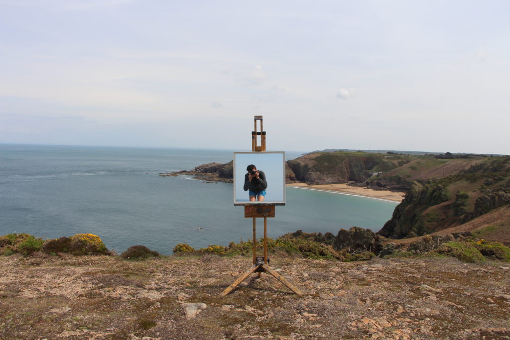
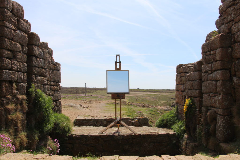
I conducted this photo shoot using an easel and the same white square mirror I had previously used. The shoot was conducted to further develop the idea of using the mirror as a tool to tell a story like GUILLAUME AMAT.

The use of an easel is to draw attention away from the object holding the mirror as it is irrelevant in the meaning of the image. In my previous set of images I used a model to hold up the mirror which could be interpreted in a way that means they are hiding behind the mirror perhaps to hind their identity or they are scared of the environment around them. The easel is simply an inanimate object will no added value in this context. Although as easel’s are normally used to hold art while the artist is painting, the use of the easel could be interpreted as the mirror is reflecting art or the most important part of the image.

Image result for easel

I conducted this shoot around the cliff paths of Jersey which have been scarred by the war.

I am pleased with the success of this shoot as it looks professional as I have captured the the easel in a similar place in each image. I am going to edit the images to improve this.

Easter shoot plan

Over Easter, and the week leading up to it I hope to visit these different car boots areas to take pictures of different car boot stalls for the similarities and variation project. The places I wish to visit are:

  • 7th April – Millbrook Car Boot Sale 7 am – 1 pm
  • 7th April – St peters youth and community center 9 am – 1 pm
  • 14th April – Millbrook Car Boot Sale 7 am – 1 pm
  • 14 April – St peters youth and community center 9 am – 1 pm
  • 21 April – Millbrook Car Boot Sale 7 am – 1 pm
  • 21 April – St peters youth and community center 9 am – 1 pm
  • 28 April – Millbrook Car Boot Sale 7 am – 1 pm
  • 28 April – St peters youth and community center 9 am – 1 pm

As many car boots are open early and finish quite early I don’t think that I will be able to make both of them in the same day so I will rotate which ones I go to each week so hopefully I will have four different photo shoots for the end of Easter. I will be taking inspiration form Huang Qingjun who photographed families with all all their possessions for his project “family stuff”. Although I’m not photographing families with all their possessions, i hope to create the same effect of telling the stall owners story by photographing them and their “stuff”.

Image result for Huang Qingjun

Sunrise Shoot

After reviewing all of the best image that I had taken over the course of this project I realised that I needed more for the element of Fire. I gean to think about that different ways in which you are able to photograph fire so the image don’t become repetitive. So I had the idea of photographing the sun as this is the biggest source of fire know to man. For this shoot I wanted to photograph the sun it creates the most interesting light which is at sunrise and sunset, as I have already done many shoots focusing on the sunset I decided to photograph the sunrise to see if the light produced was any different to that at sunset. For this this shoot I woke up at 4:45 and drove to st Catharines break water for 5;15as the sun was supposed to rise at 5:30 an I wanted to photograph the change in the light. Overall I think that this shoot went very well, I did get some image that are similar to others that I have taken, but in the images the light is very unique and different from any other image that I have taken.

Nadav Kander – Dark Line – The Thames Estuary

His ongoing series, Dark Line – Thames Estuary, focuses on the point where England’s longest river meets the sea. Arranged in diptych or triptych, the photographs look to obscured, uncertain horizons, evoking a sense of departure, loss and longing. The textured, yet often desolate images present a Thames that is sometimes violent, sometimes still. “I wish to make work that does not literally describe what is in front of me,” says Kander. “I do not wish to focus my lens and capture a millisecond of realistic information.” Throughout Michael Martens ‘sea change’ book he has also used the diptych or triptych method and therefore I will aim to try and complete some to implement into my photo book that i plan to do.

From an interview with Nadav Kander :

Could you describe the project for anyone who hasn’t seen it yet?

NK: Dark Line follows the Thames Estuary, the part of the river where it widens and slows down, where the river reaches the end of its journey and enters the North Sea. I’m very interested in the idea of journey and destiny, which works perfectly with the notion of the river widening, slowing and ultimately ending – and yet is the end really the beginning? To use T.S. Elliot’s quote, ‘In my end is my beginning.’ Does the river end or does it begin? Does it get evaporated and rise up into cloud and rain again, and do the cycles of life just continue onward? Is it not as human beings we’ve become caught up in having a beginning and an end?

I think that these ideas that Kander has described is really thought provoking and allows his images to contain a much deeper meaning than they would have otherwise. This sense of questioning reality and the notion of thinking ‘is this the beginning or end’ really allows a deeper thinking into life and essentially our perspective. This links to the ocean and the way in which we don’t know what lies beneath the surface, creating a sense of unknowing. This was taken of interest by my previous artist Jem Southam and i think it is interesting to see how different artists have explored similar ideas with a similar subject matter yet in different ways. Also Hiroshi Sugimoto displays a similar view presenting a different way of looking at a relatively boring subject matter, thus being the ocean.

Image result for Nadav Kander The Thames Estuary

Image result for Nadav Kander The Thames Estuary

The fascinating thing about this series is how unrecognizable the Thames is. It feels moodier and slower than in reality. I think this shows us Kander’s view of how he feels about the world around him and what slow moving, dark water means to him. In an interview he said “I don’t necessarily feel like that every time I’m there photographing but it’s how I feel about it more generally.” Kander elaborates in the interview to say that “there’s a lot of fear of the unknown” suggesting that the sea is the unknown after a bad experience when he was a child. On the other hand, despite the sense is isolation and mystery, Hiroshi Sugimotos project presents us with ideas of feeling a great sense of destiny or even voyage of where it might take them.

I think as a result of looking into this project I want to firstly create a series of diptych and triptych’s with my images that i have already collated. I also will conduct a photo shoot at sea level which will differ from my previous shoots that are often higher up, on top of cliff tops. Within this photo shoot, I will aim to portray a sense of darkness and the unknown by editing them in these ways but also using the weather to my advantage to enhance this.

Advertising In The Beauty Industry

Old Fashioned Advertising

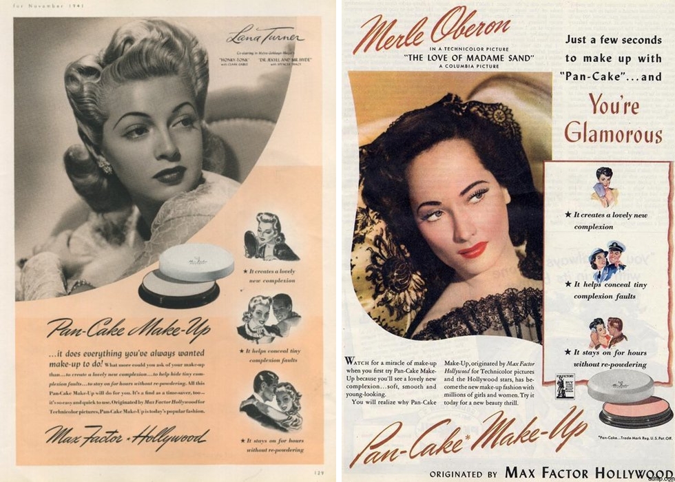
In the past messages about beauty ideals and perfection were obviously promoted to women in advertising for various products. To sell products companies link their brand with a desired look or lifestyle that their customer is looking to achieve, if they believe that buying this product will help them to reach their goals they are more likely to purchase it. Bold statements were used such as “this is no shape for a girl” “great look great body great lash mascara” “how attractive are you on the beach” to target the audiences insecurities directly and make a clear message about the benefits of the product. Although these are old methods of advertising that we would think are now outdated in many ways the same ideas are used in less obvious ways.

Modern Advertising

Modern advertising has a way of being incorporated into every aspect of out lives, there is almost no way to live without being impacted by the messages pushed at us through advertisements. Since the rise of the internet advertising techniques have changed drastically. whilst before they would have been printed in magazines, on posters, billboards TV and Radio they now now have ways of targeting individuals directly. Through the use of HTTP cookies, data is gathered when sent between the website and the users device. They were designed to remember information and interactions users make on the internet, recording their browsing history. this data is bought by advertising companies who use it to specialise and target products towards appropriate customers. Adverts will then appear on various websites, social media platforms and videos.

When looking on my own Instagram to see what products and services were being targeted towards me I found many adverts specific to where I live proving just how much information is collected and used. I also saw a lot of sponsored posts for clothes and beauty products such this teeth whitening kit. This style of modern advertising is more subtle, integrating it into your newsfeed often I will scroll past them without questioning the subliminal messages they are communicating about how purchasing these products is the answer.

On the other hand some commercials and campaigns have started to represent a more versatile group of people, due to the media companies are coming under more scrutiny to more on from traditional beauty ideal and show real people in their adverts.

Barbara Kruger

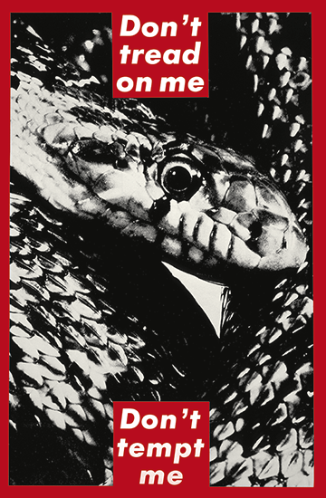
Barbara Kruger, an artist from New Jersey who worked as graphic designer and art director for various magazines created a collection focusing on power struggles mainly for women. By layering photographs she found in existing magazines with aggressive slogans such as “I shop therefore I am” written in white over red boxes to stand out from the black and white backgrounds. They are deigned to imitate the deigns and messages behind real adverts that shout messages at the consumer, and question the viewer about feminism, classism and consumerism. Her work has appeared on billboards, buscards, posters and train stations to further imitate the conventions of advertisements.

Extension rebellion

I also want to look into culturally relevant issues and how they are being publicised, Extinction Rebellion, a current movement against climate change, and the extinction of life due to biodiversity loss and ecological collapse. So far the activists from all walks of life have nonviolently protested in major cities around the world in hope to disrupt daily life and gain awareness from the public and government, some have taken extreme actions to get attention for the cause with over 1,000 people arrested so far. They have a bold memorable logo which is a mix of a cross and a sand timer to symbolise how time is running out for us to change our habit and reverse the effect of climate change. The colour green has been their focus for more of their posters and signs because of its clear links will nature and sustainability along with bold black writing reminiscent of Barbara Kruger’s work and similar persuasive adverts. The middle image shows how the group is using extreme emotive method to display the seriousness of the cause.

Personal Response

After looking at these various advertising methods used to persuade audience into purchasing product or believing in an idea I want to incorporate similar concepts into my work. I have considered adding emotive and brutal phrases into the magazine that go with the idea of beauty ideals and perspectives towards achieving perfection. I also want to create a series of images in the form of modern advertising for example, sponsored ads on social media, posters and product packaging. These will go alongside the magazine to display the idea of how we see messages around this ideal all around us on a daily basis.

presenting my work: Batia suter Lexicon Cycle of life research

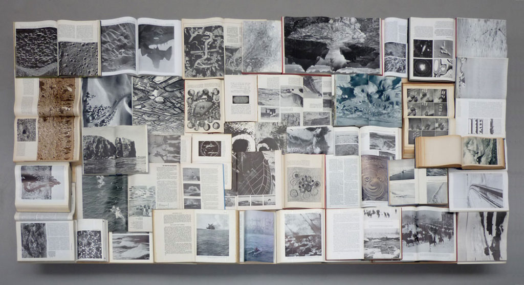
The imagery you can see above is based off of the historical relevancy within the book itself. so not all of these images are form her but the achieve itself. The combination of figurative and literary to my mind is interesting, as it allows myself to possibly think about something I could add into my project. Many of these images are objectivity and not a specific representation of a person themselves. I also like the way in which she chooses to have this sort of loose representation, to my mind this feeling of a scrapbook always has a clear presentation of thought about everything that the book itself contains. From the presentation purpose the huge size of the pieces themselves is something which I believe to be really effective and why I too want to show huge prints, similar to herself. I think using the turn in the wall is also effective, perhaps if I did rows of four within two on each side in the crease, it would allow a much more abstract presentation.

Every page from Sutlers book has a full sized image leaking over the ends of the pages, It both concentrates on this style of a lexicon with an overruling theme. She photographs everything which has some sort of relation through narrative. Due to the sheer size and effectiveness of her pieces, one on every page of full leak, it’s what allows myself to belive if you’re going to go and try to show this monumental representation of everything, you have to really go hard.

Biography:

Swiss-born, Amsterdam-based artist Batia Suter (b. 1967) studied at the art academies of Zürich and Arnhem (NL), and was also trained at the Werkplaats Typografie. Suter produces monumental prints of digitally manipulated images for specific locations, and works on photo-animations, image sequences and collages, often using found pictures. In 2007 she published Parallel Encyclopedia (Roma 100), followed by Parallel Encyclopedia #2 in 2016 (Roma 284), containing a large composition of images taken from books she has collected along the years. Surface Series (Roma 160), published in 2011, is an evocative montage of found images exploring the diverse resonances of geological landscape and visual surface. The underlying themes of Batia Suter’s practice are the ‘iconification’ and ‘immunogenicity’ of images, and the circumstances by which they become charged with new associative values. Her work intuitively situates old images in new contexts to provoke surprising reactions and significative possibilities. By this method, and with an attuned sensitivity to hidden harmonies and expressive accidents, Suter thus generates hypnagogic spaces where pictures can communicate by their own logic, in a force field of imaginative metamorphosis.

lexicon means a collection fo items all represent as though ti i . dictionary fo images. I felt as though ti was important to research this as my book is similar to a lexicon I the fact that it focuses on the narrative of life and death and everything that concerns it.

I decided through looking into how this artist presents her work, usually, having a continuous over-flowing page, I decided I should create a narrative which too allows my theme of black and yet too has these large strong images. I believe this presentation is the best and possibly the final,. I might start developing some new photo possibly with over ruling images and creating a new possibly more interesting composition, and possibly adding in more chaos photos of the pressed jar shoot.