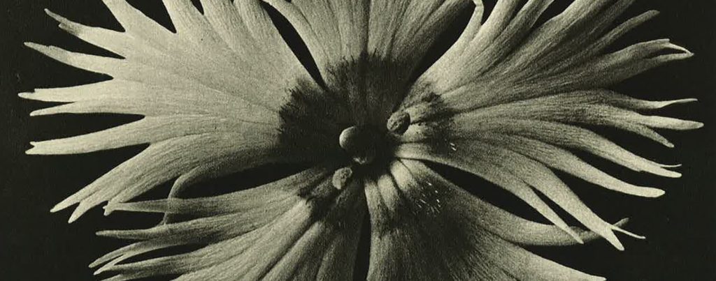
Category Archives: Research

Filters

Author:
Category:

Abstract Texture Shoot #1

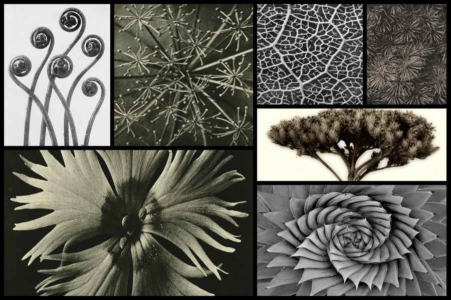
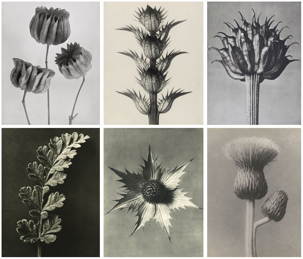
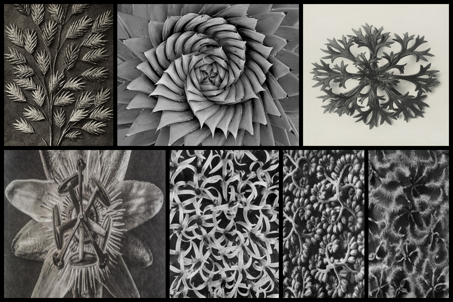
For this shoot I wanted to focus my attention around the textures and patterns found within the abstraction and isolation of photographing a single plant. Having previously looked at the works of Karl Blossfeldt I became inspired through the simplicity of his style but effectiveness regarding the plants hidden beauty from their structure and aestheticism. What I wanted to capture in this shoot was how patterns and textures can be found wherever you go in Jersey whilst looking at the wildlife, and that one such instance, in this case plants, can’t be viewed by the everyday eye but instead needs to be viewed from a closer and unusual perspective in order to properly see how the plants truly looks. I wanted to achieve an aesthetic looks like Blossfeldt’s, using a monochrome filter that exaggerates the shades of the plant, contrasting it from the surrounding environment. Some of his work can be seen below:
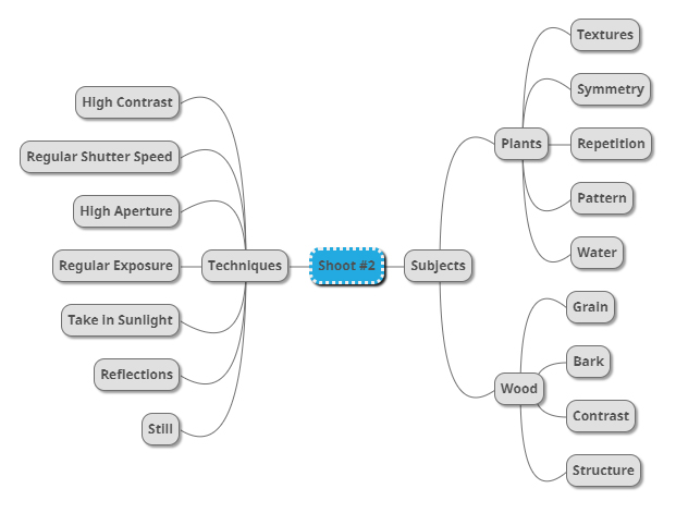
Once I had looked at some of his work I decided to go onto make a mind-map for my shoot. By doing this I hope to make my shoot a lot more easy for me to complete, this is because by using a mind-map it would allow me to more effectively identify what I should photograph when in the are, stopping me from taking images that would maybe distance myself from my aims. Here are some examples of my ideas regarding the new shoot:
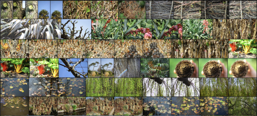
Once I had completed my mind-map I decided to go ahead with the shoot, my main focus for the area are around the coastal areas of Jersey which have the biggest variety of plants to photograph. Using my mind-map as my primary source of inspiration I decided to take 100-200 images regarding textures and patterns. Here are my results:
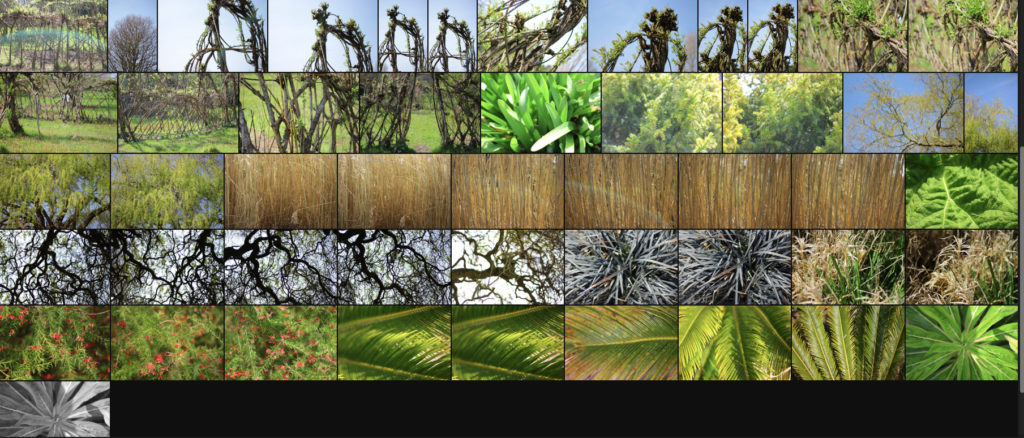
Once I had completed the shoot I decided to go onto select ten images I thought best reflected the overall intention of the shoot. By doing this it would allow for me to whittle the results down to only five which could then be used to analysed in more detail and find the photo that best overall represented the entire shoot and my thought process. Here are the selection of ten images that I thought both visually and contextuall reflected the shoot:

After I had chosen the ten images I thought were most effective I then moved onto selecting the pieces that I thought summed up the shoot well. To do this I will be analysing the five that I found to be both visually and contextually appealing to me and the viewers, this would include looking at the visual, technical and conceptual aspects of the piece in order to select the image that best sums up the overall shoot. Here are my decisions:
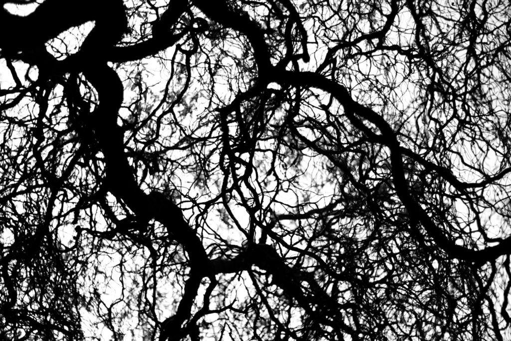
I chose this image because I loved the textured pattern created by the branches of the tree growing out, for me this resembled a spider web where a general formation can be seen from what the branches have created, however there is a randomness overall as each branch has no sense of direction. I found that the thickness of certain branches brought together the overall piece, this is because of how they provide a sense of aestheticism within due to smaller black lines dart out of the sides of think thicker pieces. For me this is particularly effective from how the backdrop is white and so creates silhouettes of the outreaching branches, really abstracting the tree and highlighting the patterns created from it. Overall I found this image related well to the topic of patterns and textures due to it presenting the top of the trees through a perspective not usually regarded. providing the viewer with an insight into the patterns branches make across the landscape.
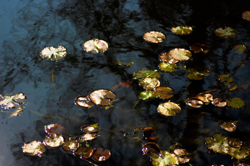
What I really liked about this photograph was the use of motion blur to capture the lillies and the reflection of the water. By capturing the brightly coloured lillies against a mainly dark surface of water I found that it created an unusual texture as by incorporating both on a sunny day it removed the impression of water, instead replacing it with a mirror of what overlooks the pond. The motion blur for me also added a sense of movement within the piece due to how it distorts the water surface replacing it with a pattern of blues and blacks blended together making it look almost like a convas. Overall I found that this piece went well with the topic of textures and patterns due to how the blur smoothened the waters surface whilst using the lillies as patches of vibrant circles to highlight what is reality.
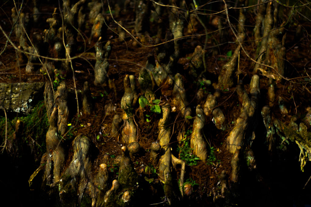
For me I selected this image because of how the forms created by the wood come up from the ground as if they were an alien species, these little wooden formations jot up from the group and spread out as they lead further back in land. This pattern they create for me really provided a great contrast due to the variety of different colours which can be seen defining the shapes through things such as grass, moss and water. I found that the black border which surrounded the piece really added to the overall effect due to ow it almost boxes in how the image is represented, making the viewer question what is beyond the patterned field of wooden spires. Overall I found this piece represented the topic well due to the odd spire like structures dotting out of the ground in random patterns, for me this was a good representation of natures patterns and how they can range from normal to unnatural.
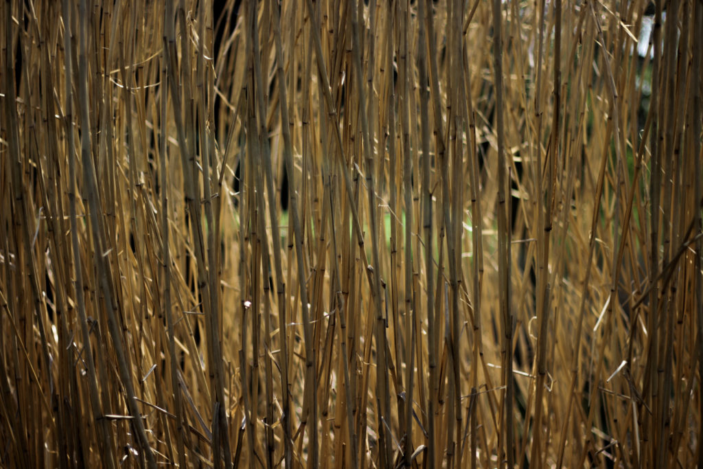
The reason I selected this image was because of the use of repitition present throughout the photo. I found this image to be effective due to how it portrays a common pattern often seen in nature through many of the same plants seen side by side often next to walkways, and so capturing it using a composition that boxes this symmetrical and repetative pattern in really abstracts it from its surrounding environment as it gives the viewer a more upfront and personal confrontation to a common pattern seen in your everyday life. Overall I found that the piece is effective in presenting viewers with an everyday view into the patterns and textures you can find almost anywhere you are.
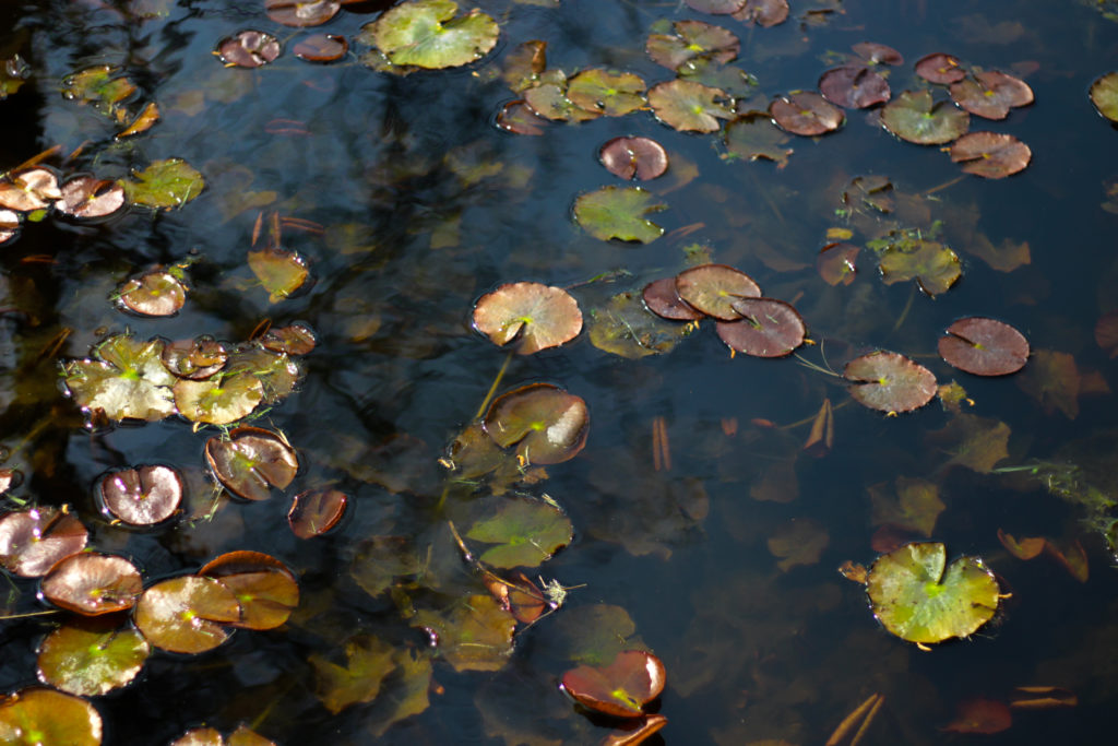
Like one of the images above what I liked about it was the use of motion blur to create a textured pattern between both the water and lillies. I really liked the random pattern created by the lillies onto of the water which reflects the lillies below the surface, by doing this the water creates the imapression of two layers of lillies on top of each other. I didn’t however find this photo to be overall that effective due to how the lillies for me take up too much of the surface leaving little for the waters surface to be portrayed properly. Overall however I found it did relate to the topic of textures and patterns due to how the double layer of lillies represented the repetition found in nature.

After my shoot and analysing five of the images it allowed me to come to a conclusion regarding the best outcome from the entire shoot. Here is my final decision for the photograph that best sums up my aims from the shoot:

Final Image:

When looking over this image I found that it put across a great sense of aestheticism with the blacks of the waters surface and the blues complimenting the vibrant lillies which are dotted around the photograph. I really liked the underlying lillies below the surface as I thought they added some depth to the overall image with the reflection of the trees overcasting the lillies added to the contrast of the image. In regard to the topic title of textures and patterns I found that the photo related well to the title due to how the pattern of the lillies dotted around the surface with the surface of the water becoming blurred from motion which as a result added texture to the surrounding area.

Circles | Specification

First my first few photo-shoots I have a few ideas.

  • Drone Top Down
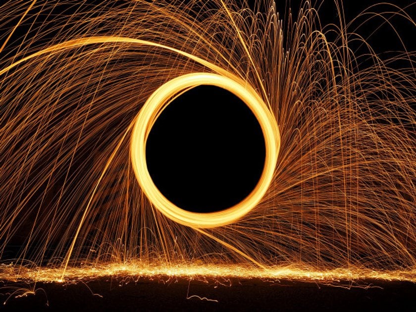
  • Steel Wool
  • Circles in town
  • Circles inside

Drone Top Down

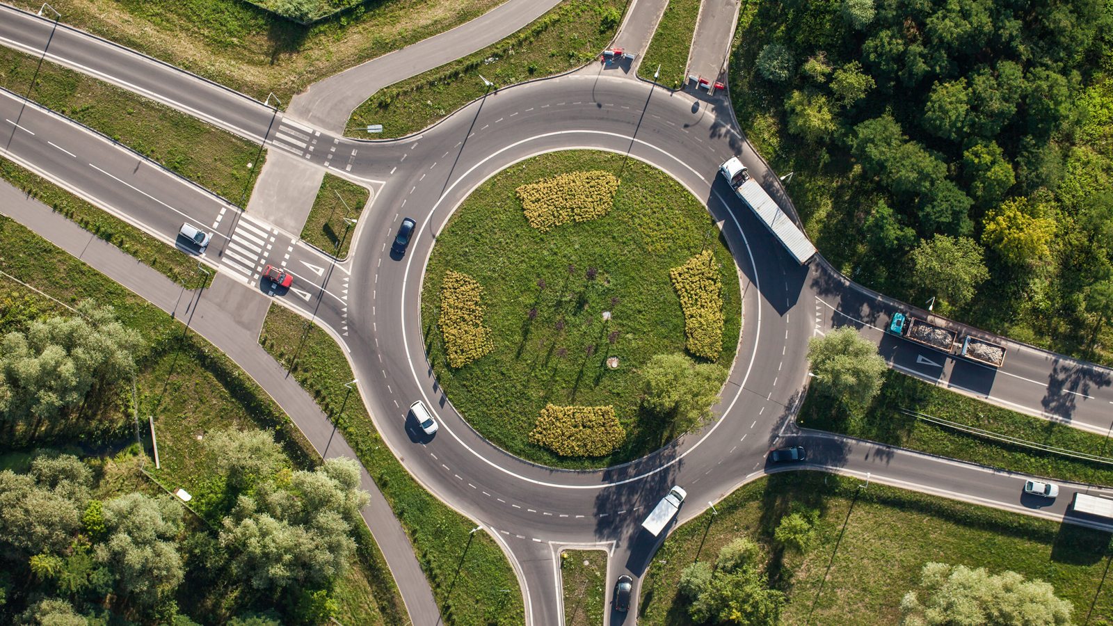
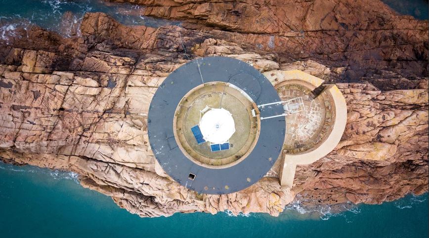
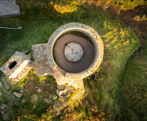
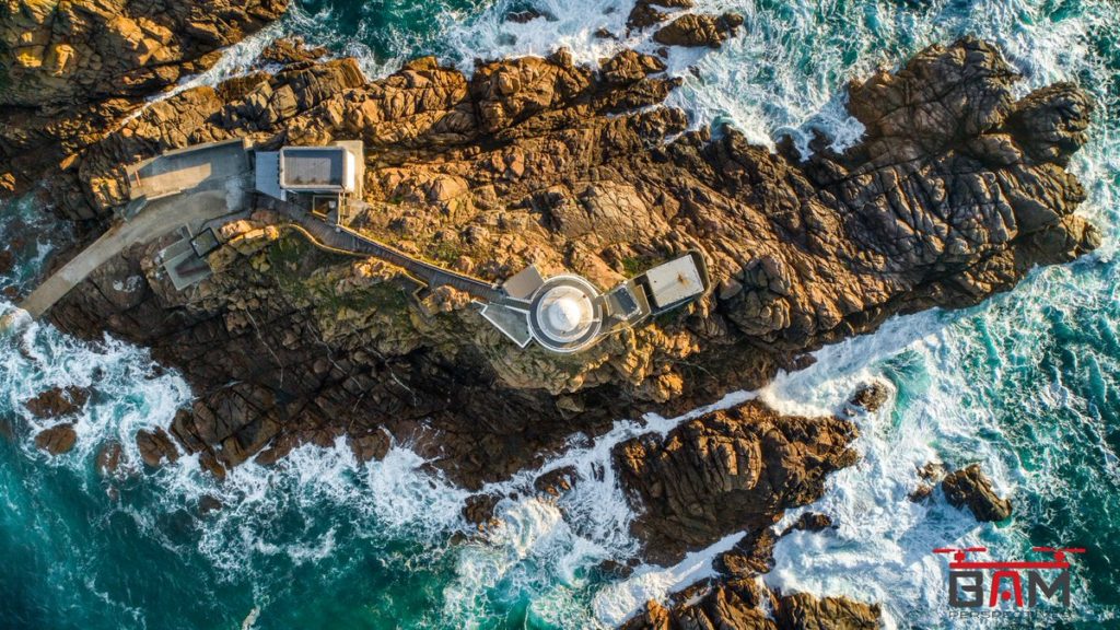
For this shoot, I plan to shoot one if not more locations in Jersey where there are prominent circular features. These places include Noirmont Point MP1, Noirmont Point Lighthouse and a roundabout, likely at the Waterfront St Helier.

A similar stlye to what I would like to try – Image by BAM Perspectives

Steel Wool

For this shoot, I would like to produce something similar to what is below. It involves sparking a strip of steel wool and swinging it around in a circle.

Image result for steel wool photography
Unknown

Circles in Town

Walking around urban areas, photographing things that are circular. I am not sure what to expect but I would imagine I will find a lot of examples.

Image result for circles in cities photography
Jono Vernon-Powell

Roundabout

Again with the drone, I would like to fly over a roundabout (perhaps at the Waterfront St Helier) and shoot top-down onto the roundabout.

Image result for circles in cities photography
Unknown

Circular Tiny Planet

For this I will take images and then use a circular photograph program to create this images.

Image result for circular image tiny planet

Planning Shoot #2

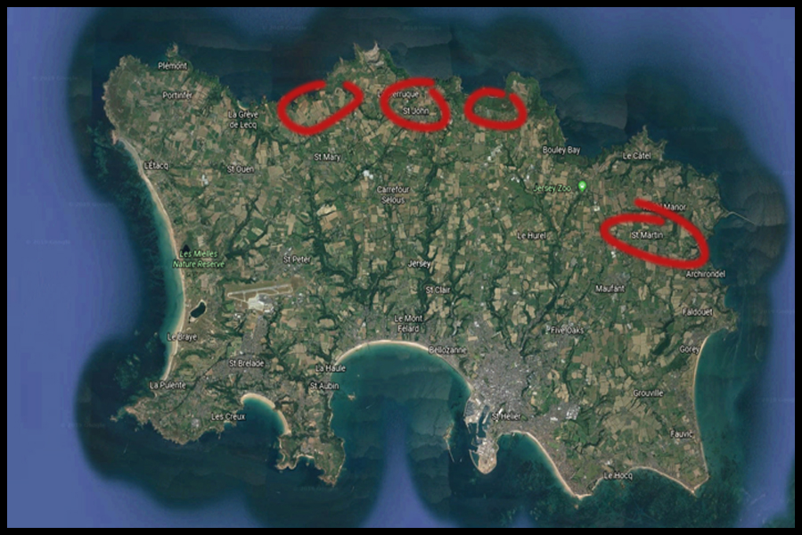
Before going ahead with the next shoot I decided that I would plan what I would want to focus on within the shoot. To do this I had previously looked at the photographer Karl Blossfeldt, a photographer who took a more abstract approach to photography looking at contrast within the structures of plants as his main method of depicting the presentation of them in a more abstract way, doing so through pattern and texture. By using him as my main source of inspiration towards the shoot I would like to produce a response which can also link into my topic of textures and patterns. An idea for the shoot is to photograph colorful or monochrome image in an abstract way regarding areas of Jersey which present me with a huge variation of plants that can reflect that area of the island. To do this I have produced a map which highlights the areas of Jersey which would allow me to take imagery in the style of my chosen photographer through what is present there. Here are some of the locations that I could potentially go to when in the process of the shoot:

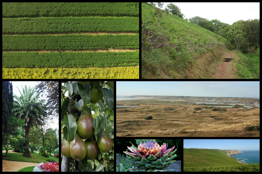
When looking over the map I decided that the reservoir located on the East of the island would provide me with the wider range of plants due to there being a broader variety of types that can be located along the shore and further into the trees. When taking the images I would have to become more up close to the subject due to wanting to capture the symmetry present in their every day designs. The North of the island however provides me with more sea based plants such as sea-weed and other plants, something completely different to the plants that could be found elsewhere. Here are the locations within the mood-board that I wish to capture in my shoot:

The aspect that I wanted to explore the most is based around the structure of the plants themselves, looking at their hidden beauty not seen to the everyday eye due to their aestheticism being hidden to those who walk past. I want here to combine both aestheticism and texture and patterns together through these natural formations as I think they provide a great contrast to my previous shoot which looked at the large forms of textures and patterns in everyday lives surrounding the coast.

Another idea could be the use of a high aperture, by doing this like in my previous shoots it would allow me to further remove the subject photographed from the actual backdrop possibly making a more unusual and weird result. From here I really wanted to draw people away from the way plants are usually seen, using a sense of aestheticism and how their shadows cast on the land could provide other forms of abstraction that I could compare to using pattern and texture.

Finally for my last idea I could use editing software such as Adobe Photoshop to edit the saturation of the plants into a different colour, by doing this it would allow me to produce more abstract images due to the contrasting colours being seemingly otherworldly and impossible to find. This could also work with their shadows which I could edit in the software to increase the contrast and produce a set of images where the shadows are emphasized.

Artist Reference – Karl Blossfeldt

Who is he?

In 1881 Blossfeldt began his studies as an apprentice at the Art Ironworks and Foundry in Mägdesprung, Germany, where he studied sculpture and iron casting. He then moved to Berlin to study at the School of the Museum of Decorative Arts (Kunstgewerbemuseum). In 1890 Blossfeldt received a scholarship to study in Rome under Moritz Meurer, a decorative artist and professor of ornament and design. Along with several other assistants, Blossfeldt created and photographed casts of botanical specimens in and around Rome. He continued to work with Meurer through 1896 and traveled beyond Italy to North Africa and Greece to collect specimens. Beginning in 1898 Blossfeldt taught design at the School of the Museum of Decorative Arts (Kunstgewerbeschule), and in 1930 he became professor emeritus. There he established a plant photography archive that he used to teach his students about design and patterns found in nature.

Blossfeldt had no formal training as a photographer and used homemade cameras that he outfitted with lenses capable of magnifying his subjects up to 30 times their natural size. The use of magnification resulted in images of extreme detail and clarity. With the precision of a botanist, Blossfeldt photographed the natural world for scientific and pedagogical purposes and inadvertently became a modern artist. His work was considered the forerunner to Neue Sachlichkeit photography, which favoured sharply focused documentarian images. In 1926, when Blossfeldt was already in his 60s, his work was exhibited to the public for the first time at Berlin’s avant-garde Galerie Nierendorf.The works exhibited there were published in the book Urformen der Kunst (1928; Art Forms in Nature [2003]). The first of his three photo books (the other two were Wundergarten der Natur, 1932; and Wunder in der Natur, 1942, the last published posthumously), it was enormously successful and remains one of the most-significant photo books of the 20th century.

I was particularly inspired by how the textures and patterns created by these natural forms really highlighted minute details that could not usually be seen by the everyday eye. Some examples of his work can be seen below:

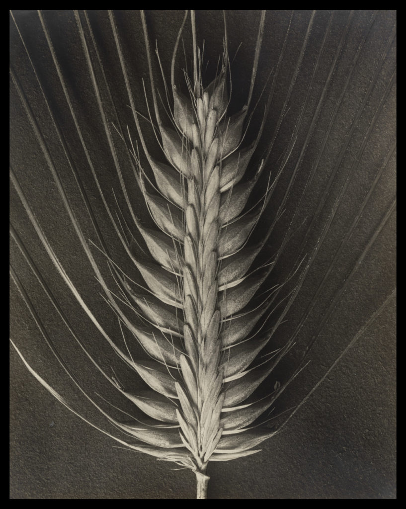
After looking at Blossfeldt’s work I decided to go onto analyse one of his images, here I would be looking at technical, visual and conceptual aspects of the photo. By doing this it would allow me to have a better understanding of how he goes about composing his imagery, and the composition he uses to do so. The image I have chosen to analyse is called Hordeum distichum and is part of his fine art series looking at textures and patterns within the structures of plants:

Visual: Visually the piece is extremely aesthetic, using contrast and a symmetrical appearance to highlight the various shadows and depth of the plant. By capturing the plant up close on a macro scale it essentially brings together the whole photo as it fills in a space that otherwise would be blank with symmetrical lines, using a high contrast to highlight the identity of the plant which seemingly unfolds from itself using predominantly darker shades to fill up any space which would contain negative space. The image itself has been taken on a closer level so that the viewer can become more personal with the plant, as seeing it up close presents the viewer with a perspective that might not have been traditionally provided for them. Because of this the photograph seems to make the plant into something completely different to its original appearance, as by singling one bud head out it casts a light onto it that maybe is not accessible when viewing them en mass.

Technical: The photo itself has been taken in black and white, using a black sheet of paper as a backdrop which highlights the structure of the plant, adding a sinister and symmetrical feel to the entire piece. Blossfeldt has made sure to capture only the head of the bud so that it may be presented in a overall symmetrical manner which leaves the end result more aesthetic for the viewers, as using an increased contrast making the different shades pop due to it greatly exaggerating the change in shade so that things like black are emphasized. When taking the image the shutter speed would have been relatively normal due to Blossfeldt not needing to capture any moving object due to the photo being taken in studio conditions, which as a result gives off a beautiful result which perfectly presents the head of the plant in a way not previously done before. Texture and pattern making up the majority of the piece as the photograph breaks up the plant so that it becomes more abstract, creating shapes that could not be previously seen due to a greater scope needed to see it.

Conceptual: Conceptually Blossfeldt can be seen taking this image in reference to fine arts, using a simple but effective camera angle and subject to produce a piece that is extremely aesthetic to the eye, emphasizing the shades so that they perfectly contrast each other and define the overall result of the photograph. The piece plays part in a series of photographs of bud which at the time were taken so that his students could use them to produce biology based work that could be used in class, however his passion for this kind of photograph led him to create more of the typographic styled method.

Photoshoot plan + Contextual Research

Sources

Colour

Colour is the aspect of things that is caused by differing qualities of light being reflected or emitted by them.

To see colour, you have to have light. When light shines on an object some colours bounce off the object and others are absorbed by it. Our eyes only see the colours that are bounced off or reflected.Light waves carry energy, determined by frequency, carried by small packets known as photons. This energy provides the basis for human vision, solar power and digital photography.

In color photography, electronic sensors or light-sensitive chemicals record color information at the time of exposure. This is usually done by analyzing the spectrum of colors into three channels of information, one dominated by red, another by green and the third by blue, in imitation of the way the normal human eye senses color.

HOW DOES COLOUR WORK?

Before colour could be reproduced the nature of light and how we perceive colour had to be clearly understood. The scientific investigation of colour had begun in the seventeenth century. In 1666, Sir Isaac Newton split sunlight with a prism to show that it was actually a combination of the seven colours of the spectrum. Nearly 200 years later, in 1861, a young Scottish physicist, James Clerk Maxwell, conducted an experiment to show that, in fact, all colours can be made by an appropriate mixture of red, green and blue light.

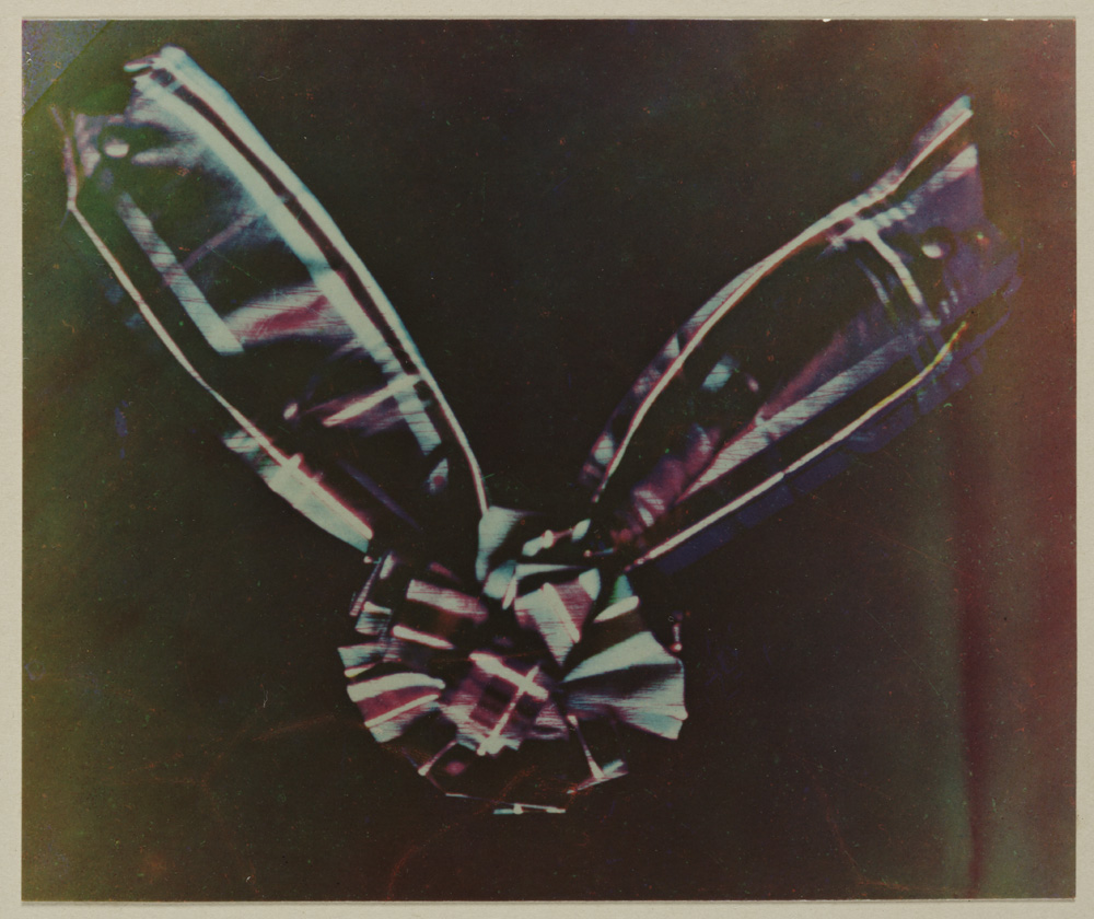
Maxwell took three separate lantern slides of a tartan ribbon through red, green and blue filters. These slides were then projected through the same filters using three separate magic lanterns. When the three images were carefully superimposed on the screen, they combined to make a coloured image which was a recognisable reproduction of the original. While Maxwell’s experiments demonstrated clearly the basic principles of colour photography, in practice, his demonstration should not have worked at all. Although the physicist didn’t know it, the photographic emulsions that he used were insensitive to red light. Fortunately for Maxwell, the red cloth in the ribbon reflected ultraviolet light. This was invisible to the eye but did register on the emulsion.

Luminance – The Absolute Measurement of Light

  • Luminance measures the absolute intensity of light, that hits the eye, after reflecting off an object.
  • Luminance is measured in candela per square meter
  • Luminance is a measured value such as velocity or weight. It does not depend on the human eye or setting, only measured physical attributes.

Brightness – Our Perception of Luminance

  • Brightness is used to denote how the human eye perceives the luminance of an object.
  • For example, a computer screen at maximum luminance looks brighter in a dark room than it would outside in the sun.
  • Although the luminance of the computer screen is the same our eyes perceive it’s brightness differently, depending on the conditions for viewing.
  • Brightness can range from dim, at the low end, to brilliant at the high end. Brightness is perceived value. It is not measured. It changes dependent of surroundings.

One person may interpret light differently than another person.  There are instances two individuals seeing the same object interpret different colours. Scientists are uncovering some interesting data on how we interpret light waves. Even though two people are seeing the same wave length they may still interpret the object to be a different colour than the other. New research suggests this can be due to things like mood and experiences.

Warm vs Cool

The distinction between “warm” and “cool” colors has been important since at least the late 18th century. The difference seems related to the observed contrast in landscape light, between the “warm” colors associated with daylight or sunset, and the “cool” colors associated with a gray or overcast day which make you feel calm, relaxed and refreshed . Warm colors are often said to be hues from red through yellow, browns and tans included. They are associated with heightened emotions and passion as well as joy and playfulness. Cool colors are often said to be the hues from blue green through blue violet, most grays included. There is historical disagreement about the colors that anchor the polarity, but 19th-century sources put the peak contrast between red orange and greenish blue.

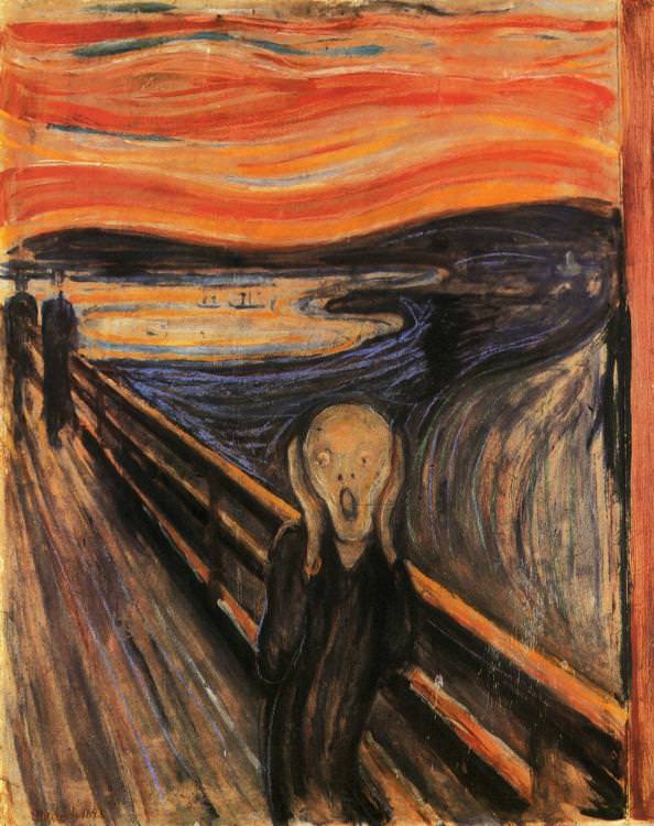
The Scream, Edvard Munch, 1893

According to Munch, “I painted this picture – painted the clouds like real blood.  The colors were screaming.[”, warm and cool color intensified fear and the feeling of hopelessness respectively, the combination of opposite color tone made the contradiction more significant and thus affecting the emotion of the audience more. 

Color theory has described perceptual and psychological effects to this contrast. Warm colors are said to advance or appear more active in a painting, while cool colors tend to recede; used in interior design or fashion, warm colors are said to arouse or stimulate the viewer, while cool colors calm and relax.

Colour Psychology

Color psychology is the study of hues as a determinant of human behaviour. Color can indeed influence a person; however, it is important to remember that these effects differ between people. Factors such as gender, age, and culture can influence how an individual perceives color.  

White:

Just as black is total absorption, so white is total reflection. In effect, it reflects the full force of the spectrum into our eyes.

Positive: Clarity, Purity, Cleanliness, Innocence, Simplicity, Sense of Space

Negative: Sterility, coldness, barriers, unfriendliness, elitism

BLUE:

Blue is the colour of the mind and is essentially soothing; it affects us mentally, rather than the physical reaction we have to red. Strong blues will stimulate clear thought and lighter, soft blues will calm the mind and aid concentration. 

Positive: Intelligence, communication, trust, efficiency, serenity, duty, logic, coolness, reflection, calm.
Negative: Coldness, aloofness, lack of emotion, unfriendliness.

YELLOW:

The yellow wavelength is relatively long and essentially stimulating. In this case the stimulus is emotional, therefore yellow is the strongest colour, psychologically. The right yellow will lift our spirits and our self-esteem; it is the colour of confidence and optimism. 

Positive: Optimism, confidence, self-esteem, extraversion, emotional strength, friendliness, creativity. 
Negative: Irrationality, fear, emotional fragility,

RED:

Positive: Physical courage, strength, warmth, energy, basic survival, ‘fight or flight’, stimulation, masculinity, excitement. 
Negative: Defiance, aggression, visual impact, strain.

Being the longest wavelength, red is a powerful colour. Although not technically the most visible, it has the property of appearing to be nearer than it is and therefore it grabs our attention first. 

BLACK:
Positive: Sophistication, glamour, security, emotional safety, efficiency, substance. 
Negative: Oppression, coldness, menace, heaviness.

Black is all colours, totally absorbed. The psychological implications of that are considerable. It creates protective barriers, as it absorbs all the energy coming towards you

Wassily Kandinsky | Artist Reference

Image result for wassily kandinsky

Wassily Wassilyevich Kandinsky was a Russian painter and art theorist. Kandinsky is generally credited as the pioneer of abstract art. Born in Moscow, Kandinsky spent his childhood in Odessa, where he graduated at Grekov Odessa Art school. He enrolled at the University of Moscow, studying law and economics.

Kandinsky exploited the evocative interrelation between color and form to create an aesthetic experience that engaged the sight, sound, and emotions of the public. He believed that total abstraction offered the possibility for profound, transcendental expression and that copying from nature only interfered with this process. Highly inspired to create art that communicated a universal sense of spirituality, he innovated a pictorial language that only loosely related to the outside world, but expressed volumes about the artist’s inner experience. His visual vocabulary developed through three phases, shifting from his early, representational canvases and their divine symbolism to his rapturous and operatic compositions, to his late, geometric and biomorphic flat planes of color.

Image result for wassily kandinsky

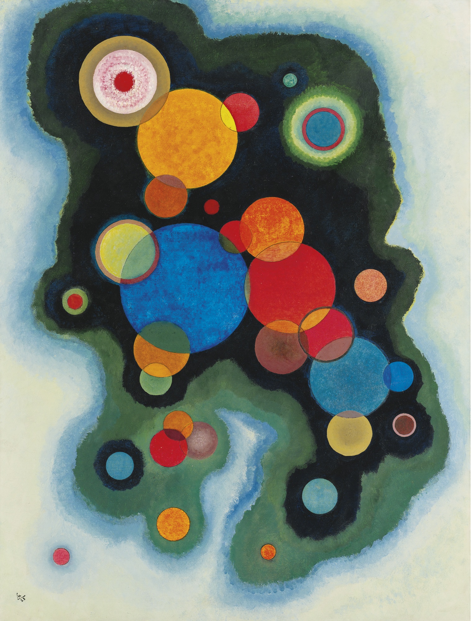
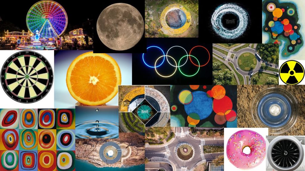
Kandinsky’s most famous pieces are his abstract work, in these examples you can see his frequent use of circles in his paintings. This was another artist of whom sparked or continued that interest in circles in imagery and I would be keen to explore this further and produce responses to these artists.

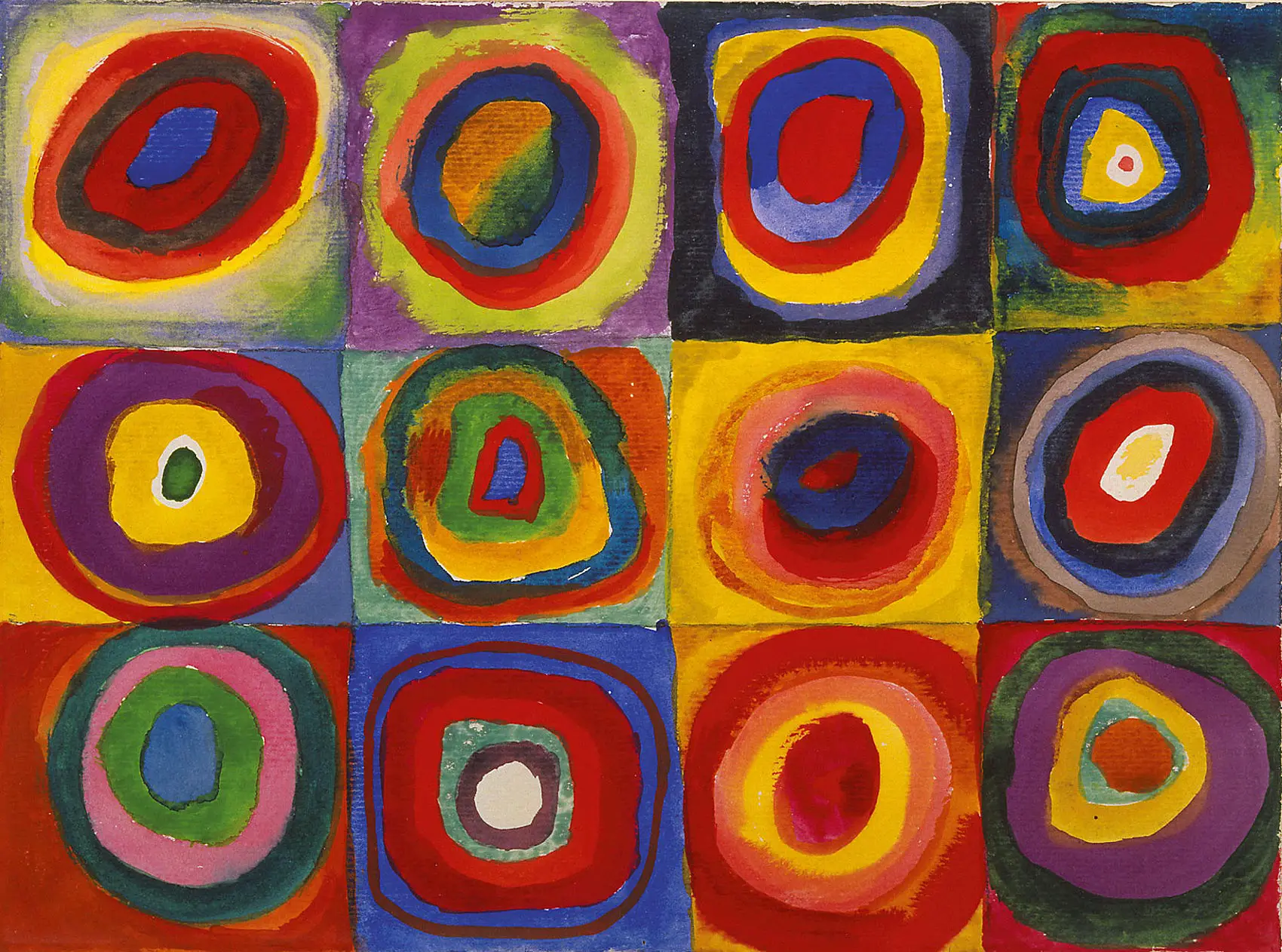
Image result for kandinsky squares with concentric circles
Squares with Concentric Circles

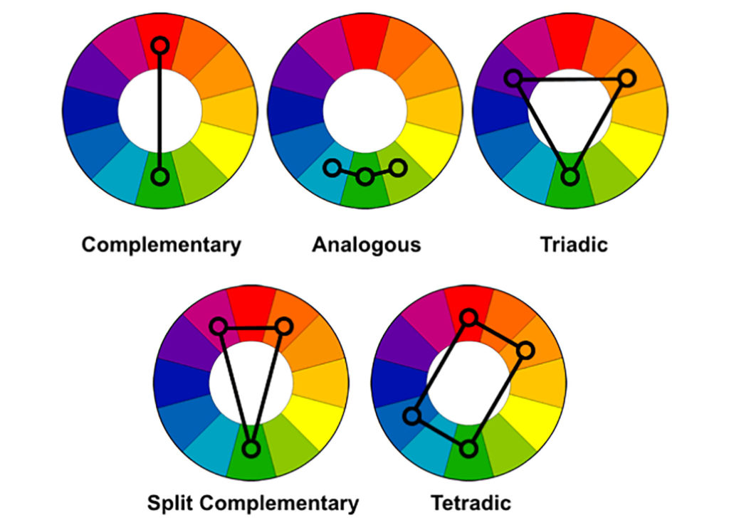
Squares with Concentric Circles (above) is a small watercolor made with gouache (a type of watercolor paint) and crayon. Kandinsky created a grid composition (the “squares”). Within each square unit, he painted “concentric circles”, meaning that the circles share a central point. He believed the circle had symbolic significance relating to the mysteries of space and he used it as an abstract form to which he would create his art. Kandinsky explores many side-by-side combinations of color relationships: complementary (colors opposite each other on the color wheel, such as orange and blue), analogous (adjacent colors on the color wheel, such as red and orange), and triad (colors spaced equally on the color wheel, such as red, blue, and yellow). He varies the intensity and value of some colors, sometimes even within the same circle. The close placement of such high-value colors makes them appear to pulsate.

The painting is a study, or sketch-like investigation into a subject. Kandinsky’s quick, freehand renderings produce lopsided and irregular geometric shapes, giving the conceptual work a living, organic feel. The watercolors bleed into one another, and the artist sometimes breaks from his formula. He saw the formula as secondary to the study’s purpose, which is the experience of viewing color relationships. Kandinsky never intended for this study to be viewed as a finished work of art, but rather as a color aid to refer to while he worked on other paintings.

BAM Perspectives – Artist Reference

Image result for bam perspectives
Marc Le Cornu – BAM Perspectives

BAM Perspectives is a business created and run solely by Marc Le Cornu, who happens to be my father. ‘BAM’ (his nickname) began the business after becoming a trained commercial drone pilot for the States of Jersey Fire and Rescue Service a few years ago, he then created the emergency services drone team to allow all emergency services to acquire use of the Fire Service’s drone and train multiple operators with ‘BAM’ in command of the team. His passion for drones and drone photography was clearly visible from this point, he loved it and decided to buy a drone himself; a DJI Mavic. This drone was compact, light and had a good camera for its relatively small size. It was with this drone he began taking photos and videos which sparked online with many people sharing and liking his work.

Image result for bam perspectives
Fun Fair St Helier

With this, he decided to create his own business to run part time whilst in the Station Commander/Group Commander position at the Fire Service. He came up with BAM Perspectives, he used social media to advertise almost completely free and he also created a website to sell images (which he could legally do with a commercial licence). He is the only local drone pilot to hold a dense urban area license, allowing him to fly over town (large built up areas) which other pilots simply cannot do (legally).

His work mainly consists of landscape imagery, both from drone and DSLR. He has 3 drones currently, DJI Mavic 2 Pro, DJI Phantom 4 Pro Obsidian and DJI Inspire 2. Not only does he do landscape imagery, he does land survey imagery, property surveys and progress images for building sites and even the predicted window views for the Horizon Apartments site. He also takes a fine art approach with abstract imagery, his use of circles both in natural and urban landscapes is something that sparked some ideas for me to follow for a project idea.

Image Analysis: Corebiere (image above)

jj

KARL BLOSSFELDT

Strikingly modern and inherently beautiful, Karl Blossfeldt’s photographs of plants, flowers and seed heads are as appealing today, as they were when they were first introduced to the public in his two landmark books Urformen der Kunst, (Archetypal Forms of Art), 1929 and Wundergarten der Natur, (The Wondergarden of Nature), 1932. From 1898-1932, Blossfeldt taught sculpture based on natural plant forms at the Royal School of the Museum of Decorative Arts in Berlin. In his lifetime Blossfeldt’s work gained praise and support from critics such as Walter Benjamin, artists of the Neue Sachlichkeit (New Realism) and the Paris Surrealists. The use of botanical specimens as photographic subject matter became popular in the early and mid-nineteenth century at the inception of the photographic medium.

What made Blossfeldt’s work unique was his extreme technical mastery of photography. He specialised in macrophotography to enlarge his plant specimens and even designed a camera for this purpose. As a result, everyday garden flowers are presented in such a way that their rhythmic forms are emphasised to the extreme and the plants take on new and exotic characteristics. Blossfeldt wanted his work to act as a teaching aid and inspiration for architects, sculptors and artists. It was his firm belief that only through the close study of the intrinsic beauty present in natural forms, that contemporary art would find its true direction.

Image analysis:

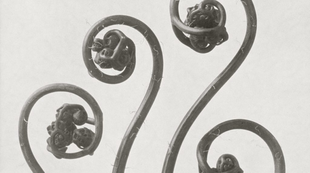
This particular photograph from Blossfeldt’s wide collection of monochrome botanical studies really looks into and highlights the idea of nature being a weird and wonderful thing. At first glance, this photograph doesn’t look like a natural form and instead looks a man made and altered object. The architectural-like structure and strange curves and bends presents the interesting side of simple things like plants that are overlooked as being boring or monotonous. The very zoomed in angle once again emphasizes the detail of the form, with very little negative space in the image so the background doesn’t take away from the main focus.


“IF I GIVE SOMEONE A HORSETAIL HE WILL HAVE NO DIFFICULTY MAKING A PHOTOGRAPHIC ENLARGEMENT OF IT. ANYONE CAN DO THAT. BUT TO OBSERVE IT, TO NOTICE AND DISCOVER OLD FORMS, IS SOMETHING ONLY FEW ARE CAPABLE OF.”