Category Archives: Research

Filters

Author:
Category:

Takashi Suzuki

Suzuki was born in 1971 in Kyoto. She lives and works in Kyoto. In
1996, she graduated from The Art Institute of Boston, MA, U.S.A. (BFA). From
2001-2002 she was a guest student in the class of Thomas Ruff at Kunstakademie Düsseldorf, Germany. “Even if photographic images exist as a method for interpreting the world, I believe those images are different from what we sees. I am interested in how the photographic image is perceived, than what the photographic subject actually is, and also in what changes the photographed information” – Suzuki quotes. Suzuki explores many projects – http://www.takashisuzuki.com/projects.html.

Mood-board of Suzuki’s images I am inspired by

“A shadow is a natural phenomenon. And without light, there is no shadow. By using an act of photography, the phenomenon becames substance.” – Takashi Suzuki. This quote was stated under her project “ARCA” on her website. Her images for this project are shown below.

This image here is interesting due to Suzuki’s use of photography to manipulate how light the image is. The image appears slightly blurry and out of focus, which I could achieve by using my camera and not focusing it properly as I take my image. It seems like Suzuki has used a glass in this image, that is being reflected. I like how she has used a white background for these series of images as this communicates a feminine touch to these photos, due to the light tones of the image. The few dark tones that there is create the outline of the object she has used to photograph. I like how this image above has faint lines within the glass. This creates a slight repetition effect; the repeated structure of the lines (straight, thin lines) create an organised, structured vibe – I feel like the consistency of the darker toned lines make the image more appealing as it is almost hard to differentiate what the object is. I am assuming that Suzuki has used a glass in the image above, but I am not 100% sure. These images were taken in 2008, which implies how easy it was for Suzuki to create such an image. Although, this image does not clearly show how modern the photo is; it does not look like such an up to date image – I feel like older photographers back in the 1900s would have been able to create this type of image.

I am inspired by Suzki to take similar images, for example her architectural images of buildings with light and shadows being portrayed onto the buildings; this links to my project which is why Suzuki is a good photographer to use as a starting point for my project. I also am really intrigued by her 2 images that I have displayed above – the photos of the bright, white images that look as if it is a glass being used as the object. I think this also relates to my project of light and darkness well because they are images that are very light and bright.

CONTEXTUAL STUDY 2: THE SUBLIME

“awe-inspiringly grand, excellent, or impressive”

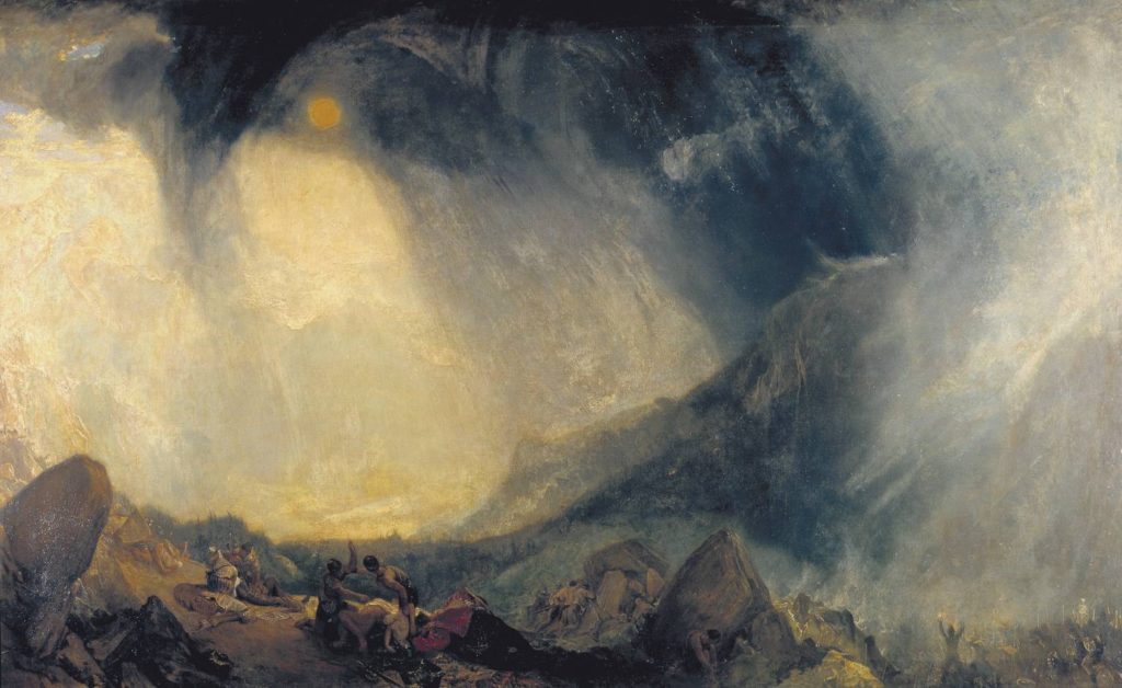
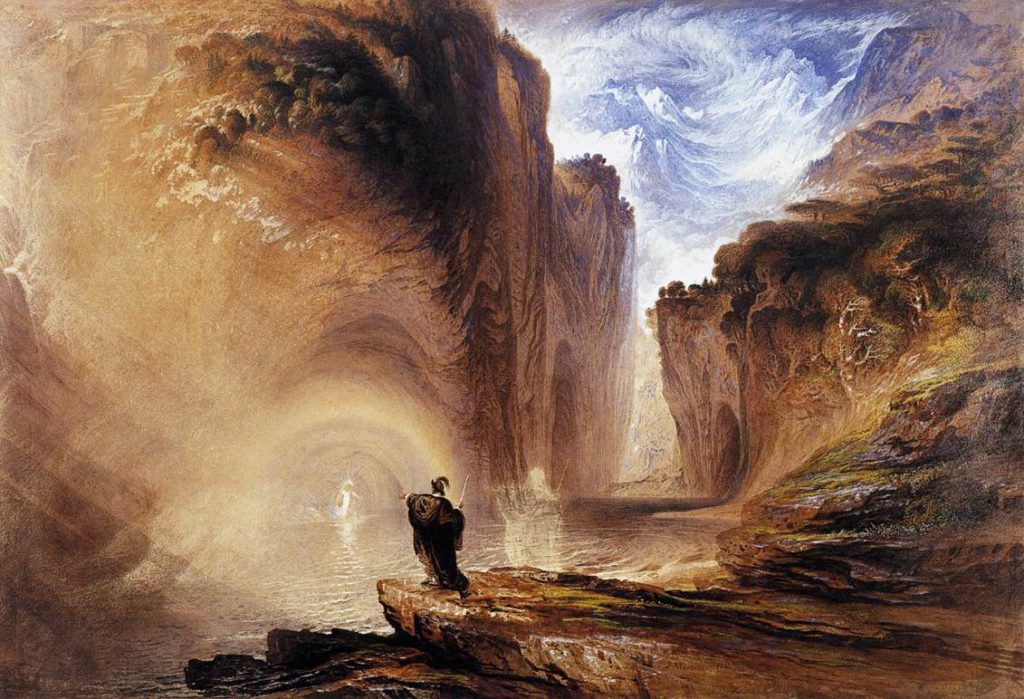
The term ‘sublime’ has been debated in the field of aesthetics for centuries. Many artists, writers, poets and musicians have sought to evoke or respond to it. The word, of Latin origin, means something that is ‘set or raised aloft, high up’. The sublime is further defined as having the quality of such greatness, magnitude or intensity, whether physical, metaphysical, moral, aesthetic or spiritual, that our ability to perceive or comprehend it is temporarily overwhelmed. The first modern approach to the sublime appeared in Edmund Burke’s 1757 treatise Philosophical Enquiry into the Origin of Our Ideas of the Sublime and Beautiful. Burke argued that feelings of the sublime occur when the subject experiences certain types of danger, pain, or terror. The feeling of terror of impending death at the hands of uncontrollable nature, speaks to the power of the sublime. One may experience the sublime through many means, but it is usually explored through nature or through art. A few decades later, German philosopher Immanuel Kant modified Burke’s definition of the sublime in his 1790 Critique of Judgment. Kant considered the sublime and the beautiful as binaries, elements that possess opposite, yet complementary qualities. While the sublime is vast and obscure, the beautiful is small and definite. Consequently, in Western art, ‘sublime’ landscapes and seascapes, especially those from the Romantic period, often represent towering mountain ranges, deep chasms, violent storms and seas, volcanic eruptions or avalanches which, if actually experienced, would be life threatening.Other themes relate to the epic and the supernatural as described in drama, poetry and fiction.

The Great Day of His Wrath 1851-3 John Martin 1789-1854
An Avalanche in the Alps, a sublime landscape painting by Philip James De Loutherbourg 
Snow Storm: Hannibal and his Army Crossing the Alps exhibited 1812 – Joseph Mallord William Turner

Contact Sheet | Tiny Planet Photoshoot

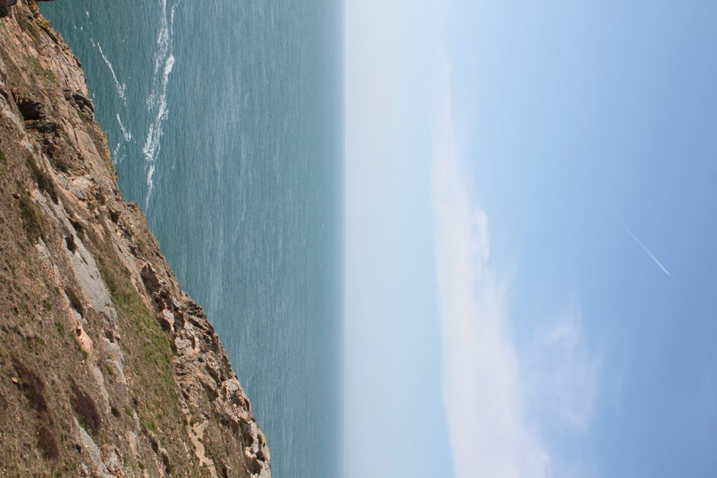
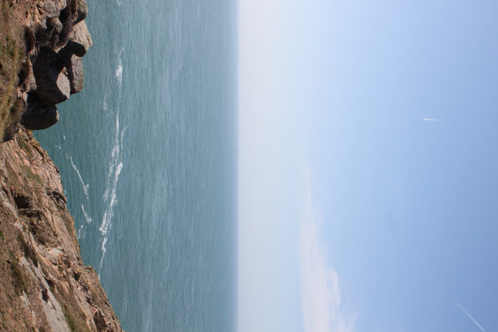
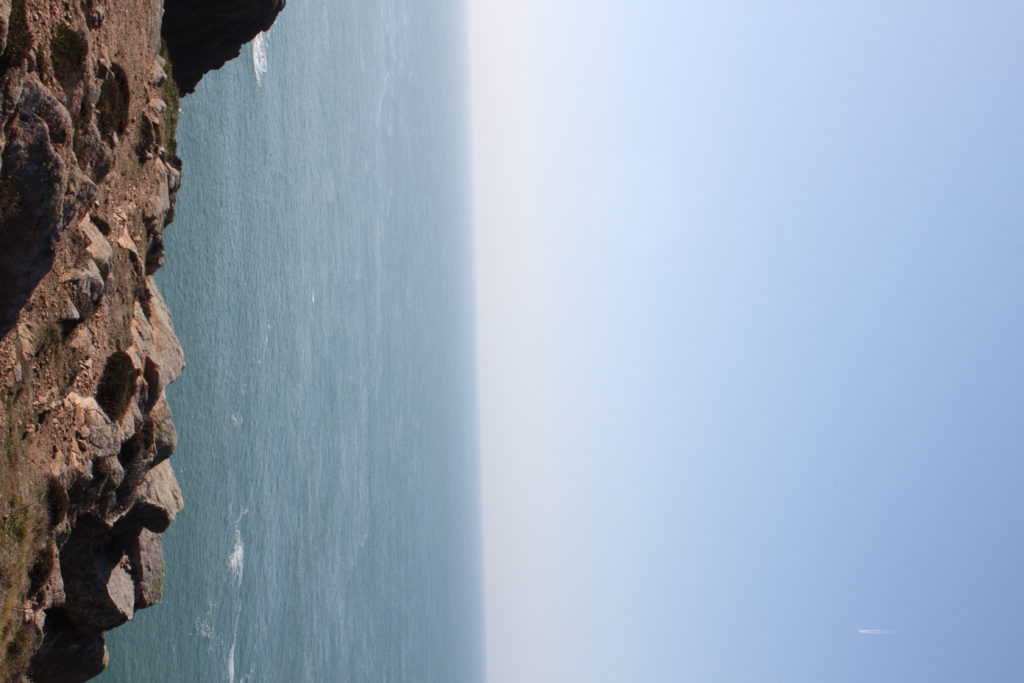
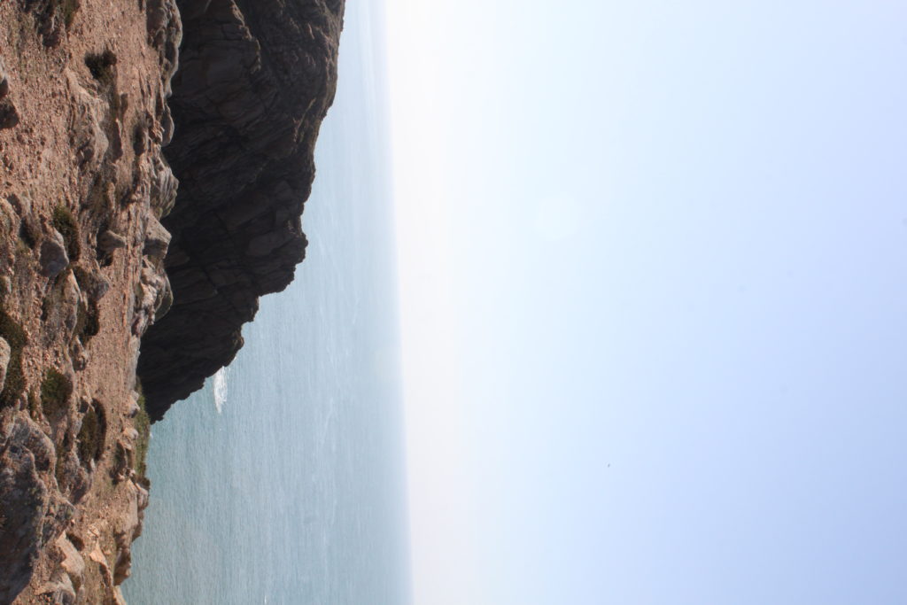
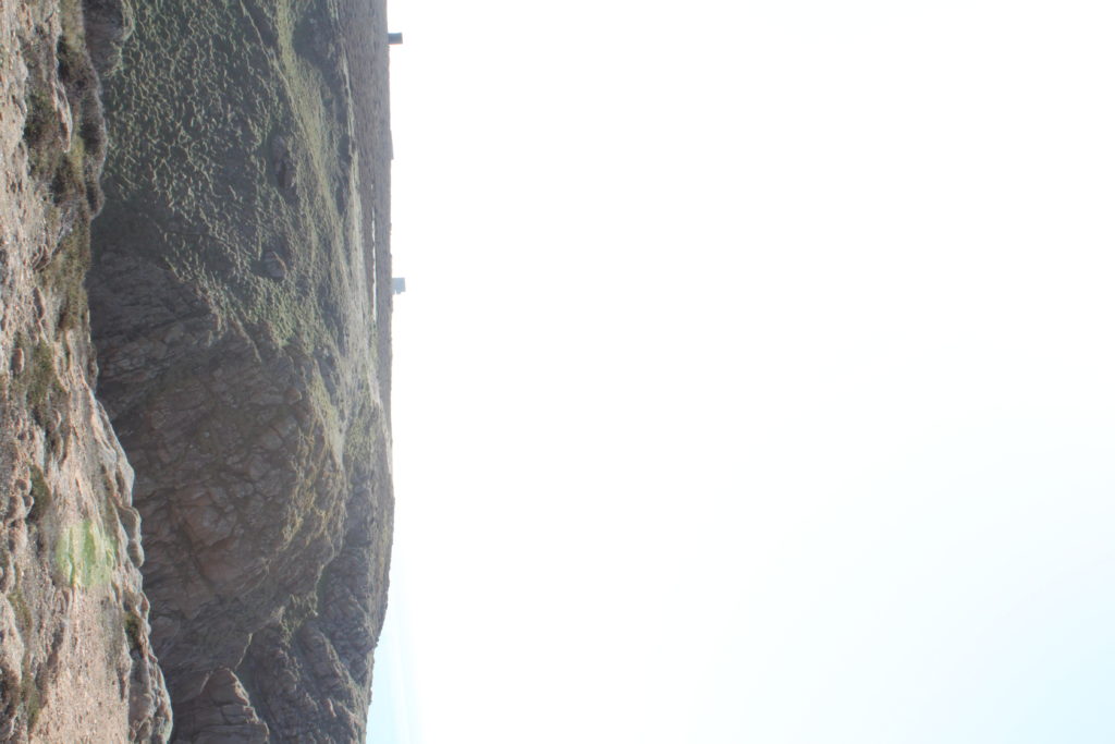
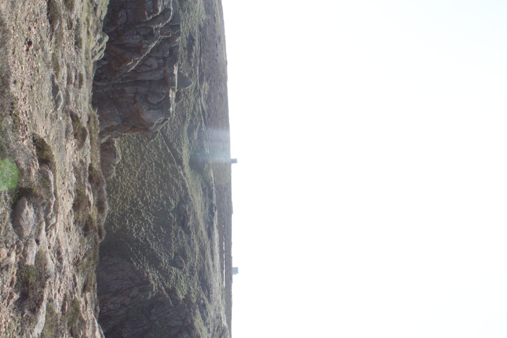
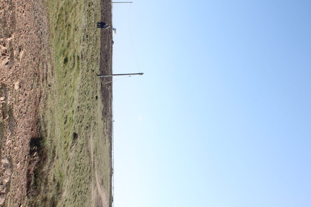
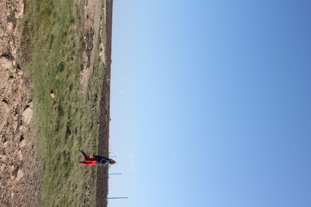
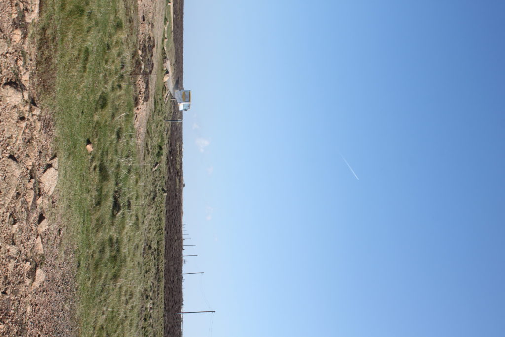
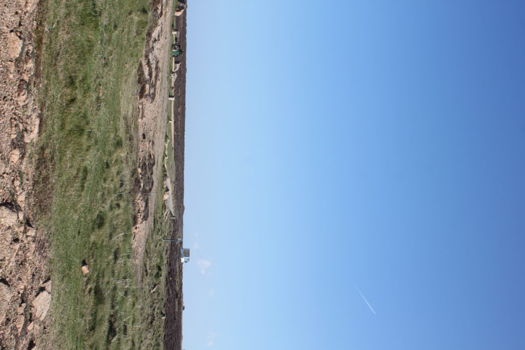
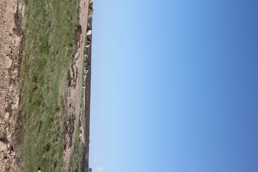
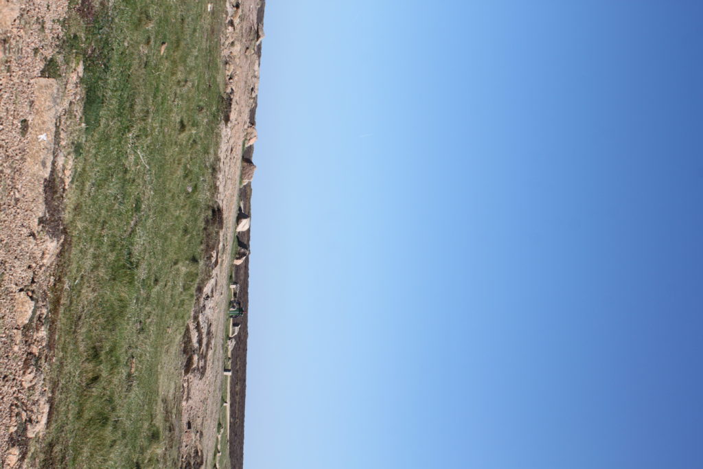
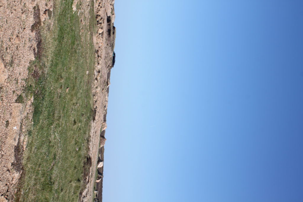
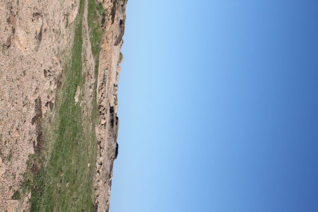
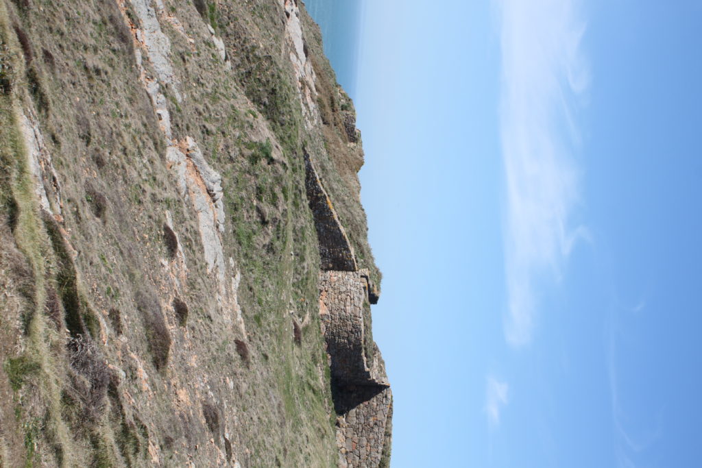
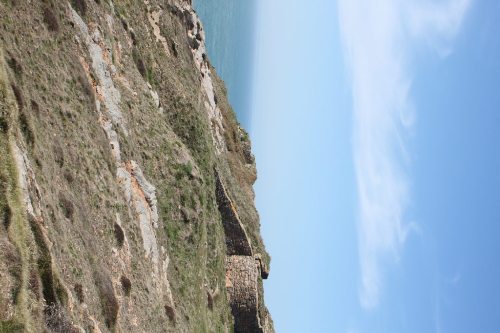
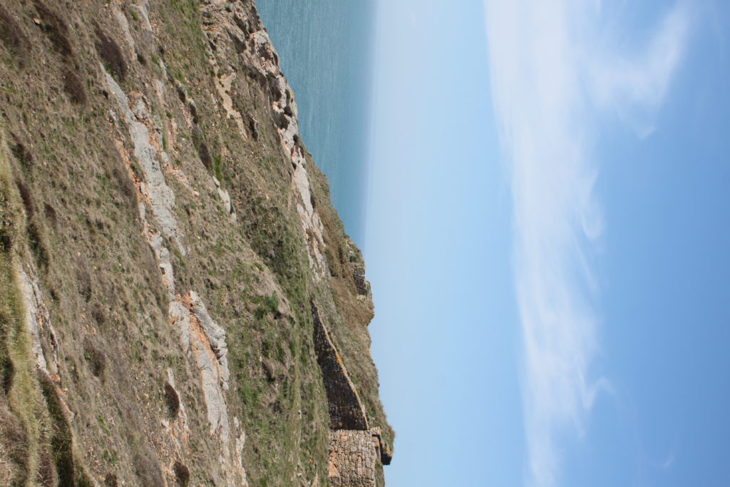
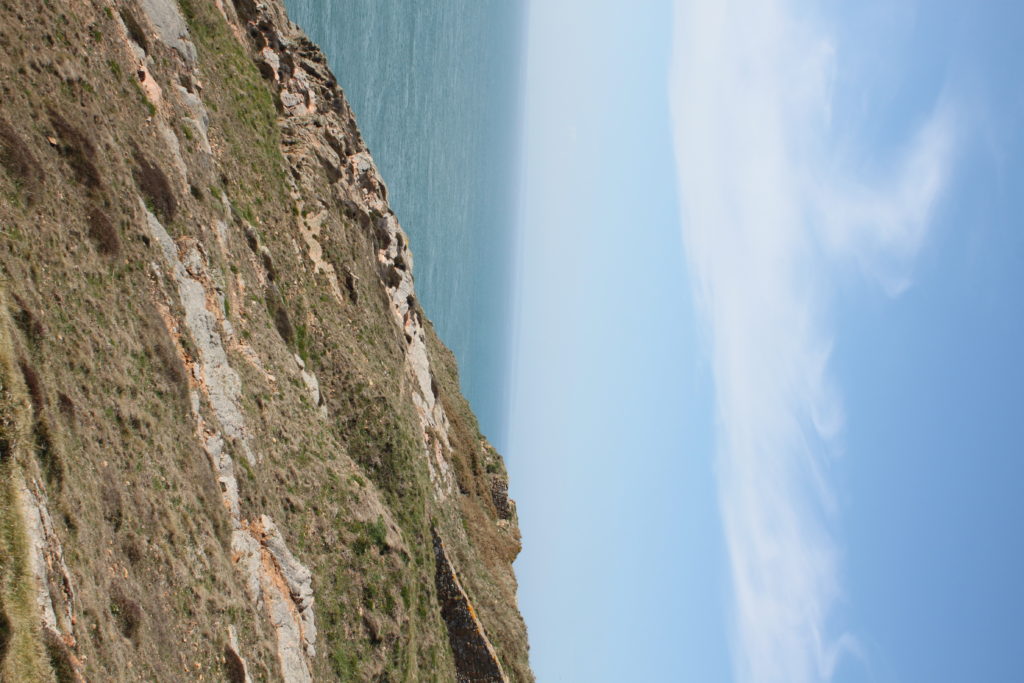
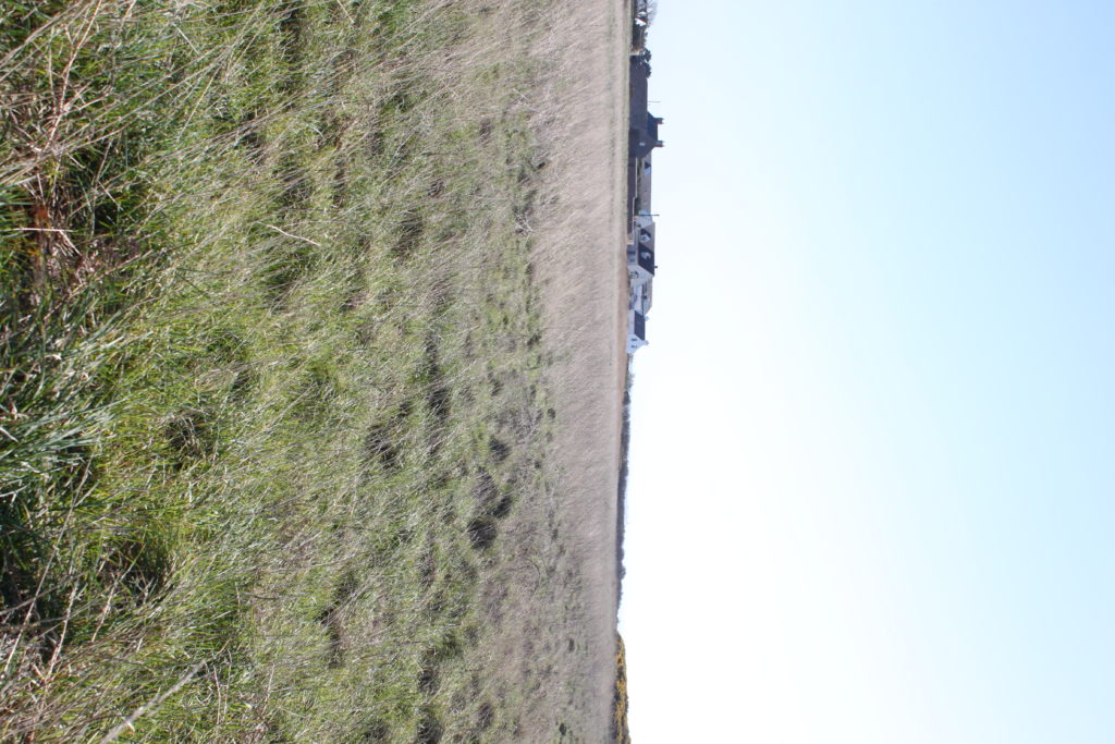
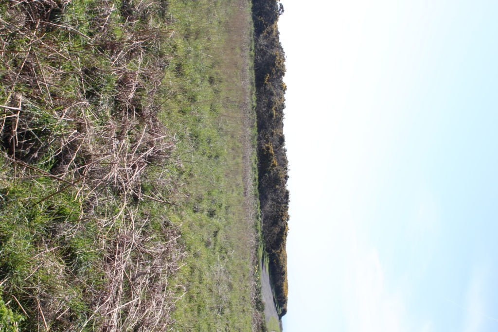
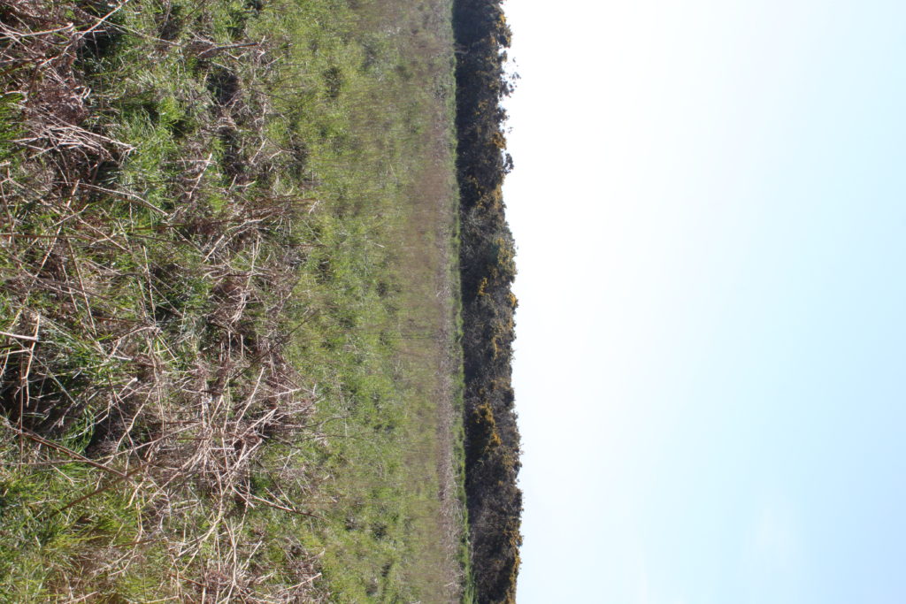
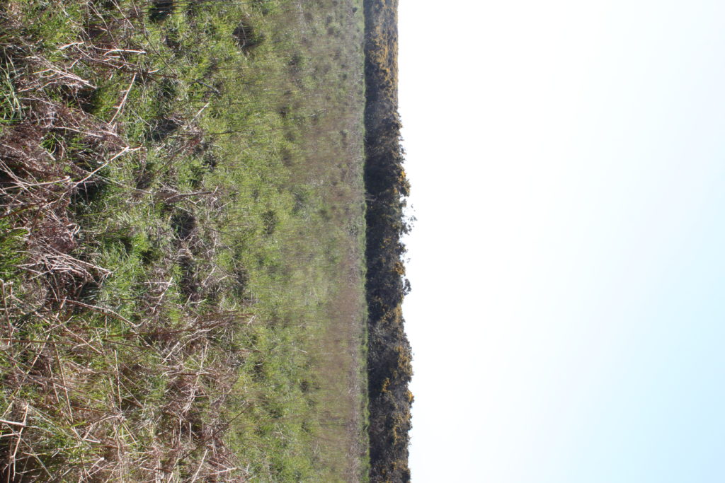
For my attempt at producing tiny planet images, I went to two locations, Les Landes and Grosnez. This is my first attempt so I am not sure how it will pan out when I put them into photoshop to create the planet.

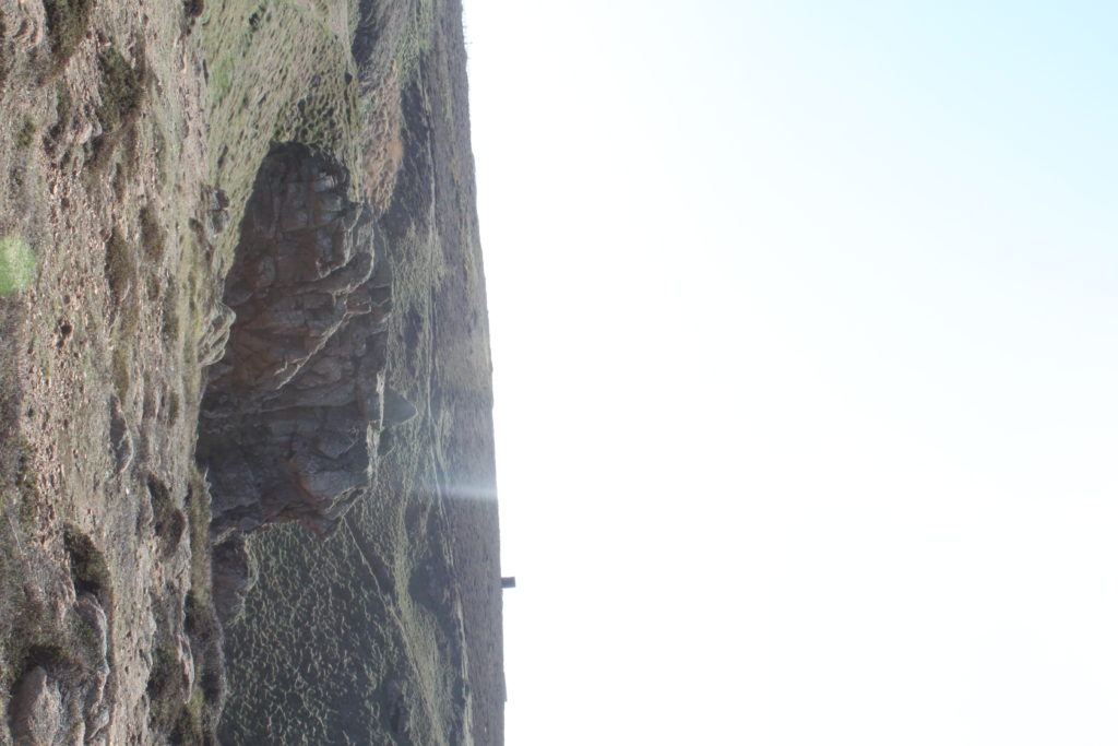
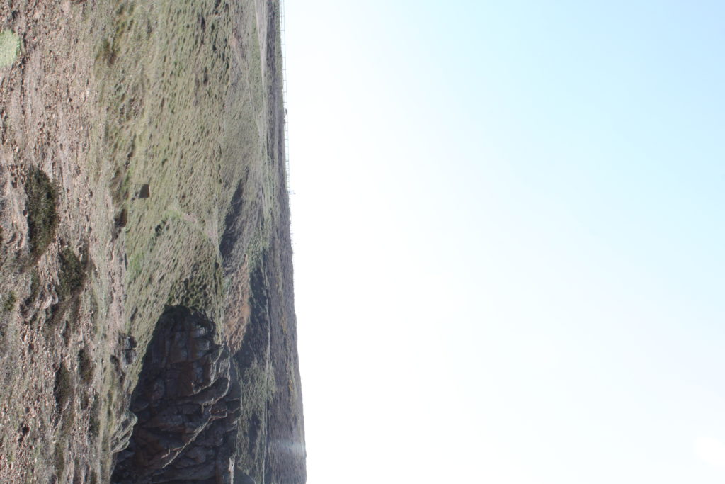
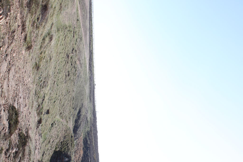
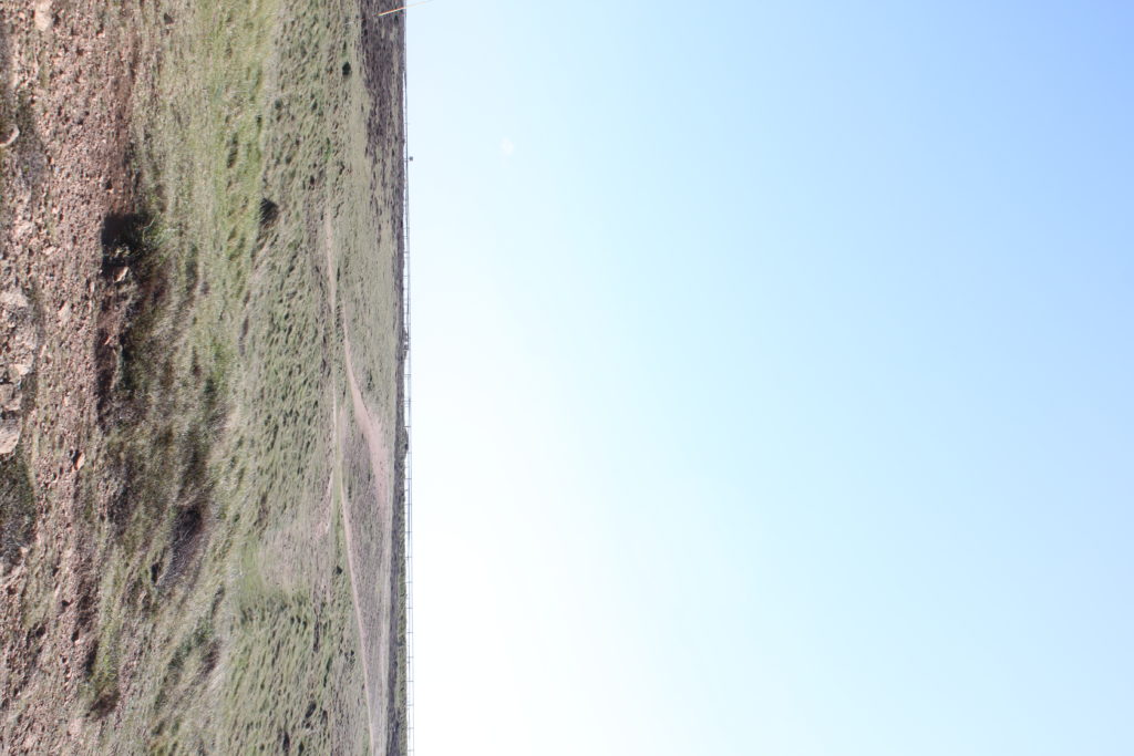
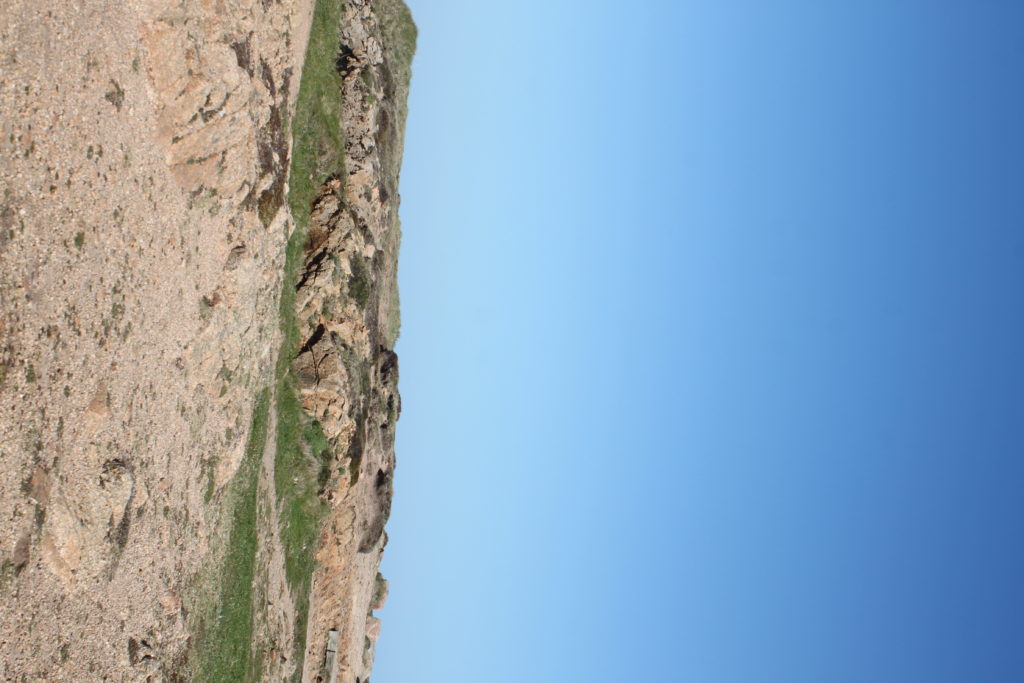
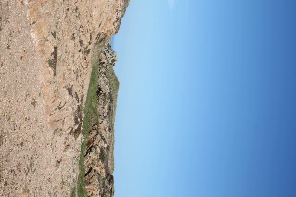
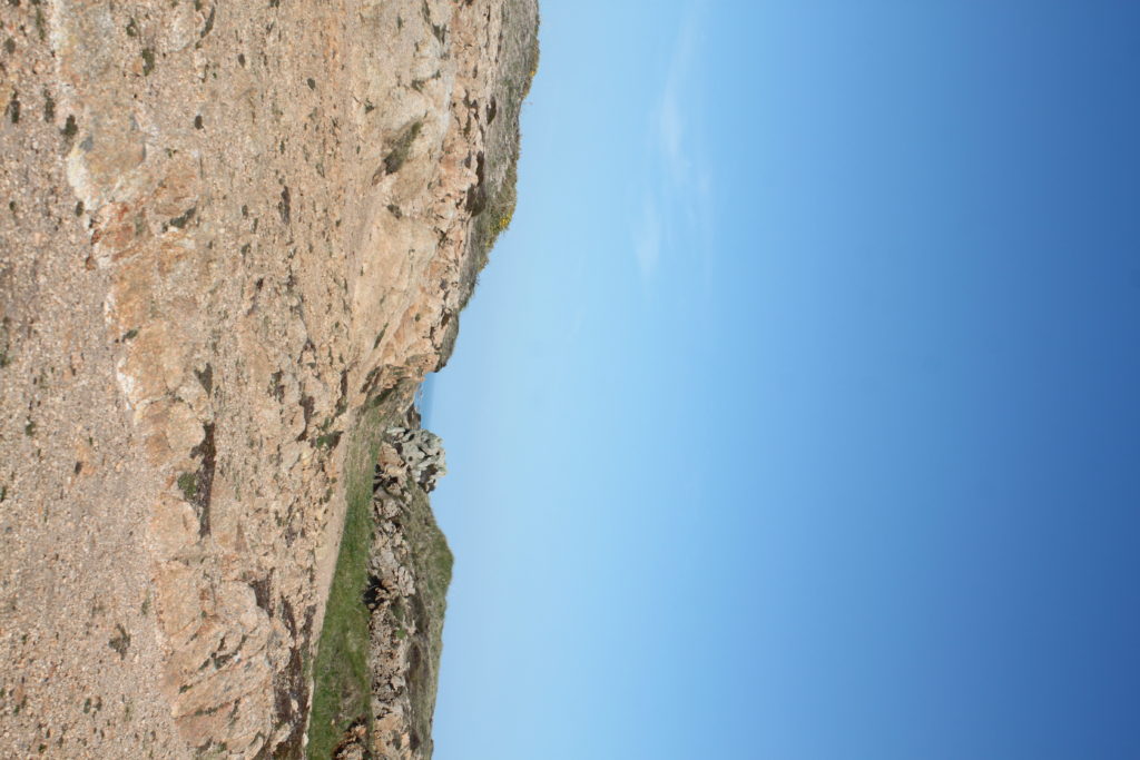
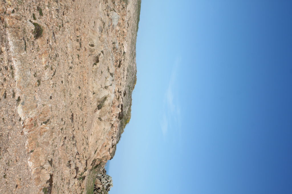
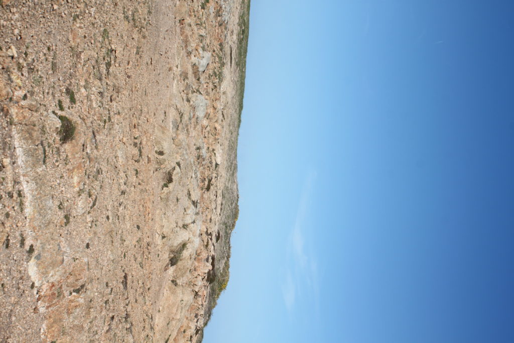
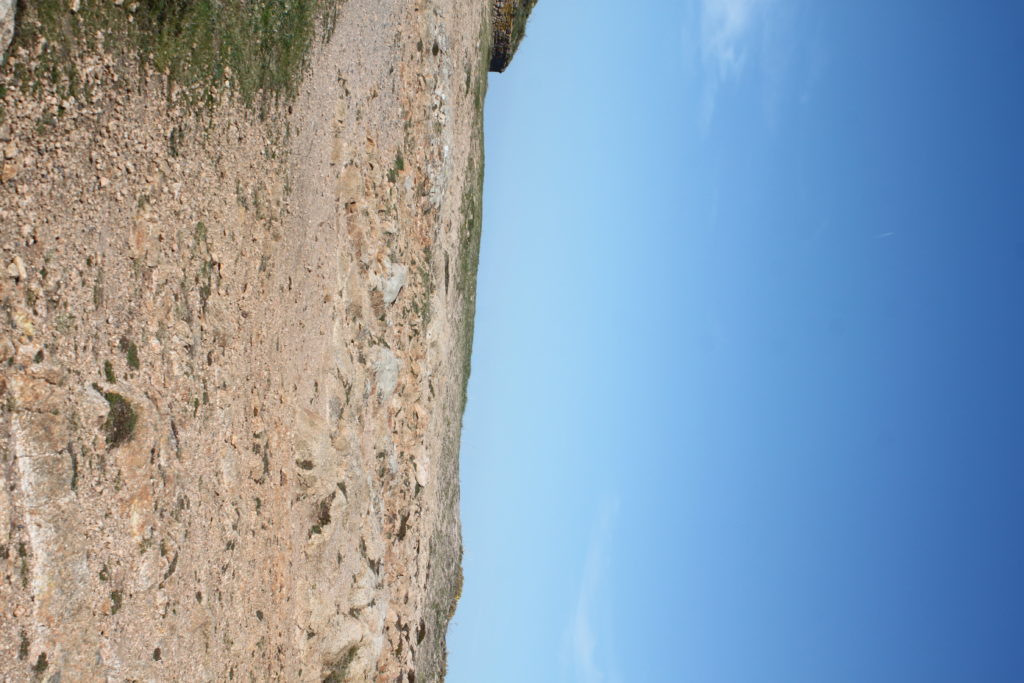
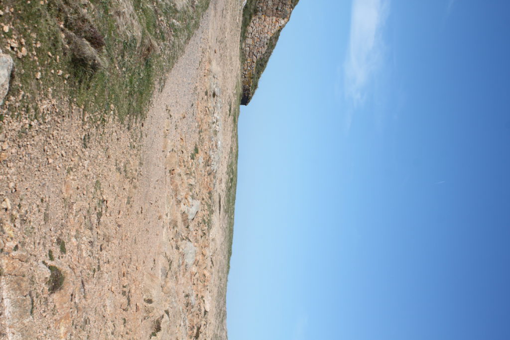
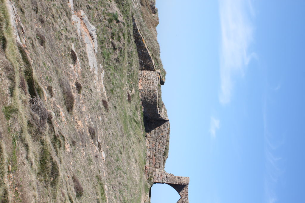
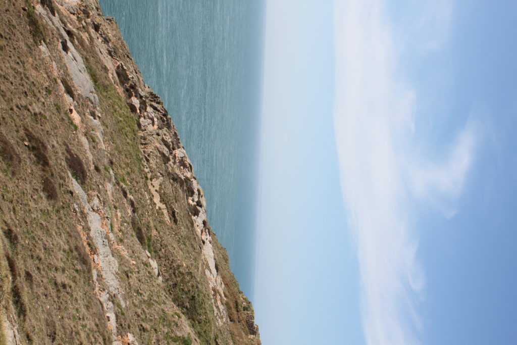
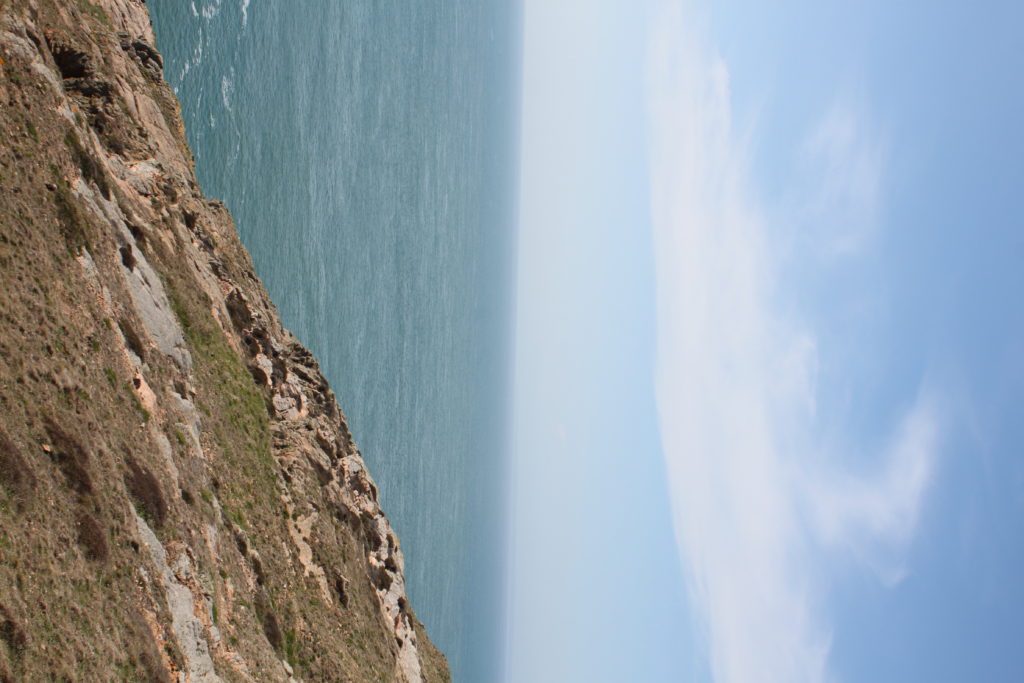
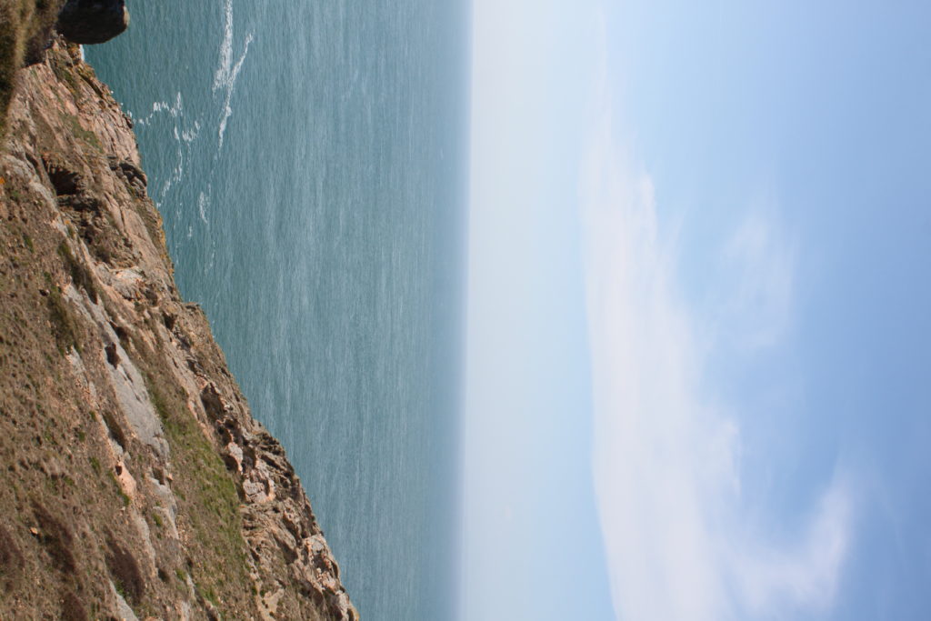
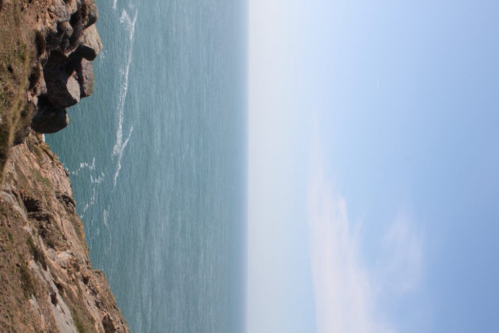
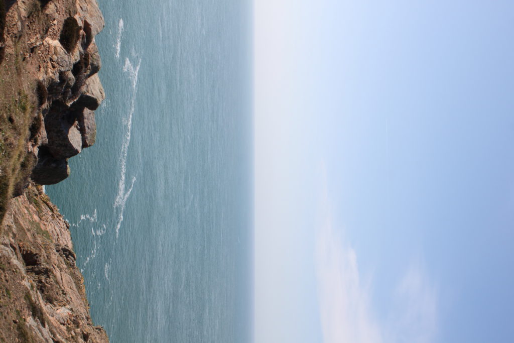
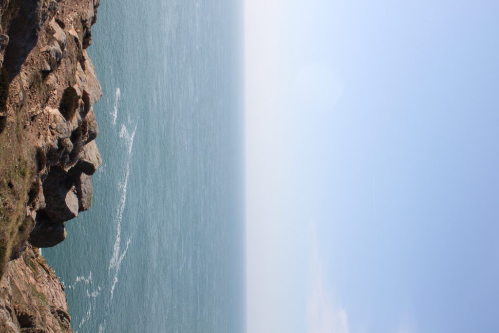
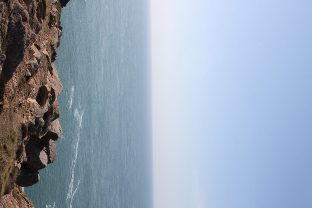
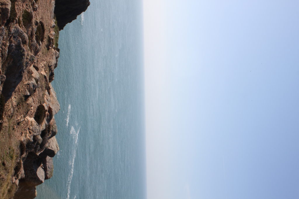
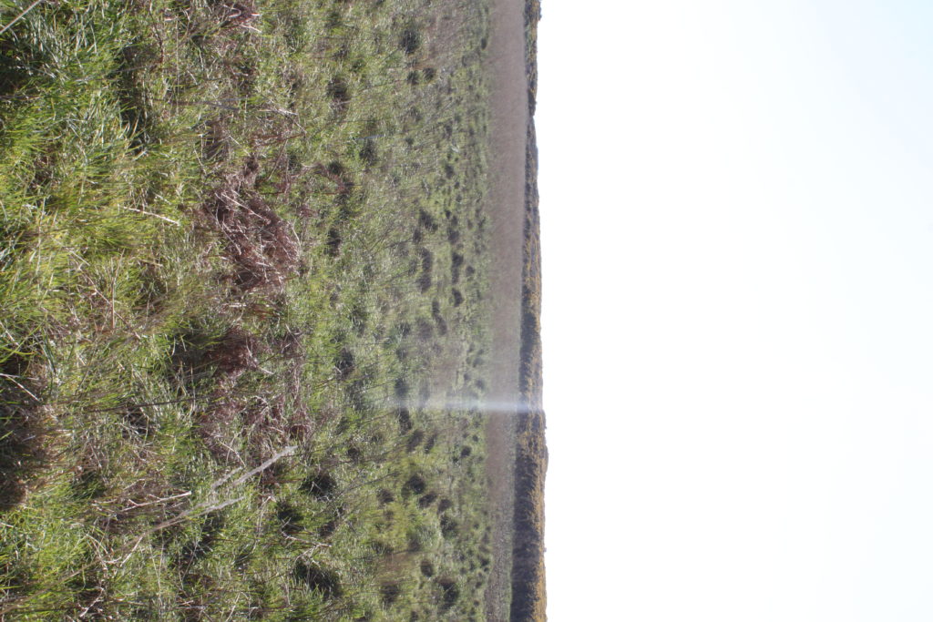
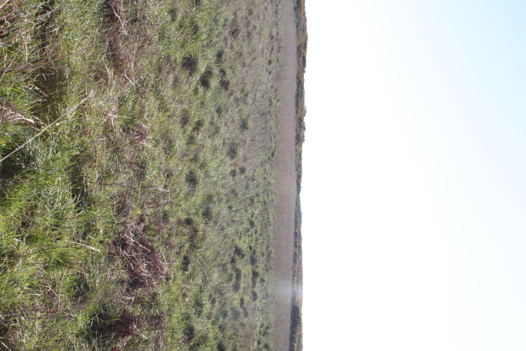
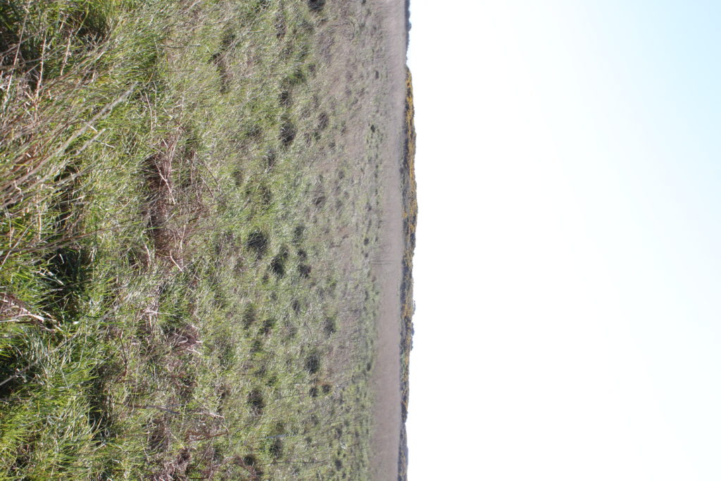
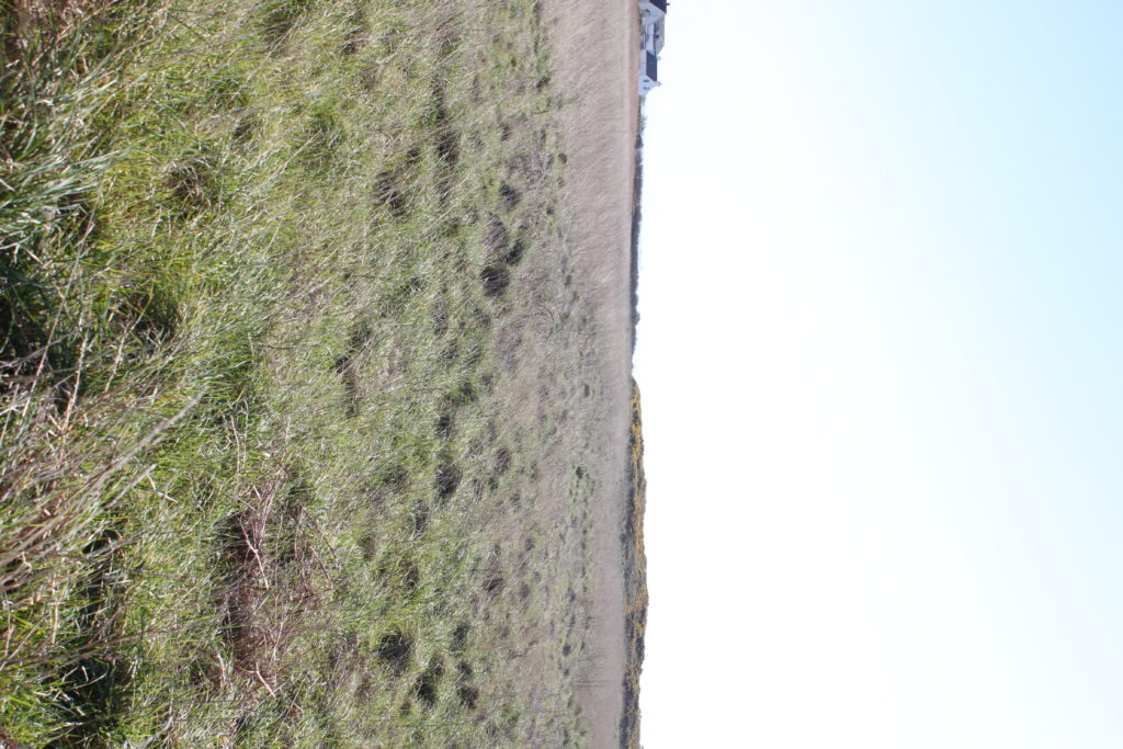
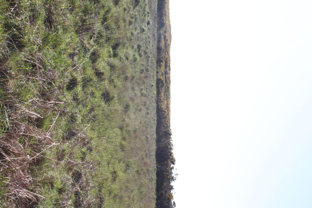
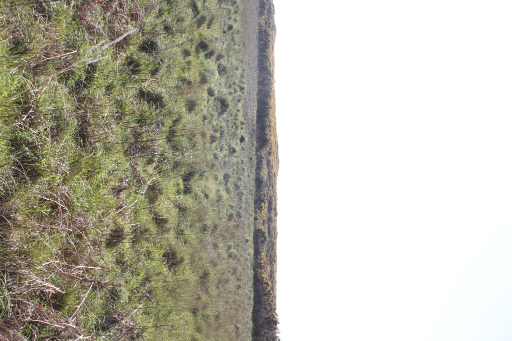
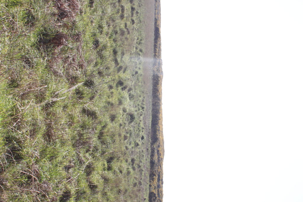
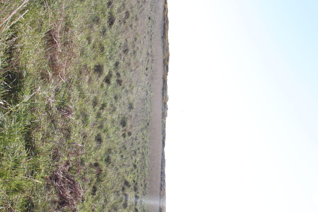
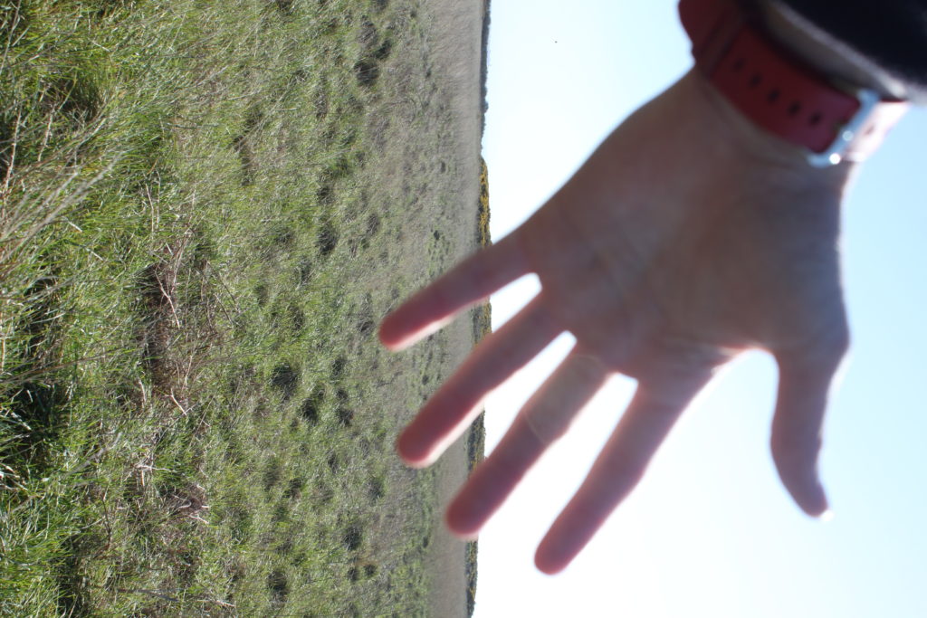
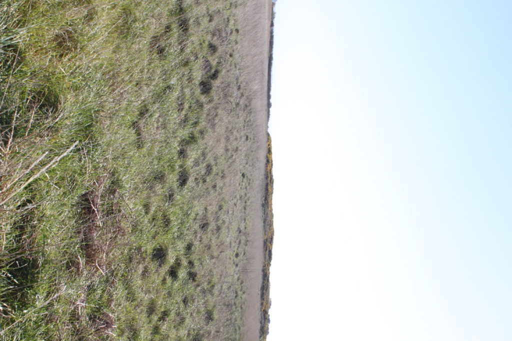
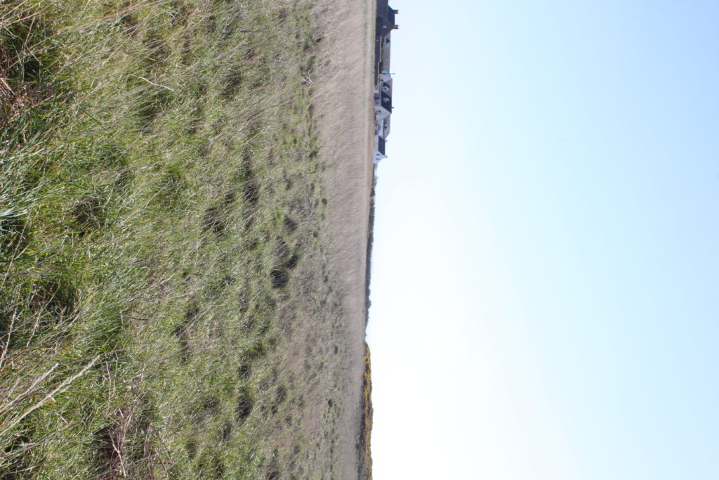
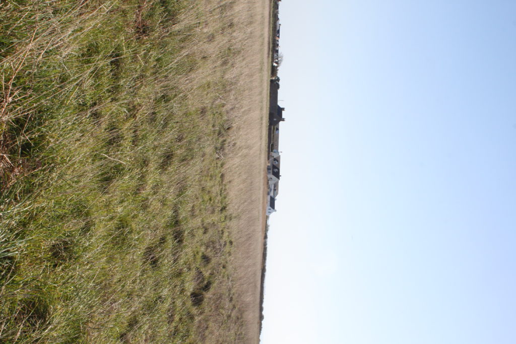
The above shoot was Grosnez, a full 360 degree panorama (not yet stitched). I had the camera on a tripod in a portrait angle so I could capture a better height. I then used full auto setting to best get the land setup best. I took the images overlapping the last by 1:3 to ensure no bits are missing and the stitching works well.

The shoot below was at Les Landes, I did the same concept, 2x 360 degree on full auto. I used ,y hand to mark the start and stop of each panorama

I now have to put the images into photoshop, create panoramas then bend the images into a circle.

Local Exhibition Study

After recently going to two exhibitions, the CCA Gallery and Public and Private, I was inspired through the works of the photographers regarding their pop art, graphics, album art, documentary photography and paintings. Looking back at the galleries I really liked how each artist’s work varied from the next, with each possessing their own unique perspective and style. The first gallery I visited was the CCA Gallery, exhibiting the works of Mike McCartney, Rupert Truman, and Carinthia West. Some examples from the gallery can be seen below:

Rupert Truman:

Storm Thorgerson founded StormStudios in the early 1990s where he worked as part of a creative team that included photographer Rupert Truman, who worked with him shooting 99% of the studio’s output.  Storm Thorgeson sadly passed away in 2013 but the Studio remains busy today creating ‘normal but’ designs and Rupert Truman has given us access to many works from the studio, including iconic props such as the heads used in the 10cc album,  Tenology, that will be included in our exhibition ‘The Eye Of The Storm‘ (Thursday 6th – Sunday 30th July 2017).
Rupert Truman is one of the leading photographers in the country and has shot images of bands from Pink Floyd to Muse. We’re delighted to announce that Rupert will be at For Arts Sake gallery Sunday 23rd July from 12-3pm talking about his art and signing copies of his book. In our interview with Rupert Truman he talks to us about his work, his time with Storm Thorgerson and the future for StormStudios.

Carinthia West:

Throughout her career as a model, actress and journalist, Carinthia West, 59, has always had her camera by her side, capturing carefree moments for her bulging scrapbooks. She remembers her great-grandmother being a keen photographer, and received her first camera – ‘a plastic thing; when you wound on the film it got caught in the sprockets’ – at the age of nine. But it was when she was given her Canon EF, a 35mm single-lens reflex camera, in the early 1970s, that she began experimenting with film and exposures while taking shots of her friends. West’s first exhibition, Hanging Out, has come about almost by chance. As a tribute to her parents, General Sir Michael and Lady West, last year she started organising a show of their extensive art collection – ranging from a Lowry, which her mother bought direct from the artist, to a Lichtenstein – at the Quay Arts Centre, a gallery that her parents had helped found and build in the Isle of Wight in 1975.

Mike McCartney:

Mike McGear is actually Paul McCartney’s brother; he changed his name in the mid-’60s shortly after the Beatles become famous, not wishing to be perceived as riding Paul’s coattails. He was a member of the Scaffold, who recorded some fairly successful comedy rock releases in the late ’60s (their “Thank U Very Much” and “Lily Pink” singles were big British hits). In 1974, he recorded a solo album with plenty of help from Paul, who wrote or co-wrote almost all the songs and sang backup; fellow Wings Linda McCartney, Denny Laine, and Jimmy McCullough also play and sing. The album, which unsurprisingly recalled Wings, attracted some critical notice, but sold poorly.

After visiting the CCA Gallery we headed over to the Public and Private gallery, they were currently holding an exhibition based around ‘Pop Icons of the 20th Century – British & American Pop Art’. Emerging in the mid 1950’s in Britain and late 1950’s in America, Pop Art reached its peak in the 1960’s and went on to become the most recognisable art form of the 20th century. It began as a revolt against the dominant approaches to art and culture and traditional views on what art should be.

Young artists felt that what they were taught at art school and what they saw in museums did not have anything to do with their lives or the things they saw around them every day. Instead they turned to sources such as Hollywood movies, advertising, product packaging, pop music and comic books for their imagery. Some of the artists who have the work exhibited are Andy Warhol, Sir Peter Blake and Patrick Caulfield. Some of their work can be seen below:

Andy Warhol:

Andy Warhol, original name Andrew Warhola, (born August 6, 1928, Pittsburgh, Pennsylvania, U.S.—died February 22, 1987, New York), American artist and filmmaker, an initiator and leading exponent of the Pop Art movement of the 1960s whose mass-produced art apotheosized the supposed banality of the commercial culture of the United States. An adroit self-publicist, he projected a concept of the artist as an impersonal, even vacuous, figure who is nevertheless a successful celebrity, businessman, and social climber. The son of Ruthenian (Rusyn) immigrants from what is now eastern Slovakia, Warhol graduated in 1949 from the Carnegie Institute of Technology, (now Carnegie Mellon University), Pittsburgh, with a degree in pictorial design. He then went to New York City, where he worked as a commercial illustrator for about a decade. Warhol began painting in the late 1950s and received sudden notoriety in 1962, when he exhibited paintings of Campbell’s soup cans, Coca-Cola bottles, and wooden replicas of Brillo soap pad boxes. By 1963 he was mass-producing these purposely banal images of consumer goods by means of photographic silkscreen prints, and he then began printing endless variations of portraits of celebrities in garish colours. The silkscreen technique was ideally suited to Warhol, for the repeated image was reduced to an insipid and dehumanized cultural icon that reflected both the supposed emptiness of American material culture and the artist’s emotional noninvolvement with the practice of his art. Warhol’s work placed him in the forefront of the emerging Pop art movement in America.

Sir Peter Blake:

Peter Blake was born in Kent and studied first at the Gravesend Technical College School of Art before continuing his studies between 1953 and 1956 at the Royal College of Art in London. At the RCA Peter Blake was at the forefront of British Pop, studying alongside Patrick Caulfield, David Hockney, Pauline Boty, Derek Boshier and Peter Phillips amongst others. He was awarded the Leverhulme Research Award in 1956, to study popular art. Between 1956 and 1957 he made an extended journey to Europe (France, Italy, Spain, Holland and Belgium), and in 1961 was awarded the first Junior Prize from the John Moores Liverpool Exhibition. In 1964 he was appointed a lecturer at the Royal College of Art in London and at the Walthamstow School of Art. In 1975 he was a founder member of the group of artists called The Brotherhood of Ruralists, and from 1994 to 1996 he was Associate Artist at the National Gallery in London. Blake became a Royal Academician in 1981, was awarded a CBE in 1983 and was knighted in 2002 for services to art. There have been multiple retrospectives of his work in Britain, with the most significant including those in 1983 at the Tate and in 2008 at Tate Liverpool. In February 2005, the Sir Peter Blake Music Art Gallery, located at the University of Leeds was opened by the artist with a permanent display of 20 examples of Blake’s album sleeve cover art, including the only public display of a signed print of the iconic Sgt. Pepper Lonely Hearts Club Band album cover.

Patrick Caulfield:


Patrick Joseph Caulfield, British artist (born Jan. 29, 1936, London, Eng.—died Sept. 29, 2005, London), was a member of the “New Generation” of 1960s British Pop and abstract artists. Caulfield’s bold paintings incorporated everyday objects in still lifes and ordinary domestic interiors and were defined by strong graphic design, black outlines, and bright, saturated colours. He later introduced elements of trompe l’oeil and photorealism into his painting. He also worked in other mediums, including graphic prints, tapestry, theatrical set design, and screen-print book illustrations. Caulfield was nominated for the Turner Prize in 1987 and shared the Jerwood Painting Prize in 1995. He was made CBE in 1996.

Minor White

Landscapes

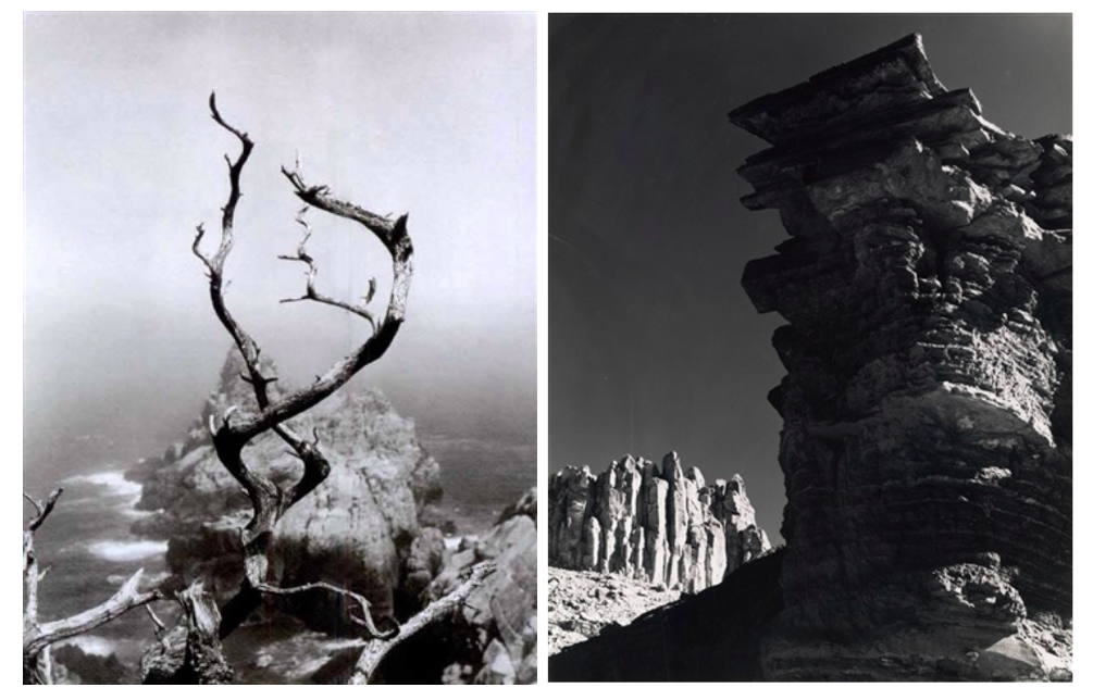
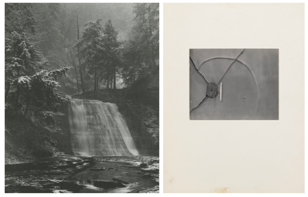
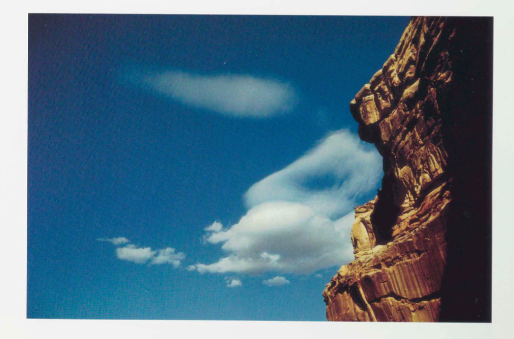
Minor White was an American photographer and editor whose efforts to extend photography’s range of expression greatly influenced creative photography in the mid-20th century. White’s interest in Zen philosophy and mysticism permeated both his subject matter and formal technique. “At first glance a photograph can inform us. At second glance it can reach us,” he once said.

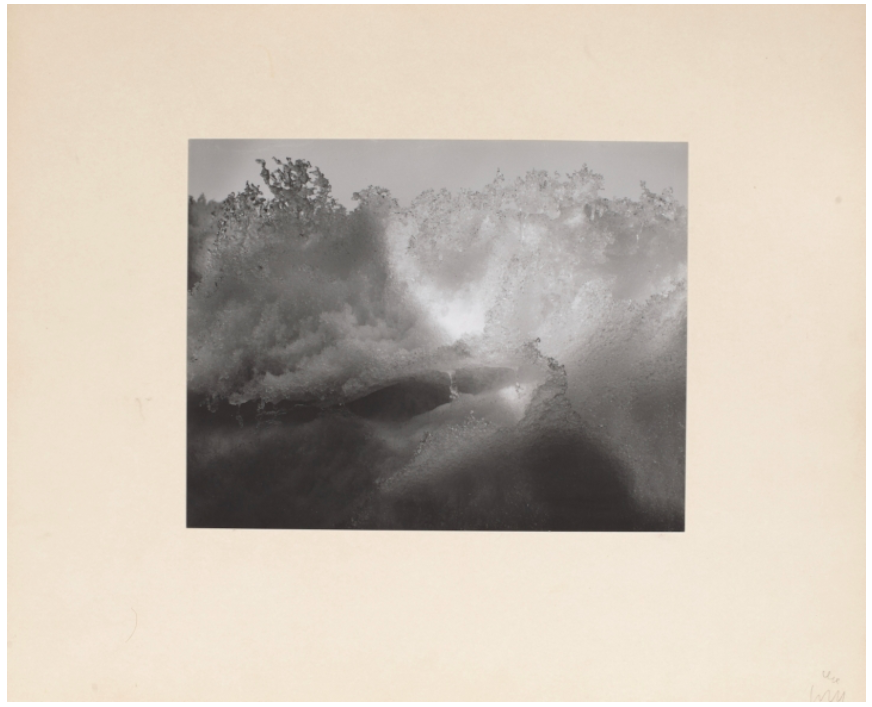
White made thousands of black-and-white and color photographs of landscapes, people and abstract subject matter, created with both technical mastery and a strong visual sense of light and shadow. White’s pictures were abstract, black-and-white closeups of rocks, wood and water. The gleaming images were spiritual and intense. He arranged them in sequences, leading viewers from one picture to another, slowing us down and forcing us to see connections and relationships between the shapes.

In 1945 he moved to New York City, where he became part of a circle of friends that included the influential photographers Edward Steichen and Alfred Stieglitz. His contact with Stieglitz helped him discover his own distinctive style. From Stieglitz he learned the expressive potential of the sequence, a group of photographs presented as a unit. White would present his work in such units along with text, creating arrangements that he hoped would inspire different moods, emotions, and associations in the viewer, moving beyond the conventional expressive possibilities of still photography. White considered his approach to this form one of his most important innovations. The sequence seems to have gratified an important psychological need for White. He also learned from Stieglitz the idea of the “equivalent,” or a photographic image intended as a visual metaphor for a state of being. Both in his photographs and in his writing.

In 1946 White moved to San Francisco, where he worked closely with the photographer Ansel Adams. Adams’s zone system, a method of visualizing how the scene or object to be photographed will appear in the final print, formed another major influence on White’s work. 

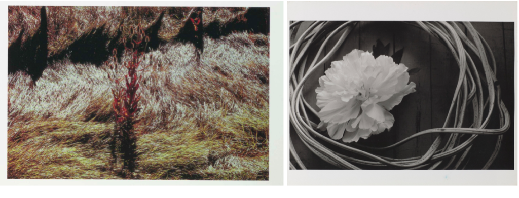
White traveled throughout the United States in the late 1950s and early ’60s and began to experiment with colour photographs.

Colour Photographs

Among his best-known books are two collections, Mirrors, Messages, Manifestations (1969), which features some of his sequences, and Minor White: Rites and Passages (1978), with excerpts from his diaries and letters and a biographical essay by James Baker Hall.

Through his mystical approach to photography, Minor White has become one of the most influential photographers of the postwar era. His landscape photographs often create abstract images that disorient the viewer and penetrate beneath the surface of the subject. White developed sequences for these pictures that underscored the meditative possibilities of reading photographs as a means of spiritual self-knowledge, a practice that continues to inspire many contemporary photographers.

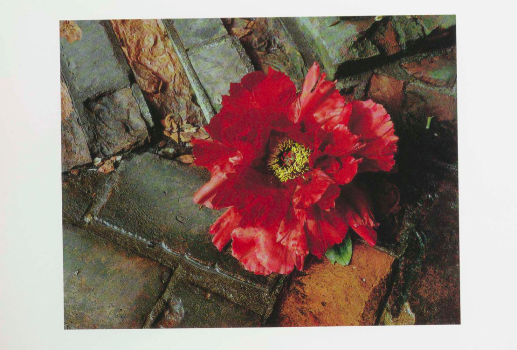
I chose Minor White as a photographer to research as I first liked how he portrayed nature spiritually and intensely. I am particularly interested in his colour photos as I like his use of bold colours against different shapes in nature, For example, the first colour image of the red/pink flower stood out to me when i saw his photos. This was because of how he portrayed the flower beautifully, even though its on a stone floor. I think that the colours complement each other well, the warm brown tones of the floor linking to the yellow center of the flower with the bright flower contrasting. I think this reflects his interest in Zen philosophy and mysticism, finding deeper meaning behind everyday objects. I also like how he considers carefully the order in which his photographs are displayed, hoping to create different moods, emotions, and associations in the viewer, moving beyond the conventional expressive possibilities of still photography. This is something I will take inspiration from in my project.

Photosoot Plan | Tiny Planet Photography

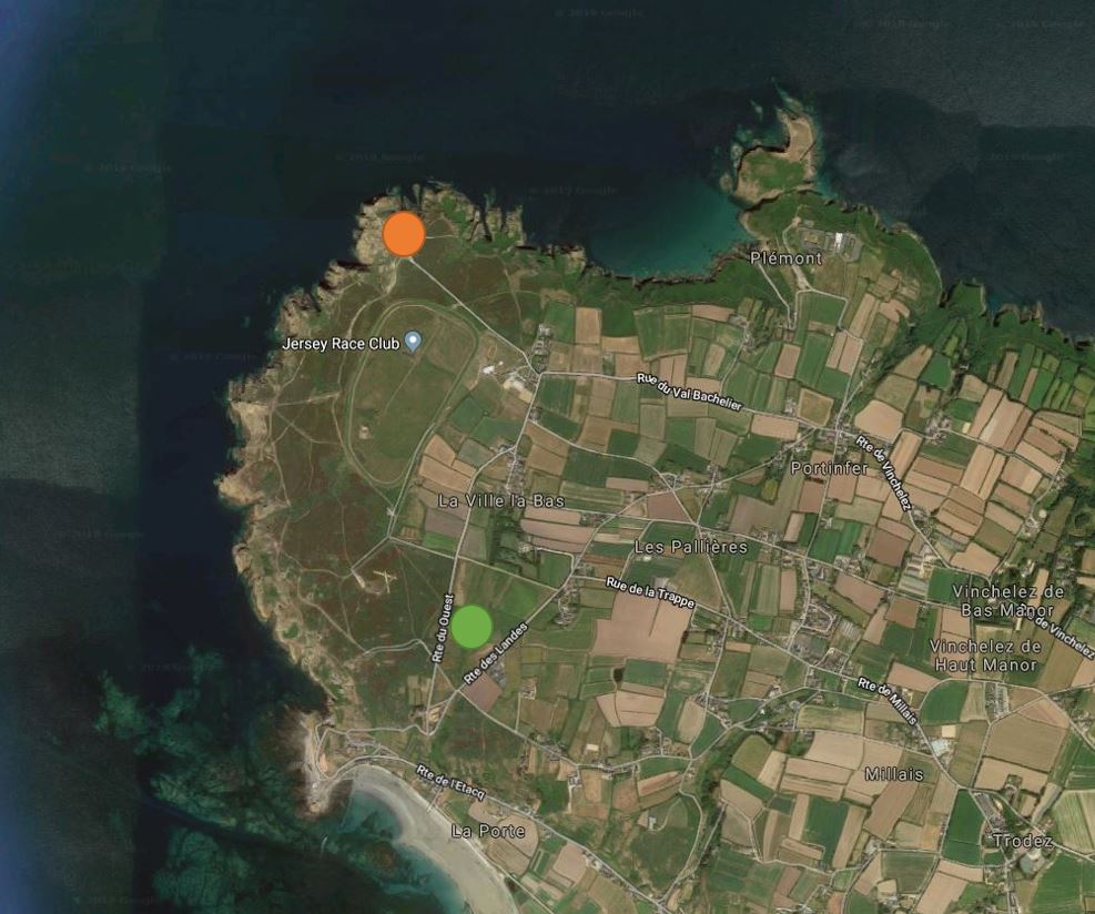
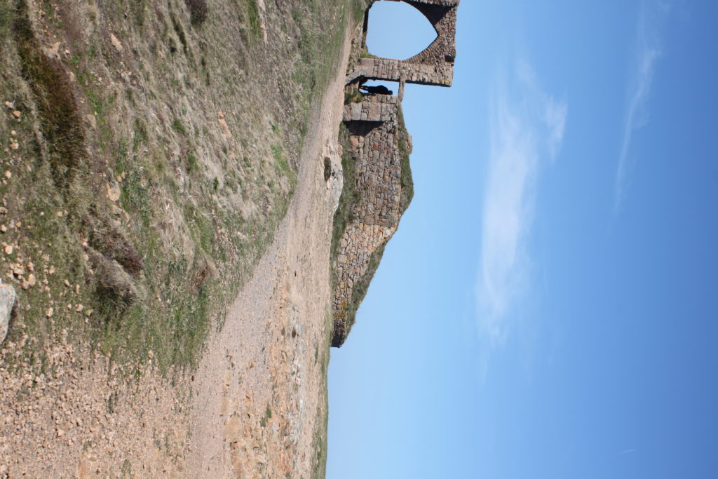
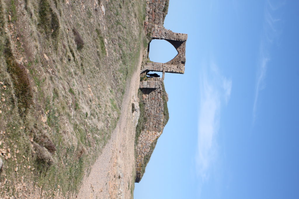
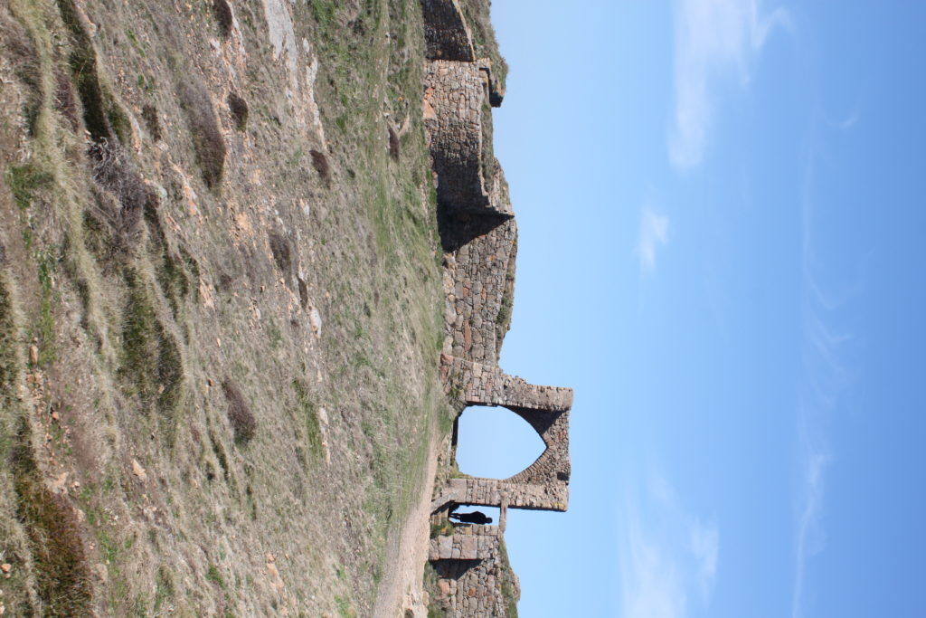
The first place I will try to shoot is Grosnez. I hope to get the castle in the planet which I think could be very interesting. The second place I would like to shoot is Les Landes, you can get a few farm houses and trees on the planet which would look good adding the houses to the rural landscape yet not over-crowding it.

The Les Landes shoot will be at the green dot and the Grosnez shoot will be at the orange dot.

Image result for tiny planet photos
Image result for grosnez castle

Jasper Johns |Artist Reference

In the mid-1950s Jasper Johns was searching for a way to move beyond Abstract Expressionism. He took the radical step of destroying his previous work and began painting a set of motifs that included numbers, the American flag, and the alphabet. These instantly recognizable images allowed him to reintroduce subject matter into his work, freeing him to explore other painterly concerns. One of the found images that Johns employed was the target, and from 1955 to 1961 the artist produced several dozen paintings and drawings that explored this device.

Initially, Johns chose a palette of primary colors, a preexisting schema as found as the image itself. The artist’s use of oil and encaustic (pigment mixed with hot wax) created a quick-drying medium that recorded each drag and drip of the brush in almost sculptural terms. Indeed, these gestural nods to his Abstract predecessors allowed him to investigate the subtle nuances between form and material. There also exists a tension between the idea of the representational (a target) and the notion of the abstract (the geometry of concentric circles).

Image result for jasper johns target with four faces
Target with Four Faces (1955)

In this work, Johns merged painting and sculpture as well as engaging the viewer with “things which are seen and not looked at.” Johns relied upon newspaper and fabric dipped in encaustic (pigment mixed with hot wax) to build the surface of the painting. He also made plaster casts of the lower half of a female model’s face over four successive months and fixed these out of order in a hinged, wooden box that he attached to the top of the canvas. By incorporating the sculptural elements in the same space as the painting, Johns emphasized the “objecthood” of the painting. This merging of mediums reinforced the three-dimensional object-ness of the paintings.

Beyond the material surface of the work, the concentric circles of the target imply the acts of taking aim, as if you were shooting in archery for example. However, Johns excluded the model’s eyes from the plaster faces, and therefore prevented any chance of an exchange of gazes between the viewer and the faces in the work, this forced the viewer to examine the interactions between the painted target and the plaster faces. Viewed through the lens of the Cold War era, the seemingly benign images can imply the targeting of the anonymous masses by global political powers as well as by corporate advertising and the mass media.

In connection to my own project, Johns’ work follows an abstract genre and incorporates circles in the simple design of the painting and this is what my project follows, circles. I would like to incorporate this idea by perhaps using the image as inspiration for images of targets in the modern day, archery for example. These targets are circular yet serve a different purpose to Johns’ art.

Kanghee Kim

Kanghee Kim is currently 27. She was born in Korea but moved to New York with her family when she was 14. At that time, there was a need for more nurses in the USA, and her mother was helping to fill that gap – but their lawyer missed a deadline. Kim was never able to secure a citizenship. Eventually, she was protected under the DACA (Deferred Action for Childhood Arrivals) policy, but her status has made leaving the country too much of a risk. She states: “I really miss Korea, especially over the last few years. Korea is the motherland. Whenever I see photos or hear about it I feel a bit torn.” Kim only got into photography in her final year of studying painting. It was this time that smartphones and cameras (technology) were improving; she was frustrated by how much space and materials were needed to paint. “I love walking around and being outside. Approaching photography as a painting was solving that problem” – Kim states.

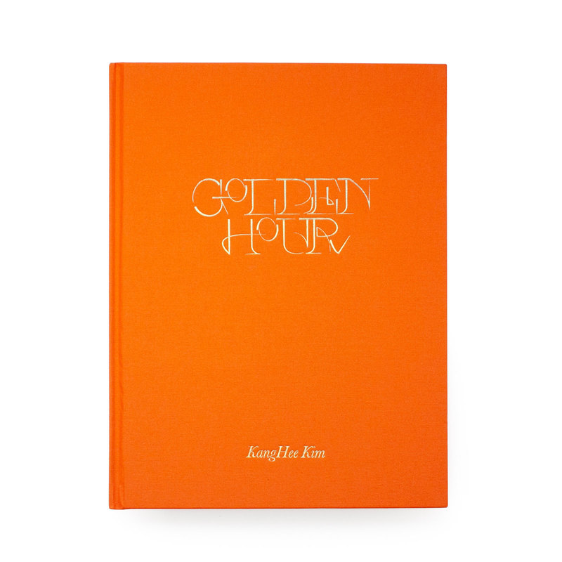
Image of her book “Golden Hour”

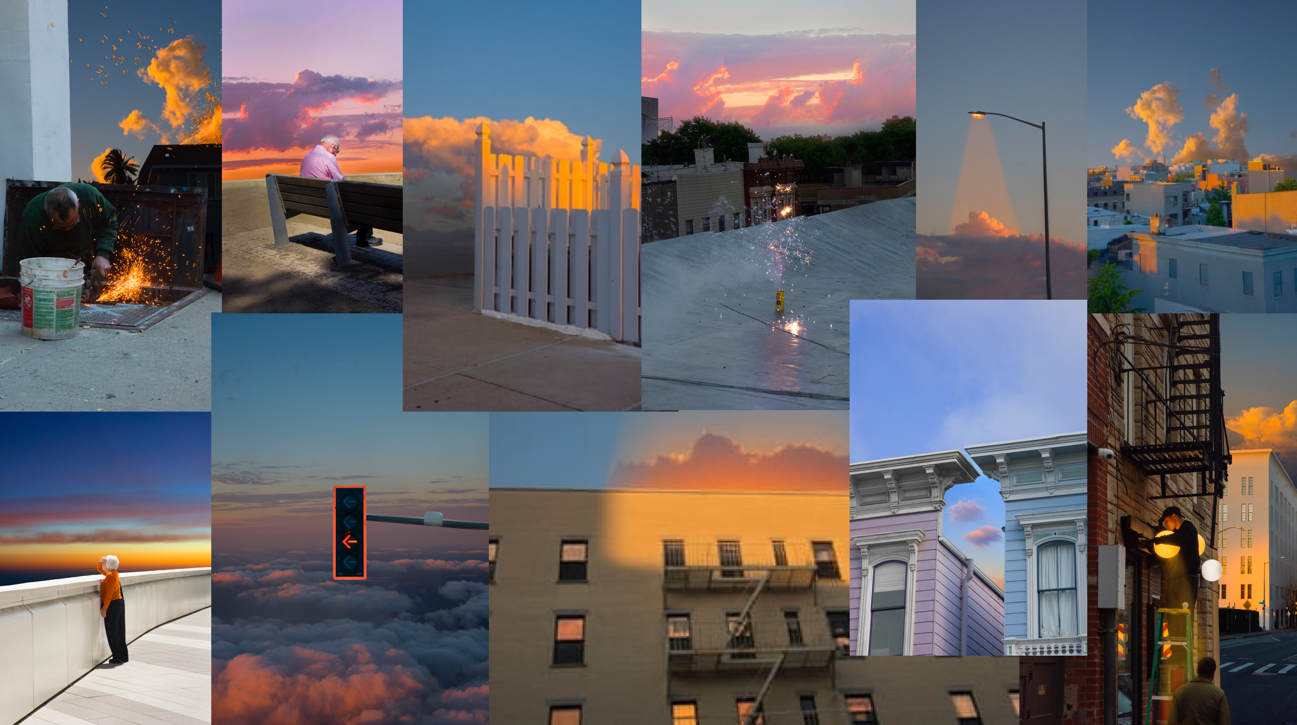
Golden Hour is Kim’s second book to be published by Same Paper, (who are based in China). Its carefully-assembled pictures are taken during the magic of the “golden hour” – the moment immediately before sunrise or sunset. This is part of her ongoing body of work, “Street Errands”Most of Kim’s images are taken in New York, California, Colorado, and Hawaii, the furthest place she could go within the states. “When I first went to California, I was pretty shocked. The sky felt so close to me. I saw palm trees for the first time, I’d only ever seen them on the internet.” says Kim. She was inspired to work with images of the sky, after visiting the West Coast. By using photoshop to manipulate and edit her images, Kim feels that she can escape, creating a “new space that feels almost like travelling to an unknown place. When I’m working on these images, it feels very therapeutic. I’m so focused I don’t think about my problems”. Making these surreal images has also been a way for Kim to appreciate what she can do within her current situation. “I used to get bored of doing the same things in the same surroundings, so finding the moments that I really like and layering them helped me to not be so pessimistic or self-pitying.”

Mood-board of Kangehee Kim’s images from her photo-book “Golden Hour”

Image Analysis

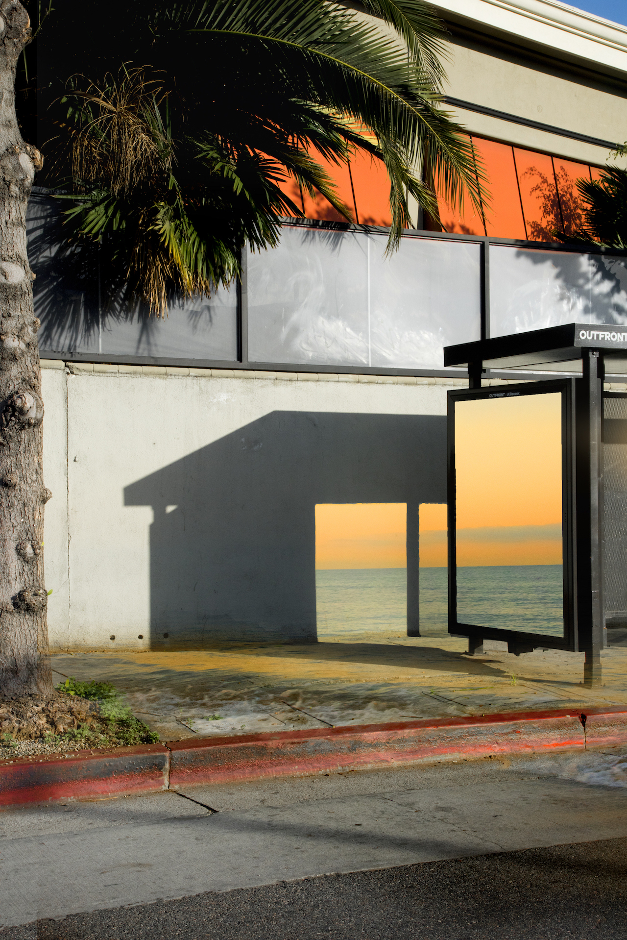
Golden Hour by KangHee Kim

This image taken by Kim is a very surrealist type of image. The way that she is focusing in on the effects of the sun during the ‘golden hour’ in the US creates this dream-like series of images. This image in particular, is portraying how sunlight creates this huge effect of beauty onto a normal scene. I like how Kim has used an editing technique process; she has manipulated the side of a bus stop (along with its shadow it creates) and placed a beautiful image of the blue sea, contrasted with the bright orange blossomed sky. She has also used a technique to make sea waves appear as if they are on the pavement. She has done this because she wanted to show that although she misses her place of birth, (Korea,) she has interpreted her current home place (the United States) to be as beautiful as her original home-town, Korea. She is implying that she loves to see a beauty in everything, and using the sun as a main focus point helps create this aspect of dream-like subject matters – this street she has photographed to incorporate images of the sea and sun would have been a plain, standard image but her surrealism artist traits has made her work much more outstanding and unique. I also like how she has made the orange sun that is being reflected on the windows of the top of the building a lot more vivid and bold; although the sun may have been reflected on these windows, it would’ve been no where near as pretty as she has edited it out to be. She really wanted to make sure each and every image in her “Golden Hour” photo-book is showing bold features of the sun and the sunlights beauty. This makes her work have an attractive aesthetic, with an orange, welcoming cover and a warming golden typography. The colours in this image are really standing out – I also like how in the top right corner of this photo, you can see a bold colour of sky blue. Her touch of surrealism has really made me intrigued into her work, and has made me realise that the sun is such an amazing factor to base a photographic piece of work on.

Kim’s work of the ‘golden hour’ links to the exam title ‘variation and similarity’ because she has made every image take an approach that pinpoints the sun as its reason of beauty and boldness – they are all similar due to the fact that they are brightly coloured and consider eat sun within some part of its photo. Yet, each image is varied from the other, as she uses different settings, as well as people, to create her creative series of photos. I have chosen this artist as one of my artist references because I am keen to follow the route of light and shadows as my exam project. I want to contrast these 2 aspects of everyday life to show how different and the different effects they create; as Kim has shown in her project, light creates a very warming, happy aesthetic, which I could want to incorporate into my work that explores light. Kanghee Kim has been a great influence into my inspiration to photograph light, as I am intrigued to do a few shoots on the effects of sunlight on different scenery. However, (as I stated in my specification,) I want to explore light as a whole – not just sunlight. This may mean I will have to capture some shoots in a studio or a dark room in my house, and use artificial sources of light, such as lamps, lighters, torches etc.
Jersey’s relationship with the Sun

Jersey is the biggest of the islands within the Channel Islands, between England and France. “A self-governing dependency of the United Kingdom, (with a mix of British and French cultures,) it’s known for its beaches, cliffside walking trails, inland valleys and historic castles.” Jersey is also the sunniest place in the British Isles; in 2010, Jersey saw 2403.2 hours of sunshine – the sunniest on record, outshining other sites across the British Isles. The island of Jersey has a close relationship with the Sun.

Mark Leonard sun photography in Jersey Channel Islands

Amateur landscape photographers in Jersey

Steve Wellum was an amateur photographer in Jersey, He has now retired, but was known for his beautiful photo-shoots he created for families, weddings and other events.

In the 1960s, 1970s and 1980s, tourism was a huge part of Jersey, with its many hours of sunlight persuading people to come and visit Jersey. There were many aspects of Jersey that adapted itself to a tourist island; there were historic landmarks that have become tourist sites, meaning Jersey soon became a place of museums and historic viewings, gaining money from its castles, (Mont Orgueil and Elizabeth castle) and the War Tunnels. This pleased the community of Jersey, as the island was becoming more popular and well-known, and it also pleased the tourists – they were more intrigued to visit Jersey with these interesting places to visit. Additionally, Jersey’s Sun meant that Jersey’s beautiful beaches and scenery became more and more visited on a daily basis.
Archival images as a postcard of Jersey landscapes

Specification

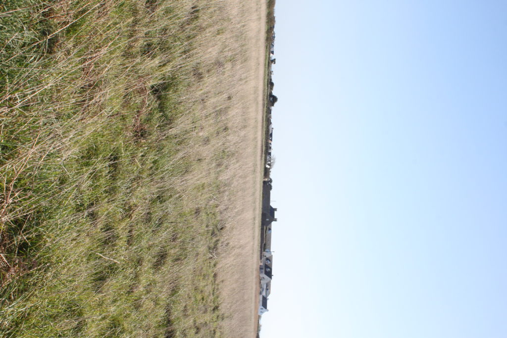
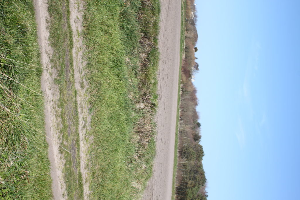
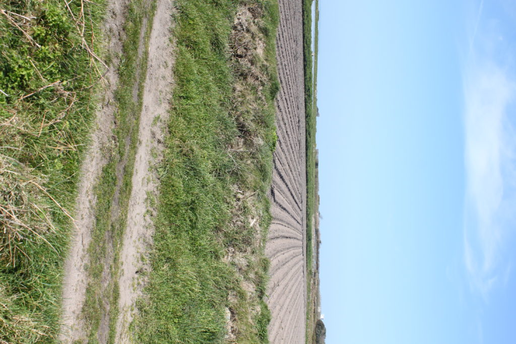
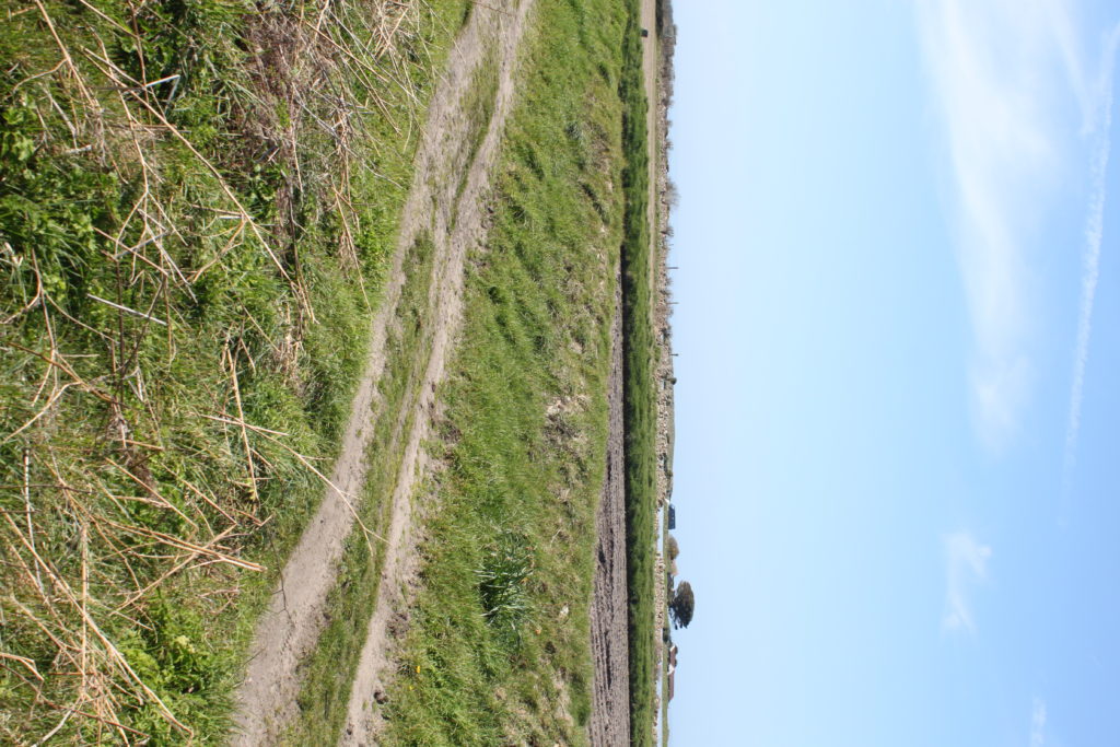
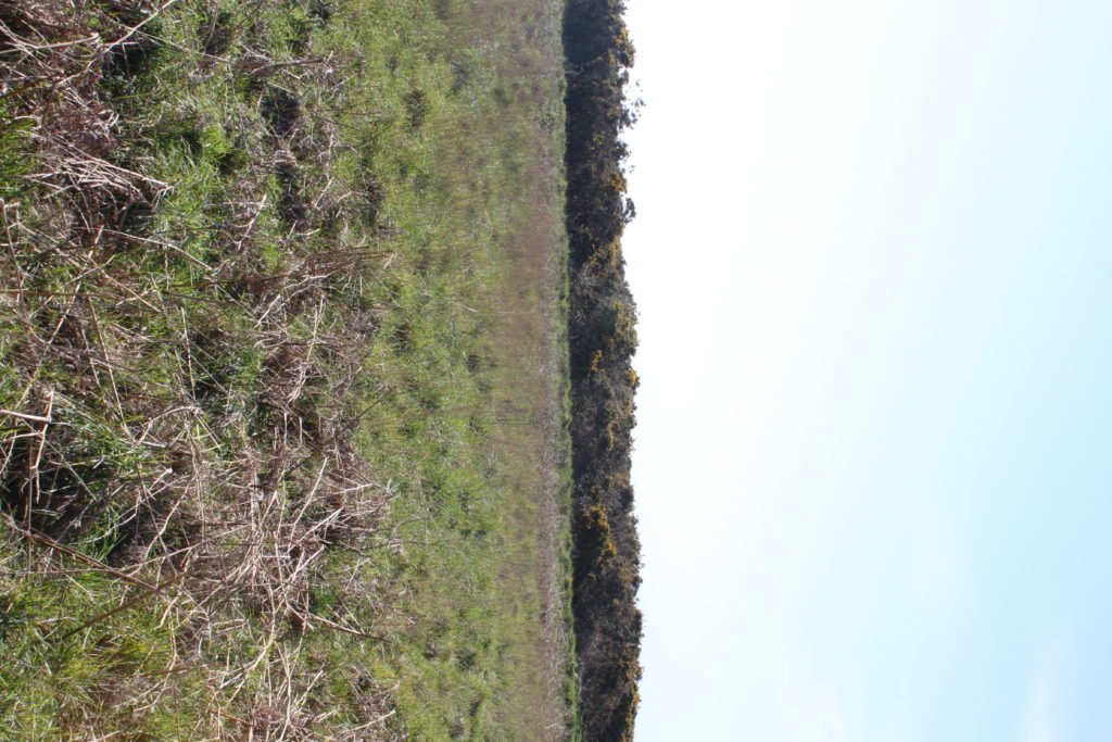
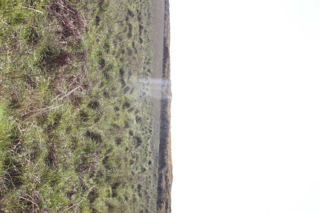
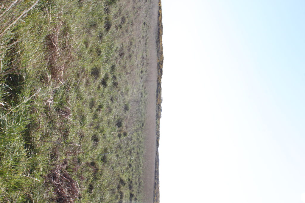
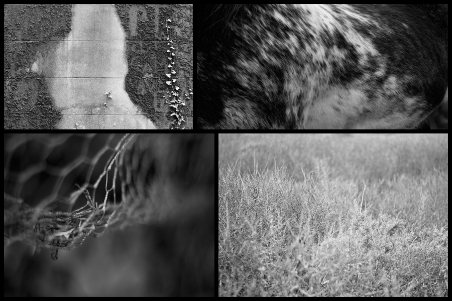
Currently for my project regarding variation and similarities I have decided to look at the topic of abstractions through things such as saturation, pattern and texture. I have chosen this topic because I am exploring how the textures, patterns and saturation within certain landscapes reflects how the environment in that area looks, this led me to look at photographers Aaron Siskind and SiegFried Hansen, both people who have looked at using the textures and patterns of areas to reflect the political stance of urban areas within cities. Personally photographer Aaron Siskind has proved to be of particular inspiration for me due to how he uses over and under exposed imagery to create piece which stray away from portraiture and instead focus on aesthetic objects to reflect who the people are and their views. Here are some examples from a previous shoot reflecting the more agricultural side of island life:

My main ideas that had risen from this are repetition found in nature and the bleakness that can accompany it. Because of this I have focused predominantly in monochrome filters as a means of highlighting this abstraction without the colour distracting the viewer from the overall composition. For me the houses and the fields which surrounded it provided most of the landscapes needed because of its wide range of plants, wildlife and man-made structures. Regarding my future plans I intend to explore other environments such as urban life and harbors, this is because both will contain completely different things which I could abstract and isolate from the environment such as reflections and glass structures, things that would not be typically seen in farmland areas. When taking the images I found a higher aperture really worked well in highlight shades and forms, which as a result produces a ghost like effect on to the plants and land, presenting the viewer with a new interpretation of what they would usually see.