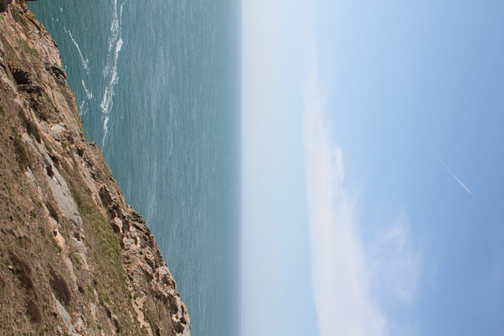
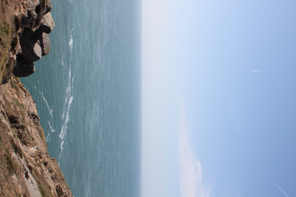
To create tiny planet images, you firstly need to take images. I took 55 images per planet, creating a 350 degree panorama as you can see below.

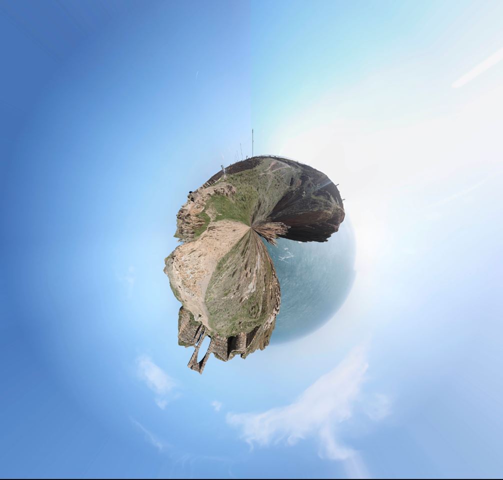
This is the step by step process of turning a panorama into a planet:
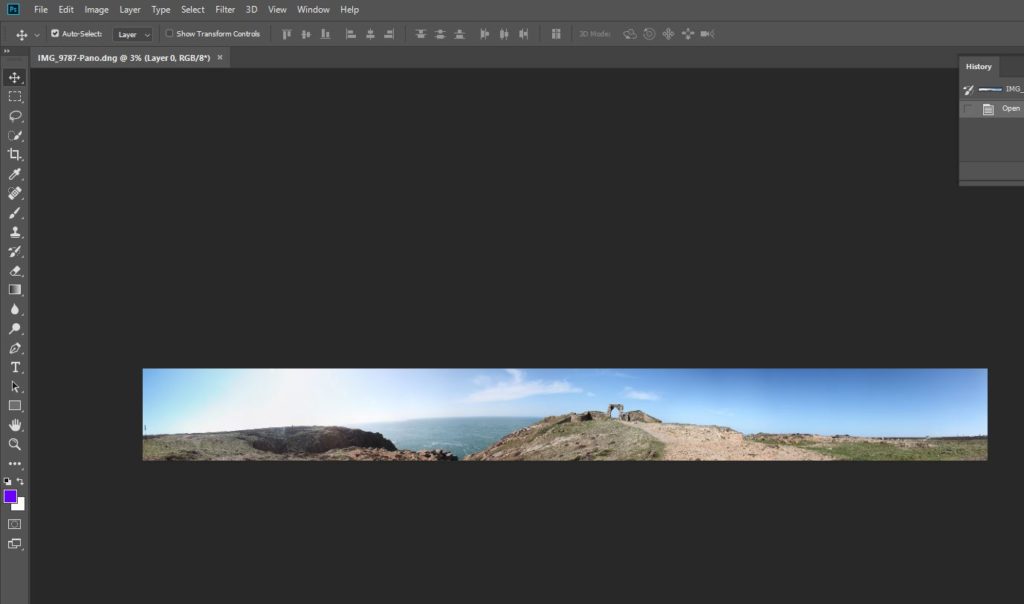
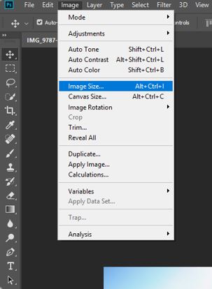
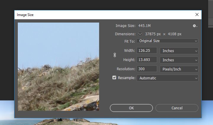
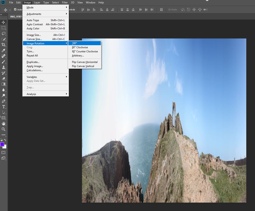
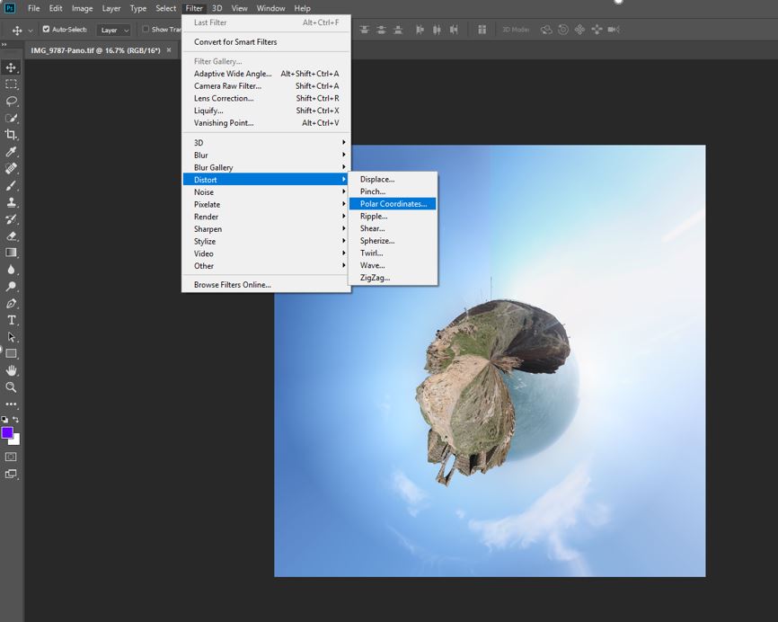
To create tiny planet images, you firstly need to take images. I took 55 images per planet, creating a 350 degree panorama as you can see below.
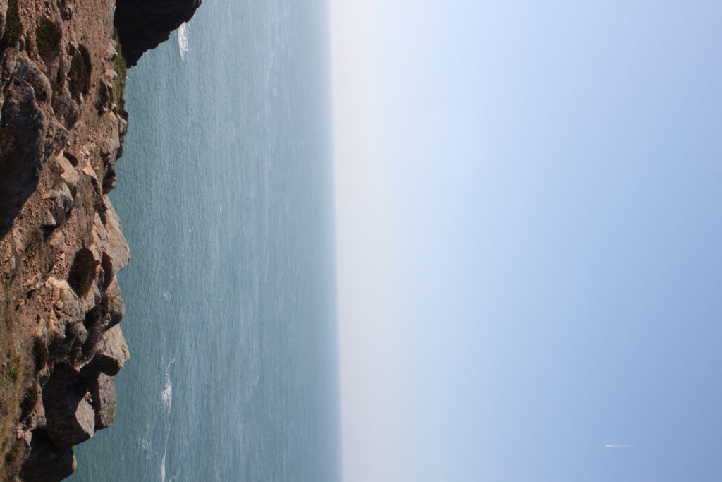
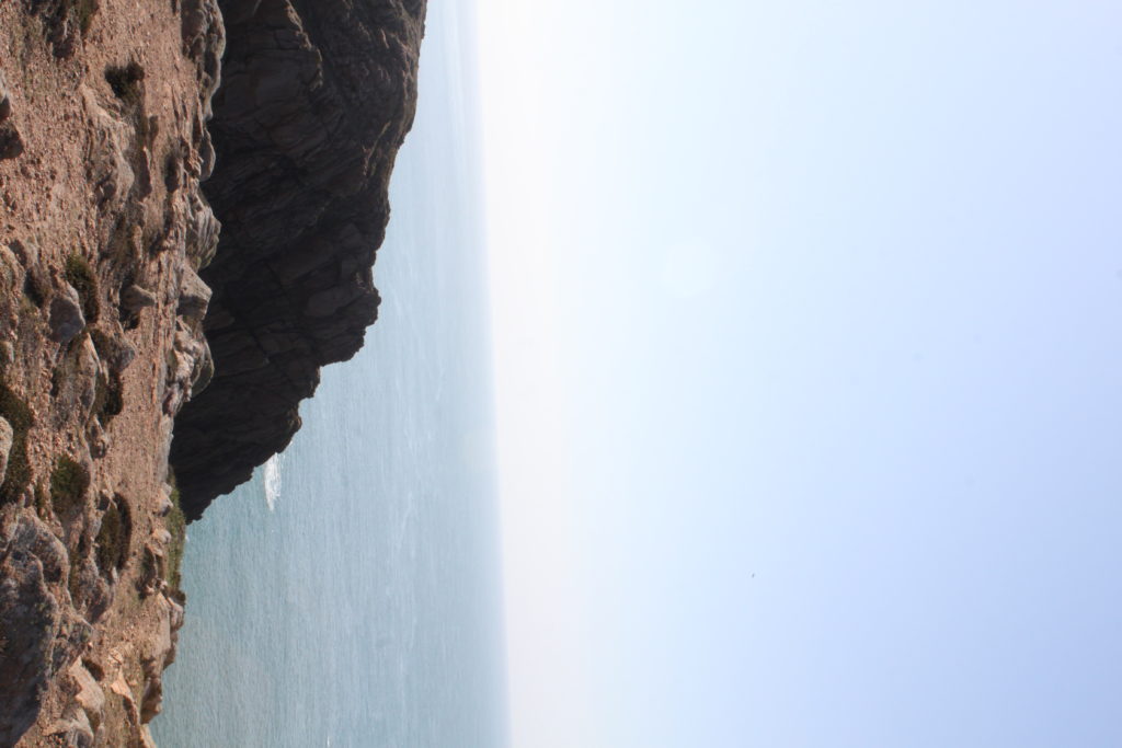
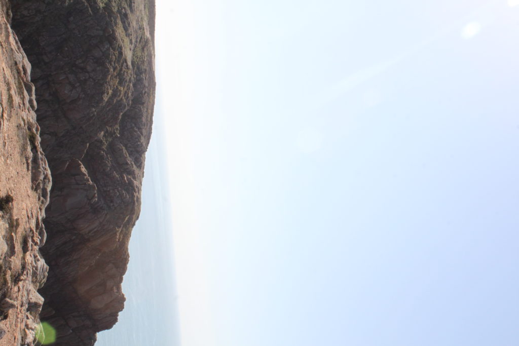
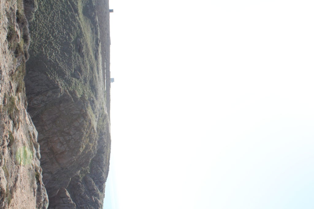
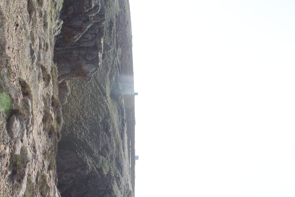
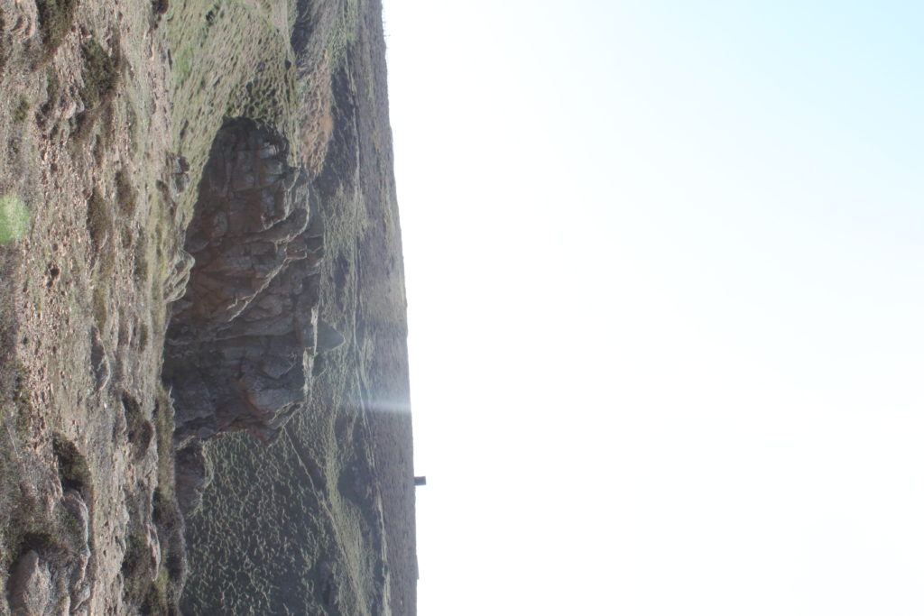
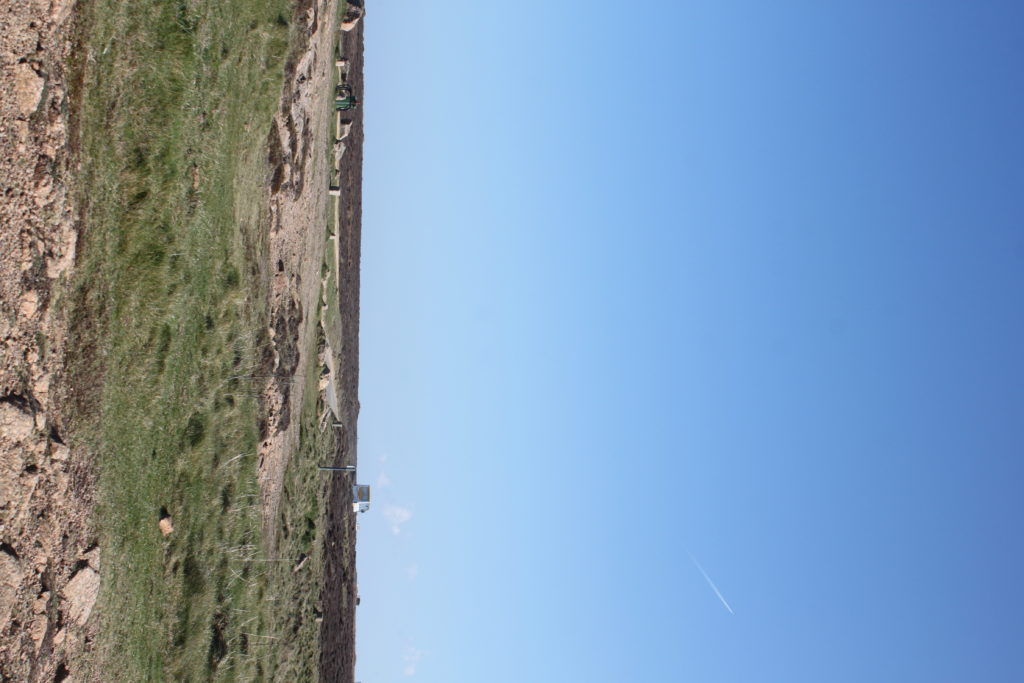
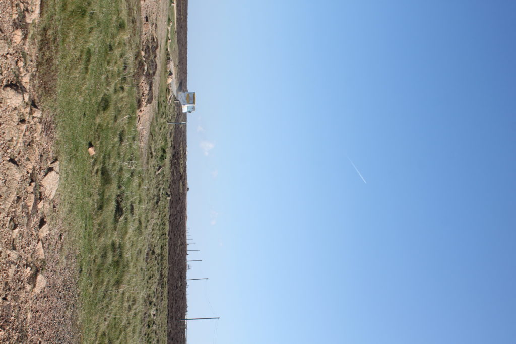
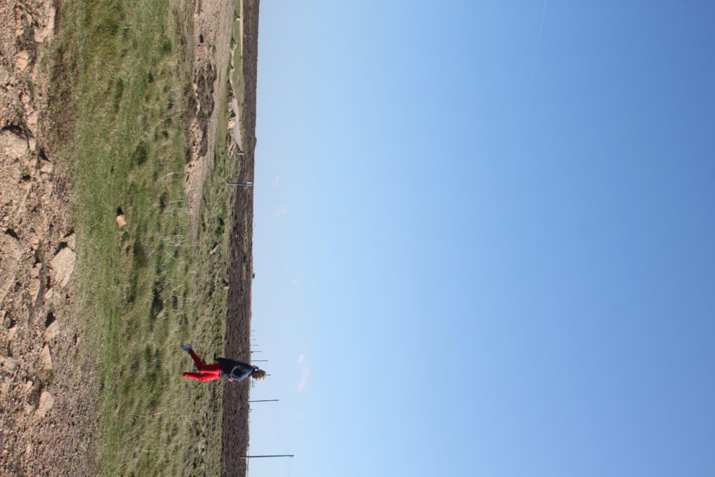

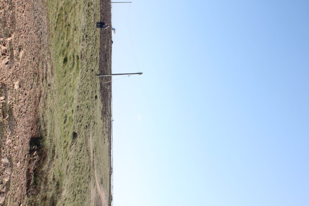

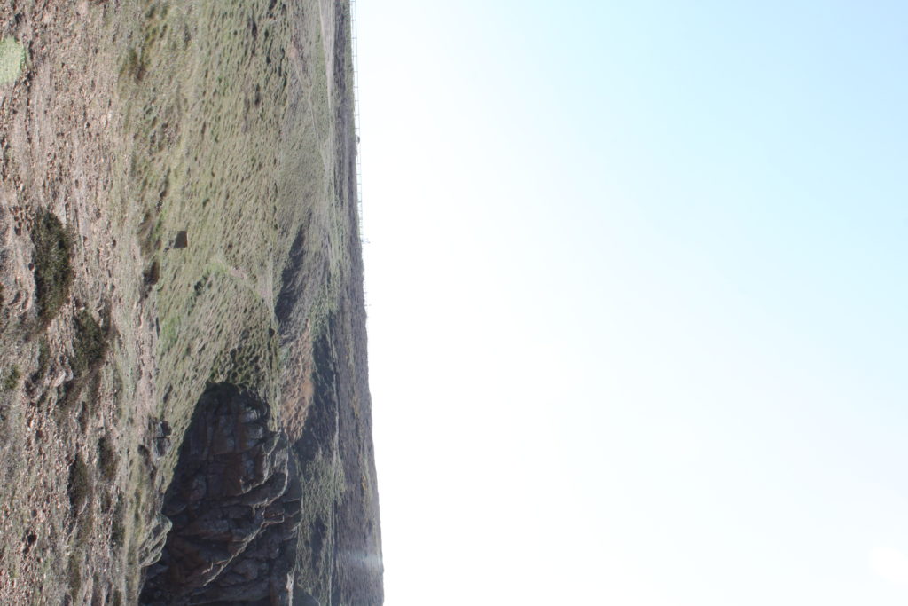
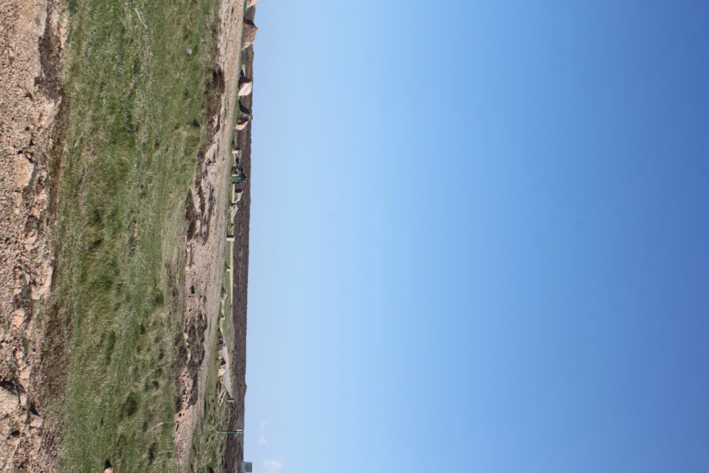
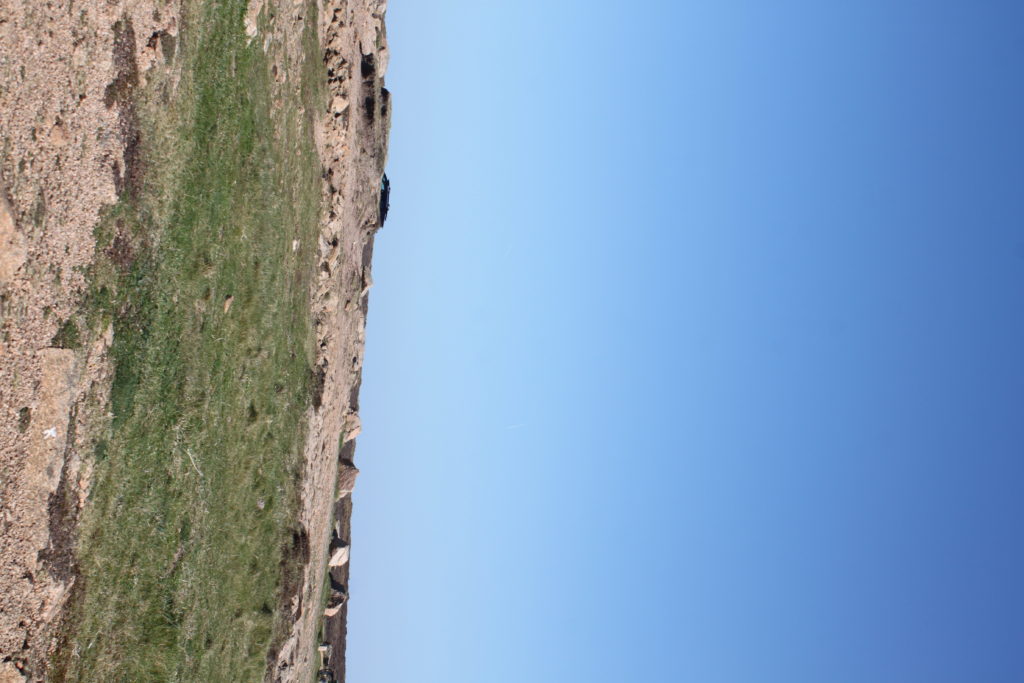
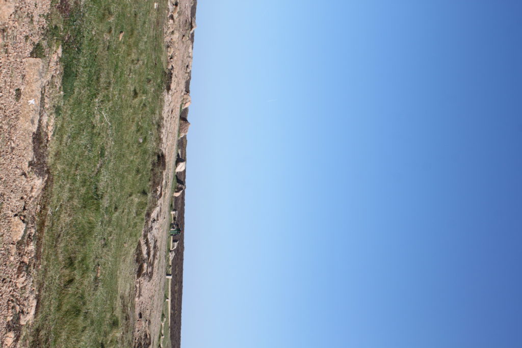

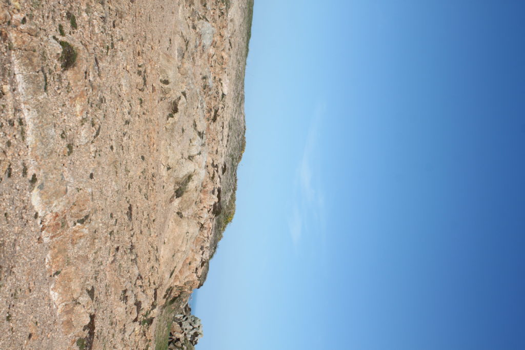
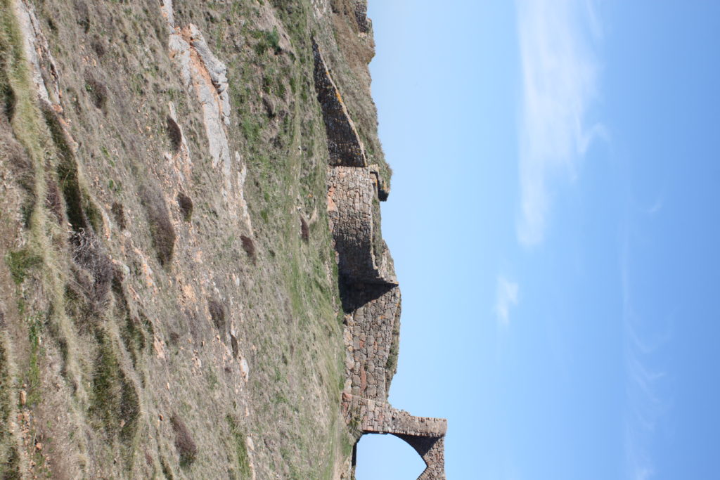
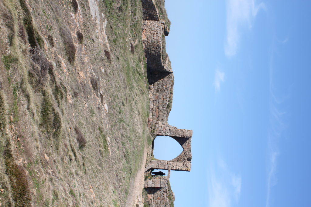

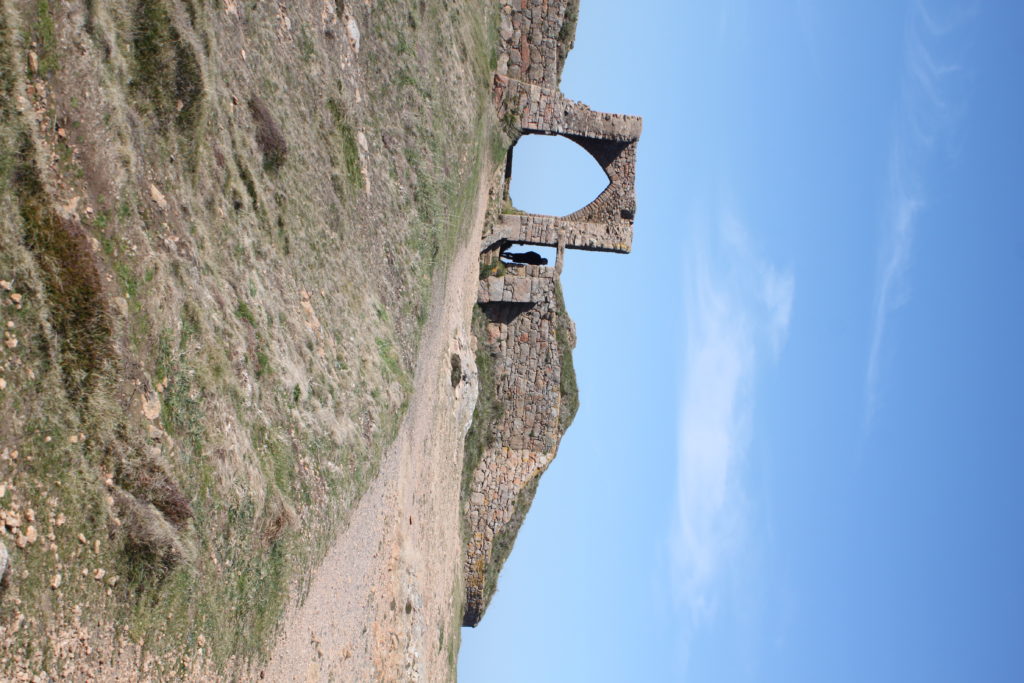
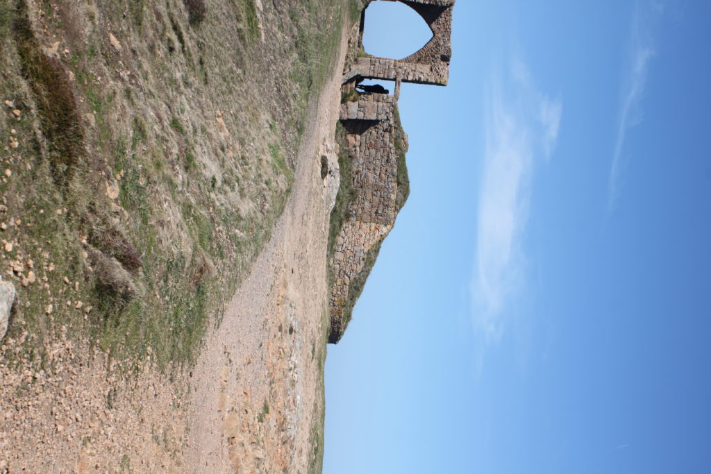

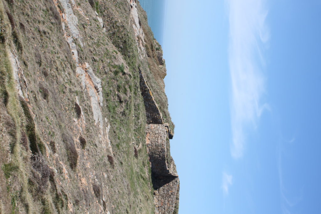
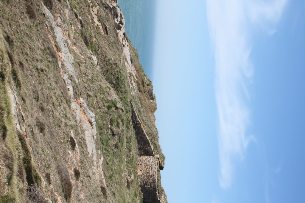
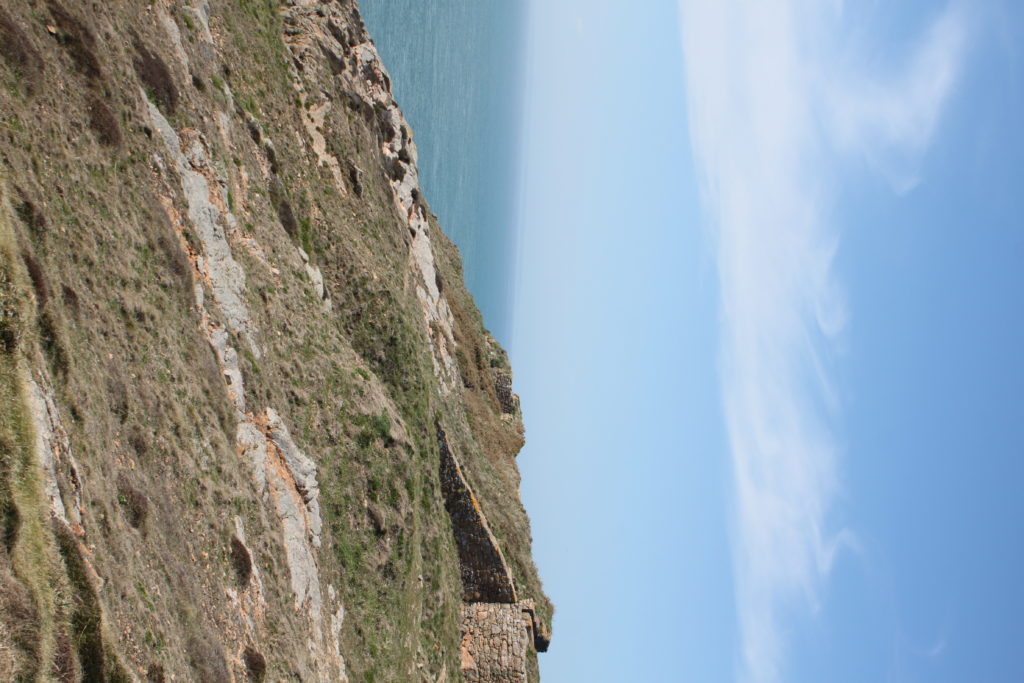
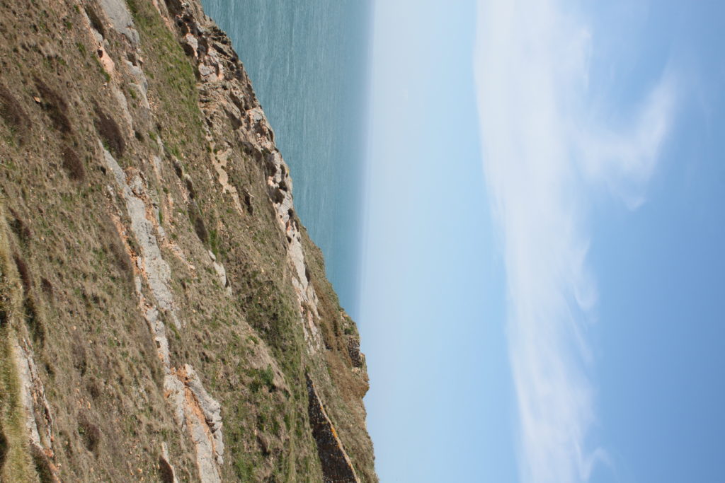

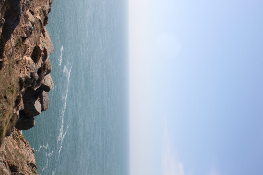
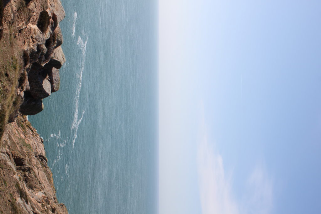
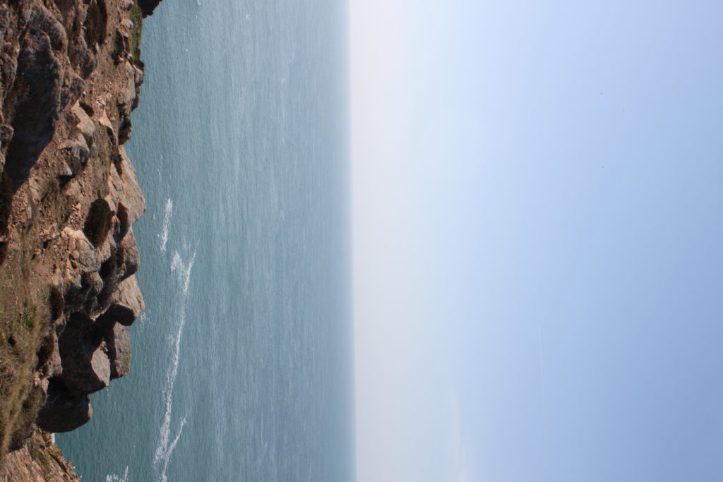
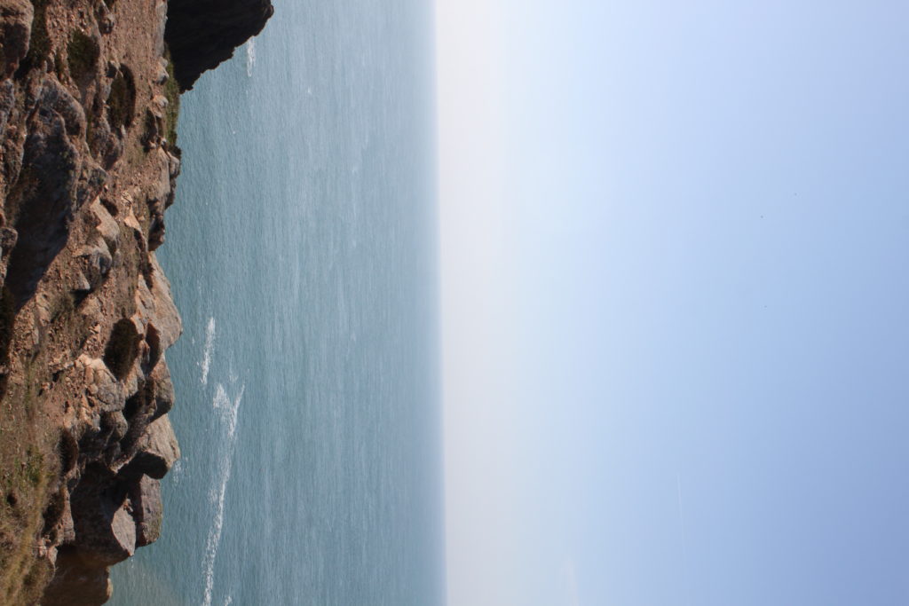

This is the step by step process of turning a panorama into a planet:


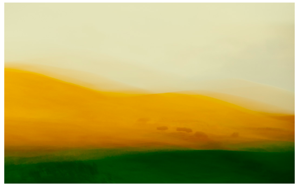
Inspired by the paintings of the old English masters with a mix of camera techniques and post processing I have developed these painterly impressionist images of both recognisable and abstract scenes into a style that goes beyond what many consider photography.
The looseness and ability to play without being tied by the light or weather affecting the scene you’d normally be shooting is the style’s appeal to me, also the chance of creating a scene that was not necessarily there. Using a tool of which its sole function is to capture exactly what is in front of it and then making it almost become a brush with which we “paint” is a joy. The results I have achieved since first experimenting with intentional camera movement (icm) have been more satisfying than any photograph I’ve made previously.
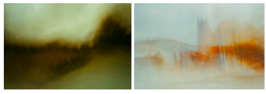
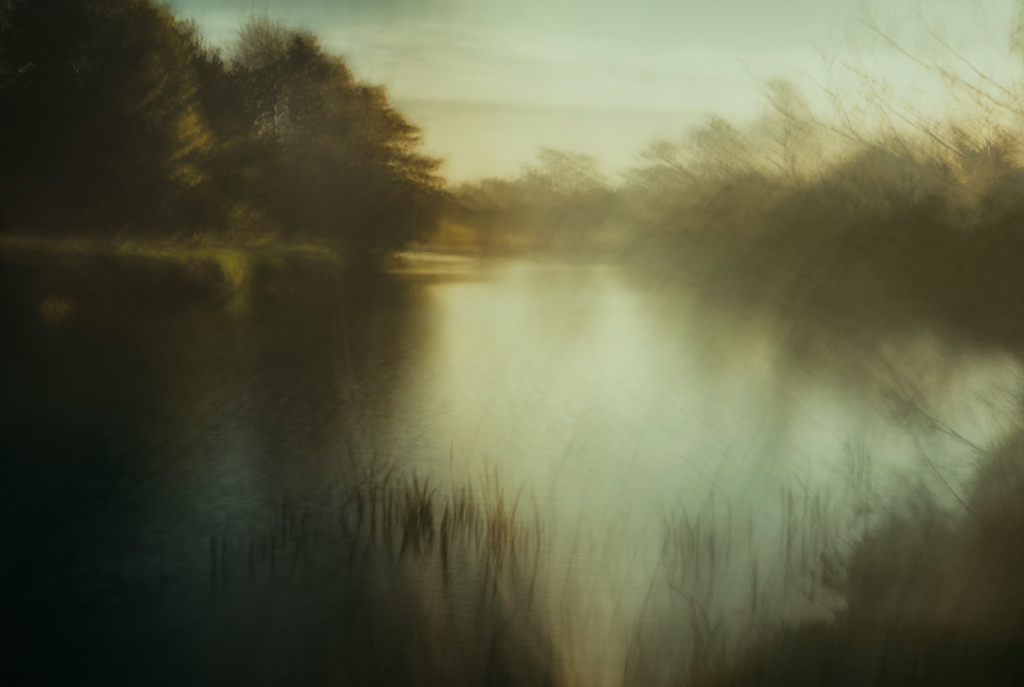
I like this image as you can still see the details of the plants in the foreground, becoming more blurry towards the back of the image. This is effective as it creates a balance between movement and detail on the landscape. I also like how in this image he only emphasised the natural colours in the landscape, rather than changing the colours in editing after the image was taken which is something he does in his photos. I like him emphasising the natural colours as it makes the landscape look more realistic and a true depiction of nature. On the other hand, it takes away from the abstract qualities of his other images where he emphasises bold shapes and bright colours. I also like how he contrasts the bright parts in the middle of the image, to the darker parts around the edges of the image, as it makes it more interesting and emphasises the composition.
With Northumberland as a home its iconic but subtle landscapes, coastline and nature in general have shaped my vision from an early age and continues to inspire me – though the thought of the challenge of a change of scene does appeal now and again. ended up with me all but abandoning the “reality” of photography and instead I use the old English master painters of the 19th century, along with the later impressionists as my inspiration to create the work I currently do. A huge influence and someone I actively try and mimic in form and colour scheme is JMW Turner.
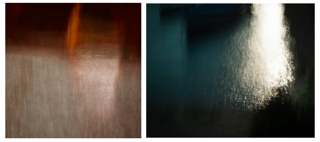
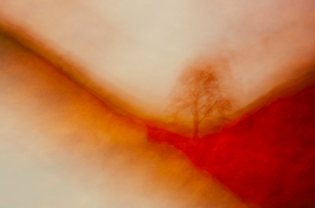
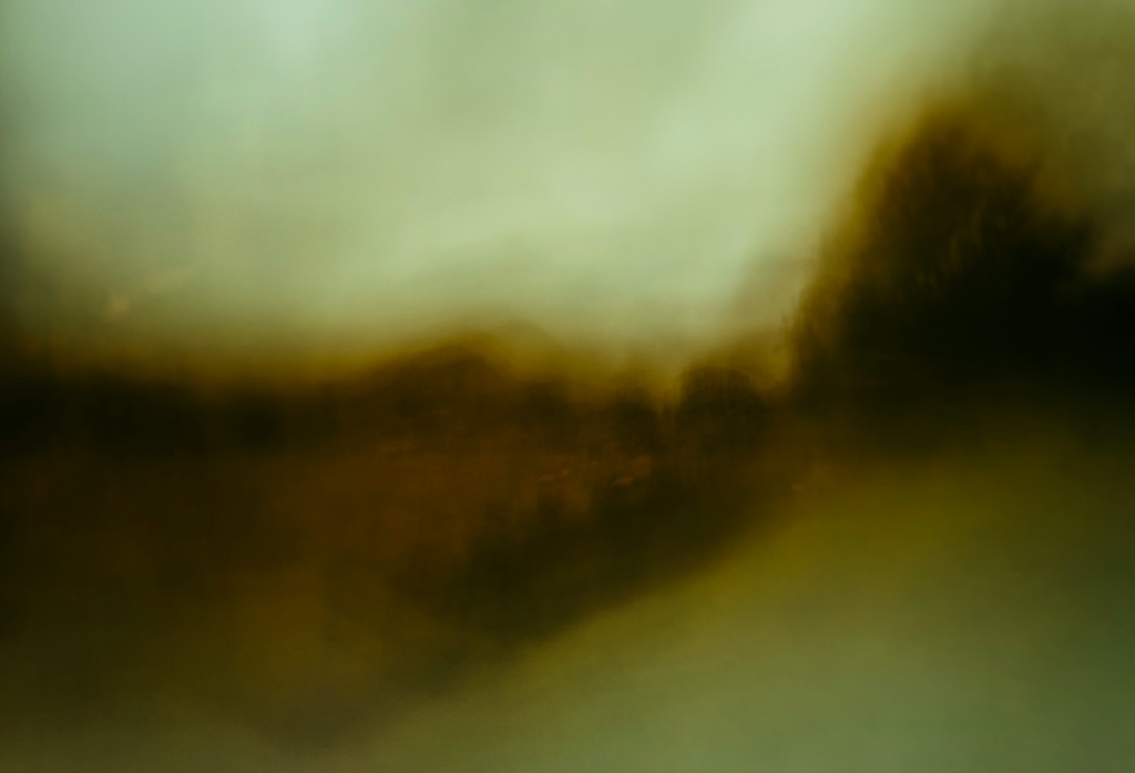
I chose Andrew S. Gray as an artist to take inspiration from as I wanted to experiment with the way I photographed images and thought that the technique he uses, by shaking his camera and editing the images to emphasise the colours, was a good way to do this. I also like how he takes inspiration from old English painters and the impressionist movement through the movement and looseness of the lines in the images, creating a blurred effect, but still being able to see the aspects and colours of the landscape which are important. I also like his focus on abstract shapes and colours which I have done previous research into. He focuses on emphasising the bold shapes in the landscape which is something I will try to interpret. I think that by interpreting this work it will contrast from the way I normally taking photos which is very detailed and precise, always focusing on the composition. By doing this technique it doesn’t allow me to find a good composition as easily through the movement of the camera. With my images that I produce, I want to be able to compare them to images I’ve previously taken in the project and see whither they would be effective to use as final images for this project.
Russian-born artist, one of the first creators of pure abstraction in modern painting. After successful avant-garde exhibitions, he founded the influential Munich group Der Blaue Reiter (“The Blue Rider”; 1911–14) and began completely abstract painting. His forms evolved from fluid and organic to geometric and, finally, to pictographic. A sensitive and reflective child, Kandinsky was fascinated by the fanfare of sensory experience that childhood affords, through colour and sound and music


An event that effected his abrupt change of career in 1896: seeing an exhibition of French Impressionists in Moscow the previous year, especially Claude Monet’s Haystacks at Giverny, which was his first experience of nonrepresentational art. The impressionists used values of color and light to show their subjects rather than painting in fine detail. and then hearing Wagner’s Lohengrin at the Bolshoi Theatre. Kandinsky chose to abandon his law career and move to Munich to devote himself full-time to the study of art.
He began with conventional themes and art forms, but all the while he was forming theories derived from devoted spiritual study and informed by an intense relationship between music and color. These theories coalesced through the first decade of the 20th century, leading him toward his ultimate status as the pioneer of abstract art. Color became more an expression of emotion rather than a faithful description of nature or subject matter.
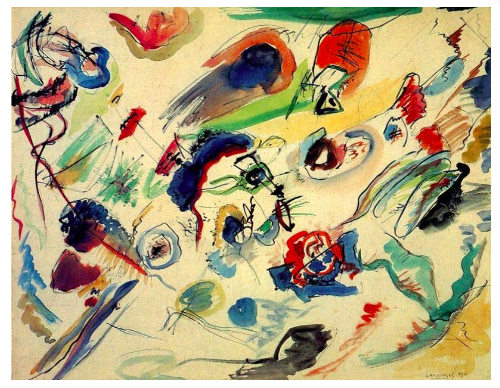

Kandinsky’s book ‘Concerning the spiritual in art’ explains Kandinsky’s own theory of painting and crystallizes the ideas that were influencing many other modern artists of the period. Along with his own groundbreaking paintings, this book had a tremendous impact on the development of modern art.
Kandinsky’s ideas are presented in two parts. The first part, called “About General Aesthetic,” issues a call for a spiritual revolution in painting that will let artists express their own inner lives in abstract, non-material terms. Just as musicians do not depend upon the material world for their music, so artists should not have to depend upon the material world for their art. In the second part, “About Painting,” Kandinsky discusses the psychology of colors, the language of form and color, and the responsibilities of the artist.
“The spiritual life, to which art belongs and of which she is one of the mightiest elements, is a complicated but definite and easily definable movement forwards and upwards. This movement is the movement of experience. It may take different forms, but it holds at bottom to the same inner thought and purpose.”
He goes on to offer a visual metaphor for our spiritual experience and how it relates to the notion of genius:
The life of the spirit may be fairly represented in diagram as a large acute-angled triangle divided horizontally into unequal parts with the narrowest segment uppermost. The lower the segment the greater it is in breadth, depth, and area.
“When religion, science and morality are shaken … and when the outer supports threaten to fall, man turns his gaze from externals in on to himself. Literature, music and art are the first and most sensitive spheres in which this spiritual revolution makes itself felt. They reflect the dark picture of the present time and show the importance of what at first was only a little point of light noticed by few and for the great majority non-existent. “

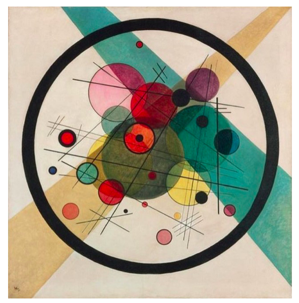
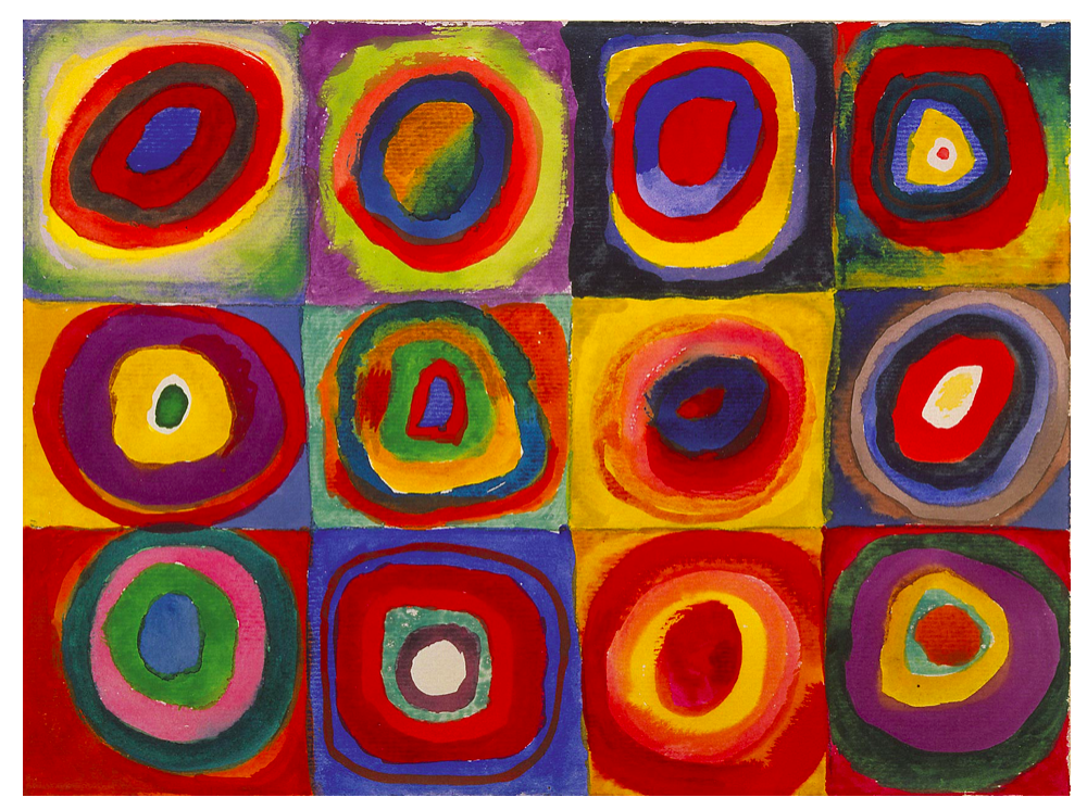
Wassily Kandinsky, ‘Several Circles’ (1926)
“This essential connection between color and form brings us to the question of the influences of form on color. Form alone, even though totally abstract and geometrical, has a power of inner suggestion. A triangle (without the accessory consideration of its being acute — or obtuse — angled or equilateral) has a spiritual value of its own. In connection with other forms, this value may be somewhat modified, but remains in quality the same.
I chose Wassily Kandinsky as a main artist to take inspiration from in my project, especially his theories on spirituality and art, as I think it links to my previous work and is a concept i can build on in my future photo shoots and will develop my work conceptually and contextually. “This essential connection between color and form brings us to the question of the influences of form on color. Form alone, even though totally abstract and geometrical, has a power of inner suggestion.” He states that shapes have spiritual value which is something I want to draw on in my images.

Like symphonies, Kandinsky’s great abstract paintings speak directly to our senses and feelings. Their constellations of mysterious marks are like waves of sound that trigger emotions. For him, the world they pointed towards was a spiritual realm, a hidden truth.
‘For Kandinsky, art was a spiritual and emotional experience. He wanted his paintings to transcend recognized forms and express feelings through colors and shapes. Kandinsky argued that artistic experiences were all about feeling, and different colors affected mood. Colour had the ability to put viewers in touch with their spiritual selves. For Kandinsky, yellow could disturb, while blue might make people feel good. Kandinsky’s thoughts on color were similar to Johann Wolfgang von Goethe’s belief that different colors can convey certain emotions. The warm colors – red, yellow, and orange – are usually considered lively colors that can sometimes be harsh. The cool colors – green, blue, and purple – are considered more peaceful and subdued. Kandinsky was especially fond of blue. He also discussed the neutrals, black, gray, and white. White is silence and quiet, and black is completely devoid of possibility. Gray can go either way.’
He formulates two core sensory distinctions between yellow and blue in terms of movement:
Kandinsky links yellow with human energy:
“The first movement of yellow, that of approach to the spectator (which can be increased by an intensification of the yellow), and also the second movement, that of over-spreading the boundaries, have a material parallel in the human energy which assails every obstacle blindly, and bursts forth aimlessly in every direction.”
Yellow is an “earthly colour”, which therefore can never have a profound spiritual meaning. This is the prerogative of blue: “The power of profound meaning is found in blue, and first in its physical movements (1) of retreat from the spectator, (2) of turning in upon its own centre. The inclination of blue to depth is so strong that its inner appeal is stronger when its shade is deeper. Blue is the typical heavenly colour.” In other words, his interpretation of this colour contrast is anchored to familiar fundamental dualities: “matter” against “spirit”, “earth” against “heaven”, “man” against “God”, etcetera (admittedly, he doesn’t actually use the word “God”).
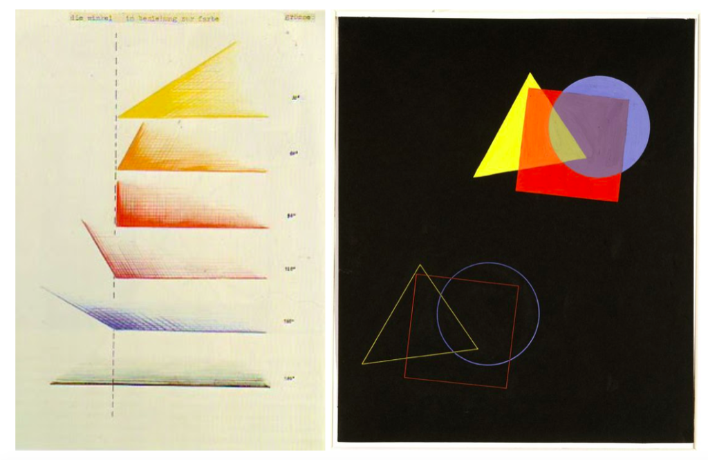
The Color theory was published in 1911 and meant to explain the painter’s palette in two ways: the effect on the eye (person’s physical understanding of the color) and “inner resonance”, phycological effect, when it effects your spiritual experience.
The theory describes not only the colors but the geometrical objects and it’s impression on the viewer:
“According to Kandinsky…, a dull shape like a circle deserves a dull color like blue. A shape with intermediate interest like a squaredeserves an intermediate color like red. A dynamic, interesting shape like a triangle deserves an enegetic, luminous, psychotic color like yellow.
This shoot will be at Noirmont point on Jersey’s south coast. I will fly a drone over a few specific locations on and around that headland. The locations I would like to shoot are Batterie Lothringen including the MP1 which covers the majority of the Noirmont headland, the Noirmont Point lighthouse and Janvrin’s Tomb in Portelet bay.


The satellite image below shows the locations I’d like to shoot, each colour coded by a coloured circle.
Green – Janvrin’s Tomb
Blue – Gun Point 1
Black – Gun Point 2
Orange – MP1 Tower + Range Finder
Yellow – Lighthouse
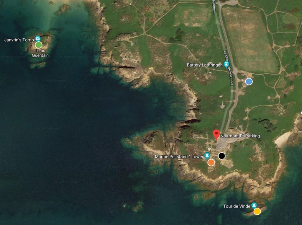
The aim of the shoot is to get top down images of locations that look like circles from above, I used satellite imagery to find the locations and also reviewed air laws and local airspace regulations to develop a plan and ensure the flight is within all regulations. The flight to Janvrin’s tomb takes the drone to it’s maximum legal distance but does not breach it, the location is just outside the Jersey Airport ATZ (Air Traffic Zone) yet we will still file a flightplan to let ATC (Air Traffic Control) know we are flying, giving location, time airborne, height and time down.
https://www.bbc.co.uk/iplayer/episode/b08v8gxj/the-art-of-japanese-life-series-1-1-nature
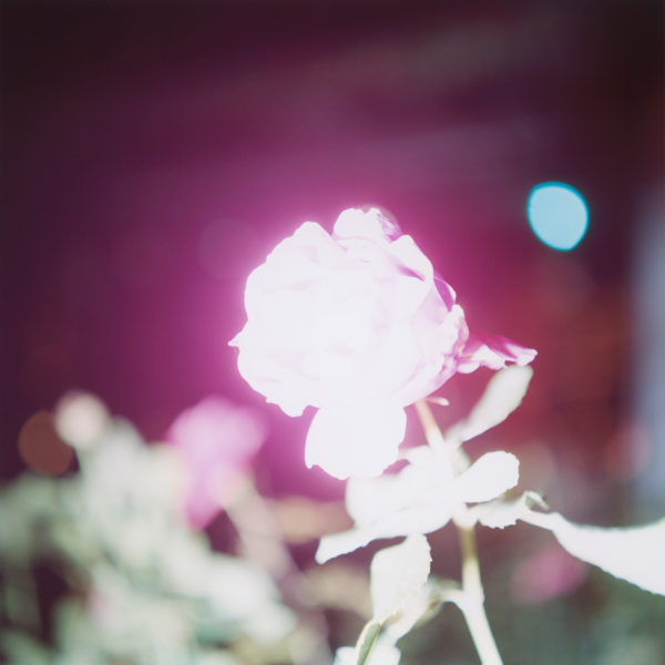
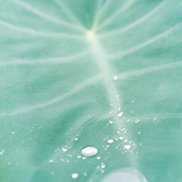
Rinko Kawauchi Hon FRPS 川内 倫子 is a Japanese photographer. Her work is characterized by a serene, poetic style, depicting the ordinary moments in life. Kawauchi became interested in photography while studying graphic design and photography at Seian University of Art and Design where she graduated in 1993. She first worked in commercial photography and advertising for several years before embarking on a career as a fine art photographer. In 2001 three of her photo books were published: Hanako (a Japanese girl’s name), Utatane (“catnap”), and Hanabi (“fireworks”). In 2004 Kawauchi published Aila; in 2010, Murmuration, and in 2011 Illuminance. Her series Illuminance is inspired by the subtle aesthetic of wabi-sabi.
In traditional Japanese aesthetics, wabi-sabi (侘寂) is a world view centered on the acceptance of transience and imperfection. The aesthetic is sometimes described as one of beauty that is “imperfect, impermanent, and incomplete”. Characteristics of the wabi-sabi aesthetic include asymmetry, roughness, simplicity, economy, austerity, modesty, intimacy, and appreciation of the ingenuous integrity of natural objects and processes.
Kawauchi’s art is rooted in Shinto, the ethnic religion of the people of Japan. According to Shinto, all things on earth have a spirit, hence no subject is too small or mundane for Kawauchi’s work; she also photographs “small events glimpsed in passing,” conveying a sense of the ephemeral. Kawauchi sees her images as parts of series that allow the viewer to juxtapose images in the imagination, thereby making the photograph a work of art and allowing a whole to emerge at the end; she likes working in photo books because they allow the viewer to engage intimately with her images.
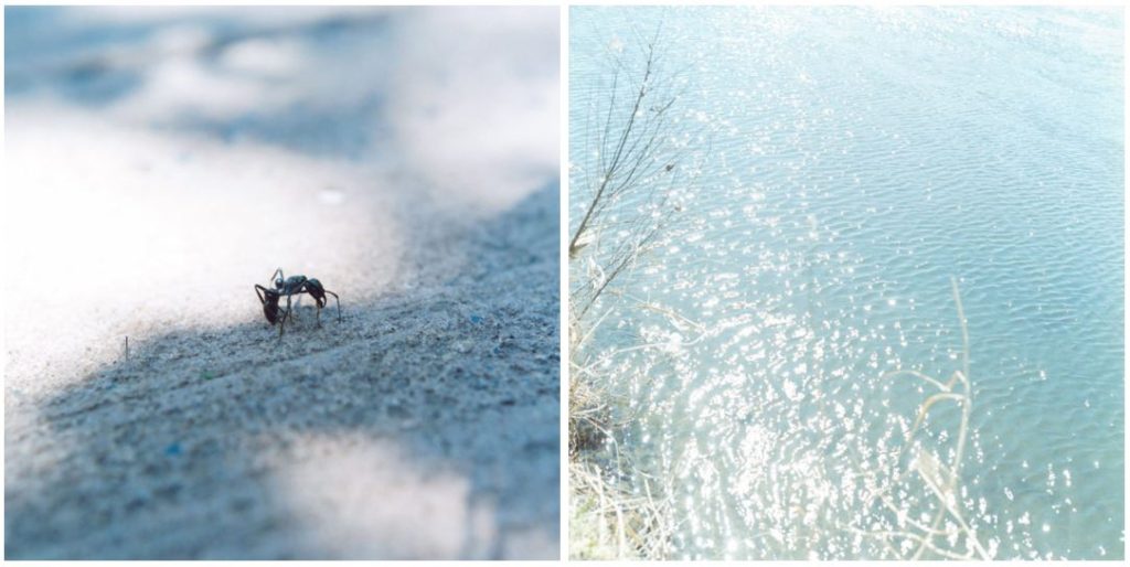
Kawauchi’s photographs give a sublime perspective of nature up close. She incorporates one of the most important photographic elements of light into her work and uses it in her favour to create the most striking images. She studies basic subjects that people see as boring or nothing special i.e. ants, water, flowers, leaves, and turns them into extraordinary focal points. Her photographs have an almost spiritual feel to them as they present nature in a majestic and serene way, differing from many other nature photographers who photograph in monochrome and capture the landscape as a whole rather than zooming in on the finer elements.
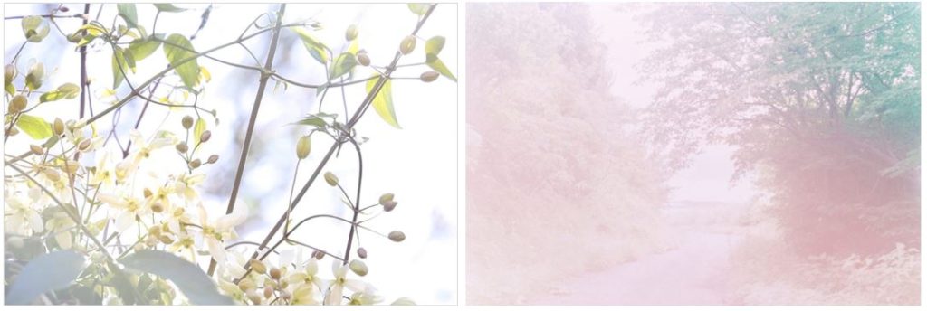

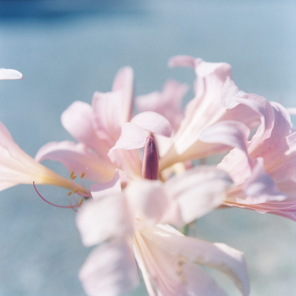
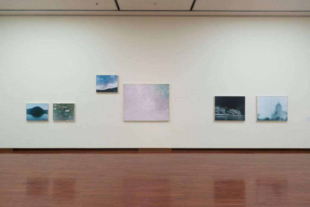
BBC SERIES ON THE JAPANESE ART OF NATURE
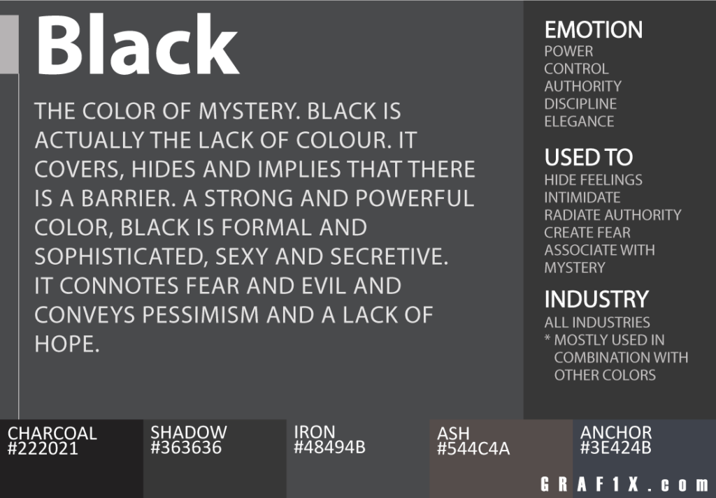
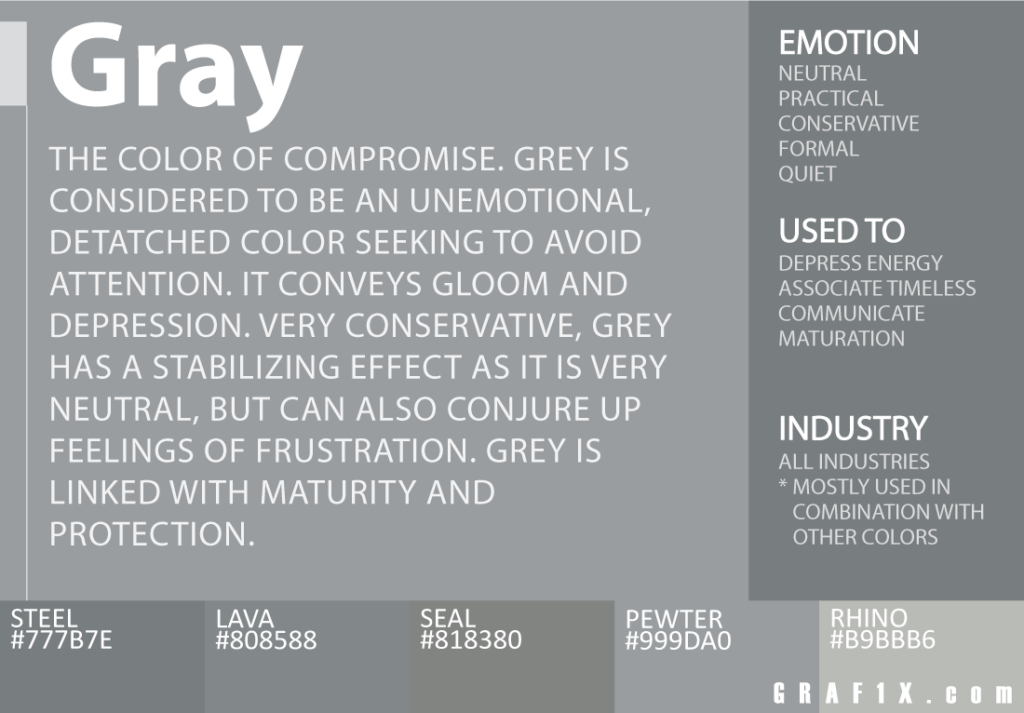
Hiroshi Sugimoto is an example of an alternative landscape photographer. Sugimoto, born on February 23, 1948, is a Japanese photographer and architect. He leads the Tokyo-based architectural firm New Material Research Laboratory. His use of an 8×10 large-format camera and extremely long exposures means Sugimoto has gained a reputation as a photographer of the highest technical ability. He is equally acclaimed for the conceptual and philosophical aspects of his work. Sugimoto has exhibited extensively in major museums and galleries throughout the world, including the Museum of Contemporary Art in Los Angeles (1994), the Metropolitan Museum of Art, New York (1995), the Serpentine Gallery, London (2003) and the Fondation Cartier pour l’Art Contemporain, Paris (2004). His most recent exhibition, “Lost Human Genetic Archive”, is showing at the Tokyo Photographic Art Museum from Sept. 3 – Nov. 13, 2016, incorporating selected images from Seascapes among others.
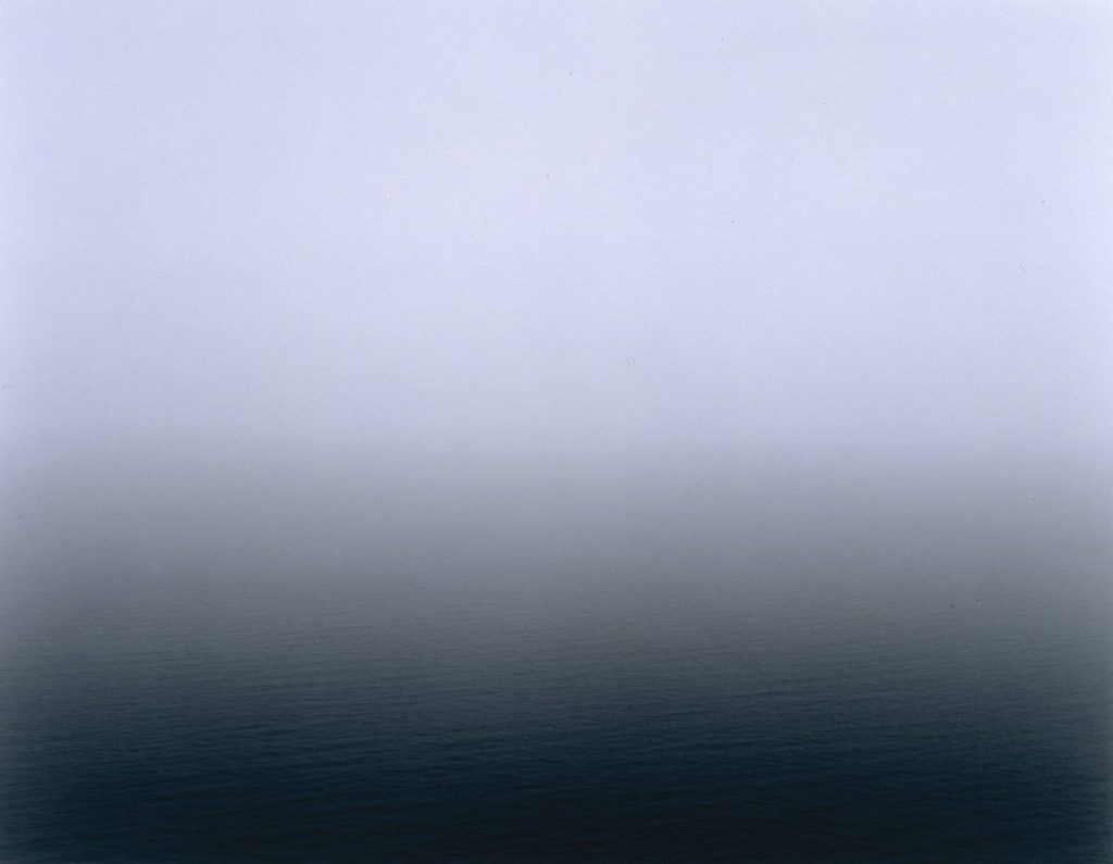
In 1980 he began working on an ongoing series of photographs of the sea and its horizon, Seascapes, in locations all over the world, using an old-fashioned large-format camera to make exposures of varying duration (up to three hours). The locations range from the English Channel and the Cliffs of Moher to the Arctic Ocean, from Positano, Italy, to the Tasman Sea and from the Norwegian Sea at Vesterålen to the Black Sea at Ozuluce in Turkey. The black-and-white pictures are all exactly the same size, split exactly in half by the horizon line. Sugimoto describes his vision of sky and water as a form of time travel.


Hiroshi uses prolonged exposure times in order to produce flat and clean images in which the ocean has creases rather than ripples and waves. He freezes time, stills movement, and makes the seascape into an unrecognizable abyss. His use of contrasting light and dark explores the haunting concept of battle between life and death. His black and white photographs stand out from the works of other photographers in its use of natural light. Hiroshi’s work embraces shadows and forms. His photographs are left open to interpretation and make viewers question the notion of his work. As a photographer, Hiroshi Sugimoto has a reputation for having some of the most impressive technical abilities.
“Water and air. So very commonplace are these substances, they hardly attract attention―and yet they vouchsafe our very existence. The beginnings of life are shrouded in myth: Let there water and air. Living phenomena spontaneously generated from water and air in the presence of light, though that could just as easily suggest random coincidence as a Deity. Let’s just say that t here happened to be a planet with water and air in our solar system, and moreover at precisely the right distance from the sun for the temperatures required to coax forth life. While hardly inconceivable that at least one such planet should exist in the vast reaches of universe, we search in vain for another similar example. Mystery of mysteries, water and air are right there before us in the sea. Every time I view the sea, I feel a calming sense of security, as if visiting my ancestral home; I embark on a voyage of seeing.”

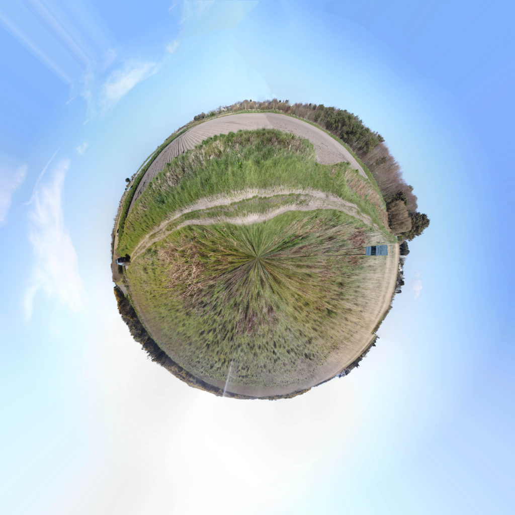
The above image was a collection of over 50 images taken in portrait covering 360 degrees. I like how smooth this planet came to be and I think this is a very successful attempt at a Tiny Planet as an experiment. I plan to carry on a do a few more. This one in particular was at Les Landes in the fields of St Ouen, this captures the calm and peaceful environment of life in the West. My only dislike is the distortion in the middle however I do not thing there is anything I can do about that.

Again, the above image was a collection of over 50 images taken in portrait covering 360 degrees just like the Les Landes planet. This one was taken on the cliffs at Grosnez where you can see the castle. I would not really call this one particularly successful. Yes it is a tiny planet and it did what I wanted it to do however, due to the nature of the location and subject matter, the planet comes across as being very squished and distorted and makes the subject difficult to recognize and the planet looks very strange and I do not believe it captures the nature of the area.
In conclusion, I think the Les Landes planet was much better than the Grosnez one because I think being on cliffs/by the sea on the Grosnez planet stops the planet being smooth and more circular and makes the image look a bit messy and too distorted for my liking.
During the late 1950s and early 1960s in New York City, the dominant art movements were Abstract Expressionism, followed by Pop art, then Minimalism. In the mid-1960s, a far smaller movement of individual artists producing realistic paintings related to photography began to practice their craft, also in New York. This was labelled as Photorealism. Photorealism artists’ work depended heavily on photographs, which they often projected onto canvas allowing images to be replicated with precision and accuracy. The exactness was often aided further by the use of an airbrush, which was originally designed to retouch photographs. Photorealism complicates the notion of realism by successfully mixing together that which is real with that which is unreal. While the image on the canvas is recognizable and carefully outlined to suggest that it is accurate, the artist often based their work upon photographs rather than direct observation. Therefore, their canvases remain distanced from reality factually and metaphorically. Many Photorealists adamantly insist that their works are not communicative of social criticism or commentary.
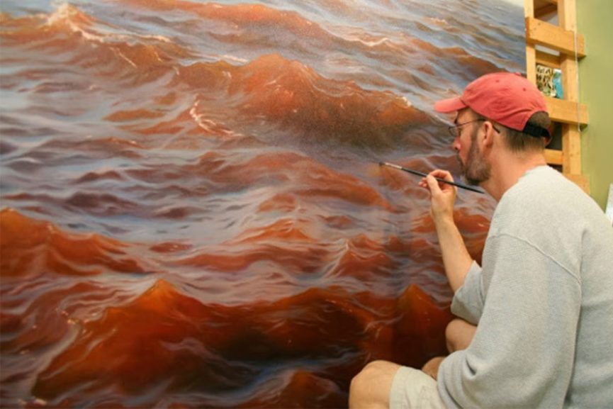

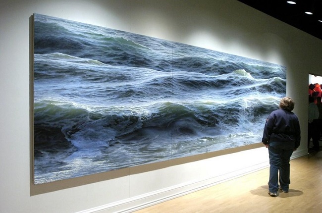
Since the origin of photography in the early-19th-century, artists have used the camera as a tool in picture making; however, artists would never reveal in paint their dependency on photographs as to do so was seen as “cheating”. In contrast, Photorealists acknowledge the modern world’s mass production and proliferation of photographs, and they do not deny their dependence on photographs. In fact, several artists attempt to replicate the effects of photography such as blurriness or multiple-viewpoints, because they favor the aesthetic and look. Therefore, while the resulting image is realistic, it is simultaneously one-stage away from reality by its dependence on the reproduced image. These works question traditional artistic methods, as well as the differences between reality and artificiality. The representation of light, as well as the interaction of light and color together has concerned artists throughout time. By using slide machines to project images onto bare canvas, Photorealism for the first time unites color and light together as one element. Furthermore, Photorealists, along with some practitioners of Pop art, reintroduced the importance of process and deliberate planning over that of improvisation and automatism, into the making of art, draftsmanship, and exacting brushwork.
MMichael Marten, born in London, has been involved in photography since he was a teenager. For his first job he was caption writer at the Camera Press photo agency. And in 1973 he was one of a group who published ‘An Index of Possibilities’, an alternative encyclopedia of ideas. Since 2003, Michael Marten has concentrated on landscape photogrpahy. His first major series was ‘Sea Change’ (2003-2012).

His series ‘Sea Change’, shows and excellent use of diptych (dictionary def: a painting, especially an altarpiece, on two hinged wooden panels which may be closed like a book), and trptych (dictionary def: a picture or relief carving on three panels, typically hinged together vertically and used as an altarpiece; a set of three associated artistic, literary, or musical works intended to be appreciated together). An example of a diptych in Michael Marten’s work is the image above of the Bedruthan Steps, Cornwall. An example of a trptych is the image below of St Ives, Cornwall.

He explores low vs high tides to see how it changes the landscape. He travelled to different parts of the British coast to photogrpah identical views at high and low tide, six or eighteen hours apart. His photographs revel how the twice daily rhythm of the sea flowing out (ebb) and the sea flowing back in (flood) can dramatically transform the landscape he was photographing
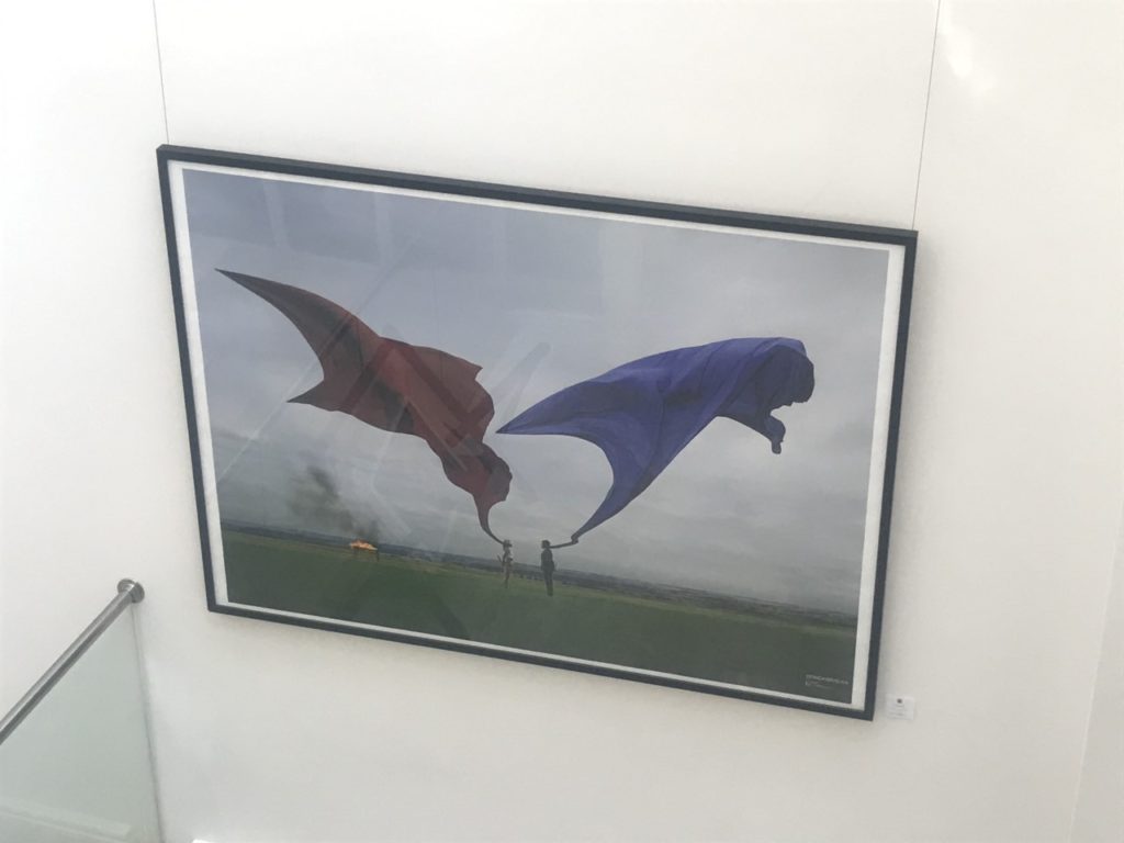

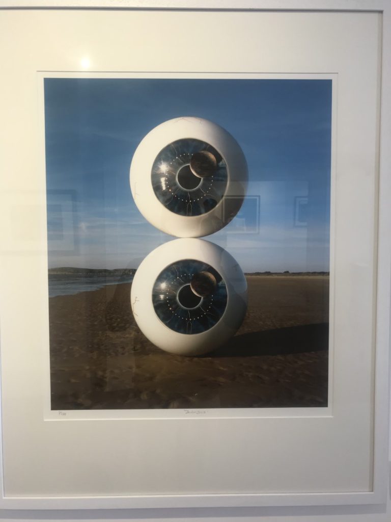
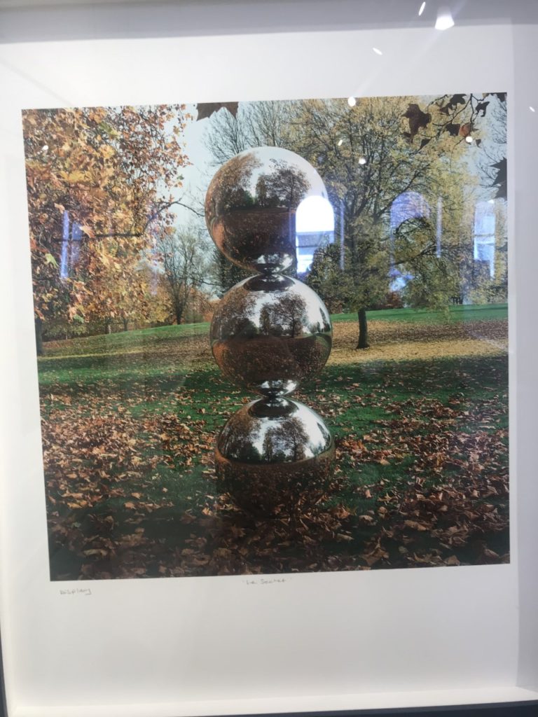
The CCA had an exhibition on musical links to photography, for example to top two images here are Biffy Clyro album covers. I really liked the bottom left image, it goes well with my circles topic but also it is very eye catching and well constructed.

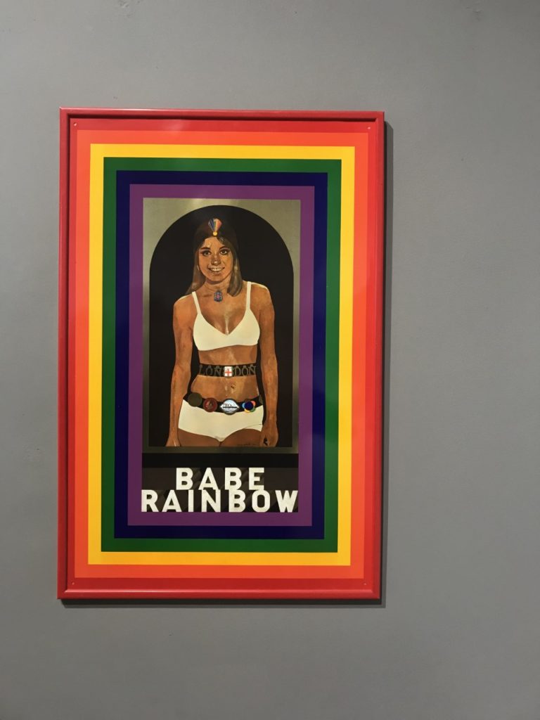
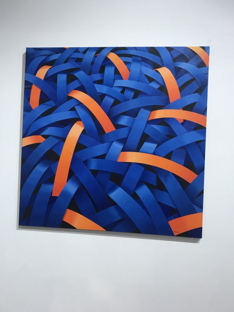

This was my first time to the Private Public gallery and I noticed that the work seemed more contemporary than the CCA’s. It was mostly art rather than photography but there were photographs around, whether they be manipulated physically or digitally. One image that interested me was the bottom left about Lily Langtree. Lily was a model/actress in the late 1800’s to early 1900’s from Jersey. She had a global fan base and this image was supposed to be the draft print for a postcard but it was so good that hey kept it. The artist has blown it up and digitally manipulated it slightly and printed it. The image on the top right was pop art and is of a woman who was a boxer or wrestler (something like that) and was able to easily beat men at their own game. The image is aimed to represent women as strong and able to be better than men at things women are stereotyped not to be able to do.