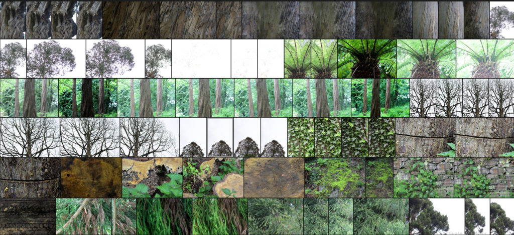
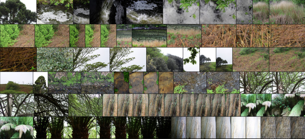
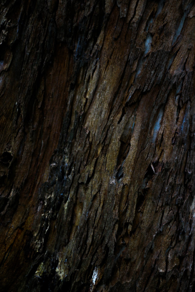
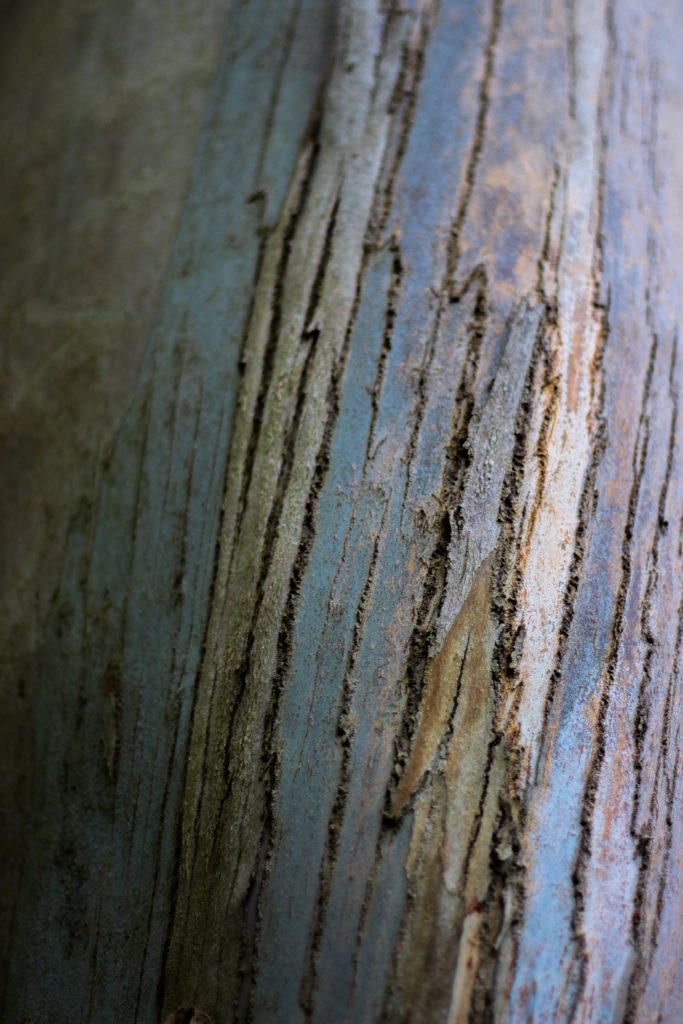
Category Archives: Research

Filters

Author:
Category:

Book Specifications

My topic in 3 words: Styles of abstraction

Topic described in a sentence: I will be exploring how three different categories of abstraction, colour, texture and pattern compliment and contrast each other when put together.

My Topic described in a paragraph: I will be looking at the topic of abstraction regarding three of the more dominant areas of it. I will firstly look at colour and the use of heavily saturated photography to isolate the subject from its surrounding environment. Texture is another theme I wish to explore through the almost unseen world present when looked at closer inspection and how natures pattern often are aesthetic and in huge variety. Lastly I will be looking at pattern and the idea of isolating once again a subject from its surrounding environment so that it becomes up to the viewers to interpret what it could be in regards to surface and look.

Design:

  • Look and feel: I would like a matte cover which would produce a photographic but card like feel which would really compliment the material being used for my overall design and theme.
  • Paper and ink: For the sleeve I would probably use printing ink to produce the title and author name, but within the book I would use glossy paper due to it producing a more detailed outcome.
  • Format, size and orientation: The format would be three portrait books due to me wanting them to be able to fit into sleeves, I would probably make the size of them relatively small just below the size of A4 paper.
  • Binding and cover: The cover would be the title of that topic of abstraction within the book such as saturated.
  • Title: Each book will have a different title regarding the contents which can be found inside.
  • Structure and architecture: The page layouts will mainly be one or two images to a spread with the occasional three images if I want to create the impression of a triptych.
  • Design and layout: Once again the pages will mainly have one to two images per spread with the occasional three or four
  • Editing and sequencing: I will be ordering the images into each book regarding which title they best fit into, saturation, texture or pattern. Each book will have the photos ordered into a way in which each compliment each other or have a greater overall theme.
  • Images and text: I would like to keep the book very minimalist and so possibly would just have the location or word saturation with its number such as #1 or #2

Photo book research

A photo book is a book in which photographs make a significant contribution to the overall content. A photo book is related to and also often used as a coffee table book.

Reymond Meeks – Halfstory Halflife

Halfstory Halflife is a book by Raymond Meeks an American photographer who is best known for his focus on memory and place, and captures daily life with his family and also the local youth. Meeks was documenting the local youth who adventure to the Catkill Mountain region in New York during summer breaks. Halfstory Halflife is a distillation of the photographs made in the shadows of these waterfalls, marked each summer by the exposure of young adults sat at a cliff both in space and in their lives.

The technical aspects to the very minimalistic layout consists of images embedded traditionally in the centre of each page with an opposing image on the next page both being A4 portrait orientation with a slight boarder round each image. For the most part, the images take up the whole A4 page however, there are some images which are A5 which are set to the right hand side of the page. I believe by having a variation of layouts throughout keeps the book interesting as it grandly becomes easier on the eye as your not consistently looking at the same layout all the way throughout the book.

As the book has a strong monochrome pallet throughout it creates strong contrasts and shadows within each images however due to the use of natural lighting, soft glares are seen on multiple images. These two factors create a strong juxtaposition due to the fact that it shows the darkness of the area and maybe their youth however the soft glare could contribute to the happiness in their lives and this location could be a spot for which allows them to proceed in being happy.

As the images are in black and white it allows for a more unrealistic interpretation of the images. I think this helps the viewer interpret these images in a different way and to connect with the pictures differently as we don’t view the world in black and white so it can be seen in an usual way. All the pages in the book are consistent, using the same style of white paper which juxtaposes with the images which alter each page with contrasting environments and a lack of colours. There are a total of 144 pages including the unused pages and a total of 78 images which is supported by a soft cover with a fold out jacket. To me, this photo book is essentially a narrative that projects the lack of youths happiness when exploring the environment, landscape today is bound up with a sense of the loss of natural space.

Deconstructing The Narrative of ‘Tal uf Tal AB’, ‘You Would’ and ‘Park Sleep’.

Book in hand: How does it feel?

The book’s cover and sleeve are created from card giving it a textures surface which feels dry to the touch, however the book itself is a more matte card surface giving it a smoother feel whilst adding a slight tint to the cover. This card texture is carried on throughout the layout of the book. The textured surface of the sleeve and book covers are repeated on each book.

Paper and ink: Use of different paper/textures/colour or B&W or both.

All of the paper inside the book are glossy matte textured being about the same thickness of ordinary photography paper. Within the book there are a few blank pages so that it adds breathing space when working your way through which adds to the overall effect of the photographers decisions. The only text is the ink which is in a small font in each corner of the pages to highlight what the title of each image is. The book overall is very consistent as there is a strong theme regarding composition and focus of the photographer throughout.

Format, size and orientation. Portraiture/landscape/square/A5, A4, A3/ number of pages.

The book itself it is a A3 size, slightly smaller than an A4 sheet of paper with an effective use of negative space throughout due to there being borders to each image boxing them in a result. This compliments his photography as the photos become easier to focus on especially as there are more dominant portraits within. Its hard to say how many pages there are due to there being no page numbers, but I would guess there are about 50 pages per book.

Binding, soft/hard cover. Image wrap/dust jacket. Saddle stitch/swiss binding/Japanese stab-binding/leperello.

The books use a paper card cover without any dust cover on due to there being no need through the use of sleeves. This as a result makes the book more visually pleasing as when opening it it directly links the cover page into the photography.

Title: Literal or poetic/relevant or intriguing?

Overall the titles seem to be more poetic rather than literal due to how the content inside each hardly reflects what the title suggests, instead being more around a different theme of family or location life in specific locations.

Narrative: What is the story/subject matter: How is it told?

There seems to be no narrative in the books but rather small sub sections where a few page spreads will be portraits with the next ones maybe be landscape shots or images about home life. This theme continues throughout the three individual books.

Design and layout: Image size on pages/single page, double-spread/images/grid, fold-outs/inserts:

Each photo inside the book tends to be the same size regarding whether it is landscape or portrait, with portraits tending to take up the entire page and the landscapes taking up about half of a page.

Editing and sequencing: Selection of images/juxtaposition of photographs/ editing process:

The images inside each book seem to have little editing done to them as each seems like they have come straight from the camera with in-camera editing techniques like low or high exposures. As a result of this the results seem to be more literal, portraying the photographers vision literally.

Images and text: Are they Linked? Introduction/essay/statement by artists or others. Use of captions (If any).

The books lack text as there are no page numbers or information about where the photographs are taken. However in each bottom corner of every page there are the titles of the photos present on each spread, this is complimented by the very occasional use of speech dialogue which can be seen on some pages which seem to depict a conversation between two random people.

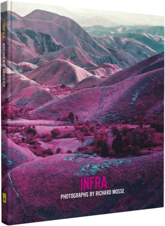
Photobook Study | Infra

71sac2LwNzL

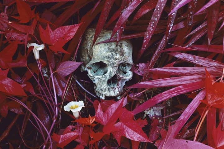
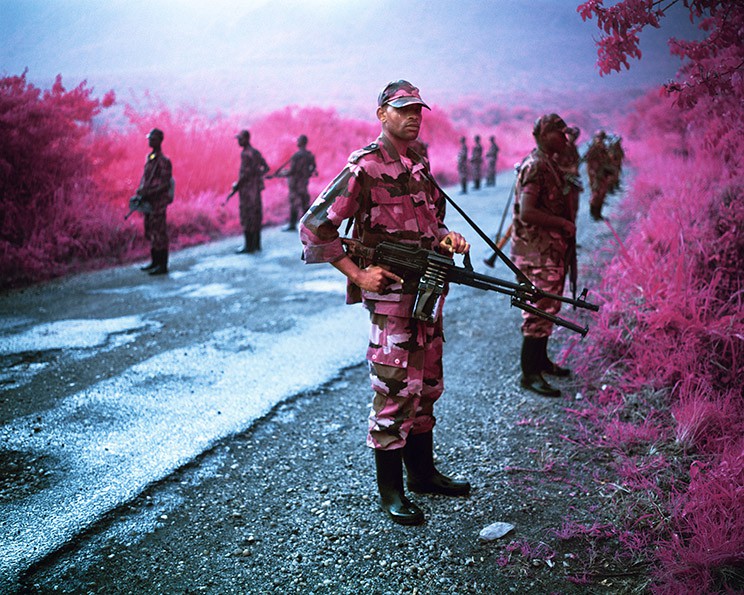
Infra, Richard Mosse’s first book, offers a radical rethinking of how to depict a conflict as complex as the ongoing war in the Democratic Republic of Congo. Mosse depicts the rich topography, inscribed with the traces of conflicting interests, as well as rebel groups at war with the Congolese national army (itself a patchwork of recently integrated warlords and their militias). For centuries, the Congo has repeatedly compelled and defied the Western ideology. Mosse brings to this subject the use of a type of color infrared film called Kodak Aerochrome. Originally developed for military reconnaissance and now discontinued, it registers an invisible spectrum of infrared light, rendering the green landscape in vivid hues of lavender, crimson, and hot pink. The results offer a fevered inflation of traditional reportage, underlining the growing tension between art, fiction, and photojournalism. Mosse’s work highlights the ineffable nature of current events in today’s Congo. Infra’s photographic dialogue begins as an intoxicating meditation on a broken genre, but ends as a haunting elegy for a vividly beautiful land touched by unspeakable tragedy.

Image result for richard mosse infra book
Image result for richard mosse infra

Mosse’s photo-book ‘Infra’ was one I found very eye catching and appealing to me. I became instantly interested in his story and his images were compelling and told the story of his time in the Congo without using a single word. My book however is not following the same approach, my book aims to make people see the world in a different way and maybe be more observant of the world around them and circles are a shape that you can see everywhere, but nobody really takes notice. That is one similarity this book has with my idea, that nobody takes notice of the conflicts etc in countries we find ‘insignificant’ to us.

Image result for richard mosse

Richard Mosse (born in Kilkenny, Ireland, 1980) holds an MFA in photography from Yale University School of Art, and additional degrees from Goldsmiths, London; King’s College London, and the London Consortium. His work has been widely exhibited internationally, including at the Palais de Tokyo and the Tate Modern. In 2011, Mosse was awarded a John Simon Guggenheim Memorial Foundation Fellowship, with a supplemental stipend from the Leon Levy Foundation. Mosse is represented by Jack Shainman Gallery.

3-DIMENSIONAL PRESENTATION

Letha Wilson:

http://concrete.keenonmag.com/19/

Letha Wilson is a mixed media artist who was born in Honolulu, Hawaii, raised in Colorado, and currently lives in Brooklyn, New York. Letha Wilson is known for combining photography with industrial materials like concrete and steel. Wilson cuts, tears and shapes her photographs, pushing and pulling the prints into place and then encases portions of the composition in cement. Using architecture and three-dimensionality as both frame and armature, Wilson reclaims the photographic image, exploring the medium’s inability to encompass the site it represents.


“MY ARTWORK INVESTIGATES RELATIONSHIPS BETWEEN ARCHITECTURE AND THE NATURAL LANDSCAPE, AND THE NAVIGATION OF BOTH URBAN AND WILDERNESS SPACES.”


Felicity Hammond:

https://www.bjp-online.com/2017/10/felicity-hammond-ipa-2016

Felicity Hammond is an emerging artist who works across photography and installation. Fascinated by political contradictions within the urban landscape her work explores construction sites and obsolete built environments. In specific works Hammond photographs digitally manipulated images from property developers’ billboards and brochures and prints them directly onto acrylic sheets which are then manipulated into unique sculptural objects.


“THE WORK DOESN’T JUST COME OUT OF MY IMAGINATION. IF I AM GATHERING ALL THESE IMAGES AND RETURNING TO THESE LANDSCAPES AGAIN AND AGAIN, I’M ENGINEERING THE OUTCOME THAT BECOMES HYPER-REAL. MY WORK DEFINITELY COMES FROM MY MEMORY, AND THE SIGNS AND SYMBOLS I CREATE; A SPACE FOR MOURNING, TRAGEDY AND MORE.”


Triptik Photo-book Inspiration – Robert Frank

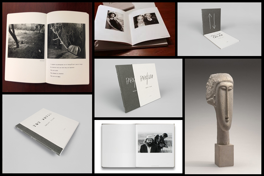
Before going a head and creating my three photo-books I decided to look at a photographer who had produced work in a style that was vaguely similar to the outcomes I desired. The books I found to be particularly inspirational were ‘You Would’, ‘Tal Of Tal AB’ and ‘Park Sleep’, what drew me to the designs in particular where how each was encased inside a brown cardboard folder which fitted the dimensions of each book perfectly. For me this was an idea I wanted to explore as I previously had aimed to produce the three books and store them in a hand-made sleeve so that could be viewed collectively but viewed individually. When looking over the books I found what drew me to them was their minimalist covers which only contained the title and authors name against a predominantly plain backdrop of textured grey card, this was very effective in regards to the book cover being a darker version of the grey which compliments the actual cover which as a result produces the impression of the binding of the sleeve being different. Some pictures of the books can be seen below:

Who is he?

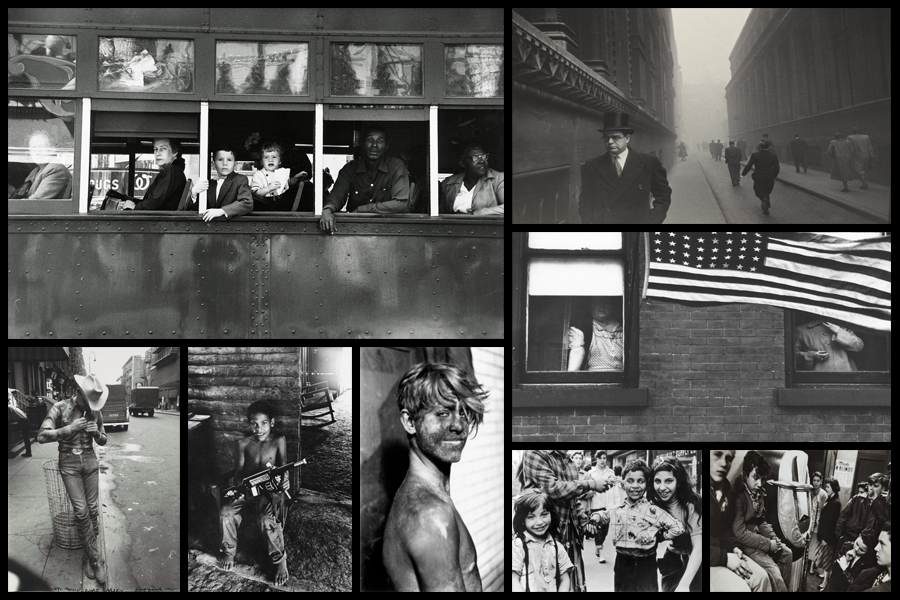
Robert Frank, born November 9, 1924, Zurich, Switzerland, Swiss American photographer and director who was one of the most influential photographers of the mid-20th century, noted for his ironic renderings of American life. Frank became a professional industrial photographer at the age of 22 and in the 1940s became a successful fashion photographer for Harper’s Bazaar magazine in Paris. He felt, however, that the scope of the work was too limited. He abandoned fashion photography about 1948 and went to the United States and then to Peru to explore the expressive possibilities of the 35-mm camera. After photographing in Europe in 1950 and 1953, Frank returned to the United States. Between 1955 and 1956 he drove across the country, taking a number of photographs. Of those, 83 were ultimately published as The Americans, 1959, a French-language version, Les Américains, had first appeared in 1958. Photographs such as Chicago, 1956 in The Americans revealed Frank’s mature style, which was characterized by bold compositions and ironic, sometimes bitter, social commentary. Their publication established Frank as a major creative photographer, and the book was widely hailed as a classic. Examples of his photography can be seen below:

When making my books I would like to explore the use of composition carried about by using singular images over a two page spread which add to the overall effect of any image you want to exaggerate or over-emphasize. For me personally I would like to incorporate mono-printing to produce the cover of my sleeves, this is because of how it would create a newspaper effect where the font thickness and size would be inconsistent and slightly faded, which as a result produces an ink collage effect.

Before ordering and making the book I would need to consider the colour of both the sleeve and books front, this is because of how I want them to be colour coordinated so that they both compliment and contrast each other which creates a more aesthetic result.

Abstract Texture Shoot #2
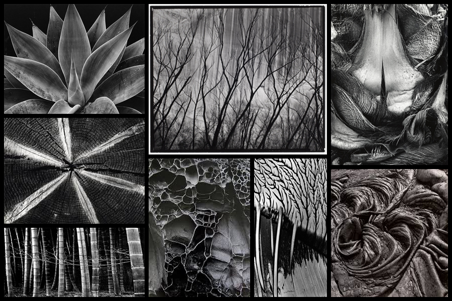
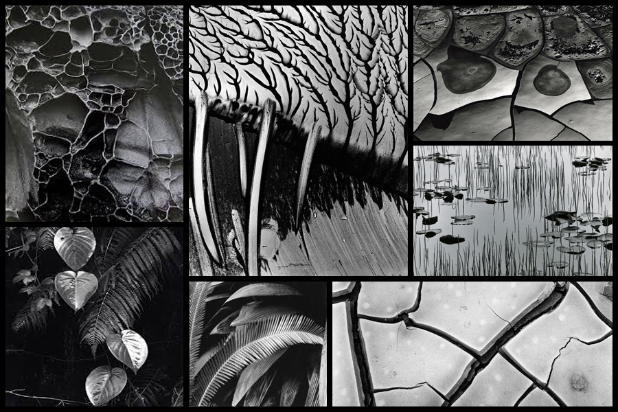
For this shoot I wanted to focus on the idea of abstraction through pattern especially in nature and the urban world. I really liked the idea of basing my photography around capturing everyday scenes of subjects in a new light which highlights the unseen patterns which are present in our everyday lives and the structures of things around us. A photographer I have looked at which I have got particular inspiration from is Brett Weston, someone who has devoted to focusing on natures pattern and the unseen world around us. The images that I found to be more inspiring were his images based around plantation and occasionally the effects of humans on the landscape such as footprints and man made intervention into the natural environment. His skills that I wanted to be able to transfer were surrounding his effective use of a low exposure to create a more dramatic scene surrounding everyday things through exaggeration of shades and tones. Some examples of his work can be seen below:

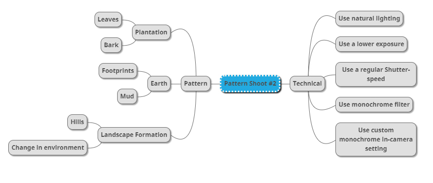
Once I had looked over some of his photos that I found were particularly inspirational for my shoot and its aims I then decided to go onto produce a mind-map. By making a mind-map it would allow me to jot down ideas and aims for the shoot and what I wanted to over achieve, this would also cut down on time wasted on the shoot as I would have a goal of what to produce on me and how to take it with it all the time directing my aims. Here are some of my ideas that I wish to use on the shoot:

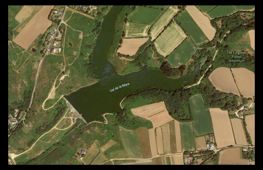
The place I have decided to take the images is called Val De La Mare due to its variety of different textures which can be found alongside the water and the trees. A map of the location can be seen below:

Here are the results of the shoot:

After finishing my shoot I decided to go onto edit the shoot down to only ten images, by doing this it would allow me to identify which were the images that were most effective from the shoot and reflected my intentions the most. Here are my decision on the top ten images of the shoot:

Once I had selected the ten images I then decided to go onto whittle them down once again to only five, by doing this it would allow me to further identify the images which were most effective from the shoot due to analysis in more depth, whilst also making it easier for me to choose an image which best sums up the entire shoot. Here are me selections:

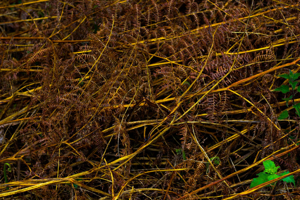
I chose this image because I loved the overall sense of the browns which came through the decaying grass. For me the crushed plants added a cool texture which highlighted the contrasting yellow stalks compared to the rest of the brown leaves. What I particularly liked was how the leaves all faced one direction, allowing for a smoother look to the overall image due to how it all seemingly moves in continual way. Overall I found that the piece did relate to the topic of texture, however I was not too pleased with the outcome as I didnt think it carried enough contrast to emphasize the darkness.

What I really liked about this image was how the green leaves overlapped the darker grain of the wood below. When looking over the image I really liked how the leaves almost presented themselves as a frame for the grainy texture of the wood, preventing it from becoming a present throughout the image and turning into a eye-sore for viewers. As a result of this I found that the contrasting yellows which are emphasized in the wood through saturation really brings more tone into the photo due to it add variation to the texture and overall colours present in the photograph.

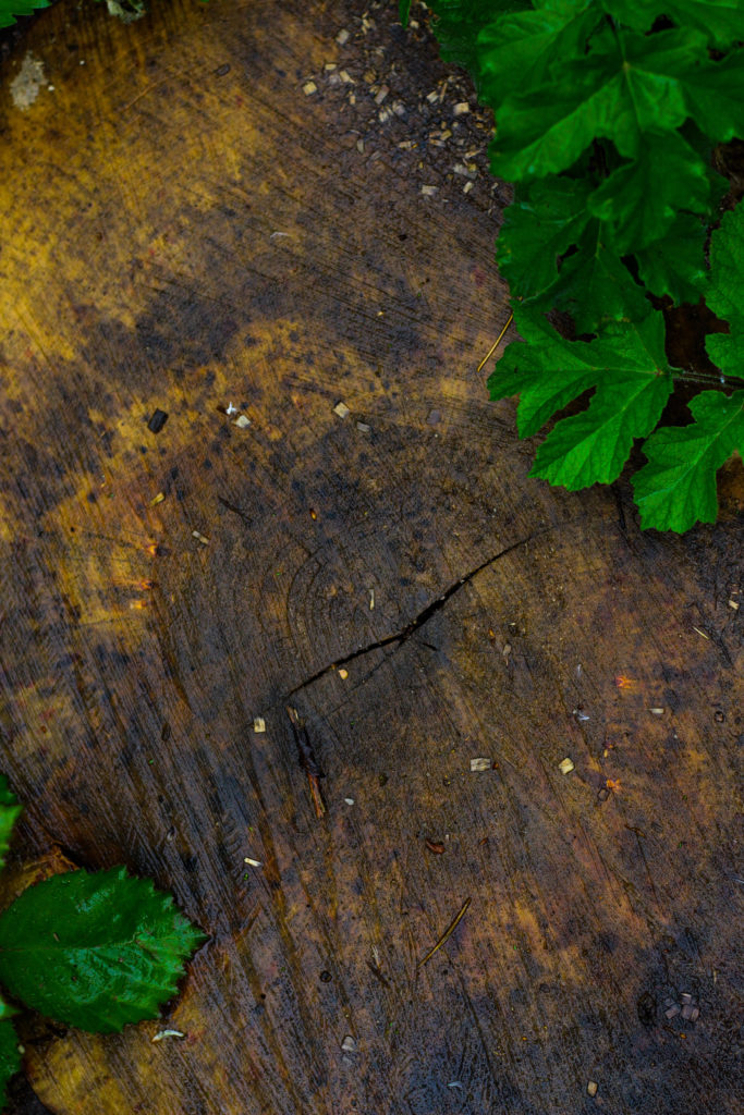
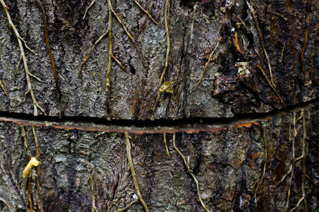
I chose this photograph because of the unusual line which had been cut across the base of the tree trunk. For me this added an extra sense of abstract to the piece due to the surface texture of the wood being disrubted by the cut mark making its way across the entire composition. What I found complimented this was the dying ivy growing down the side of the trunk, for me the lighter brown from this added that bit extra to the piece as it prevented a continual same colour presence throughout, instead breaking it up and adding variety. Overall I was really happy with the composition of the piece due to its unusual element through the cut, with the ivy and the different bark textures adding a much needed variation to the overall piece.

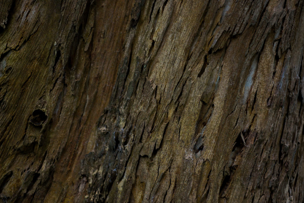
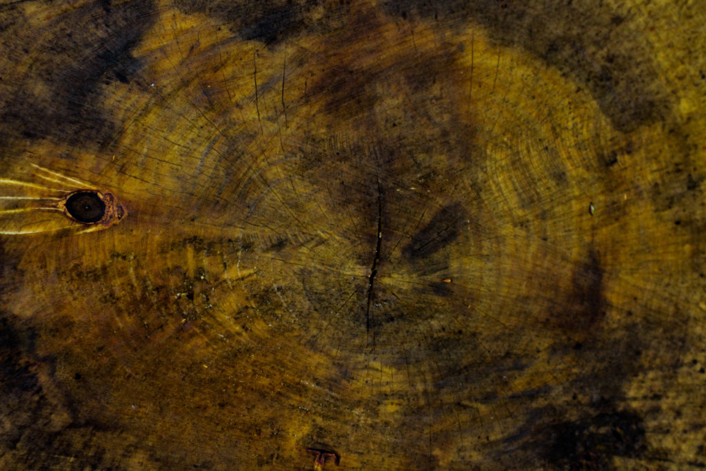
The reason I selected this image was because of it high contrast which highlights the grain and unseen colours really well. For me personally I really liked the variety of different browns and yellows present within the photo as it presents viewers with a different perspective regarding cut wood on a wet day as textures not previously seen are revealed when more closely observed. The grain knot I found broke up the composition and prevented it from becoming too overpowering and generic due to how the added black becomes an instant focal-point for anyone looking at the picture for the first time. As a result of this I am quite happy with the result due to how it provides an unseen insight into the textures present on trunks which previously would be unseen unless further inspected.

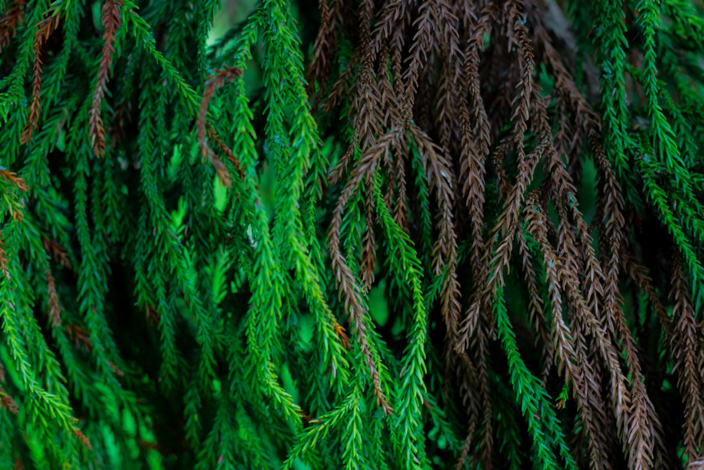
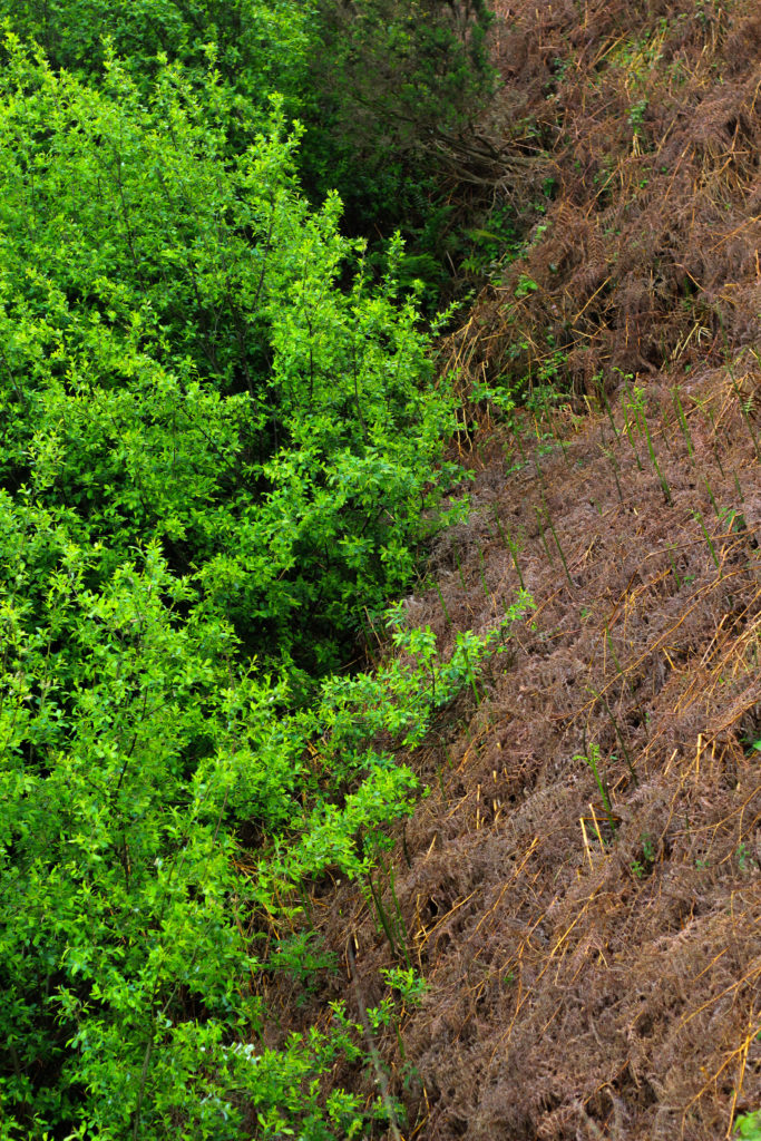
Finally I chose this because I think it really well summed up the idea surrounding the topic of texture through both its green and brown leaves branching out. Because of this I really liked the contrasting dead and lives leaves together as the texture stays the same but rather the colour changes, as a result of this I think it adds a much needed extra bit of texture due to it stopping the otherwise dominant green from becoming too much and detering the viewer. When looking over the image in regardings to the topic of texture, I found that it related well, however I was not too pleased with the overall outcome due to it lacking contrast behind the leaves which would have made it more defined.

Once I had looked at each image in more depth I decided it was time to move onto picking one image to sum up and represent the entire shoot. To do this I would have to consider looking at its visual aspects whilst also its conceptual ones and how well it related to my intentions and overall aims:

Overall when looking over all the images I found this one to be most effective regarding the topic of abstract textures. This was mainly due to the unusual cut mark made across the base of the trunk which for me added an extra sense of abstraction due to it looking a bit surreal and mysterious. This was complimented by the dying ivy which I definitely thought added that needed break between the continual texture and colour of the wood and the dark cut. For me I thought this image was executed the best due to how it represented my initial aims of the shoot whilst also taking into consideration my topic title of abstraction through texture (seen through isolating the subject from its surrounding environment).

Paul Graham

In End of an Age, British photographer Paul Graham captures the threshold moments that mark the ending of adolescence, the small slice of time between youthful indulgence and the emerging awareness of adult responsibilities. His photographs resonate between these two poles: between full-on consciousness and escape; between seeing the world with shocking clarity and the desire to hide oneself from that reality. It is a situation that each of knows and remembers all too well, a traumatic time. And it is often the threshold of a profound psychological transformation.

“It is a time when things are deeply felt, when you appear to see things very clearly, sometimes with brilliant intensity, and you believe passionately in what you can achieve, but then you also have to escape from that, to let go, to unburden yourself…The visual duality of the work reflects that duality in life – between the power of stone-cold reality and the need to escape that: get drunk, turn away, close your eyes, get stoned.” – In an interview with the author of ‘Paul Graham’ published by steidlMACK

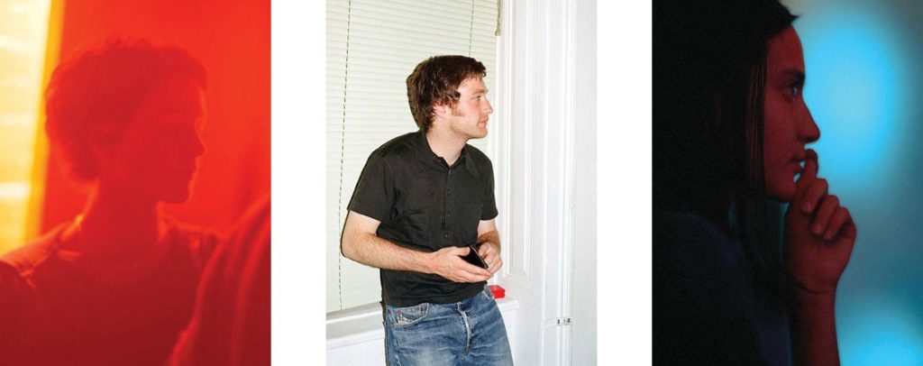
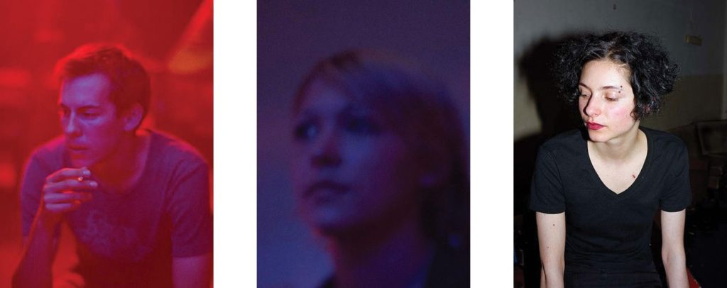
The photographs alternate between ultra-sharp direct flash images where every detail is minutely recorded, and the opposite extreme, with loose available-light photographs, saturated with colour, blurred and sometimes poorly focused. These compelling colour images are portraits in the fullest sense – images that seek to reflect on the inner self through our material presence.

When he made the pictures for End of An Age Graham was between 39 and 42 years old, whereas the young people in his pictures were around 17 to 27. His work looks back at the pleasures and discomforts of youth now consigned to the past. Although some appear to be photographed in social situations (the lighting often suggests clubs and bars), the exact locations, individually and collectively, are deliberately withheld.
“I think it’s better that I withhold the location. Anyone can see that these are young, white, First-World westerners, but beyond that, it’s best to keep it non-specific and more universal. The minute I say that these pictures were taken in Stockholm or wherever, everyone will say “Oh, so this is how young Swedes are today,” or “It’s a portrait of young Sweden,” and that’s not the point. I want them to go far beyond any national identity. It’s not Stockholm and it’s not a documentary about young Swedes. It could be anywhere from Germany to Ireland, to the UK, to Spain, to parts of the US.” – in ‘I Blame Elvis’, an interview with Jenefer Winters.

Surprisingly, Graham did not use colour filters for the pictures: “the colour casts come from the available lighting…red or ultra-violet, yellow or green, just whatever light is there, uncorrected.” Subjects also appear to move through a gradual 360-degree turn, a dance-like spin or pirouette. This hints at the question of what is being hidden, the pressures of coming to adulthood and the feelings associated with change itself.

Image Analysis

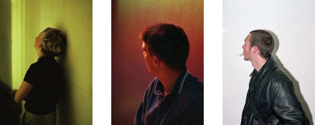
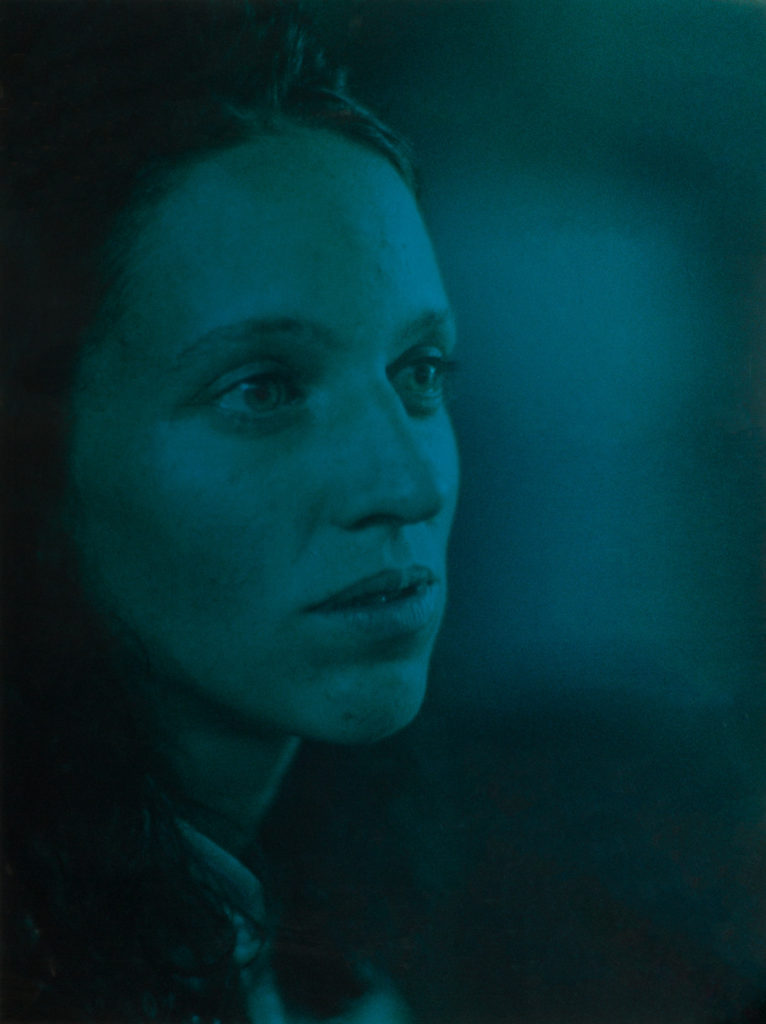
This image depicts a young woman with her face angled, as if looking off into the distance. It is unclear if the photo is staged, or candid, yet the emotion on her face still comes through. Graham composes this image to feature negative space across the right side, this suggests the nightlife environment as she is surrounded in colour. The left side of her face becomes blurred into the background, as her youth becomes associated with this atmosphere.

The colour is not overwhelming as it is not highly saturated nor highly contrasted. This allows the viewer to recognise and relate with the subject’s facial cues.

End of an age evolved from an idea Graham had in 1995 based around a common photographic ‘mistake’, the red-eye reflection so familiar from amateur snapshots. His book opens and closes with images that embrace these ‘errors’: extreme close-ups of young peoples faces with glowing red orbs floating against rough-grained skin tones. He achieves this grain in his images by using highly sensitive ISO’s.

In a way, Graham is using a documentary approach to showcase the lifestyles of the youth, yet he does this in a more minimalistic style, choosing not to present the environment, leaving the emotional strain of growing up to be shown through the facial distinctions on his subjects faces. The relationship he has with these subjects is interesting due to the age gap, signifying the strong difference between the life of the youth and the older generations.

“I was in this city on and off for two years and some of these people became good friends of mine who I know very well and remain in contact with. These people I photographed many times over, whereas others are complete strangers who happened to be standing by me, and I took a picture, and I’ve simply no idea who they are.”

Artist Reference – Brett Weston

Who is he?

Brett Weston war born 1911, Los Angeles, the second son of photographer Edward Weston. Brett was removed from school at a young age to become his father’s apprentice in Mexico, this surrounded his by revolutionary artists of the day such as Tina Modotti, Frida Kahlo and Diego Rivera, not only did this influence his but also presented his with a striking contrast to life in Mexico but as also where he first started taking photos with a small Graflex. This introduction that Brett was shown and the work of the painters unintentionally influenced his sense of form and composition, this quality of design was evident in Brett’s early images of organic and man-made subjects. Here he started to appreciate how the camera transformed subjects close up and how the contrast of black and white altered further the recognition of the subjects. Overall it is not hard to understand his attraction to focus on abstraction dye to the characteristics he was influenced by would allow him to be uniquely identified with throughout the rest of his career.

Weston later returned to California in 1926, and Brett continued to assist him in his Glendale portrait studio whilst exhibiting and selling his own photographs at the same time. From the age of seventeen a group of his images were included in the German exhibition ‘film und Foto’, considered to be one of the most important avant-garde exhibitions held between the times of the two World Wars. Because of this his received great recognition which brought Brett international attention and inclusion in various photographic exhibitions in the following years. Although his art will always be linked with his father’s it is unfair to say that his photography is imitative of Edward’s beyond the early years as he produced an enormous body of work over the seven decades. Some examples of his work can be seen below:

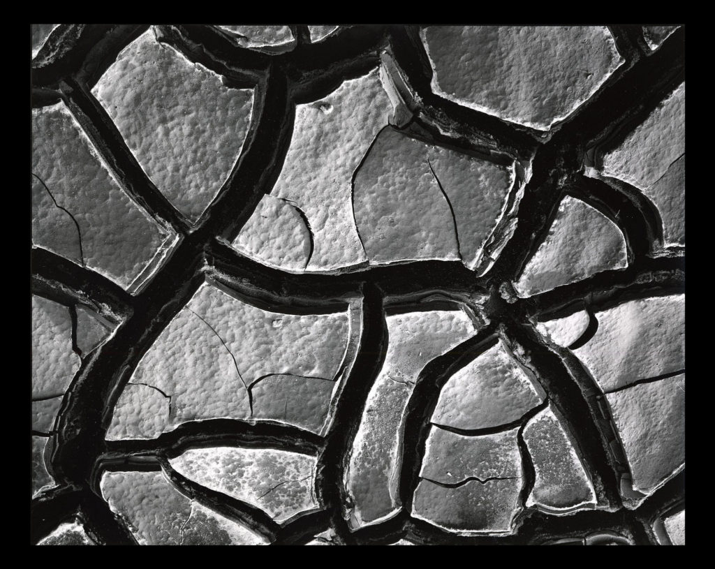
After looking over some of his images I decided that I would go onto look at one specific image that I thought would best reflect my intentions for my future shoot based around abstract patterns. The image I have chosen is called ‘Mud Cracks’ and was taken 1966 highlighting the patterns found in everyday things such as mud. Here I will go onto look at things like visual, technical and contextual aspects which would allow me to further my knowledge regarding techniques used and the style of photography created.

Visual:

Visually the piece is quite simplistic in the sense that the photo is of a piece of mud, however its when upon further inspection that there are cracks which form patterns across the mud, something the every-day eye would miss unless focused upon. For me the piece is extremely aesthetic due to how the tones used across the composition are varying grays with the only real shades coming from the cracks which allow separation in the image which prevents the outcome of pure mud becoming too overpowering. To stop the mud becoming too much Weston has made sure to include smaller cracks within the cracks of mud to add variation to the photo whilst stopping a continual generic surface from occurring across the entire image.

Technical:

When looking across the image it is clear to say that a slightly lower exposure has been used so that the darkness in between the cracks is highlighted above the rest of the image which due to sunlight is a lot lighter and therefore becomes the focal point. It looks like a higher shutter speed has been used to capture crisp detail of the mud as you can clearly see the lumps and grooves present on each slab of mud whilst there being no evidence of motion blur whatsoever. Weston has made sure to include a clear fifty fifty ration between mud and cracks which stop one or the other from becoming too overpowering and stopped the effectiveness of the other.

Contextual:

The aim of the piece is meant to create the subject and present it in an unrecognizable fashion, devoid of sentimentality. There is meant to be a sense of a lack of human presence and narrative making it unclear of what the photographer is trying to express. The composition is not amazing and the angle is wrong, however this is the aim of the photographer who could argue that the aim of modern photography is so that the image is only partially aesthetic. These concentrated images share the high-contrast and graphic qualities of Weston’s panoramas while emphasizing his affinity for “significant details” and the unprecedented attention to form, texture, shadow, and light that he explored throughout his nearly-seventy-year career.

VARIATION – PATTERNS

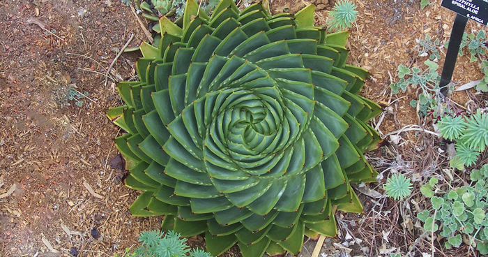
The variation of patterns within nature on plants, flowers, tree bark, and forming on water are diverse and show the fascinating visual details of the natural world. One artist who looks at patterns of nature in a compelling way is Adrienne Adam, a fine art photographer. Her up-close photographs of plants, flowers, trees, sand and the ground explore the varied colours, forms, shapes, thicknesses and sizes of the subjects she photographs, furthermore fulfilling the idea of natural beauty that surrounds these natural forms.

Adrienne Adam

Adrienne writes on her website that the art of seeing for her is a spiritual practice by which she empties her mind of the business of life in order to be fully present and available to her surroundings. Most of the images she makes are intimate landscapes showing the subtle and unique patterns and textures… the magic found in nature. When making images her intention is to show the Spirit of nature. The degree to which she is successful at capturing the essence and energy of the subject on film is directly proportionate to the degree to which she is fully present with the subject that catches her eye. Adrienne considers herself a “student of light“– always standing on the edge of confidence in her exposures. “Light is as subtle and ever-changing as the wind. It is tangible and yet illusive.” For this reason, the images she makes are all exposed in available light so they are a study of how this element shifts and dances on the surface of a tree, of the water, of our lives. The images Adam’s presents are made with either the medium format 500CM Hasselblad or digital Nikon D300 cameras. Regardless of which camera or lens she uses. her intention is to isolate a small part of a scene in a way that tells the entire story of the big picture. During the selection process she chooses images that best represent the spirit of the original subject or scene in terms of color, contrast and mood. When Adams uses film, the “selects” are scanned and guide prints are made.  The guides are returned to her to determine accuracy of the scan as-well-as for cropping purposes. In the case of images made with the D300, she makes the color and size adjustments herself. Once this process is complete the images are ready for print on a variety of papers and alternative media.


“AS I SEE IT, THE CREATION OF PHOTOGRAPHIC ART HAS TWO PRIMARY ELEMENTS – THE ART OF “SEEING” AND THE ART OF “CAPTURING” WHAT IS SEEN ON FILM.”


When seeing and technical knowing are aligned I am fortunate enough to “capture” the Spirit of Nature on film and share it with others. More importantly, I have become a better person and my life is filled with the understanding of what photography and nature teaches me… “Be conscious and notice the abundance and magic of life in every moment.”