After reading the initial brief of the project these are the artists/ art movements/ ideas that have come to mind.
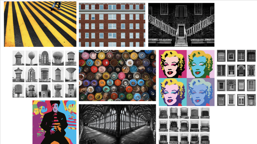
Repetition, Pop art, Typologies and Symmetry
After reading the initial brief of the project these are the artists/ art movements/ ideas that have come to mind.
Repetition, Pop art, Typologies and Symmetry

John Baldessari was a leading Californian conceptual artist. Painting was important to his early work, but by the end of the decade he had begun to introduce text and pre-existing images to create riddles that highlighted some of the unspoken assumptions of contemporary painting. In the 1970’s, he abandoned his interest in painting and began to make a diverse range of media, though his interests were based on the photographic image. Conceptual art has shaped his interest in exploring how photographic images communicate. However, he works with light humor and materials and motifs that reflect the influence of pop art. He works with pre-existing images, arranging them in a way to suggest a narrative. He seems to distort his images – from cropping the images, to collaging them with unrelated images, to blocking out faces and objects with colored dots; this all forces us to ask how and what the image is communicating.

The image above is part of Baldessari’s approach to conceptual art during the 1970’s. This photo is of 6 people who seem to be dressed smart and professional. The image portrays normality, as it is a simple image of 5 men and 1 women that are staring out the window. Baldessari liked to incorporate into various features into his work, such as leaving us with questions about what the image is communicating and showing or trying to tell us. This aspect of the photo, where all the models seem to all be bunched near the slanted window creates this sense of uncertainty and leaves us wondering what are they all so attached on looking at? What is so interesting about what they can possibly see out the window? Additionally, Baldessari was interested in using parts of pop art in his work, as well as collaging his images with unrelated art or other images to block out objects or faces (as he has done in the image above). He has made these models faces invisible – so we don’t know what they look like, what their facial expressions are displaying, if they are talking with each other or where they are looking. Instead, he has used coloured dots to cover their faces which is similar to aspects of pop art, such as artists like Roy Lichtenstein and Andy Warhol., who use small coloured dots to make up their images. Again, this makes the us as an audience of his work, consider all these different factors that he his hiding from us. This is what makes his art and photographic images so intriguing, and why I was influenced to do something on a similar level to Baldessari.
Hiroshi Sugimoto is a Japanese photographer and architect. He was born in 1948 in Tokyo, Japan. In 1970, Sugimoto studied politics and sociology at Rikkyō University in Tokyo. He retrained as an artist in 1974 and recived his BFA in Fine Arts at the Art Center College of Design, Pasadena, California. He later settled in New York City and soon started working as a dealer of Japanese antiquities in Soho.
He has spoken of his work as an expression of ‘time exposed’ or photographs that serve as a time capsule for a series of events in time.
In 1980 he began working on an ongoing series of photographs of the sea and its horizon, Seascapes, in locations all over the world, using an old-fashioned large-format camera to make exposures of varing duration (up to three hours).
The black-and-white pictures are all exactly the same size, bifurcated exactly in half by the horizon line. Many of his images lack any physical detail which would make the objects of his photographs easily distingushable , instead, he strongly focuses on lighting and textures in his work.

This photo has been taken using natural lighting while being carefully positioned in order so that the horizon in the middle of the photograph. This taken rule of thirds seems to have been considered in terms of the shading differences in the background and foreground. There is a large tonal range of grey, where there is a gradual shade change, from the darkest point along the bottom of the image and the lightest being at the top. There is a very short depth of field considering that the photo is mostly blurred from the fog. However the foreground of the image is the only part to be in focus and where textures can be seen from the small ripples in the sea, although it is very still. The dark, grey/blue tones bring a cold temperature to the photograph along with the low light sensitivity where we can just about see the horizon in the middle of the image. Although the image is blurred and obscure there are no rounded or curved shapes. Everything is very straight but there are no outlines.
Sugimoto’s image brings a sense of romanticism in their evocation of landscape, related to Ansel Adam’s approaches to photography. This image shows how he sees nature. Sugimoto has said: ‘When I look at nature I see the artificiality behind it. Even though the seascape is the least changed part of nature, population and the resulting pollution have made nature into something artificial’.
Possible responses could be:

DEFINITION = Conceptual art is art where the idea (or concept) behind the work is more important than the finished art product/object.
It emerged as an art movement in the 1960s and the term usually refers to art made from the mid-1960s to the mid-1970s. When an artist uses a conceptual form of art, it means that all of the planning and decisions are made beforehand and this has greater importance that the artists final outcomes. Conceptual art can be anything – the overall visual aspects of conceptual art may be confusing, misleading or it could be boring or interesting. The reason that it became an art movement is because of its intriguing features – many people look at conceptual art and wonder why an artist has displayed something in this form. There are many artists that had made conceptual art, but it was only defined as a distinct movement in an article written by Sol LeWitt in 1967. The link attached shows many of the artists that have formed conceptual art, and many of their exhibitions. Some of these are Bruce Nauman, Martin Creed, John Baldessari and Bernd Becher and Hilla Becher. They all take approaches to this that have influenced many other artists and artworks. For example, Bernd and Hilla Becher focus their work on typologies.
Variation and Similarity is the given title for our exam. I In this post I will be showing my understanding of this title as well as looking at ways in which I can explore it.
A change or slight difference in condition, amount, or level, typically within certain limits.
A different or distinct form or version of something.
Difference, Contrast, Variant, Form
My understanding of the word variation is that features or characteristics can vary massively between subjects and so give these subjects different characteristics.
The state or fact of being similar.
A similar feature or aspect.
Likeness, Sameness, Parallel
My understanding of the word similarity is that two things that have similarities have many things which are somewhat parallel to each other and so have things in common that are comparable.
Modernism
” Modernism was generally based on idealism and a utopian vision of human life and society and a belief in progress. It assumed that certain ultimate universal principles or truths such as those formulated by religion or science could be used to understand or explain reality. Modernist artists experimented with form, technique and processes rather than focusing on subjects, believing they could find a way of purely reflecting the modern world. ”

Modernism in art and photography was very showing things and portraying scenes in the way the photographer / artist thought they
Post-Modernism
“Post-Modernism collapsed the distinction between high culture and mass or popular culture, between art and everyday life. Because postmodernism broke the established rules about style, it introduced a new era of freedom and a sense that ‘anything goes’. Often funny, tongue-in-cheek or ludicrous; it can be confrontational and controversial, challenging the boundaries of taste; but most crucially, it reflects a self-awareness of style itself.”


Sources:

This image of Sugimoto’s expresses his style. Evidently, the black and white theme continues but he uses animals instead of people or objects as his subject. In the image, Hyenas, Jackals and Vultures appear to be fighting over something, likely a kill. This fighting is a fine line where life meets death, the kill itself is represents the dark side of that spectrum. The weather also plays a vital role in exposing this theme which is only emphasized by the black and white. The horizon marks the border between the light and the dark, the margin that represents the border between life and death.
Despite the image being constructed post shoot, it looks very real and to the viewer, it creates a sense of fear perhaps and an exaggeration of the line between life and death. Visually, the image stands out by being unique and interesting with its wild subjects however the composition of the image itself increases the image’s likability. Being black and white, the image attracts a nice contrast between light and dark, linking to the theme of life and death that we see in the subject matter. Further,more, the sky has little structure and retains a rather smooth texture yet the shading adds a real depth to the image and almost sets the brightness of the entire image and creates an effect making the image appear brighter yet still having a meanness to it.
This image, despite using fake subjects, is quite a fascinating image when it comes to the taking of the image itself. It could appear that Sugimoto put himself in danger being so close to wild predators. He captures a lot of lives in that image and that fact even further expresses how fragile that can be as they fight over a kill. I would think that he used a wide angle lens at quite a close range, maybe only 5-10 meters from the subjects. I would believe he used a faster shutter speed and a medium ISO to capture the birds flying perfectly still but also having the light in the image to light the foreground but not too much to have the background (sky) to be over-exposed.

sources:
Hiroshi Sugimoto is a Japanese born photographer, who first began taking interest during his time in highschool. Although Sugimoto studied Politics and Sociology at university level in 1970, he decided to ratrain in 1974 and recieved a BFA in Fine Arts at the Arts Centre College of Design.

Sugimoto describes his work as an expression of time exposed photographs which act as a time capsule for a series of events in time.
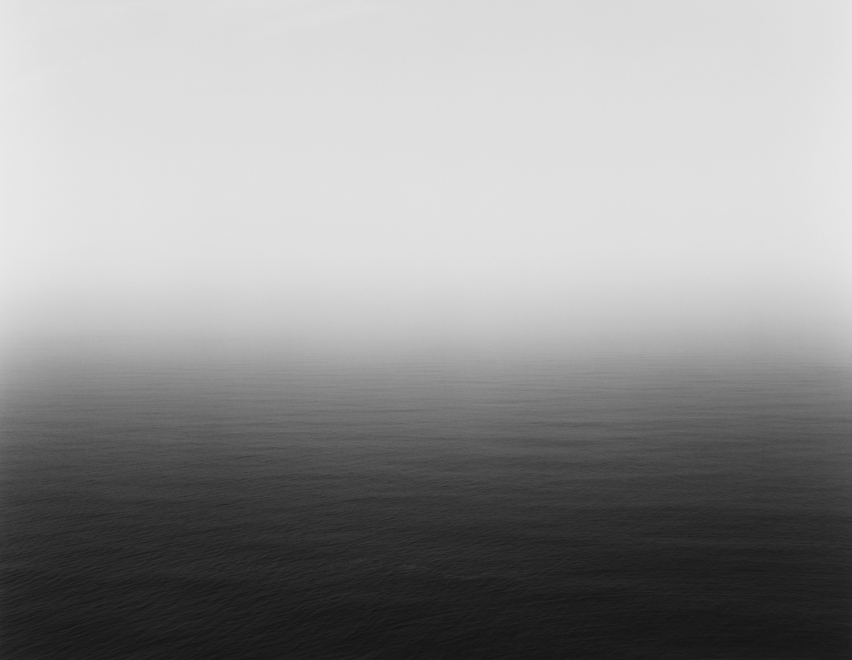
Many of Sugimotos photos lack the physical detail which would allow the photos objects to be distinguished, and instead strongly focuses on the lighting and textures. Sugimotos photos do not follow a certain pattern, and his images do not specify the subjects in which we are looking at,suggesting that he follows the surrealist movement.
Sugimoto produces a vast amount of his images using a large 8×10 format camera on a long exposure, creating the blurred effect that some of his images have.