The Play photoshoot was a photographic response to the work of famous artist John Baldessari.
The Play photoshoot was a photographic response to the work of famous artist John Baldessari.






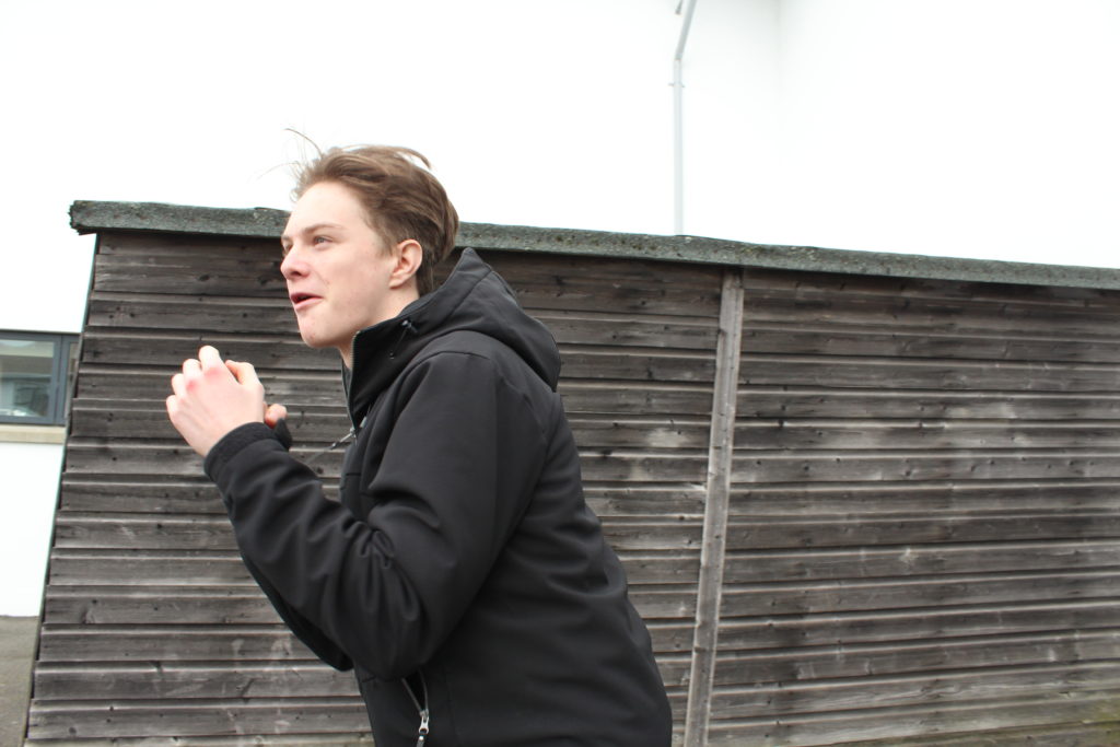
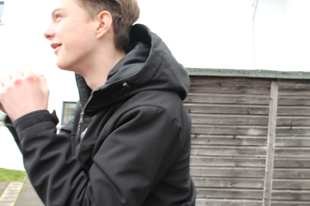
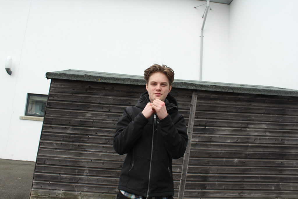
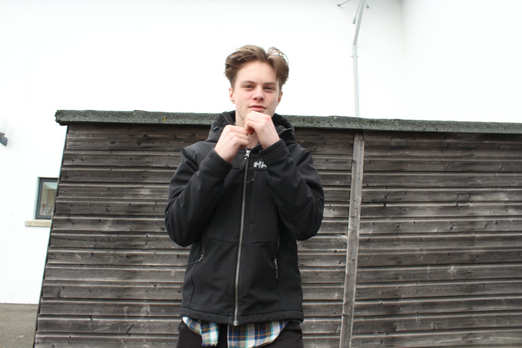
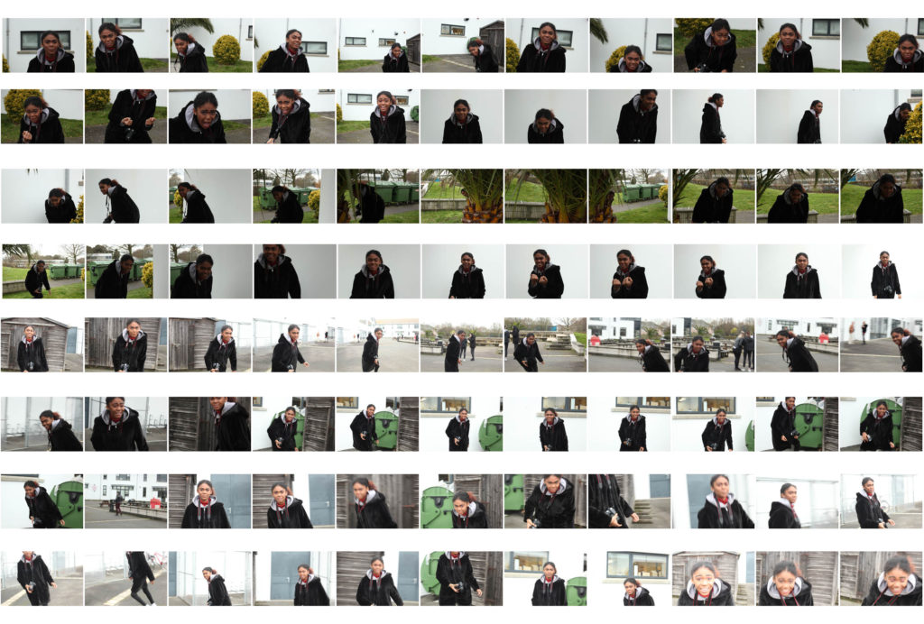
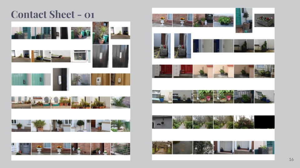
Photoshoot contact sheet





























































Sources:


Who is he?
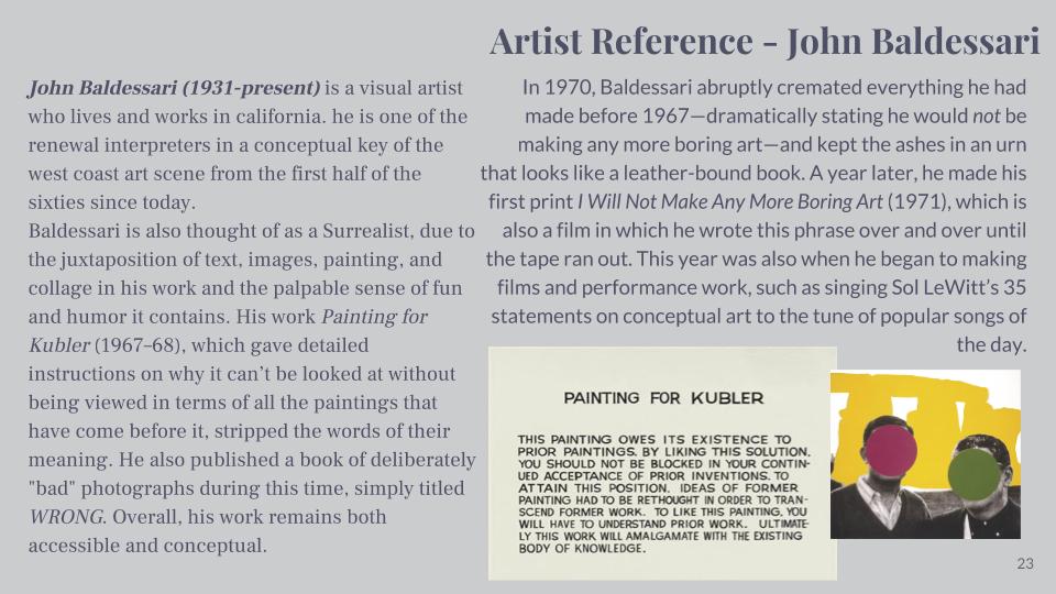
John Baldessari is renowned as a leading Californian Conceptual artist. Painting was important to his early work: when he emerged, in the early 1960s, he was working in a gestural style. But by the end of the decade he had begun to introduce text and pre-existing images, often doing so to create riddles that highlighted some of the unspoken assumptions of contemporary painting – as he once said, “I think when I’m doing art, I’m questioning how to do it.” And in the 1970s he abandoned painting altogether and made in a diverse range of media, though his interests generally centered on the photographic image. Conceptual art has shaped his interest in exploring how photographic images communicate, yet his work has little of the austerity usually associated with that style; instead he works with light humor, and with materials and motifs that also reflect the influence of Pop Art. Baldessari has also been a famously influential teacher. His ideas, and his relaxed and innovative approach to teaching, have made an important impact on many, most notably the so-called Picture Generations, whose blend of Pop and Conceptual art was prominent in the 1980s.
Baldessari first began to move away from gestural painting when he started to work with materials from billboard posters. It prompted him to analyze how these very popular, public means of communication functioned, and it could be argued that his work ever since has done the same. He invariably works with pre-existing images, often arranging them in such a way as to suggest a narrative, yet the various means he employs to distort them – from cropping the images, to collaging them with unrelated images, to blocking out faces and objects with colored dots – all force us to ask how and what the image is communicating.A crucial development in Baldessari’s work was the introduction of text to his paintings. It marked, for him, the realization that images and texts behave in similar ways – both using codes to convey their messages. Text began to disappear from his work in the early 1970s, and since then he has generally relied on collage, but his work has continued to operate with the same understanding of the coded character of images.
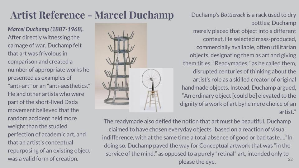
Typically, he collages together apparently unrelated categories of image or motif, yet the result is to force us to recognize that those images often communicate similar messages.On a visit to the Metropolitan Museum in New York in 1965, Baldessari was struck by the use of unpainted plaster to fill in missing shards of Greek vases. This prompted his interest in how images are effected by having portions removed or blotted out, and he has continued to explore this ever since. Often, the result of his alterations to photographs is to render them generic, suggesting to us that rather than capturing a special moment, or unusual event, photographs often communicate very standardized messages. Here are some examples of his works:
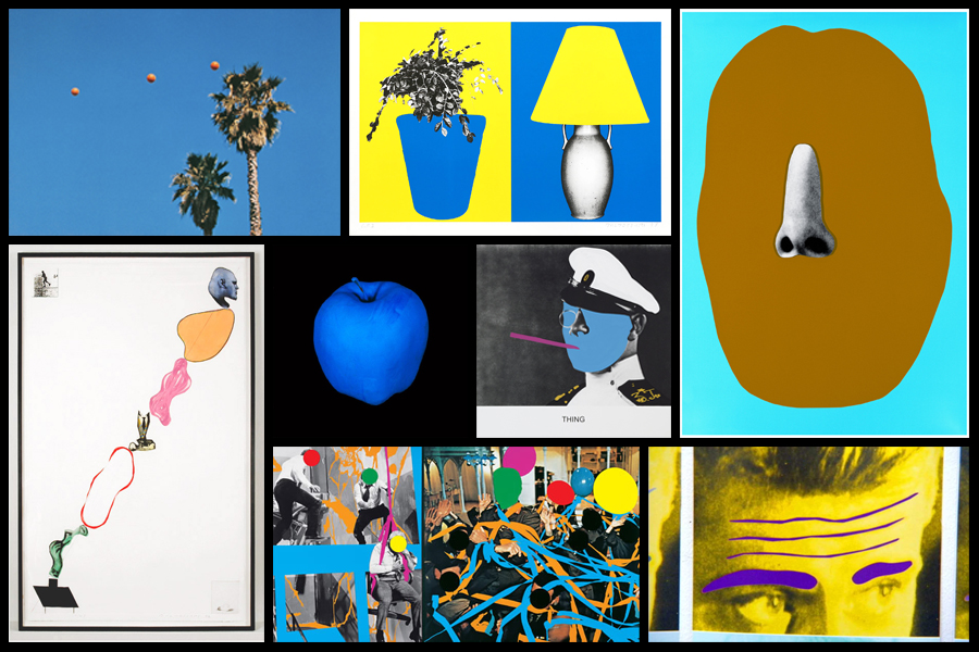
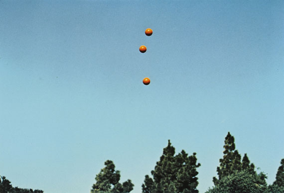
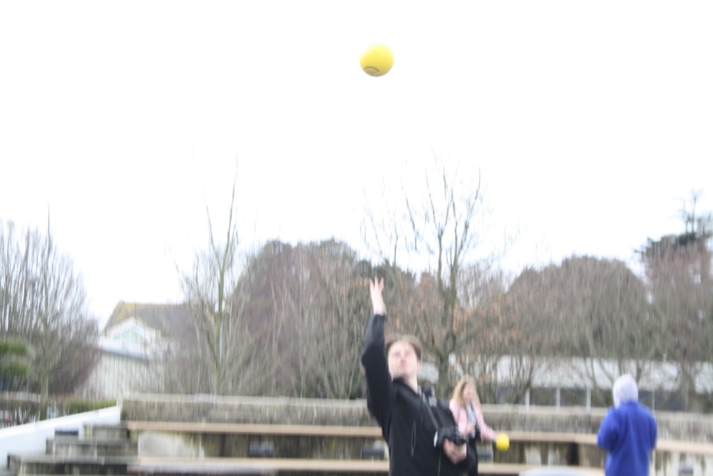
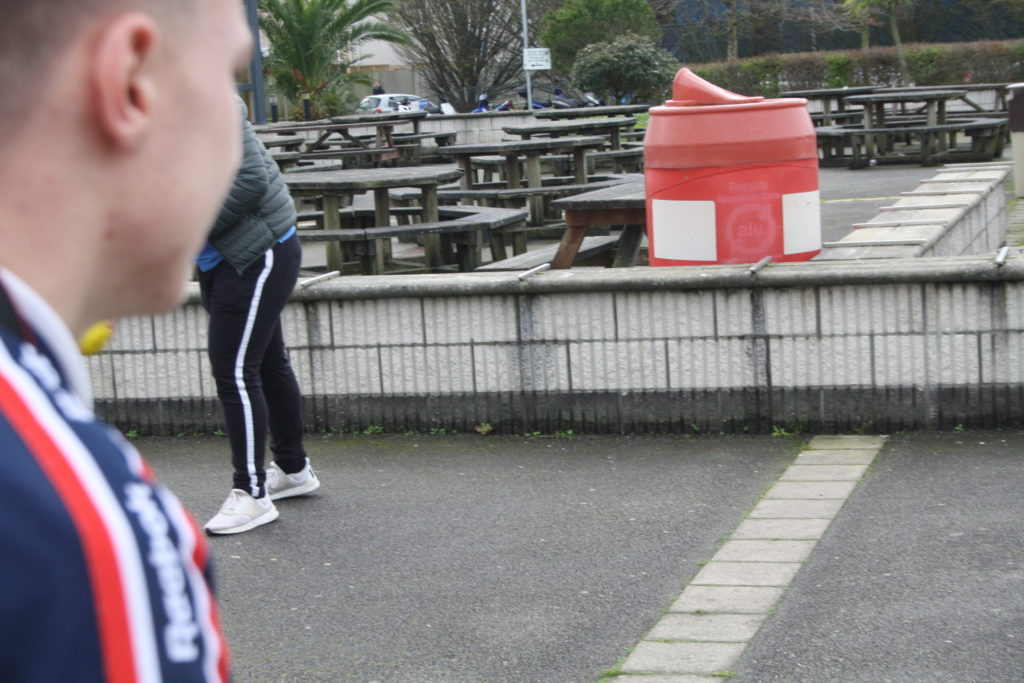
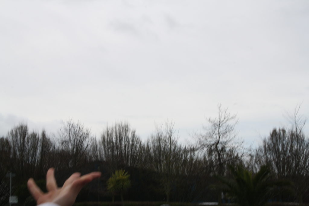
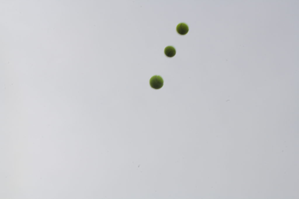
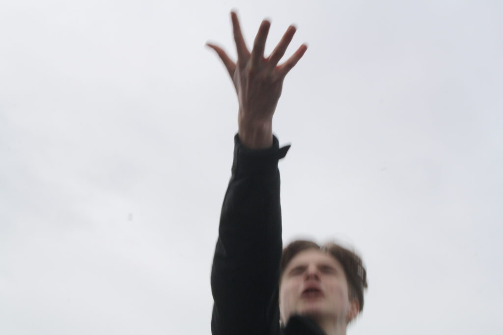
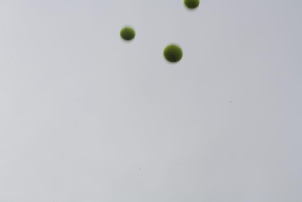
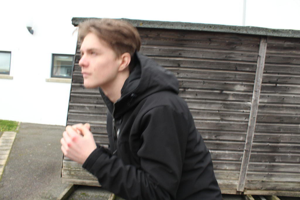
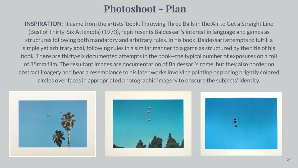
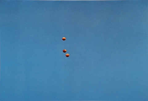
After looking over some of his work I decided to create a response to the project he worked on called Throwing Three Balls in the Air to Get a Straight Line. This project attracted me because of how bizarre and unique it was, using the formation of randomized ball positions in the air to create ‘art’. I then proceeded to make a response to this by throwing various balls in the air and attempting to capture them mid-flight, using only the backdrop as the main form of contrast in the photo. I would also experiment with shutter speed where I would try to capture other moving subjects, here were my results:

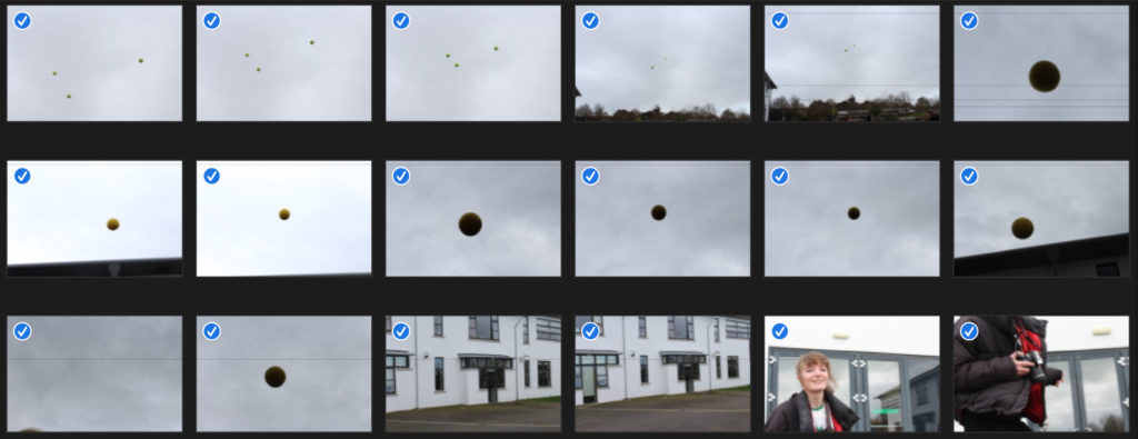

Once I had completed this task I decided to pick out the three images that I thought best reflected what I wanted to experiment with, here were the results:
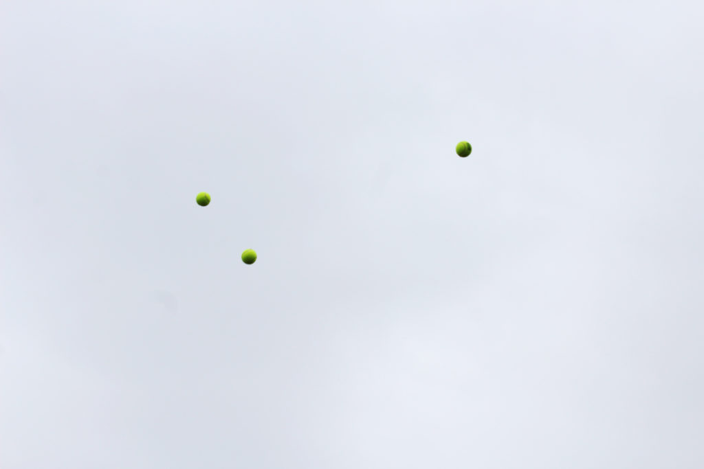
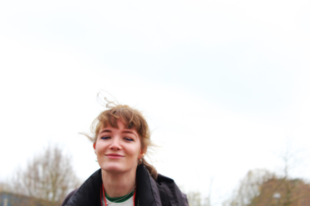
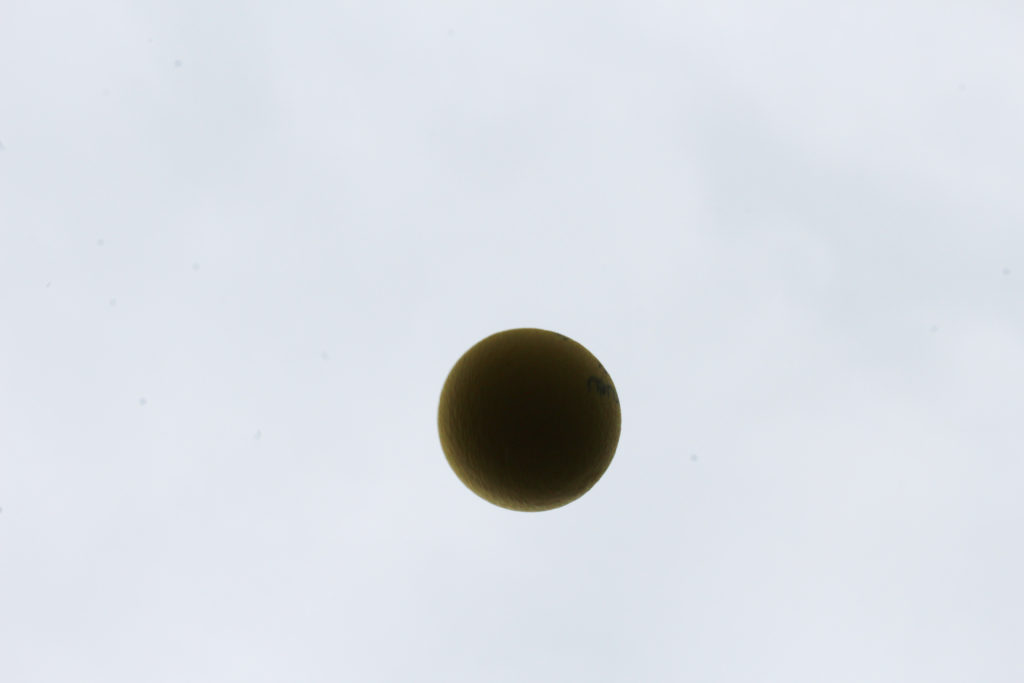
I really liked the idea of capturing a subject mid movement as it allowed for a new stance of photography I had not previously explored. In future shoots I could look at things like birds mid-flight or people and shadows, this would open up opportunities for further abstraction of the environment photographed as by incorporating moving things it could bring the image into life.
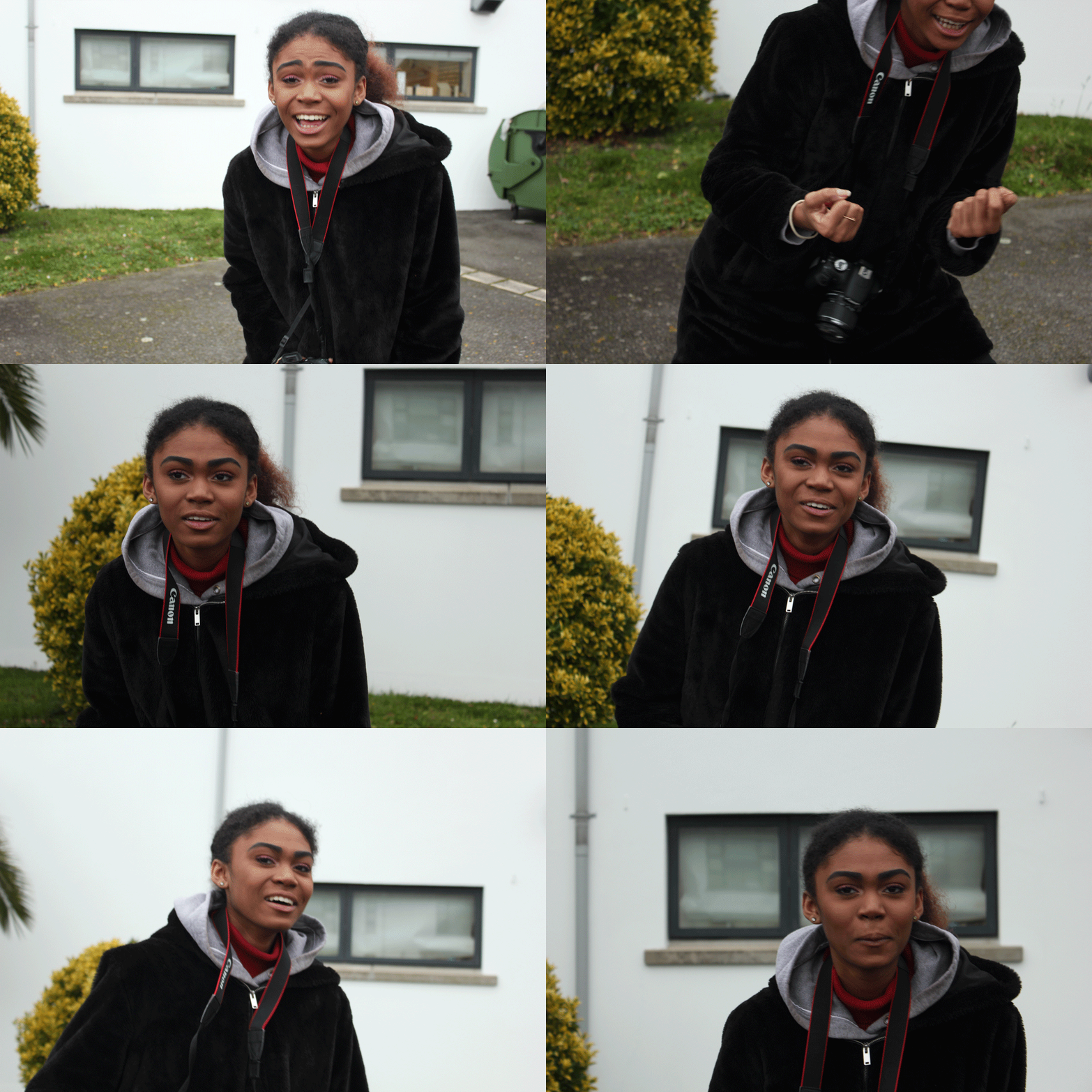
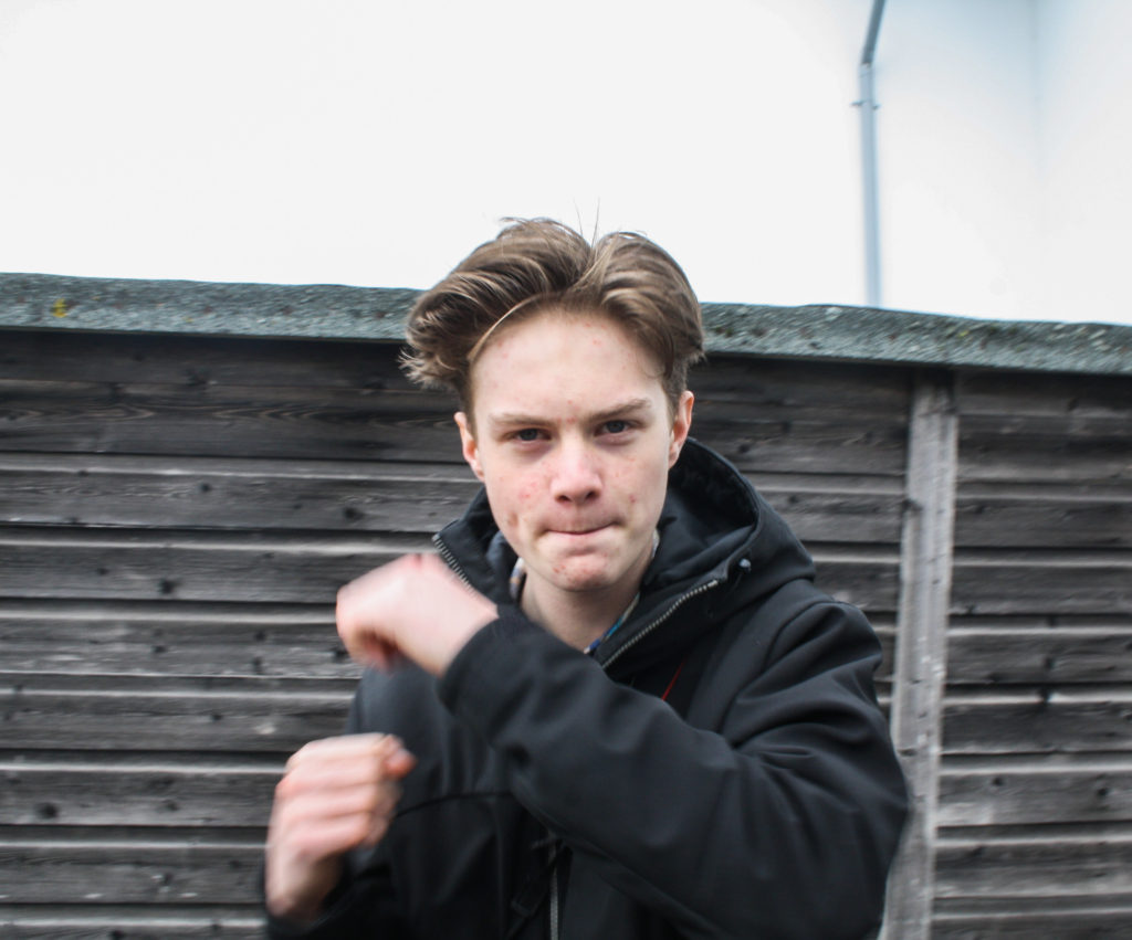
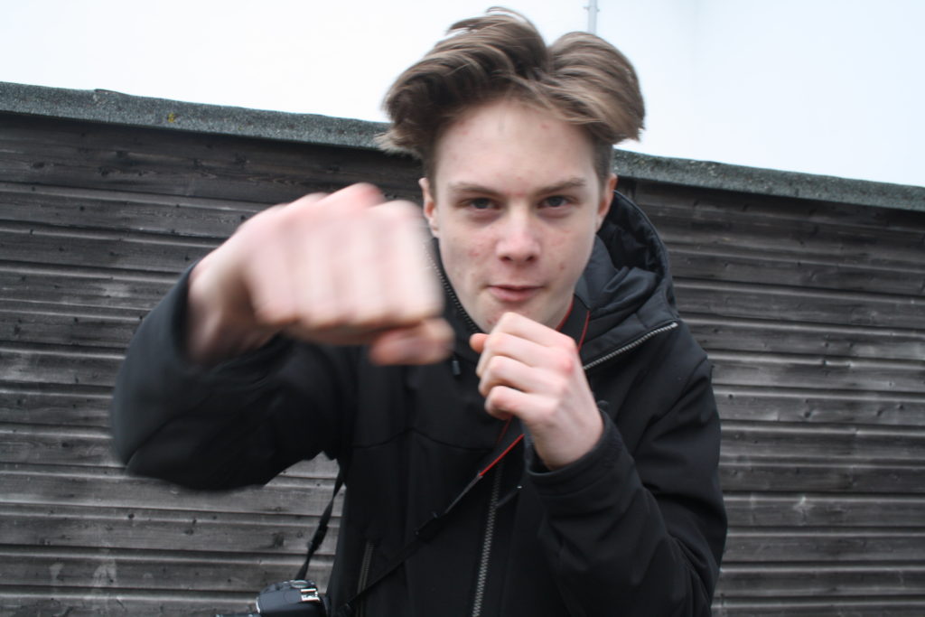
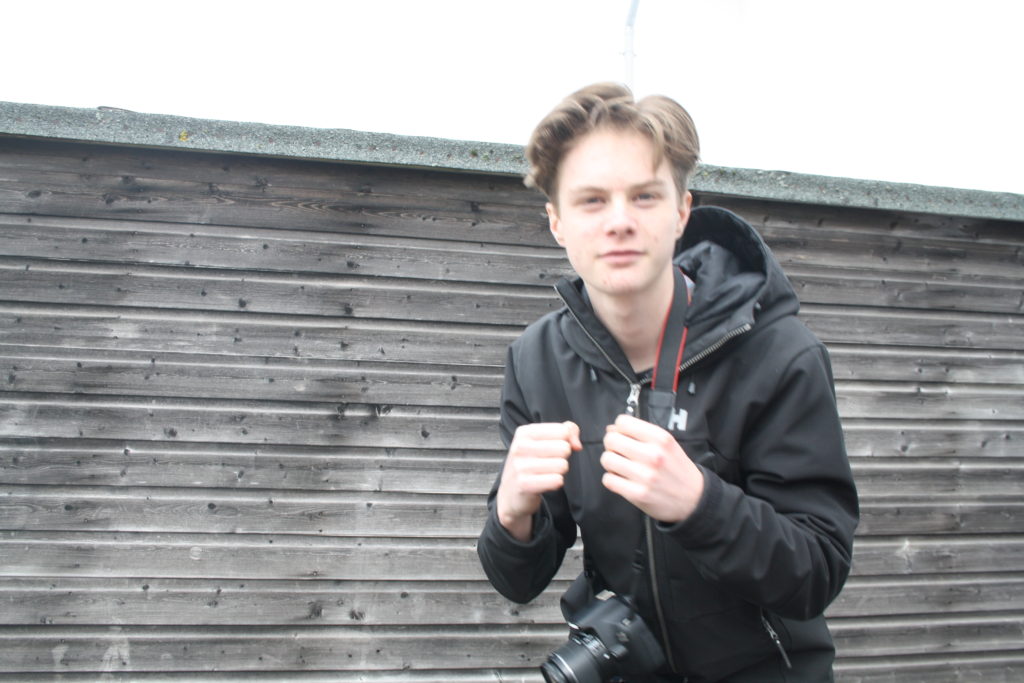
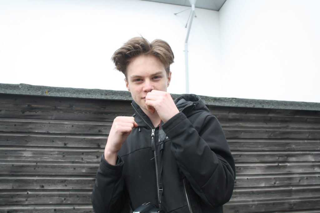
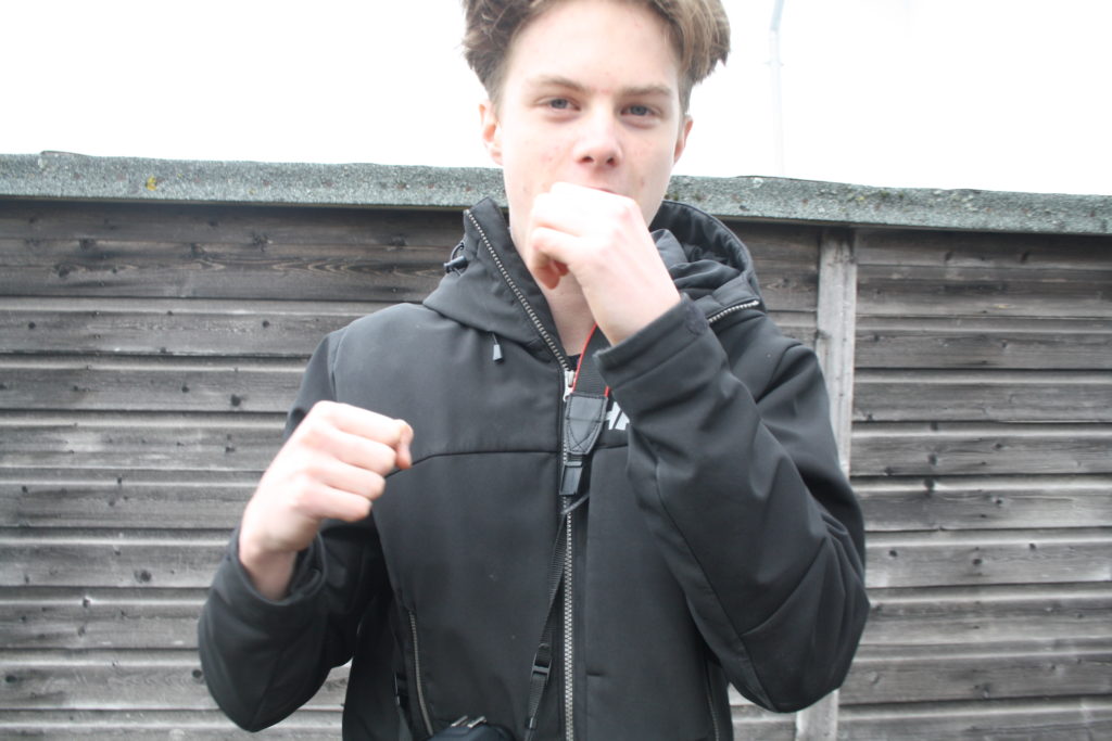
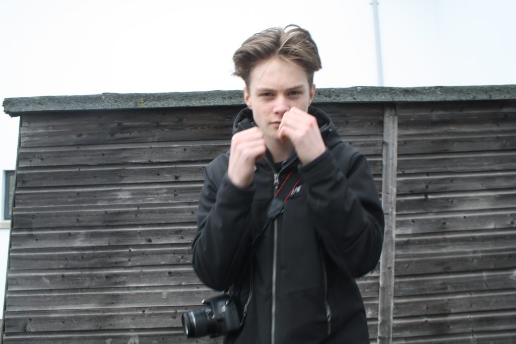
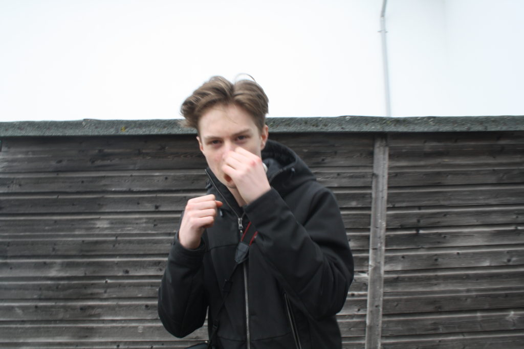
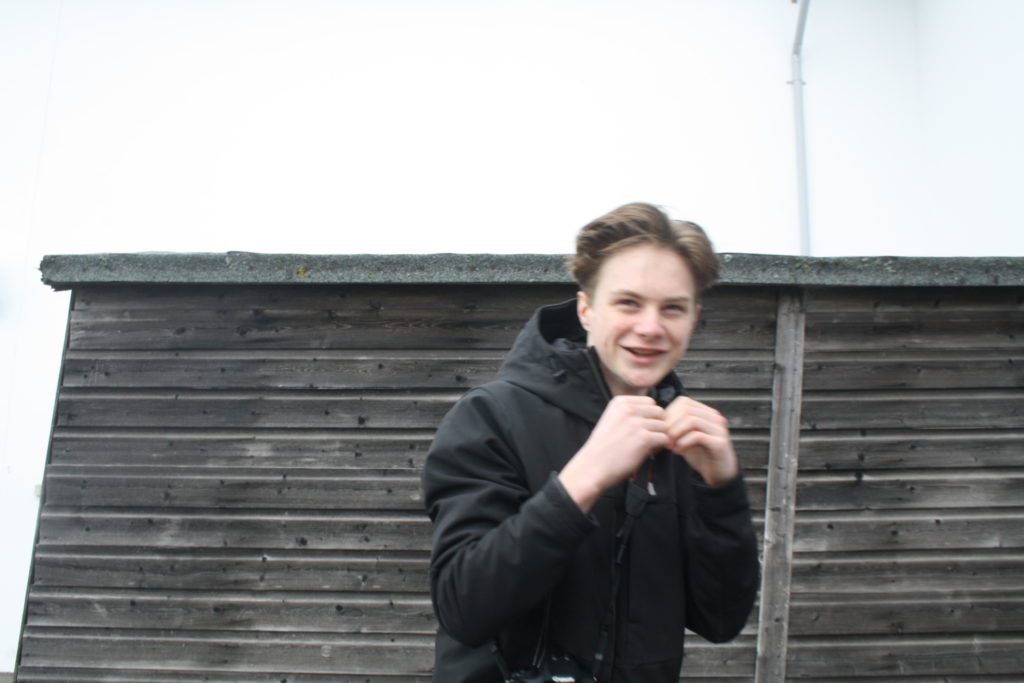
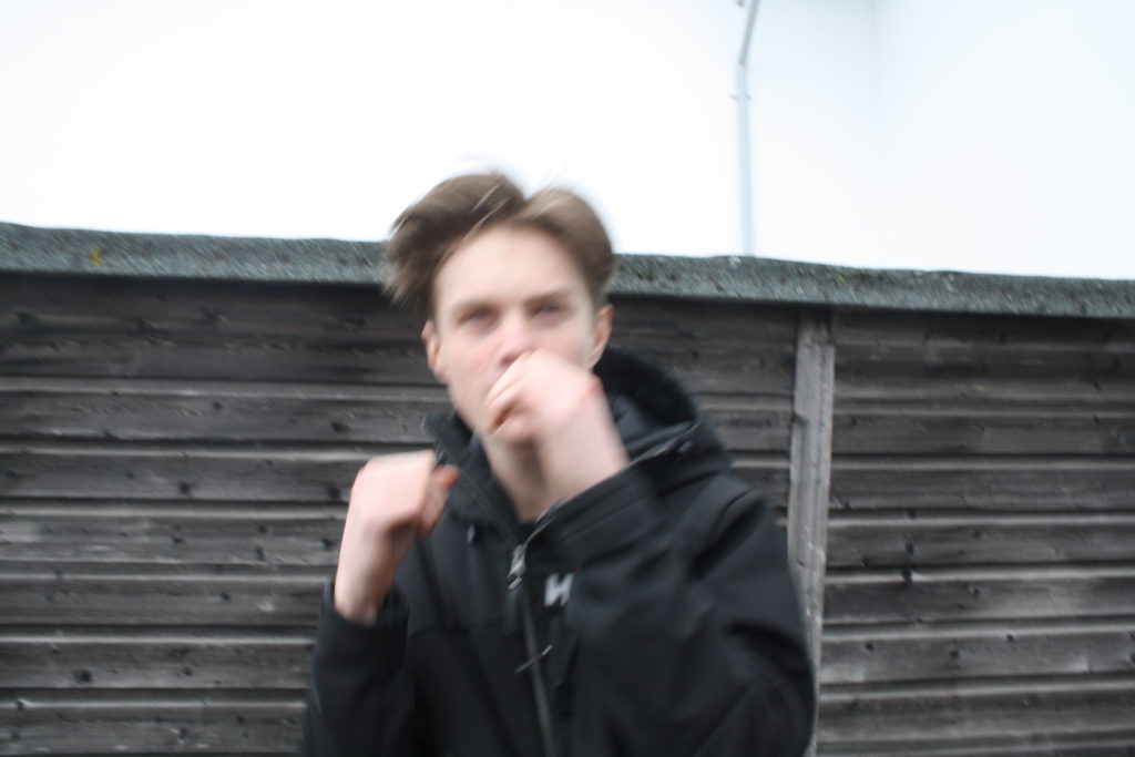
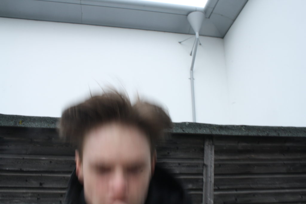
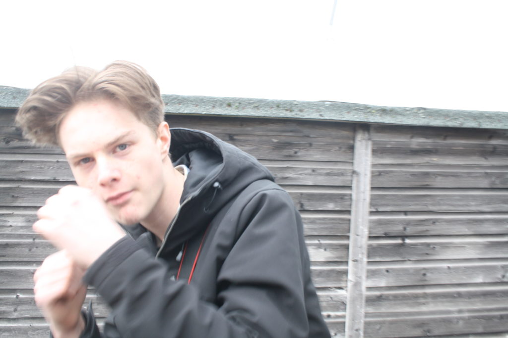
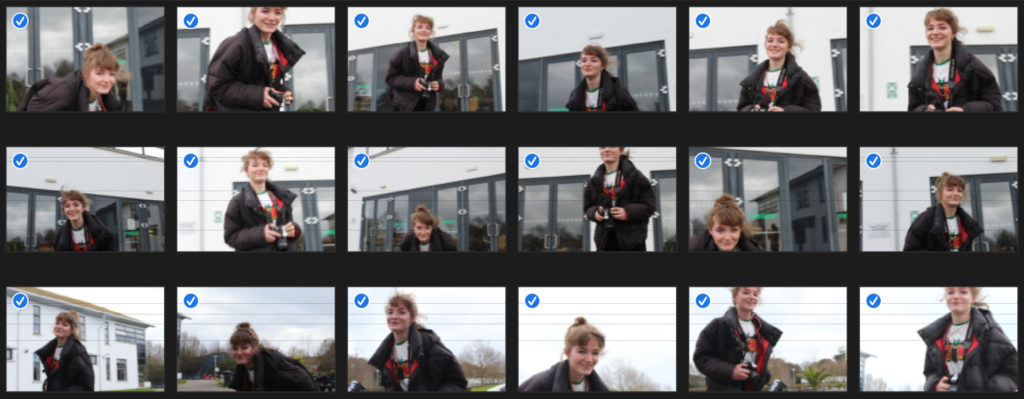
I was inspired by John Baldessari to capture images of a model moving and dodging the camera, due to his photographic art being humorous, so I experimented with something that I could create into a style similar to his. I wanted my model to appear as if she is boxing, hence why she is clenching her hands into a ball to appear as if she has boxing gloves on. On my camera, I used the setting Tv, put the white balance to cloudy (approx 6000K on my camera), and set the ISO to 1/200 for this first shoot. This made my images quite sharp and clear, due to a fast shutter speed.
For this experiment, I changed my camera settings; I kept the white balance and camera setting ‘Tv’ the same, however I lowered the ISO to 1/160. I told my model to do the same technique and movements as the last shoot, where she had to try and run around and dodge to camera. I decided to make a grid layout as I felt that this repetition of similar images is easy and interesting to look at from this sort of format.
To make this grid layout, I used photoshop. My first step was to create a square canvas. Next, I went to view, new guides and clicked horizontal 450px. I did this again but changed the px to 900px. Then I repeated this for vertical guides, where I chose 450px and then did it again with the vertical option selected and put 900px.
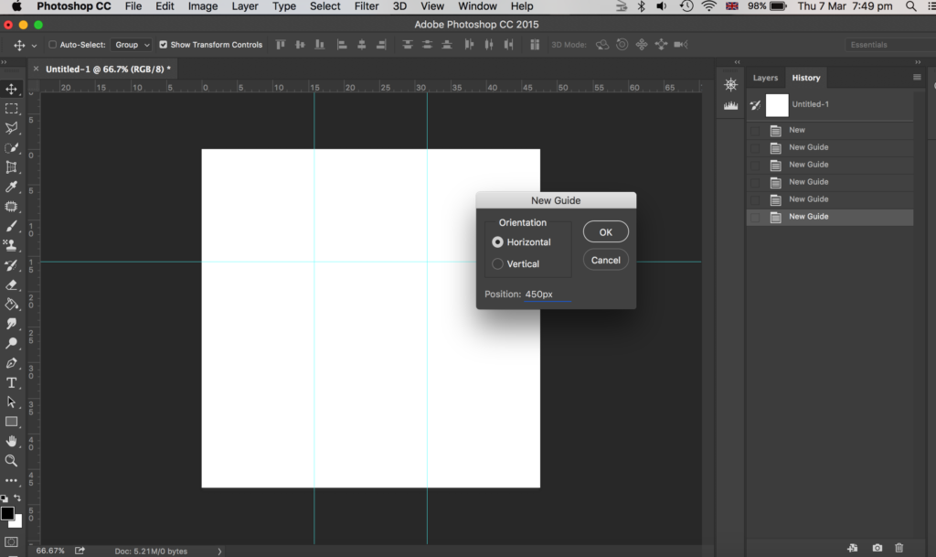
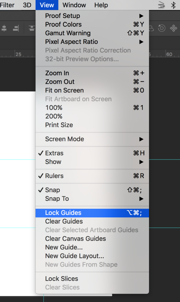
Then I went to view and chose lock guides.
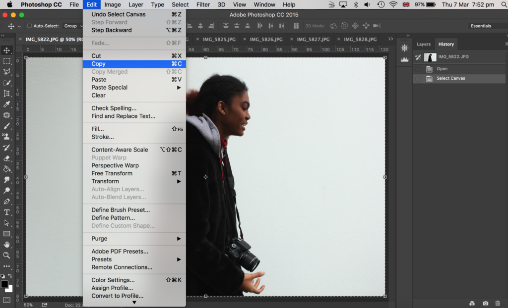
Then I opened up all my images on photoshop that I wanted to use – I chose 9 images of my model dodging the camera. I went onto each photo in photoshop and went to select, all and edit, copy.
Then I went onto the canvas I made with guides and went to edit, paste. To make my image smaller to fit on the canvas I went to edit, free transform where I could then adjust my image size. I placed it within one of the squares the guides had made. I then got the rectangular marquee tool and made a selection of what part of the image I wanted to get rid of; I wanted the image to be square, with a white border in between the image and the guidelines. Then I went to layer, layer via copy.
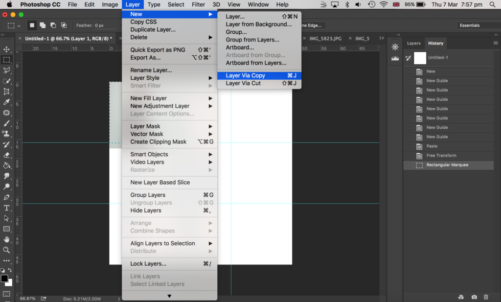
After that, I went onto the layers panel to the right side of the image shown above, and deleted the original layer of that image (before I cropped it) so that I was left with a cropped version of that photo which I made as a square shape.
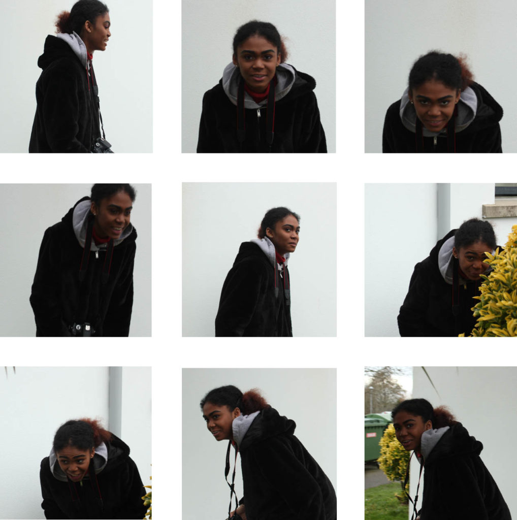
Here is my final outcome as shown above.
I did the same game of play, where the model had to run round and dodge the camera and make actions as if she was boxing, yet I wanted to experiment with the ISO again. So, for this experiment, I lowered the ISO to 1/100. This made the images blurrier due to a slower shutter speed.
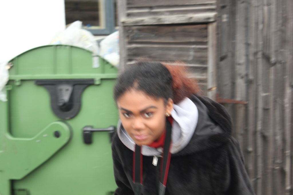
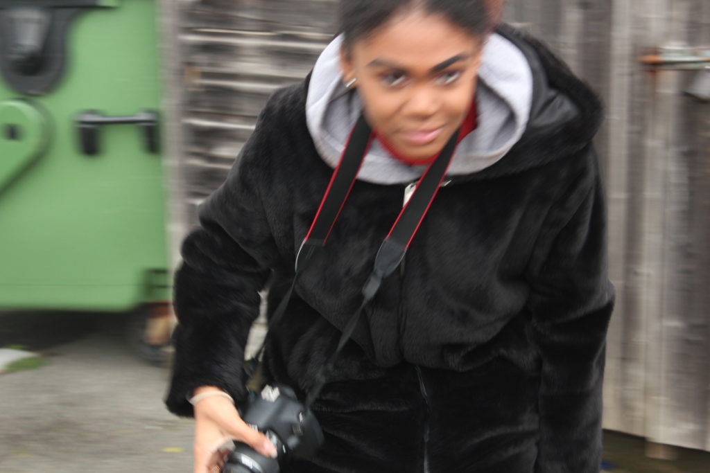
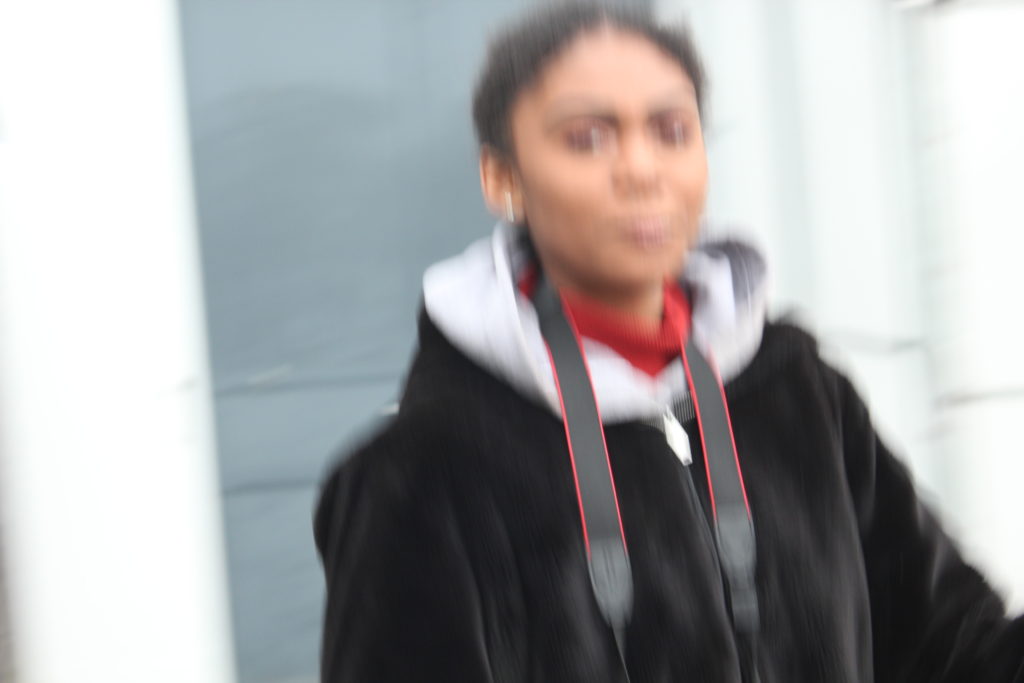
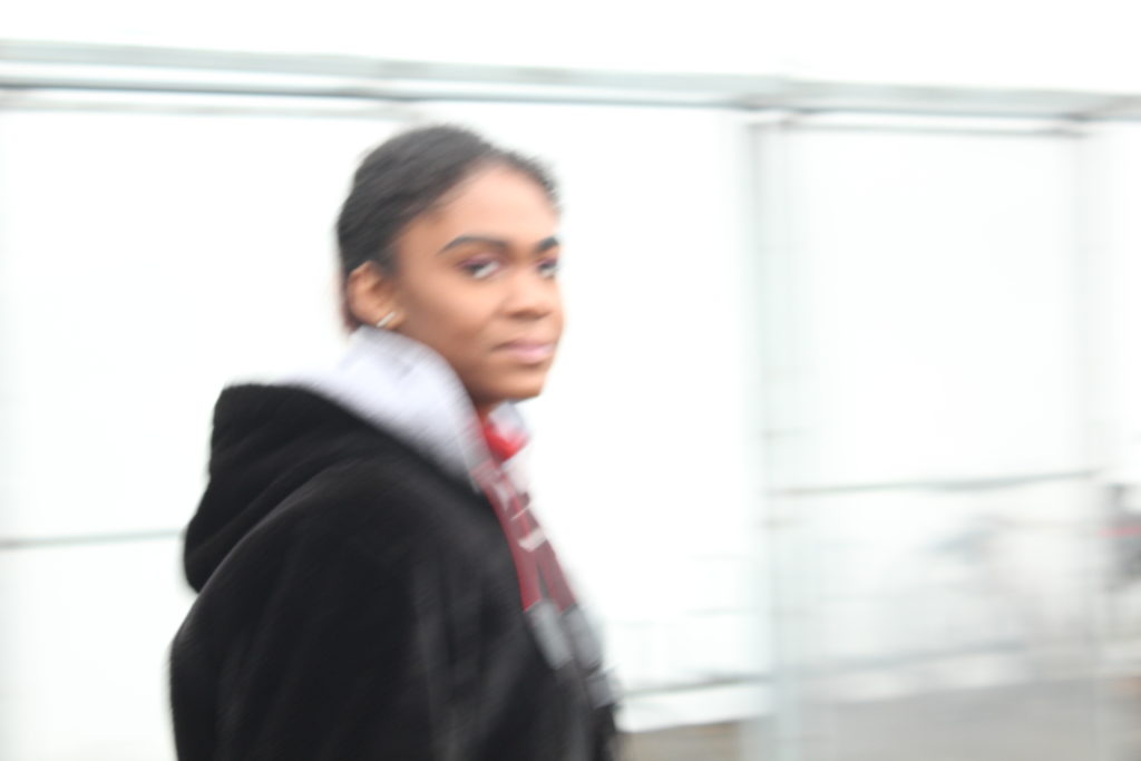
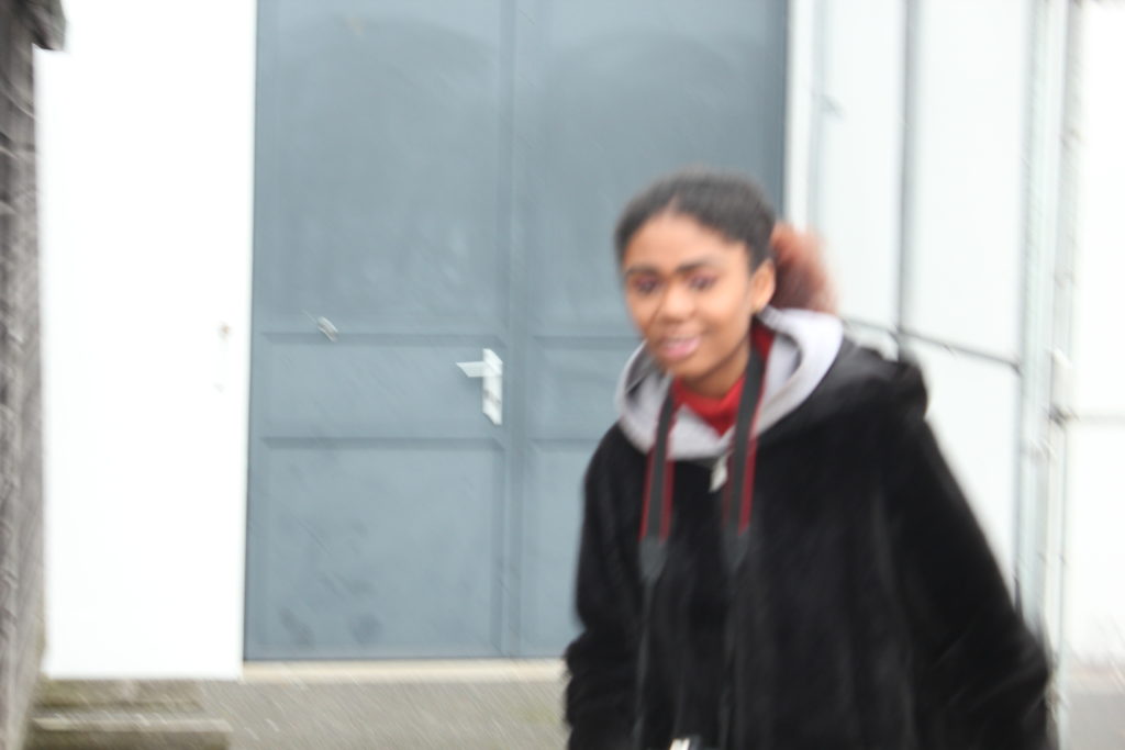
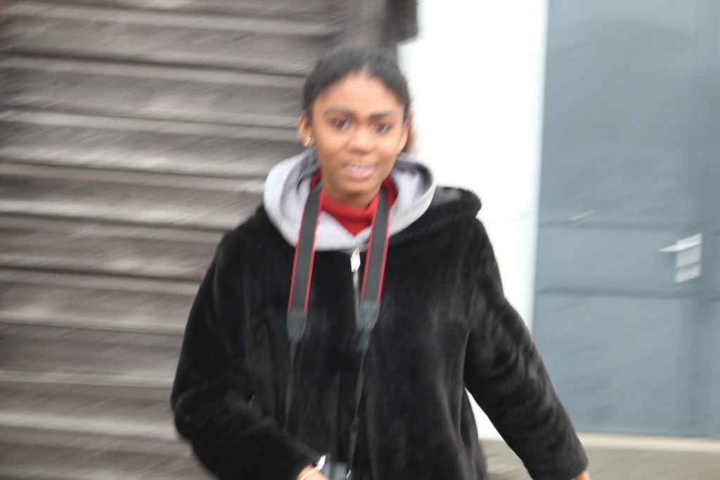
Overall contact sheet of my first ‘play’ shoot:


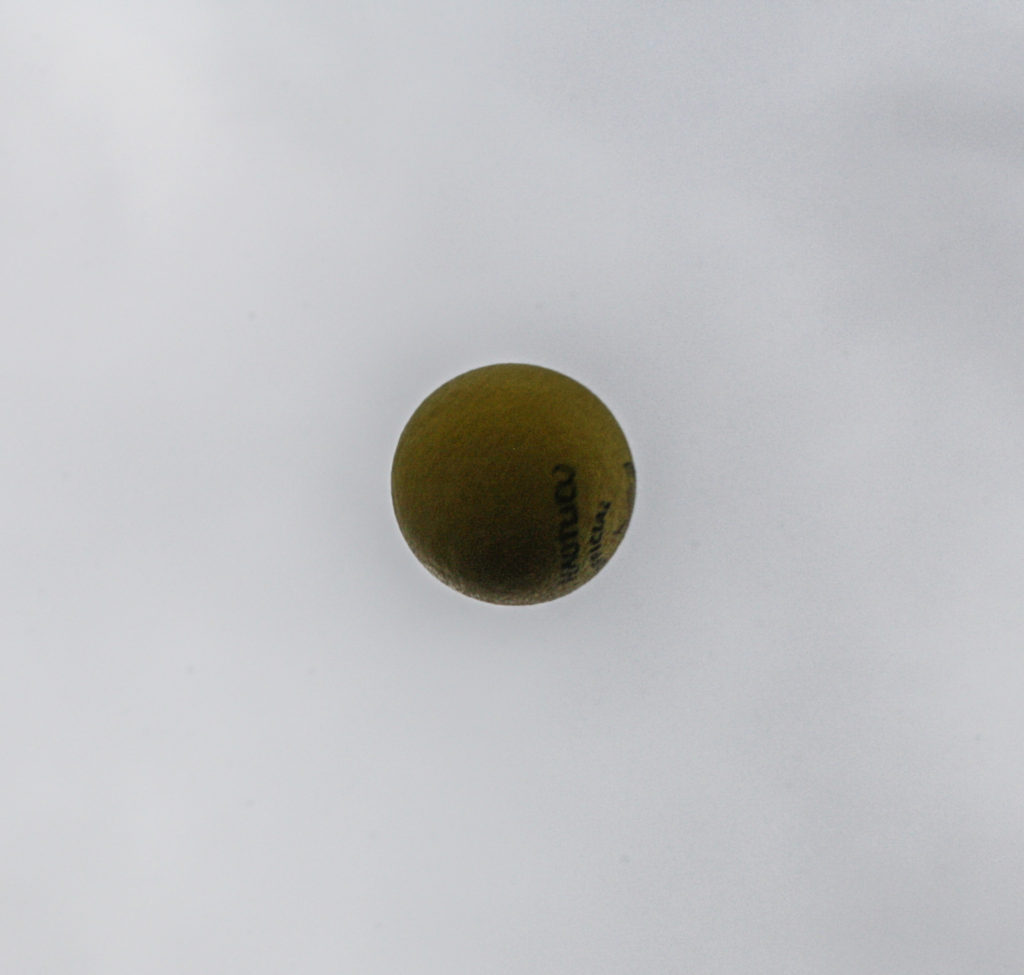
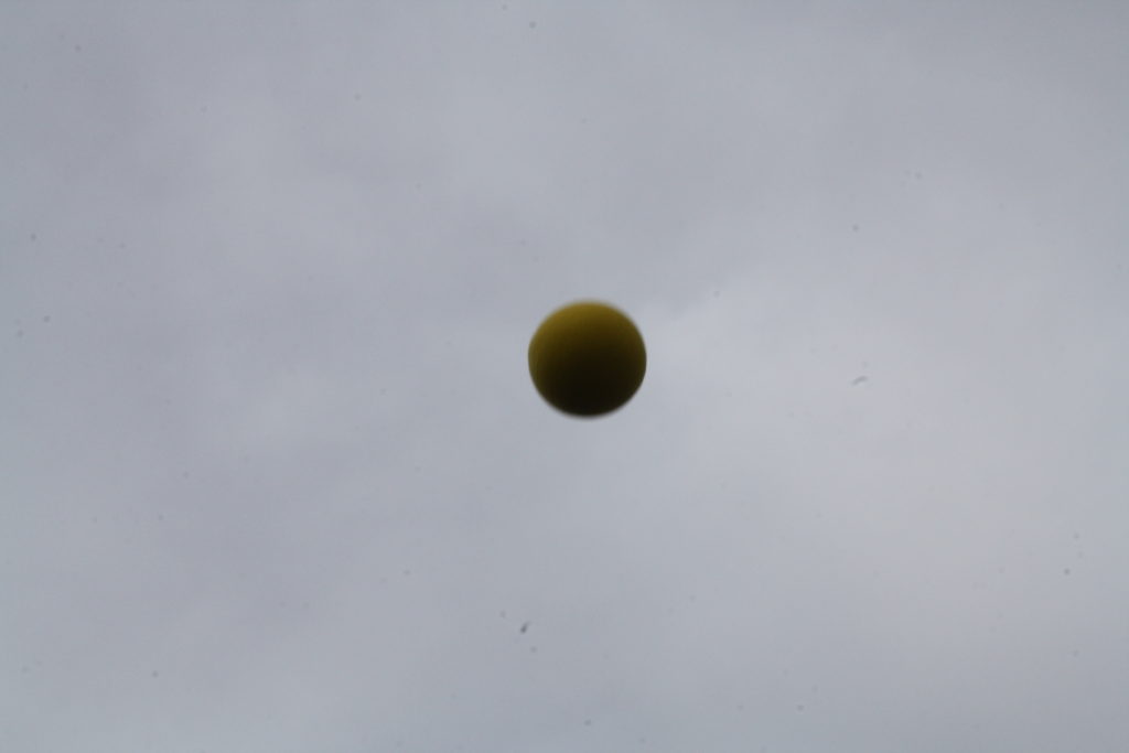
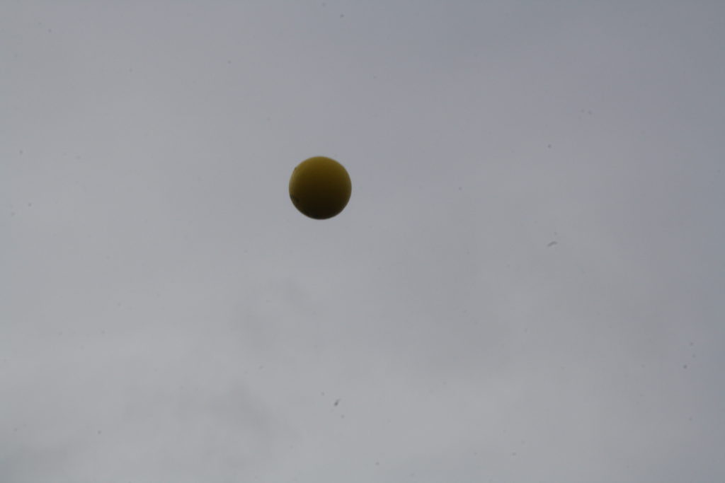
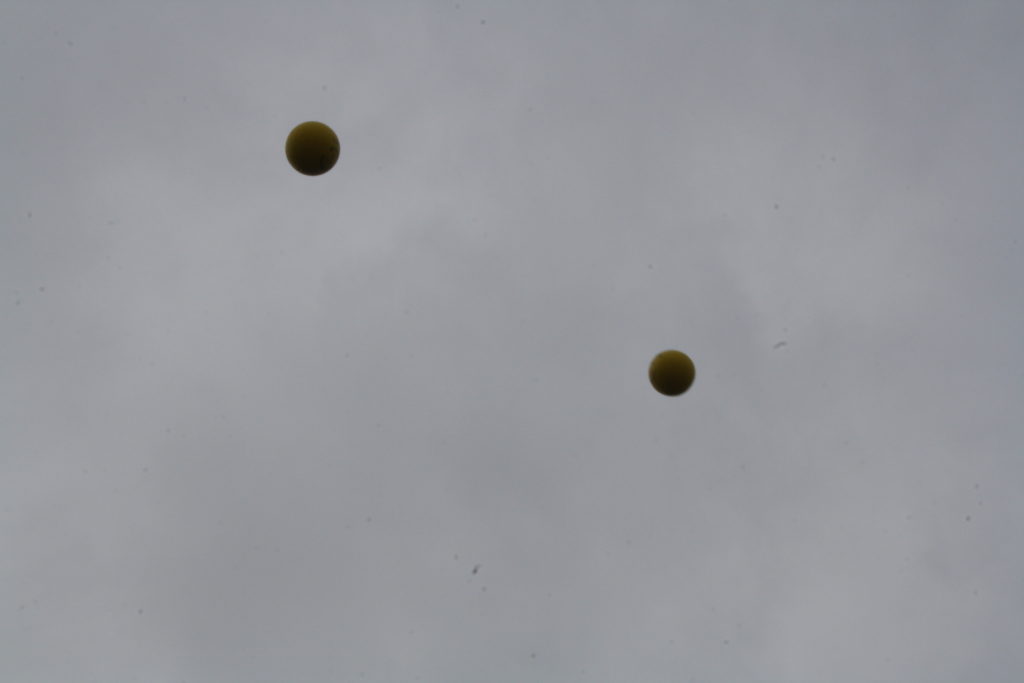
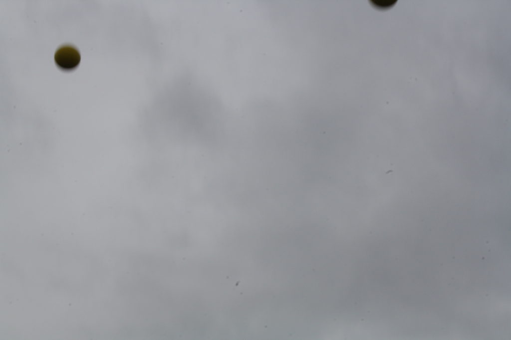
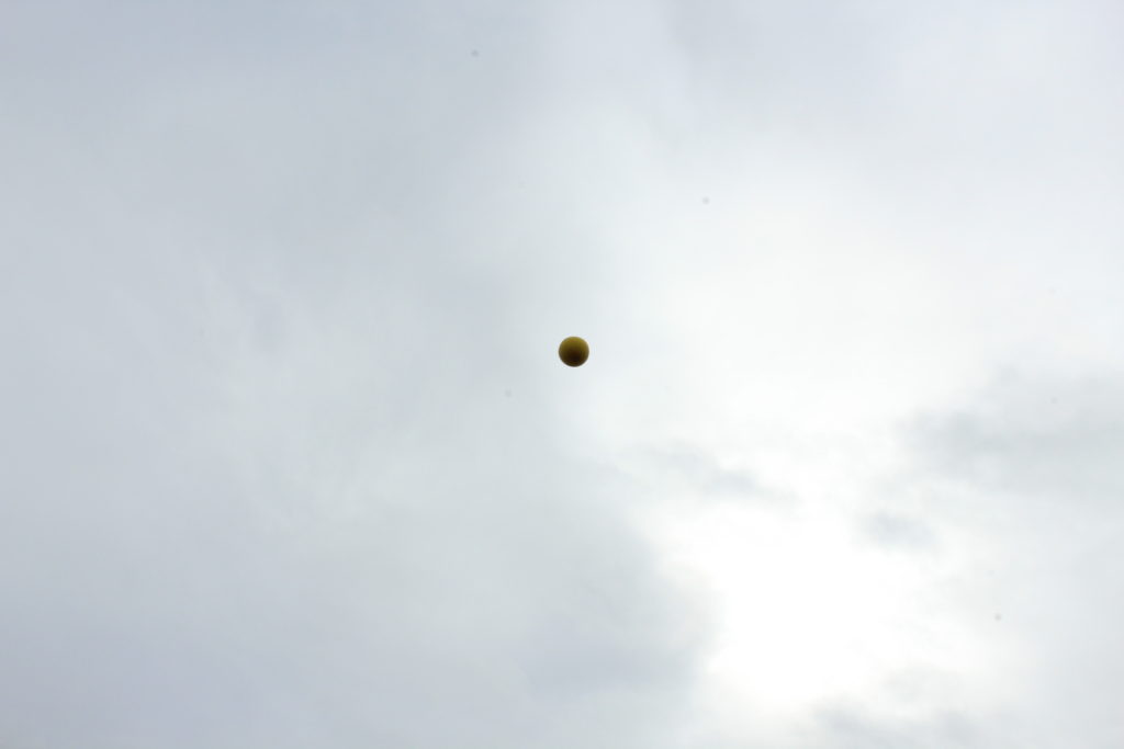
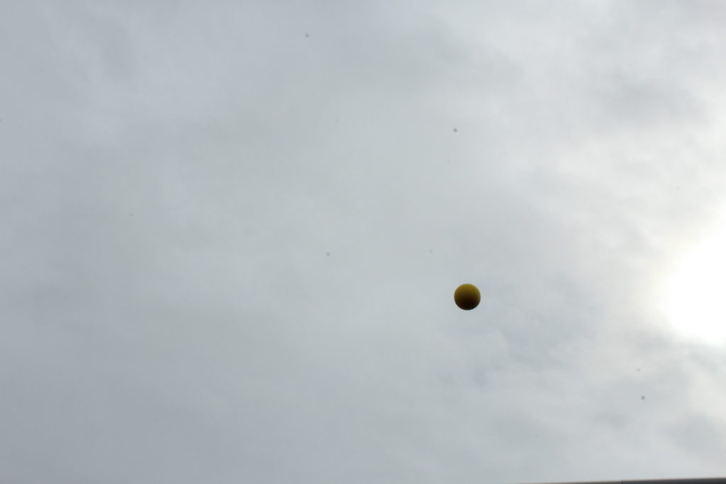
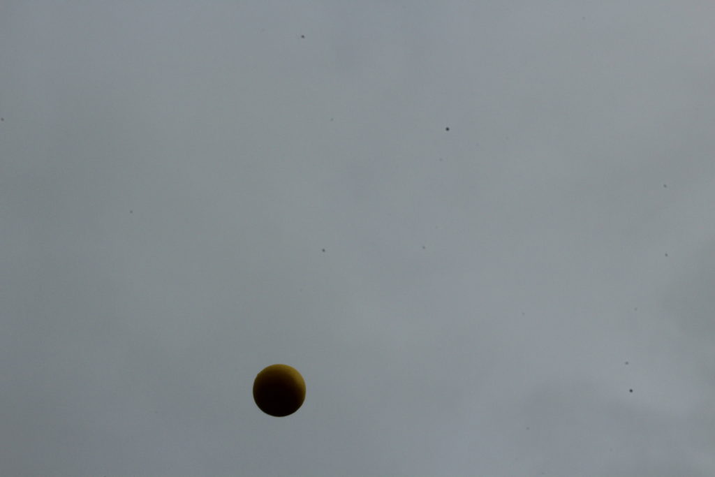
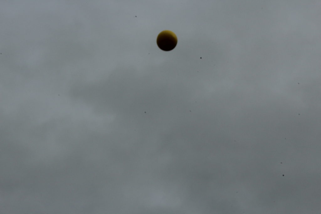
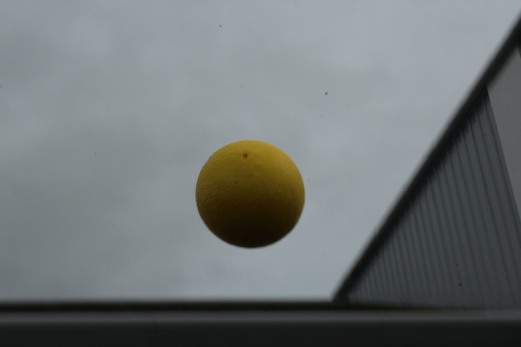
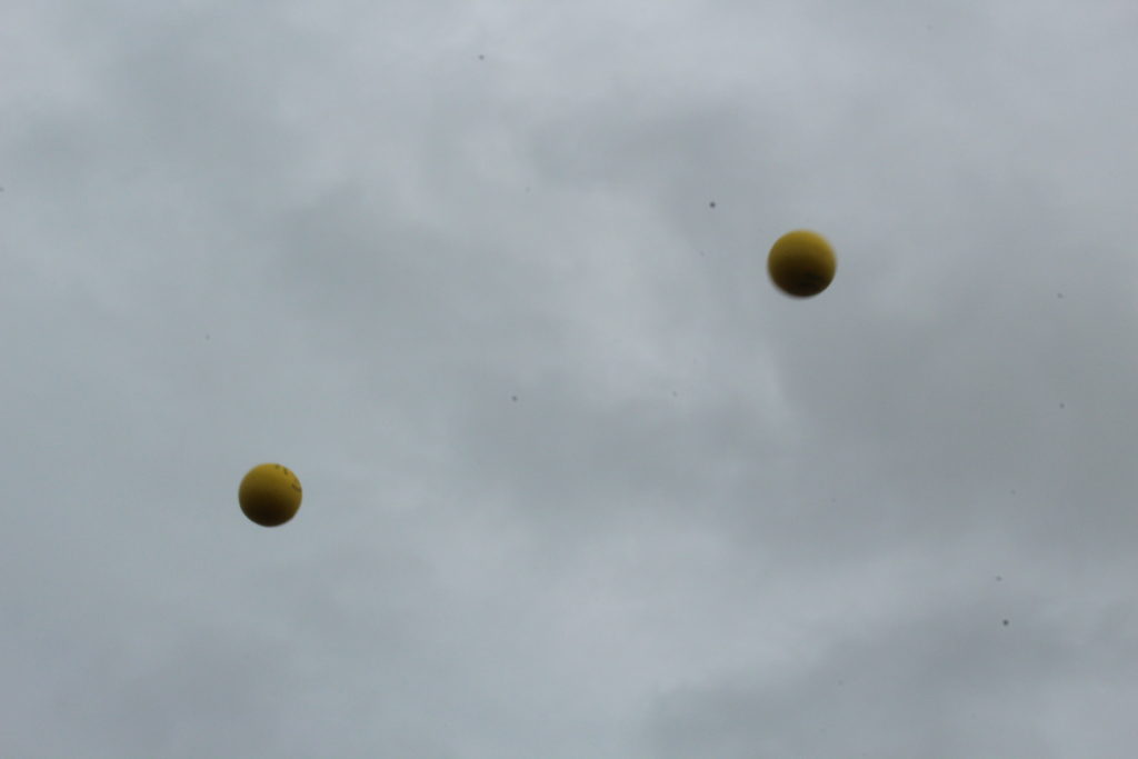
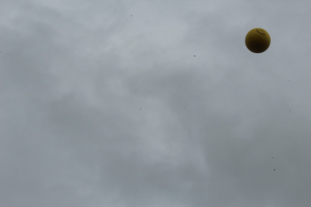
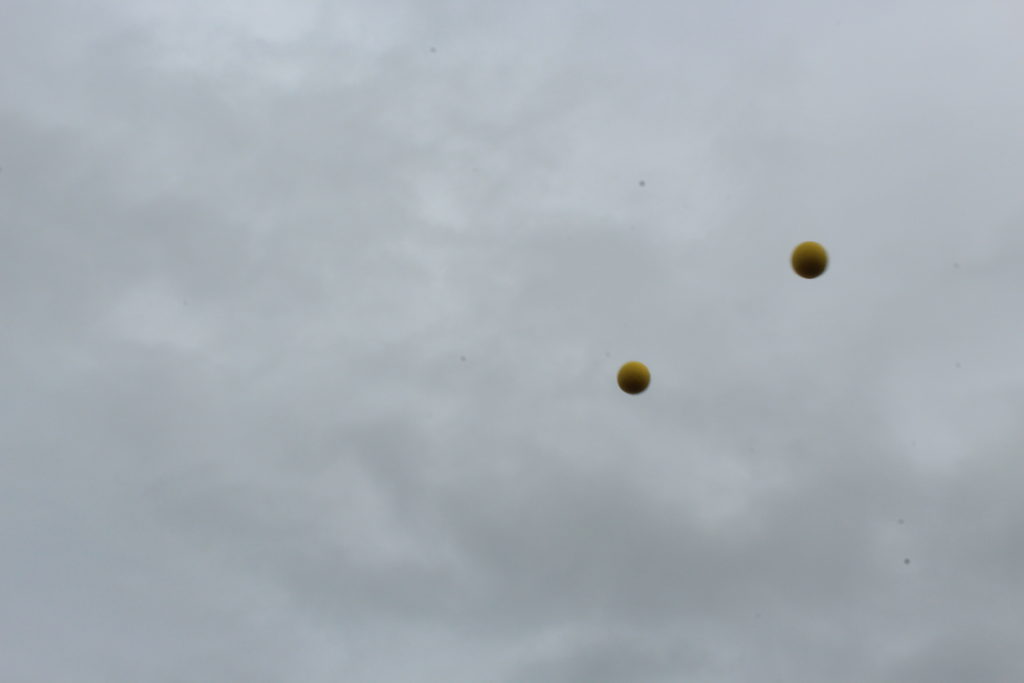
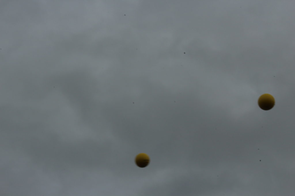
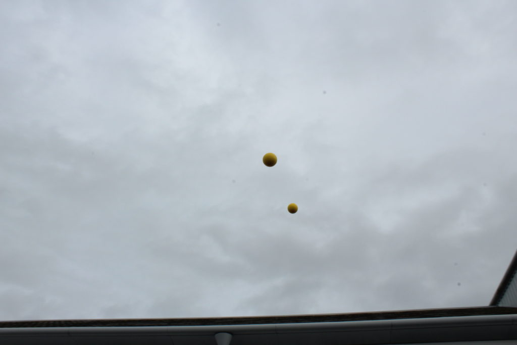
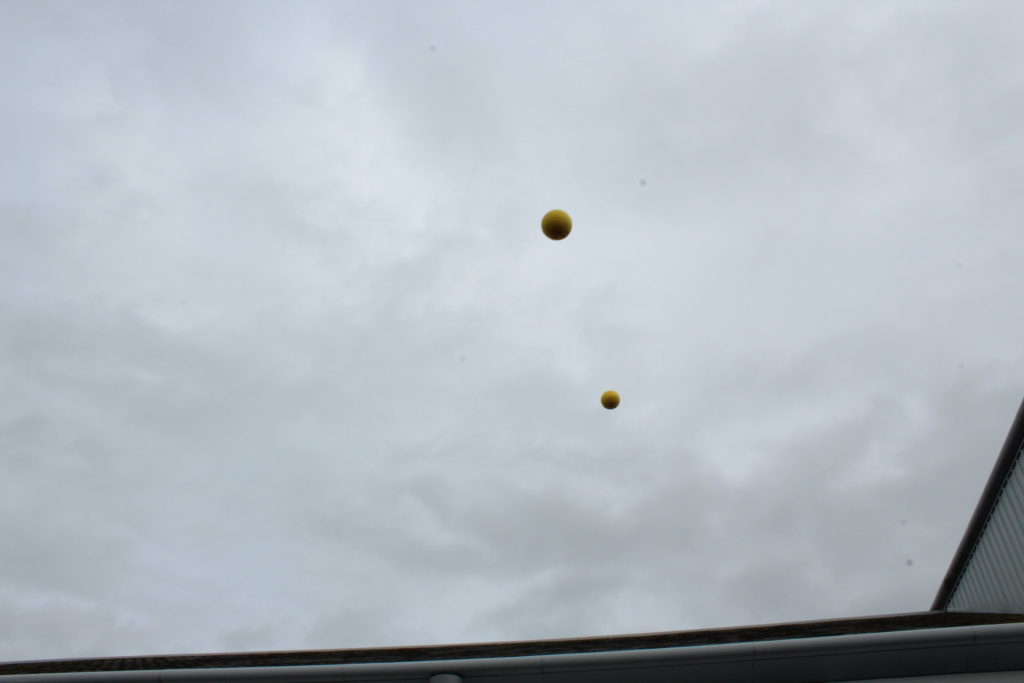
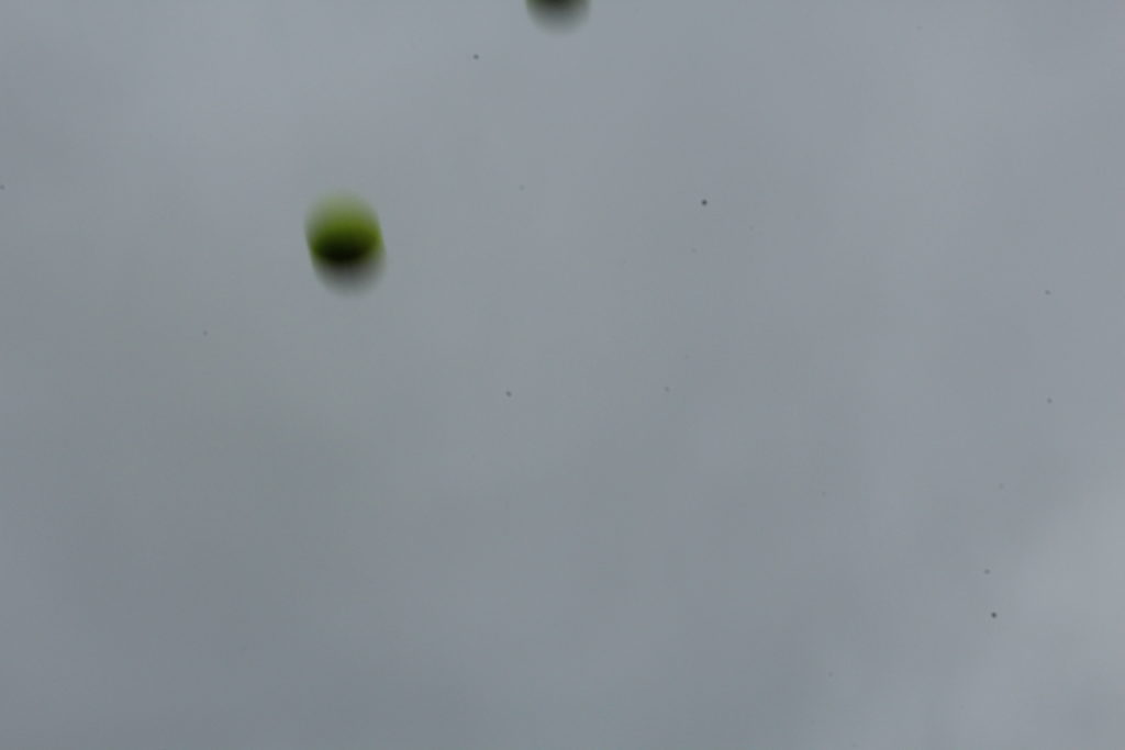
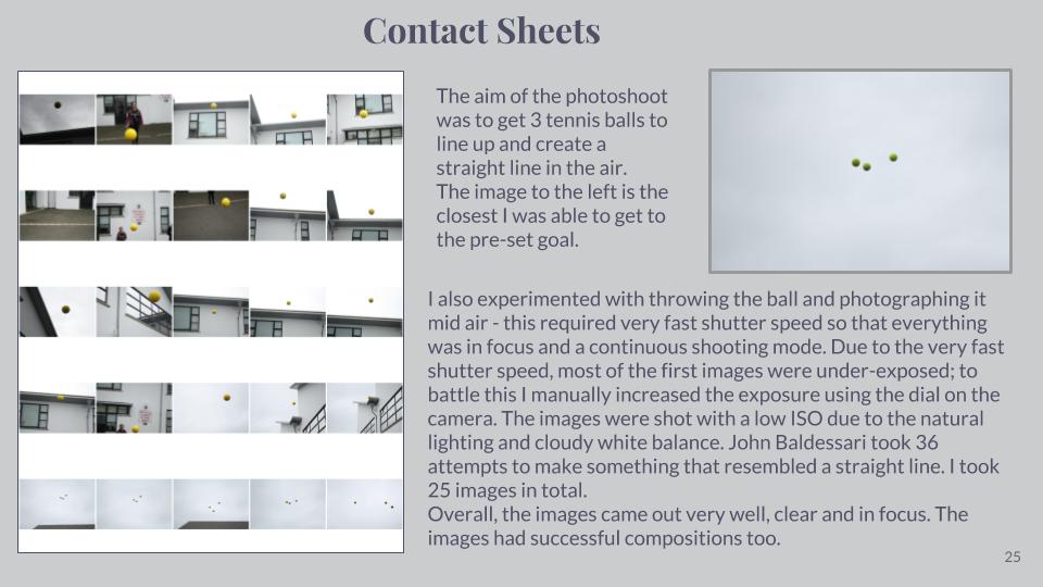
For this experiment, I got my model to throw up one yellow ball in the air. This was an idea inspired by Baldessari, again, as he throw oranges up into a clear sky in California. However, because the sky was cloudy and grey (unlike Baldessari’s blue sky,) I chose a yellow ball to throw into the air as I felt this would be a clearer colour to see in the dark, gloomy sky. I experimented with the ISO; the first image is with an ISO of 1/200, which made my image appear lighter. The other 2 images are where I experimented with a lower ISO so they appeared darker.
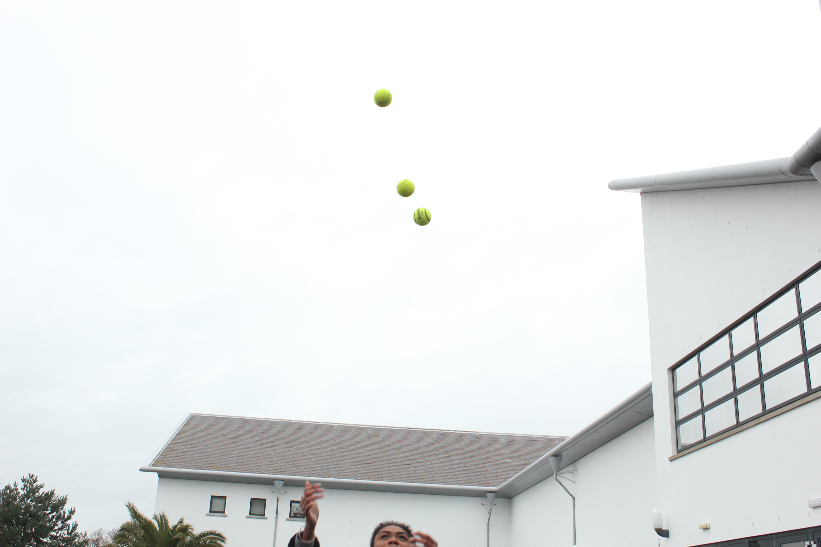
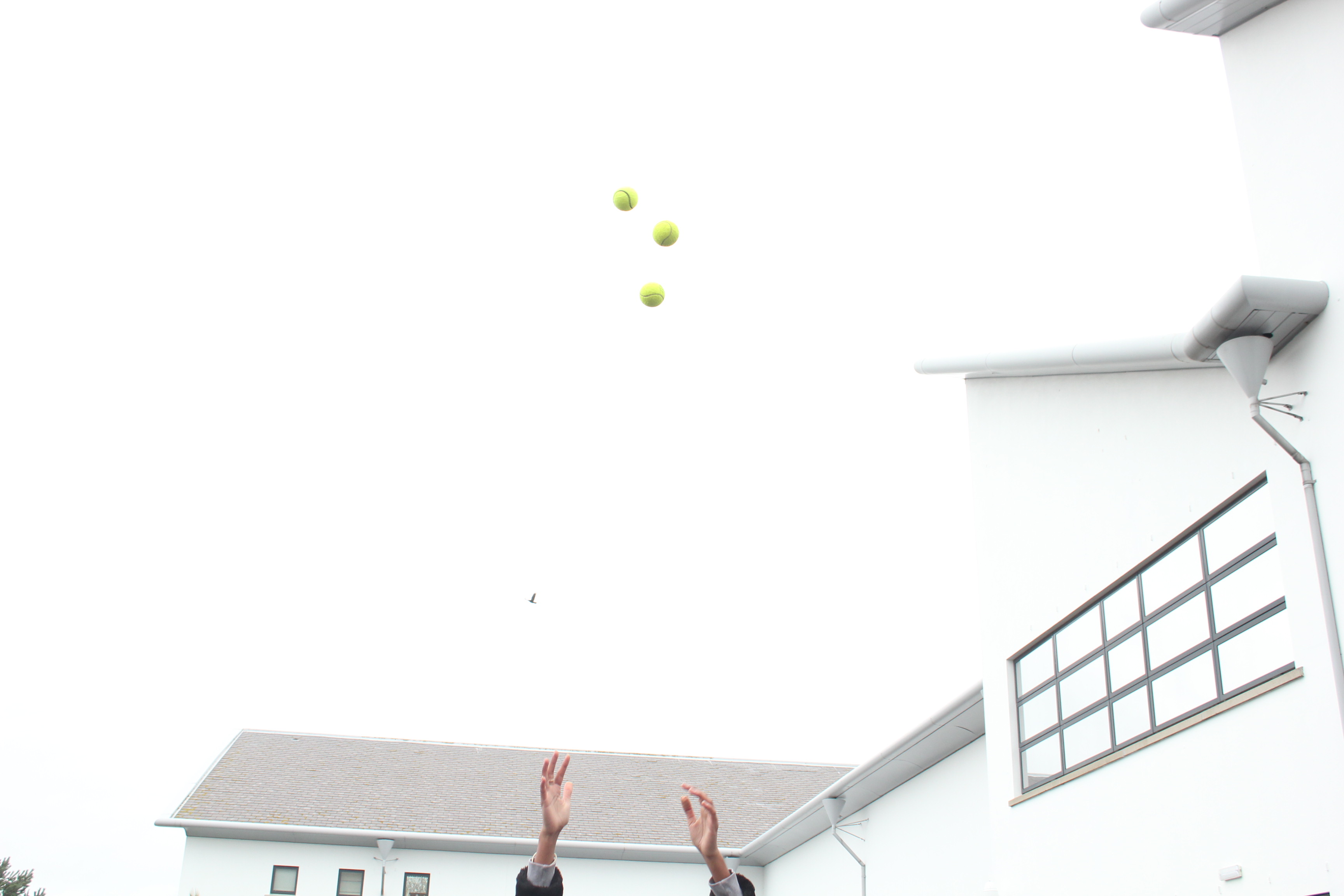
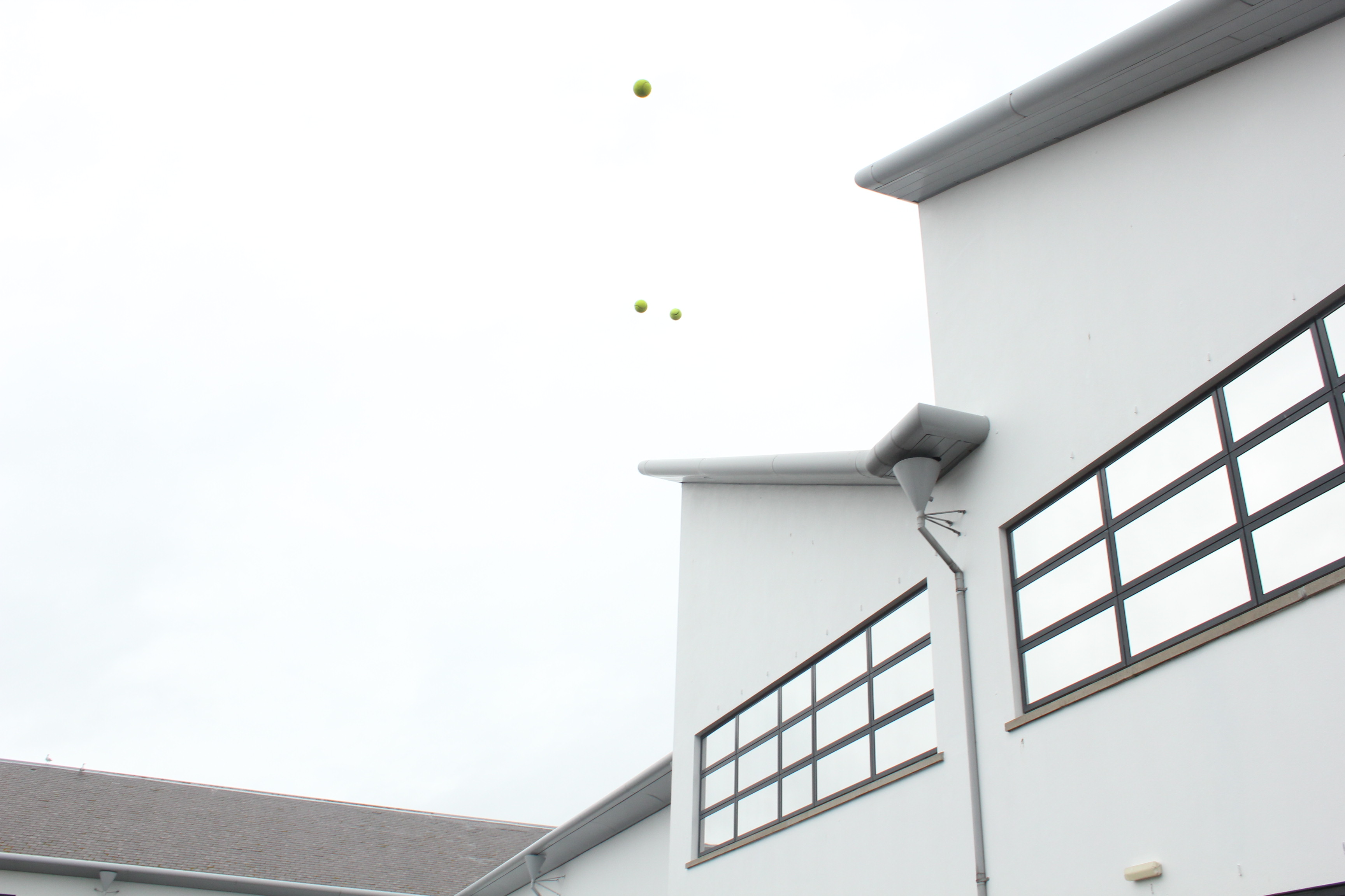
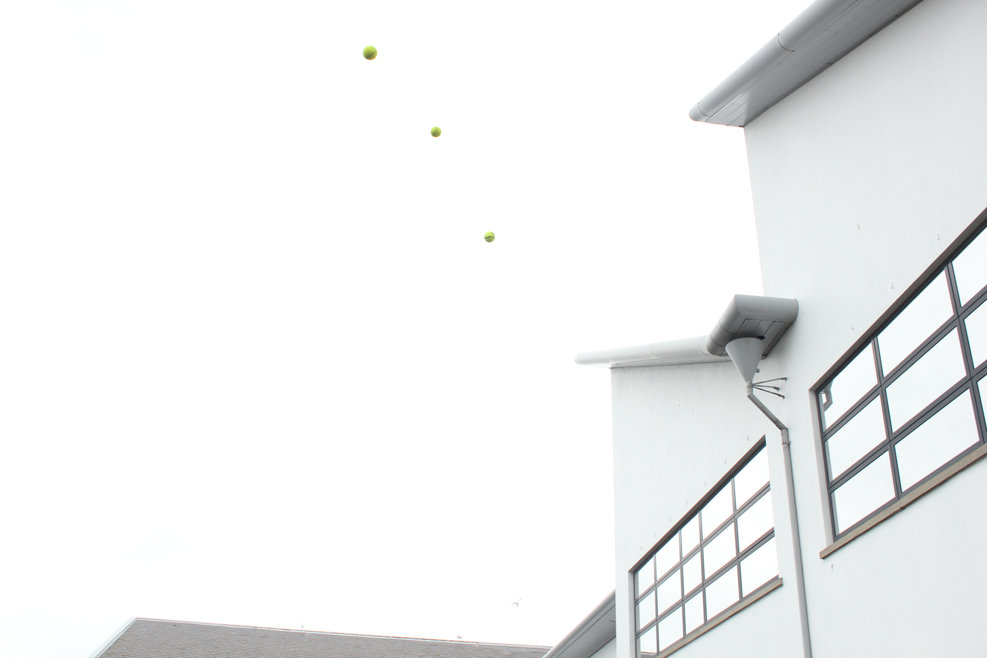
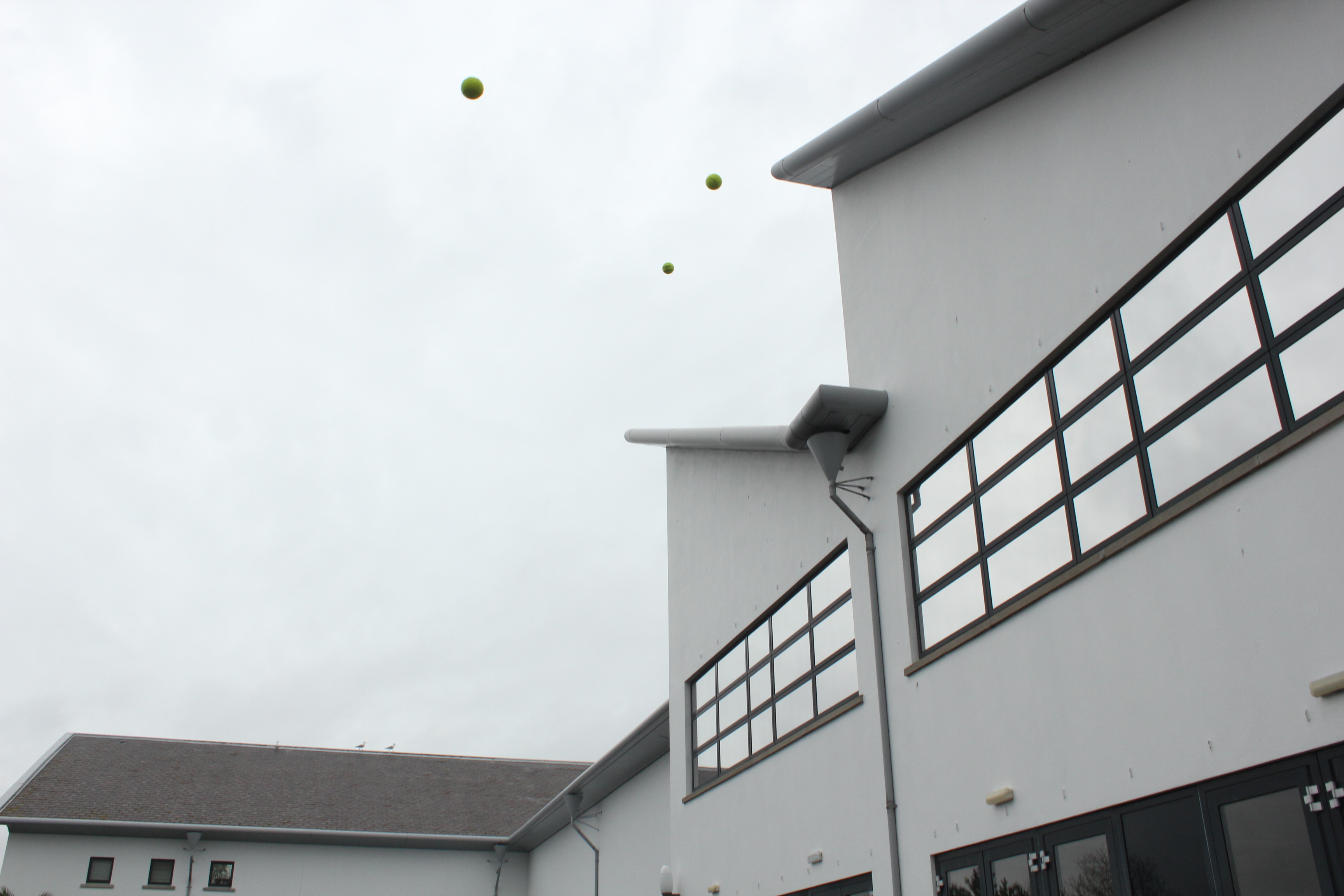
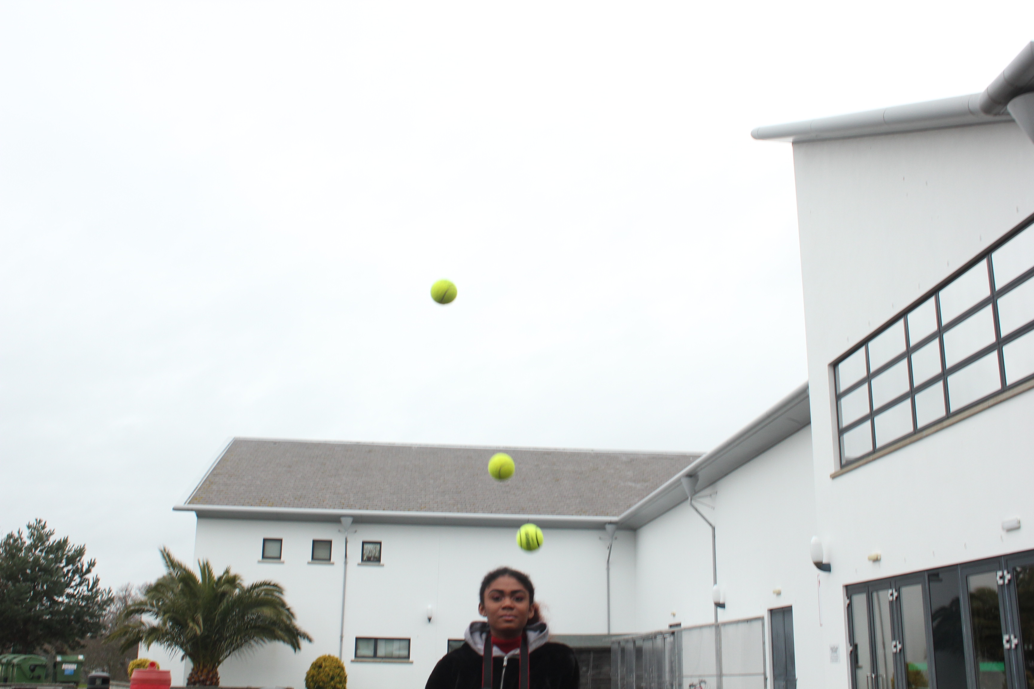
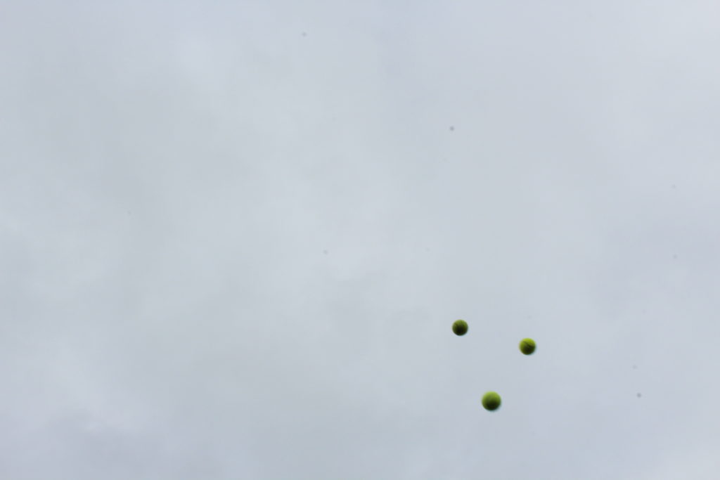
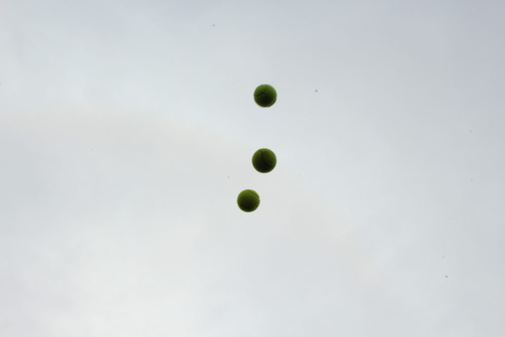
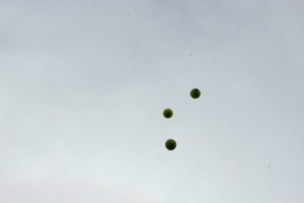
With this experiment, I then used 3 yellow balls and got my model to throw them up into the air, again, like Baldessari’s work of throwing oranges into the sky. To achieve a similar image to his, I got my model to throw all 3 balls at the same time, so that it created a line of the 3 balls.
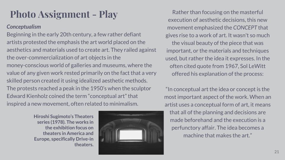
For my response to Hiroshi Sugimoto, I photographed the horizon and edited the images by cropping them into squares, adjusting the contrast and applied a black and white filter. I feel that my last image in this response is the best result.





This short video is something I do everyday, a daily repetition.
What is a GIF?
A GIF (Graphical Interchange Format) is an image format invented in 1987 by Steve Wilhite, a US software writer who was looking for a way to animate images in the smallest file size. In short, GIFs are a series of images or soundless video that will loop continuously and doesn’t require anyone to press play. This repetition makes GIFs feel immediately familiar, like the beat of a song.
I then wanted to go one step further and develop my own GIF use the software Adobe Photoshop. Before doing this I would have to photograph one specific objects and variations of the objects shape and size, the object I decided on were water bottles. I chose bottles because of their common use in the everyday world and how easily they can be obtained, I then gathered together the classes bottles and proceeded to photograph them in the same position as the first, giving off the impression of the bottle changing as the frames moved. For one of the animations I wanted to add shapes moving around the screen to see whether it would effect the overall outcome and create a more aesthetic result. When I came out with the final result I made sure to put each frame at 0.2 seconds so that the animation seemed more fluid, these were my results:
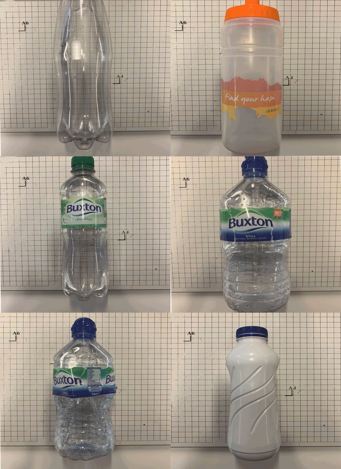
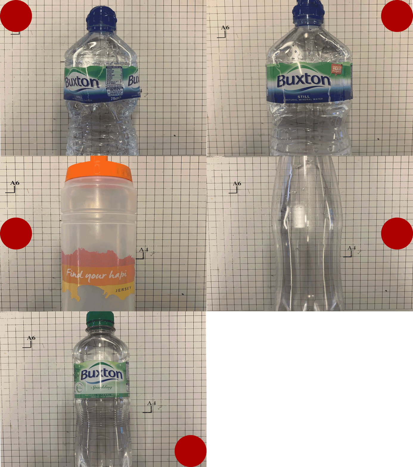
Once I had made the GIFs I found that they related to the topic of variation and similarities through their constant transitioning between different styles of bottle. By doing this in future posts it would allow me to experiment with variations of some of the things photographed such as reflections and rock formations but taken in a topographic way where all subjects are taken in the centre of the image so that their transitions in the animation are smoother.