Category Archives: Recording

Filters

Author:
Category:

Photoshoot 5

For my fifth photoshoot I planned to visit and explore a natural area photographing both plants and flowers and well as water and it’s surroundings. I wanted to focus on drawing inspiration from different artists and photographers I’ve explored, i.e. Wassily Kandinsky’s theories on colour and shape, Rinko Kawauchi’s photography who I explored at the start of the project and my concept of connection between nature and spirituality together as I come towards the end of my project.

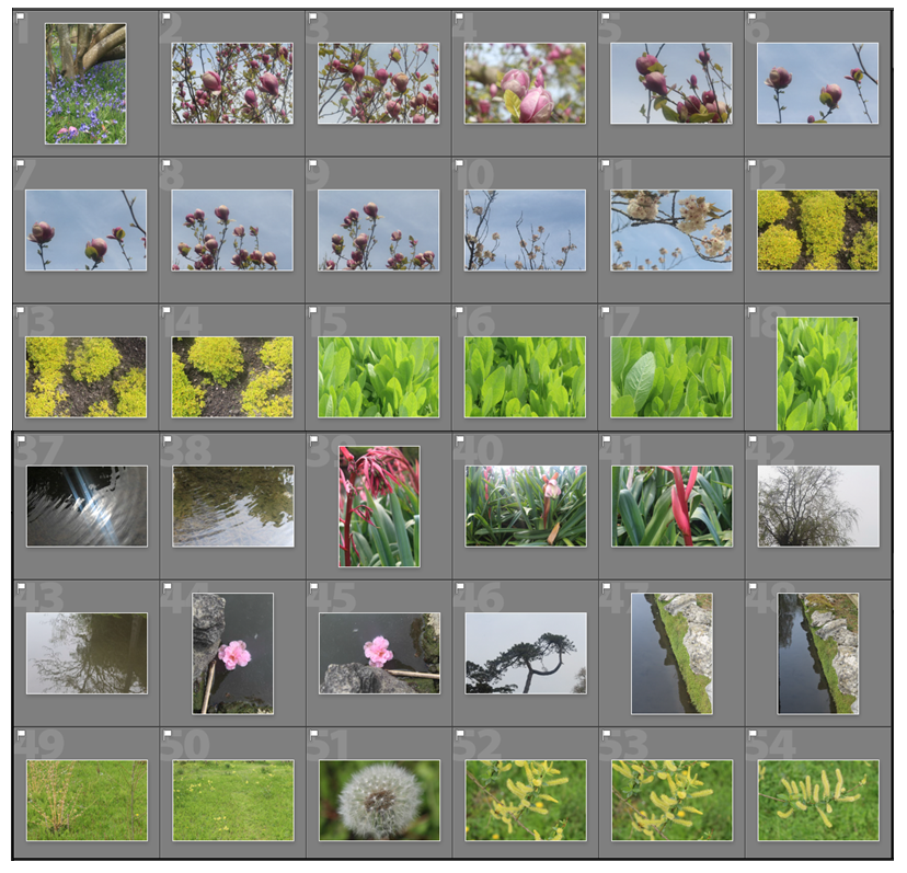
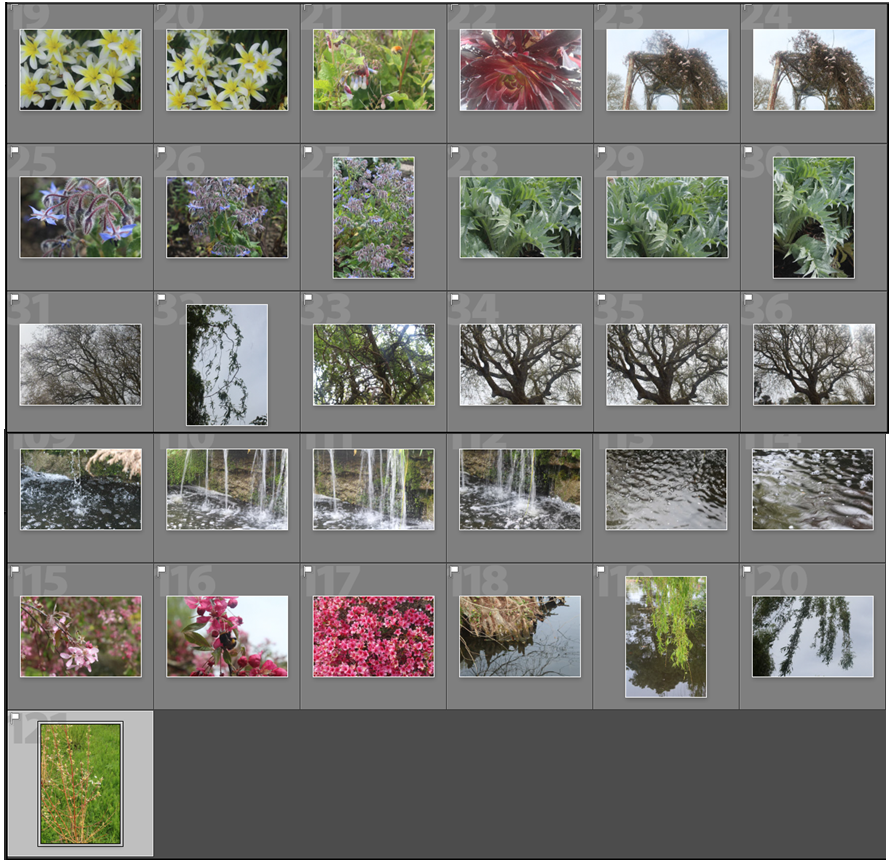
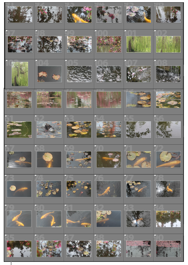
I narrowed down my shoot’s image to ones I thought could be considered as final outcomes for this shoot and displayed them in two separate sections as I think they have different qualities to them. The first half I think focus ore on nature, plants and botany emphasising the light and the ranging of warm and cool tones in the landscape. The second half looks at water in more depth and aspects within it i.e koi fish and plants on top and near water.
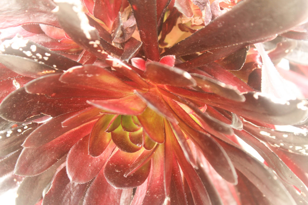
I chose these two images as some of the final outcomes for this shoot as I like the close up, macro angle they both have. I also like the different textures in both the images that contrast from one another. I chose the plant in the first image to photograph as I like the warm red tones, which links to my focus on warm and cool colours in my project. I also like how the leaves come towards the lens because of the angle they taken at, going out of focus the closer they get, which I think this makes the image seem more personal and spiritual. The way the light shines is emphasised on some of the leaves, and around the outside of the frame is effective. The colours in this image range from green/yellow in the centre of the plant to different tones of red, which i think further emphasises the spirituality of this image as the centre is light.

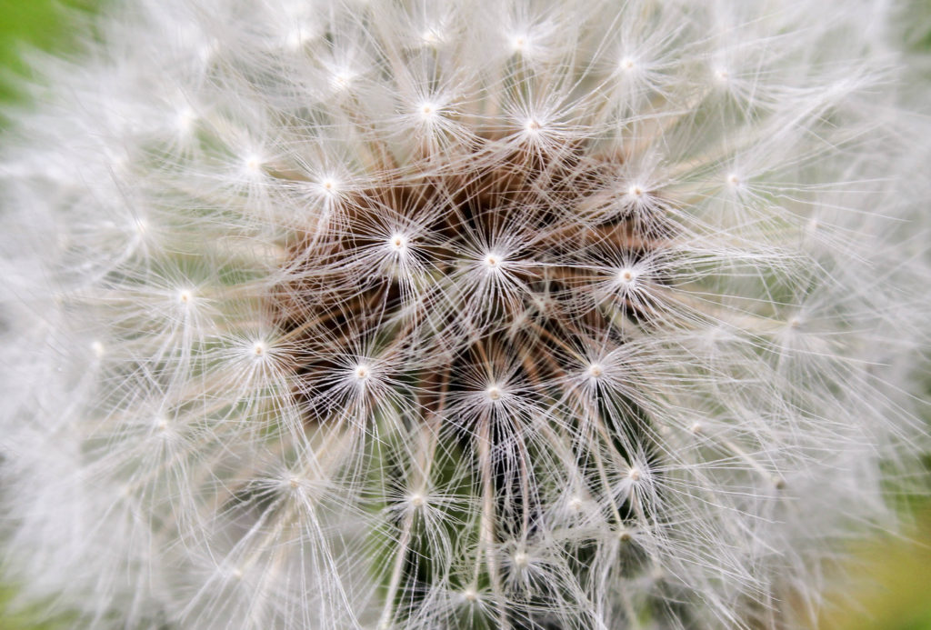
The second image I took with a close up angle as I was interested in emphasising the intricate pattern made by the individual parts of the plant. I chose to crop the original image so the pattern filled up most of the frame and to create a even closer perspective. I also think that this plant represents something that is ephemeral which links to my previous work in this project exploring Rinko Kawauchi who enjoys beauty, joy, and the ephemeral existence of the lives in nature. I also think that this image goes well paired with the first image as I think the colours complement each other, the white in this image linking to the parts of the first image where the light is emphasised.
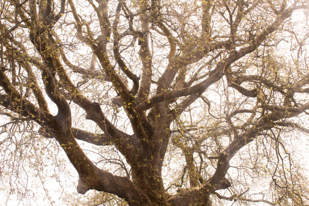
I like the first image of this pair through the intricate patterns and also because of its conceptual meaning. To me, this image represents connections of nature, through the many different lines and branches reaching to fill the entire frame. I also think it reflects some of the ideologies of Wassily Kandinsky through the curved lines going in different directions, reflecting his theories on geometric shapes about how shapes have different energies. In this image the main aspect is the larger trunk and branches coming off the tree, but i also like how them smaller branches have grown off the side and are growing downwards. This is then all complemented by the brown and yellow tones of the image that make the overall appearance ore soft and mystical.

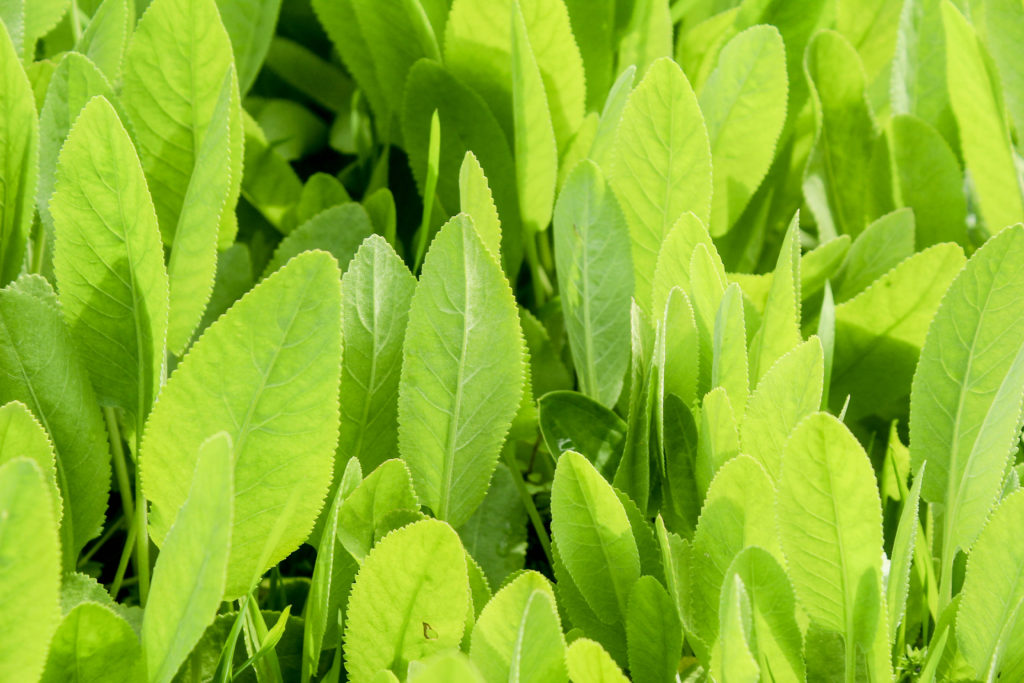
I then contrasted the first image by placing it next the image of bright green leaves and plants. I chose to take this image, filling up the entire frame with the green pattern, as I like how only the cool colour is shown, which I can then contrast this to other warm colour images. It contrasts particularly to the first image of this pair as the leaves in the tree have a more yellow/ green tones, which links to the bright green of the smaller plants in the second image. One difference between the images are that the first is more of a landscape image, whereas the second is a more macro angle which creates a variation of angles.
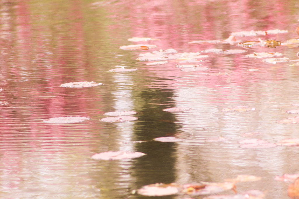
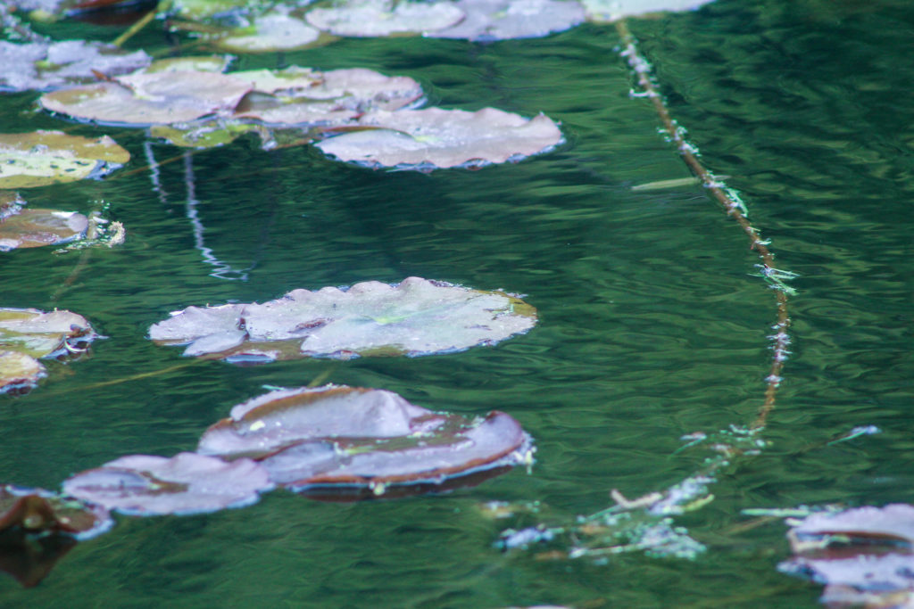
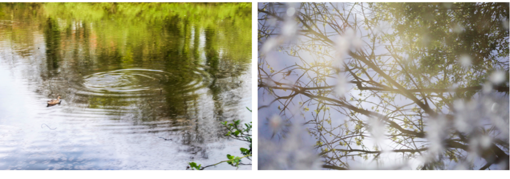
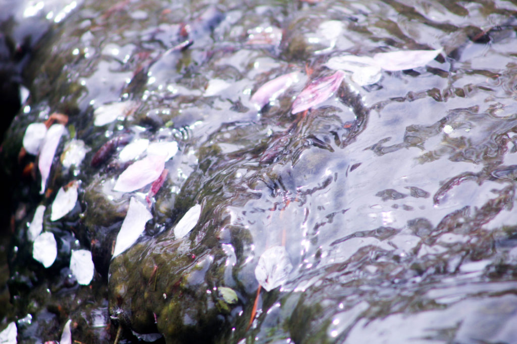
I like these two images displayed together as they are images of the same plants (lily pads) in the same area of water, but because of the surrounding nature, that isn’t shown in the images, the colours displayed in the reflections are completely different. In the first image, was taken next to the image was a Malus floribunda a common name Japanese flowering crabapple, which is why the reflection on the water is different tones of pink. I think that it reflects concept of abstract art more, through the distracted lines in the water and different sections of bright colours from pink,white and brown. What makes this image more interesting is the lily pads on top of the water the break up the patterns created by the ripples in the water, but are still a light colour, so complement the other tones in the landscape.

The second image is a more close up angle I took with a long lens to focus on the shapes of the lily pads and plants, rather than the water. I edited this image to emphasise the blue/green tones which I think is effective and contrasts to the other image well and emphasises the cool colour, rather than the warm ones that were more present before editing. I like the different colour lily pads, that are circular shapes, reflecting Kandinsky’s theories of geometrical shapes having energy, which contrasts the the curved line shape of the branch to the right. This together makes an interesting composition of different natural patterns and geometrical shapes.
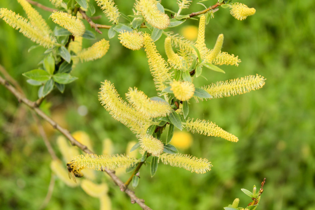
I chose the first image to display as an outcome for this shoot as I like how the bright yellow colour, contrasts with the green behind. This is the first image in this shoot that noticeable contains both warm and cool colours, but because there are yellow undertones the grass behind the plants in the foreground, the colours go together well. I also like in this image how some parts of the plants in the foreground are in focus, but the further away from the camera, the more out of focus the landscape gets. This allows for the main focus of the image to be the plant, but the colour in the background to still be noticeable.

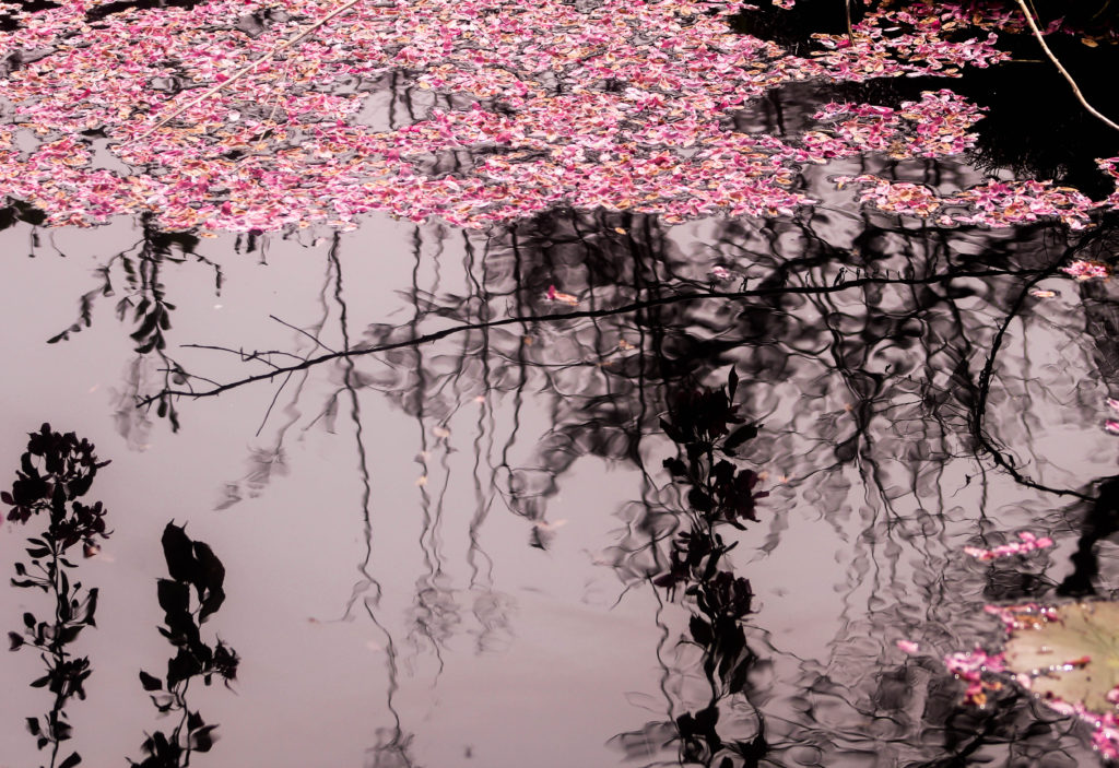
The second image of this pair reminds me of the work by Susan degrees, even though she used light sensitive paper to create her images of plant and water, I think that the shadows of the surrounding plants as a reflection creates a similar effect. The image was taken next to Malus floribunda tree which is why the pink petals are floating on the water. I think this contrasts well to the black reflection on the water and the reflection of the sky which has a pink tone because I edited it to have a warmer appearance. Another reason this image reminds me of Susan Derges work is through the defined shapes of the plants which are reflected on the water. This is similar to Derges as she includes the intricate shapes of the plants and flowers she prints in water on light sensitive paper.
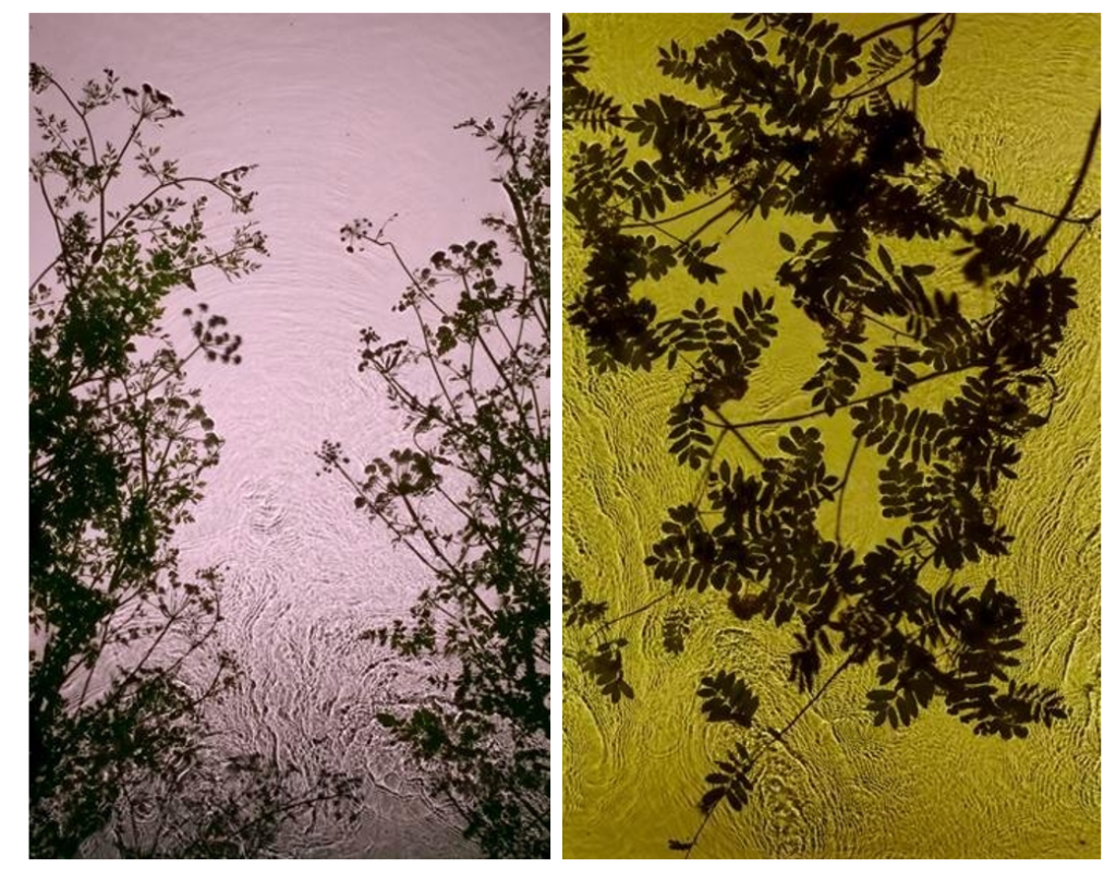
Examples of Susan Derges Work

This section of the photoshoot i focused on water aspects of the landscape and what is found in and around the water. I think this is interesting as a different style of image was produced in the second half of this shoot, even though they are from the same area. I displayed below the images I thought were the most effective.
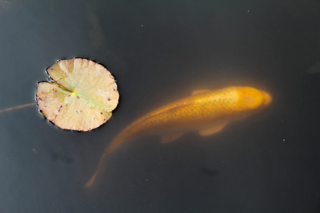
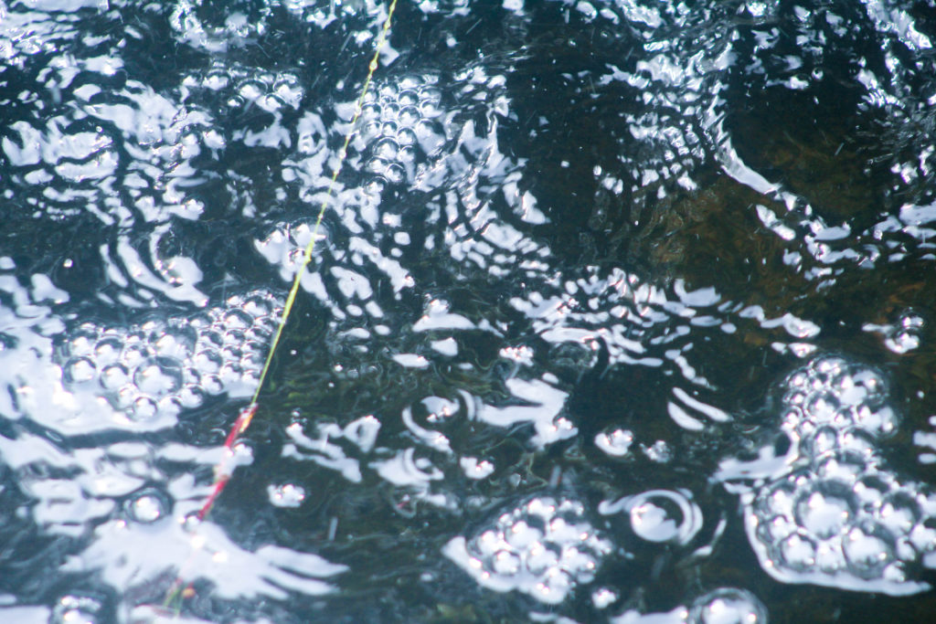
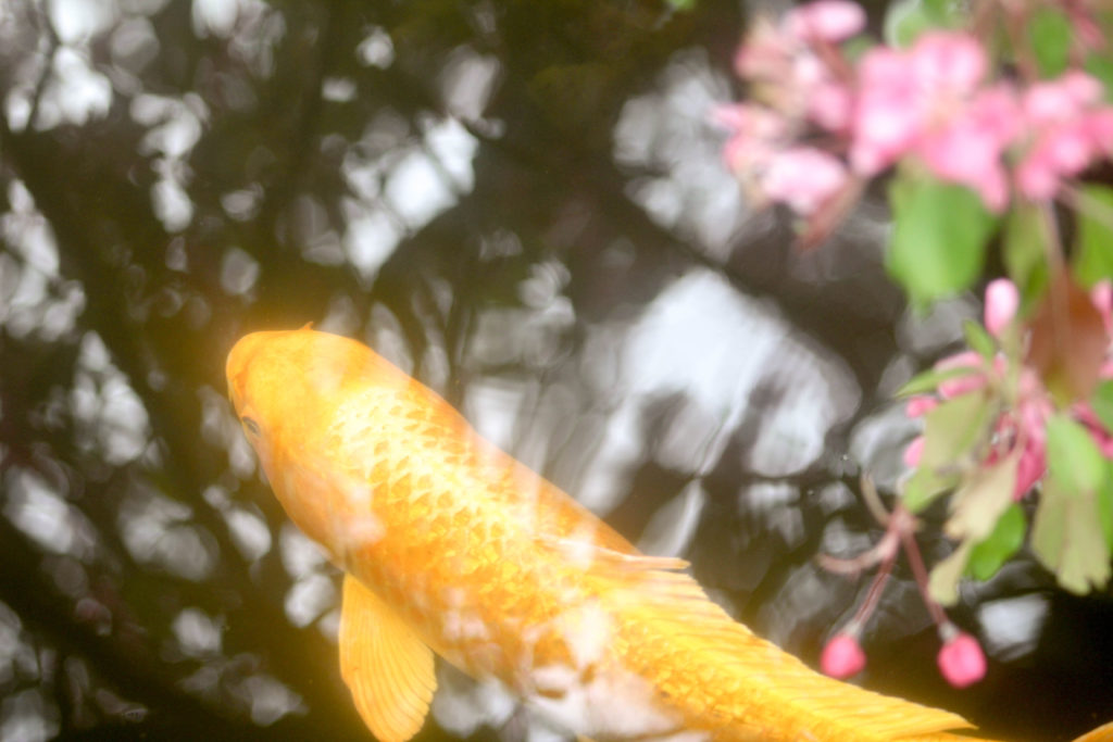
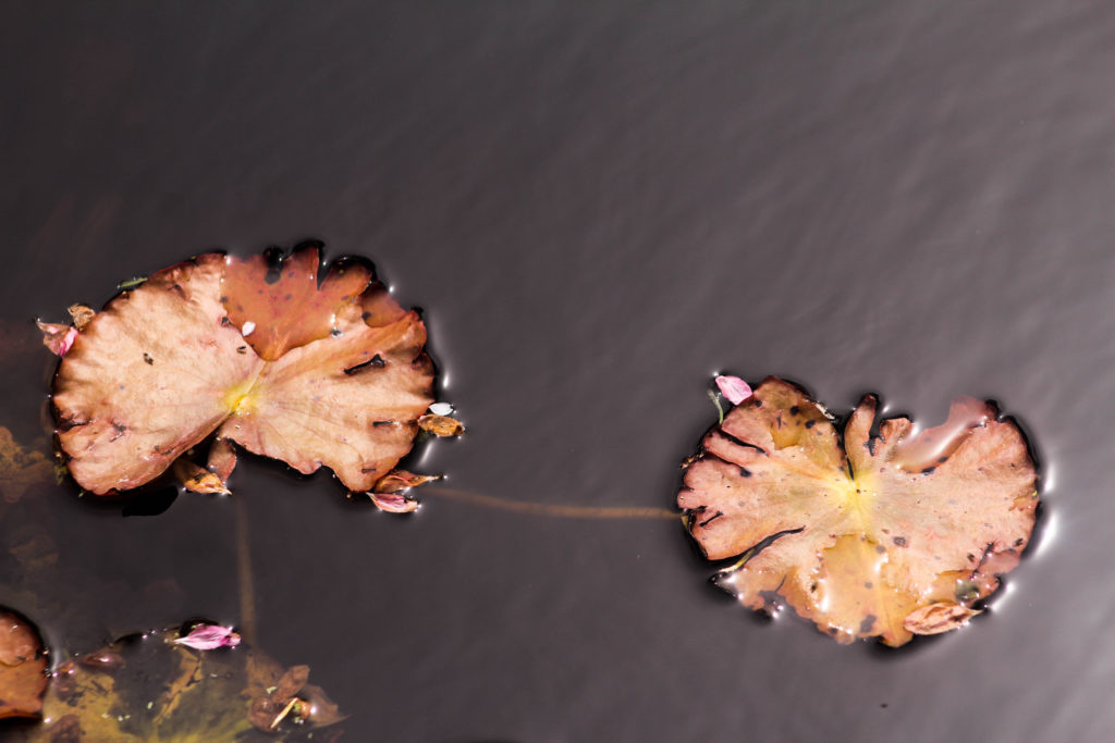
These two images are some of my favourite from this shoot, I displayed them together as I liked how the calmness of the first image contrasts with the the detailed patterns in the second. The first image is of a koi fish which I saw in a pond and decided to photograph this as I knew that symbolises many different things, and has a long history in Chinese and Japanese culture. . Koi Fish meaning in Japan is good fortune or luck they also are associated with perseverance in adversity and strength of purpose. I like the composition of this image is as it’s vey simplisticand only shows two aspects of nature. I think that the lily pad next the fish makes the image and composition more interesting, the full circular shape reflecting some of Kandinsky’s theories of geometrical shapes and circles. The gold/orange colour of the fish is effective and complements the colour of the lily pads they are both warm colours. The black appearance of the water further emphasises the warm colours and also the calm and peaceful atmosphere as there are no waves in thewater distracting from the plant and fish. There are several species of Koi, each with their own defining colors and markings. Accordingly, each type has its own spiritual overtones and meanings. A black fish, called Kumonryu, is named after the Japanese dragon of transformation and is said to signify upcoming life changes. The gold fish, Yamabuki, fittingly symbolises gold, wealth, and good fortune.

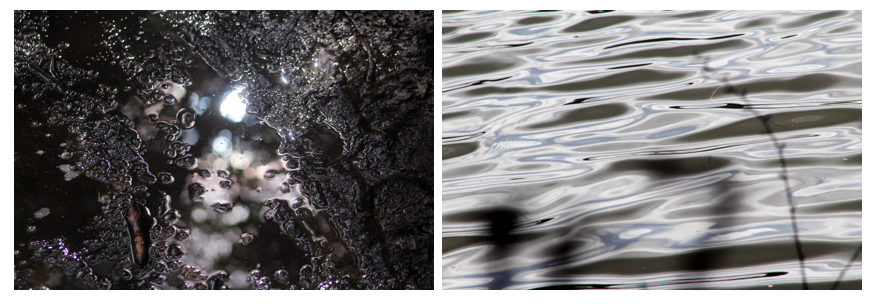
I like the second image as its of water, like the first image, but is completely different as I took it near a small water fall which is how the the bubbles were formed. I think it links well to the first image as the same dark tones of the water are also between the patterns in the water and have light areas that are emphasises by the darker parts. One difference is that in the second image I edited it to further emphasise the cool blue tones that could contrast to warm ones. I think that edited this image emphasising the cool colours was more effective than if i edited it to emphasise warm colours as water naturally has a cool tone. I also like how the shape of the bubbles are emphasised moresby the light reflecting off the curved edges, making the shape more noticeable. This is another reason I think these two images go well together as they both contain circular shapes, linking to Kandinsky’s theories on geometric shapes and circles.
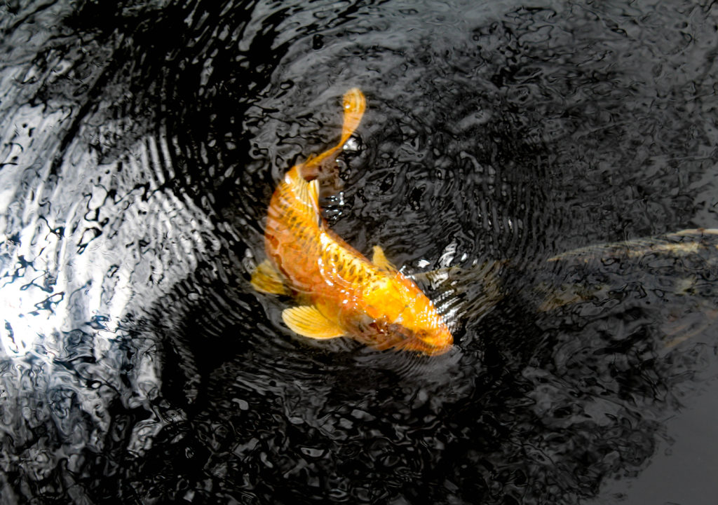
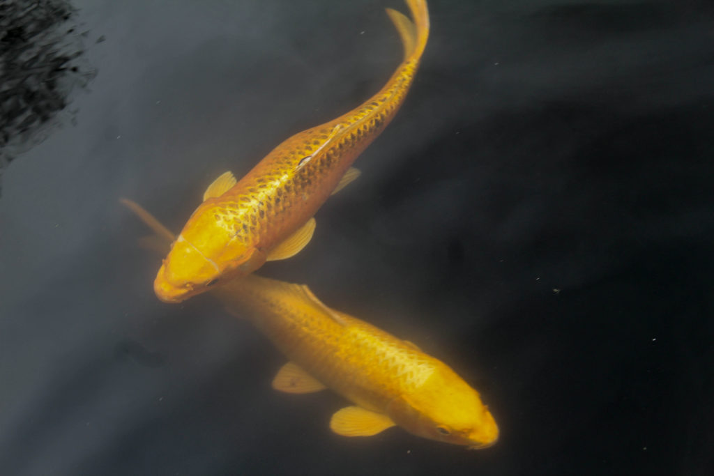
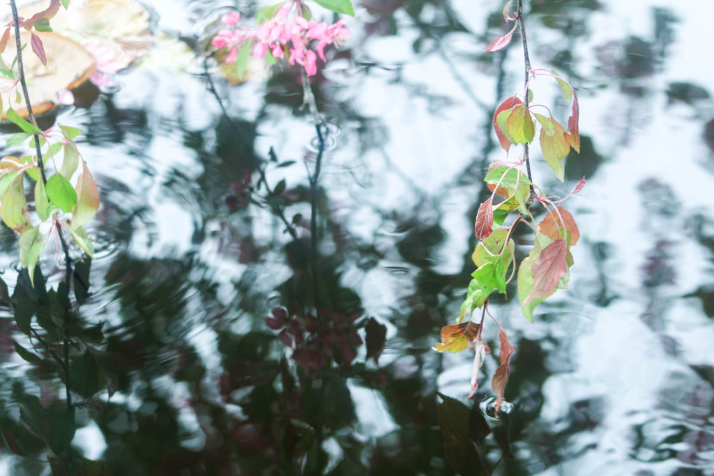
I chose to take different angles of koi fish with different surrounding reflections on the water to see if a plain black background or a more detailed background was more effective. In the first of these three images I photographed the ripples created by the fish coming closer to the surface of the water which creates a more distorted appearance. This image shows more movement than the other image and more reflections of the water through the ripples, ranging from white, grey and black. This makes a more interesting pattern through the ranging colours and the shape that the fishes body is in. The second image is similar to the first image of a koi fish in this shoot as it had has a simplistic plain black background as well adding to the calm and tranquil appearance. The difference between the two is that the second image displays two fish swimming together creating a interesting shape of them overlapping. The ripples and the slight reflection in the top left corner of the image create more texture and pattern. In the third image I included flowers from the Malus floribunda tree in the right side of the image. I kept this part out of focus and kept the main focus on the fish, which I think creates an interesting composition. Out of the three images, the most is going on in this image, as well as the flowers, the reflections of the surrounding trees are shown on the water which shows another side of nature. I think that the brown and white colours of this are effective as the white continues over the fishes body and makes the pattern and scales distorted. I displayed these three images together as I thought it was interesting how photographs of the same subject can have completely different appearances.
Evaluation

I think this photoshoot was successful in capturing nature, taking inspiration from different artists and photographers I have explored in my project and combining some of their concepts. For example, many of the images in this shoot took inspiration fro Kandinsky’s theories on geometric shapes i.e circles and his thought on warm and cool colours having energies. Other images took inspiration from Susan Derges, where the shadows of the plants on water, reflect the appearance of lots on light sensitive paper. Some images took inspiration from Rinko Kawauchi who explores ephemeral existence in some of her images. I also tried to emphasise the spiritual quality of the nature which i think i did effectively through the colours I’ve emphasised and the intricate details i’ve focused on.

Experimentation
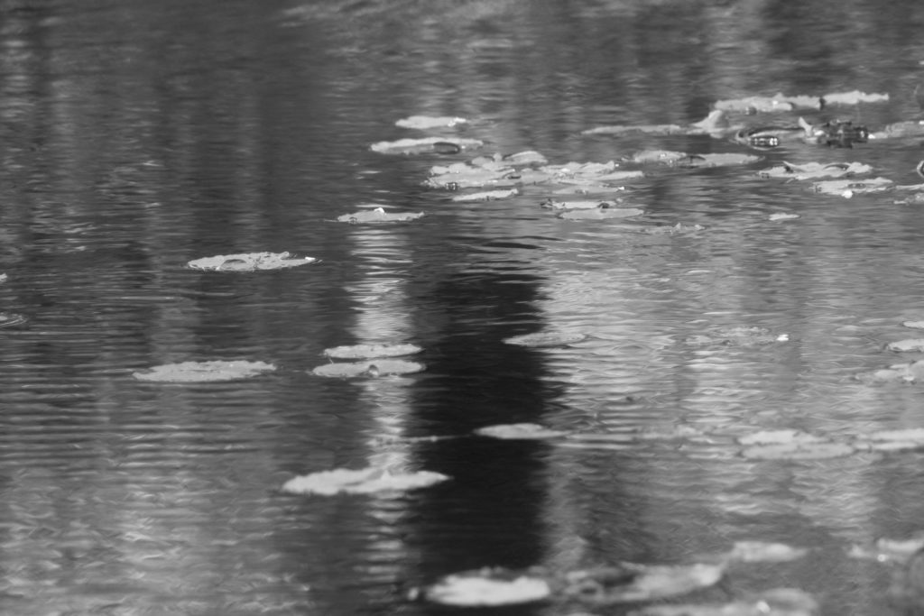
I then decided to experiment by editing these images different warm and cool colours to see which would create the best aesthetic. I think the black and white is effective in emphasising the range dark to light tones of grey in this image, and also highlights the brightness of the lily pads on top of the water. However, for this project I think that because I’ve focused on the different colour that bring people different emotions, that by displaying this image in black and white wouldn’t link as well to the concepts behind my project and to my other image. That is why i decided to also edit this photo different colours that are different from the original pink tones. When comparing these edits I still think that it’s better with the warm tones emphasised rather than changing them to cool colours because I think that what makes this photo interesting is the natural pink tones from the tree in the reflection. By changing the colour of this you cannot notice the natural effect of the tree in reflection.
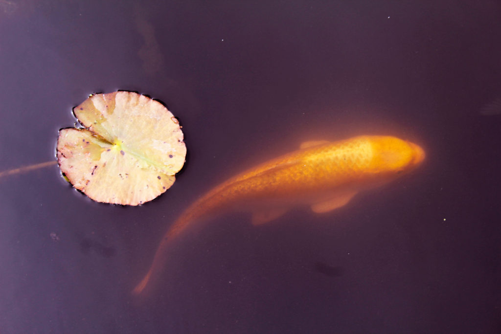

I also experimented with cropping when editing these images to see if a closer angle would make a better composition. In the image of the koi fish, I think that by cropping the image to one section is not as effective as the real composition as it takes away from the simplistic appearance with the negative space surrounding the fish and the lilypad. With the second image of the close up angle of the plant, I found that I liked when I zoomed in one section the image and think that the closer angle focuses on aspects like patten and light even more than the original.

Photoshoot 4

In this shoot I have displayed images where I have tried to focus on close up aspects on the environment that may not be as noticeable, especially on bold colours that stand out from the background of the image, drawn from abstract concepts. I also focused on lines and patterns made from branches. I think that this second photoshoot at Queens valley was successful in me discovering the full concept of my project concerning the relationship between nature and humans.

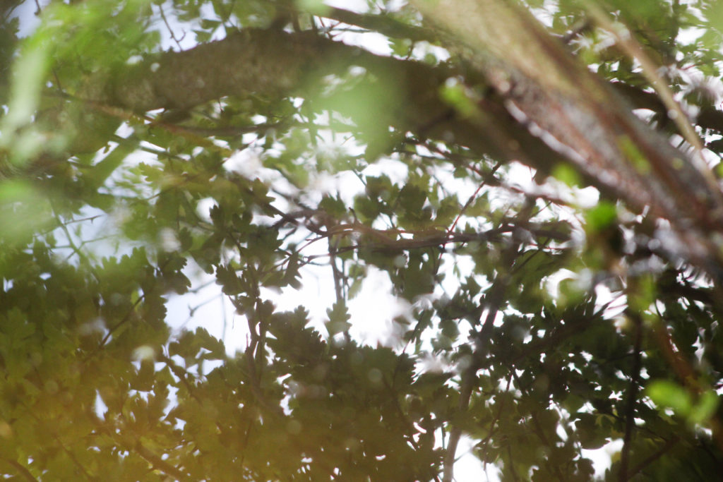
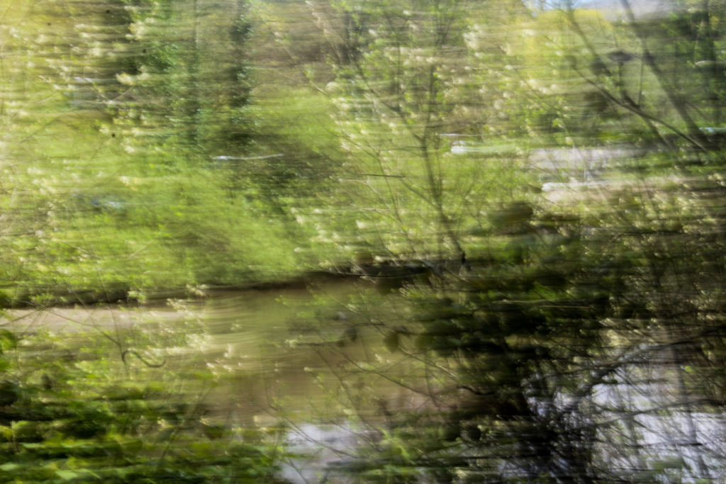
This is one of my favourite images from this shoot. I especially like how the whole image is filled with patterns and texture. I tried to focus on light and the soft colours, so zoomed in on the reflection of the trees on the water and had the leaves close up to the camera so they are blurred, creating a relationship between the camera and nature. I think that this draws on the concept I want to explore of the relationship and connection between humans and nature. By taking the photo within the plants and trees it creates the illusion of being completely surrounded by natural world as the entire frame is filled with natural objects. By focusing on aspects of light on the water reflection, and even in the close up leaves in the left corner, I think this image really draws from ideologies of spirituality and nature being connected in many ways. This is a concept I want to explore and research more in my project to get a better understanding of how nature and humans are connected in ways that many people may not know.

I also like the composition of this image and how the branch in the right corner is out of focus, but creates a break in the image and adds another aspect to look at. I think what makes this image stand out to me is the contrast of the bright white reflection from the sun on the water thats contrasted with the natural green and brown tones surrounded it and reading interesting patterns. I also like how the leaves from the plants that are surrounding the camera are only shown in the reflection of the water.

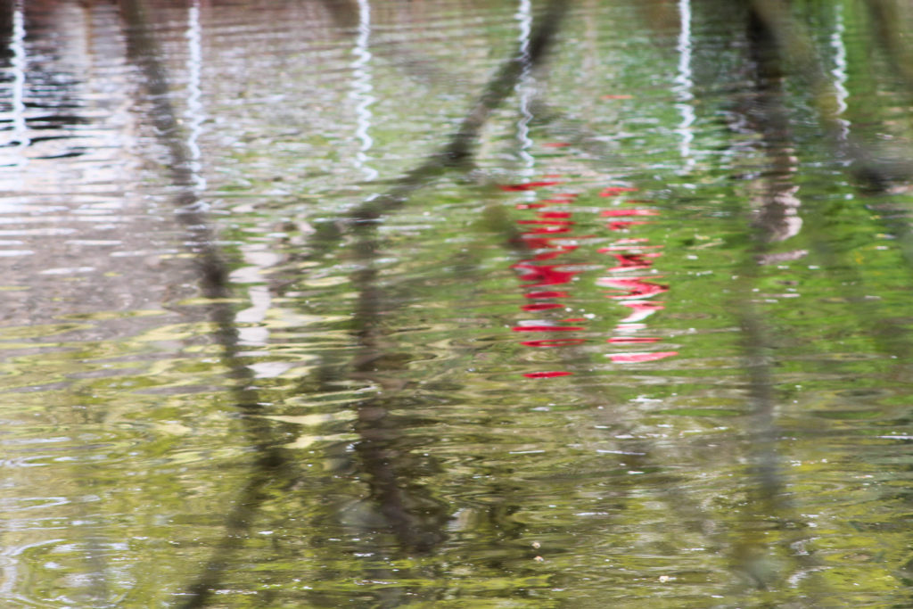
I also tried to focus on bold colours that were different from the surrounding landscape, which I think these two image above do well. The first image is of a reflection of a person walking along the path in a reflection. I chose this as an image to display as I don’t think its easy to tell that the red reflection is a person. I also liked how the red colour was completely different to the surrounding greens and browns, reflecting ideologies of abstract. I also think that the branches in front of the camera that are out of focus create another aspect to the image that makes it more interesting, and creates a similar effect to the first image in my shoot, where the camera is immersed in the nature, creating the the appearance of being surrounded by the natural world. I also think this reflects the theme of humans and nature being connected, as in this image an reflection of a person is shown on the reflection on something natural, connecting the two together.

In the second image I liked the bright orange colour and the shape of the leaf contrasting against the white and brown background. What makes this image more interesting is that patterns created from the sky in the reflection water, the white colour contrasting to the patterns of orange and brown in the image. I like the composition of the leaf in the foreground and the blurred background that is divided into sections of darker and lighter. One aspect I don’t like about the composition is how the second of the orange leaves is half way out of the frame, which doesn’t create a as aesthetically pleasing image to me. Although this composition may be interesting to use in my final images as I normally take images symmetrically or which fit in the frame aesthetically, this image contrasting from what I usually do. I think that the orange colour in this image really emphasises the spirituality of nature and plants, as it stands out from the less bright background of brown, focusing on a smaller aspect of nature and it’s ethereal beauty.

This image stood out to me when selecting my final images for this shoot as I think that has a simplistic and calm appearance that not many of images had. I think this is because in this image the lines/ripples in the water are repetitive and consistent, whereas in most of the other images, I photographed things in the landscape which were more unusual meaning that the patterns and lines were not consistent and more disorderly. I this image the ripples start light towards the foreground of the image and gradually become darker towards the background, creating a more aesthetically pleasing range of colours and composition. What makes this image interesting is the duck which is placed in a unusual place in the frame. Instead of photographing the duck towards the centre of the image, i decided to place it at the top left corner so both the ripples in the water and the duck are seen. I think that this image also reflects ideologies of spirituality and nature through the ripples made by the duck in the water and the undisturbed, tranquil appearance which further emphasises the peaceful nature.

I think this is an interesting image that builds from some f the images I took in my first photo shoot of the same type of water plant in a different area. In my first image i only focused on the plant, with the surrounding water being flat, whereas in this image the plant is surrounded by leaves and sticks fallen from the surrounding nature. This creates an interesting pattern that contrasts from the vertical green lines of the plant coming out of the water. I focused on only photographing one of these plants as i wanted it to seem out of place within the background of the image which is what I think I achieved. In comparison to the background the green tones of the plant are bright an is similar the second photo in this shoot, focusing on a smaller aspect of nature and it’s ethereal beauty. I also like how this plant is growing out of the water as I think it reflects concepts of new life and nature having a spirit.

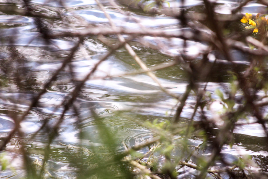
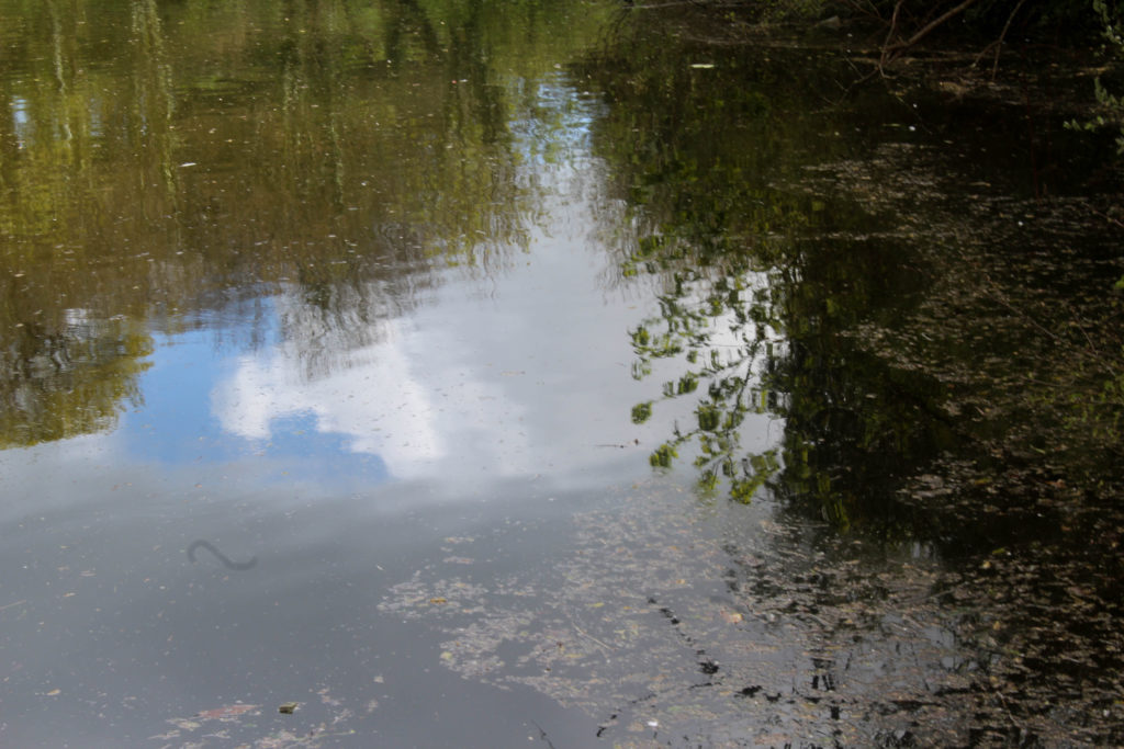
I also decided to take a photo in the same place as my second photoshoot of the reflection of the same plant, as I was interested in how an image of the same natural object can look so different at diffrent time of the day and with different weather. On my second photoshoot the weather was slightly cloudy and overcast, whereas for this shoot the sky sky was blue, which is why the reflection on the water creates a different appearance for the image. I tried to photograph this emphasising the light and the reflection of the blurred white cloud against the water as I think this creates an image that is more spiritual and focuses on the beauty of nature.

Abstract Reflections

In this shoot I also focused on shapes in the landscape that had sections of bold colours, as I wanted to explore ideas of abstract more and thought that by photographing reflections in water creates a distorted appearance of bright colours. The weather on this shoot was good as the bright blue sky contrasts against the clouds in the sky, which I could then juxtapose to the colours in the landscape.

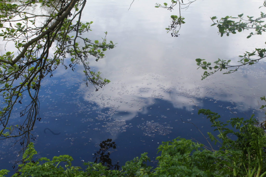
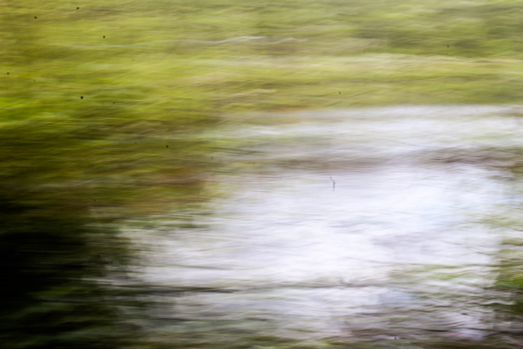
For this image I used a slight longer exposure than the rest of the images when photographing abstract shapes. I think this was effective as it captured the slight movement of the water which made the clouds look less like a reflection and more like part of the water which I think adds to the spiritual quality of it. I like the composition of how mage is framed by the surrounding plats, especially on the left side where the branches from the trees goes close to the water. I also like how the bottom section shows a different type of plants that is more green and is apart of the plants on the ground. I think that this contrast between the green of the leaves and the bright blue and, that is the sky reflected on the water, is effective. It creates sections within the image of different colours with different patterns that I think reflect abstract art and photography.

Andrew S. Gray

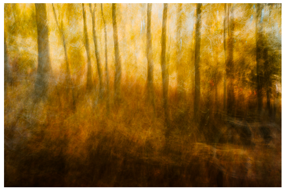
I think this shoot also reflects the work Andrew S. Gray similar to my previous shoot, as in some of his landscape images he captures bright solid sections in his blurred photos. In this shoot where I looked at abstract shapes I think that the solid colour sections reflects Grays work. When editing these images I could alter the hues in the natural aspects to be more brightly coloured and abstract. One difference between both out images is that in some he doesn’t pick up the details of the landscape (like the image on the left whereas in my images I still includes the patterns, shapes of leaves and light reflection on water as I thought that these elements were necessary. I didn’t try to blur the images in these shoot, like my previous shoot, as I wanted to try interpreting his work in a different way.

Experimentation: Warm vs Cool

When editing these images in light room and photoshop I tried to emphasise the warm tones and cool tones by creating different variations of the same image, looking at orange, red and blue tones. I think for this image, emphasising the warm tones orange and red was more effective as I feel it further emphasises the spiritual quality that the image has. The colours yellow, orange and red remind me of positive emotions rather than negative. For example, the colour yellow. Nearly all cultures tie this colour to a sense of warmth, both physical and emotional. In Japan it represents bravery. Many religious groups, particularly those from Ancient Egypt and in Hindu tradition align the colour yellow with the Divine. Consider that the halos of the angels typically appear in a yellow or gold colour. Spiritually speaking it represents the element of fire, our sense of vision, energy, harmony and personal identity. Orange is sacred in Hinduism. It is in the Fifth Ray of 7 that classifies humans mystically. In general symbolism, orange brings happiness and health into our lives. In the Tarot it symbolises the intellect and spirituality. Cool colours i.e. blue is often connected with spiritual studies, meditation, and Magical practitioners use blue or purple to represent the Water element. To me the colours orange and red make the image have a warmth and spiritual quality that couldn’t be achieved with cool colours. I also like how this image the close up leaves that are are out of focus from being close the camera are still noticeable and are emphasised with the colour yellow. Because you can see through these sections, it makes the leaves look transparent and emphasises the range tones in the image. The cool editing has a different appearance and an atmosphere thats calming and tranquil, creating a more peaceful image.

Wassily Kandinsky Work

My image above reminds me of this artwork by Wassily Kandinsky through many different aspects. One way is through the colours used, ranging from blue, to orange to red, similar to me editing where I emphasised the cool and warm colours. I also think it links to this piece through the shapes and lines. In my image the reflection of the leaves on the water show the light shine through the leaves, creating circular and interesting shapes, which I think are shown in Kandinsky’s painting where he emphasises circular shapes and rounded lines. The rounded shapes in my image are the small branches that are shown to be above the water, contrasting against the pattern of the leaves the water. One difference between mine and Kandinsky’s painting is that he uses abstract shapes with geometrical patterns, my image does not contain these as they are not shapes that are created in nature and represent Kandinsky’s theories in his book ‘Concerning the Spiritual in Art’ where “This essential connection between color and form brings us to the question of the influences of form on color. Form alone, even though totally abstract and geometrical, has a power of inner suggestion. A triangle (without the accessory consideration of its being acute — or obtuse — angled or equilateral) has a spiritual value of its own.The case is similar with a circle, a square, or any conceivable geometrical figure” I think I could further emphasise these theories in my future work. For example I could like at different shapes as Kandinsky believed that “The mutual influence of form and color now becomes clear. A yellow triangle, a blue circle, a green square, or a green triangle, a yellow circle, a blue square—all these are different and have different spiritual values.”

“Like symphonies, Kandinsky’s great abstract paintings speak directly to our senses and feelings. Their constellations of mysterious marks are like waves of sound that trigger emotions.” For him, the world they pointed towards was a spiritual realm, a hidden truth. I think that some of the images in this shoot, especially the ones where I focused on abstract landscapes, reflect some of Kandinsky’s earlier work where he focused more on landscape. For example in Kandinsky’s painting above, he used tones of the same colour in different sections of the painting, which I think is reflected some of my images, especially when I edited them to have different hues. The difference between these images are that Kandinsky focused on landscapes whereas I looked at reflections on water because I thought that the distorted image of the aspects in the landscape would be effective.

Photoshoot 3- Landscape Experimentation

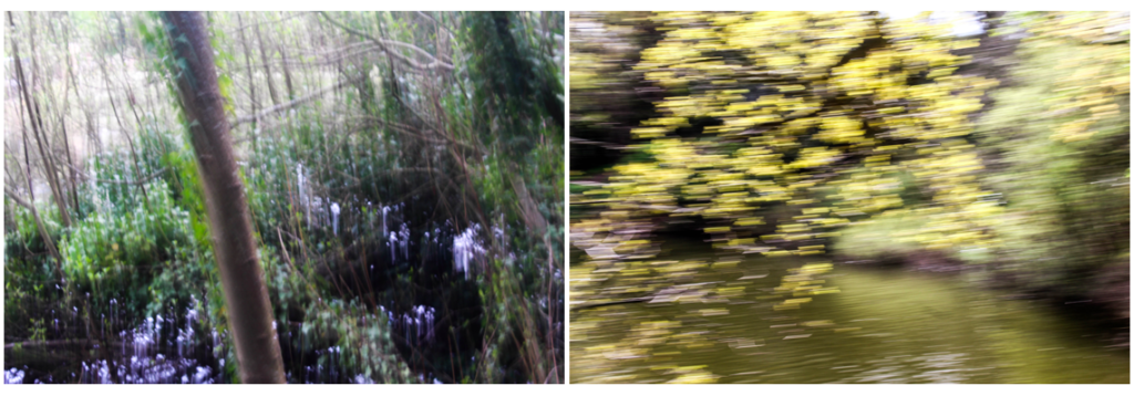
On this photoshoot I narrowed down the 400 images I took to 68 so I could look through them am pick which ones I like the most and the ones I want to be my final outcomes. On this shoot I focused on abstract shapes in some of the images and also took inspiration from the photographer Andrew S. Grey where he moves his camera when taking the images, to create a blurred effect which he takes inspiration from early english landscape painters. I think that some of the image I took whilst moving the camera were effective, but a lot of them weren’t as it was only the second time I have experimented with this technique. I chose the ones I thought were most effective and displayed them below. I also displayed the images where i focused on abstract shapes in a separate blog post that have bold solid colours. I separated this into two photoshoots so i could display my experimentation and edits with them and also because I thought that the images I took were completely different styles with different techniques.

Andrew S. Gray Interpretations

When taking these photos I found it hard to create goos compositions of the landscape as I couldn’t see exactly what the final image what turn out like until i had taken the image. This want had had to many different variations of images of the same angle to find a good composition. I also found it hard to fins the right shutter speed to use when photographing so experimented with a variety to find one to make the image blurry, but not so much that you can’t see the outlines of the shapes e.g plants and tress in the image.

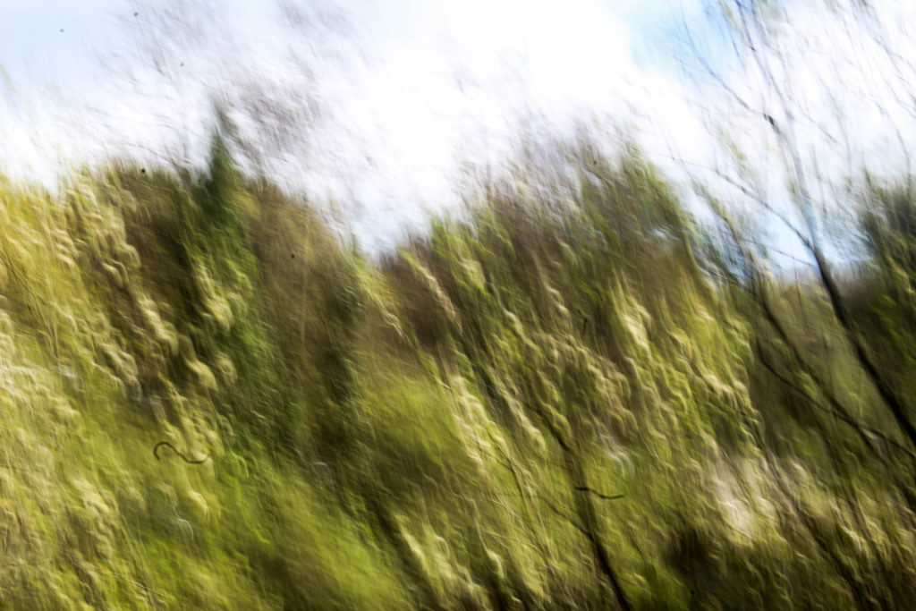
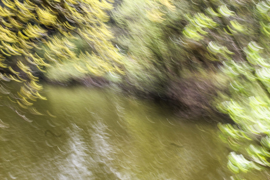
I think that this image is a good example of this, as you can still see the outline of the tree on the right see of the image, the bright water, and the trees along the horizon. I also think that the colours in this image complement each other well with the bright pale blue on the water, with the variation of green tones from darker to lighter. I think that this is one of the better compositions i took in this shoot as it’s divided into section, all contrasting one another from the colours. I think that this represents the work of the photographer Andrew S. Gray well as I think resembles the work of early english landscape painters, where the blurred lines look like brush strokes of a paintbrush.

I think the this style of photograph greatly contrasts from the other photos i have taken in this project and portrays nature from a different perspective. Instead of the detailed, sharp, in focus photos i have previously taken where I focus on the outline and patterns, these images are blurred and in the moment shots. I think this gives them an effect like I have taken the photo as I’ve quickly passed the scene. I think that this linked to the photographer Rinko Kawauchi who i have previously looked at as she believes the fleeting nature of these dualities is what ultimately determines our fragile existence. I like how she photographs things that are ‘ephemeral’, that won’t last for long. I think this concept is represented in this style of work through the blurriness, creating movement and represents the ‘fleeting nature’.

I particularly like this image as I like how the lines from moving the camera are even more noticeable than in the other images. I think that this effect takes the bright and darks parts of the image more noticeable as they’re separated from the rest of the image. As the tree was in the foreground when the image was taken with a moving camera this part is more i focus than the background go the image where the trees are completely blurred. I like the colours that are i this image, as they range from brown to green to bright green which all complement each other and emphasise the effect of the natural landscape. I also like this composition the most out of all the images I took with this technique as it was hard to see where the different aspects of the image were placed in the frame. I like how the sections are created by the edge of the reservoir with the two trees in the foreground.

Work by AndrewS. Gray

I think i have successfully taken images taking inspiration from Andrew S. Gray where he creates camera in motion images. A technique called intentional camera movement mixed with various editing processes create his abstract landscapes. Some are recognisable vistas, whereas some form from feeling and emotion as if from a paint brush. I eel i interpreted his work well,even though i haven’t experimented with this technique a lot. This might explain why in some of his image there s more focus in some areas thelawdscape than other, through practising this technique Andrew S. Gray has developed his own style. In my images there are less areas in the landscape that are i focus. Also in Gray’s he emphasises light and reflections, and warm colours, especially in the image above. In my images I tried to emphasises the earth tones like green and brown as I thought the contrast between the sky and the green was effective.

I think that this photoshoot was good in developing the style of images I want to take in my project and allowed my to experiment with different camera techniques.

Experimentation

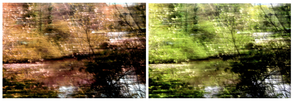
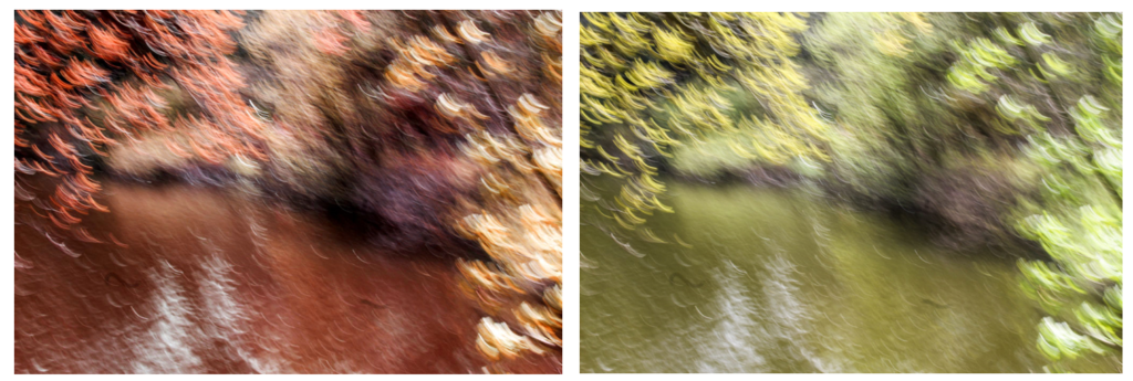
I wanted to try and experiment with different hues in the images to create more abstract appearance with bright bald colours. I edited the same image and created different variations with warming colour colours. This edit makes the image less identifiable as a natural landscape, making it more abstract as it hard to tell what it’s taken of. Some of the patterns and textures are still shown in he image, but the image looks unnatural through the bright colours that wouldn’t necessarily found in a natural landscape. I like these edits of this image, but think that my project will be most effective you can see more of the natural aspects the abstract landscape.

I also experimented by slightly adjusting the tones and colours in the image to more natural colours, so that the landscape is still recognisable. I think that these images are more effective for my project and touch on concept of spirituality through the blurred light lines on the landscape to me looks other-worldly, especially with the warm colours emphasised. I also think that these edits interpret the work of Andrew S. Gray more effectively sin many of his images he uses editing to emphasises the natural colours and brighter abstract colours to make the landscape stand out more. I found that liked to emphasise warm colours within his work which is what I tried to do in these experimentations. I also think that these works represent the of the early English painters more as the lines created by the movement of the camera is further emphasised by the shadows and highlights I emphasised.

Evaluation

I think that this shoot was successful in interpreting the work of Andrew S. Gray and in experiment with different camera techniques that I haven’t tried before. These photos are completely different from the detailed and focused images I normally take which is why I enjoyed this shoot as it allowed me to experiment with a different style of image. I also think allowed me in a different light, emphasising the ideas that things are ephemeral’, that won’t last for long emphasising the fragile existence of nature. I think these images link to this idea of fragile existence’ as the blurred effect makes the plants and natural objects seem momentary and delicate, which is an effect that wouldn’t be achieved through in focus images. In future shoots I want to link in humans to this existence and how they are connected.

I think that some of the final images from this shoot could be used within the final photobook and final images of this project as although they are different from my other images, they could create a different aspect to my work that makes my final project images more interesting.

Psychogeography shoot

Edits:

I experimented with extreme cropping with these images to place negative space in different areas of the image.

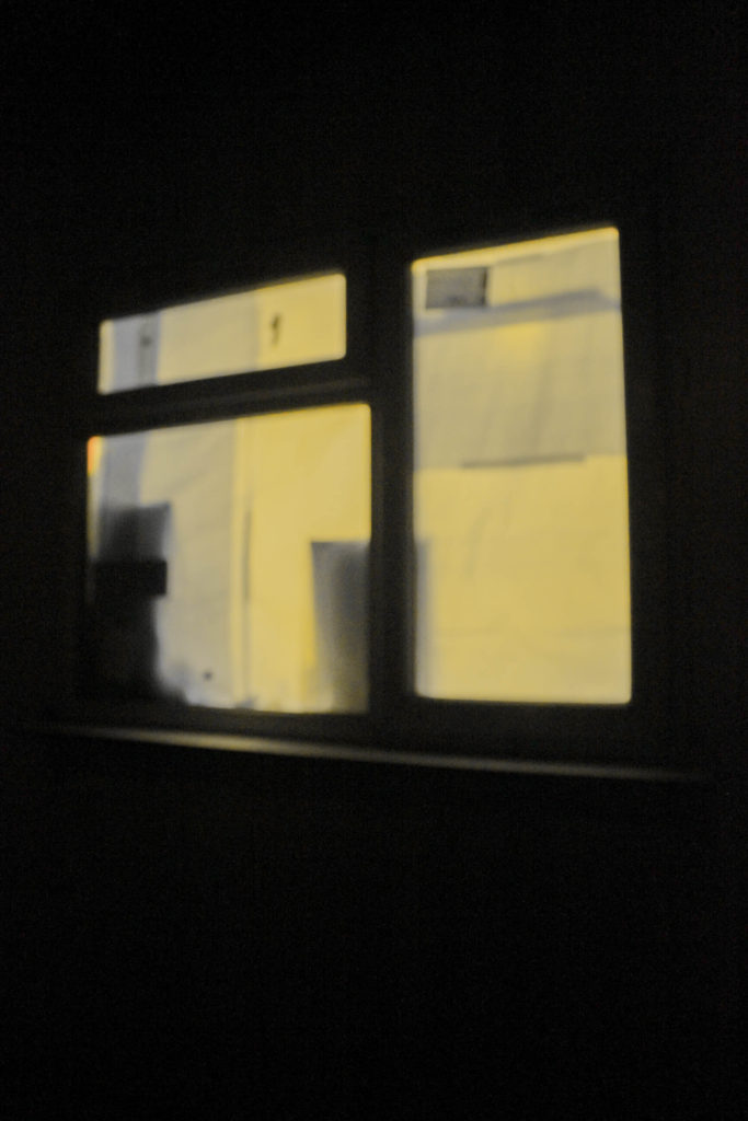
In the image of the green window, I changed the hue to appear more yellow as I knew it wouldn’t affect the rest of the image due to it being dark.

Tiny Planet | Creation Process

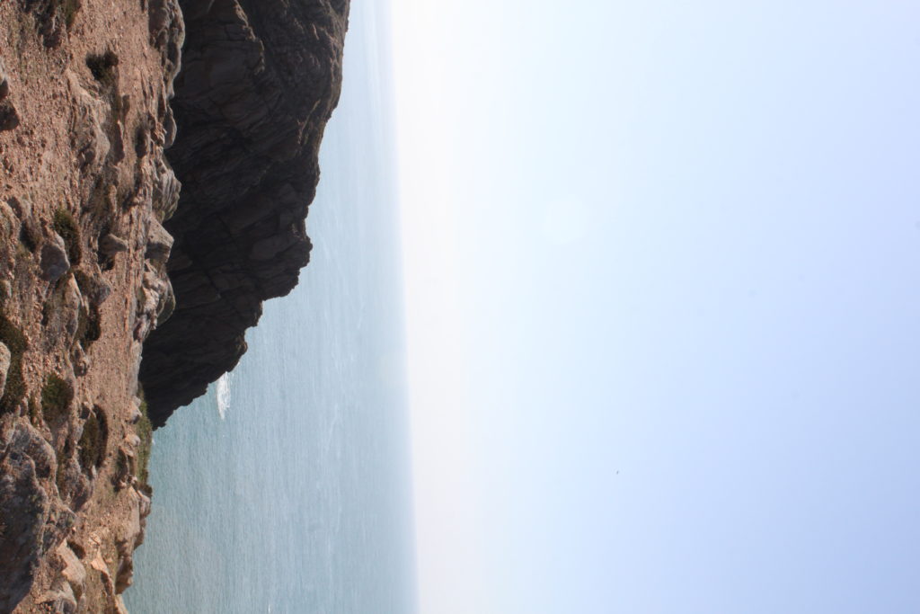
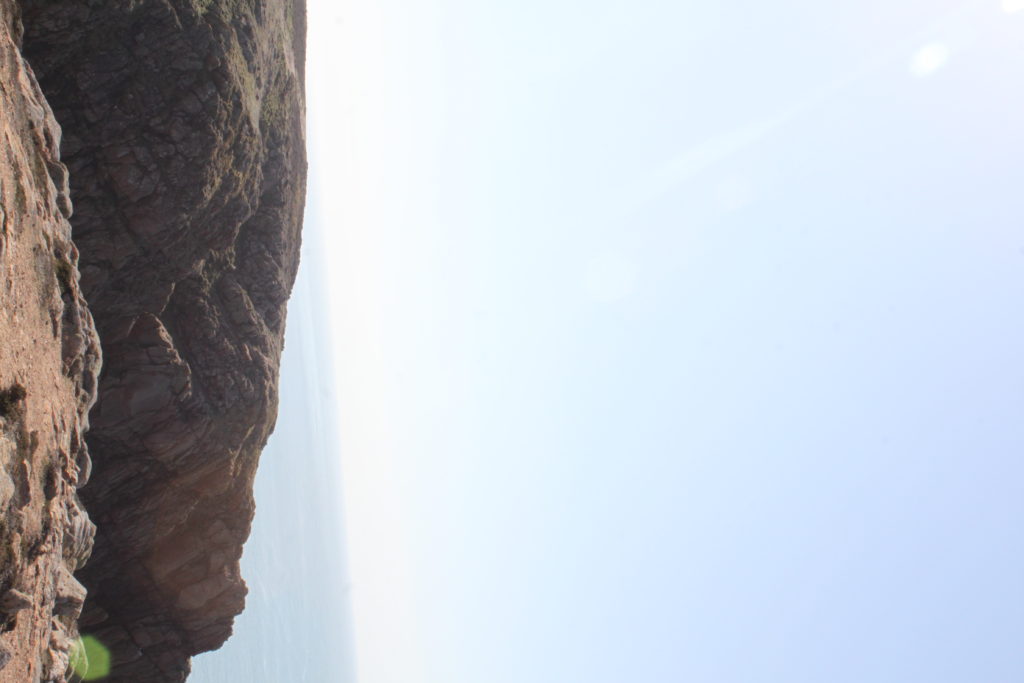
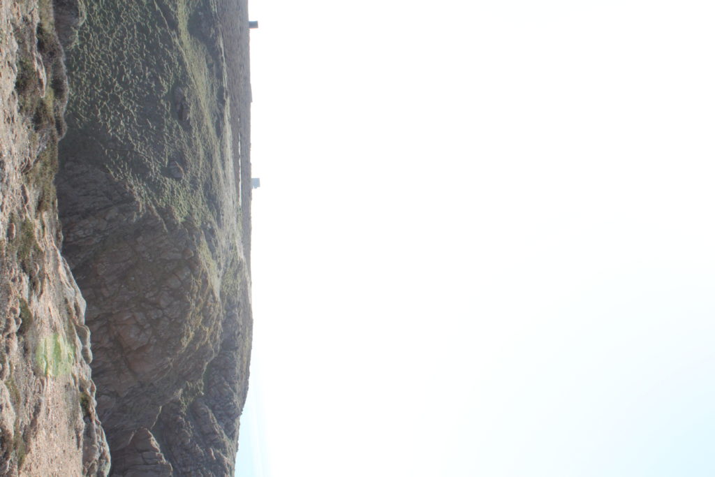
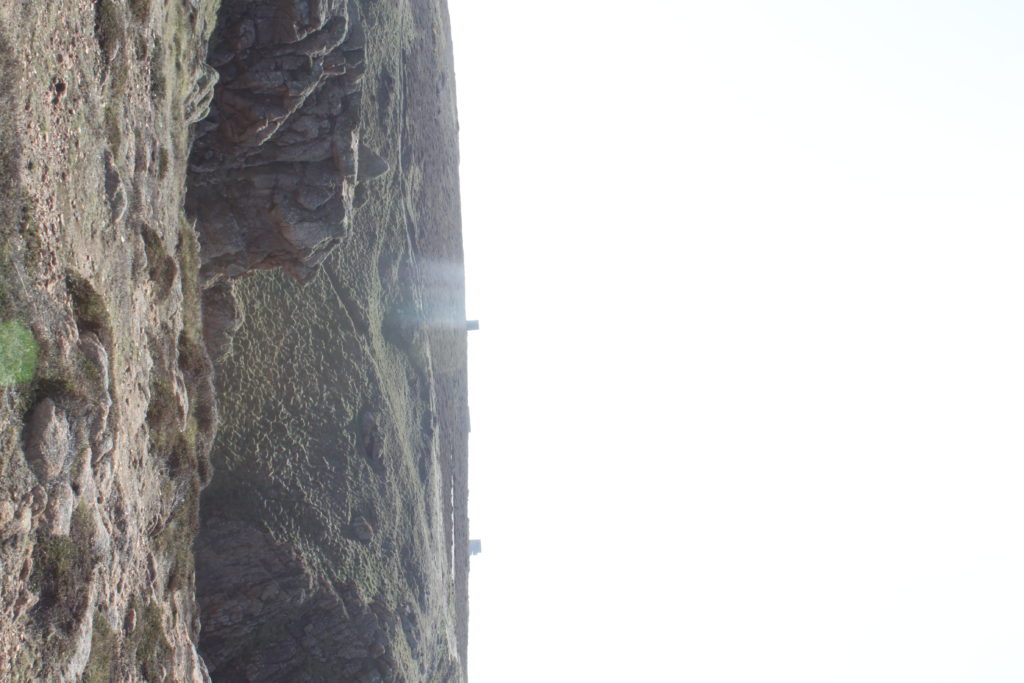
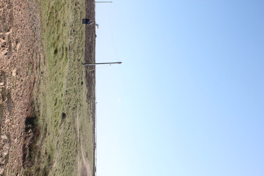
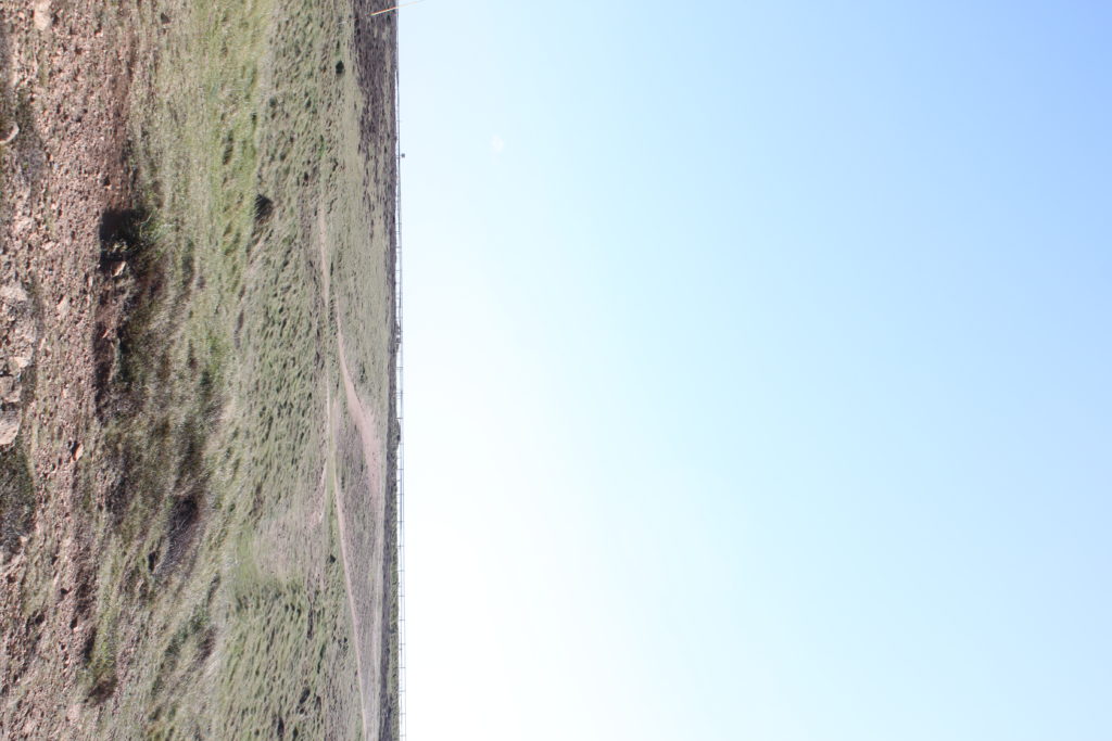
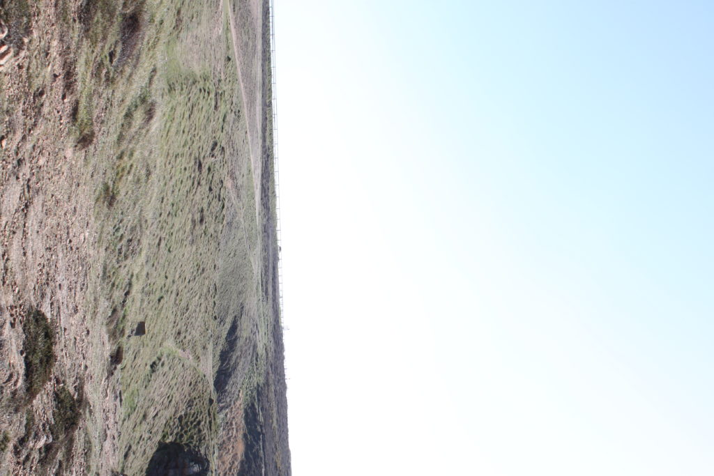
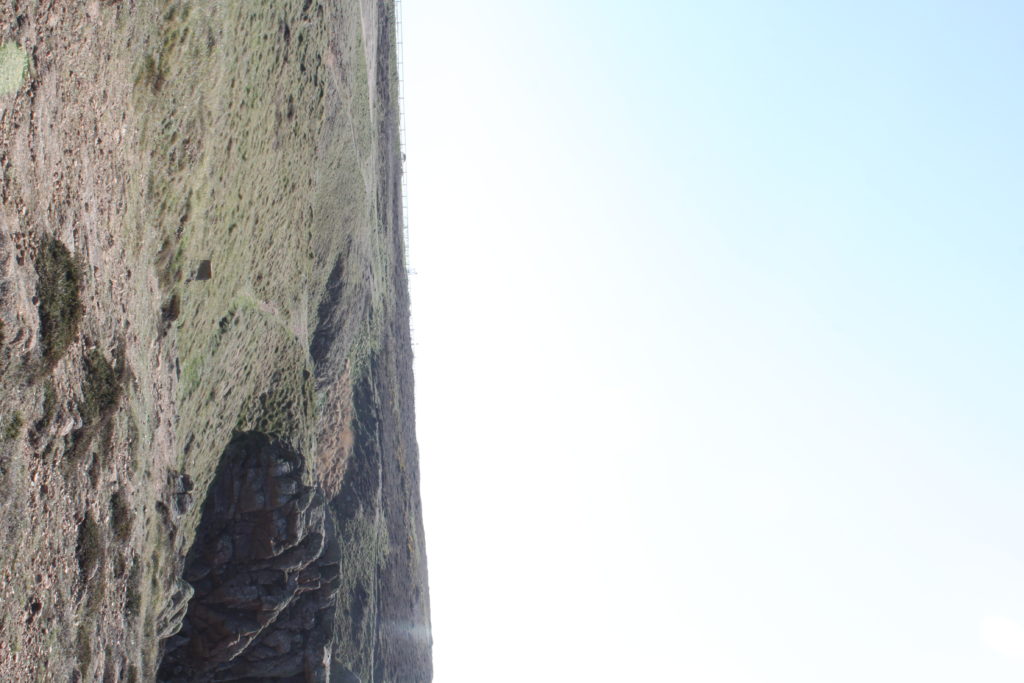
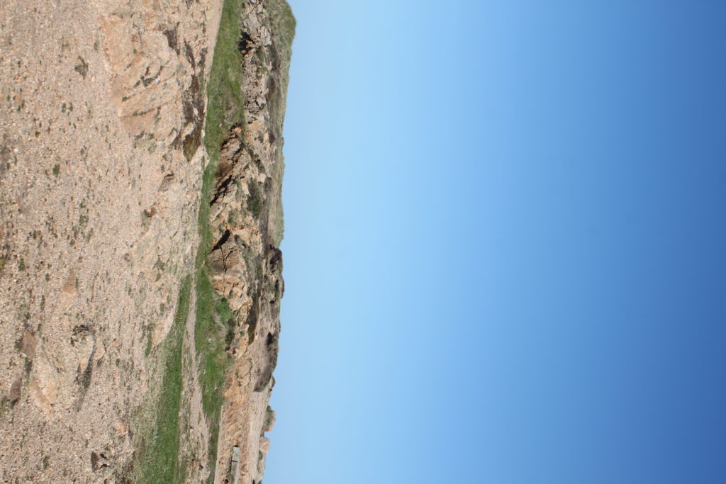
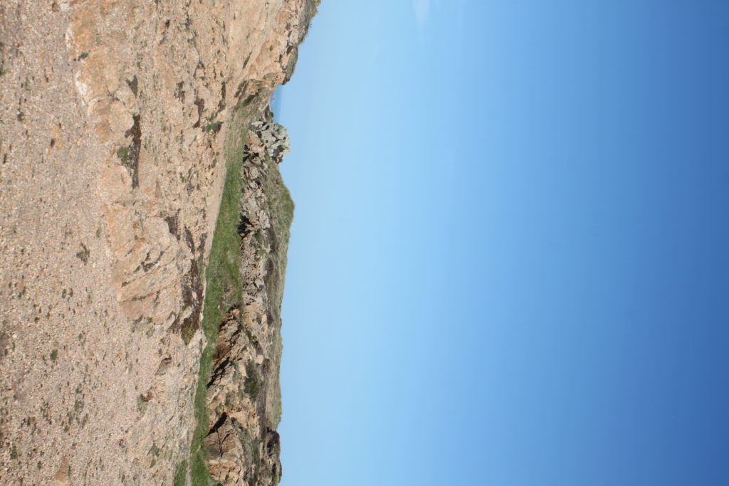
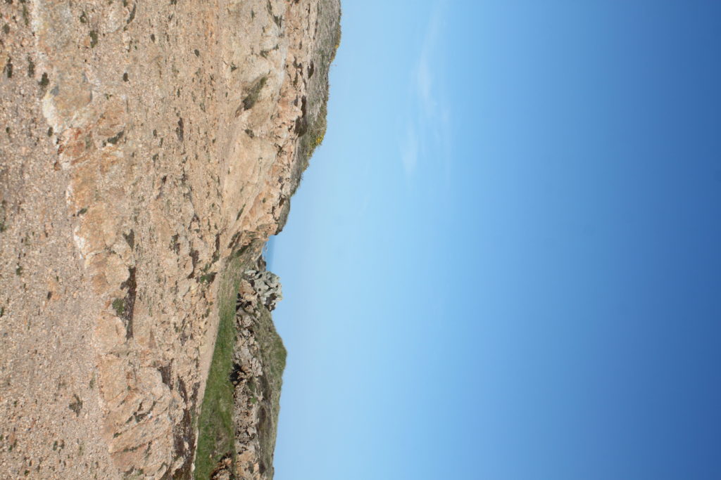
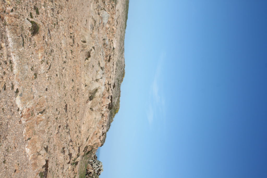
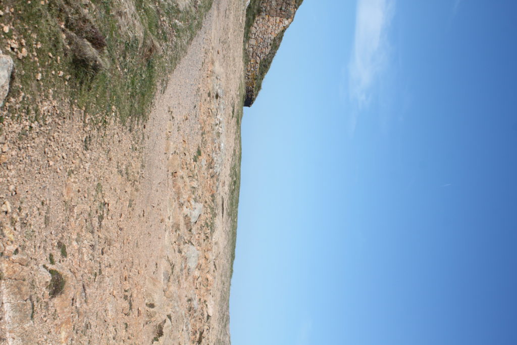
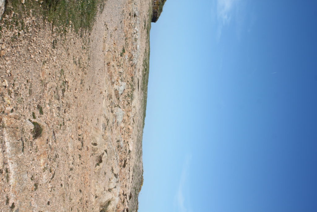
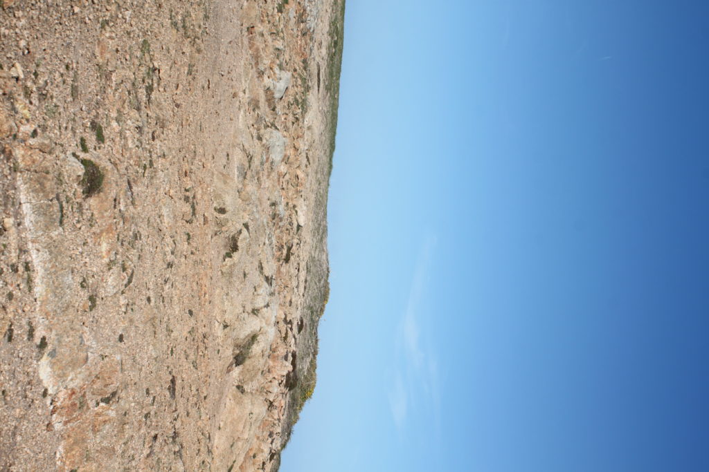
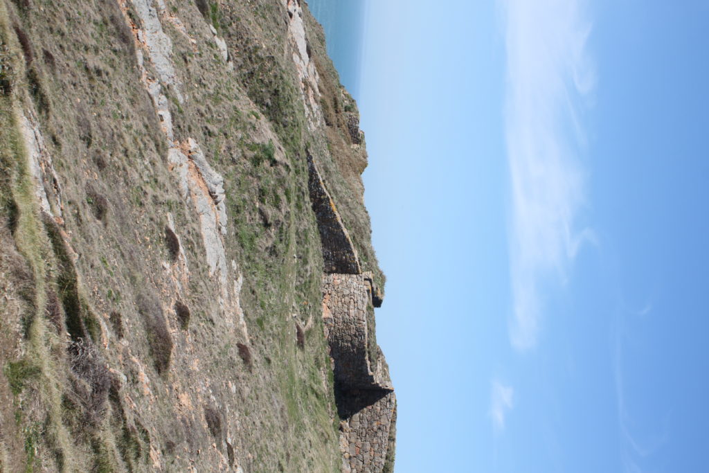
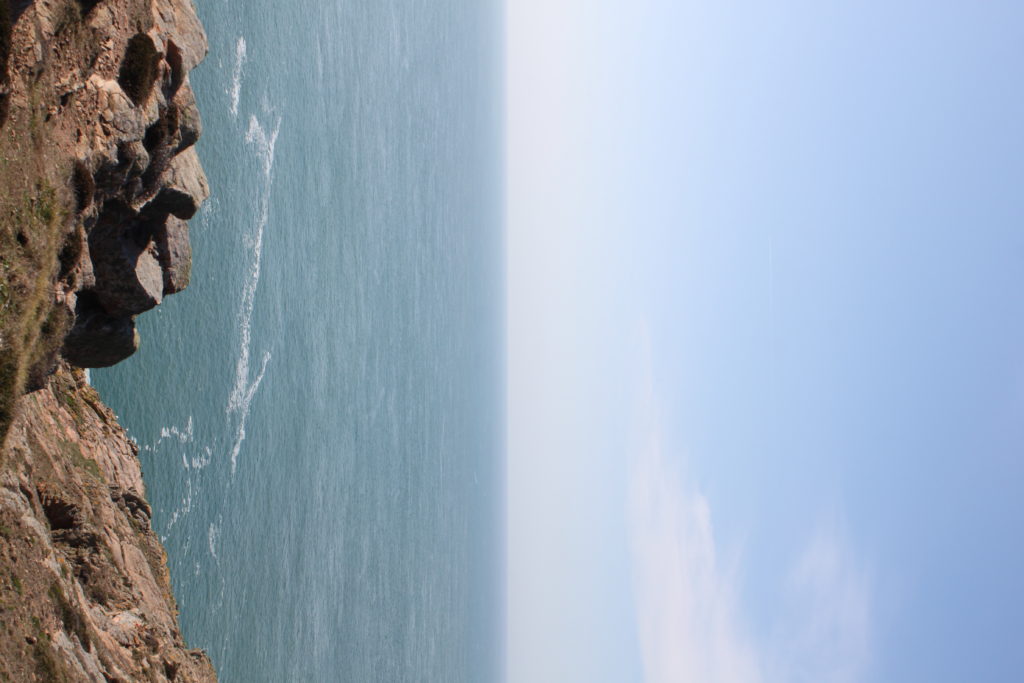
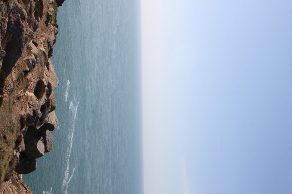
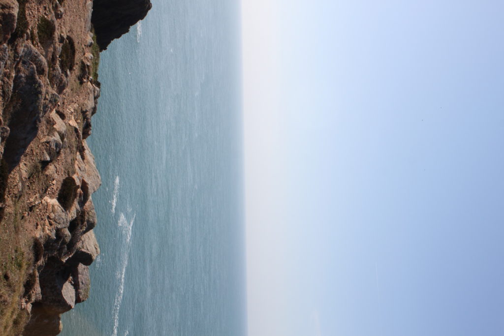
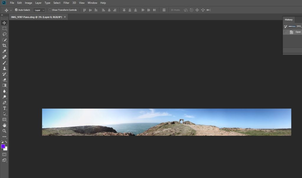
To create tiny planet images, you firstly need to take images. I took 55 images per planet, creating a 350 degree panorama as you can see below.

360 degree panormama

This is the step by step process of turning a panorama into a planet:

Start off with your panorama in Photoshop
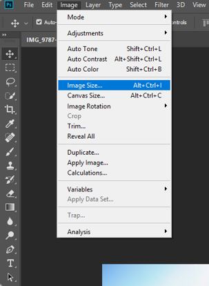
Image > Image Size
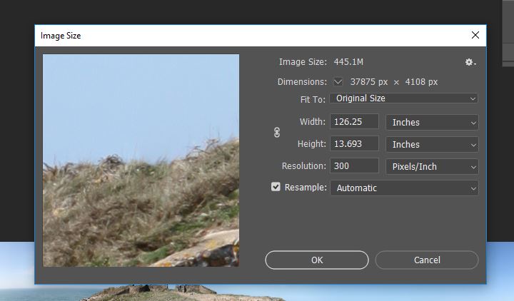
Change the Height to match the Width
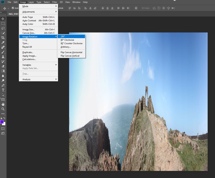
Then flip it 180 degrees = Image > Image Rotation > 180
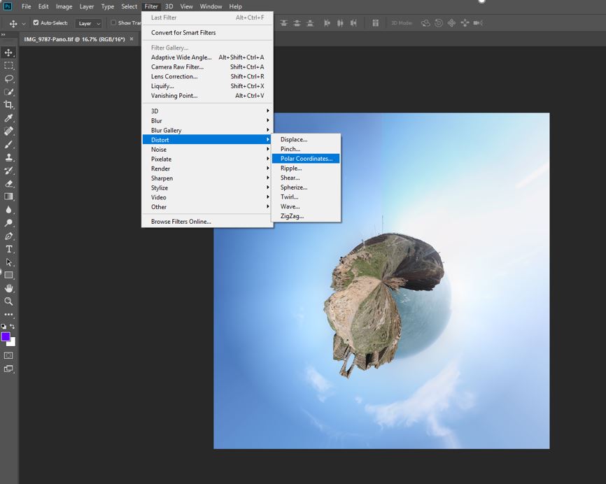
Finally go Filter > Distort > Polar Coordinates and voila
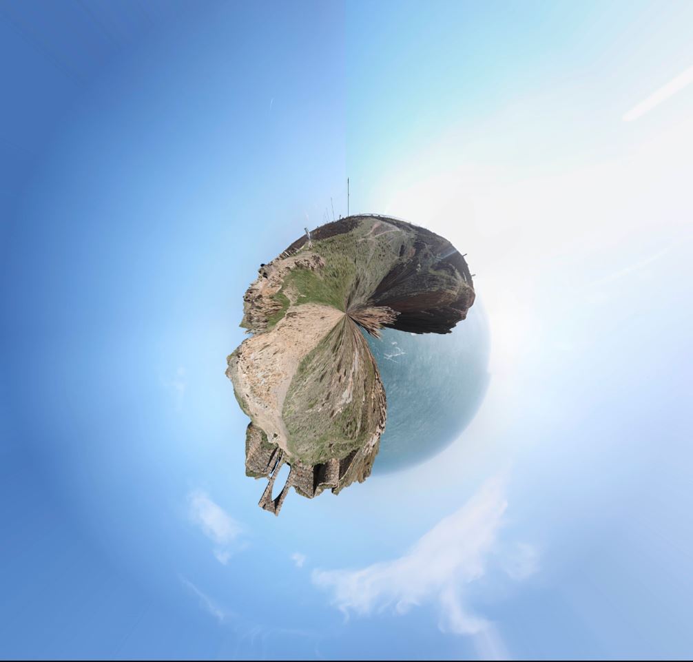
Tiny Planet for Grosnez

Abstract Colour Shoot #1

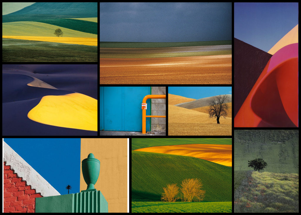
For this shoot I wanted to create a response to the works of Fontana as I really liked the simplicity created through his highly saturated images. What drew me to his imagery was his use of using the textures and patterns found in nature and man-made objects to create impressions of the landscape around him in a way which would not have usually been percieved. From this shoot I would aim to achieve a new style of photography which I could then go onto incorporate into possible future works especially the aspects of colours, something I don’t normally consider when doing shoots. To create the desired effect I would probably have to manually increase the contrast and saturation within my settings of the camera in order to produce the outcome for the photos I would like. Using Fontana as my main source of inspiration I decided to have a look at some of his works which I found to be of particular interest:

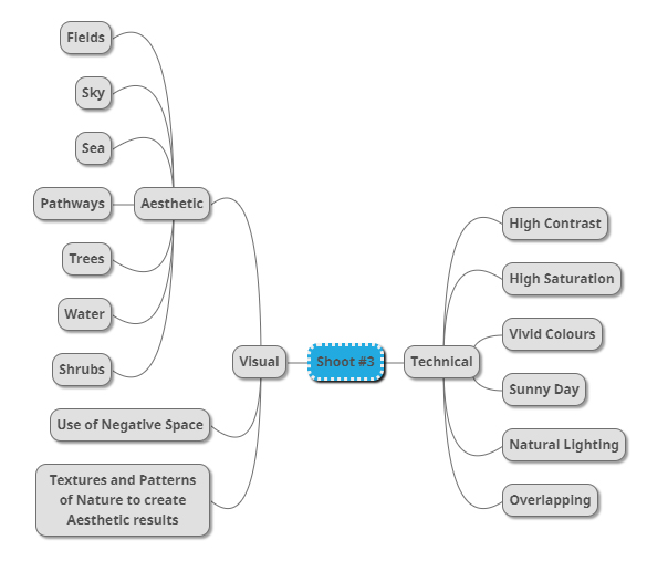
Once I had gone over a few of Fontana’s imagery I decided it was nearly time to go ahead with the shoot itself. However before doing so I wanted to create a mind-map for the goals when taking photographs, by doing so for me it would reduce wasted time as it would allow me to quickly identify what I wanted to capture in order to achieve the results needed. Not only would this stop wasted time but allow me longer to focus on the things that I may not have realised if doing the shoot there and then. Here are some of my ideas:

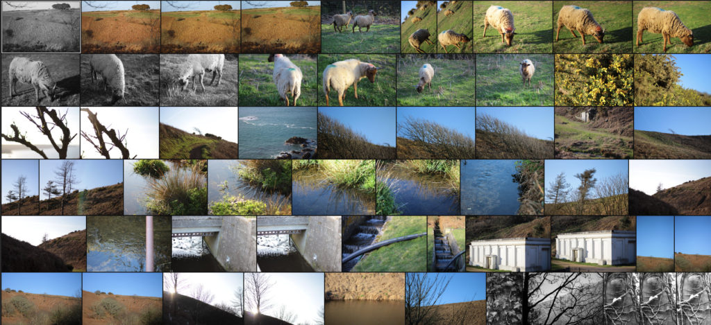
Once I had completed my mind-map I decided it was time to actually go ahead with the shoot. To do this I wanted to explore the area North of Jersey as this area had the highest number of agriculture out of Jersey as it would provide me with the subjects needed to achieve the aims of the shoot. Using my mind-map as my primary source of inspiration and ideas I explored the footpaths which surrounded the North coast looking at how the blue sky could contrast the hills. Here are the results of my shoot:

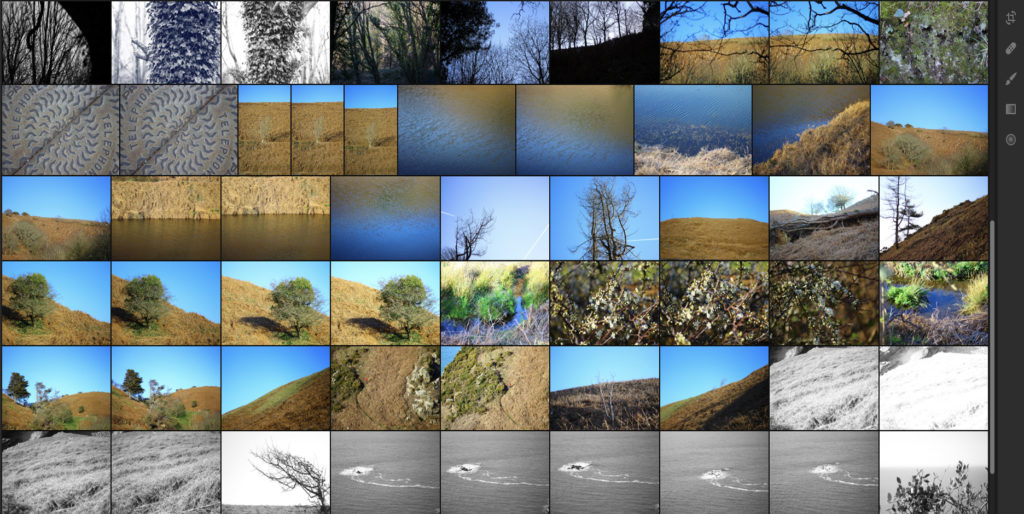
Once I had completed the shoot I then wanted to go onto select out ten images that I thought were most effective and related most to not only the topic title of textures and patterns but also saturation. By doing this it would allow me to reflect on each image and make in easier to choose out a selection of five from that so that I could later on pick one overall image that I thought best reflected my intentions for the shoot. Here is my selection for the ten images I thought were best suited to the topic of saturation regarding textures and patterns:

After I had selected the ten images that I thought worked best regarding the topic title I decided to then whittle them back down to five images, by doing this it would allow me to analyse each image in more depth looking at things such as the visual and technical aspect of the pieces that I thought made them work well and link back towards the title of saturation and make my overall choice of best image easier. Here is my selection of the five best images from my shoot:

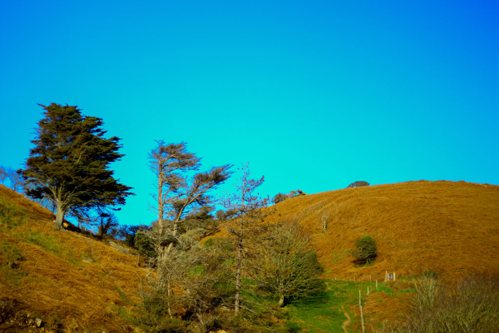
I selected this image because I loved how the orange contrasted the blue sky with the tree breaking up the dominant two colours. What I liked about this was how the two main colours compliment each other, however to stop both colours from becoming to eye-sore to the viewer the use of a lighter shaded tree and its shadow provide us with an implicit focus to what we almost instantly draw our eyes to. I also really liked the symmetry present within the photo as the skyline and pathway with the tree line up against each other as it presented the viewers with an overall sense of aestheticism. When looking over the image I found that it related well in response to saturation evident through the orange grass and the overly blue sky, this sense of other-worldly colour for me gives the viewer the impression of an over exaggerated landscape which has certainly been edited.

What I really loved about this image was the over use of blue to create the impression of an artificial sky, complimented by the patterns created from the tree branches I found that this worked well due to the overcast impression it paints on the photograph. For me I found that the use of the negative space taken up by the blue really brought the image together due to how it prevents the pattern of branches from completely covering the entire composition. The image itself relates well to saturation from how the use of an overly blue sky creates the impression of something to perfect to be true, with the photograph linking to texture and pattern through the branches which grow in random directions that produce a hige sense of aestheticism against the blue sky.

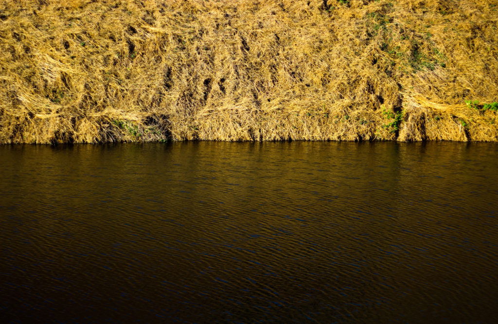
I chose this image because of how I loved the golden colours of the grass contrasted to the rippling water. For me this image represented two over exaggerated aspects of nature, especially as an island where we are surrounded by water presenting both the land and sea side by side in a sort of aesthetic and beautiful state creates the transition between the two as a natural mirror. I found that the gold presenting throughout the image as the main reason for choosing the photo due to it adding character to the water, reflecting the overlapping pattern of the grass as it grows. As a result of this I found that the two contrasting textures present in this image, being the rippling water and the overlapping grass as complimenting each other as one provides a more abstract representation for the other. The saturated golds in the piece also link it to the title through the coloured reflection that would not usually been seen by the everyday eye.

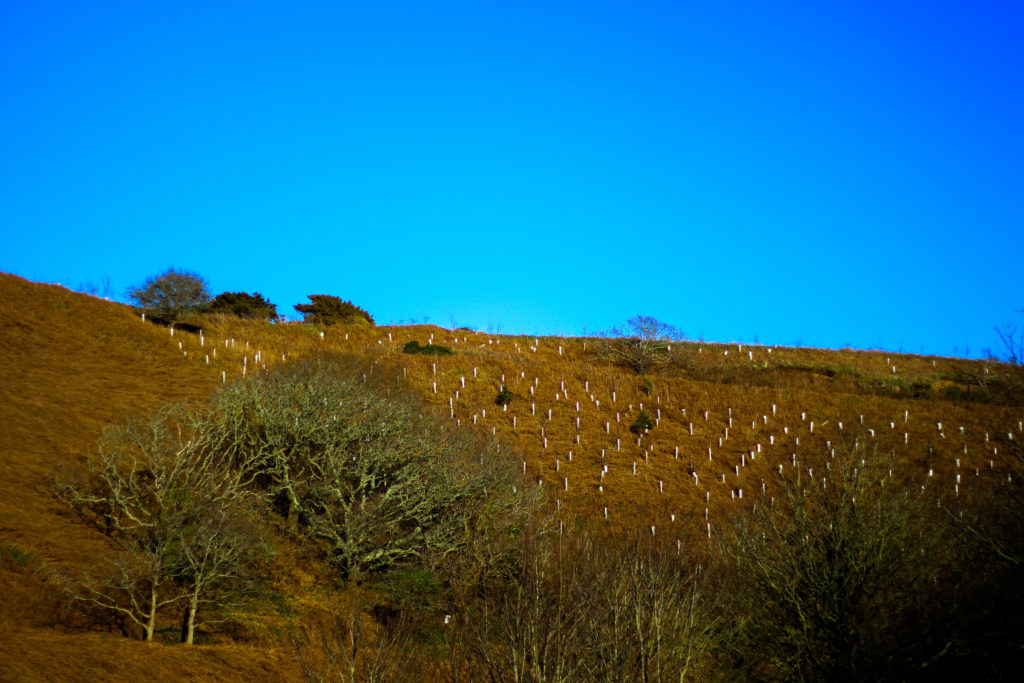
For me I selected this image because of its use of neutral space to create a more abstract impression of the landscape and whats in it. For me the tree against the blue sky was what brought the image together due to how it broke up the otherwise dull composition of the photo, what I found was how the messy texture of the grass completely contrasted the smooth matte texture of the sky which sorts of juxtaposes it. I liked how the composition that took into consideration the angle of the hill made use of the sky and contrasting orange grass surrounding it so that it would not become too overpowering. Overall I find this image did reference well regarding the topic of saturation, however looking at texture and pattern it did not serve a great load towards possible patterns except through grass.

Finally I selected this image because of the natural gradient created by the sun, sky and grass to produce this sort of golden natural film over the waters surface. For me this piece worked well because of how no real use of saturation editing was used due to how vibrant the surface of the water was on that sunny day with only a bit of cropping being needed. I really liked how the composition of the piece was based around a fifty fifty colour wise, with the golds taking the top and the blues the bottom, because of this for me the piece was well balanced with no aspect overpowering the other and creating an aesthetic product. However when looking over the image I did not find it had a great deal to do with saturation due to there being no actual reflection of a saturated landscape.

After looking over the visual, technical and conceptual aspects of the five selected images I was happy enough to come to a conclusion regarding which image would be best to reflect my intentions around saturated photography whilst also looking at the title textures and patterns. Here is my final decision towards the topic of saturation:

Final Image:

I chose this image as my final photograph to sum up my chosen topic because of the contrasting sides to the landscape it presents using highly saturated colours. For me the dominant use of yellows and golds in the photo bring about great aestheticism whilst highlighting how areas of our environment provide us with varying textures and pattern (such as ripples in the water and the overlapping of grass), something that the everyday eye would not take in unless looked upon carefully. Symmetry played a part in this decision due to how it presented the image as visually pleasing, stopping both the water and land from becoming too overpowering.

Tiny Planet Shoot | Final Outcomes

Les Landes

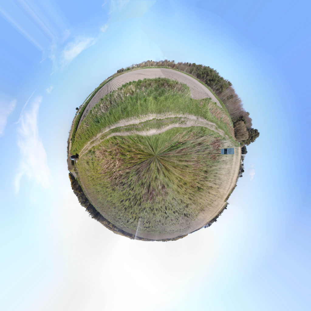
The above image was a collection of over 50 images taken in portrait covering 360 degrees. I like how smooth this planet came to be and I think this is a very successful attempt at a Tiny Planet as an experiment. I plan to carry on a do a few more. This one in particular was at Les Landes in the fields of St Ouen, this captures the calm and peaceful environment of life in the West. My only dislike is the distortion in the middle however I do not thing there is anything I can do about that.

Grosnez

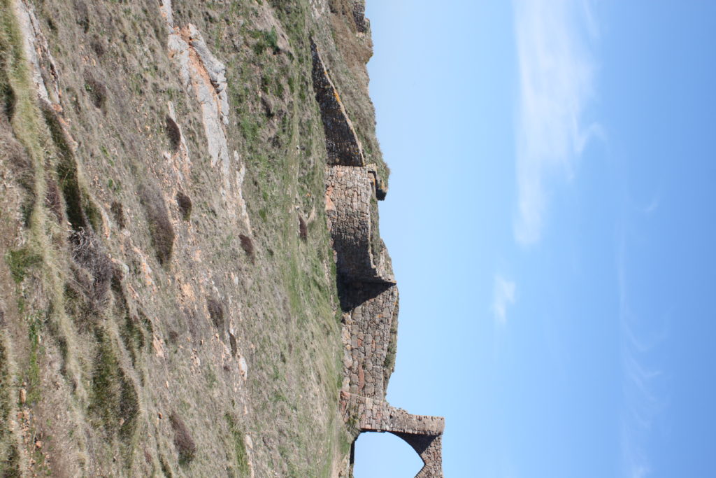
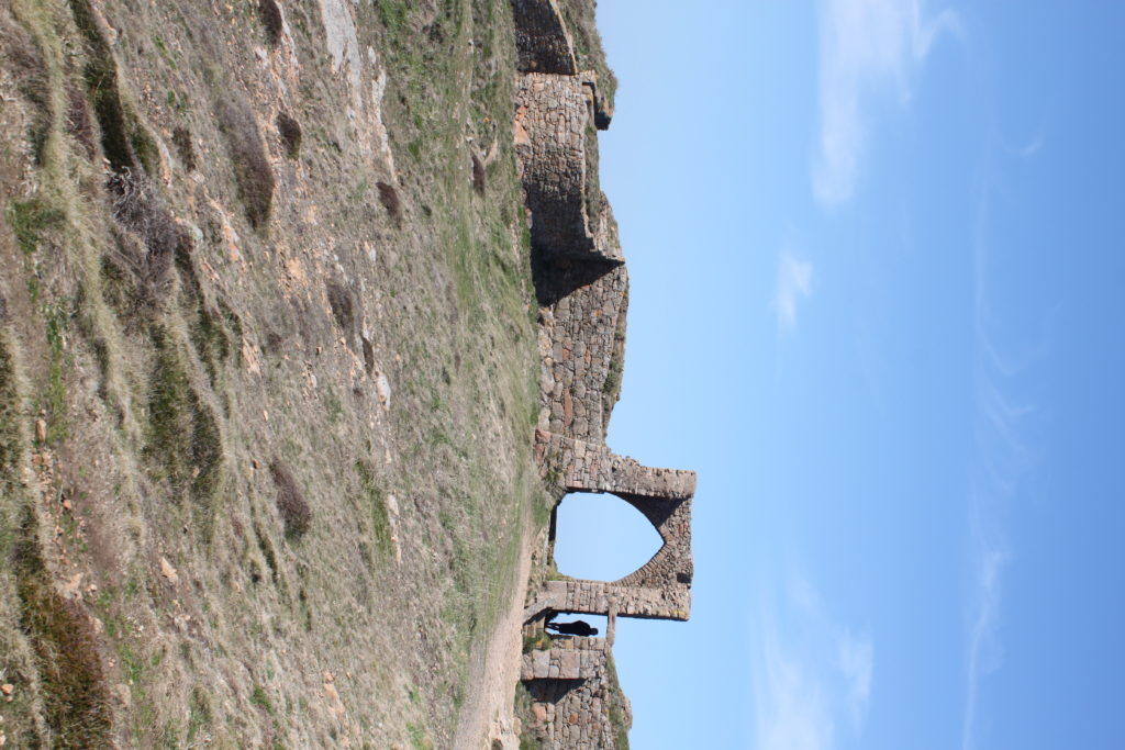
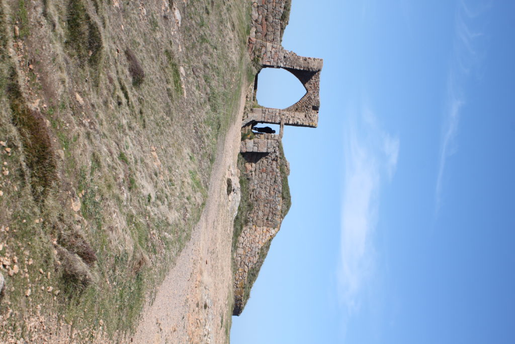
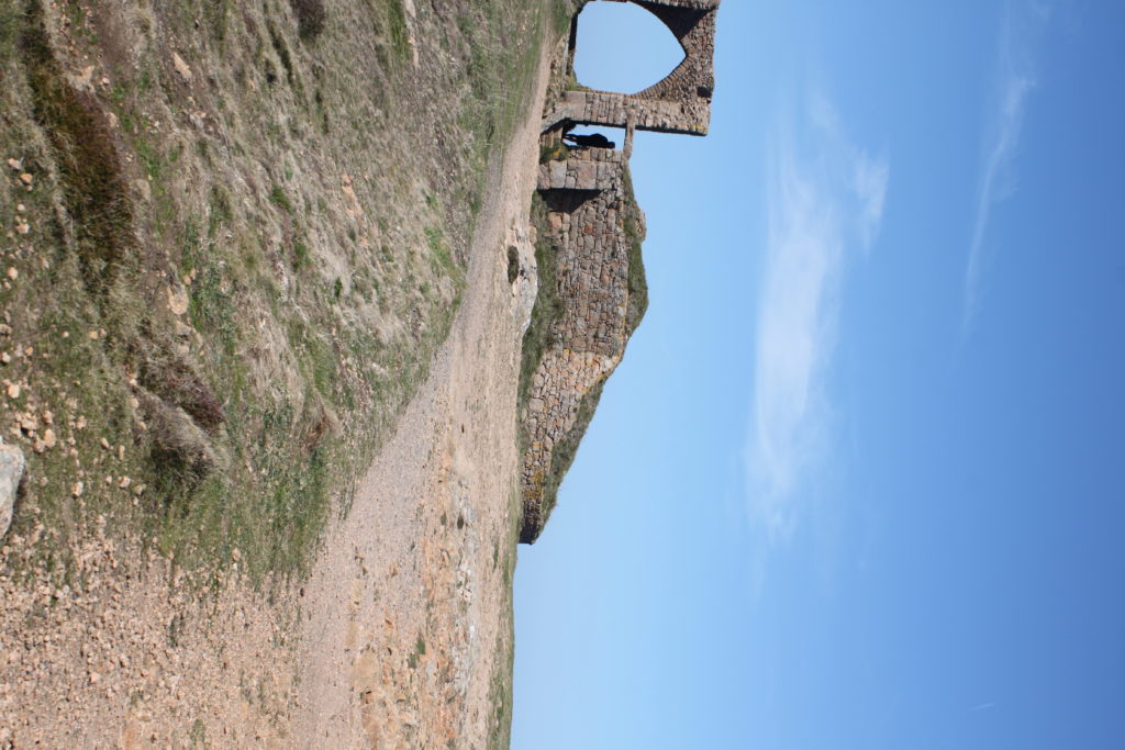
Again, the above image was a collection of over 50 images taken in portrait covering 360 degrees just like the Les Landes planet. This one was taken on the cliffs at Grosnez where you can see the castle. I would not really call this one particularly successful. Yes it is a tiny planet and it did what I wanted it to do however, due to the nature of the location and subject matter, the planet comes across as being very squished and distorted and makes the subject difficult to recognize and the planet looks very strange and I do not believe it captures the nature of the area.

In conclusion, I think the Les Landes planet was much better than the Grosnez one because I think being on cliffs/by the sea on the Grosnez planet stops the planet being smooth and more circular and makes the image look a bit messy and too distorted for my liking.