

These are the tidal times, and the times of first and last light, sunrise and sunset for the day that I am planning to take photographs.


What I would change/improve on for my next photoshoot.
I think that for my next photoshoot I will be taking images with a less busy a chaotic foreground and try to take images that focus solely on the tide around the lighthouse. I also feel like some of the images didn’t show clearly that the tide was low, which was my primary aim.

These are the tidal times, and the times of first and last light, sunrise and sunset for the day that I am planning to take photographs.
For this photoshoot I am going to be taking photographs in three areas of the west coast; Le Braye, Watersplash and l’Etach. These images will be taken around 1700hrs, because the predicted high tide time is 1715hrs.


What I would change/improve on for my next photoshoot.
From this photoshoot I have learnt that I need to take more images from different angles so that I have a greater variety of images for my contrasts. I have also decided that for my next photoshoot, I am going to continue to photograph the distinct differences between the low tide and high tide, however, I am going to photograph some different areas of Jersey, including: Corbiere, Plemont Bay, Watersplash (but closer and photographing more of the beach). I am also going to ensure that I am photographing away from the sun as well, so that I don’t have any lens glare in my photographs.

These are the tidal times, and the times of first and last light, sunrise and sunset for the day that I am planning to take photographs.
For this photoshoot I visited three different beaches along the west coast of Jersey; Le Braye, Watersplash and l’Etach. I also visited Plemont Bay briefly. I took photographs around the predicted time of the low tide, 1100hrs.
The images I took from this shoot:


I felt that some of these images worked well because of how clear the image showed that it was low tide, and that some of the images were very natural. However, in some images there was the issue of ‘clutter’ signs and cars were taking away from the natural landscape and leading the viewer’s eye away from the subject of the photograph.
I then visited the same areas from the same position as the first set of images at 1300hrs, to show a middle ground between the low and high tide.


I felt that these images weren’t as effective because the tide had now come in slightly but it was not significant enough to show a drastic change and therefore they weren’t as exciting to contrast with the other images in the shoot.
What I would change/improve on for my next photoshoot.
From this photoshoot I have realised that I need to ensure that my images don’t have unnecessary clutter in them, such as signs, vehicles and people who would distract from the focus of the images. For my next photoshoot, I am going to take photographs from more angles in order for me to clearly show the contrasts between high and low tide.
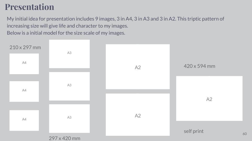
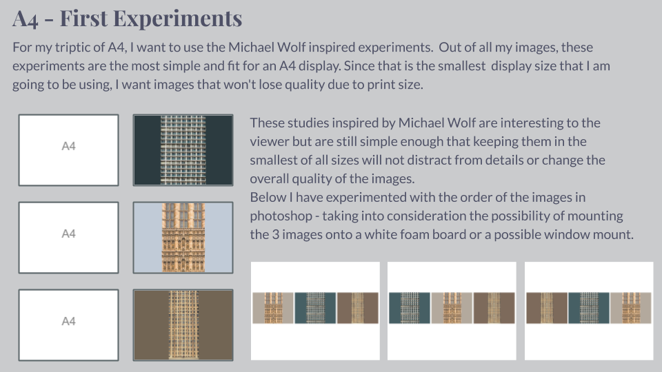
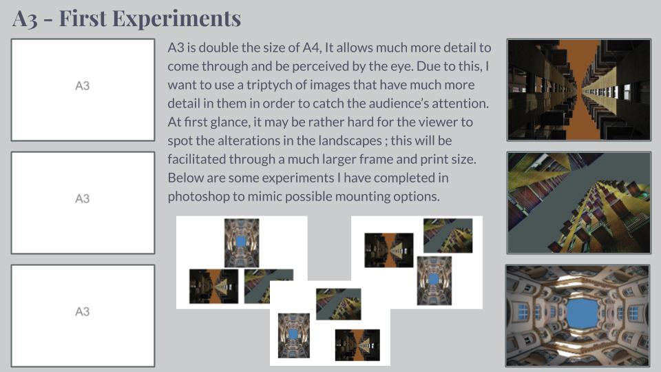
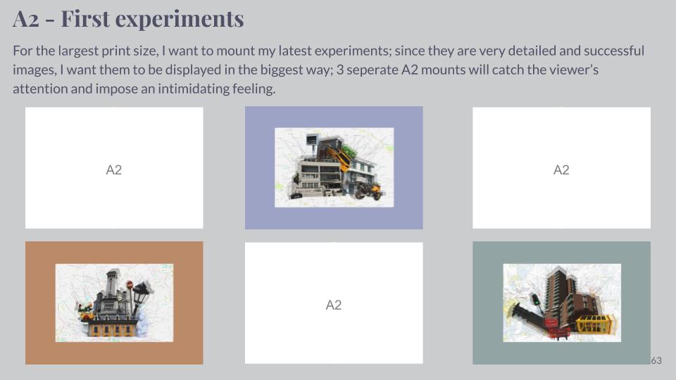
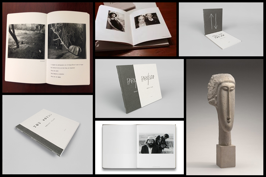
Before going a head and creating my three photo-books I decided to look at a photographer who had produced work in a style that was vaguely similar to the outcomes I desired. The books I found to be particularly inspirational were ‘You Would’, ‘Tal Of Tal AB’ and ‘Park Sleep’, what drew me to the designs in particular where how each was encased inside a brown cardboard folder which fitted the dimensions of each book perfectly. For me this was an idea I wanted to explore as I previously had aimed to produce the three books and store them in a hand-made sleeve so that could be viewed collectively but viewed individually. When looking over the books I found what drew me to them was their minimalist covers which only contained the title and authors name against a predominantly plain backdrop of textured grey card, this was very effective in regards to the book cover being a darker version of the grey which compliments the actual cover which as a result produces the impression of the binding of the sleeve being different. Some pictures of the books can be seen below:
Who is he?
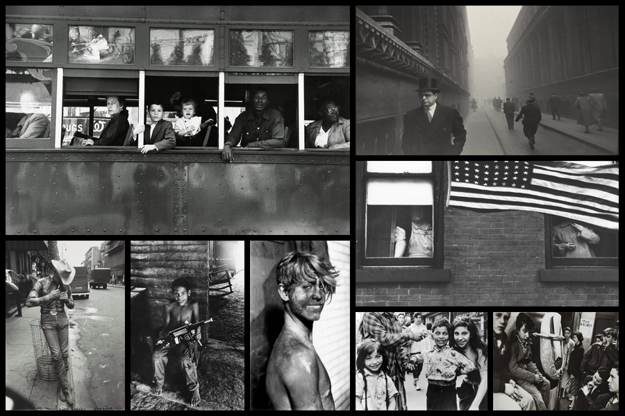
Robert Frank, born November 9, 1924, Zurich, Switzerland, Swiss American photographer and director who was one of the most influential photographers of the mid-20th century, noted for his ironic renderings of American life. Frank became a professional industrial photographer at the age of 22 and in the 1940s became a successful fashion photographer for Harper’s Bazaar magazine in Paris. He felt, however, that the scope of the work was too limited. He abandoned fashion photography about 1948 and went to the United States and then to Peru to explore the expressive possibilities of the 35-mm camera. After photographing in Europe in 1950 and 1953, Frank returned to the United States. Between 1955 and 1956 he drove across the country, taking a number of photographs. Of those, 83 were ultimately published as The Americans, 1959, a French-language version, Les Américains, had first appeared in 1958. Photographs such as Chicago, 1956 in The Americans revealed Frank’s mature style, which was characterized by bold compositions and ironic, sometimes bitter, social commentary. Their publication established Frank as a major creative photographer, and the book was widely hailed as a classic. Examples of his photography can be seen below:
When making my books I would like to explore the use of composition carried about by using singular images over a two page spread which add to the overall effect of any image you want to exaggerate or over-emphasize. For me personally I would like to incorporate mono-printing to produce the cover of my sleeves, this is because of how it would create a newspaper effect where the font thickness and size would be inconsistent and slightly faded, which as a result produces an ink collage effect.
Before ordering and making the book I would need to consider the colour of both the sleeve and books front, this is because of how I want them to be colour coordinated so that they both compliment and contrast each other which creates a more aesthetic result.


Edits:






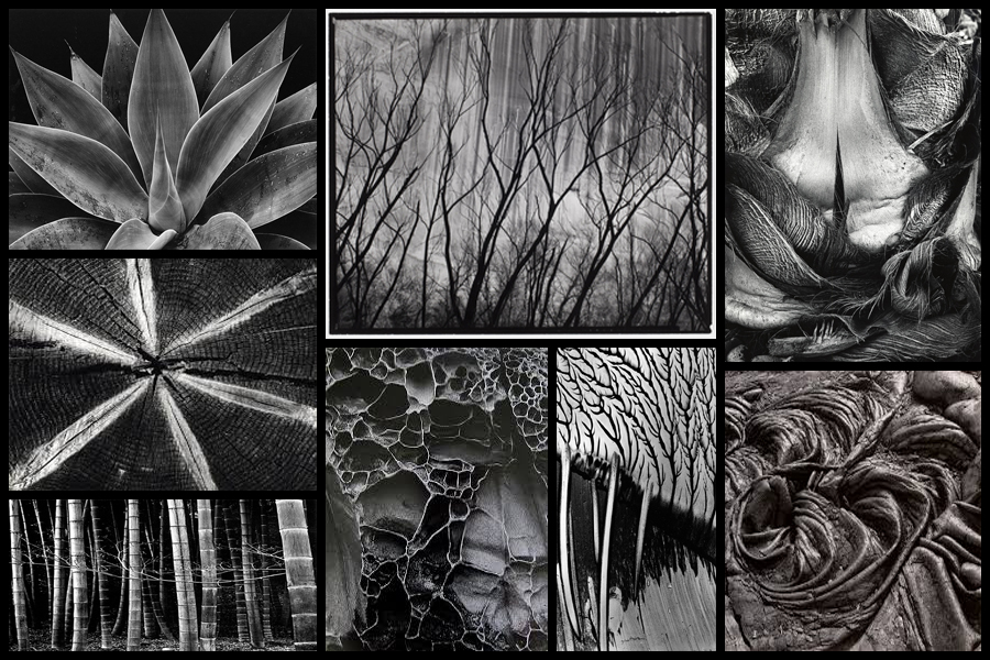
For this shoot I wanted to focus on the idea of abstraction through pattern especially in nature and the urban world. I really liked the idea of basing my photography around capturing everyday scenes of subjects in a new light which highlights the unseen patterns which are present in our everyday lives and the structures of things around us. A photographer I have looked at which I have got particular inspiration from is Brett Weston, someone who has devoted to focusing on natures pattern and the unseen world around us. The images that I found to be more inspiring were his images based around plantation and occasionally the effects of humans on the landscape such as footprints and man made intervention into the natural environment. His skills that I wanted to be able to transfer were surrounding his effective use of a low exposure to create a more dramatic scene surrounding everyday things through exaggeration of shades and tones. Some examples of his work can be seen below:
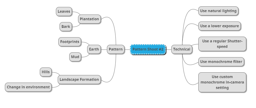
Once I had looked over some of his photos that I found were particularly inspirational for my shoot and its aims I then decided to go onto produce a mind-map. By making a mind-map it would allow me to jot down ideas and aims for the shoot and what I wanted to over achieve, this would also cut down on time wasted on the shoot as I would have a goal of what to produce on me and how to take it with it all the time directing my aims. Here are some of my ideas that I wish to use on the shoot:
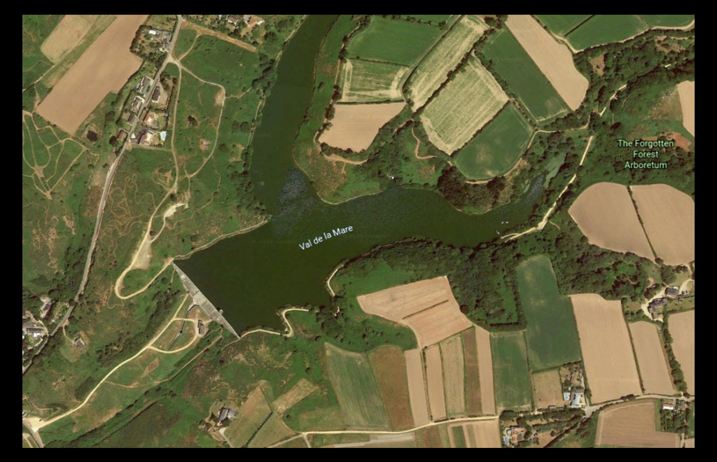
The place I have decided to take the images is called Val De La Mare due to its variety of different textures which can be found alongside the water and the trees. A map of the location can be seen below:
Here are the results of the shoot:
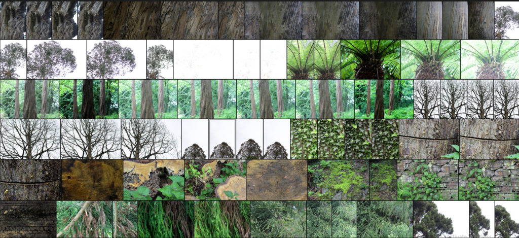
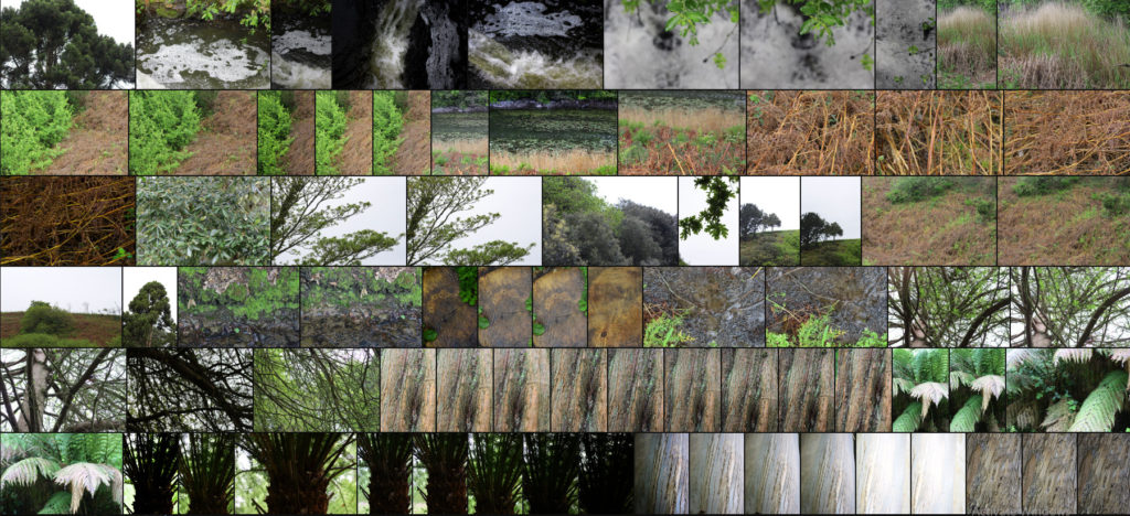
After finishing my shoot I decided to go onto edit the shoot down to only ten images, by doing this it would allow me to identify which were the images that were most effective from the shoot and reflected my intentions the most. Here are my decision on the top ten images of the shoot:
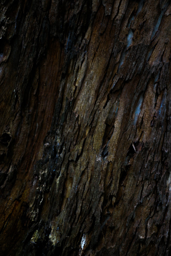
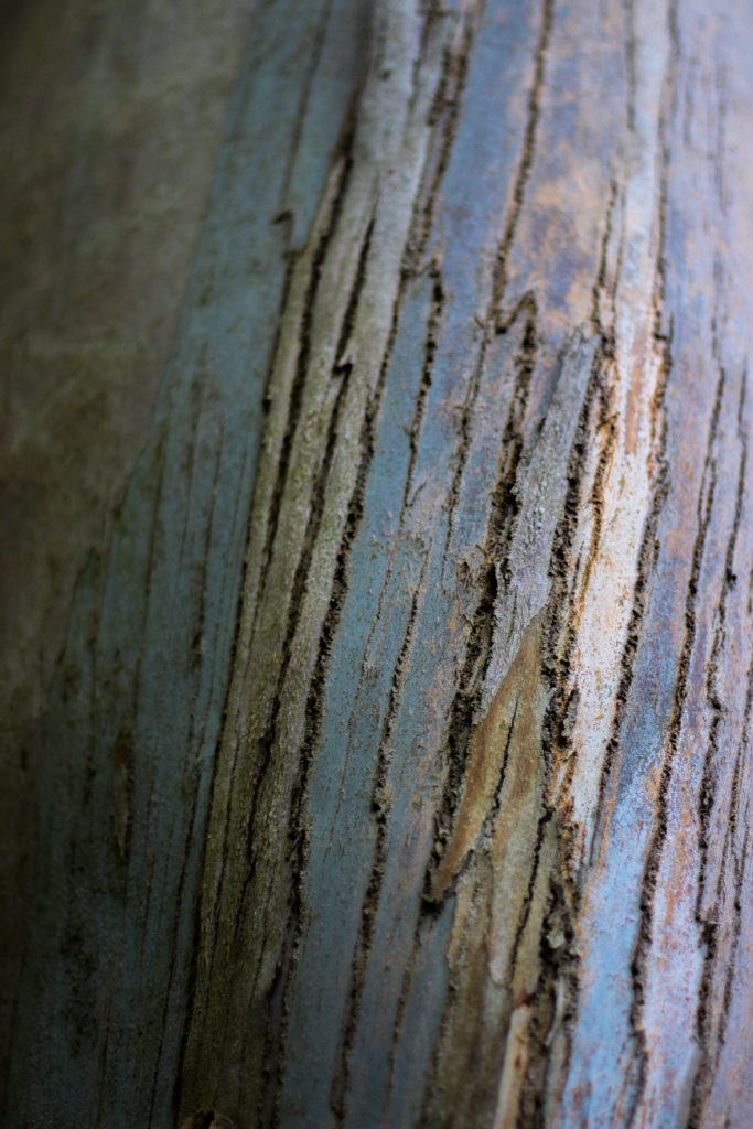

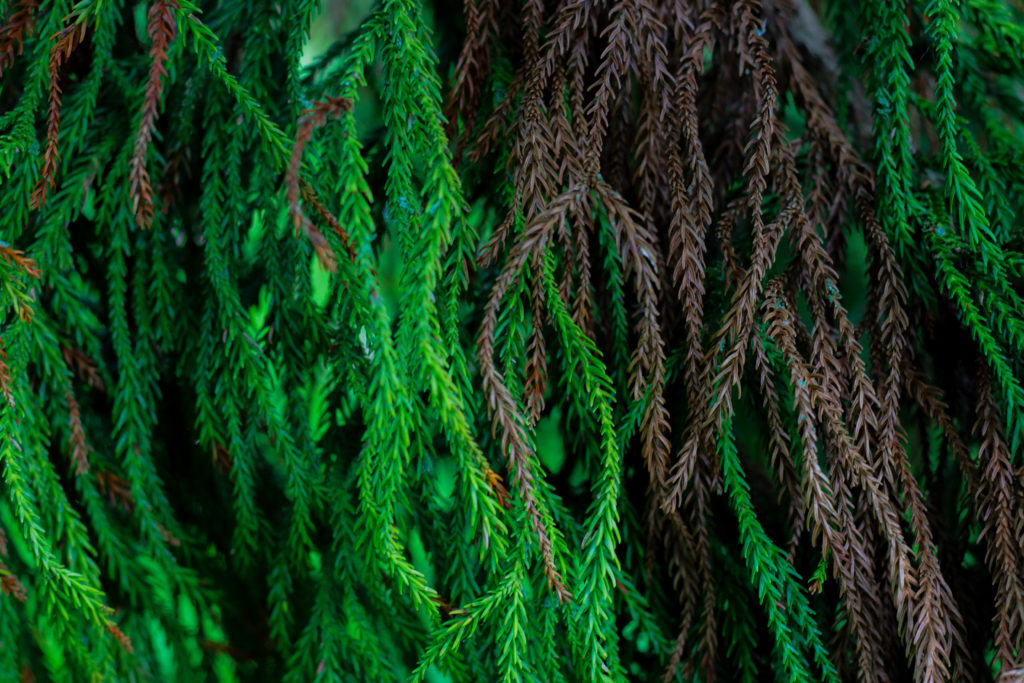
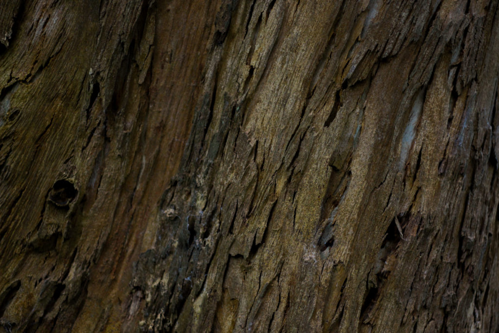
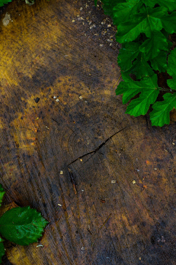
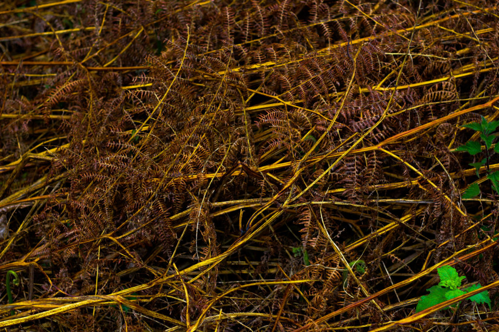
Once I had selected the ten images I then decided to go onto whittle them down once again to only five, by doing this it would allow me to further identify the images which were most effective from the shoot due to analysis in more depth, whilst also making it easier for me to choose an image which best sums up the entire shoot. Here are me selections:

I chose this image because I loved the overall sense of the browns which came through the decaying grass. For me the crushed plants added a cool texture which highlighted the contrasting yellow stalks compared to the rest of the brown leaves. What I particularly liked was how the leaves all faced one direction, allowing for a smoother look to the overall image due to how it all seemingly moves in continual way. Overall I found that the piece did relate to the topic of texture, however I was not too pleased with the outcome as I didnt think it carried enough contrast to emphasize the darkness.

What I really liked about this image was how the green leaves overlapped the darker grain of the wood below. When looking over the image I really liked how the leaves almost presented themselves as a frame for the grainy texture of the wood, preventing it from becoming a present throughout the image and turning into a eye-sore for viewers. As a result of this I found that the contrasting yellows which are emphasized in the wood through saturation really brings more tone into the photo due to it add variation to the texture and overall colours present in the photograph.

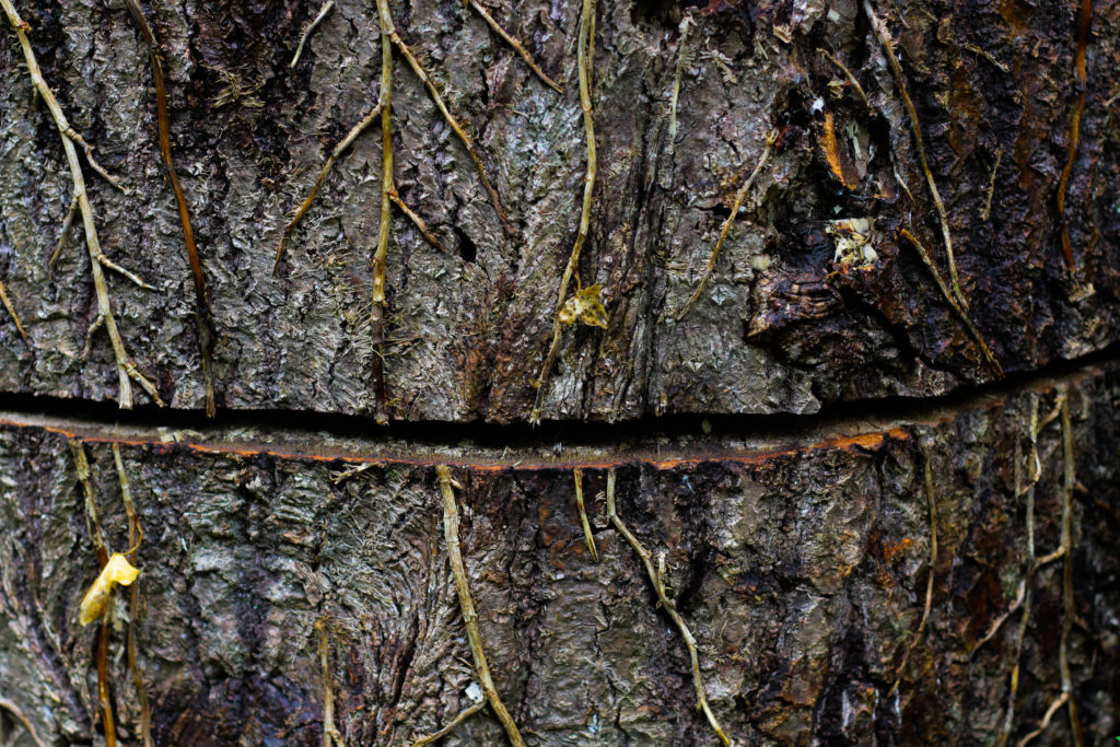
I chose this photograph because of the unusual line which had been cut across the base of the tree trunk. For me this added an extra sense of abstract to the piece due to the surface texture of the wood being disrubted by the cut mark making its way across the entire composition. What I found complimented this was the dying ivy growing down the side of the trunk, for me the lighter brown from this added that bit extra to the piece as it prevented a continual same colour presence throughout, instead breaking it up and adding variety. Overall I was really happy with the composition of the piece due to its unusual element through the cut, with the ivy and the different bark textures adding a much needed variation to the overall piece.

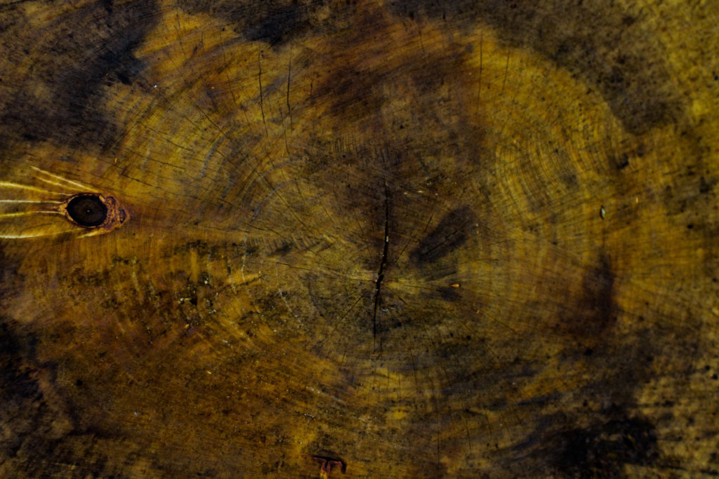
The reason I selected this image was because of it high contrast which highlights the grain and unseen colours really well. For me personally I really liked the variety of different browns and yellows present within the photo as it presents viewers with a different perspective regarding cut wood on a wet day as textures not previously seen are revealed when more closely observed. The grain knot I found broke up the composition and prevented it from becoming too overpowering and generic due to how the added black becomes an instant focal-point for anyone looking at the picture for the first time. As a result of this I am quite happy with the result due to how it provides an unseen insight into the textures present on trunks which previously would be unseen unless further inspected.

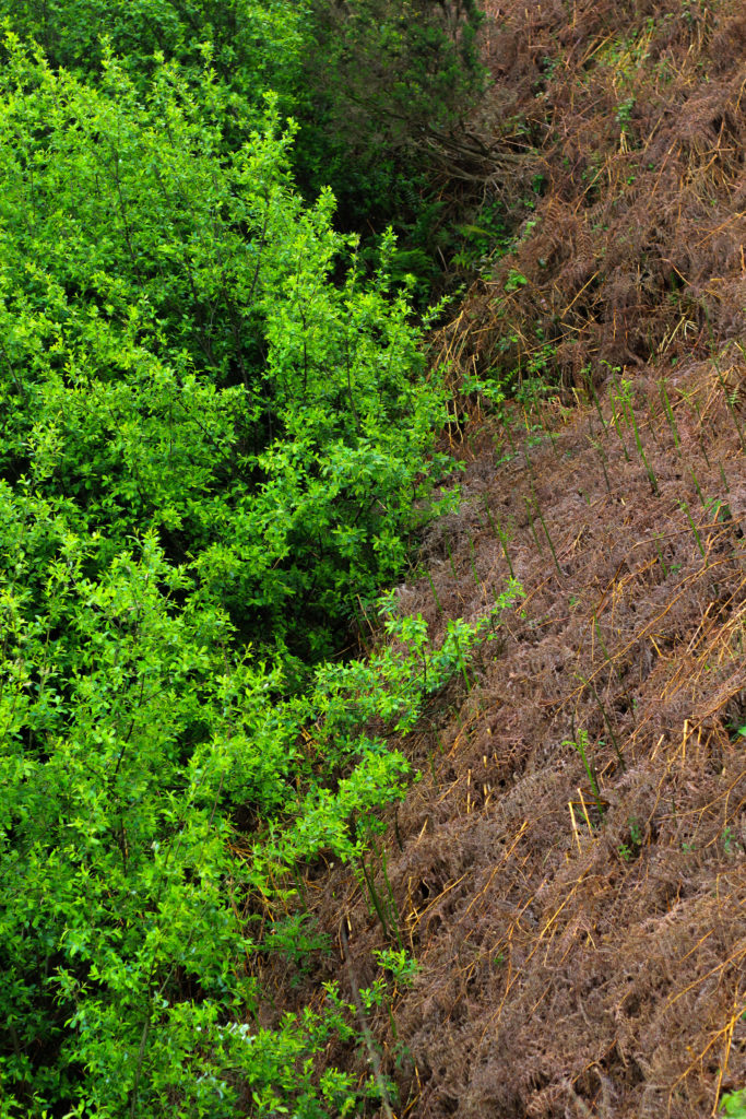
Finally I chose this because I think it really well summed up the idea surrounding the topic of texture through both its green and brown leaves branching out. Because of this I really liked the contrasting dead and lives leaves together as the texture stays the same but rather the colour changes, as a result of this I think it adds a much needed extra bit of texture due to it stopping the otherwise dominant green from becoming too much and detering the viewer. When looking over the image in regardings to the topic of texture, I found that it related well, however I was not too pleased with the overall outcome due to it lacking contrast behind the leaves which would have made it more defined.
Once I had looked at each image in more depth I decided it was time to move onto picking one image to sum up and represent the entire shoot. To do this I would have to consider looking at its visual aspects whilst also its conceptual ones and how well it related to my intentions and overall aims:

Overall when looking over all the images I found this one to be most effective regarding the topic of abstract textures. This was mainly due to the unusual cut mark made across the base of the trunk which for me added an extra sense of abstraction due to it looking a bit surreal and mysterious. This was complimented by the dying ivy which I definitely thought added that needed break between the continual texture and colour of the wood and the dark cut. For me I thought this image was executed the best due to how it represented my initial aims of the shoot whilst also taking into consideration my topic title of abstraction through texture (seen through isolating the subject from its surrounding environment).
The drone images I produced came out nicely however I think its important to share the time it took to really get those images. We were at Noirmont for around 3 hours shooting, it can take 10 minutes just to get one shot right, especially on the accuracy level I was aiming for to ensure my images were perfect.
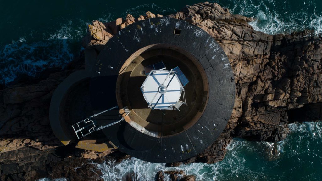
Trying to capture an image such as the one above looks simple but requires skill and patience, two things that I honestly don’t have with drones! I have very little experience but luckily I had someone to talk me through and help me along the way. The drone will hold its GPS position automatically however this can drift in around a 1 meter size area which is not good when you are trying to get a perfectly straight top down image such as the one above, You can see the light bulb on the top is perfectly in the center and it may have taken up to 10 minutes to get it perfect, you end to find that you make a slight left correction for example and it moves too far and you want to go back a bit but its too far and it will never sit perfectly where you like it when you’re shooting a subject close such as this with a high requirement for visual accuracy. I took a number of images I believed were central and confirmed this later then selected the best images to go forward to editing.



The shoot at Noirmont comprised of air and ground shoots. My main aim was to scout around looking for circles with my camera and snapping what I saw that formed a circular shape, I would also map out places to look at from the air using a drone. I then took the drone up and photographed circular shapes from the air over the Noirmont headland and Janvrin’s Tomb in Portelet.
Below are my final outcomes:
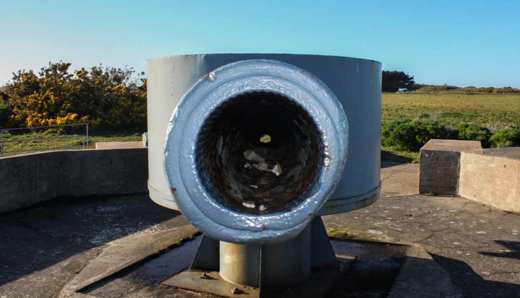


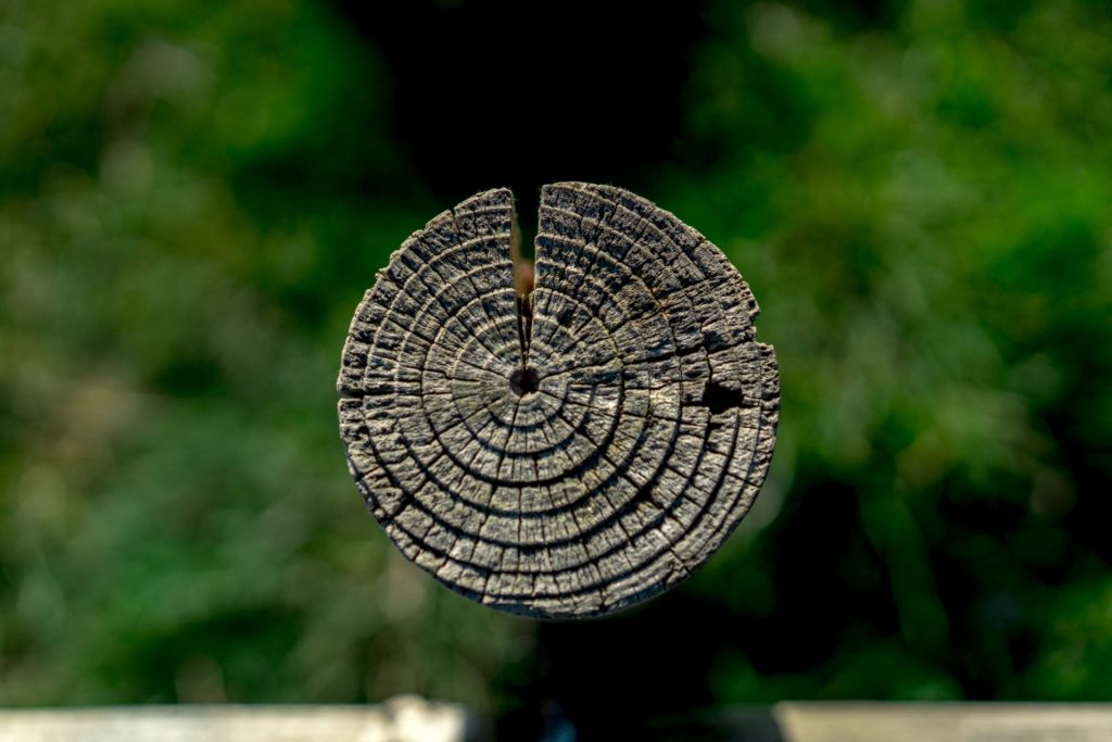

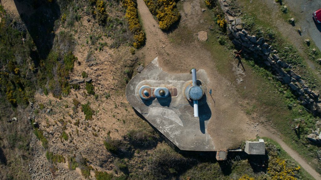
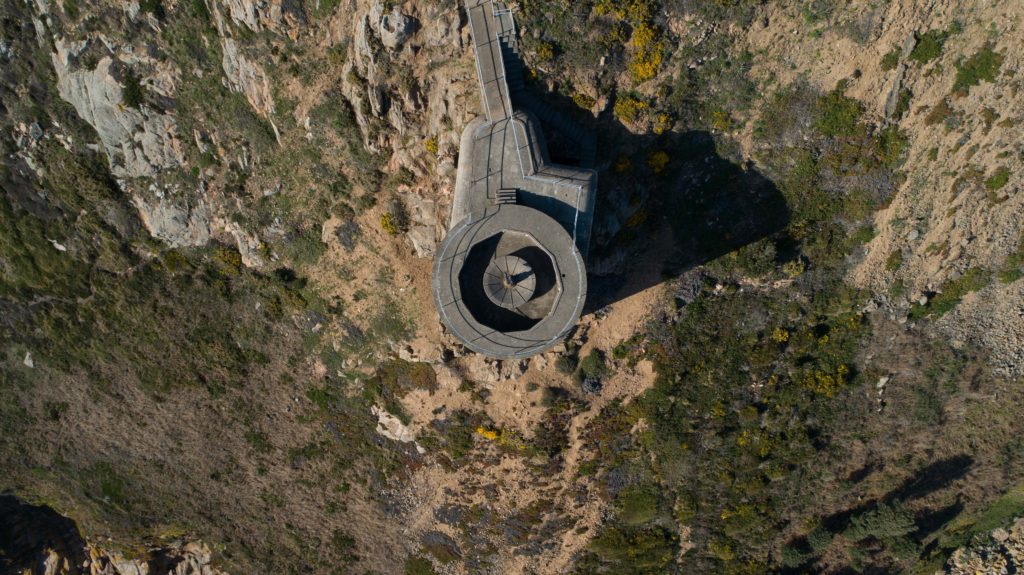

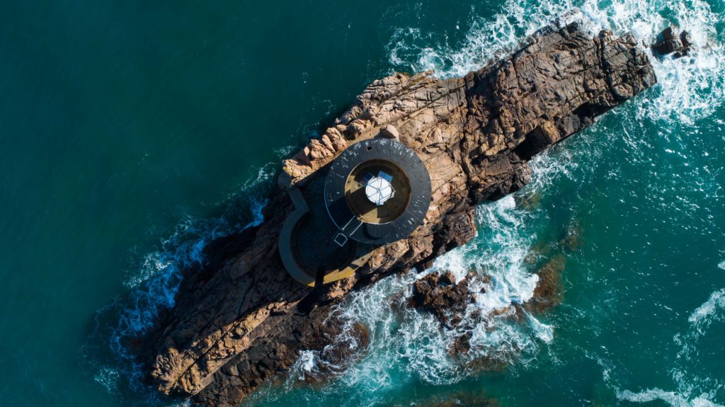
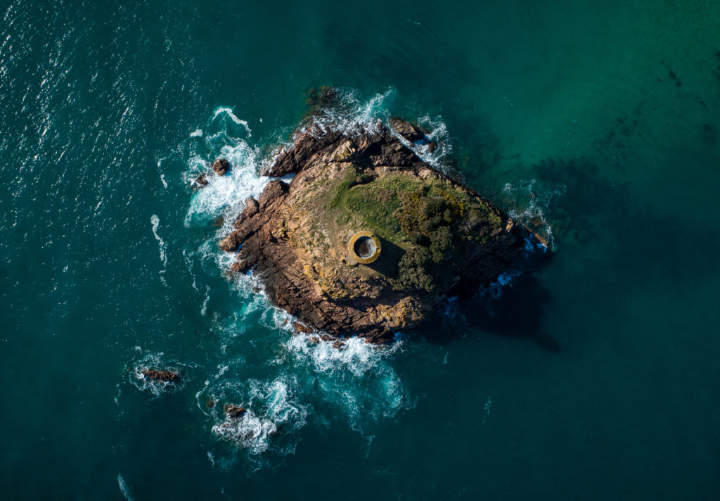
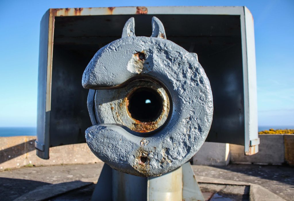
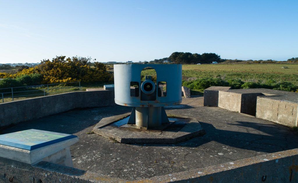

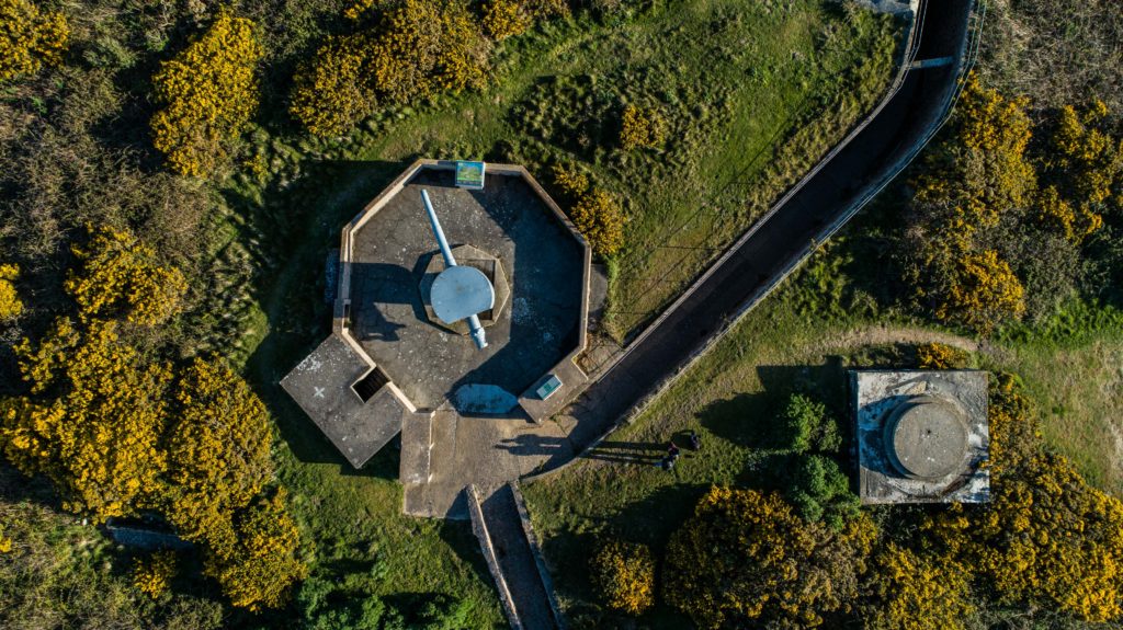
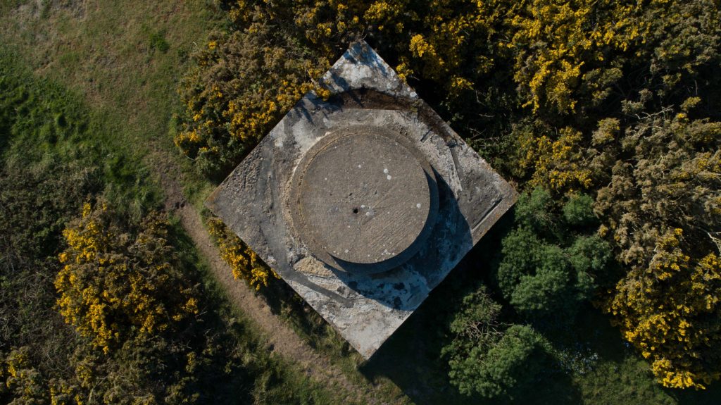
I am very happy with my final outcomes above, they really capture the more rural side of my project and show how circles can be found everywhere.

The above image was a wooden post on the Noirmont headland as part of the shoot you see above. The pole itself caught my eye as I was walking looking for spots to shoot with the drone. I positioned myself above the pole and shot top-down with a low aperture, automatic white balance, 100 ISO and a medium shutter speed. The low aperture produced the effect where the grass below is not in focus yet the pole is extremely sharp. This allows for the viewers eyes to be drawn straight to the pole and have little to distract them, it also makes the image very simple and eye catching.
The rings on the pole are the growth rings of the tree the wood came from. Each year, a tree forms new cells, arranged in concentric circles called annual rings or annual growth rings. These annual rings show the amount of wood produced during one growing season. Therefore this pole shows the life of a tree that once stood and lived and grew, each circle representing the growth and age of the tree and this can be interpreted into human life and human context.
The image clarity really brings out the textures and feel of the wood and you can almost feel is as you see it, you can imagine your fingers passing over it and feeling the roughness of the wood and feel the individual rings. The high aperture creates the effect of blurring the background giving it depth. The colors itself have been brought out through editing, the original image made the wood looked quite pale and the grass quite bright however through editing the nice woody color and textures could be brought out to their best.