Category Archives: Recording

Filters

Author:
Category:

Variation And Similarity Evaluation Analysis

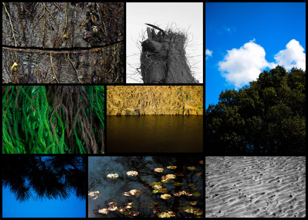
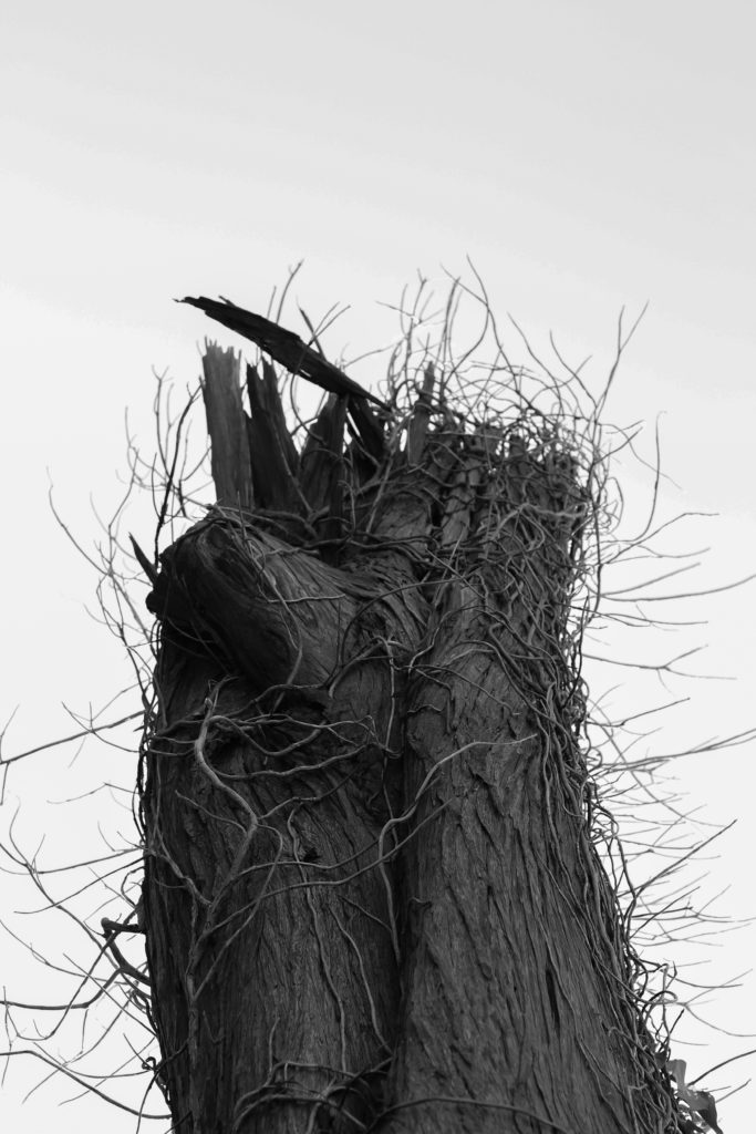
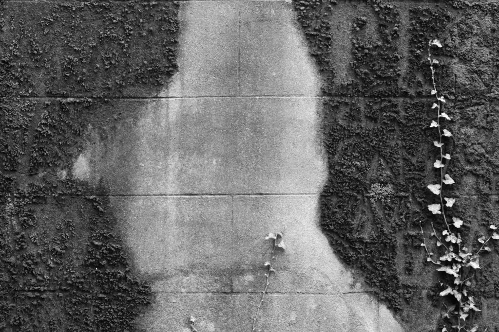
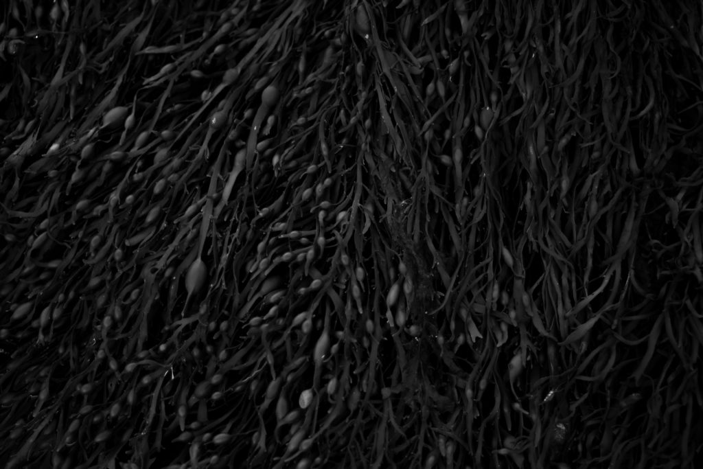
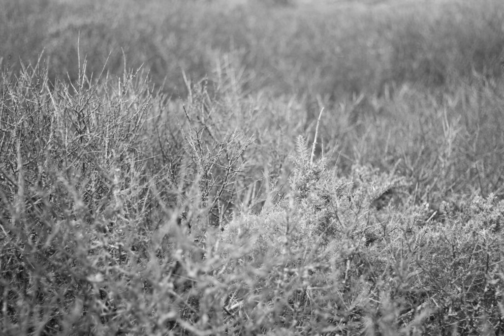
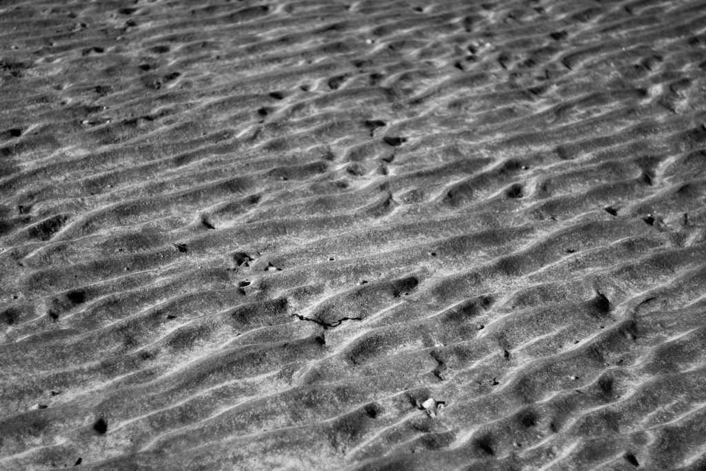
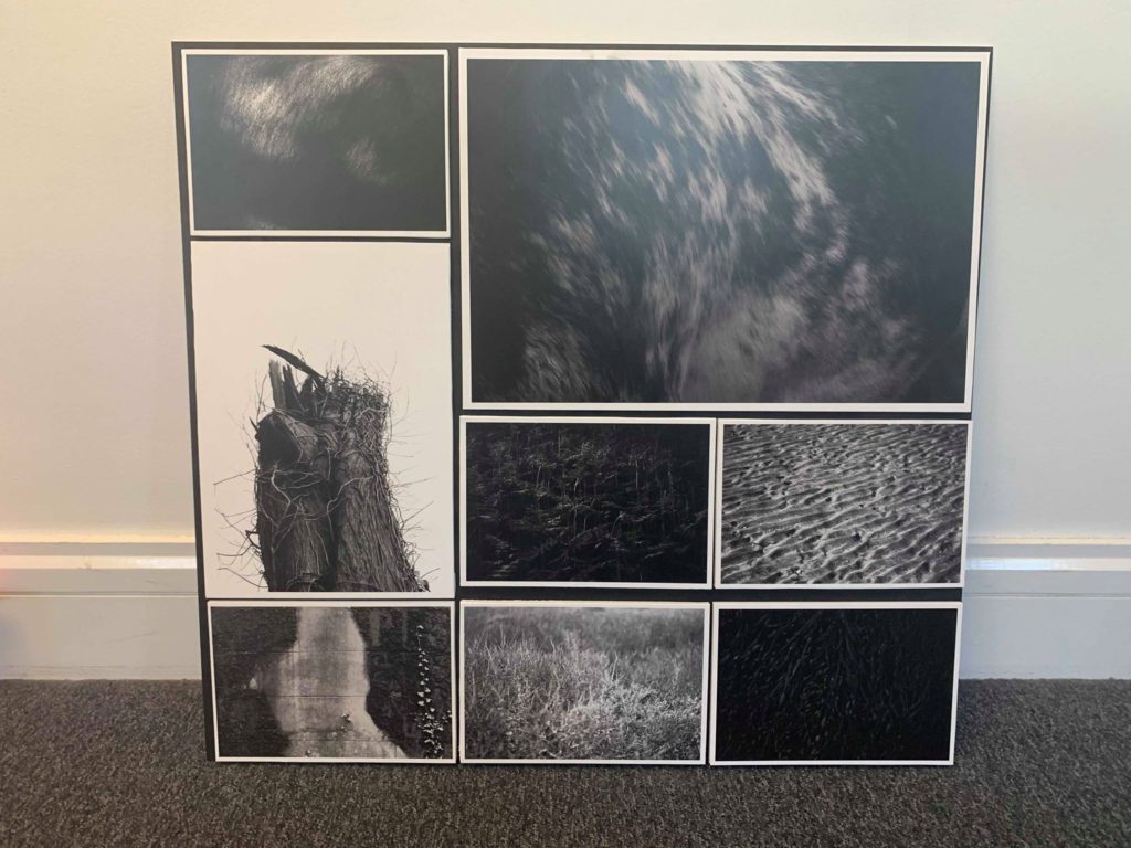
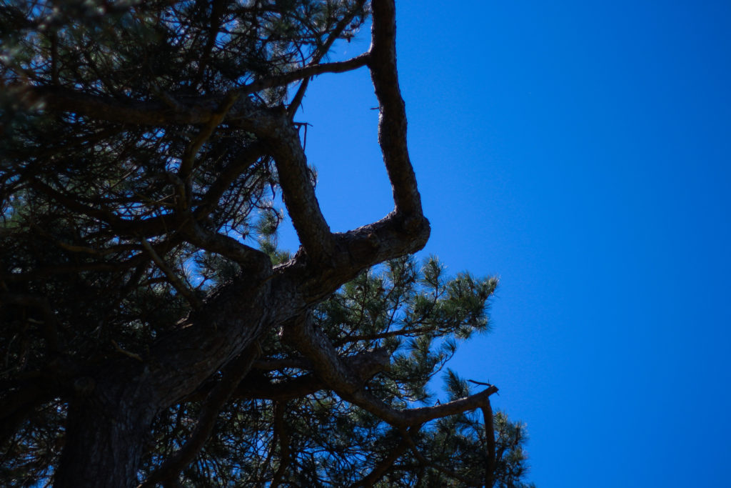
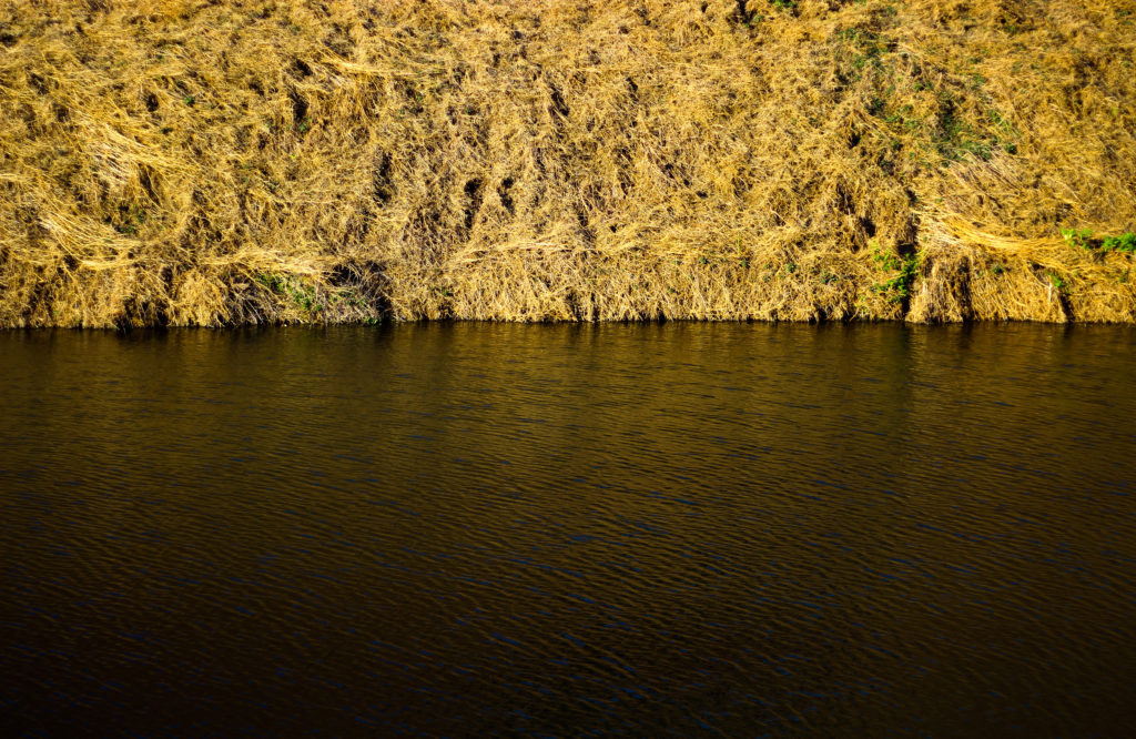
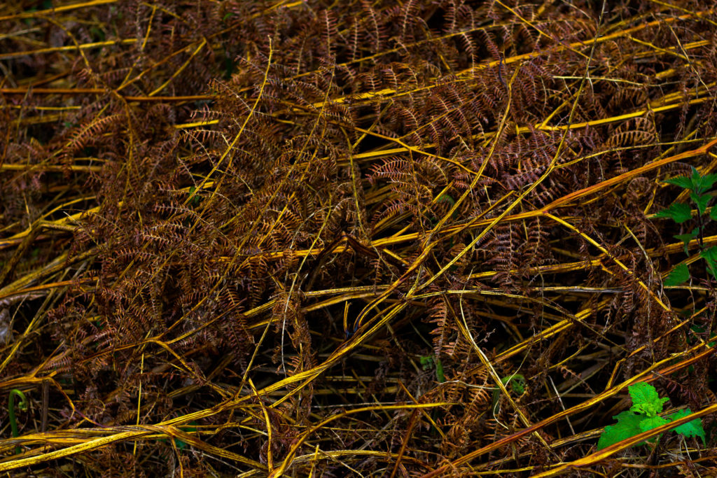
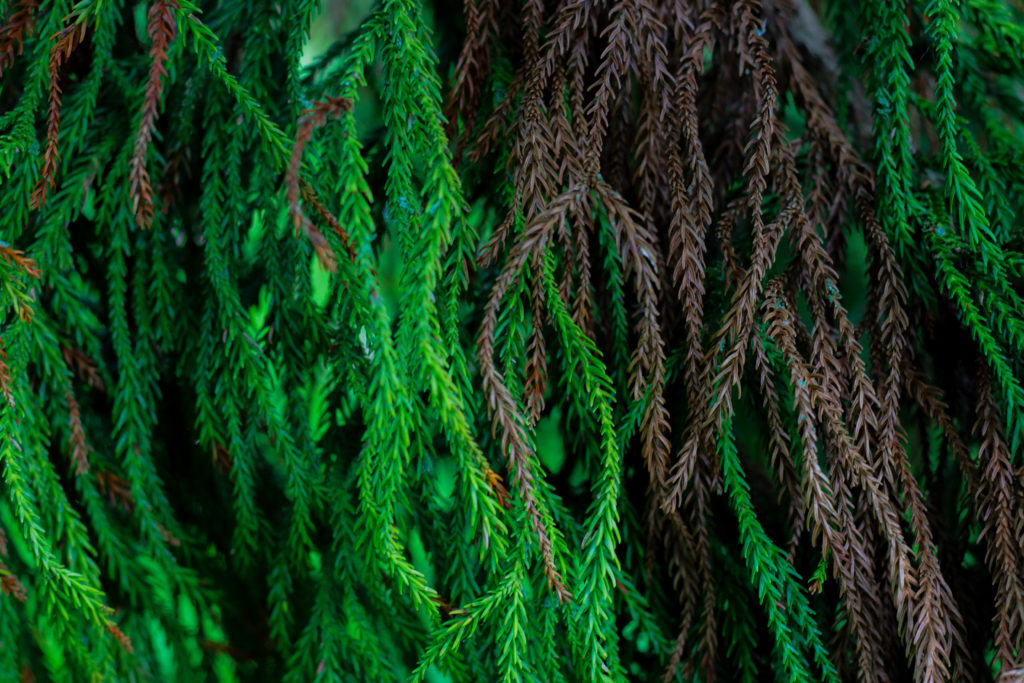
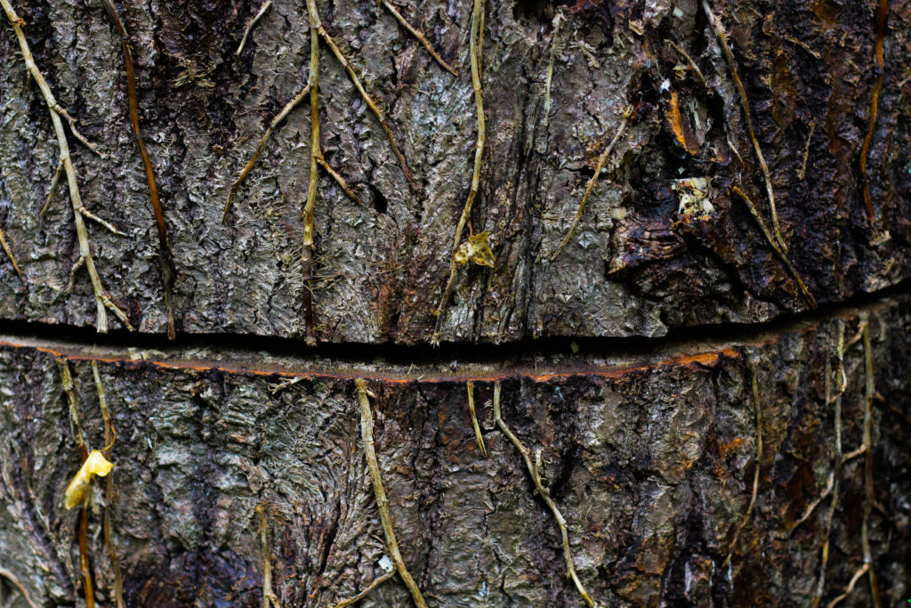
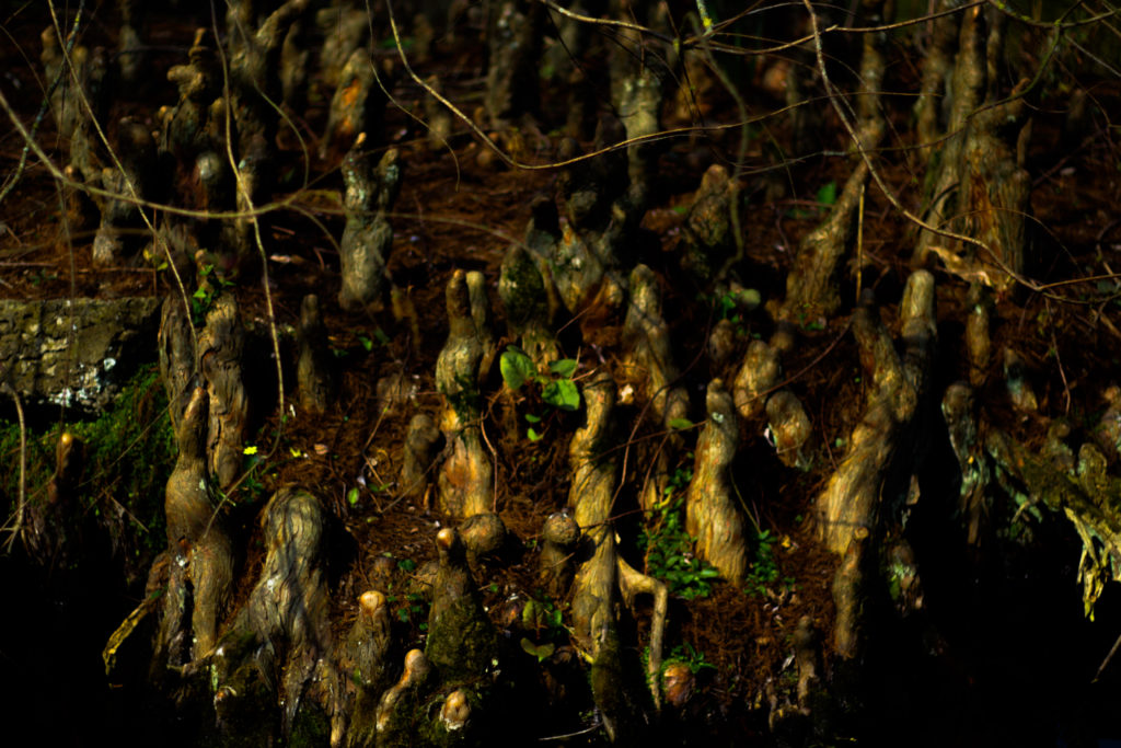
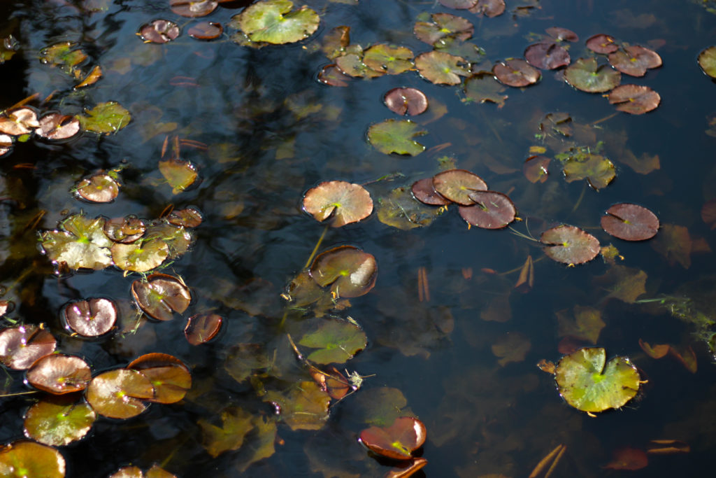
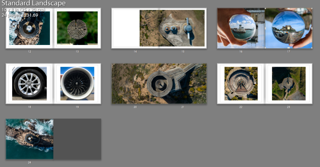
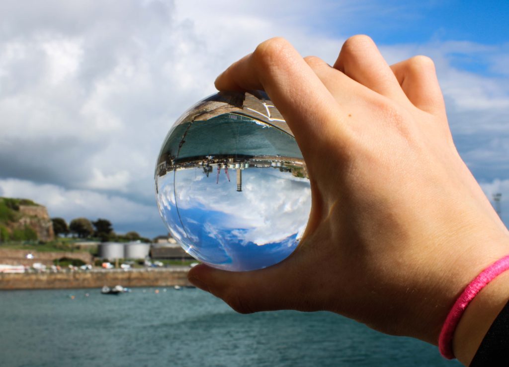
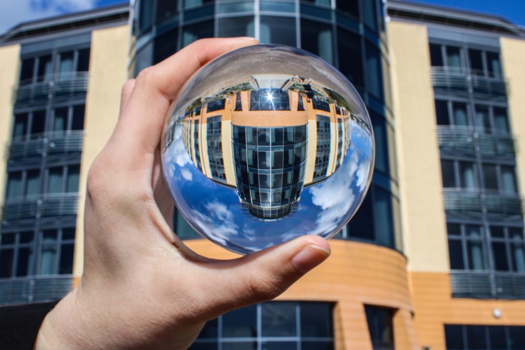
Regarding the results of my topic of ‘Variation and Similarity’, I am very satisfied with the steps my project has gone in relation to the creation of three sub themes based around the idea of abstraction and the produce of three individual books looking at each of these themes. When starting my project I made sure that I wanted to explore the idea of abstraction and the varying themes and styles which could be used to look at the topic as a whole. To do this from the start I had originally wanted to go down the route of looking at the idea of dividing my results into three sections much like my coursework, my idea behind this was so that it would provide me with a much broader range in what I would be able to capture and relate to the project, rather than looking at one theme, three would provide me with contrasting results which on the surface could not be seen relating, however with the underlying theme combined it linked them together to present them in a way that the viewer would understand after knowing my intentions. Initially I had gone about to different sections of the island with the purpose of either photographing the subjects in an isolated way or a way which captures the entire landscape which would broaden the audiences perspective. I had selected the themes of texture, colour and pattern because of how they were so common in out everyday lives that they went predominantly unseen due to us overlooking them, providing us with an insight into the structures and unseen beauty that we walk past on a regular basis. In the creation of each topic I had tried to reduce editing to a minimal so that any changes would have had to been produced inside the camera there and then, which as a result for me provides a greater connection with them due to holding a more personal and first person account with the subject.

When going through my creative process I had found certain faults through how I was occasionally straying into the topic of another theme, however in the use of mind-maps it allowed me to train my line of thought towards my goals and aims of each shoot, resulting in the photos taken reflecting my intended purpose for that shoot. Looking back at my process of going about with photo shoots mood boards and the research of individuals, I soon came to believe they had been a crucial element in defining my inspirations of what I would want to achieve in the future of my exam, the creation of artist reference pages really helped drive my inspirations and aspirations due to further research into their work allowing a more developed understanding into their mind-processes and techniques. Looking back at the posts I have created on the blog I am happy to say that I had explored a huge amount of contextual studies in both the art world and photography world, researching the links between the two in fields such as colour and the origins of abstract art, something that without would not have allowed me to produce some of the work created. This consisted of certain art styles such as field paintings where an artists would focus on the block colour of a landscape rather than what was inside it, as a result of this it allowed for me go about photographing landscapes using a new perspective that had been unknown to me. Certain artists that had helped me develop my understanding throughout the project are Robert Frank, Aaron Siskind, the Weston’s and Franco Fontana. Though all these photographers had different styles of work, they all contributed towards the outcomes of each shoot which could then be linked to each other through them being sub-sections of abstraction, without looking into the techniques and styles of each photographers I would not have known how to use my ideas with the camera to capture my intended images. Regarding how my final outcomes turned out I was relatively happy with the foam and card mountings due to how the 3d element created by them in a mood-board fashion allowed audiences to understand the theme underlying each section, looking at individual images would not allow any insight into my intentions for the project, but rather the viewing of them as a collective would. This was closely tied into my work of producing three individual books looking each at a different theme of abstraction, these came out amazingly due to how they perfectly reflected how I wanted a journal’s guide to be, with minimal text providing a narrative for my thought process and results.

Framing + Evaluation Of Final Pieces

Before going onto finishing my final pieces I had to make a selection of eight to nine images that I thought would work well together regarding each final mood-board composition. Throughout the project I have been using various techniques such as monochrome, gradients and motion blur to improve my overall skills and perspectives regarding my stance and intpretation of the topic of variation and similarity. When looking over my project it has allowed me to photograph subjects in a new light using techniques that I would not have previously used, the overall process that I have used for each shoot has given me a new understanding of how my composition can affect the viewers opinion and interpretation of situations whilst allowed me to explore new styles that I had not previously looked at. Here are my image selections for each moodboard composition and the final outcomes:

I was really happy with the outcome of this section regarding the themes of variation and similarity, this is mainly due to how I loved the use of tightly boxing in each photograph so that they emerged as a compact form which ever so slightly defined the individual images through the boxing in using white borders. For me the implementation of the borders was the key in creating the composition of the mood-board, this is because of how each photograph is taken using a monochrome filter and against a black backdrop it would render images pointless due to them merging into the background, by adding a white border not only did it make obvious the seperation between the board and images, but also defined what was in each border more due to the greater contrast now present.

The images I selected for this mood-board are centered around the theme of abstraction through pattern. The reason I selected only monochrome pictures are because I found that they perfectly highlighted the everyday unseen patterns presented in our journies ranging from walls, animals and grass. I wanted to box these images together because I found they all related really well to each other regarding both visual and contextual aspect, seen through the varying shades present and up close representation of different subjects which are highly contrasting their surroundings.

Peronally this outcome came out well for me as I found the placement of images complimented each other through the transitioning of colours that went from one image to the next. When creating the mood-board I tried to create a sub theme within where I chose to focus on only a few certain colours such as yellows, oranges and blues, this way the outcome produced was visually aesthetically pleasing due to how the white boarders that accompanied each photo boxed it in, defining it in the process whilst the colours were brought out through its limited framing. Out of the three final layouts for the final pieces this was definitely the one I tried to experiment with the most seen through the must larger use of nagative space, the reason for this was that I wanted to allow more breathing space for the picture as it contained the more light hearted and beautiful photos out of the three themes

The overall topic for this board was abstraction through colour, here I wanted to provide the viewer with my interpretation of this through saturation. I decided on this because of how through saturation it allowed for the creation of landscapes that seem too colourful and surreal to be real, by photographing the entire landscape it allowed me to focus on not only on the subject but what the potential surrounding area would look like portrayed differently, something I changed to isolating the subjects like the other two themes.

Finally for my last composition I wanted to create a larger mood-board than the other two made, consisting of ten images rather than eight. The reason behind my thought process for this is because of how there is such a variety of different textures present in each of the shoots that it would be much harder to present my process and results using only eight, through ten images it could allow me to create two different forms of texture five times, all whilst compacting them onto a singular piece of card. I tried to incorporate a lot of colour into this composition created from the natural forms of each subject (the difference was that I did not use any editing to create a saturated unreal environment), my intention behind this was to draw the viewers in through aesthetic textures that could be found in gardens and Jersey’s landscape.

For this section I was mainly focusing on the topic of abstraction through textures in the natural environment. I mainly here wanted to focus on the form of subjects such as plantation and water due to them providing the largest amount of variation regarding how their surfaces could be warped and changed concerning their location and type. Much like the first mood-board I wanted to base the composition around tightly packed images being defined through the use of white borders which as a result increases their contrast. My aim here was to fill up as much blank space as possible so that the result would seem as though they were all linked, being serperated by small lines which create depth in the piece.

Overall I was really please with the three mood-board results as they reflected my intentions for the shoot perfectly, where you would need to see each theme as a collective rather than an individual item. I was particularly happy with how the compositions turned out and the definition created through the mounting of white foam board against the surface of black card, for me this complimented my imagery really well due to the majority of them being too dark or bright which could be stopped through the implementation of borders or black card.

Framing Ideas For Final Piece

After I had complete making the book I then wanted to go onto designing some layouts for prints which I could mount up on foam board and card. I wanted to incorporate eight to nine images from each theme of abstraction and present them in a mood-board fashion where the images can be viewed as individual collections. However before going a head with the actual framing up I decided that I would make some smaller mood-boards which I could possibly implement the photos into when scaling them up. Here are some of my ideas regarding how I could go about composing each composition:

I quite liked the idea of compacting all the photos together and so for this composition wanted to have only the images separated by a thin black boarder which would merge them all together into one aesthetic mood-board as a result. I really liked the idea of symmetry here and wanted to use that to have the more significant images on the outskirts with the middle having smaller images that linked to the larger ones through topics or themes of colour, topic or composition.

Here I wanted to try experimenting with the use of negative space on the mood-board, to do this I added larger gaps between each photo which I hoped would highlight the larger or more important images more. This mainly was based around the bottom of the board where I emphasized the three individual images compared to the rest of the photographs, this would allow me to use three images that had the closest theme together so that they would be presented as the focal point for the overall composition.

Finally for my last composition I reverted back to the compact theme of the first composition. However when designing this one I got rid of the symmetry, instead replacing it with a random order which slotted together like a puzzle, this way the board would not become too predictable therefore drawing in the viewers. I really liked the pairing of the four A5 images in the bottom left corner, this is because of how I think they provided order to the overall relatively disordered board.

Overall I am relatively happy with the outcomes I have produced for each of the mood-boards, as a result of this it is likely that I will use one of each for the three different photographic themes I have regarding abstraction. When making them I will probably be mounting them onto white foam board and then glueing them onto a black sheet of card so that it create a 3D illusion when looked at, before this however I will be adding a white boarder to each of the images so that it defines them more, allowed them to be identified easier.

Creating Book Sleeve

Whilst my books were being printed I decided to go ahead with the design of my book sleeve, the idea behind this was from Robert Frank and his storage of his books being inside. I wanted to create a simplistic design due to it being able to compliment the minimalist design of each book, however before the design I would have to measure up a plan in relation to my only known dimensions of the books being 15.5cm x 23.3cm. Using the software Photoshop I would need to go ahead and create a structure made from various shapes to allow me to fold together a sleeve with minimal equipment. Using only two dimensions I was able to create a fold-able sleeve which would be able to fit together and store all three of my printed books. Here is the plan for the design:

I started by printing out the individual shapes and cutting each out, by doing this it allowed me to trace around the outline of each box and slowly combine all pieces together so that it formed the overall shape. From here I proceeded to cut out the design from the card using a ruler to accurately fold the bends so that they became forced into a box formation. I found that glue had not been strong enough to stick the sides together, and so led me to use double sided tape to provide a strong holding force between the sides of card, as a result of this the book ceased to fall apart. Here are the images from my final creation of the black card book sleeve:

Overall I found the result of the sleeve to be effective in the case of being able to hold all three books whilst maintaining its form, however if making one in the future I would have to consider using a stronger material so that it would present a more sturdy structure. The idea itself really only acted as a dust cover for the books due to them being softcover journal books which have no cover expect for the paper they were printed on, and so the development of this sleeve allowed for me to protect them from scratches and dents which could occur once they are printed.

Final Books Layouts

For the final titles of each book I settled on Motif, Form and Hue, this was because of how they are synonyms for texture, pattern and colour as I found them to be more effective if only consisting of three or four letters. When creating the final design for each colour I decided upon using a dark grey to contrast the lighter grey of the title, this way the text slightly merged with the cover preventing it from becoming too overpowering. The books themselves have been printed on a 15 x 25cm format (Journal book), this is because they would fit perfectly inside the sleeve I am currently creating to fit each book in. From my first draft there has not been considerable change due to how I was overall really pleased with the results I had created, with the only tweaks being the composition of the last two images on the final page.

Overall these are the final layouts for each of the books, Motif, Form and Hue. The three books contain a different theme within each looking at colour, texture and pattern, all of which come under my topic title of abstraction and the variety of ways in which it can be portrayed through the camera. Within the books I have included a variety of different page layouts consisting of double spreads, single images and triple photos, all of which I have previously experimented with so that they can transition between the different photos inside s effective as possible. Regarding certain images I have made sure to include a white border around each photo due to how it effectively boxes in the pieces, separating them from the next and creating contrast between the pages which I have used a white backdrop for all pages except the covers. The use of a white backdrop I found was the most effective outcome I could produce due to it not taking away anything from the images like a coloured backdrop would, instead adding definition and that needed bit of contrast on the monochrome imagery. In creating the book I wanted to go straight into the theme portrayed on the covers of each, this meant that the first pages would include my best image from each section so that it set the pace and theme for the rest of the spreads.

When creating the books I made sure to have sub themes within each of the books, this could include colours ranging from blue and green to different depths of shade created through the monochrome filters. I decided against the implementation of page number because of how they interfered with the single images covering double page spreads, which in my opinion reduced the impact through the presence of small numbers in each corner. I also went against it because of how my initial idea of creating a personal journal exploring an abstract theme, leaving me to want pages to be as minimal as possible.

Proof of purchase

Evaluation

I think overall, I fulfilled the exam title ‘Variation and Similarity’ successfully as the final theme I chose to follow was ‘Light vs Darkness’. This interpretation of variation and similarity was interesting as I found I could use many factors to photograph; it can be anything you see, (since light and darkness can just be a varied amount of light and dark tones).

I started off with following the idea of repetition, where I did a mini experimentation shoot of doors and windows to see if I liked this theme. I started to think I could explore repetition further and start to capture other aspects such as shadows and lighting, reflections, architectural structures (like doors and windows,) sunlight, colour, water, nature, landscapes and seascapes. However, I then took the route of photographing light and darkness as I felt this related more to the exam title. This is because, light and darkness are two polar opposites and so this is a variation of tones. However, they are similar because they can create similar effects, such as shadows.

I did 7 main shoots to explore light and darkness, with 1 mini shoot (so overall, 8 different shoots). I think these went successfully as I planned all my shoots beforehand so I knew what I wanted to achieve. I thought about my composition so that each of my images could be taken from various angles and perspectives to see which worked best. I edited all my images from all my shoots, and then made a narrow selection of 10-30 images that I liked the best; I did this on light-room as I found it easier to make selections from. To select my final images I went onto light-room and changed the filter settings to flagged so I could see all my favourite selection of images. Then I narrowed down to a further 50 or so images that I thought would work well to create a final piece from. I had images of people (from my studio shoot with lights,) as well as coloured glow-stick images from a studio shoot, architecture images, beach images and seascapes, as well as a few images from my boat shoot. In the end, I looked at what I thought my most appropriate images were to fit my exam theme of light and darkness and found that these were my images that included shadows in them. A lot of these were black and white images, however there was 1 boat image in colour. I finally selected 11 images to use (which I displayed in my final image choices blog post). These consisted of 2 boat images, 1 studio image, 1 home shoot image, 5 architecture images and 2 beach images. The only image that didn’t match well with the other final images is the studio shoot photo of the glow-sticks; however, I still selected this as one my final prints because I wanted to show how I explored light and darkness in a creative way. I think that because I displayed this glow-stick image on its own final piece, its worked well because it wasn’t juxtaposed with any other shadow images. Maybe I shouldn’t have included this image because of how unrelated it is to my other images but I still think it was a successful choice.

In terms of artist references, I chose 6 artists to analyse. However, only 4 of these artists was based on my interpretation of the exam title (light vs darkness). The other 2 artists was inspiration for when I first started the exam and I was experimenting with different styles of variation and similarity to see what I preferred. I think the 4 artists I chose to use as inspiration for my exam was an appropriate choice as they all used photography as a chance to explore light and darkness. Initially, the artists I wanted to take a big step to follow was Kanghee Kim, as another idea for mms specification was to explore the sun; as she uses the sun to capture images in her photo-book ‘Golden Hour’, I made an artist reference about her. Yet, as I realised that I wanted to go down the route of light and darkness (not just the sun,) I still thought of Kim as a good artists inspiration. Ray K Metzker was another bold inspiration towards a lot of my images as his images of shadows and street photography really outline the variation between light and darkness. I think I could’ve used more artists for references as 4 isn’t a huge amount – although, because these 4 artists were such big influences on my work, I think only having 4 artists was successful as I really concentrated on shoots that reflected their work and their style of photography, (as shown in my images of mine similar to artists blog post).

Photobook Design | Final Draft

I am happy with this final design and I will send this to be printed. To start with, my title page and back page were designed to be eye catching yet simple and that’s why I chose those images. I used white text as it worked well with the background and a bold sans-serif font for effect. The back page is also simple and the circle contains text that explains the meaning behind the name ‘Latitude’.

The first image is Liberation Square in town (which happens to be a circle), the second set of pages represents the urban and rural contrast and also the differentiation of technique through the lens ball and tiny planet photography yet maintaining the circle shape, following out theme of Variation and Similarity. The next double page spread is La Hocq, then Noirmont bunkers, Janvrin’s tomb with a zoomed image, Batterie Moltke guns, tower to wood contrast between natural and man made structures. Then Noirmont targeting position, then lens balls of the harbor VTS and Mont Orgueil Castle, wheel and jet engine, Noirmont MP1, guns from Batterie Moltke and Lothringen and finally Noirmont Lighthouse.

I wish I had a larger variety of images however it was not viable due to cost but mainly because the book would seem overcrowded and maybe too jumbled, therefore I stuck to a basic set of images that worked together.

Images of mine similar to artists

My flower shoot was inspired by artists such as Takashi Suzuki, as she photographs studio images of objects, (like flowers, as well as sweets). Rinko Kawauchi was another artist; her illuminance book consists of images where my flower shoot created similar styles.

Takashi Suzuki’s style of photography:

Takashi Suzuki’s image

Images of mine similar to Suzuki’s:

Rinko Kawauchi’s style of photography:

Mood-board of Kim’s photography

Images of mine similar to Kim’s:

My architecture shoot was inspired by artists such as Ray K Metzker, Takashi Suzuki and Kanghee Kim.

Ray K Metzker style of photography:

Mood-board of Metzker’s photography

Images of mine that are similar to Metzker:

Mood-board of my images similar to Ray K Metzker

Takashi Suzuki’s style of photography:

Mood-board of Suzuki’s photography

Images of mine that are similar to Suzuki’s style:

Mood-board of my images similar to Suzuki’s

Kanghee Kim style of photography:

Mood-board of Kim’s photography

Images of mine that are similar to Kim’s style of photography:

Merge Experimenting

I attempted merging images together to create one image where the circles are halved. I thought this would work well however this image was the only presentable one. I am glad I experimented and realized that this didn’t work however I do not believe this image would fit in with the rest of my book as it would be too alien in comparison to the other images in the book. As well as the fact both of these images are used in separate pages.

St Helier \ Gorey Photoshoot | Final Outcomes

Below are my final outcomes from yesterday’s shoot (Monday);

These final outcomes from one shoot made that day very successful in my opinion, I was very happy with the lens ball images and some of the extra little shots I produced whilst walking around town and Gorey.

My favorite images, which is labelled above, is of Mont Orgueil Castle above Gorey taken through the lens ball. I simply had the camera on auto as I had to hold the ball in my left hand and shoot with my right so I believe auto would likely be the most sensible approach to taking this image, yet I usually try to use manual settings on all shoots. The lens ball can be difficult to master when shooting objects from afar. You need to play around with the camera and ball at the same time to work out the best angles and distances between the subject, lens ball and camera lens to achieve the best clarity, depth and subject size possible.

The main reason I like this image more than the is because it is more of a close up, it allows for more details to be picked up in the image, furthermore, the ball looks much more 3 Dimensional and may even look like a planet as it picks up the sky very well.