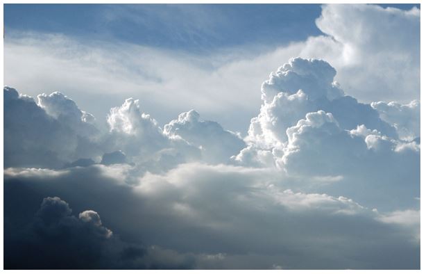
My main focus of this project will be based around the natural world and the variations and similarities within the landscapes and places around me. I will be looking at weather types and patterns, i.e. sunny, cloudy, rainy, windy, and also zooming in close on the environment and looking at the wide variety of leafs, trees, insects and other products of nature. Alongside looking at how diverse and varying the natural world can be, I will also explore how all kinds of nature can be linked back together through the idea of sublime beauty, fragility, and untouched by man. The aim of my investigation will be to highlight the beauty and delicacy of nature and how heterogeneous and interesting it can be. I will be photographing in places I pass through frequently, so I can create a link to my daily life and surroundings. I will also explore parts of the nature-rich island of Jersey that I never usually go to e.g. the coastline to enable that I get a variety of photographs and subject topics. I will experiment arranging my photos of a similar nature in a grid format, like Bernd and Hilla Becher to demonstrate knowledge of typologies.
Category Archives: Planning
Filters
INITIAL IDEAS
Initial ideas:
• markings and patterns, shells, butterflies, trees, dog breeds, eggs, seeds, collections
• family resemblance, size, shape, facial characteristics
• customs, conventions, foods, languages,
• uniformity, conformity, standardisation, monotony, routine, supermarkets, car parks, office buildings
• housing estates, blocks of flats, front gardens, windows, doors, lockers,
• attempts to achieve individuality, standing out from the crowd
• market stalls, spice racks, car boot sales, zoos, public gardens
• microscopic creatures, snowflakes, crystals
• symmetry, asymmetry, structural variation, flaws, faults, schisms
• colour, tone, texture, shape, scale
• seasons, climates, weather types
A L T E R N A T I V E P H O T O G R A P H Y
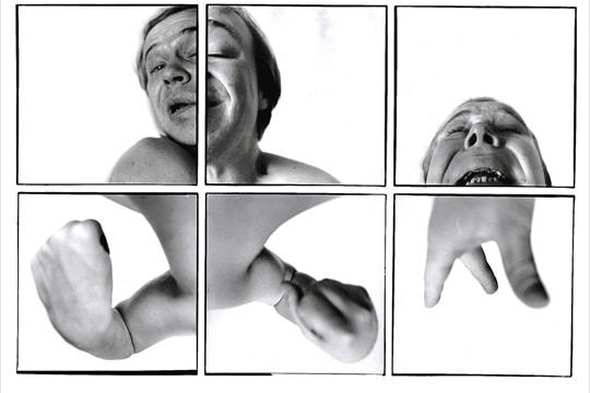
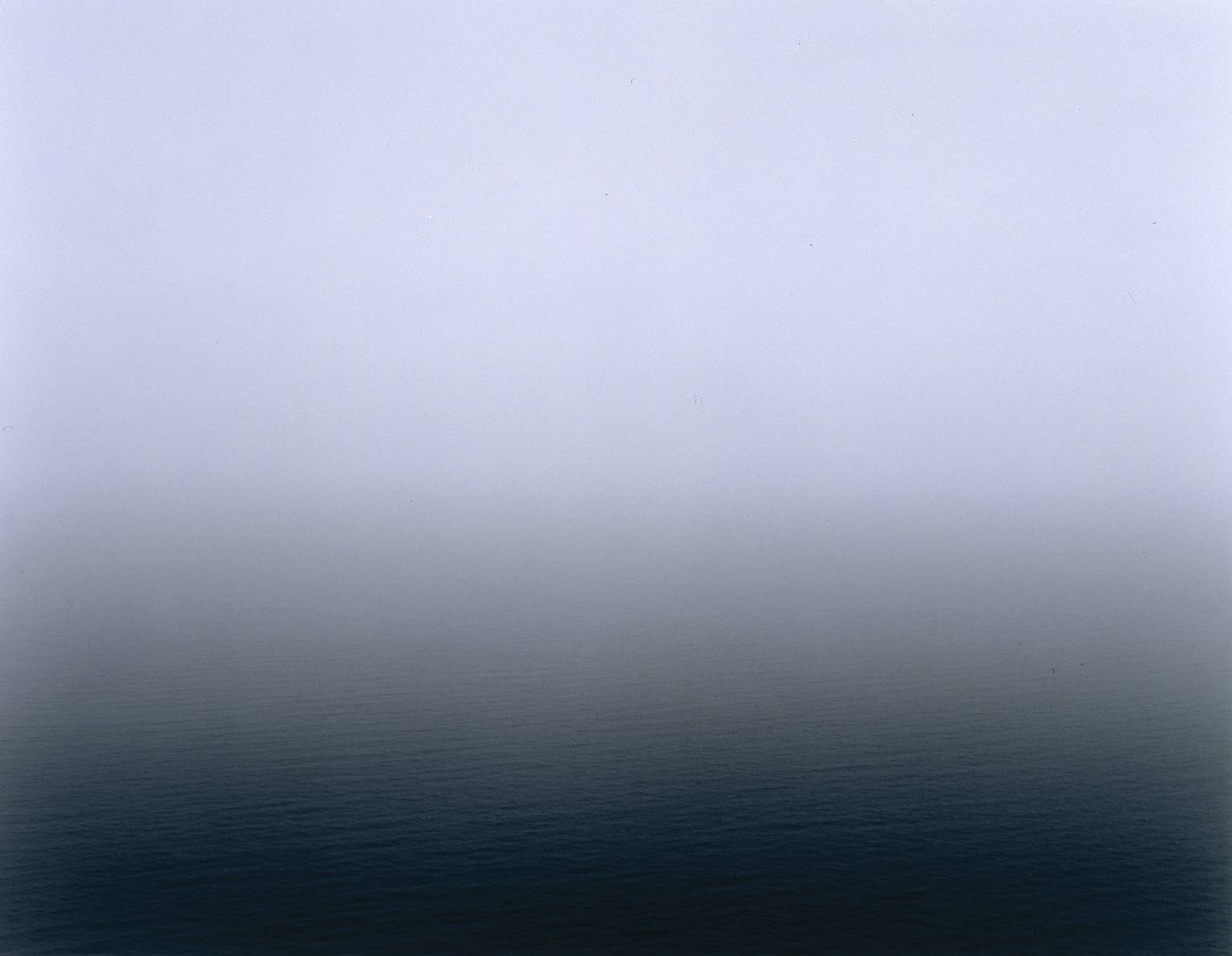
In such an accessible medium as photography, the human body has often been portrayed in a highly predictable way. Finding a variation on this well-worn theme can be difficult. Thomas Florschuetz and John Coplans are exceptions to this and have presented the body in ways that attempt to establish a more original variant on the theme. Hiroshi Sugimoto’s seascapes present a more minimalist approach transcending the conventional seaside image.
M O V E M E N T
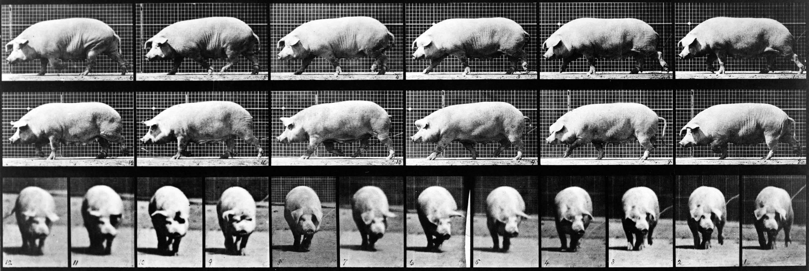
The illusion of movement is created by running together sequences of single images, each being a slight variant on the previous one. Eadweard Muybridge’s photographs from the 1880s are still used as a basis for studying motion by animators and filmmakers. Gifs made of his photographic series have a quality that is somehow both humorous and compelling. Steven Pippin in Laundromat Locomotion paid homage to Muybridge’s processes. Étienne-Jules Marey’s photographs have similar aims, with perhaps more poetic qualities.
S U B T L E C H A N G E S
Many photographers, such as Lorna Simpson create subtle variations of a similar image to make their audience look more closely at the world. William Christenberry returns to the same places to photograph familiar objects and buildings over time, creating a kind of typology that has links with the work of Bernd and Hilla Becher. In his book where Children Sleep James Mollison records the sleeping conditions of different children across the world. Ian Breakwell, Jem Southam, Georg Gerster, Antony Cairns and Olafur Elliasson have all explored variations and similarities around given themes.
Planning Future Shoots
Before commencing with my shoot I thought it would be appropriate to come up with ideas regarding what I would want to base my shoot around. I had previously looked at the works of Aaron Siskind and his use of portraying the surrounding area in abstract ways, defined by patterns and textures which present deteriorating areas in a new aesthetic light. Using him as my major inspiration for the shoot I decided to focus on a slightly built up area which would be surrounded by different landscapes and environments. To do this I would have to look at a map and decide upon areas that I thought I could use this style of photography to properly reflect my opinion and viewpoint regarding how that area portrayed. Here are a few locations that I could possibly explore on the shoot below:
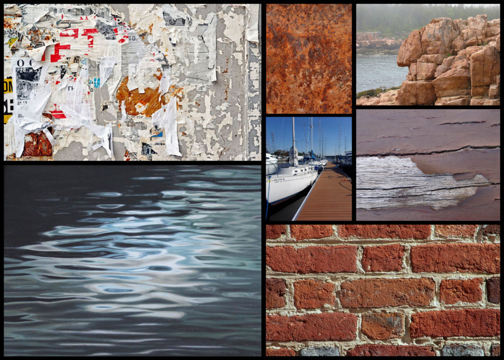
The areas I chose I found to have the biggest variety of aspects within the landscape, consisting of urban and natural viewpoints which would allow me to explore opposing opinions in abstract ways which could be linked into each other. I tried to include areas within Jersey that were next to the sea, this was because I wanted to explore the use of reflects to create abstract patterns of different materials in the water such as the bricks on a pier. To do this I’m going to plan out a few ideas which I would be able to photograph regarding the topic of the variation of textures and surfaces, which once done can be used to link in with each other providing me results that would not seemed rushed but instead compliment each other and can be presented as a set. Here is a mood board of some of the textures and surfaces I wish to capture on the shoot:
One aspect of the shoot I wanted to explore is the formation of rocks, due to Jersey being an island it is completely surrounded by rocky beaches that consist of various types of rock. By using a monochrome filter I wish to highlight the detail and aestheticism of the structures, using a higher contrast to portray the light and dark more drastically than usual, exaggerating the features as a result. To accompany this I could take pictures of the reflect given off by the sea during a sunny or overcast day, this would provide me with a variety of different shades and results which could determine the mood of the entire image. By reflecting objects like walls on the sea it could further enhance the abstraction by including two different environments into one image, man-made and the natural landscape.
Another idea within the shoot could be the use of materials found in that area to display textures and a variety of surfaces. This would consist of surfaces such as walls and wood, I chose these because of the huge variation in shape and form that they come in making each surface unique to that specific area. What I also wanted to pick up from these surface textures was the use of symmetrical aestheticism which would present the viewer with the idea of something with intelligence designing the shape of form of the photographed subject.
For my last idea I found that focusing on everyday objects found in the area explored would be a great topic to pursue. This is because the objects found in the area can often be linked to the people living there, with ropes lying around maybe reflecting a beach side village or cigarettes and rubbish present inside town. This idea for me links best to the works of Aaron Siskind as he moved from portraiture to abstract due to finding that the objects found often best portrayed the people living there in a unique and unusual light, giving more meaning to the image as it then becomes down to the audiences interpretation instead.
Fine Art Reference
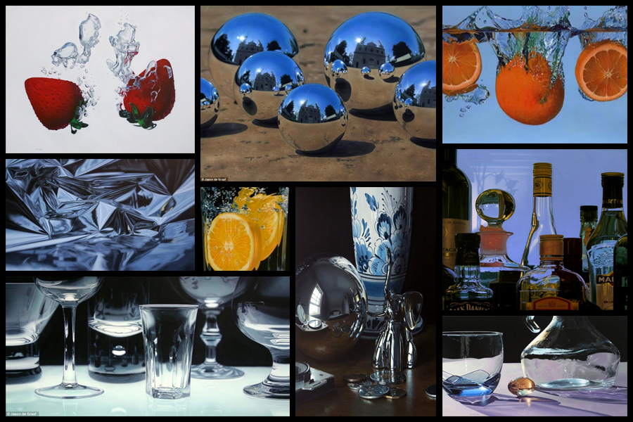
Before going ahead with a shoot and artist reference I decided that I would explore a fine artist that I could link into my future work. I would be looking at their composition and portrayal of certain everyday objects, whilst also looking at how their portray their vision of the landscape in new and creative ways. One particular artist that I found to be inspiring was the fine artist Jason De Graaf, someone who focused on reflections and objects that reflected as a means of enhancing the colour and vibrancy of the subject photographed. For me this was a unique way of seeing the subject photographed as he sets about using natural reflections such as splashes and sunlight to add contrast to otherwise boring everyday items such as fruit. Some examples of his work can be seen below:
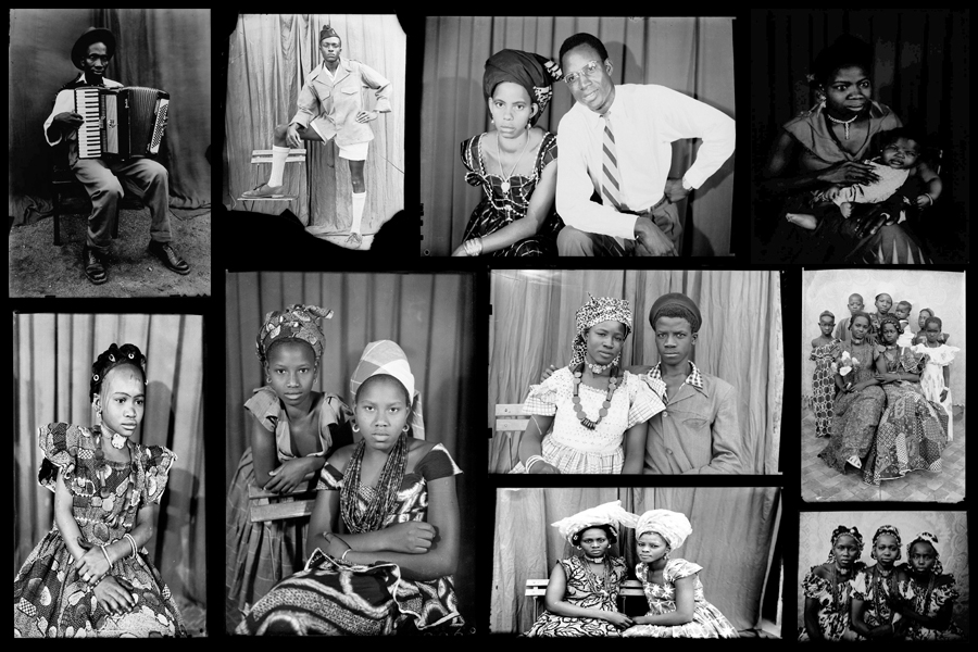
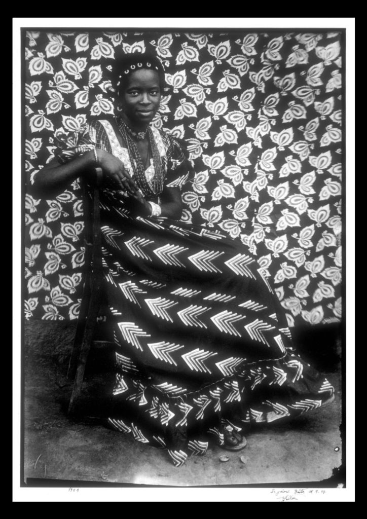
I really liked his use of tinfoil to create abstract landscapes in a sort of surreal and conceptual way with no actual editing done. For me this gave rise to the idea of used a kaleidoscope when photographing my intended areas, further abstracting the subjects from their natural environment and instead producing it to the viewers as something up to interpretation regarding what it could be. When thinking about the use of textures and patterns and creating surreal landscapes with it I stumbled across the photographer Seydou Keita, a photographer who captured African culture through the subjects clothes and patterns present in their everyday lives.
Seydou Keita was a self-taught photographer who in 1948 opened a studio in portraiture gaining a reputation for his skill throughout West Africa. Most of his photos and style are influenced by a great sense of aesthetics, dressing man young men European style clothing with customers bringing in items of clothing they wanted to be photographed in. Keita provided his own clothing and accessories such as watches, pens, radios, scooters, etc. which he often left inside his studio. Originally it was mainly women who came with their traditional robes that covered their legs and throats, only later shifting towards wearing Western outfits in the late 60s. Once again some examples of his work can be seen below:
For future shoots I may consider taking objects out of my home into the natural landscape I have chosen and portray it in an abstract way which reflects a part of me rather than just the landscape itself. An alternative method which I could use would be to photograph the landscape on a more personal level, getting closer the to the subjects and capturing them in a more abstract way through up-close photography and their isolation from their surrounding environment. Some examples of this could consist of fences, horses, gardens and trees, all of these subjects play a part for something in society, whether it be work or just for relaxation, and so by portraying them in an unusual way which captures them in a light not previous used would as a result give viewers a new perspective. One of the image I found to be particularly effective for me is a piece by Seydou Kaita called Untitled [Seated Woman with Chevron Print Dress]:
Visual:
Visually the piece uses traditional African textiles and dresses as the main method of presenting aestheticism towards the viewer. What Keita does here is use two contrasting textiles which class in pattern not colour, as a result of this the opposing texture defines the women opposed to her blending into the backdrop. By leaving a section of the floor in it increases the effectiveness of the textures due to how it stops the entire image from becoming too eye-sore whilst also adding contrast between the predominantly white textiles, once again helping to define the figure of the women from the backdrop. Composition wise the women is centered in the middle of the photo, by doing this for me it immediately draws my eye to the subject as the contrasting clothing she’s wearing draws your eyes to the face in particular which is presented as a breaking point between subject and texture.
Technical:
When looking at the photograph you can see how the image was taken mid-movement, this is because of how the top right of the textile backdrop is motion blurred, this adds a sense of depth within the piece as it defines the women more due to her being photographed more crisply. An average exposure and shutter speed seems to have been used due to shades all being relatively normal without exaggeration, whilst the blurred areas provide me with evidence that the shutter speed is normal and has been unedited or untouched. The piece seems to use natural lighting as the light appears from all sides of the subject, not emphasizing or reducing the effect of the shadows, meaning that the image must have been taken outside of his studio.
Conceptual:
In the twentieth century, photography became a medium of expression that African artists began to draw upon to reflect on the world around them. One of the exceptional talents to emerge in this area has been the Malian photographer Seydou Keita (ca. 1921–2001), whose work has been admired on an international scale. Keita’s oeuvre consists of portraits that chronicle Malian life during the mid-twentieth century. His portraits are renowned for not only their masterful formal composition, but also their ability to capture the nuances of this important transitional period in Malian history.
This portrait of an unidentified woman displays the signature pictorial style that made Keita the premier Malian photographer of his generation. Employing different backdrops and successfully combining pattern on pattern, the woman’s skirt is dynamically juxtaposed with the regularity of the floral motif on the backdrop behind her. Keita positioned the woman so the arrow design of her dress directs the viewer to her bodice, where light vertical elements of her blouse lead toward her smiling, confident face. The overall pattern on the backdrop holds the viewer’s attention while it gently repeats itself and simultaneously guides our eyes back down to her skirt.
Variation And Similarity – Exploring Ideas
Before commencing with various shoots and photographic inspirations I decided that I would be suitable to research various ideas that I could use as my theme for the topics of variation and similarity. Here I will be exploring five different stances I can taken regarding the given subject, and how I could go about taking images of the intended areas and their uses, these are my choices:
Empty Spaces/Full Spaces:
Here I could photograph empty/full car parks, using the lighting present there to create aesthetic and contrasted results. This can be done to more effect in enclosed parking areas such as the ones present in town, where a more cramped and urban feel is created. I could also make use of the empty car parks at night in the open, using the odd lamppost’s lighting as a means of casting an eerie feeling upon the surrounding area. A photographer who I could explore this with is Denis Felix, someone who explore the abandoned landscapes of areas in homes and buildings. Also done by photographer Johnny Joo, he capture the areas of society that have moved on, leaving natural to reclaim the land previously used. I could use monochrome photography for this as it could allow for a more unnatural feel to come across when viewing the photos.
Textures/Patterns:
For this idea I could explore the variation of patterns and textures within a variety of different objects present in different landscapes. By presenting everything as more abstract and aesthetic it could not just visually please the viewer but also provide an insight into the hidden world that can be portrayed by these surfaces, where you perspective can be warped depending on how you see the object. Photographers that I could use for this idea are Paul Sanders, someone who looks at the structure of objects and photographs them in an aesthetic and original way, and Edward Weston, a photographer who uses macro photography to capture textures and patterns of architectural and natural subjects, in both the environmental and man-made world.
Animals:
Regarding the idea of animals I thought the variation of species would be a great topic due to Jersey having one of the worlds most famous endangered species zoos in the world, Durrell. By photographing a large variety of different species side by side it would provide a huge insight into how evolution has occurred and the different features and characteristics of each one. Some photographers that I could study for inspiration for this idea are the photographers Martin Bailey and Tim Flach. What I liked was their style of separating the subject from the backdrop using Photoshop or a black cover which really brings out the aspects of the animal they intend to capture.
Natural Formation Of Objects:
Here I wanted to explore how the formation of natural objects found in our everyday environment. By using macro photography it could highlight the hidden patterns in things that we view all the time, by photographing a variety of different plants etc like a topography it would give symmetry and aestheticism to the viewer who could see each image in a larger picture when compared to the other images taken the same way. The photographer Karl Blosfeldt I felt was a particular inspiration for me as he used topographics to capture the tips of plants using macro photography, which he would then display side by side so that they increased the overall interpretation of how the style of photography is viewed.
Abstract Landscapes:
Finally for this topic I wanted to look at how the various landscapes in Jersey could be viewed using abstract and unique perspectives regarding the formation of the area. Here I would have to look at the vivid colours and contrast them against more stark and ugly aspects of the area like concrete and walls, using telephone boxes, lines and brightly painted areas to do so. Some photographers that I would like to study for this are Sigfried Hansen and Ricardo Cases, who both use vivid colours to portray the landscape in a vibrant and interesting way that draws the viewer in through aestheticism and symmetry.
Overall when looking over the chosen ideas I found that the abstract stance of separating the subject from its environment really appealed to me the most as it presented me with alternative methods of showing my work, leaving the viewer to purely focus on that one subject. These are most evident in the topics of animals, natural formations and texture/pattern, giving me the opportunity to explore this style the most.
PLANNING FOR FIRST 4 THEMED SHOOTS FOR VARIATION AND SIMILARITY
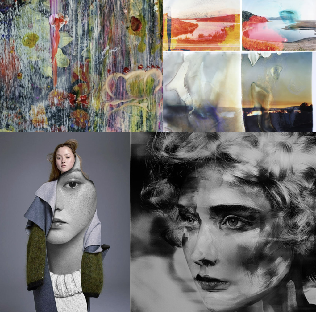
FIRST SHOOT:landscape manipulation shoot: within this shoot I have 4 different concepts that I would like to edit and experiment with when taking an manipulating the photos. The first I have recently looked up at and it is to take a more subsequently ‘normal’ landscape photo, yet cover the outcomes in a liquid and then use this development of the photo as the final. This liquidation, allows colours to move and leak and forms a new more interesting composition. Additionally this creates a clear transpire of artistic influence and forms a connection of fine art, and making it appear as if this photo was some what painted. The approach to this technique is: My second developmental idea for landscape shoots, is the editing process to make landscapes look as I have are paintings, or visa vera: Lastly I could use this same method in order to make portraits and other images, look as though they are painted, by doing thick brush stroke effects or making the image look more abstract and more filled with fine art effects. Additionally As spoken about previously, I want to believe the main version of this is taking pictures of thick paintings, possible inspired by van Gogh and Monet, and making it look as though they could be real people, or real objects. I think this is a very interesting method on how I could start developing my work. My third idea is surreal manipulation to a landscapes. I believe if I were to experiment with how landscape can be altered, in order to have more similar stylistic values to things such as paintings, or piece of more abstract contemporary work, it could be very successful. Surreal manipulation to a landscape to edit. I believe this could further link to making landscape look like altered realities and turned into abstract manipulated paintings. This again showing how far art has the ability to go. These abstract pieces come under many art categories and also shows an understanding of how to develop a piece to see a progression of artistic influence.
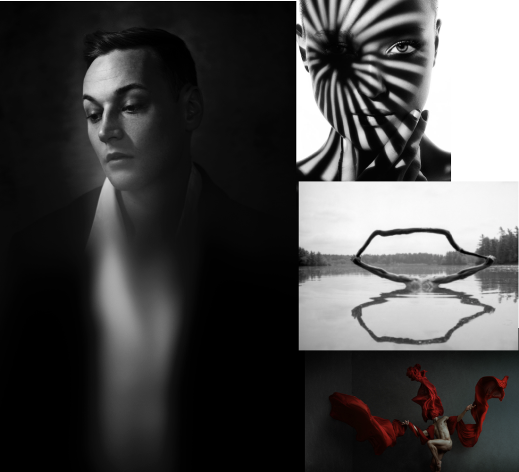
Studio shoot :To my mind the studio shoot is the shoot which I know what final outcomes I am really looking for, and even to the extent, this shoot will really help me to develop the rest of my imagery. I have divided this shoot into 5 subcategories of images, which I want to capture and further develop and how and why I believe these executions are the most important. The first is using a glass bowl, or jar, and using this in front of a face in order to distort and stretch the face. Not only does this once agin show an interest of the element of fine art, but is almost connotes the elements of visible chaos, and showing a trauma to that persons personality. This can also be seen by the work of William Ye. Another inspiration from Ye will be experimenting with using a flowing piece of fabric, in order to show a structure in the piece. I believe this effortless looking towel and the structure of the body, creates such a successful outcome, and connotes an overlooked power. This sentiment of chaos I believe can also be represented through the effect of people climbing on top of each other, and or forming together to make structures and new bodily forms. This shows a unity of people standing together, and also a combination of family. This leads me onto my representation of chaos, and the acts of people when pulled together in a group, yet still showing the effortlessness of how to form a new stature creating a new art piece. The last idea which combines fine art, and the media that I can do within a studio, is the editing of faces onto peoples clothes, and using this to effect true feelings, and or editing on events which symbolise trauma or the past of peoples lives. This I believe has a certain contemporary art feel, yet is not done through a painting style. The combination of high fashion within this shoot, also symbolises the beauty industry and how you have to look a certain why, and what is expected. These geometric shapes, create combinations of cubism and once again this whole shoot linked together with the interposing state of form, composition, and fine art media effect.
family and friends shoot: For the family shoot I want to both approach this in both a journalism and unconventional surreal manner. I wish to start off by producing images of many large groups of friends and family, or people who have a close net relationship. I then want to develop these into collages of smudges images, and faces covered and layered with effects, to create a distortion of identity, but a similarity into the way which they are all covered. An extension from this process, could be family pictures, and portraits collages together, or patterns which have a significance to the families themselves. This could be, a flags or perhaps a pattern made by a grandparent. Anything which is texturised yet still causes a effect fro the family themselves, and an expression of themselves.
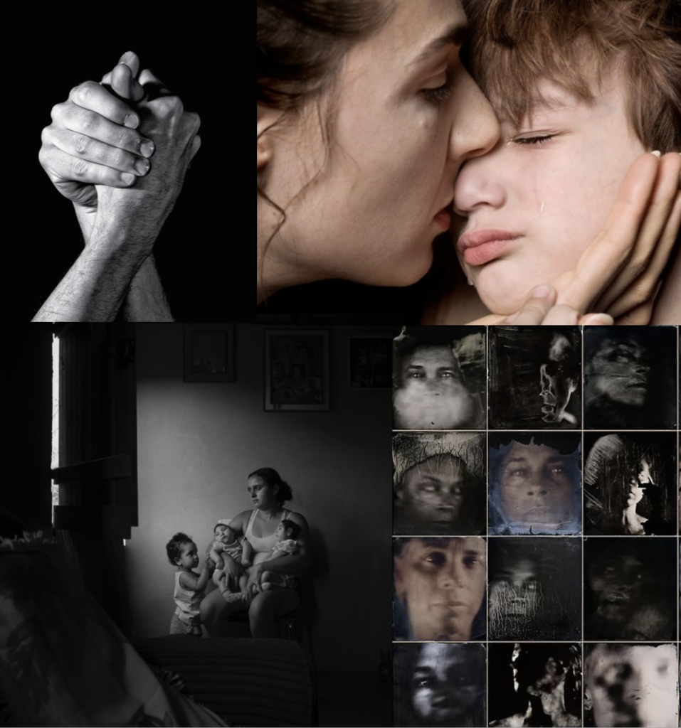
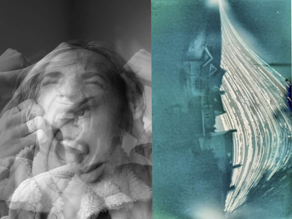
chaos: inspiration from the media: Chaos to my mind, is something which causes a feeling which depends an emotional response of panic and madness. It can mostly be seen throughout the media, through articles, fake news or even protests which go too far. These movements are all about conflict of peoples beliefs, because of this, I Believe if I were to layer images of people causing different facial effects, in order to show different emotional and a chaotic feeling expanding and becoming more abstract. This not only builds tension within the image but also shows expressions of human conflict within the images. Secondly a good example of variation and similarity, is watching peoples daily lives, and their own independent news. This could be caught and seen through peoples daily lives, and the activities which they get up too. Street photography is a great way to capture a reality of the people possibly not correctly expressed through the chaotic media, andI belive this would be a very interesting way to reflect the society which we live within. Chaos can also be shown through more unconventional techniques, these being the light patterns of slow exposure, of perhaps even manipulating a person or landscape, to look or be presented in a unconventional way. This unique approach too seeing the worlds could count as a reflection of mediation and journalism, and the many dimensions which it is possible to see a story or event. You could even explore taking a picture from many different angles, and then experimenting with which angle tells the chosen story most successfully.
My Response to Lewis Bush/Michael WOLF
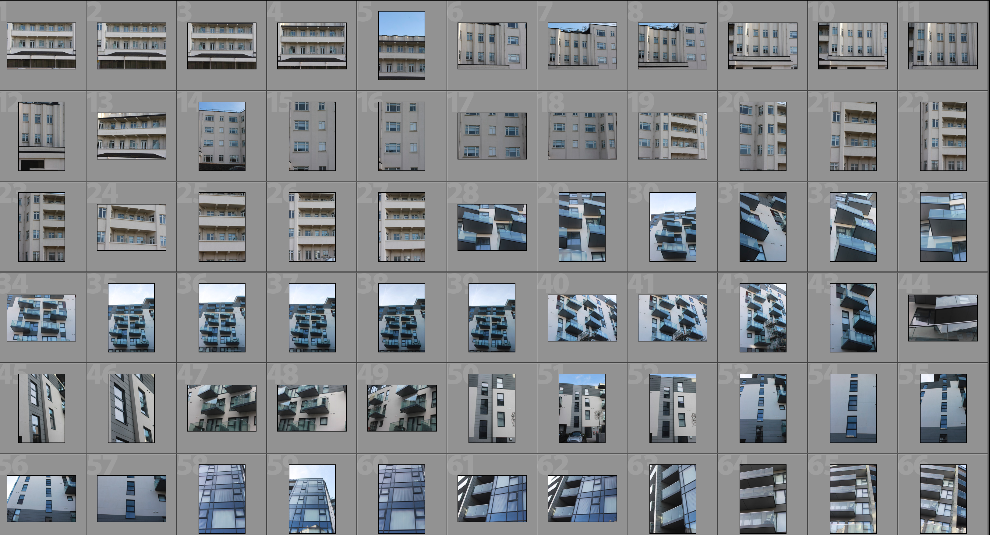
This shoot draws inspiration from Lewis Bush’s ‘Metropole’ as well as Michael Wolf’s ‘Architecture of Density’ and aims to show some of the repetition and symmetry in blocks of flats and offices whilst at the same time showing the difference in designs between buildings. Going into this shoot I had the vision of photoshopping the photographs that result to create compositions that are full of patterns and are illusion-like. Lewis Bush’s ‘Metropole’ came to me as an inspiration because it explores the fact that there are an increasing amount of large buildings for offices or flats taking away from green land and so the landscape in which we live is turning into a repetitive view of similar flats and offices leaving citizens with a feeling of monotony as everything is being redeveloped to serve the same purpose. Bush’s work on ‘Metropole’ shows a lot of emphasis on the repetition between buildings and I have tried to replicate this in this shoot. Wolf’s work has inspired me as he essentially does what I am attempting to do in this shoot but on a much larger scale by photographing the density of high-riser apartments in Hong Kong.
One way in which I could develop on this shoot in the future is by looking at typology, which would involve me researching Bernd and Hilla Bechers, of high rise buildings in Jersey. I could approach this by finding the 14 high rise apartment blocks in Jersey and photographing these in a similar style to this shoot and then creating a typology page of these different buildings.
Contact Sheet
Edited Photographs
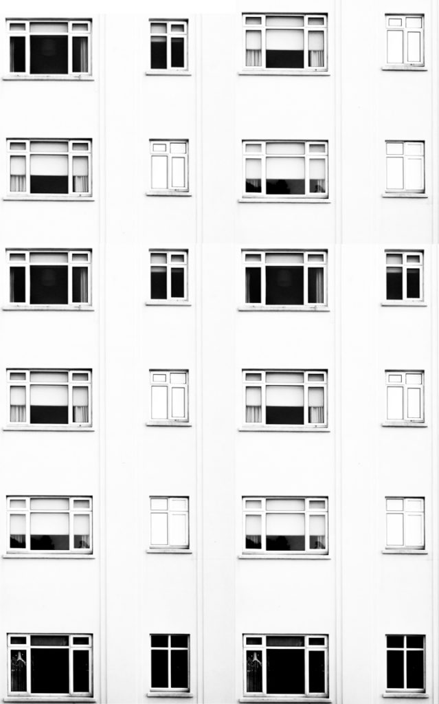
After going through all of the photographs that I produced on this shoot I selected some of the best that I could edit. I edited these photographs by putting a black and white filter on in order to allow the viewer to focus on the shapes within the photographs rather than the colour. I then used a perspective crop on the majority of the photographs in order to make the photograph completely straight on in order to further emphasise the symmetry and patterns within the photographs. As well as the black and white filter I increased the contrast, used high highlights and whites, used low shadows and blacks and adjusted the exposure accordingly to create a composition that is mostly over exposed but the features such as the windows are emphasised to help the shapes within the buildings to come forward.
Edits
After editing the individual photographs I brought the photographs into a blank photoshop document and duplicated it. After the duplication I then messed around with the layout of the multiple photographs to create illusions that show lots of repetition and some symmetry. The result is montages that emphasise in blocky shapes and use a black and white filter to bring contrast into the photographs.
#1
#2
#3
#4
#5
#6
Analysis
I captured this photograph in a natural lighting in order to bring out the natural shadows and shapes within the building that I was photographing. There is a wide tonal range due to both the nature of the building and my editing to the photograph. The bright whiteness in the walls of the photograph contrasts greatly with the dark black shadows on the balconies. I took this photograph on a bright day where there was plenty of sunlight so only needed to use a low ISO of 100 along with a shutter speed of 1/60 to capture this photograph. The low ISO paired with the quick shutter speed allowed for the photograph to be as high in quality as possible as well as not being overexposed (even though I edited the photograph to increase the exposure. I edited this photograph by using a black and white filter to bring out the shapes in the windows as well as the shadows and then I increased the contrast, highlights and whites whilst reducing blacks and shadows to create a composition that had high contrast between the black and whites. A depth of field of f/16 was used to capture the photograph which can be seen as the whole of the photograph is in focus. The photograph has a slightly cold colour cast to it due the bright whiteness throughout it.
I opted for a black and white filter over a colour photograph as it helped to bring out the details within the buildings, especially the contrasts as well as a wide tonal range to create a more dramatic composition. Due to the deep shadows and edges within the photograph as well as the editing of the photograph the composition has a 3D effect as it appears to have different layers which bring the photograph to life. There is also a lot of patterns and repetition within the photograph, which I aimed to create when setting out on this shoot. I have placed the balconies on the two horizontal lines of the rule of thirds as I feel that they are the most interesting parts of the photograph so placing them along these lines creates a more interesting composition as well as helping with symmetry.
The aim of this shoot was to create a set of photographs that showed the repetition of shapes within blocks of flats and offices and how this repetition can be aesthetically pleasing. The overall results shows how even though there is a lot of repetition within individual buildings, each building has its own unique characteristics and shapes and therefore have variance. The inspiration for this shoot came from photographs of tall tower blocks in cities such as Hong Kong where each floor and flat are almost identical, which is perfectly demonstrated in Michael Wolf’s work as well as inspiration from Lewis Bush’s ‘Metropole’ in which he looks at the development of buildings through a double exposure technique to create a similar outcome to what I have done.
The concept behind this is that there are an increasing amount of these large and repetitive buildings that make way for office buildings or flats due to the ever rising population and urban migration. The photographs resulting from my shoot show just how repetitive these buildings that are taking space from nature really are and reflect the idea that some residents may believe that the landscape of cities including Jersey is becoming repetitive and monotonous as lots of land is being taken to serve the same purpose of housing or offices.
ESA // Moodboard, Mindmap and Initial Ideas
For my exam, I am wanting to focus on nature and the way it changes. There are multiple areas that I can look into such as flowers and animals, however, becasue I live on an island the sea is a very significant part of the landscape and the tides are constantly changing. In both predictable and unpredictable ways. I feel like this would be an interesting topic to explore because of the variations as well as the similarites in each tidal movement.
How I am going to go about photographing the tidal movements:
I am going to take a series of images from various areas of the island. Each area will contain photos taken every 5/10 minutes, until a visible change occurs. With these series of images I am hoping to display them in two ways. Firstly I am going to create a moving image using photoshop, to show the tidal movements. I am also going to display the images in a grid, so that each photo is one frame of the moving image.
Artists I am going to look at and the images that have inspired me:
- Michael Marten
- Lorna Simpson
- Eadweard Muybridge
- Hiroshi Sugimoto
- Roni Horn
- Jem Southam
- Bernd and Hilla Becher
- John Baldessari
2019 Photography Exam Planner
Final Deadline for improving Coursework: MON 11 MARCH – Whole School!
Examination dates: 15 hrs controlled test over 3 days
Groups 13A / 13C – 7, 13 & 21 May
Group 13D – 8, 14 & 22 May
The Themes: ‘VARIATION and/or SIMILARITY’
Link to PLANNER for A2 EXAMINATIONS 2019
Assessment Objectives
You should provide evidence that fulfils the four Assessment Objectives:
AO1 Develop ideas through sustained and focused investigations informed by contextual and other sources, demonstrating analytical and critical understanding
AO2 Explore and select appropriate resources, media, materials, techniques and processes, reviewing and refining ideas as work develops
AO3 Record ideas, observations and insights relevant to intentions, reflecting critically on work and progress
AO4 Present a personal and meaningful response that realises intentions and, where appropriate, makes connections between visual and other elements.
Definition in dictionary:
VARIATION
- a change or slight difference in condition, amount, or level, typically within certain limits.
“regional variations in house prices”Synonyms: difference, dissimilarity, disparity, inequality, contrast, discrepancy, imbalance, dissimilitude, differential, distinction More
- a different or distinct form or version of something.
“hurling is an Irish variation of hockey”Synonyms: variant, form, alternative, alternative form, other form, different form, derived form, development, adaptation, alteration, modification, revision, revised version
“he was wearing a variation of court dress”
SIMILARITY
- the state of being almost the same, or a particular way in which something is almost the same:
“the similarity of symptoms makes them hard to diagnose” - a similar feature or aspect.
“the similarities between people of different nationalities”Synonyms: resemblance, likeness, sameness, similar nature, similitude, comparability, correspondence, comparison, analogy, parallel, parallelism, equivalence; interchangeability, closeness, nearness, affinity, homogeneity, agreement, indistinguishability, uniformity; community, kinship, relatedness; archaicsemblance
“the similarity between him and his daughter was startling”
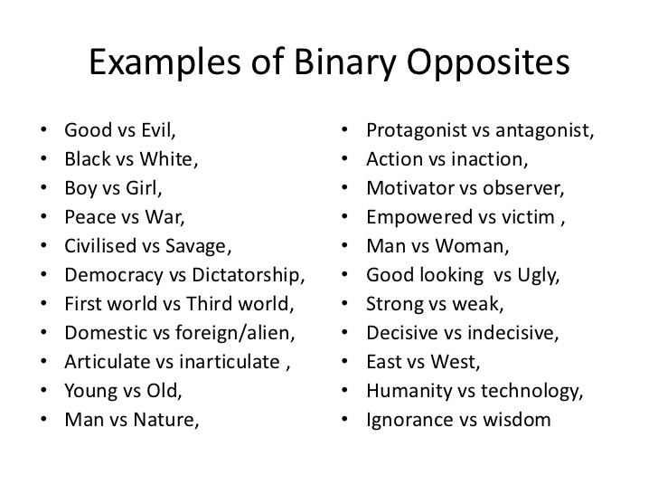
Binary opposition
The exam themes of ‘VARIATION and/or SIMILARITY’ are a binary opposite – a pair of related terms or concepts that are opposite in meaning.
Binary opposition originated in Saussurean structuralist theory in Linquistics (scientific study of language) According to Ferdinand de Saussure, binary opposition is the system by which, in language and thought, two theoretical opposites are strictly defined and set off against one another. Using binary opposites can often be very helpful in generating ideas for a photographic project as it provides a framework – a set of boundaries to work within.
How to start – TASKS FOR H-TERM
- Read the Exam Paper and Exam Planner thoroughly, especially pages pages 3-5 and page 24-27 which details specific starting points and approaches to the exam theme – make notes! Look up the word in the dictionary, synonyms and etymology (the study of the origin of words and the way in which their meanings have changed throughout history.)
- Brainstorm your idea and research artists listed – look also at starting points in other disciplines e.g. Fine Art and Graphic Communication etc.
- Begin to gather information, collect images, make a mood-board and mind-map,
- Make plans for photoshoots and write a specification.
- Produce at least ONE PHOTO-SHOOT over H-Term as a response to tasks listed below and initial research and ideas.
- You must show evidence of the above on your blog– complete at least 4-5 blog posts.
Each week you are required to make a photographic response (still-images and/or moving image) that relates to the research and work that you explored in that week. Sustained investigations means taking a lot of time and effort to produce the best you can possibly do – reviewing, modifying and refining your idea and taking more pictures to build up a strong body of work with a clear sense of purpose and direction |
Preparatory Supporting Studies (Blog posts) – 8 weeks of lessons + 2 weeks Easter Break:
Prior to the timed examination you must produce and submit preparatory supporting studies which show why and how the supervised and timed work takes the form it does. You must produce a number of blog posts 25-40 that charts the development of your final piece from conception to completion and must show evidence of:
- Research and exploration of your ideas
- Recorded your experiences and observations
- Analysis and interpretation of things seen, imagined or remembered
- Experimentation with materials, processes and techniques
- Select, evaluate and develop ideas further through sustained investigation
- Show connections between your work and that of other artists/ photographers
Controlled Exam 15 hrs over three days: (Final Outcome)
This time is for you to fine tune and adjust your final images for print using creative tools in Lightroom/Photoshop and/or complete a final edit of your photobook, film or video in Premiere. Your final outcome(s) must be presented in a thoughtful, careful and professional manner demonstrating skills in presenting work in either window mounts, picture frames, foam-board, and/ or submit pdf of photobook, or embed (from Youtube upload) moving image and video based production to the blog.