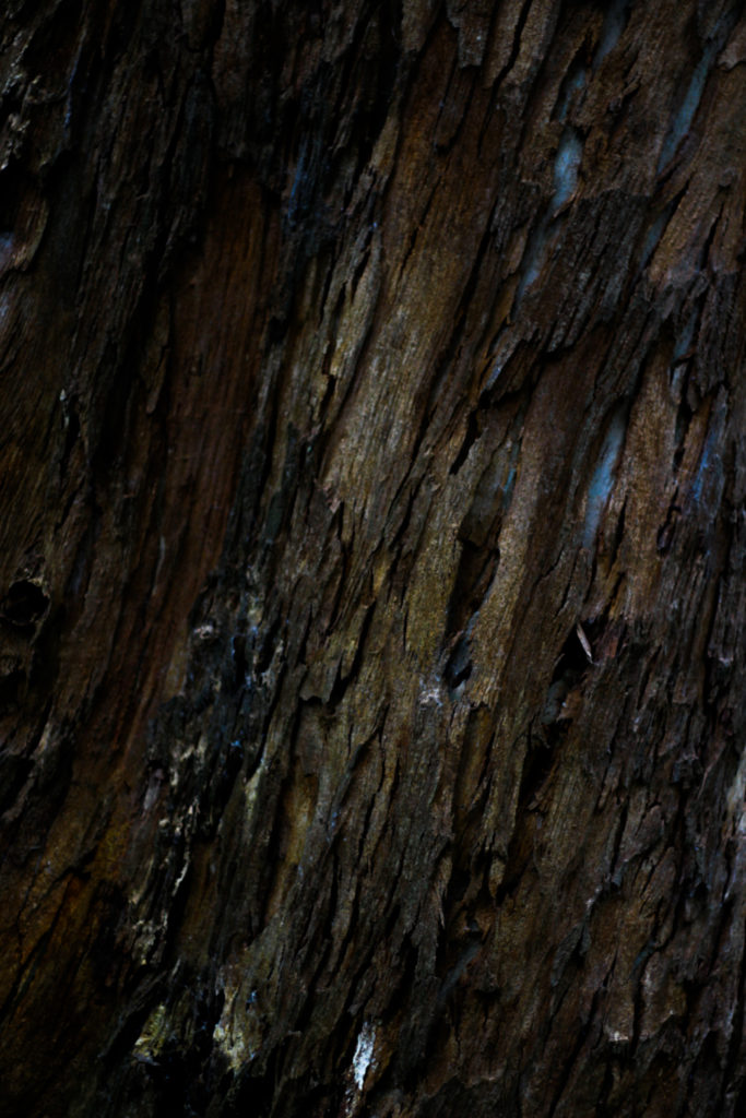
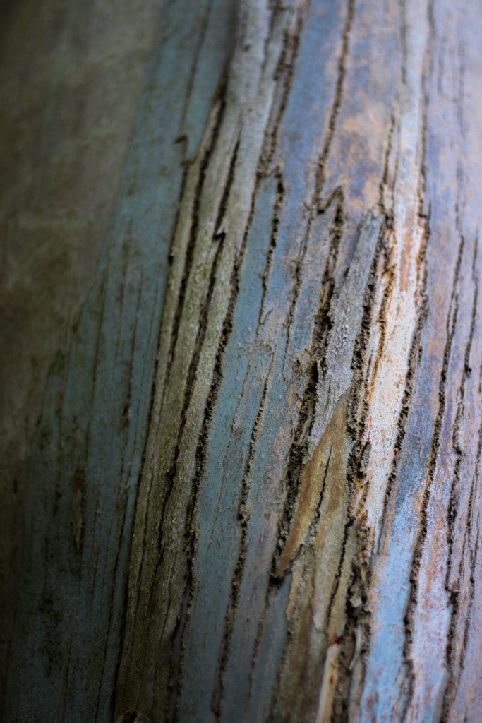
Once I had got both sets of film developed I placed all the images out and put each images into groups as I wanted to single out the strong images within each set. I displayed them out onto a big board where I could clearly see them making it easier to find the stronger images. The images that I thought weren’t good enough I would remove from the board. Once I had removed all the bad images I began playing around with them and trying out different layouts. I had multiple different layouts however, some of the layouts didn’t reflect my images in a strong enough way as some of the images didn’t fit with each other the way I wanted them too. In addition, my last experiment really reflected my images in a way that created a relationship between each image and displayed them in a way that allowed for them to really compliment each other. The yellow stickie notes where to indicate the images I was going to use as a double page spread and the green stickies where used to show the images I wanted to display as a set.
Category Archives: Planning
Filters
Book Specifications
My topic in 3 words: Styles of abstraction
Topic described in a sentence: I will be exploring how three different categories of abstraction, colour, texture and pattern compliment and contrast each other when put together.
My Topic described in a paragraph: I will be looking at the topic of abstraction regarding three of the more dominant areas of it. I will firstly look at colour and the use of heavily saturated photography to isolate the subject from its surrounding environment. Texture is another theme I wish to explore through the almost unseen world present when looked at closer inspection and how natures pattern often are aesthetic and in huge variety. Lastly I will be looking at pattern and the idea of isolating once again a subject from its surrounding environment so that it becomes up to the viewers to interpret what it could be in regards to surface and look.
Design:
- Look and feel: I would like a matte cover which would produce a photographic but card like feel which would really compliment the material being used for my overall design and theme.
- Paper and ink: For the sleeve I would probably use printing ink to produce the title and author name, but within the book I would use glossy paper due to it producing a more detailed outcome.
- Format, size and orientation: The format would be three portrait books due to me wanting them to be able to fit into sleeves, I would probably make the size of them relatively small just below the size of A4 paper.
- Binding and cover: The cover would be the title of that topic of abstraction within the book such as saturated.
- Title: Each book will have a different title regarding the contents which can be found inside.
- Structure and architecture: The page layouts will mainly be one or two images to a spread with the occasional three images if I want to create the impression of a triptych.
- Design and layout: Once again the pages will mainly have one to two images per spread with the occasional three or four
- Editing and sequencing: I will be ordering the images into each book regarding which title they best fit into, saturation, texture or pattern. Each book will have the photos ordered into a way in which each compliment each other or have a greater overall theme.
- Images and text: I would like to keep the book very minimalist and so possibly would just have the location or word saturation with its number such as #1 or #2
Rorschach Plan:
Concept: To create an interpretation of Rorschach’s original inkblots, used to examine a person’s personality characteristics and emotional functioning.
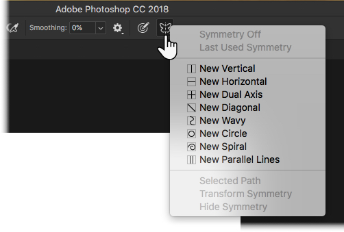
Procedure: Starting with a blank landscape page, I will change the background colour to beige to resemble that of the original prints. I will use ink brushes found online to create the same watery effect. In symmetry mode, I will choose the vertical option, which will create a line down the center of the page. Anything I draw on one side of the line will be replicated exactly on the other. Like Rorschach, I will also experiment with various colours in order to create different shapes for people to perceive. Once completed, I will ask a selection of my peers to tell me what they see in each image. This sample will also include the people I have chosen to photograph.
Experimenting with Presentation
FINAL PRESENTATION IDEAS
Full-size prints:
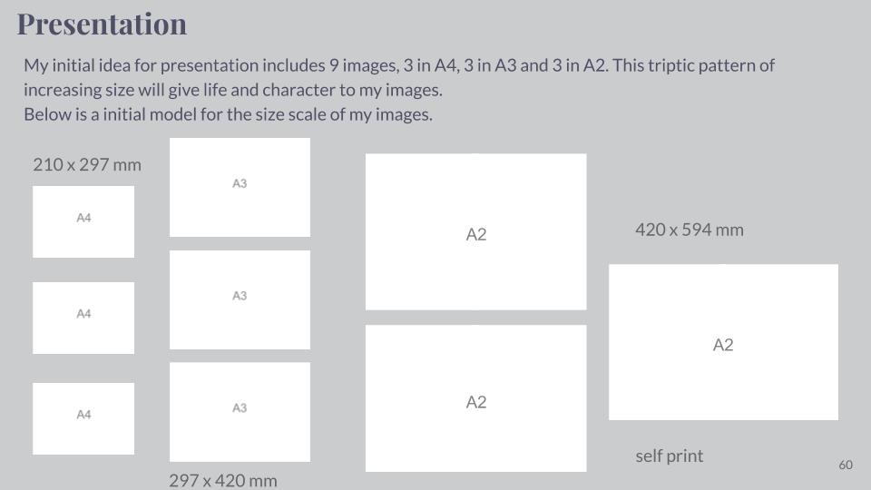
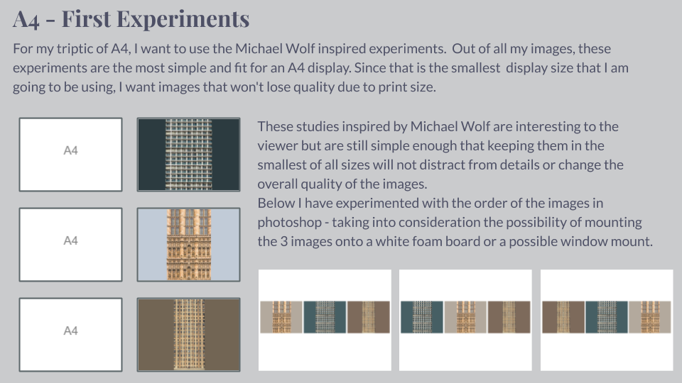
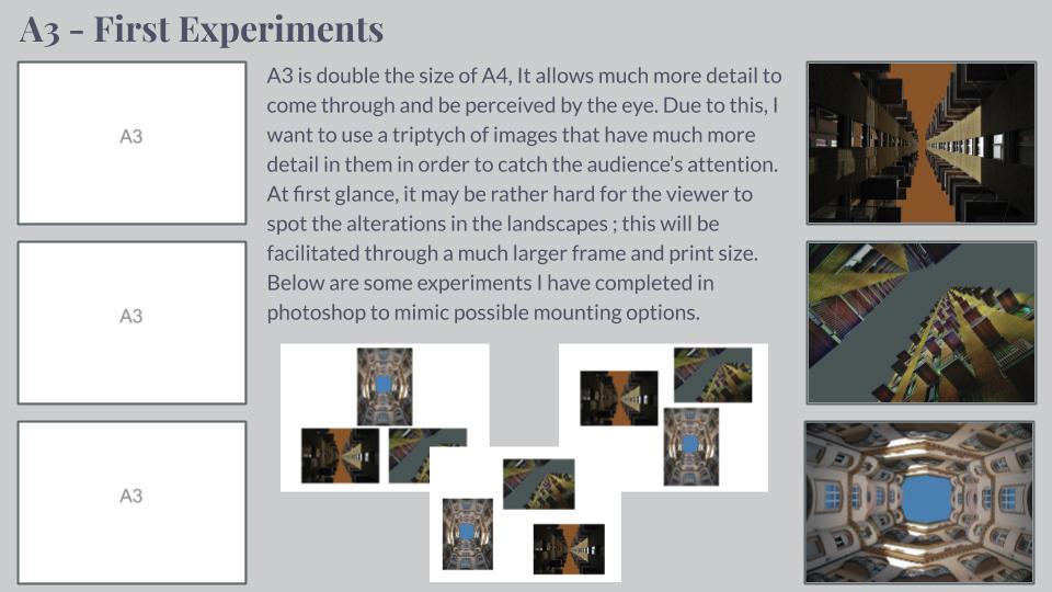
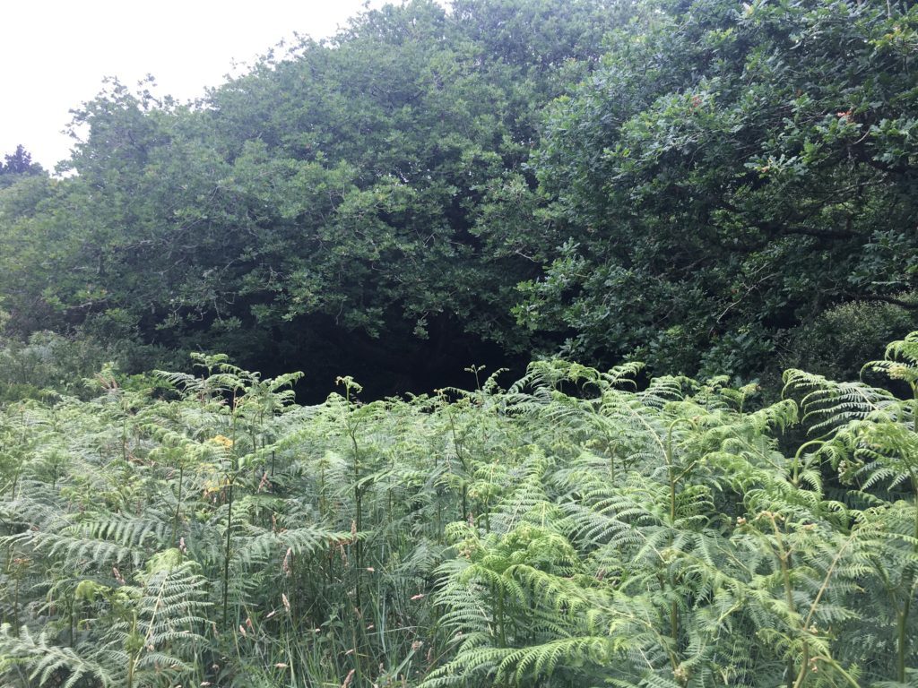
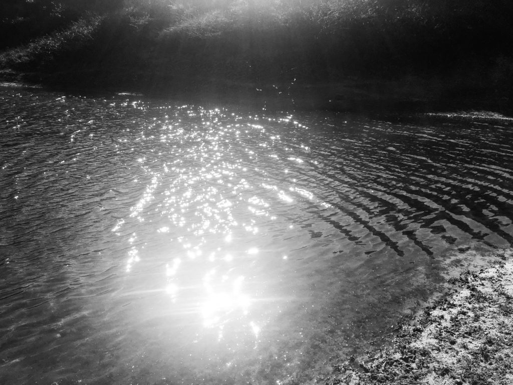
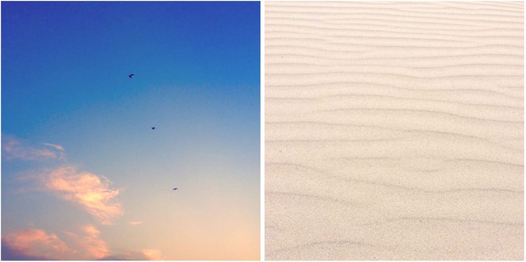
Coming towards the end of my project, I have started to think about final presentation ideas. I have come up with the idea of full-size prints, grid format, photo collection and photobook. I will definitely present at least one of my final prints alone and full-size. Full-size prints are a good presentation method for strong composition and visually interesting image. Pictured below are two photographs I feel I could present alone, however this is not certain as I am still to finalize my favourite prints. I may mount my photographs onto card or use spraymount to stick them down and present them.
1.
2.
Grid format:
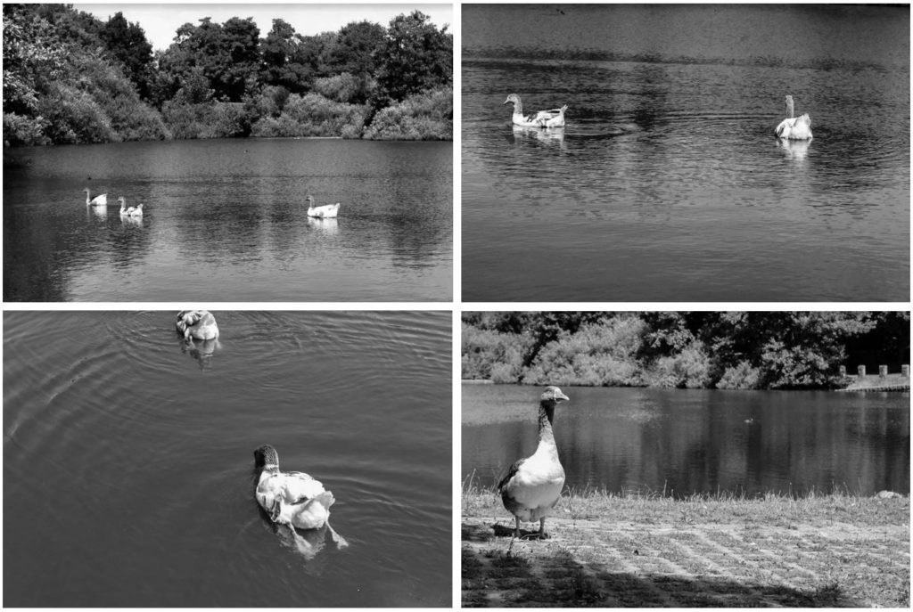
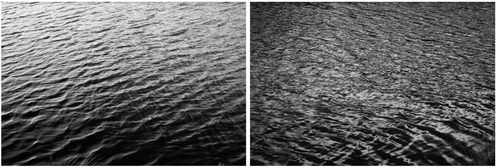
I like the idea of using grid format to present multiple of my images at once. Grid format is a good idea for images that aren’t very visually strong presented alone. I have exprimented with this grid format before my final exam to test the idea, presented below. I think the grid format works well as I am able to show 4 of my images in one collection, images that are interconnected and are all brought back to the idea of nature.
3.
4.
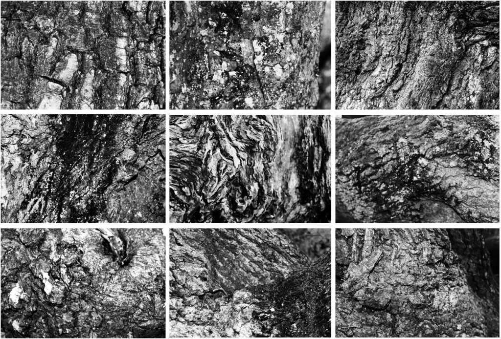
5.
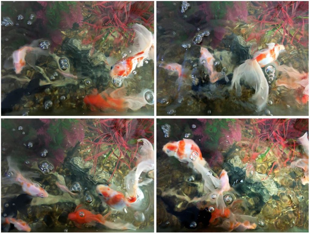
6.
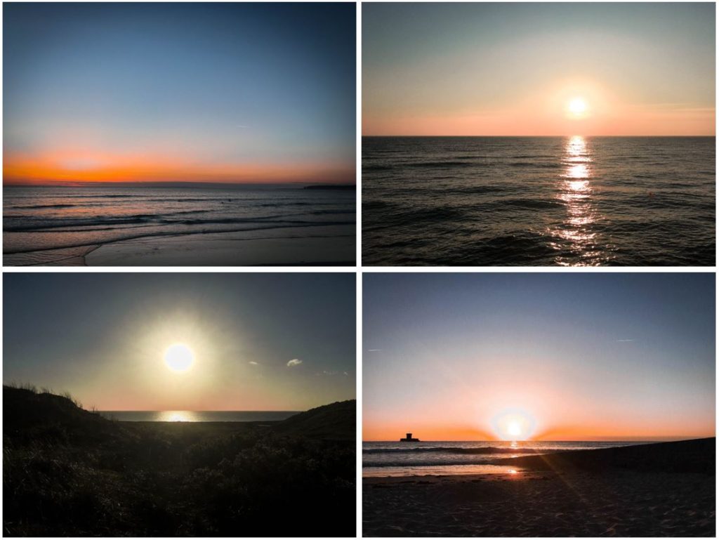
7.
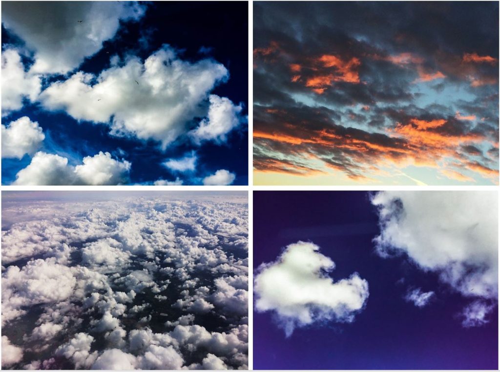
Photo collection:
Photo collection is similar to the grid format, but I am able to place more or less than 4 of my photographs together and in a different style i.e. side by side or one below another. Again, I have experimented before the exam with numerous primary source photos below. I am happy with my edits and think my individual images work well together.
6.

7.
8.
Photobook:
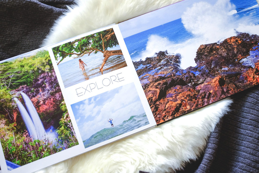
A possibility for presenting my final prints is by photo-book. This is a relatively lengthy process however the final product would be a successful way of presenting the different categories of nature and my wide variety of photos. If I am to create a photobook I would create it using Blurb and Adobe Lightroom CC.
Abstract Texture Shoot #2
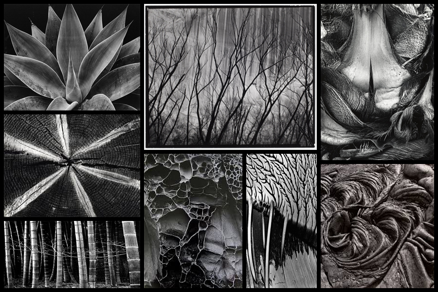
For this shoot I wanted to focus on the idea of abstraction through pattern especially in nature and the urban world. I really liked the idea of basing my photography around capturing everyday scenes of subjects in a new light which highlights the unseen patterns which are present in our everyday lives and the structures of things around us. A photographer I have looked at which I have got particular inspiration from is Brett Weston, someone who has devoted to focusing on natures pattern and the unseen world around us. The images that I found to be more inspiring were his images based around plantation and occasionally the effects of humans on the landscape such as footprints and man made intervention into the natural environment. His skills that I wanted to be able to transfer were surrounding his effective use of a low exposure to create a more dramatic scene surrounding everyday things through exaggeration of shades and tones. Some examples of his work can be seen below:
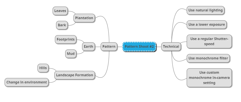
Once I had looked over some of his photos that I found were particularly inspirational for my shoot and its aims I then decided to go onto produce a mind-map. By making a mind-map it would allow me to jot down ideas and aims for the shoot and what I wanted to over achieve, this would also cut down on time wasted on the shoot as I would have a goal of what to produce on me and how to take it with it all the time directing my aims. Here are some of my ideas that I wish to use on the shoot:
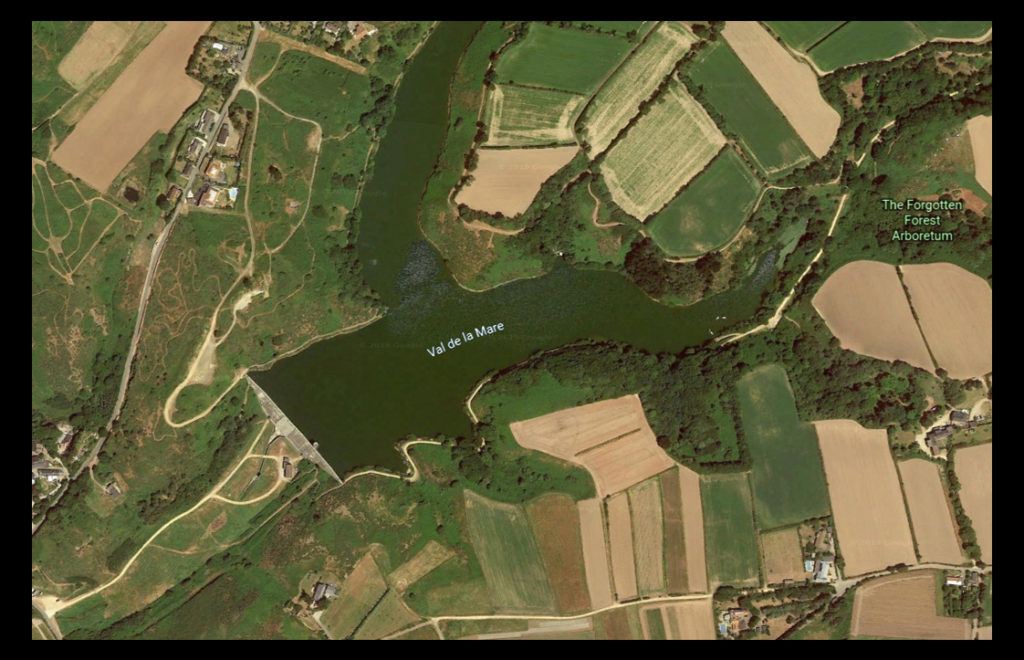
The place I have decided to take the images is called Val De La Mare due to its variety of different textures which can be found alongside the water and the trees. A map of the location can be seen below:
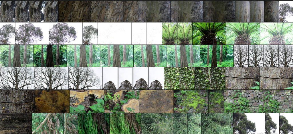
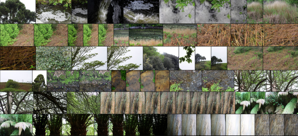
Here are the results of the shoot:
After finishing my shoot I decided to go onto edit the shoot down to only ten images, by doing this it would allow me to identify which were the images that were most effective from the shoot and reflected my intentions the most. Here are my decision on the top ten images of the shoot:
Once I had selected the ten images I then decided to go onto whittle them down once again to only five, by doing this it would allow me to further identify the images which were most effective from the shoot due to analysis in more depth, whilst also making it easier for me to choose an image which best sums up the entire shoot. Here are me selections:
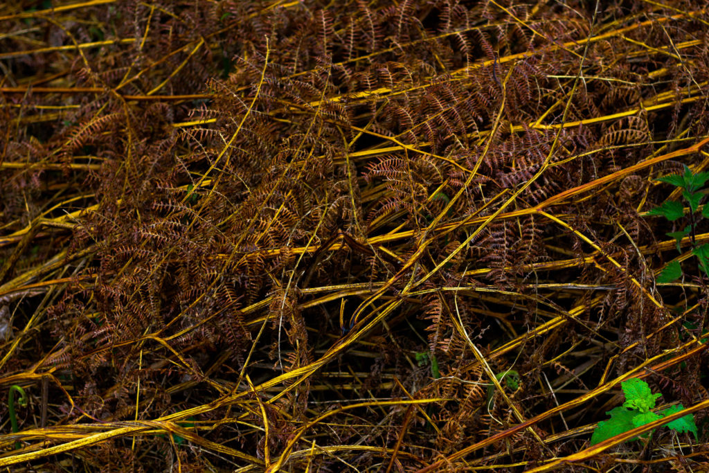
I chose this image because I loved the overall sense of the browns which came through the decaying grass. For me the crushed plants added a cool texture which highlighted the contrasting yellow stalks compared to the rest of the brown leaves. What I particularly liked was how the leaves all faced one direction, allowing for a smoother look to the overall image due to how it all seemingly moves in continual way. Overall I found that the piece did relate to the topic of texture, however I was not too pleased with the outcome as I didnt think it carried enough contrast to emphasize the darkness.
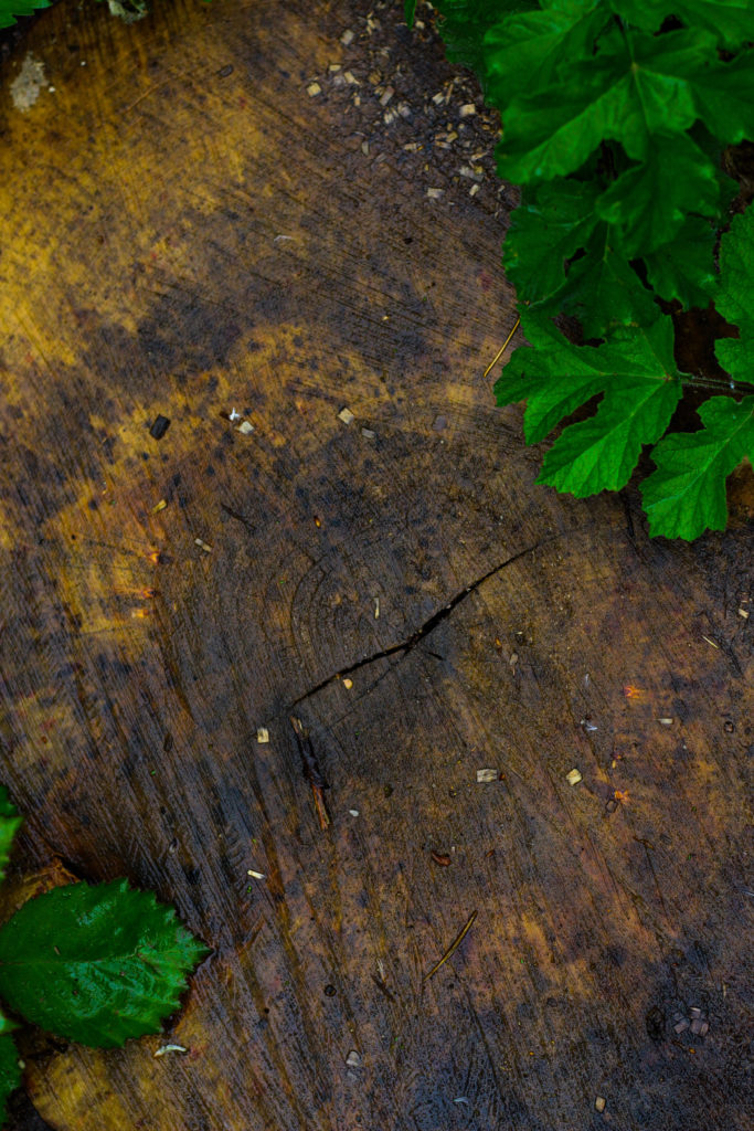
What I really liked about this image was how the green leaves overlapped the darker grain of the wood below. When looking over the image I really liked how the leaves almost presented themselves as a frame for the grainy texture of the wood, preventing it from becoming a present throughout the image and turning into a eye-sore for viewers. As a result of this I found that the contrasting yellows which are emphasized in the wood through saturation really brings more tone into the photo due to it add variation to the texture and overall colours present in the photograph.
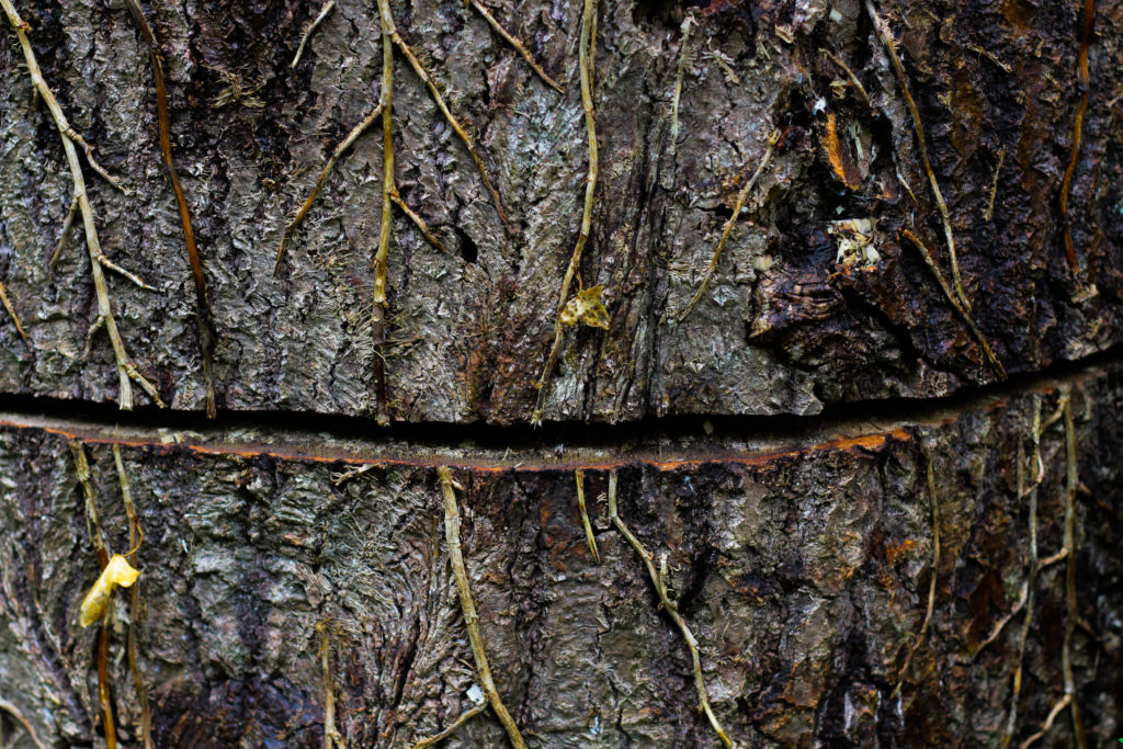
I chose this photograph because of the unusual line which had been cut across the base of the tree trunk. For me this added an extra sense of abstract to the piece due to the surface texture of the wood being disrubted by the cut mark making its way across the entire composition. What I found complimented this was the dying ivy growing down the side of the trunk, for me the lighter brown from this added that bit extra to the piece as it prevented a continual same colour presence throughout, instead breaking it up and adding variety. Overall I was really happy with the composition of the piece due to its unusual element through the cut, with the ivy and the different bark textures adding a much needed variation to the overall piece.
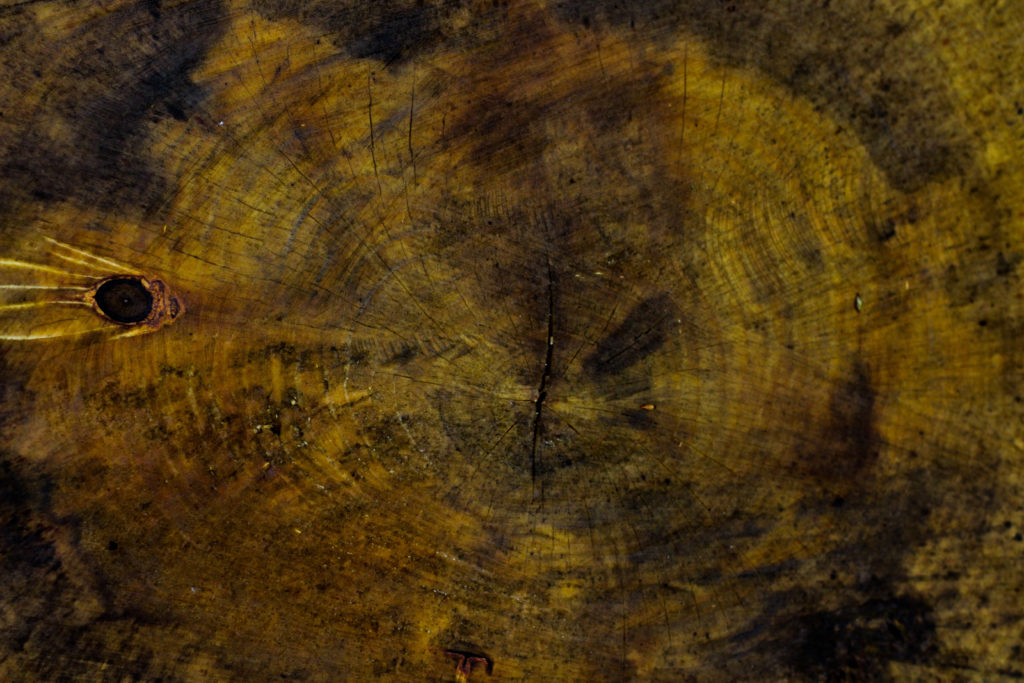
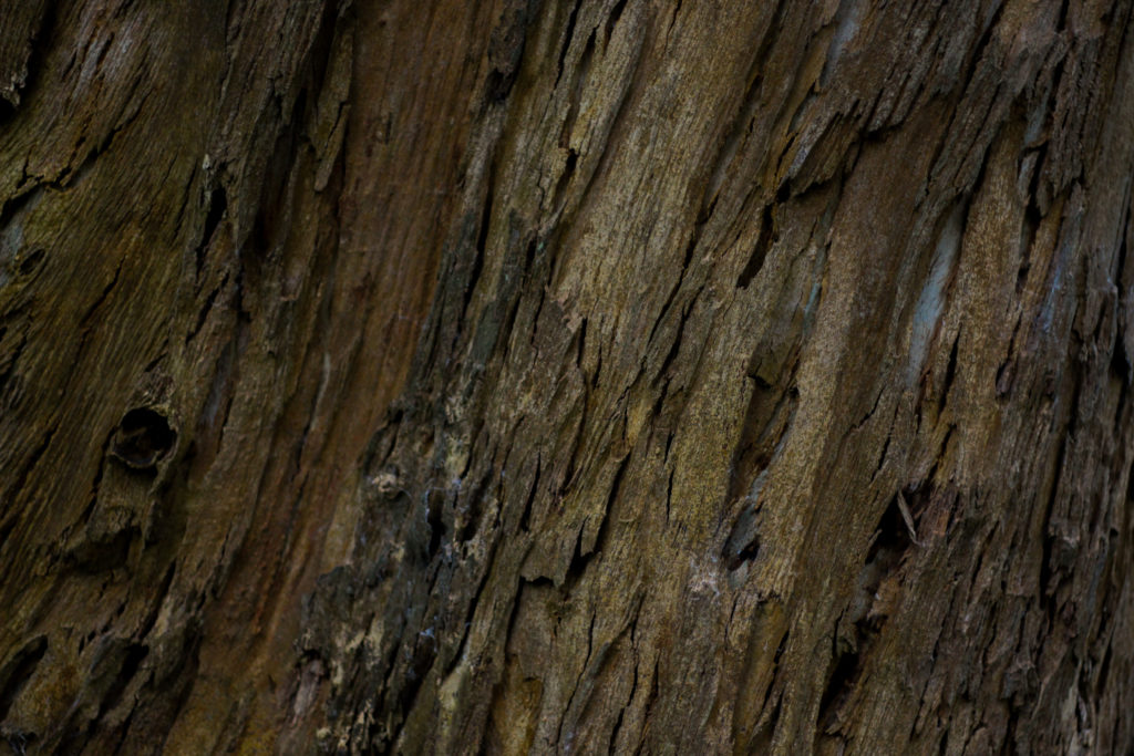
The reason I selected this image was because of it high contrast which highlights the grain and unseen colours really well. For me personally I really liked the variety of different browns and yellows present within the photo as it presents viewers with a different perspective regarding cut wood on a wet day as textures not previously seen are revealed when more closely observed. The grain knot I found broke up the composition and prevented it from becoming too overpowering and generic due to how the added black becomes an instant focal-point for anyone looking at the picture for the first time. As a result of this I am quite happy with the result due to how it provides an unseen insight into the textures present on trunks which previously would be unseen unless further inspected.
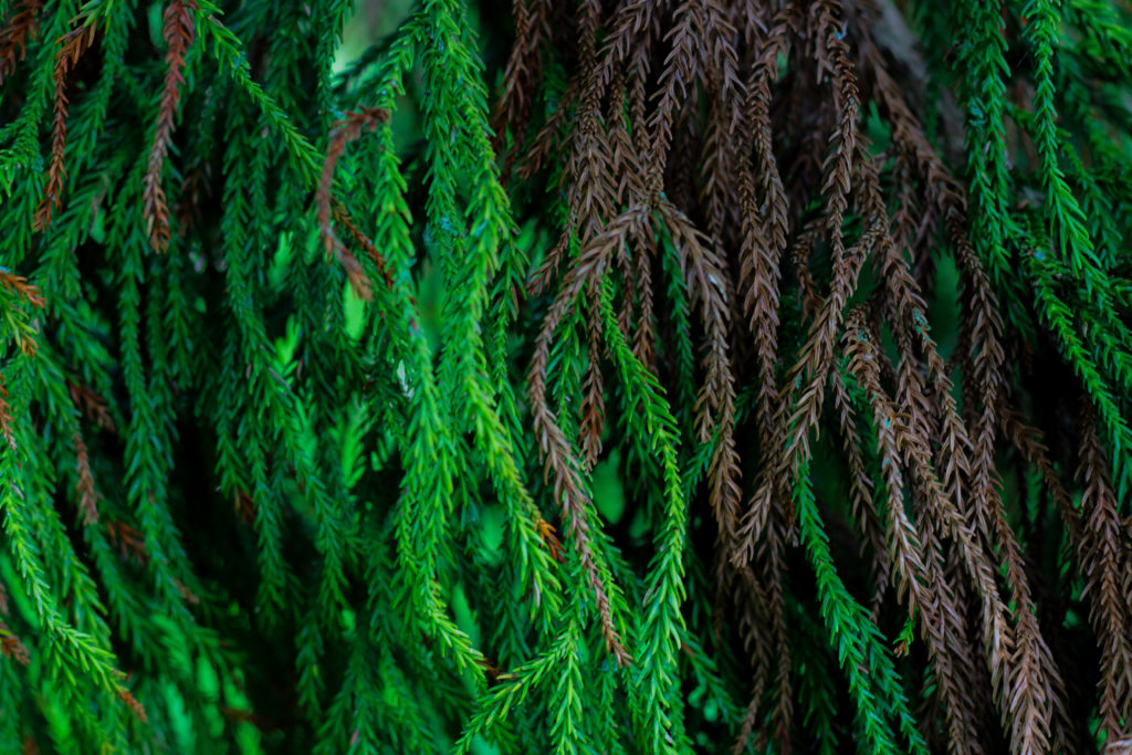
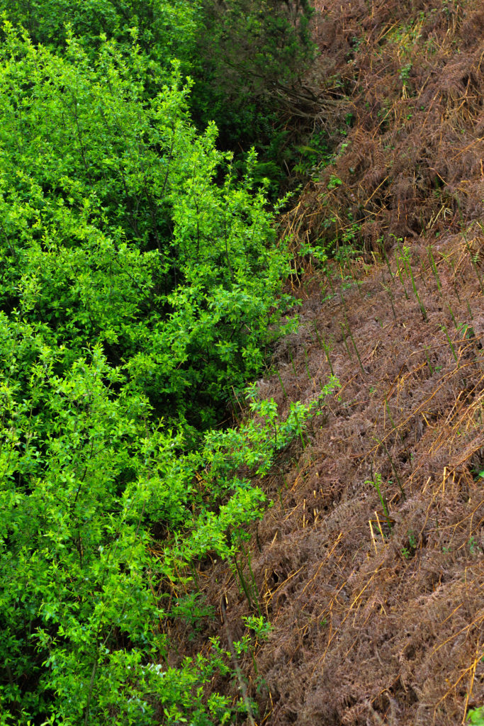
Finally I chose this because I think it really well summed up the idea surrounding the topic of texture through both its green and brown leaves branching out. Because of this I really liked the contrasting dead and lives leaves together as the texture stays the same but rather the colour changes, as a result of this I think it adds a much needed extra bit of texture due to it stopping the otherwise dominant green from becoming too much and detering the viewer. When looking over the image in regardings to the topic of texture, I found that it related well, however I was not too pleased with the overall outcome due to it lacking contrast behind the leaves which would have made it more defined.
Once I had looked at each image in more depth I decided it was time to move onto picking one image to sum up and represent the entire shoot. To do this I would have to consider looking at its visual aspects whilst also its conceptual ones and how well it related to my intentions and overall aims:

Overall when looking over all the images I found this one to be most effective regarding the topic of abstract textures. This was mainly due to the unusual cut mark made across the base of the trunk which for me added an extra sense of abstraction due to it looking a bit surreal and mysterious. This was complimented by the dying ivy which I definitely thought added that needed break between the continual texture and colour of the wood and the dark cut. For me I thought this image was executed the best due to how it represented my initial aims of the shoot whilst also taking into consideration my topic title of abstraction through texture (seen through isolating the subject from its surrounding environment).
Paul Graham Shoot Plan:
Concept: To capture subjects casually in a social setting, inspired by Paul Graham’s “End of an Age” project.
Lighting: Two portable LED floodlights giving out artificial light to show the subject from different angles. I may choose to use only one when creating shadows on the face.
Props: I will cover the portable lights with blue colour gels, using tape to stick them down, in order to create blue light. In future shoots, I will experiment with other colour gels including red and green
Location: Social occasion at friend’s house
Camera Settings: Raised exposure for low-light situations, Small aperture to allow in more light, I will experiment with shutter speed to produce moving images and still images
Artist Reference – Brett Weston
Who is he?
Brett Weston war born 1911, Los Angeles, the second son of photographer Edward Weston. Brett was removed from school at a young age to become his father’s apprentice in Mexico, this surrounded his by revolutionary artists of the day such as Tina Modotti, Frida Kahlo and Diego Rivera, not only did this influence his but also presented his with a striking contrast to life in Mexico but as also where he first started taking photos with a small Graflex. This introduction that Brett was shown and the work of the painters unintentionally influenced his sense of form and composition, this quality of design was evident in Brett’s early images of organic and man-made subjects. Here he started to appreciate how the camera transformed subjects close up and how the contrast of black and white altered further the recognition of the subjects. Overall it is not hard to understand his attraction to focus on abstraction dye to the characteristics he was influenced by would allow him to be uniquely identified with throughout the rest of his career.
Weston later returned to California in 1926, and Brett continued to assist him in his Glendale portrait studio whilst exhibiting and selling his own photographs at the same time. From the age of seventeen a group of his images were included in the German exhibition ‘film und Foto’, considered to be one of the most important avant-garde exhibitions held between the times of the two World Wars. Because of this his received great recognition which brought Brett international attention and inclusion in various photographic exhibitions in the following years. Although his art will always be linked with his father’s it is unfair to say that his photography is imitative of Edward’s beyond the early years as he produced an enormous body of work over the seven decades. Some examples of his work can be seen below:
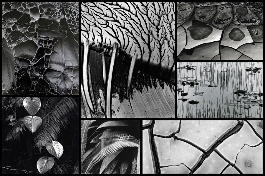
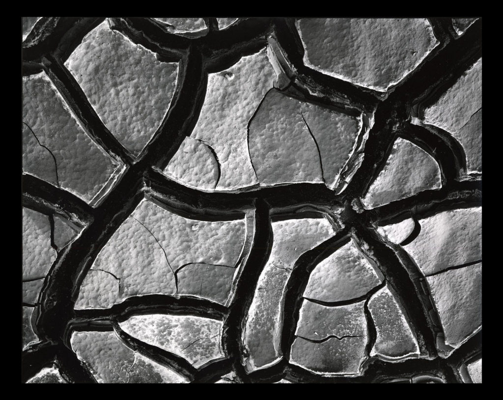
After looking over some of his images I decided that I would go onto look at one specific image that I thought would best reflect my intentions for my future shoot based around abstract patterns. The image I have chosen is called ‘Mud Cracks’ and was taken 1966 highlighting the patterns found in everyday things such as mud. Here I will go onto look at things like visual, technical and contextual aspects which would allow me to further my knowledge regarding techniques used and the style of photography created.
Visual:
Visually the piece is quite simplistic in the sense that the photo is of a piece of mud, however its when upon further inspection that there are cracks which form patterns across the mud, something the every-day eye would miss unless focused upon. For me the piece is extremely aesthetic due to how the tones used across the composition are varying grays with the only real shades coming from the cracks which allow separation in the image which prevents the outcome of pure mud becoming too overpowering. To stop the mud becoming too much Weston has made sure to include smaller cracks within the cracks of mud to add variation to the photo whilst stopping a continual generic surface from occurring across the entire image.
Technical:
When looking across the image it is clear to say that a slightly lower exposure has been used so that the darkness in between the cracks is highlighted above the rest of the image which due to sunlight is a lot lighter and therefore becomes the focal point. It looks like a higher shutter speed has been used to capture crisp detail of the mud as you can clearly see the lumps and grooves present on each slab of mud whilst there being no evidence of motion blur whatsoever. Weston has made sure to include a clear fifty fifty ration between mud and cracks which stop one or the other from becoming too overpowering and stopped the effectiveness of the other.
Contextual:
The aim of the piece is meant to create the subject and present it in an unrecognizable fashion, devoid of sentimentality. There is meant to be a sense of a lack of human presence and narrative making it unclear of what the photographer is trying to express. The composition is not amazing and the angle is wrong, however this is the aim of the photographer who could argue that the aim of modern photography is so that the image is only partially aesthetic. These concentrated images share the high-contrast and graphic qualities of Weston’s panoramas while emphasizing his affinity for “significant details” and the unprecedented attention to form, texture, shadow, and light that he explored throughout his nearly-seventy-year career.
ESA // Photoshoot Plan
Produce a detailed plan of 3 shoots for each idea in your specification that you are intending to do.
Photoshoot One
For my first photo shoot, I am going to visit the beaches along the coasts of Jersey, taking photographs at low and high tide.
The areas I am going to be visiting are:
- Le Braye
- Le Port
- Plémont Beach
- l’Etach

For this photo shoot, I am going to be taking inspiration from Michael Marten and his images that show the ebbs and flows of the tide.
Photoshoot Two
For my second photo shoot, I am going to visit l’Etach and take images throughout the day revisiting every hour, starting from low tide (@ 1100hrs) to high tide (@ 1700hrs). After this photo shoot, I should have 7 final images, which I can then present as a moving image or gif, as well as a grid of images.
For this photo shoot, I am going to be taking inspiration from Eadward Muybridge and his series of images that he produced to show that all of a horse’s hooves come off of the ground at the same time at some point whilst they are galloping.

Photoshoot Three
For my third photoshoot I am going to take photographs at the Watersplash and I am going to take images to capture the movement of the water, so I will set up in one place and take constant photographs of this one area.

ESA // Specification
I am going to be looking at movement photography for my exam. Specifically looking at tidal movements and how the landscape changes and contrasts between low and high tide.
My photographs and photo shoot ideas are inspired by the work of the photographer, Michael Marten, his series of images that look at the differences between the high and low tides and looking at the ebbs and flows of the sea.


Michael Marten Bedruthan Steps, Cornwall. 25 and 31 August 2007. High water 4.30pm, low water 2pm
Another photographer that has inspired my idea is Eadward Muybridge, and his work where he looks at the movement on the galloping horse and other animals and I plan to present my work in a similar way. I am hoping to present my images in a grid format and then on the blog I am hoping to present my images in a gif as well.

Sow
photograph
Eadweard Muybridge
For my photoshoots I am going to want to plan around the low tides and the high tides, I want to ensure that the photographs are clear and that the subject that they are focused on is clearly the tide. In order to ensure that my photographs are clear, I am going to try and avoid photographing at sun set, because I will end up with a glare from the sun. I will also try to avoid clutter within my images such as signs, cars or large groups of people which may draw away from the subject of the photographs. To avoid people I am going to try and photograph landscapes that may be more isolated to the public and therefore will have less cars and people within shot. I will also need to make sure that I use a tripod in order to have the horizon level in all my images.


