Category Archives: Planning

Filters

Author:
Category:

Framing Ideas For Final Piece

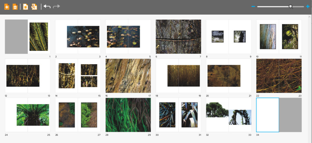
After I had complete making the book I then wanted to go onto designing some layouts for prints which I could mount up on foam board and card. I wanted to incorporate eight to nine images from each theme of abstraction and present them in a mood-board fashion where the images can be viewed as individual collections. However before going a head with the actual framing up I decided that I would make some smaller mood-boards which I could possibly implement the photos into when scaling them up. Here are some of my ideas regarding how I could go about composing each composition:

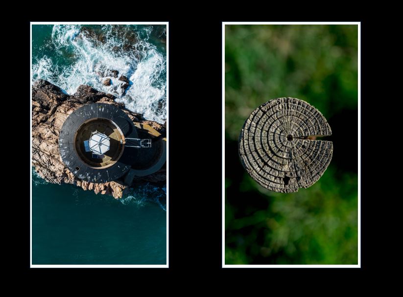
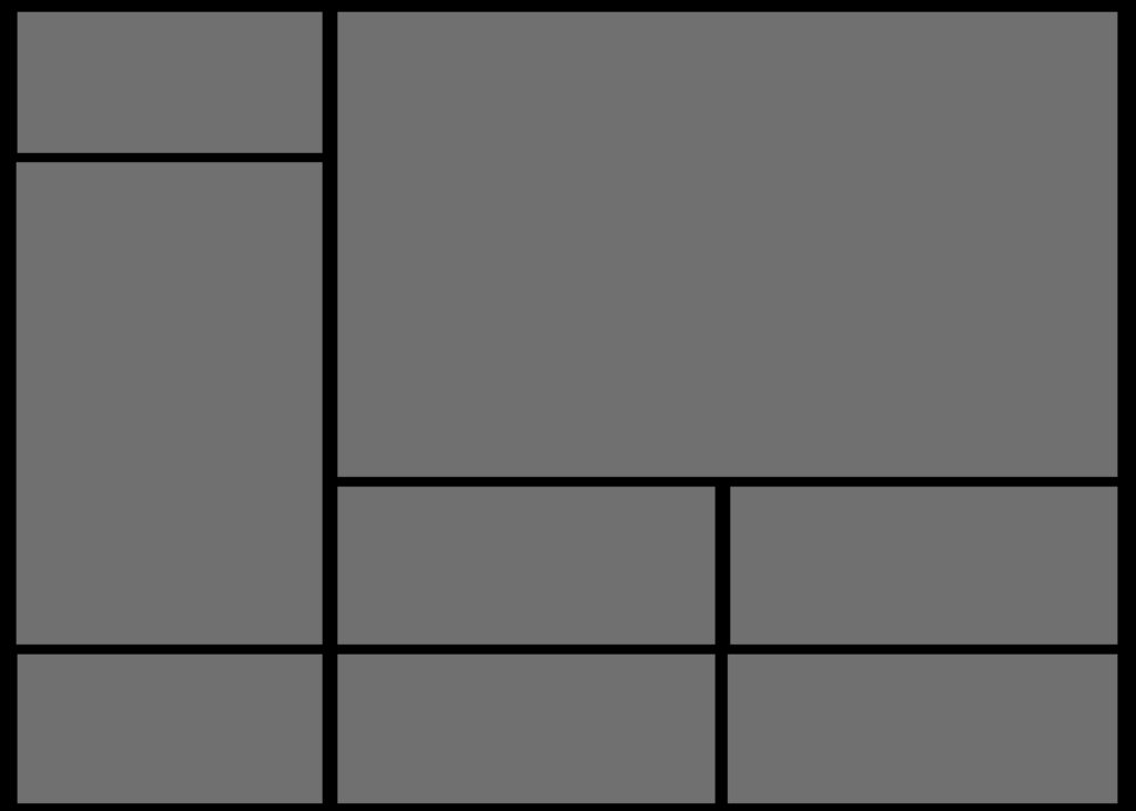
I quite liked the idea of compacting all the photos together and so for this composition wanted to have only the images separated by a thin black boarder which would merge them all together into one aesthetic mood-board as a result. I really liked the idea of symmetry here and wanted to use that to have the more significant images on the outskirts with the middle having smaller images that linked to the larger ones through topics or themes of colour, topic or composition.

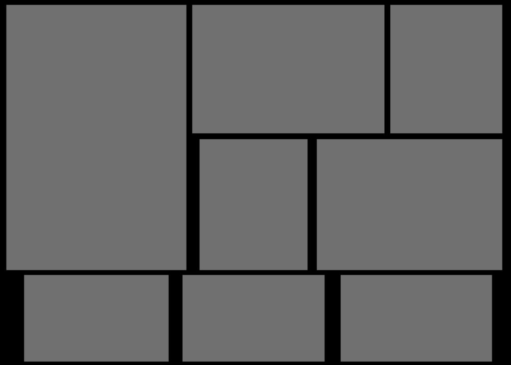
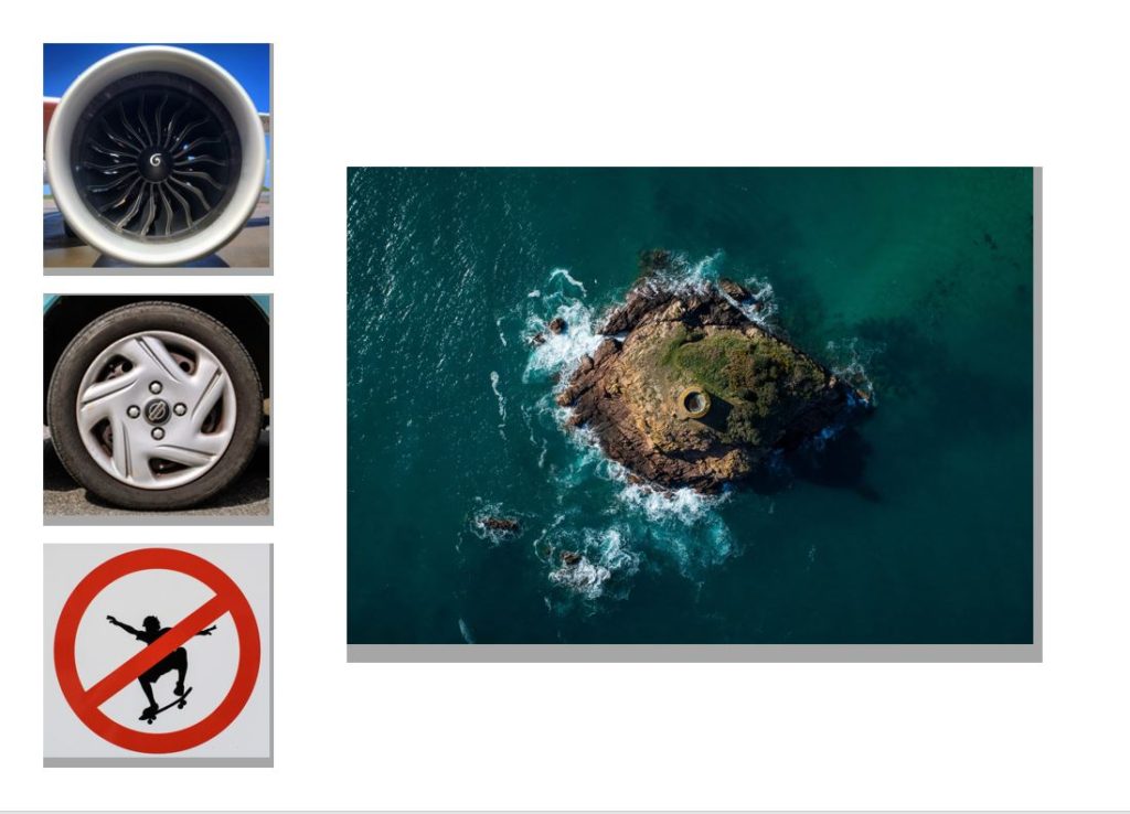
Here I wanted to try experimenting with the use of negative space on the mood-board, to do this I added larger gaps between each photo which I hoped would highlight the larger or more important images more. This mainly was based around the bottom of the board where I emphasized the three individual images compared to the rest of the photographs, this would allow me to use three images that had the closest theme together so that they would be presented as the focal point for the overall composition.

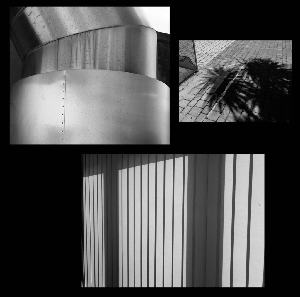
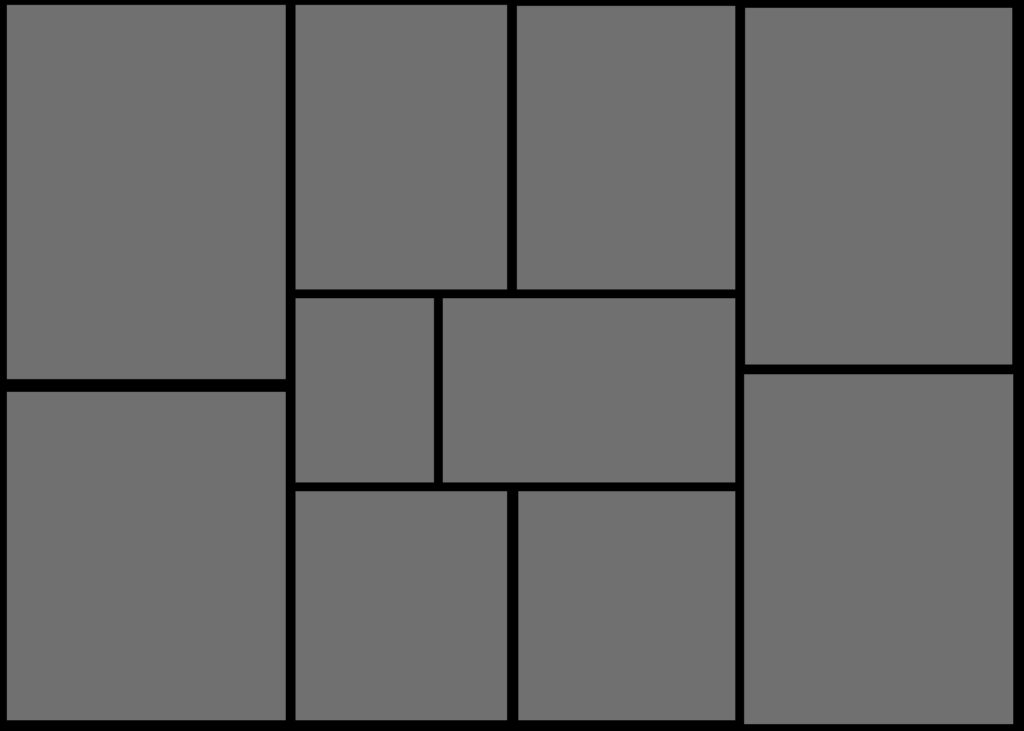
Finally for my last composition I reverted back to the compact theme of the first composition. However when designing this one I got rid of the symmetry, instead replacing it with a random order which slotted together like a puzzle, this way the board would not become too predictable therefore drawing in the viewers. I really liked the pairing of the four A5 images in the bottom left corner, this is because of how I think they provided order to the overall relatively disordered board.

Overall I am relatively happy with the outcomes I have produced for each of the mood-boards, as a result of this it is likely that I will use one of each for the three different photographic themes I have regarding abstraction. When making them I will probably be mounting them onto white foam board and then glueing them onto a black sheet of card so that it create a 3D illusion when looked at, before this however I will be adding a white boarder to each of the images so that it defines them more, allowed them to be identified easier.

Final Books Layouts

For the final titles of each book I settled on Motif, Form and Hue, this was because of how they are synonyms for texture, pattern and colour as I found them to be more effective if only consisting of three or four letters. When creating the final design for each colour I decided upon using a dark grey to contrast the lighter grey of the title, this way the text slightly merged with the cover preventing it from becoming too overpowering. The books themselves have been printed on a 15 x 25cm format (Journal book), this is because they would fit perfectly inside the sleeve I am currently creating to fit each book in. From my first draft there has not been considerable change due to how I was overall really pleased with the results I had created, with the only tweaks being the composition of the last two images on the final page.

Overall these are the final layouts for each of the books, Motif, Form and Hue. The three books contain a different theme within each looking at colour, texture and pattern, all of which come under my topic title of abstraction and the variety of ways in which it can be portrayed through the camera. Within the books I have included a variety of different page layouts consisting of double spreads, single images and triple photos, all of which I have previously experimented with so that they can transition between the different photos inside s effective as possible. Regarding certain images I have made sure to include a white border around each photo due to how it effectively boxes in the pieces, separating them from the next and creating contrast between the pages which I have used a white backdrop for all pages except the covers. The use of a white backdrop I found was the most effective outcome I could produce due to it not taking away anything from the images like a coloured backdrop would, instead adding definition and that needed bit of contrast on the monochrome imagery. In creating the book I wanted to go straight into the theme portrayed on the covers of each, this meant that the first pages would include my best image from each section so that it set the pace and theme for the rest of the spreads.

When creating the books I made sure to have sub themes within each of the books, this could include colours ranging from blue and green to different depths of shade created through the monochrome filters. I decided against the implementation of page number because of how they interfered with the single images covering double page spreads, which in my opinion reduced the impact through the presence of small numbers in each corner. I also went against it because of how my initial idea of creating a personal journal exploring an abstract theme, leaving me to want pages to be as minimal as possible.

Proof of purchase

Phtotobook | Title Page

After much umming and ahhing I decided on a name. ‘Latitude’. I discovered this name when looking through a Thesaurus at other names for circles and I rather liked it straight away. I had a couple of other options however for me, this one stood out for many reasons.

Firstly, it just sounds cool and catchy. Secondly, latitude is a circle on world charts and this links to my images of tiny planets as they are globes like out planet. Lastly, on a map, latitude looks like rings around the earth and this links to my cover image you see above of the wood with the rings representing life.

Adding Cover To Books

Once I had looked at the compositions of the fonts and colour of the covers I came to a conclusion of the designs I wanted and proceeded to use them on all three books. Like the compositions I made sure to leave the overall theme of design the same throughout each of the covers as I wanted to enforce the idea of them containing a different style of photography with the same overall theme. Here are the results of the designs and my thought process behind them:

For the fonts on the covers I decided with Abril FatFace, this is because it created a formal font which contrasted well against the grey backdrop and produced an outcome that I had seen present in most of the minimalist abstract covers. Colour wise I went with a lighter grey to the grey used on the cover due to me wanted to blend them together to some degree and prevent the text from becoming too overpowering. This led to my choice of using font size 80 due to how it didn’t take up a huge amount of space in comparison to the rest of the page, but how it also made use of the negative space surrounding it which it used to its effect.

For the font for the authors name I once again went with the same font as the title being Abril FatFace. This is because I wanted consistency throughout the cover and matching all text to the same font was crucial to this. Regarding the font size I went with a size 18, this is because unlike the title I wanted to leave the authors name more or less unnoticed due to how it didn’t provide any relevant information on the subject within each book.

Finally for the backdrop I had created I’d used an enlarged grey square which stretched across the cover. To accompany this I experimented with a variety of colours such as blues and browns present in the books to discover what would work well against the title and fonts used. My outcome was a dark grey that was borderline black, I selected this because of how I found it to be relatively neutral in disclosing what would be inside the book with only the title giving it away, which as a result allowed for the books to work together as a trilogy, stopping designs clashing which could occur when putting them into sleeves.

Experimenting With Text

After I had finished designing my first drafts for each of the three books I then decided that I would go onto implement potential text fonts to the book covers I was in the process of creating. The only text that I would be adding was regarding the actual title of the books and the my name on the bottom of the front cover. For me the text is extremely important as it is the first thing the viewer sees when looking at a book and the font used, linking the contents and the overall themes of the books together so the could be relevant to each other, whilst also presents an overall theme of design to the audience. To experiment with fonts first I would need create a mood board regarding the fonts that I thought would be most effective for the cover of the book. I found a variety of photography quotes and proceeded to find fonts that I thought suited a contrasting background well. Here are my results:

By experiment with these fonts I hoped to find one that would draw viewers in whilst not being overpowering and reducing the effectiveness of the overall book. This would be vital as the books have hardly any text meaning that the text which is there would need to be designed to its best of ability. Before I went on to do this I decided that I would go and explore a few ways in which I could implement the text onto the surfaces of each book and their positions, here are a few ideas of various examples I would draw certain aspects of inspiration from in my final design of the covers:

Once I was satisfied with the design in my head I decided to go ahead with what I thought would be the most effective use of text positioning for the titles and author names on each cover. Overall I had three designs in mind which I thought their simplicity allowed for maximum effectiveness. These are my designs:

After I had finished designing my covers for the three different layouts I decided upon the far left cover. This was because I wanted the title to be the first thing that the audience would read (left to right) and the implementation of the full stop filled in that extra bit of white space whilst stopping the title ending there. Here I wanted the authors names to contrast the position of the title and so deemed the placement of it in the bottom right of the cover would provide effective due to it being the second thing that the viewer would read.

Book Designs – First Drafts

When editing my book I decided that I would use the software called Blurb to create my three books for final exam. I chose this because of how it presented me with a bigger variety of different templates that I could more easily access to that on Lightroom, allowing me to experiment more with my layouts. Whilst designing my books I decided that I would make myself refer back to my photographic books which I had drawn inspiration from by the photographer Robert Frank. By looks at his three books together it gave me ideas for the development of my own, this included the use of negative space being used effectively in order to enhance each image the way I wanted. Overall when looking over the three books ‘Tal Uf Tal Ab’, ‘You Would’ and ‘Park Sleep’ I found that I had gone down a slightly different path as in Frank’s books he had a closely similar theme throughout the three books compared to that of mine which have a similar but different theme in each book. Using his books as references and my main influence I was able to select and layout about forty images for each book. Here are my current compositions:

Title: Hue. Here I made sure to have an overall theme of blue in which each page consisted of vivid colours where yellows, greens and blues dominated the majority of the pages. I particularly wanted to focus page compositions around the idea of trees and other things against the backdrop of a bright blue sky due to really liking the contrast that it produced. For the selection of the images I decided that I would mainly focus on shots from a distance, this is because of how I thought by portraying the overall landscape that each picture was taken in would be more effective than choosing to focus on only one singular object, isolating it.
Title: Motif. For this book I wanted to look at the idea of abstraction through pattern, here I made sure that I would isolate the subjects from their surrounding environment, by doing this it would allow the audience to really enhance and look at the detail present in our everyday lives. Throughout the book I made sure to have a clear distinguish between the darker images and the lighter ones, by doing this for me it allowed for a smoother transition from page to page as it portrayed the impression of the book getting darker and the lighter,
Title: Form. This book focuses on the idea of abstraction through texture rather than pattern or colour, for this book particularly I wanted to portray the commonly seen things during walks through woods in a new light not previously seen before. To do this I made sure that I captured the surfaces of each subject in a lighting that defined its surface more dramatically that it would usually be seen as. I tried to base the book around the themes of brown, green and blue, all colours repeatedly seen in woods, using in camera settings to portray them in a more surreal and abstract light.

When designing my books I decided that I really wanted each book to have the same layout as the next, this was because I wanted the viewer to know that each book was linked together, regardless of the photos inside, and that a similar composition was a great way of doing this. Within the books I have made sure to include a variety of different page layouts consisting of one image a spread to three images a spread, this way it didn’t make the outcomes dull and bland, instead adding interesting changes in the design of the book to make the reader want to turn the next page. I originally had experimented with the blank spaces and had found by using certain images it allowed for me to use photos as a transition between different coloured pieces or subjects within, preventing this outcomes as seeming too much and rushed. I didn’t choose to have any text in my books due to wanting them to be as minimalist as possible which would allow the viewers to only focus on the images rather that what was around them.

Some of the issues that I am having through the process of creating the compositions are the particularly the compositions of the last spread, this is due to how I want it to be more simplistic, but rather retain the overall qualities and composition of the rest of the book. My final issue is the composition consistency throughout the books, this is due to a stronger start of portraying images, however this becomes harder to maintain as I progress through its creation, leaving me too have some pages blank in which I need to come back to and redesign.

Book Specification

How you want your book to look and feel:

I want my book to be simplistic yet still powerful. The professionalism will come from printing full scale images with good ink. I will hold all the images together using purple and red ribbons, similar to the way Satoshi Fujiwara uses an elastic band to hold his book together.

Format, size and orientation:

  • 40 pages including acetate
  • The cover will be printed A3 size (297 x 420mm)
  • Other pages included inside will be printed Square (296 x 300mm), A4 (210 x 297mm), Rectangle (250 x 420mm) and Small Rectangle (180 x 420mm)
  • Acetate will be printed A4 size

Rhythm and sequencing:

I will pair images together based on the shapes in each image. For example, pairing close-up head shots with further away shots for contrast.

Structure and architecture:

Some images will be cropped to fit the scale of the paper, this will prevent the viewer from seeing certain features of a portrait. Other images will be flipped upside down.

Narrative:

The book will look at the individuality between males and females as well as the differences between human beings and their psychological processes.

Title:

The book will not be given a title, as like Rorschach’s ink blot tests, in which there is no text, it is down to interpretation. I want the viewer to create their own relationship between the ink blots and the portraits partnered with them rather than be hinted at with the use of a title.

Images and text:

No text included

Colour and B&W (or a mix):

All images are different colours including red, green and blue. As the pages are different sizes, when the pages are folded, it will become layers of different colours.

Paper and ink:

Unlike Satoshi Fujiwara, I will only use matte paper to produce my book. For two reasons; 1 being that it is what is available for the printer that I will be using and 2 in that it will help blend all the images together into one big ‘book of colour’. The Rorschach ink blots that I have produced will be included as acetate pieces so that the images can be seen through them.


This is a mock up version that I created so that I could establish which images to pair together and the order in which they went. I wanted the colours to balance out within the book so tried to order them red, green, blue

Photobook Specification

Narrative: What is your story?
Describe in:

  • 3 words – Circles, Difference & Similarity
  • A sentence – Exploring circles in different environments and in different ways.
  • A paragraph – For this project I will be responding to circles. Maybe not that simple… I would like to explore a shape we rarely take notice of in our daily lives and I would like to use different techniques and environments to share what people miss so easily yet appear everywhere. The aim is to perhaps inspire people to look around and enjoy the world around them and take notice of the little details, like circles, that appear everywhere. The similarity being the shape, the differences; being the environment, location, angle, photographic technique and the urban/rural landscape.

Design: Consider the following

  • How you want your book to look and feel – Landscape, similar width to height, perhaps slightly longer width but only marginally, hard back and strong binding that doesn’t have much image lost in the gap.
  • Paper and ink – Not matte but not glossy, in between.
  • Format, size and orientation – Landscape, ever so slightly longer width than height.
  • Binding and cover – Visible binding, hard back with printed images on the cover.
  • Title – “Latitude” or “Meridian” or “Annulus” or “Ecliptic”
  • Design and layout –
  • Editing and sequencing –
  • Images and text – Little text other than title and all images will be the very best, not a huge amount, short but sweet.

Mounting and Display Designs

My first images to present (below) are contrasts of each other and work very well as a set of two. I have two ideas to start with, one where each image is on white foam board and the other idea is they they are in black window mounts. You can see the two designs below and I have decided to go with the black window mount. When using the diagrams below, I liked both ideas however the black mount make the colors more prolific and allowed for a nice contrast between the white in the water and the black mount.

My next set of images to present are different, I plan to have a set of 3 images in a line sitting next to a larger image. I have two very similar ideas for this one, as you can see below. You see the set of 3 on the left on top of an extra foam board to make them stand out (3D) and the image on the right is not, however on the second idea the image on the right is also on foam board. In the end, I decided to follow the second idea and have the image on the right on foam board as well and the set on the left.

Final print layouts

I decided I wanted to print 4 photos in A3, 4 photos in A4 and 3 photos in A5. This is shown below:

My 3 A5 images
My 4 A4 images
My 4 A3 images

I experimented with a few different ways in how I was to present my images. My first instinct was to go with these layouts below:

I liked these 2 together as even though one is in colour and the other is in black and white, they are both related to each other due to the fact they are both from my boat shoot and they have similar shaped objects and structures in those 2 images.

I liked these 2 A4 images and 1 A5 image together because the consistency of the black and white created an effective look. Additionally, I liked how they all are landscape images and how the bottom image has the strongest structure of shadows. I was thinking that I could trim all these images so there is no white borders and spray mount each image onto a piece of foam board. Then, I would’ve got a big piece of black card and stick each image on top of the foam board onto the card so they are assembled together.

I thought these 2 A3 images looked good placed next to each other as they both have strong shadows in each image. I would’ve done a window mount of these images together so that they were included in the same piece of card but in 2 separate frames.

Then, with the remaining 4 image prints, I would’ve put them all onto a piece of foam board and stuck the foam board onto a piece of black card, but maybe a different coloured card for the glow stick print on foam board.

However, I thought that some of the layouts above could’ve looked better, so below is some more experimentations of layouts:

With seeing all the different best possibilities that could work well to present my final images, I decided to use these below:

With these 2 A3 images, I am going to put them both onto a separate piece of foam board and put this on top of some black card.

With these 2 A5 images, I am going to do the same as the idea above – put them onto foam board and then onto black card.

With this 1 A3 image and 2 A4 images, I am going to do the same foam board idea and put them onto black card.

With these 2 A4 images, I am going to put them together in the same window mount, however they will be in separate frames on the same black card.

With this A3 image, I am going to make a window mount of black card.

With this A5 image, I am going to put it onto foam board but I am thinking of keeping the white border around this image so that when I put it onto card, there will be a nice thin white strip to separate the colour of the card and the black background of the photo.