Category Archives: Final Outcomes

Filters

Author:
Category:

Photobook Design | Final Draft

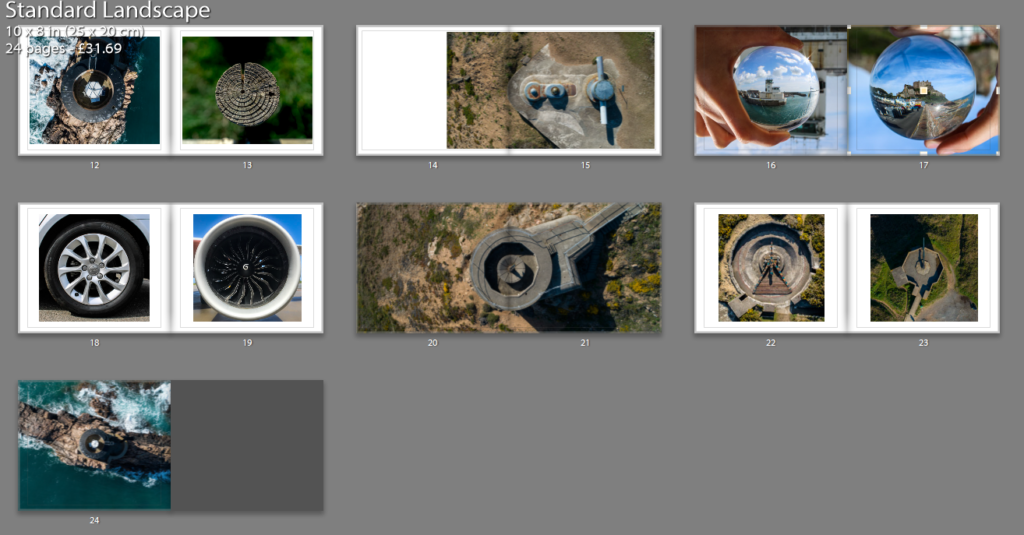
I am happy with this final design and I will send this to be printed. To start with, my title page and back page were designed to be eye catching yet simple and that’s why I chose those images. I used white text as it worked well with the background and a bold sans-serif font for effect. The back page is also simple and the circle contains text that explains the meaning behind the name ‘Latitude’.

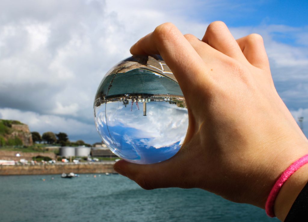
The first image is Liberation Square in town (which happens to be a circle), the second set of pages represents the urban and rural contrast and also the differentiation of technique through the lens ball and tiny planet photography yet maintaining the circle shape, following out theme of Variation and Similarity. The next double page spread is La Hocq, then Noirmont bunkers, Janvrin’s tomb with a zoomed image, Batterie Moltke guns, tower to wood contrast between natural and man made structures. Then Noirmont targeting position, then lens balls of the harbor VTS and Mont Orgueil Castle, wheel and jet engine, Noirmont MP1, guns from Batterie Moltke and Lothringen and finally Noirmont Lighthouse.

I wish I had a larger variety of images however it was not viable due to cost but mainly because the book would seem overcrowded and maybe too jumbled, therefore I stuck to a basic set of images that worked together.

Images of mine similar to artists

My flower shoot was inspired by artists such as Takashi Suzuki, as she photographs studio images of objects, (like flowers, as well as sweets). Rinko Kawauchi was another artist; her illuminance book consists of images where my flower shoot created similar styles.

Takashi Suzuki’s style of photography:

Takashi Suzuki’s image

Images of mine similar to Suzuki’s:

Rinko Kawauchi’s style of photography:

Mood-board of Kim’s photography

Images of mine similar to Kim’s:

My architecture shoot was inspired by artists such as Ray K Metzker, Takashi Suzuki and Kanghee Kim.

Ray K Metzker style of photography:

Mood-board of Metzker’s photography

Images of mine that are similar to Metzker:

Mood-board of my images similar to Ray K Metzker

Takashi Suzuki’s style of photography:

Mood-board of Suzuki’s photography

Images of mine that are similar to Suzuki’s style:

Mood-board of my images similar to Suzuki’s

Kanghee Kim style of photography:

Mood-board of Kim’s photography

Images of mine that are similar to Kim’s style of photography:

Phtotobook | Title Page

After much umming and ahhing I decided on a name. ‘Latitude’. I discovered this name when looking through a Thesaurus at other names for circles and I rather liked it straight away. I had a couple of other options however for me, this one stood out for many reasons.

Firstly, it just sounds cool and catchy. Secondly, latitude is a circle on world charts and this links to my images of tiny planets as they are globes like out planet. Lastly, on a map, latitude looks like rings around the earth and this links to my cover image you see above of the wood with the rings representing life.

Merge Experimenting

I attempted merging images together to create one image where the circles are halved. I thought this would work well however this image was the only presentable one. I am glad I experimented and realized that this didn’t work however I do not believe this image would fit in with the rest of my book as it would be too alien in comparison to the other images in the book. As well as the fact both of these images are used in separate pages.

St Helier \ Gorey Photoshoot | Final Outcomes

Below are my final outcomes from yesterday’s shoot (Monday);

These final outcomes from one shoot made that day very successful in my opinion, I was very happy with the lens ball images and some of the extra little shots I produced whilst walking around town and Gorey.

My favorite images, which is labelled above, is of Mont Orgueil Castle above Gorey taken through the lens ball. I simply had the camera on auto as I had to hold the ball in my left hand and shoot with my right so I believe auto would likely be the most sensible approach to taking this image, yet I usually try to use manual settings on all shoots. The lens ball can be difficult to master when shooting objects from afar. You need to play around with the camera and ball at the same time to work out the best angles and distances between the subject, lens ball and camera lens to achieve the best clarity, depth and subject size possible.

The main reason I like this image more than the is because it is more of a close up, it allows for more details to be picked up in the image, furthermore, the ball looks much more 3 Dimensional and may even look like a planet as it picks up the sky very well.

Adding Cover To Books

Once I had looked at the compositions of the fonts and colour of the covers I came to a conclusion of the designs I wanted and proceeded to use them on all three books. Like the compositions I made sure to leave the overall theme of design the same throughout each of the covers as I wanted to enforce the idea of them containing a different style of photography with the same overall theme. Here are the results of the designs and my thought process behind them:

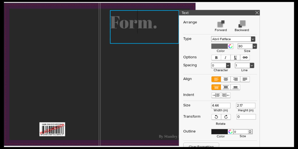
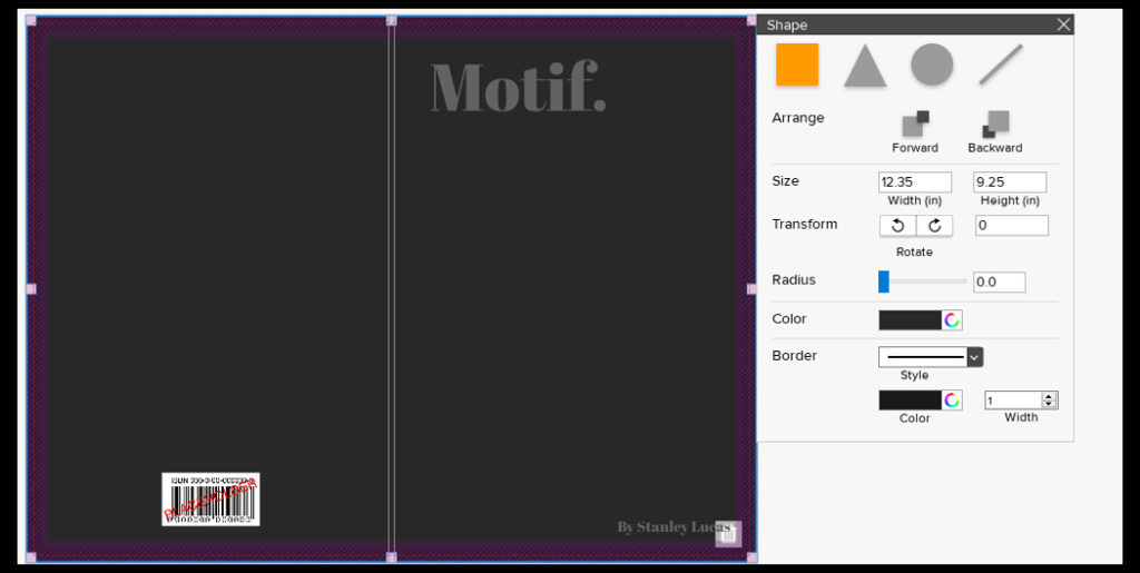
For the fonts on the covers I decided with Abril FatFace, this is because it created a formal font which contrasted well against the grey backdrop and produced an outcome that I had seen present in most of the minimalist abstract covers. Colour wise I went with a lighter grey to the grey used on the cover due to me wanted to blend them together to some degree and prevent the text from becoming too overpowering. This led to my choice of using font size 80 due to how it didn’t take up a huge amount of space in comparison to the rest of the page, but how it also made use of the negative space surrounding it which it used to its effect.

For the font for the authors name I once again went with the same font as the title being Abril FatFace. This is because I wanted consistency throughout the cover and matching all text to the same font was crucial to this. Regarding the font size I went with a size 18, this is because unlike the title I wanted to leave the authors name more or less unnoticed due to how it didn’t provide any relevant information on the subject within each book.

Finally for the backdrop I had created I’d used an enlarged grey square which stretched across the cover. To accompany this I experimented with a variety of colours such as blues and browns present in the books to discover what would work well against the title and fonts used. My outcome was a dark grey that was borderline black, I selected this because of how I found it to be relatively neutral in disclosing what would be inside the book with only the title giving it away, which as a result allowed for the books to work together as a trilogy, stopping designs clashing which could occur when putting them into sleeves.

Final Photobook and Evaluation

A link to my photobook:

Visceral

Analysis of Photobook and Evaluation

In conclusion, I think that I have explored the concept of variation and similarity successfully, developing my ideas thoroughly and consistently throughout. I started off my project with the intention to explore ideas of sublime and beauty within nature, focusing on emphasising light and fragility within the natural world. I wanted to able to express an emotion through my photos, whether that be using shapes, shadows, reflections and light. I explored the work by the Japanese photographer Rinko Kawauchi as I liked how she photographs things that are ‘ephemeral’, addressing concepts like life and death in her work and how photographs everyday situations and objects and emphasises the beauty that most people wouldn’t notice. I tried to take inspiration from this in my first photoshoot where I focused on emphasising the soft shapes and patterns I found in nature, as well as the fragility. This shoot inspired me to keep photographing emphasisng the fragility and nature, but to also build on this linking it to spirituality. I experimented by making videos of the movement in nature and focused on sounds created in the natural landscape which I think was effective in building my concept of spiritual qualities and energies in nature. I then started exploring the artist Wassily Kandinsky, specifically his book named ‘Concerning the spiritual in art’ and his theories on shapes and colour. “This essential connection between color and form brings us to the question of the influences of form on color. Form alone, even though totally abstract and geometrical, has a power of inner suggestion.” He states that shapes have spiritual value which is something I wanted to draw on in my images. I took inspiration from Kandinsky theories in my next photoshoots, particularly photoshoot 4 and 5, and decided that I wanted the concept of warm and cool colours to be a main element in my project. I think that my fifth photoshoot was my most successful as I think that the images produced represent the concept of my project well, where I focused on light, textures and movement, as well as warm and cool colours, expressing the interconnection between aspects of nature and humans. Towards the end of my project I wanted to add another type of image to my collection of images, and discovered the photographer Anna Atkins who was the first woman photographer to make a photobook. The type of image was a camera-less photograph which I decided to interpret. I wanted to create and portray them in a way that is different to how they were seen in the 1900s when they were first created, which was scientifically. I wanted to emphasise the spiritual quality through the fragile and round lines of the objects on top of the light sensitive paper. I thought this was effective which is why i decided to include some of the photographs inside my photobook, and also as some of my framed final prints.

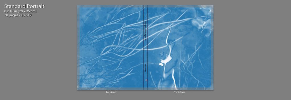
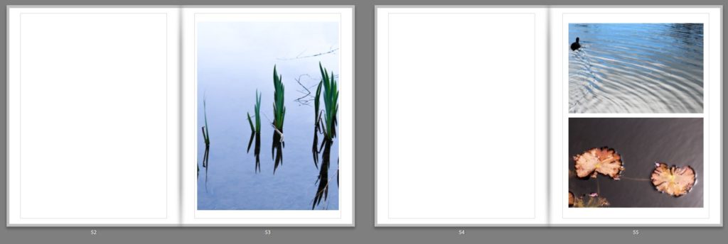
For the front cover of my photobook I decided to use one of my digitally edited interpretations of a cyanotype as I think this image indicates to the reader the spiritual nature of this photobook and it’s focus on the natural world. I like the pale blue colour that contrasts to the white of the plants and ripples in the water, as they’re soft colours that reflect the delicate features within the book. It also links to the physical photograms that will be included in the book, having a similar appearance. I decided to wrap this image around the front and back cover of the book as I think it works best full page, and by reducing it so its smaller on the page, it wouldn’t be as powerful. This is a difference between mine and Rinko Kawauchi’s photobook cover, where she included two smaller separate images on the front and back. The first page inside the photobook has the title: ‘Visceral’ in the middle which i chose as it is ‘relating to deep inward feelings’ which i think links to the spiritual nature and energy of my project and how nature provokes emotions within humans. The first double page spread displayed one image on the right side of the page. I wanted to start the book of simplistically and think that by displaying this image singularly of water falling emphasises it. I chose this image as the first one as I think the centred picture of the drops of water falling has the appearance of a peaceful and undisturbed landscape, starting the book off with a tranquil image that emphasises texture and beauty. On the next double page I also only included one image on the right side, but this time made it a full page image. I chose this image as I think it links to the first images through the ripples and textures on the water, but also looks at abstract colours and shapes. This is through the reflection of the person in the water, which isn’t noticeable a person. It also links to the first image through the branches in the foreground on the image that are out of focus as the first image also shows a section of a plant in top right in the foreground. The next double page spread I decided to use an imagoes both of the pages. The first is a full page image of koi fish, which I particularly liked as it shows the movement of the fish through the ripples in the water, linking the previous image. I think that is is a powerful image as the orange of the fish is greatly contrasted against the black of the water. I think displayed a landscape image of a closeup angle of a leaf, with the background of water. This links to the koi fish image as leafs also orange and both have the background of water. The next pages I have left blank in my design as I intend to physical insert the photograms that I made in envelopes on these empty pages. I think this will give my photobook an interactive aspect the will intrigue the reader by making them have to physically open the envelopes. I have left four blank double page spread throughout my book to put in the photograms.

I decided to use my landscape image of a tree as my first double page image as I think that this emphasises the detailed patterns of the branches that may not be as noticeable if it were smaller. I like how the trees in the centre of the image, so the tree trunk id along the spine of the book and the branches are coming out diagonally onto each page as it creates an interesting composition. On pages 14 ad 15 I used a zoomed in image all a full page image of the ripples on the water were i have reflected the light and have contrasted this with an image of a tree taken through the reflection of a puddle. I think that these images links as they are both focusing on the light and patterns in water. In the first image you can see branches in the foreground which are out of focus which links to detailed branches of the tree in the reflection. Pages 16 nd 17 I added another double page spread of a closeup image of a plant where i have emphasised the warm colours and the light. I think that this is the most effective double page spread through the bold colours ranging from yellow to red on the leaves. On pages 22 and 23 I decided to contrast the cool green colours leaves, with the warm orange tones of the koi in the water. Although these image contrast each other, they are also like through the rounded shape of the leaves in both the image, the second being a lily pad hiding the fishes face. I think that these pages are effective and stand out through the use of bold colours, I used this combination to keep the reader interested. I then displayed an image of mould which i edited to be a soft pink colours on double page spread. I like this image as it took something which isn’t normally considered nice to look at and changed it into something aesthetically pleasing. I also like how the textures and emphasised even more though the edit which is why I decided to display across two pages. Another double page spread that I think is effective is on pages 30 and 31 which I think this has a different appearance then the rest of my images. I like how the dark background of mud emphasises the reflection of the sun in the puddle, making it seem as though this picture was taken at night time when it wasn’t. I think this image is another example of photographing something which isn’t considered beautiful, puddle in mud, and making it aesthetically pleasing. I continued my photobook with combinations two images across two pages and wth double page spreads. At the end of my book i left space for my to insert a photogram. I think this is good way to end the book as it focuses on a different type of photograph that I have physically created, still relating to the spiritual qualities of nature through the delicate lines and shapes.

I think that my photobook is a good representation of my work in this project, the images showing the final outcomes of my developed ideas. By using both natural landscape and camera-less photograms I think this successfully links to my concept of nature relating to spiritual and personal connections. Photographing natural landscapes I think developed my ideas and theories from my last project and made me produce work to a higher standard a having more knowledge of techniques and contextual references.

Experimenting With Text

After I had finished designing my first drafts for each of the three books I then decided that I would go onto implement potential text fonts to the book covers I was in the process of creating. The only text that I would be adding was regarding the actual title of the books and the my name on the bottom of the front cover. For me the text is extremely important as it is the first thing the viewer sees when looking at a book and the font used, linking the contents and the overall themes of the books together so the could be relevant to each other, whilst also presents an overall theme of design to the audience. To experiment with fonts first I would need create a mood board regarding the fonts that I thought would be most effective for the cover of the book. I found a variety of photography quotes and proceeded to find fonts that I thought suited a contrasting background well. Here are my results:

By experiment with these fonts I hoped to find one that would draw viewers in whilst not being overpowering and reducing the effectiveness of the overall book. This would be vital as the books have hardly any text meaning that the text which is there would need to be designed to its best of ability. Before I went on to do this I decided that I would go and explore a few ways in which I could implement the text onto the surfaces of each book and their positions, here are a few ideas of various examples I would draw certain aspects of inspiration from in my final design of the covers:

Once I was satisfied with the design in my head I decided to go ahead with what I thought would be the most effective use of text positioning for the titles and author names on each cover. Overall I had three designs in mind which I thought their simplicity allowed for maximum effectiveness. These are my designs:

After I had finished designing my covers for the three different layouts I decided upon the far left cover. This was because I wanted the title to be the first thing that the audience would read (left to right) and the implementation of the full stop filled in that extra bit of white space whilst stopping the title ending there. Here I wanted the authors names to contrast the position of the title and so deemed the placement of it in the bottom right of the cover would provide effective due to it being the second thing that the viewer would read.

Book Designs – First Drafts

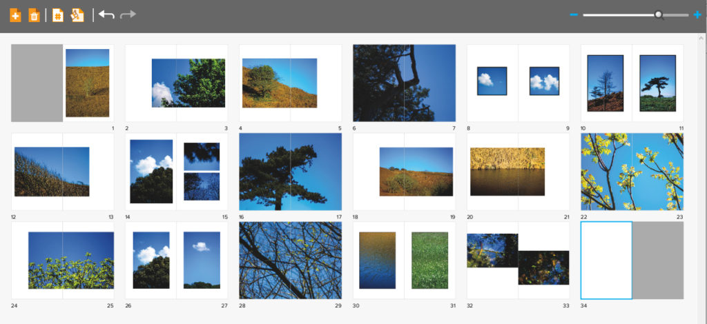
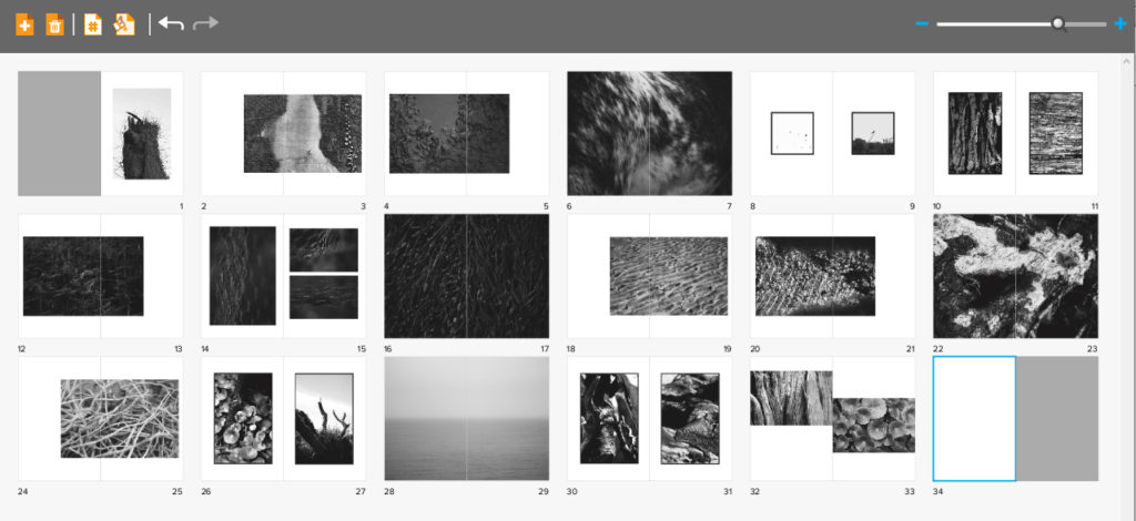
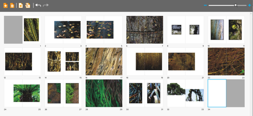
When editing my book I decided that I would use the software called Blurb to create my three books for final exam. I chose this because of how it presented me with a bigger variety of different templates that I could more easily access to that on Lightroom, allowing me to experiment more with my layouts. Whilst designing my books I decided that I would make myself refer back to my photographic books which I had drawn inspiration from by the photographer Robert Frank. By looks at his three books together it gave me ideas for the development of my own, this included the use of negative space being used effectively in order to enhance each image the way I wanted. Overall when looking over the three books ‘Tal Uf Tal Ab’, ‘You Would’ and ‘Park Sleep’ I found that I had gone down a slightly different path as in Frank’s books he had a closely similar theme throughout the three books compared to that of mine which have a similar but different theme in each book. Using his books as references and my main influence I was able to select and layout about forty images for each book. Here are my current compositions:

Title: Hue. Here I made sure to have an overall theme of blue in which each page consisted of vivid colours where yellows, greens and blues dominated the majority of the pages. I particularly wanted to focus page compositions around the idea of trees and other things against the backdrop of a bright blue sky due to really liking the contrast that it produced. For the selection of the images I decided that I would mainly focus on shots from a distance, this is because of how I thought by portraying the overall landscape that each picture was taken in would be more effective than choosing to focus on only one singular object, isolating it.
Title: Motif. For this book I wanted to look at the idea of abstraction through pattern, here I made sure that I would isolate the subjects from their surrounding environment, by doing this it would allow the audience to really enhance and look at the detail present in our everyday lives. Throughout the book I made sure to have a clear distinguish between the darker images and the lighter ones, by doing this for me it allowed for a smoother transition from page to page as it portrayed the impression of the book getting darker and the lighter,
Title: Form. This book focuses on the idea of abstraction through texture rather than pattern or colour, for this book particularly I wanted to portray the commonly seen things during walks through woods in a new light not previously seen before. To do this I made sure that I captured the surfaces of each subject in a lighting that defined its surface more dramatically that it would usually be seen as. I tried to base the book around the themes of brown, green and blue, all colours repeatedly seen in woods, using in camera settings to portray them in a more surreal and abstract light.

When designing my books I decided that I really wanted each book to have the same layout as the next, this was because I wanted the viewer to know that each book was linked together, regardless of the photos inside, and that a similar composition was a great way of doing this. Within the books I have made sure to include a variety of different page layouts consisting of one image a spread to three images a spread, this way it didn’t make the outcomes dull and bland, instead adding interesting changes in the design of the book to make the reader want to turn the next page. I originally had experimented with the blank spaces and had found by using certain images it allowed for me to use photos as a transition between different coloured pieces or subjects within, preventing this outcomes as seeming too much and rushed. I didn’t choose to have any text in my books due to wanting them to be as minimalist as possible which would allow the viewers to only focus on the images rather that what was around them.

Some of the issues that I am having through the process of creating the compositions are the particularly the compositions of the last spread, this is due to how I want it to be more simplistic, but rather retain the overall qualities and composition of the rest of the book. My final issue is the composition consistency throughout the books, this is due to a stronger start of portraying images, however this becomes harder to maintain as I progress through its creation, leaving me too have some pages blank in which I need to come back to and redesign.

Evaluation of Project

Overall, my project builds relationships between psychological theories and portrait images through colour. Images are paired with ink blot tests that reflect the mental processes of the people in the images, however the shapes are interpreted differently by each viewer who sees it. The entire project is completely up to interpretation, even subtle features in the subject’s faces can portray one emotion to one person and be viewed differently to someone else. The idea of variation is shown through changes in colour and shapes and emotion although similarity comes from us all being human.