Category Archives: Extension

Filters

Author:
Category:

Style EXPERIMENTATION – Bokeh

What is it?

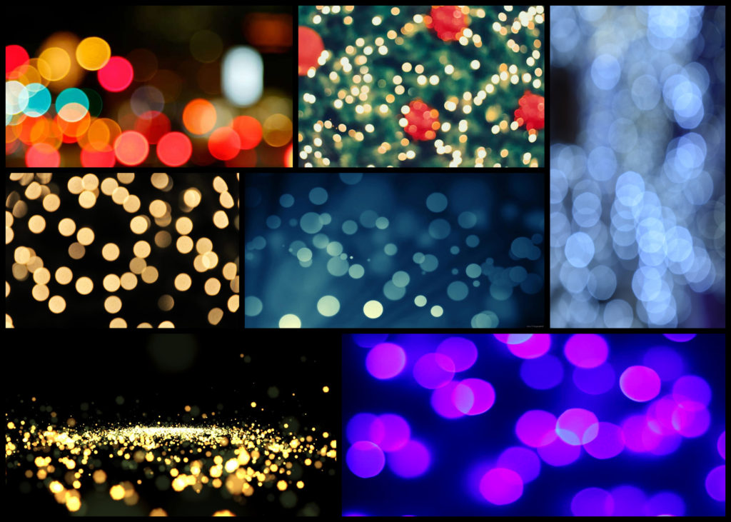
Named after the Japanese word for “blur” or “haze”, bokeh is an optical phenomenon that stamps the character of the lens on each photo in the way that bright out-of-focus elements are rendered. When out of focus, bright pinpoints become attractive, ghostly circles of light. Or at least they are circles with the right lens.Out-of-focus elements can be just as important to finishing the composition and can dramatically change the viewer’s perception of the piece. The key to using bokeh in a shot is to use a wide aperture on a close focused subject so that elements in front and behind the point of focus blur readily. If the lens has curved aperture blades, these will be reflected in the shape of the bokeh.

By tradition, bokeh hunters prize these circular shapes more. But straight aperture blades can create different shapes, such as hexagons if the lens has six blades and is used at a larger f-stop, such as f/8. These can be just as effective creatively. A more obvious way in which lens construction has influenced photographic trends comes with the zoom lens. The zoom-burst effect provides a way to guide the eye to the centre of the shot by turning the surrounding field into a blur of movement. The effect is easy to create although mastery takes a little longer.

The key is to focus on the centre of the image and during the shot quickly turn the zoom ring. It helps to have the camera on a tripod as this will minimise shake during the relatively long exposures needed to give you enough time to turn the zoom ring. Similar to creative use of bokeh, zoom bursts often work best with bright, colourful elements in the out-of-focus area. Although it needs a steady hand to pull off well, you can bring swirls into zoom-burst shots by holding the zoom ring and turning the camera instead. Here are some examples:

To ensure a clear image in the centre, photographers often combine the zoom burst with flash, using slow sync flash to fire extra light at the beginning or end of the exposure to freeze the subject. This can work extremely well in night-time city shots when you have streetlights to help emphasise the zoom effect. At the other end of the scale, zooming can be used to create extreme focus effects, particularly for macro shots. Even at high f-stops, it is difficult to capture a depth of field of more than a few centimetres of in close-up images. Here I wanted to explore a few ways in which I could experiment with the way I could take future shoots and so found walking around town at night was one of the best ways to do so. These were my outcomes:

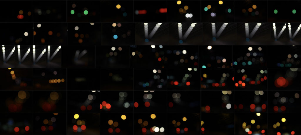
Once I’d experimented a little with the technique I decided to have a go at photographing the lights in tunnels and on car as they seemed to produce the best outcomes regarding variety of composition and brightness. When taking the images I really enjoyed taking into consideration a new style of composition not previously used where block lights could be overlapped or on their own. Here are three of my favourite outcomes from the experimental shoot:

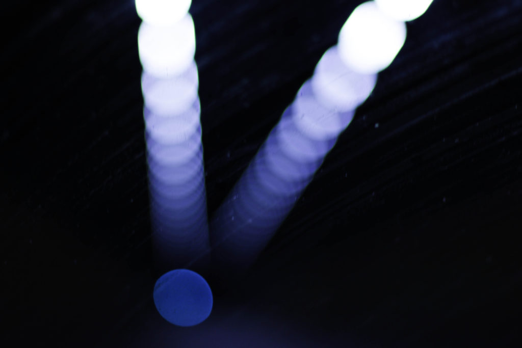
What I liked about this image was the use of the mainly blue lighting fading out as it progressed through the photo. For me this effect created a great sense of aestheticism as it highlighted the dirt of the window it was taken from, this for me added extra texture to the image whilst also making use of the negative space so that it would not be predominantly black and leave the product as a bit of an eye sore. The shades of blue present within I found to cast an ambient light throughout, with the primary light source becoming the main focal point for viewers due to the sequence of other lights deriving from it.

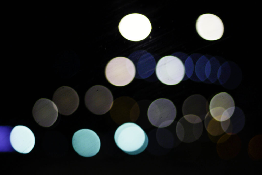
Here I particularly liked the variety of different colours present which make use of the black backdrop which separates each light so that they become a sort of structured shape. Looking at the blues, whites and greys they all compliment each other so that they do not become overpowering, with the occasional different colour such as red or orange breaking up the pattern and adding more depth to the overall outcome. For me the blackness of the top right corner brings together the whole image due to how it adds a space and stops the continuous lights from overpowering the entire piece.

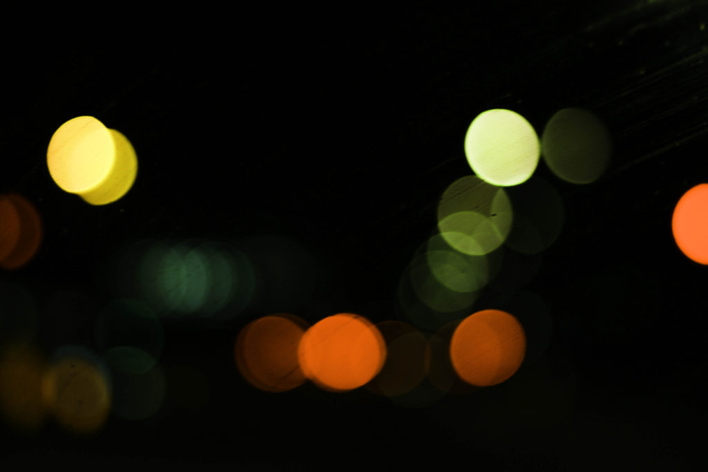
Finally what drew me to this image was the appearance of murky greens, reds and yellows which add a sense of eeriness to the photograph. These darker colours are complimented by the surrounding black which envelops each light merging them into the next whilst the sequence snakes off image. I particularly found the implementation of the reds and oranges to be of great effect due to how the prevent the mainly greens and yellows from taking over and making the image overall quite dull.

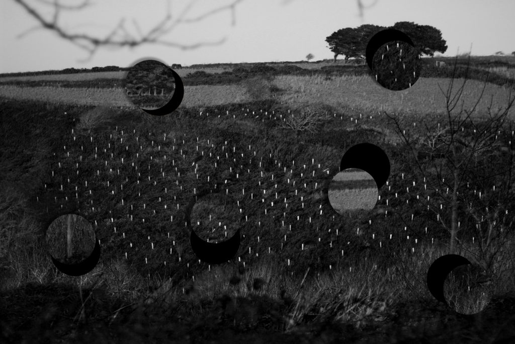
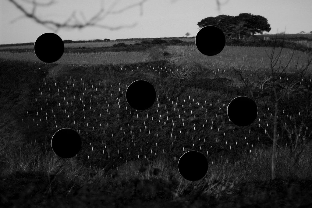
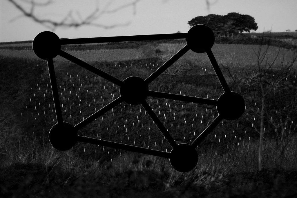
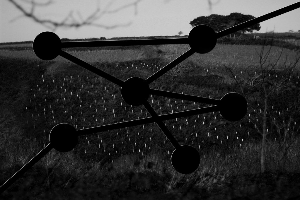
Overall for me this experimentation was useful as it broadened my stance regarding photography and the styles and techniques that could be used to take new and original perspectives of my surrounding environment. For a future reference I could combine certain bokeh images together to form a more abstract result combining patterns from both so that they merge and create something almost alien like.

Local Exhibition Study

After recently going to two exhibitions, the CCA Gallery and Public and Private, I was inspired through the works of the photographers regarding their pop art, graphics, album art, documentary photography and paintings. Looking back at the galleries I really liked how each artist’s work varied from the next, with each possessing their own unique perspective and style. The first gallery I visited was the CCA Gallery, exhibiting the works of Mike McCartney, Rupert Truman, and Carinthia West. Some examples from the gallery can be seen below:

Rupert Truman:

Storm Thorgerson founded StormStudios in the early 1990s where he worked as part of a creative team that included photographer Rupert Truman, who worked with him shooting 99% of the studio’s output.  Storm Thorgeson sadly passed away in 2013 but the Studio remains busy today creating ‘normal but’ designs and Rupert Truman has given us access to many works from the studio, including iconic props such as the heads used in the 10cc album,  Tenology, that will be included in our exhibition ‘The Eye Of The Storm‘ (Thursday 6th – Sunday 30th July 2017).
Rupert Truman is one of the leading photographers in the country and has shot images of bands from Pink Floyd to Muse. We’re delighted to announce that Rupert will be at For Arts Sake gallery Sunday 23rd July from 12-3pm talking about his art and signing copies of his book. In our interview with Rupert Truman he talks to us about his work, his time with Storm Thorgerson and the future for StormStudios.

Carinthia West:

Throughout her career as a model, actress and journalist, Carinthia West, 59, has always had her camera by her side, capturing carefree moments for her bulging scrapbooks. She remembers her great-grandmother being a keen photographer, and received her first camera – ‘a plastic thing; when you wound on the film it got caught in the sprockets’ – at the age of nine. But it was when she was given her Canon EF, a 35mm single-lens reflex camera, in the early 1970s, that she began experimenting with film and exposures while taking shots of her friends. West’s first exhibition, Hanging Out, has come about almost by chance. As a tribute to her parents, General Sir Michael and Lady West, last year she started organising a show of their extensive art collection – ranging from a Lowry, which her mother bought direct from the artist, to a Lichtenstein – at the Quay Arts Centre, a gallery that her parents had helped found and build in the Isle of Wight in 1975.

Mike McCartney:

Mike McGear is actually Paul McCartney’s brother; he changed his name in the mid-’60s shortly after the Beatles become famous, not wishing to be perceived as riding Paul’s coattails. He was a member of the Scaffold, who recorded some fairly successful comedy rock releases in the late ’60s (their “Thank U Very Much” and “Lily Pink” singles were big British hits). In 1974, he recorded a solo album with plenty of help from Paul, who wrote or co-wrote almost all the songs and sang backup; fellow Wings Linda McCartney, Denny Laine, and Jimmy McCullough also play and sing. The album, which unsurprisingly recalled Wings, attracted some critical notice, but sold poorly.

After visiting the CCA Gallery we headed over to the Public and Private gallery, they were currently holding an exhibition based around ‘Pop Icons of the 20th Century – British & American Pop Art’. Emerging in the mid 1950’s in Britain and late 1950’s in America, Pop Art reached its peak in the 1960’s and went on to become the most recognisable art form of the 20th century. It began as a revolt against the dominant approaches to art and culture and traditional views on what art should be.

Young artists felt that what they were taught at art school and what they saw in museums did not have anything to do with their lives or the things they saw around them every day. Instead they turned to sources such as Hollywood movies, advertising, product packaging, pop music and comic books for their imagery. Some of the artists who have the work exhibited are Andy Warhol, Sir Peter Blake and Patrick Caulfield. Some of their work can be seen below:

Andy Warhol:

Andy Warhol, original name Andrew Warhola, (born August 6, 1928, Pittsburgh, Pennsylvania, U.S.—died February 22, 1987, New York), American artist and filmmaker, an initiator and leading exponent of the Pop Art movement of the 1960s whose mass-produced art apotheosized the supposed banality of the commercial culture of the United States. An adroit self-publicist, he projected a concept of the artist as an impersonal, even vacuous, figure who is nevertheless a successful celebrity, businessman, and social climber. The son of Ruthenian (Rusyn) immigrants from what is now eastern Slovakia, Warhol graduated in 1949 from the Carnegie Institute of Technology, (now Carnegie Mellon University), Pittsburgh, with a degree in pictorial design. He then went to New York City, where he worked as a commercial illustrator for about a decade. Warhol began painting in the late 1950s and received sudden notoriety in 1962, when he exhibited paintings of Campbell’s soup cans, Coca-Cola bottles, and wooden replicas of Brillo soap pad boxes. By 1963 he was mass-producing these purposely banal images of consumer goods by means of photographic silkscreen prints, and he then began printing endless variations of portraits of celebrities in garish colours. The silkscreen technique was ideally suited to Warhol, for the repeated image was reduced to an insipid and dehumanized cultural icon that reflected both the supposed emptiness of American material culture and the artist’s emotional noninvolvement with the practice of his art. Warhol’s work placed him in the forefront of the emerging Pop art movement in America.

Sir Peter Blake:

Peter Blake was born in Kent and studied first at the Gravesend Technical College School of Art before continuing his studies between 1953 and 1956 at the Royal College of Art in London. At the RCA Peter Blake was at the forefront of British Pop, studying alongside Patrick Caulfield, David Hockney, Pauline Boty, Derek Boshier and Peter Phillips amongst others. He was awarded the Leverhulme Research Award in 1956, to study popular art. Between 1956 and 1957 he made an extended journey to Europe (France, Italy, Spain, Holland and Belgium), and in 1961 was awarded the first Junior Prize from the John Moores Liverpool Exhibition. In 1964 he was appointed a lecturer at the Royal College of Art in London and at the Walthamstow School of Art. In 1975 he was a founder member of the group of artists called The Brotherhood of Ruralists, and from 1994 to 1996 he was Associate Artist at the National Gallery in London. Blake became a Royal Academician in 1981, was awarded a CBE in 1983 and was knighted in 2002 for services to art. There have been multiple retrospectives of his work in Britain, with the most significant including those in 1983 at the Tate and in 2008 at Tate Liverpool. In February 2005, the Sir Peter Blake Music Art Gallery, located at the University of Leeds was opened by the artist with a permanent display of 20 examples of Blake’s album sleeve cover art, including the only public display of a signed print of the iconic Sgt. Pepper Lonely Hearts Club Band album cover.

Patrick Caulfield:


Patrick Joseph Caulfield, British artist (born Jan. 29, 1936, London, Eng.—died Sept. 29, 2005, London), was a member of the “New Generation” of 1960s British Pop and abstract artists. Caulfield’s bold paintings incorporated everyday objects in still lifes and ordinary domestic interiors and were defined by strong graphic design, black outlines, and bright, saturated colours. He later introduced elements of trompe l’oeil and photorealism into his painting. He also worked in other mediums, including graphic prints, tapestry, theatrical set design, and screen-print book illustrations. Caulfield was nominated for the Turner Prize in 1987 and shared the Jerwood Painting Prize in 1995. He was made CBE in 1996.

Experimentation With Images – Cutouts

After my initial experimentation with images, using color to respond to John Baldessari, I decided to create another response in which I would become more practical with my ideas and actually cut out parts of the image itself. To do this I would need to use a small circular object which I could proceed to cut around as an outline for the areas of photo I wanted to take out. Using a Stanley knife and a small cup I traced the outline and cut around the outskirts of the edge trying to be as neat as possible, after cutting out wanted areas on all of the photos I went onto experiment with their presentation, linking areas and using the off-cuts to put back onto the photos. Once I had create four different layouts I photographed them against a black piece of card so that more definition could be created. Overall I decided to do this because I wanted to become more practical like Baldessari who would go out of his way to make certain scenes happen, and so by me creating a response like this it would allow me to be in control of the image taken completely, warping it so that it links into my intended outcome. Here are the final developed cut-outs of the photos taken and their various experimentation’s:

For my first edit I decided I wanted to make use of the parts cut out, this is because I loved the idea of placing parts of an environment that would not typically be seen in any other location elsewhere. I chose to use the circles as a theme because of how their repetition linked into Baldessari’s work that centered around figures and form, and so by placing things in usual ways presented aestheticism for the viewer who is drawn to how the locations don’t fit into where they are placed.

For this image I wanted to layout the basis for branching various ideas for designs off on, this could consist of various linking techniques towards each circle and where they could start and end. I selected the areas with the photo which I thought captured the essential patterns and textures seen such as trees, card, sky and fields. These three different areas of the environment make up the piece and so by taking a section of it out impacts the outcome much more than it initially did.

Firstly for this image I decided to link together each circle to one another, giving each three links with the exception of the middle one having five in order to connect it to every other one. The idea behind this was to essentially link together each of the different sections of the landscape together and present the piece with an abstract and unusual object within, making the viewer think about how each area impacts the next.

Finally for this last experiment I tried to randomize how the layout of the cut-outs experimentation look completely. To do this I randomly linked together various circles making sure that two circles had a link to the border of the photo. I tried to make sure the path of the links was completely uncoordinated leaving me to cross over various paths to make a form with no actual structure in the photograph.

Overall I found that my experimentation using the four images went well due to it pushing me to create more edits outside of software, making me more practical with my photographs whilst involving me more with the actual process and outcome of each piece. I chose to use this image as the experiment because of how I thought it presented the most diverse textures and patterns within a landscape found in most of my photos.