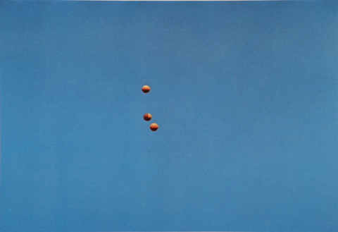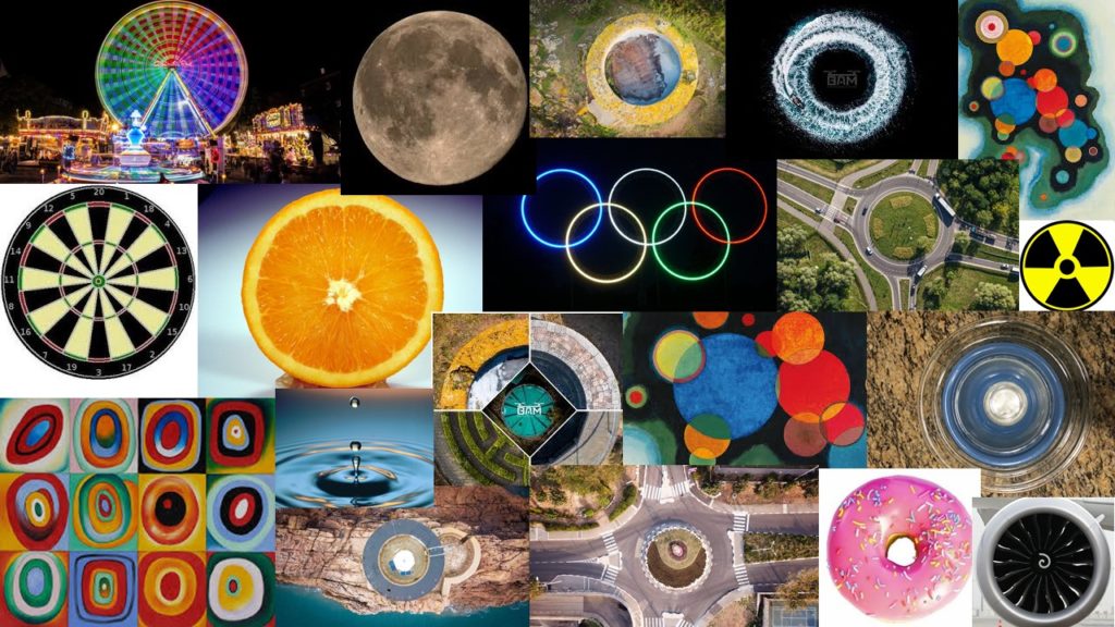
Mood Board | Circular


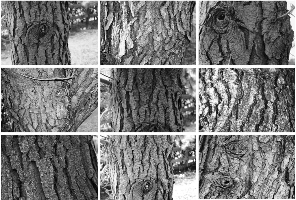
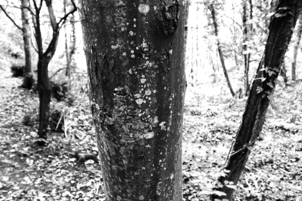
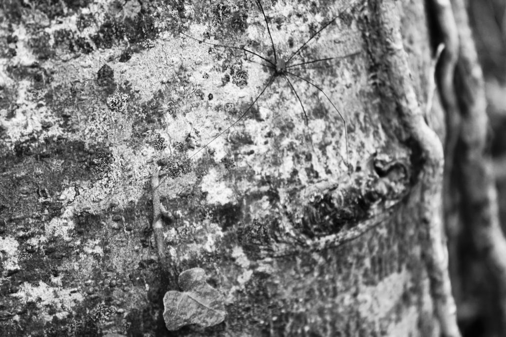
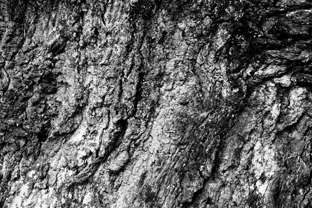
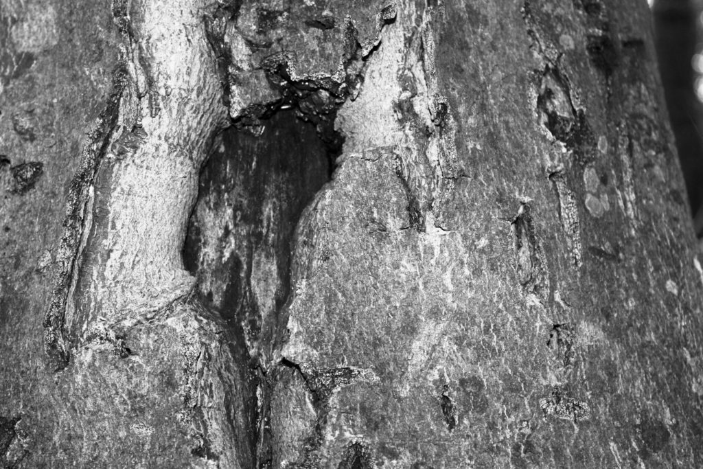
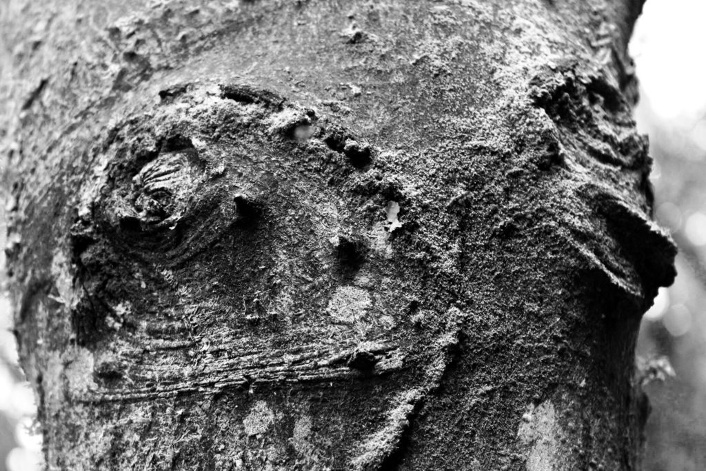
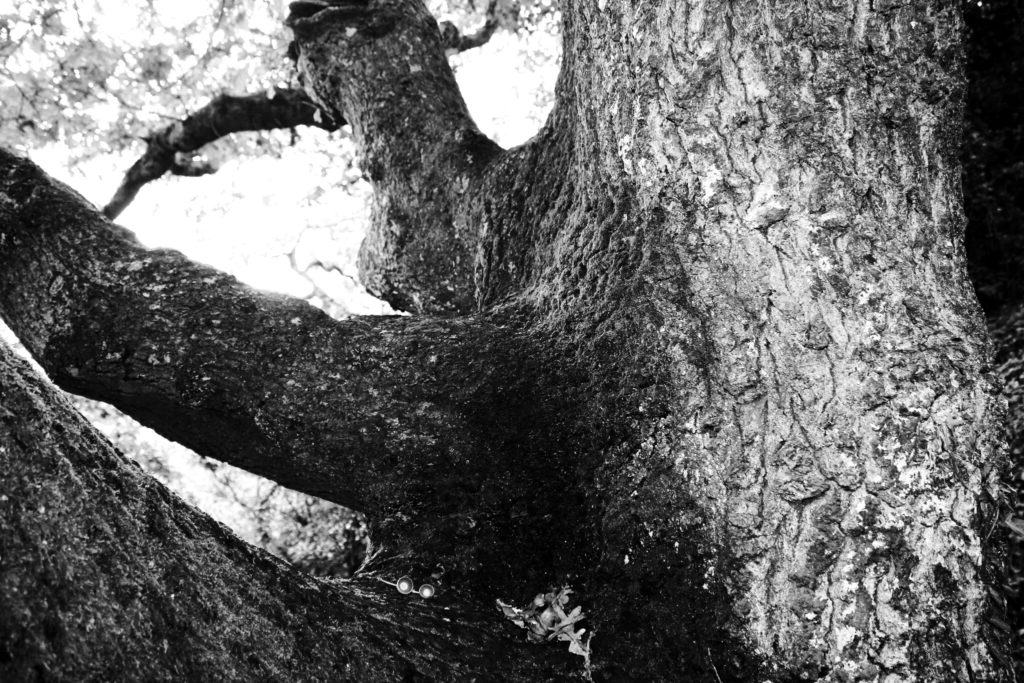
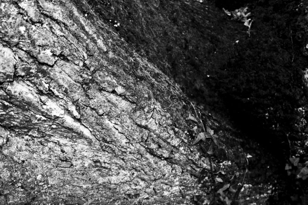
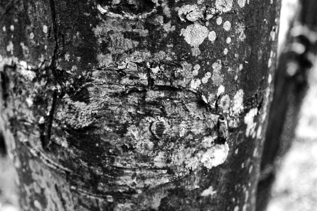
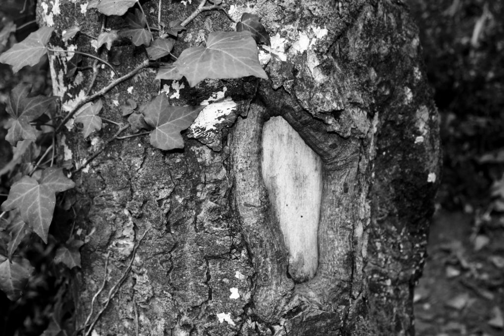
My first photoshoot for my Variation and Similarity project was based around trees. As trees come under the form of typologies, studied by Bernd and Hilla Becher, I have experimented with presenting my work in the style of these photographers. The basic yet effective grid format gives my photographs a clear presentation and shows a variety of my images side by side in one photo montage. Along with looking at the overall structure of trees, I have zoomed in on the closer features like bark patterns and colours, to explore my project route of variation within nature.


The graphics interchange format (GIF) is a bitmap image forma that was developed by a team at the online services provider CompuServe led by an American computer scientist Steve Wilhite on June 15 1987. It has since come to widespread usage on the World Wide Web due to its wide support and potability. Giffs are less suitable for reproducing color photographs and other images with color gradients, but it is well-suited for simpler images such as graphics or logos with solid areas of color.
I wanted to experiment with something similar to the Bechers, where I would photograph similar objects to create a repeated effect. I thought that photographing different windows and doors around the area I live would create an interesting effect as they all the same objects as they all do the same thing, yet they are all completely different in terms of colour, size, shape, texture and tones. My experimentation with typologies is shown in the 2 shoots below.
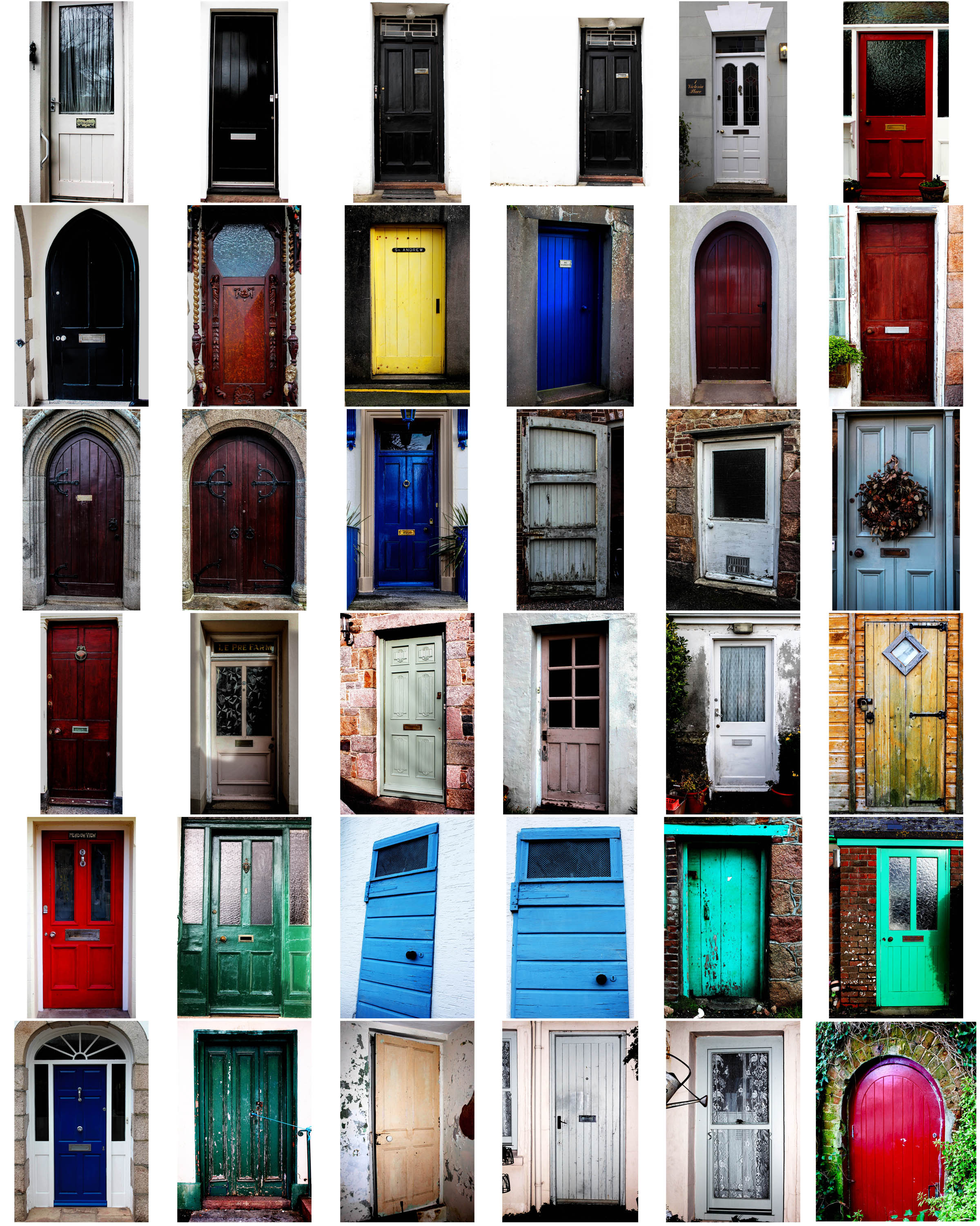
For this shoot, I made sure I captured each door I wanted to photograph from a face on perspective, so that they all had a similar viewpoint. I did this as I was inspired by the Becher’s to create multiple photos of the same object from the same camera angle. I edited all my images in lightroom, where I adjusted the brightness and contrast, as well as the exposure to make the photo colours more vivid and bright. I kept my images in colour because I felt that this was more appropriate for the shoot I was doing; I wanted to show the variance of different colours and textures in all the doors I photographed – a black and white effect would’t have made this same effect. Although the Becher’s did this, I wanted to differ from their typologies because their work was carried out in the 1900s, whereas my interpretation is more modern, with more modern and bright doors.
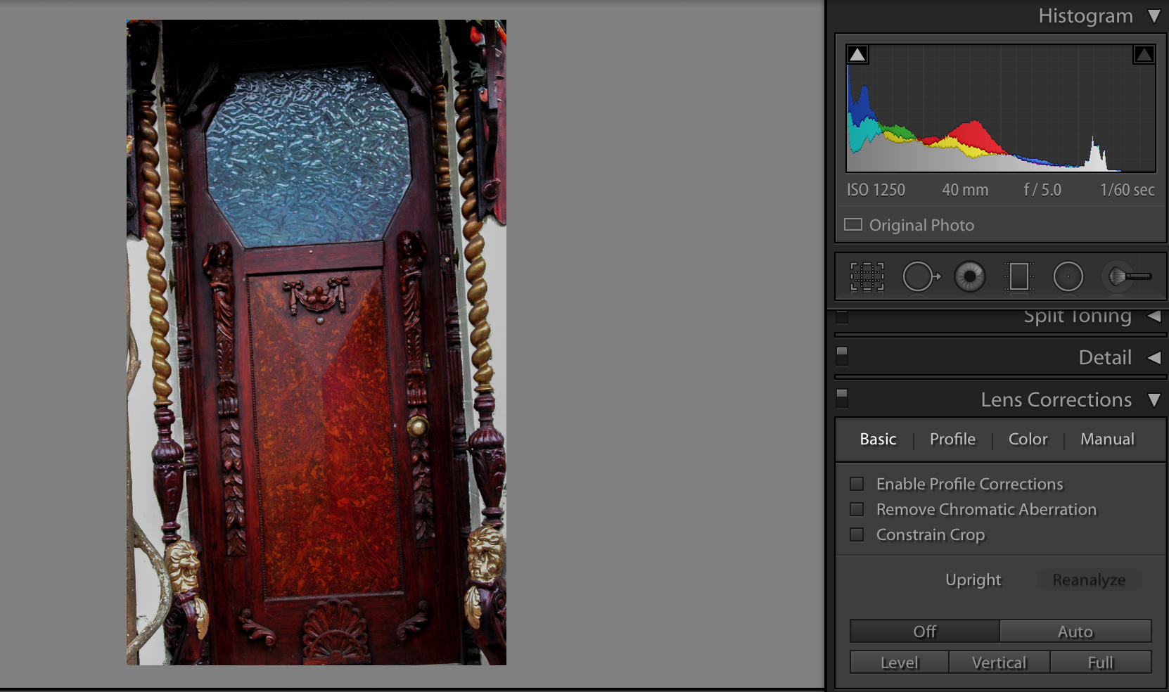
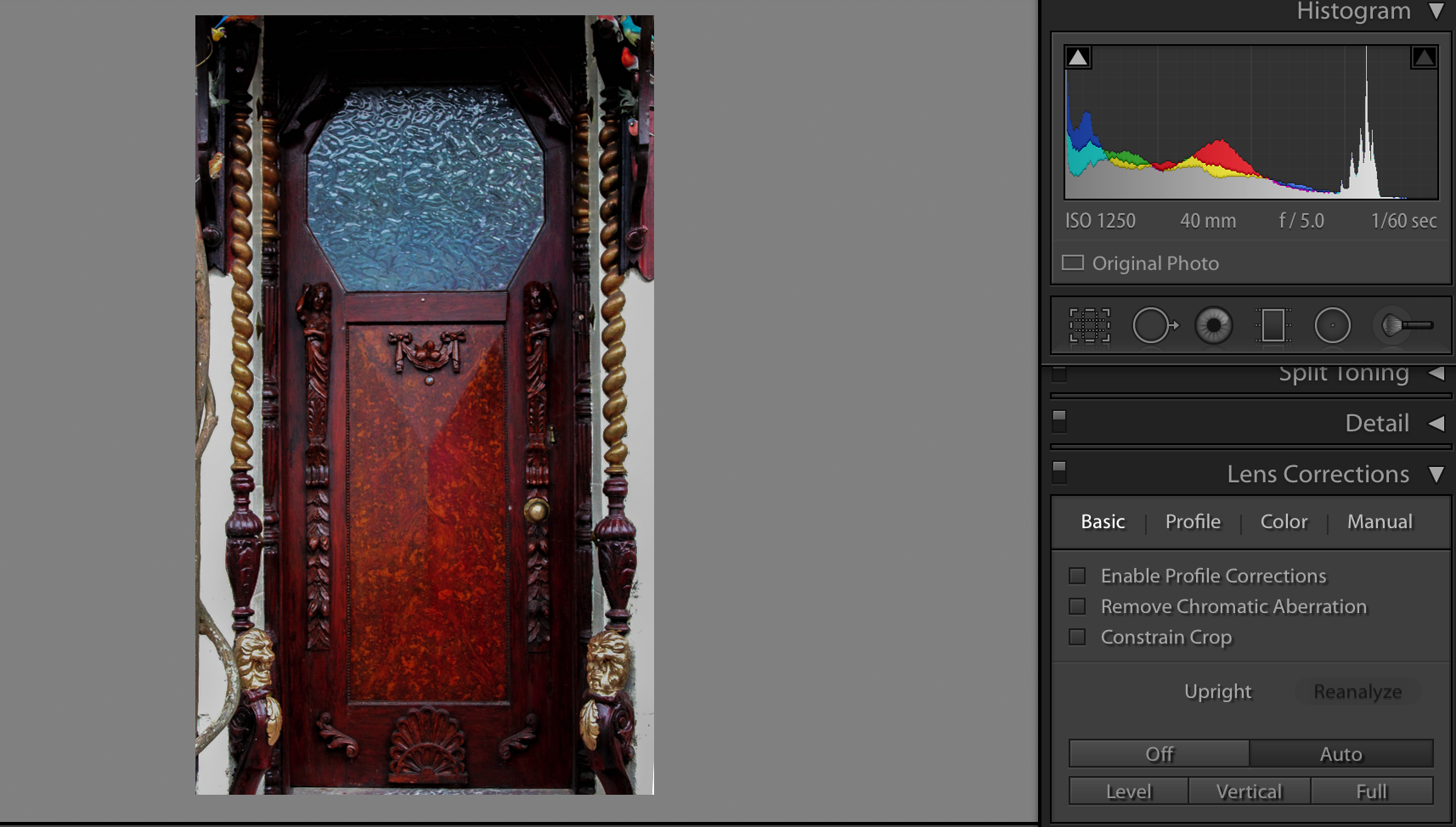
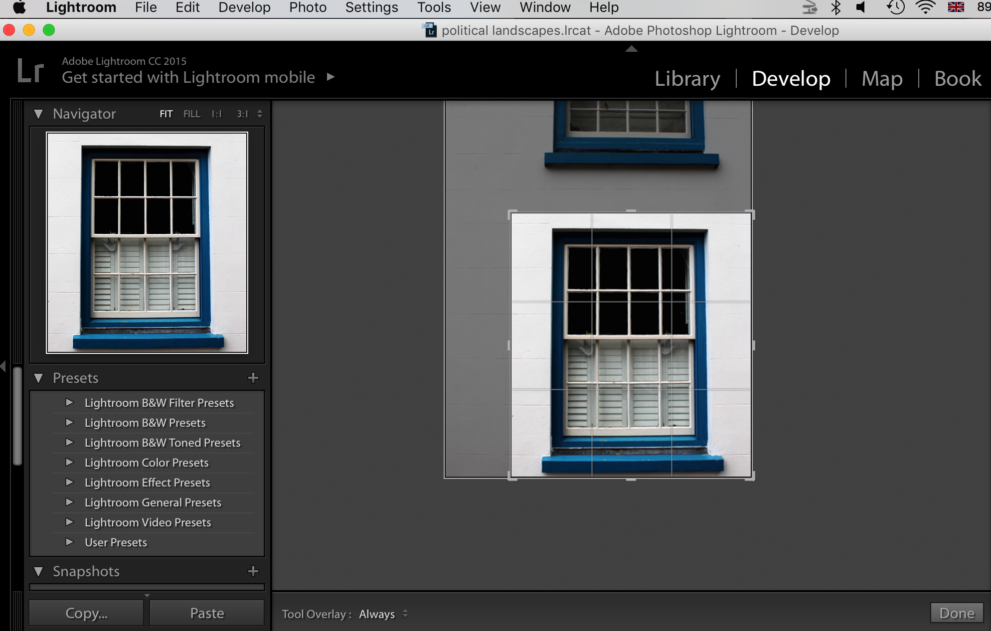
Additionally, I adjusted the lens correction for most of my images so that they all had a face on perspective. For instance, the screen-shots below is a valid example of how I used the lens correction to straighten up my images:

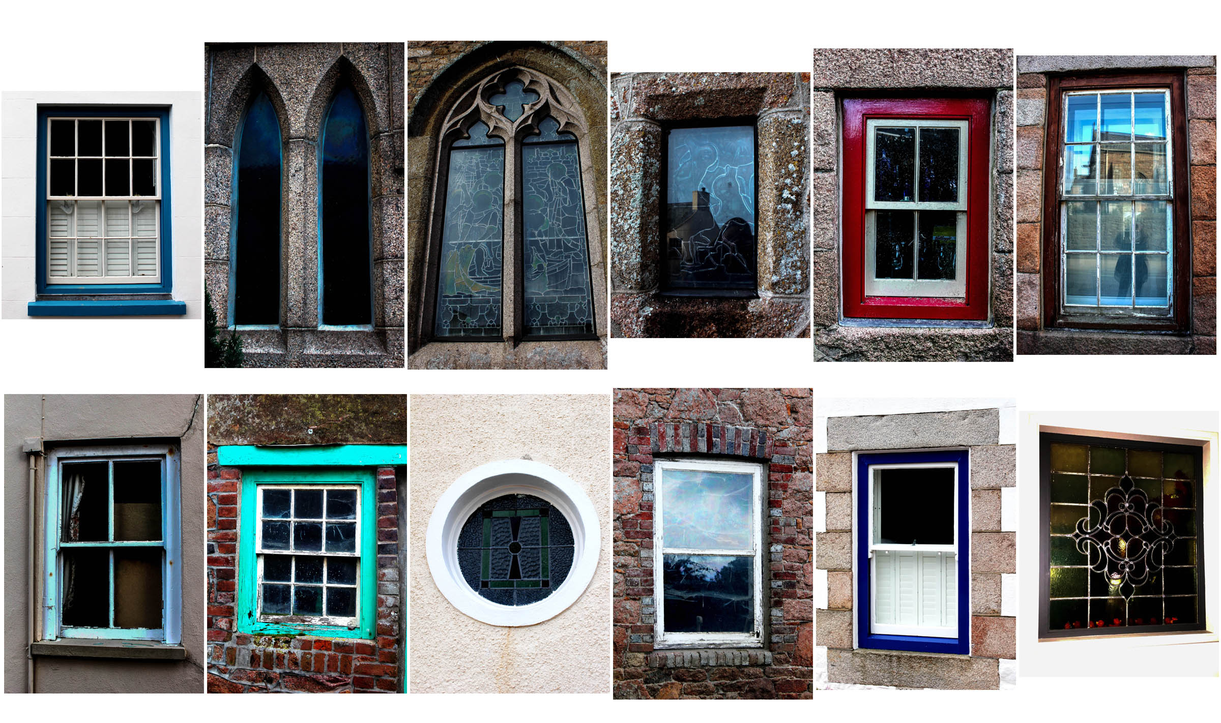
For this shoot, I took the same approach as with my first shoot of doors, but used windows as my main focused object instead. Again, I took all my images from a straight on perspective and edited them all in lightroom.
I cropped every image that appeared less straight on than others, so that they all were cropped to show an even photo. For example, I cropped this image here as I realised I wanted to create a consistency between my series of images of doors and windows, and so only showing one window an image would work best to create a repetition effect.
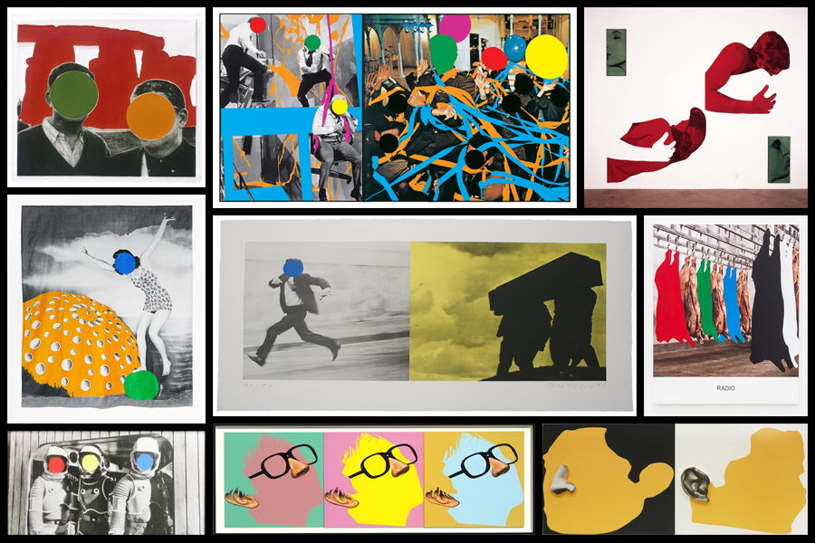
After looking over the works of John Baldessari I became inspired to create my own response regarding the colours used within his graphics used. I really liked his used of block colouring to create abstract effects within pre-taken images of people and landscapes, blocking out faces and aspects of the environment as a means of censorship. As a result of this it produces collages of different materials which contrast one another allowing for a aesthetically pleasing result. To create the intended results I would have to use software such as Adobe Photoshop to cut and paste in colour in the areas wanted, the photos I will be using are images I have previously taken in shoots regarding the topic of variation and similarity. Here are some examples of Baldessari’s work which I will be drawing inspiration from:
Once I had chosen some of the works which I would be using as a reference to create off I decided to go ahead and proceed to cut areas out which I thought would look more effective with varying ranges of colour. Using Adobe Photoshop I used the snipping tool to cut out and replace the different areas of each image with block colouring, looking back at Baldessari’s work as a reference to my structure of creating related works. Here is the process of me creating each image:
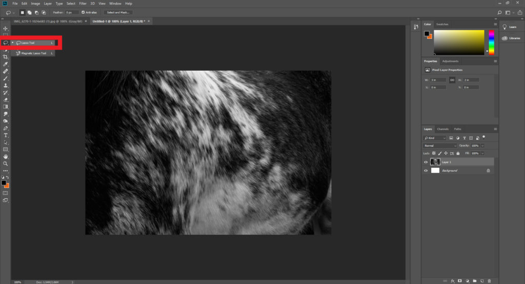
Step 1: Select the lasso tool located on the top left hand side of the tool bar and make sure the freehand option is chosen.
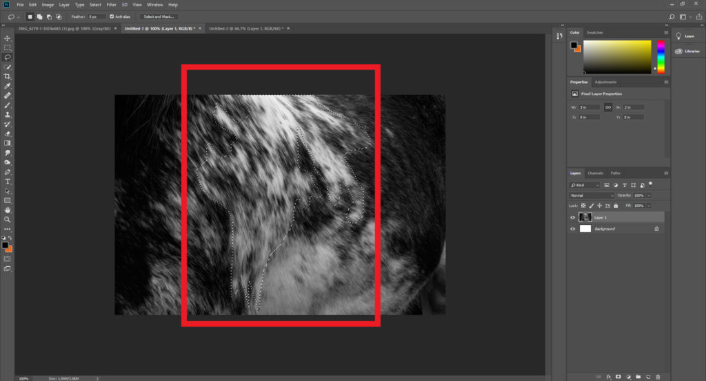
Step 2: Once you have selected the lasso tool draw out the desired shape of the area you intend to make a block colour out of, when doing it make sure to connect the end and the start point so that it does not ruin the layout.
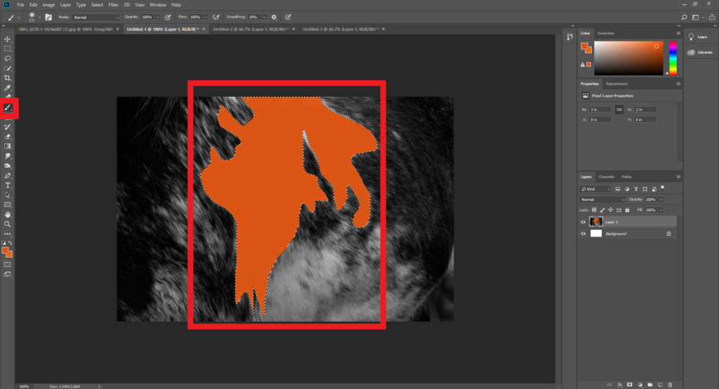
Step 3: After highlighting the wanted area make sure to go on to chose the paintbrush tool next, located just under the lasso tool. Using the colour boxes select a colour that contrasts the piece well and paint it within the lassoed area, making sure to deselect the highlighted are once completed.
When I finished experiment with various designs I then chose four images that I best reflected the intended outcome of the process and inspiration towards John Baldessari’s work. These are the images I selected as the best outcomes of the experimentation:
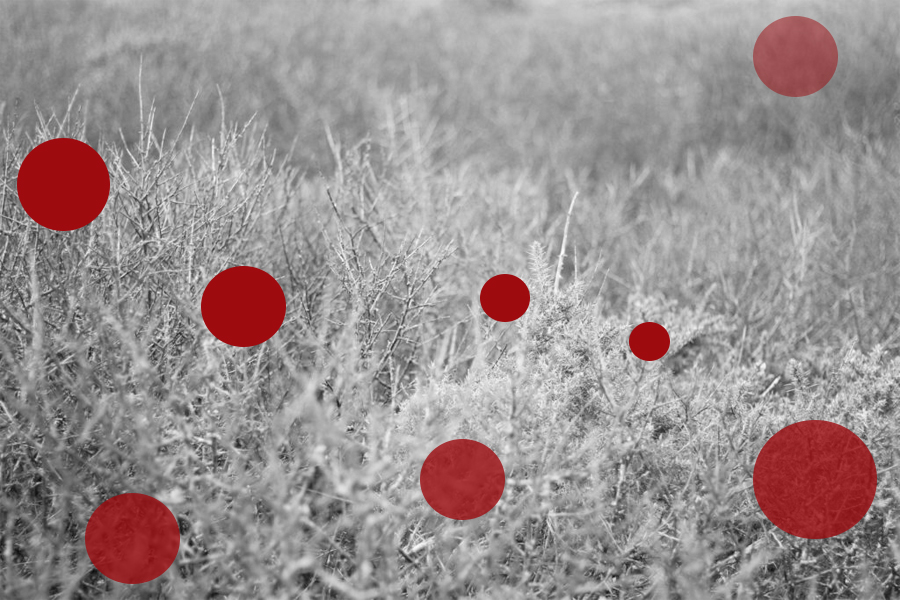
For this image I used red circles each with a varying opacity, by doing this it would create the impression of different depths of fields, with the more out of focused being the more faded shapes. When creating it I wanted to make sure there was still a natural feel to the piece, so limited the amount of shapes depending on the focus of the area so that they would not overpower and fill the entire piece.
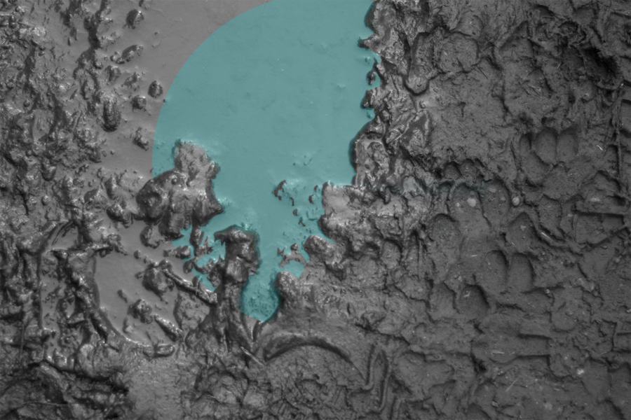
Here I wanted to capture a reflection of a shape within a muddy puddle. To do this I had to crop out the parts of the shape which touched the mud, this seemed a bit to complicated for a Baldessari’s work, however I liked the final outcome of how the lighter blue completely contrasted that of the surrounding black mud of the image.
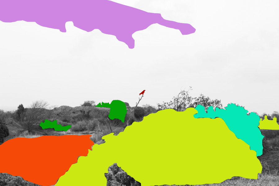
When editing this piece I tried to block colour only the bushes and trees that were the most outstanding to the environment, allowing me to roughly cut out the area and replace it all with colour that contrasted but complimented each other so that it would not become eye sore. When placing the block colours I made sure not to have them grouped together so much as by clustering them together it would reduce the effect of the simplicity I wanted to put across, instead abstracting the photo too much.
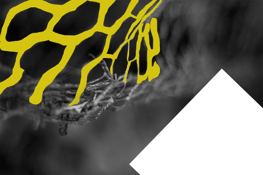
Finally I selected this image because I like the roughly cut out mesh wire which it replaced with a contrasted yellow which compliments the black which makes up the majority of the photo. By also adding the white rectangle I found that it brakes the piece up and instead stops the yellow from becoming too minimal and the black becoming too overpowering.
The Play photoshoot was a photographic response to the work of famous artist John Baldessari.






Photoshoot contact sheet






























































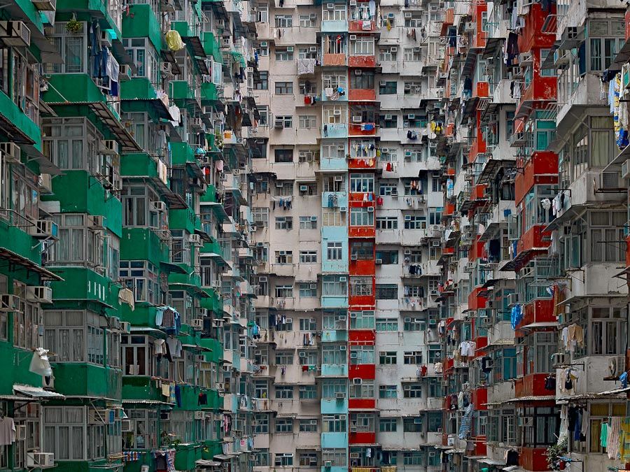
Michael Wolf, born 1954, is a German artist and photographer who resides in and works in Hong Kong and Paris. Wolf’s work focuses on the daily life within big cities such as Hong Kong. Wolf one first prize in the Contemporary Issues category of the 2004 World Press Photo competition for his photographs of workers in several types of factories. His career began in 1994 as a photojournalist, when he spent eight years working in Hong Kong for German magazine ‘Stern’. Wolf says that a decline in the magazine industry led to photojournalism assignments becoming “stupid and boring” therefore he decided to work on only fine-art photography projects from 2003.
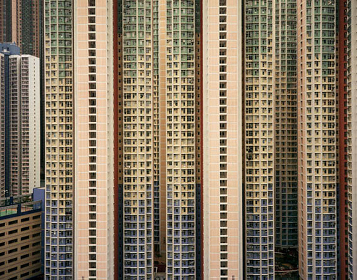
In Wolf’s series titled “Architecture of Density” he photographs Hong Kong’s tall buildings in order to show them as “abstractions, never-ending repetitions of architectural patterns” – the photographs excluded the sky and the ground and so emphasised the vertical lines and shapes within the buildings. The first book containing images from the series, Hong Kong: Front Door/ Back Door, was published in 2005 – in this book reviews noted how the photographs represented the overpopulation occurring in the city and the massiveness of the human presence.
I intend to take a lot of inspiration from Wolf’s work on ‘Architecture of Density’ as I believe that his work on this project brilliantly demonstrates the similarity within buildings through the patterns that are demonstrated within them as well as bringing light to how different the buildings all are, even though they all often contain very similar shapes and structures. I like Wolf’s work a lot due to the patterns and repetition within the photographs, I feel that they create a very intriguing and abstract appearance to the work as you are initially unsure at what you are looking at. Of course Wolf creates this work using much larger buildings and so can further dramatise these effects of massive repetitive buildings so in my responses to this work it will likely be necessary to use photoshop in order to create more repetition to achieve the same effect as Wolf has. Ultimately Wolf shows the repetition within the world we live in as well as showing the fact that even though there are so many buildings built for the same purpose, they all manage to have their own individualistic features.
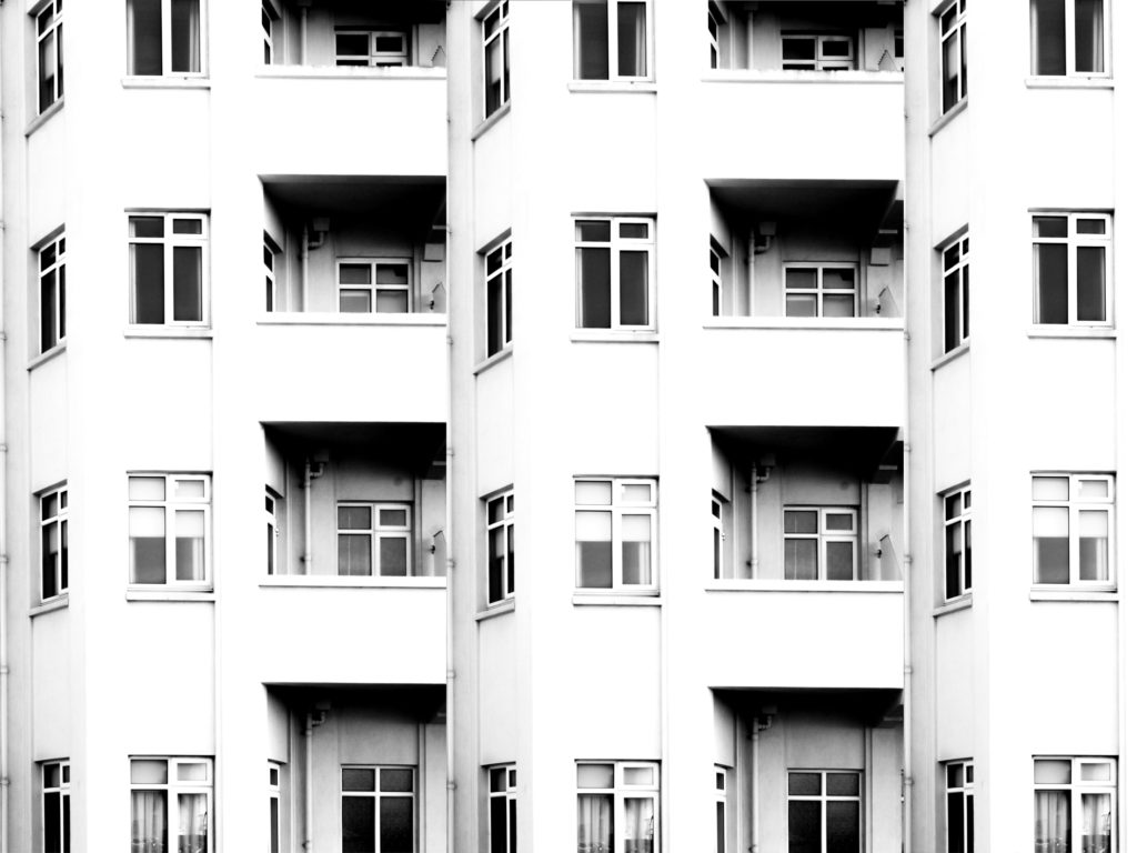
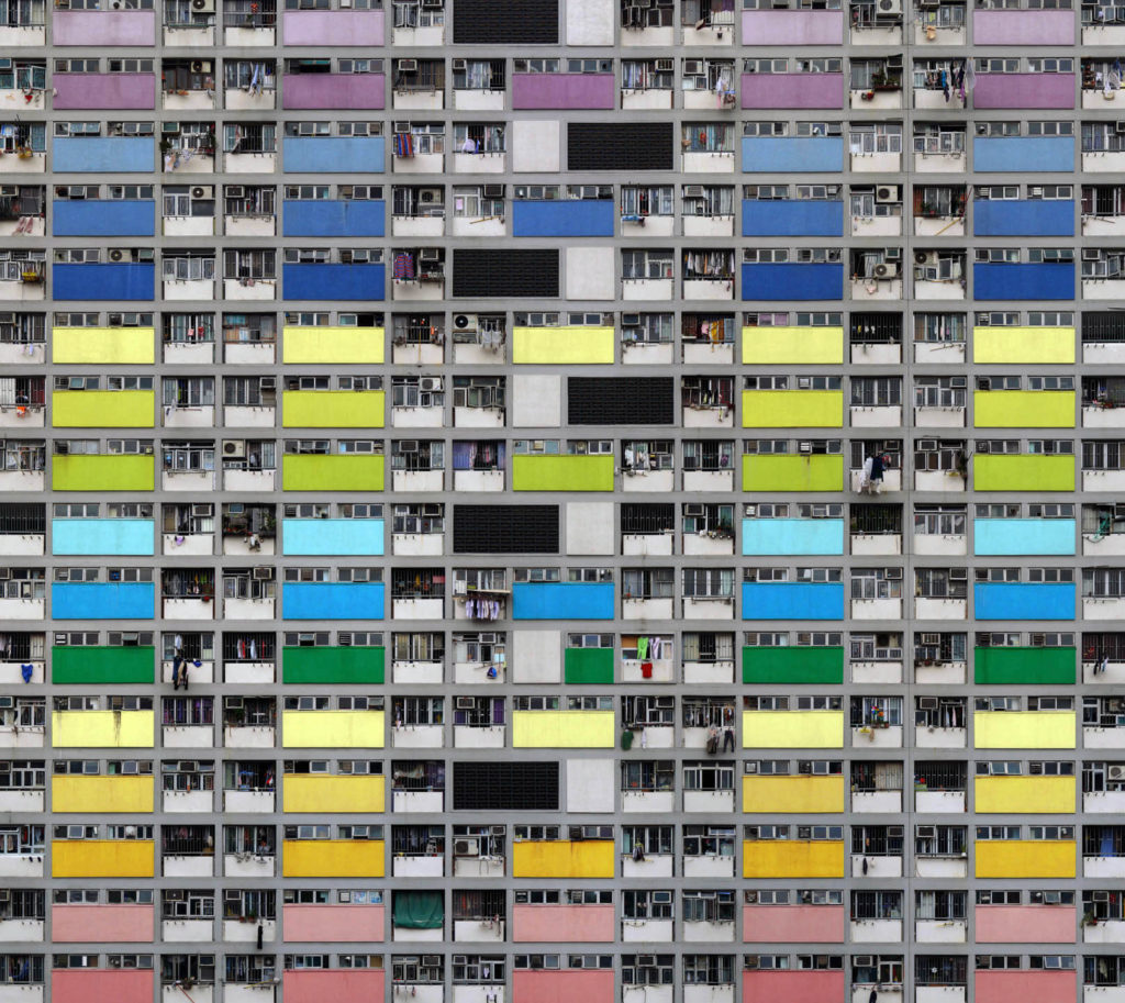
In this photograph from Wolf’s “Architecture of Density” he has used the natural lighting from the city of Hong Kong in order to capture a photograph of a repetitive and colourful high-riser apartment block. By using the natural lighting he has been able to capture the natural tonal ranges and contrasts within the building as well as being able to ensure that the image depicts the city of Hong Kong accurately. A deep depth of field would have been used to capture this photograph of the repetitive apartment block face; this is obvious as all aspects of the photograph are in focus in order to ensure that the viewer can look throughout the photograph and spot the continuing patterns. A fairly quick shutter speed, such as 1/80 will have been used to capture the photograph along with a low ISO of close to 100. This is because Wolf will have altered settings of the camera so that the correct amount of light was entering the lens from the city and that the quality of the photograph was as high and as noise-free as possible. This has led to a photograph that is corrected exposed and is visually pleasing to look at.
There is plenty of colour throughout the photograph due to the colourful panels placed across the apartment block; despite this there is not much saturation in the colours as they seem quite bleak and faded. To me this has been done on purpose by Wolf to suggest that this high-density, repetitive type of apartment block is not a sustainable or enjoyable way of living and represents how the population of Hong Kong feel about their living situation – it all seems quite bleak and boring as there is no room for innovation. There is a good level of contrast between the tones within the photograph as there are plenty of black tones within the shadows of balconies contrasting with the lighter tones of the coloured panels – this contrast increases the drama within the photograph to create a more striking composition. Due to the flat nature of the face of the apartment block there is a very 2D feeling to this photograph, but it does not take away from the effectiveness of the photograph as it further demonstrates the repetition and patterns shown throughout the apartment block.
This photograph is part of Wolf’s “Architecture of Density” in which he photographs Hong Kong’s tall buildings in order to show them as “abstractions, never-ending repetitions of architectural patterns”. The project included books published, including Hong Kong: Front Door/ Back Door which allowed Wolf to present the photographs collectively to prompt the reader to compare the structures, shapes and colours within the different Hong Kong high-risers and therefore demonstrated variance and similarity in his work. As a whole this work shows how over-populated and dense cities such as Hong Kong are and gives an insight into their lifestyle and possibly the bleakness of it. This work also possibly raises questions about what the human population are going to do in the future as human population constantly rises and we run out of space in these large cities. Property prices are inevitably going to rise as this unsustainable approach continues and it is just an amount of time until the demand for housing increases drastically past the supply of housing.
Who is he?
John Baldessari is renowned as a leading Californian Conceptual artist. Painting was important to his early work: when he emerged, in the early 1960s, he was working in a gestural style. But by the end of the decade he had begun to introduce text and pre-existing images, often doing so to create riddles that highlighted some of the unspoken assumptions of contemporary painting – as he once said, “I think when I’m doing art, I’m questioning how to do it.” And in the 1970s he abandoned painting altogether and made in a diverse range of media, though his interests generally centered on the photographic image. Conceptual art has shaped his interest in exploring how photographic images communicate, yet his work has little of the austerity usually associated with that style; instead he works with light humor, and with materials and motifs that also reflect the influence of Pop Art. Baldessari has also been a famously influential teacher. His ideas, and his relaxed and innovative approach to teaching, have made an important impact on many, most notably the so-called Picture Generations, whose blend of Pop and Conceptual art was prominent in the 1980s.
Baldessari first began to move away from gestural painting when he started to work with materials from billboard posters. It prompted him to analyze how these very popular, public means of communication functioned, and it could be argued that his work ever since has done the same. He invariably works with pre-existing images, often arranging them in such a way as to suggest a narrative, yet the various means he employs to distort them – from cropping the images, to collaging them with unrelated images, to blocking out faces and objects with colored dots – all force us to ask how and what the image is communicating.A crucial development in Baldessari’s work was the introduction of text to his paintings. It marked, for him, the realization that images and texts behave in similar ways – both using codes to convey their messages. Text began to disappear from his work in the early 1970s, and since then he has generally relied on collage, but his work has continued to operate with the same understanding of the coded character of images.
Typically, he collages together apparently unrelated categories of image or motif, yet the result is to force us to recognize that those images often communicate similar messages.On a visit to the Metropolitan Museum in New York in 1965, Baldessari was struck by the use of unpainted plaster to fill in missing shards of Greek vases. This prompted his interest in how images are effected by having portions removed or blotted out, and he has continued to explore this ever since. Often, the result of his alterations to photographs is to render them generic, suggesting to us that rather than capturing a special moment, or unusual event, photographs often communicate very standardized messages. Here are some examples of his works:
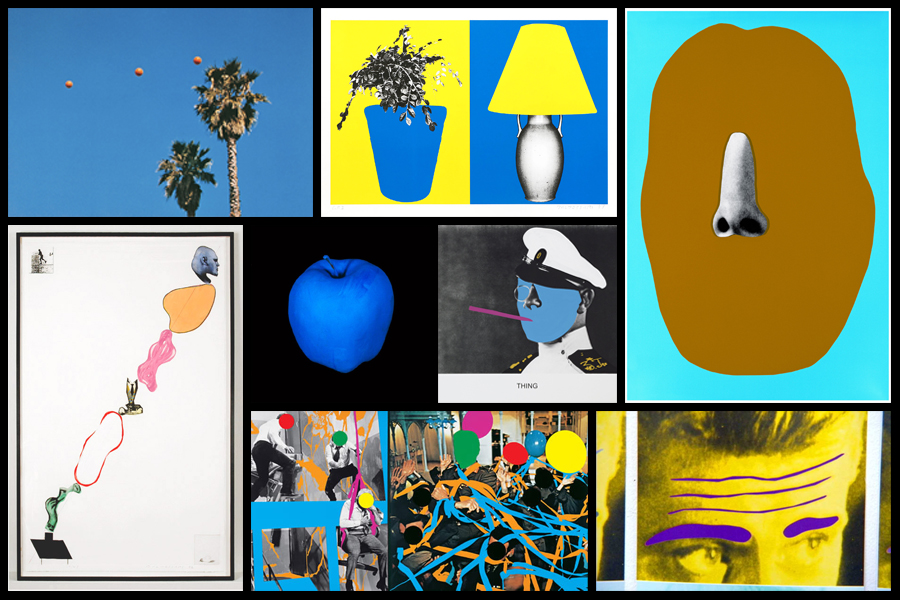
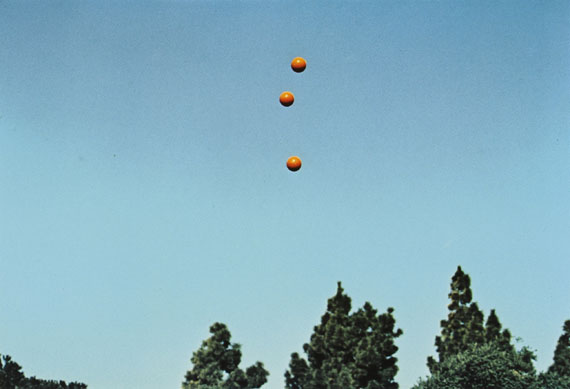
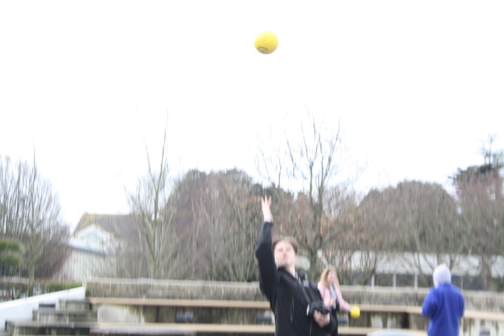
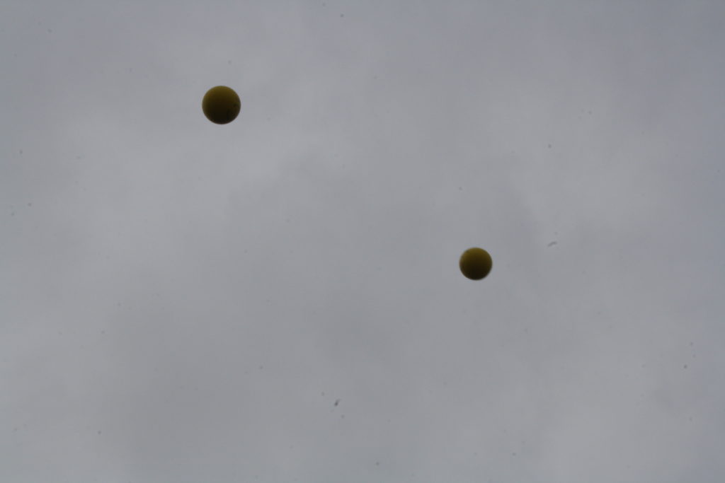
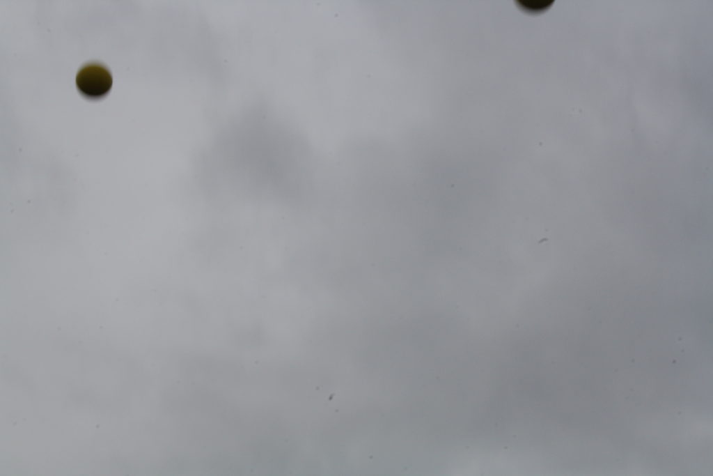
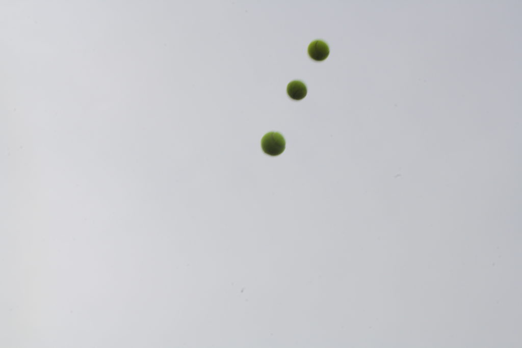
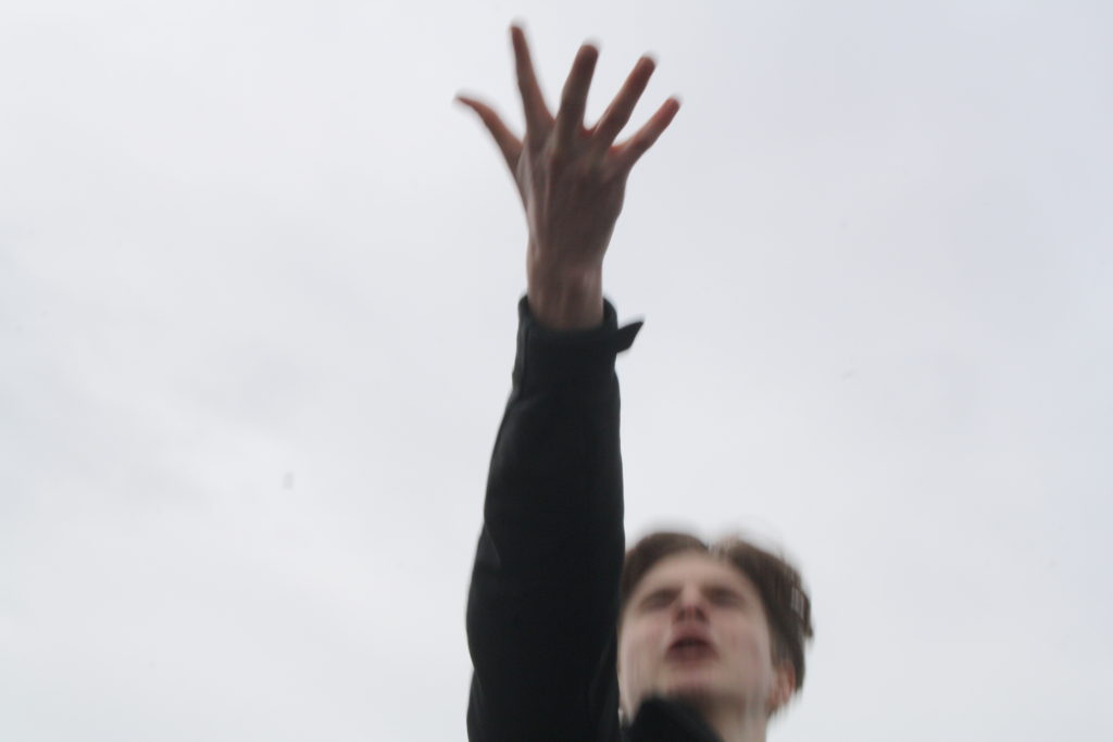
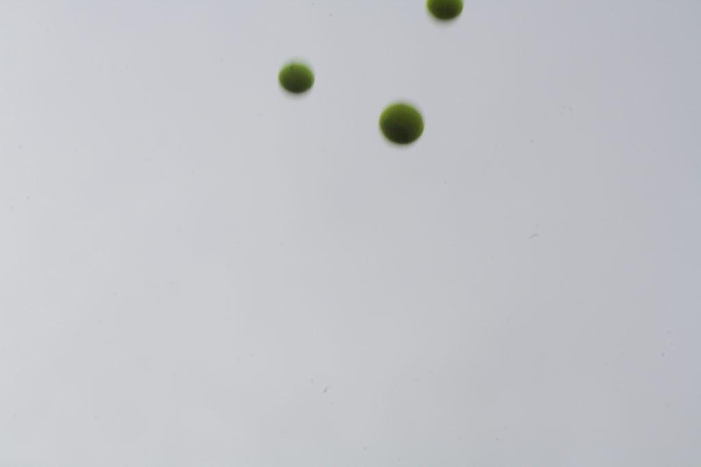
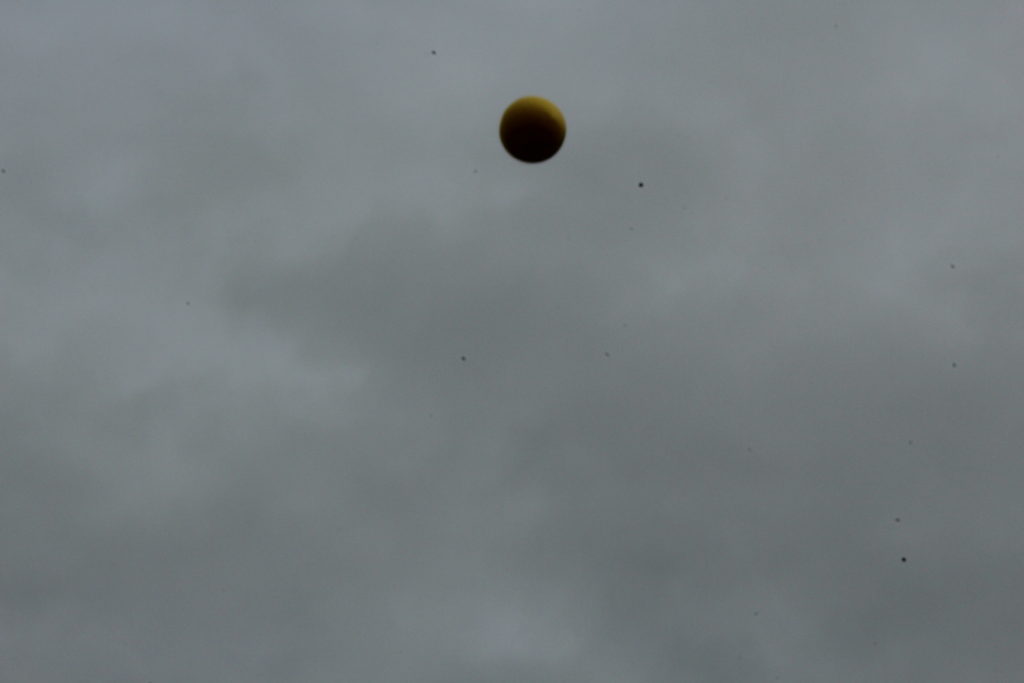
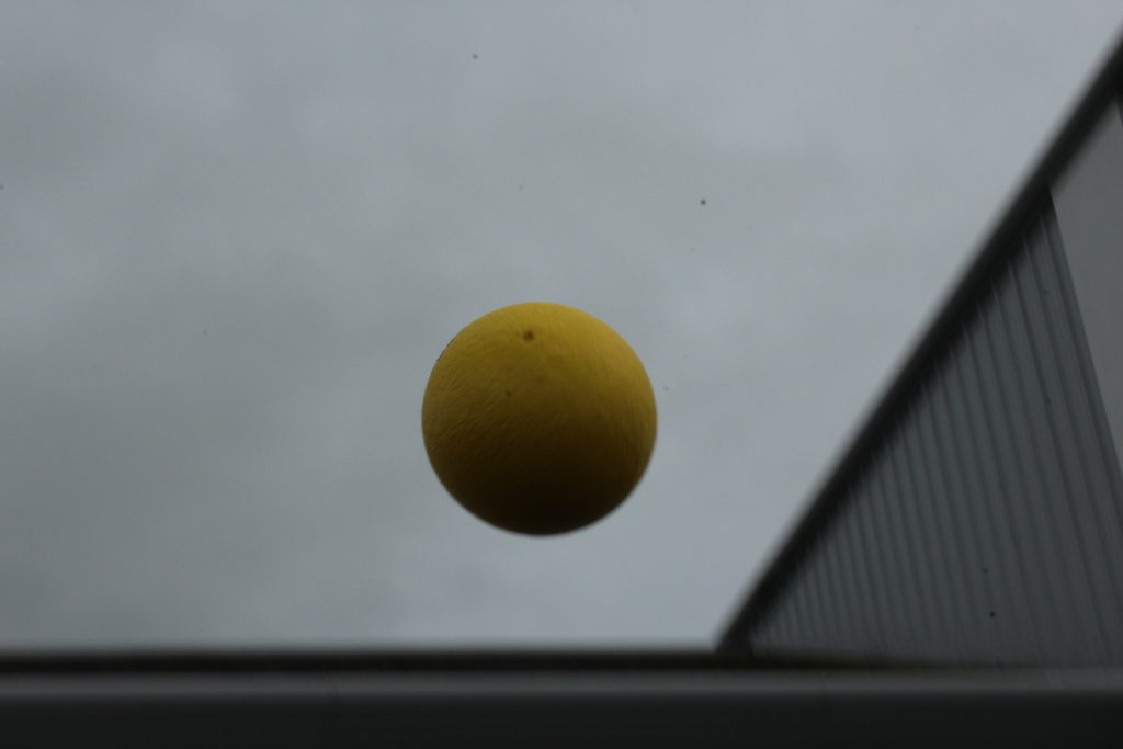
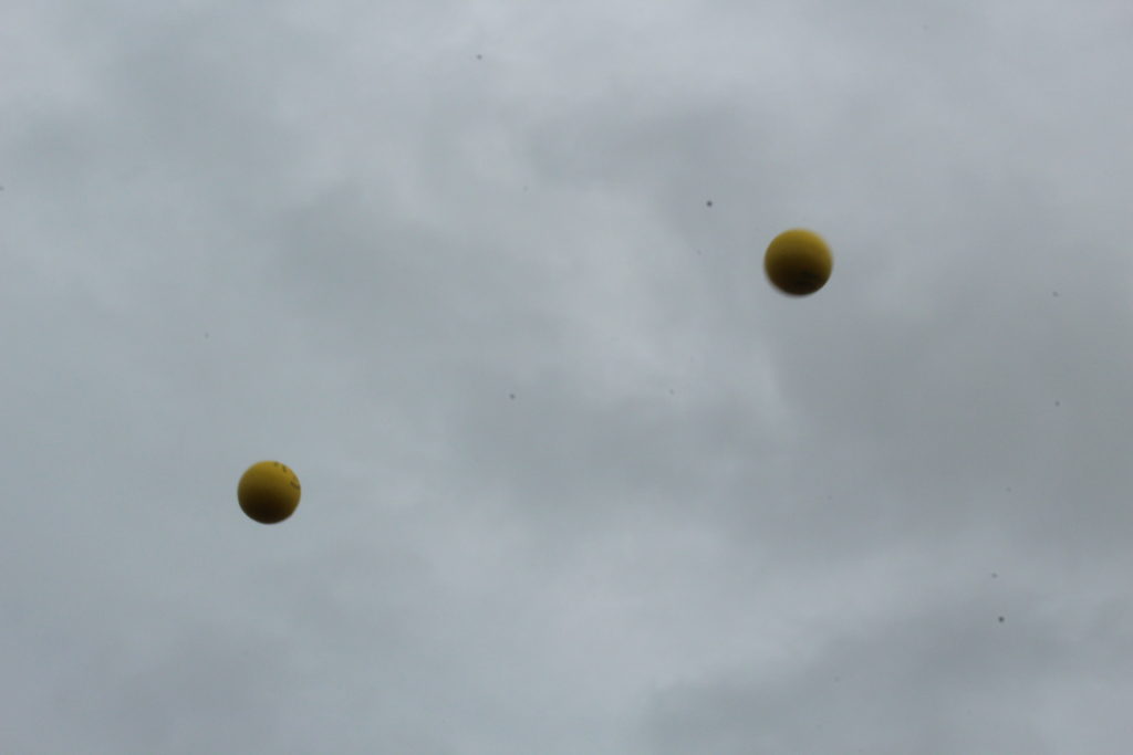
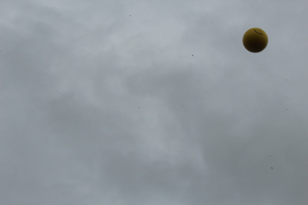
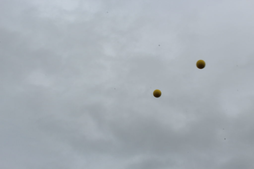
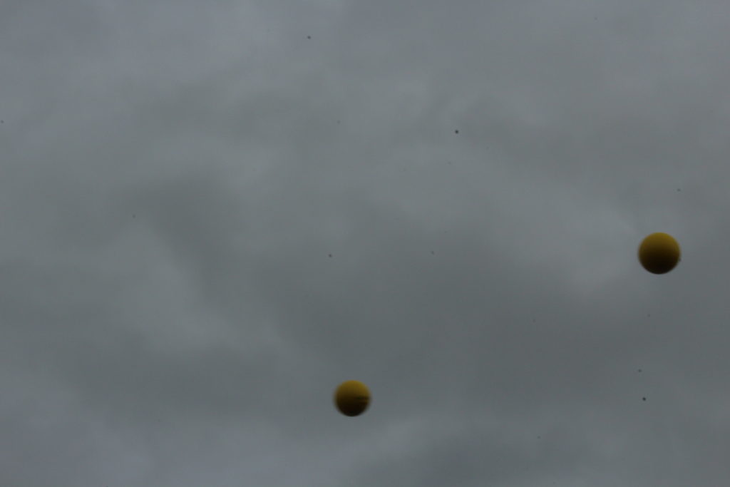
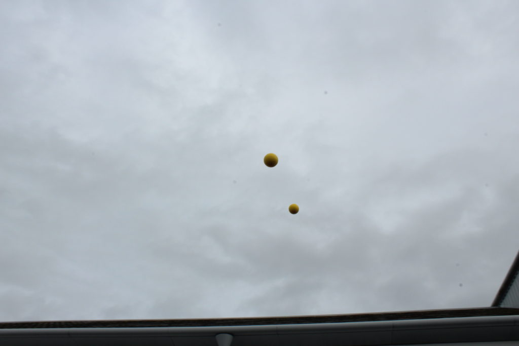
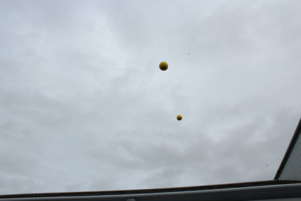
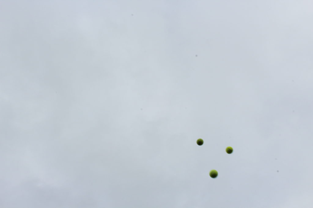
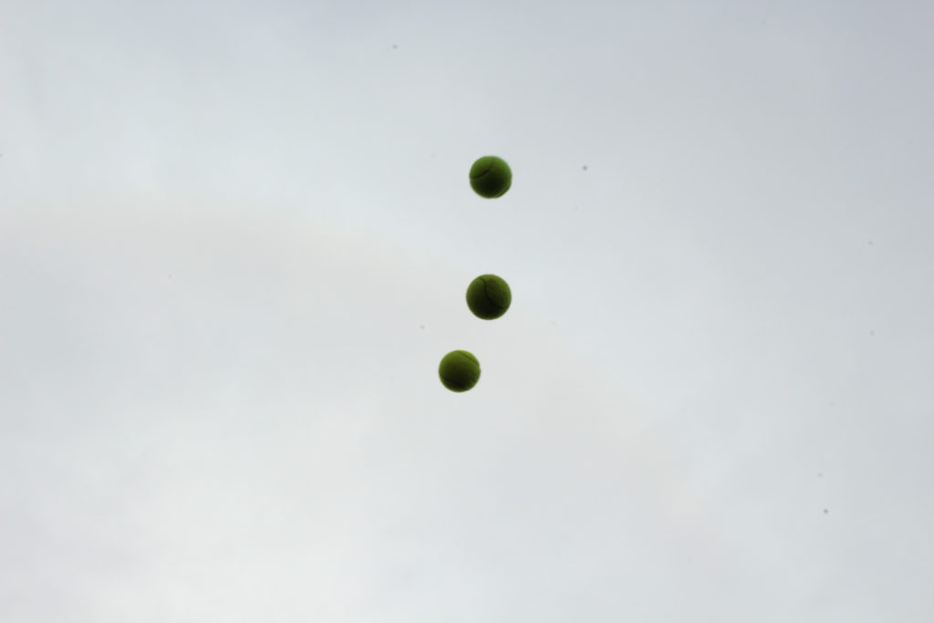
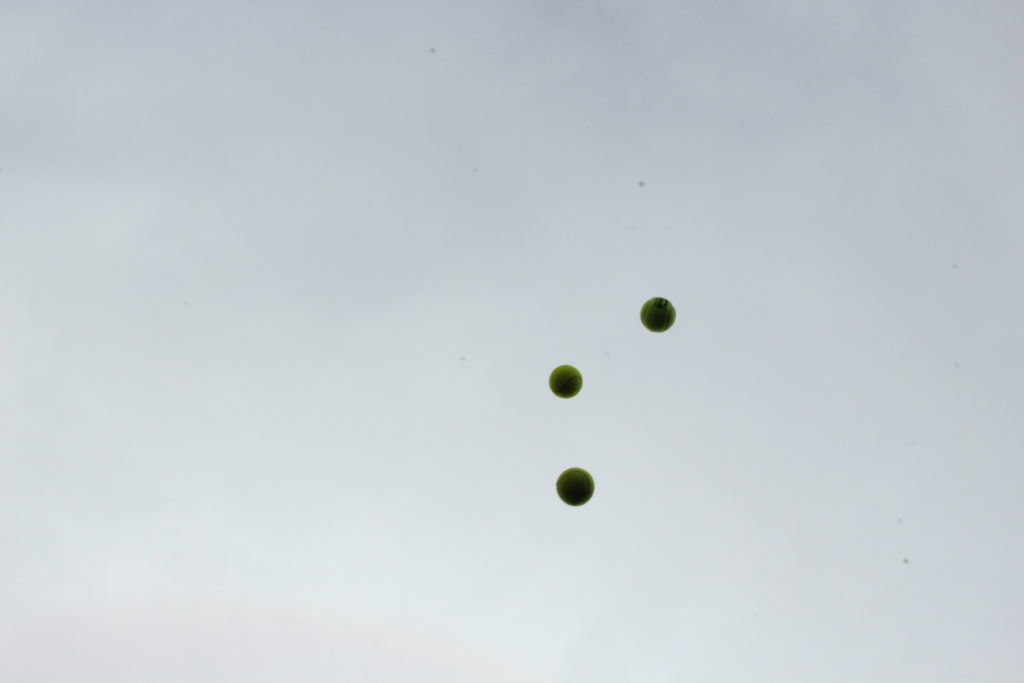
After looking over some of his work I decided to create a response to the project he worked on called Throwing Three Balls in the Air to Get a Straight Line. This project attracted me because of how bizarre and unique it was, using the formation of randomized ball positions in the air to create ‘art’. I then proceeded to make a response to this by throwing various balls in the air and attempting to capture them mid-flight, using only the backdrop as the main form of contrast in the photo. I would also experiment with shutter speed where I would try to capture other moving subjects, here were my results:

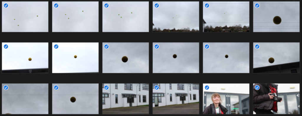

Once I had completed this task I decided to pick out the three images that I thought best reflected what I wanted to experiment with, here were the results:
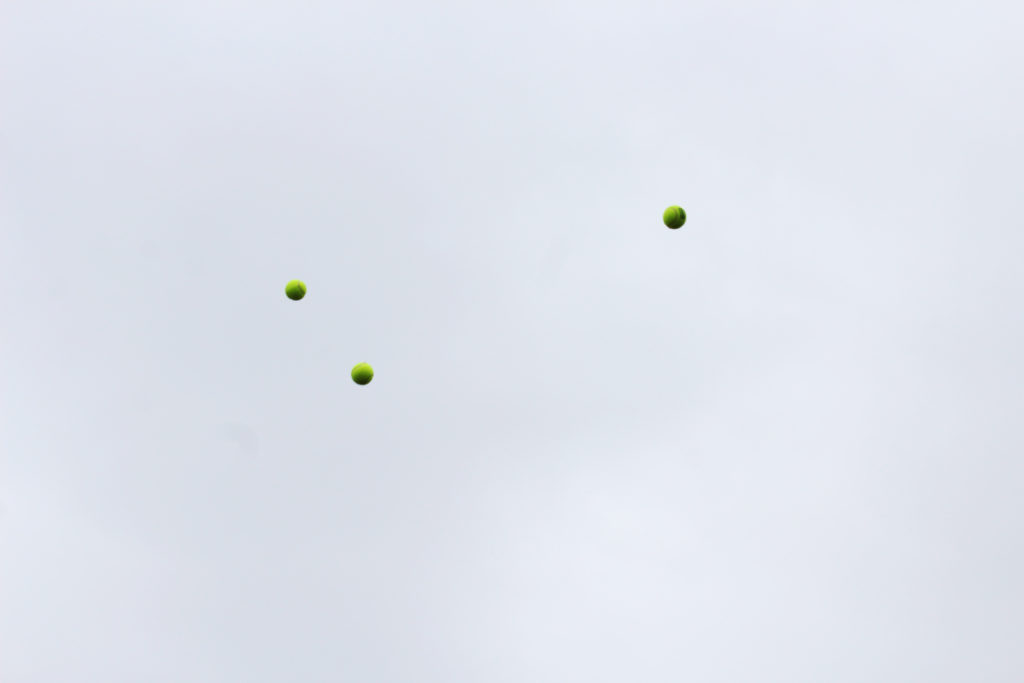
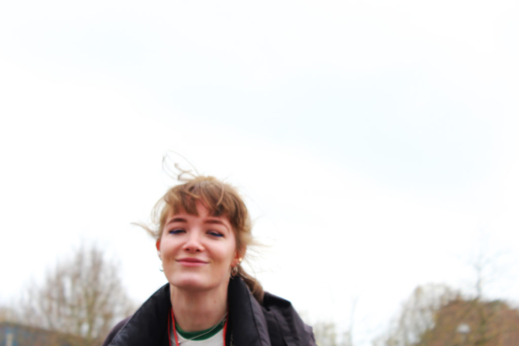
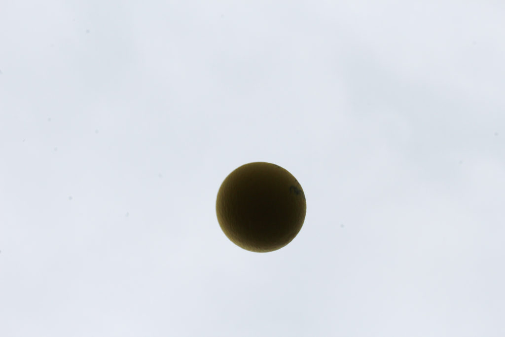
I really liked the idea of capturing a subject mid movement as it allowed for a new stance of photography I had not previously explored. In future shoots I could look at things like birds mid-flight or people and shadows, this would open up opportunities for further abstraction of the environment photographed as by incorporating moving things it could bring the image into life.
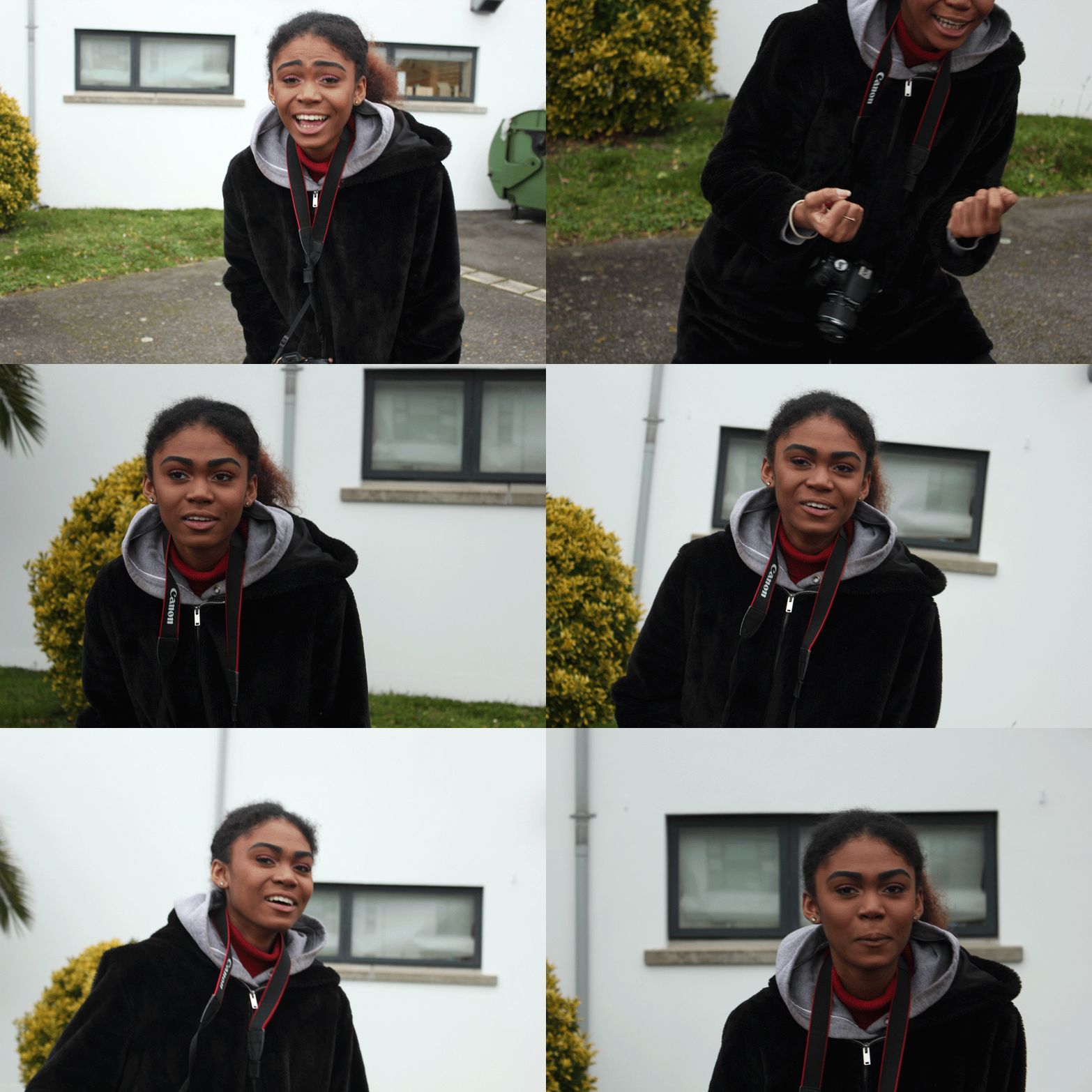
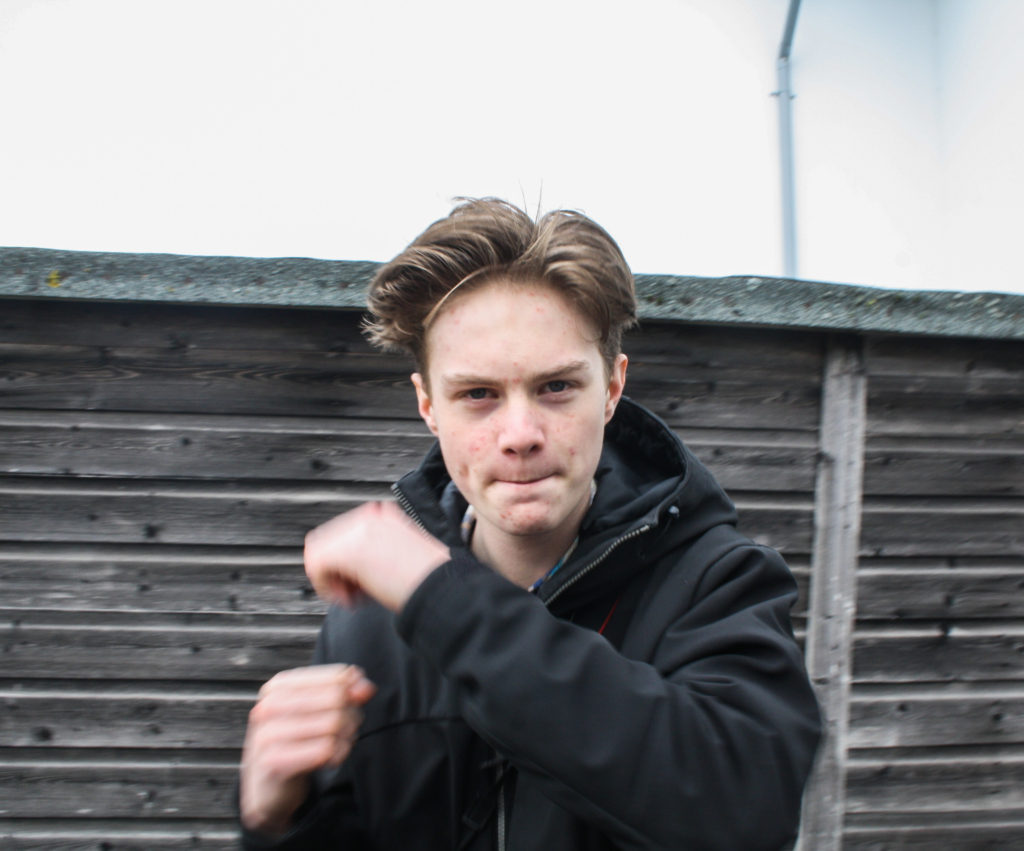
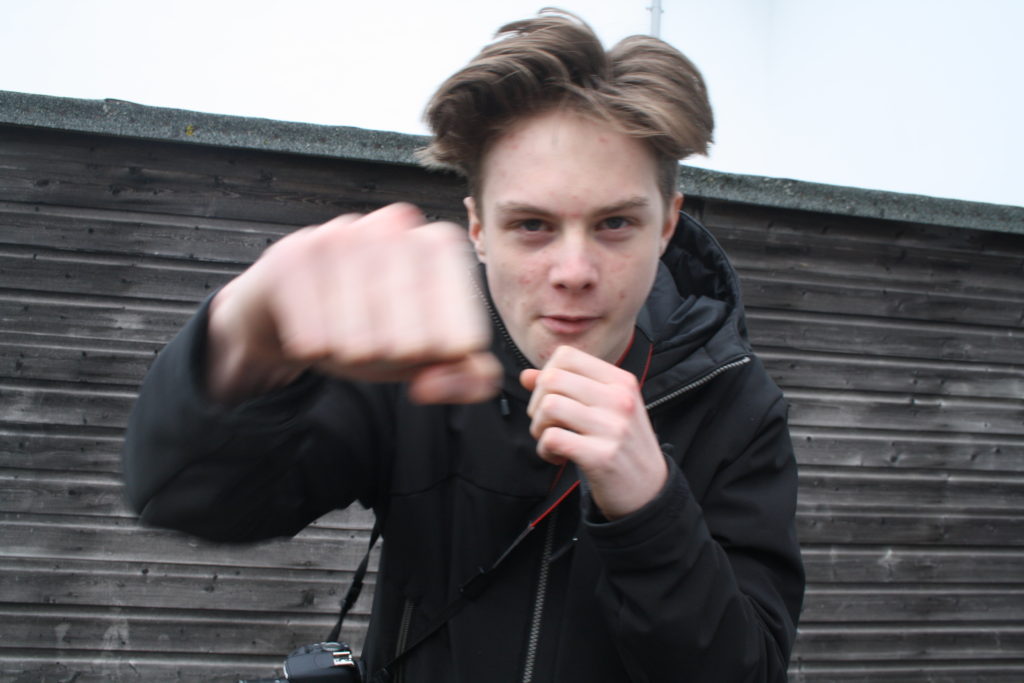
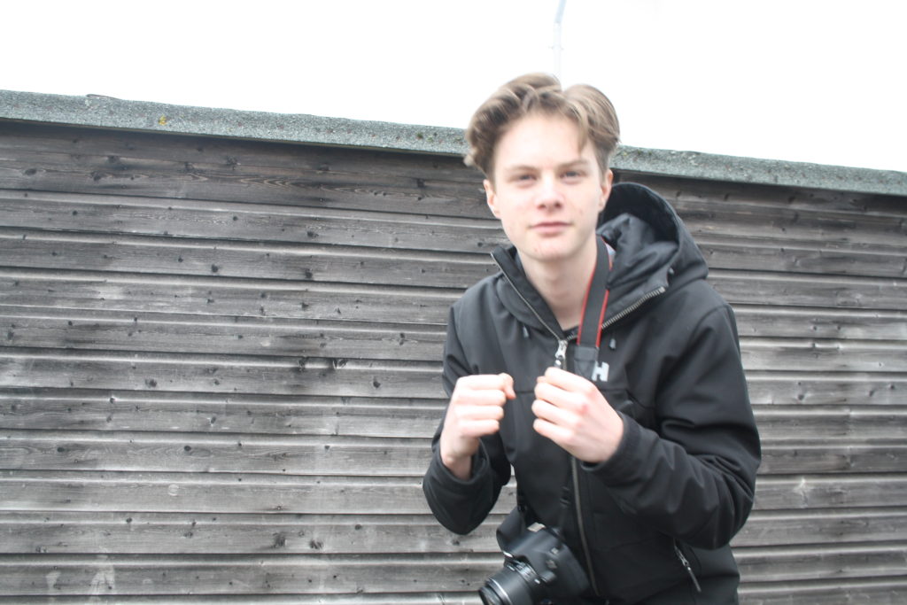
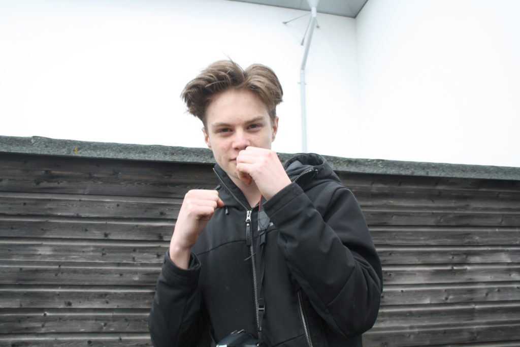
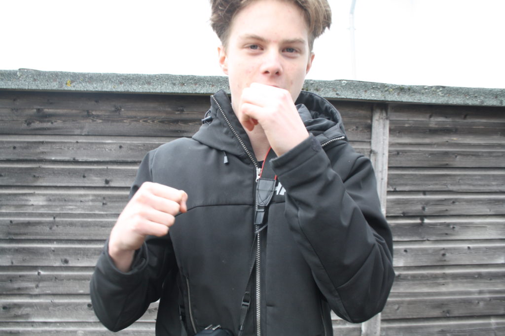
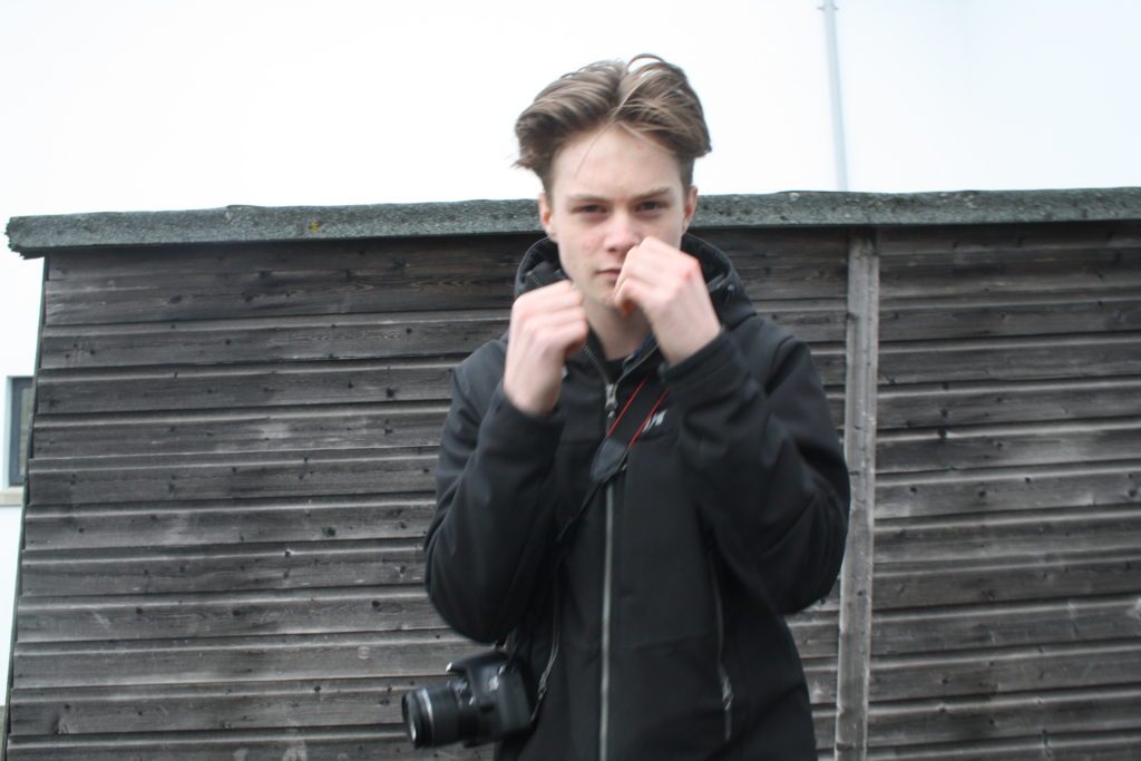
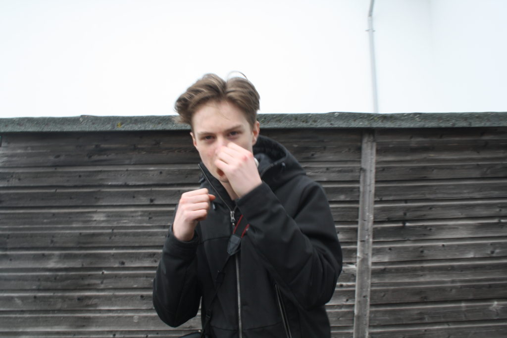
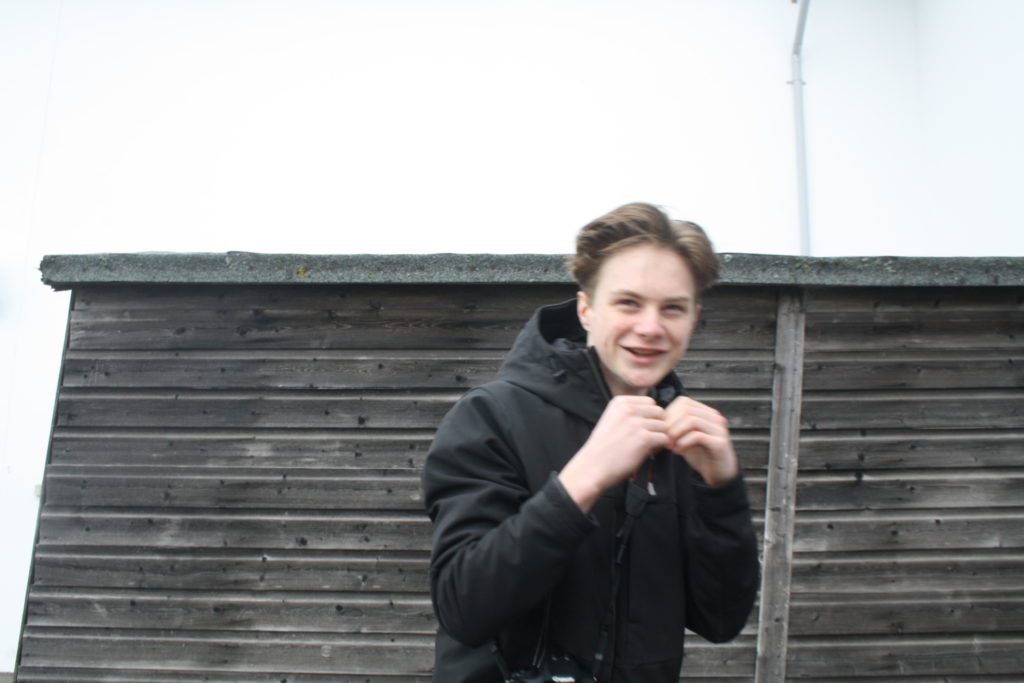
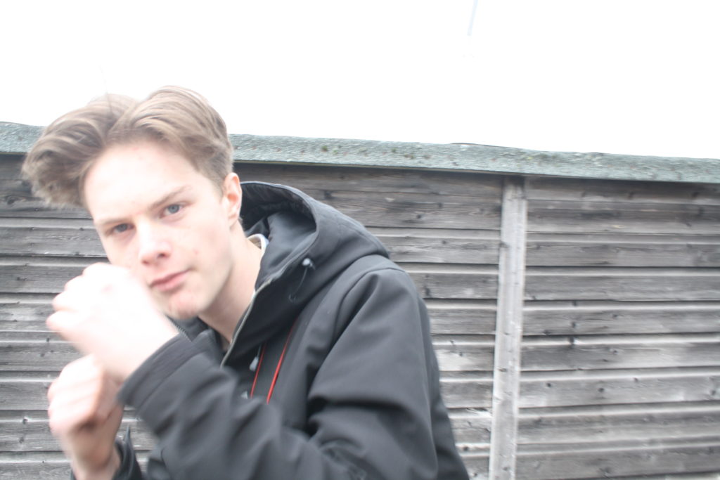
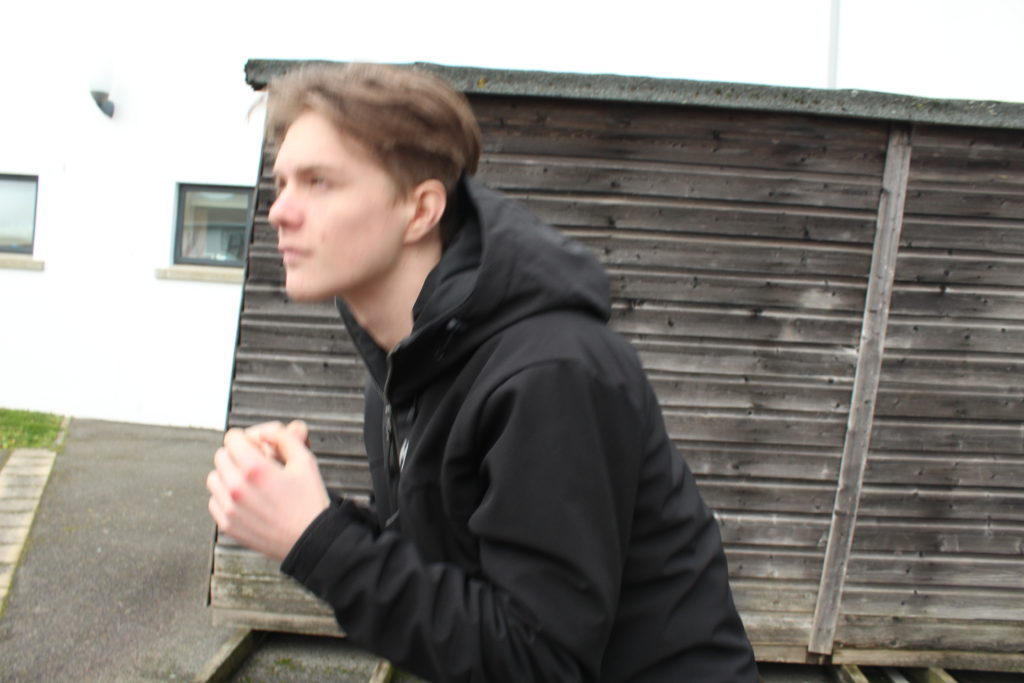
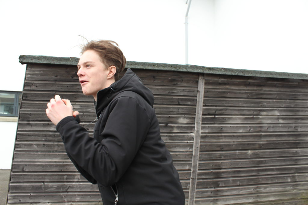
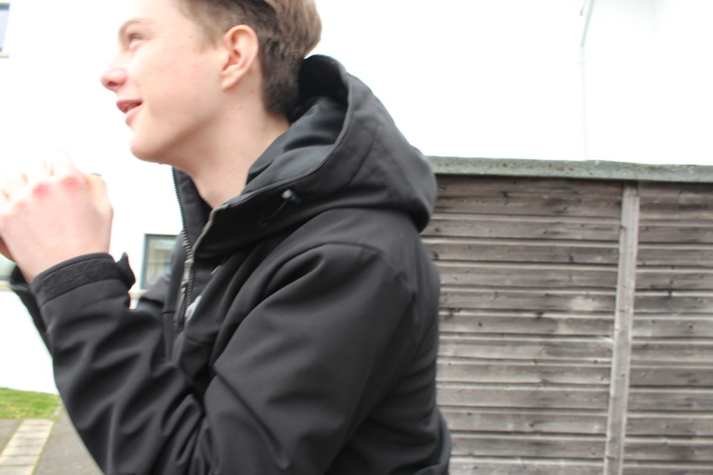
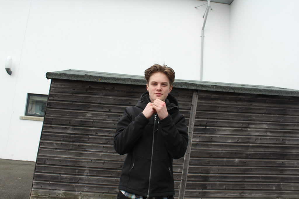
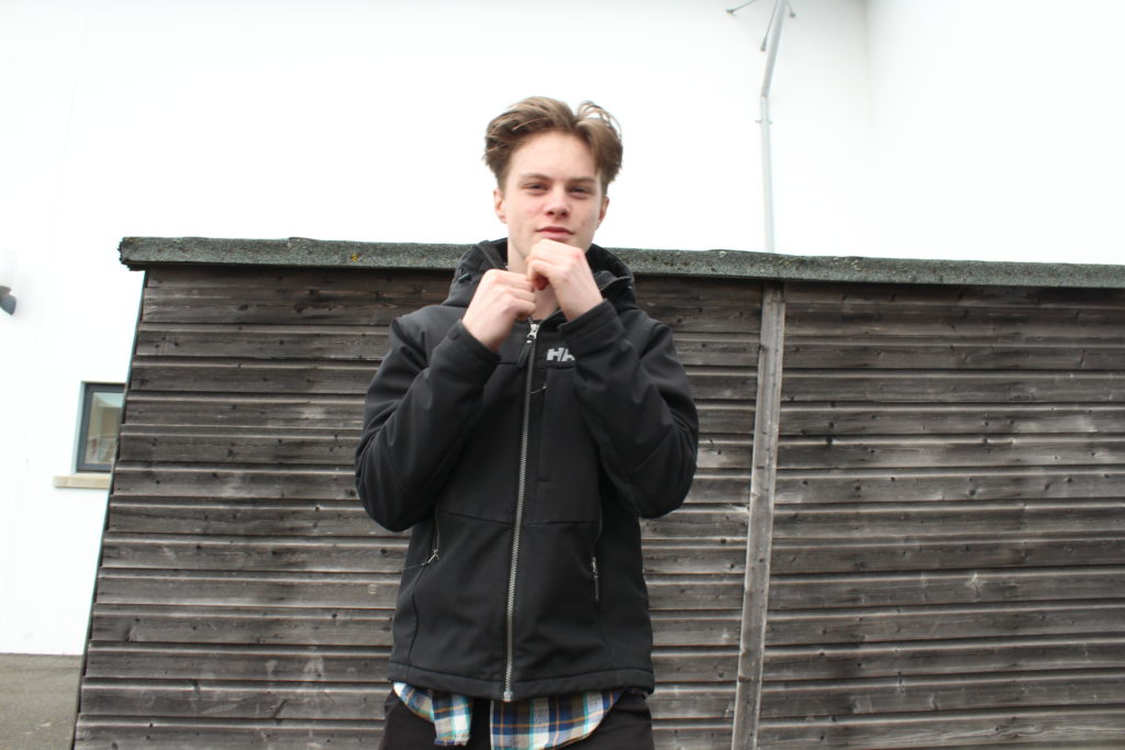
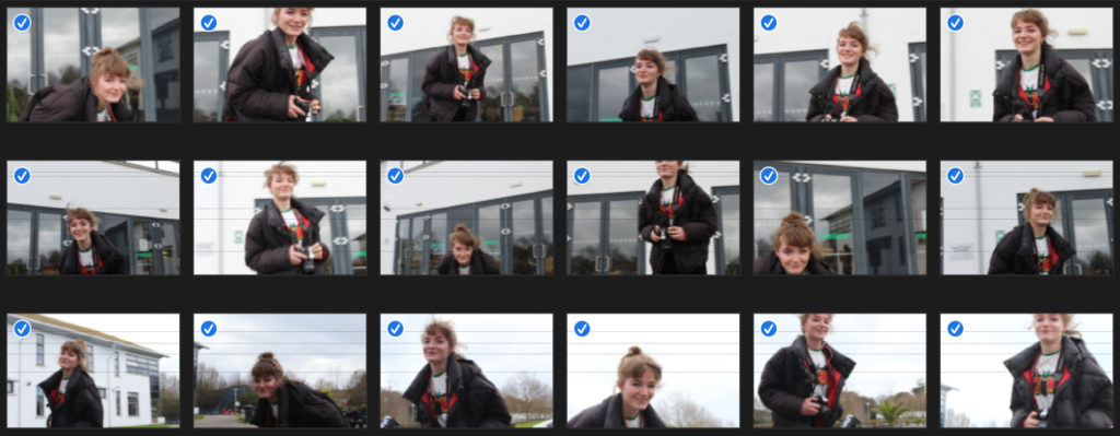
I was inspired by John Baldessari to capture images of a model moving and dodging the camera, due to his photographic art being humorous, so I experimented with something that I could create into a style similar to his. I wanted my model to appear as if she is boxing, hence why she is clenching her hands into a ball to appear as if she has boxing gloves on. On my camera, I used the setting Tv, put the white balance to cloudy (approx 6000K on my camera), and set the ISO to 1/200 for this first shoot. This made my images quite sharp and clear, due to a fast shutter speed.
For this experiment, I changed my camera settings; I kept the white balance and camera setting ‘Tv’ the same, however I lowered the ISO to 1/160. I told my model to do the same technique and movements as the last shoot, where she had to try and run around and dodge to camera. I decided to make a grid layout as I felt that this repetition of similar images is easy and interesting to look at from this sort of format.
To make this grid layout, I used photoshop. My first step was to create a square canvas. Next, I went to view, new guides and clicked horizontal 450px. I did this again but changed the px to 900px. Then I repeated this for vertical guides, where I chose 450px and then did it again with the vertical option selected and put 900px.
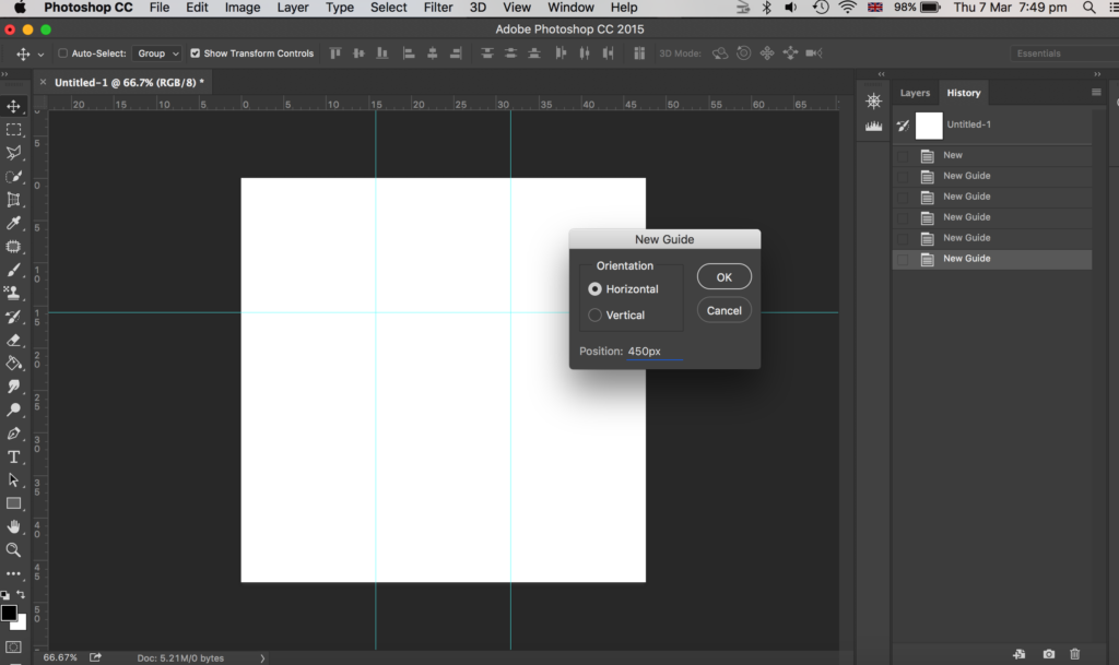
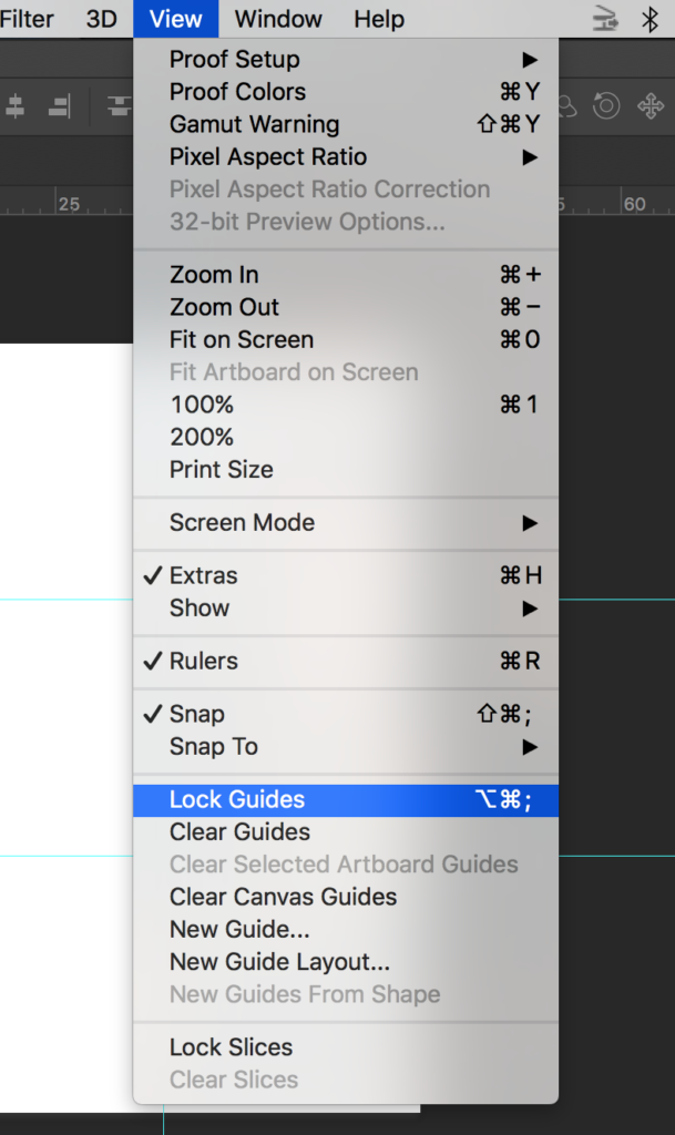
Then I went to view and chose lock guides.
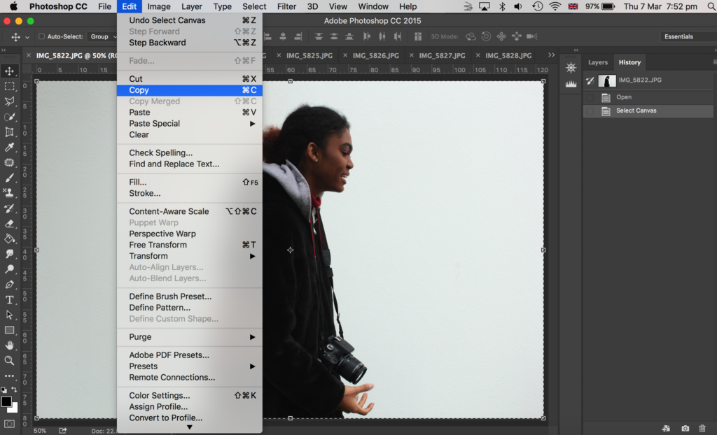
Then I opened up all my images on photoshop that I wanted to use – I chose 9 images of my model dodging the camera. I went onto each photo in photoshop and went to select, all and edit, copy.
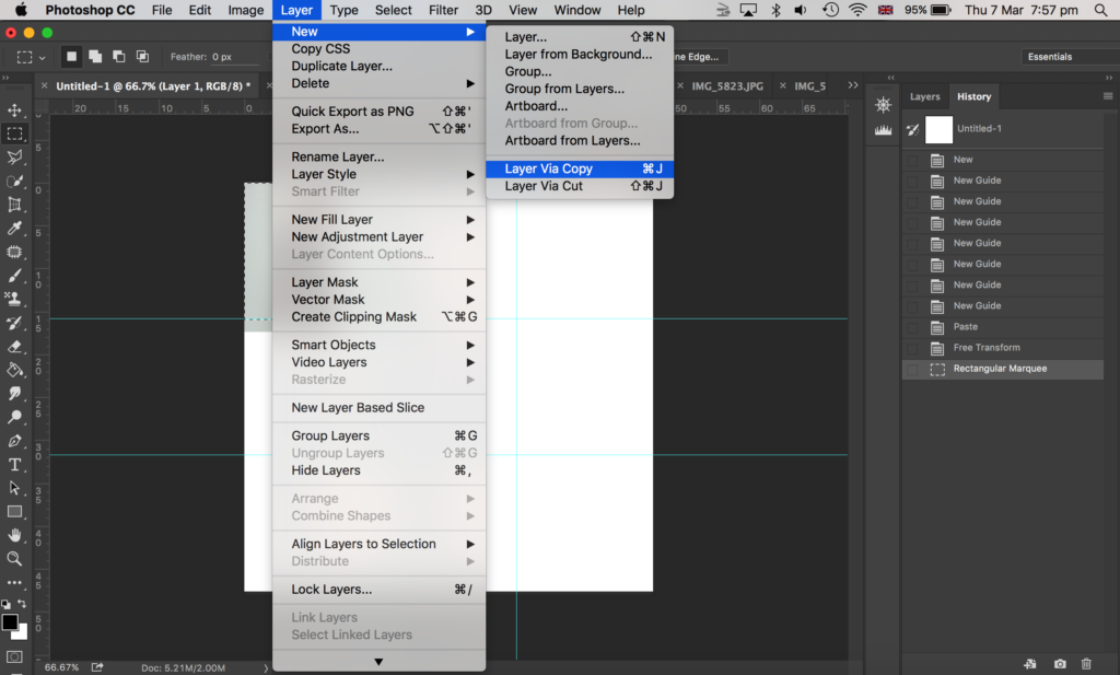
Then I went onto the canvas I made with guides and went to edit, paste. To make my image smaller to fit on the canvas I went to edit, free transform where I could then adjust my image size. I placed it within one of the squares the guides had made. I then got the rectangular marquee tool and made a selection of what part of the image I wanted to get rid of; I wanted the image to be square, with a white border in between the image and the guidelines. Then I went to layer, layer via copy.
After that, I went onto the layers panel to the right side of the image shown above, and deleted the original layer of that image (before I cropped it) so that I was left with a cropped version of that photo which I made as a square shape.
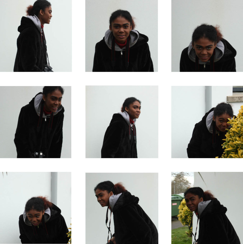
Here is my final outcome as shown above.
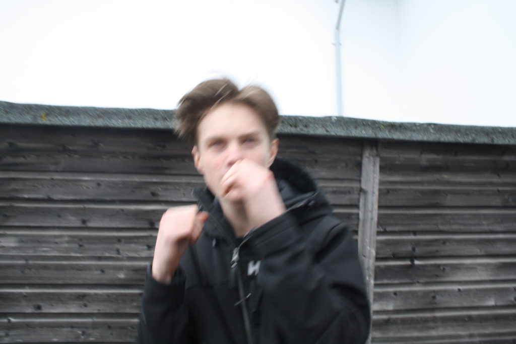
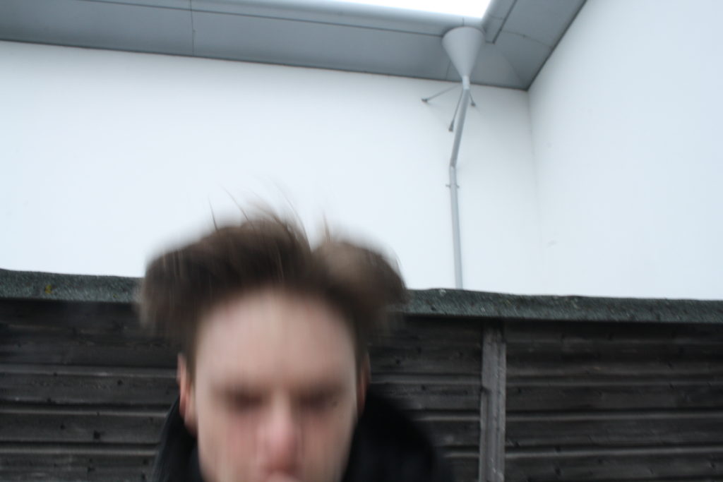
I did the same game of play, where the model had to run round and dodge the camera and make actions as if she was boxing, yet I wanted to experiment with the ISO again. So, for this experiment, I lowered the ISO to 1/100. This made the images blurrier due to a slower shutter speed.
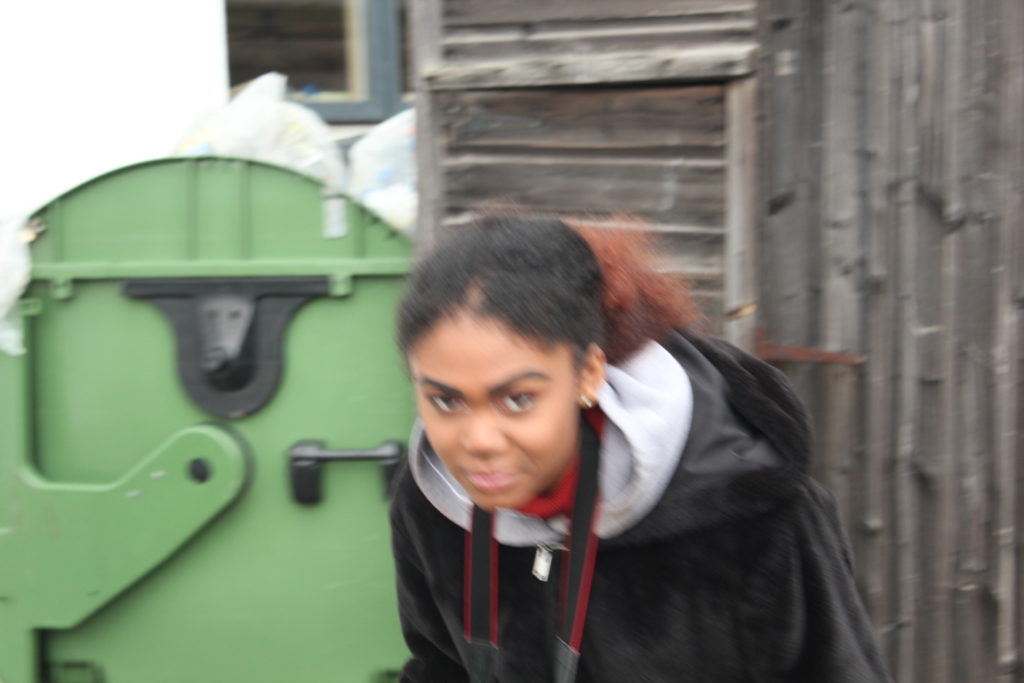
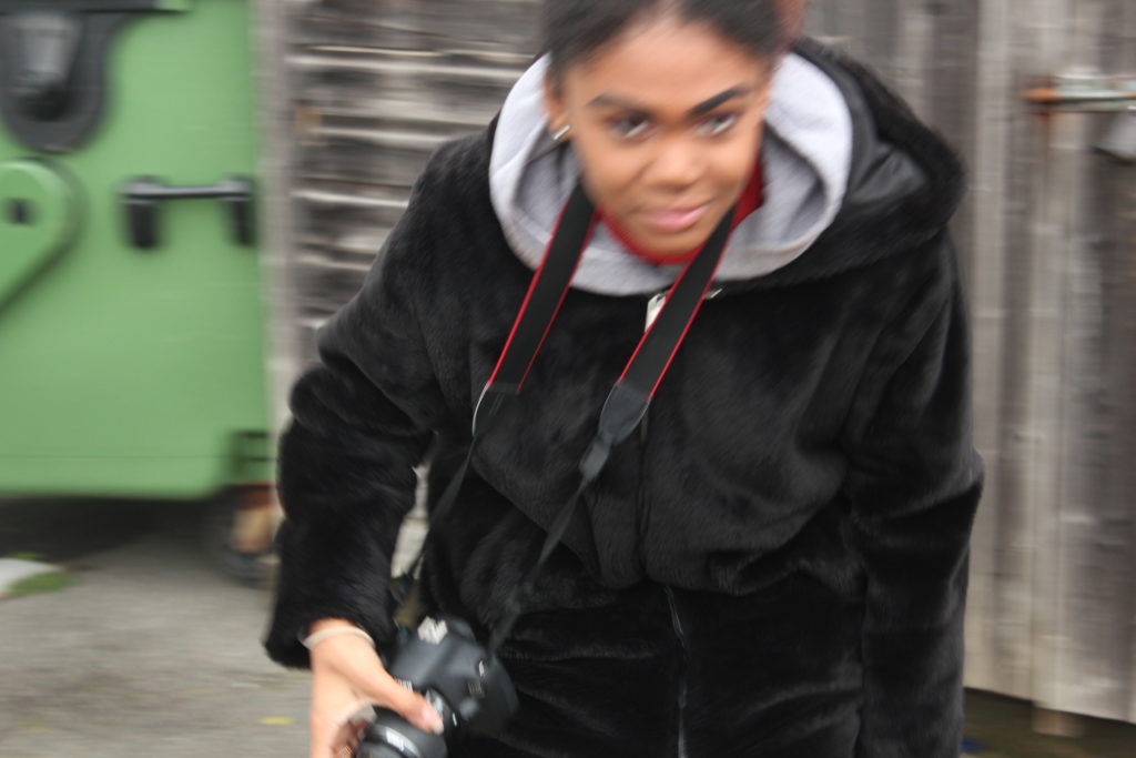
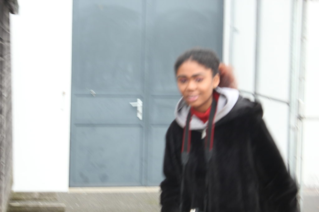
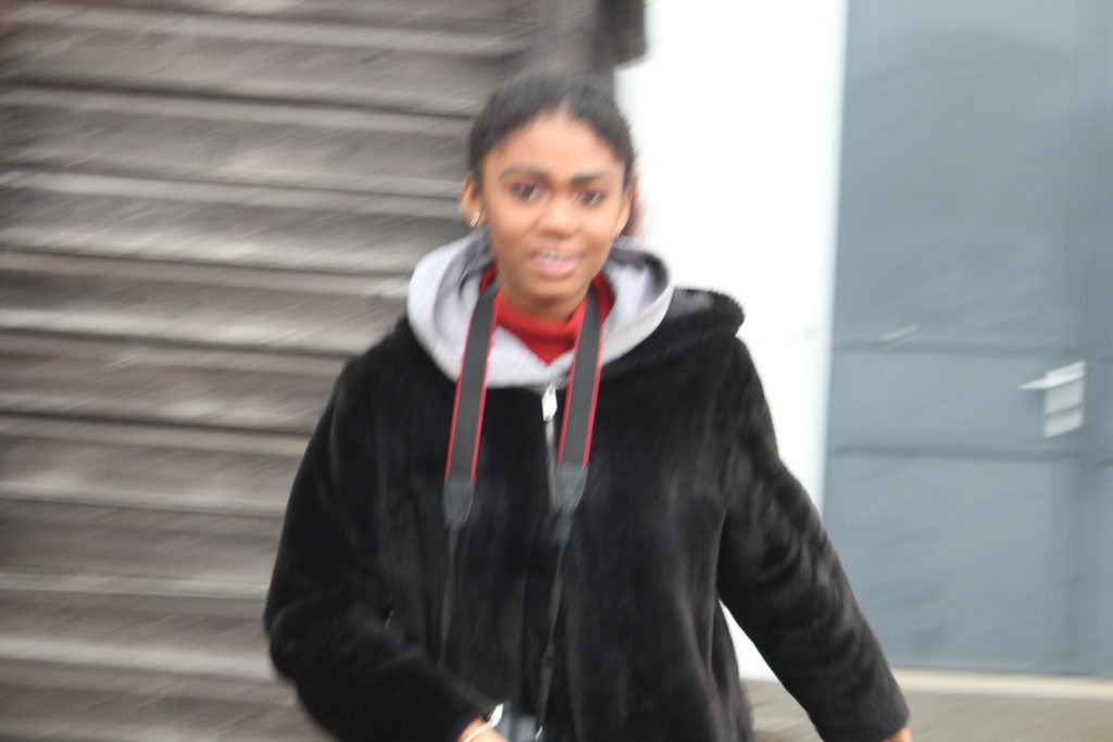
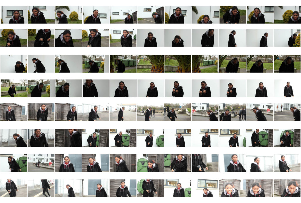
Overall contact sheet of my first ‘play’ shoot:


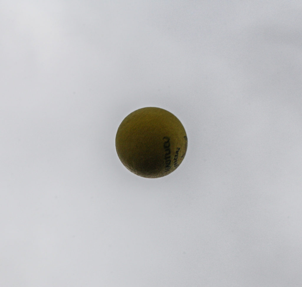
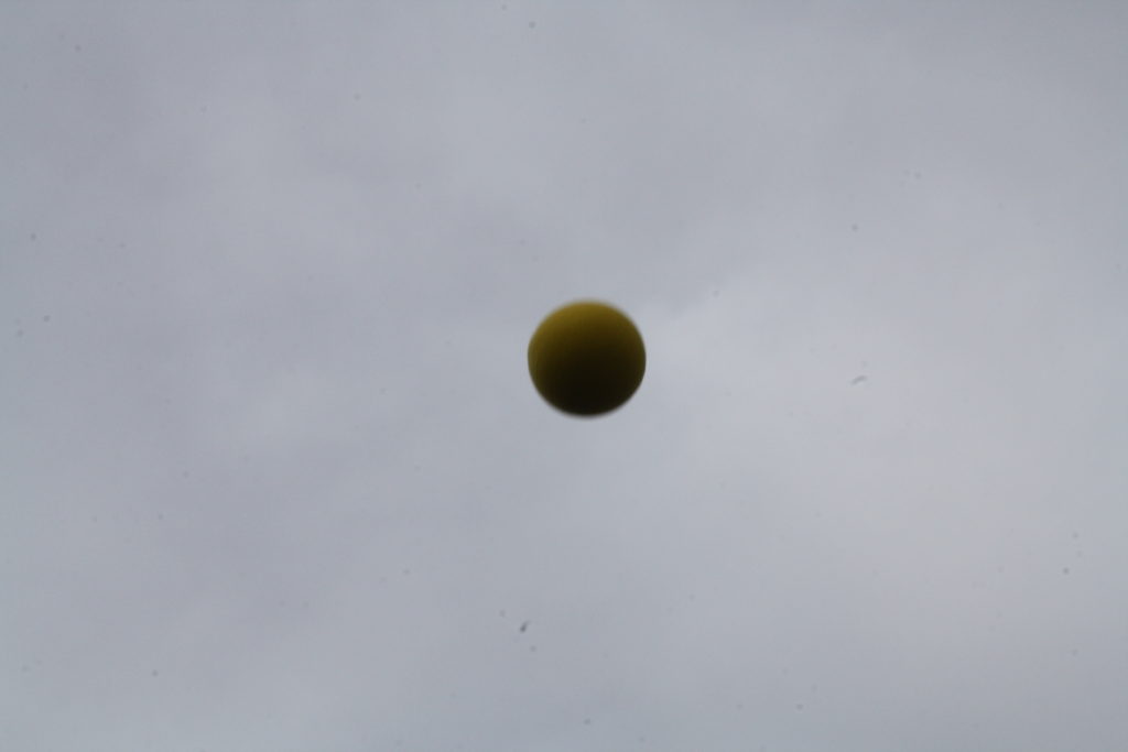
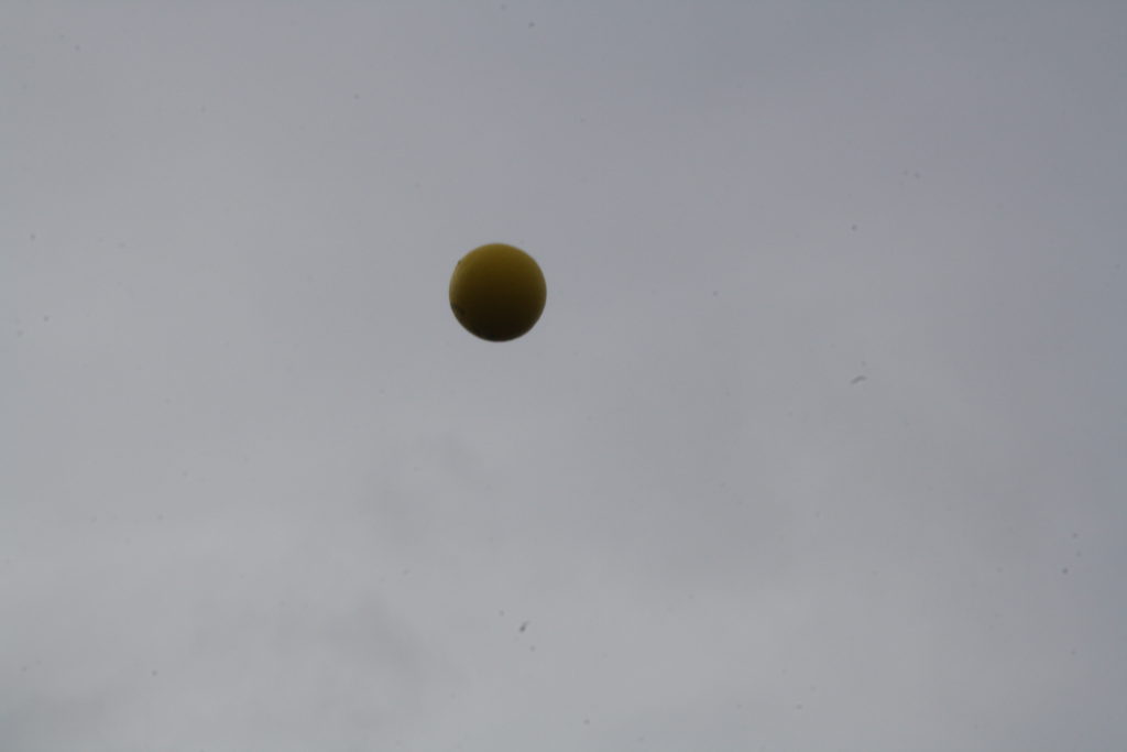
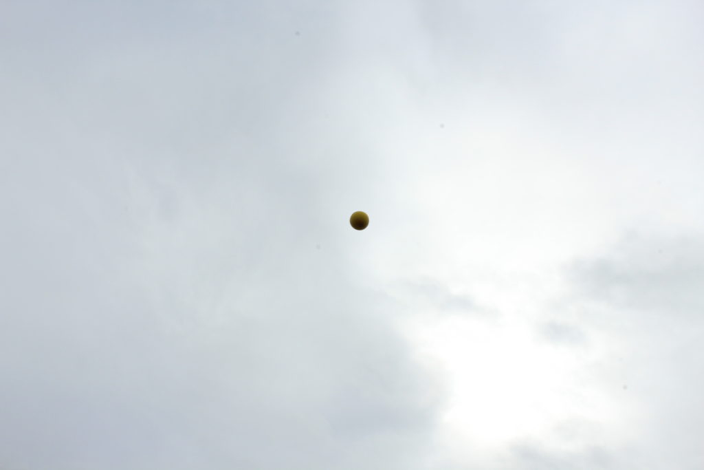
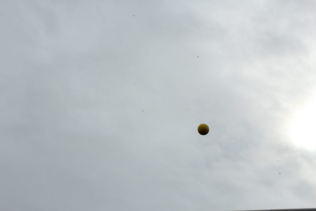
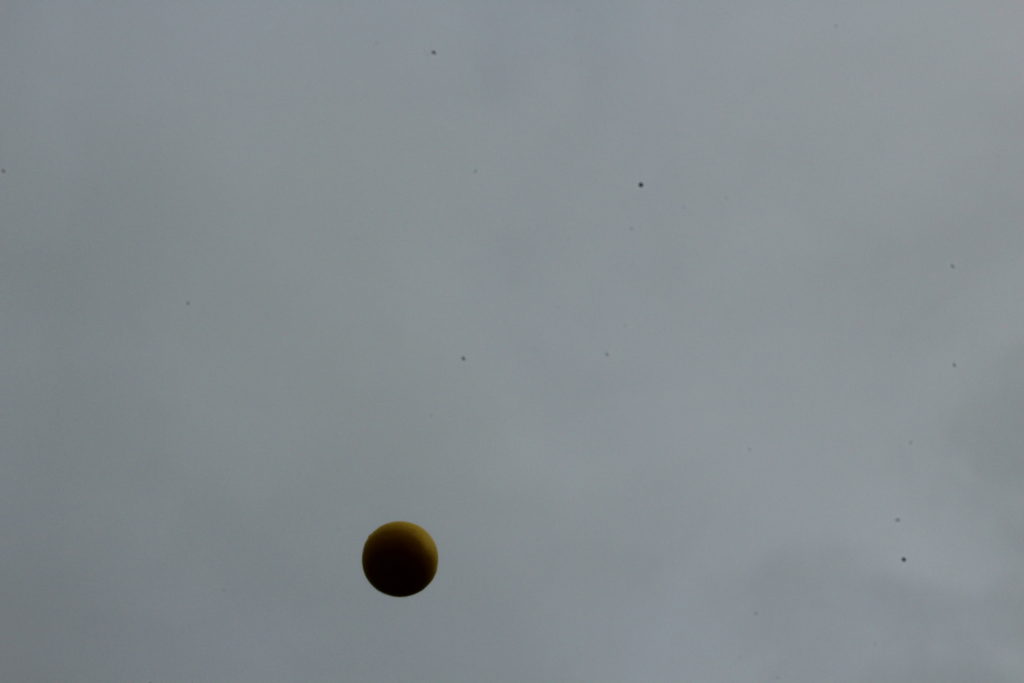
For this experiment, I got my model to throw up one yellow ball in the air. This was an idea inspired by Baldessari, again, as he throw oranges up into a clear sky in California. However, because the sky was cloudy and grey (unlike Baldessari’s blue sky,) I chose a yellow ball to throw into the air as I felt this would be a clearer colour to see in the dark, gloomy sky. I experimented with the ISO; the first image is with an ISO of 1/200, which made my image appear lighter. The other 2 images are where I experimented with a lower ISO so they appeared darker.
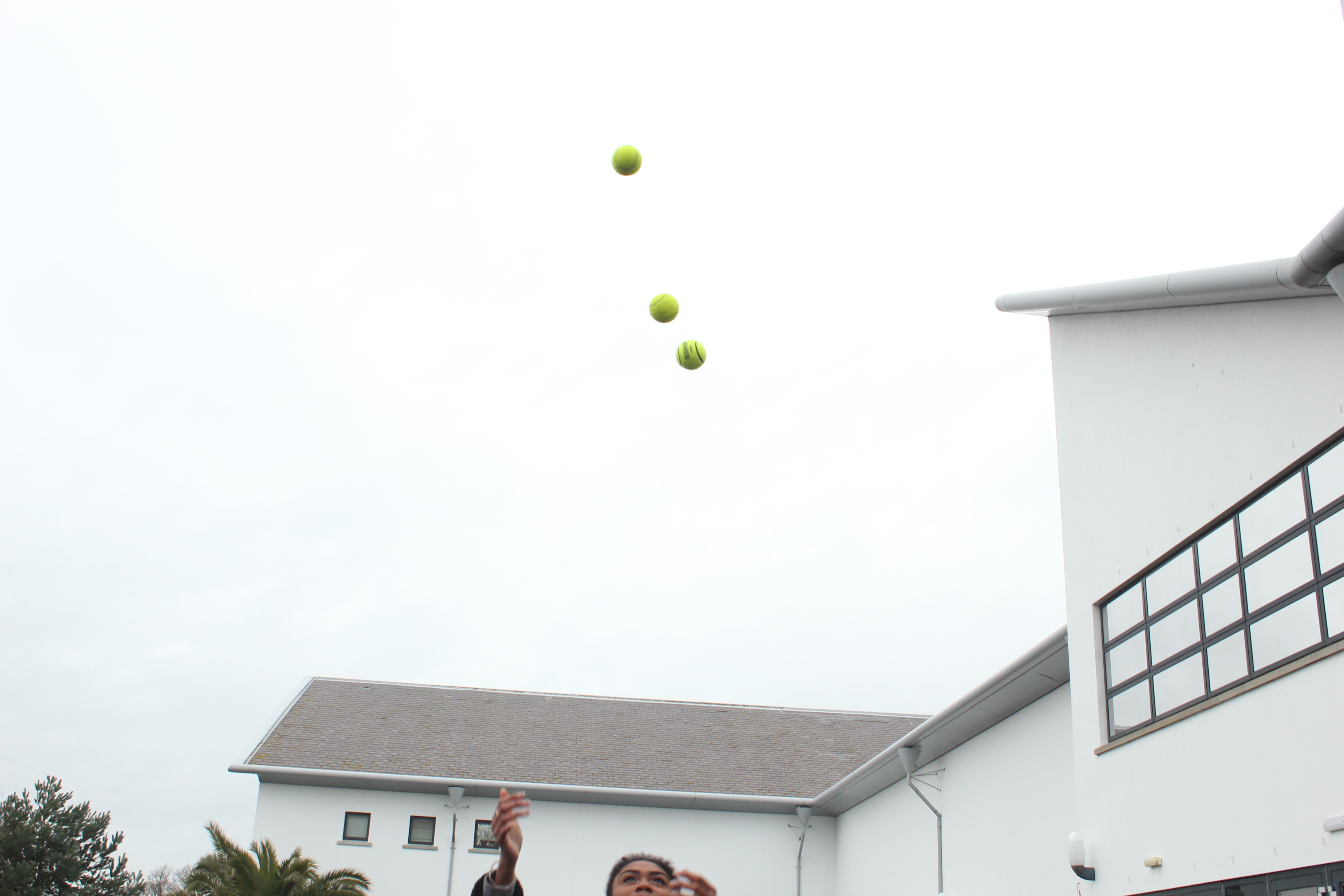
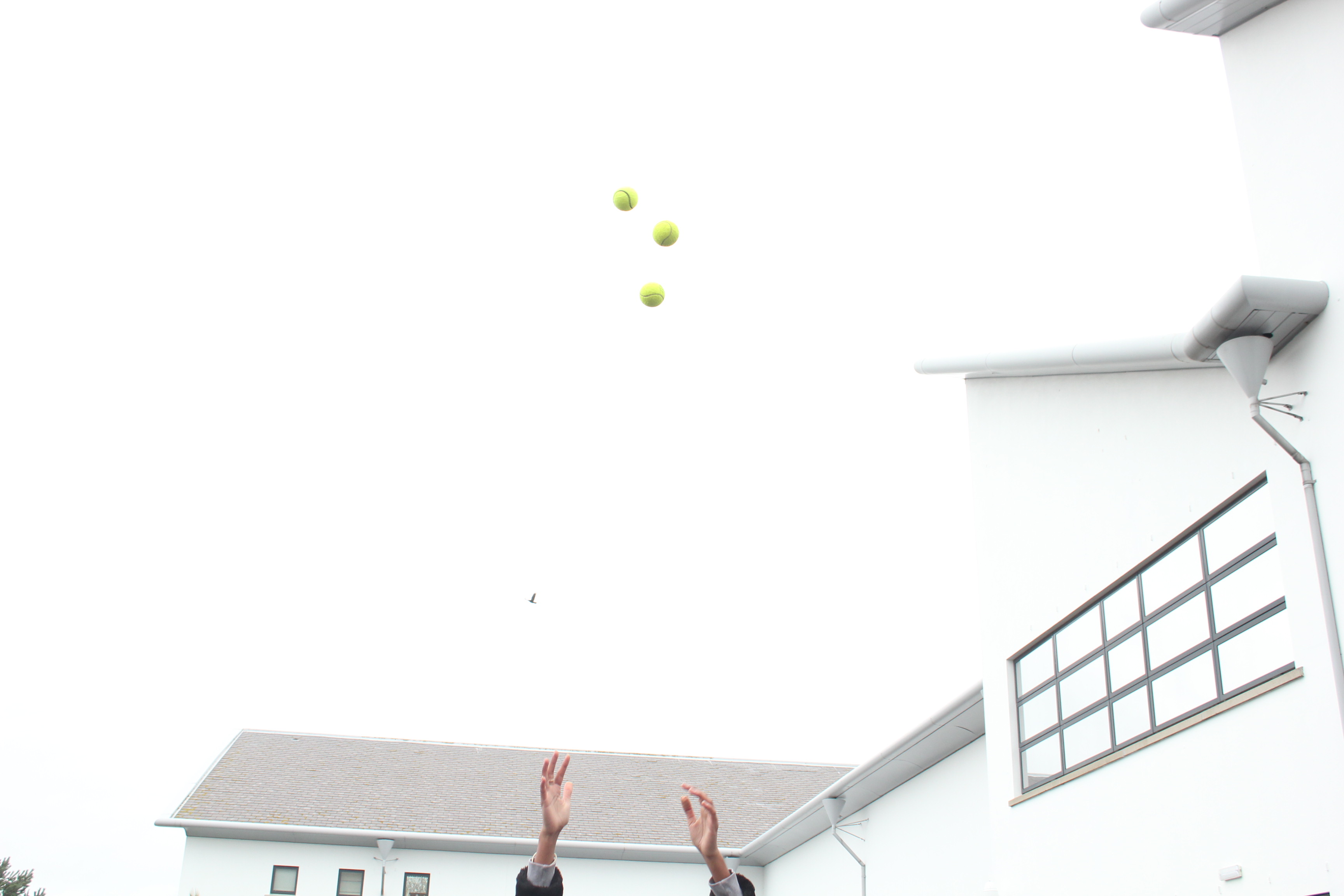
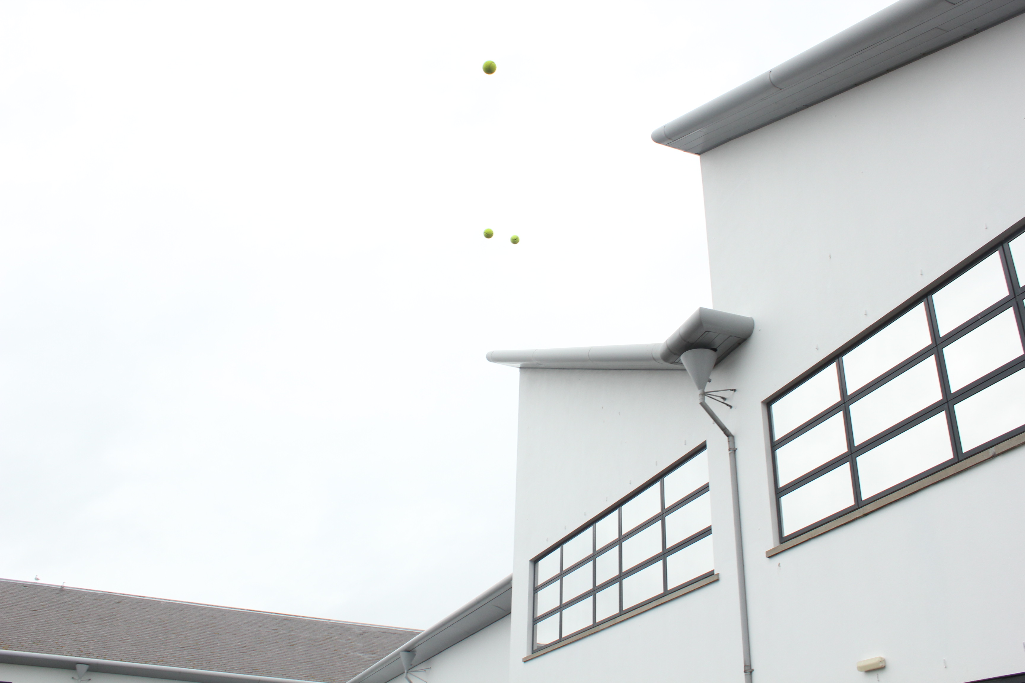
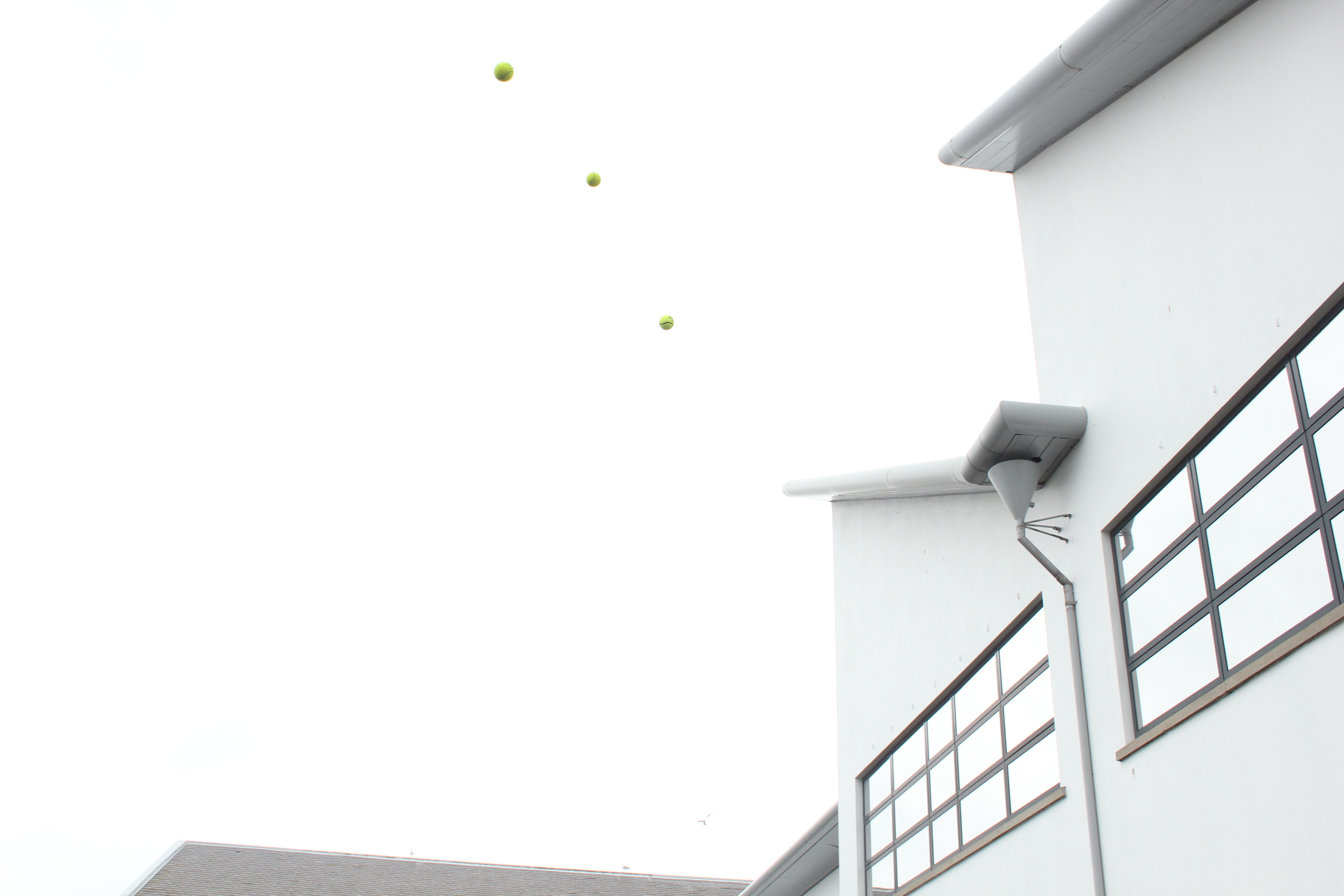
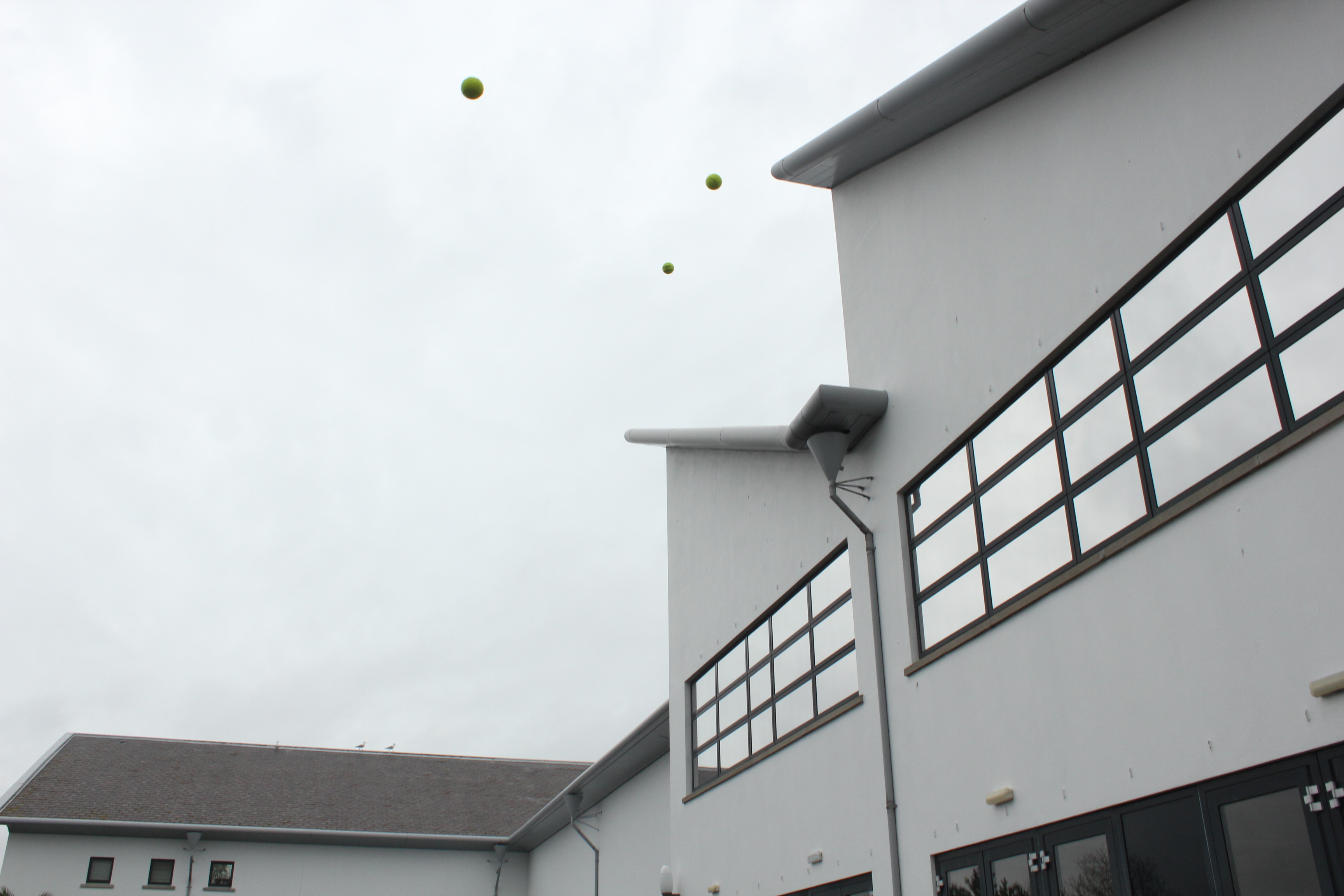
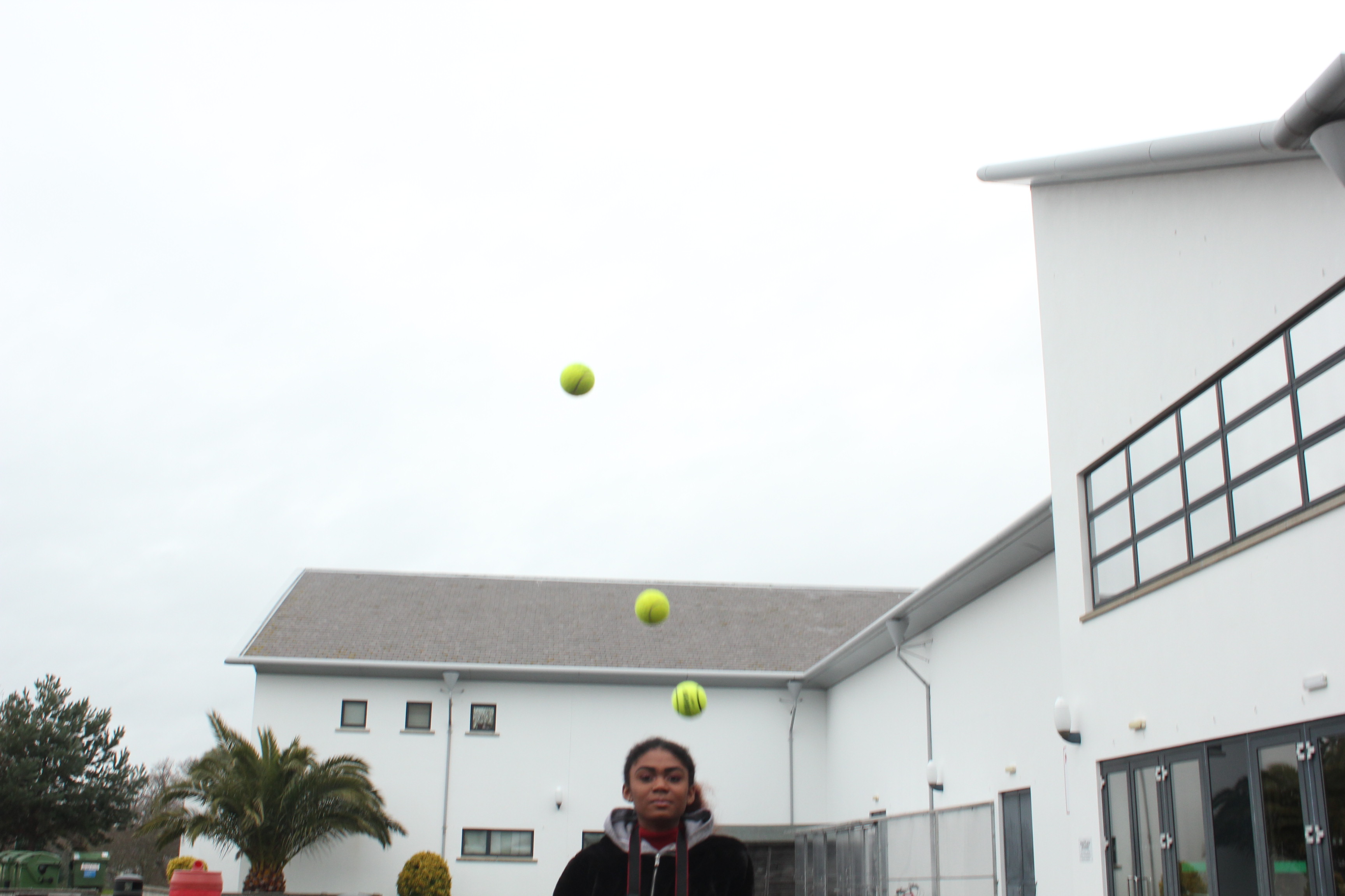
With this experiment, I then used 3 yellow balls and got my model to throw them up into the air, again, like Baldessari’s work of throwing oranges into the sky. To achieve a similar image to his, I got my model to throw all 3 balls at the same time, so that it created a line of the 3 balls.
