Favourite edited images
Category Archives: Experimenting
Filters
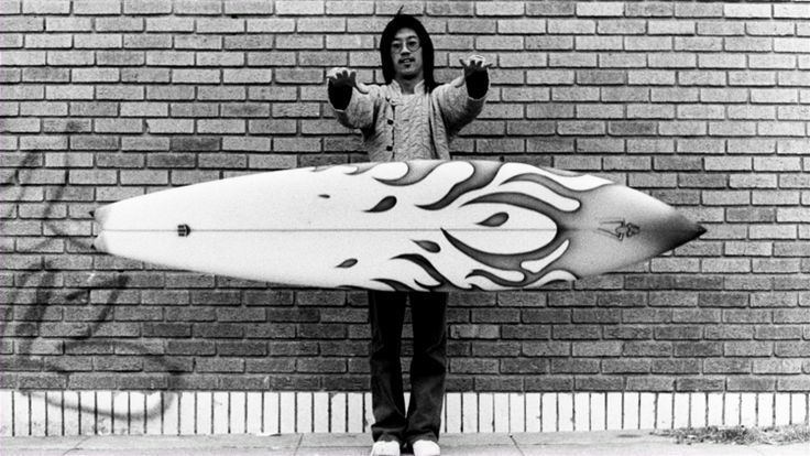
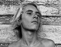
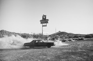
Craig Stecyk -photoshoot
Images to replicate
Edited Images
Noirmont Photoshoot
My photoshoot at Noirmont consisted of ground based photography as well as from the air with the Phantom. Below is the contact sheet for all images collected on the day, both land and air. All of the unusable or poor shots had already been removed prior to this screenshot as part of the first stage of selection.
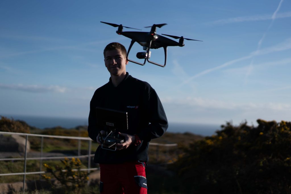
Flying the drone on the shoot
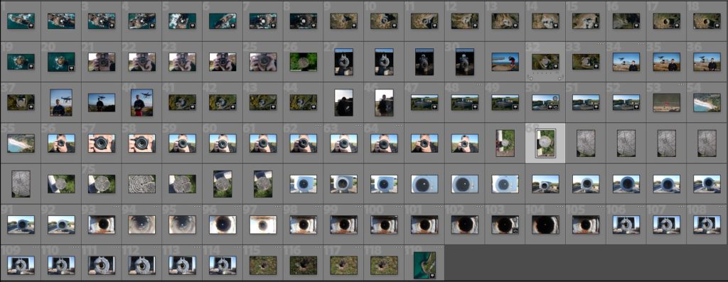
I now plan to edit the images and produce a set of land based and air based final outcomes from this shoot. Focusing on circles in different environments and angles.
Photoshoot 6- Photograms
Photoshoot Plan
For this shoot I plan to experiment by creating images, like Anna Atkins, by using light sensitive paper and placing natural objects on top to create a print. I wanted to take inspiration from Anna Atkins as I think her images have a spiritual quality to them and I think by producing similar image, it will give my project a different type of photos, other than the landscape images, that will take my project further. I plan to see the outcomes of this experimentation and decide if i want to use them in my final outcome. If the outcomes aren’t as effective as I thought they would be, I plan to produce similar looking images from natural objects by editing, that have the same appearance of Anna Atkins images. I also think these images will reflect the work of Susan Derges as she also used light sensitive paper to create her images of the natural aspect water. I plan to take inspiration from both these photographer in my photoshoot.
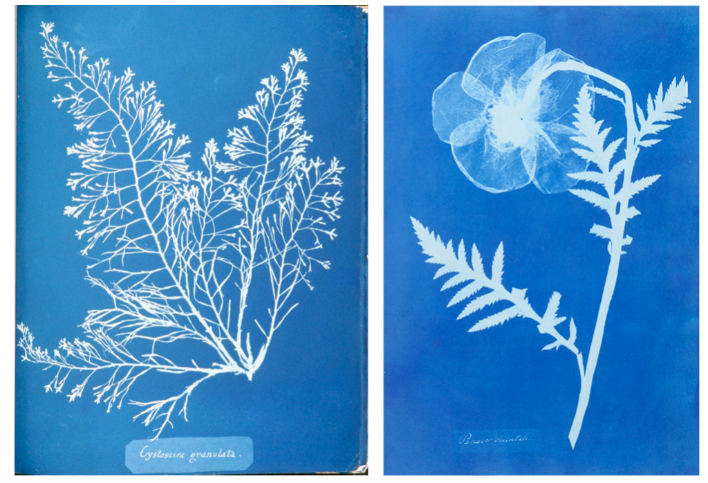
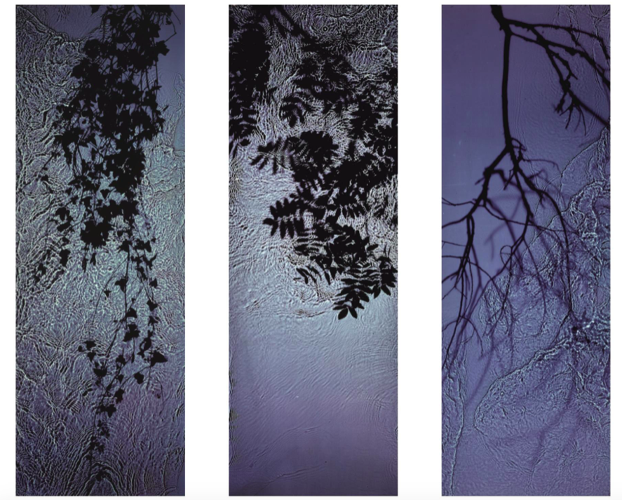
Light Sensitive Paper Experimentation
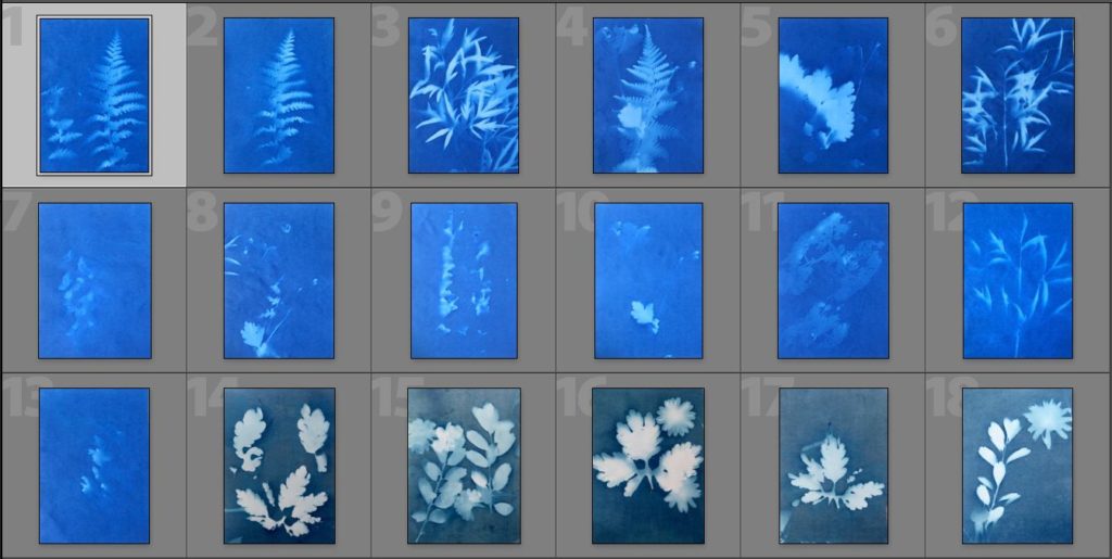
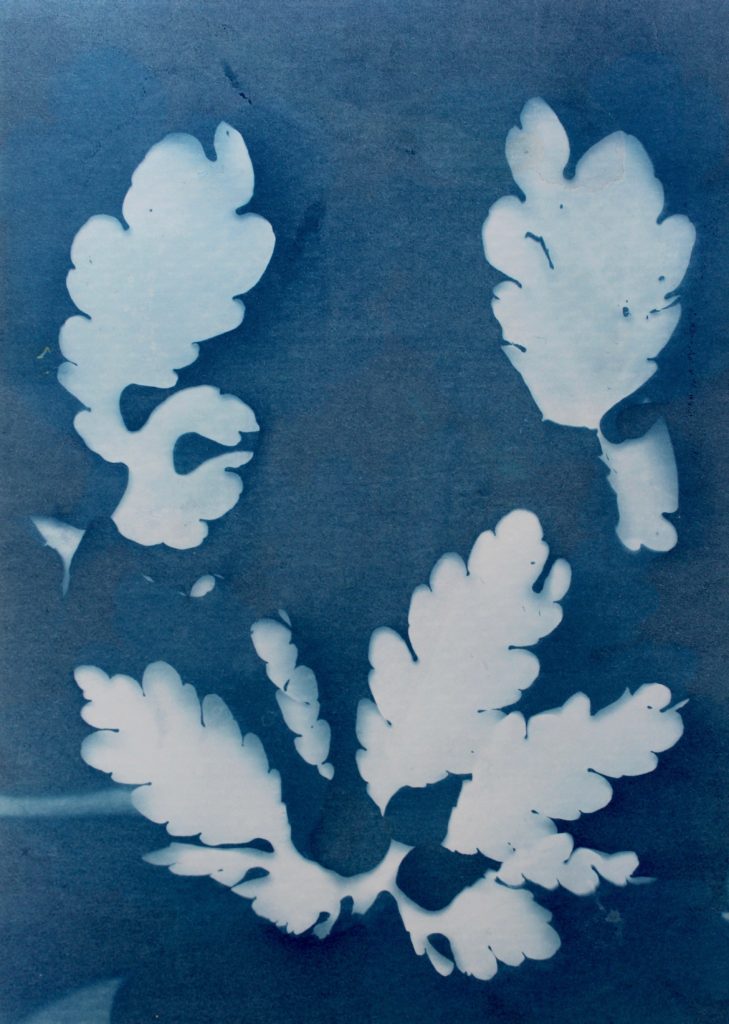
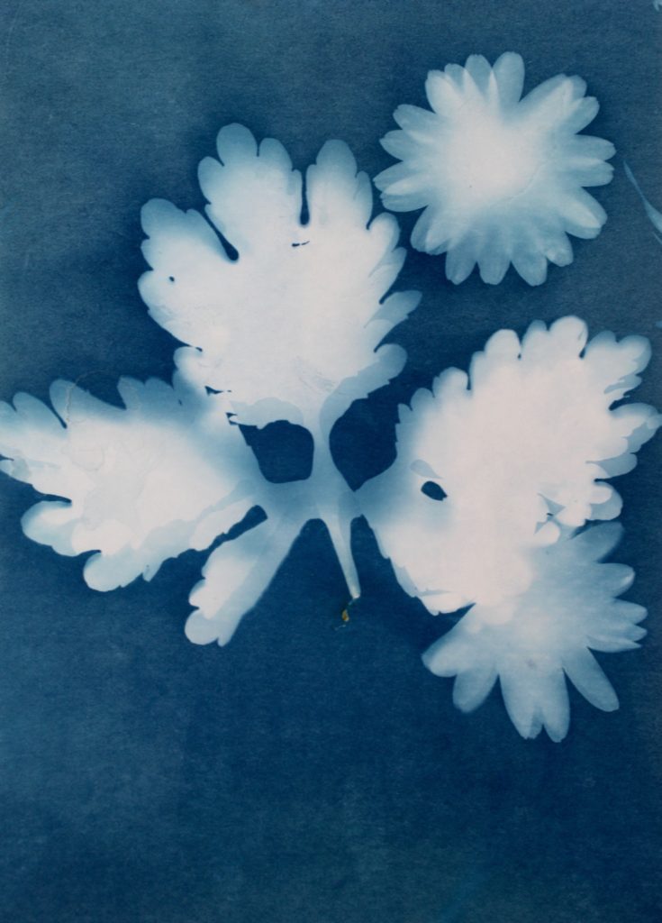
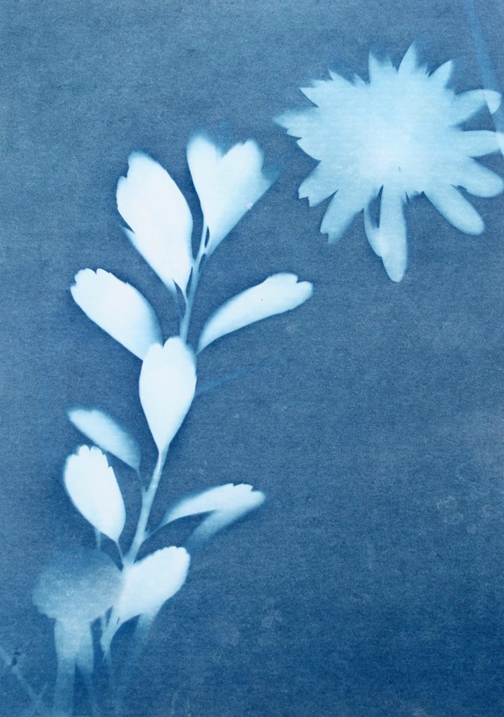
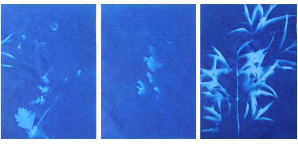
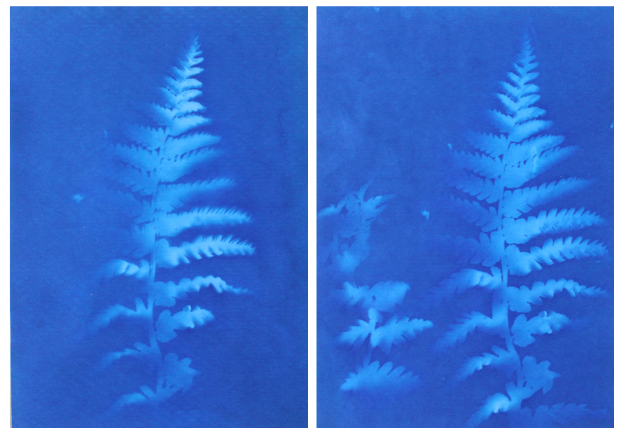
I think that these three photograms were the most effective in this shoot as they are the most clear and defined compared to others. I think this is specifically in the first image were I think that the shadows that were created by the plant on the paper were printed, making the outsides of objects on the paper darker, emphasising the brightness against the dark background. I like this as it makes the objects seem more 3D like they are coming out of the page. Other images in this shoot didn’t have this but were still effective. I also like how the specific rounded shapes of the leaves are precisely shown and noticeable against the blue background because i left it out in the sun for a long period so that the light sensitive paper had a long time to to change colour. I experimented in this shoot by leaving light sensitive paper out in the sun for different amounts of time and found that when I didn’t leave them for long, the outline of the object on the paper wasn’t as noticeable and as emphasised against the blue background. I think that both of these effects are successful as the blurred create a different look in comparison to the precise ones where I left them out in the sun for longer. I decided for some of the photograms, like the first one, to place multiple natural objects on the paper as I thought that this would create a more interesting composition when they printed. I also experimented with only one object and found that I preferred multiple.
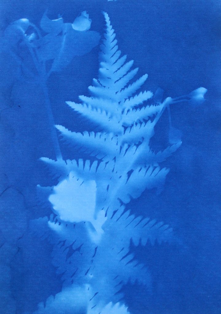
In the second image the natural objects had moved because of the wind but because of this the plants have two different outlines, one being more faint than the other. I think that this was effective, not being as precise as the first one, as it adds different ranges of blue tones on the plants. It also creates a blurred effect making it look as though the plants are moving. I also like how in this photogram that some of the plants overlap each other, I did this to create a more interesting composition.
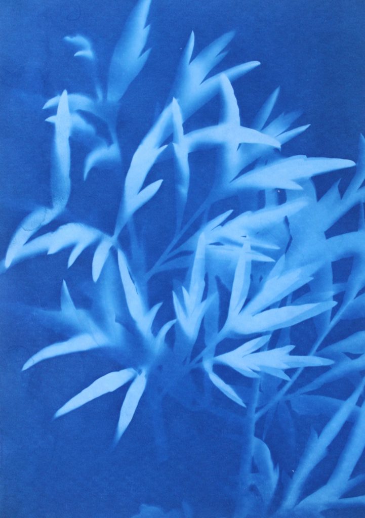
I also like this photograms as it has more shapes than any of the other ones because I used multiple of the same plant placed over each other, creating an interesting patterns against the blue background. By having the solid colours of the leaves more noticeable, it makes what the photogram is of more apparent. I like the smaller leaves that are coming from the stems as you can noticeably identify that they are leaves, linking to nature. The plants towards the top of the photograms are less clear than the ones in the middle, becoming more blurred as the edges. I think this is because the edges of the plant had started coming off the paper as it was left in the sun, but i think it’s effective as it focuses the audiences attention to the centre of the photogram. I think this is also emphasised by how it becomes darker towards the edges of the paper, highlighting the white colours in the middle. Another aspect I like is how the plant goes off the edges of the paper, as I think it contrasts nicely to the other photograms that are placed precisely in the middle or around each other. This is like Anna Atkins where she doesn’t let the plants she places on the light sensitive paper go over the edges. I thought that by doing this I would be creating my own interpretation of her work, but not directly copying the way she displays plants.
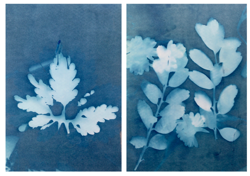
I tried to use a variety of different plants on the paper to create a range of different appearances and compositions. I tried to find plants that had interesting leaves and details so I could see the effect this created on the paper. I think this was effective as it means i could display all the photograms together and they will all be separate and contrast from one another. Also like in some photograms, like the first one displayed above, there are two plants on the paper, where one has printed clearly and the other hasn’t, creating a blurred effective in the background. I think this creates an interesting juxtaposition.
I also think that this experimentation looks at photograms in a different way to what people in the 1900s did where they were used in a scientific, analytical way. In my opinion those photograms in the 1900s still have a spiritual quality to them through the delicate lines and shapes. This is what I tried to interpret when creating my own by selecting plants with interesting shapes to highlight the intricate and delicate appearance even more.
Evaluation
Overall I think that I successfully interpreted the work of Anna Akins by experimenting with the same the technique to produce camera-less images that she did. I think that I will use some of these photograms as some of my final outcomes as I think they add another level to my work, contrasting to the landscape and close up images I have taken in nature with a camera. By including some of these in my final pints and photobook, I can emphasise nature with a different technique, still following the same theme as the other images. I will experiment by seeing how these photograms look alongside my camera images, and what they loo like separately to decide how I am going to display them.
Presenting Compositions as GIF’s
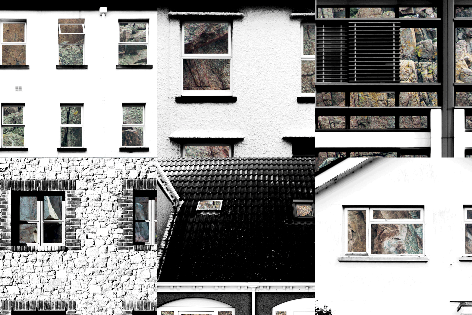
Previously I have experimented with GIF’s, but that experiment only included photographs of a limited number of building faces. In the below GIF I have included 12 fully edited photographs in which the building faces have been layered over rock faces. This use of GIF’s is extremely relevant to the topic ‘Variation and Similarities’ as it is an easily displayable way to demonstrate both variation and similarities between subjects. The 0.2 second time that each photograph is shown for, along with the cropping, creates a very abstract and unique method of presentation as the viewer is not sure what they are looking at until the GIF has been played multiple times. By using the GIF format the photographs are constantly being compared to eachother as the individualistic features of each building are being focused on and then replaced with another feature of another building, therefore it is demonstrating the variance and similarity between the buildings.
Building Faces / Rock Typologies
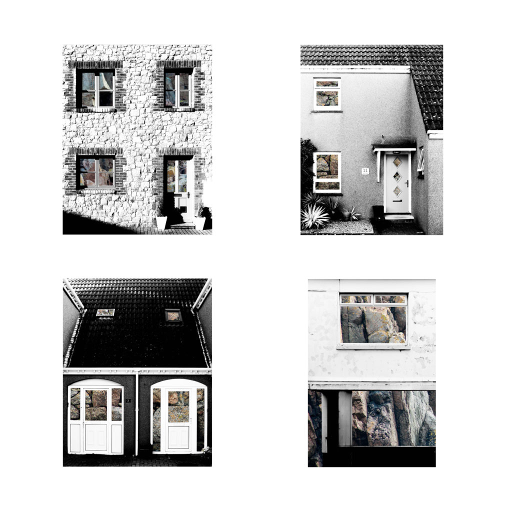
In this post I have experimented with presenting my compositions in which I layered photographs of building faces over photographs of granite rock faces. I believe that since I am looking at subjects that are easily comparable to eachother a typology grid is suitable – I have explored typology in the past through the works of Bernd and Hila Bechers and think it is a very effective was of drawing attention to the similarities and differences between the buildings. The use of rock faces in these compositions is great for creating similarities and differences between the photographs because not one rock face is the same as another; there is always individual angles and shapes that are unique to the rock. In typical use of typologies, all of the photographs are cropped to the same size – I had looked at doing this when putting the typologies together but found that it would take away from the composition of some of the photographs so it was best to leave them in their full shape. These typologies are made of my shortlist of best edits so I may change the photographs to all be cropped in the same way when I narrow the photographs down to about four.


Building Faces / Steel Typologies
In this post I have experimented with presenting my compositions in which I layered photographs of building faces over photographs that show the texture of steel. I believe that since I am looking at subjects that are easily comparable to eachother a typology grid is suitable – I have explored typology in the past through the works of Bernd and Hila Bechers and think it is a very effective was of drawing attention to the similarities and differences between the buildings. I have tried to use a wide variety of steel textures to create as much variety between the photographs as possible. In typical use of typologies, all of the photographs are cropped to the same size – I had looked at doing this when putting the typologies together but found that it would take away from the composition of some of the photographs so it was best to leave them in their full shape. These typologies are made of my shortlist of best edits so I may change the photographs to all be cropped in the same way when I narrow the photographs down to about four.


Style EXPERIMENTATION – Long Exposures
What is a long exposure?
Long exposure photography is when we are using a much longer shutter speed, and it’s usually used as a specific technique to achieve a certain effect. There’s no defined transition point at which a shutter speed becomes slow enough to define your shooting as ‘long exposure photography’. Generally speaking, I tend to think of it as when we are talking about our exposure times in terms of seconds, rather than fractions of a second. These kind of long exposure times (shutter speed is the same as exposure time), are often used to blur something in a photo, for example running water in stream, or the movement of stars across the night sky. A long exposure helps us to trace the pattern of time and render things in a different way to how we are used to seeing them. When we see things differently, it naturally fascinates us and that’s a significant factor in creating a compelling image.
In order to achieve long exposures during the daytime, it’s often necessary to use neutral density filters on a lens, which cuts down the light entering the lens. With less light entering the lens, the shutter speed needs to be much longer to achieve the same exposure. Neutral density filters can allow you to shoot exposures of several minutes long, even in bright daytime situations. Here are some examples:
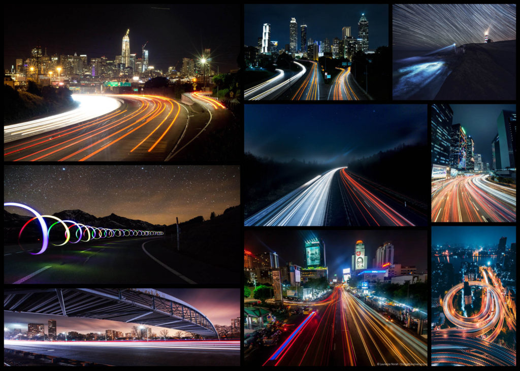
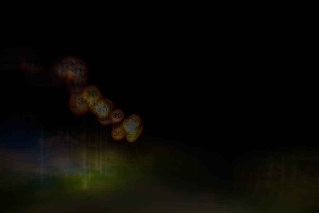
For this mini shoot I wanted to explore how the twisting roads of Jersey would create long exposure by focusing on cars and the variety of coloured lights that are created from them. I want to particularly look at the different textures and patterns I could make out of moving the camera whilst keeping the camera still. However when taking some of the photos I may try at experimenting with a monochrome filter to see if it would effect the outcome of the light trails looking at whether or not they blend the colours together. Here are some of the results from the shoot overall:
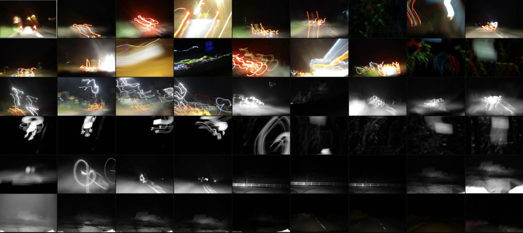
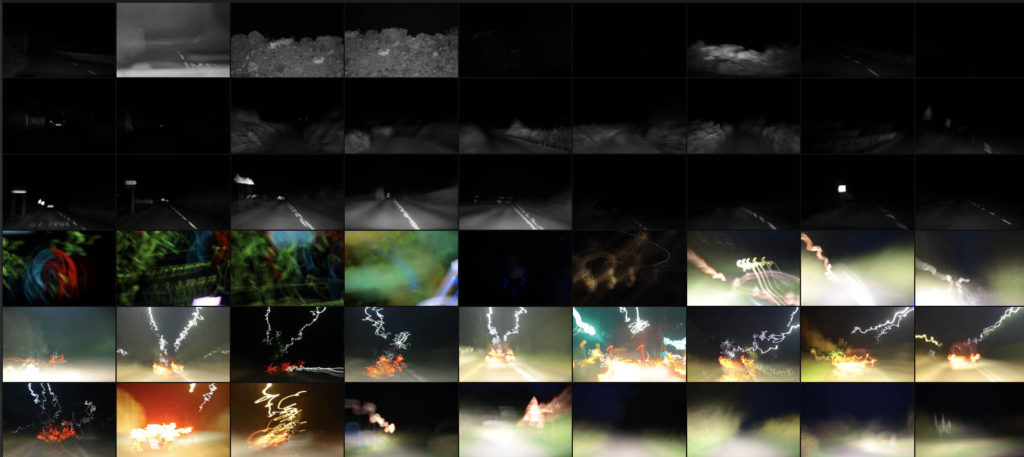

Once I had finished the shoot I decided to select ten images that I thought represented the shoot best whilst also reflecting my overall intentions behind what I wanted to achieve and have the outcome of photos look like. When doing the shoto I made sure to try a variety of things such as using a monochrome filter to produce some of the pictures, my aim behind this was to experiment and see whether by devoiding the image of colour if it would provide a smoother transition between shades. Here is my selection of my ten favourite images:
From here I wanted to then go onto whittle the selection down to only three images out of the mini shoot, by doing so it would allow me to analyse each of the image to more detail and understand the visual, technical and coceptual aspects behind the photos and my thought process behind selecting it. Here are my favourite three images:
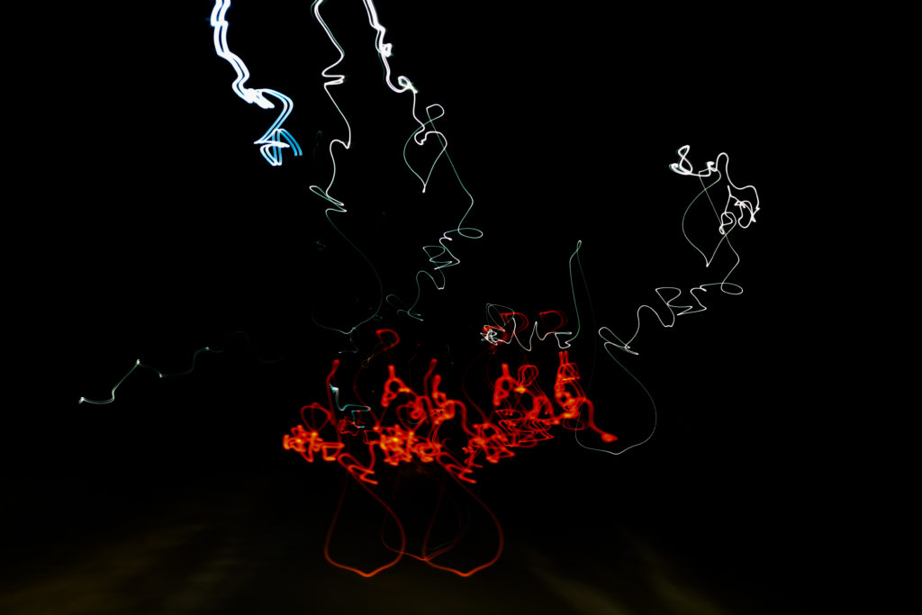
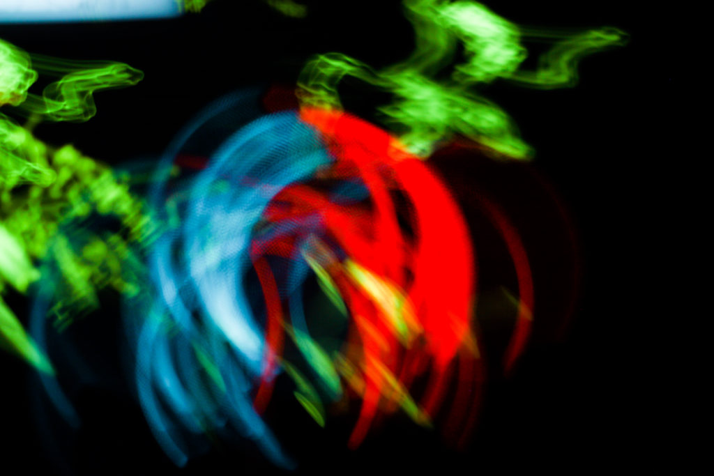
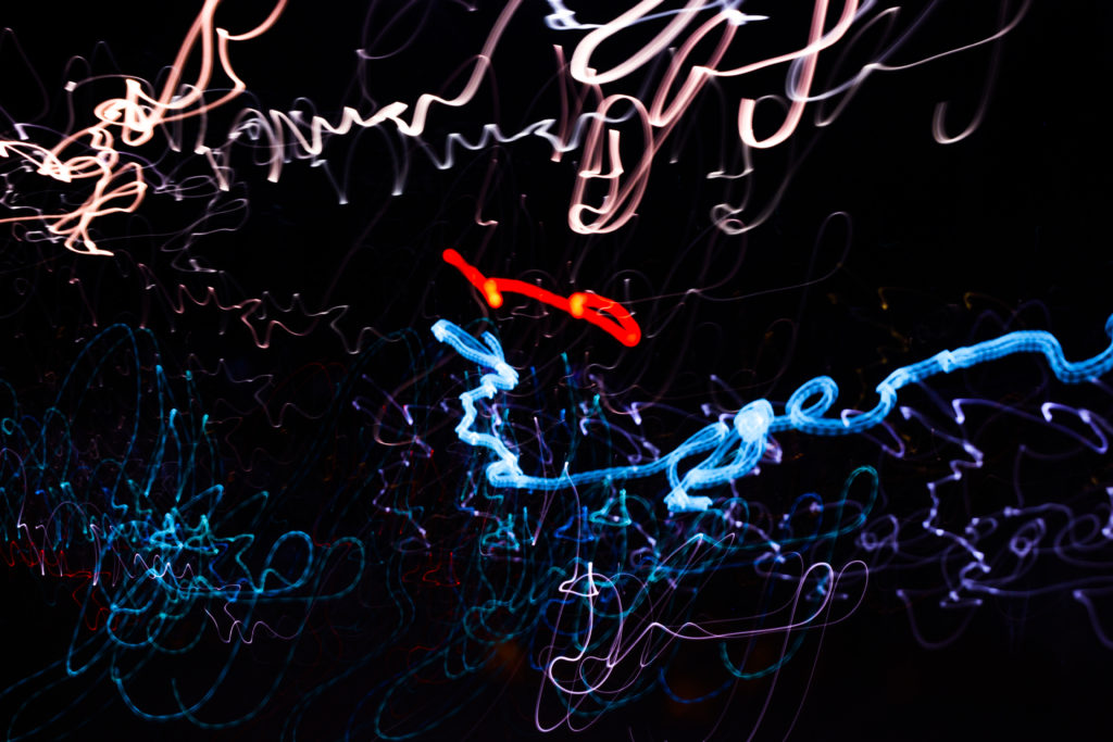
I selected this image because of how I really love the contrasting colours of red and white which also complimented each other against the emerging floor underneath. The image itself is of a moving car taken going over a speed bump during a long exposure, I really liked how its movement of bumping was captured through the pattern created with no actual goal of where its going. Overall I liked how the image relates well to long exposure as it creates an abstract pattern of the lighting, removing the car completely and leaving me with a series of lights with no coordination.
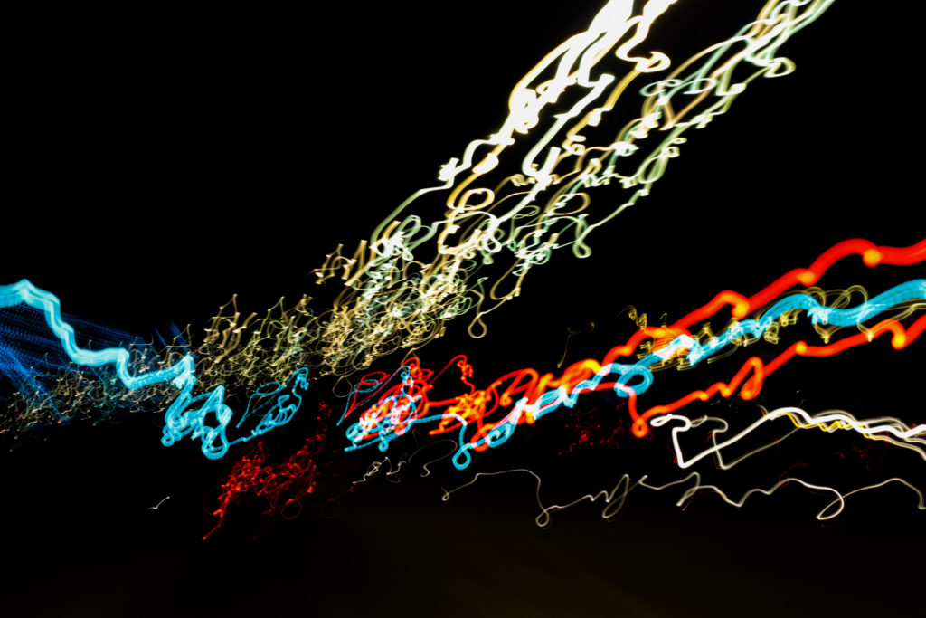
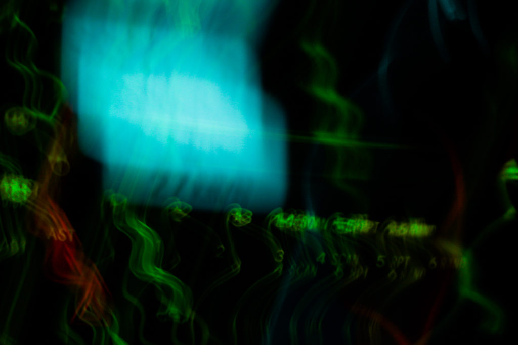
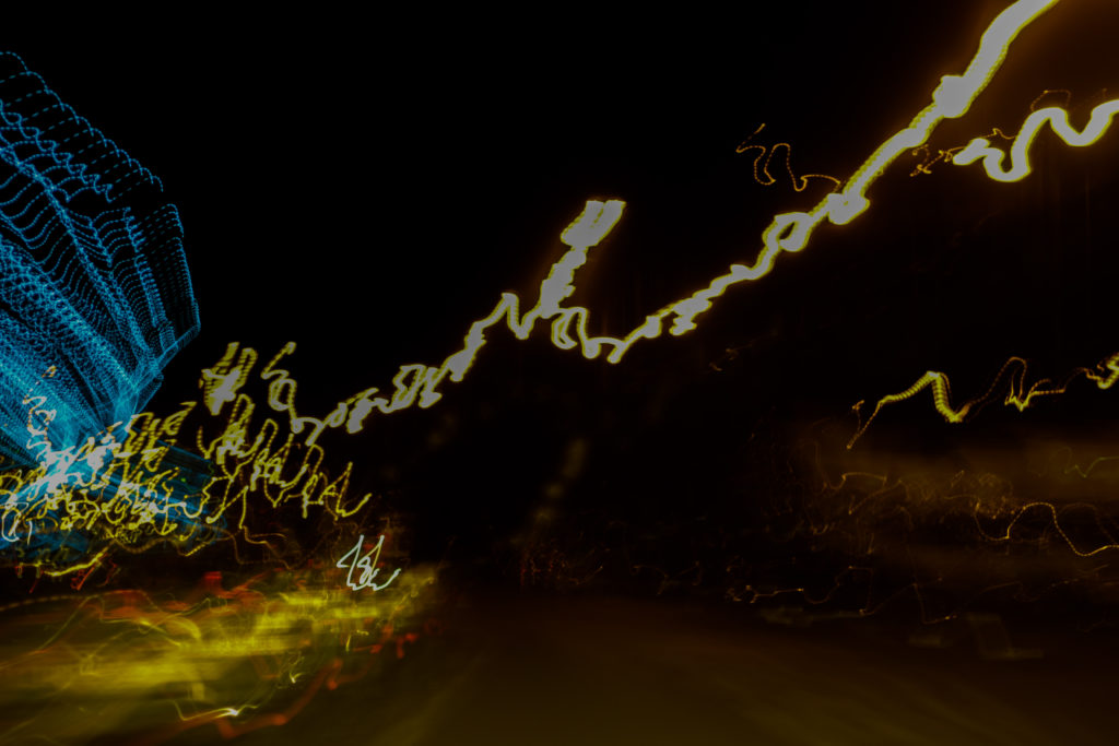
The reason I chose this image was because of the coordinated composition of the colours against the black backdrop. Personally for me I found that the lightings approach from the bottom left to top right of the photo created a great sense of aestheticism due to how the black space left behind in certain areas leaves enought room so that neither the lights or the darkness becomes too overpowering for the viewer. By mixing together a variety of different colours into the light sequence I found that it really stopped the lighting from becoming repetative and boring, as a result for me the added blues and reds emphasise the movement in the image.
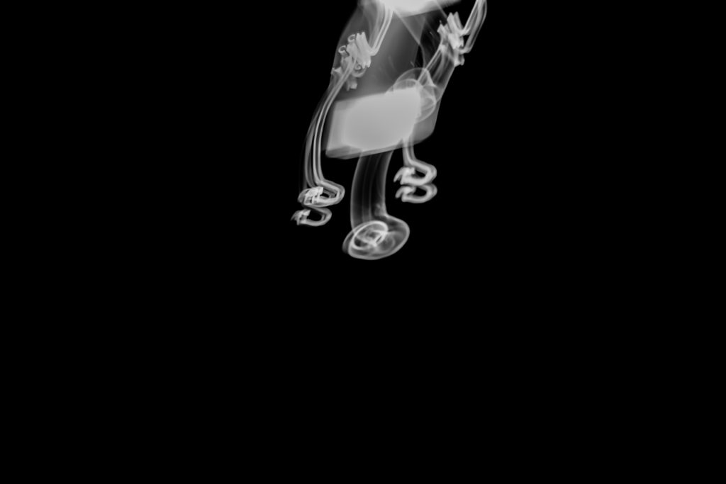
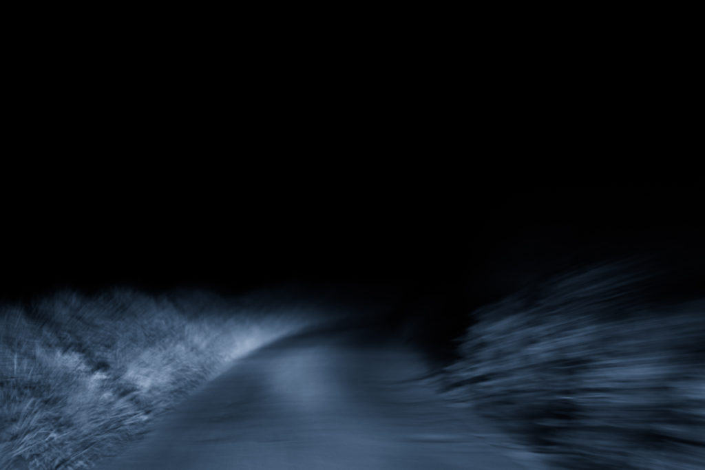
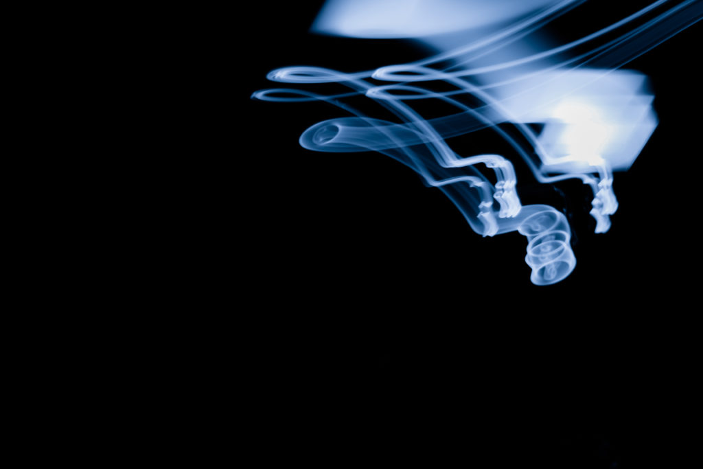
Finally I selected this image because of its simplicity, here I loved how the use of black negative space to highlight a smoke like effect created from a swaying lamp on a boat. What drew me to the image was the symmetry created from the light and how by using a monochrome filter on the image it puts arcoss the impression of smoke filtering down the screen. For what the image lacked I found it made up for it in contrast against the black backdrop with the ghost like lines presenting the viewer with a great sense of aetheticism.
Overall I found the shoot to go quite well as it highlighted the movement in our everyday lives but instead by removing the subjects and leaving on the light sources they have left behind. As a result of this all textures lights and landscapes are a direct reflection of our everyday transport to and from work or school.
Theo Gosselin photo shoot
Images to replicate
My Interpretations
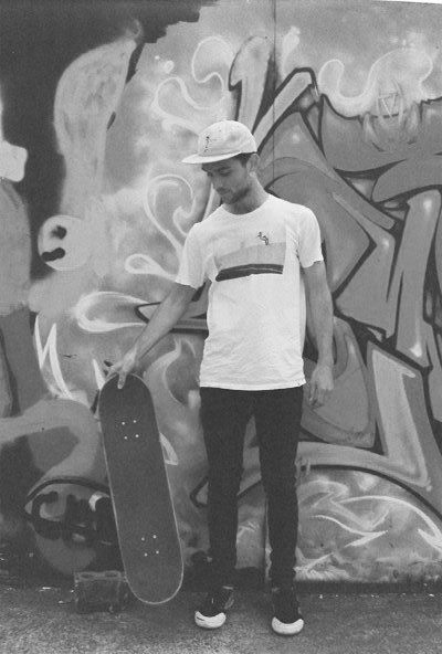
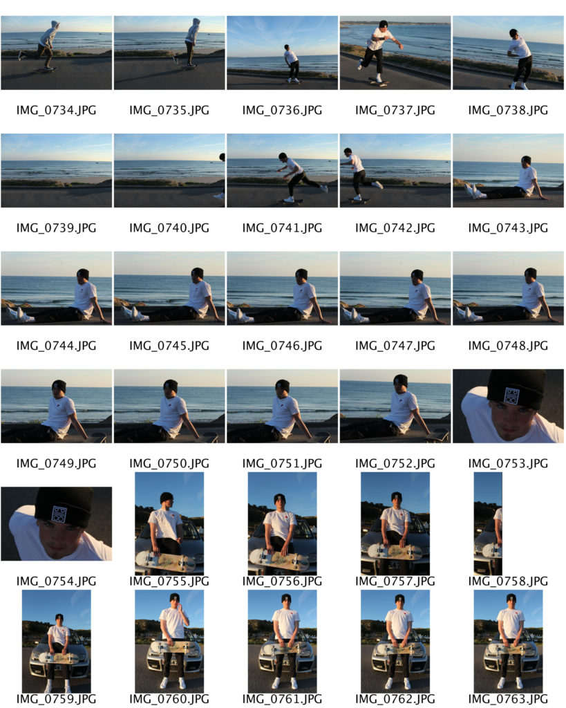
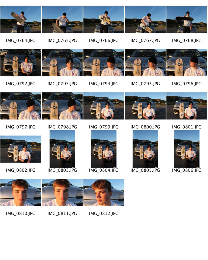
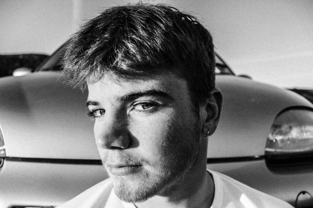
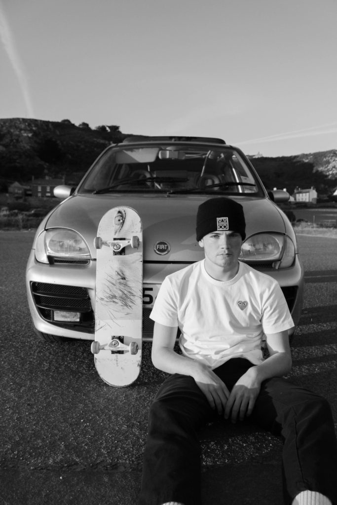
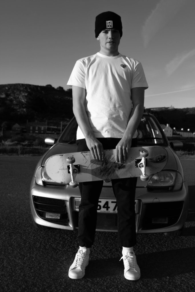
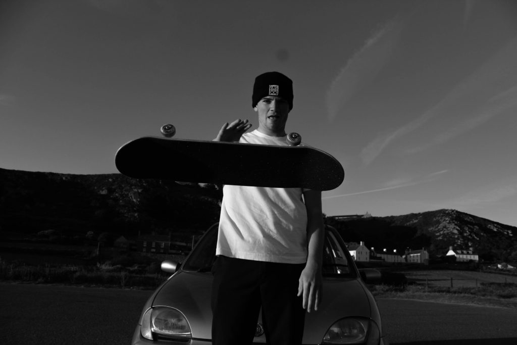
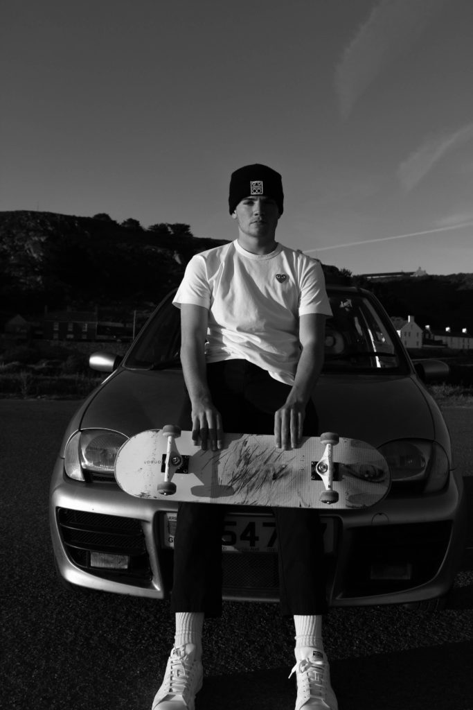
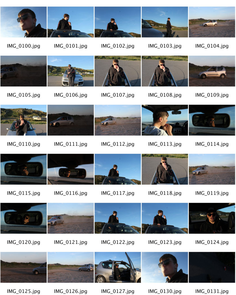
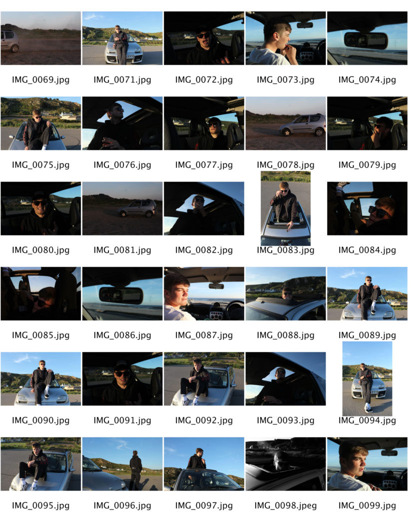
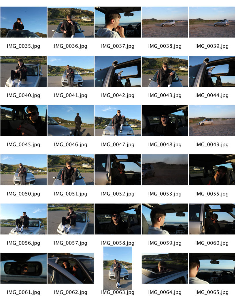
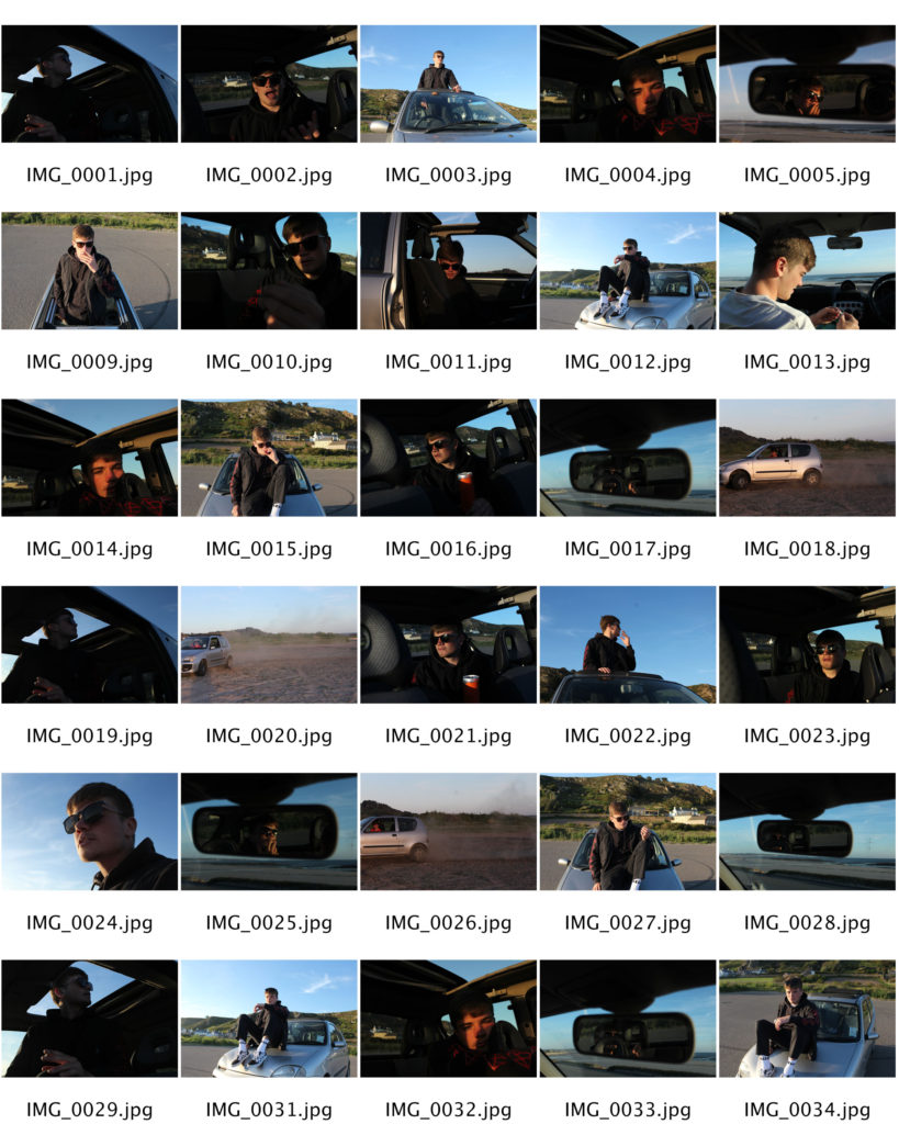
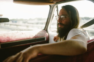
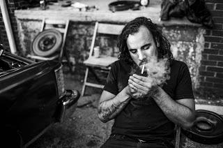
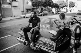
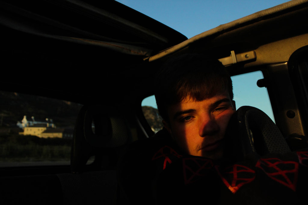
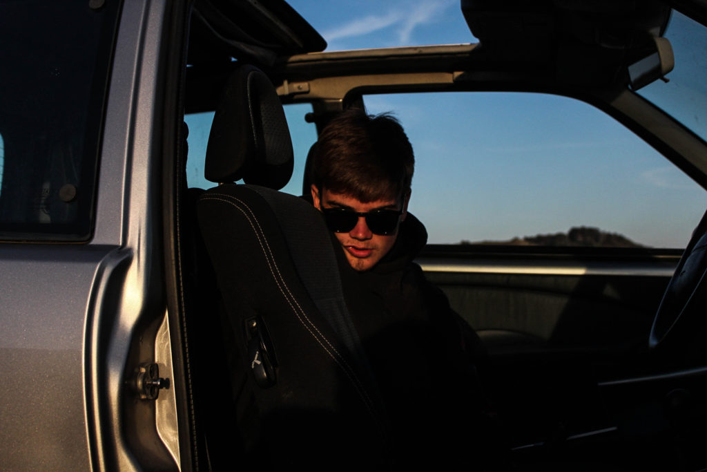
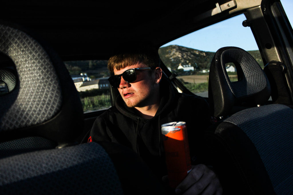
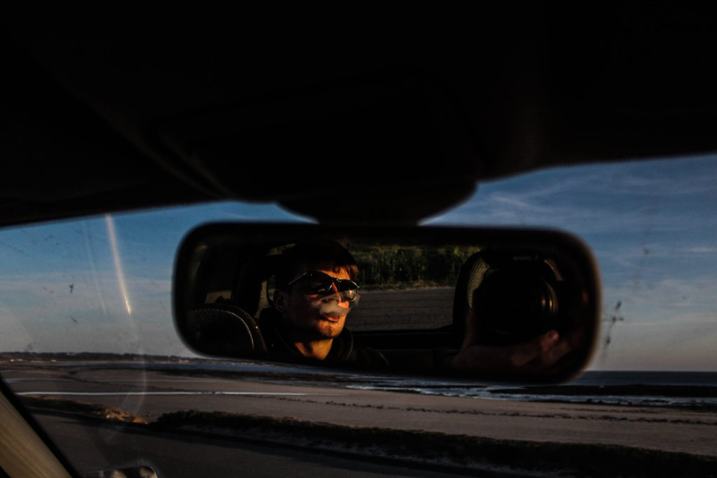
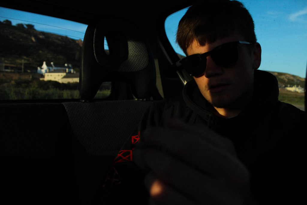
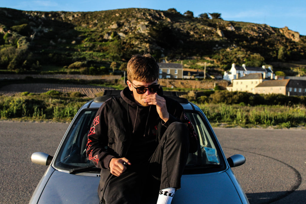
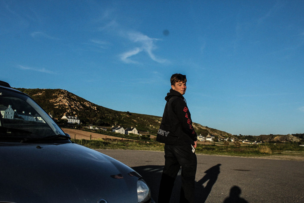
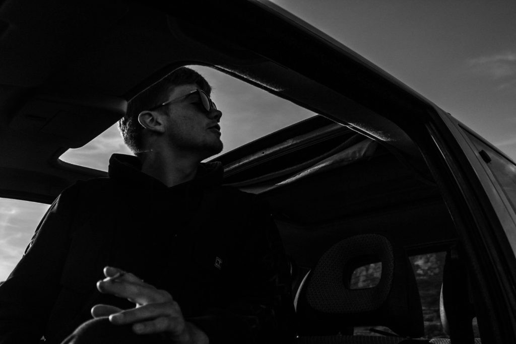
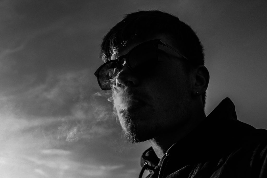
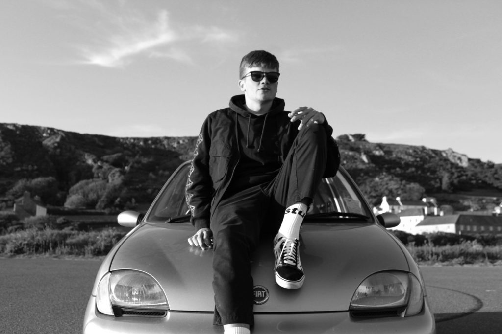
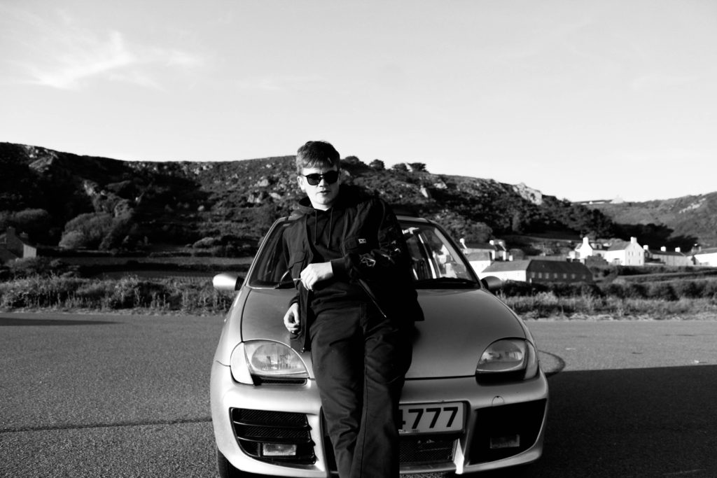
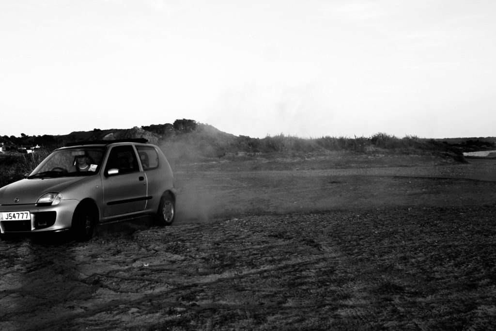
These images I took in the style of Theo Gosselin’s have significant relations towards my project as I believe that they fall into the lifestyle I want to capture. The high contrasts and dull hard lighting throughout creates strong shadows and silhouettes which I believe allows for these images to stand out greatly. As some of Theo’s images are in both black and white I also wanted to edit mine in a similar way. I felt that when editing these images Some where certainly stronger in colour and also in black and white due to the effects I wanted to create within each image; for example the shadows. Furthermore, as I was aiming to replicate some of Theo’s images I wanted to edit the images in a similar way to the specific ones I selected as I wanted my work to have specific similarities to his work. When taking these images I wanted to go out before sunset as the lighting I wanted to use wasn’t too harsh and bright which created perfect colours on the models face. This time is usually known as “golden hour”. I wanted to enhance these colours as I found the colours seen in Theo’s where strong and had a real effect on the models features. As I am focusing on lifestyle I wanted to have the main focus as the model, I believe by enhancing the colours and the background really allowed for the model and his features to really stand out over anything else.
Experimentation


