Category Archives: Experimenting

Filters

Author:
Category:

ESA // Edits

For my edits I decided against doing anything drastic with my images and instead I stuck to cropping the images and adjusting the angle of the images to ensure that the horizons lined up with the low and high tides.

For example without editing my images look like this:

There is a clear difference between the images, the lighthouse is darker on the high tide image due to the difference in natural lighting. I have also taken the image wihtout zooming in therefore the proportions are different and the bunker and cliff edge in the forground of the high tide image is more noticble and is the subject of the image which is leading the viewers eye away from the lighthouse. Although it is not an obvious difference there is a gap between the horizon in the low tide image and the horizon in the high tide image.

In order to have these images line up and ensure that the obvious and visible difference is the change in tides, I have edited the images so that you can see that the horizons line up and the images and more in proportion with one another. I have cropped the bunker and cliff edge in the foreground out to also ensure that the main subject of the images is the lighthouse and the tidal changes.

I repeated this process on my other images.

Possible final layout

Once I had come up with a layout with the images I had previously had developed I had the images scanned so I could come up with a digital copy. However, when copying the layout I found that some of the images didn’t work well together as some of the images where too much together and just didn’t look right which resulted in me moving them round and changing it up. These were some of the images I found didn’t look right together however, looked right once I had played around with it.

Before and After

Possible final layout – photo book


Shoot 6 – Boats

For this shoot, I wanted to go and visit boats down on the beach on a sunny day, when the tide was low so I was able to walk around the boats and take my images. I wanted to see how boats can have different effects of light and darkness due to their positioning on the beach, which is where the sun shines onto heavily.

Contact sheet

Edits

Shoot 4 – Darkroom

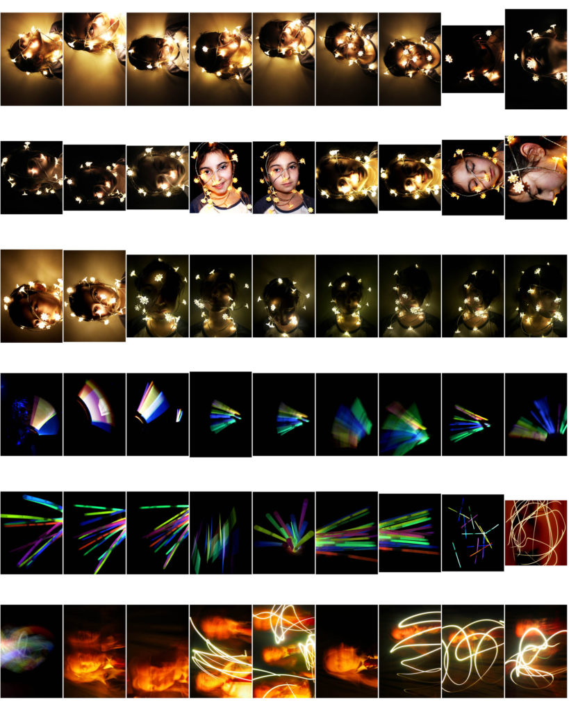
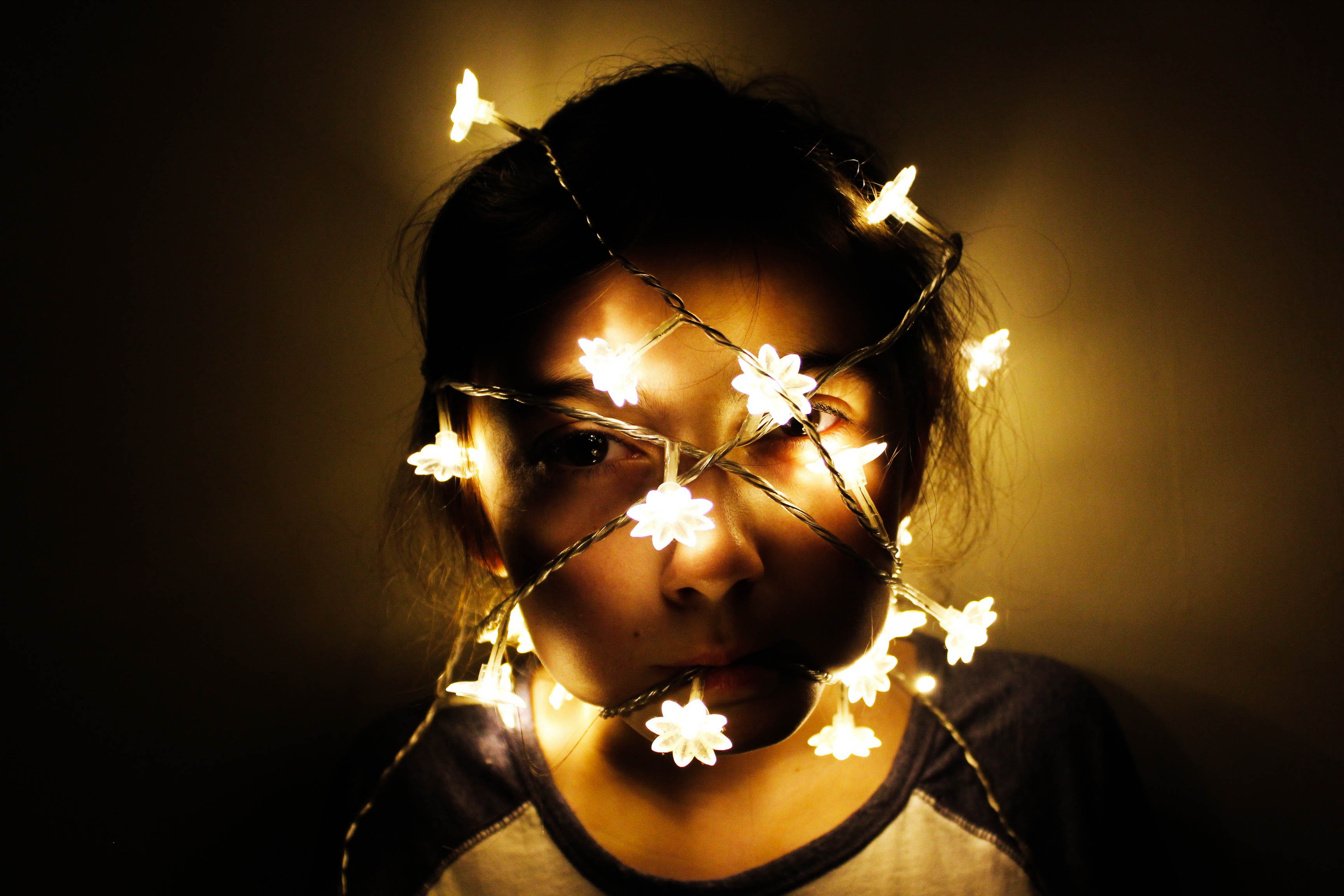
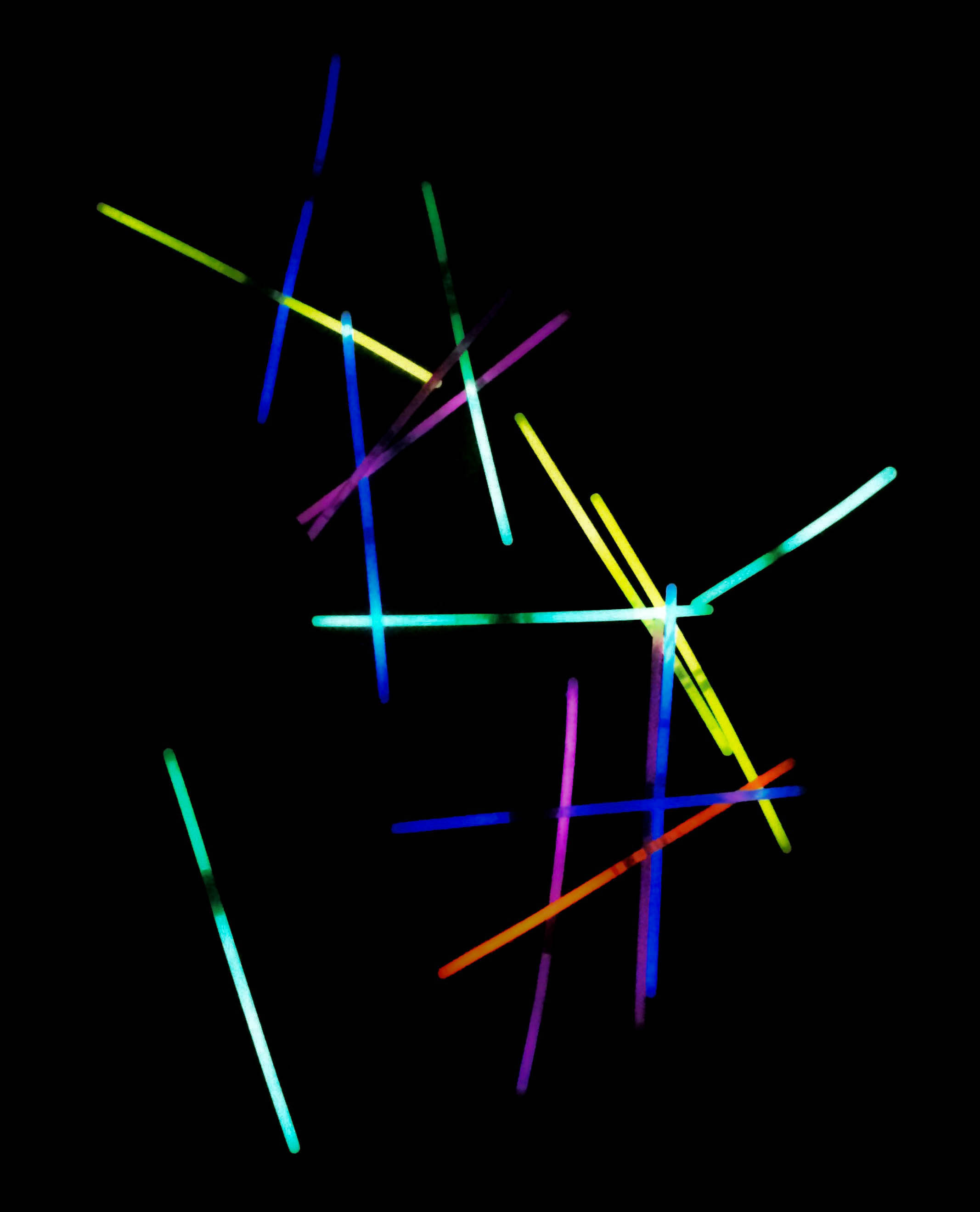
For this shoot, I wanted to create a series of images that included multi-coloured lights from a bundle of glowsticks, as well as an experimentation of using slow shutter speed and waving an iPhone torch and glow sticks around in a dark room. Additionally, in my darkroom shoot, I used fairy lights around a model to see the effect of light and darkness on the models face.

Contact sheet

Edits

Deconstructing The Narrative of ‘Tal uf Tal AB’, ‘You Would’ and ‘Park Sleep’.

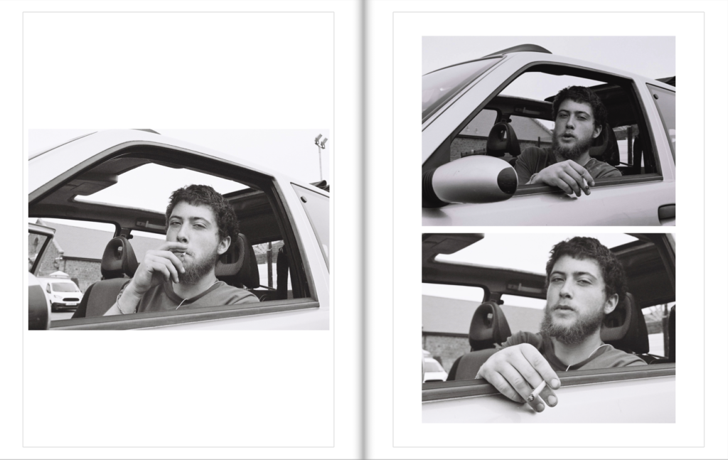
Book in hand: How does it feel?

The book’s cover and sleeve are created from card giving it a textures surface which feels dry to the touch, however the book itself is a more matte card surface giving it a smoother feel whilst adding a slight tint to the cover. This card texture is carried on throughout the layout of the book. The textured surface of the sleeve and book covers are repeated on each book.

Paper and ink: Use of different paper/textures/colour or B&W or both.

All of the paper inside the book are glossy matte textured being about the same thickness of ordinary photography paper. Within the book there are a few blank pages so that it adds breathing space when working your way through which adds to the overall effect of the photographers decisions. The only text is the ink which is in a small font in each corner of the pages to highlight what the title of each image is. The book overall is very consistent as there is a strong theme regarding composition and focus of the photographer throughout.

Format, size and orientation. Portraiture/landscape/square/A5, A4, A3/ number of pages.

The book itself it is a A3 size, slightly smaller than an A4 sheet of paper with an effective use of negative space throughout due to there being borders to each image boxing them in a result. This compliments his photography as the photos become easier to focus on especially as there are more dominant portraits within. Its hard to say how many pages there are due to there being no page numbers, but I would guess there are about 50 pages per book.

Binding, soft/hard cover. Image wrap/dust jacket. Saddle stitch/swiss binding/Japanese stab-binding/leperello.

The books use a paper card cover without any dust cover on due to there being no need through the use of sleeves. This as a result makes the book more visually pleasing as when opening it it directly links the cover page into the photography.

Title: Literal or poetic/relevant or intriguing?

Overall the titles seem to be more poetic rather than literal due to how the content inside each hardly reflects what the title suggests, instead being more around a different theme of family or location life in specific locations.

Narrative: What is the story/subject matter: How is it told?

There seems to be no narrative in the books but rather small sub sections where a few page spreads will be portraits with the next ones maybe be landscape shots or images about home life. This theme continues throughout the three individual books.

Design and layout: Image size on pages/single page, double-spread/images/grid, fold-outs/inserts:

Each photo inside the book tends to be the same size regarding whether it is landscape or portrait, with portraits tending to take up the entire page and the landscapes taking up about half of a page.

Editing and sequencing: Selection of images/juxtaposition of photographs/ editing process:

The images inside each book seem to have little editing done to them as each seems like they have come straight from the camera with in-camera editing techniques like low or high exposures. As a result of this the results seem to be more literal, portraying the photographers vision literally.

Images and text: Are they Linked? Introduction/essay/statement by artists or others. Use of captions (If any).

The books lack text as there are no page numbers or information about where the photographs are taken. However in each bottom corner of every page there are the titles of the photos present on each spread, this is complimented by the very occasional use of speech dialogue which can be seen on some pages which seem to depict a conversation between two random people.

Photoshoot | St Helier

My planned photoshoot for St Helier did not go to plan due to the Jersey Boat Show taking place at the time. This affected my ability to shoot certain places and areas. Therefore I moved to Gorey and shot there as well to get some extra imagery. I spent 3 hours walking around town and also Gorey village looking for circles and exploring them through photography.

Below is the contact sheet of that afternoon;

This shoot was completely ground based, no drone today however I did take the drone up with my dad the day before and I will upload this in a separate post.

Shoot 3 – Architecture

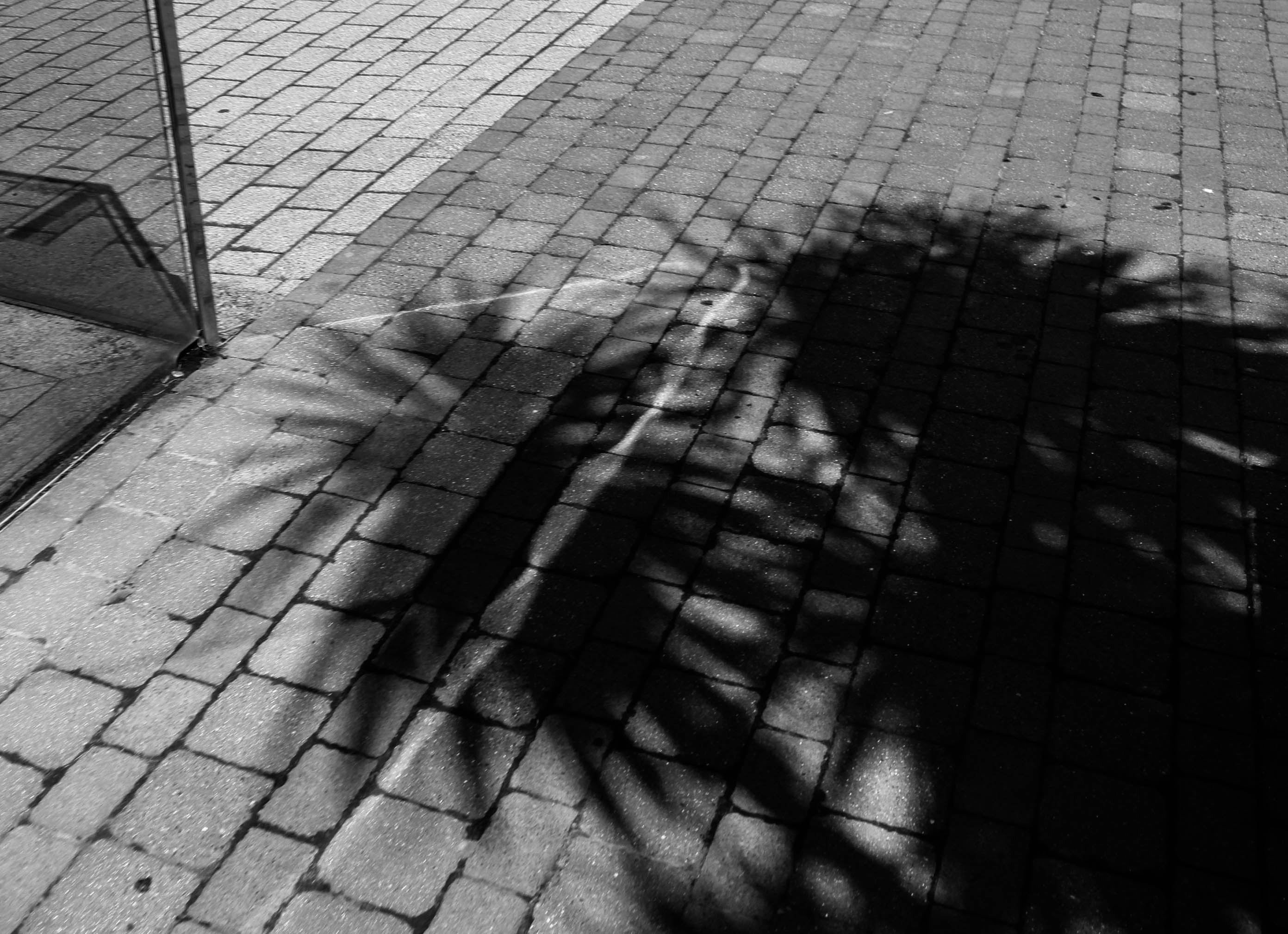
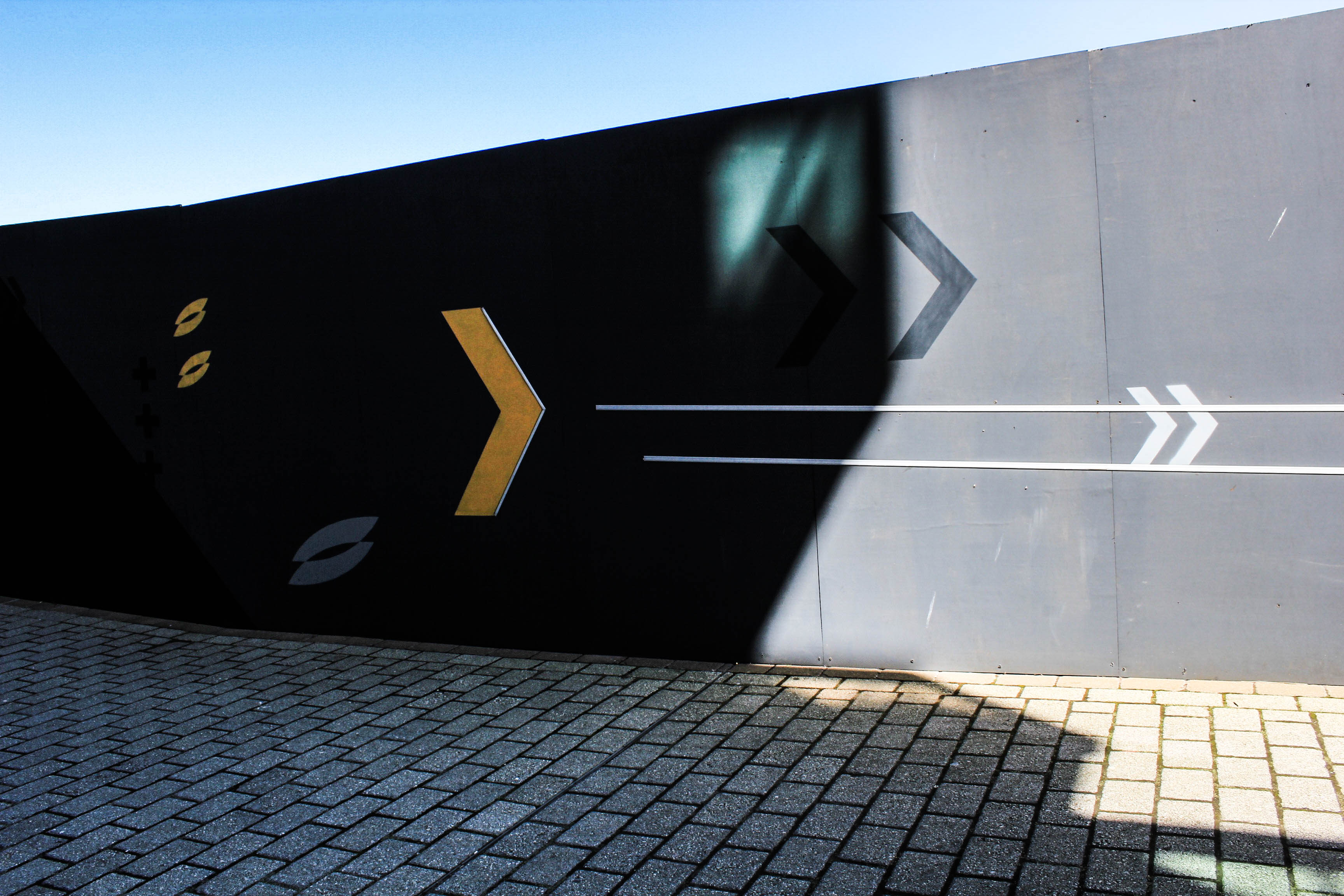
For this shoot, I wanted to concentrate on capturing light and darkness within architecture. This included taking my images in the day time on a sunny day with strong rays of sun light. Shadows were a bold factor in this shoot which helped me to create a sense of darkness in my images. I was inspired by a few photographers to create this shoot, which I discuss further down in this blog post.

Contact sheet


Edits


Photobook Design Experimentaion

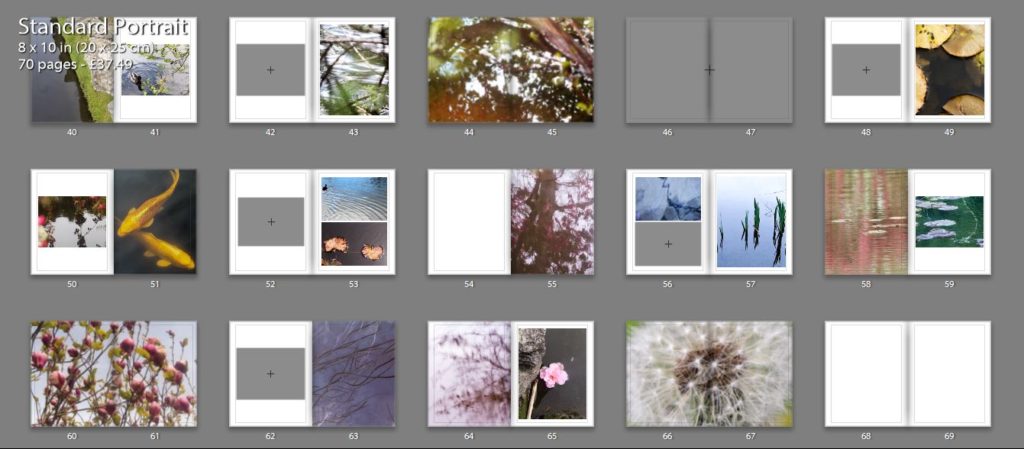
I thought that my close up image of the orange leaf would pair well with one of my koi fish images as both the main subjects in the images have orange tones which make them both connected. I experimented with two different koi fish images, one showing two fished overlapping each other and the other showing the movement of one fish through the ripples in the water. The first image is a calmer image, the water in the background being flat which gives it a more peaceful appearance. I like how the two fish are swimming near each other and are overlapping as they create an interesting shape in the water. This is contrasted to the second image which shows one fish coming to the top of the water, creating waves which i tried to emphasise when I edited the image. This image isn’t as calm as the first image and shows the texture of the water.

I think that the second combination is the best double page spread as the single koi fish swimming the water links better to the single leaf and has a similar rounded shape which is why I will use it in my photobook. Also the background of the images complement each other as they both reflect the light from the sun and have bright white sections, creating similar shapes on the water. I think hat this combination is the most effective and makes for the most interesting layout.

This double page I am planning to use as the first page in my photo book. I experimented by using a combination of two images on the pages, and a single image to see which was the best layout. The first double page with two images I like as the ripples in the water on the left side linking to the patterns in the second image of falling water. I like the first image as it draws on theories of abstraction through the bright red reflection of a person on the water that are warped and distorted. I also like how there are out of focus branches near the lens of the camera that add another natural aspect to the image and contrasting against the horizontal ripples of the water. This connects to the second image on the right page as there is also an section of a plant out of focus in the top right corner. The second double page is the single image of the water falling on the right side. I think that this is also effective as it focuses the reader onto that particular image so they aren’t distracted by the shapes the image that’s on the left of the other layout. I think this makes the appearance more peaceful which is why i am going to use the single image in my first page, and the image that was on the left on the page after. This is because both images are very detailed and think that they work best displayed alone.

I chose these two images to display as double pages as I think that the patterns are more detailed and noticeable when the image is filling the entire frame. I like how the first image has the bright red tones that range from right to dark, with the brightest pint being where the sun is hitting the leaves. I think this really links to my projects concept of spiritual qualities in nature emphasising the bright lights against it and the small patterns on the leaves.I also think that the second image is effective as a double page spread as there is a lot of detail in branched of the tree creating a very intricate pattern. I think this is why I will use it as a double page as I want to emphasises these aspects. I also think that this image links well to personal and spiritual aspects of nature through the yellow tones and the brightness of the image making it look peaceful and ethereal.