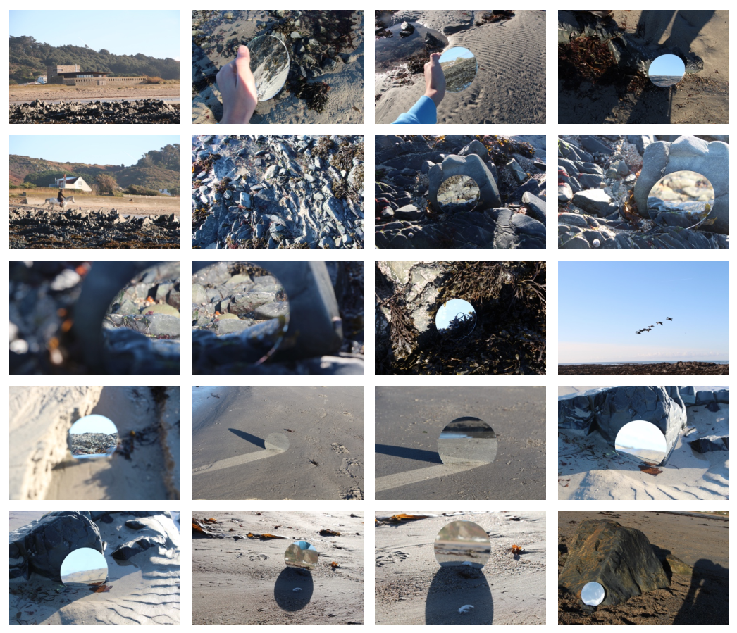
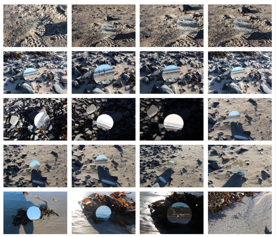
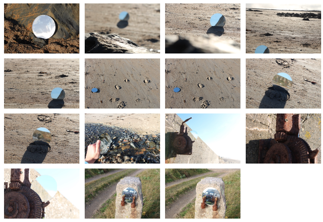
After having a quick look at the work of Cody William Smith I have deiced to conduct a photo shoot in the style of his work. I can see lots of ways I can further develop and explore this work using digital manipulation.
Best Photos
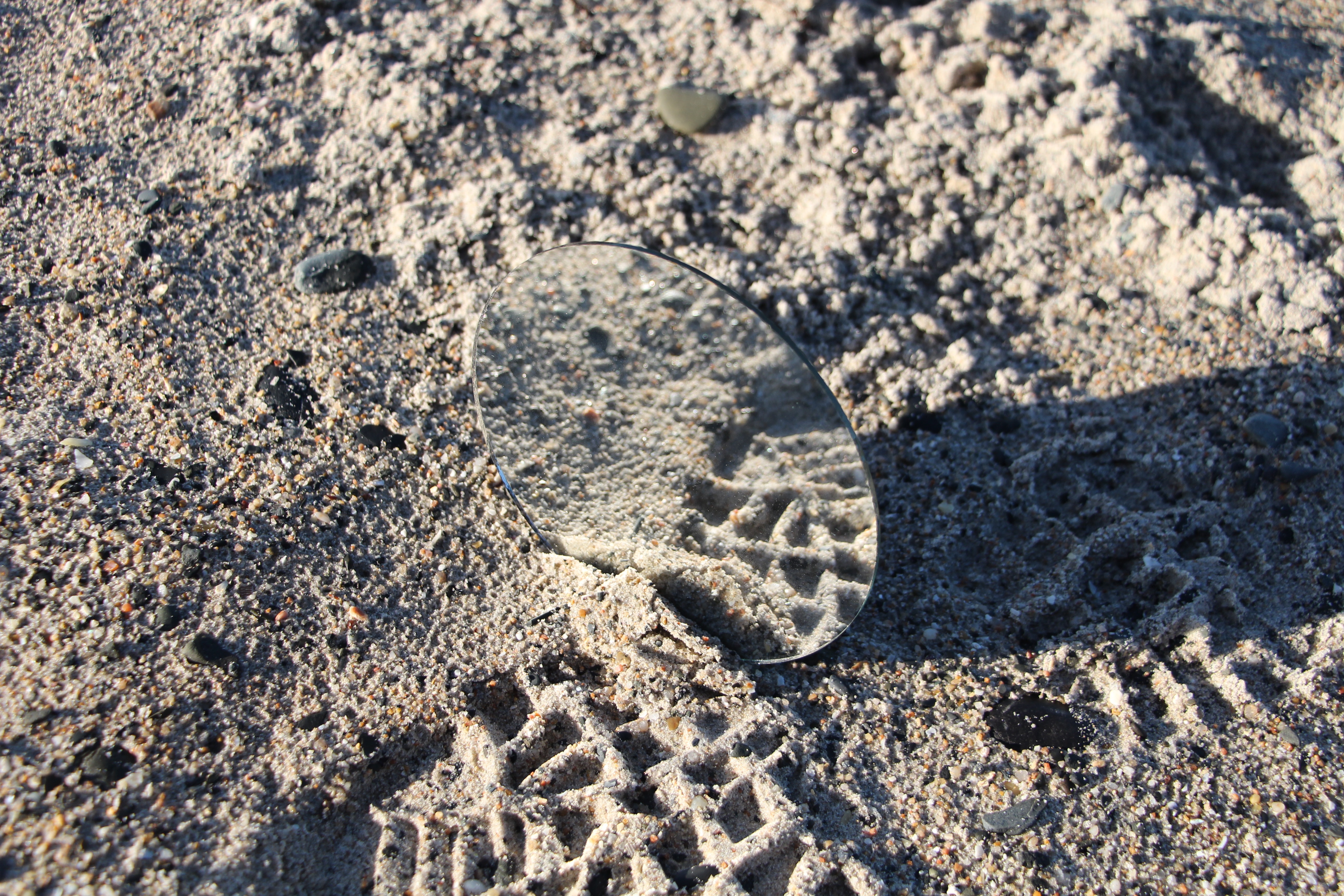
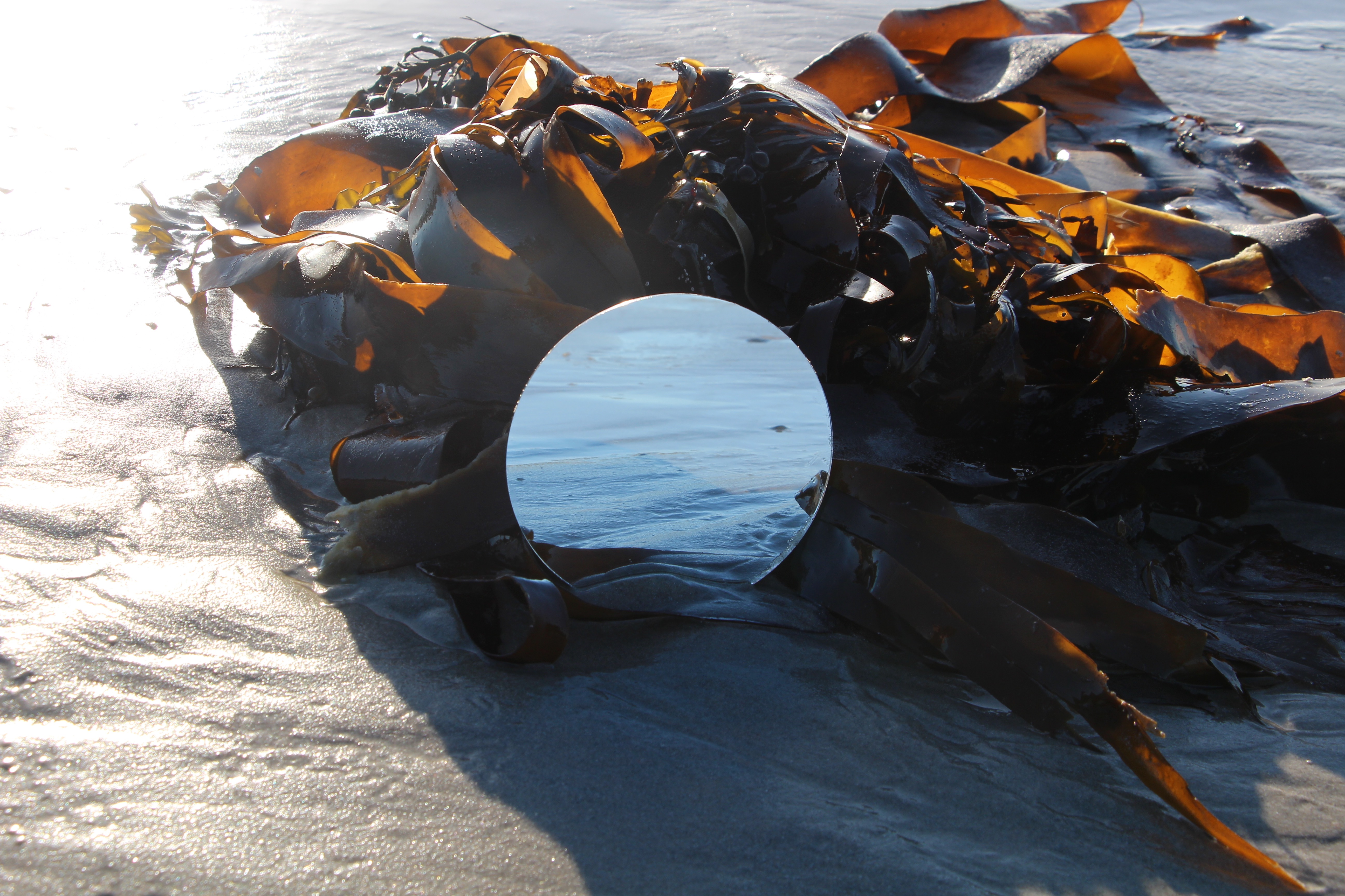
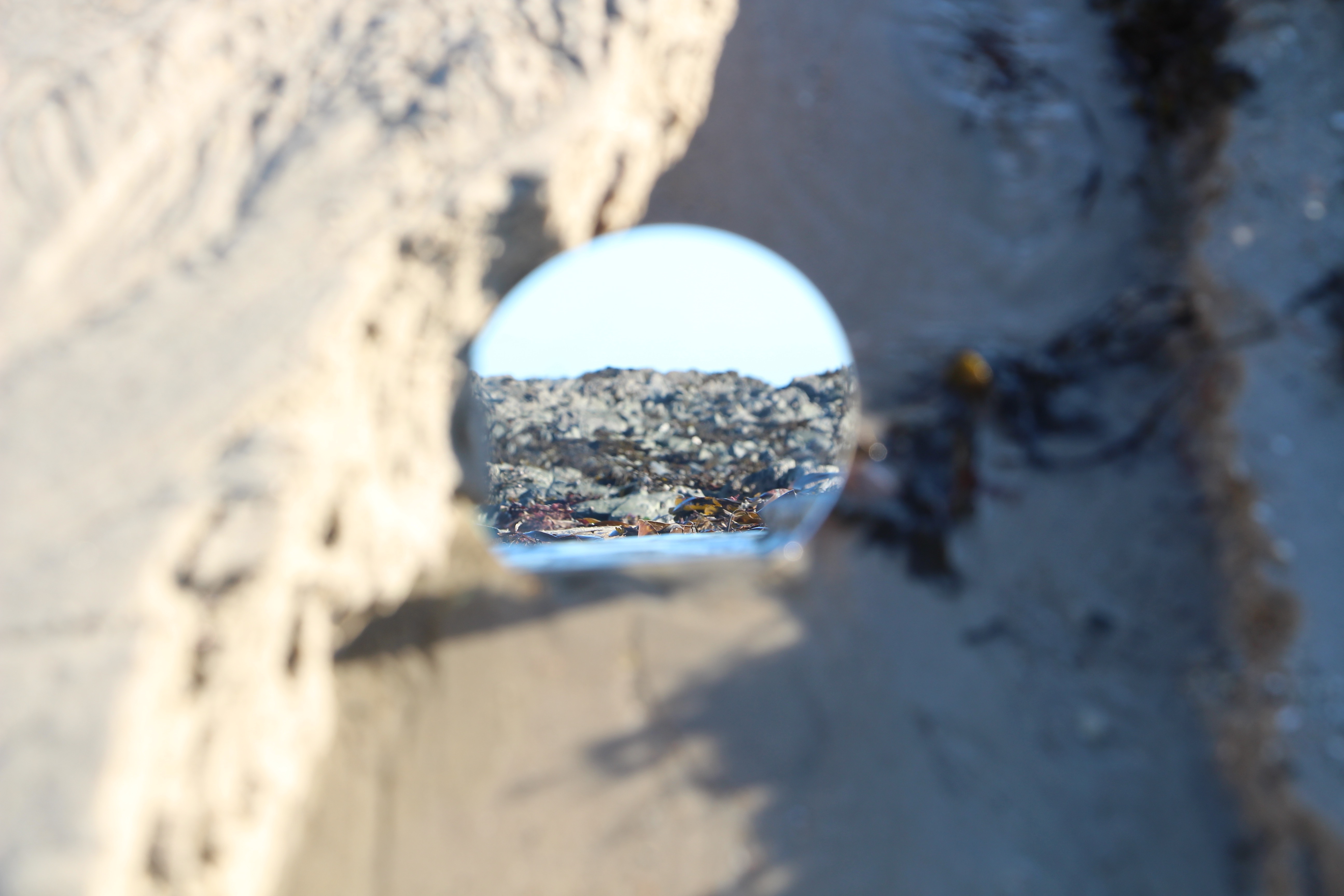
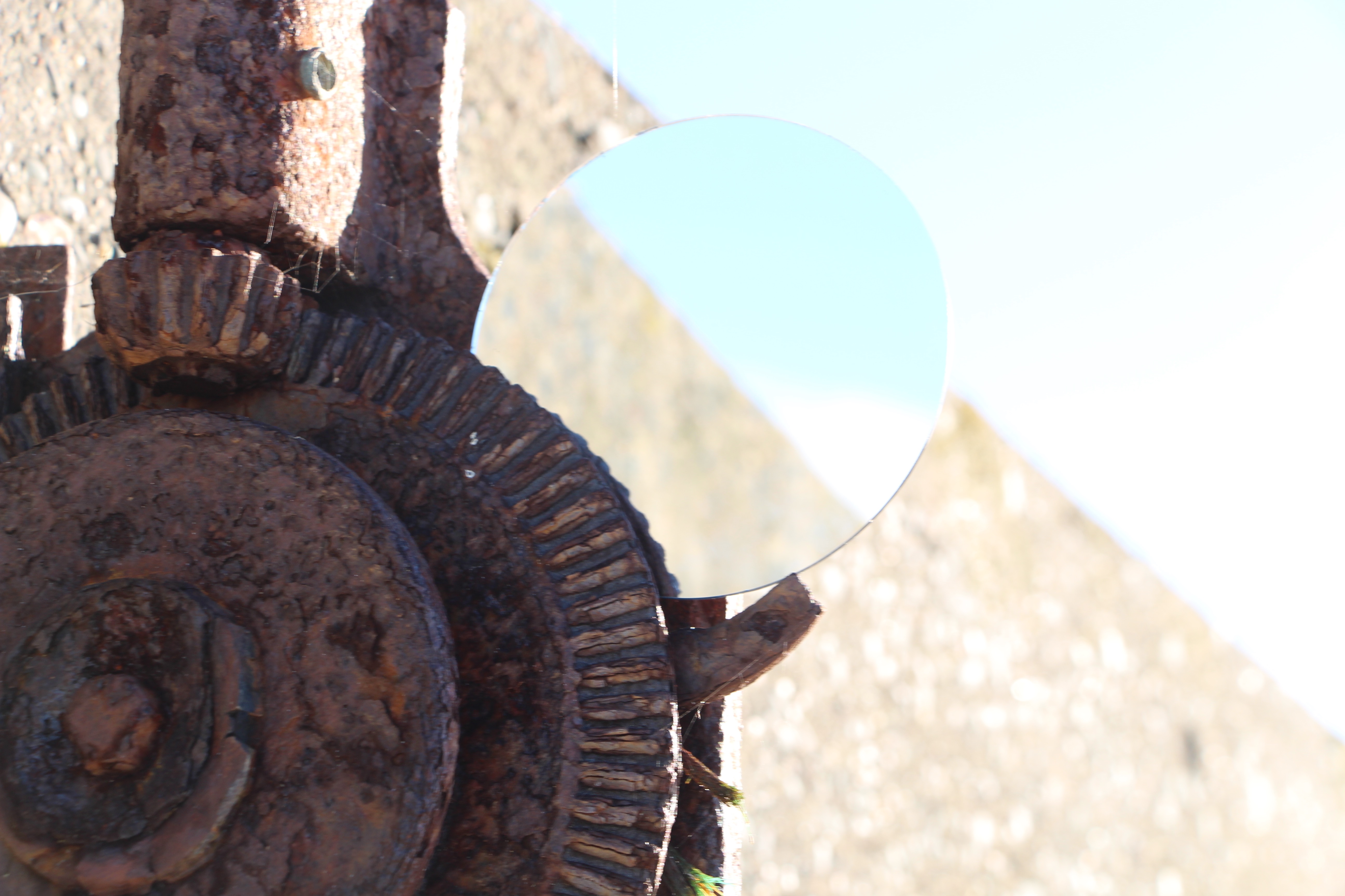
After having a quick look at the work of Cody William Smith I have deiced to conduct a photo shoot in the style of his work. I can see lots of ways I can further develop and explore this work using digital manipulation.


Best Photos


Dodging the camera
My response to the task of ‘dodging the camera’ was to create a gif by taking photos in one area trying to follow one of my friends around as they attempted the dodge the camera or run away from it. I felt that these images worked best when they are presented in a looping gif, rather than seperate image as it shows the movement within the images.


Creating a line with balls


John Baldessari: Throwing Three Balls in the Air to Get a Straight Line (Best of Thirty-Six Attempts)
Baldessari is a conceptual artist working in photography, film, video, artists’ books, billboards, and public works. He started as a painter in his early career, Baldessari cremated all of the work he produced between 1953 and 1966 in a ceremony in 1970 to mark his transition from abstract painting to text-based art.
His artists’ book, Throwing Three Balls in the Air to Get a Straight Line (Best of Thirty-Six Attempts) (1973). It represents Baldessari’s interest in language and games as structurews following both mandatory and arbitory rules.
My Response to John Baldessari was to go outside a throw up three tennis balls and try and create a straight line. Some of my attempts worked out however, some attempts ended up having the balls in a triangle or only capturing two out of three tennis balls.


Throwing a dodgeball in the air
My Response was to throw a dodgeball in the air and then try to capture it in a photo, some of these attempts worked well however, like the last image sometimes the ball wouldn’t always be clearly in shot.


Coin Toss
“I just got so tired of looking at these faces” – John Baldessari
John Baldessari also made a series of images where he blanked out peoples faces.

In response to this idea we flipped a coin over a copy of an archival photograph and wherever it landed we cut out around it so that at the end of the excerise we had an image with lots of circles cut out of it and a blank piece of paper with the cut outs placed out on it.


This is example typology I produced to start developing my ideas.
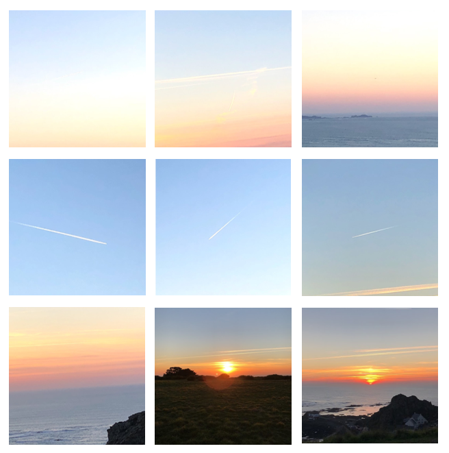
After this experimentation I looked into the work of Cody William Smith.


He uses mirrors in the natural landscape to create interesting effects. I think I use his work to develop the theme of Natural vs Industrial.
After drawing inspiration from a range of photographers including Tim Booth, Huang Qingjun and Lewis Bush, I have come up with a few ideas for photo-shoots in response to ‘Variance and Analysis’ that will explore the topic in different aspects including repetition, personal belongings that make someone individual and personal features.
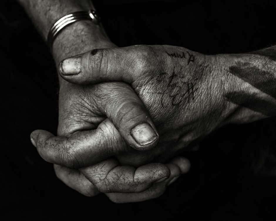 My first idea for a shoot is to photograph the hands of different people. I have chosen to focus on a person’s hands as there are man features on a hand that give indication of the person that they belong to – they can have clear veins running through them, they can have calluses, different skin tones and then everyone is guaranteed to have different lines running throughout their hands due to their genes as well as individual fingerprints. I have taken inspiration for this shoot from photography Tim Booth who did a project titled ‘A Show of Hands’.
I could approach this shoot idea by doing either close up photographs to create abstract photographs emphasising the lines in the hands or by showing the whole hand. I could experiment with this by using different types of lighting such as natural lighting or flash as well as using inks or paints to highlight the features of the hands. I could further experiment with this route by printing off the photographs and bringing the lines and details within the hands to life by placing a physical object such as string along the lines to create a 3D effect.
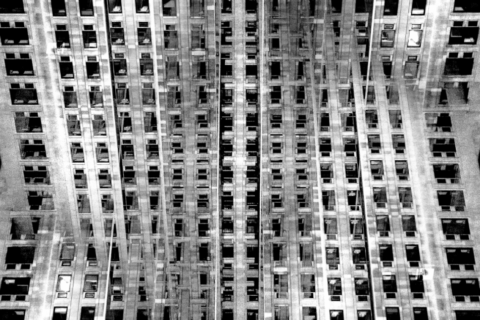
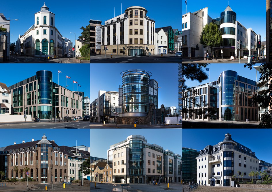
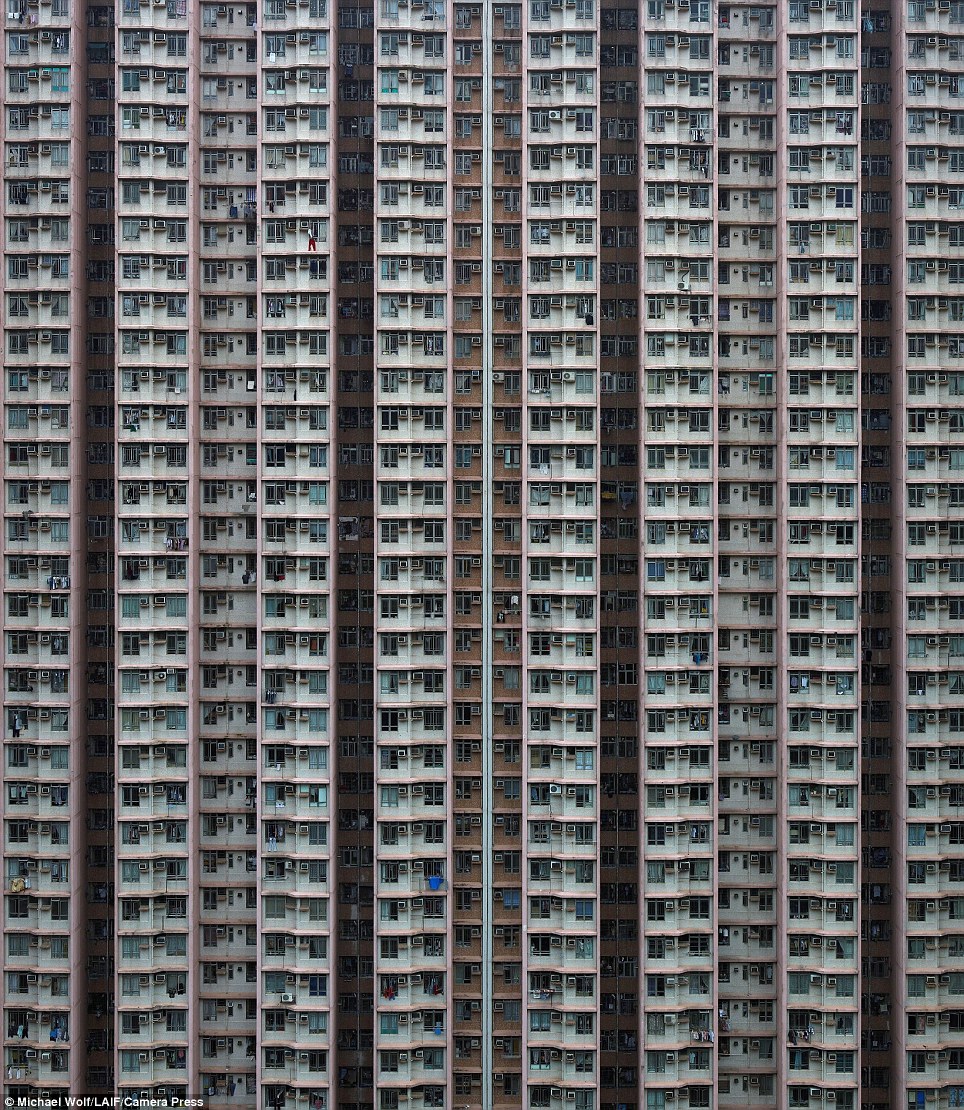 My second shoot idea is to photograph blocks of flats around Jersey and then photoshopping the resulting photographs to create repetition and patterns of the photographs in order to create a sense of monotony within the photographs and to show how repetitive blocks of flats can be. The resulting photographs will be very symmetrical and will almost create illusions. I could also approach this idea by photographing the symmetry and repetition within the blocks of flats and then presenting the photographs alongside each-other multiple times in a typographic style. I have drawn inspiration for this shoot idea from Lewis Bush’s work on ‘Metropole’ as well as the blocks of apartments in cities such as Hong Kong
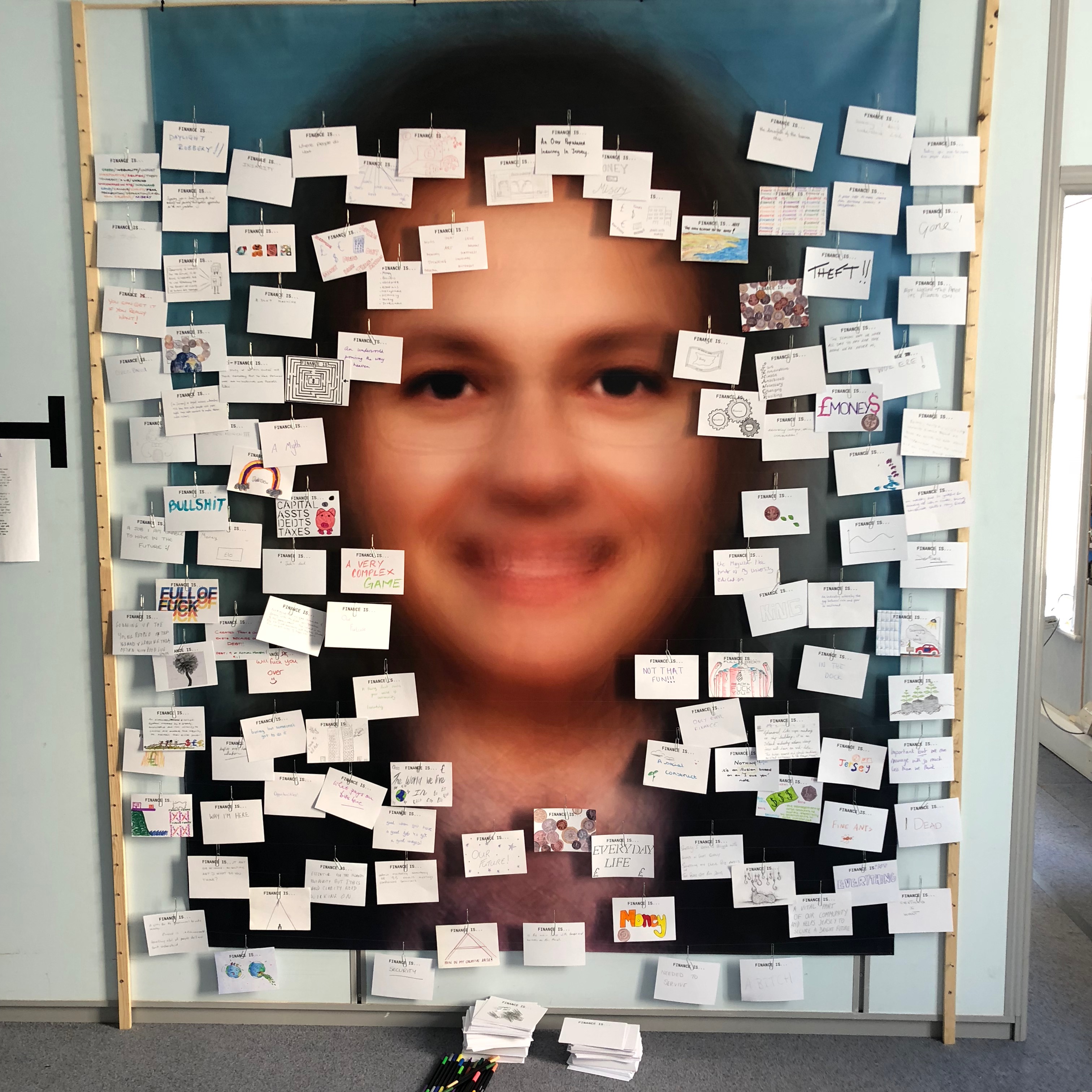 My third photo-shoot idea draws inspiration from Lewis Bush’s work on ‘Trading Zones’ in Jersey. In one segment of the work he showcased cards showing what the public though of finance. From this I believe that I could explore the unique hand-writing style of every individual through asking them to write what ‘Variance and Similarity’ means to them. The result of this will be a range of cards showing a variety of hand-writing styles which may be messy or neat which ultimately will give a slight insight into a personality trait of the person. Hand-writing is unique to everyone as everyone learns from a young age to write in different ways – some write quickly and messily whilst others take pride in ensuring that their hand-writing is neat and almost art-like. The aim of this shoot would be to show the wide variance in people’s styles.
 My fourth shoot idea will focus on the personal belongings of different people. One way in which I could look at the personal belongings of individuals is by photographing the items that people carry around in their school bags on a day-to-day basis. This could be an interesting shoot that will give an insight into the personality traits of the individual as everyone will have different variations of items, some people may have more unnecessary items in their bags whereas some may only carry the minimum. This shoot idea takes inspiration from Huang Qingjun’s work ‘Jiading’ meaning ‘Family Stuff’ in which he photographed families along with their belongings in rural China to show the effect that modernisation is having on the population of the rural areas. I could present this in a typology style way so that the viewer can easily see the similarities and differences between what people carry around with them.
Repetition can be seen as an element of typologies when it is used in photography. I used the idea of typologies in order to create the gif below, I took photographs of people’s keys in my class on a plain background and then at first I was going to display the images on a grid, however, I wanted to experiment with the movement that a gif provides.
The images displayed in a grid:


The images displayed in a gif:

In order to create the gif, I used Adobe Photoshop. The images below show a step by step of how I created the gif. Experimenting with gifs and moving images is a great step into looking at tidal movements and the changes the sea makes. I am thinking of using the skills I have learnt in class when creating a gif with keys, to create a timelapse looking display of images, shows the tide at different points during the day from low tide to high tide.


 Lewis Bush (born 1988 in London) is a British photographer, writer, curator and educator. Bush studied history at the University of Warwick and gained a master’s degree in documentary photography from London College of Communication, where he lectures on photojournalism and documentary photography. In his work bush seeks to draw attention to forms of invisible power that operate in the world – such as finance. Bush has the standpoint that ‘power is always problematic because it’s natural resting state is arbitrary and untransparent’. Bush’s projects tend to incorporate writing and he has written about photography for a range of national and international print and web titles.
In Bush’s ‘The Memory of History‘ from 2012, he travels through a range of European countries to document the way in which the past was being politically manipulated in the context of the economic crisis and recession.
Bush is a photographer in residence at the Societe Jersiaise in Jersey where he is working on his project ‘Trading Zones‘ in which he looks at the international finance industry. It looks at the global economic crisis that began ten years ago and the resulting financial sector. Finance has been very unrepresented in documentaries due to its complexity and stature meaning that there is plenty of potential for investigation for documentary photographers such as Bush. The project ‘Trading Zones’ is a result of six months spent as the 2018 Archisle photographer in residence at the Societe Jersiaise in Jersey, which is currently undergoing huge renovations in the financial sector. Bush says he has used this time to “establish the foundations of what I anticipate will be a long term photographic inquiry into the financial services industry” as the project comes under documentary photography so this project will be ongoing over a long period of time.

Bush’s work on ‘Trading Zones’ interest me as he had a section in the gallery in which he showcased cards showing what the public though of finance. This idea drew inspiration from a project by EJ Major, who sent out cards asking ‘what love is’, expecting people to respond in whichever way they felt appropriate. I could possibly respond to this idea as I have considered exploring the variety in people’s handwriting – everyone has their own unique style of writing and especially ways of drawing specific characters. I believe that by asking multiple people to write down what ‘Variance and Similarity’ means to them I will be left with a collection of cards covered with unique handwriting styles and so will be able to show how characteristics as small as handwriting can show the differences in people’s personality traits.
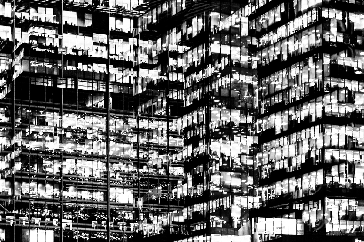 The main project by Bush that interests me is ‘Metropole’ in which he used a technique of double exposure. The project looks at the collapse of the British Empire and how in its place globalised capitalism grew as London has been rebranded as “a city of demolition, cranes, and glittering new high rises”. ‘Metropole’ aims to record the effect of this on London through the form of documentary photography. This appeals to me and links to the theme ‘Variance and Similarity’ because it explores the fact that there are an increasing amount of large buildings for offices or flats taking away from green land and so the landscape in which we live is turning into a repetitive view of similar flats and offices leaving citizens with a feeling of monotony as everything is being redeveloped to serve the same purpose. Bush’s work on ‘Metropole’ shows a lot of emphasis on the repetition between buildings due to his double exposure effect. I intend to respond to this work by capturing blocks of flats or offices, both in day and at night and then altering the photographs in photoshop to replicate the buildings and create a pattern of repetition throughout the edits. These edits will show how buildings can look different individually but a lot of them can be very boring and repetitive.
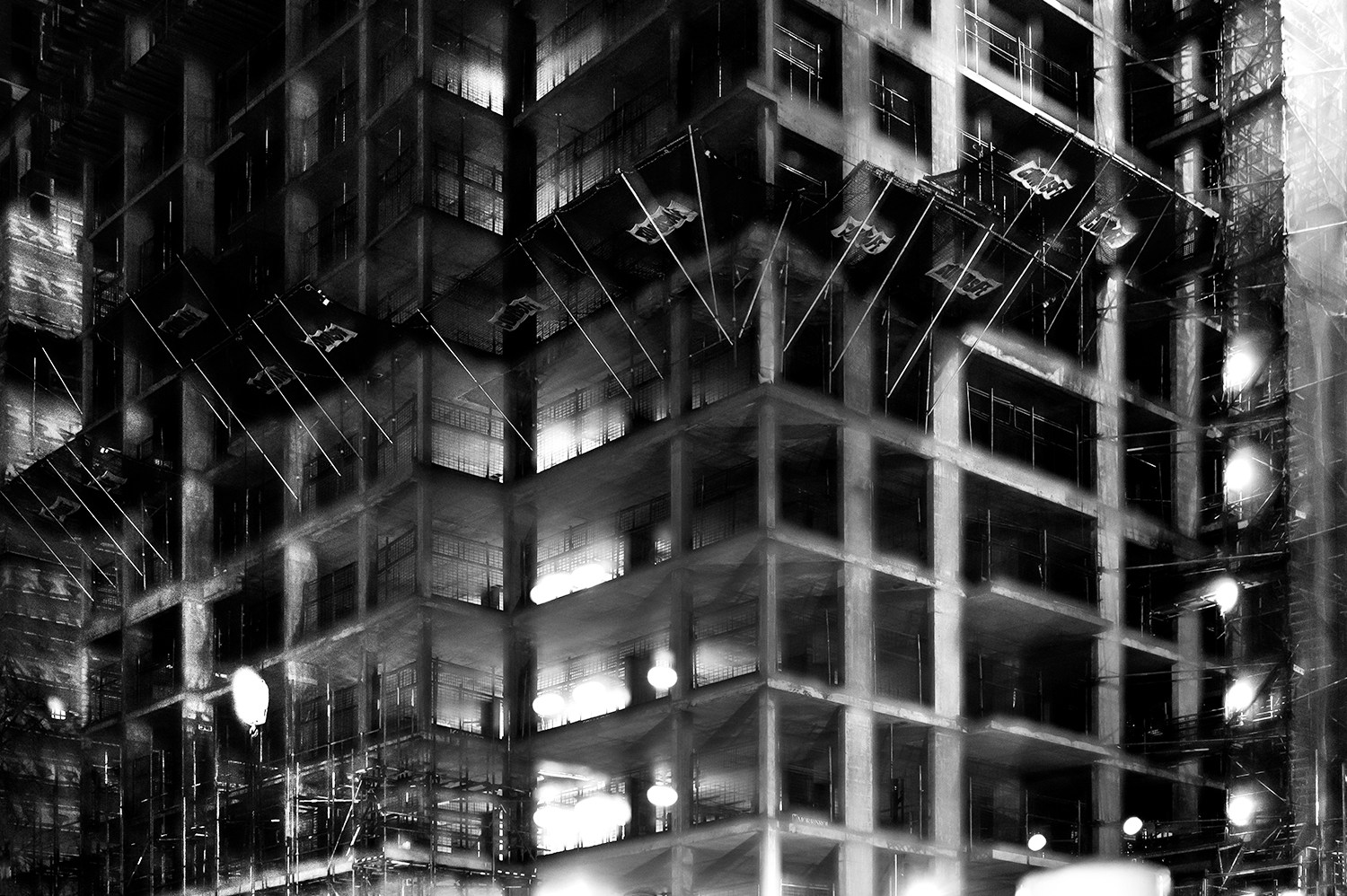
In this photograph it appears that lighting from within the inside of the building was used in what is possible night photograph. The use of this light is used to Bush’s advantage advantage as he uses double exposures to layer building over building creating a disorientating viewing along with contrast between the over-exposed lights and the dark shadows within the building. There is a wide tonal range within the photograph thanks to the range of shadows and lights within the photograph – this wide tonal range makes the photograph interesting in whichever segment the viewer looks as it creates intricate shapes and shadows throughout. The lights and shapes are very intense as the viewer has to try piece the photograph together in order to understand it. It is unclear whether a short or deep depth of field will have been used in this photograph due to the disorientating nature of it – this adds to the mysterious elements of the photograph. A fairly slow shutter speed will have been used along with a low ISO in order for enough of the light to enter the lens from the dark environment whilst keeping the quality of the photograph as high as possible.
There is no colour in this photograph – only black and white along with the shades in between. This black and white approach to the photograph is very effective as it allows you to focus on the structure of the photograph and the buildings rather than being distracted by colours. The black and white effect also adds to the disorientating effect of the double exposure technique. Another addition that the black and white effect brings to the photograph is more contrast between the tones – especially between the bright white lights and the black shadows. The bright lights may be representative of a light at the end of the tunnel due to their glow in comparison to their environment. The photograph seems to have the texture of a graphite drawing which creates a really interesting viewing as what the viewer is seeing seems almost surreal. There is quite a 3D effect to the photograph due to the blending of photographs in order to create platforms coming out towards the viewer from the building. This 3D effect is complimented by the wide range of tones within the photograph. There are two points in the photograph to which the eye is initially drawn – these are the bright heaven-like lights and the platforms extending from the buildings – this is due to the lights contrasting in tone to the rest of the photograph and the platforms providing different shapes to the rest of the image. The platforms are also placed along the higher horizontal line of the rule of thirds meaning they add aesthetic to the photograph.
This photograph was taken from Bush’s project titled ‘Metropole‘. This project looked at the collapse of the British Empire and how in its place globalised capitalism grew. London has been rebranded from “an investment opportunity” to “a city of demolition, cranes, and glittering new high rises”. ‘Metropole’ aims to record the effect of this on London through the form of documentary photography. The project is titled ‘Metropole’ as London was once known as the Metropole meaning it was the mother city at the centre of a vast empire. These photographs were produced “during numerous winter night walks through the city”.
On Bush’s website he says that he used double exposure to create “increasingly disorientating and threatening as the series progresses” in order to create the “sense of loss that many Londoners feel” in the big city. This theme of a feeling of loss within the city emphasises how cities such as London have changed with the arrival of these repetitive blocks of flats – possibly for the worse. Bush continues this theme in his work on ‘Trading Zones’ in which he studies the Jersey financial sector. I think that through this exploration of disorientation and change Bush is trying to show that people often feel that the world is moving too fast for its own good as people get lost in temporary trends and patterns of life, ultimately resulting in repetition.
AO1 – Develop your ideas through sustained and focused investigations informed by contextual and other sources, demonstrating analytical and critical understanding.
To achieve an A or A*-grade you must demonstrate an Exceptional ability (Level 6) through sustained and focused investigations achieving 16-18 marks out of 18.
Get yourself familiar with the assessment grid here:

To develop your ideas further from initial research using mind-maps and mood-boards based on the themes VARIATION and/or SIMILARITY you need to be looking at the work of others (artists, photographers, filmmakers, writers, theoreticians, historians etc) and write a specification with 2-3 unique ideas that you want to explore further.
Research and analyse the work of at least 2-3 (or more) photographers/ artists. Produce at least 2-3 blog posts for each artist reference that illustrate your thinking and understanding using pictures and annotation and make a photographic response to your research into the work of others
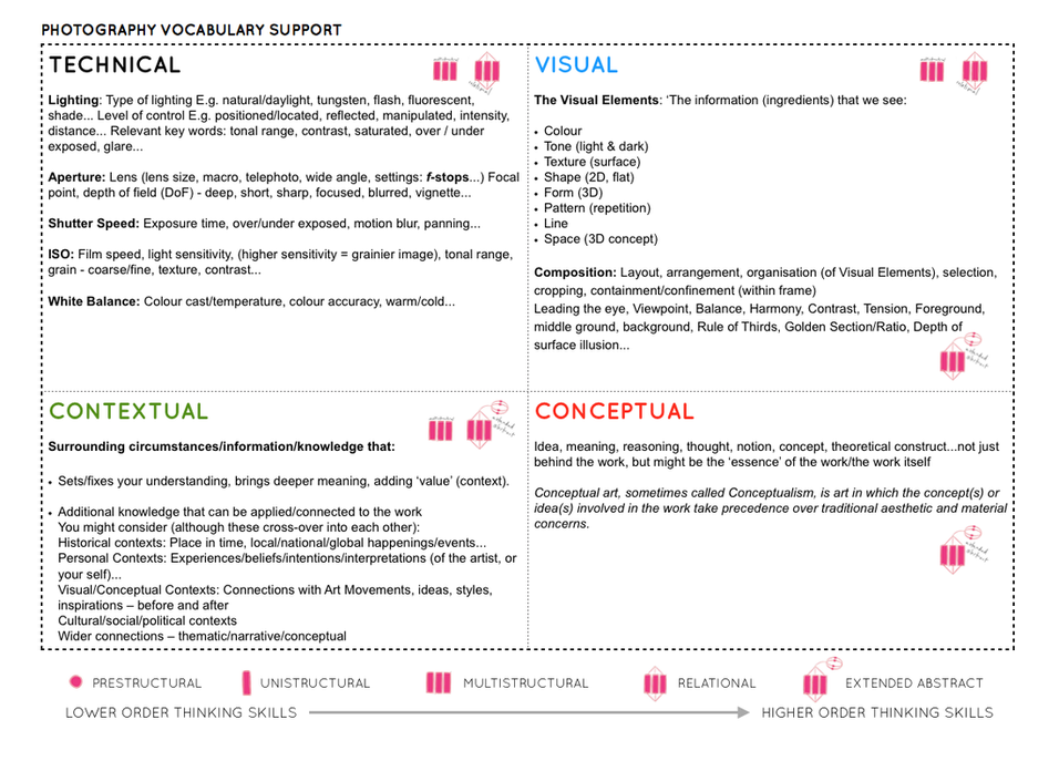
For more help and guidance on image analysis go to Photo Literacy
Below are inspirations and artists references exploring the exam themes of VARIATION and/or SIMILARITY.
| Each week you are required to make a photographic response (still-images and/or moving image) that relates to the research and work that you explored in that week. Sustained investigations means taking a lot of time and effort to produce the best you can possibly do – reviewing, modifying and refining your idea and taking more pictures to build up a strong body of work with a clear sense of purpose and direction |
USEFUL WEBSITES
Lensculture – great source for new contemporary photography from all over the world
Photographic Museum Humanity
Landscape Stories
Photography magazine and journals
Aperture Magazine – American based publication
Aperture BLOG – in-de[th interviews with artists
British Journal of Photography (BJP) – Journal on Contemporary Photography
Huck Magazine
GUP Magazine
FOAM Magazine
Blogs and podcasts for writing and talking about contemporary photographic practice:
1000 WORDS
MAGIC HOUR
A SMALL VOICE
SAINT LUCY
Conscientious Photography Magazine
COLIN PANTALL BLOG
American Suburb X – look at home as it is blocked by Education
The Photobook Review
Photography Agencies and Collectives
World Press Photo – the best news photography and photojournalism
Magnum Photos – photo agency, picture stories from all over the world.
Panos Picture – photo agency
Agency VU – photo agency
INSTITUTE – photo agency
Sputnik Photos – photo collective made of Polish and East European photographers
A Fine Beginning – photo collective in Wales
Document Scotland – photo collective in Scotland
NOOR – a collective uniting a select group of highly accomplished photojournalists and documentary storytellers focusing on contemporary global issues.
Photobook makers and publishers
Aperture
MACK
Steidl
Chose Commune
Self Publish Be Happy
Dewi Lewis Publishing
Akina Books
Skinnerboox
Kehrer
Void
Witty Kiwi
Dalpine
Kodoji Press
Super Labo
Fw: Books
Editions Xavier Barrel
Morel Books
PhotoBookStore – Independent bookshop with good video browsers
Produce a number of quick photoshoots or video shoots using your mobile phone or camera . These initial recordings are testing out ideas that you could develop and refine later on as part of your exam project.
MUST – Choose 1 Task – (C-grades)
SHOULD – Explore 2 Tasks – (B-grades)
COULD – Complete all 3 Tasks – (A-grades)
Record an activity or routine that you do/ repeat on a daily basis, e.g. brushing teeth, putting on clothes, applying make-up, comb your hair, eating, feeding your dog, walk to school/work, sleeping, scree time on social media, talking, selfies
Yoko Ono: early video works in the 1960s
Since emerging onto the international art scene in the early 1960s, Yoko Ono has made profound contributions to visual art, performance, filmmaking, and experimental music. Born in Tokyo in 1933, she moved with her family to New York in the mid-1950s and enrolled at Sarah Lawrence College. Over the next decade she lived in New York, Tokyo, and London, greatly influencing the international development of Fluxus and Conceptual art.
Ono’s earliest works were often based on instructions that she communicated to the public in verbal or written form. Painting to Be Stepped On (1960–61), for example, invited people to tread upon a piece of canvas placed directly on the floor, either physically or in their minds. Though easily overlooked, the work radically questioned the division between art and the everyday. In 1964, she compiled more than 150 of her instructions in her groundbreaking artist’s book, Grapefruit. The instructions range from feasible to improbable, often relying upon the reader’s imagination to complete the work. At turns poetic, humorous, unsettling, and idealistic, Ono’s early instruction pieces anticipated her later work, such as Cut Piece (1964), a performance in which people were invited to cut away portions of her clothing; Sky Machine (1966), a sculpture that speaks to her environmental concerns; and To See the Sky (2015), a spiral staircase installed beneath a skylight that visitors were invited to ascend in order to contemplate the sky.
Marina Abramovich: Art Must be Beautiful
Since the beginning of her career in Belgrade during the early 1970s, Marina Abramović has pioneered performance as a visual art form. She created some of the most important early works in this practice, including Rhythm 0 (1974), in which she offered herself as an object of experimentation for the audience, as well as Rhythm 5 (1974), where she lay in the centre of a burning five-point star to the point of losing consciousness. These performances married concept with physicality, endurance with empathy, complicity with loss of control, passivity with danger. They pushed the boundaries of self-discovery, both of herself and her audience. They also marked her first engagements with time, stillness, energy, pain, and the resulting heightened consciousness generated by long durational performance.
The body has always been both her subject and medium. Exploring her physical and mental limits in works that ritualise the simple actions of everyday life, she has withstood pain, exhaustion and danger in her quest for emotional and spiritual transformation. From 1975-88, Abramović and the German artist Ulay performed together, dealing with relations of duality. She returned to solo performances in 1989 and for The Artist Is Present (2010) she sat motionless for at least eight hours per day over three months, engaged in silent eye-contact with hundreds of strangers one by one.
Andy Warhol early experimental films
The films Andy Warhol made in the 1960s are among the most significant works in the career of this prolific and mercurial American artist. In the short span of five years, from 1963 through 1968, Warhol produced nearly 650 films, including hundreds of silent Screen Tests, or portrait films, and dozens of full-length movies, in styles ranging from minimalist avant-garde to commercial “sexploitation.” Warhol’s films have been highly regarded for their radical explorations beyond the frontiers of conventional cinema. With works such as Empire (1964), his notorious eight-hour film of the Empire State Building, My Hustler (1965), a social comedy about gay life on Fire Island, and the double-screen The Chelsea Girls (1966), the first avant-garde film to achieve extensive commercial exhibition, Warhol redefined the film-going experience for a wide range of audiences and attracted serious critical attention as well as much publicity. In 1970, the artist withdrew his films from distribution; for the next twenty years, most critics and scholars could only reconstruct these works from reviews and other verbal accounts.
Martha Rosler: Kitchen Semiotics, 1975
In this performance Rosler takes on the role of an apron-clad housewife and parodies the television cooking demonstrations popularized by Julia Child in the 1960s. Standing in a kitchen, surrounded by refrigerator, table, and stove, she moves through the alphabet from A to Z, assigning a letter to the various tools found in this domestic space. Wielding knives, a nutcracker, and a rolling pin, she warms to her task, her gestures sharply punctuating the rage and frustration of oppressive women’s roles. Rosler has said of this work, “I was concerned with something like the notion of ‘language speaking the subject,’ and with the transformation of the woman herself into a sign in a system of signs that represent a system of food production, a system of harnessed subjectivity.”
Bruce Naumann: early video works
For more than 50 years Naumann has worked in every conceivable artistic medium, dissolving established genres and inventing new ones in the process. His expanded notion of sculpture admits wax casts and neon signs, bodily contortions and immersive video environments. Coming of age amid the political and social upheavals of the 1960s, Nauman never adhered to rigid distinctions between the arts, but rather has staked his career on “investigating the possibilities of what art may be.
After graduating from art school at the age of 24, Nauman took up residence in a vacant grocery store in San Francisco. Alone in this studio with time on his hands, he resolved that anything he did there could be art: “Sometimes the activity involve[d] making something, and sometimes the activity [was] the piece.”3 He often recorded his efforts on camera, as in Composite Photo of Two Messes on the Studio Floor(1967), which shows the plaster dust and refuse that litters his workspace—the dregs of the creative act. And in a series of now-iconic videos, he used his own body as raw material, engaging in humble, repetitive tasks that could be maddening (Bouncing in the Corner, 1968), coy (Walk with Contrapposto, 1968) or haltingly graceful (Slow Angle Walk [Beckett Walk], 1968). Each tedious exercise drones on for an hour—the standard length of a videotape—and subjects artist and viewer alike to a minor test of endurance.
Andy Warhol was a leading figure in the Pop Art movement. Like his contemporaries Roy Lichtenstein and Robert Rauschenberg, Warhol responded to mass-media culture of the 1960s. His silkscreens of cultural and consumer icons—including Marilyn Monroe, Elizabeth Taylor, Campbell’s Soup Cans, and Brillo Boxes—would make him one of the most famous artists of his generation. “The best thing about a picture is that it never changes, even when the people in it do,” he once explained. Born Andrew Warhola on August 6, 1928 in Pittsburgh, PA, he graduated from the Carnegie Institute of Technology in 1949. Moving to New York to pursue a career in commercial illustration, the young artist worked for magazine such as Vogue and Glamour. Though Warhol was a gay man, he kept much of his private life a secret, occasionally referencing his sexuality through art. This is perhaps most evident in his drawings of male nudes from the 1950s, and later in his film Sleep (1963), which portrays the poet John Giorno nude. In 1964, Warhol rented a studio loft on East 47th street in Midtown Manhattan which was later known as The Factory. The artist used The Factory as a hub for movie stars, models, and artists, who became fodder for his prints and films. The space also functioned as a performance venue for The Velvet Underground. During the 1980s, Warhol collaborated with several younger artists, including Jean-Michel Basquiat, Francesco Clemente, and Keith Haring. The artist died tragically following complications from routine gall bladder surgery at the age of 58, on February 22, 1987 in New York, NY. After his death, the artist’s estate became The Andy Warhol Foundation and in 1994, a museum dedicated to the artist and his oeuvre opened in his native Pittsburgh. Today, his works are held in the collections of the Art Institute of Chicago, the Whitney Museum of American Art in New York, and the Tate Gallery in London, among others.


William Klein is an American artist known for his unconventional style of abstract photography depicting city scenes. Although similar in subject matter to other street photographers such as Diane Arbus and Saul Leiter, as well as fashion photographers Irving Penn and Richard Avedon, Klein’s images break from established modes. “I came from the outside, the rules of photography didn’t interest me. There were things you could do with a camera that you couldn’t do with any other medium—grain, contrast, blur, cock-eyed framing, eliminating or exaggerating grey tones and so on,” he reflected. “I thought it would be good to show what’s possible, to say that this is as valid of a way of using the camera as conventional approaches.” Born on April 19, 1928 in New York, NY, Klein studied painting and worked briefly as Fernand Léger’s assistant in Paris, but never received formal training in photography. His fashion work has been featured prominently in Vogue magazine, and has also been the subject of several iconic photo books, including Life is Good and Good for You In New York (1957) and Tokyo (1964). In the 1980s, he turned to film projects and has produced many memorable documentary and feature films, such as Muhammed Ali, The Greatest (1969). Klein currently lives and works in Paris, France. His works are held in the collections of The Museum of Modern Art in New York, the National Gallery of Art in Washington, D.C., and the Art Institute of Chicago, among others.


Contact-sheets – showing a variety of similar shots, exploring different ways of framing


Dafna Talmor: Constructed Landscapes
This ongoing body of work consists of staged landscapes made of collaged and montaged colour negatives shot across different locations that include Israel, Venezuela, the UK and USA. Initially taken as mere keepsakes, landscapes are merged and transformed through the act of slicing and splicing. The resulting photographs are a conflation, ‘real’ yet virtual and imaginary. This conflation aims to transform a specific place – initially loaded with personal meaning, memories and connotations – into a space that has been emptied of subjectivity and becomes universal.
In dialogue with the history of photography, Constructed Landscapes references early Pictorialist tendencies of combination printing as well as Modernist experimental techniques such as montage, collage and multiple exposures. While distinctly holding historical references, the work also engages with contemporary discourses on manipulation, the analogue/digital divide and the effects these have on photography’s status and veracity. Through this work, I am interested in creating a space that defies specificity, refers to the transient, and metaphorically blurs space, memory and time.


Typology means the study and interpretation of types and became associated with photography through the work of Bernd and Hilla Becher, whose photographs taken over the course of 50 years of industrial structures; water towers, grain elevators, blast furnaces etc can be considered conceptual art. They were interested in the basic forms of these architectural structures and referred to them as ‘Anonyme Skulpturen’ (Anonymous Sculptures.)
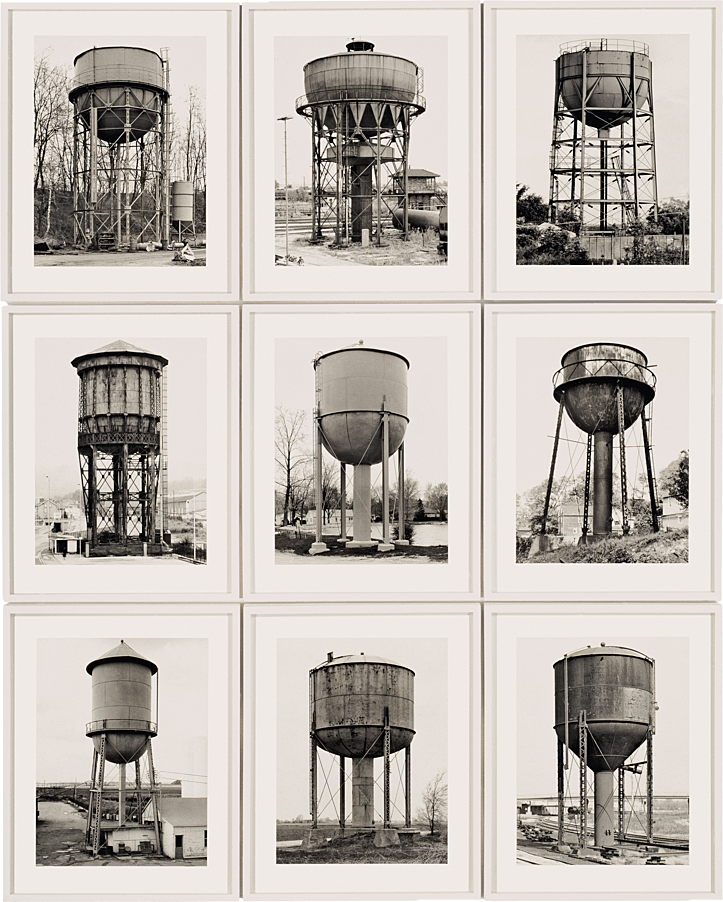
The Becher’s were influenced by the work of earlier German photographers linked to the New Objectivity movement of the 1920s such as August Sander, Karl Blossfeldt and Albert-Renger-Patzsch.
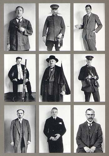
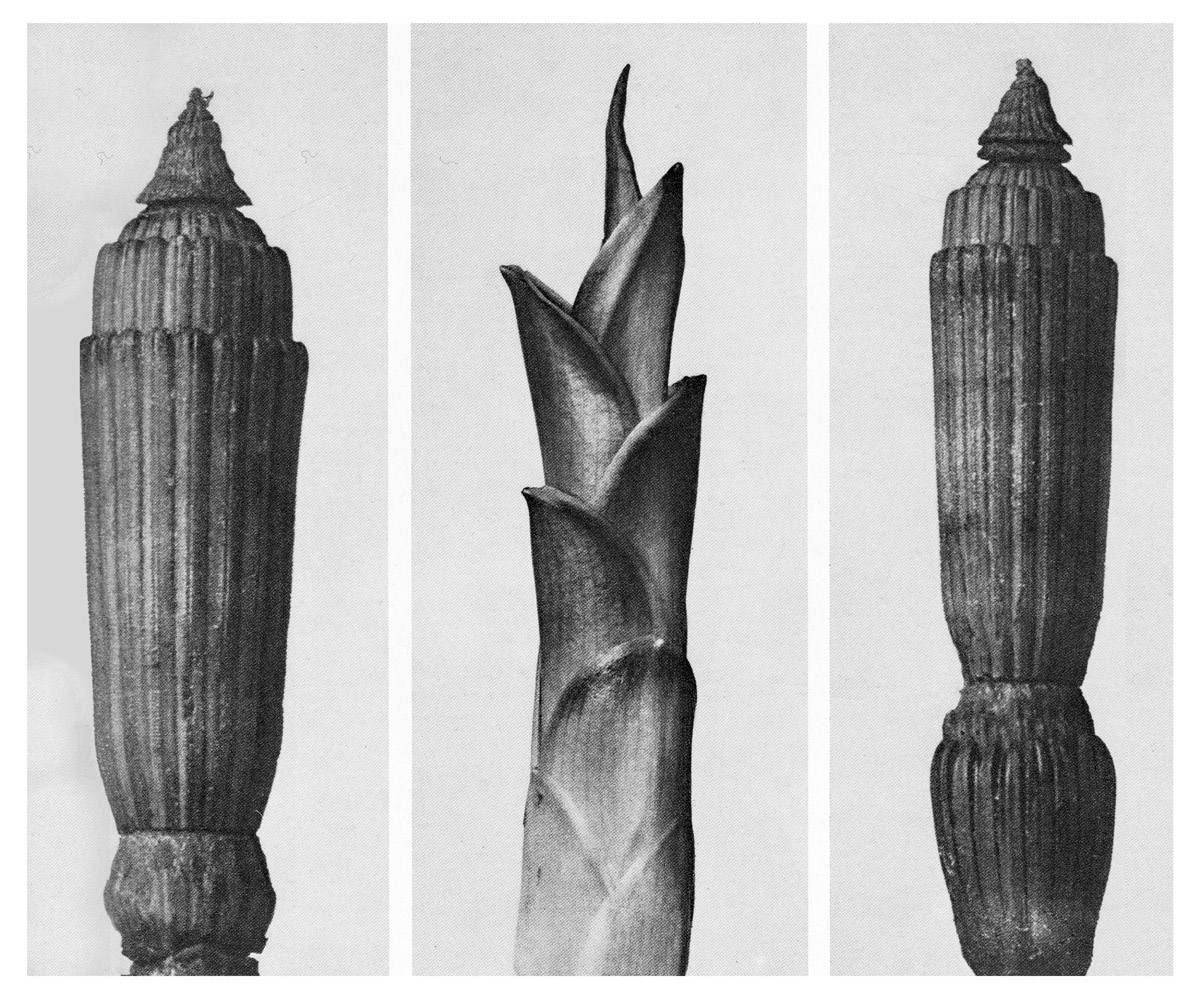

See also the work by Americans, William Christenberry and Ed Ruscha’s photographic works on types e.g. Twentysix Gasoline Stations (1964). Every building on the Sunset Strip (1966). Or Idris Khan‘s appropriation of Bechers’ images.


See previous blog post for more guidelines and a photo-assignment.
Not least of the Bechers’ legacy is their lasting influence on subsequent generations of artists who use the photographic medium today, most notably the students taught by Bernd Becher at the Düsseldorf Art Academy between 1976 and 1996. Among his most renowned students are Andreas Gursky, Candida Höfer, Thomas Ruff, and Thomas Struth.


Gustave Le Gray (French 1820 –1884) was an early pioneer of seascapes.
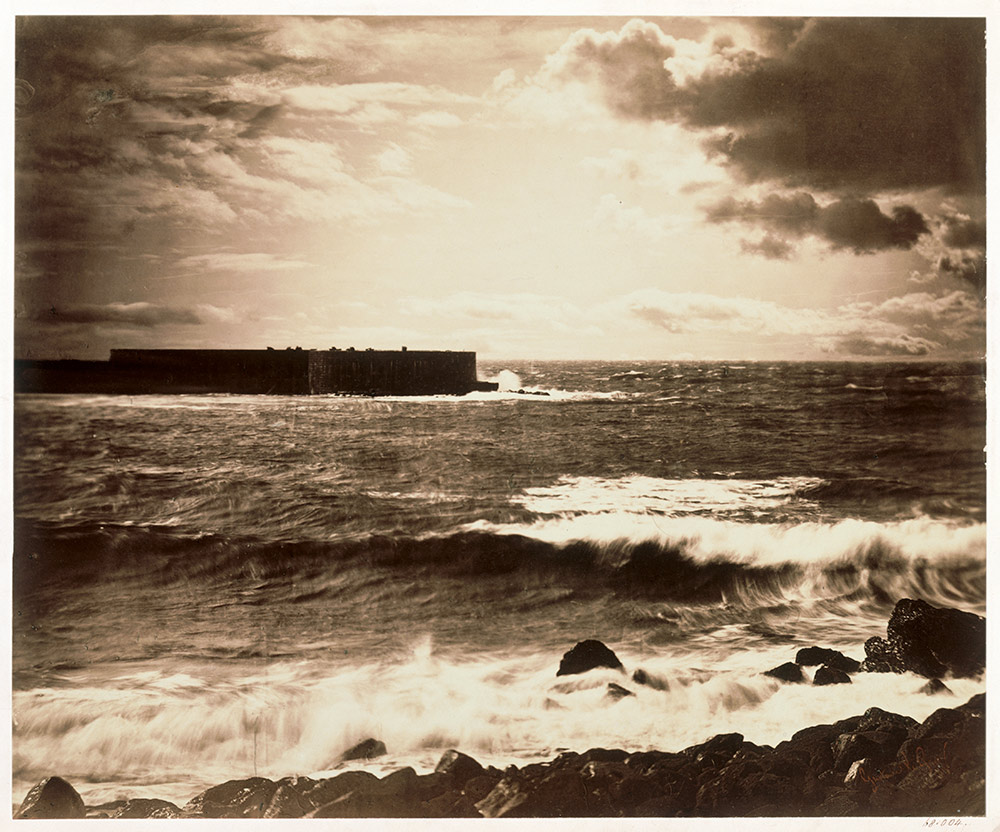
Combination printing, creating seascapes by using one negative for the water and one negative for the sky at a time where it was impossible to have at the same time the sky and the sea on a picture due to the too extreme luminosity range. Combination printing was an early experiment of HDR photography where you expose for bright and dark areas of a landscape scene.
Contemporary approaches to views of horizons between sky and sea, see inspiration from Japanese photographer Hiroshi Sugimoto whose monochrome images are minimalist and spiritual in their expression.
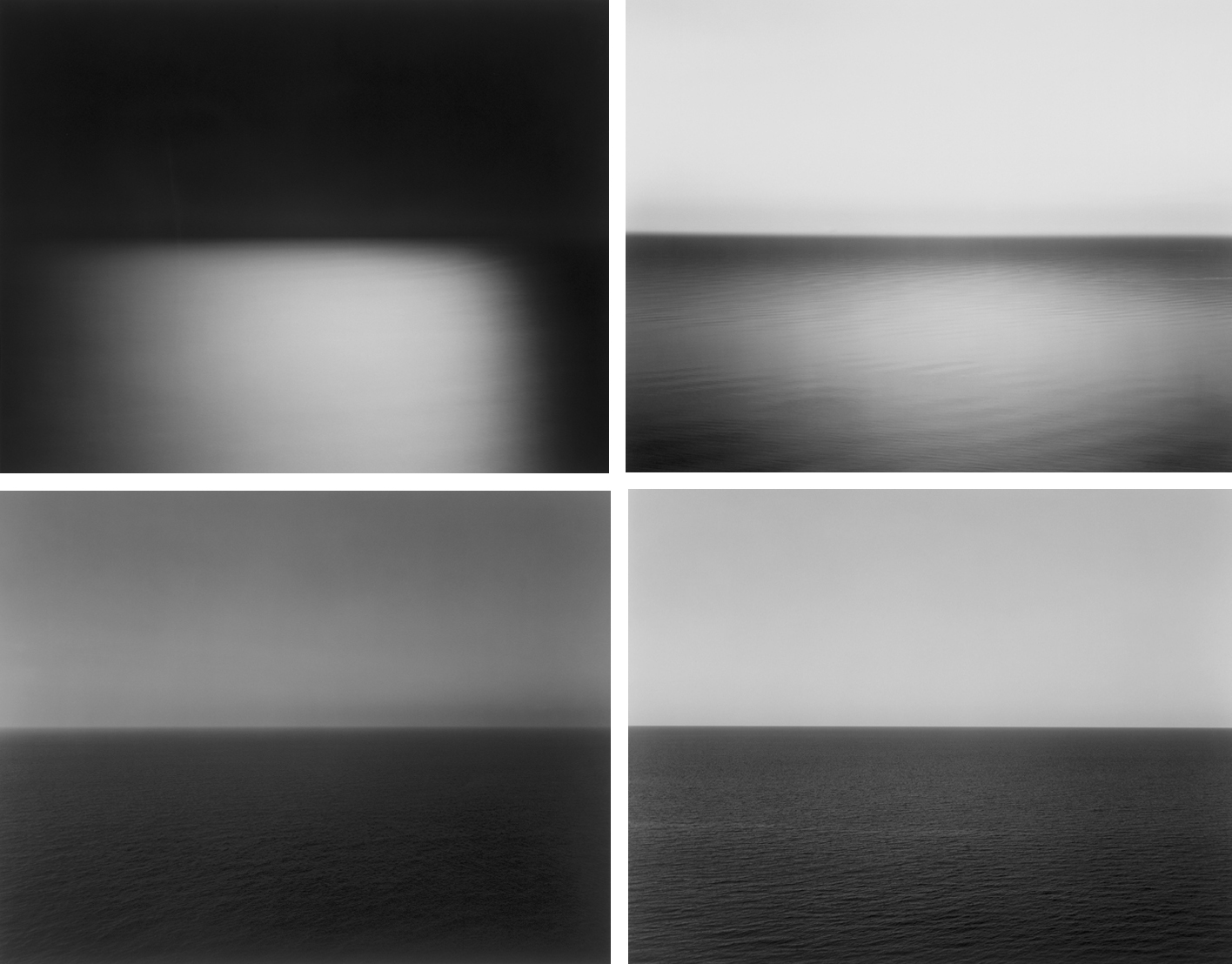
If you intend to explore sea landscapes you must do contextual research in relation to the art movement of Romanticism – see below. Technically you must make images exploring diverse quality of light, expansive views and weather patterns at different times of the day. Make sure to use a tripod, cable release and apply exposure bracketing and experiment with HDR techniques in post-production. Other techniques such as panoramic images and Hockney ‘joiners’ and Typology studies are also appropriate.
Jersey west coast has unique identity and geography. For many it is place of refuse from work, school and where they go for relaxation, leisure, beach, surfing, walking. If we think about Jersey and an island surrounded by water and with a one of the fastest tidal moments in the world you can look at photographers who has explored the notion of sea or water in interesting ways.
Michael Marten: Sea Change
Excellent use of diptych and triptych and exploring low vs high tides to see how it changes a landscape scene


Mark Power: The Shipping Forecats
Intangible and mysterious, familiar yet obscure, the shipping forecast is broadcast four times daily on BBC Radio 4. For those at, or about to put to sea, the forecast may mean the difference between life and death. In The Shipping Forecast, Mark Power documents the 31 sea areas covered by the forecast,

Subject of water – both studies done on the Thames River in London
Roni Horn: Dictionary of Water
Water is a series of photographs of the surface of the Thames. It is ever-changing: now swirling, now scrunched like black tin foil, now in Turneresque lemon and flame colours, now plucked up into dune shapes. Each is annotated with tiny numbers, which refer to footnotes. The footnotes, hundreds in total, worry away in small type under the images – they happen, in other words, under the surface, and concern what the water suggests and conceals. (“Black water is sexy. / What is water? / What do you know about water? Only that it’s everywhere differently. / Disappearance: that’s why suicides are attracted to it. / You can’t talk about water without talking about oneself. / Down at the river I shot my baby.”)

Mark Dion: Archeaology
Archaeological excavations aren’t limited to ancient Egypt or Stone Age villages. In 1999 during the Tate Thames Dig artist Mark Dion and volunteers collected found objects from the river bed and displayed in the cabinets.
Helge Skodvin: 240 Landscape

Michael Wolf, Hongkong books
Thom and Beth Atkinson: Missing Buildings

Jitka Hanzlova: Female

Roni Horn: You are the Weather

Kenneth O Halloran: Bing, Bing, Bong, Bong, Bing, Bing, Bing


Alejandro Cartagena, Carpoolers

Michael Subotzky and Patrick Waterhouse; Ponte City
Ponte City was, once, a tower of dreams — a specific, Apartheid-era dream. The residential tower was first envisioned in the 1970s, at the height of Apartheid confidence and white Johannesburg’s economic boom. Amidst the tower’s 54 stories, the builders promised purpose-built bachelor pads (complete with raised bedchambers, offering dazzling views of the city), “Pallazzo-en-Paradiso” suites (flanked by meticulously screened off servant’s quarters), and so many amenities — men’s leisure wear outlets, sundecks, an indoor ski slope — that the tower’s builders promised “Live in Ponte and never go out”.
In 2011, the two artists produced a series of lightboxes, which were designed to imitate the tower’s window, door, and television arrangement. The latest exhibition of the series, at Le Bal, expands the scope of what’s on display. The show includes dozens of photographs, but also contains a wide variety of multimedia material: promotional advertising from the building’s opening (“AFRICAN QUEEN”) and re-opening (“LIVE YOUR LIFE”) and 3-D reproductions of the building’s bulletin boards, complete with documents salvaged from former tenant’s homes. The two artists have even reproduced copies of the original architects’ plans from the 1970s, which focus inordinately on the aforementioned bachelor pads — a small stand-in for the sleazy, faux-luxurious fantasy that has propped up the tower from its inception.
Mikhael Subotzky, in describing his compulsion to photograph, has said, “For me, photography has become a way of attempting to make sense of the very strange world that I see around me. I don’t ever expect to achieve that understanding, but the fact that I am trying comforts me”. His and Waterhouse’s bold, persistent, though always impossible, efforts could not be clearer in Ponte City. The project combines exhausting research and tremendous exactitude with a powerful human face. Although no one could ever fully understand the legacy of this twisted symbol of Johannesburg’s history, hopes, dreams, and future, Subotzky and Waterhouse try, admirably.


Niall McDiarmid: Crossing Paths, Town to Town, Via Vauxhall

Tom Wood: All Zones off Peak – Using public transport as a method of exploration


George Georgiou: Last Stop


Eadweard Muybridge was the man who famously proved a horse can fly. Adapting the very latest technology to his ends, he proved his theory by getting a galloping horse to trigger the shutters of a bank of cameras. This experiment proved indisputably for the first time what no eye had previously seen – that a horse lifts all four hooves off the ground at one point in the action of running. Seeking a means of sharing his groundbreaking work, he invented the zoopraxiscope, a method of projecting animated versions of his photographs as short moving sequences, which anticipated subsequent developments in the history of cinema.
British-born Muybridge, who emigrated to the United States in the 1850s, is one of the most influential photographers of all time. He pushed the limits of the camera’s possibilities, creating world-famous images of animals and humans in motion. Just as impressive are his vast panoramas of American landscapes, such as the Yosemite valley, and his documentation of the rapidly growing nation, particularly in San Francisco. His dramatic life included extensive travels in North and Central America, a career as a successful lecturer, and the scandal of his trial for the murder of his wife’s lover.
This exhibition brings together the full range of his art for the first time, and explores the ways in which Muybridge created and honed his remarkable images, which continue to resonate with artists today. Highlights include a seventeen foot panorama of San Francisco and recreations of the zoopraxiscope in action. His influence has forever changed our understanding and interpretation of the world, and can be found in many diverse fields, from Marcel Duchamp‘s painting Nude Descending a Staircase and countless works by Francis Bacon, to the blockbuster film The Matrix and Philip Glass’s opera The Photographer.


Etienne-Jules Marey (French, 1830–1904); Chronophotography
Unlike the motion studies of Eadweard Muybridge, who depicted movement as a series of discrete moments on separate, sequential negatives, Marey’s analyses of motion are characterized by multiple exposures on a single photographic plate. In this photograph, Charles Fremont, a civil engineer who assisted Marey in his laboratory, used Marey’s method to study blacksmiths at the anvil; the dynamic synthesis of their arced blows traced the pattern of manual effort involved in the task. Fremont’s photographic investigations into the conservation and expenditure of energy during human labor established principles that laid the foundation for modern industrial production.


John Baldessari: I’m Making Art
John Baldessari: Throwing Three Balls in the Air to Get a Straight Line (Best of Thirty-Six Attempts)
Bas Jan Ader: Tea Party
Bas Jan Ader: I’m Too Sad to Tell You
Tom Pope
 Bruce McLean: Pose work for Plinths
Erwin Wurm
Dziga Vertov:Man with a Movie Camera, 1929
Part documentary and part cinematic art, this film follows a city in the 1920s Soviet Union throughout the day, from morning to night. Directed by Dziga Vertov, with a variety of complex and innovative camera shots, the film depicts scenes of ordinary daily life in Russia. Vertov celebrates the modernity of the city, with its vast buildings, dense population and bustling industries. While there are no titles or narration, Vertov still naturally conveys the marvels of the modern city.

Gillian Wearing: Signs that Say What You Want Them To Say and Not Signs that Say What Someone Else Wants You To Say (1992-93)
Gillian Wearing: Dancing in Peckham
Claude Cahun play with gender identities.
Born Lucy Schwob, Claude Cahun was a French photographer, sculptor, and writer. She is best known for her self-portraits in which she assumes a variety of personas, including dandy, weight lifter, aviator, and doll.

In this image, Cahun has shaved her head and is dressed in men’s clothing. She once explained: “Under this mask, another mask; I will never finish removing all these faces.”1 (Claude Cahun, Disavowals, London 2007, p.183)
Cahun was friends with many Surrealist artists and writers; André Breton once called her “one of the most curious spirits of our time.”2 (See Guardian article below by Gavin James Bower, “Claude Cahun: Finding a Lost Great,)
While many male Surrealists depicted women as objects of male desire, Cahun staged images of herself that challenge the idea of the politics of gender. Cahun was championing the idea of gender fluidity way before the hashtags of today. She was exploring her identity, not defining it. Her self-portraits often interrogates space, such as domestic interiors and Jersey landscapes using rock crevasses and granite gate posts.
The Jersey Heritage Trust collection represents the largest repository of the artistic work of Cahun who moved to the Jersey in 1937 with her stepsister and lover Marcel Moore. She was imprisoned and sentenced to death in 1944 for activities in the resistance during the Occupation. However, Cahun survived and she was almost forgotten until the late 1980s, and much of her and Moore’s work was destroyed by the Nazis, who requisitioned their home. CaHun died in 1954 of ill health (some contribute this to her time in German captivity) and Moore killed herself in 1972. They are both buried together in St Brelade’s churchyard.
A few articles to read:
https://www.theguardian.com/books/2012/feb/14/claude-cahun-finding-great
http://www.bbc.com/culture/story/20160629-claude-cahun-the-trans-artist-years-ahead-of-her-time
Link to Jersey Heritage: https://www.jerseyheritage.org/collection-items/claude-cahun
For further feminist theory and context read the following essay:
Amelia Jones: The “Eternal Return”: Self-Portrait Photography as Technology of Embodiment – pdf Jones_Eternal Return
In 2017 the National Portrait Gallery in London brough the work of Claude Cahun and Gillian Wearing together for the first time. Slipping between genders and personae in their photographic self-images, Wearing and Cahun become others while inventing themselves. “We were born in different times, we have different concerns, and we come from different backgrounds. She didn’t know me, yet I know her,” Wearing says, paying homage to Cahun and acknowledging her presence. The bigger question the exhibition might ask is less how we construct identities for ourselves than what is this thing called presence?
Gillian Wearing and Claude Cahun: Behind the Mask, Another Mask is at the National Portrait Gallery, London, 9 March-29 May
Behind a mask, Wearing is being Cahun. Previously she has re-enacted photographs of Andy Warhol in drag, the young Diane Arbus with a camera, Robert Mapplethorpe with a skull-topped cane, hard-bitten New York crime photographer Weegee wreathed in cigar-smoke. Among these doubles, you know Wearing is in the frame somewhere, under the silicon mask and the prosthetics, the wigs and makeup and the lighting. Going through her own family albums, she has become her own mother and her father. It is a surprise she has never got lost in this hall of time-slipping mirrors, among her own self-images and the faces she has adopted. Wearing has got others to play her game, too – substituting their own adult voices with those of a child, putting on disguises while confessing their secrets on video.


This exhibition surveys Sherman’s career, from her early experiments as a student in Buffalo in the mid-1970s to a recent large-scale photographic mural, presented here for the first time in the United States. Included are some of the artist’s groundbreaking works—the complete “Untitled Film Stills” (1977–80) and centerfolds (1981), plus the celebrated history portraits (1988–90)—and examples from her most important series, from her fashion work of the early 1980s to the break-through sex pictures of 1992 to her monumental 2008 society portraits.
Sherman works in series, and each of her bodies of work is self-contained and internally coherent; yet there are themes that have recurred throughout her career. The exhibition showcases the artist’s individual series and also presents works grouped thematically around such common threads as cinema and performance; horror and the grotesque; myth, carnival, and fairy tales; and gender and class identity.
Further reading and context:
Krauss_Rosalind_E_Bachelors
Johanna Burton (ed) Cindy Sherman, October Files, MIT Press From
A few articles/ reviews
Hal Foster https://www.lrb.co.uk/v34/n09/hal-foster/at-moma
The Guardian: https://www.theguardian.com/artanddesign/2016/jul/03/cindy-sherman-interview-retrospective-motivation
Shannon O’Donnell and her book: Shrinking Violet
Here is link to Shannon’s blog showing all her research, analysis, recordings, experimentation and evaluations
Chrissy Knight portraits of Women of Yesterday
Clare Rae came to Jersey in 2017 and made a series of work, Never Standing on two Feet in response to Claude Cahun

Find more images and information here on Clare Rae’s website.
Exhibited in Entre Nous: Claude Cahun and Clare Rae at the Centre for Contemporary Photography, Melbourne Australia 22 March – 6 May 2018, and subsequently at CCA Galleries in Jersey, UK, 7–28 September 2018.
An accompanying book, Never Standing on Two Feet with an introduction by Susan Bright and essay by Gareth Syvret was published by Perimeter editions in April 2018. Purchase online via Perimeter.
See this blog post Photography, Performance and the Body for more details and context of the above artists work
Memento (2000) is an American neo-noir psychological thriller film written and directed by Christopher Nolan. It stars Guy Pearce, as a man who, as a result of a past trauma, has anterograde amnesia (the inability to form new memories) and has short-term memory loss approximately every five minutes. He is searching for the persons who attacked him and killed his wife, using an intricate system of Polaroid photographs and tattoos to track information he cannot remember. Memento is presented as two different sequences of scenes interspersed during the film: a series in black-and-white that is shown chronologically, and a series of color sequences shown in reverse order (simulating for the audience the mental state of the protagonist). The two sequences meet at the end of the film, producing one complete and cohesive narrative
Explanation of the film’s intricate narrative structure
Duane Michaels: photo-stories eg. The Bogeyman, The Spirit Leaves the Body. A self-taught photographer, Duane Michals broke away from established traditions of the medium during the 1960s. His messages and poems inscribed on the photographs, and his visual stories created through multiple images, defied the principles of the reigning practitioners of the form. Indeed, Michals considers himself as much a storyteller as a photographer.

Tom Hunter: Headlines, Life and Death in Hackney
Since 1997, Tom Hunter has turned his camera on his surrounding neighbourhood of Hackney, showing empathy without being polemic. He is known for a remarkable blend of political commentary, history of art and the technicalities of photography. Working to create photographs that are the result of an exaggerated link between newspaper headlines, paintings from The National Gallery’s permanent collection and Hackney lifestyle, Hunter often seems to ask more questions than he can answer visually.


Read more here about Tom Hunter’s work in The Guardian
Photobooks to study where a theme or narrative is explored in subtle vairiations
In 2001, Rinko Kawauchi published three astonishing photobooks simultaneously—Utatane, Hanabi, andHanako—establishing herself as one of the most innovative newcomers to contemporary photography. Other notable monographs include Aila (2004), The Eyes, the Ear (2005), and Semear (2007). Now, ten years after her precipitous entry onto the international stage, Aperture has published Illuminance, the first volume of Kawauchi’s work to be published outside of Japan.
Kawauchi’s work has frequently been lauded for its nuanced palette and offhand compositional mastery, as well as its ability to incite wonder via careful attention to tiny gestures and the incidental details of her everyday environment. In Illuminance, Kawauchi continues her exploration of the extraordinary in the mundane, drawn to the fundamental cycles of life and the seemingly inadvertent, fractal-like organization of the natural world into formal patterns.
Sophie Calle: The Address Book
In the early nineteen-eighties, the French artist Sophie Calle, who is known for projects that involve immersing herself in the lives of strangers or allowing strangers a view of her own life, found an address book on the street in Paris. Before mailing it back to its owner—a filmmaker called Pierre D.—she photocopied the contents and then proceeded to call each person listed in it to ask questions about him. “I will try to discover who he is without ever meeting him, and I will try to produce a portrait of him over an undetermined length of time that will depend on the willingness of his friends to talk about him—and on the turns taken by the events,” she wrote. She turned her encounters into short pieces, which were published almost daily over the course of a month in the newspaper Libération. When Pierre D. discovered what Calle was doing, he threatened to sue her for invasion of privacy, and she agreed not to re-publish the work until after his death. Siglio Press has just brought out the project—consisting of Calle’s writings and accompanying photographs—as a book, giving readers the chance to peer, along with Calle, into the touchingly elusive figure at the center of her investigations.


W. Eugene Smith: photo -essay – classical storytelling
Although he was only a member of Magnum for four years between 1955 and 58, acclaimed photographer W. Eugene Smith had a lasting impact on both the agency and photojournalism in general. Smith compared his mode of working to that of a playwright; the powerful narrative structures of his photo essays set a new benchmark for the genre. His series, The Country Doctor, shot on assignment for Life Magazine in 1948, documents the everyday life of Dr Ernest Guy Ceriani, a GP tasked with providing 24-hour medical care to over 2,000 people in the small town of Kremmling, in the Rocky Mountains. The story was important at the time for drawing attention to the national shortage of country doctors and the impact of this on remote communities. Today the photoessay is widely regarded as representing a definitive moment in the history of photojournalism.


Anders Petersen (Cafe Lehmitz)
Café Lehmitz, a beer joint at the Reeperbahn, was a meeting point for many who worked in Hamburg’s red-light district: prostitutes, pimps, transvestites, workers, and petty criminals. Anders Petersen was 18 years old when he first visited Hamburg in 1962, chanced upon Café Lehmitz, and established friends that made an impact on his life. In 1968 he returned to Lehmitz, found new regulars , renewed contact and began to take pictures. His photographs, which we first published in book form in 1978, have become classics of their genre. Their candidness and authenticity continue to move the viewer. The solidarity evident in them prevents voyeurism or false pity arising vis-á-vis a milieu generally referred to as asocial. The other world of Café Lehmitz, which no longer exists in this form, becomes visible as a lively community with its own self-image and dignity.


Read article here in The Guardian where Anders Petersen talks bout his famous photobook
Raymond Meeks Halfstory Halflife
Every summer, since as long as anyone in the area can remember, groups of teenage boys and girls have been congregating by a single-lane bridge that spans the tributaries of Bowery and Catskill Creeks in the Catskill Mountain region of New York. Just below it, in the wilderness, a waterfall drops sixty feet above a pond. Those daring enough to take the leap usually take a small run-up before flinging themselves off the precipice. Within the act of the jump and its timeless ritual lingers the last fleeting moments of youth, of endless summer days and reckless abandon. Beyond that, the unknown.
Known for his slow-burning chronicles of rural America, Raymond Meeks turns his attention to Furlong and its intrepid summer dwellers in his most recent book Halfstory Halflife. Sketching out his local area with a sensitive lyricism, Meeks observed its energy and atmosphere over the course of three years; the spectacle of the wait, the anticipation of the climb and the final leap into darkness, where time comes to a standstill as bodies are frozen in motion. These everyday experiences and rituals, simple and carefree in their nature, gain a weight and significance through the lens, as the bodies fall somewhere beyond the threshold of youth and into adulthood.
Read interview here on Lensculture with Raymond Meeks


Theo Gosselin: Sans Limites
Deliberately cinematic, Gosselin’s photography reveals friends in the act of escaping from their regular lives into newly enticing and perilous modes of existence, ever in search of the persistent though elusive idea of freedom. The result of the photographer´s most recent road trips across the US, Spain, Scotland and native France, Sans Limites presents a significant evolution of Gosselin´s long term project; photography sur le motif (“of the object(s) or what the eye actually sees”) and his attempt to communicate the actual visual conditions seen at the time of the photographing.
At times, Gosselin´s work approaches something akin to poésie bucolique; his photographs representing modern day pastoral landscapes that resemble 21st century equivalents of Poussin’s Et in Arcadia ego, Manet’s Déjeuner sur L’herbe or Cézanne’s Les Grandes Baigneuses. At other times, his images capture moments more resonant of Bacchanalian scenes painted by Titian, Rubens or Levêque.
Robert Adams: Turning Back
Inspired by the bicentennial of the Lewis and Clark expedition, photographer Robert Adams’s most recent work presents a new look at the territory these explorers covered and the results of their effort. Titled Turning Back: A Photographic Journal of Re-exploration, the project considers the explorers’ historic journey as they returned to the East. Starting at the Pacific, Adams traveled along the Columbia River, recording the geography and how the land has been used. His photographs show the coastal tourist areas, the vast acreage of timber cultivation and clearcutting farther inland, and the small family farms of eastern Oregon. The pictures offer a reflection on the promise described by Lewis and Clark — a meditation on what was lost and what is retained, what we value regionally and as a people with a common history.
In conjunction with the museum’s spring 2007 exhibit “Robert Adams: Turning Back” we sent Daniel Houghton ’06 to Oregon to interview photographer Robert Adams.


Ricardo Cases: el porque de las naranjas
– exploring colour of the sun in his native Spain
At first sight, reality appears chaotic and anarchic. If events have any kind of logic to them, it lies well hidden behind an overlay of banality so thick as to make it invisible. And yet, at certain exceptional moments, life slackens and reveals itself. The automaton allows its innards be glimpsed, and its mechanism becomes momentarily evident as the logic of chaos.
In his new work, El porqué de la naranjas, Spanish photographer Ricardo Cases does not document the surface symptoms of reality, but instead renders the non-visible, the mechanistic. In his immediate surroundings – the fertile region of Levante in Spain – the photographer reveals ephemeral moments that might otherwise go unnoticed. Out on the streets he sets out to make visible the laws that regulate the universe, hunting down the elementary participles in the same vein as a nuclear physicist attempting to identify the Higgs particle. Cases uses the landscape as a laboratory, a place where these mechanisms can manifest themselves freely. The work is not a portrait of Levante itself, but of the spirit of Levante, and thus of the spirit of Spain as a whole.


Sigfried Hansen: Hold the Line
Street photography exploring colour, shapes, geometry
Street photography exists as a genre in incredibly many facets and manifestations. It is always about the right time to release the shutter, at a moment that captures and accurately reflects what is fleeting and coincidental. For Siegfried Hansen, street photography is not so much in the nature of reportage and documentation. What he is interested in is graphic elements, shapes, interwoven lines and structures that, when harmoniously related to oneanother, yield an abstract image. Whereas in the photographs of such prominent role models as Henri Cartier-Bresson and André Kertész people play a major role, in the works of this Hamburg photographer faces and people are only suggested and are at best only dimly visible. No more is shown than is needed to create an interesting and balanced combination of people and objects.


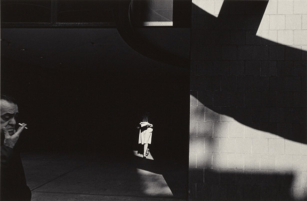
Ray K Metzker – graphic street photography
Metzker was born in 1931 in Milwaukee and attended the Institute of Design, Chicago–a renowned school that had a few years earlier been dubbed the New Bauhaus– from 1956 to 1959. He was thus an heir to the avant-garde photography that had developed in Europe in the 1920’s. Early in his career, his work was marked by unusual intensity. Composites, multiple-exposure, superimposition of negatives, juxtapositions of two images, solarization and other formal means were part and parcel of his vocabulary. He was committed to discovering the potential of black and white photography during the shooting and the printing, and has shown consummate skill in each stage of the photographic process. Ray Metzker’s unique and continually evolving mastery of light, shadow, and line transform the ordinary into a realm of pure visual delight.

