Tim Booth, born in 1963, began his interest and work in photography when he started using his father’s camera at the age of eight. Booth was inspired by travel and photography to spend several years shooting freelance photographs for a lot of UK weekend magazines as well as newspapers in Africa, Pakistan and South East Asia. Booth has exhibitions shot all over the world, for example ‘Into the Light’ shot in Africa. Booth’s work ranges from portraiture to landscape work. He was been voted the ‘No. 1 Black and White photographer’ working in the UK today by OneEyeLand.
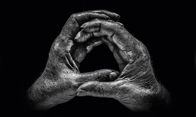
The book that brought him international recognition, which is also the piece of work that I am interested in, was ‘A Show of Hands’ which won awards. The project spanned over twenty years and features hand portraits of hundreds of people whose hands are intrinsic to their contribution to the world – they show who they are and what they do. Some portraits are of well-known celebrities and others are from working class people with everyday backgrounds. Although there is a wide variety in people with their hands photographed, all of the hands show an insight into the person’s lives and professions through the different markings, shaping’s, scars and lines. The idea for this project came after he took a portrait of his 95-year-old grandmother’s hands – the photograph showed hands that had lives through two world wars, played the piano, went through art school, cared for the sick and played tennis for the county. Booth said he was “sitting with my grandmother in her garden, and as always was struck by their arthritic pithiness.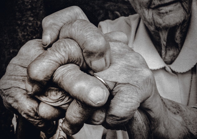 The way they rested on her walking stick showing her wedding ring, so smooth against the rough skin, told a large part of her story”. Booth says that it was his first ‘hands as a portrait’ and inspired him to carry out more hand portraits. Booth decided that throughout the project he would shoot in black and white, in natural light and in half an hour wherever his subject found most convenient – I will also try to go by these standards as I seek to draw inspirations from this project. Booth also says he has “always preferred black and white as a portrait medium. It enables you to focus on all the detail and form, and not be distracted by skin colour, markers, blemishes and veins” which I completely agree with and believe that it will be vital in my response to this. When picking his subjects booth would first think of a profession he wanted to feature and then who would best represent it. In total there are about 115 pairs of hands in the exhibition telling hundreds of stories of people.
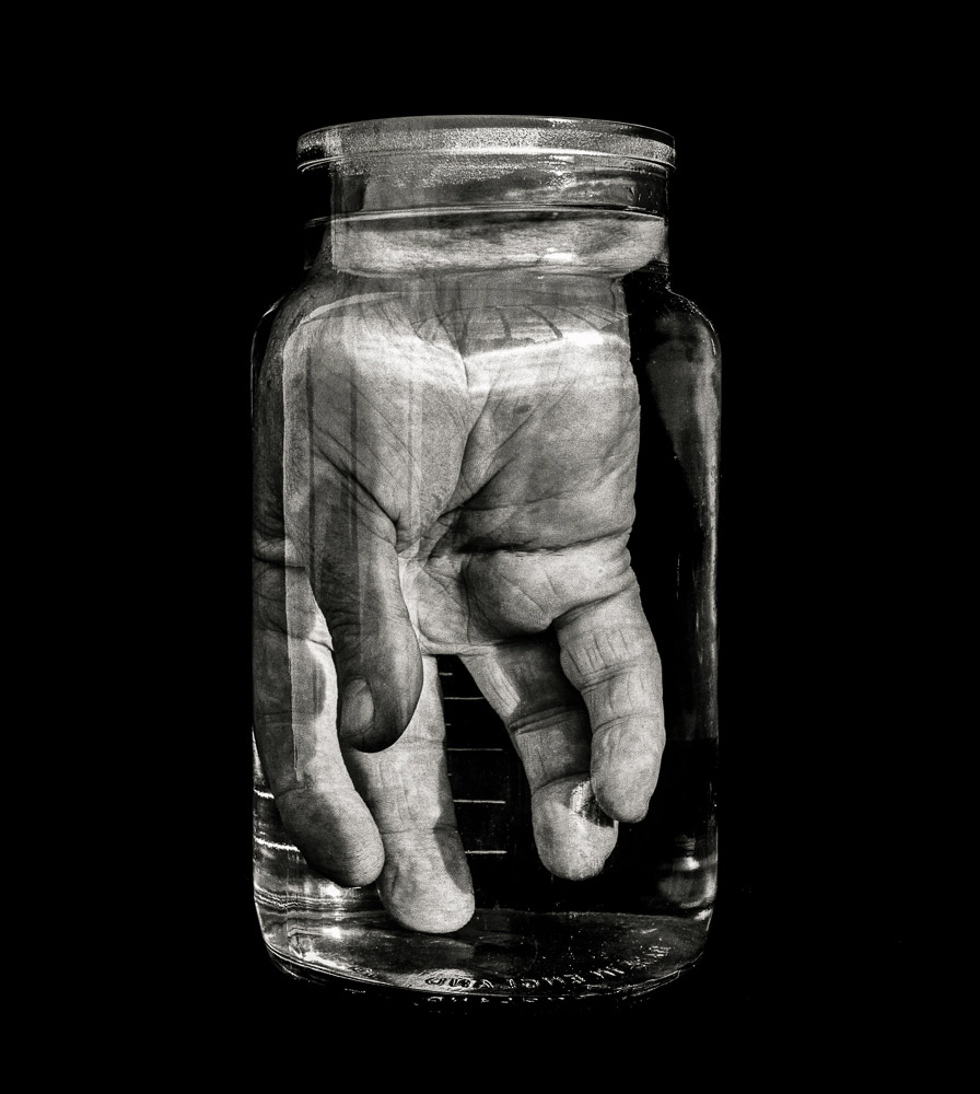
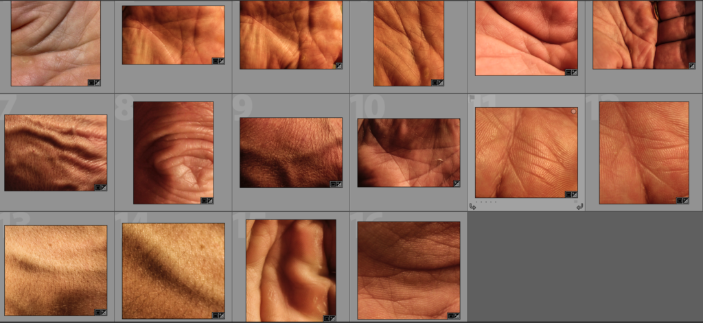
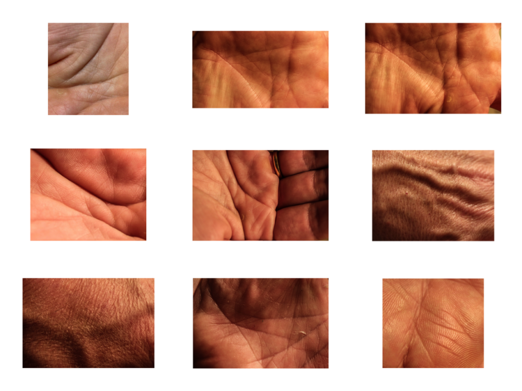
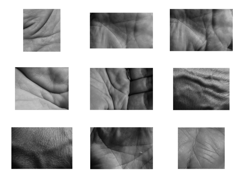
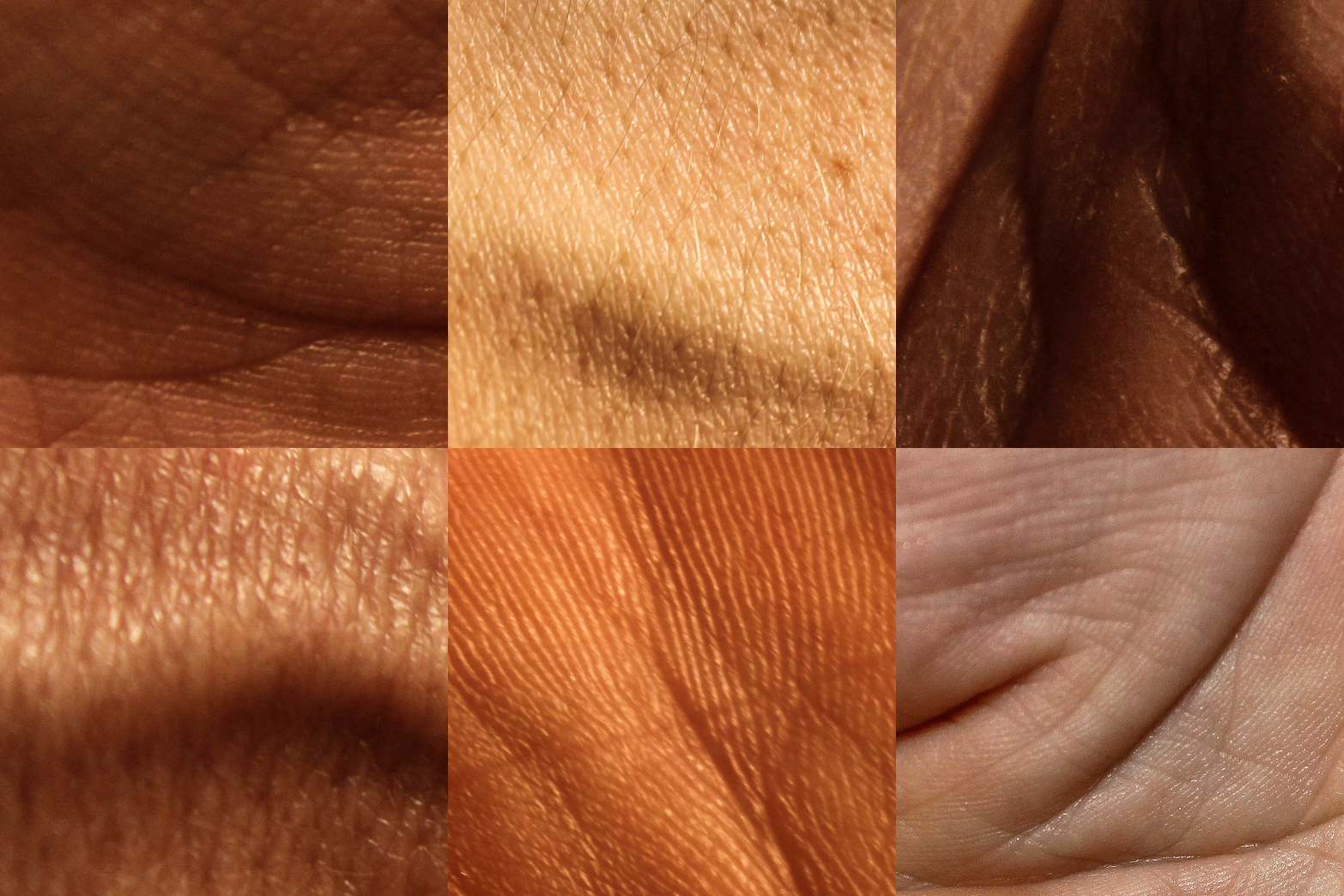
I have chosen to focus on hands, especially Booth’s “A Show of Hands” because a pair of hands tells multiple stories of a person’s life and who they are without having to show the features of their face, which many people may be insecure about. I plan on responding to this work by producing close up photographs of hands in a similar way to Booth but without the props as I intend to create more of a typology style result with my response. After the first initial response I may create further shoots in order to develop the idea by covering the hands in paints or inks in order to highlight the features within the hands and so a more interesting result.
Analysis
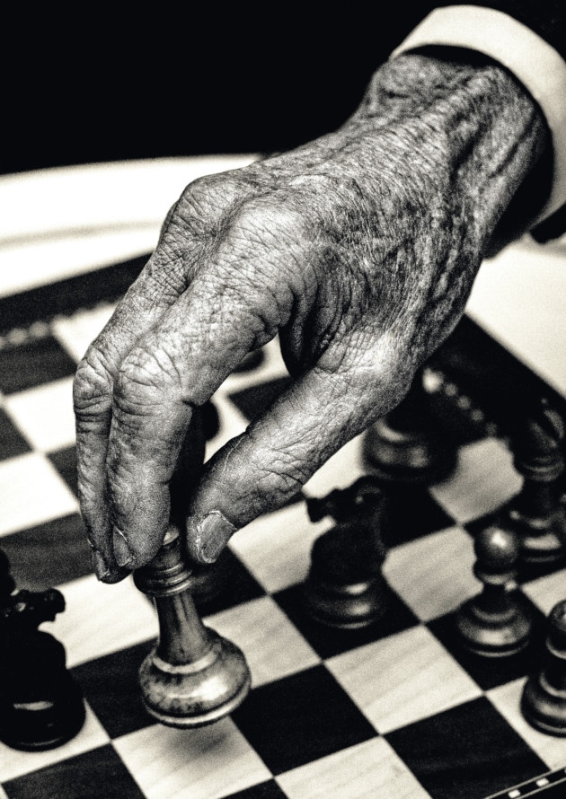
Booth would always use natural lighting in his hand portraits to create a type of photograph that allows the natural shadows and lines within the hands to be brought forward. This photograph shows a very wide tonal range as there many dark tones throughout both the chess pieces and the crevices in the hands but at the same time there are contrasting light tones highlighted throughout the hand to create a strong contrast and therefore emphasise the features that Booth tries to capture within the hand. This photograph has quite a lot of contrast due to this wide tonal range and is exposed just right to the point that this contrast in emphasised more. A shallow depth of field was used to capture this photograph as can be told by how the hand is so sharp and in focus along with the chess piece that the hand is holding compared with the rest of the chess board in the background. A low ISO will have been used in order to capture this photograph as the photograph is of very high quality – this low ISO paired with a shutter speed of around 1/60 allow for a technically correct photograph to be created.
There is no colour in this photograph – Booth has purposefully opted for a black and white colour scheme as he says he has “always preferred black and white as a portrait medium. It enables you to focus on all the detail and form, and not be distracted by skin colour, markers, blemishes and veins”. This rings very true in this photograph as it makes the details such as the veins and wrinkles in the hand pop in order to create a more interesting composition. The black and white also allows the texture of the hands to come through more as well as the wooden texture of the chess pieces. The wrinkled texture helps to create a 3D effect within the photograph, especially as the wrinkles begin to blur closer to the cuff. The fingers and the chess piece sit on the bottom left cross-section of the rule of thirds and so create an aesthetically pleasing photograph as well as being technically correct.
This photograph is of Lord Carrington who is a renowned chess player. Booth said that as soon as he got permission from Lord Carrington to carry out the shoot with him he knew that he wanted to bring an aspect of chess into the hand portrait. Carrington and Booth sat in Carrington’s garden playing with different set-ups of the chess pieces and board eventually coming to a conclusion that they would move the Queen amongst the pawns as a joke as it is something a chess player would never do, especially someone of Lord Carrington’s level. Booth would take these hand portraits on a Nikon F2 with a 55mm Macro lens on Tri-x (a grainy black and white film). He set regulations within which he would work on this project – he would shoot in black and white, in natural light and in half an hour wherever the subject found most convenient.
When speaking on why Booth chose to focus on hands he said “My decision to focus on hands was also a deliberate choice. In a pair of hands you can see a whole life, a story if you will, that doesn’t require you to make a judgment about the person, which faces inevitably do.” This statement can be clearly justified in this photograph as the chess gives an insight into what Lord Carrington does as well as the deep wrinkles and shapes within the hands showing the amount the he has lived through. Booth aims to keep the photographs that he shoots simple; he says “I only have one goal really when shooting, and that’s to take a photograph that engenders a reaction in the viewer, making them not only remember the image, but want to see it again.”

