Category Archives: Evaluating

Filters

Author:
Category:

Photoshoot 1

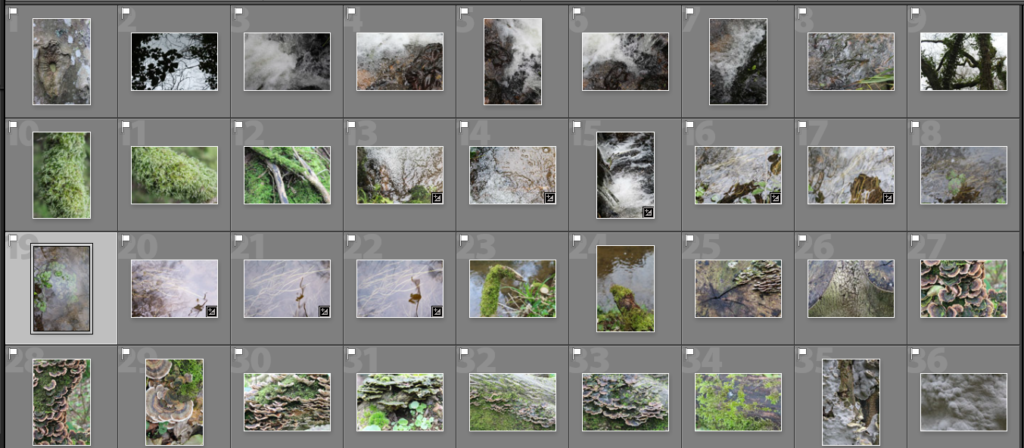
For my first photoshoot I went to St Catherines woods to explore repetition within nature, focusing on the fragility and rounded shapes that are created. I also wanted to focus on light and reflections, starting to take inspiration from the photographer Rinko Kawauchi .

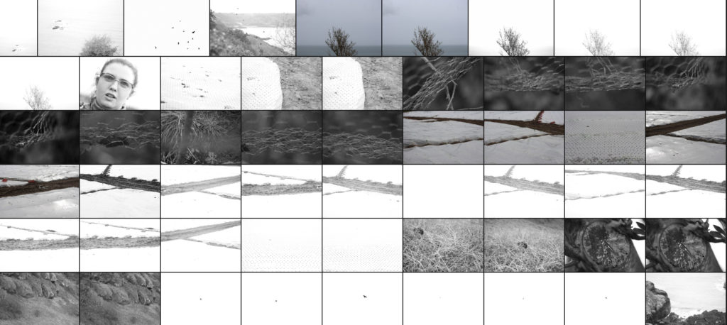
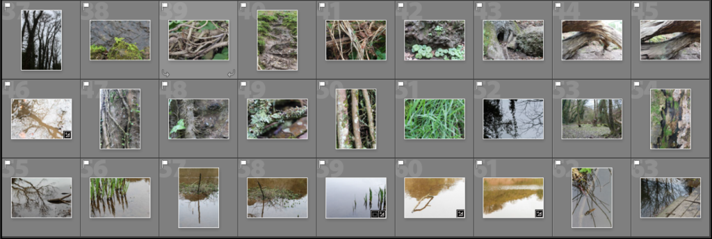
I narrowed down the 250 images i photographed to 63 and displayed them in a contact sheet below. I found that I liked the images that were close up of detailed patterns.
Reflection and Water
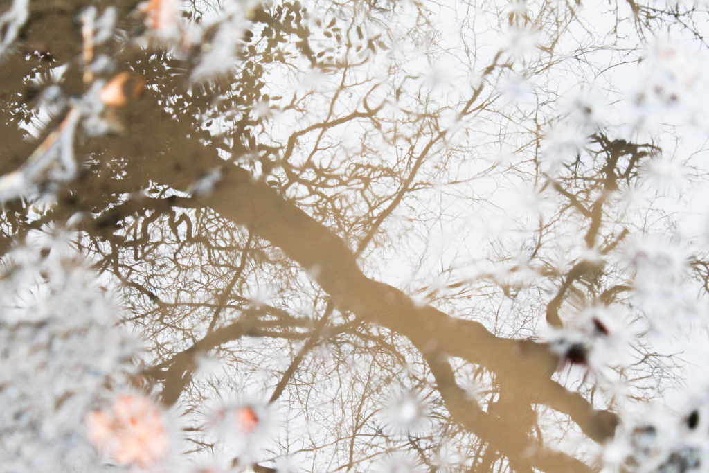
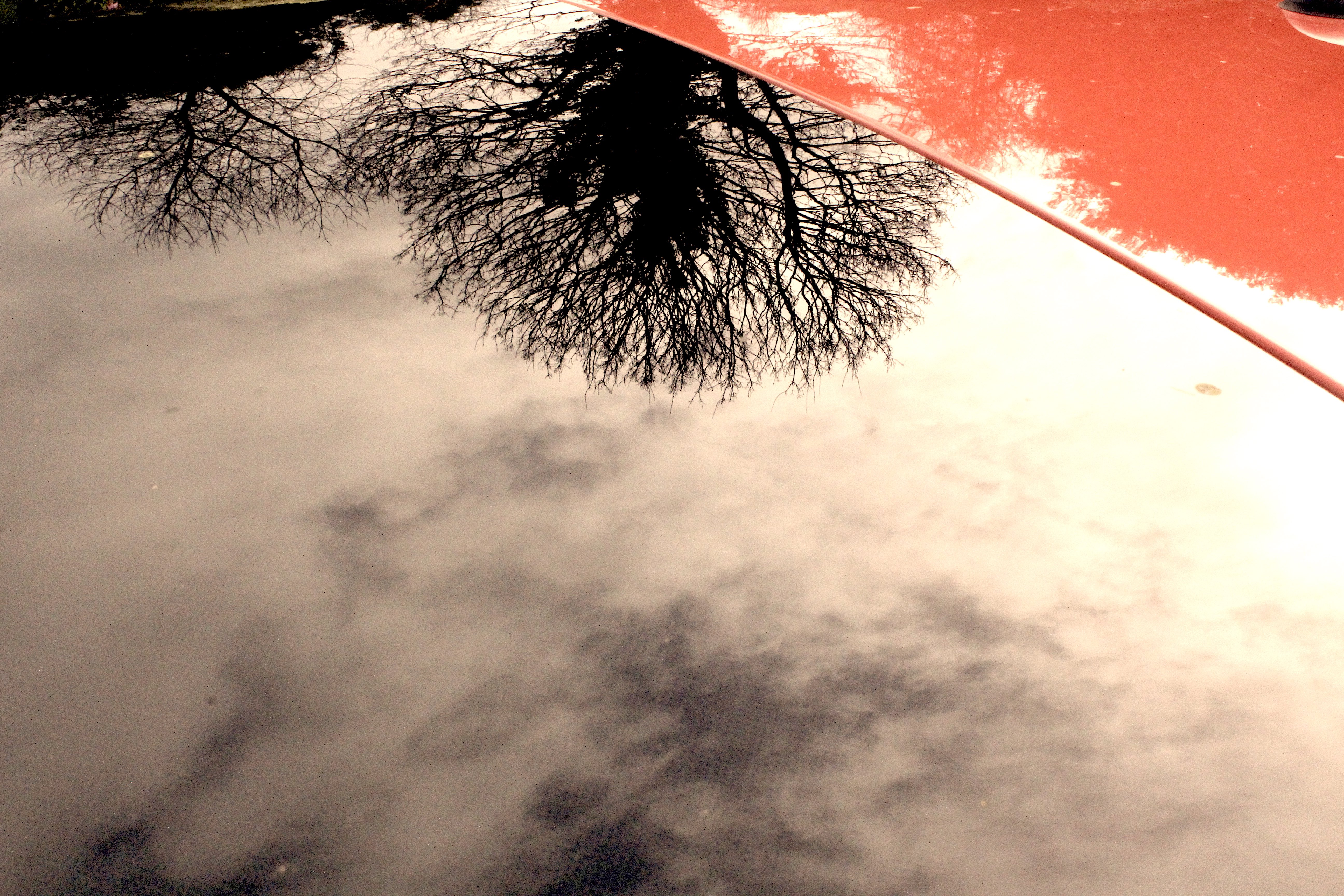
I particularly like these two images from my shoot because of the use of light in the reflections on the water. In the first image I emphasised the yellow tones of the landscape by photographing the reflection of a tree in muddy water. I tried to highlight the fragility and beauty of the tree and nature, even though it’s photographed through something that isn’t normally considered aesthetically pleasing. The mud in the water makes the reflection of the tree a yellow/brown tone which emphases the shape more. I decided to have my point of focus in the center of the image with the edges out of focus, this causes all the attention on the reflection rather than the floor around it. I also increased the exposure when taking the photo to emphasise the brightness of the sky and to interpret the work of Rinko Kawauchi. I think that this is a interesting image as instead of a straight forward photo of a tree, it uses another aspect created by nature to portray it. I also like how the tree trunk goes diagonally across, creating an interesting composition, with the detailed branches coming off the sides. I also displayed my other image below it as I think these two images work well together, both using light to emphasise the beauty of nature, both having increased exposure.

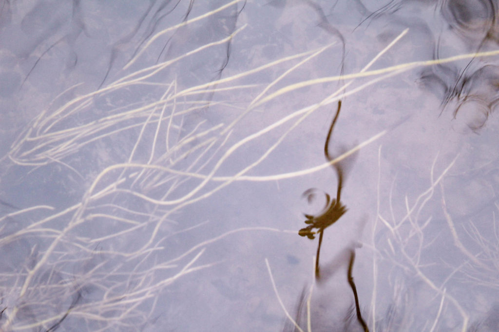
In the second image i focused on what was underneath the water and the colour of the plants, as well as the reflections of the surrounding plants. I like this image as the water moving in the stream makes the reflections of the plants blurred, creating interesting shapes. The slight reflections at the top of the image, frame the photo and create depth between the plants underneath the water. I also like how these plants are all growing in the same direction from the way the water is travelling down the stream, which is them contrasted to the reflection going vertically down at the top of the image. To me , the main focus point of the image is the darker reflection of the plant that off center. This is because its the closest aspect to the camera, and is the darkest point so is the first thing the audiences eyes are drawn to. Also because it is the only reflection that the audience can tell is a pant, as it closer and more of it is shown. I think that the nature in this image is emphasised as there isn’t anything man made, and portrays the plants how they have naturally grown. Another aspect i like is the drop of water that has created a ripple on the plant shadow as it also creates a blurred effect. In later photo shoots i could experiment with creating ripples like this on water. I think that both images take inspiration from Rinko Kawauchi but still look like my own style and interpretation. For further photo shoots I could look more into how Kawauchi takes her photos to interpret her style more.
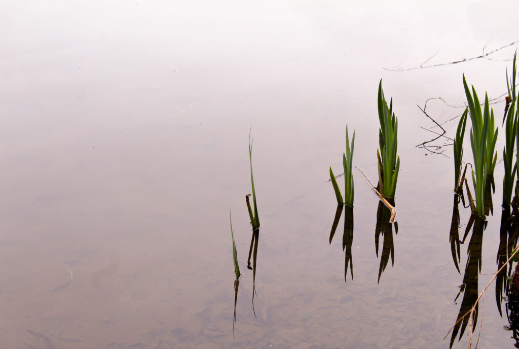
I also like this image because of how I used the negative space to make the plants and reflections stand out. When photographing, I tried to zoom in on just the plants in the water and to take out anything else. I chose this image to display as i like the reflections combined with the plants that make interesting shapes. I wanted to emphasise a feeling of calm by using the over cast weather that day to my advantage through the reflection from the sky on the water being grey/white. I like how the water goes from white at the top of the image, to darker grey/brown tones towards the bottom starting to show the ground underneath. This creates depth in the image emphasising another aspect of nature. The bright green colour of the plants is contrasted to the colour of the water, making it the first point the audience looks . To edit this image i could crop it so the space above and below the image is the same, creating a more aesthetically pleasing image. I could also experiment by changing the tones in the water to see if any other colours would go well with the green on the plants, as well as edit the water to all be the same tone so that there weren’t any darker areas. This would further emphasise my use of negative space.
Repetition

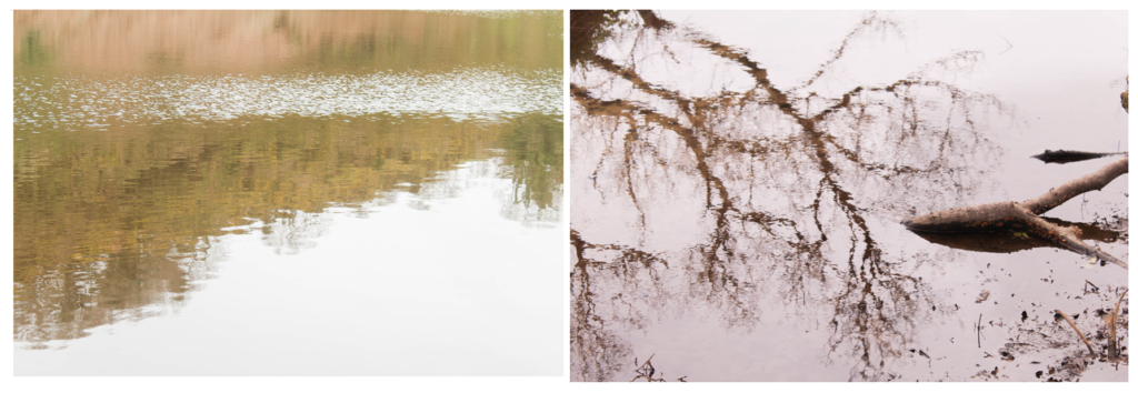
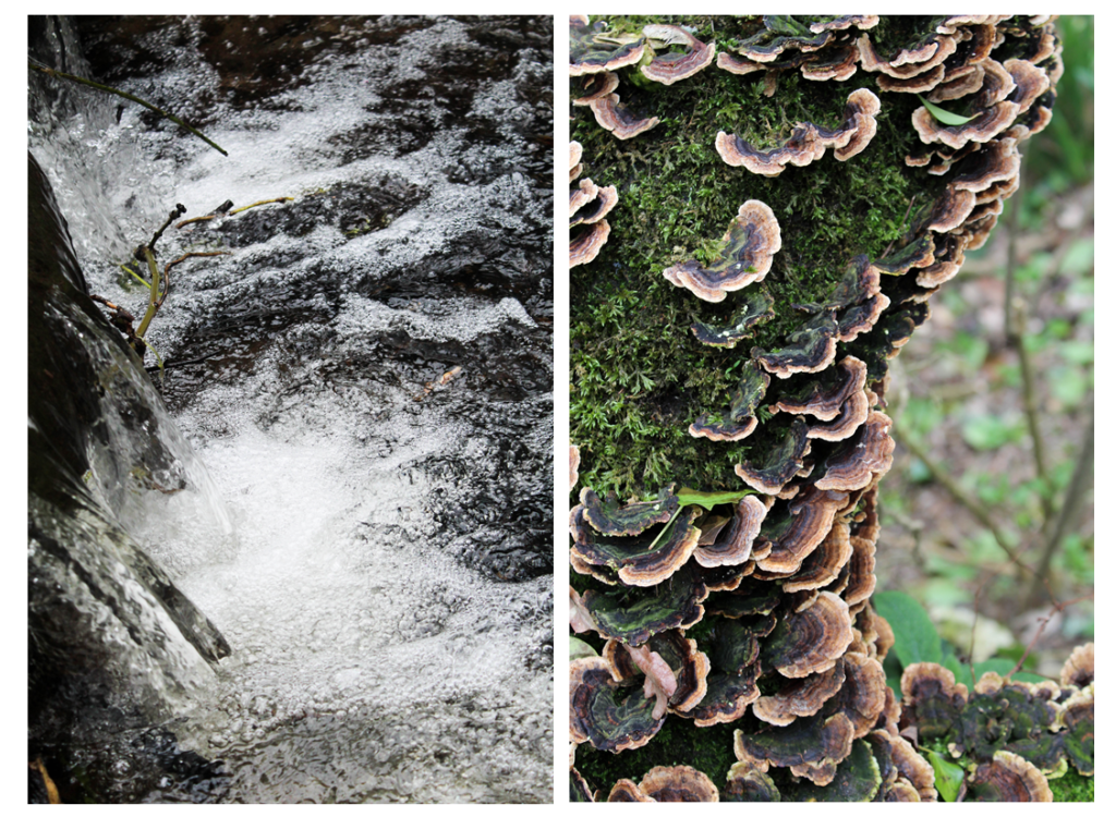
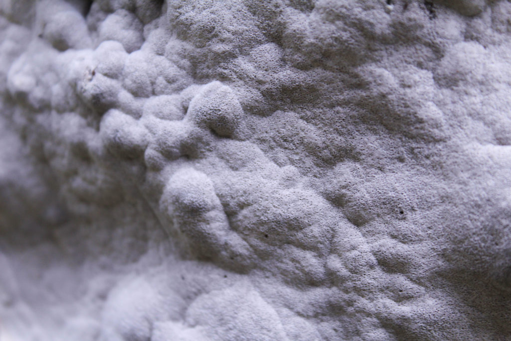
I also wanted to explore repetition and round shapes in nature as well as reflection. I think these images are completely different to the images of the first half of my shoot as i wanted to experiment by photographing in different ways to see if I prefer one technique over another, and to generate new ideas for my project.
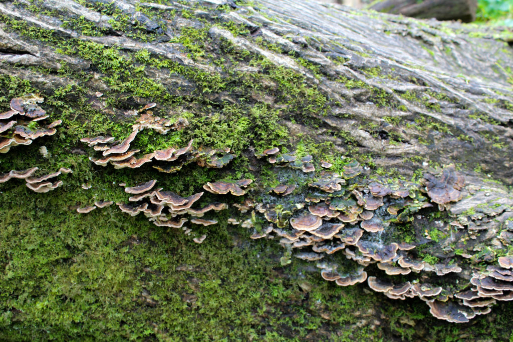
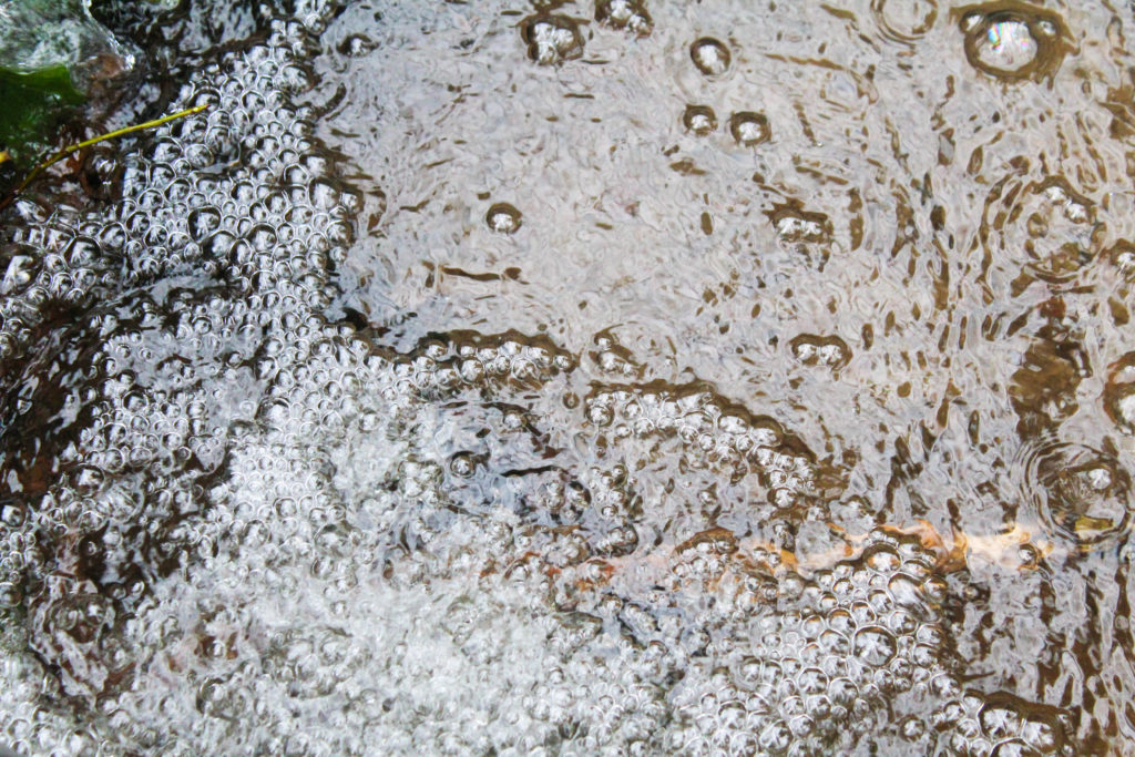
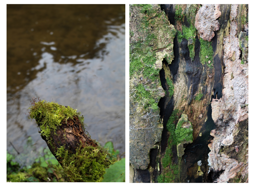
I found i was focusing on close up patterns of different textures as they look interesting when there’s more to look at. The first image is of a tree trunk on its side as I thought that the different sections of patterns create an interesting photo. The top part of the image is the pattern created from the bark on the tree. The detail is emphasised by the ranging dark to light colour, highlighting the curved lines. The center part of the image is of ” naturally grown, this section adds even more texture to the image and is a completely different pattern to the other parts of the image. These shapes interested me as they were different to any other shapes I found, the light to dark brown colours contrasting against the green on the bark adding more emphasis to them. The bottom section of the image is green and brown textured pattern which again contrast to the other sections. I like how in this image the pattern are diagonal across the image, emphasising on how the tree has naturally grown until it fell over. Overall I like this image and think that it would go well paired with another image if I were to use it in a photo book or display as the green/brown tones will complement or contrast well to other colours in nature.

The second image I took of the bubbles creates by the stream where the circle pattern is repeated. I photographed the image so that this pattern took up just over half, which is then contrasted to the water with a different rippled pattern. I also tried to emphasise the white in the image, that is the white sky reflected on the water as I think this emphasises the shadows as there is more contrast. I like how theres a division between the bubbles and the rippled water from the shadows as it makes the patterns looks more textured and noticeable. In also like how the darkest point of the image is the right side, where the darker rock is beneath the water, which is then contrasted to the white bubbles in the center of the image, which is contrasted to the brown/white tones on the right side. This splits the image into three different sections and creates an interesting composition. I think that this image would work best displayed with another image, rather than by itself as I think that if it was contrasted to another pattern it would be more powerful.

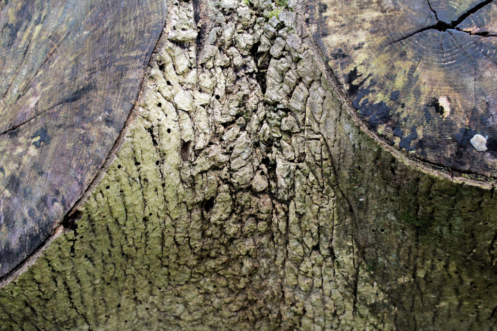
In the third image I focused on the patterns on the bark of a tree and the different tones that are portrayed . I particularly like the composition in this image as the two parts where a branch has been cut off are on the top and left corners, not showing the whole circle. I like this as it fills up the whole image with interesting patterns and create a symmetrical image. The image is not completely symmetrical as the branches have grown naturally as different sizes and in different places, emphasisng how nature is unpredictable. I think that the colour of the two cut off branch dark brown/green contrasts well with the colour of the light green bark. I focused the camera on the center section of the image as I wanted to emphasise the texture and shadows that the bark had created and the beauty within it.
Conclusion

Overall, I think this photo shoot went well and gave me more ideas the I can experiment with in future shoots. For my photo shoot where i look at the movement of water, i want to try and add more ripples to flat water, like in one of the image in this shoot to see the outcome. I also want to interpret the work of Rinko Kawauchi further by focusing more on light and perhaps focusing on fragility more in a feminine way. I think that the final outcomes from this shoot were good but i want to develop the concept of my project further and find the meaning behind the images other than my own personal appreciation fro nature. To do this I will research more artists and find inspiration from them.

Michael Wolf

Michael Wolf, born 1954, is a German artist and photographer who resides in and works in Hong Kong and Paris. Wolf’s work focuses on the daily life within big cities such as Hong Kong. Wolf one first prize in the Contemporary Issues category of the 2004 World Press Photo competition for his photographs of workers in several types of factories. His career began in 1994 as a photojournalist, when he spent eight years working in Hong Kong for German magazine ‘Stern’. Wolf says that a decline in the magazine industry led to photojournalism assignments becoming “stupid and boring” therefore he decided to work on only fine-art photography projects from 2003.

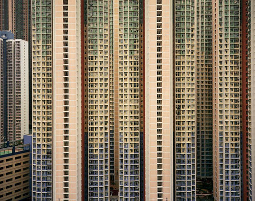
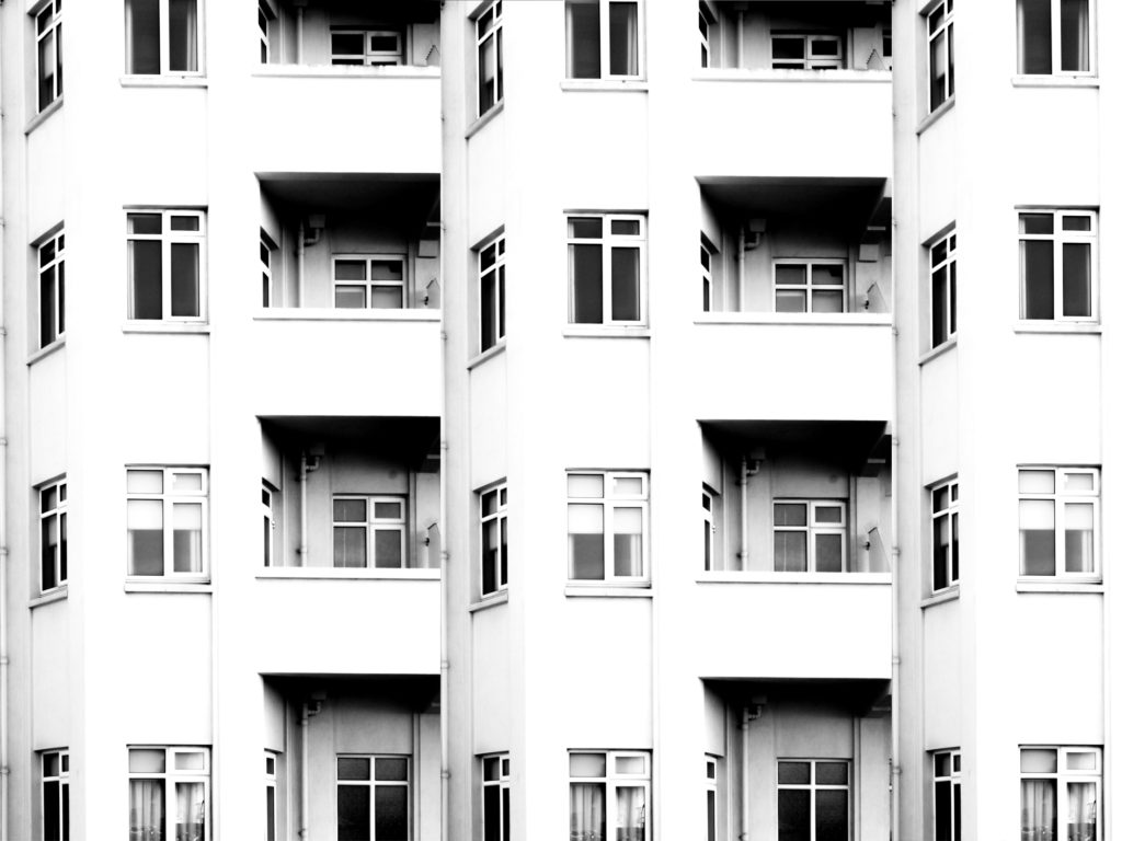
In Wolf’s series titled “Architecture of Density” he photographs Hong Kong’s tall buildings in order to show them as “abstractions, never-ending repetitions of architectural patterns” – the photographs excluded the sky and the ground and so emphasised the vertical lines and shapes within the buildings. The first book containing images from the series, Hong Kong: Front Door/ Back Door, was published in 2005 – in this book reviews noted how the photographs represented the overpopulation occurring in the city and the massiveness of the human presence.

I intend to take a lot of inspiration from Wolf’s work on ‘Architecture of Density’ as I believe that his work on this project brilliantly demonstrates the similarity within buildings through the patterns that are demonstrated within them as well as bringing light to how different the buildings all are, even though they all often contain very similar shapes and structures. I like Wolf’s work a lot due to the patterns and repetition within the photographs, I feel that they create a very intriguing and abstract appearance to the work as you are initially unsure at what you are looking at. Of course Wolf creates this work using much larger buildings and so can further dramatise these effects of massive repetitive buildings so in my responses to this work it will likely be necessary to use photoshop in order to create more repetition to achieve the same effect as Wolf has. Ultimately Wolf shows the repetition within the world we live in as well as showing the fact that even though there are so many buildings built for the same purpose, they all manage to have their own individualistic features.

A response taking inspiration from Lewis Bush and Michael Wolf

Analysis

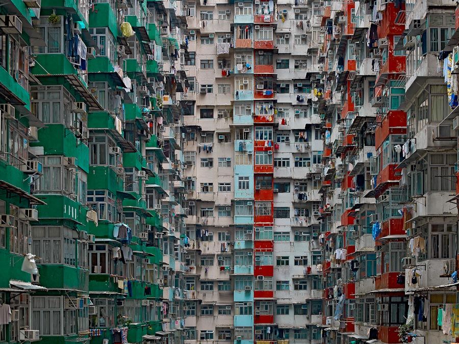
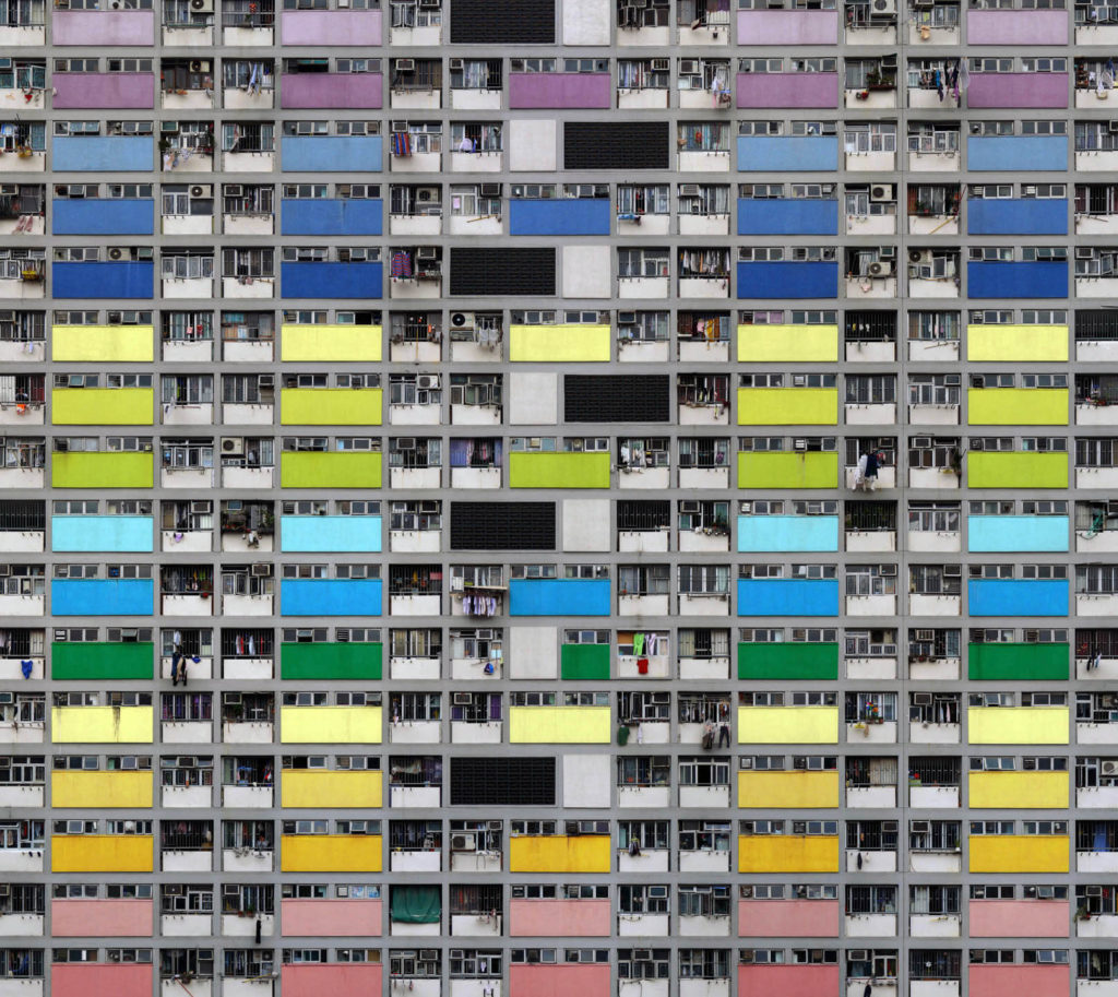
In this photograph from Wolf’s “Architecture of Density” he has used the natural lighting from the city of Hong Kong in order to capture a photograph of a repetitive and colourful high-riser apartment block. By using the natural lighting he has been able to capture the natural tonal ranges and contrasts within the building as well as being able to ensure that the image depicts the city of Hong Kong accurately. A deep depth of field would have been used to capture this photograph of the repetitive apartment block face; this is obvious as all aspects of the photograph are in focus in order to ensure that the viewer can look throughout the photograph and spot the continuing patterns. A fairly quick shutter speed, such as 1/80 will have been used to capture the photograph along with a low ISO of close to 100. This is because Wolf will have altered settings of the camera so that the correct amount of light was entering the lens from the city and that the quality of the photograph was as high and as noise-free as possible. This has led to a photograph that is corrected exposed and is visually pleasing to look at.

There is plenty of colour throughout the photograph due to the colourful panels placed across the apartment block; despite this there is not much saturation in the colours as they seem quite bleak and faded. To me this has been done on purpose by Wolf to suggest that this high-density, repetitive type of apartment block is not a sustainable or enjoyable way of living and represents how the population of Hong Kong feel about their living situation – it all seems quite bleak and boring as there is no room for innovation. There is a good level of contrast between the tones within the photograph as there are plenty of black tones within the shadows of balconies contrasting with the lighter tones of the coloured panels – this contrast increases the drama within the photograph to create a more striking composition. Due to the flat nature of the face of the apartment block there is a very 2D feeling to this photograph, but it does not take away from the effectiveness of the photograph as it further demonstrates the repetition and patterns shown throughout the apartment block.

This photograph is part of Wolf’s “Architecture of Density” in which he photographs Hong Kong’s tall buildings in order to show them as “abstractions, never-ending repetitions of architectural patterns”. The project included books published, including Hong Kong: Front Door/ Back Door which allowed Wolf to present the photographs collectively to prompt the reader to compare the structures, shapes and colours within the different Hong Kong high-risers and therefore demonstrated variance and similarity in his work. As a whole this work shows how over-populated and dense cities such as Hong Kong are and gives an insight into their lifestyle and possibly the bleakness of it. This work also possibly raises questions about what the human population are going to do in the future as human population constantly rises and we run out of space in these large cities. Property prices are inevitably going to rise as this unsustainable approach continues and it is just an amount of time until the demand for housing increases drastically past the supply of housing.

John Baldessari Response

Who is he?

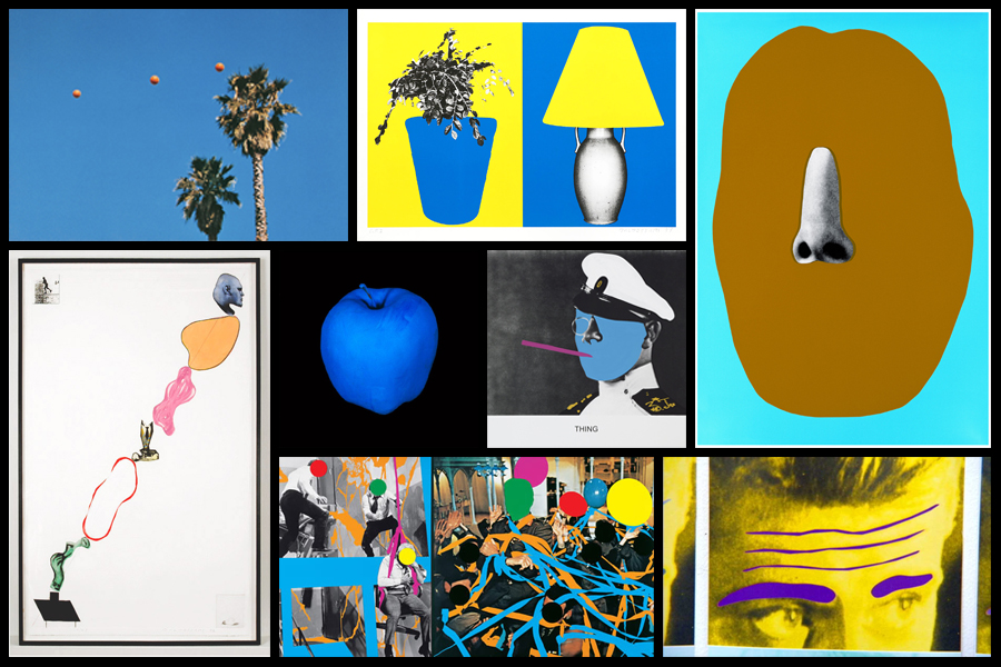
John Baldessari is renowned as a leading Californian Conceptual artist. Painting was important to his early work: when he emerged, in the early 1960s, he was working in a gestural style. But by the end of the decade he had begun to introduce text and pre-existing images, often doing so to create riddles that highlighted some of the unspoken assumptions of contemporary painting – as he once said, “I think when I’m doing art, I’m questioning how to do it.” And in the 1970s he abandoned painting altogether and made in a diverse range of media, though his interests generally centered on the photographic image. Conceptual art has shaped his interest in exploring how photographic images communicate, yet his work has little of the austerity usually associated with that style; instead he works with light humor, and with materials and motifs that also reflect the influence of Pop Art. Baldessari has also been a famously influential teacher. His ideas, and his relaxed and innovative approach to teaching, have made an important impact on many, most notably the so-called Picture Generations, whose blend of Pop and Conceptual art was prominent in the 1980s.

Baldessari first began to move away from gestural painting when he started to work with materials from billboard posters. It prompted him to analyze how these very popular, public means of communication functioned, and it could be argued that his work ever since has done the same. He invariably works with pre-existing images, often arranging them in such a way as to suggest a narrative, yet the various means he employs to distort them – from cropping the images, to collaging them with unrelated images, to blocking out faces and objects with colored dots – all force us to ask how and what the image is communicating.A crucial development in Baldessari’s work was the introduction of text to his paintings. It marked, for him, the realization that images and texts behave in similar ways – both using codes to convey their messages. Text began to disappear from his work in the early 1970s, and since then he has generally relied on collage, but his work has continued to operate with the same understanding of the coded character of images.

Typically, he collages together apparently unrelated categories of image or motif, yet the result is to force us to recognize that those images often communicate similar messages.On a visit to the Metropolitan Museum in New York in 1965, Baldessari was struck by the use of unpainted plaster to fill in missing shards of Greek vases. This prompted his interest in how images are effected by having portions removed or blotted out, and he has continued to explore this ever since. Often, the result of his alterations to photographs is to render them generic, suggesting to us that rather than capturing a special moment, or unusual event, photographs often communicate very standardized messages. Here are some examples of his works:

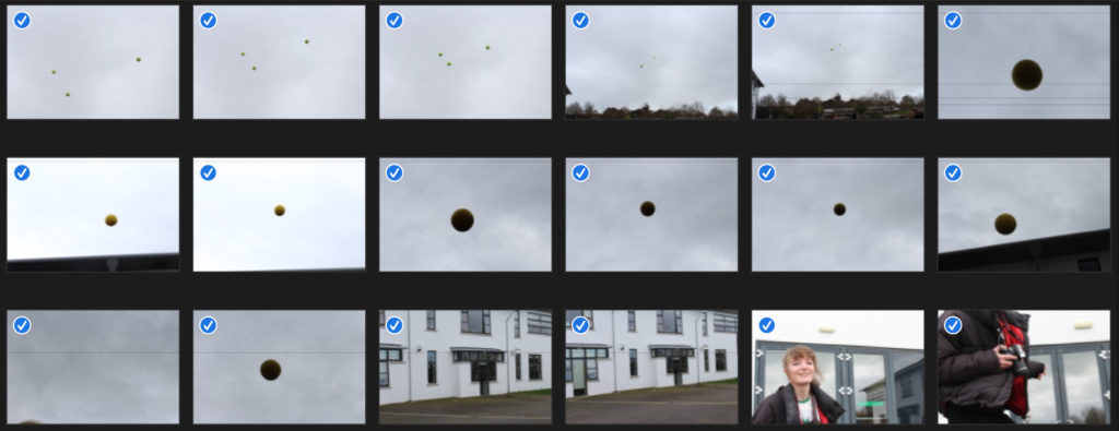
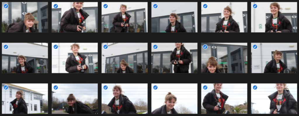
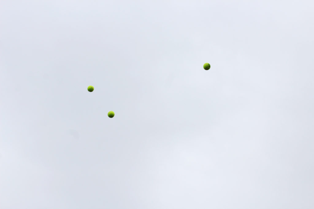
After looking over some of his work I decided to create a response to the project he worked on called Throwing Three Balls in the Air to Get a Straight Line. This project attracted me because of how bizarre and unique it was, using the formation of randomized ball positions in the air to create ‘art’. I then proceeded to make a response to this by throwing various balls in the air and attempting to capture them mid-flight, using only the backdrop as the main form of contrast in the photo. I would also experiment with shutter speed where I would try to capture other moving subjects, here were my results:

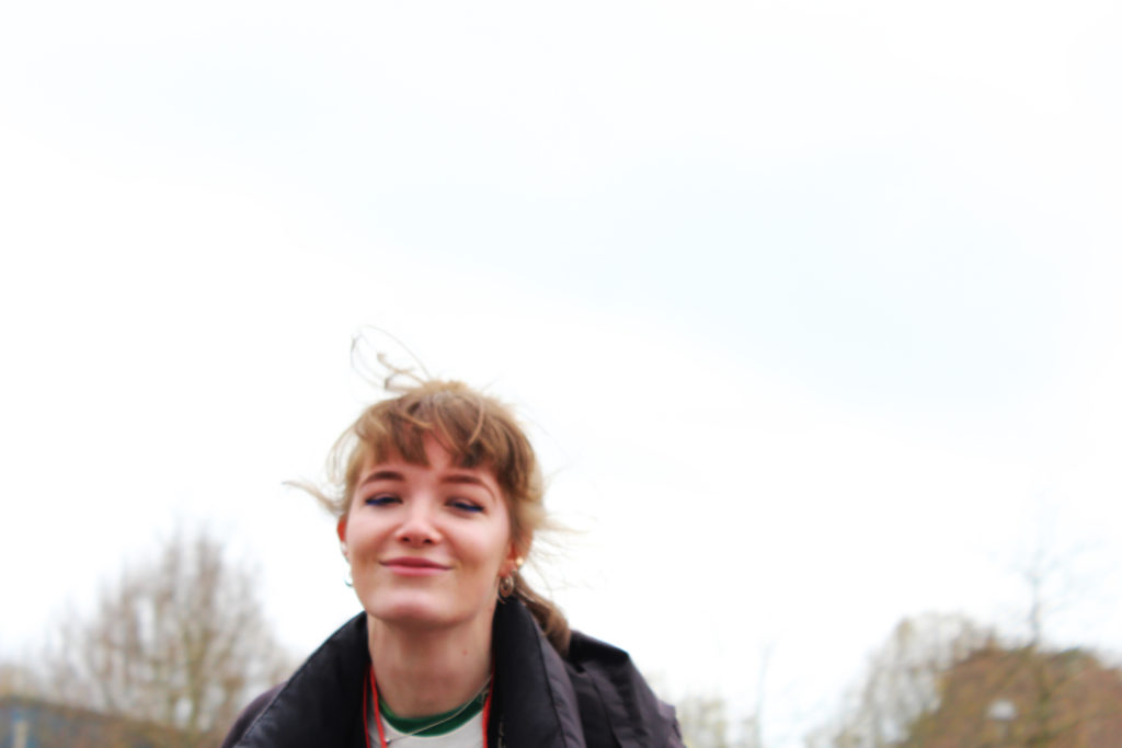
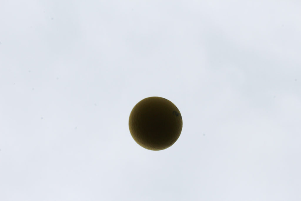
Once I had completed this task I decided to pick out the three images that I thought best reflected what I wanted to experiment with, here were the results:

I really liked the idea of capturing a subject mid movement as it allowed for a new stance of photography I had not previously explored. In future shoots I could look at things like birds mid-flight or people and shadows, this would open up opportunities for further abstraction of the environment photographed as by incorporating moving things it could bring the image into life.

Hiroshi Sugimoto | Image Analysis

Image result for hiroshi sugimoto

This image of Sugimoto’s expresses his style. Evidently, the black and white theme continues but he uses animals instead of people or objects as his subject.  In the image, Hyenas, Jackals and Vultures appear to be fighting over something, likely a kill.  This fighting is a fine line where life meets death, the kill itself is represents the dark side of that spectrum. The weather also plays a vital role in exposing this theme which is only emphasized by the black and white. The horizon marks the border between the light and the dark, the margin that represents the border between life and death.

Despite the image being constructed post shoot, it looks very real and to the viewer, it creates a sense of fear perhaps and an exaggeration of the line between life and death. Visually, the image stands out by being unique and interesting with its wild subjects however the composition of the image itself increases the image’s likability. Being black and white, the image attracts a nice contrast between light and dark, linking to the theme of life and death that we see in the subject matter. Further,more, the sky has little structure and retains a rather smooth texture yet the shading adds a real depth to the image and almost sets the brightness of the entire image and creates an effect making the image appear brighter yet still having a meanness to it.

This image, despite using fake subjects, is quite a fascinating image when it comes to the taking of the image itself. It could appear that Sugimoto put himself in danger being so close to wild predators. He captures a lot of lives in that image and that fact even further expresses how fragile that can be as they fight over a kill. I would think that he used a wide angle lens at quite a close range, maybe only 5-10 meters from the subjects. I would believe he used a faster shutter speed and a medium ISO to capture the birds flying perfectly still but also having the light in the image to light the foreground but not too much to have the background (sky) to be over-exposed.

David Prentice | Linked to Hiroshi Sugimoto

David Prentice was an English artist and former art teacher. In 1964 he was one of the four founder members of Birmingham’s Ikon Gallery. His work is hard-edged, abstract, close to the Op art of a period when young artists and architects were full of ideas for new beginnings.

For many years, his subject was the Malvern Hills, which he knew intimately from countless walks with sketchpad in hand. The forms of the hills were a constant, the weather constantly changing. He painted with the concern for structure and surface that had characterized his earlier work. The watercolors, often done on the spot, were more specific but the paintings done in the studio were as carefully constructed as ever. 
In time his subjects expanded to include dramatic cityscapes of London, especially of the river, and the landscape of Skye, or rather its approaches.

Image result for david prentice artist
Images from David Prentices gallery
Image result for Hiroshi Sugimoto
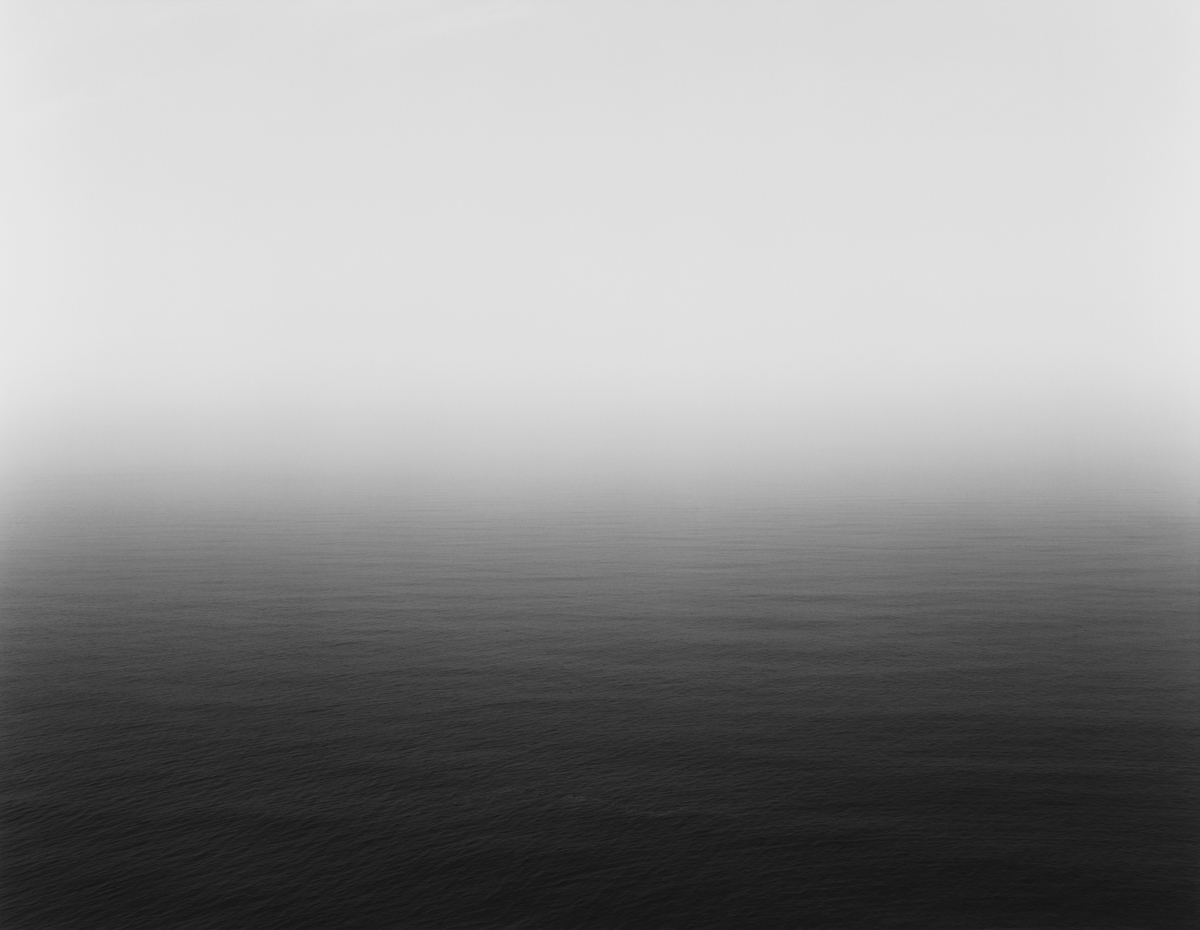
Hiroshi Sugimoto Image from Seascapes Project

I believe there are direct correlations between the work of David Prentice and Hiroshi Sugimoto. The key similarity is the attention to lighting and textures as appose to detail and displaying a landscape how we would usually see it. Instead, Prentice uses large brush strokes giving a faded/blury look to the landscape with emphasis on accurate depiction of light. Sugimoto focuses on using slow shutter speeds to bring about this faded look like Prentice does. Despite Sugimoto’s images being in black and white I believe there is a main focus on how lighting/weather can transform the similar landscape that he focuses on. Another key similarity in their works is the elimination of any man made features creating a difficulty in identification of a place.

Abstract Pattern Shoot #1

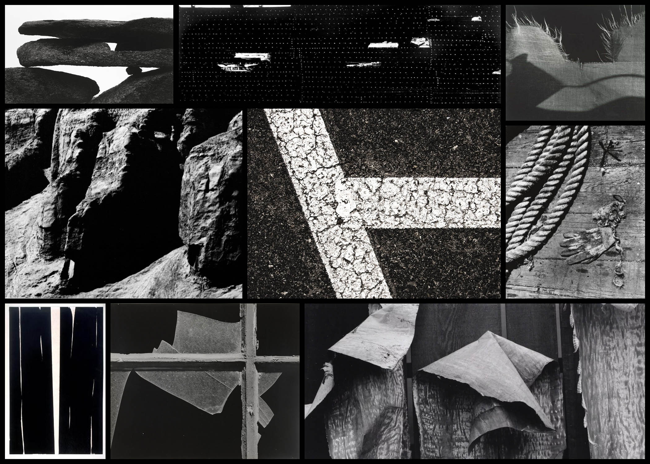
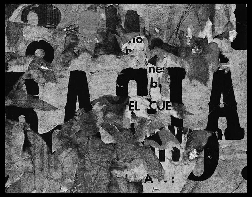
For this shoot I wanted to explore the use of natural forms in abstract and unusual ways using a monochrome filter to do so. Here I would walk around on specific area photographing the subjects in a highly contrasted light, which once edited would differ visually to what I originally saw. The photographer who I wanted to use as a reference of photography for this was Aaron Siskind, someone who specialised in abstract photography within streets as a means of creating a political view. What I especially looked at in his works were how he used only monochrome filter to create this images, choosing to take an angle upon the object that completely warps it compared to its original state. Here are some examples of his works:

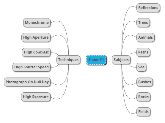
From here I wanted to go on to produce a mind-map, by doing this it would allow me to focus on the things I intend to photograph when on the shoot, preventing me from capturing subjects that would have no relation to what I was doing at all. Not only would this make me more efficient, but also make the results of my shoot overall more effective. Here are some of my ideas for the future shoot:

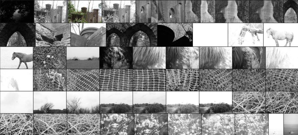
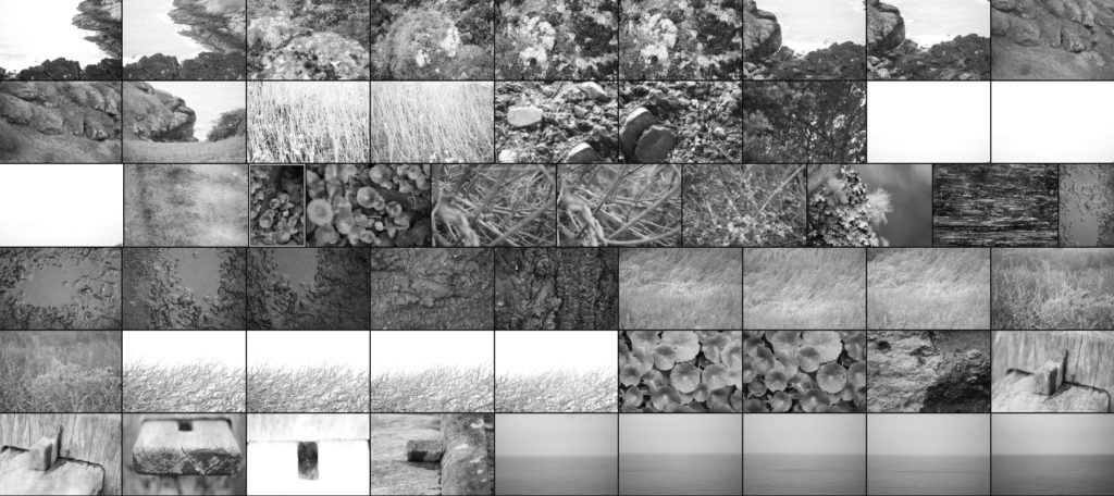
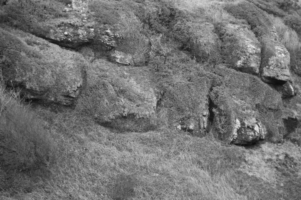
Once I had finished with my ideas I decided it was time to move onto the shoot itself. For the shoot I would be exploring the North of the Island as I found that was the area of Jersey that had the highest ratio of agriculture and natural landscapes. Using the mind-map as my reference I decided footpaths would be my main go to. Here are the results of the shoot:

Once I had finished the shoot I then decided to whittle all the images down to a selection of only ten. By doing this not only would it make it easier for me to decide on an image that best reflects the overall idea of the shoot, but also the one that both technically and visually is best. Here are my choices for the ten best images:

After I had selected the ten images I found most effective I then decided to once again whittle the selection down to now only fives images. In doing this it would allow me to analyse each image in more depth than the rest, looking at why the image was chosen, the technical aspects of it and its overall relation to the entire topic, whilst making it easier to pick the final image. Here are my choices:

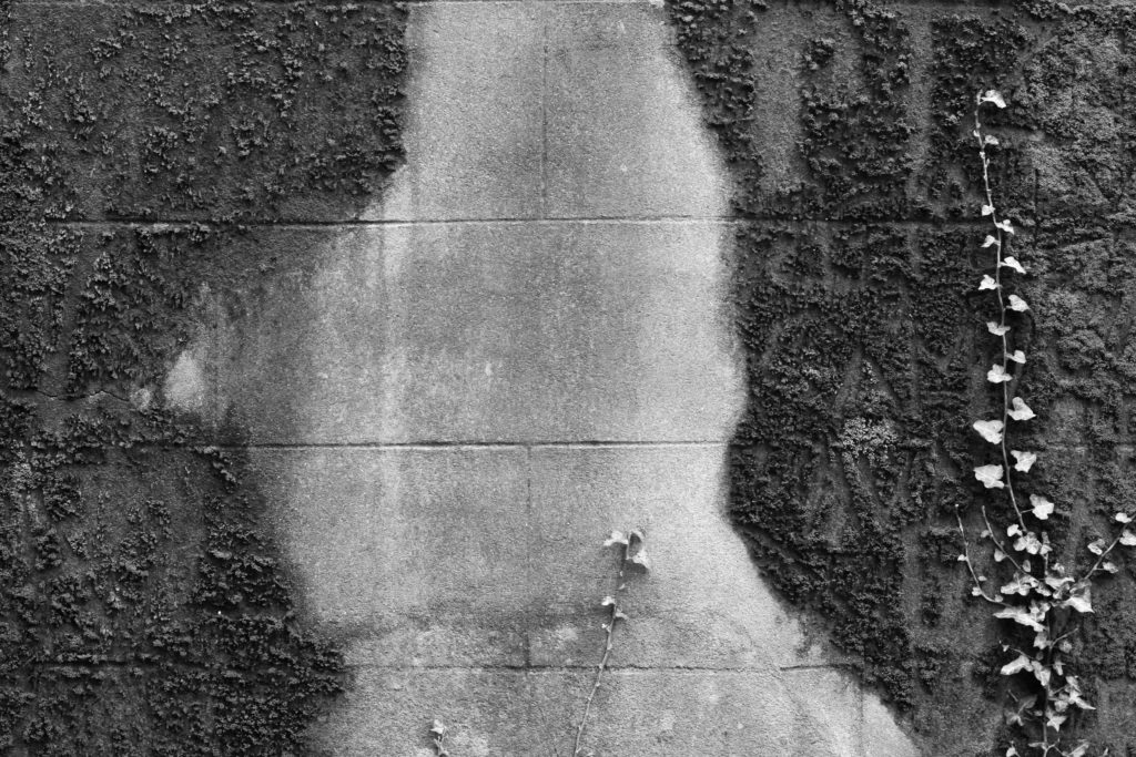
I selected this image because I loved the contrast between the wall and the surrounding ivy which grows upon it. For me by photographing a slither or concrete contrasted by the ivy it produces an abstract effect where two different environments merge into one, warping the images as you make your way to the centre of it. Composition wise I found the use of the darker ivy as a border to be effective as it slowly joins with the lighter shades of the brick, making use of any negative space which could have been there whilst producing an aesthetically pleasing result. I found that the use of a higher contrast was particularly effective here as it really highlights the hidden feature within the moss and bricks, creating more depth whilst also stopping parts of the piece from becoming too eye-sore for viewers.

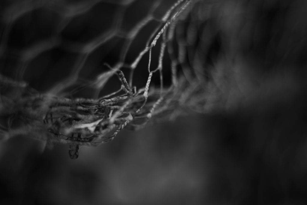
For this image the reason I chose it was because of the great use of a depth of field. By only focusing on one part of the mesh wire I found that it produced an abstract effect that messes with the mind regarding where the focus come into play. The detail of the actual focused wire that separates itself from the rest of the image for me creates a huge aesthetic feel, as the fluid transition from focus to out of focus really compliments each other, especially through the use of shades such as greys and blacks. Regarding the composition I really like how it is not centred in the middle, but rather the top left, this really gives a sense of depth within the piece as the background becomes blurred and the then is up to the viewer to interpret what could be surrounding the fence.

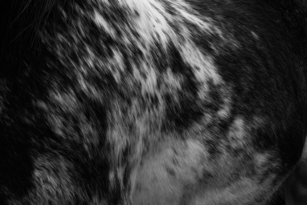
What I loved about this image was how the varying shades of the horse create an aesthetic abstract effect where each shades merges into the next. I largely chose this image because of how the composition portrays the side of the horse, with the whites coming down from the left and the rest of the piece being surrounded by black hairs which provide the photography with a natural border. What sold the image for me was how the use of a high contrast really brings out the definition within the side of the horse and the form of the body, this in a way isolate the actual horse from its side as it takes the viewer a few moments to actually figure out what the image is of, with only hints giving it away.

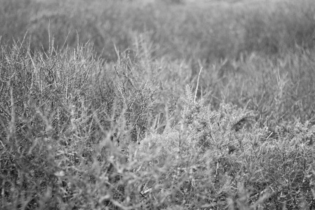
For this image I was drawn towards once again the depth of field within the landscape. By focusing on only one layer of the bushes it creates a feel or vastness within the photo as it highlights the sharpened ends of the branches whilst softening the rest of the area. This contrast for me really brings a sense of aestheticism over the whole image, as by using only a monochrome filter it leaves the image devoid of any distractions to rather allow us to look at the formation of the natural subjects within. The composition of the focused areas is also a major reason why I selected it, this is because of how there is a larger area of focused bush on the left which grows smaller as you progress, stopping the blurred backdrop from becoming more overpowering than it actually is.

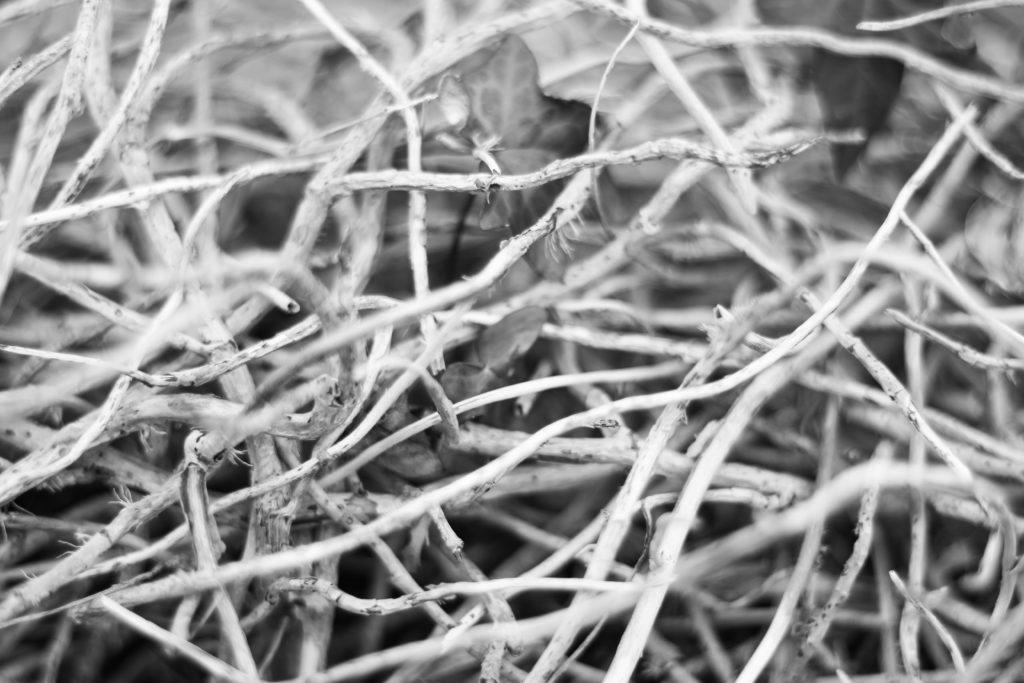
Finally I selected this image because I loved how the overlapping twigs presented themselves as a sort of abstract mess, with there being no actual order to how or where they are coming from. I also really liked how the shadows between the twigs were really contrasted opposed to the lighter shades of the wood which consisted mostly of lighter areas. This was complimented through once again a use of depth of field which blurs some of the layers of twigs out, by doing this for me I found it to be more effective due to how its stopped any eye-sore from occurring for the viewers, prevented us from not being sure where to draw our eyes to.

Once I had analysed and selected the five images I thought were most effective regarding their technical, visual and relevance to the overall topic I then proceeded to chose my best photo:

FINAL IMAGE:

The reason I chose this as my final image was because of the composition, contrast and definition that was present inside this photo. What drew this to me the most was how the piece was perfectly focused with some use of depth of field, whilst using a variety of different shades present on the horses side to create an abstract effect that mimics the natural environment around it. In relation to the entire topic of variation and similarity I found that this image reflected well the differing aspects regarding the textures and patterns which can be found within the different landscapes of Jersey, where the North could consist of more natural ones like this, whereas the South could maybe be more concrete and urban. As well as this the image for me presents me with a new perspective regarding how textures and patterns can also be found in living things found in these particular landscapes rather than just the way you personally view the landscape as well.

PLANNING FOR SECOND SHOOT AND FINAL OUTCOMES

My concept for the beginning of this shoot was first to show a type of beauty within my personal daily life, I wanted this to be a reflection of the everyday and seeing beauty within the normal. I wanted to show both a combination of femininity but also a focus on how I could express this not only through a softer tonal scheme but a more vibrant colour. I wanted to show variations of both nature elements, and also more detailed areas that are looked over for being seen as beautiful. I not only wanted to from beautiful imagery but I too wanted to how a more abstract and interesting composition  to my work.

additional edits:

overall analysis:

Artist Reference – Aaron Siskind

Who is he?

Arron Siskind was born December 4th, 1903, New York, dying in February 8th, 1992, Providence, Rhode Island. Siskind became an influential teacher, editor and photographer who is best known for his innovations in abstract photography. Starting 1932, as an English teacher in New York City he became a member of the Photo League, participating in projects designed to document neighbourhood life during the Great Depression. Siskind’s project Dead End: The Bowery and Harlem Document shows his concern for pure design rather than the subjects themselves. Because of this in the late 1930s he stopped photographing people and instead moved onto architectural photography, seen present in his book Old Houses of Bucks County, a book which looked at natural phenomena and still life. 

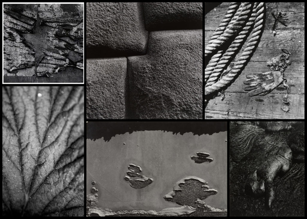
Siskind soon specialised in abstract work which he became best known for, where he expresses his own state of mind instead of recording the subject matter as it is. In the late 1940s textures and patterns became the core focus for him, looking at regular objects such as rope, sand and seaweed. Siskind’s inspiration came from Group f.64 who photographed the subject up close much like his own style, this led him onto photographing two-dimensional surfaces such as pavements, billboards and walls, especially the ones which had been decayed and worn out by the weather. This turned into his main theme that allowed for him to take photos of the ruins of Arch of Constantine in 1967, a piece that was not originally accepted by other photographers. However many artists liked this and Siskind’s was hung up alongside abstract expressionist paintings. 

Most of his inspiration comes from various activities as a founding member of the Society of Photographic Education and as a co-editor of Choice, a literary and photography magazine. Overall his greatest inspiration was as a professor of photography at the Institute of Design of the Illinois Institute of Technology in Chicago, a post he held from 1951 to 1971. His final works consist of a 30 year anthology of his photographs, Bucks County, Photographs of Early Architecture and Places. Here are some examples of his work below:After looking over some examples of his work I decided that I would analyse one of his images, by doing this it would allow for a greater insight into how these photos are created and what makes them so effective. When looking over the photos it would give me the ability to incorporate the style into my own works, making them more effective as a result. The image I chose for this is called San Luis Potosi 16, a photo of a rotting billboard with deteriorating paper:

Visual: 

Visually the image is of a billboard that had been left to rot, and as a result has become this abstract piece in itself which hides the initial meaning meant to be put across by it. This is accompanied by the fact that the paper has been repeatedly stacked upon different posters underneath, because of this the writing seems to jump around the image rather than stick in one place. When looking at it I found that the different sizes of fonts really attracted my attention due to it breaking up the piece from becoming too generic and repetitive, allowing for your eyes to travel across it with ease rather than become eye-sore from a lack of contrast. Composition wise the use of placing the biggest text in the centre of the photo really creates the whole image, as it becomes the focal point for your initial glance and the source of it’s overall aestheticism. 

Technical: 

When looking over the image there is a use of high contrast, this is done so that there is a clear definition between the lights and dark present inside the piece, emphasising and changing the final outcome as a result. The photo has been taken using monochrome, this like the contrast increases the difference between the lights and dark whilst also honing in on specific details that may of not been previously picked up upon when looking at it in colour. A relatively normal exposure and shutter speed have been used as there is no sign of blur or one of he shades overpowering the other, instead capturing the billboard as it was seen at the time. 

Conceptual: 

The image itself is part of a series consisting of various billboards in and around cities, capturing their deterioration in an aesthetic and unusual way. When looking over the photo it is clear to me that it was taken at the peak of Siskind’s exploration and experimentation regarding various takes on the environment which makes us the surrounding area, using it to reflect what can be seen and expected rather than take portraits instead. By using a monochrome filter it brings out the aestheticism of the image, making it entirely possible to interpret the image purely on an aesthetic level. The reason for Siskind’s attraction to abstract takes on cities come from experimentation between photographing an object in an unusual way or photographing the people found in that area, after much time he decided upon using abstraction to express his opinion regarding his viewpoint of the surround place, making the viewer interpret his meaning through only visual appearance alone. 

Fine Art Reference

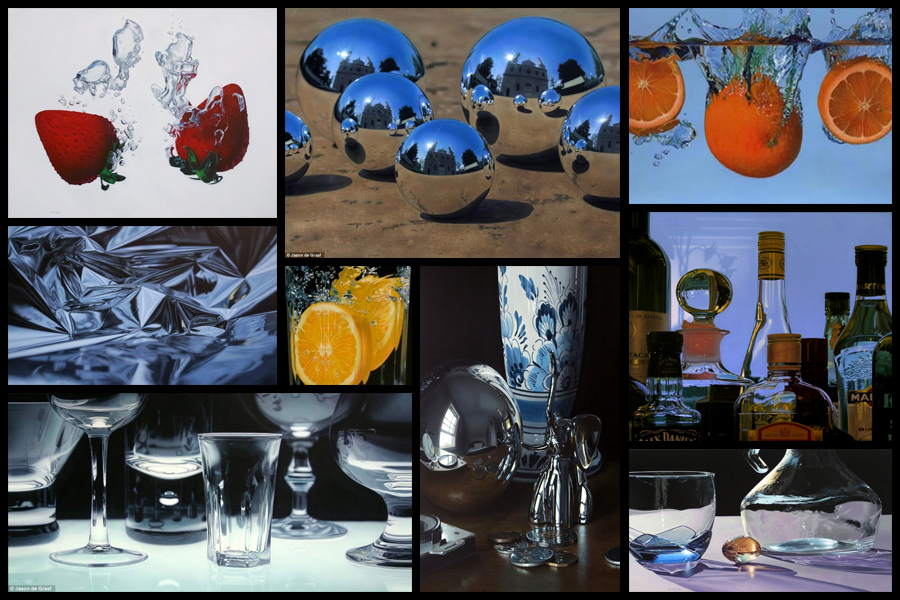
Before going ahead with a shoot and artist reference I decided that I would explore a fine artist that I could link into my future work. I would be looking at their composition and portrayal of certain everyday objects, whilst also looking at how their portray their vision of the landscape in new and creative ways. One particular artist that I found to be inspiring was the fine artist Jason De Graaf, someone who focused on reflections and objects that reflected as a means of enhancing the colour and vibrancy of the subject photographed. For me this was a unique way of seeing the subject photographed as he sets about using natural reflections such as splashes and sunlight to add contrast to otherwise boring everyday items such as fruit. Some examples of his work can be seen below:

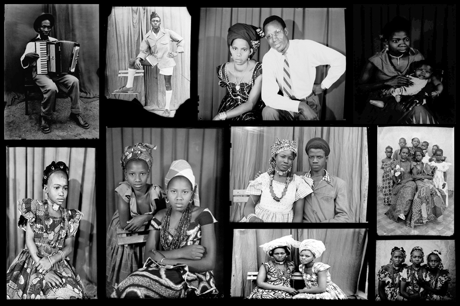
I really liked his use of tinfoil to create abstract landscapes in a sort of surreal and conceptual way with no actual editing done. For me this gave rise to the idea of used a kaleidoscope when photographing my intended areas, further abstracting the subjects from their natural environment and instead producing it to the viewers as something up to interpretation regarding what it could be. When thinking about the use of textures and patterns and creating surreal landscapes with it I stumbled across the photographer Seydou Keita, a photographer who captured African culture through the subjects clothes and patterns present in their everyday lives.

Seydou Keita was a self-taught photographer who in 1948 opened a studio in portraiture gaining a reputation for his skill throughout West Africa. Most of his photos and style are influenced by a great sense of aesthetics, dressing man young men European style clothing with customers bringing in items of clothing they wanted to be photographed in. Keita provided his own clothing and accessories such as watches, pens, radios, scooters, etc. which he often left inside his studio. Originally it was mainly women who came with their traditional robes that covered their legs and throats, only later shifting towards wearing Western outfits in the late 60s. Once again some examples of his work can be seen below:

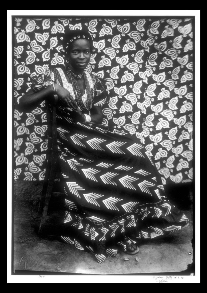
For future shoots I may consider taking objects out of my home into the natural landscape I have chosen and portray it in an abstract way which reflects a part of me rather than just the landscape itself. An alternative method which I could use would be to photograph the landscape on a more personal level, getting closer the to the subjects and capturing them in a more abstract way through up-close photography and their isolation from their surrounding environment. Some examples of this could consist of fences, horses, gardens and trees, all of these subjects play a part for something in society, whether it be work or just for relaxation, and so by portraying them in an unusual way which captures them in a light not previous used would as a result give viewers a new perspective. One of the image I found to be particularly effective for me is a piece by Seydou Kaita called Untitled [Seated Woman with Chevron Print Dress]:

Visual:

Visually the piece uses traditional African textiles and dresses as the main method of presenting aestheticism towards the viewer. What Keita does here is use two contrasting textiles which class in pattern not colour, as a result of this the opposing texture defines the women opposed to her blending into the backdrop. By leaving a section of the floor in it increases the effectiveness of the textures due to how it stops the entire image from becoming too eye-sore whilst also adding contrast between the predominantly white textiles, once again helping to define the figure of the women from the backdrop. Composition wise the women is centered in the middle of the photo, by doing this for me it immediately draws my eye to the subject as the contrasting clothing she’s wearing draws your eyes to the face in particular which is presented as a breaking point between subject and texture.

Technical:

When looking at the photograph you can see how the image was taken mid-movement, this is because of how the top right of the textile backdrop is motion blurred, this adds a sense of depth within the piece as it defines the women more due to her being photographed more crisply. An average exposure and shutter speed seems to have been used due to shades all being relatively normal without exaggeration, whilst the blurred areas provide me with evidence that the shutter speed is normal and has been unedited or untouched. The piece seems to use natural lighting as the light appears from all sides of the subject, not emphasizing or reducing the effect of the shadows, meaning that the image must have been taken outside of his studio.

Conceptual:

In the twentieth century, photography became a medium of expression that African artists began to draw upon to reflect on the world around them. One of the exceptional talents to emerge in this area has been the Malian photographer Seydou Keita (ca. 1921–2001), whose work has been admired on an international scale. Keita’s oeuvre consists of portraits that chronicle Malian life during the mid-twentieth century. His portraits are renowned for not only their masterful formal composition, but also their ability to capture the nuances of this important transitional period in Malian history. 
This portrait of an unidentified woman displays the signature pictorial style that made Keita the premier Malian photographer of his generation. Employing different backdrops and successfully combining pattern on pattern, the woman’s skirt is dynamically juxtaposed with the regularity of the floral motif on the backdrop behind her. Keita positioned the woman so the arrow design of her dress directs the viewer to her bodice, where light vertical elements of her blouse lead toward her smiling, confident face. The overall pattern on the backdrop holds the viewer’s attention while it gently repeats itself and simultaneously guides our eyes back down to her skirt.

VARIATION AND SIMILARITY SECOND IDEA OF DEVELOPMENT

Connecting onwards from the fine art side Similarly from the themes of William Ye, I want to focus on the themes of media, and that of chaos. Chaos formed off the premis of fake news, mass inflictions of terror, criticism of others, lack of trust and the lack of equality and accurate representation fo people. This is a large subdivision for a photography perspective, however, in this blog post I purpose to break down how I found these ideas step by step and the way they too successfully link to fine art.

when I was further considering the themes which are very influential within the media, I began to think distancing myself from more of the chaos, and into more of the long danger causes and pains which the media has causes. The mediation of images which only portray the same similar and very limited appearance to look a certain way, and question the extent, should we and are we expected to look and act the same? this leads me onto thinking that mediation and online influence and if it has led us to the destruction of our own minds and capabilities, due to us being stuck thinking and limiting ourselves to certain consciousness. The media subsequently is taking a percentage of our voice, it is regardless to the balance which we need, its such a staged development of the world, this lack of variation has really inflicted peoples opinions, and thirst for success and personal health and mental health issues within themsleves. Media produces a sense of importance around flaws, faults and criticism of ourselves and others. The power overs girls online is something which is unjust, it gives confidence to have less humanity, and allows groups of people to produce their own  acts of terror and chaos and target others, without the fear of prosecution. Coincidentally this presentation of power can too be linked tho the effect of DNA on people and what they do when they have power. These acts of people could also be used as an act of experiment to see prejudice, racism and discriminatory behaviour, and the scientific reasoning of why these actions are still occurring in 2019. However ‘new media’ is giving people their own large platform on social media states, such as instagram , these influences have the power to promote whatever product of system they want onto larger demographics. Their influence had the ability to change peoples perception of themselves as they have unconventionally large beauty standards. And make their young influential audience believe They should too aspire to look like them, despite even them not looking, or having a life that they are being convinced to want. However, the main primary purpose of media is to be an informative news source, and in order to educate people on real life events and happenings across the globe.  These current events are divided into political, social and cultural issues. Huge monumental political movements at the moment can be found within the discussion of fake news, me too, black lives matter, and general movements of feminism and the stretch for equality. However it is interesting the way the media presents each and every one of these subject matters, and which they deem to be more important than others. The media is a huge part of almost everyones everyday lives, because of tis it also successfully links into the study of each individuals everyday and what their actions do and what their consequences are like.

This then links to my next idea of expression of body and face and the relation and similarity seen between the stories and growth of a family. My final and third idea, links well again with the consideration of fine art, and political chaos, and it is the expression of body and face, and how we act towards and with our family, in groups of people. family is the first identity we are given, it is an almost extension of ourselves and who we are associated with for the first many years of our lives. Family is a primary example once agin our our DNA, and also a similarity we are also associated with having to others. Family should be a shared love of multiple support, however, I believe it is also a struggle of lifting and being there for each other. Family could be an investigation as to why and how forms and bonds are created, and more than just a genetic basis of variation .Artistic inspiration that I have found are the two following pieces, both link to the conceptions of media affecting out behaviour, genetics and have a fine art sentiment to them:

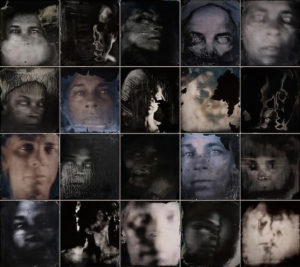
I chose this first piece as I belive it once again shows connotations to both a fine art element of abstraction and a clear artistic influence and quality to the photos. Secondly The element of community being all confined to one bonding image, and also how it forms a cohesion of family elements, and or a joined aspect of suffering in this case. It is a variation of a group of people experiencing the same effects of trauma. Additionally this trauma could have been caused by chaos within media. The effect of media fake news, and the reinforcing and constantly addressing of terrorism acts and focusing on the cruelties of the world, is what is seen within these images. A combination of individual views and variations on what they are seeing from the world. I love the effect that was used in these is, I believe it was over exposure, but covered In different fabrics and effects and then the image were near liquified, and formed into a more soft format of photos. 

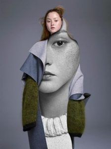
I chose this image as inspiration, due to many media related images or influencer images being concentrated on photoshoots with females looking to be the main idea of beauty. However I thought this piece was interesting as the high fashion and fine art feel comes through the interesting composition of clothes, the circular shape shows a fluidity to the images, much like many of the artists I have previously spoken about studying, additionally. The face using the eye for direct contact shows a true reflection of herself. Overall I will use these two development ideas for the effect of: combining all fo my three main perspectives, and use this to combine into five staged shoots. to begin my project.