Category Archives: Evaluating

Filters

Author:
Category:

Artist Reference – Eggleston

Who is he?

Since the early 1960s, William Eggleston used color photographs to describe the cultural transformations in Tennessee and the rural South. He registers these changes in scenes of everyday life, such as portraits of family and friends, as well as gasoline stations, cars, and shop interiors. Switching from black and white to color, his response to the vibrancy of postwar consumer culture and America’s bright promise of a better life paralleled Pop Art’s fascination with consumerism. Eggleston’s “snapshot aesthetic” speaks to new cultural phenomena as it relates to photography: from the Polaroid’s instantaneous images, the way things slip in and out of view in the camera lens, and our constantly shifting attention. Eggleston captures how ephemeral things represent human presence in the world, while playing with the idea of experience and memory and our perceptions of things to make them feel personal and intimate.

Color has a multivalent meaning for Eggleston: it expressed the new and the old, the banal and the extraordinary, the man-made and the natural. His non-conformist sensibilities left him open to explore the commercial printing process of dye transfer to see what it could contribute to picturing reality in color rather than the selling of lifestyles, concepts, and ideas. His brief encounter with Warhol exposed him to forms of popular photography and advertising, contributing to his experimental attitude toward the medium. Eggleston’s use of the anecdotal character of everyday life to describe a particular place and time by focusing either on a particular detail, such as an object, or facial expression, or by taking in a whole scene pushes the boundaries of the documentary style of photography associated with Robert Frank and Walker Evans’ photographs. His insider view allowed him to create a collective picture of life in the South, capturing how it transformed from a rural into a suburban society. Some examples of his work can be seen below:
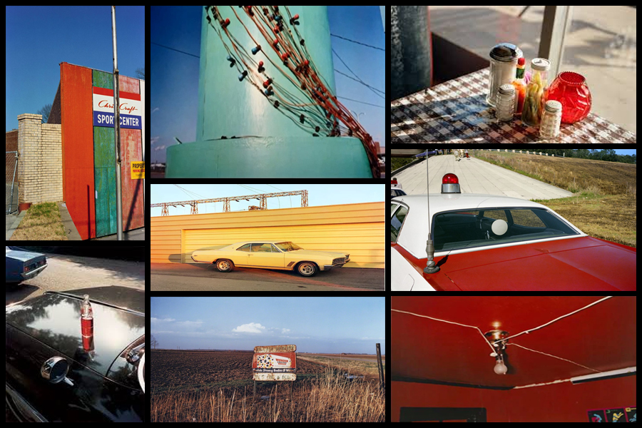
The snapshot aesthetic provided Eggleston with the appropriate format for creating anecdotal pictures about everyday life. Its association with family photographs, amateur photography, as well as Kodak’s Brownie camera (which was useable by everyone) lent his work the proper proportions and personal attitude toward the impersonal everyday. I wanted to make colour one of my main focuses when photographing the selected areas, here I found that looking and analyzing an image would prove to be most effective as it would allow an insight for me into the technical, visual and conceptual aspects of the photo that make it so aesthetic through over-saturation. The image I have chosen is called “Cannon’s Grocery, near Greensboro, Ala” and was taken 1972:
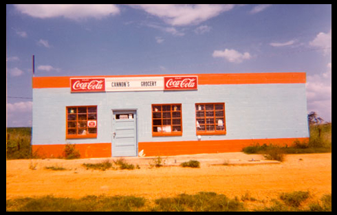
Visual: Visually the image is very aesthetic from the amount of warm colours that are present within it such as the oranges, yellows and blues. For me these colour provide us with a sense of uniqueness as all supposedly contrast each other, however instead it compliments with the colours of the building reflecting the surrounding environment like the desert and sky. Overall the piece only consists of about four to five different colours making it very simplistic regarding what can be seen, however a filter has been used to enhance the yellows and blue and create an almost artificial environment of something that may be seen on a movie set. What draws me in is how out of place the building seems as it vibrant colours are perhaps the opposite of what the desert could be seen as, giving the impression for viewers of something that could be seen for miles due to it being so out of place from its surrounding environmental landscape.

Technical: When looking over the photograph it is clear to say that a filter has been used to create an artificial feel to the overall piece due to certain colours like yellow being implicitly present through the image. A regular shutter speed and slightly lower higher exposure has been used to create a crisp and in focus shot being devoid of overpowering shadows or motion blur. The photographer has obviously made the building the focal point of the piece due to how it instantly draws the viewers attention due to its randomness regarding the surrounding environment with the yellow sand being used as a way to stop the building from dominating the composition and being too overpowering. Finally the colours have definitely been taken into consideration due to how each one contrasts another colour within the photo providing an obvious sense of old school aestheticism due to how they aren’t as crisp as they could be.

Conceptual: The image was taken at a time when the art world shunned colour photography. The solo show the Eggleston but on at the Museum of Modern Art in 1976 broke through this black and white barrier as it paved the way for wider acceptance of art and making it the preferred medium. The photograph itself represents the exciting time period in photograph when an image’s tone was more provocative than its subject.

Style EXPERIMENTATION – Long Exposures

What is a long exposure?

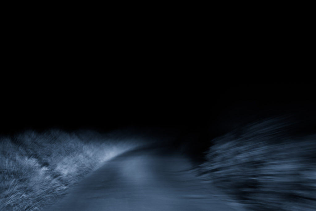
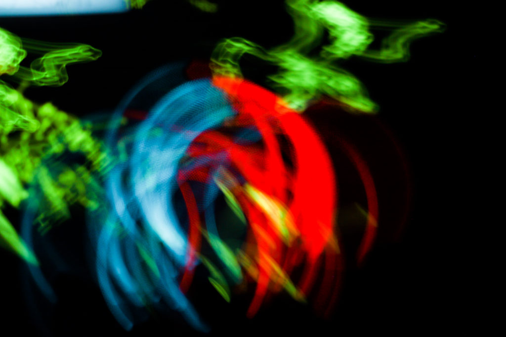
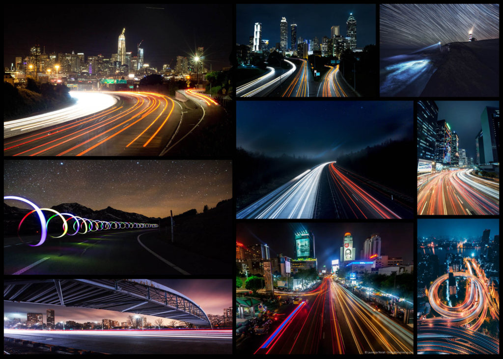
Long exposure photography is when we are using a much longer shutter speed, and it’s usually used as a specific technique to achieve a certain effect.  There’s no defined transition point at which a shutter speed becomes slow enough to define your shooting as ‘long exposure photography’.  Generally speaking, I tend to think of it as when we are talking about our exposure times in terms of seconds, rather than fractions of a second.  These kind of long exposure times (shutter speed is the same as exposure time), are often used to blur something in a photo, for example running water in stream, or the movement of stars across the night sky.  A long exposure helps us to trace the pattern of time and render things in a different way to how we are used to seeing them.  When we see things differently, it naturally fascinates us and that’s a significant factor in creating a compelling image.
In order to achieve long exposures during the daytime, it’s often necessary to use neutral density filters on a lens, which cuts down the light entering the lens.  With less light entering the lens, the shutter speed needs to be much longer to achieve the same exposure.  Neutral density filters can allow you to shoot exposures of several minutes long, even in bright daytime situations. Here are some examples:

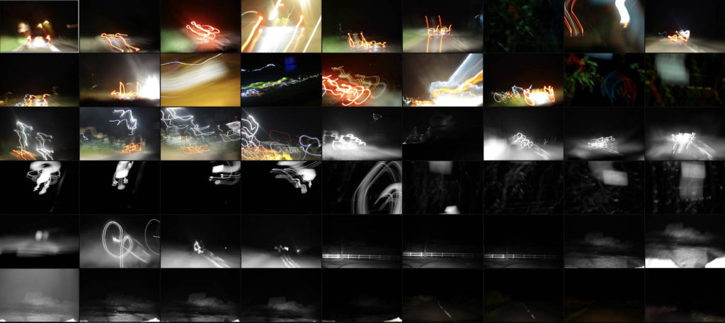
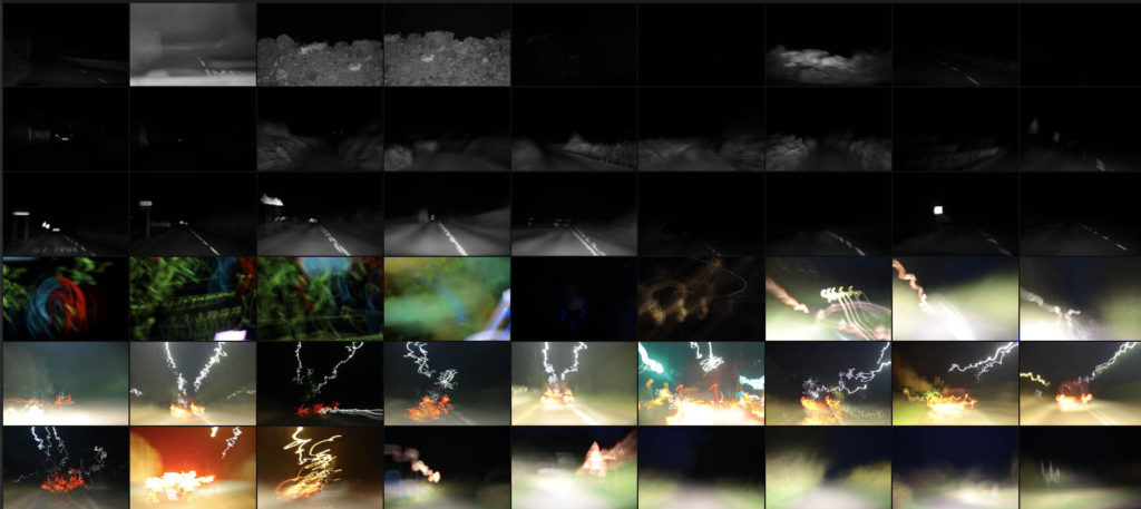
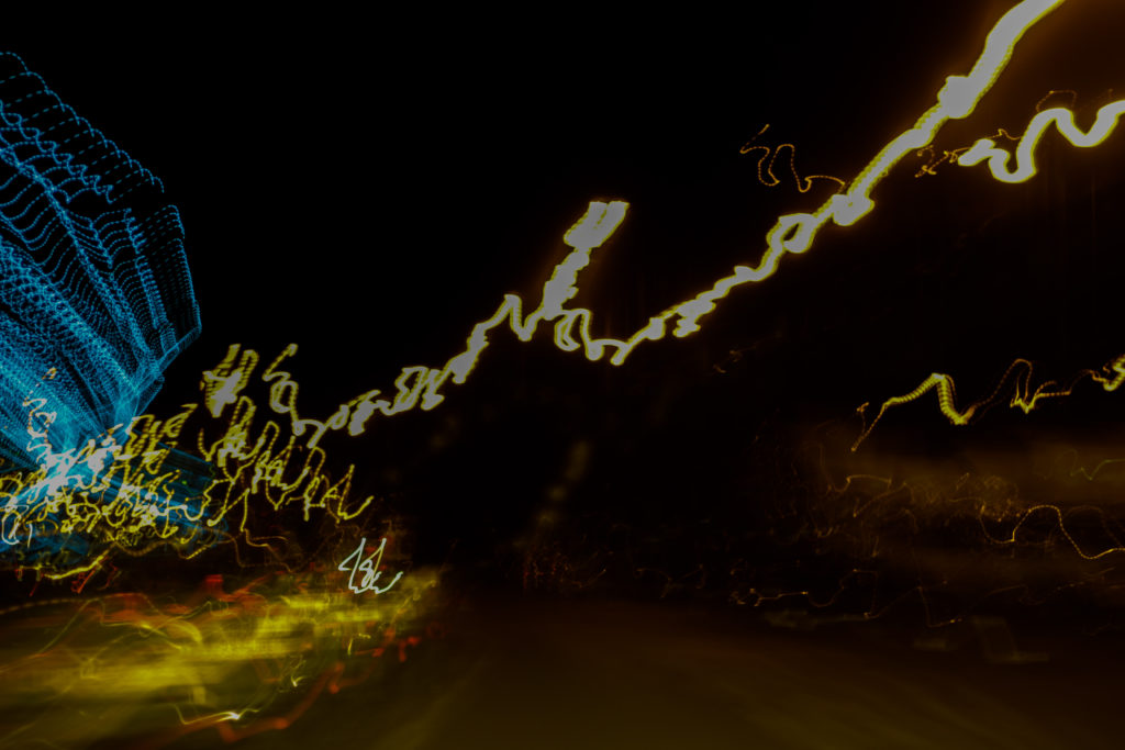
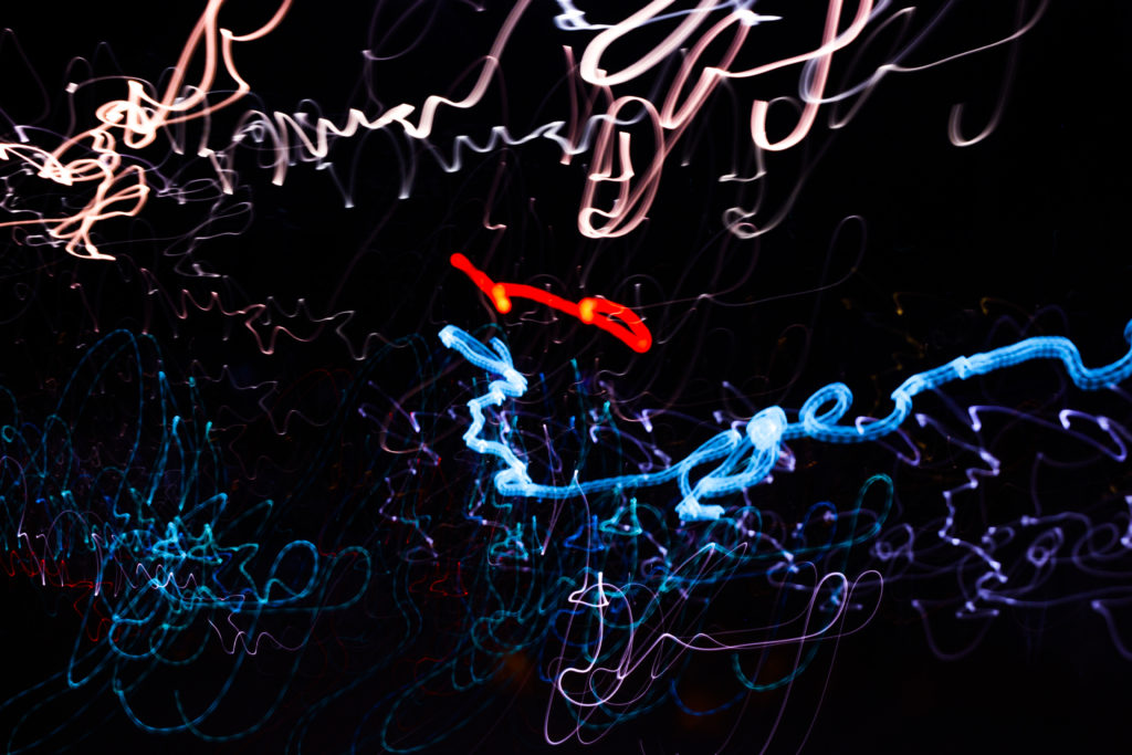
For this mini shoot I wanted to explore how the twisting roads of Jersey would create long exposure by focusing on cars and the variety of coloured lights that are created from them. I want to particularly look at the different textures and patterns I could make out of moving the camera whilst keeping the camera still. However when taking some of the photos I may try at experimenting with a monochrome filter to see if it would effect the outcome of the light trails looking at whether or not they blend the colours together. Here are some of the results from the shoot overall:

Once I had finished the shoot I decided to select ten images that I thought represented the shoot best whilst also reflecting my overall intentions behind what I wanted to achieve and have the outcome of photos look like. When doing the shoto I made sure to try a variety of things such as using a monochrome filter to produce some of the pictures, my aim behind this was to experiment and see whether by devoiding the image of colour if it would provide a smoother transition between shades. Here is my selection of my ten favourite images:

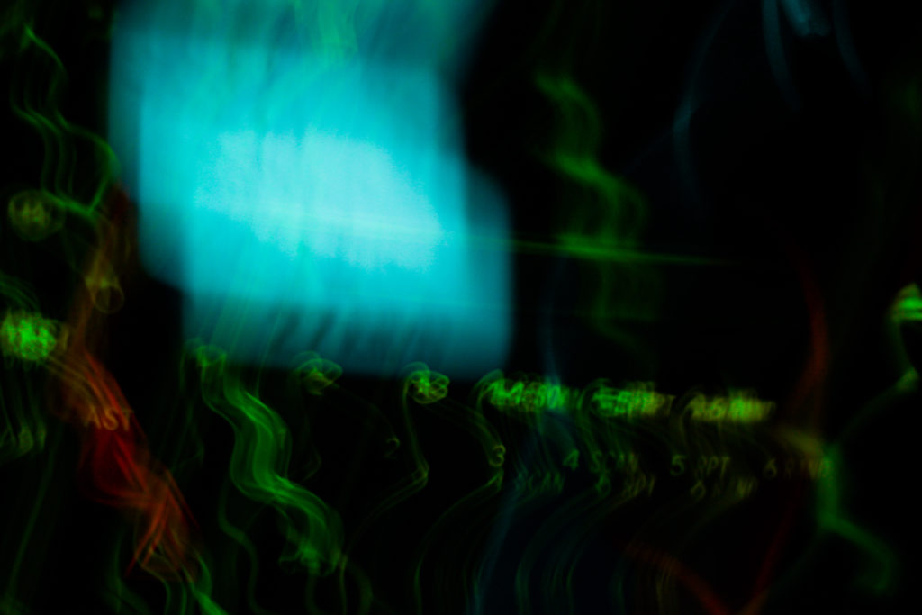
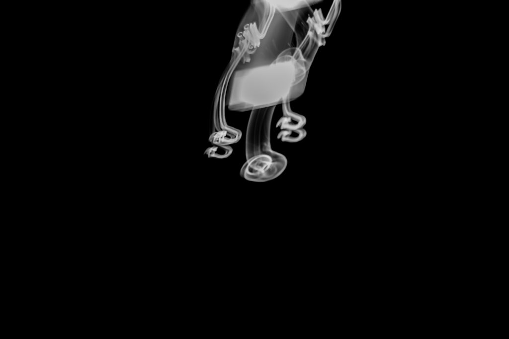
From here I wanted to then go onto whittle the selection down to only three images out of the mini shoot, by doing so it would allow me to analyse each of the image to more detail and understand the visual, technical and coceptual aspects behind the photos and my thought process behind selecting it. Here are my favourite three images:

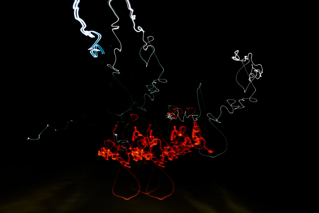
I selected this image because of how I really love the contrasting colours of red and white which also complimented each other against the emerging floor underneath. The image itself is of a moving car taken going over a speed bump during a long exposure, I really liked how its movement of bumping was captured through the pattern created with no actual goal of where its going. Overall I liked how the image relates well to long exposure as it creates an abstract pattern of the lighting, removing the car completely and leaving me with a series of lights with no coordination.

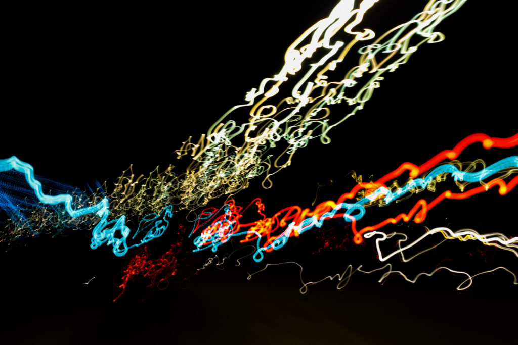
The reason I chose this image was because of the coordinated composition of the colours against the black backdrop. Personally for me I found that the lightings approach from the bottom left to top right of the photo created a great sense of aestheticism due to how the black space left behind in certain areas leaves enought room so that neither the lights or the darkness becomes too overpowering for the viewer. By mixing together a variety of different colours into the light sequence I found that it really stopped the lighting from becoming repetative and boring, as a result for me the added blues and reds emphasise the movement in the image.

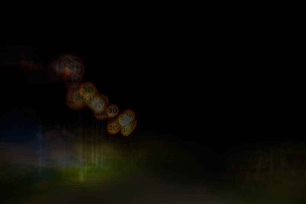
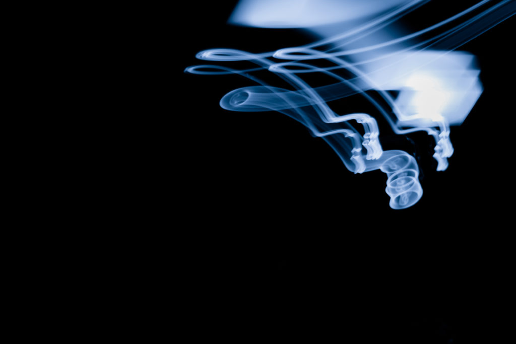
Finally I selected this image because of its simplicity, here I loved how the use of black negative space to highlight a smoke like effect created from a swaying lamp on a boat. What drew me to the image was the symmetry created from the light and how by using a monochrome filter on the image it puts arcoss the impression of smoke filtering down the screen. For what the image lacked I found it made up for it in contrast against the black backdrop with the ghost like lines presenting the viewer with a great sense of aetheticism.

Overall I found the shoot to go quite well as it highlighted the movement in our everyday lives but instead by removing the subjects and leaving on the light sources they have left behind. As a result of this all textures lights and landscapes are a direct reflection of our everyday transport to and from work or school.

Abstract Pattern Shoot #2

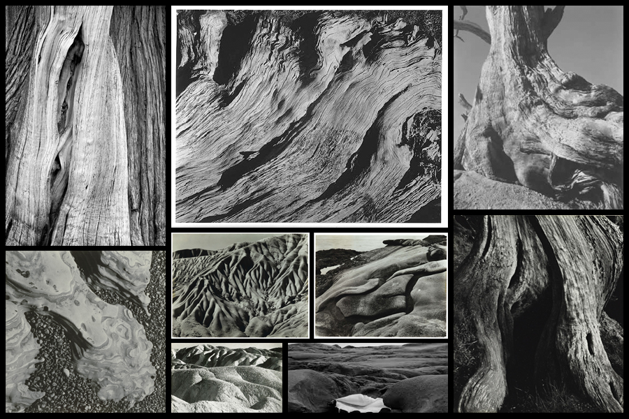
Regarding this shoot I wanted to respond to the works of Edward Weston due to his focus being mainly around the idea of capturing texture and pattern present within natural forms of the landscape. Overall what I found to be particularly interesting was his photographs surrounding trees and rock formations which use high aestheticism as the main form of attraction and the intricate beauty each resembles. This as a result has inspired me to go onto produce a shoot looking at the natural formations regarding textures of the landscape in the North of Jersey. From this I hope to achieve a new style of photography I can later go onto use to portray the environment in a new way and possibly go onto include them in my final prints and photo-book. Using Weston as my main source of inspiration I decided to have a look at some of his particular works that I thought reflected my mind-set of the shoot the most:

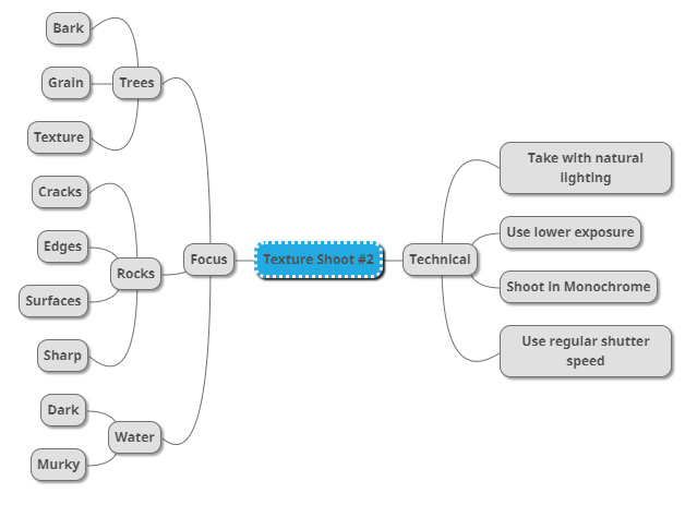
After I had looked over some of his works that inspired me the most I then decided to move onto creating a mind-map for my shoot. By doing this it would allow me to jot my ideas down for future reference whilst reducing the time wasted on the shoot. Not only would creating a mind-map prevent me from wasting time but it would also allow me to direct my intentions immediately during the shoot, instantly understanding what it was that I intended to achieve by the end of it and what I could focus on to get the results I wanted. Here are some of my ideas:

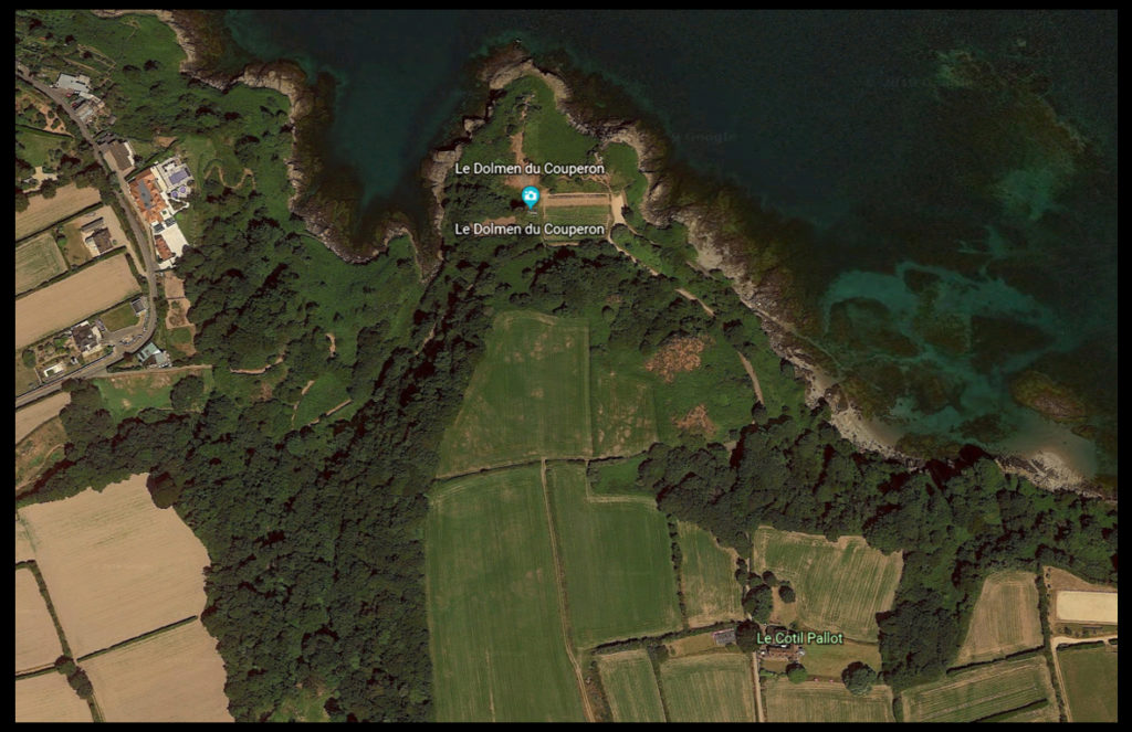
After looking at my initial ideas I decided upon going to the area of Le Dolmen du Couperon . I chose this location because of its wider range of different areas such as woodland and beaches, allowing for the perfect area to photograph my intended areas of focus. What drew my initial interest was how some of the woodland had been cut down and would have left behind stumps and ruined trees which would be great to photograph regarding the idea of bark and grain texture. Here is a map of the intended area to photograph:

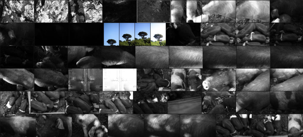
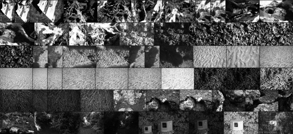
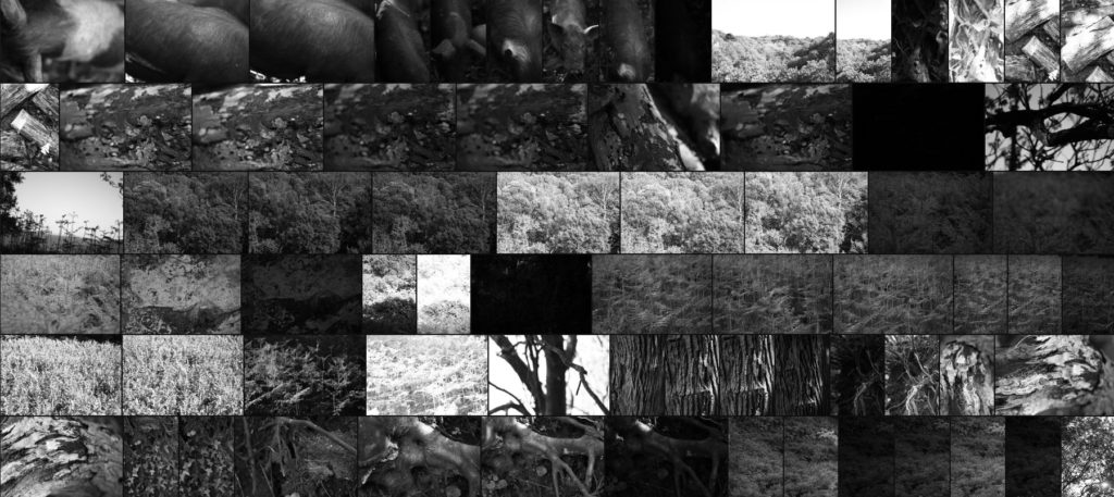
Here are the results of my shoot:

Once I had finished the shoot I then went on to whittling the selection down to only ten images, by doing so this would allow me to decide and make easier which image best reflected my overall intentions and goal of the shoot. Here are my ten best images:

After I had done this I then decided to go onto further and whittle the selection down to only five images this time. By doing this it would allow me to analyze the images in more depth looking at the visual, technical and conceptual aspects of each. These are my choices for the five best images:

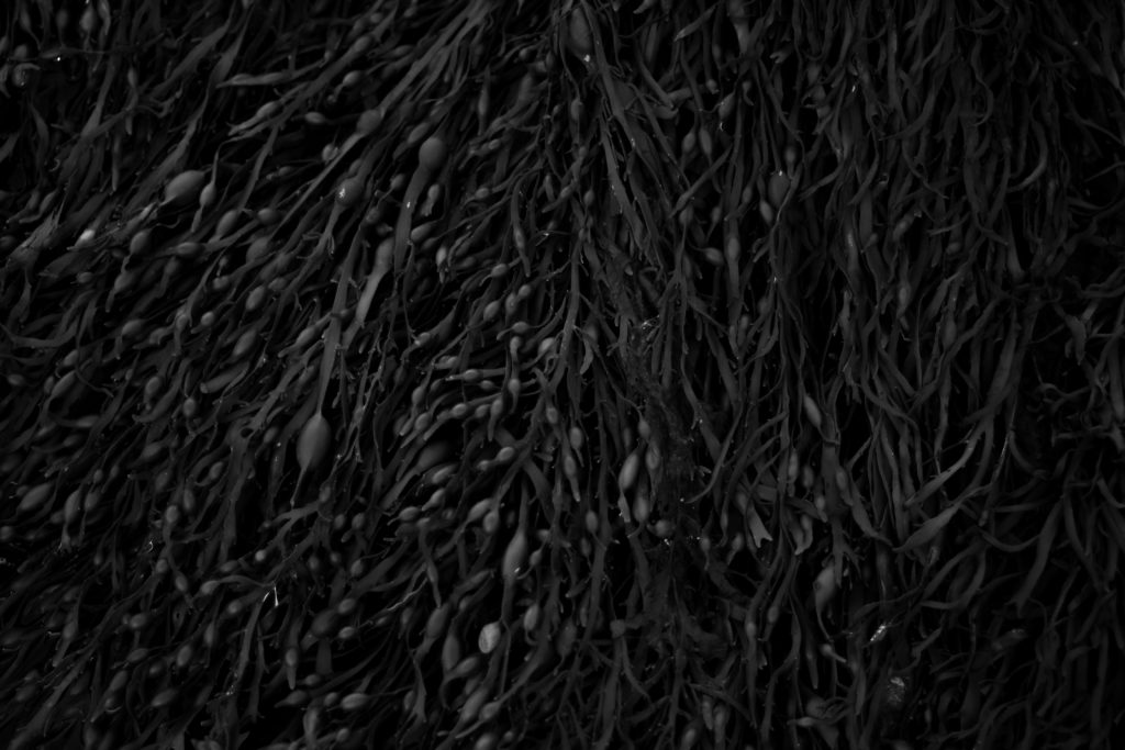
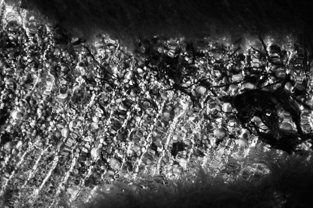
What I loved about this image was how the low exposure allowed for the over emphasis of the contrast between each piece of seaweed. For me the inclusion of highlights inbetween the pattern allowed for greater emphasis of the overdefined overlapping pieces as the monochrome filter perfectly captures this. Personally I found that the darker border around the pieces added to the overall affect, this is because of how it boxes the seaweed in and creates a great contrast which increases the aestheticism of the photo. Overall I thought the outcome was very effective as it captured exactly the subject as I wanted whilst providing the viewer with one of natures patterns.

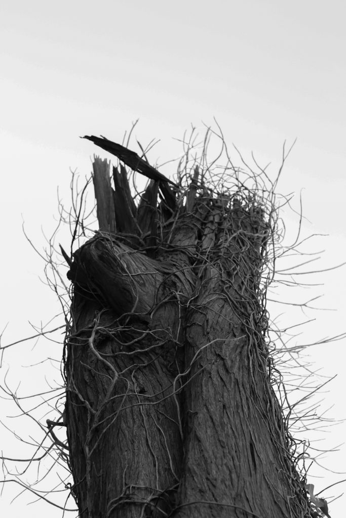
I selected this image because I loves how the dead tree branches out from the bottom of the composition with varying dead ivy producing from its side which provides a stark contrast to the overcast backdrop. By taking the image against a overcast backdrop for me it added extra definition to the subject as it over exaggerates the features whilst isolating the subject from its surrounding environment and limiting the viewers perspective of what it is. Personally I found this this piece came out really well as it provided me with the patterns desired from the outreaching ivy whilst also being close to my goal within my pattern mind-map stated above.

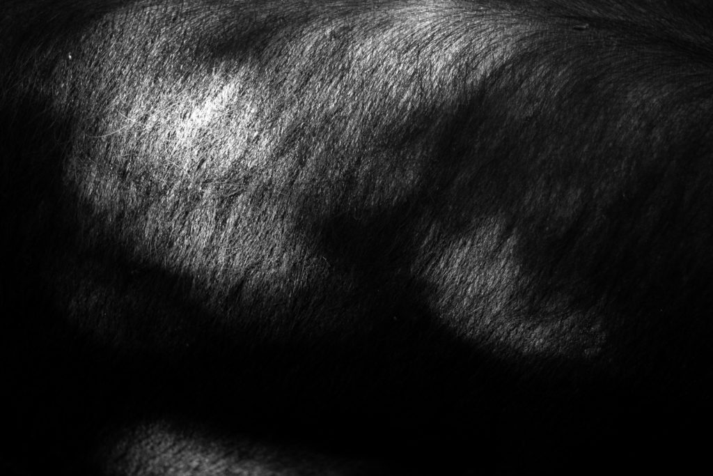
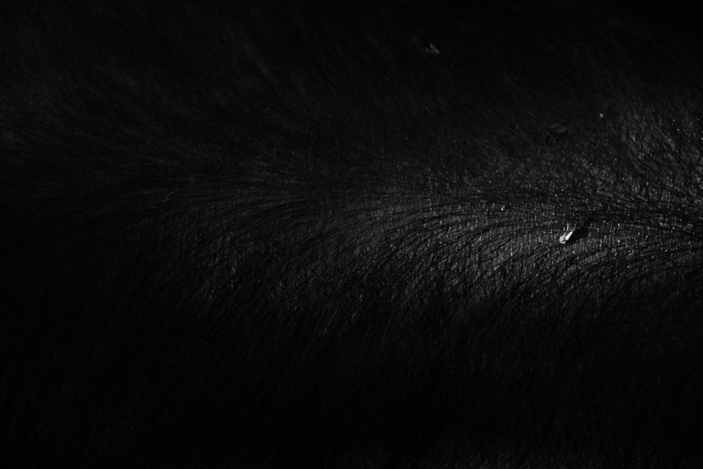
The reason I chose this was mainly due to its link to the previous pattern shoot which highlighted the mane of a horse instead. I selected this because I loves the huge contrast within the photo with the individual hair of the pig being highlighted by the limited amount of natural lighting from the sun. For me this adds a huge amount of character to the image as by limiting and abstracting the rest of the pig from view it makes you really look into the piece to further explore what could be hidden in the darkness. As a result of this I found this piece worked well and would be well suited to work with the other picture in the previous shoot which could be further used in a composition.

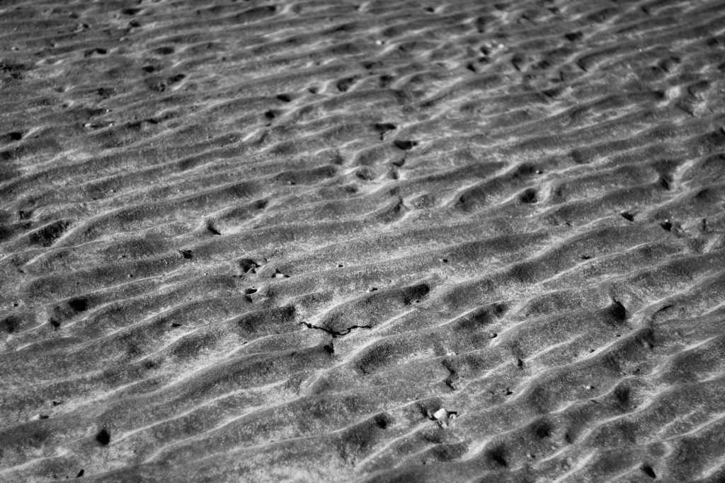
What made me choose this image was the pattern created from the sea going out and leaving behind the bumpy pattern that leads outwards for miles. By using a higher exposure I found that I was able to highlight certaom parts of the bumps leaving the rest of it in an exaggerated shadow which as a result creates the impression of a sort of sandy sea with various bumps overlapping or breaking up others. For me I really liked the result as it carries a sort of natural aestheticism where it makes the bumps seems too artificial to be true, therefore creating an almost surreal landscape as if from a birds eye perspective.

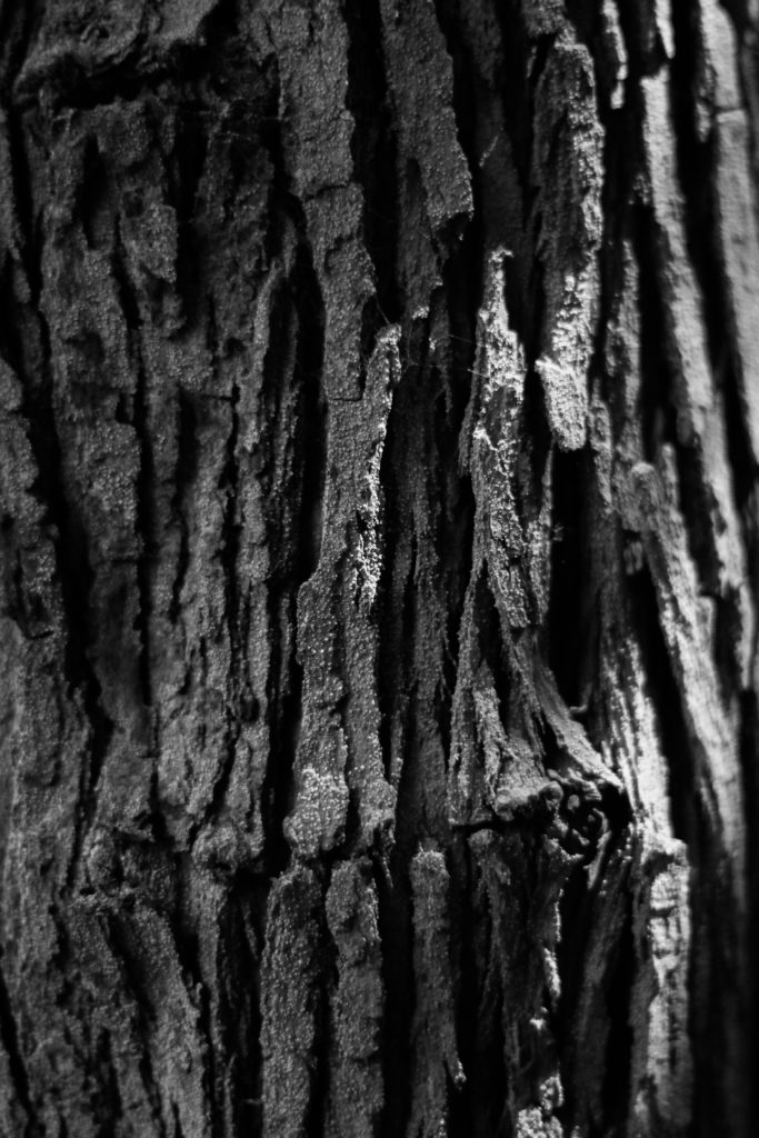
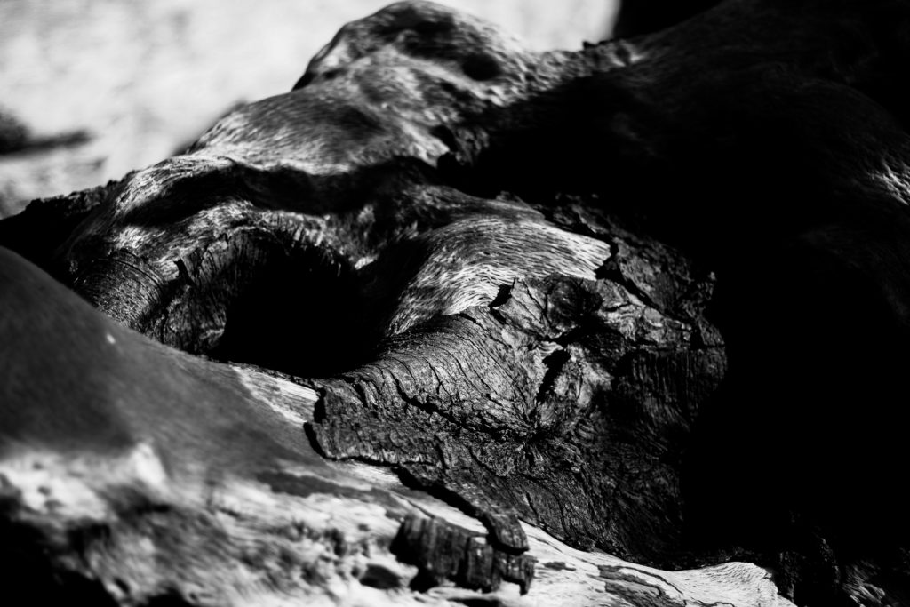
Finally I chose this image because I really liked the contrast between the dark and lighter aspects of the woods surface. When looking over the image I found that the clear contrast between the darker right side of the wood and the lighter left side added a much needed definition through how it induces a sense of mystery by removing most of what would be seen of the log. I also liked how the hole in the log adds a sense of depth through it removing the continuous grain present on the surface of the wood, instead breaking it up and becoming the main focal point of the image. As a result of this I was really pleased with this outcome as it reflected my intentions for the shoot whilst linking itself back to the topic of abstract patterns.

Once I had analysed each image I then decided it was time to move onto selected the best image that represented my overall aims and intentions of the shoot. This was my choice:

For me the image of the overly contrasted seaweed represented my aims for the shoot the most, this was because of how the overlapping pattern created when the tide goes out became really aesthetically pleasing for me due to the gaps of darkness inbetween highlighting the various shapes of the seaweed as it progressed along the composition of the photograph. Looking over the image for me it is clear that the small air sacks of seaweed add a very much needed aspect to the entire photograph, this is mainly due to how they tend to be a lighter shade from that particular area inflating and stretching the surface area as a result, whilst presenting them as more light and eye-catching to the rest of the piled seaweed.

Abstract Colour Shoot #1

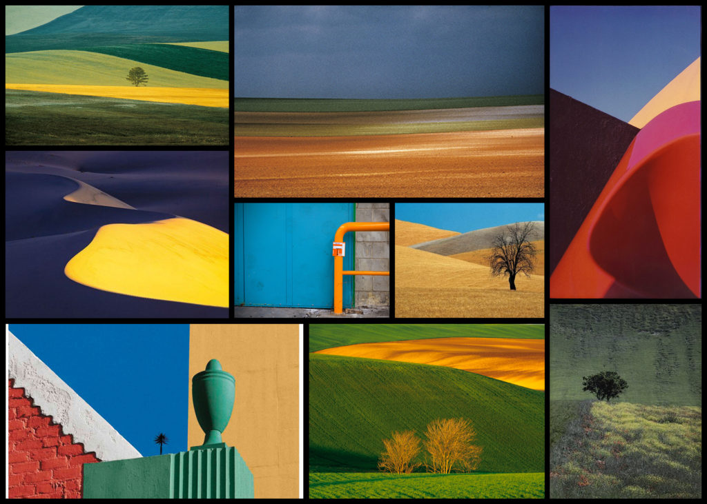
For this shoot I wanted to create a response to the works of Fontana as I really liked the simplicity created through his highly saturated images. What drew me to his imagery was his use of using the textures and patterns found in nature and man-made objects to create impressions of the landscape around him in a way which would not have usually been percieved. From this shoot I would aim to achieve a new style of photography which I could then go onto incorporate into possible future works especially the aspects of colours, something I don’t normally consider when doing shoots. To create the desired effect I would probably have to manually increase the contrast and saturation within my settings of the camera in order to produce the outcome for the photos I would like. Using Fontana as my main source of inspiration I decided to have a look at some of his works which I found to be of particular interest:

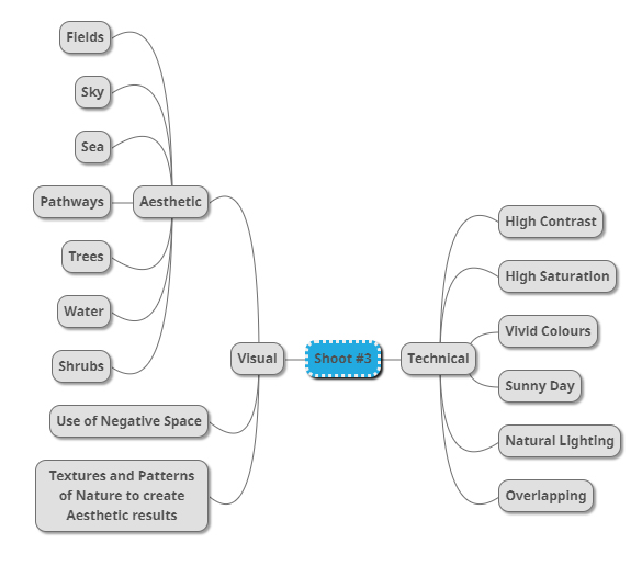
Once I had gone over a few of Fontana’s imagery I decided it was nearly time to go ahead with the shoot itself. However before doing so I wanted to create a mind-map for the goals when taking photographs, by doing so for me it would reduce wasted time as it would allow me to quickly identify what I wanted to capture in order to achieve the results needed. Not only would this stop wasted time but allow me longer to focus on the things that I may not have realised if doing the shoot there and then. Here are some of my ideas:

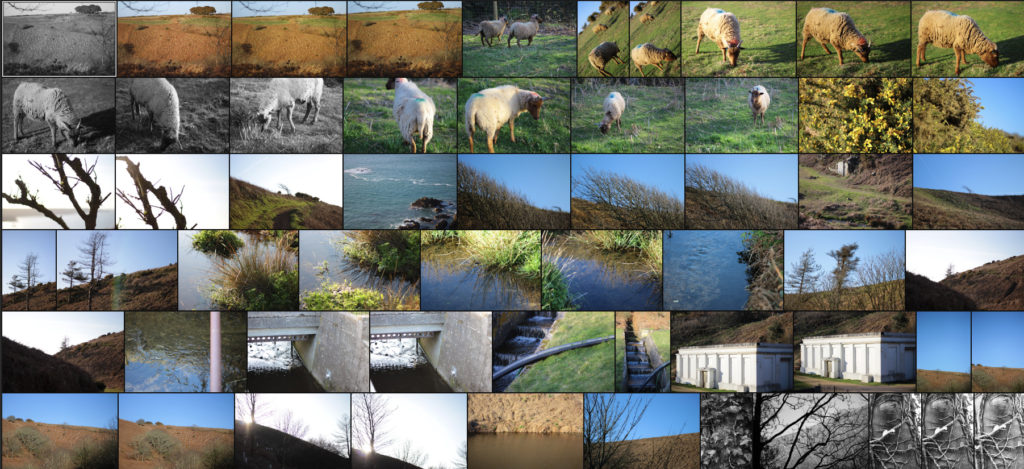
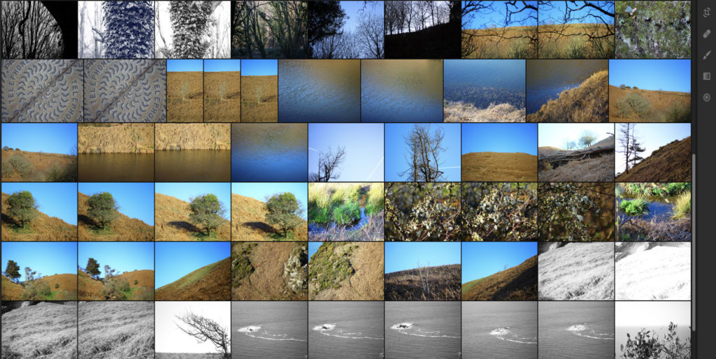
Once I had completed my mind-map I decided it was time to actually go ahead with the shoot. To do this I wanted to explore the area North of Jersey as this area had the highest number of agriculture out of Jersey as it would provide me with the subjects needed to achieve the aims of the shoot. Using my mind-map as my primary source of inspiration and ideas I explored the footpaths which surrounded the North coast looking at how the blue sky could contrast the hills. Here are the results of my shoot:

Once I had completed the shoot I then wanted to go onto select out ten images that I thought were most effective and related most to not only the topic title of textures and patterns but also saturation. By doing this it would allow me to reflect on each image and make in easier to choose out a selection of five from that so that I could later on pick one overall image that I thought best reflected my intentions for the shoot. Here is my selection for the ten images I thought were best suited to the topic of saturation regarding textures and patterns:

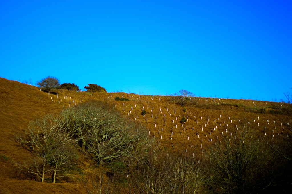
After I had selected the ten images that I thought worked best regarding the topic title I decided to then whittle them back down to five images, by doing this it would allow me to analyse each image in more depth looking at things such as the visual and technical aspect of the pieces that I thought made them work well and link back towards the title of saturation and make my overall choice of best image easier. Here is my selection of the five best images from my shoot:

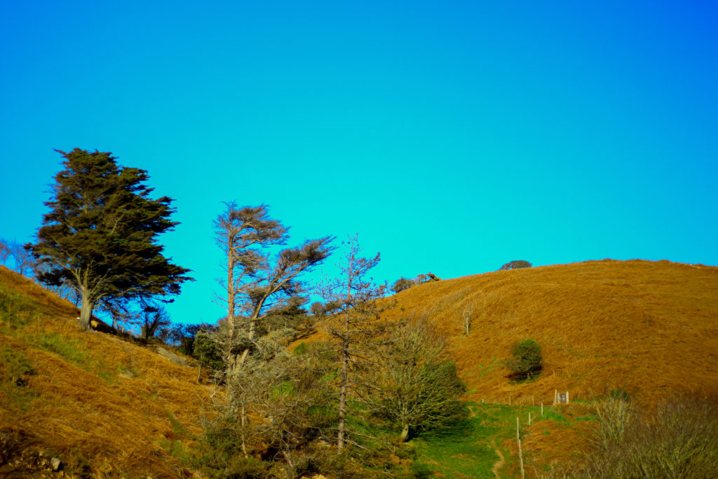
I selected this image because I loved how the orange contrasted the blue sky with the tree breaking up the dominant two colours. What I liked about this was how the two main colours compliment each other, however to stop both colours from becoming to eye-sore to the viewer the use of a lighter shaded tree and its shadow provide us with an implicit focus to what we almost instantly draw our eyes to. I also really liked the symmetry present within the photo as the skyline and pathway with the tree line up against each other as it presented the viewers with an overall sense of aestheticism. When looking over the image I found that it related well in response to saturation evident through the orange grass and the overly blue sky, this sense of other-worldly colour for me gives the viewer the impression of an over exaggerated landscape which has certainly been edited.

What I really loved about this image was the over use of blue to create the impression of an artificial sky, complimented by the patterns created from the tree branches I found that this worked well due to the overcast impression it paints on the photograph. For me I found that the use of the negative space taken up by the blue really brought the image together due to how it prevents the pattern of branches from completely covering the entire composition. The image itself relates well to saturation from how the use of an overly blue sky creates the impression of something to perfect to be true, with the photograph linking to texture and pattern through the branches which grow in random directions that produce a hige sense of aestheticism against the blue sky.

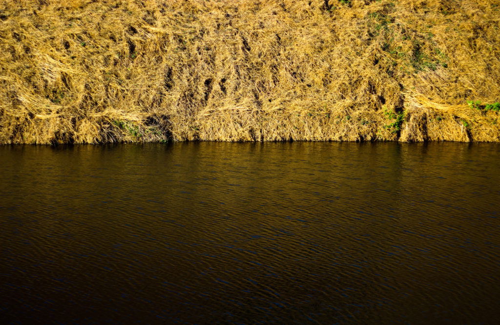
I chose this image because of how I loved the golden colours of the grass contrasted to the rippling water. For me this image represented two over exaggerated aspects of nature, especially as an island where we are surrounded by water presenting both the land and sea side by side in a sort of aesthetic and beautiful state creates the transition between the two as a natural mirror. I found that the gold presenting throughout the image as the main reason for choosing the photo due to it adding character to the water, reflecting the overlapping pattern of the grass as it grows. As a result of this I found that the two contrasting textures present in this image, being the rippling water and the overlapping grass as complimenting each other as one provides a more abstract representation for the other. The saturated golds in the piece also link it to the title through the coloured reflection that would not usually been seen by the everyday eye.

For me I selected this image because of its use of neutral space to create a more abstract impression of the landscape and whats in it. For me the tree against the blue sky was what brought the image together due to how it broke up the otherwise dull composition of the photo, what I found was how the messy texture of the grass completely contrasted the smooth matte texture of the sky which sorts of juxtaposes it. I liked how the composition that took into consideration the angle of the hill made use of the sky and contrasting orange grass surrounding it so that it would not become too overpowering. Overall I find this image did reference well regarding the topic of saturation, however looking at texture and pattern it did not serve a great load towards possible patterns except through grass.

Finally I selected this image because of the natural gradient created by the sun, sky and grass to produce this sort of golden natural film over the waters surface. For me this piece worked well because of how no real use of saturation editing was used due to how vibrant the surface of the water was on that sunny day with only a bit of cropping being needed. I really liked how the composition of the piece was based around a fifty fifty colour wise, with the golds taking the top and the blues the bottom, because of this for me the piece was well balanced with no aspect overpowering the other and creating an aesthetic product. However when looking over the image I did not find it had a great deal to do with saturation due to there being no actual reflection of a saturated landscape.

After looking over the visual, technical and conceptual aspects of the five selected images I was happy enough to come to a conclusion regarding which image would be best to reflect my intentions around saturated photography whilst also looking at the title textures and patterns. Here is my final decision towards the topic of saturation:

Final Image:

I chose this image as my final photograph to sum up my chosen topic because of the contrasting sides to the landscape it presents using highly saturated colours. For me the dominant use of yellows and golds in the photo bring about great aestheticism whilst highlighting how areas of our environment provide us with varying textures and pattern (such as ripples in the water and the overlapping of grass), something that the everyday eye would not take in unless looked upon carefully. Symmetry played a part in this decision due to how it presented the image as visually pleasing, stopping both the water and land from becoming too overpowering.

Tiny Planet Shoot | Final Outcomes

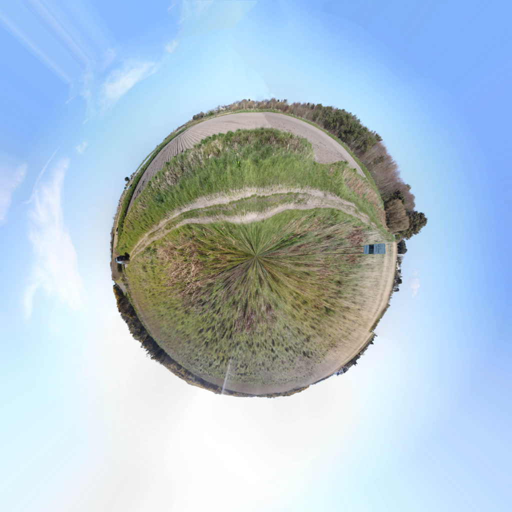
Les Landes

The above image was a collection of over 50 images taken in portrait covering 360 degrees. I like how smooth this planet came to be and I think this is a very successful attempt at a Tiny Planet as an experiment. I plan to carry on a do a few more. This one in particular was at Les Landes in the fields of St Ouen, this captures the calm and peaceful environment of life in the West. My only dislike is the distortion in the middle however I do not thing there is anything I can do about that.

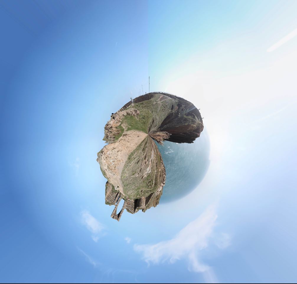
Grosnez

Again, the above image was a collection of over 50 images taken in portrait covering 360 degrees just like the Les Landes planet. This one was taken on the cliffs at Grosnez where you can see the castle. I would not really call this one particularly successful. Yes it is a tiny planet and it did what I wanted it to do however, due to the nature of the location and subject matter, the planet comes across as being very squished and distorted and makes the subject difficult to recognize and the planet looks very strange and I do not believe it captures the nature of the area.

In conclusion, I think the Les Landes planet was much better than the Grosnez one because I think being on cliffs/by the sea on the Grosnez planet stops the planet being smooth and more circular and makes the image look a bit messy and too distorted for my liking.

Artist Reference – Franco Fontana

Who is he?

Franco Fontana was born in 1933 in Modena. He took up photography in 1961 and joined an amateur club. He held his earliest solo shows in 1968 in Modena, his native city, which marked a turning point in his career. He had published over severnty books with Italian, French, German, Swiss, Spanish, American and Japanese publishers. His photographs have appeared worldwide in over 400 exhibitions, solo and collective. His images are in collection in over fifty public and private, Itlaisn and international galleries. Many companies have asked him to collaborate on advertising campaigns, he had published photographs in The New York Times and various other major magazines, with Fontana being invited to hold photography workshops in various school, universities and institutes such as the Guggenheim Museum in New York. Every year he holds academic courses at the Politecnico di Torino, and the LUISS University, Rome. He is the director of the Toscana Fotoferstival and has collaborated with the Centre Georges Pompidou, the Japanese Ministry of Culture and the French Ministry of Culture.

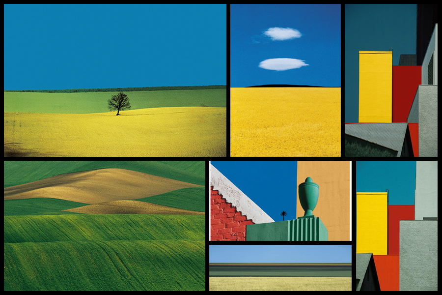
Fontans photography mainly depicts extremely aesthic portrayals of natural landscapes, using vibrant colours and a high saturation to link beauty to what would typically be seen in things such as flower, fields and the sky. What has inspired me is his use of aesthetics through a more unusually high saturation, depicting which would usually be everday scenes in a more visually appealing approach. Here I intend to go about photographing nature in a more aesthetic manner, using the textures and patterns found in each subject as a means of photographing a hidden viewpoint not usually seen to the everyday eye. Some examples of his work can be seen below:

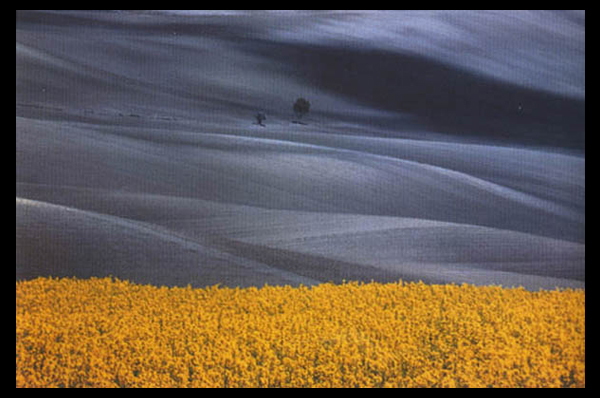
After looking over some of his works I decided that I would go onto analyse one of his images, by doing this it would allow me to have a broader knowledge regarding the techniques used to photograph the pictures and the more conceptual side of them. To do this I would have to look at three categories, technicality, visual and conceptual, the image that I have selected to study is called Paesaggio Basilicata, and was photographed 1990, depicting the use of minimalist styled composition of a agricultural landscape:

Technical:

Technically the image is composed using a very minimalist technique, capturing and using only the yellow crops and the contrasted black and white backdrop to provide the image with an overall very aesthetic product. The photo has been taken in two filters, one being coloured and the other monochrome, by doing this it really highlights the shadows that make up the layers of the hill seen in the background and as a result create an abstract like effect which in a way depicts them as waves. To stop the monochrome becoming too overpowering Fontana has included two small trees located in the center of the photo, including this allows for a more symmetrical and aesthetic looks as the continual gradients of the hill are broken up and separated. The yellow contrasts this due to it being a contrast to black and so allows the shades on the hillside to pop even more.

Visual:

Looking at the image its evident that a high saturation has been used to create the vivid colour of the grass which is depicted unnaturally yellow. This is also contrasted by the monochrome hills which by doing so allows for all of the hills to have a layered portrayal used by the darker areas which have highlighted and smoothed out the grass to create a more gradient effect as a result. Composition wise the placement of the trees in the center has definitely been thought about, this is because of how it breaks up the otherwise consistent pattern found throughout the photo, with the yellow flowers taking on about 1/3 of the image up so that it cant become too overpowering due to its colours.

Conceptual:

The style used for this photo is based on his on vibrant language, Photographic Trans-avantgarde, abstracting the landscape and its colours. By using things such as a higher saturation he aims to create ideals for people regarding the aestheticism of an area which is often over-exaggerated in order to push a certain mind-set onto the viewer.

Contextual Study – Colour Field Paintings

What are field paintings?

Field painting was a term that originally was applied to the work from about 1950 of three American abstract expressionist painters, Mark Rothko, Barnett Newman and Clyfford Still. The words ‘colour field painters’ was the title of the chapter dealing with these artists in the American scholar Irvine Sandler’s ground-breaking history, Abstract Expressionism, published 1970.

From around 1960 a more purely abstract form of colour field painting emerged in the work of Helen Frankenhaler, Morris Louis, Kenneth Noland, Alma Thomas, Sam Gilliam and others. It differed from abstract expressionism in that these artists eliminated both the emotional, mythic or religious content of the earlier movement, and the highly personal and painterly or gestural application associated with it. In 1964 an exhibition of thirty-one artists associated with this development was organised by the critic Clement Greenberg at the Los Angeles County Museum of Art. He titled it Post-Painterly Abstraction, a term often also used to describe the work of the 1960 generation and their successors.

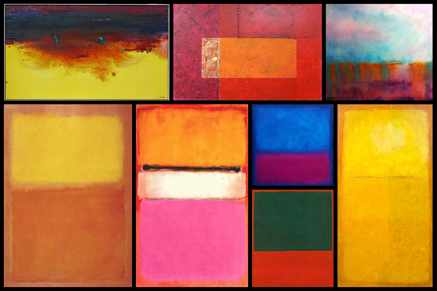
In Britain there was a major development of colour field painting in the 1960s in the work of Robyn Denny, John Hoyland, Richard Smith and others. Some examples of field paintings can be seen below:

Color Field Paintings emerged out of the attempts of several artists in the late 1940s to devise a modern, mythic art. Seeking to connect with the primordial emotions locked in ancient myths, rather than the symbols themselves, they sought a new style that would do away with any suggestion of illustration.The style was championed most enthusiastically by critic Clement Greenberg, who acclaimed the advances it achieved in the realm of form and composition. Bemoaning what he saw as the increasingly imitative, academic qualities of some action painters, he argued that Color Field Painting represented the way forward. His advocacy of the style proved highly influential.

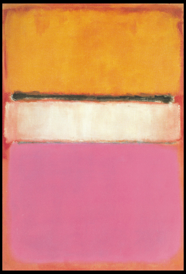
From here I wanted to explore the typical aspects that could be found within many field paintings. To do this I would need to analyse a painting and look at the technical, visual and conceptual ideas behind each brush stroke. By doing this I would like to take inspiration from this and use it towards a future shoot regarding Franco Fontana, using a highly saturation landscape to create abstract work which highlight the texture and patterns that can be found in everyday life regarding hills around the coast. The painting I have chosen to analyse is called White Center (Yellow, Pink and Lavender on Rose) by Mark Rothko:

Technical:
The painting, top to bottom, signifies Rothko’s multiform style of abstract painting. A rose ground, darker in color on top and paler at the bottom, holds a horizontal yellow rectangle, followed by a black horizontal strip. A white rectangular band is in the center of the painting, and the bottom is lavender. Several tones of the colors were used, establishing the effect of a wide range of mood and atmosphere. Whilst not being that technical, the lack of form or structure presents the viewer with a piece that becomes aesthetic to the eye, however its simplicity provides effectiveness from how it allows the viewer’s mind to wonder and interpret each painting to a more personal level.

Visual:
Mark Rothko continued to simplify the compositional elements of his paintings. In 1950, he began to divide the canvas into horizontal bands of color. Despite the frontal composition and absence of spatial illusionism in these works, the broad bands of color appear simultaneously to float in front of the picture plane and to merge with the color field upon which they are place, as in White Center (yellow pink and lavender on rose), 1950. A luminosity results from the repeated layering of thin washes of paint, which allows some underpainting to show through the upper coats. In each work of this period, Rothko sought only subtle variations in proportion and color, yet achieved within this limited format a broad range of emotions and moods. The photo at the top displays this painting’s supreme color choices, namely yellow, pink and lavender on rose.

Conceptual:

The piece represents Rothko’s love for reduction, colour, shape, balance, depth and composition, all of which are surrounded by cloudy edges against a undetermined backdrop. The idea behind the piece was to reduce the colours and the forms expanded in size, dwarfing the background which disappears behind the towering coloured forms. Many can interpret it as a dominance of colour using vivid and lush colours provide contrast and symmetry, for many it presents us with the idea that Rothko is enveloping the viewer and inviting us to contemplate and emotively respond to the space he has created.

Michael Luitaud

Mood-board of Luitaud’s images

This is an artist reference for my exam, as I am inspired by his cutlery images to create similar images experimenting with light and darkness to create shadows and other similar effects as the images he creates when exploring photography with cutlery. This artists fits into the theme variation and similarity because he is exploring cutlery (which is an everyday object), and he is focused on looking into the similarity between forks and spoons, but the variation in how they are perceived, using light as an important factor in order to create such unique and varied images. He experiments with different positioning’s of the cutlery, as well as a variation of camera perspectives he uses to capture these images.

Luitad’s image

This image by Luitad is intriguing due to how he has manipulated the background and lighting to create this unique shadow effect. He used what looks like two forks and one spoon to create the image above. He must have used a reflection of some sort (maybe a mirror) as you can see the reflection of the cutlery. I think this is very effective in achieving such a creative series of images. Luitad is using an artificial light to portray the forks and spoons as a sort of silhouette. I like how the sides of the forks and spoon are portrayed really dark due to how Luitad has positioned the lighting. This silhouette effect makes the image overall a lot more appealing.

Luitad’s images are inspiring me to do something similar. I want to do a shoot based on cutlery, where I would experiment with lighting to explore shadows and silhouette effects.

Reviewing and Reflecting

How well have ideas developed?

I have developed my ideas well by adding more inspirations from artists to influence my final shoots. I have started with the idea of sunlight, but have added on the idea that I wanted to explore light in general, as well as exploring its opposite of darkness to communicate the variance of these 2 everyday factors of life, as well as the similarity of how light and darkness can interact to produce similar effects that will be shown throughout my photoshoots.


Are ideas explored and selective appropriate to intentions?

My ideas have not yet been explored thoroughly; I have experimented with repetition of doors and windows – these 2 shoots were produced from the influence of the Becher’s and their typology approaches. However, I need to experiment with my specification ideas and start to focus on the shoots I have planned – (blog post on planning of shoots).


Are they sustained and focused?

My ideas are sustained and focused as I have researched artists to back up my evidence of where I want my photography exam project to follow.


Are they reviewed and refined?

My ideas are reviewed and reflected as I have followed on from my main idea of ‘sunlight’. I did a lot of research on the Sun and Jersey’s relation to the Sun, and the art movement romanticism and how this links to my project due to its beauty. Yet, I have refined my ideas to light vs darkness, using studio photo shoots as well as outside, natural sunlight shoots within nature etc. This is to make my project more varied so I can explore many different factors within lightness and darkness.


How many responses/ shoots?

So far, I have only done 1 experiment shoot to explore the idea of repetition. However, I have been planning on my other shoots to show my ideas. I am planning on doing a good amount of shoots, investigating sunlight, artificial light, shadows, variance of light and dark tones within nature, seascapes and people.


Command of camera skills/ photographic techniques and processes

I am planning on using my camera to take my other photo-shoots. I am going to experiment within my shoots by adjusting the ISO and white balance etc to whatever lighting I am in.


Understanding of composition/ considering quality of light

I will make sure I photograph my images from a variety of angles to make sure I can gain the best images possible from my shoots into light and darkness. This is also to ensure that my images are better in terms of lighting; I want to be able to have a perfect image so that when it comes to the editing process, I can adjust whether I want my images to be lighter or darker.


What are the overall quality of the images?

So far, I have only done one photo-shoot but the quality of these images were high as I made sure the composition of my images were all from a face on perspective, and were edited and cropped carefully.


How do they respond to research?

I have conducted research on Kanghee Kim, the sun and Jersey’s relation to the sun. I will respond to this research in further shoots. However I have already responded to the Becher’s typology images with my typology of doors and windows. I am planning on making a research blog post on romanticism and an artist from that movement, (J W Turner), and other artists such as Ray K Metzer, Viviane Sassen and Rinko Kawauchi that are giving me inspirations to take my photos.


How do they relate to artists references?

My images so far relate to artist references as I have also done a ‘play’ shoot with links to John Baldessari, as well as my doors and windows shoots which links to Bernd and Hilla Becher.


How do the interpret exam theme?

Bernd and Hilla Becher interpret the exam theme because they are taking images of similar types of building from the same viewpoints, where all the images are the same format (black and white), yet all the buildings are varied as they all come in different layouts but share similar characteristics such as the shapes of the buildings within 1 typology and the structure of them. John Baldessari interprets the exam theme as he is experimenting with how play is a similar thing that everyone does at some point, yet it can be so varied in how people interpret the meaning of play; everyone plays differently.

Ray K Metzker

Metzker was born in 1931 in Milwaukee. He attended the Institute of Design, Chicago. He taught for many years at the Philadelphia College of Art and also taught at the University of Mexico. After his graduate studies at the Institute of Design (Chicago,) Metzker travelled a lot throughout Europe in 1960-1961, where he had two striking realisations in his work of photography: that “light” would be his primary subject and that he would seek a combination of complexity over simplicity. Metzker often said “the artist begins his explorations by embracing what he doesn’t know.” He was a successor to photography where he had developed new and experimental ideas within this field of art and design. Early in his career, his work was considered as having an unusual intensity. “Composites, multiple-exposure, superimposition of negatives, juxtapositions of two images, solarization and other formal means were part and parcel of his vocabulary.”  He was determined and committed to discovering the potential of black and white photography. Ray Metzker’s unique and continuous mastery of light, shadow and line “transform the ordinary into a realm of pure visual delight.” His street photography and darkroom experiments made it clear that his core, main subject was always light itself. Ray Metzker died in October 2014 at the age of 83 in Philadelphia. He had made this city his home since 1962.

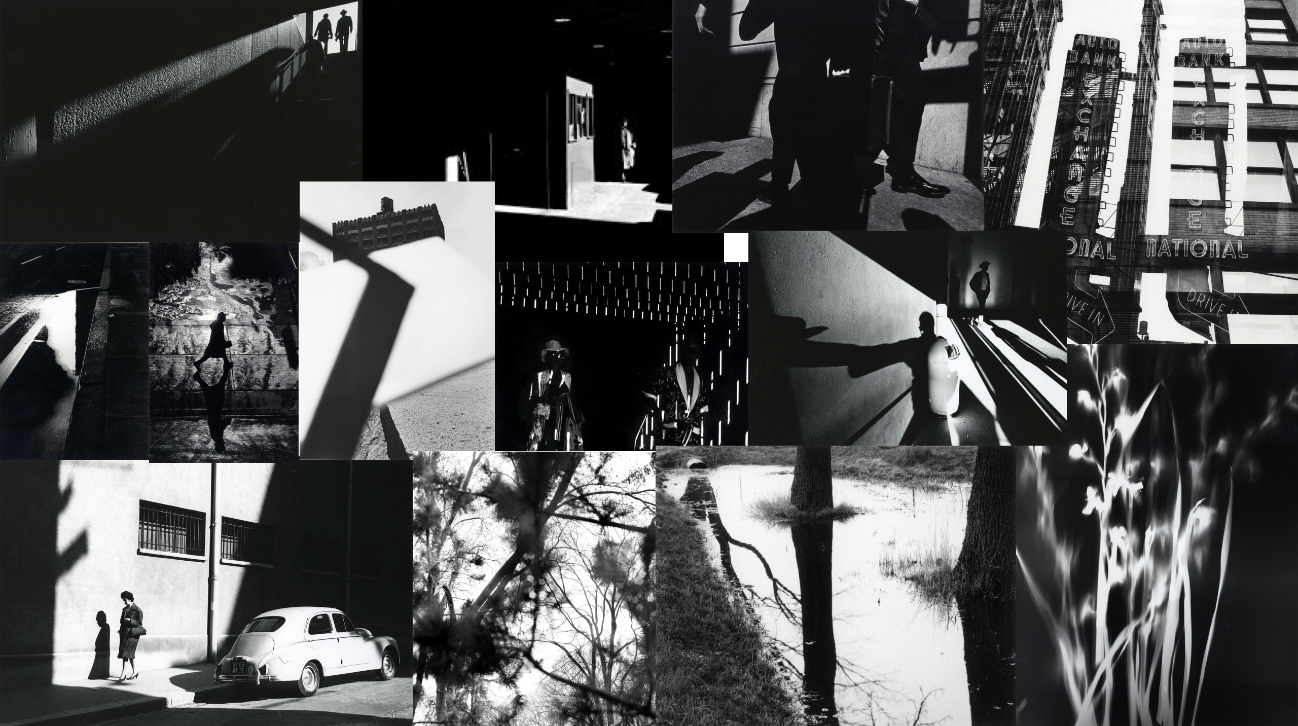
Mood-board of Metzker’s images

I am intrigued by Metzker’s work as he is approaching the theme of light and darkness in a different way that I have thought about approaching it. He is more focused on light and shadows, mainly capturing street photographs that are exploring buildings and people. I want to experiment with different styles of photography in order to capture a good series of images that are exploring light and darkness. In order to do this, I want to do an architecture shoot that incorporates light and darkness/shadows into my architectural images.

Ray K. Metzker – 80 HY-5, City Whispers, 1980 – Howard

This image of Metzker’s explores light and darkness as he has captured this photo at a good timing in order to get the woman walking past the light toned side of the building. I like how the woman appears to be walking as she has one foot up off the ground as if she is rushing along the street. Additionally, I like how she appears almost like a silhouette due to how dark toned she looks in the image. This contrasts well against the lighter toned marble wall. This marble wall implies that this city is not a poor one; it must be fairly wealthy as marble walls are the type to seem wealthy and substantial. This links to the context of the image; Metzker took this image in the 80’s in New York (Howard is in NY). New York in the 1980s was a controversial time; “A polarizing Republican in the White House, protests for equality in the streets and a new wave of sexual self-identification. This was N.Y.C. in the early ’80s, during the 36 months in which it changed art, design, activism, food, literature and love — forever.This shows that many aspects of life were changing and evolving – rich people were becoming richer and people who received racism or discrimination were fighting for equality. The way Metzker has chose to go about his street photography that explores light and darkness is he captured the rich, pleasant side of New York. The woman in the centre of the image is dressed well, in a long coat with high heels on, as if she is rushing along to her daily workplace which is probably a well paid job due to the how well she seems to dress. Moreover, you can see the older fashioned cars which also hints that this image was taken on the 80s. On the left side of the image, you can see tall buildings in New York, which are also really dark toned like the main woman in the photo. I like how this is juxtaposed with the light toned, bright sky. On top of this, I like how the huge buildings have shadows on them; on the very far left building you can clearly tell that there is a big strike of shadow that is hitting the left half of this building. The other half of this building is a lot more brighter which had a good contrast with the shadows.