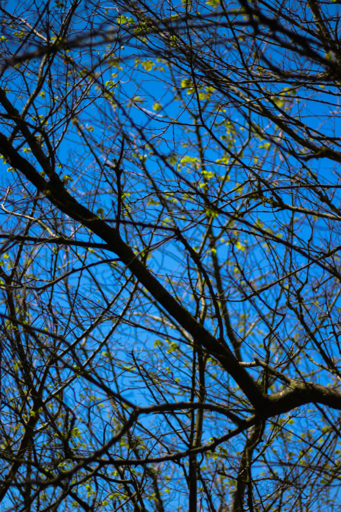
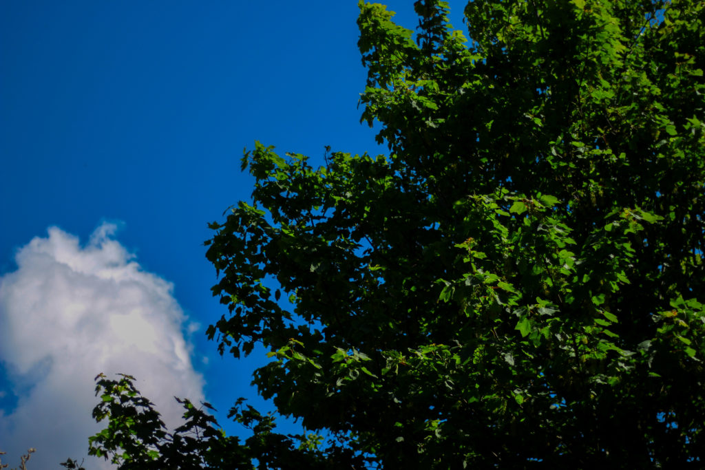
Category Archives: Evaluating

Filters

Author:
Category:

FINAL PHOTOGRAPHS

I have decided on 4 final photographs for my project. Each one of shoots were different in subject focus i.e. light, water, green, trees, and were inspired by a varied host of artists and photographers. My final outcomes and edited photographs from each shoot vary distinctively from one another, but are all still interconnected by nature. My project aim was to look at the variation and similarity within nature, so I categorized my shoots into nature topics that I felt would allow me to look at nature from multiple viewpoints . I focused on capturing texture, line, shadow and tone in my capture points. I looked at multiple artists and photographers for each category of nature, allowing me to have a spectrum of photographs inspired by a collection of different photographers.

Final photograph 1:

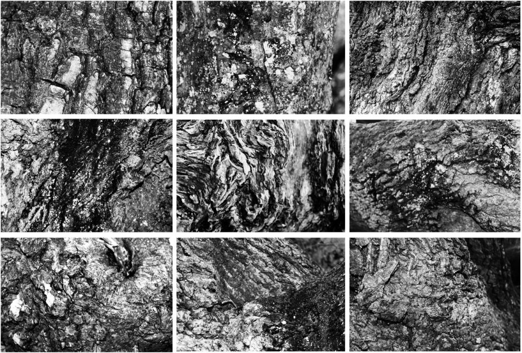
My first final photograph is from shoot 2, focused around ‘trees’. I aimed to look at trees from afar and very up close to capture the intricate detail and patterns of the tree bark. Final photograph 1 is a capture of 9 images arranged in a grid format, all of different angles and captures of numerous trees up close. I chose to arrange my photographs in this format as inspiration of Bernd and Hilla Becher who specialized in typologies and presenting multiple images of similar nature. All photographs from this shoot were edited into black and white individually as I felt the strong contrast of white and black, with shades of grey intertwined really emphasizes the tonal contrasts and shadows of my photographs effectively. My camera allowed me to present the complex detail of each curve, piece of moss, shape, bump and indent in the tree. I felt this linked back well to the idea of variation in nature as although each tree may look similar from afar, from up-close, it is evident that the detail differs greatly.
Final photograph 2:

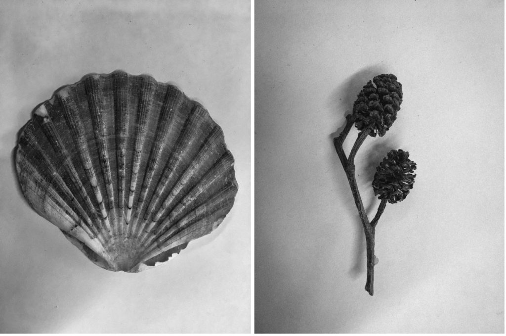
My second final photograph is from my second photographic shoot: natural forms. This photograph was taken in the style of botanical photographer Karl Blossfeldt. I photographed alternative natural forms as shown below rather than just flowers as I felt it was something different. I edited my images into monochrome and added ‘clarity’ and ‘sharpness’ to my images to emphasize the detail and tonal differences of the forms.
Final photograph 3:

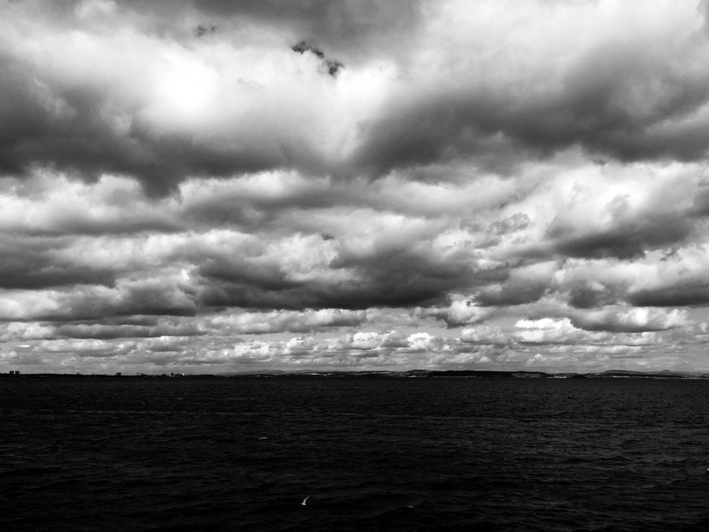
My final photograph 3 was taken in shoot 3, in response to cloudscapes. In this shoot, I took photographs in response to Alfred Stieglitz and John Day, two photographers with a very different visual style. This particular photograph was taken and edited by inspiration from Alfred Stieglitz’s Equivelents. Equivalents looks at dramatic black and white cloudscapes, an alternative viewpoint to many other photographers who photograph the sky in heavily saturated colour. In order to respond effectively, I edited this photograph in Lightroom CC, turning it into black and white then increasing the ‘contrast’, ‘clarity’ and ‘shadows’ to how I saw fit. This worked well and presented the billowing clouds as heavy and the image as very dynamic and bold. Cloudscapes can be looked at in many ways, exploring the serene and calm aspect of nature, or opposingly nature’s stormy and tempestuous character.
Final photograph 4:

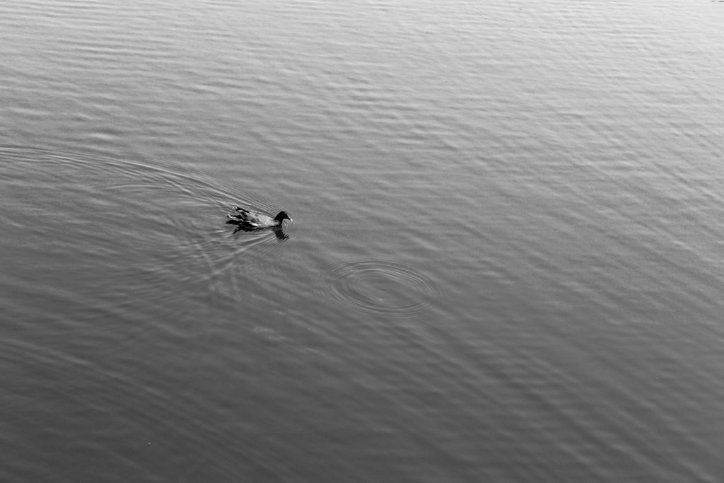
My 3rd final photograph comes from shoot 4, focused on the subject of water. I looked at Hiroshi Sugimoto’s work before this shoot, inspiring my style of response. This photograph looks at nature in an alternative way to my other photographs. This image is very simplistic and strips nature down to it’s most basic form, exploring the serenity and tranquility of how wildlife and the landscape come together to produce basic yet beautiful sights. There is little movement displayed in the water, only one single circular ripple where a raindrop has hit the water.
Final photograph 5:

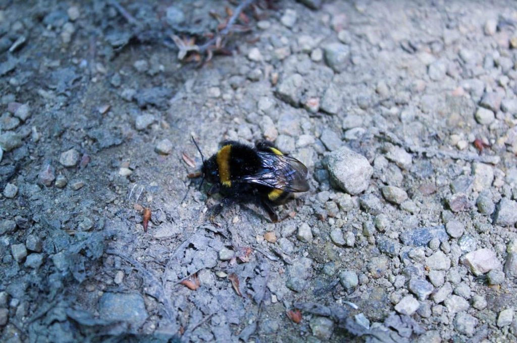
My second final photograph is from shoot 5, responding to Rinko Kawauchi. I got up-close to a bee to capture a very zoomed in look at nature’s produce. I aimed to capture the bee in detail, from it’s vibrant yellow colour, to the detail in it’s wings. The bee is the obvious main focal point of this photograph, situated centrally in the image; it contrasts well with the simplistic background of small rocks and stones.
Evaluation of my Final Piece

Throughout my work on the topic ‘Variance and Similarity’ I took lots of inspiration from a variety of sources and my experiments and plans developed over time to give a final piece that is the result of trial and error. On first thoughts when approaching ‘Variance and Similarity’ I decided that my approach would be based on the comparison of similar subjects and characteristics.

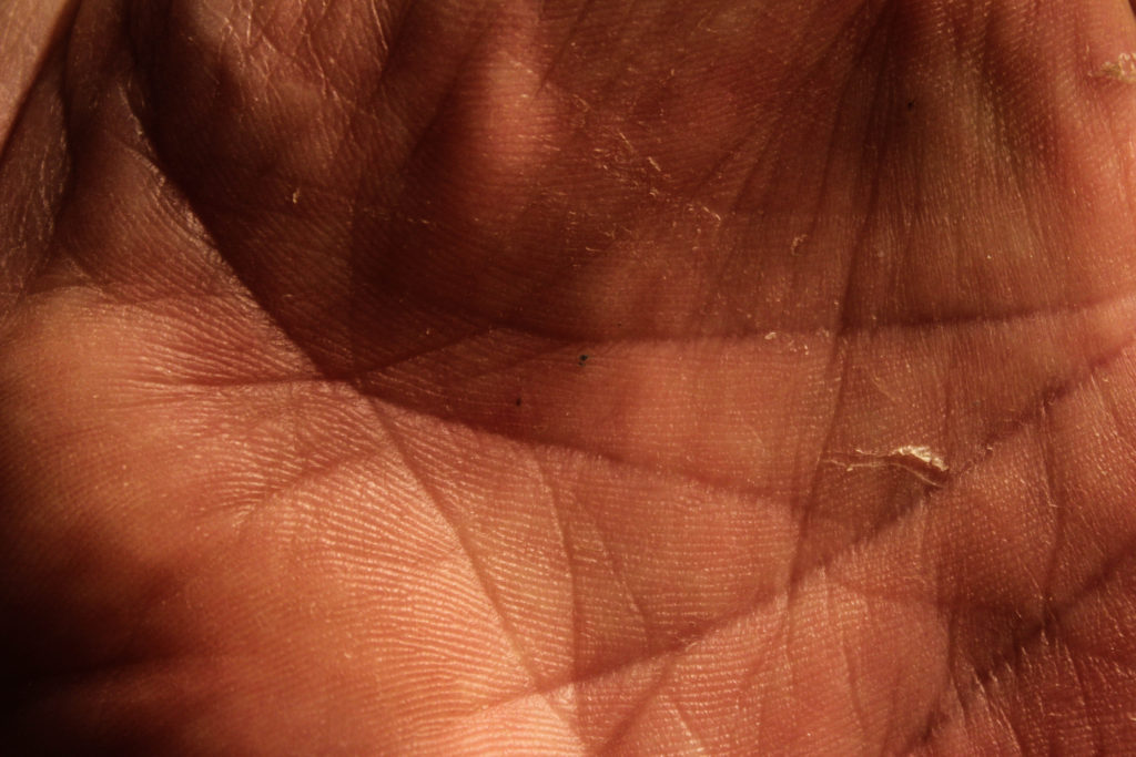
My initial ideas were to show the difference between people through the individual hand creases bespoke to each person, to create a typology of different styles of buildings and to photograph the personal belongings of individuals to give an insight into personalities. After experimenting with photographing hands close up whilst taking inspiration from Tim Booth and John Coplans I decided that this approach was too limited and did not allow me to expand what I was photographing, and I found the same when photographing the personal belongings of individuals whilst taking inspiration from Huang Qingjun’s ‘Family Stuff’.
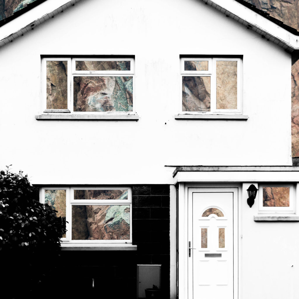
Therefore I started exploring the patterns within buildings and the similarities between them – this took inspiration from Lewis Bush’s work on Metropole and Michael Wolf’s work. My initial response to these photographers layed the foundations for my final pieces as these photographs would be the base layers for the double exposure photographs that I would create later with photographs of textured steel. After researching the Becher’s I began to experiment with ways in which I could effectively display and compare photographs – I created both GIF’s and typology grids, and the grids became a key part of my project as I came to believe that they are a simple and effective way to compare photographs.

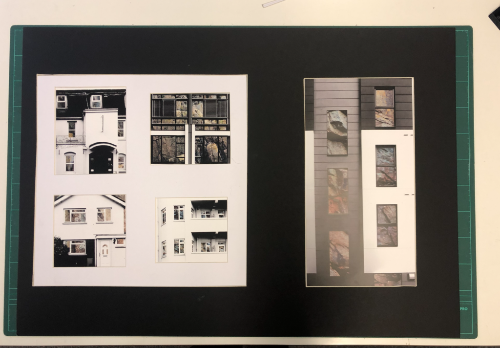
After beginning to pave a way for the route that my project would be taking, I researched John Baldessari and took inspiration from him in the sense of creating unusual abstract photographs, and his idea of putting coloured dots over faces led me to experiment with cutting out shapes in the building faces that I was photographing in order to reveal something else. At the same time I was experimenting with double exposure with inspiration from Lewis Bush’s ‘Metropole’. I decided to take a deeper search into the context of houses and buildings and so began to explore granite, due to it being an abundant resource in Jersey for building houses. This resulted in me experimenting with layering photographs of houses over photographs of granite and cutting out shapes of the natural frames to show the granite that is the base of the house. I found that this method was not as effective when working with photographs of steel so proceeded to create double exposure edits with the photographs of the steel and found that this created an abstract approach to show how buildings and materials change over time, whilst also incorporating steel due to the fact that more buildings are being built using it now more than ever. This double layering led to my final piece in which I incorporate typology grids inspired by the Bechers’ after I improved on the photographs of steel that I had photographed.
To conclude, I believe that I successfully fulfilled the exam brief and theme of ‘Variance and Similarity’ as my final outcome successfully shows the differences between different building faces whilst drawing comparisons between them, such as the common features including doors and windows. This comparison is aided by the use of a typology grid to show that the photographs are linked but individual. Therefore the photographs and presentation successfully show the variance and similarities between different building faces whilst drawing inspiration from a variety of photographs, but primarily from Lewis Bush, the Bechers’ and other New Typologists.

The final photographs produced have all been edited and captured in a way that ensures that they are technically accurate and aesthetically appealing. They were all captured with a natural lighting in order to ensure that all the natural shadows and contrasts were present in the photographs, as well as ensuring that a sufficient tonal range was present to create more contrast within the photographs. For the photographs in the typology grid there is a warm colour cast due to the rust of the steel – this contrasts with the composition on the left side which has a cold colour cast because of the cold nature of the steel layered over it. There is not a huge presence of colour in the final piece as the original photographs are in black and white but the steel layered over it is providing colours through the rust and textures within it. The final compositions are fairly two-dimensional as planned because I want to show the buildings as faces rather than as a whole structure. There is a strong sense of pattern and shapes throughout the composition due to the natural structure of houses – the windows and frames provide this sense of shaping which allows for the photographs to be contrasted. The context and idea behind this piece is that it gives an insight into changing trends. This is shown in the photographs as some of the building faces present are older and more of a traditional design, whereas others are newer estate houses. This typology grid allows the photographs included to be compared for what they are and they give an insight into how the design of buildings change, but also how the key components and shapes stay constant. The steel used also represents the changes occurring over time because previously houses in Jersey have been manufactured with granite being the base material, such as in cod houses. However, more recently with the occurrence of the high investment in the financial investment and a modern wave of house designs, steel is being used more often in houses and buildings, therefore the steel represents a variance in design and the rust represents the natural change in trends. For the composition including the granite edits the idea and context is very similar and is built from the same base (being the variance and similarities in buildings), however the granite represents an insight into what the structures of buildings are traditionally built with, compared to the steel that is more commonly being used. Together these two presentations show the variance and similarity of how buildings are built in both form and function and enable contrast to be drawn between buildings.

Final Prints

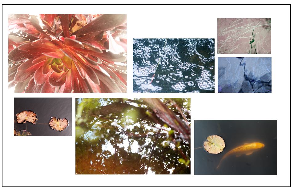
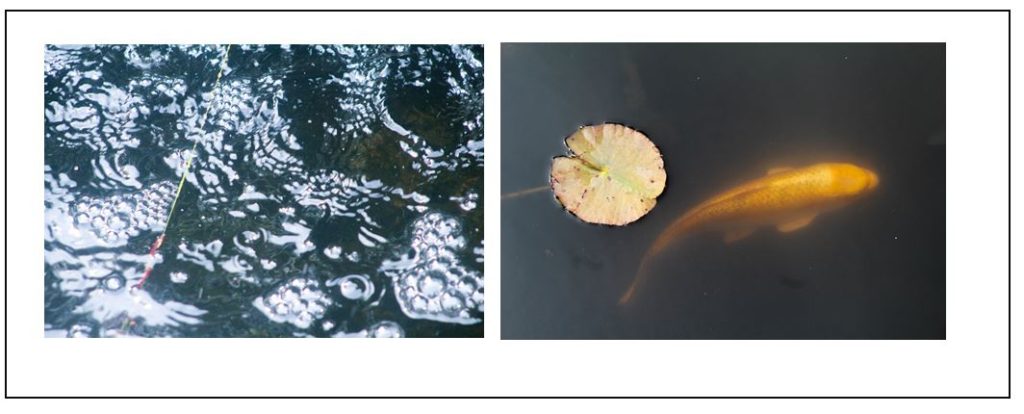
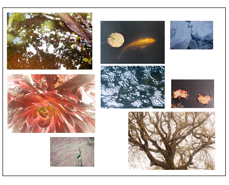
I started experimenting with different layouts that I could display my final prints as, arranging the photos digitally. I found the by doing these experimentations I was able to try different pairings and combinations to plan what do when I framed my images. I experimented with pairing two images together to se what they would look like displayed, and also all my images together to see which ones look the best. I also found the artist Alexander Mourant to take inspiration from when racing my cyanotypes.

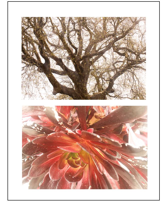
I thought that these two images worked well together as the warm tones in them both links them together. I also like how the they are both centered as the compositions complement each other. To me, the bottom image is the most powerful and stand out more than the top image through the bright natural red colour and the light yellow centre. This yellow connects to the top image, as it has yellow/brown tones throughout. However I think that this combination of images doesn’t show the audience enough about m project, because of this i won’t use this layout to frame my final prints.

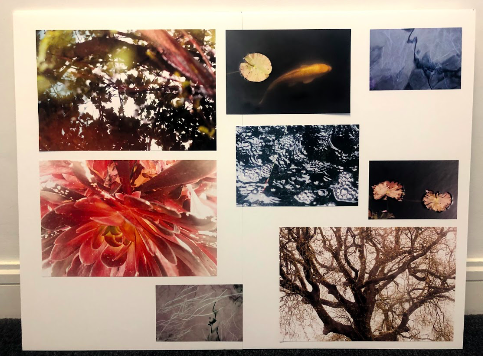
I think that by displaying my images all together on a board, the audience gets to look at the different aspects of nature i have explored, and an idea of what is inside my photobook. I placed the A3 images near the edges of the frame and fitted the A4 and A5 ones around the as I think this makes a good layout. I placed the A4 images of the koi fish and the bubbles next to each other as I think they make a good pair, where the textures contrasts to one another, but is still linked through the subject of water. I displayed two of the A3 ones together on the top left of the frame as I also think these two complement each other, through the warm tones and emphasis on light. I placed the A5 photos where I have manipulated the colours (blue and pink) near the edges of the frame as I think that spacing them out makes them more effective as images then together.

Alexander Mourant

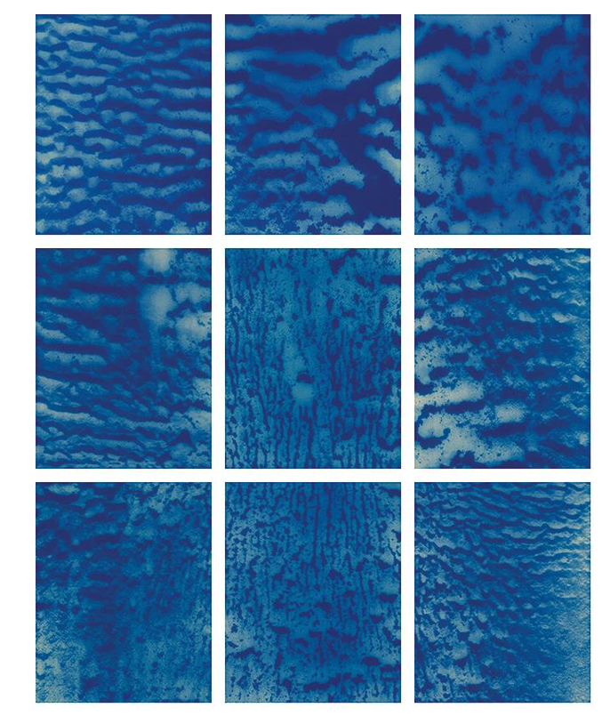
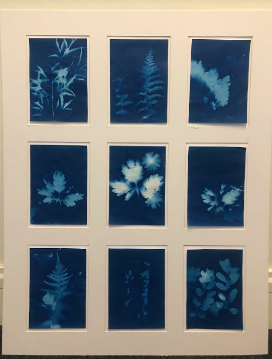
I am taking inspiration from the photographer Alexander Mourant and the way he displays his photography in grid format. I also want do this with the photograms i produced, displaying 9 of them together. I think this will be effective as it presents them in a way that they can be contrasted against one another, but still shows the variation and similarity between them. I think this also links to the scientific background of cyanotypes when I display them precisely. When I do this I want to make the cyanotypes coming off of the page slightly, to give them a more personal and authentic look, rather than placed flat against the background. I also want there to be a frame around them so will leave space between the outside of the cyanotypes and the frame board I will cut in a grid format, so thats there is a white space separating them. This will also makes them seem as though they coming off the display.

Final Prints

Photobook Design Experimentaion

I thought that my close up image of the orange leaf would pair well with one of my koi fish images as both the main subjects in the images have orange tones which make them both connected. I experimented with two different koi fish images, one showing two fished overlapping each other and the other showing the movement of one fish through the ripples in the water. The first image is a calmer image, the water in the background being flat which gives it a more peaceful appearance. I like how the two fish are swimming near each other and are overlapping as they create an interesting shape in the water. This is contrasted to the second image which shows one fish coming to the top of the water, creating waves which i tried to emphasise when I edited the image. This image isn’t as calm as the first image and shows the texture of the water.

I think that the second combination is the best double page spread as the single koi fish swimming the water links better to the single leaf and has a similar rounded shape which is why I will use it in my photobook. Also the background of the images complement each other as they both reflect the light from the sun and have bright white sections, creating similar shapes on the water. I think hat this combination is the most effective and makes for the most interesting layout.

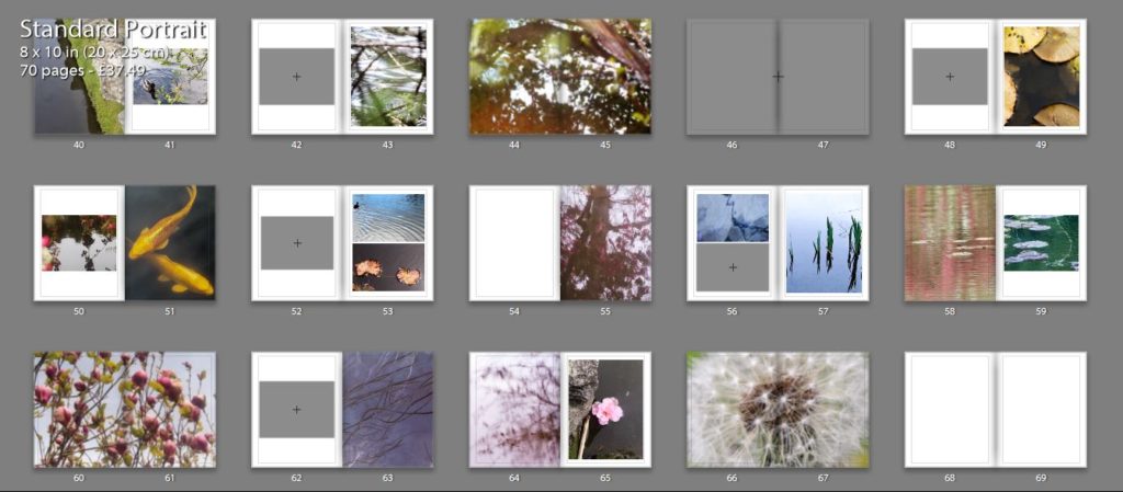
This double page I am planning to use as the first page in my photo book. I experimented by using a combination of two images on the pages, and a single image to see which was the best layout. The first double page with two images I like as the ripples in the water on the left side linking to the patterns in the second image of falling water. I like the first image as it draws on theories of abstraction through the bright red reflection of a person on the water that are warped and distorted. I also like how there are out of focus branches near the lens of the camera that add another natural aspect to the image and contrasting against the horizontal ripples of the water. This connects to the second image on the right page as there is also an section of a plant out of focus in the top right corner. The second double page is the single image of the water falling on the right side. I think that this is also effective as it focuses the reader onto that particular image so they aren’t distracted by the shapes the image that’s on the left of the other layout. I think this makes the appearance more peaceful which is why i am going to use the single image in my first page, and the image that was on the left on the page after. This is because both images are very detailed and think that they work best displayed alone.

I chose these two images to display as double pages as I think that the patterns are more detailed and noticeable when the image is filling the entire frame. I like how the first image has the bright red tones that range from right to dark, with the brightest pint being where the sun is hitting the leaves. I think this really links to my projects concept of spiritual qualities in nature emphasising the bright lights against it and the small patterns on the leaves.I also think that the second image is effective as a double page spread as there is a lot of detail in branched of the tree creating a very intricate pattern. I think this is why I will use it as a double page as I want to emphasises these aspects. I also think that this image links well to personal and spiritual aspects of nature through the yellow tones and the brightness of the image making it look peaceful and ethereal.

Book Specification

Write a book specification and describe in detail what your book will be about in terms of narrative, concept and design.  Produce a mood-board of design ideas and consider the following:

Narrative: What is your story?
Describe:

A sentence

Spirituality and personal connections in nature.

A paragraph

My photo book is looking at personal connections and spirituality in nature, focusing on warm and cold colours, textures, and concepts of abstraction to express how the natural world had it’s own energy and can provoke emotions in humans. I also want to bring a scientific aspect into my photobook, looking at photograms and camera-less images in a spiritual and delicate way.

Title options:

Visceral:

-‘Relating to deep inward feelings rather than to the intellect.’

-‘Being or arising from impulse or sudden emotion rather than from thought or deliberation’

•Ethereal

-‘Extremely delicate and light in a way that seems not to be of this world.’

Transcendant

-‘Beyond or above the range of normal or physical human experience.’

Structure and architecture, Design and layout, Editing and sequencing, Images and text:

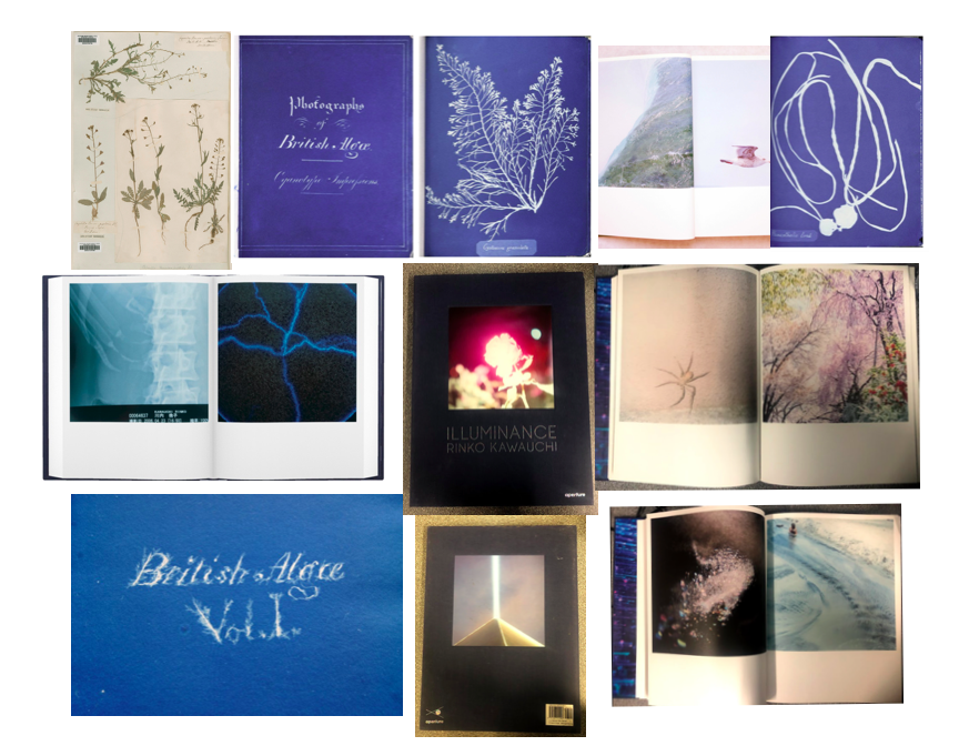
On some of the pages in my photo book I want to contrast the images where I’ve emphasised the warm colours, with images where I’ve looked at cold colours. I think this will be effective in making the images stand out and be more powerful. On other pages I want to use two images that have a link between them, whether than be through a shape or colour that are in both the images. Doing this links to Rinko Kauwauchi’s book Illuminance where on each of her double page spreads the two images are connected in someway. I think that this will create a more interesting photo book and will make it easy to look through, rather than having images that are not connected at all. I also want to physically include some of the photo grams that I created in my 6th photo shoot within my book. I want to do this by having them inside small envelopes on a few pages in the book. Because there won’t be many in the book, it will create a mystery for the reader to see what it is. This will make the reader have to physically open and take out the photogram to look at, creating a interactive quality. This is taking inspiration from Anna Atkins photo book ‘Photographs of British Algae: Cyanotype Impressions’ which is said to be the first photo book made. I think this will give my book more of a scientific appearance, looking at nature in a more objective way, that I can then contrast with my more personal and spiritual images. I want my photo book to be portrait and relatively small so it’s easy top pickup ad open. This means that the photograms inside the book will have to be small, which I think is effective as it will make them seem rare and precious, creating a more authentic and special appearance for them. I want the layout of my image to be simple as most of the natural images I’ve taken are quite detailed and patterned, but displaying them simply it would allow the reader to look at them without being distracted by other images if there were too many on a double page spread.

Evaluation of Progress

How well have ideas developed? I have an idea I am following and I am expanding that as I do more shoots.
Are ideas explored and selective appropriate to intentions?
I believe they are as I shot what I thought suited the topic and the project idea I am following
Are they sustained and focused?
I have been following one idea and have stuck to it.
How many responses/ shoots?
I have produced 2 responses so far and plan for a further 2 if not 3 in the coming weeks.
What are the overall quality of the images? The final outcomes I have selected so far have been of a high standard and I am proud of the way the have turned out so far.
How do they respond to research? My images so far have followed my theme of circles, I have explored circles in different way through changing location, subject matter, style and Urban/Rural environments.
How do they relate to artists references? I have chosen my artist references for a reason. Each artists I have explored has inspired me imagery wise or conceptually. Each artist has produced images that could be circle related or follow a conceptual path that relates to my project.
How do the interpret exam theme? Circles follow the exam theme by looking at the similarities of the shape but in different environments and contexts.

Drone Shoot | How

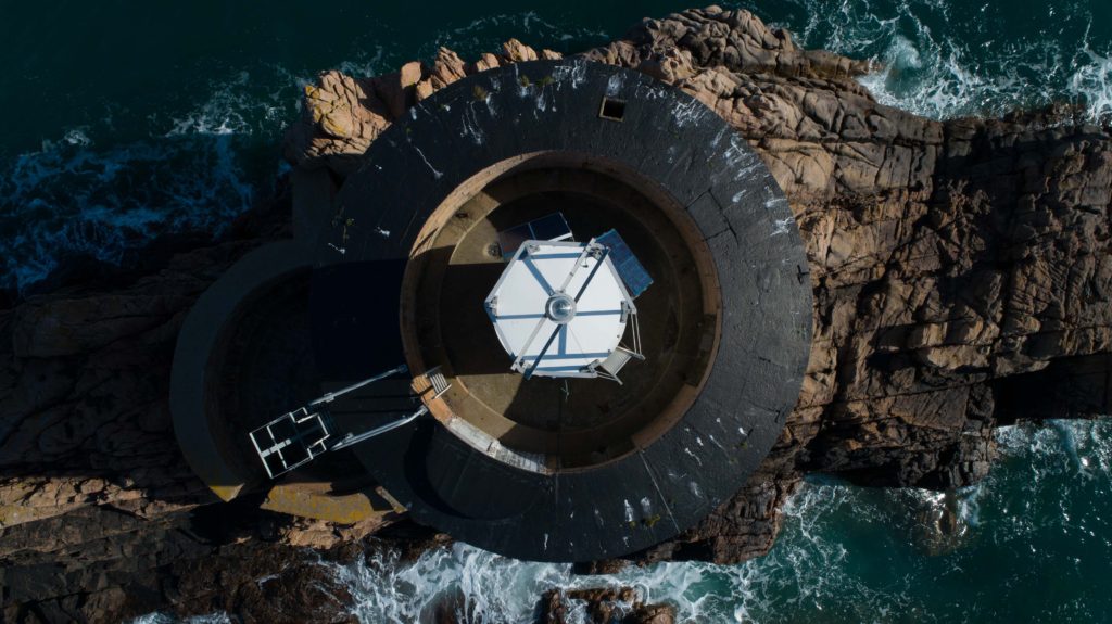
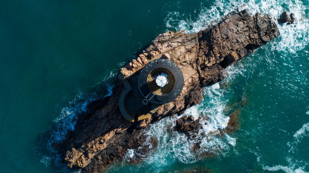
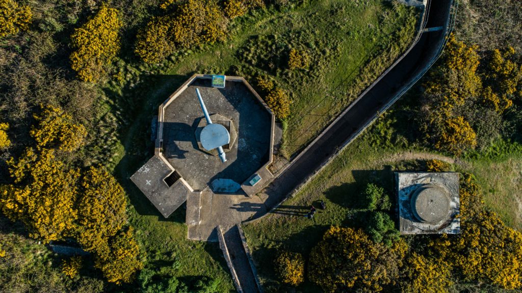
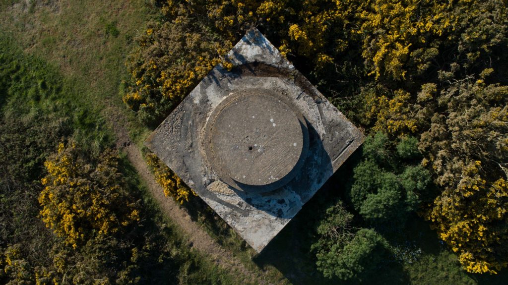
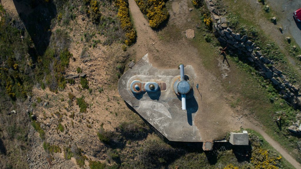
The drone images I produced came out nicely however I think its important to share the time it took to really get those images. We were at Noirmont for around 3 hours shooting, it can take 10 minutes just to get one shot right, especially on the accuracy level I was aiming for to ensure my images were perfect.

Noirmont Lighthouse

Trying to capture an image such as the one above looks simple but requires skill and patience, two things that I honestly don’t have with drones! I have very little experience but luckily I had someone to talk me through and help me along the way. The drone will hold its GPS position automatically however this can drift in around a 1 meter size area which is not good when you are trying to get a perfectly straight top down image such as the one above, You can see the light bulb on the top is perfectly in the center and it may have taken up to 10 minutes to get it perfect, you end to find that you make a slight left correction for example and it moves too far and you want to go back a bit but its too far and it will never sit perfectly where you like it when you’re shooting a subject close such as this with a high requirement for visual accuracy. I took a number of images I believed were central and confirmed this later then selected the best images to go forward to editing.

Noirmont Shoot |Final Outcomes

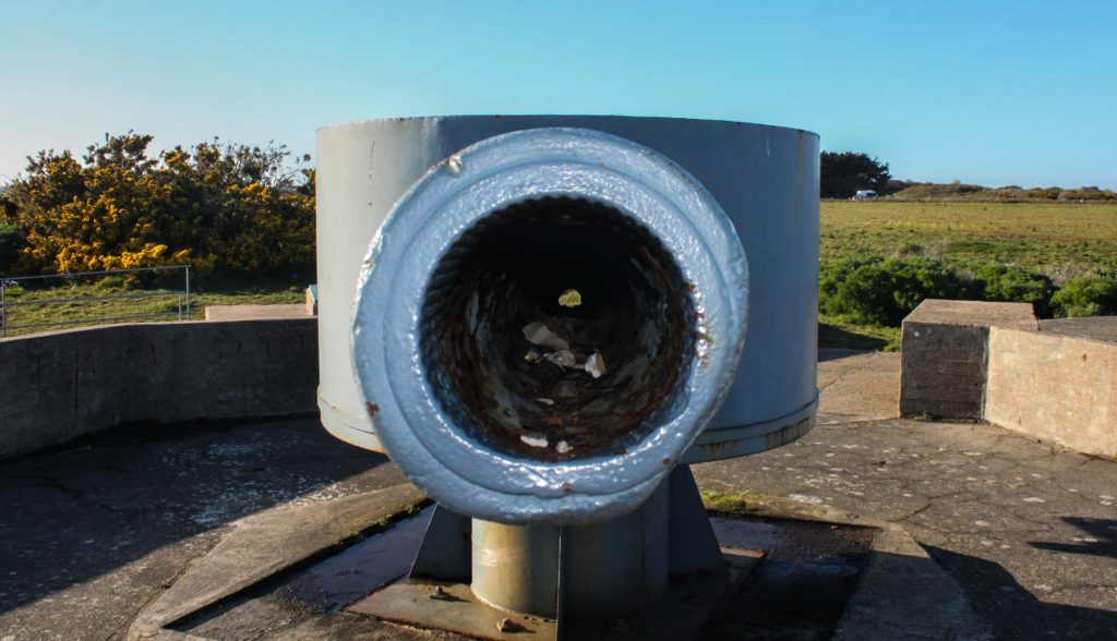
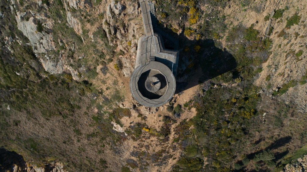
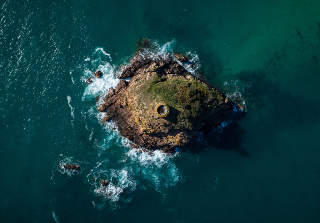
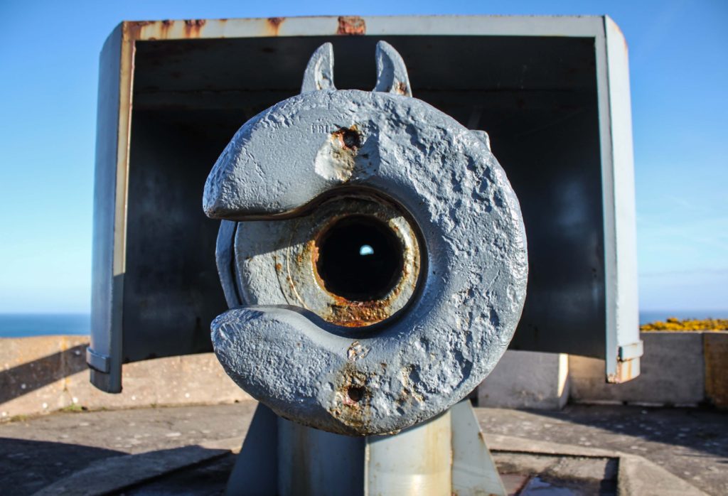
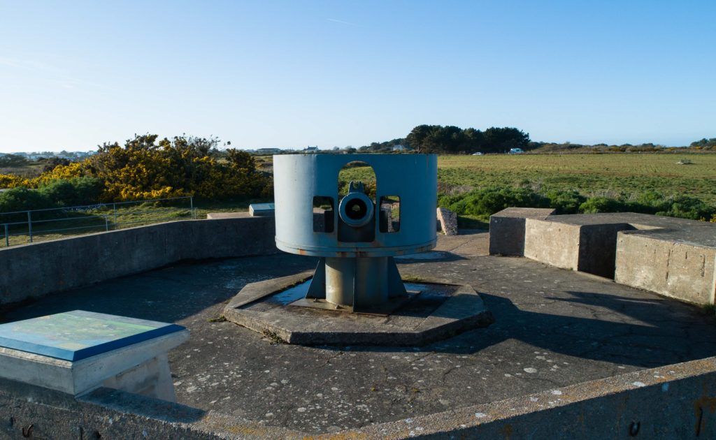
The shoot at Noirmont comprised of air and ground shoots. My main aim was to scout around looking for circles with my camera and snapping what I saw that formed a circular shape, I would also map out places to look at from the air using a drone. I then took the drone up and photographed circular shapes from the air over the Noirmont headland and Janvrin’s Tomb in Portelet.

Below are my final outcomes:

I am very happy with my final outcomes above, they really capture the more rural side of my project and show how circles can be found everywhere.

Image Analysis

Wood

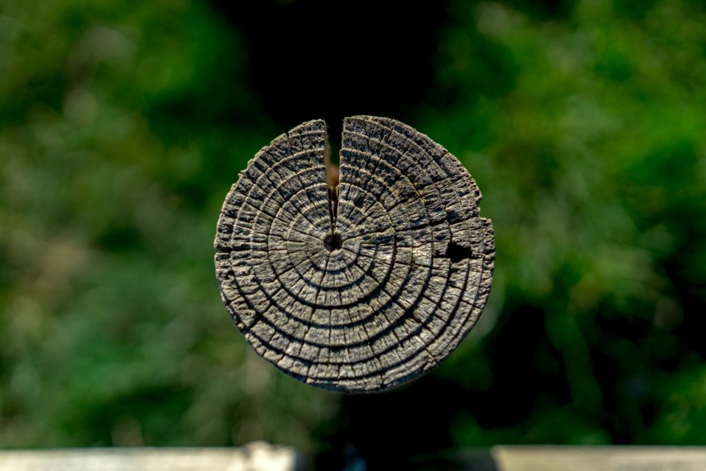
The above image was a wooden post on the Noirmont headland as part of the shoot you see above. The pole itself caught my eye as I was walking looking for spots to shoot with the drone. I positioned myself above the pole and shot top-down with a low aperture, automatic white balance, 100 ISO and a medium shutter speed. The low aperture produced the effect where the grass below is not in focus yet the pole is extremely sharp. This allows for the viewers eyes to be drawn straight to the pole and have little to distract them, it also makes the image very simple and eye catching.

The rings on the pole are the growth rings of the tree the wood came from. Each year, a tree forms new cells, arranged in concentric circles called annual rings or annual growth rings. These annual rings show the amount of wood produced during one growing season. Therefore this pole shows the life of a tree that once stood and lived and grew, each circle representing the growth and age of the tree and this can be interpreted into human life and human context.

The image clarity really brings out the textures and feel of the wood and you can almost feel is as you see it, you can imagine your fingers passing over it and feeling the roughness of the wood and feel the individual rings. The high aperture creates the effect of blurring the background giving it depth. The colors itself have been brought out through editing, the original image made the wood looked quite pale and the grass quite bright however through editing the nice woody color and textures could be brought out to their best.

Artist Reference – Brett Weston

Who is he?

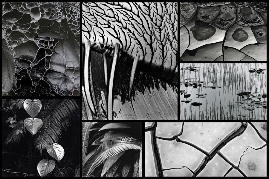
Brett Weston war born 1911, Los Angeles, the second son of photographer Edward Weston. Brett was removed from school at a young age to become his father’s apprentice in Mexico, this surrounded his by revolutionary artists of the day such as Tina Modotti, Frida Kahlo and Diego Rivera, not only did this influence his but also presented his with a striking contrast to life in Mexico but as also where he first started taking photos with a small Graflex. This introduction that Brett was shown and the work of the painters unintentionally influenced his sense of form and composition, this quality of design was evident in Brett’s early images of organic and man-made subjects. Here he started to appreciate how the camera transformed subjects close up and how the contrast of black and white altered further the recognition of the subjects. Overall it is not hard to understand his attraction to focus on abstraction dye to the characteristics he was influenced by would allow him to be uniquely identified with throughout the rest of his career.

Weston later returned to California in 1926, and Brett continued to assist him in his Glendale portrait studio whilst exhibiting and selling his own photographs at the same time. From the age of seventeen a group of his images were included in the German exhibition ‘film und Foto’, considered to be one of the most important avant-garde exhibitions held between the times of the two World Wars. Because of this his received great recognition which brought Brett international attention and inclusion in various photographic exhibitions in the following years. Although his art will always be linked with his father’s it is unfair to say that his photography is imitative of Edward’s beyond the early years as he produced an enormous body of work over the seven decades. Some examples of his work can be seen below:

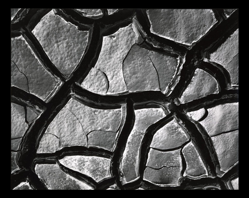
After looking over some of his images I decided that I would go onto look at one specific image that I thought would best reflect my intentions for my future shoot based around abstract patterns. The image I have chosen is called ‘Mud Cracks’ and was taken 1966 highlighting the patterns found in everyday things such as mud. Here I will go onto look at things like visual, technical and contextual aspects which would allow me to further my knowledge regarding techniques used and the style of photography created.

Visual:

Visually the piece is quite simplistic in the sense that the photo is of a piece of mud, however its when upon further inspection that there are cracks which form patterns across the mud, something the every-day eye would miss unless focused upon. For me the piece is extremely aesthetic due to how the tones used across the composition are varying grays with the only real shades coming from the cracks which allow separation in the image which prevents the outcome of pure mud becoming too overpowering. To stop the mud becoming too much Weston has made sure to include smaller cracks within the cracks of mud to add variation to the photo whilst stopping a continual generic surface from occurring across the entire image.

Technical:

When looking across the image it is clear to say that a slightly lower exposure has been used so that the darkness in between the cracks is highlighted above the rest of the image which due to sunlight is a lot lighter and therefore becomes the focal point. It looks like a higher shutter speed has been used to capture crisp detail of the mud as you can clearly see the lumps and grooves present on each slab of mud whilst there being no evidence of motion blur whatsoever. Weston has made sure to include a clear fifty fifty ration between mud and cracks which stop one or the other from becoming too overpowering and stopped the effectiveness of the other.

Contextual:

The aim of the piece is meant to create the subject and present it in an unrecognizable fashion, devoid of sentimentality. There is meant to be a sense of a lack of human presence and narrative making it unclear of what the photographer is trying to express. The composition is not amazing and the angle is wrong, however this is the aim of the photographer who could argue that the aim of modern photography is so that the image is only partially aesthetic. These concentrated images share the high-contrast and graphic qualities of Weston’s panoramas while emphasizing his affinity for “significant details” and the unprecedented attention to form, texture, shadow, and light that he explored throughout his nearly-seventy-year career.

Abstract Colour Shoot #2

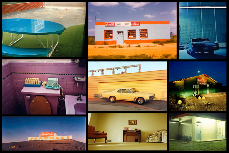
For this shoot I wanted to create a response to the work of Engleston due to his focus around the idea of tone and colour within urban and natural environments. What I found most interesting within his photography was how in most of them there is an overall sense of a single colour such as yellow or red, this has inspired me to create work that relates through the use of incorporating an overlay which can be vaguely seen in each picture. As a result of this I hope to achieve a new style of photography where I can this underlying saturation to produce outcomes for the photos and possible photography book in the future. Using Eagleston as my main source of inspiration I have decided to have a look at some of his works which I found to be of particular interest:

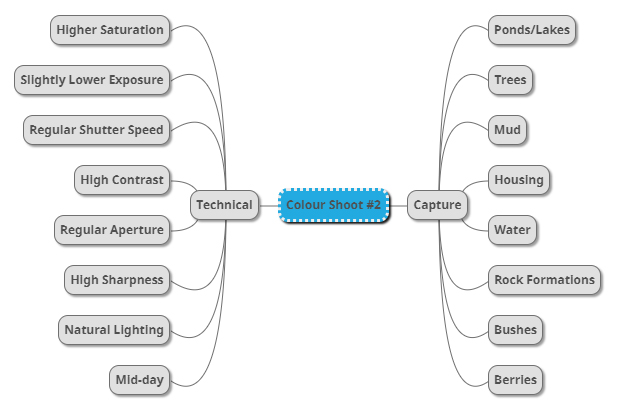
After I had looked over some of his more inspirational work I decided it was nearly time to go ahead with the shoot itself. Before doing this however I would need to create a mind-map, by doing this it would allow me to express my ideas and intentions of what I want to achieve in the shoot. Creating a mind-map not only would help direct my aims of the shoot but also reduce time wasted from deciding there and then what to do and take. Here are some of my ideas on what I want to produce during the shoot:

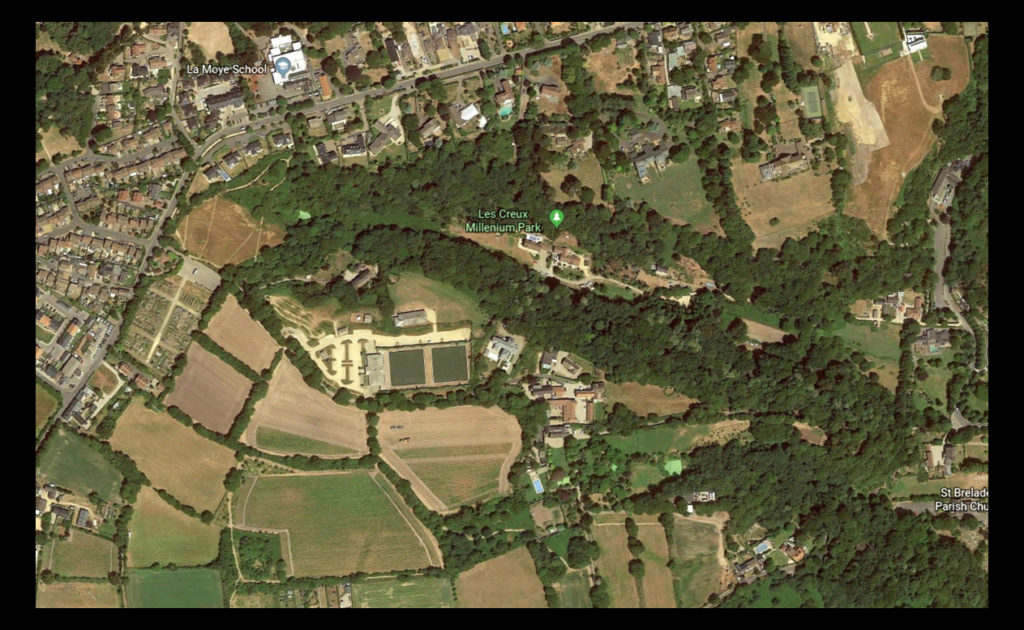
Once I had completed my mind-map I then decided that I would move onto the shoot itself. Using this my ideas noted above as the basis for my goals in the shoot I decided to photograph the area of Les Creux Millenium Park due to the huge range of landscape it possessed in the surrounding area, ranging from houses, fields and woods. A map of the area can be seen below:

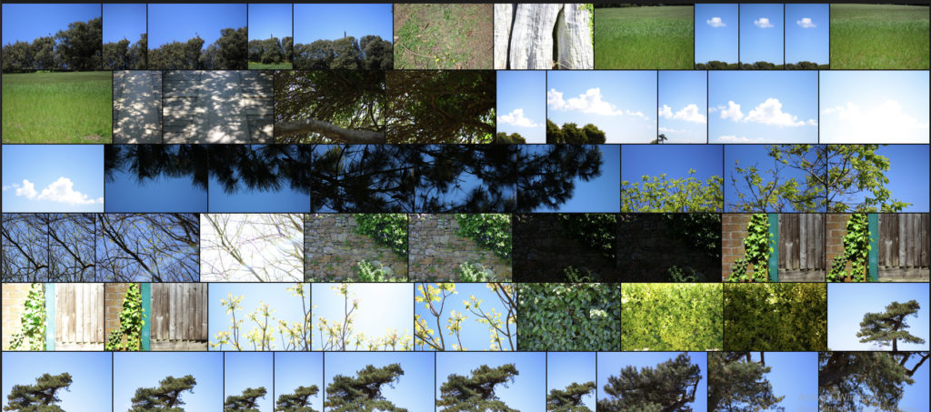
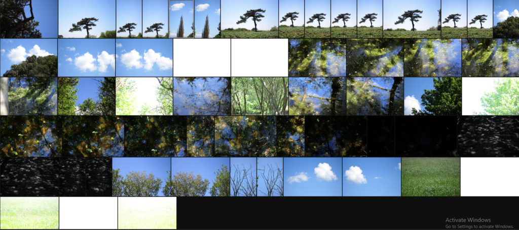
Here are the results of the shoot:

Once I had completed the shoot I then decided to go onto whittle the selection of images down to only ten. By doing this it would make it easier for me to identify which images reflected my intentions for the shoot the best and which ones had the best relevence for my topic. Here is my selection for the ten best images of the shoot:

After I had selected the ten best images I then decided that I would move onto choosing fives images that out of the ten reflected my intentions the most and had the best overall sense of aestheticism. To do this I would have to look at technicality, visual aspects and context. Here are my choices:

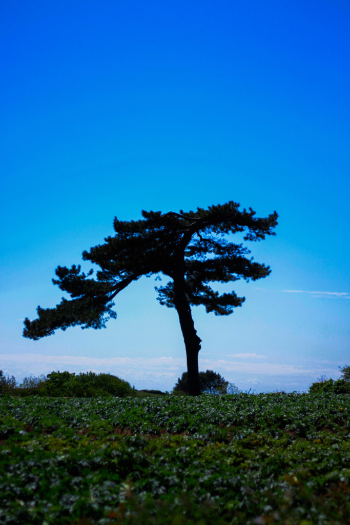
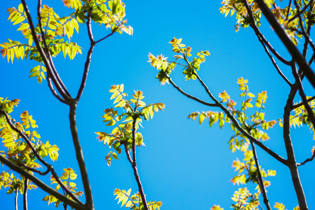
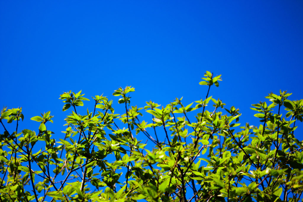
I selected this images because I really liked the defined contrast between the overly blue sky and the unusual shape of the tree. For me the green and dark browns contrasting the sky made the image the most effective due to how they are complimentary colours and so work well side by side producing an aesthetic reault. Composition wise I found that the tree being slightly on the left allowed for the end result to be more impacting because of the way it arches over the landscape filling more negative space in a more unusual way. In relation to the topic of variation of abstraction the image related well as I separated the tree from its surroundings allowed for a unique perspective to be viewed of it where it becomes isolated from its surrounding environment.

For this image the reason I selected it was because of how the blue sky and tree were complimented by the cloud which sort of transitions into the tree itself whilst merging into the blue around the corners. By the clouds taking over the negative space for me it allowed for a more effective use of the sky due to it otherwise being a bland and boring picture, however the inclusion of clouds prevents this and instead allows for an aesthetic result which could work well in a set of three. In relation to the topic the image goes well as it is evidently saturated too much which as a result produces a more abstract effect which in a way prevents viewers from seeing the tree as it once was, instead looking at it in a new light.

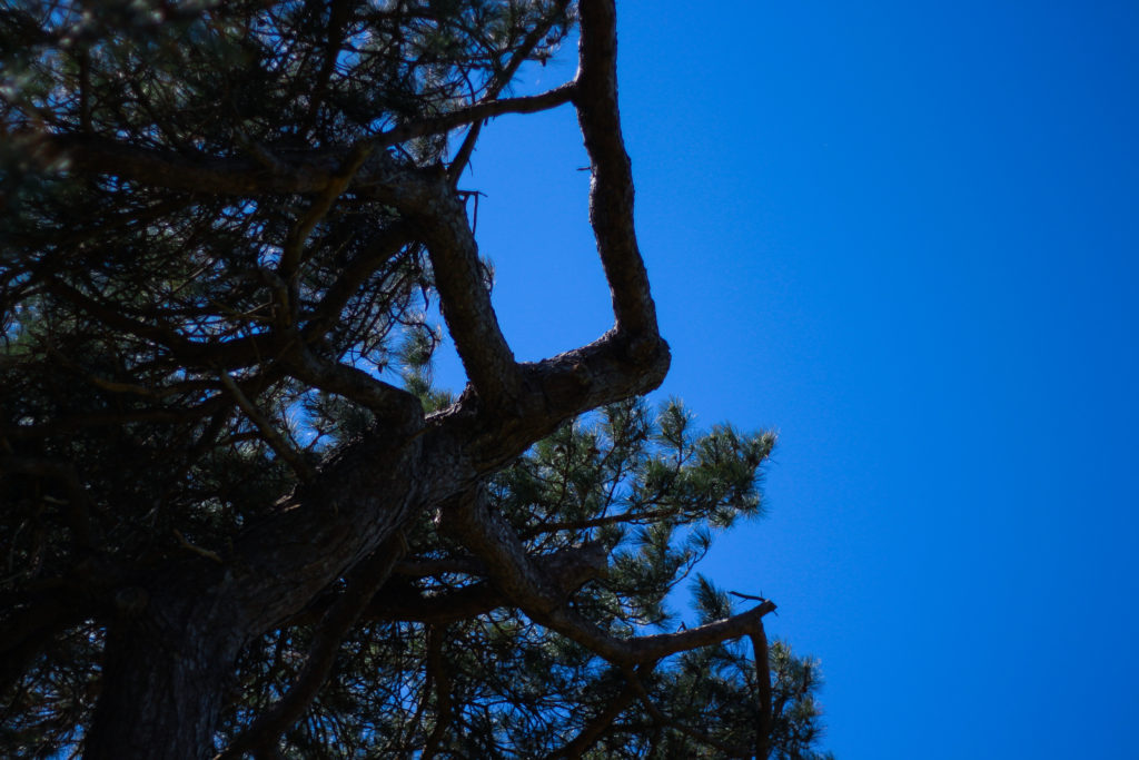
What I liked about this images was the contrasting overly saturated colours that overpower the image. For me this works really well as the image in a way is divided into two sections, one being the sky and the other nature, however I really liked the implementation of the cloud which breaks up the two dominant colour from becoming too overpowering and ruining the piece. As a result of this the cloud enhances the two colours creating an aesthetic result due to both the tree and the sky being in proportion to each others saturation. When looking at the image in regards to my topic of abstract variations I think that it goes well with the rest of the images taken due to how they all present a similar vision where there is a sense of overpowering colour which seem too surreal to be real.

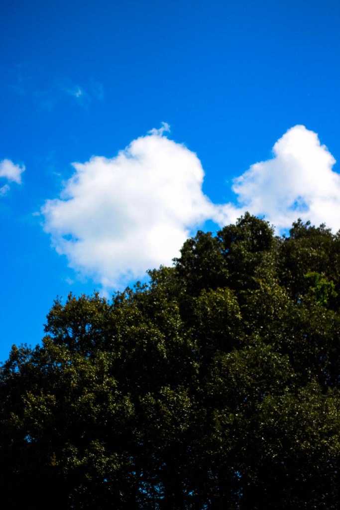
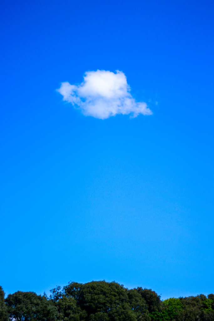
What I loved about this image was its overall simplicity. This is done through a very minimal way where there are only three small aspects to the piece being the cloud, trees and sky. For me they all compliment each other nicely due to how the green and blue contrast with the symmetry of the cloud being in the centre adding too effect from a sense of artificial aestheticism that is created. Overall once again symmetry is the key aspect to this photograph as the cloud be placed directly in the middle adds to effect as its almost as if it was placed there from its unusual position. For me this links greatly to the topic as the colours are so enhanced combined with the weird composition which as a result ends in a abstract portrait of the sky in a block minimalist way.

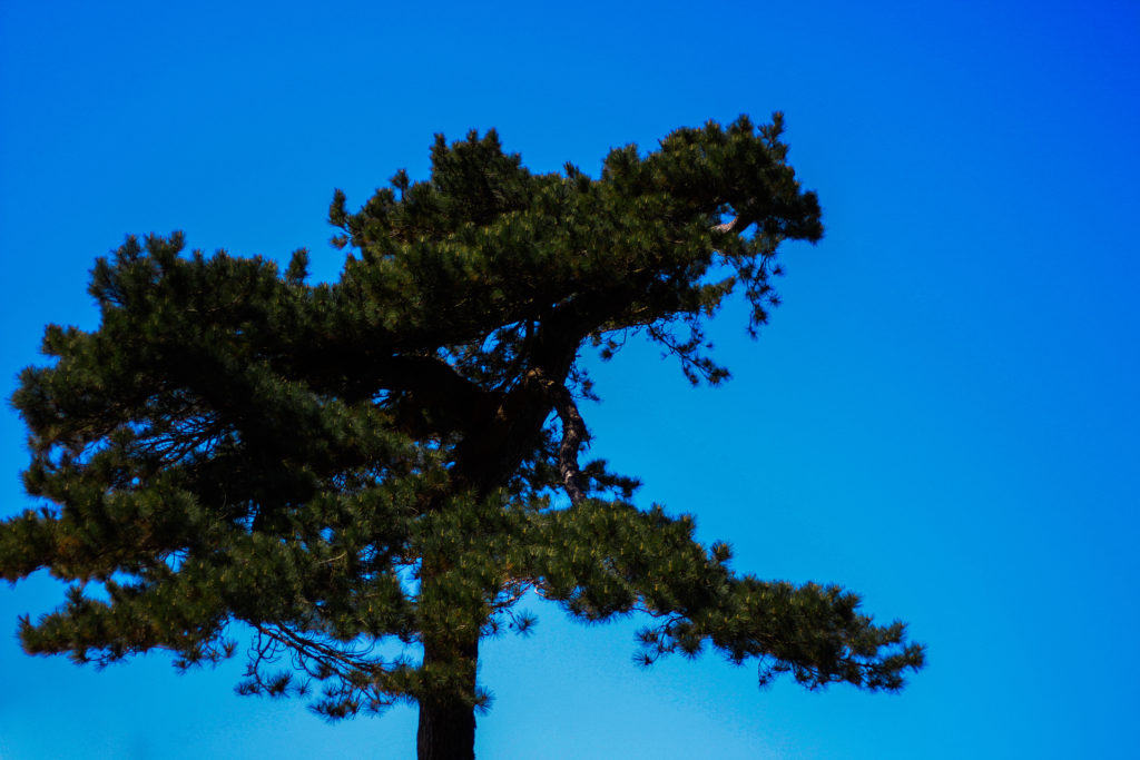
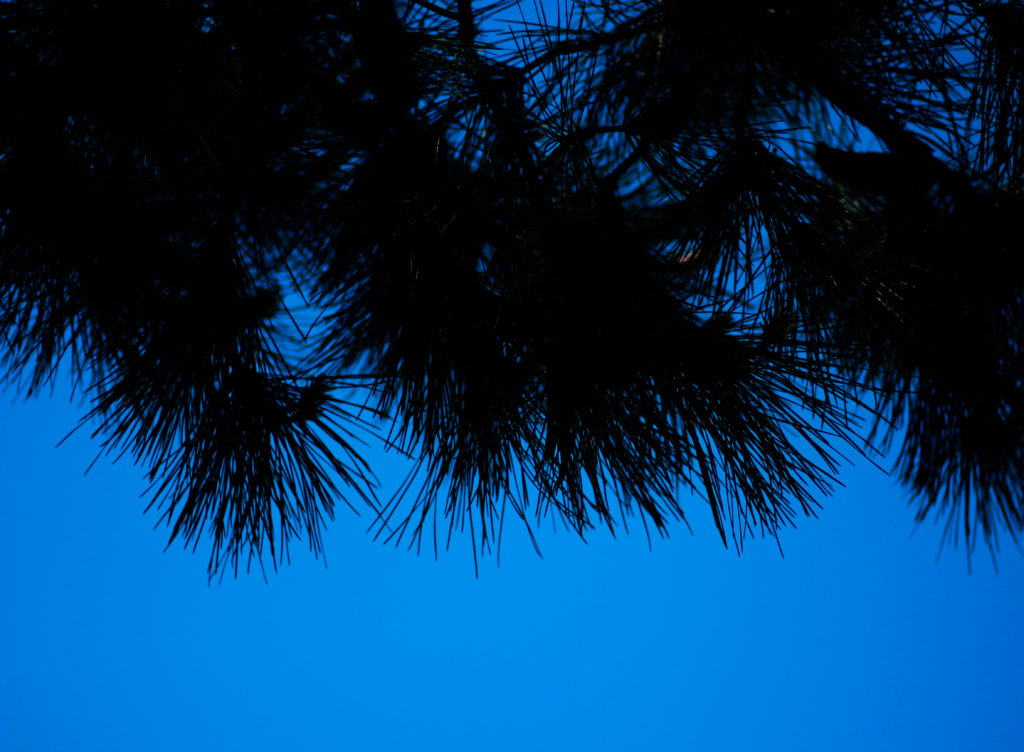
Finally I selected this image because of the huge contrast between the pines and sky which create a silhoutte of the leaves, isolated it from its environment and portraying them in a way that makes them seem as if they were something else. This contrast for me works well with an image in the previous colour shoot which I think when looking towards planning a photo-book would work well due to its similar qualities. As a result this image relates well to the topic but has been selected really in relevance to how it can be linked to the previous shoot in which silhouette of trees can be seen against a harsh blue backdrop.

After looking over all five images it allowed me to come to a conclusion to which images worked well in relation to the topic of abstract variations (this shoot being colour). By looking in depth at each image it allowed me to sum up its qualities as a reflection of my intentions not only to the shoot but the overall topic. This is my final choice for the image that best represents the entire shoot:

The reason I chose this image as the best reflection for the overall intentions of the shoot is because of how I loved the way the composition of the piece induced a sense of an artificial landscape in which it seems almost too surreal to be real. For me the vivid colour combined with the symmetrical composition of the tree really tie the photo together as each aspect of the piece compliment each other which preventing the others from overpowering and ruining the picture from becoming too eye-sore.