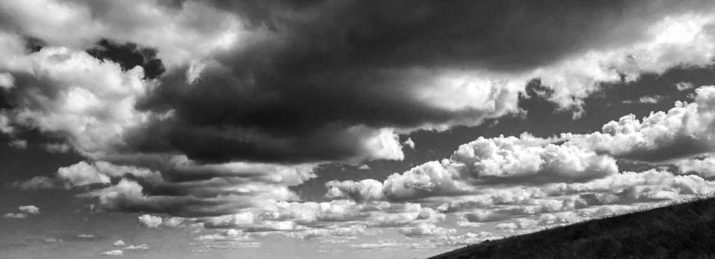
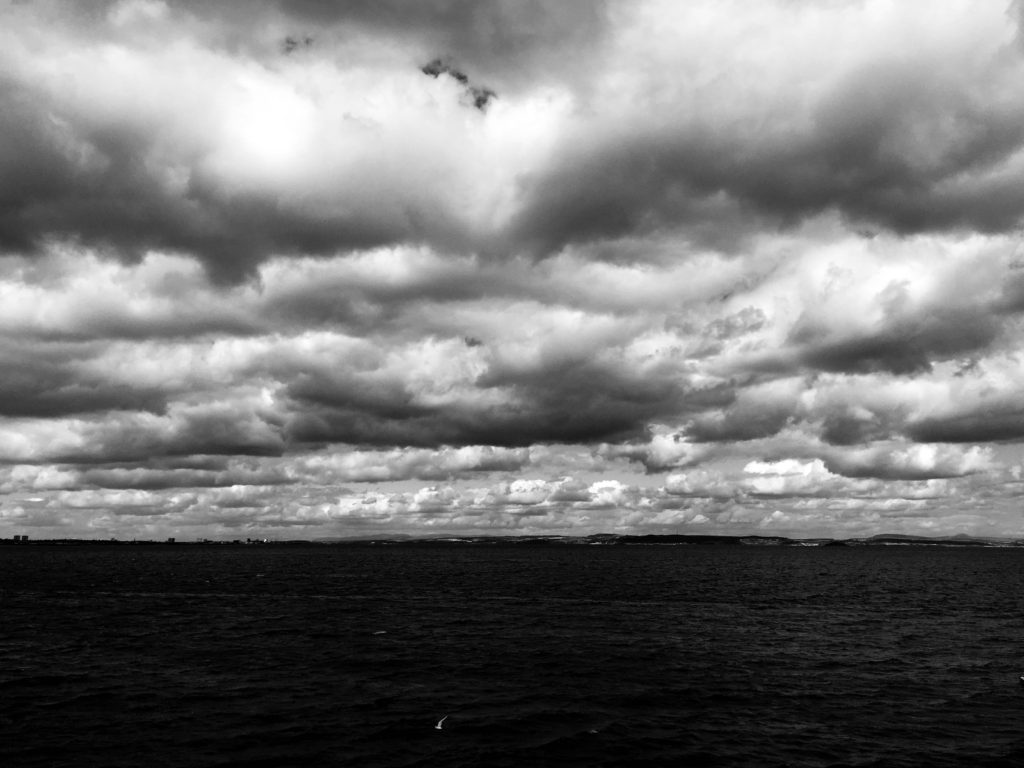
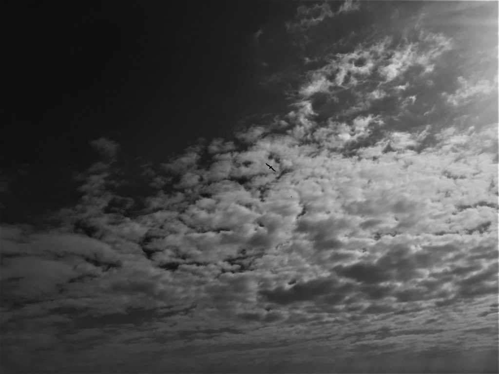
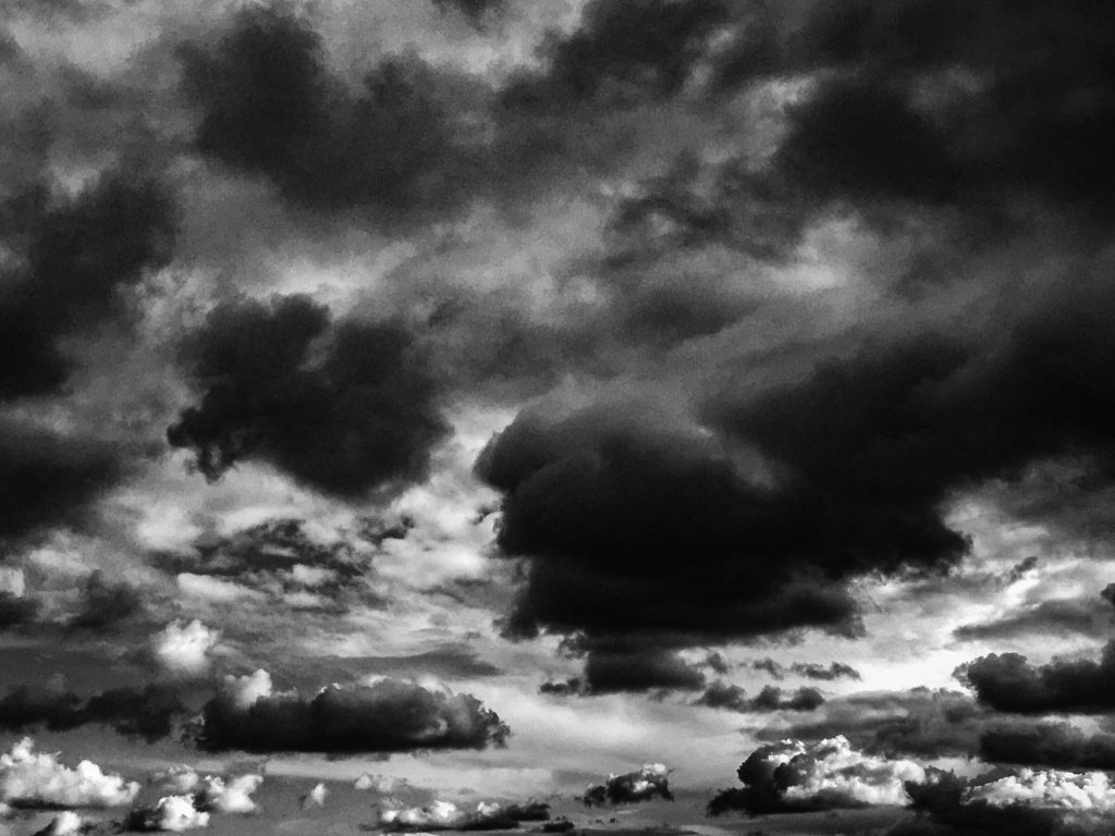
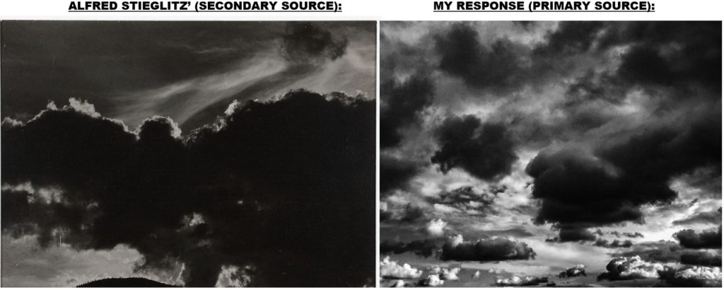
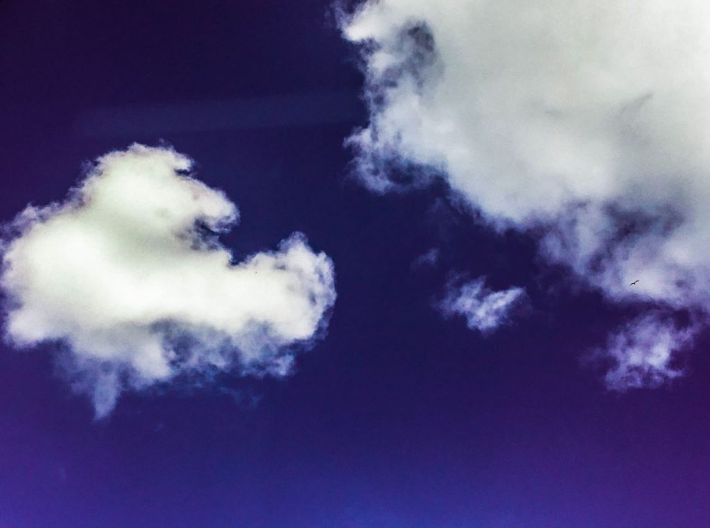
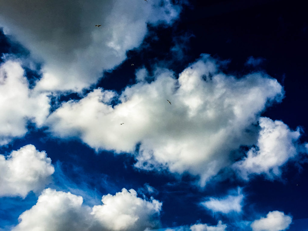
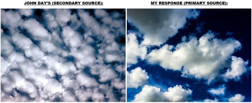
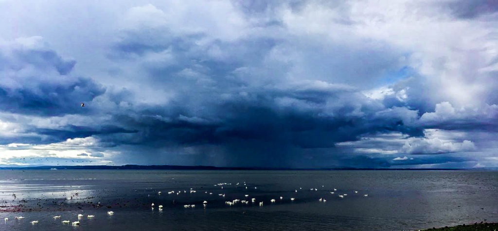
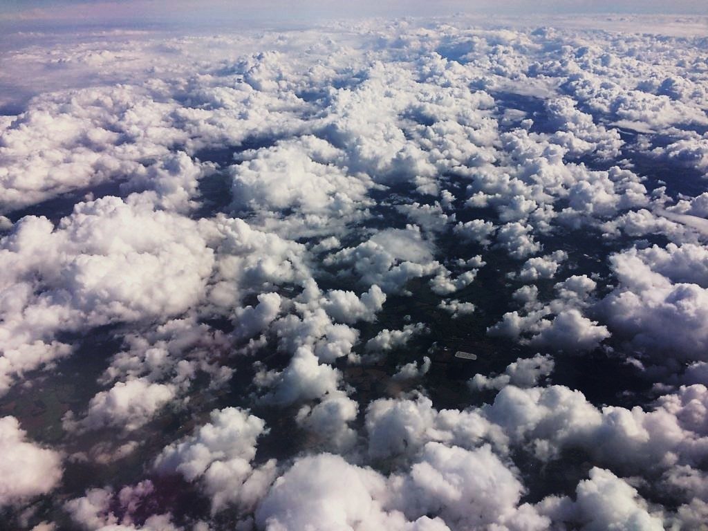
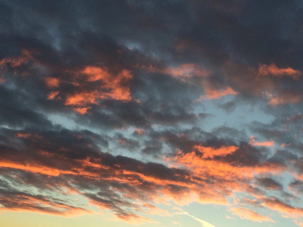
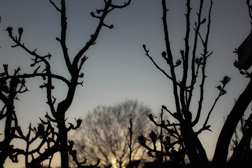
The 3rd category of my nature study is cloudscapes. From previously researching Alfred Stieglitz’s Equivelents and John Day’s photographs for inspiration, I have taken my own photos in response to the artists. In response to Stieglitz, I have captured heavy cloudscapes in times of bad / stormy weather in order to emphasize the dramatic sky like he focused on in Equivalents. John Day approaches cloudsacapes in a complete opposite visual style, with heavy saturation and colour enhancement in order to present the rich and varying colours of the sky above.
Category Archives: Developing
Filters
Gallery Visits
CCA Gallery – Hill St
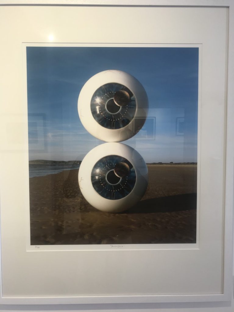
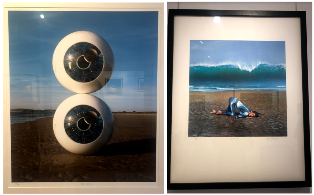
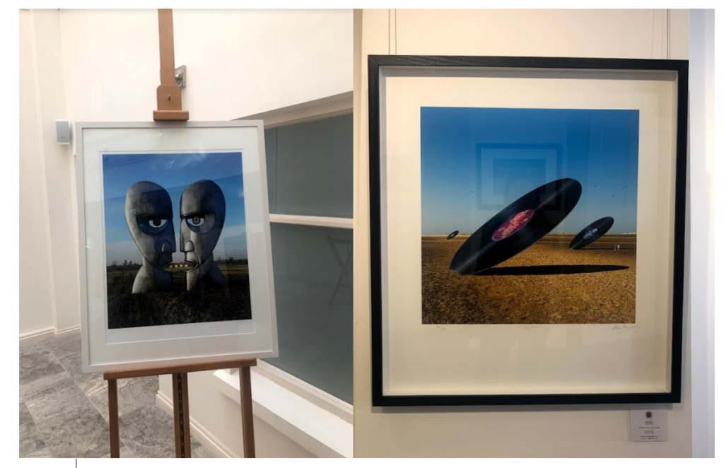
The CCA had an exhibition on musical links to photography, for example to top two images here are Biffy Clyro album covers. I really liked the bottom left image, it goes well with my circles topic but also it is very eye catching and well constructed.
Private Public Gallery
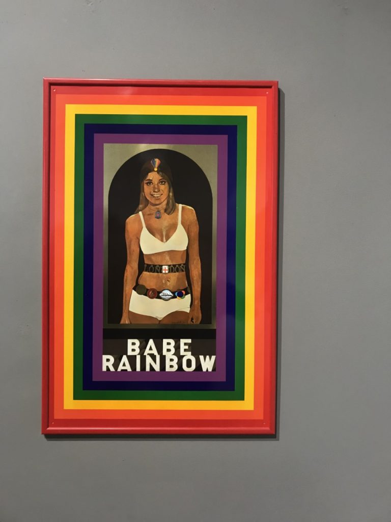
This was my first time to the Private Public gallery and I noticed that the work seemed more contemporary than the CCA’s. It was mostly art rather than photography but there were photographs around, whether they be manipulated physically or digitally. One image that interested me was the bottom left about Lily Langtree. Lily was a model/actress in the late 1800’s to early 1900’s from Jersey. She had a global fan base and this image was supposed to be the draft print for a postcard but it was so good that hey kept it. The artist has blown it up and digitally manipulated it slightly and printed it. The image on the top right was pop art and is of a woman who was a boxer or wrestler (something like that) and was able to easily beat men at their own game. The image is aimed to represent women as strong and able to be better than men at things women are stereotyped not to be able to do.
Lilia Luganskaia Response:
Edits:
Exhibitions
Behind the Lens
I visited the CCA gallery which had an exhibition called ‘Behind the Lens’ by
Mike McCartney, Carinthia West and Rupert Trueman looking at Britain in 1960s-70s, pop/counter culture, sexual revolution, rock documentary.
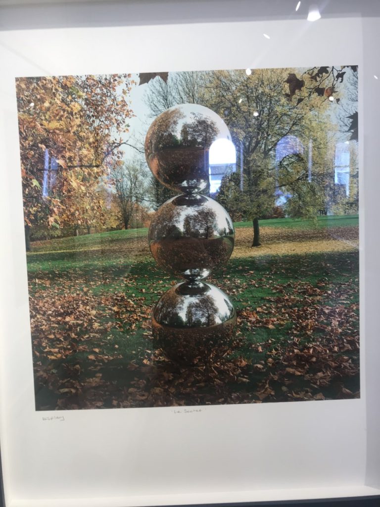
This image stood out to me in this exhibition as the mirrors had been physically put into the landscape rather than being digitally manipulated in. I liked this as it shows nature in a different way to other images I’ve seen. I like how the landscape looks artificial, but still shows the natural waterfall and grass in the background and foreground of the image. I also like the simplicity of the image, and how the tree is the main aspect of the image, with the shadow along the floor.
Pop Icons
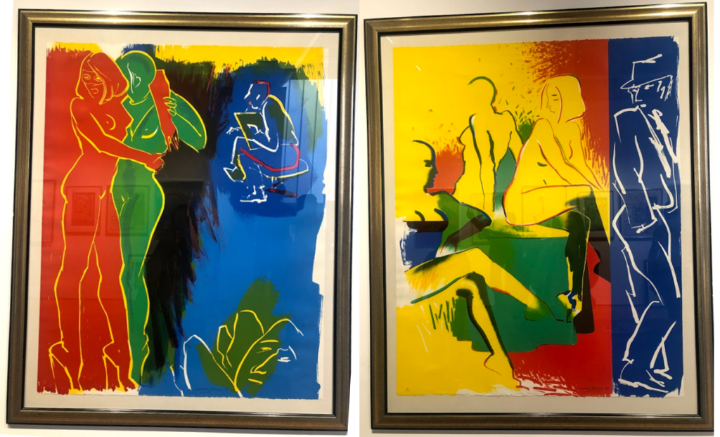
The second Private gallery I visited looked was called ‘Pop Icons’ and looked at Pop-art, reflecting on mass consumerism, advertising, celebrity culture, iconography. Artworks by Andy Warhol, Roy Lichtenstein, David Hockney, Peter Blake and other artists were displayed.
1950’s in Britain and late 1950’s in America, Pop Art reached its peak in the 1960’s and went on to become the most recognisable art form of the 20th century. It began as a revolt against the dominant approaches to art and culture and traditional views on what art should be. I particularly liked these two pieces above by the same artist because of their use of primary colours and the sections in which they’re divided into. I think i have slightly explored this in my project where i focused on block colours when editing the original images. Adjusting the colours in these images make them link to the work in pop art, although they are not a bold colours, this is something I could explore in my project further. I also like the use if cured lines and shapes representing the figures i the images as I think they relate to shapes and lines that you fins in natures and plants, linking to my projects.
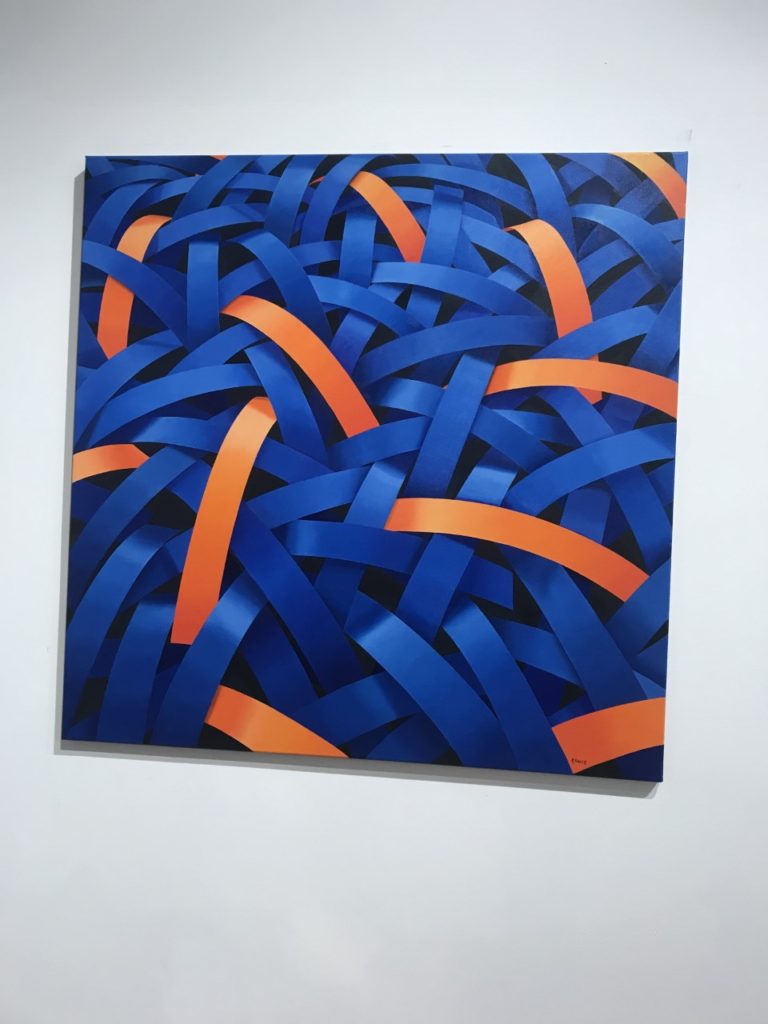
Gallery Director Chris Clifford said, “Pop Art often takes imagery that is currently in use in advertising. Product labeling and logos figure prominently in the imagery chosen by pop artists, seen in the labels of Campbell’s Soup Cans, by Andy Warhol who is one of the artists featured in this exhibition. I also liked this image I displayed above as the repetition of the curved lines and colours, links to the theme of variation and similarity. I also liked how the patterns in the 2D images looked 3D like they wee coming off the image. In his image I thought that the blue colours linked to colours in nature and water, and the bright orange also links to my experimentation where I have included colour which arena normally found in nature within my images to make them stand out.
Being Human –
Feminism, representation of women artists in the art world, alternative voices etc.
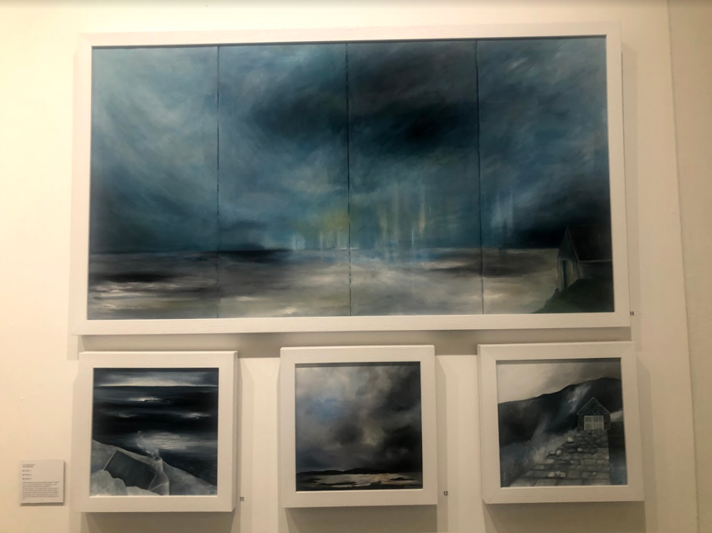
I think the this exhibition related well to this project as a lot of the work focused on nature, emphasising the representation of woman artists. This relates to my work as one aspect i am exploring is femininity in nature, looking at soft shapes that follow a stereotypical view of woman. I particularly liked these pieces above as I think that they represent ideologies of sublime, with the storm and dark clouds above the landscape, creating movement. The tones in the image are cool and emphasis the shadows, looking at the vastness in the scene. This relates to the work I am doing now as I have explored the ideologies behind sublime and beautiful, this type of image being something I could explore more in my project where I look at the other dangerous side to nature, rather than the fragility that i have focused on so far. So far i have explored warm, soft tones and colours in my images, this contrasts to these pieces where predominately cold dark colours are used, and is another aspect that i could look at in my work, contrasting cool and warm tones.
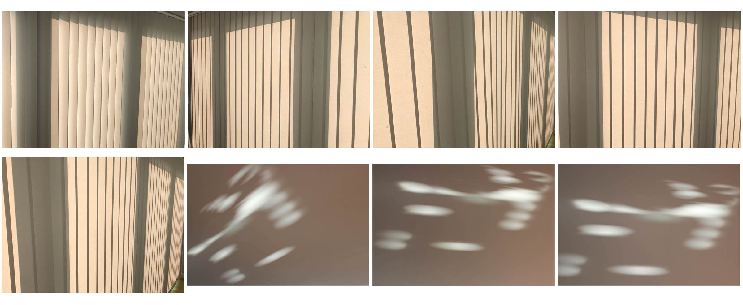
Shoot 2 – Home
Home shoot
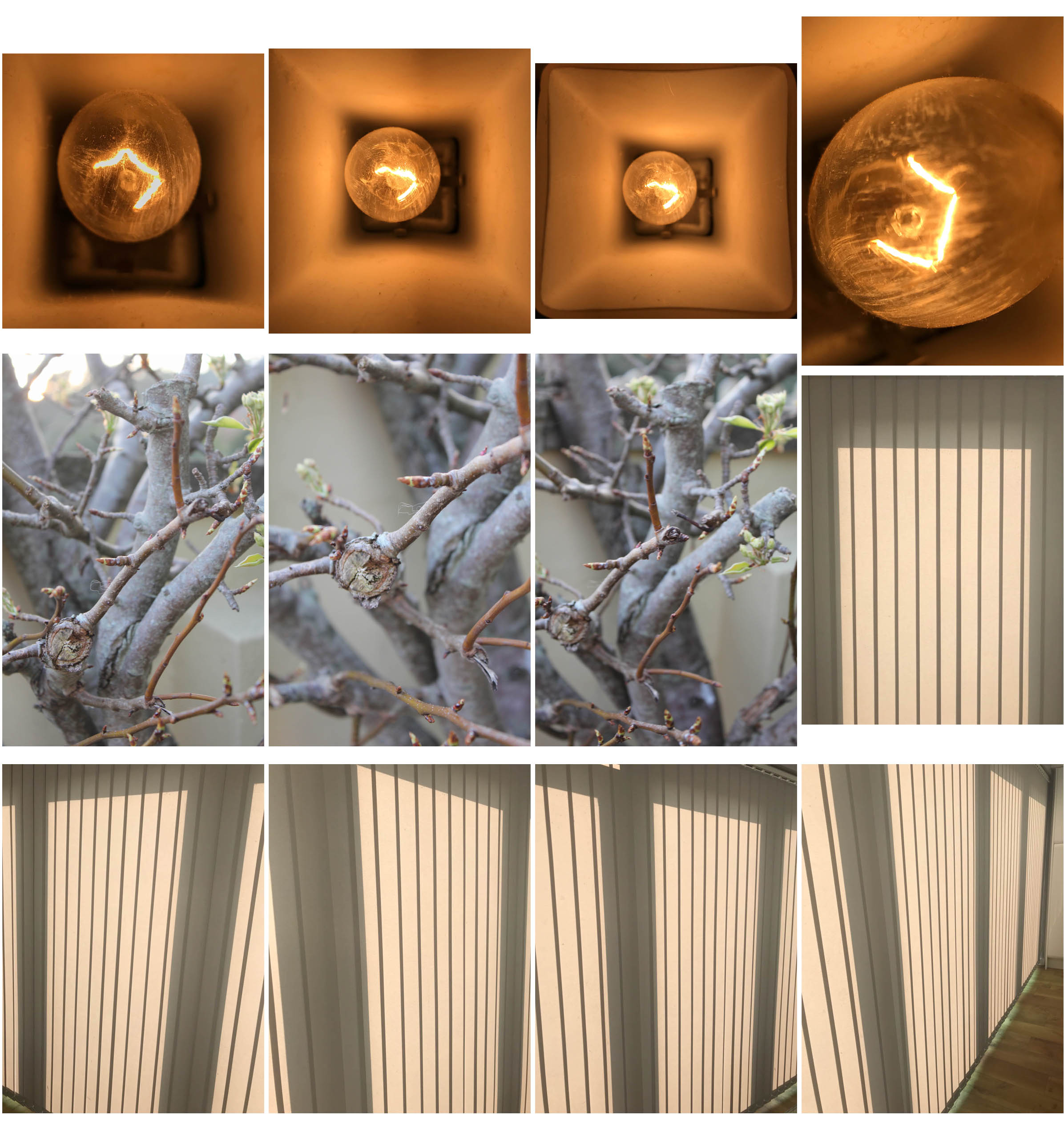
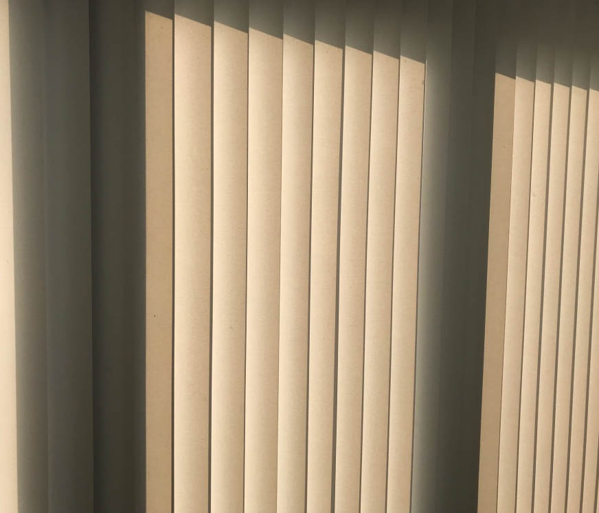
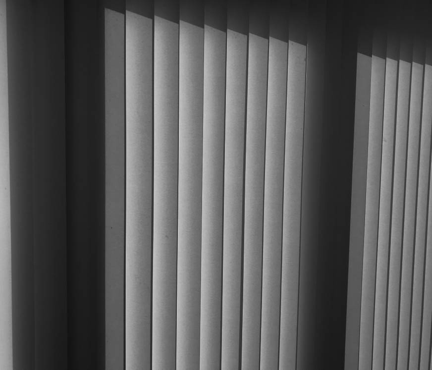
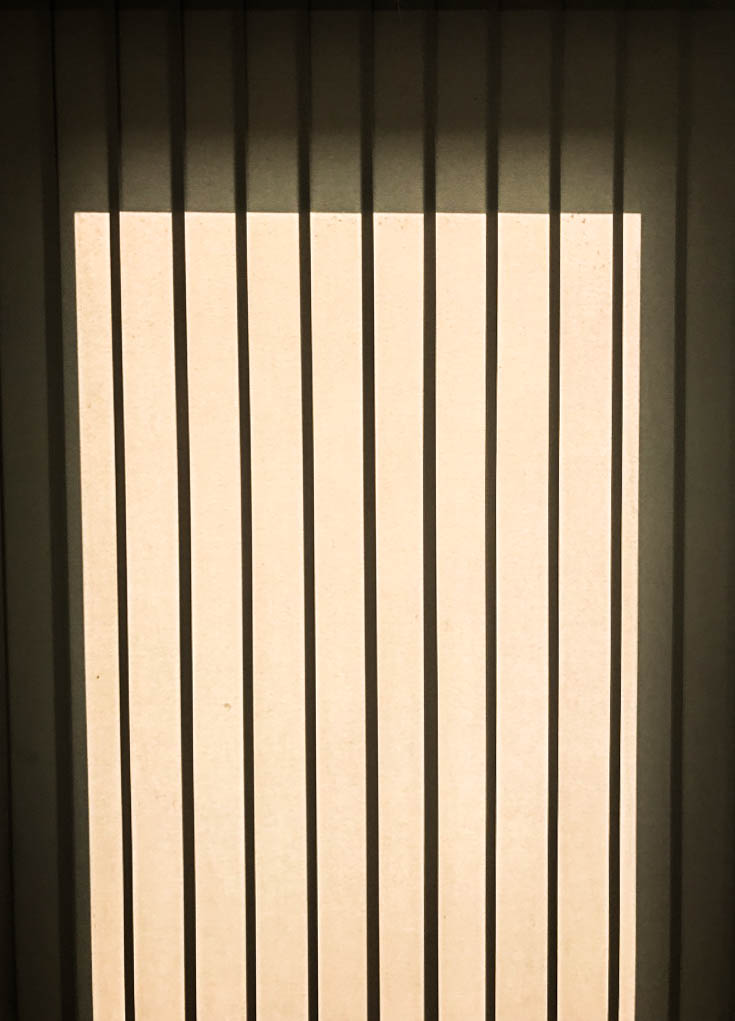
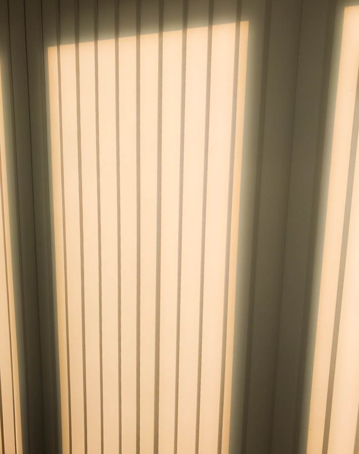
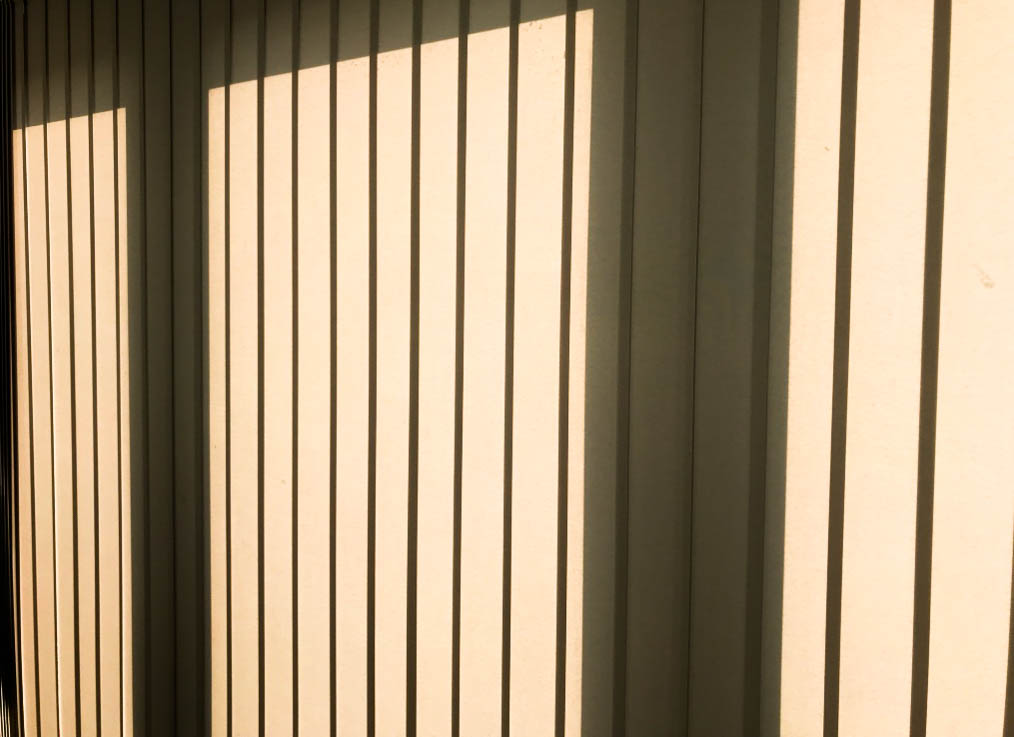
For this shoot, I wanted to just focus on light and/or shadow affecting objects or areas in and around my house. I used my Canon camera for this shoot. Below are the contact sheets displaying my responses:
Experimentation
To edit my images, I used lightroom. I adjusted the brightness, contrast, shadows, whites, blacks and sometimes the clarity. I also experimented with 2 black and white images but thought that the colour images looked best for these types of images, as light and shadow contrasts the best when in their natural colour.
Shoot 1 – Flowers
Flower studio shoot
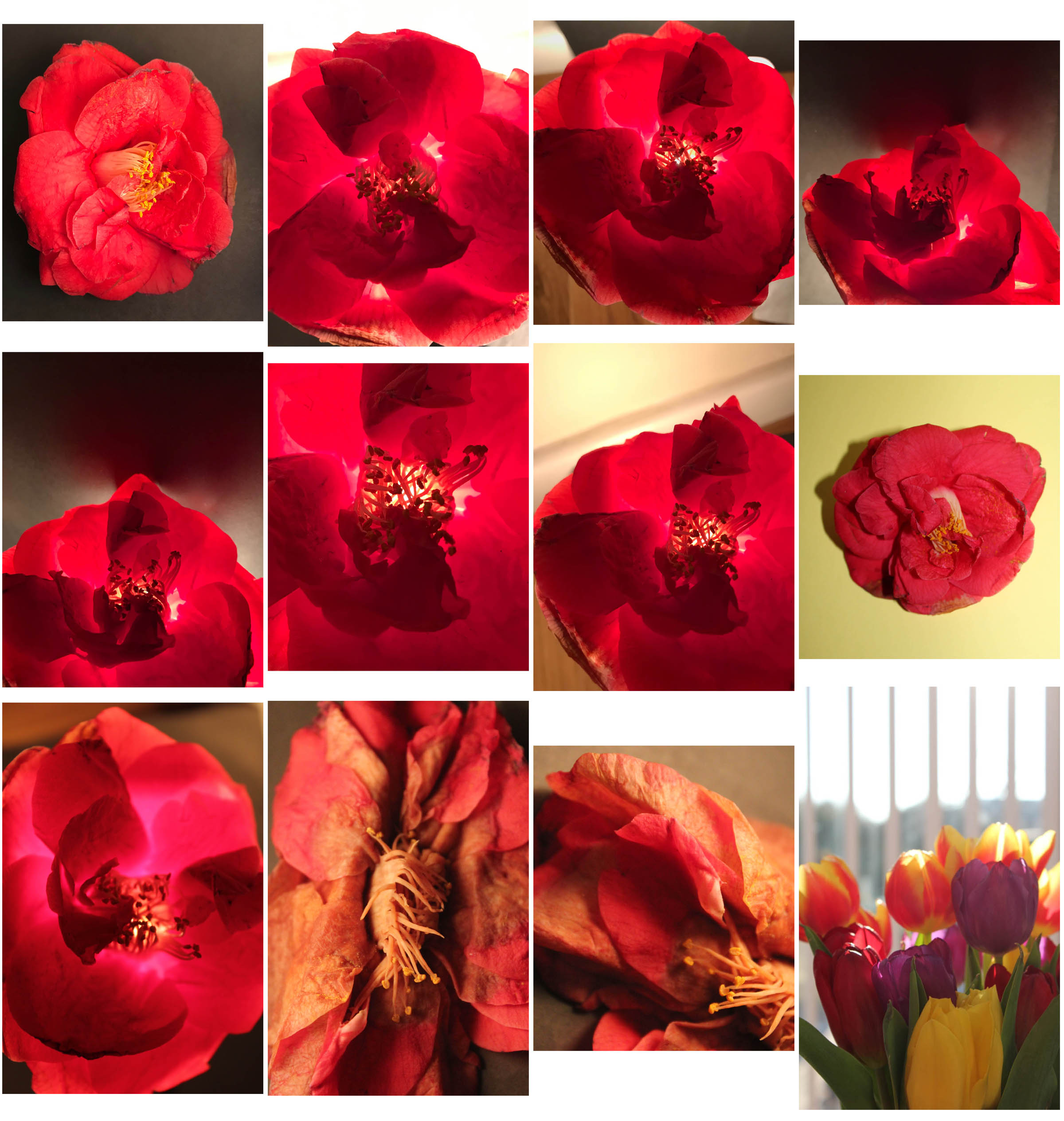
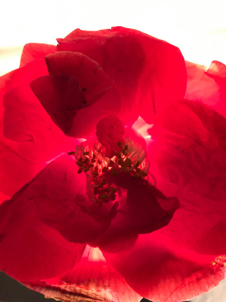
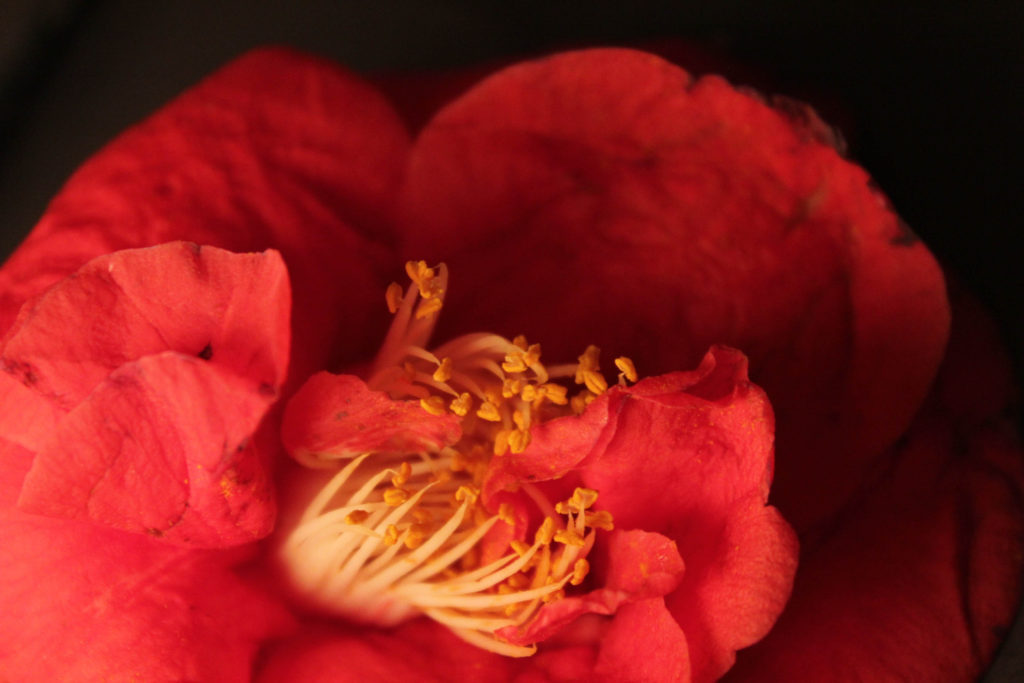
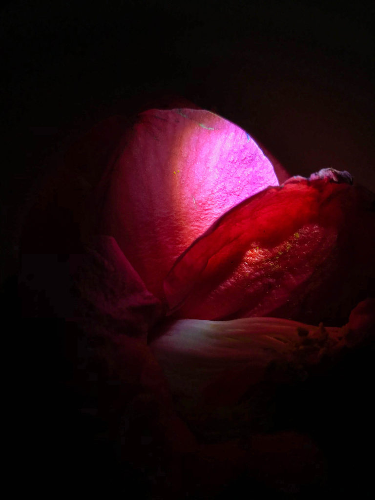
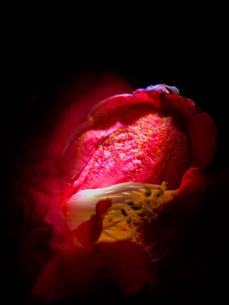
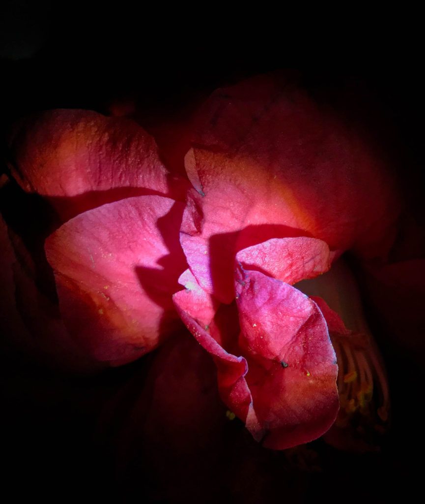
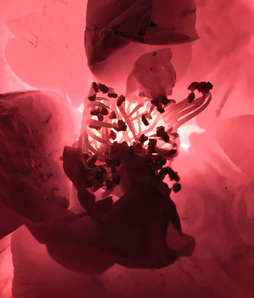
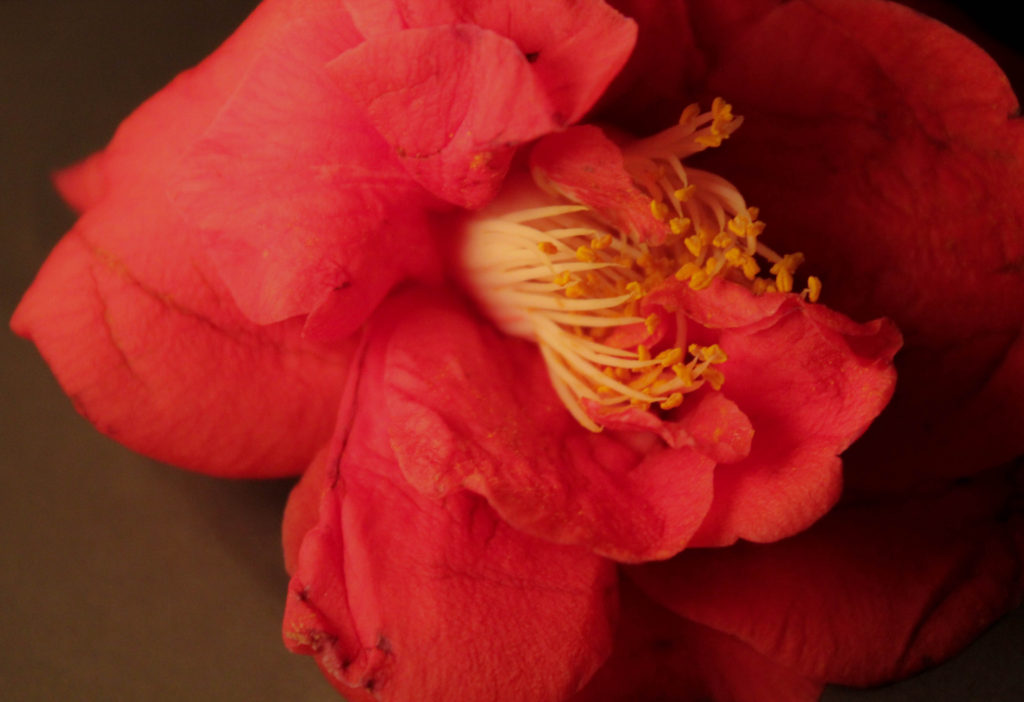
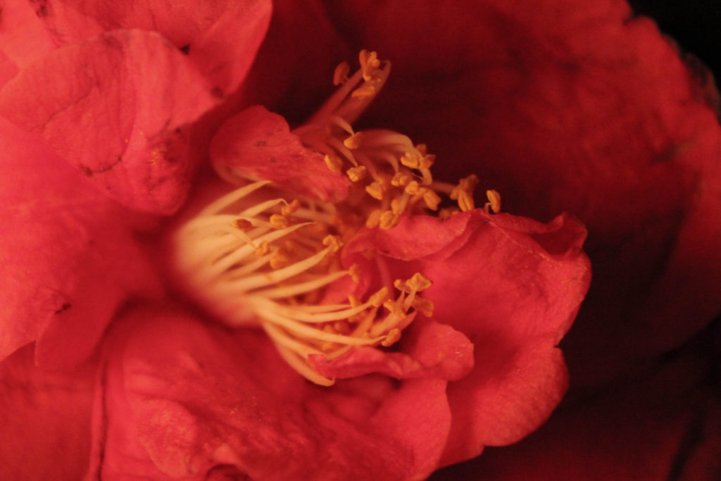
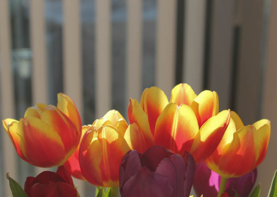
I did this shoot at home, where I wanted to focus on nature and close-ups within my project of light and darkness. Some pink flowers had fallen off one of the trees in my garden so I took 3 different flowers and did a shoot inside with those flowers. I wanted to focus on shooting close-up images of the flowers, where I got someone to hold a torch onto the flowers so that it created clear light and shadows within my picture frame. I took these images with my Canon camera, and experimented with the ISO to see different photographic responses with the light I was using. I also varied between the use of the ‘close-up’ mode on my camera. Additionally, at the time I found these flowers, there was a bold stroke of sunlight that looked appealing on some flowers I had in my house – so there are 6 images in my contact sheets that were not taken in a studio shoot – I took them primarily due to the sunlight shining onto them through the window.
This shoot was inspired by mainly 2 artists: Rinko Kawauchi was one of them. Her illuminance photo-book consists of images such as:
Images of mine inspired by Kawauchi:
Experimentation
I used lightroom to edit these images. I wanted to experiment with adjusting the brightness and contrast, as well as the vibrance, highlights, shadows and clarity.
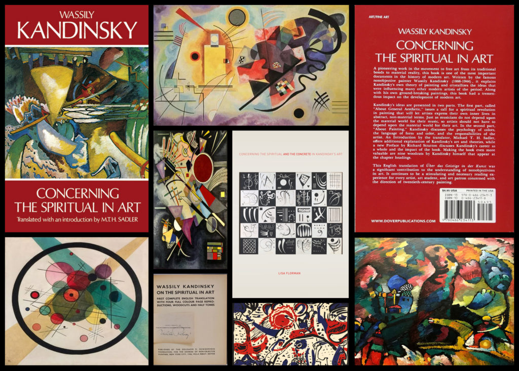
‘Concerning the Spiritual in Art’ by Wassily Kandinsky
Who is he?
Born in Moscow in 1866, Wassily Kandinsky took up the study of art in earnest at age 30, moving to Munich to study drawing and painting. A trained musician, Kandinsky approached color with a musician’s sensibility. An obsession with Monet led him to explore his own creative concepts of color on canvas, which were sometimes controversial among his contemporaries and critics, but Kandinsky emerged as a respected leader of the abstract art movement in the early 20th century. In Munich, Kandinsky was accepted into a prestigious private painting school, moving on to the Munich Academy of Arts. But much of his study was self-directed. He began with conventional themes and art forms, but all the while he was forming theories derived from devoted spiritual study and informed by an intense relationship between music and color.
Color became more an expression of emotion rather than a description of nature or subject matter. He formed friendships and artist groups with other painters of the time, such as Paul Klee. He frequently exhibited, taught art classes and published his ideas on theories of art. He had already formed the New Artists Association in Munich; the Blue Rider group was founded with fellow artist Franz Marc, and he was a member of the Bauhaus movement alongside Klee and composer Arnold Schoenberg. Back in Germany after clashing theoretically with other artists, he taught at the Bauhaus school in Berlin and wrote plays and poems. In 1933, when the Nazis seized power, storm troopers shut down the Bauhaus school. Although Kandinsky had achieved German citizenship, World War II made it impossible for him to stay there. In July 1937, he and other artists were featured in the “Degenerate Art Exhibition” in Munich. It was widely attended, but 57 of his works were confiscated by the Nazis.
What is the book about?
The book acts as a reflection of anticipating “the spiritual turning-point” where Kandinsky looks at how this could occur within people. To do this Kadinsky looks at the artistic meanings of the psychology of colour, the compositional interrelation of forms etc. As a result of this her main goal as an artist becomes the constant search to find the very innermost necessity that can be found within the spiritual foundations of any individual. When looking through the initial pages of the book it is made very clear that Kadinsky is trying to anticipate the emergence of abstract art as the purest form of influence on the human soul, allowing many to view the future optimistically, foretelling the upcoming emergences of spirituality. Some examples of the book and its content can be seen below:
After reading through a bit of his book and looking over some of his artwork, I decided to go onto analyse a piece of his work that for me summed up his points stated in the book and his link between spirituality and the individual. The image I have selected is called ‘On White II’, and was created 1923:
Visual: The piece overall is very aesthetic through its contrasting bright colours and the use of negative space to create feeling within the blocks and random assortment of shapes jotted around. The bright colours for me draw a sense of happiness linked together with gloom, this is due to how the vibrant colours compliment each other bringing about a sense of joy, however contrasted to this is the darker greens and black which for me derives the image of its joy and instead implemented some underlying perspective of loss of gloom which could potentially be interpretted.
Technical: When looking over the image its clear that though the image looks like a random assortment of coloured shapes each piece has been carefully placed to be as effective as possible to that it can impact the viewer through its paint splatter like composition. The use of black within allows to break up the overlapping shapes which otherwise would have become too overpowering without a border. For me the use of the negative space occationally included with a few black lines adds to the overall effectiveness due to how it boxes in and compresses the piece so that it is only confined to one area making it as a result more minimalist.
Contextual: Kandinsky used an array of geometric shapes and lines in a colourful and riotous contemporary display, prompting many artists to imitate his style. On White II, is located at Georges Pompidou Centre, Paris, France. As the title suggests, white is predominant in this painting, including the background. Kandinsky used white to represent life, peace and silence. The majority of the geometric shapes are presented in a variety of colours, reflecting the artist’s love for the free expression of inner emotions. Striking through the kaleidoscope of shapes and colours are bold, spiked barbs in black, representing non-existence and death. Kandinsky liked to paint while listening to music, and On White II, is his interpretation of the music, as created by his inner consciousness. The abstract and possibly mesmerising display of shapes and colours can be compared with the complexity of a musical composition.
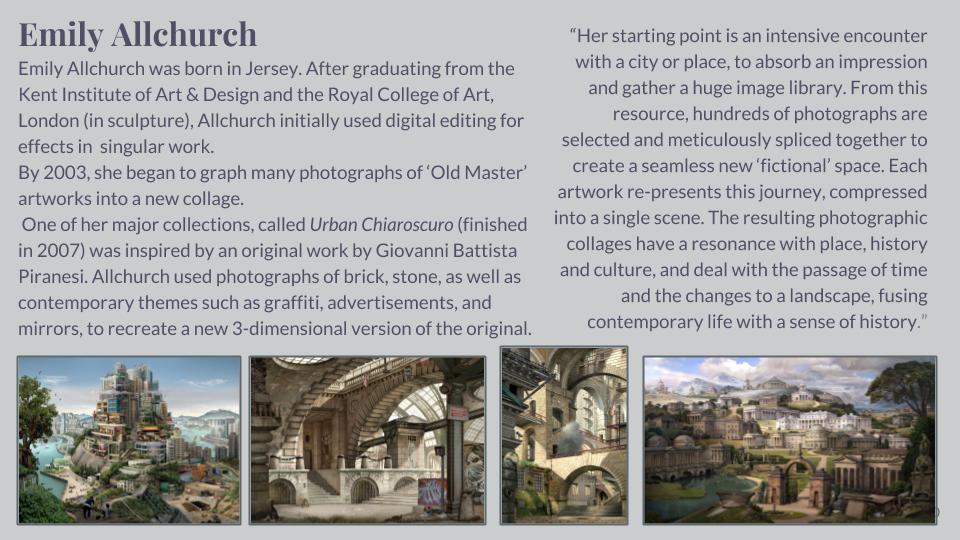
Artist Study – Emily Allchurch
Sources:
- Emily Allchurch Vimeo Video – https://vimeo.com/301598017
- Culture Jersey article – https://culture.je/events/visual-art/event/ccasm-gallery/emily-allchurch-fact-and-folly/438
- PDF leaflet (contextua) – http://www.gbsfineart.com/wp-content/uploads/2015/04/MAG-catalogue.pdf
- Jersey Article – https://www.womenartdealers.org/2017/11/03/karin-weber-gallery-presents-emily-allchurch-then-is-now-introductory-show-the-making-of-babel-hong-kong/
Light and darkness
Light is:
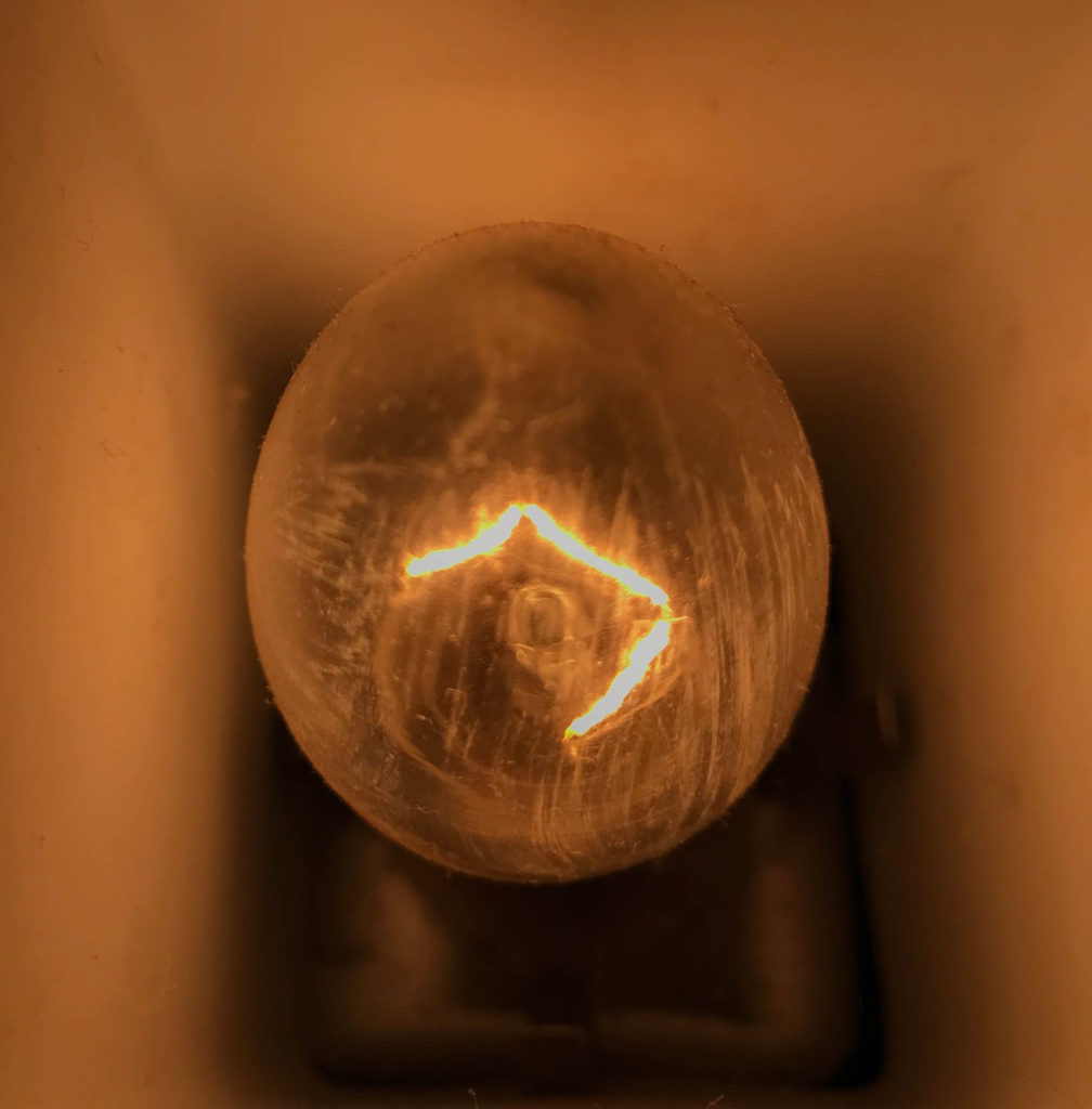
In photography terms, light is “the illumination of scenes to be photographed. A photograph simply records patterns of light, color, and shade; lighting is all-important in controlling the image. In many cases even illumination is desired to give an accurate rendition of the scene.” Light is important within photography as it determines how beautiful, scary, eerie or amazing an image is; really, it communicates the tone of the image. A really bright image with lots of light being let into the lens will allow for images to appear jolly and happy, whereas the opposite would be images with a lot less light – a dark image would be considered scary or frightening or maybe it could imply secrecy. I like how light is an important factor when taking photos. Using this as a baseline for my project will allow me to explore the exam theme well; I will be experimenting with light by using a range of sources of light – the sun, torches, a man light within a room etc.
Darkness is:
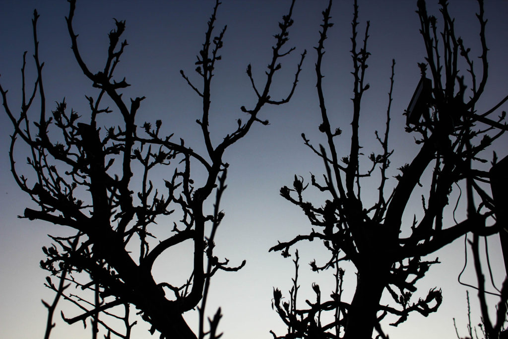
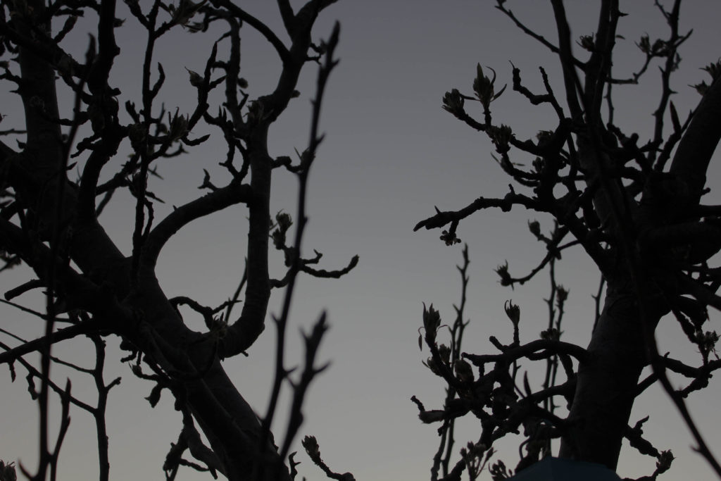
In photography, darkness is just as important as light. “If photography is writing with light, darkness is the punctuation. Darkness defines shapes, makes two dimensions look like three, and heightens drama.” I want to also experiment with darkness in relation to light, for example capturing shadows, or silhouettes, or doing a studio shoot where I use a model and a spotlight so the model appears as light and dark depending on where I position the light.
Reviewing and Reflecting
How well have ideas developed?
I have developed my ideas well by adding more inspirations from artists to influence my final shoots. I have started with the idea of sunlight, but have added on the idea that I wanted to explore light in general, as well as exploring its opposite of darkness to communicate the variance of these 2 everyday factors of life, as well as the similarity of how light and darkness can interact to produce similar effects that will be shown throughout my photoshoots.
Are ideas explored and selective appropriate to intentions?
My ideas have not yet been explored thoroughly; I have experimented with repetition of doors and windows – these 2 shoots were produced from the influence of the Becher’s and their typology approaches. However, I need to experiment with my specification ideas and start to focus on the shoots I have planned – (blog post on planning of shoots).
Are they sustained and focused?
My ideas are sustained and focused as I have researched artists to back up my evidence of where I want my photography exam project to follow.
Are they reviewed and refined?
My ideas are reviewed and reflected as I have followed on from my main idea of ‘sunlight’. I did a lot of research on the Sun and Jersey’s relation to the Sun, and the art movement romanticism and how this links to my project due to its beauty. Yet, I have refined my ideas to light vs darkness, using studio photo shoots as well as outside, natural sunlight shoots within nature etc. This is to make my project more varied so I can explore many different factors within lightness and darkness.
How many responses/ shoots?
So far, I have only done 1 experiment shoot to explore the idea of repetition. However, I have been planning on my other shoots to show my ideas. I am planning on doing a good amount of shoots, investigating sunlight, artificial light, shadows, variance of light and dark tones within nature, seascapes and people.
Command of camera skills/ photographic techniques and processes
I am planning on using my camera to take my other photo-shoots. I am going to experiment within my shoots by adjusting the ISO and white balance etc to whatever lighting I am in.
Understanding of composition/ considering quality of light
I will make sure I photograph my images from a variety of angles to make sure I can gain the best images possible from my shoots into light and darkness. This is also to ensure that my images are better in terms of lighting; I want to be able to have a perfect image so that when it comes to the editing process, I can adjust whether I want my images to be lighter or darker.
What are the overall quality of the images?
So far, I have only done one photo-shoot but the quality of these images were high as I made sure the composition of my images were all from a face on perspective, and were edited and cropped carefully.
How do they respond to research?
I have conducted research on Kanghee Kim, the sun and Jersey’s relation to the sun. I will respond to this research in further shoots. However I have already responded to the Becher’s typology images with my typology of doors and windows. I am planning on making a research blog post on romanticism and an artist from that movement, (J W Turner), and other artists such as Ray K Metzer, Viviane Sassen and Rinko Kawauchi that are giving me inspirations to take my photos.
How do they relate to artists references?
My images so far relate to artist references as I have also done a ‘play’ shoot with links to John Baldessari, as well as my doors and windows shoots which links to Bernd and Hilla Becher.
How do the interpret exam theme?
Bernd and Hilla Becher interpret the exam theme because they are taking images of similar types of building from the same viewpoints, where all the images are the same format (black and white), yet all the buildings are varied as they all come in different layouts but share similar characteristics such as the shapes of the buildings within 1 typology and the structure of them. John Baldessari interprets the exam theme as he is experimenting with how play is a similar thing that everyone does at some point, yet it can be so varied in how people interpret the meaning of play; everyone plays differently.