

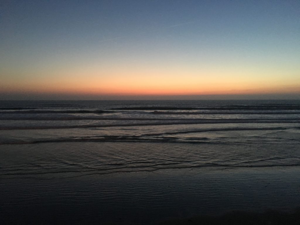
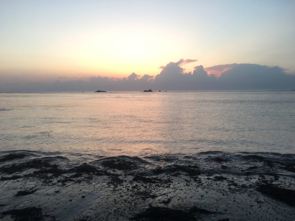
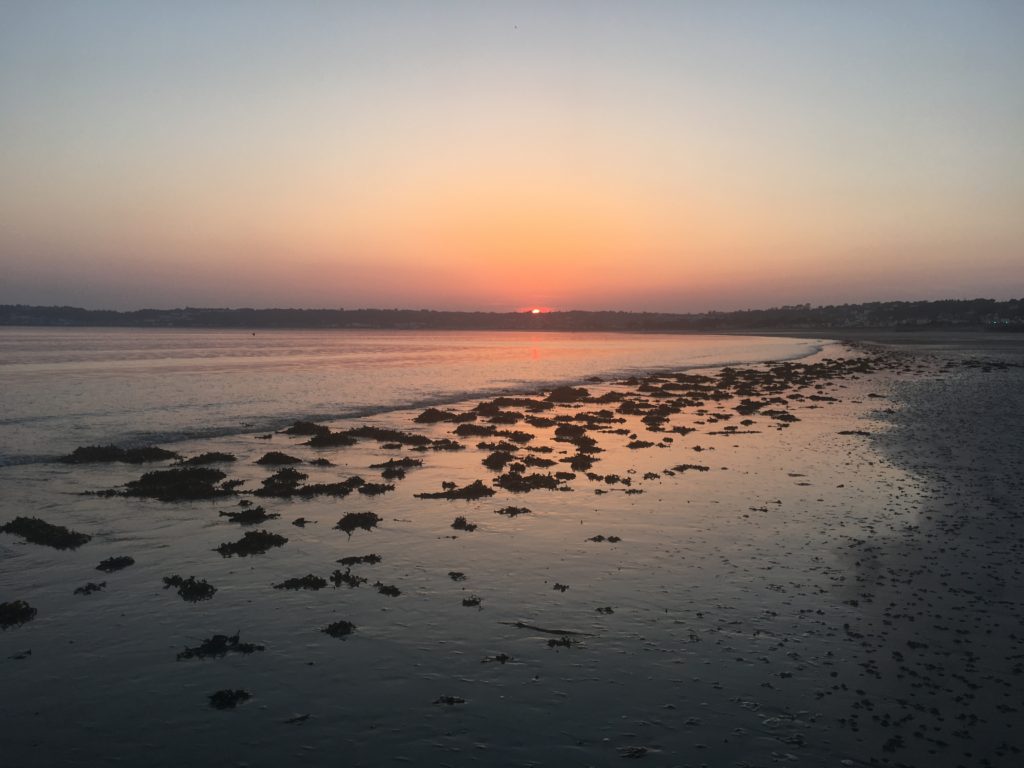
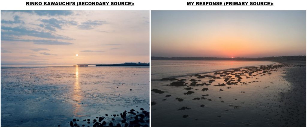
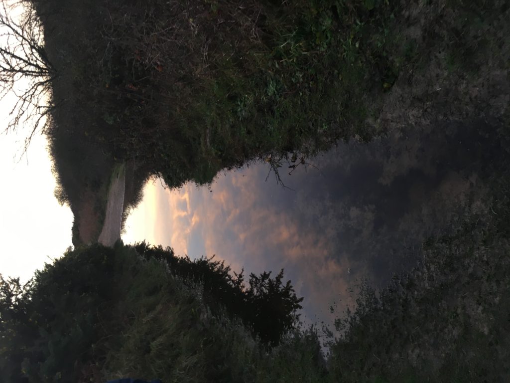
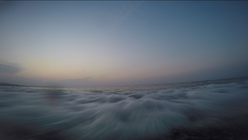
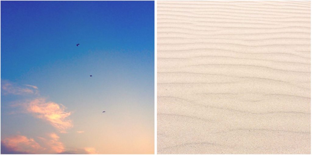
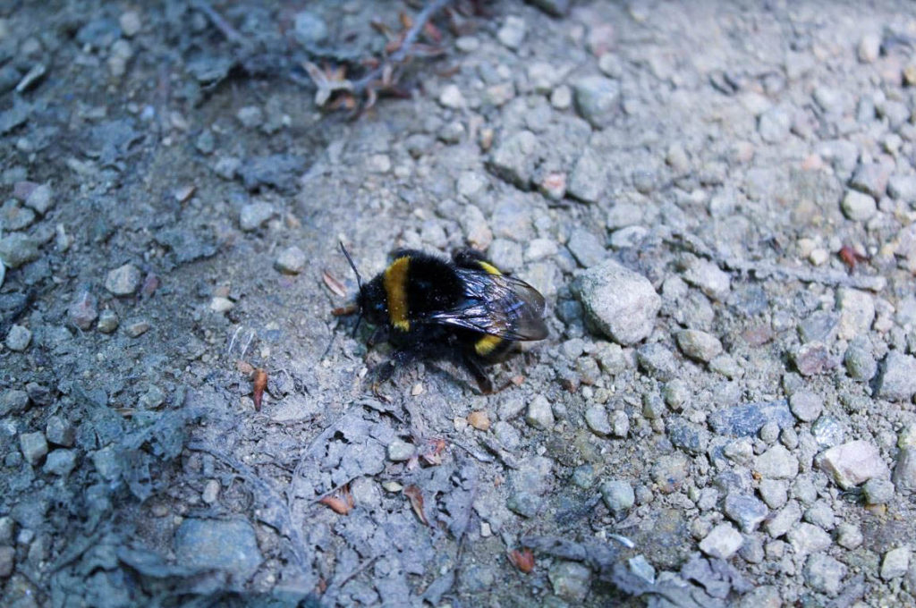
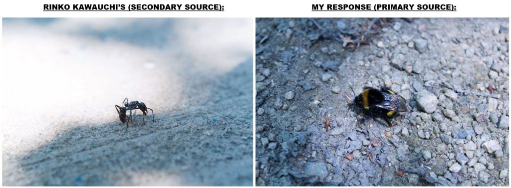
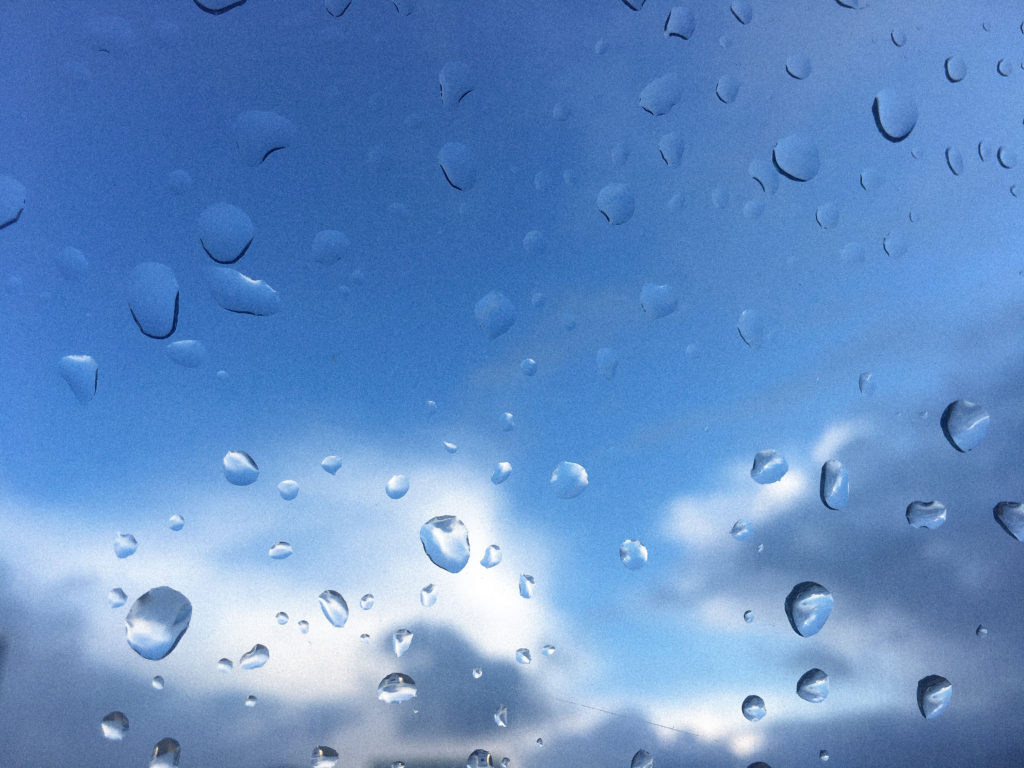
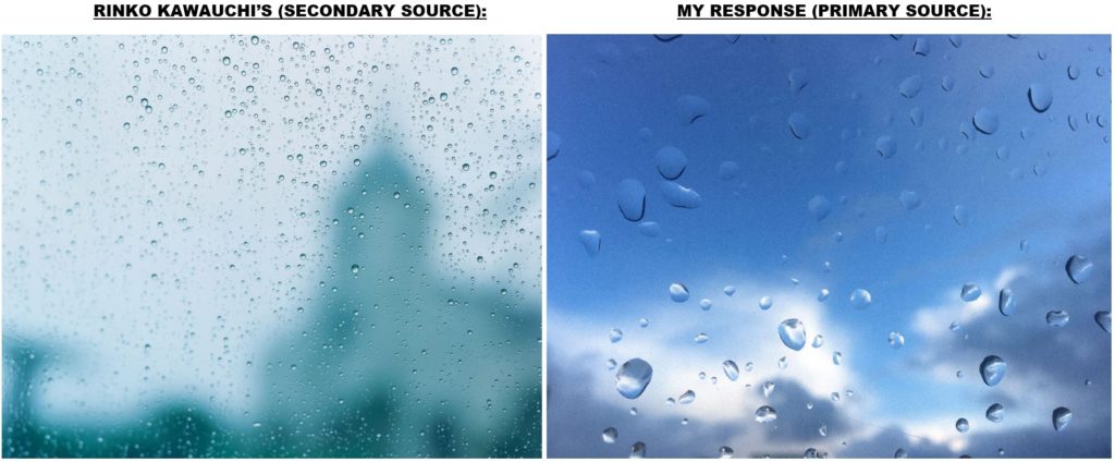
For my 5th photographic shoot, I have taken primary source in response to Rinko Kawauchi’s work. I really like her work as it reinforces the sublime beauty of seemingly mundane things like insects, and skyscapes. She uses the element of light to her advantage and zooms in on nature to produce romantic imagery. Taking inspiration from her areas of study, I have photographed a variety of subjects i.e. the sun rising and setting, patterns in the sand, and a bee close-up. I have included multiple videos to show visual movement where I have photographed, specifically the movement of water, which I can’t present in a still image. I have shown direct comparisons between my responses and her works in multiple images to show clear contrast and similarities.

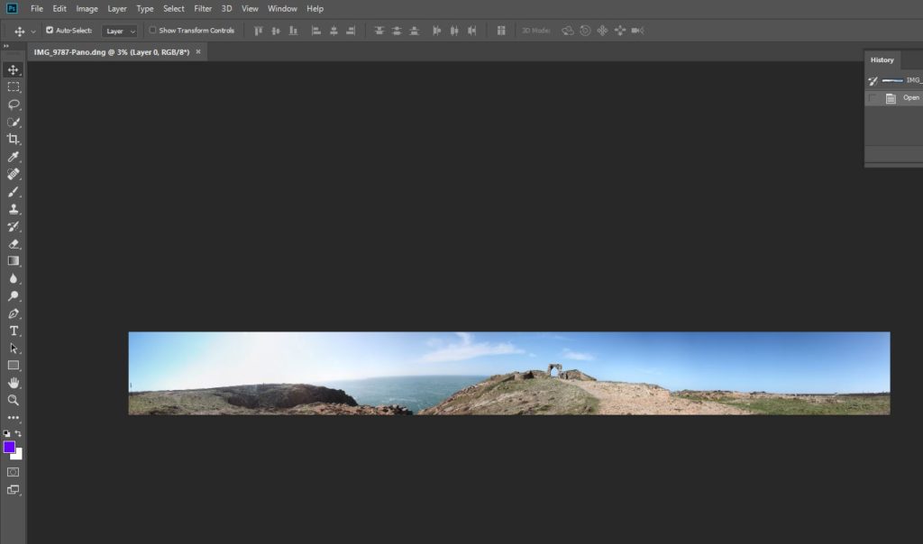
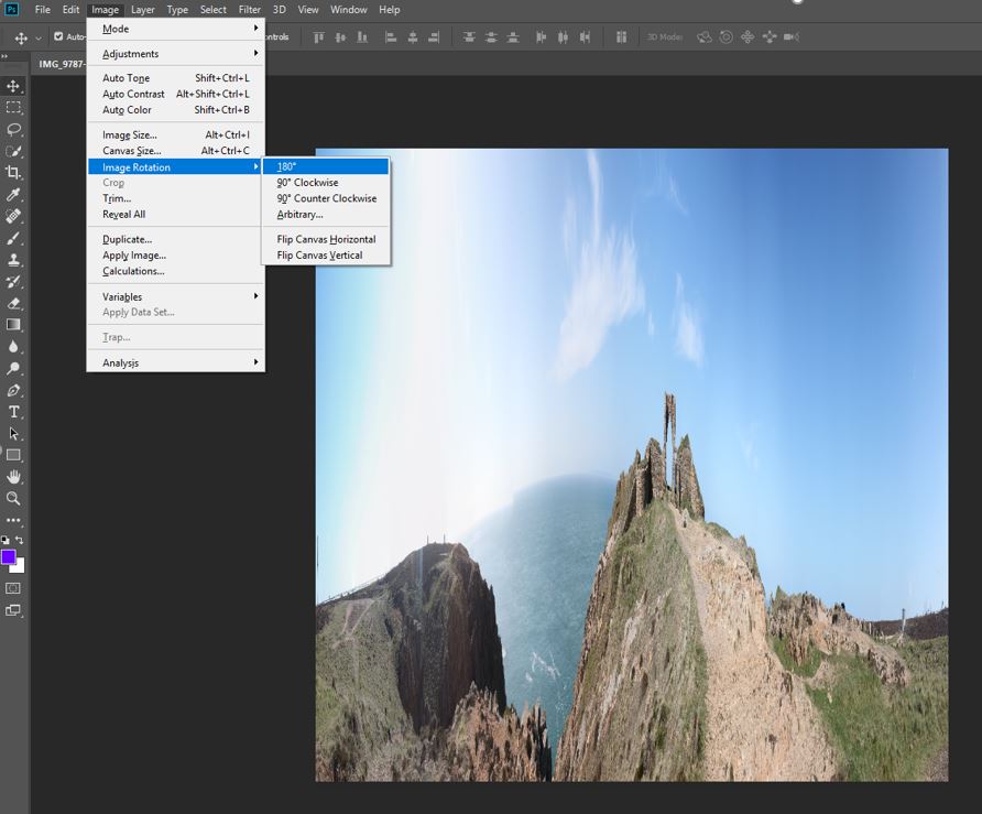
To create tiny planet images, you firstly need to take images. I took 55 images per planet, creating a 350 degree panorama as you can see below.
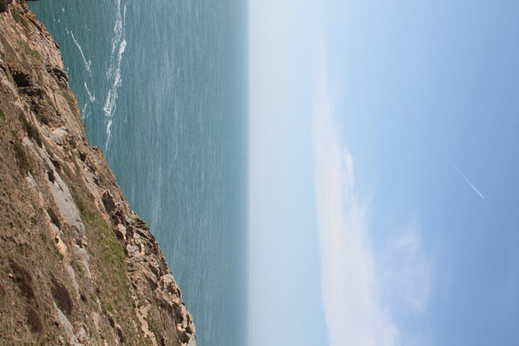
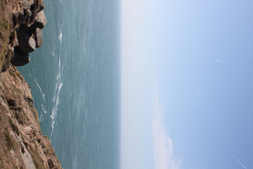
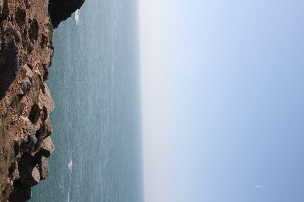
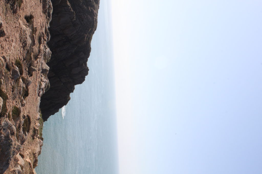
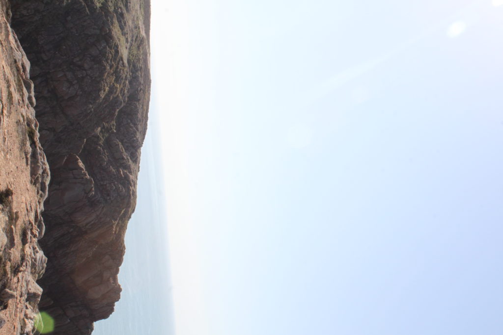
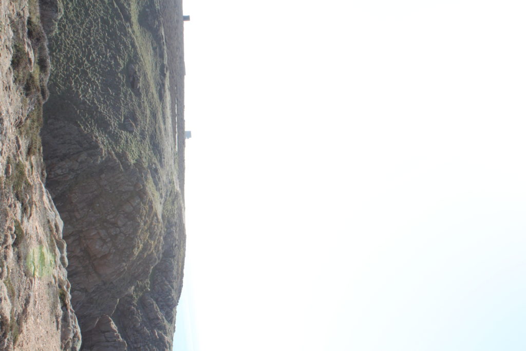
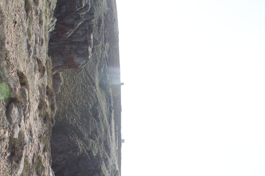
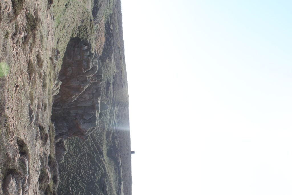
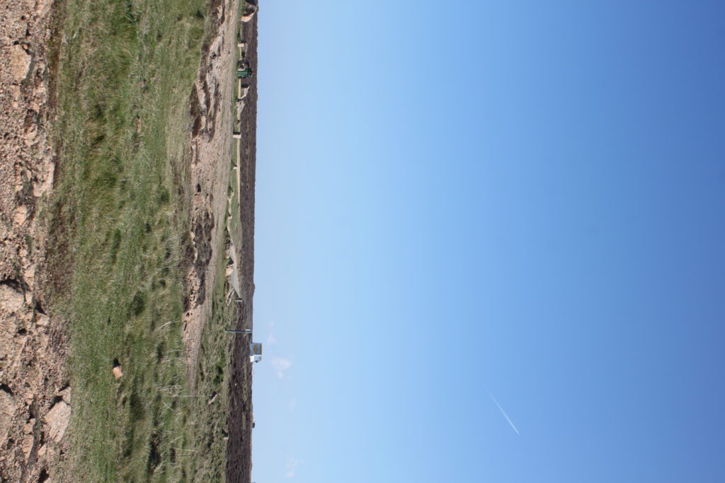
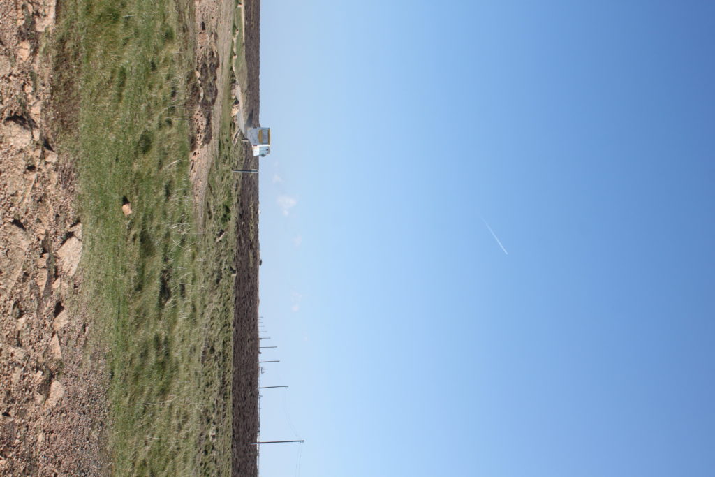
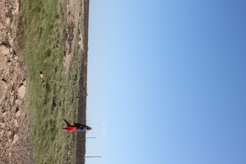

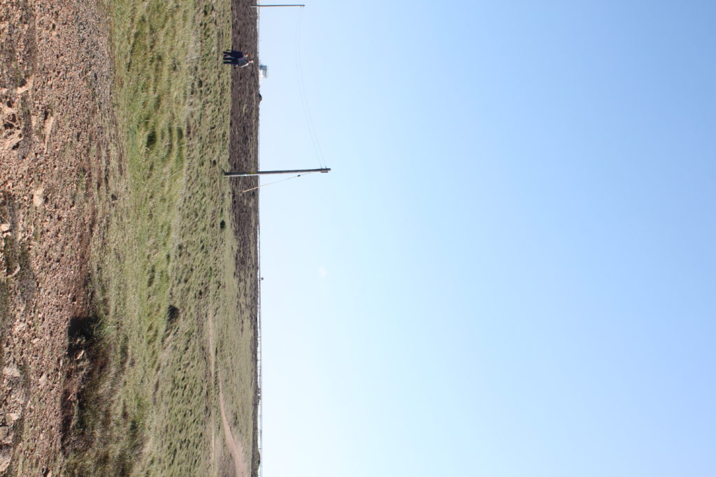
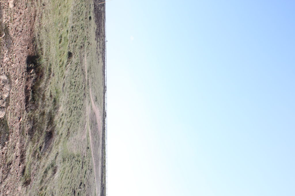

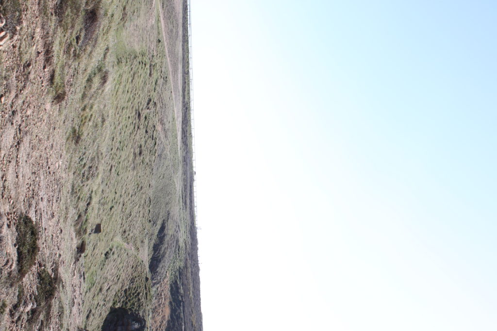
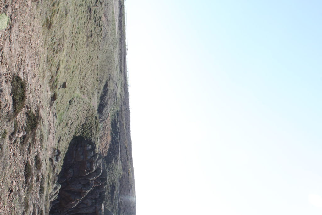
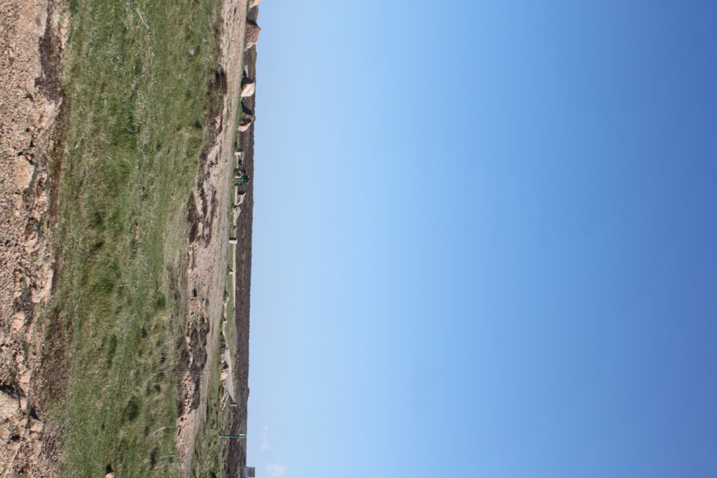
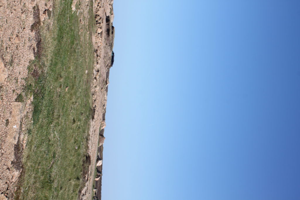
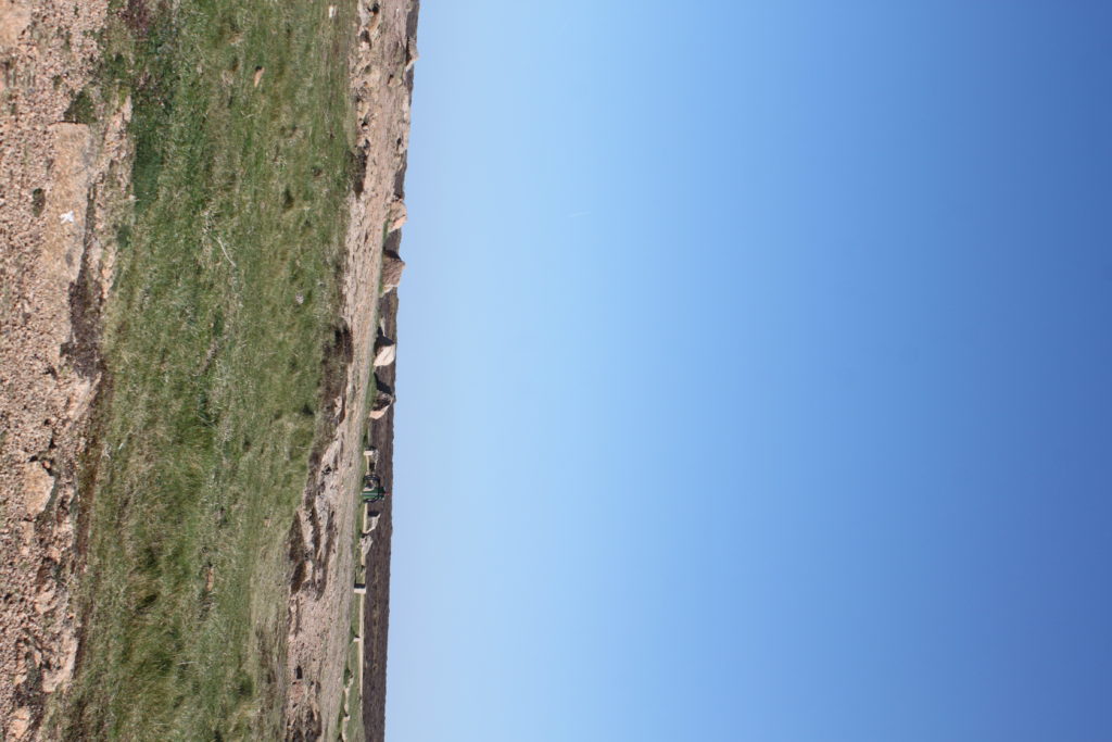
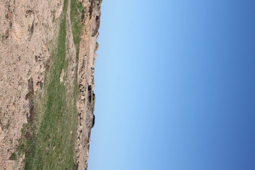

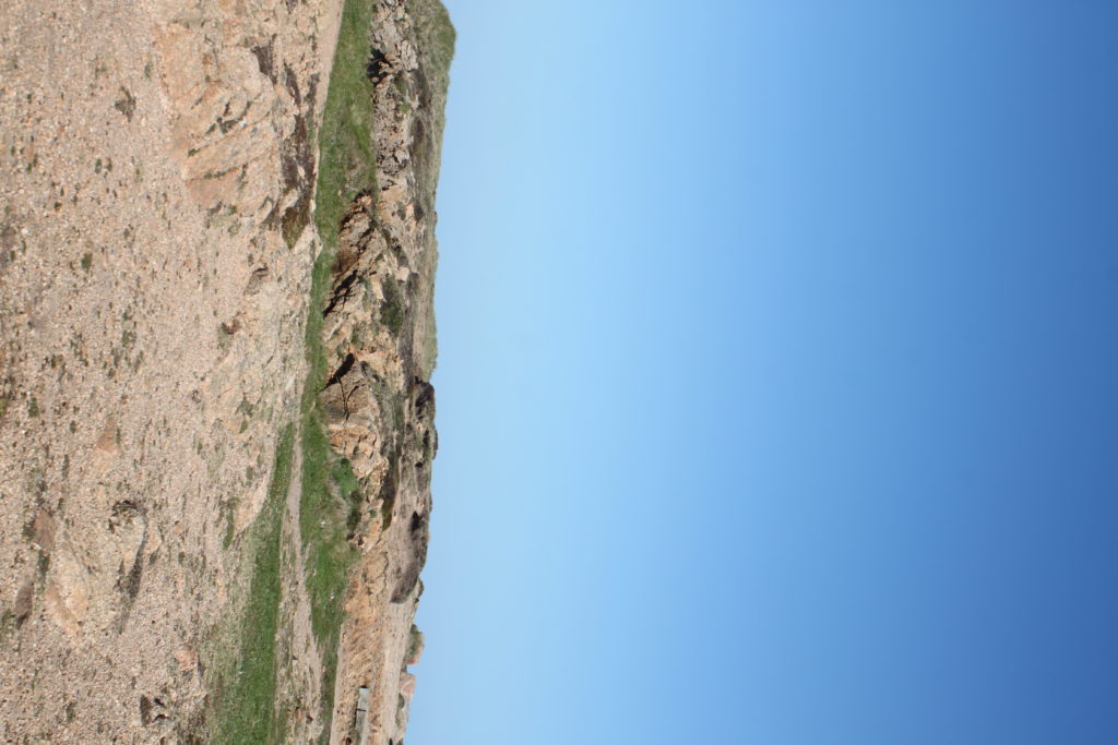
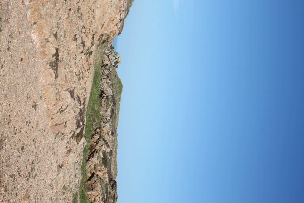
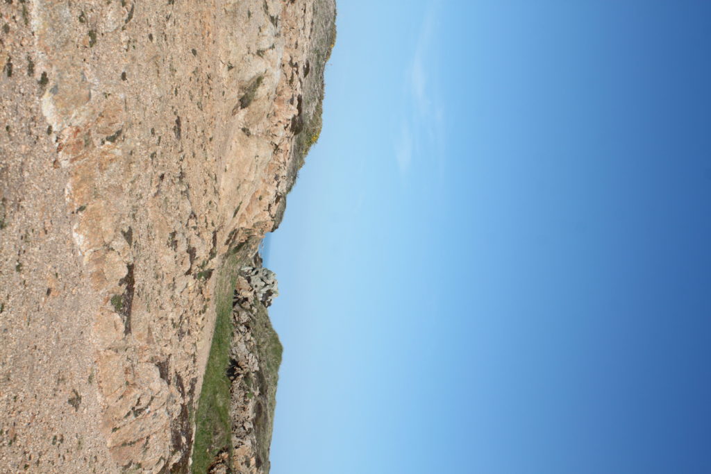
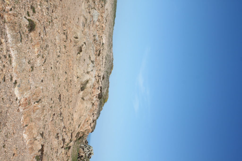
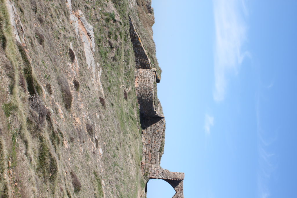
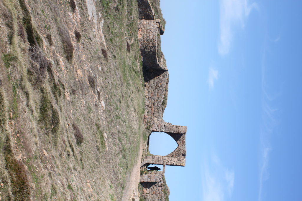

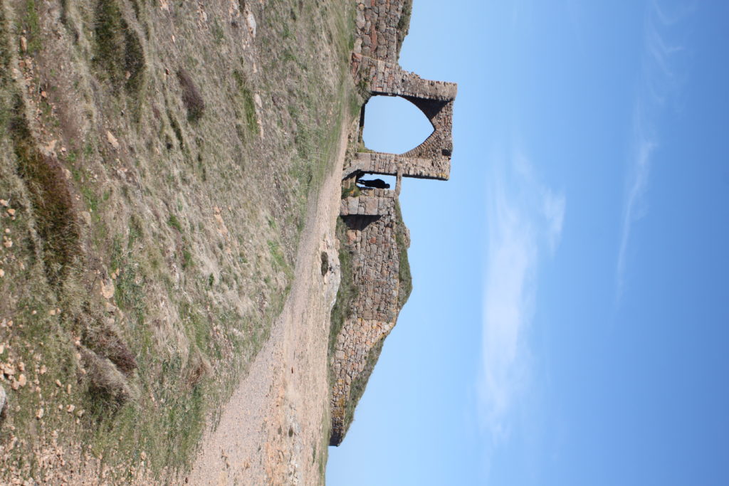
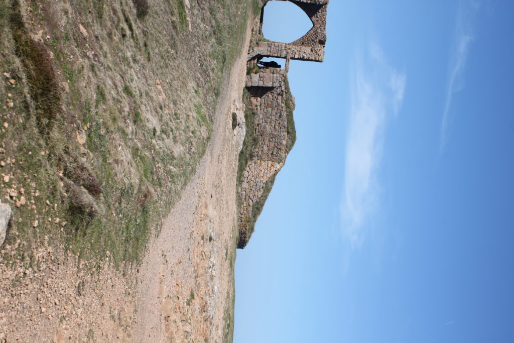

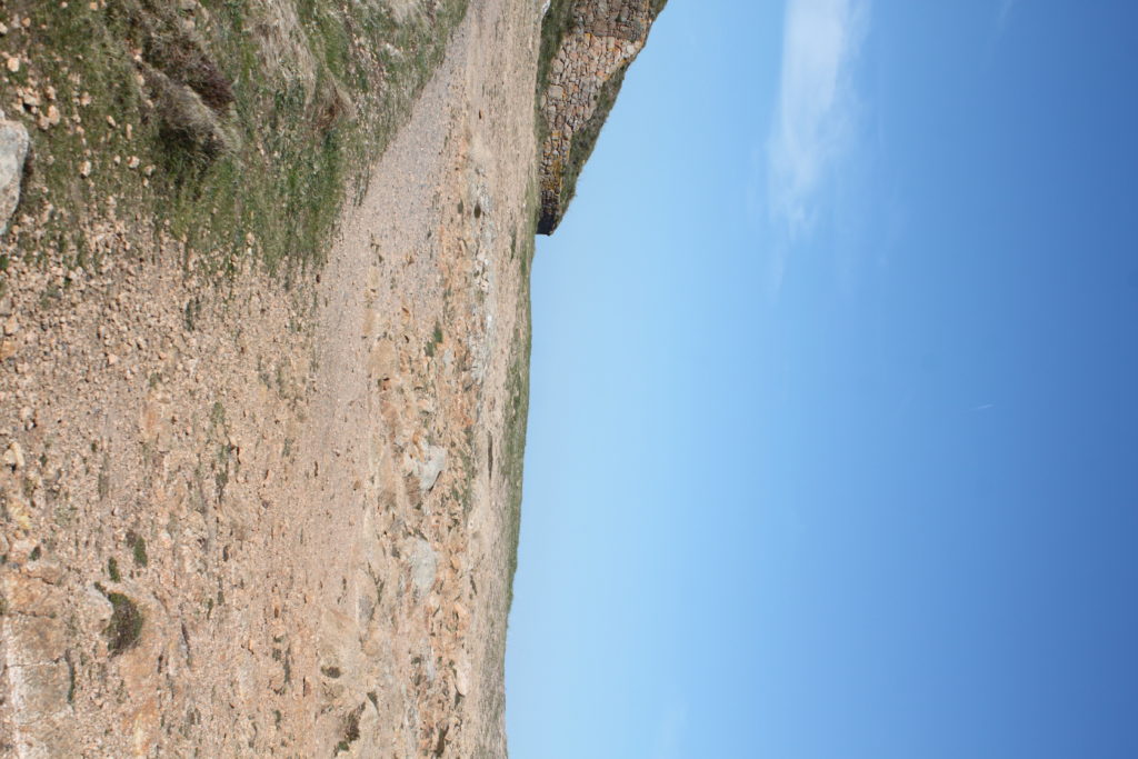
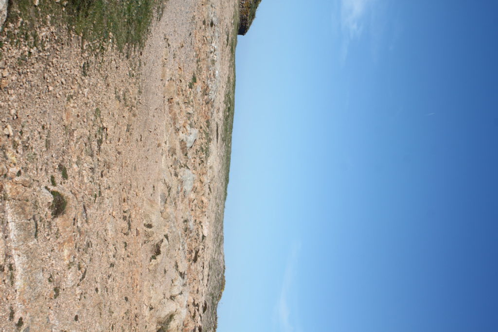
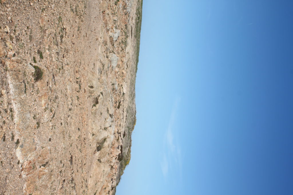
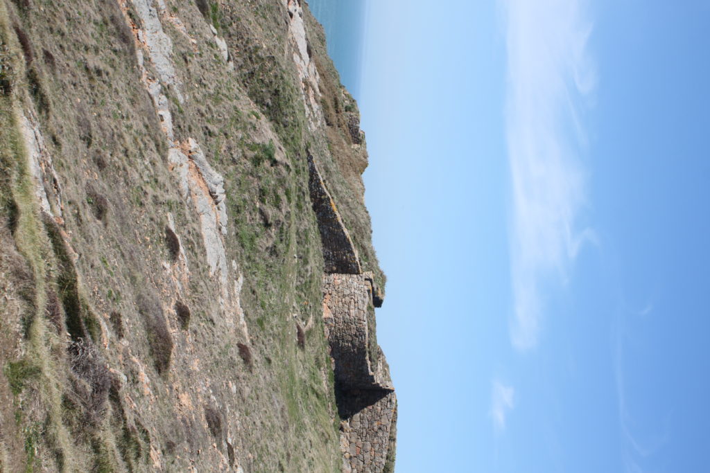
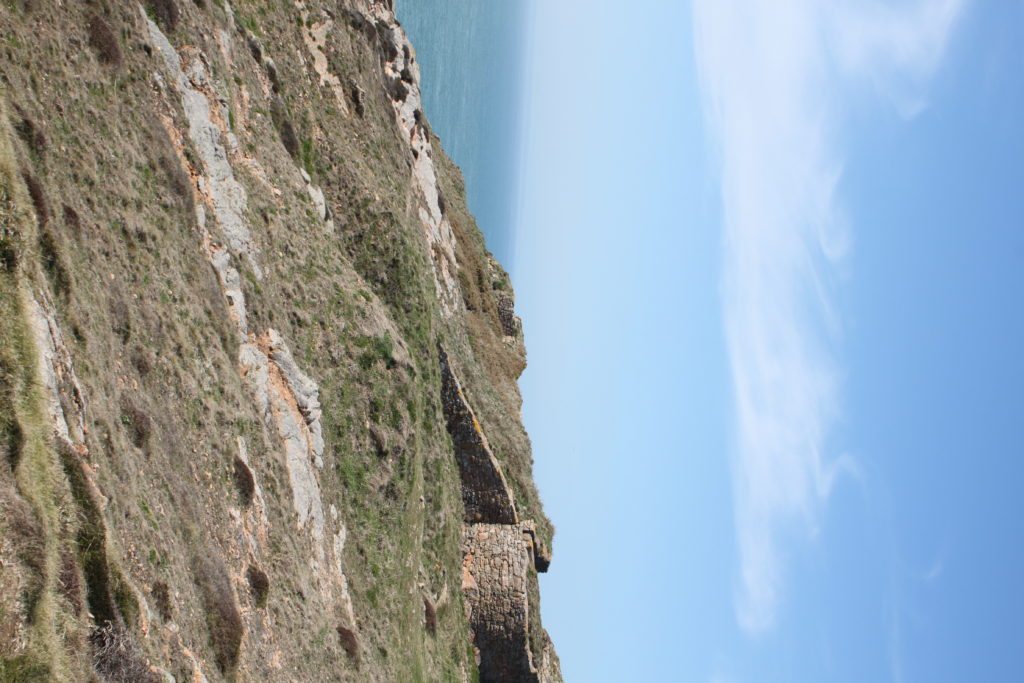
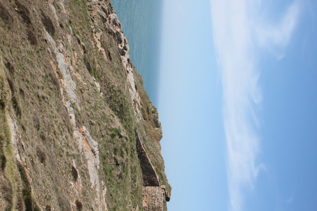
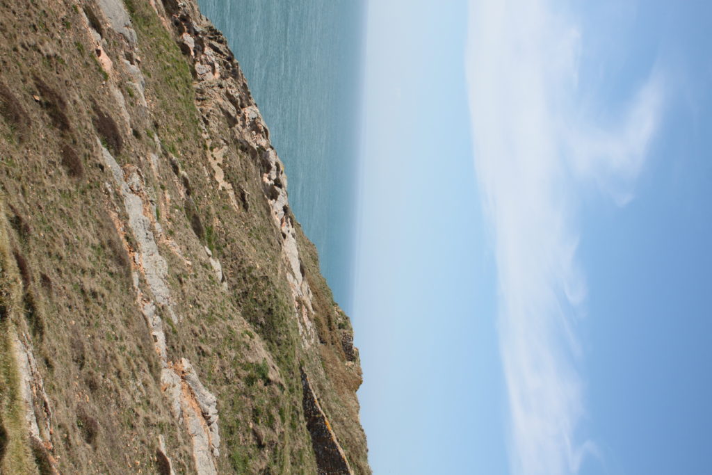
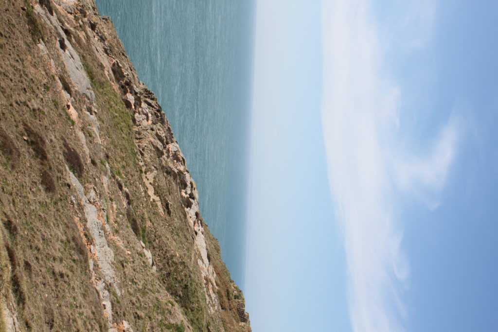
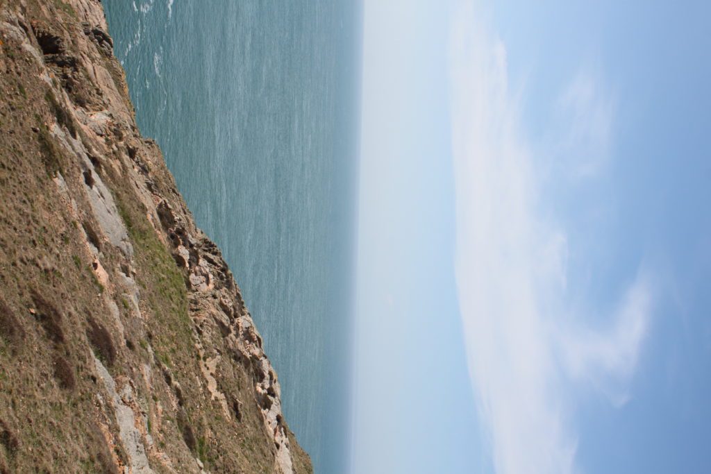
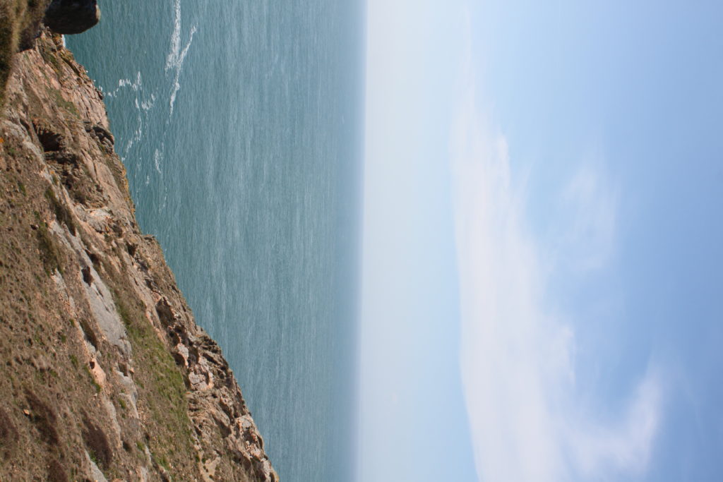

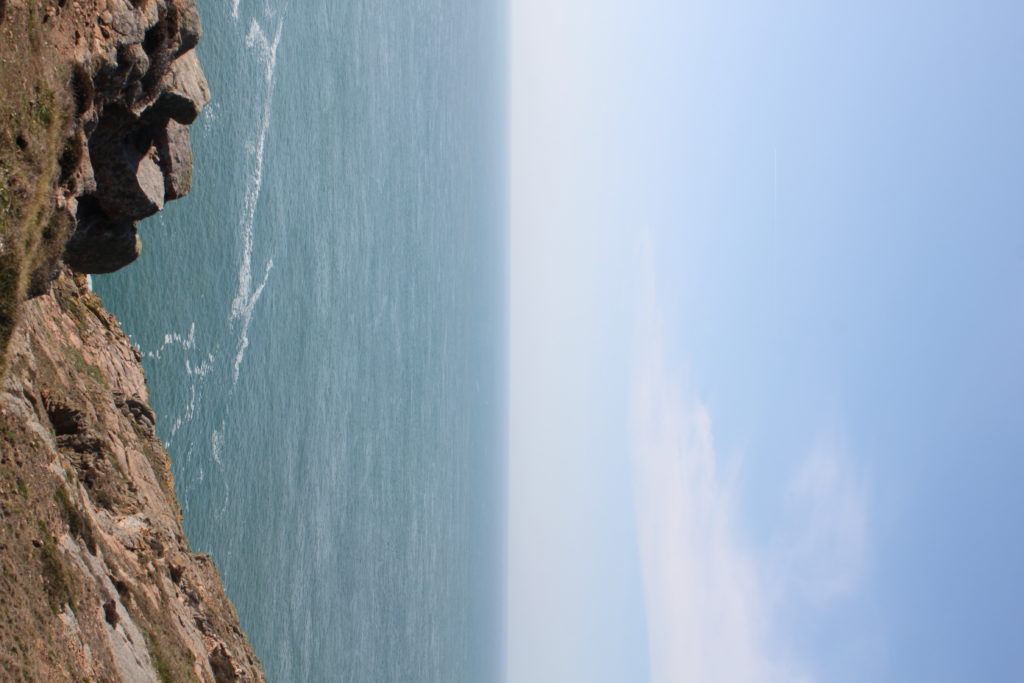
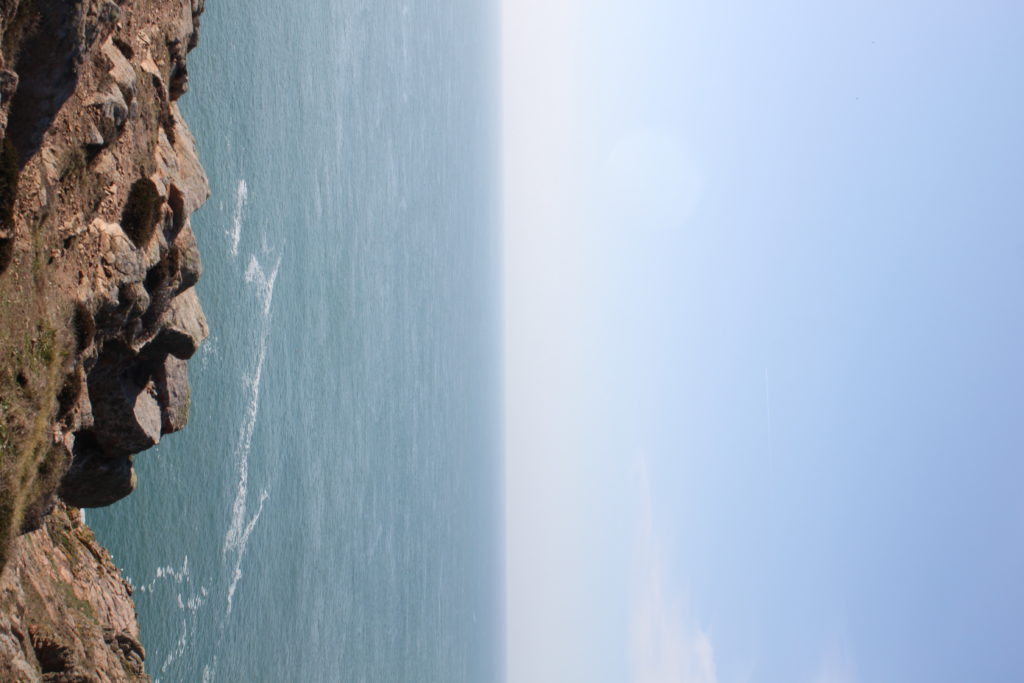
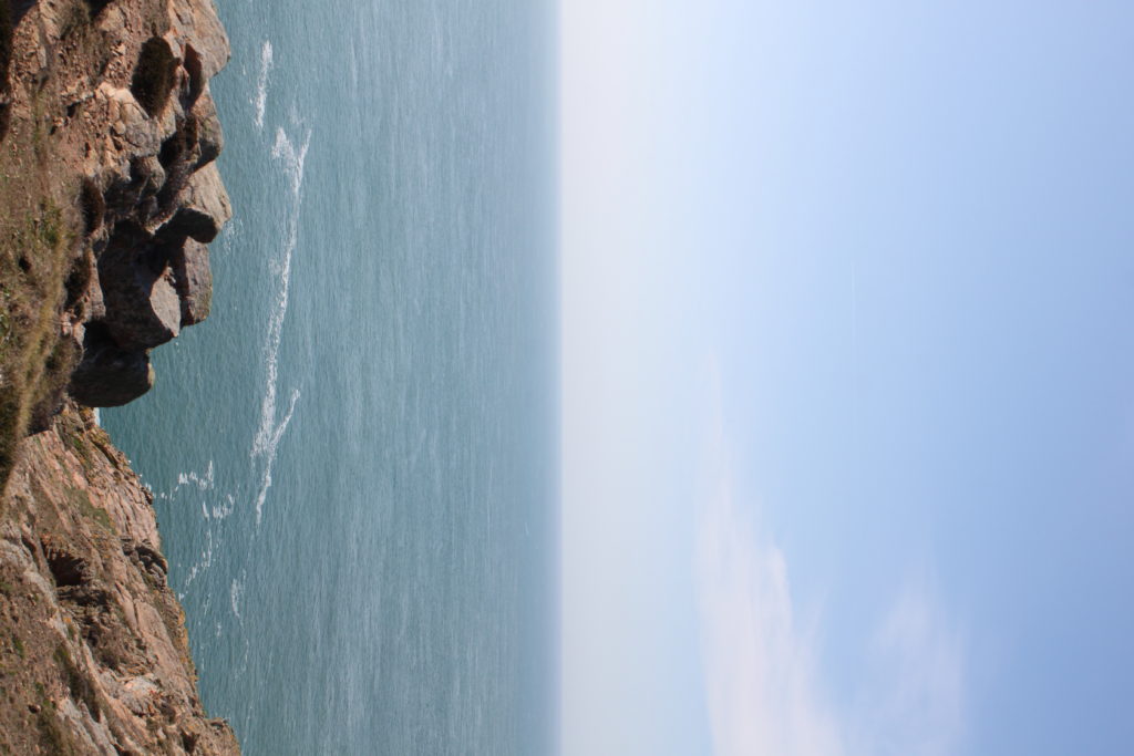
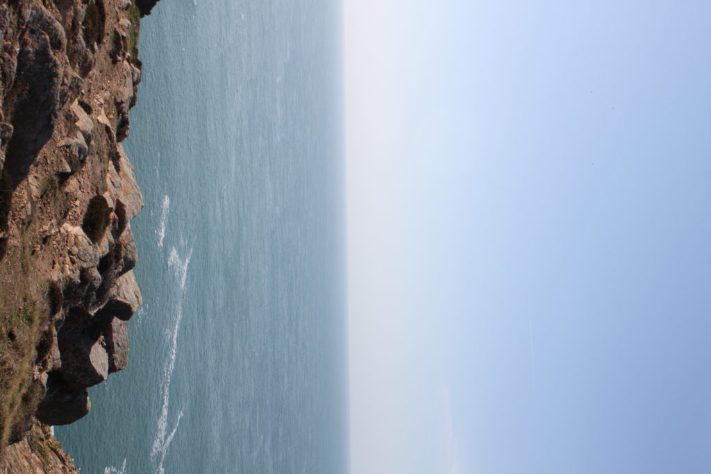
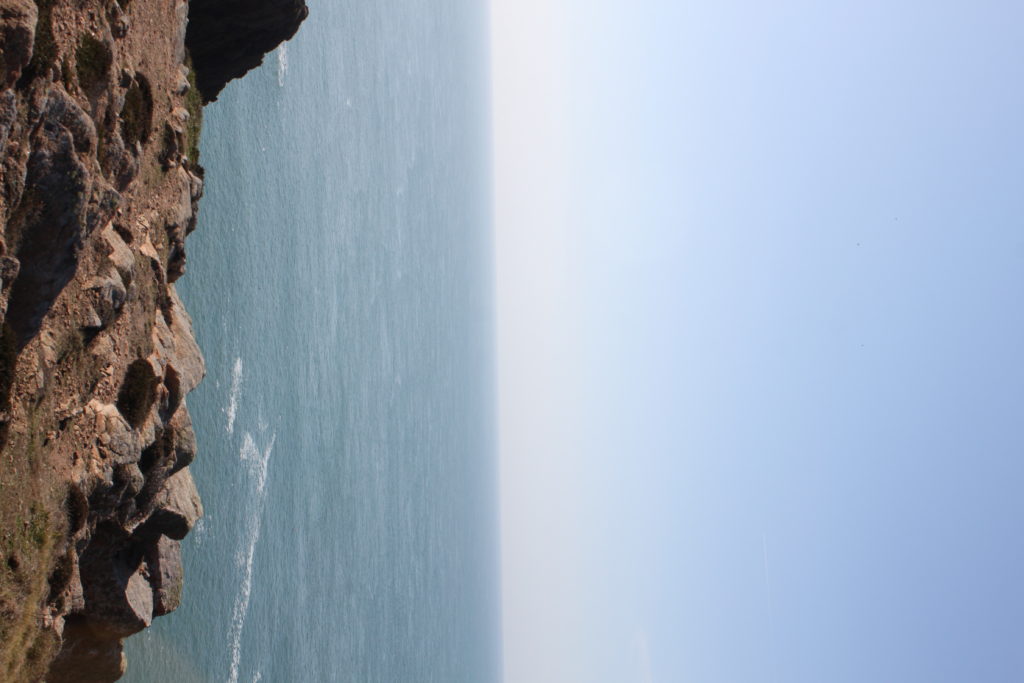

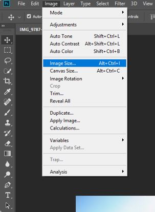
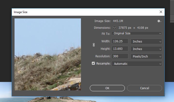
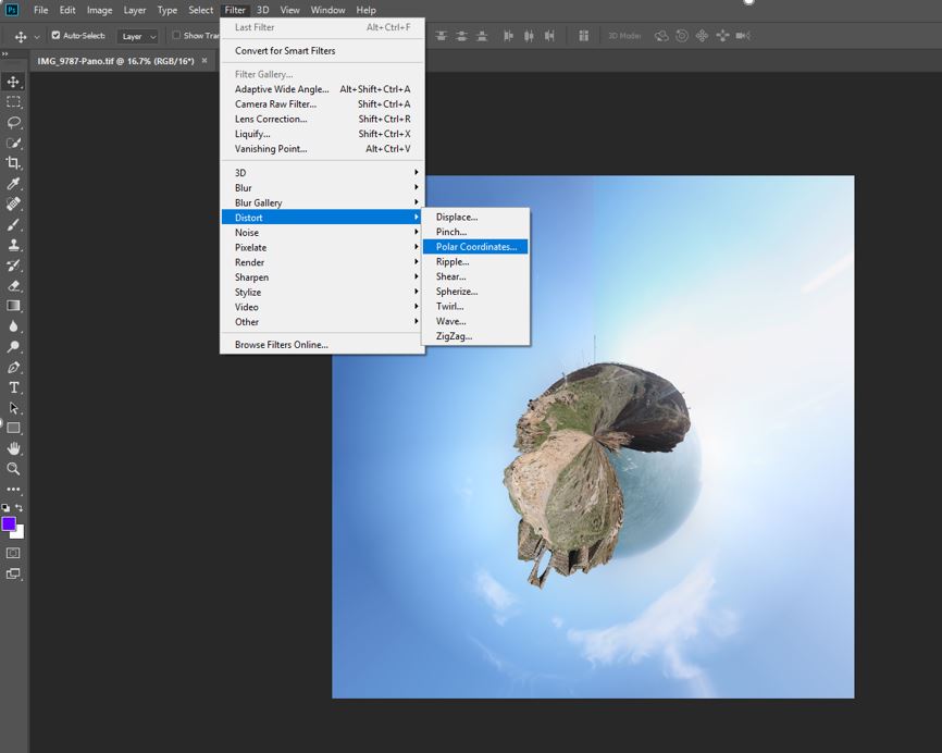
This is the step by step process of turning a panorama into a planet:
For this shoot I wanted to create a response to the works of Fontana as I really liked the simplicity created through his highly saturated images. What drew me to his imagery was his use of using the textures and patterns found in nature and man-made objects to create impressions of the landscape around him in a way which would not have usually been percieved. From this shoot I would aim to achieve a new style of photography which I could then go onto incorporate into possible future works especially the aspects of colours, something I don’t normally consider when doing shoots. To create the desired effect I would probably have to manually increase the contrast and saturation within my settings of the camera in order to produce the outcome for the photos I would like. Using Fontana as my main source of inspiration I decided to have a look at some of his works which I found to be of particular interest:
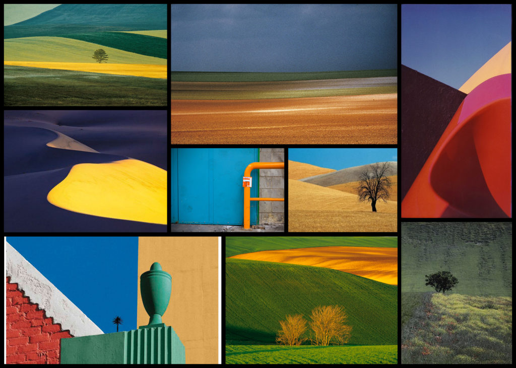
Once I had gone over a few of Fontana’s imagery I decided it was nearly time to go ahead with the shoot itself. However before doing so I wanted to create a mind-map for the goals when taking photographs, by doing so for me it would reduce wasted time as it would allow me to quickly identify what I wanted to capture in order to achieve the results needed. Not only would this stop wasted time but allow me longer to focus on the things that I may not have realised if doing the shoot there and then. Here are some of my ideas:
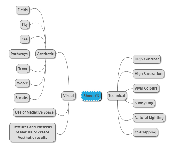
Once I had completed my mind-map I decided it was time to actually go ahead with the shoot. To do this I wanted to explore the area North of Jersey as this area had the highest number of agriculture out of Jersey as it would provide me with the subjects needed to achieve the aims of the shoot. Using my mind-map as my primary source of inspiration and ideas I explored the footpaths which surrounded the North coast looking at how the blue sky could contrast the hills. Here are the results of my shoot:
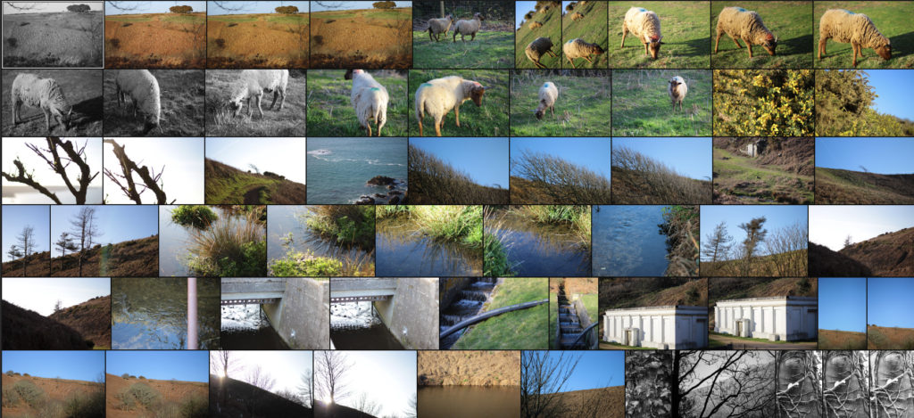
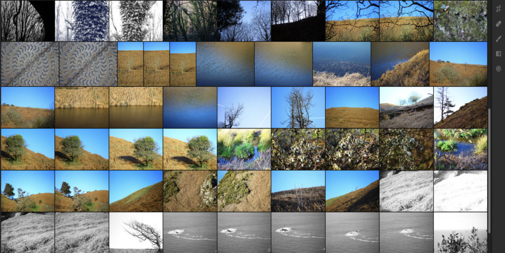

Once I had completed the shoot I then wanted to go onto select out ten images that I thought were most effective and related most to not only the topic title of textures and patterns but also saturation. By doing this it would allow me to reflect on each image and make in easier to choose out a selection of five from that so that I could later on pick one overall image that I thought best reflected my intentions for the shoot. Here is my selection for the ten images I thought were best suited to the topic of saturation regarding textures and patterns:


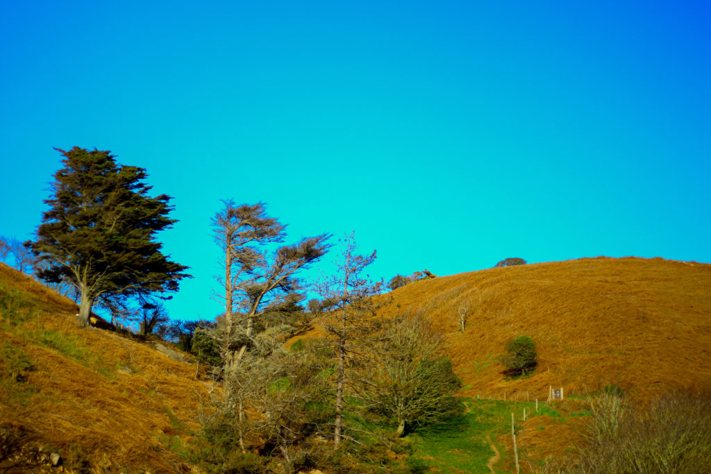


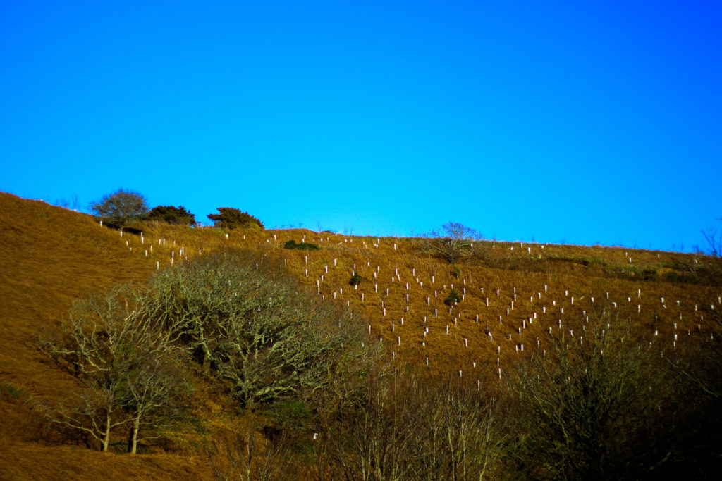
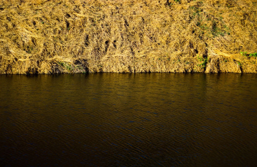


After I had selected the ten images that I thought worked best regarding the topic title I decided to then whittle them back down to five images, by doing this it would allow me to analyse each image in more depth looking at things such as the visual and technical aspect of the pieces that I thought made them work well and link back towards the title of saturation and make my overall choice of best image easier. Here is my selection of the five best images from my shoot:

I selected this image because I loved how the orange contrasted the blue sky with the tree breaking up the dominant two colours. What I liked about this was how the two main colours compliment each other, however to stop both colours from becoming to eye-sore to the viewer the use of a lighter shaded tree and its shadow provide us with an implicit focus to what we almost instantly draw our eyes to. I also really liked the symmetry present within the photo as the skyline and pathway with the tree line up against each other as it presented the viewers with an overall sense of aestheticism. When looking over the image I found that it related well in response to saturation evident through the orange grass and the overly blue sky, this sense of other-worldly colour for me gives the viewer the impression of an over exaggerated landscape which has certainly been edited.

What I really loved about this image was the over use of blue to create the impression of an artificial sky, complimented by the patterns created from the tree branches I found that this worked well due to the overcast impression it paints on the photograph. For me I found that the use of the negative space taken up by the blue really brought the image together due to how it prevents the pattern of branches from completely covering the entire composition. The image itself relates well to saturation from how the use of an overly blue sky creates the impression of something to perfect to be true, with the photograph linking to texture and pattern through the branches which grow in random directions that produce a hige sense of aestheticism against the blue sky.

I chose this image because of how I loved the golden colours of the grass contrasted to the rippling water. For me this image represented two over exaggerated aspects of nature, especially as an island where we are surrounded by water presenting both the land and sea side by side in a sort of aesthetic and beautiful state creates the transition between the two as a natural mirror. I found that the gold presenting throughout the image as the main reason for choosing the photo due to it adding character to the water, reflecting the overlapping pattern of the grass as it grows. As a result of this I found that the two contrasting textures present in this image, being the rippling water and the overlapping grass as complimenting each other as one provides a more abstract representation for the other. The saturated golds in the piece also link it to the title through the coloured reflection that would not usually been seen by the everyday eye.

For me I selected this image because of its use of neutral space to create a more abstract impression of the landscape and whats in it. For me the tree against the blue sky was what brought the image together due to how it broke up the otherwise dull composition of the photo, what I found was how the messy texture of the grass completely contrasted the smooth matte texture of the sky which sorts of juxtaposes it. I liked how the composition that took into consideration the angle of the hill made use of the sky and contrasting orange grass surrounding it so that it would not become too overpowering. Overall I find this image did reference well regarding the topic of saturation, however looking at texture and pattern it did not serve a great load towards possible patterns except through grass.

Finally I selected this image because of the natural gradient created by the sun, sky and grass to produce this sort of golden natural film over the waters surface. For me this piece worked well because of how no real use of saturation editing was used due to how vibrant the surface of the water was on that sunny day with only a bit of cropping being needed. I really liked how the composition of the piece was based around a fifty fifty colour wise, with the golds taking the top and the blues the bottom, because of this for me the piece was well balanced with no aspect overpowering the other and creating an aesthetic product. However when looking over the image I did not find it had a great deal to do with saturation due to there being no actual reflection of a saturated landscape.
After looking over the visual, technical and conceptual aspects of the five selected images I was happy enough to come to a conclusion regarding which image would be best to reflect my intentions around saturated photography whilst also looking at the title textures and patterns. Here is my final decision towards the topic of saturation:
Final Image:

I chose this image as my final photograph to sum up my chosen topic because of the contrasting sides to the landscape it presents using highly saturated colours. For me the dominant use of yellows and golds in the photo bring about great aestheticism whilst highlighting how areas of our environment provide us with varying textures and pattern (such as ripples in the water and the overlapping of grass), something that the everyday eye would not take in unless looked upon carefully. Symmetry played a part in this decision due to how it presented the image as visually pleasing, stopping both the water and land from becoming too overpowering.
This shoot will be at Noirmont point on Jersey’s south coast. I will fly a drone over a few specific locations on and around that headland. The locations I would like to shoot are Batterie Lothringen including the MP1 which covers the majority of the Noirmont headland, the Noirmont Point lighthouse and Janvrin’s Tomb in Portelet bay.


The satellite image below shows the locations I’d like to shoot, each colour coded by a coloured circle.
Green – Janvrin’s Tomb
Blue – Gun Point 1
Black – Gun Point 2
Orange – MP1 Tower + Range Finder
Yellow – Lighthouse
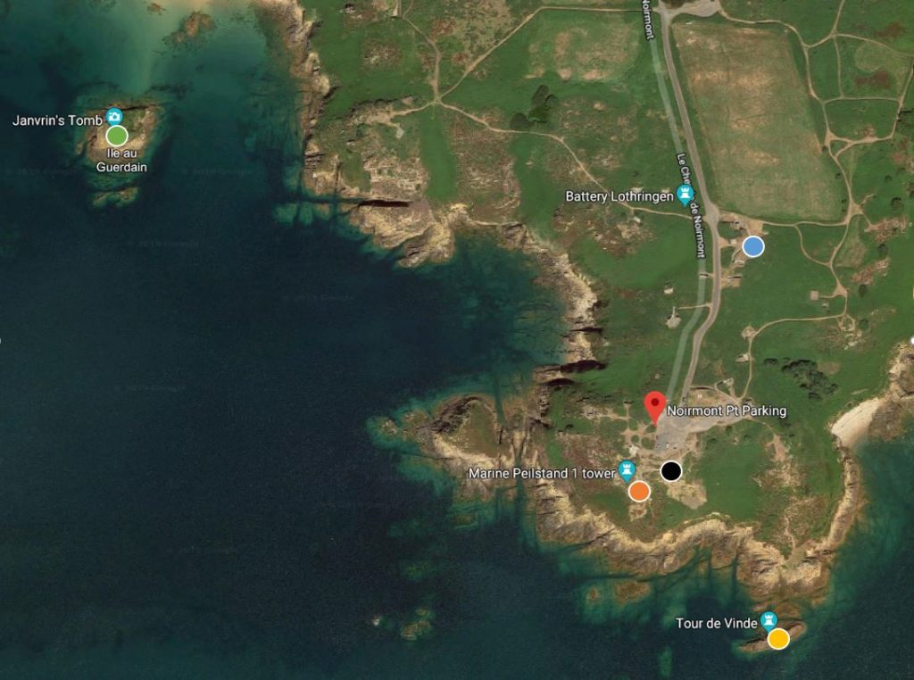
The aim of the shoot is to get top down images of locations that look like circles from above, I used satellite imagery to find the locations and also reviewed air laws and local airspace regulations to develop a plan and ensure the flight is within all regulations. The flight to Janvrin’s tomb takes the drone to it’s maximum legal distance but does not breach it, the location is just outside the Jersey Airport ATZ (Air Traffic Zone) yet we will still file a flightplan to let ATC (Air Traffic Control) know we are flying, giving location, time airborne, height and time down.
In order to develop my exploring of ‘Variance and Similarity’ further I have further shoots that I plan on producing so that I can add to the material that I have to work with as well as adding to possible experiments that I can do with my work.
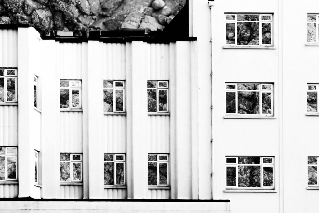
In this post I am showing the outcomes of manipulating both my shoots of building faces and granite faces. Previously I have experimented with removing parts of the building face to reveal other buildings behind it in order to create contrast between the two and to show the similarities and differences between buildings. This experiment draws inspiration from that as I found that it can be quite effective when I remove the natural frames from the photographs to give an insight into the background photograph. I have used this approach when experimenting with integrating the building and granite photographs together – I photoshopped out all windows of the building face in the foreground to reveal the texture and natural colours of the granite in the background. I experimented with presenting the granite photographs in black and white but I found that the outcome was too boring, whereas when the granite photographs were in colour it would bring the photograph to life by contrasting with the high-contrast black and white building face, which would further bring out the colours of the rock. The idea behind these experiments comes from the fact that a lot of houses have granite lying under the decoration and so this represents peeling back the layers of plaster and paint to reveal the base structure.
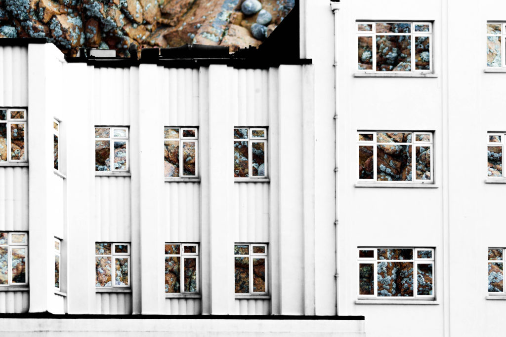

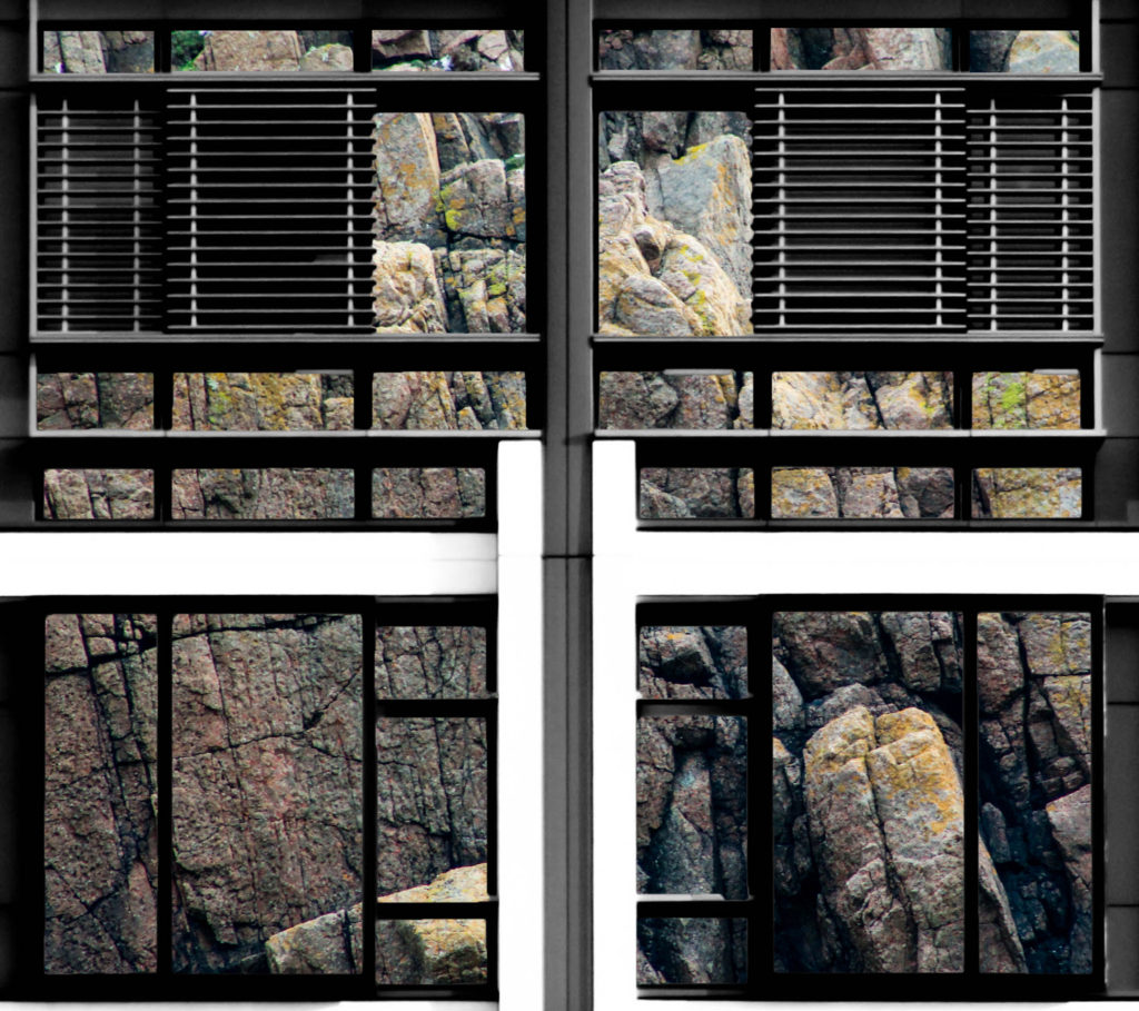
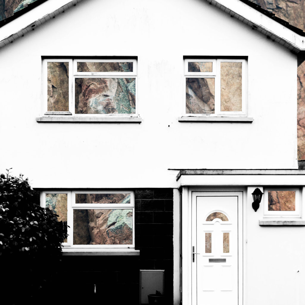
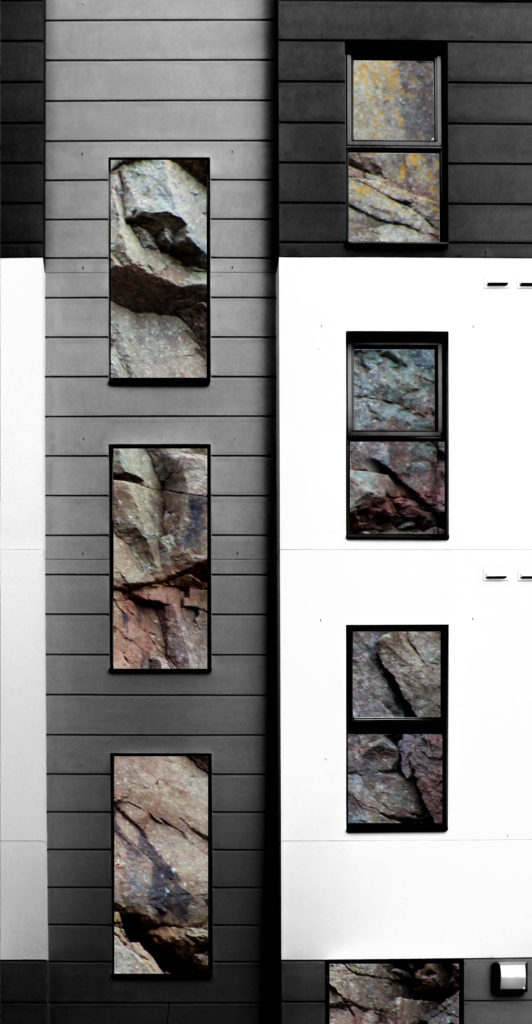
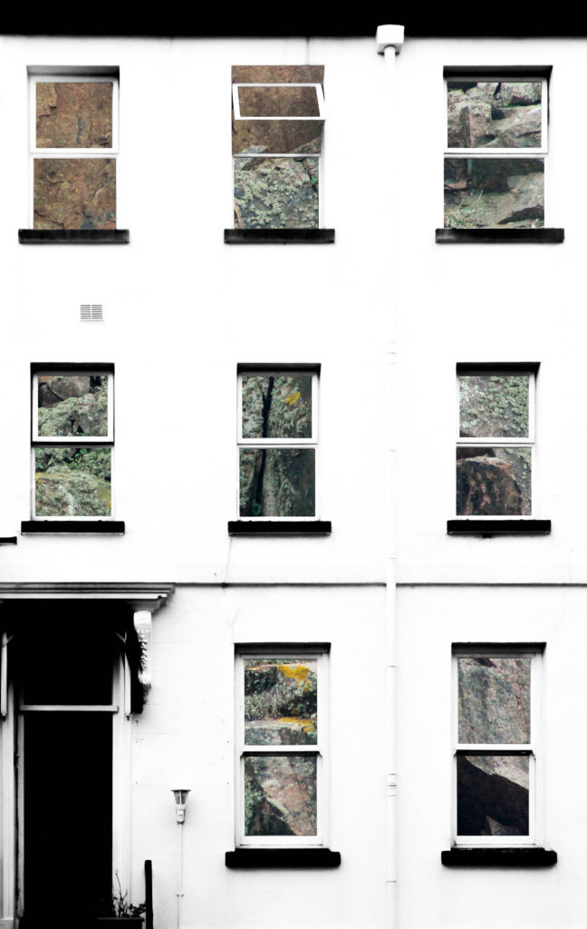

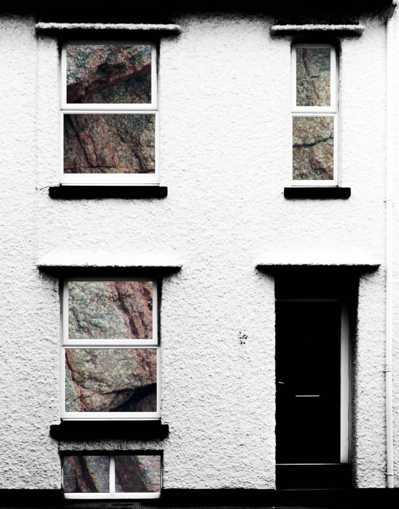

In this composition, natural day lighting was used. Due to the nature of the house face, the natural light only brought out so many shadows and shapes within it meaning that there is only a simple face to it, which contrasts to the rock face in the background which has all sorts of shapes, tones and shadows brought out from the natural lighting. I used a 300mm lens to capture the photograph of the rock to ensure that I could zoom in enough to create the abstract composition as I intended to. I used a deep depth of field as well in order to ensure that everything was sharp and in focus to ensure that the resulting photograph was as of high a quality as possible.
I used an ISO of 800, an aperture of f/8.0 and a shutter speed of 1/500 when taking the rock photographs. The ISO of 800 is fairly high but ensures that the photograph is correctly exposed along with the quick shutter speed of 1/500 that allows the photograph to be sharp and focused when the camera is zoomed in to such an extent. The depth of field ensures that the photograph is fully in focus and is clear. For capturing the building face I only used a shutter speed of 1/100 and an ISO of 100. These camera settings have allowed me to create contrast between the two photographs incorporated into the composition.
The photograph of the house face has been kept in black and white whereas the rock photograph in the background has been kept in colour to create a contrast between the two photographs and to emphasise the natural colours and tones within the rock face. There is also a wide tonal range within the composition due to the editing to create high contrast and to bring out the shadows in both photographs. There is a strong sense of texture within the composition due to the sharp angles and shapes within the rock face, this adds to the aesthetic qualities of the composition. There is also a sense of 3D in the composition for the same reasons – the jagged rock face contrasts with the flat face of the house in the foreground. The unpredictable structure of the rock shapes also contrasts greatly with the house face structure which has been carefully designed and built to meet form and function requirements.
The idea behind these experiments comes from the fact that a lot of houses have granite lying under the decoration and so this represents peeling back the layers of plaster and paint to reveal the base structure. The house face was originally photographed as part of a shoot to show the variance and similarities between houses within a certain geographic area, but I have realised that I can achieve the aim of that shoot whilst being able to add another element of contrast through contrasting the man-made building structures with the natural granite structures.
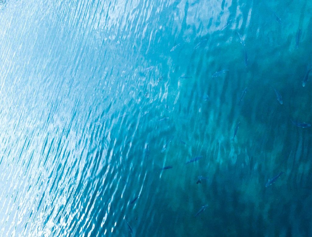
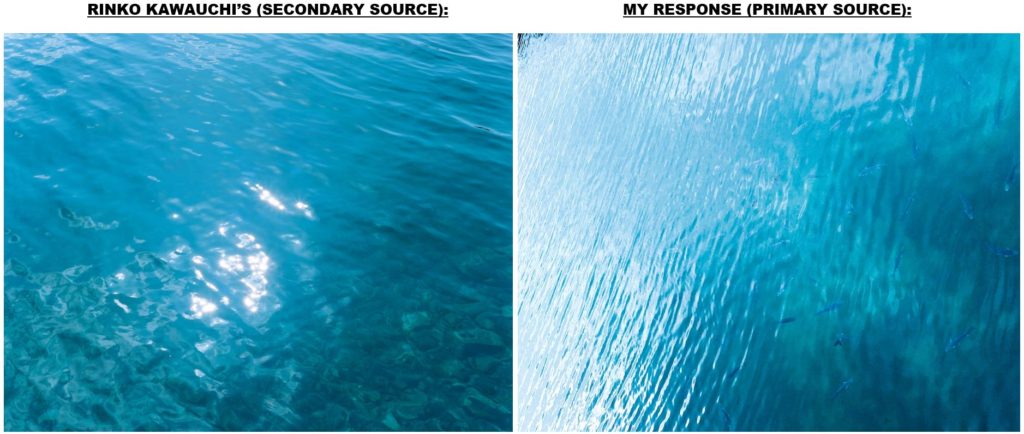
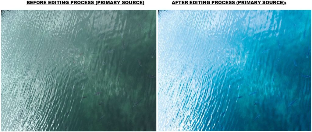
My 4th photographic shoot has been based around ‘water’. I categorized nature into 4 sections I would focus on photographing, water being one of them. Before my shoot, I have looked at photographers who incorporate water photography into their work, including Hiroshi Sugimoto, and Rinko Kawauchi. Hiroshi specializes in ‘seascapes’, an area of work focusing on the distinct horizon between sea and sky. On the other hand, Rinko looks at the sublime, including photographs of the water in her large collection of work. She uses the element of light to her advantage, something I have taken inspiration of in my photograph pictured below. I have captured the light hitting the water and glistening in the reflection. I photographed and video-captured this to show the movement of light and include motion in my imagery. I believe these primary sources represent the beauty of how light and water come together to explore the sublime.
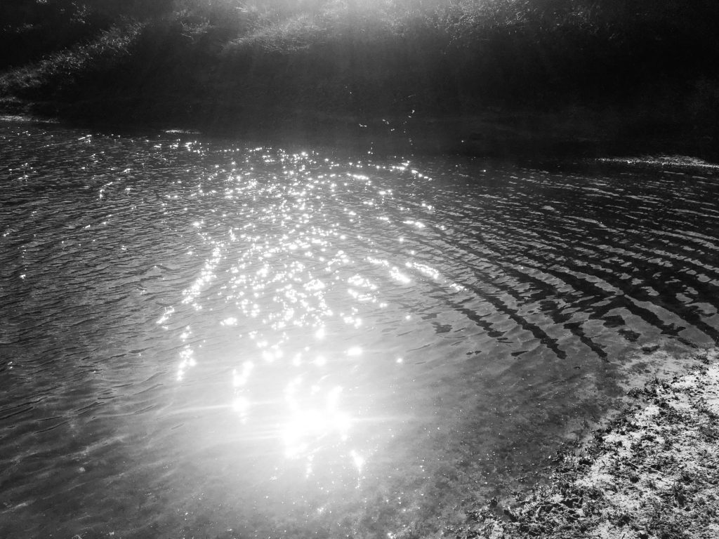
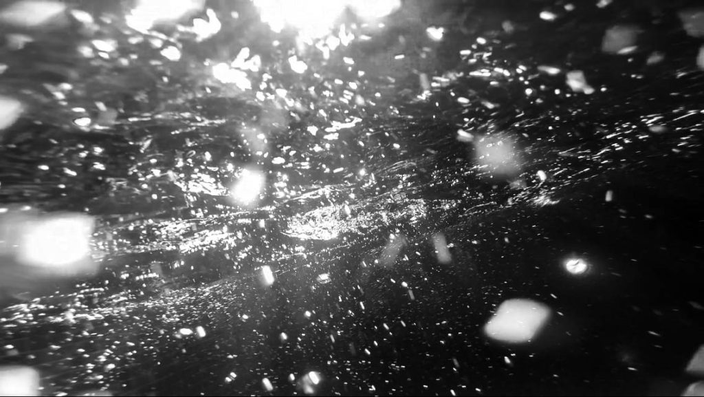
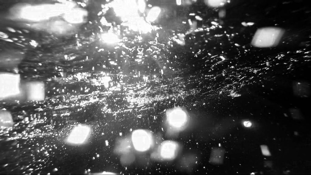
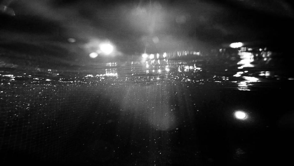
For the second part of my photographic study on water, I have looked at the source of habitat it provides in the environment to wildlife. As I am looking at variation of nature for my project, I thought it would be an interesting angle to look at the various ways in which water can be photographed; one way being as an element, another as a habitat and another as a form of patterns and abstraction.
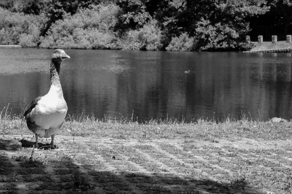
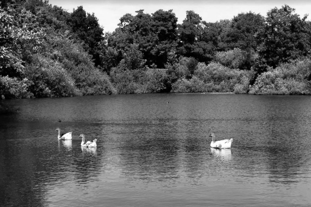
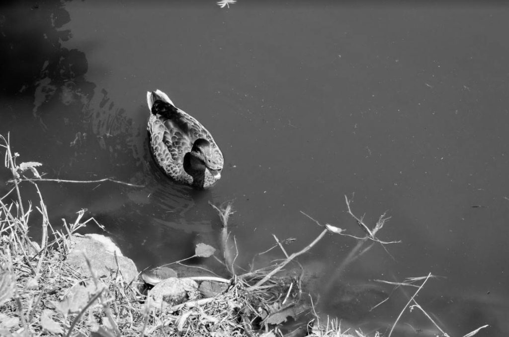
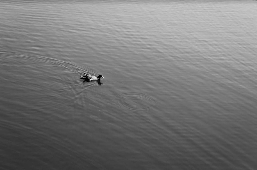
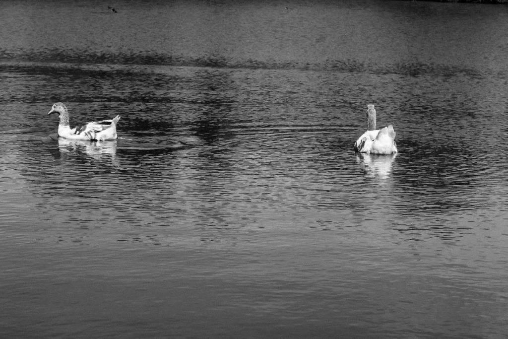
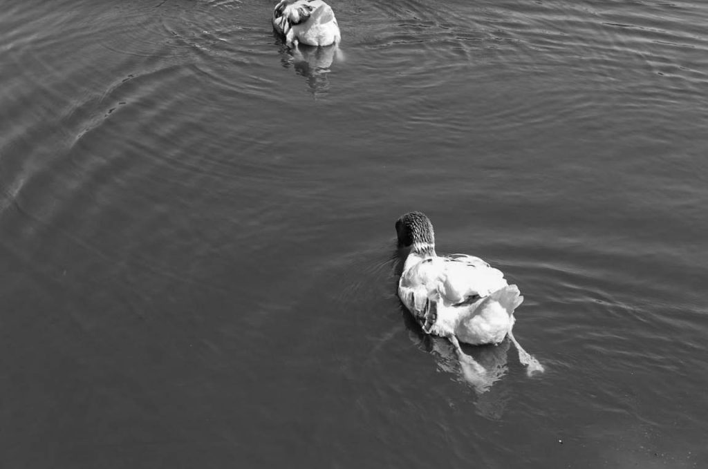
My final area of study is based around the patterns, form and abstract nature of water. The variety of images I have taken of water in the sea and reservoirs, show the interesting patterns, and shapes within the water. I have edited the photos into black and white to show resembelance to Sugimoto’s work, as well as highlighting the varying shades and tonal contrasts as a result of different white balance and lighting.
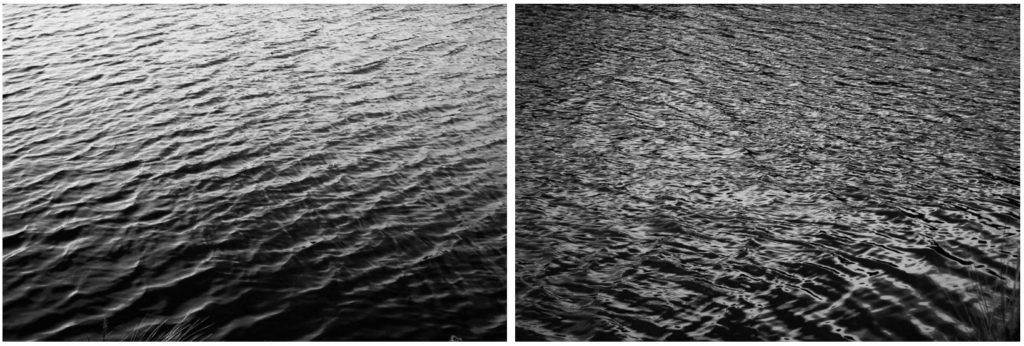
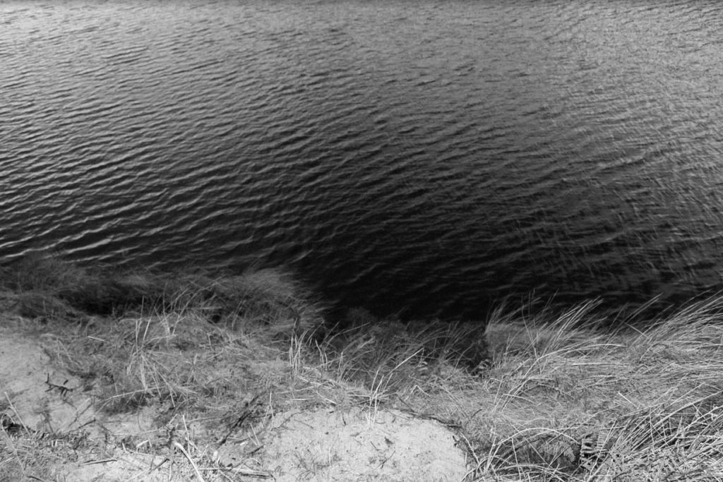
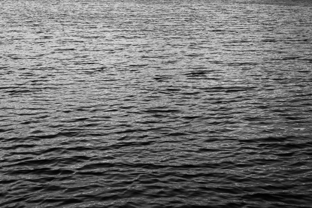
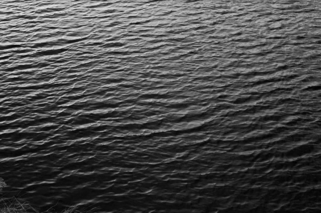
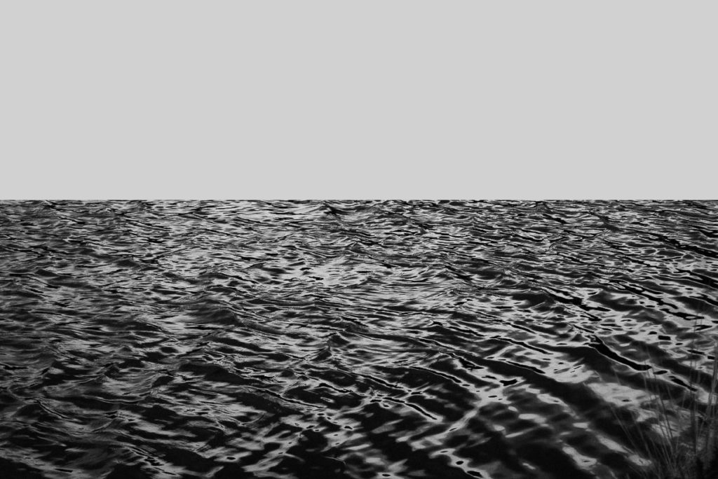
Using one of my photographs, I have created an edit in response to the work of Hiroshi Sugimoto’s. Like Hiroshi does with his photographs, I have separated the horizon from the sea with a distinct landscape line. Using Photoshop CC, I have filled in the top half of the photo with a pale grey colour to contrast with the black and white water.
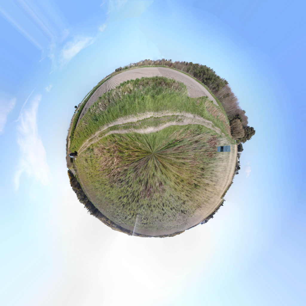
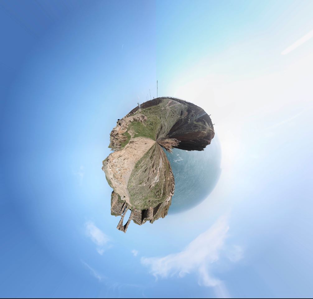
The above image was a collection of over 50 images taken in portrait covering 360 degrees. I like how smooth this planet came to be and I think this is a very successful attempt at a Tiny Planet as an experiment. I plan to carry on a do a few more. This one in particular was at Les Landes in the fields of St Ouen, this captures the calm and peaceful environment of life in the West. My only dislike is the distortion in the middle however I do not thing there is anything I can do about that.

Again, the above image was a collection of over 50 images taken in portrait covering 360 degrees just like the Les Landes planet. This one was taken on the cliffs at Grosnez where you can see the castle. I would not really call this one particularly successful. Yes it is a tiny planet and it did what I wanted it to do however, due to the nature of the location and subject matter, the planet comes across as being very squished and distorted and makes the subject difficult to recognize and the planet looks very strange and I do not believe it captures the nature of the area.
In conclusion, I think the Les Landes planet was much better than the Grosnez one because I think being on cliffs/by the sea on the Grosnez planet stops the planet being smooth and more circular and makes the image look a bit messy and too distorted for my liking.


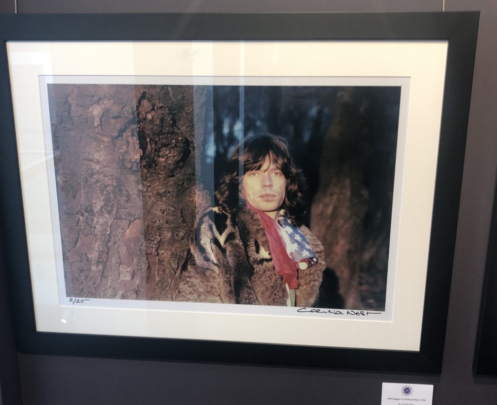
The CCA Gallery was an exhibition by Mike McCartney, Rupert Truman, and Carinthia West. The exhibition showed a range of alternative album covers for artists in the 60’s, such as Pink Floyd, as well as giving an insight into the lives of other 60’s icons, including Mick Jagger. The gallery had a documentative approach in the portrait styles, as seen in the photo of Mick Jagger
One photo which caught my attention was the Mick Jagger ‘double exposure in the tube’ piece by Corinthia West. I think this appeals to me due to the work that I have been experimenting with throughout my ‘Variance and Similarities’ project – I have looked a lot at the use of double exposure and layering photographs over eachother to create a disorientating effect or to add an element of excitement to a typically boring photograph.
Although liking this piece by West, the majority of the west of her work didn’t appeal to me as they were all plain and documentary-style portraits which did not have much to them other than the fact that the subjects were considered icons. As can be seen on the right photograph, her portrait of Mick Jagger is simply him stood next to a tree looking blankly at the camera – there is nothing to catch the eye or add an element of interest to it.
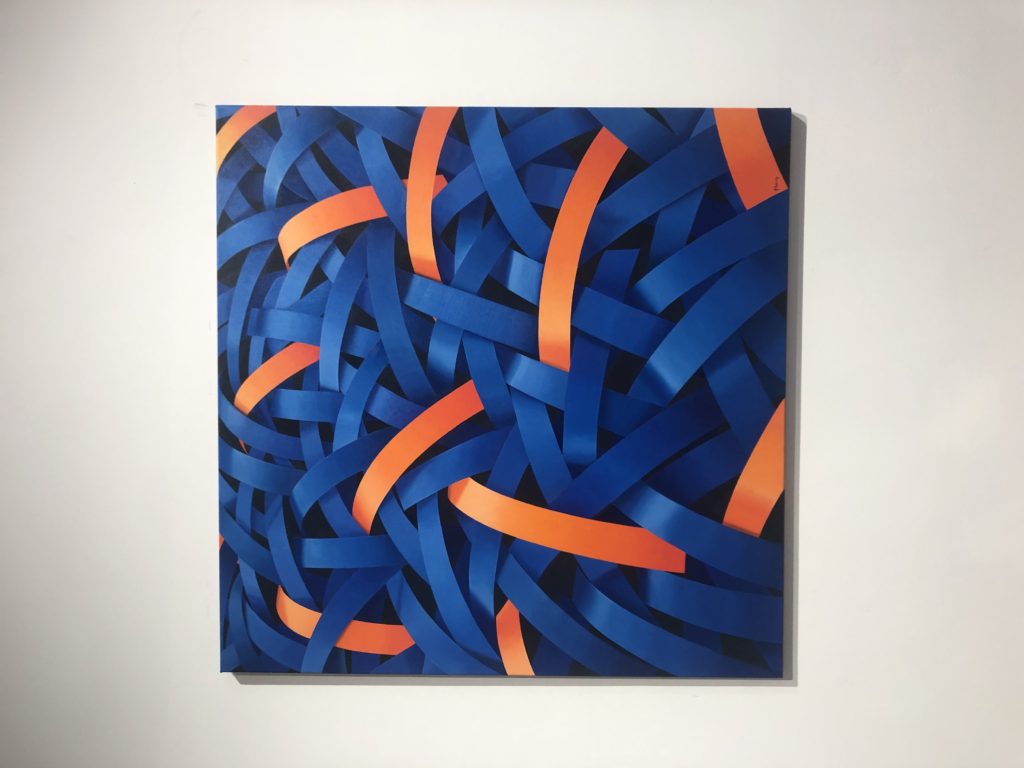
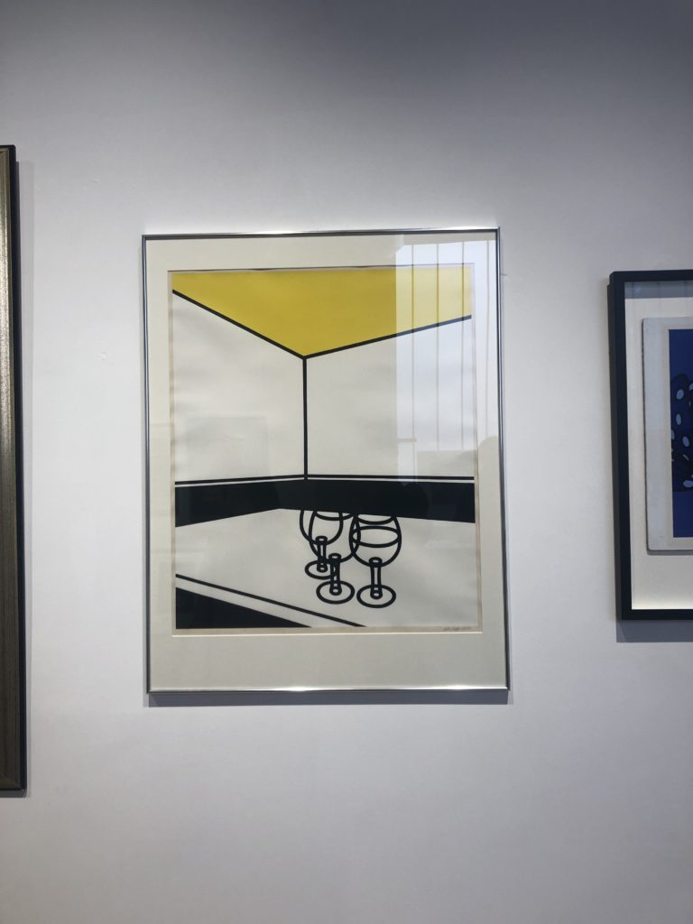
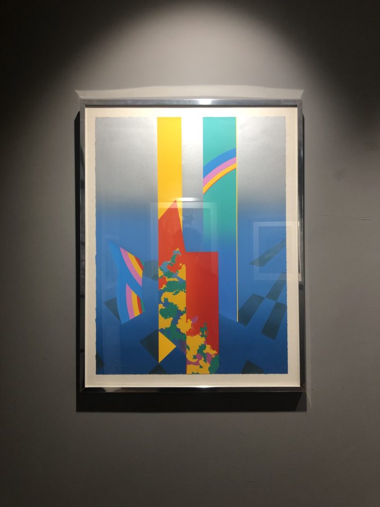
The private gallery contrasted greatly with the CCA gallery – the private gallery focused a lot more on the culture of pop art. The work consisted of lots of bright colours, abstract shapes, and represented the theme of mass customisation as Andy Warhol intended. The gallery was titled ‘Pop icons on the 20th century, Britain and American pop art’. The pop art movement was around in the 1950’s and peaked in the 60’s but is still widely recognised and practiced today. The work at this gallery had a very contemporary style to it – a lot of the work was art rather than photography but was still relevant as the themes and styles used can be transferred into photography.
One photograph from the private gallery that I particularly liked was ‘Homard Bleu’ by Nick Parlett. The photograph is an abstract painting of what appears to be shiny metallic pieces of metal all intertwined but the painting stemmed from a quick sketch of long grass by the beach side. The story of how the painting came to be really appealed to me because it shows how you can pull abstraction from anything you want to and turn something into something completely different whilst still keeping elements of it.
A photograph that didn’t appeal to me was ‘Black & White Cafe’ by Patrick Caulfield. I think this is because the photograph seems so empty and doesn’t have anything to draw attention to it other than it’s simplicity. Of course it would be harder to paint this composition than it seems but it seemed to lack skill and anything of interest – which I suppose was the idea behind it in the first place.