Category Archives: Developing

Filters

Author:
Category:

History Of Colour Photography

When photography was invented in 1839, it was a black-and-white medium, and it remained that way for almost one hundred years. Photography then was a fragile, cumbersome, and expensive process. In order to practice, photographers needed a lot of extra money and time, or a sponsor. In that early period, the people advancing photographic technology tended to focus not on achieving color photographs but on making improvements in the optical, chemical, and practical aspects of photography. For many, the goal was to make photography more suitable for portraiture—its most desired application. For that, photographic technology needed to be more stable, portable, and affordable, not more colorful. But people wanted color photos. (Portraits before photography were paintings—in full, glorious color.) By 1880, once the early technical hurdles had been overcome, portrait photographers began experimenting with color. They employed artists to tint photographers’ daguerreotypes and calotypes by hand.

British photographers introduced hand coloring photographs to Japan, where the practice became widespread and Japanese artists further perfected the technique. The refined, delicate hand coloring became a defining characteristic of Japanese tourist photography, the results of which were carried back to the West, influencing the art of hand coloring there. This wildly popular technique persisted in Europe and the Americas until twenty years later when Autochrome plates arrived. In Japan, hand coloring lasted yet another twenty years beyond.

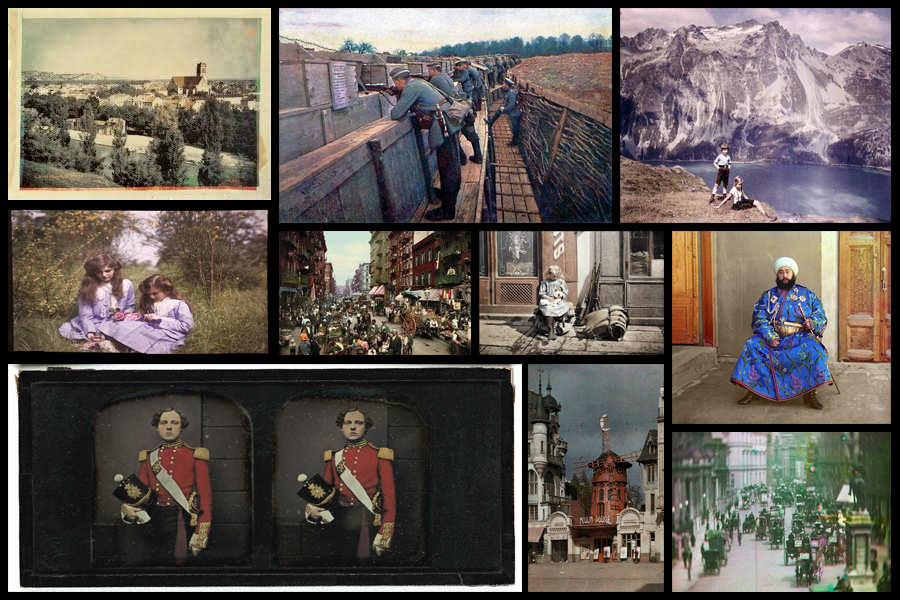
When first attempted in early 1840s people were trying to find a sort of chameleon substance which would be be able to assume the colour of any light falling upon it. The first results were typically obtained from projecting a solar spectrum directly onto the sensitive surface promising an eventual success, however a comparatively dull image would form in the camera required exposures lasting for hours or even days. The quality and range of the image colour were sometimes severely limited mainly due to primary colours, such as the chemically made ‘Hillotype’ process invented by America Levi Hill in 1850. Many others tried to experiment with other methods that prevented colours from fading over time such as Edmond Becquerel who achieved better results to some extent. Over about seven decades there was continuous experiments along these lines which would occasionally raise hopes but having no value at practical level. Here are some examples of early coloured photography:
Regarding the first ever colour photograph it was taken as early as 1826 by Nicephore Niepce, however it took until 1861 to be developed by technology which could incorporate very basic colour. Overall though it was the Scottish Physicist and poet James Clerk Maxwell who produced the first true colour photograph that didn’t fade immediately or need colour adding afterwards by hand. The image can be interpreted as sinister and mysterious, this is because the colours red, green and blue have been used to take a still image of some tartan ribbon which had to be taken three times using different coloured filters each time. The technique itself was developed because of the theories about how the eye can process colour. This is the first non-fading coloured image:
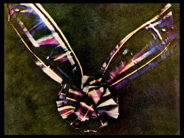
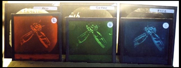
The three-colour method, which is the foundation of virtually all practical color processes whether chemical or electronic, was first suggested in an 1855 paper on colour vision by Maxwell. It is based on the Young-Helmholtz theory that the normal human eye perceives colour because the retina is covered with millions of intermingled cone cells of three different types: In theory, one type is most sensitive to the end of the spectrum we call “red”, another is more sensitive to the middle or “green” region, and a third which is most strongly stimulated by “blue”. The named colours are somewhat arbitrary divisions imposed on the continuous spectrum of visible light, and the theory is not an entirely accurate description of cone sensitivity. Nevertheless, it coincides enough with the sensations experienced by the eye that when these three colors are used the three cones types are adequately and unequally stimulated.

In his studies of color vision, Maxwell showed, by using a rotating disk with which he could alter the proportions, that any visible hue or gray tone could be created by mixing only three pure colours of light red, green and blue in proportions that would stimulate the three types of cells to the same degrees under particular lighting conditions. To emphasize that each type of cell by itself did not actually see colour but was simply more or less stimulated, he drew an analogy to black-and-white photography: if three colorless photographs of the same scene were taken through red, green and blue filters, and transparencies made from them were projected through the same filters and superimposed on a screen, the result would be an image reproducing not only red, green and blue, but all of the colors in the original scene. Because Sutton’s photographic plates were in fact insensitive to red and barely sensitive to green, the results of this pioneering experiment were far from perfect.

Style EXPERIMENTATION – Long Exposures

What is a long exposure?

Long exposure photography is when we are using a much longer shutter speed, and it’s usually used as a specific technique to achieve a certain effect.  There’s no defined transition point at which a shutter speed becomes slow enough to define your shooting as ‘long exposure photography’.  Generally speaking, I tend to think of it as when we are talking about our exposure times in terms of seconds, rather than fractions of a second.  These kind of long exposure times (shutter speed is the same as exposure time), are often used to blur something in a photo, for example running water in stream, or the movement of stars across the night sky.  A long exposure helps us to trace the pattern of time and render things in a different way to how we are used to seeing them.  When we see things differently, it naturally fascinates us and that’s a significant factor in creating a compelling image.

In order to achieve long exposures during the daytime, it’s often necessary to use neutral density filters on a lens, which cuts down the light entering the lens.  With less light entering the lens, the shutter speed needs to be much longer to achieve the same exposure.  Neutral density filters can allow you to shoot exposures of several minutes long, even in bright daytime situations. Here are some examples:

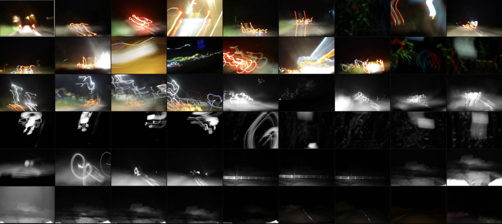
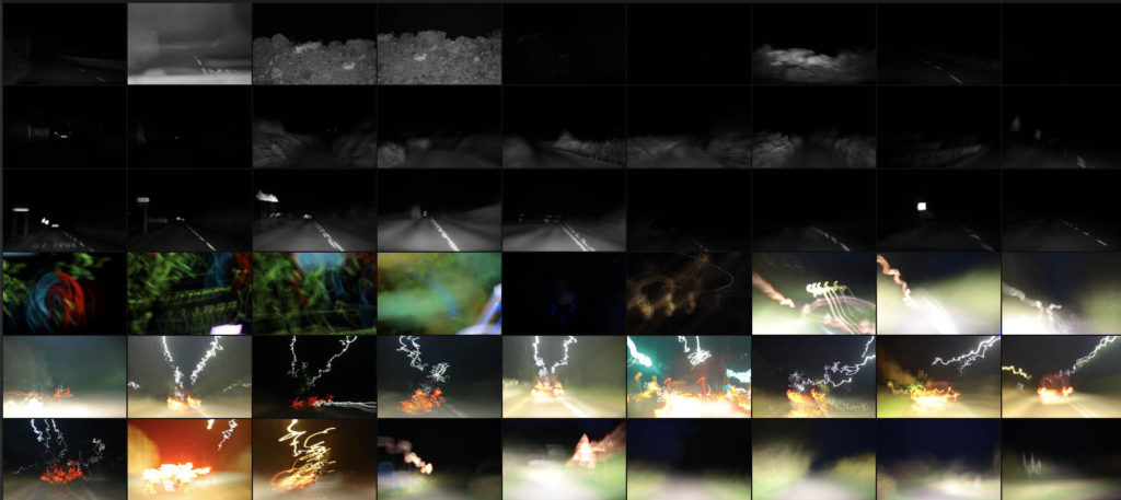
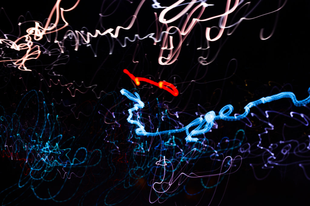
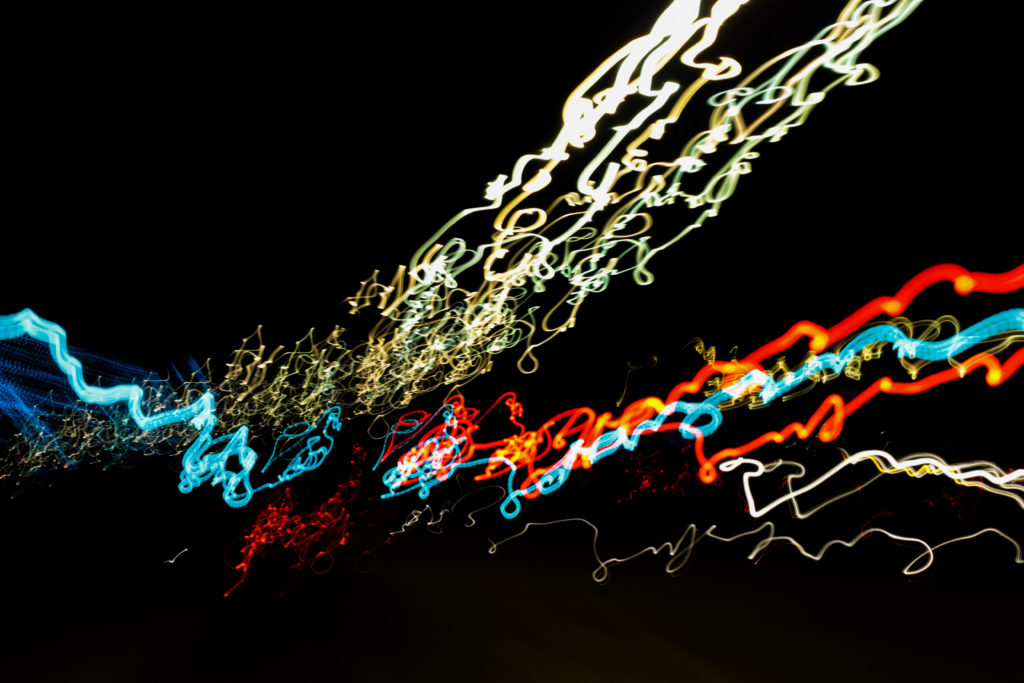
For this mini shoot I wanted to explore how the twisting roads of Jersey would create long exposure by focusing on cars and the variety of coloured lights that are created from them. I want to particularly look at the different textures and patterns I could make out of moving the camera whilst keeping the camera still. However when taking some of the photos I may try at experimenting with a monochrome filter to see if it would effect the outcome of the light trails looking at whether or not they blend the colours together. Here are some of the results from the shoot overall:

Once I had finished the shoot I decided to select ten images that I thought represented the shoot best whilst also reflecting my overall intentions behind what I wanted to achieve and have the outcome of photos look like. When doing the shoto I made sure to try a variety of things such as using a monochrome filter to produce some of the pictures, my aim behind this was to experiment and see whether by devoiding the image of colour if it would provide a smoother transition between shades. Here is my selection of my ten favourite images:

From here I wanted to then go onto whittle the selection down to only three images out of the mini shoot, by doing so it would allow me to analyse each of the image to more detail and understand the visual, technical and coceptual aspects behind the photos and my thought process behind selecting it. Here are my favourite three images:

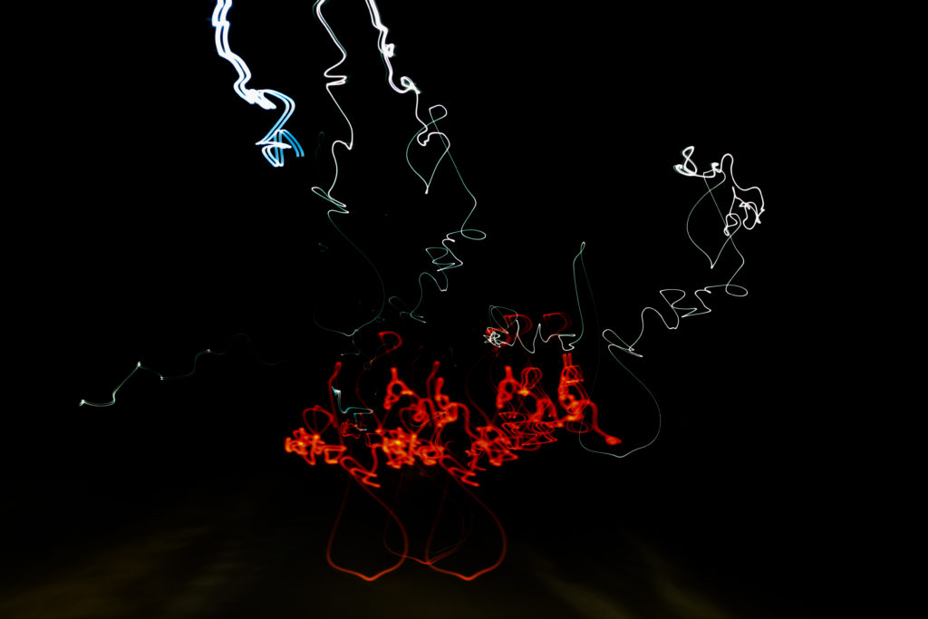
I selected this image because of how I really love the contrasting colours of red and white which also complimented each other against the emerging floor underneath. The image itself is of a moving car taken going over a speed bump during a long exposure, I really liked how its movement of bumping was captured through the pattern created with no actual goal of where its going. Overall I liked how the image relates well to long exposure as it creates an abstract pattern of the lighting, removing the car completely and leaving me with a series of lights with no coordination.

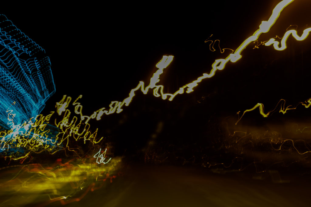
The reason I chose this image was because of the coordinated composition of the colours against the black backdrop. Personally for me I found that the lightings approach from the bottom left to top right of the photo created a great sense of aestheticism due to how the black space left behind in certain areas leaves enought room so that neither the lights or the darkness becomes too overpowering for the viewer. By mixing together a variety of different colours into the light sequence I found that it really stopped the lighting from becoming repetative and boring, as a result for me the added blues and reds emphasise the movement in the image.

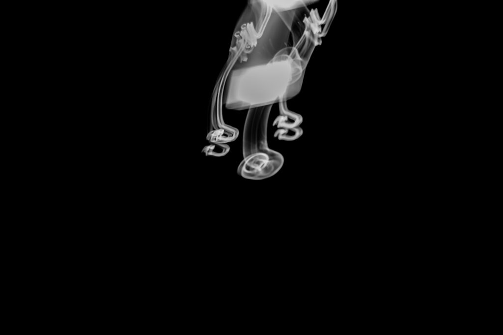
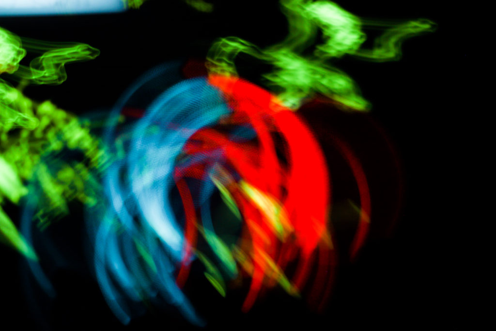
Finally I selected this image because of its simplicity, here I loved how the use of black negative space to highlight a smoke like effect created from a swaying lamp on a boat. What drew me to the image was the symmetry created from the light and how by using a monochrome filter on the image it puts arcoss the impression of smoke filtering down the screen. For what the image lacked I found it made up for it in contrast against the black backdrop with the ghost like lines presenting the viewer with a great sense of aetheticism.

Overall I found the shoot to go quite well as it highlighted the movement in our everyday lives but instead by removing the subjects and leaving on the light sources they have left behind. As a result of this all textures lights and landscapes are a direct reflection of our everyday transport to and from work or school.

Artist Reference – Edward Weston

Who is he?

Edward Henry Weston was born March 24th, 1886, dying January 1st 1958. Weston grew up in Chicago and moved to California when he was 21, from a young age he knew he wanted to be a photographer and initially his work became viewed as a typically soft focus on pictorialism which was a popular theme at the time. Within a few years of photography he abandoned his original style and went on to use one of the now regarded as most highly detailed photographic images. However in 1947 he was diagnosed with Parkinson’s disease and he stopped photographing soon after which led to his remaining ten years of his life overseeing the printing of more than 1,000 of his most famous images.

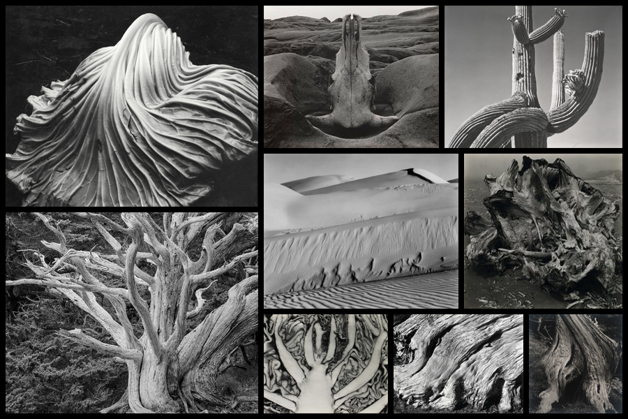
Currently Weston is known as one of the most innovative and influential American photographers, being regarded as a master photographer of the 20th century. Over his career he range of subjects to photograph had widened, photographing things like landscapes, nudes, still life, portraits and genre scene even including parodies. Weston today can be seen as creating what is quintessentially seen as American, especially Californian approach to photography, this is due to his focus on the people and places of the American West where in 1937 Weston became the first photographer to receive a Guggenheim Fellowship. Because of this he went on to produce up to 1,400 negatives using an 8 x 10 view camera which many of his famous photographs being taken of trees and rocks around the area of Point Lobos, California where he lived for many years. Some examples of his photograph can be seen below:

After looking over some of his images I decided to analyse one of them that I thought related best to my overall topic of variation regarding abstraction through different presentations. The image is called Point Lobos named after where it was taken where he photographed different rock formations using different compositions each time. By analyzing the image I can look into three sections, technical, visual and contextual, these will give me a greater understanding of how the image is taken and the underlying thought process beneath it.

Visual:

Visually the piece is extremely aesthetic due to its symmetry and use of different tones. What drew me to it originally was how the rocks mostly grey surface was complimented by the boarder of black waters and edges, for me this brought the photo together as it boxed in what Weston wanted to focus on, the texture of the surface. By using the divide between the two sides of the rock and composing it in the center of the image I found that it stopped the formation from becoming too overpowering and prevented it from becoming too bland and generic. For me this area of rock is effective because of how the darkened cracks all face the same direction whilst using the dark water as a gradient to eventually fade in and create an eerie result.

Technical:

When looking at the image its fair to say that a relatively lower exposure was used to create the darkened effect of the water and corners of the piece, allowing as a results for the areas where the sun hits to pop out against the rest of the composition. A regular shutter speed has been used as when looking at the water there is some slight movement blur which indicates that the photo was taken intentionally to capture its crashing against the rocks surface and as a result produce a greater transition between rock and water. It is clear when viewing the image that the composition has been greatly taken into consideration due to the placement of the dividing crack and the portion of the image taken up by the water.

Contextual:

During the late 1940s when this image was taken, Weston’s photography was becoming increasingly personal. He began to capture private picnics, trips in his car, and his family and friends—all of which were subjects he avoided in his earlier years. The beauty in this image derives from Weston’s overpowering sense of place at Point Lobos, the sharp lens focus, the flawlessness of a natural form, and the thorough attention to detail in his printing. This image, among many, illustrates how Weston often renounced the use of manipulation in his photographs in order to depict the realities of the world. This style of photography is referred to as “Pure and Straight Photography,” a term coined in the late 1800s when photographers began to create photographic prints that were not manipulated in any way. Weston will always be recognized for the simple, yet emotionally charged, clarity of his pictures. In viewing this photograph we find that Weston’s main goal was not to manipulate but rather merely to capture the beauty of Point Lobos.

Aesthetics in Art – Contextual Studies

Aesthetic comes under a branch of photography which examines the nature of art and our own personal experience with it. The term originally emerged during the 18th century in Europe, soon developing in England as philosophers grouped together images into fields of poetry, sculpture, music and dance. As a result of this they became all classified in art as one category which was called les beaux arts, or fine arts. From this philosophers have began to reason that no description could define or explain beauty. They argued that there were only some rational properties of it such as order, symmetry and proportion, however it is mainly regarded as an experience from an individuals perspective rather than a reason alone.

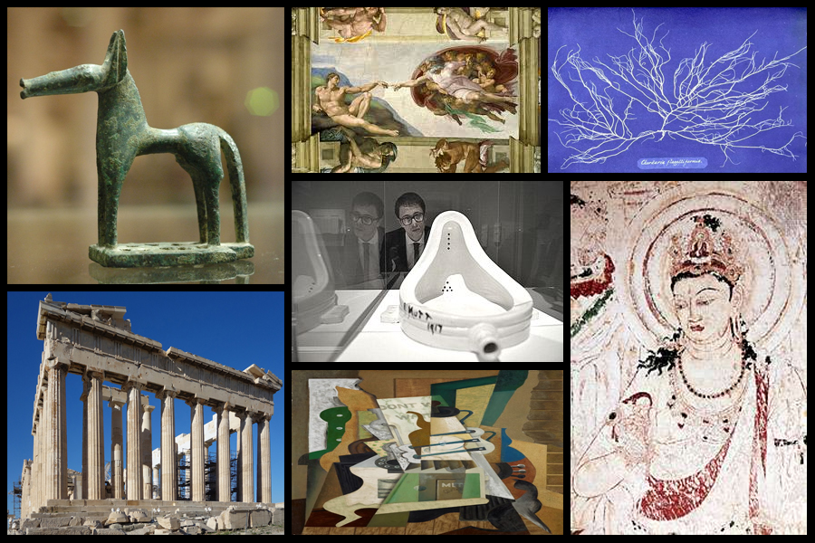
It is clear for us to say that through our understanding of intuition and experience with human feeling and emotion, aesthetic experience could include a mixture of feelings such as pleasure, rage, grief, suffering and joy. One particular philosopher named Immanuel Kant interpreted aesthetics as a field which gave priority to form over function, with him stating that beauty was independent of any particular figure which it was attached to. Today many historians and philosophers have argued that there is no such thing as aesthetics in art but rather there only being artists. Some of the earlier examples of aestheticism from different generations and cultures can be seen below:

The first use of the term aesthetics in something like its modern sense is commonly attributed to Alexander Baumgarten in 1735 with Francis Hutcheson marking the first systematic inquiries into aesthetics in the sense of them being a distinct branch of philosophy. Undoubtedly the 18th century saw the flourishing of inquiries into beauty, taste, the sublime, and genius, but few would be content to start a history of aesthetics in that century. For many centuries earlier, going back to ancient Greece, there had been philosophical reflection, even if only in a piecemeal fashion, on poetry, painting, music, and the beautiful, and these reflections had an enormous influence on later philosophizing. What is noticeable, though, is that prior to the 18th century it is not always clear where the boundary lies between aesthetics, as such, conceived as a distinctively philosophical inquiry into judgments of taste and the foundations of the arts and more general theorizing about art, including, for example, treatises on the arts often aimed at practitioners themselves.

Regarding a more modern approach to aesthetics it can still be seen as the basis for much of our societies development through our architecture to our art. Various examples can be seen below:

Style EXPERIMENTATION – Bokeh

What is it?

Named after the Japanese word for “blur” or “haze”, bokeh is an optical phenomenon that stamps the character of the lens on each photo in the way that bright out-of-focus elements are rendered. When out of focus, bright pinpoints become attractive, ghostly circles of light. Or at least they are circles with the right lens.Out-of-focus elements can be just as important to finishing the composition and can dramatically change the viewer’s perception of the piece. The key to using bokeh in a shot is to use a wide aperture on a close focused subject so that elements in front and behind the point of focus blur readily. If the lens has curved aperture blades, these will be reflected in the shape of the bokeh.

By tradition, bokeh hunters prize these circular shapes more. But straight aperture blades can create different shapes, such as hexagons if the lens has six blades and is used at a larger f-stop, such as f/8. These can be just as effective creatively. A more obvious way in which lens construction has influenced photographic trends comes with the zoom lens. The zoom-burst effect provides a way to guide the eye to the centre of the shot by turning the surrounding field into a blur of movement. The effect is easy to create although mastery takes a little longer.

The key is to focus on the centre of the image and during the shot quickly turn the zoom ring. It helps to have the camera on a tripod as this will minimise shake during the relatively long exposures needed to give you enough time to turn the zoom ring. Similar to creative use of bokeh, zoom bursts often work best with bright, colourful elements in the out-of-focus area. Although it needs a steady hand to pull off well, you can bring swirls into zoom-burst shots by holding the zoom ring and turning the camera instead. Here are some examples:

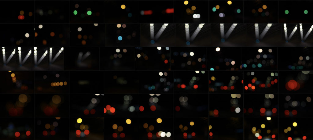
To ensure a clear image in the centre, photographers often combine the zoom burst with flash, using slow sync flash to fire extra light at the beginning or end of the exposure to freeze the subject. This can work extremely well in night-time city shots when you have streetlights to help emphasise the zoom effect. At the other end of the scale, zooming can be used to create extreme focus effects, particularly for macro shots. Even at high f-stops, it is difficult to capture a depth of field of more than a few centimetres of in close-up images. Here I wanted to explore a few ways in which I could experiment with the way I could take future shoots and so found walking around town at night was one of the best ways to do so. These were my outcomes:

Once I’d experimented a little with the technique I decided to have a go at photographing the lights in tunnels and on car as they seemed to produce the best outcomes regarding variety of composition and brightness. When taking the images I really enjoyed taking into consideration a new style of composition not previously used where block lights could be overlapped or on their own. Here are three of my favourite outcomes from the experimental shoot:

What I liked about this image was the use of the mainly blue lighting fading out as it progressed through the photo. For me this effect created a great sense of aestheticism as it highlighted the dirt of the window it was taken from, this for me added extra texture to the image whilst also making use of the negative space so that it would not be predominantly black and leave the product as a bit of an eye sore. The shades of blue present within I found to cast an ambient light throughout, with the primary light source becoming the main focal point for viewers due to the sequence of other lights deriving from it.
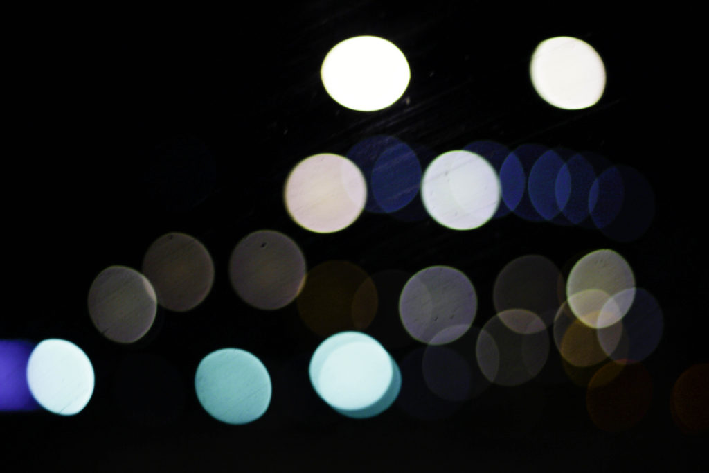
Here I particularly liked the variety of different colours present which make use of the black backdrop which separates each light so that they become a sort of structured shape. Looking at the blues, whites and greys they all compliment each other so that they do not become overpowering, with the occasional different colour such as red or orange breaking up the pattern and adding more depth to the overall outcome. For me the blackness of the top right corner brings together the whole image due to how it adds a space and stops the continuous lights from overpowering the entire piece.
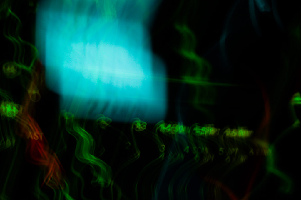
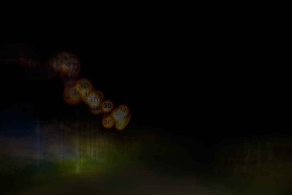
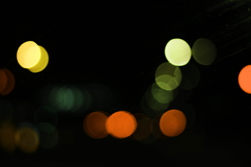
Finally what drew me to this image was the appearance of murky greens, reds and yellows which add a sense of eeriness to the photograph. These darker colours are complimented by the surrounding black which envelops each light merging them into the next whilst the sequence snakes off image. I particularly found the implementation of the reds and oranges to be of great effect due to how the prevent the mainly greens and yellows from taking over and making the image overall quite dull.

Overall for me this experimentation was useful as it broadened my stance regarding photography and the styles and techniques that could be used to take new and original perspectives of my surrounding environment. For a future reference I could combine certain bokeh images together to form a more abstract result combining patterns from both so that they merge and create something almost alien like.

Spirituality and Nature

The realities explored in science and spirituality are often assumed to be unrelated to one another. Science explores the outer world with a series of questions beginning with the basic query, “What is this? What is this world all about?” while spirituality begins with the question, “Who am I?”.

In the ancient world these two forms of knowledge were not in conflict but were understood to have a deep and subtle connection. Man’s knowledge of himself complemented his understanding of the universe and formed the basis for a strong and healthy relationship to the creation in which he lived. It is the disconnect between these two types of knowledge that is causing many of the challenges that we face as a global community today.

Ancient wisdom describes human beings as having five layers of experience: the environment, the physical body, the mind, the intuition and our self or spirit. Our connection with the environment is our first level of experience, and one of the most important. If our environment is clean and positive, it has a positive impact on all the other layers of our existence. As a result, they come into balance and we experience a greater sense of peace and connection within ourselves and with others around us. Historically, nature, mountains, rivers, trees, the sun, the moon have always been honored in ancient cultures. It’s only when we start moving away from our connection to nature and ourselves that we begin polluting and destroying the environment.

Religion

While many human beings choose to measure the importance of Nature through economic value or scientific worth, the most difficult of Nature’s gifts to “measure” is its connection to our spirituality. While the spiritual self is not always linked to religion, it is more than relevant to explore the revered place that Nature has been given in so many of the world’s religions.

Christianity tells the story of a paradise on Earth, rightly situated in the beauty of a garden, and documents the efforts of Noah as he’s commanded by God to save two of every species on the planet. Buddhism teaches that all life is sacred. Muslims believe that Nature was given to humans as a gift from Allah. Indigenous cultures all over the world have celebrated the existence of Nature as their “mother”.

 Humans & Nature

Japanese Shinrin-yoku had compared how the body reacts to being immersed in nature (woodland), to being in an urban environment. The results of the analysis supported the story told above. Finding that being in the woods was calming, activating the parasympathetic nervous system associated with contentment. Whereas the urban environment stimulated the sympathetic nervous system associated with drive and threat. There’s plenty of evidence that exposure to nature is good for people’s health, well-being and happiness.

Research has consistently shown that increased connection with nature results in decreased stress, anxiety, anger, aggression, depression, and a sense of gloom; while it increases a variety of measures of physical health.

“From the smallest microorganisms to the largest animals, all life on Earth has a common ancestor.  Everything is connected to everything. ” Our relationship with nature has historically been one of imbalance and overuse.  Nearly every step in human history has unfortunately been accompanied with a leap in environmental degradation.  At first, humans were incredibly in-tune with their surroundings.  With advancements in technology and agriculture though, humans began to find more efficient ways of sustaining themselves.  These advancements allowed for more permanent settlements, which led to rapid population growth and a distancing from nature.

Nature and Mental Health

New studies find evidence in support of what we see clinically. It found that virtually any form of immersion in the natural world, outside of your internal world, heightens your overall well-being and well as more positive engagement with the larger human community.

Exposure to nature has been shown to evoke positive emotions, as well as strengthen individual resilience (Marselle et al. 2013) and coping skills (van den Berg 2010). Getting into nature has been shown to have positive impacts on concentration, learning, problem solving, critical thinking capacity, and creativity as well as enhance mental health and wellbeing through encouraging physical fitness and social engagement.

One study is from the University of British Columbia. It highlights an essential dimension of true “mental health” – the realm beyond healing and managing conflicts and dysfunctions. Mental health includes the capacity to move “outside” of yourself, and thereby Increase and broaden your mental and emotional perspectives about people and life in general. That’s the realm that grows, for example, from meditation – the mindfulness state of being grounded in awareness of the present moment. 

Sir David Attenborough talking about Nature and Mental Health

Rinko Kawauchi who i have previously looked at, believes the fleeting nature of these dualities is what ultimately determines our fragile existence. I like how she photographs things that are ‘ephemeral’, that won’t last for long which are unified by an unapologetically sublime aesthetic, a sense of wonder, and by her linking of the earthly and the celestial, the physical and the spiritual. Wassily Kandinsky, who I’ve explored also looks at spirituality in his book ‘Concerning the Spiritual in Art’ where he writes about his beliefs on how art links to humans and spiritual life. “The spiritual life, to which art belongs and of which she is one of the mightiest elements, is a complicated but definite and easily definable movement forwards and upwards. This movement is the movement of experience. It may take different forms, but it holds at bottom to the same inner thought and purpose.”-Kandinsky.

Our Spiritual Connection to Nature: https://www.huffpost.com/entry/our-spiritual-connection_b_648379

http://www.globalharmonycrew.com/nature-and-spirituality-the-earths-role-in-human-happiness

https://www.humansandnature.org/humans-nature-the-right-relationship

http://www.exploringroots.org/blog/2017/5/25/the-relationship-between-humans-nature-and-health-what-the-research-tell-us

https://www.ncbi.nlm.nih.gov/pmc/articles/PMC4157607/

Building Faces Shoot 4 – St. Johns

In this shoot I have developed on my previous shoots in which I have looked at the faces of housing blocks, office blocks, houses and other types of commercial buildings within Jersey. In my previous shoots I explored the area of Havre Des Pas, St. Helier and St. Peters and took photographs of houses in the area to demonstrate how the houses can have similar features and materials used due to being in the same geographical area whilst also having these features changed slightly in each house to make each house unique and different. In this shoot I have photographed an estate in St. Johns to show how similar the houses in estates can be – they are often designed in bulk to create a quick and easy building process and so leads to lots of similar houses with the same style and layout. Of course, even when looking at how similar these houses all are, there are lots of features which make the houses individualistic, such as the paint colour or the style of window or the curtains. All of these features go towards emphasising how factors such as personal taste can create something ordinary into an individualistic feature that can make the house stand out from others. The essential idea behind this shoot is to reinforce the idea of variance and similarity in previous shoots and to show how even though something may be produced to be similar, there will always be differences. These photographs will contribute to the material that I have available to me to use in editing with my photographs of steel and granite. I have stayed consistent with using the high-contrast black and white filter with these photographs as I believe that it allows for a strong finish when layered over the photographs of steel and granite.

Edits

Layering Building Faces Over Steel

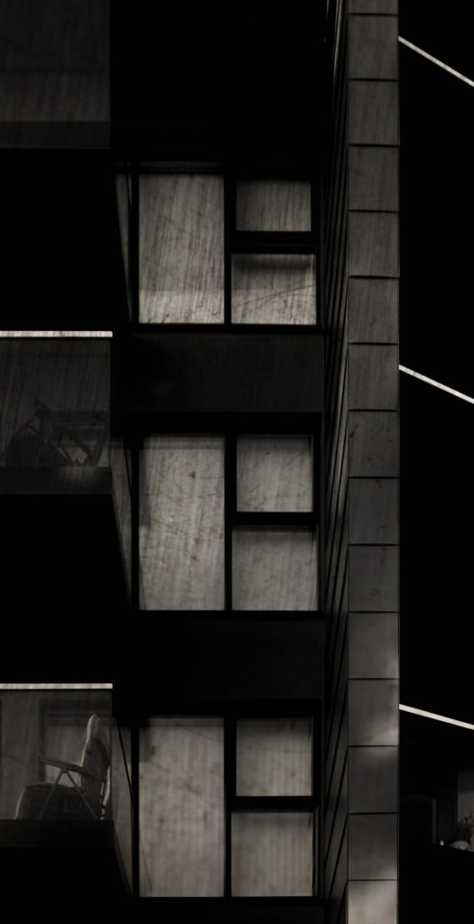
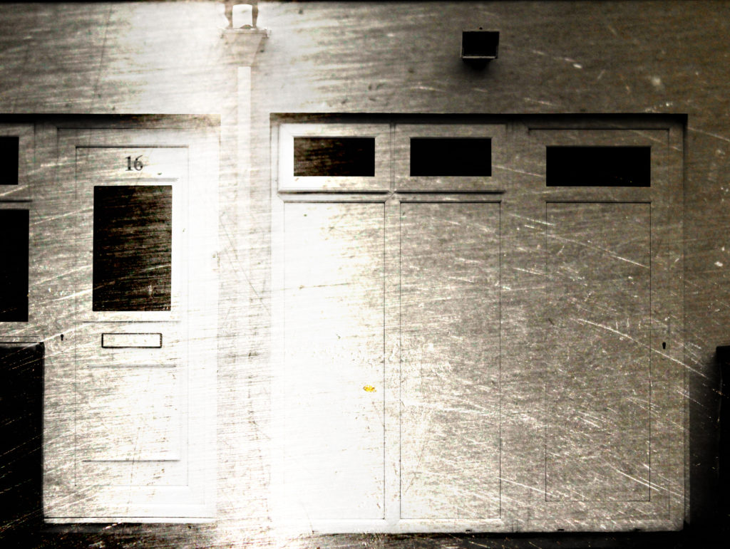
The below edits are the results of my shoot in which I photographed steel as a surface in order to capture its texture. I have layered the building face photographs from previous shoots over the steel photographs as a hint at how buildings such as office blocks are now being developed. In the top three edits I have made the composition by removing the natural frames from the photograph to reveal the scratchy steel texture in the background – I have done this previously to show granite and find that doing this with granite in the background looks much more effective due to the unpredictable shapes and colours within the rock whereas the steel is slightly boring and predictable. In the later edits I focused on creating them through using double exposure methods on photoshop – I edited the blending options to blend the two photographs together resulting in the building structures being clearly shown with the texture of the steel being shown at the same time to allow consistent contrast.

Analysis

When capturing this photograph I used the natural day light to capture the natural elements of the building face. Using natural daylight on the steel rod used for the background allowed for the reflections to be seen in the rod to add further contrast and tones within the photograph. The photograph is slightly overexposed but when layered over the darker steel it creates a composition that is abstract in which the overexposed building face does not look out of place. I used a deep depth of field when capturing the photographs used in this composition to ensure that all of the photograph was sharp and in focus. A shutter speed of 1/60 was used as well because the steel and building face were both still objects which didn’t require very fast shutter speeds – when this is paired with the low ISO of 200 used it allows for the best quality composition possible with the correct amount of light entering the lens from the surrounding area. The rust and reflection in the steel rod creates a slightly warm colour cast and creates on old-fashioned eroded feeling in the composition.

The black and white building face contrasts with the warm rust on the steel in a very complementary way as it creates a damaged dynamic to the photograph and really brings the texture of the steel to the forefront to create an interesting composition. There is a wide tonal range in the composition because of the reflections and scratches in the steel. The building face captured is a very flat one and so the photograph is very flat and two-dimensional – it almost looks like a screenprint. The photograph fits in with the rule of thirds as the building face merges into the steel rod on the top third of the photograph to create an aesthetically pleasing photograph along with the man-made shapes such as the windows.

This photograph is the result of an edit from a shoot focusing on the texture and properties of steel. The composition was made by blending together the face of a building and a close-up photograph of a steel rod. I have looked at contrasting man-made building faces with natural granite rock faces in my previous shoots. This has led to me thinking, as I was focusing on the material of granite, it may be interesting to contrast man-made structures with eachother by focusing on how the materials used to make houses have changed overtime. Traditionally granite has been used in Jersey but as office blocks, such as the international finance centre, have been developed there has been an increase in more ‘modern’ looking materials, such as steel. Therefore I have captured close-up photographs of steel objects to capture its texture, which by itself makes for quite a boring photograph, but I will experiment with layering the building faces over the steel. Steel is an alloy of iron and carbon and because of its high tensile strength and low cost, it is a major component used in buildings, infrastructure, tools, ships, cars and other items. Since it is used so much in the world around us, as granite is, I believe that it is important for me to include the exploration of this material in my project. I plan on presenting these photographs in a typology grid or possibly as GIF’s in the future as well as creating more edits in a similar style.

Gallery Visits

Behind the Lens

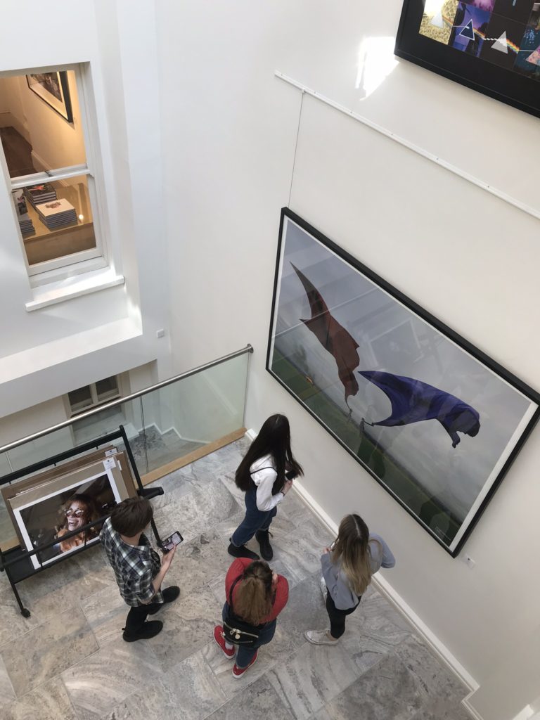
This exhibition featured the works of Carinthia West, Mike McCartney and Rupert Truman. The exhibition explores Britain in the 1960s-70s when Rock and Roll made its revolutionary impact on music.

Carinthia West is a photographer and journalist, whose credits include Marie-Claire, Harper’s and Queen, Harper’s Bazaar, Tatler, the LA Weekly, The Independent, The Telegraph, Saga and US magazines, covering travel, lifestyle, humour and (her least favourite subject!) the celebrity interview. She has been friends with some of the 20th century’s greatest names from music, film and society. Anjelica Huston, Mick Jagger, George Harrison, Ronnie Wood, Robin Williams, Paul Getty Jnr, Neil Young, Helen Mirren, David Bowie, Paul Simon, Bonnie Raitt, Carly Simon, James Taylor, King Hussein and Queen Noor of Jordan, are just a few of those she photographed at both casual and private, intimate and poignant moments in their lives. 

Mike McCartney was born in Liverpool 1944, he is a British performing artist and rock photographer and the younger brother of Paul McCartney. He attended the Liverpool Institute two years behind his brother. He was a photographer during his entire musical career, and has continued with photography since then. Beatles’ manager Brian Epstein nicknamed him “Flash Harry” in the early 1960s because he was always taking pictures with a flash gun. He has published books of photographs that he took of The Beatles backstage and on tour, and he recently brought out a limited edition book of photographs he took spontaneously backstage at Live8. In 2005, McCartney exhibited a collection of photographs that he had taken in the 1960s, called “Mike McCartney’s Liverpool Life”, both in Liverpool and other venues, such as The Provincial Museum of Alberta. In addition, an exhibition book was published of the collection.

British photographer Rupert Truman began working with Storm Thorgerson in the late 80’s shooting most of the studios output. When Storm died in 2013 he left the StormStudios to Rupert Truman, Peter Curzon and Dan Abott. They have collectively created album covers for some of the most celebrated bands such as Pink Floyd, Biffy Clyro, Muse, Pendulum and The Steve Miller Band to name a few.

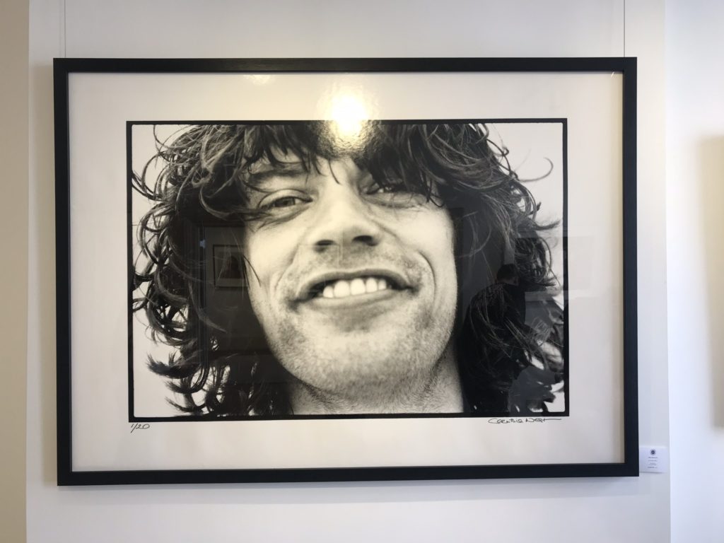
Mick Jagger ‘Diamond Smile’ Malibu, California 1976

My favourite image from this exhibition depicts Mick Jagger on Malibu Beach in 1976. The image is a black and white cropped headshot. Although simplistic, this image appeals to me as it appears relatable in that Carinthia West captures casual moments when spending time with her friends. The freedom of capturing with little time to compose or adjust settings gives the image a feeling of spontaneity. The image is also one of Carinthia’s favourite shots as a result of nostalgia:

“Not only does Mick look incredibly relaxed, but the day-old growth reminds me that he had probably been up all night, jamming with other musicians at Ronnie Wood’s Malibu Beach house. I took this shot in the early morning after one of these sessions. See if you can spot the diamond flashing in his smile.”

Biffy Clyro: Opposites 1, 2013

My least favourite image from this exhibition is the album cover of Biffy Clyro’s Opposites, produced by Rupert Truman. The reason I do not like this image as much as the others is due to the combination of reality and simulation, I cannot tell what is real in the image and what is fake. After researching the process, it becomes more clear. The cover is supposed to depict the oldest living tree in the world, located in Chile. Biffy Clyro’s Simon Neil said: “I loved the original image of the tree, and I got thinking about how strong the roots must be, and how strong my band is”. They decided to include variations in the different albums by having two different locations with different objects hanging upon them: one to represent the interconnections of things – tree of life, positive – and one to represent the disconnectedness – tree of death, negative. So, mirrors which reflect, and scissors which sever. Biffy Clyro suggested the bones, to make a third variation. The tree had to be man made and taken to Iceland or it wouldn’t be the same tree on both albums. The hanging objects are central – many cultures have them – often called votive or wishing trees, intended to warn visitors of sacred ground or as offerings to appease the gods.

Pop Icons

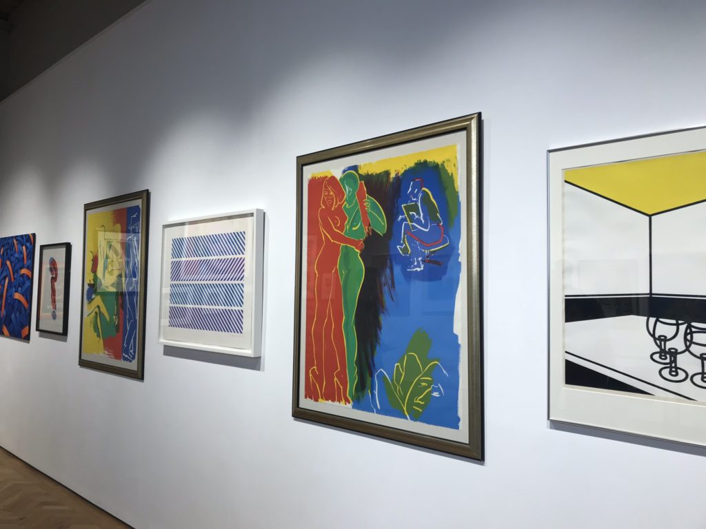
The next exhibition we visited reflected on the Pop Icons of the 20th Century through British & American Pop Art, exhibiting artworks by Andy Warhol, Roy Lichtenstein, David Hockney, Peter Blake, Robert Indiana, Tom Wesselmann, Eduardo Paolozzi, Patrick Caulfield and Allen Jones.

Emerging in the mid 1950’s in Britain and late 1950’s in America, Pop Art reached its peak in the 1960’s and went on to become the most recognisable art form of the 20th century. It began as a revolt against the dominant approaches to art and culture and traditional views on what art should be

Young artists felt that what they were taught at art school and what they saw in museums did not have anything to do with their lives or the things they saw around them every day. Instead they turned to sources such as Hollywood movies, advertising, product packaging, pop music and comic books for their imagery.

Although they were inspired by similar subject matter, British Pop Art is often seen as distinctive from the American version. Early pop art in Britain was fuelled by American popular culture viewed from a distance, while the American artists were inspired by what they saw and experienced living within that culture. In the United States, pop style was a return to representational art (art that depicted the visual world in a recognisable way) and the use of hard edges and distinct forms after the painterly looseness of abstract expressionism. By using impersonal, mundane imagery, pop artists also wanted to move away from the emphasis on personal feelings and personal symbolism that characterised abstract expressionism.

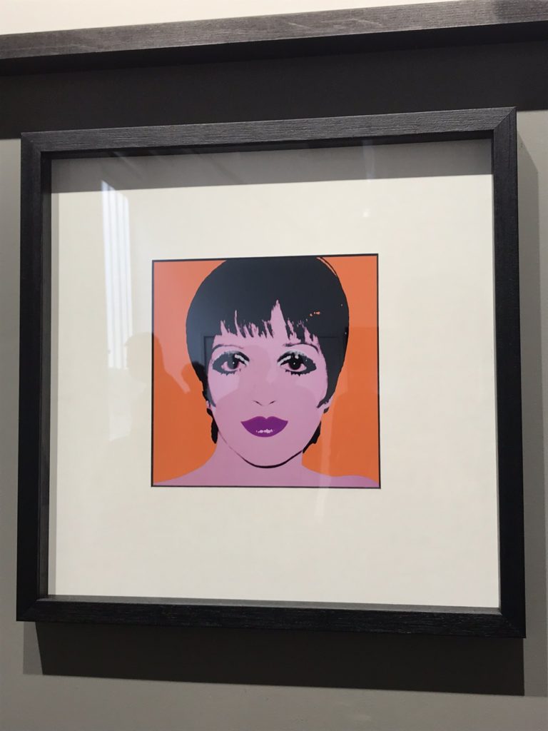
Liza Minnelli, 1978

One of my favourite pieces from this exhibition was created by Andy Warhol. One thing I like about his work is his ability to choose the right colours depending on who he is portraying. Liza Minnelli was a friend of Warhol’s, even going on to create a collection of his works worth over $40 million. Her short black bangs, large dark eyes outlined with heavy makeup, and full lips painted a dark red stood out in the print even before they were transferred to silkscreen, which would simplify them even further.

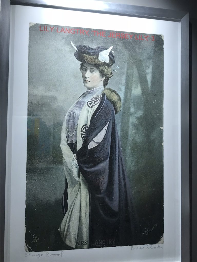
One of my least favourite pieces is this portrait of Lily Langtry, produced by Peter Blake. As I was not familiar with the history of Lily Langtry, the meaning behind the image became less significant to me. However, after researching, I am now more interested.

Emilie Charlotte Langtry, nicknamed “The Jersey Lily“, was a British-American socialite, actress and producer in the late 1800s to early 1900s. Born on the island of Jersey, she was known for her looks and personality which attracted interest, commentary, and invitations from artists and society hostesses, and she was celebrated as a young woman of great beauty and charm. She was the subject of widespread public and media interest.

Being Human

The final exhibition showcases Feminism and represents the artwork of local female artists.

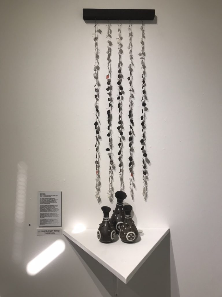
Maker’s Mark, Pippa Barrow

I liked this piece made from black stoneware, porcelain, iron fillings, glaze, stains and reclaimed ebony due to the meaning behind every feature. The idea for the piece originated from cave paintings and the innate desire to record one’s existence.

The 3 vessels represent 3 women in Pippa’s family, inlaid with symbols of love, life and loss. Above them, hangs a shower of hundreds of tiny ceramic fragments, marked unintentionally with the fingerprints of the artist as they pinched off pieces of clay.

The piece is heavily influenced by Barrow’s upbringing in South Africa, but also aims to represent the common human experience, in particular the limitations and expectations experienced by women of all ages and cultures.

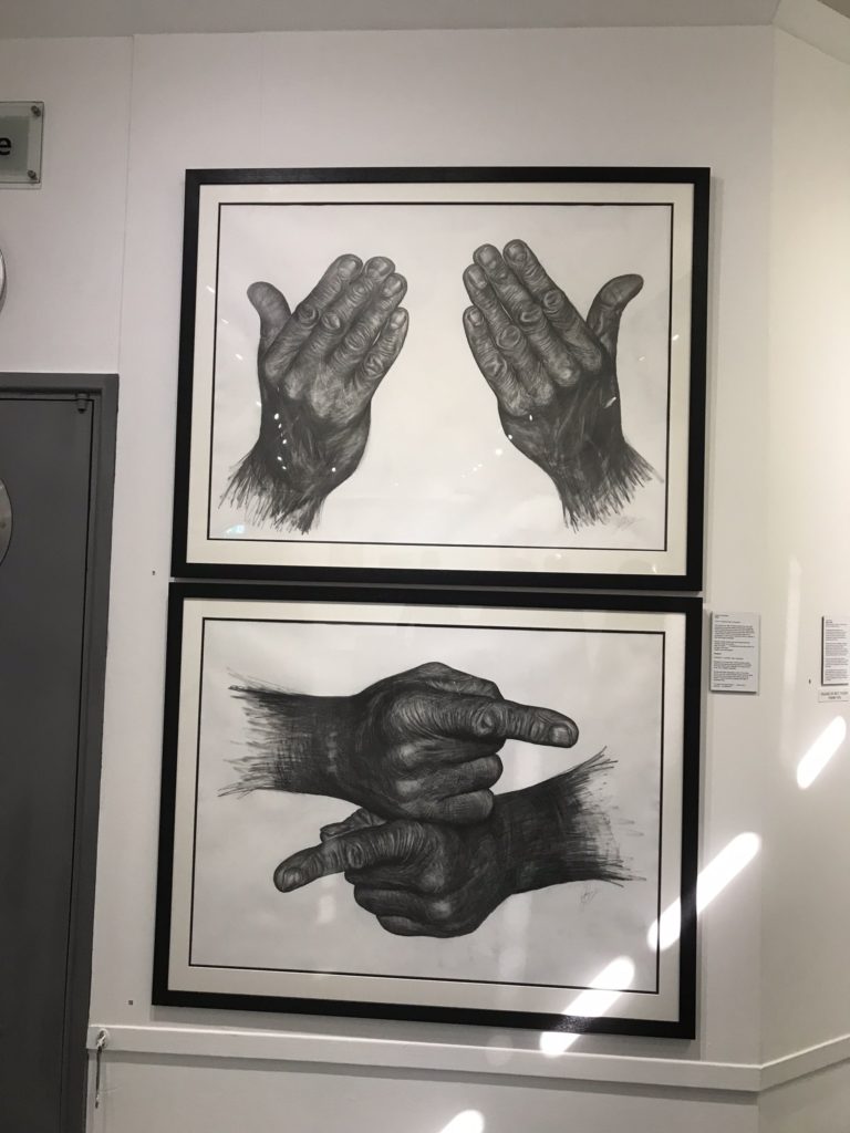
One of my least favourite pieces was this one that looks to be either a biro, pencil or charcoal drawing. I am less interested in this piece as I have seen works like it before, even producing almost identical works myself in my GCSE Fine Art exam. This shows a lack of individuality, however the inspiration may explain the meaning behind it. Both drawings depict two hands pointing in opposite directions. This symbolises the inability for us as humans to co-operate with each other.

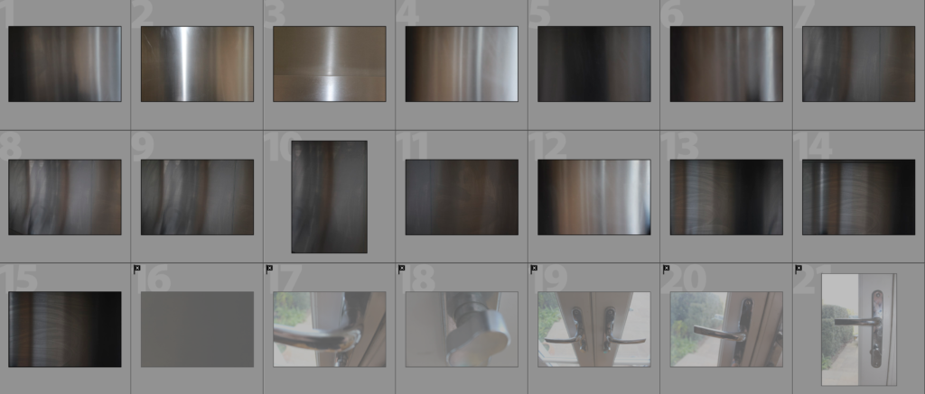
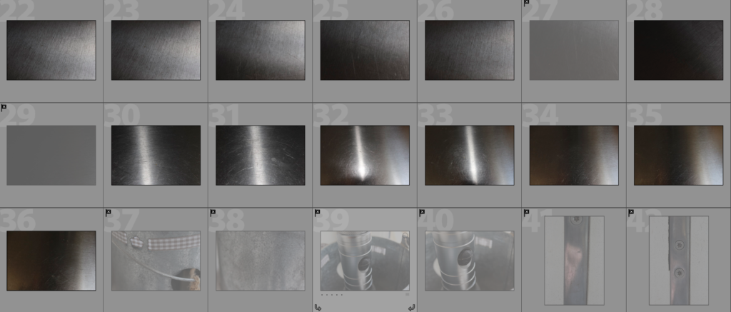
Steel Shoot

This shoot focuses on steel and its texture. I have looked at contrasting man-made building faces with natural granite rock faces in my previous shoots. This has led to me thinking, as I was focusing on the material of granite, it may be interesting to contrast man-made structures with eachother by focusing on how the materials used to make houses have changed overtime. Traditionally granite has been used in Jersey but as office blocks, such as the international finance centre, have been developed there has been an increase in more ‘modern’ looking materials, such as steel. Therefore I have captured close-up photographs of steel objects to capture its texture, which by itself makes for quite a boring photograph, but I will experiment with layering the building faces over the steel. Steel is an alloy of iron and carbon and because of its high tensile strength and low cost, it is a major component used in buildings, infrastructure, tools, ships, cars and other items. Since it is used so much in the world around us, as granite is, I believe that it is important for me to include the exploration of this material in my project.

The pictures that I have captured in this shoot have focused on the texture of steel and have been captured with the intentions of using it in an abstract approach. The scratches and reflections in the steel create different shades and bring the texture out in the material so I believe that this approach may work well when it comes to using a double exposure approach. Please see my next post ‘Layering Building Faces Over Steel’ for the edits resulting from this shoot and analysis of the work.