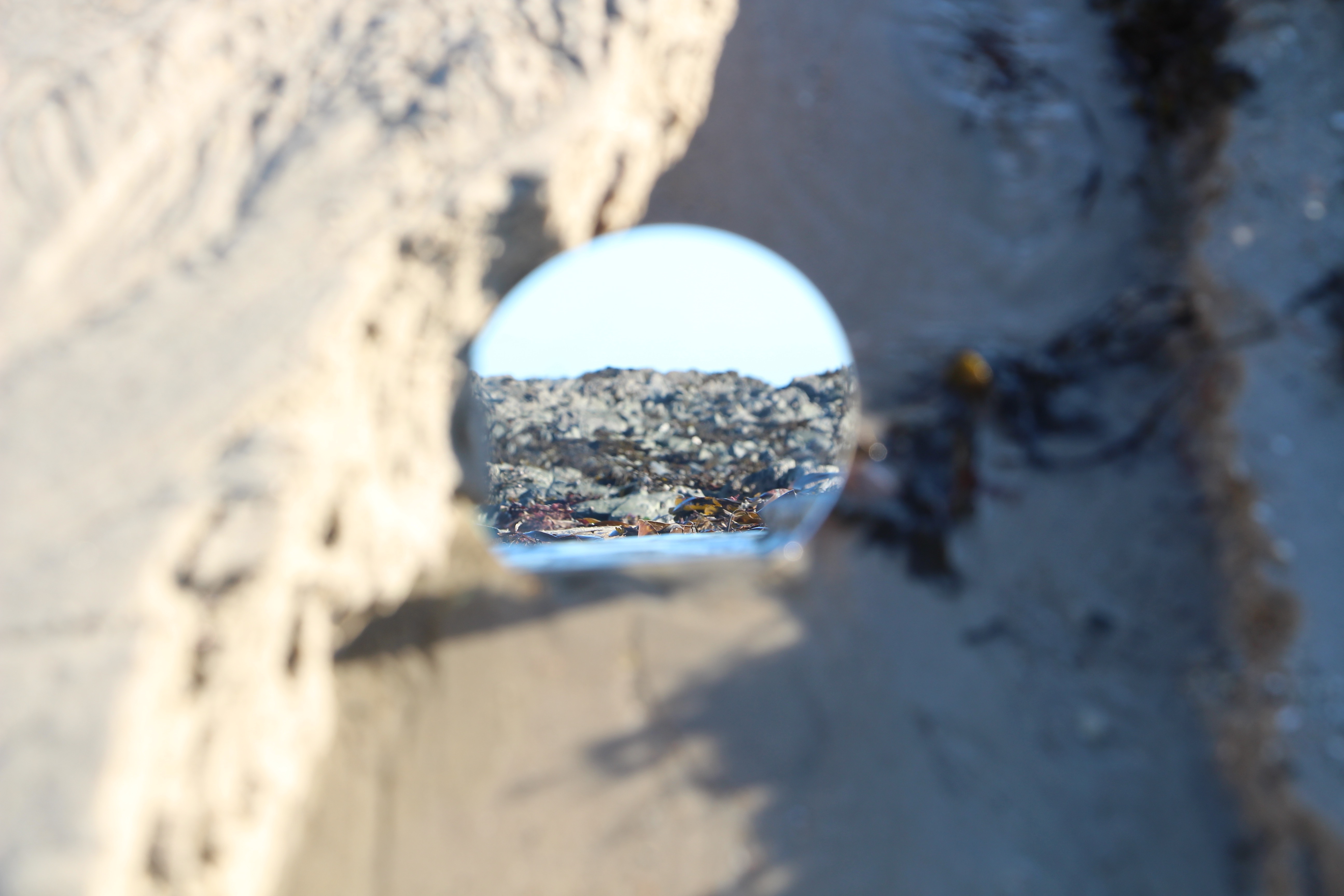
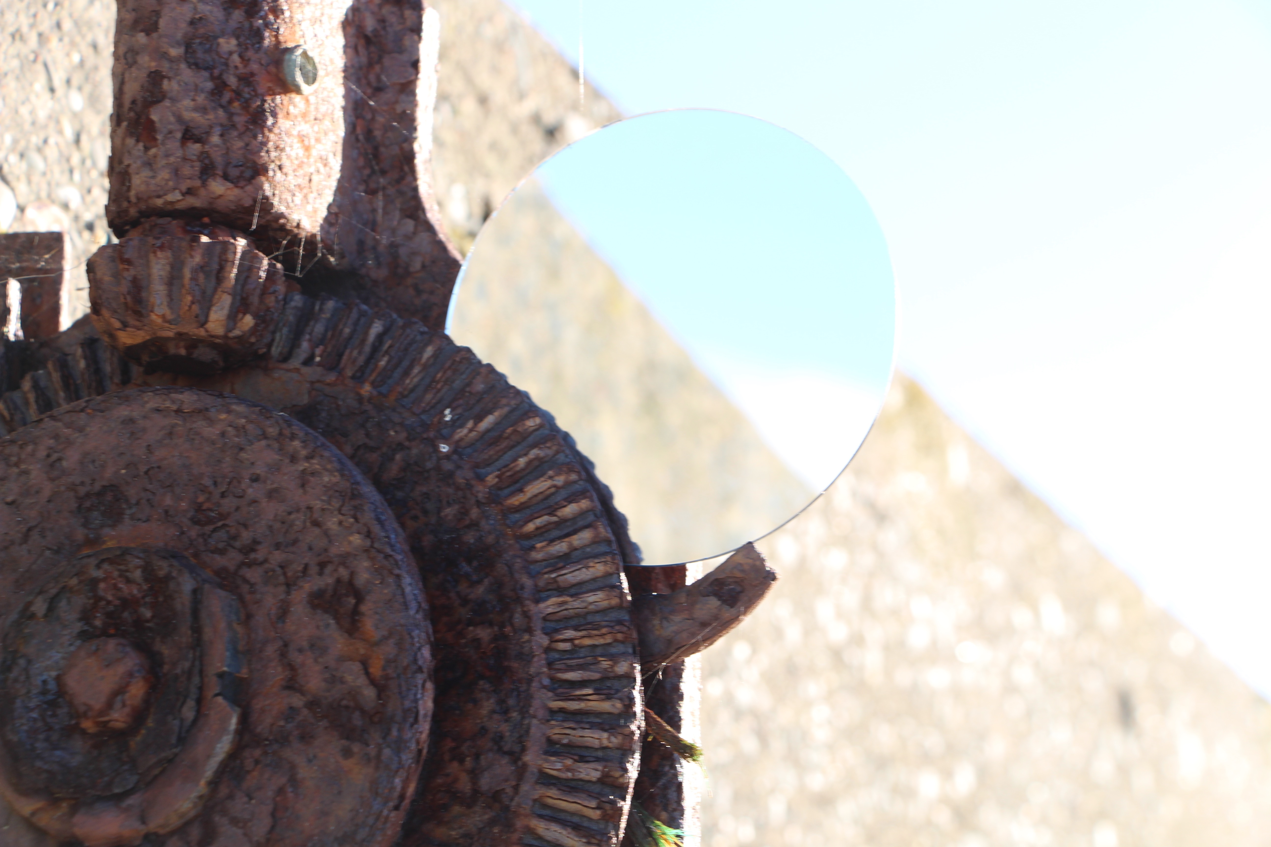
Category Archives: Developing

Filters

Author:
Category:

Variation and Similarity

What is variation?

Variation is “a change or slight difference in condition, amount, or level, typically within certain limits.”

On googles dictionary, it also defines as “a different or distinct form or version of something.”

My first thoughts on how to approach this noun which appears as part of our exam theme, is to explore differences in objects or people. Straight away, I felt that I could base my exam on simple, everyday things, such as everyday routines that people do, as well as everyday objects, such as food, flowers, shoes and so on. Most people do similar things every morning, like brushing their teeth, eating breakfast, and travelling to school/work in a car, a bus or walking or cycling. This leads me onto the other part of the exam theme, which is ‘similarity’.

What is similarity?

Similarity is “a similar feature or aspect.” Google’s example of the noun in a sentence is “the similarities between people of different nationalities.”

I feel that similarity can be explored in many interesting ways; for example, people and families would be interesting due to how family have similar features, like face shape, skin and colour so taking a portrait approach would be intriguing. Additionally, people and bodies is another portrait approach that could be successful because everyone has the same body parts, yet linking to the other part of the exam theme ‘variation’, everyone’s body parts and features varies due to DNA.

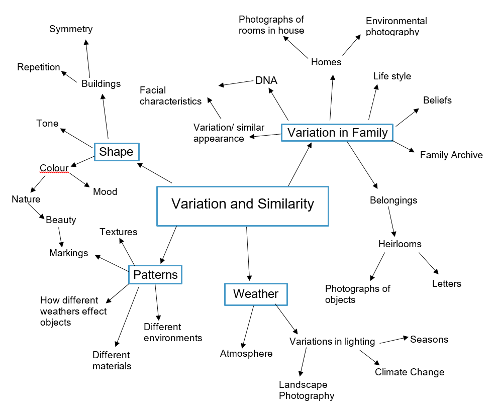
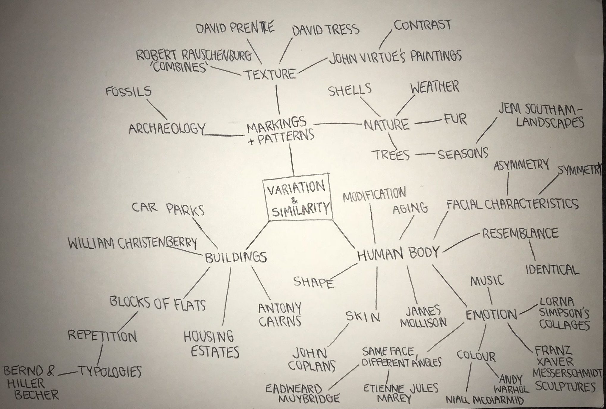
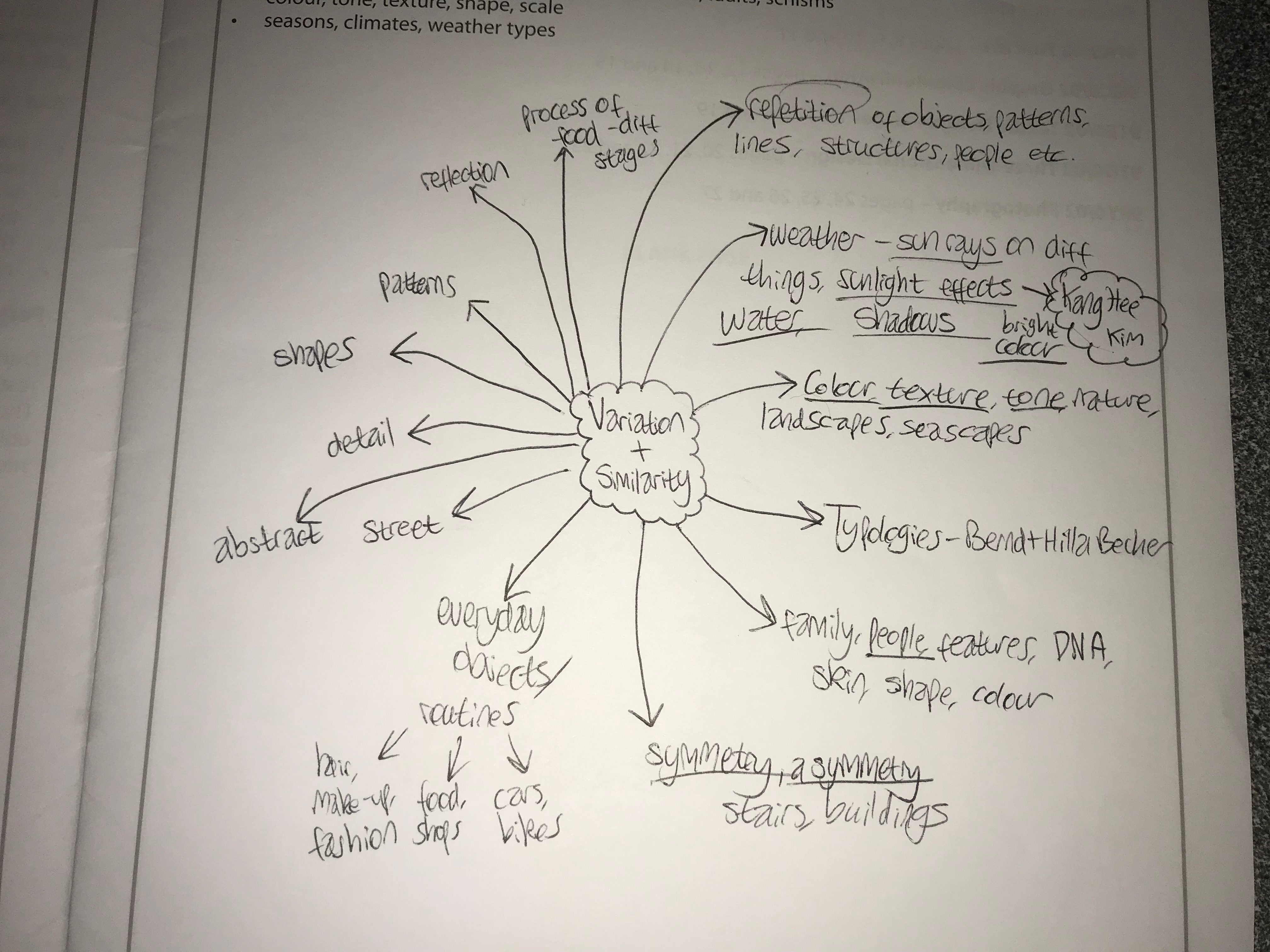
My broad range of aspects to focus in on for this exam is bringing me new ideas that I could explore. Below is a mind map of some ideas that I have come up with:

Variation & Similarity – Starting Points

Definitions:

VARIATION
1. a change or slight difference in condition, amount, or level, typically within certain limits.
“regional variations in house prices” Synonyms: difference, dissimilarity, disparity, inequality, contrast, discrepancy, imbalance, dissimilitude, differential, distinction
2. a different or distinct form or version of something.
“hurling is an Irish variation of hockey” Synonyms: variant, form, alternative, alternative form, other form, different form, derived form, development, adaptation, alteration, modification, revision, revised version
“he was wearing a variation of court dress”

SIMILARITY
1. the state of being almost the same, or a particular way in which something is almost the same:
“the similarity of symptoms makes them hard to diagnose”
2. a similar feature or aspect.
“the similarities between people of different nationalities” Synonyms: resemblance, likeness, sameness, similar nature, similitude, comparability, correspondence, comparison, analogy, parallel, parallelism, equivalence; interchangeability, closeness, nearness, affinity, homogeneity, agreement, indistinguishability, uniformity; community, kinship, relatedness; archaicsemblance
“the similarity between him and his daughter was startling”

After reading the booklet, I instantly decided that I wanted to go down 1 of 3 pathways.

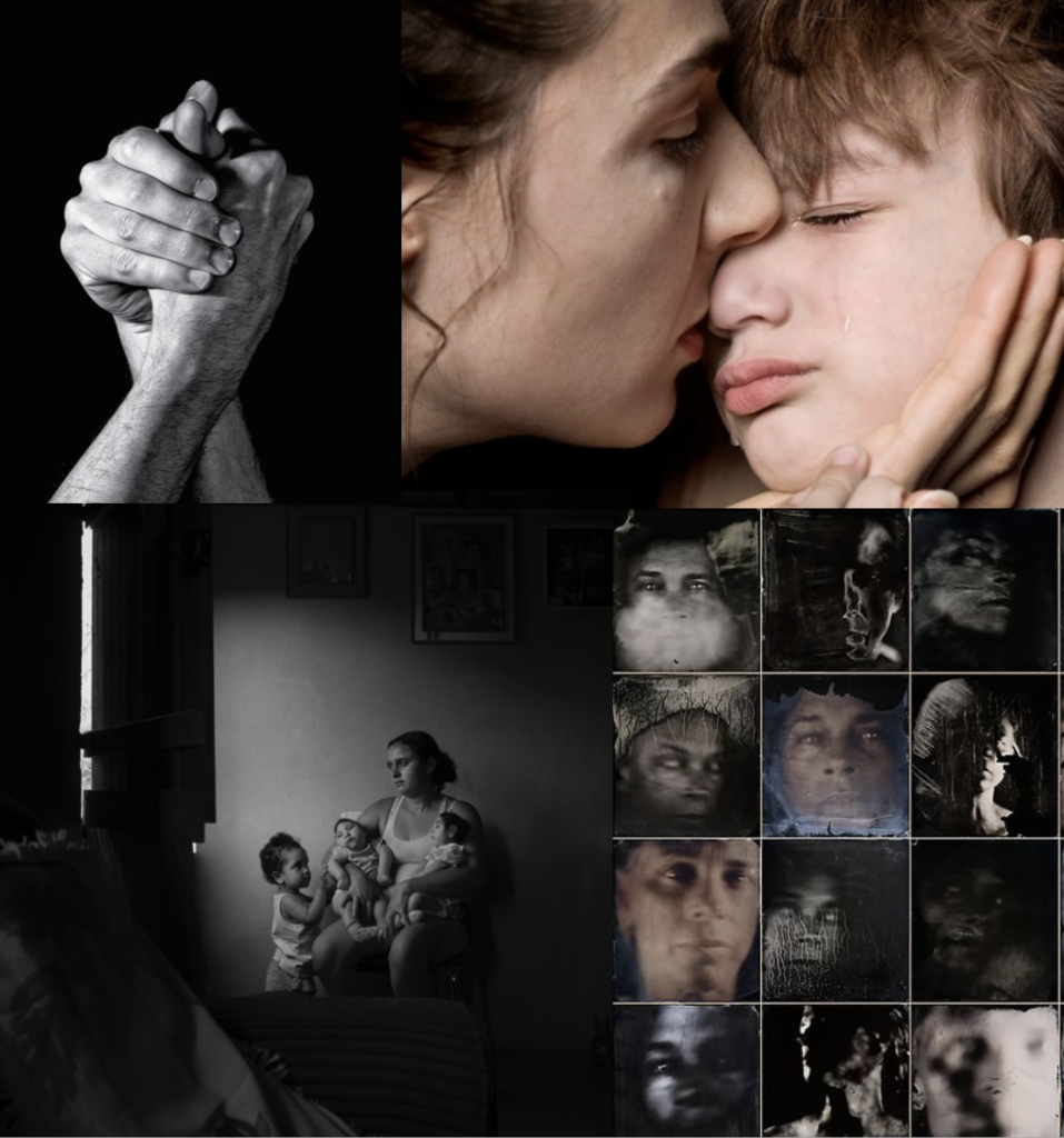
“Though we differ in the way we look and things we believe in, there’s something we all share: emotion. Human emotion is innate in all of us; it’s something we’re born with and something we die with. Happiness, sadness, love, hatred, worries, and indifference – these are things that constantly occur in our daily lives.”

Planning Future Shoots

Before commencing with my shoot I thought it would be appropriate to come up with ideas regarding what I would want to base my shoot around. I had previously looked at the works of Aaron Siskind and his use of portraying the surrounding area in abstract ways, defined by patterns and textures which present deteriorating areas in a new aesthetic light. Using him as my major inspiration for the shoot I decided to focus on a slightly built up area which would be surrounded by different landscapes and environments. To do this I would have to look at a map and decide upon areas that I thought I could use this style of photography to properly reflect my opinion and viewpoint regarding how that area portrayed. Here are a few locations that I could possibly explore on the shoot below:

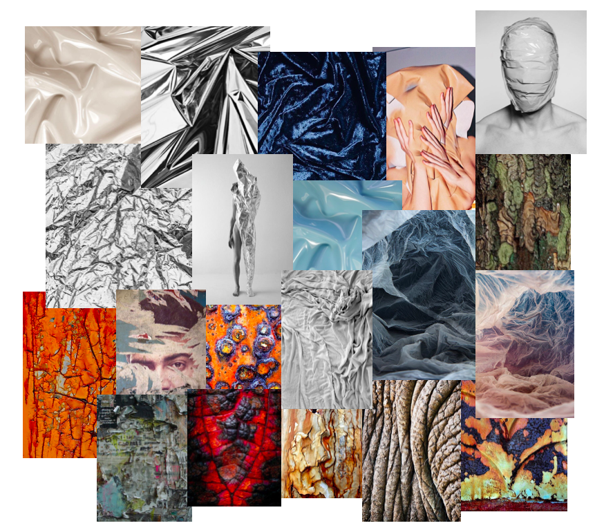
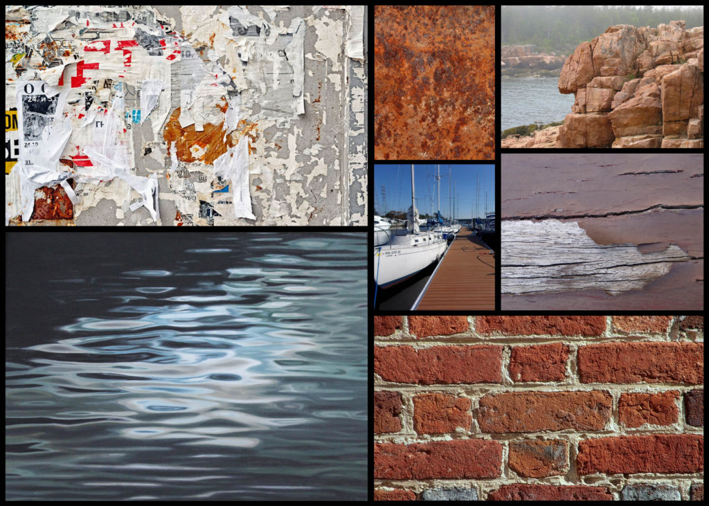
The areas I chose I found to have the biggest variety of aspects within the landscape, consisting of urban and natural viewpoints which would allow me to explore opposing opinions in abstract ways which could be linked into each other. I tried to include areas within Jersey that were next to the sea, this was because I wanted to explore the use of reflects to create abstract patterns of different materials in the water such as the bricks on a pier. To do this I’m going to plan out a few ideas which I would be able to photograph regarding the topic of the variation of textures and surfaces, which once done can be used to link in with each other providing me results that would not seemed rushed but instead compliment each other and can be presented as a set. Here is a mood board of some of the textures and surfaces I wish to capture on the shoot:

One aspect of the shoot I wanted to explore is the formation of rocks, due to Jersey being an island it is completely surrounded by rocky beaches that consist of various types of rock. By using a monochrome filter I wish to highlight the detail and aestheticism of the structures, using a higher contrast to portray the light and dark more drastically than usual, exaggerating the features as a result. To accompany this I could take pictures of the reflect given off by the sea during a sunny or overcast day, this would provide me with a variety of different shades and results which could determine the mood of the entire image. By reflecting objects like walls on the sea it could further enhance the abstraction by including two different environments into one image, man-made and the natural landscape.

Another idea within the shoot could be the use of materials found in that area to display textures and a variety of surfaces. This would consist of surfaces such as walls and wood, I chose these because of the huge variation in shape and form that they come in making each surface unique to that specific area. What I also wanted to pick up from these surface textures was the use of symmetrical aestheticism which would present the viewer with the idea of something with intelligence designing the shape of form of the photographed subject.

For my last idea I found that focusing on everyday objects found in the area explored would be a great topic to pursue. This is because the objects found in the area can often be linked to the people living there, with ropes lying around maybe reflecting a beach side village or cigarettes and rubbish present inside town. This idea for me links best to the works of Aaron Siskind as he moved from portraiture to abstract due to finding that the objects found often best portrayed the people living there in a unique and unusual light, giving more meaning to the image as it then becomes down to the audiences interpretation instead.

Variation And Similarity – Exploring Ideas

Before commencing with various shoots and photographic inspirations I decided that I would be suitable to research various ideas that I could use as my theme for the topics of variation and similarity. Here I will be exploring five different stances I can taken regarding the given subject, and how I could go about taking images of the intended areas and their uses, these are my choices:

Empty Spaces/Full Spaces: 

Here I could photograph empty/full car parks, using the lighting present there to create aesthetic and contrasted results. This can be done to more effect in enclosed parking areas such as the ones present in town, where a more cramped and urban feel is created. I could also make use of the empty car parks at night in the open, using the odd lamppost’s lighting as a means of casting an eerie feeling upon the surrounding area. A photographer who I could explore this with is Denis Felix, someone who explore the abandoned landscapes of areas in homes and buildings. Also done by photographer Johnny Joo, he capture the areas of society that have moved on, leaving natural to reclaim the land previously used. I could use monochrome photography for this as it could allow for a more unnatural feel to come across when viewing the photos.

Textures/Patterns:

For this idea I could explore the variation of patterns and textures within a variety of different objects present in different landscapes. By presenting everything as more abstract and aesthetic it could not just visually please the viewer but also provide an insight into the hidden world that can be portrayed by these surfaces, where you perspective can be warped depending on how you see the object. Photographers that I could use for this idea are Paul Sanders, someone who looks at the structure of objects and photographs them in an aesthetic and original way, and Edward Weston, a photographer who uses macro photography to capture textures and patterns of architectural and natural subjects, in both the environmental and man-made world.

Animals: 

Regarding the idea of animals I thought the variation of species would be a great topic due to Jersey having one of the worlds most famous endangered species zoos in the world, Durrell. By photographing a large variety of different species side by side it would provide a huge insight into how evolution has occurred and the different features and characteristics of each one. Some photographers that I could study for inspiration for this idea are the photographers Martin Bailey and Tim Flach. What I liked was their style of separating the subject from the backdrop using Photoshop or a black cover which really brings out the aspects of the animal they intend to capture.

Natural Formation Of Objects:

Here I wanted to explore how the formation of natural objects found in our everyday environment. By using macro photography it could highlight the hidden patterns in things that we view all the time, by photographing a variety of different plants etc like a topography it would give symmetry and aestheticism to the viewer who could see each image in a larger picture when compared to the other images taken the same way. The photographer Karl Blosfeldt I felt was a particular inspiration for me as he used topographics to capture the tips of plants using macro photography, which he would then display side by side so that they increased the overall interpretation of how the style of photography is viewed.

Abstract Landscapes:

Finally for this topic I wanted to look at how the various landscapes in Jersey could be viewed using abstract and unique perspectives regarding the formation of the area. Here I would have to look at the vivid colours and contrast them against more stark and ugly aspects of the area like concrete and walls, using telephone boxes, lines and brightly painted areas to do so. Some photographers that I would like to study for this are Sigfried Hansen and Ricardo Cases, who both use vivid colours to portray the landscape in a vibrant and interesting way that draws the viewer in through aestheticism and symmetry.

Overall when looking over the chosen ideas I found that the abstract stance of separating the subject from its environment really appealed to me the most as it presented me with alternative methods of showing my work, leaving the viewer to purely focus on that one subject. These are most evident in the topics of animals, natural formations and texture/pattern, giving me the opportunity to explore this style the most.

Variation / Similarity : generating ideas

1. Define and interpret the words

  • Variation
  • Similarity

2. Look carefully at the inspiration points below …

August Sander – The Face of Our Time

One of the first photographic typological studies was by the German photographer August Sander, whose epic project ‘People of the 20th Century‘ (40,000 negatives were destroyed during WWII and in a fire) produced volume of portraits entitled ‘The Face of Our Time’ in 1929. Sander categorised his portraits according to their profession and social class.

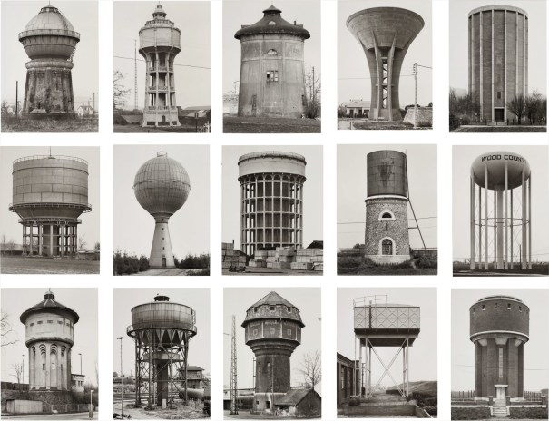
Sander’s methodical, disciplined approach to photographing the world has had an enormous influence on later photographers linked to The Dusseldorf School, notably Bernd and Hilla Becher. This approach can also be seen in the work of their students Thomas Struth and Thomas Ruff. Other photographers who have explored this idea include Stephen ShoreGillian WearingNicholas NixonMartina Mullaney and Ari Versluis.

Image result for bernd and hilla becher
Bernd and Hilla Becher

Read this article about by Hans-Michael Koetzle about Sander’s epic project.

Image result for august sander grid
August Sander

The Typologist – a Tumblr blog
Typologies Flickr Group
Typologies article
Steve Tyler’s series Typologies of Mass Consumption
A great blog post about Typologies

Boris Mikhailov – German Portraits

Nearly a century after August Sander’s portraits of German society, the Ukrainian photographer Boris Mikhailov created a series of pictures of the amateur actors in a German theatre company in the town of Braunschweig. Shot in profile against a black background, the photographer makes reference not only to Sander’s typol0gical study but also to Theodor Piderit’s Principles of Mimic and Physiognomy, published in Braunschweig in 1858 and also to Hitler’s interest in eugenics; Hitler became a German citizen in Braunschweig in 1932. The profile portrait also encourages the viewer to make formal comparisons between the sitters. Mikhailov’s portraits and those of August Sander were exhibited together in 2012.

Image result for boris mikhailov german portraits
Boris Mikhailov

Michael Wolf – Paris Tree Shadows (and other urban phenomena)

Michael Wolf’s early career as a photo journalist is perhaps evident in his various studies of urban life. He documents repetitive features of the urban landscape, clearly influenced by the deadpan approach of the Dusseldorf School and the New Topographics photographers. However, Wolf’s approach appears more concerned with the symbolic role played by mundane items such as his ‘bastard chairs‘ which suggest the density of the urban environment of Hong Kong and the human ingenuity of its inhabitants. Wolf often uses a strict typological approach, as in his series ‘100 x 100‘, repeating the same vantage point. However, Wolf is always interested in the individuality of his human subjects and the tremendous visual variety of the interiors in which they live. He often displays his images in groups or in series to draw attention to repetitive phenomena. There is humour and poetry in these groupings. A good example of this is the beautiful and subtle “Paris Tree Shadows’ series.

Image result for michael wolf paris tree shadows
Michael Wolf

Michael Wolf is known for his large-format architectural photos of Chicago and primarily of Hong Kong, where he has been living for more than 15 years.

His latest pictures have also been created in a big city: Tokyo. But this time Tokyo’s architecture is not the topic. Michael Wolf’s Tokyo Compression focuses on the craziness of Tokyo’s underground system. For his shots he has chosen a location which relentlessly provides his camera with new pictures minute by minute.

Every day thousands and thousands of people enter this subsurface hell for two or more hours, constrained between glass, steel and other people who roll to their place of work and back home beneath the city. In Michael Wolf’s pictures we look into countless human faces, all trying to sustain this evident madness in their own way.

Brainstorm

Variation

noun
1.  A change or slight difference in condition, amount, or level, typically within certain limits.
Synonyms: difference, dissimilarity, disparity, inequality,  contrast, discrepancy, imbalance, differential, distinction
2.  A different or distinct form or version of something.
Synonyms: variant, form, alternative, other form, different form, derived from, development, adaptation, alteration, modification, revision, revised version


Similarity

noun
  1. the state or fact of being similar.
    -a similar feature or aspect.

Synonyms: resemblance, likeness, sameness, similar, correspondence,  comparison, analogy, parallel, equivalence, interchangeability, closeness, nearness, affinity, agreement,  indistinguishability, uniformity, community, kinship 

Key Words:

  • Contrast
  • Distinction
  • Alternative
  • Modification
  • Revised version
  • Resemblance
  • Comparison
  • Repetition
  • Parallel
  • Closeness
  • Agreement
  • Community

Texture

Texture photography stands out from different types of this medium as the focus of photographers is put on the textural aspect of it. The quality of each photo is measured by its impact, and this type of photography can be defined as imagery which impact depends on the texture of the represented subject.

Texture can stand for surface irregularities or small forms on a surface that are sometimes rendered visible through the optical enlargement of details. While the aim of each photo is to attract the attention of the viewers, this could be achieved through the emphasis of different elements such as color, leading lines, dramatic scenery, or in this case texture.

Three sub-types of texture photography can be defined through the use of terms detail, information, and drama. In the first, interesting details on the surface of an object are of primary concern for the photographer, drama relies on the dramatic effects, as the term itself suggests, and for information it is important to select what info is communicated through the photo and to make a compositional decision that would best bring it out.

Patterns and Shadows
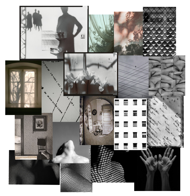
Filling the frame with a repetitive pattern can give the impression of size and large numbers. The key to this is to attempt to zoom in close enough to the pattern that it fills the frame. Patterns can be found virtually anywhere, although some of the easiest ones to identify occur in nature. Architectural design offers a great source of patterns, especially in mirrored high-rise buildings. Compositional considerations such as the Rule of Thirds, leading lines, balance, and framing usually don’t apply when shooting patterns.

The other common use of repetition in photography is to capture the interruption of the flow of a pattern. Broken repetition might include adding a contrasting object (color, shape, texture) or removing one of the repeating objects.

Body and Patterns
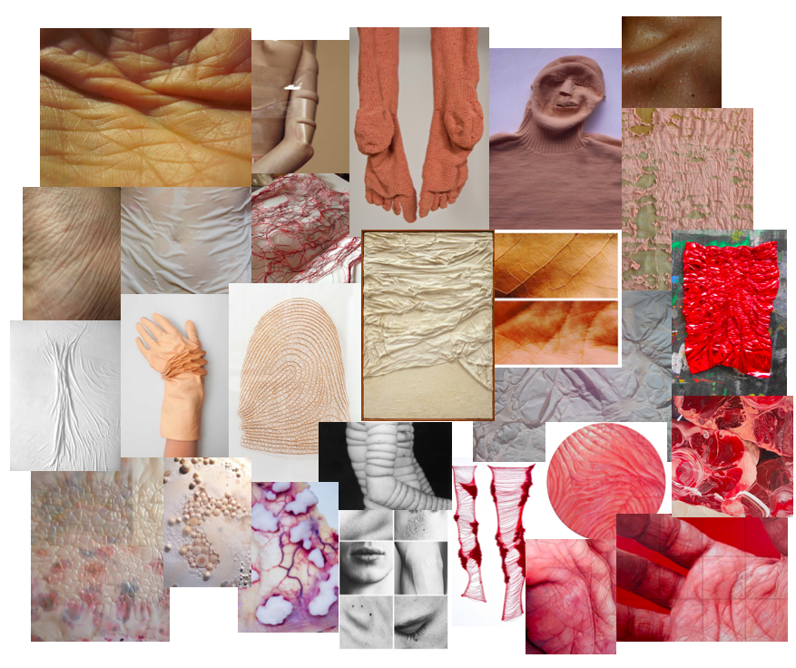
The human body is central to how we understand facets of identity such as gender, sexuality, race, and ethnicity. People alter their bodies, hair, and clothing to align with or rebel against social conventions and to express messages to others around them. Many artists explore gender through representations of the body and by using their own bodies in their creative process. Portraying body and pattern could challenge the notion that the female in art is an”object,” rather than its, subject, viewer, or creator.

The 1960s and 1970s were a time of social upheavals in the United States and Europe, significant among them the fight for equality for women with regards to sexuality, reproductive rights, the family, and the workplace. Around this time, the body took on another important role as a medium with which artists created their work. In performance art, a term coined in the early 1960s as the genre was starting to take hold, the actions an artist performs are central to the work of art. For many artists, using their bodies in performances became a way to both claim control over their own bodies and to question issues of gender.
FIRST SHOOT, LANDSCAPE WITH SURREAL EDITS

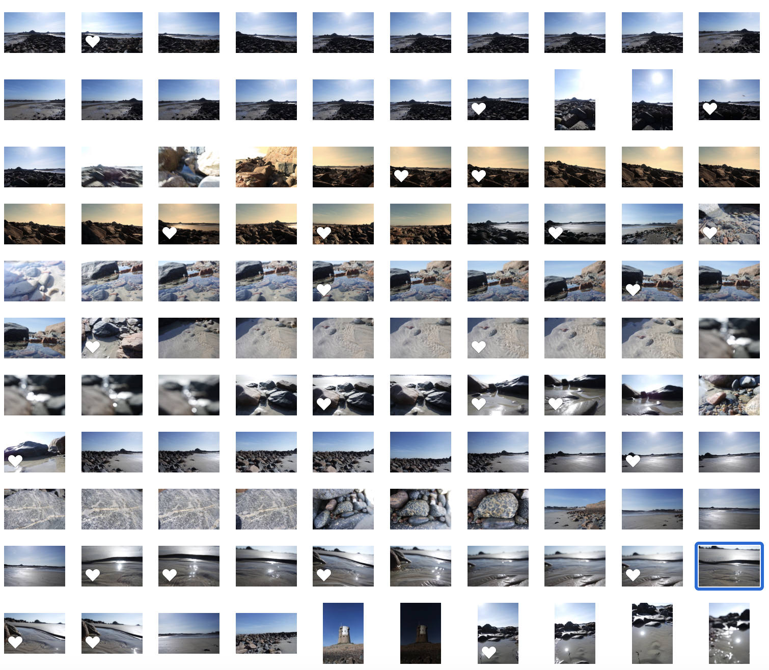
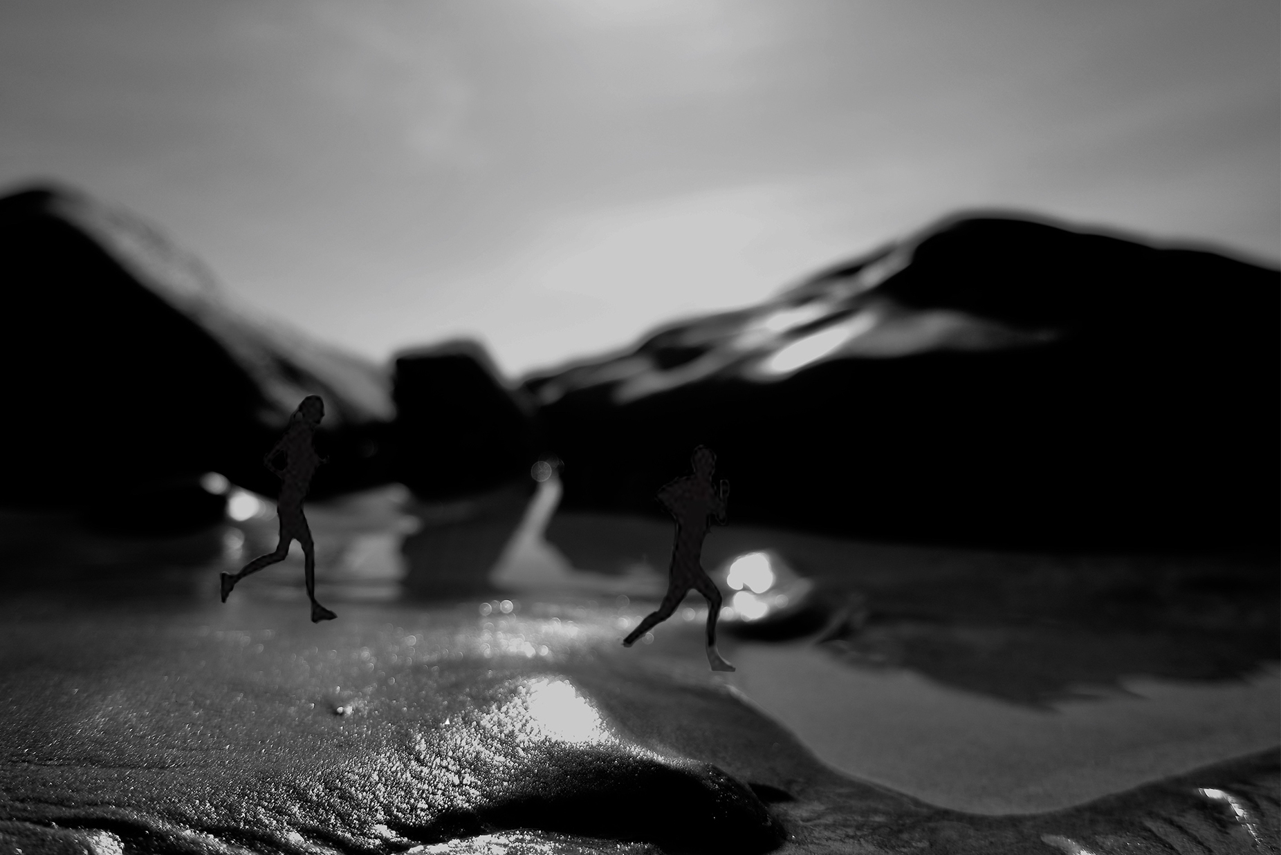
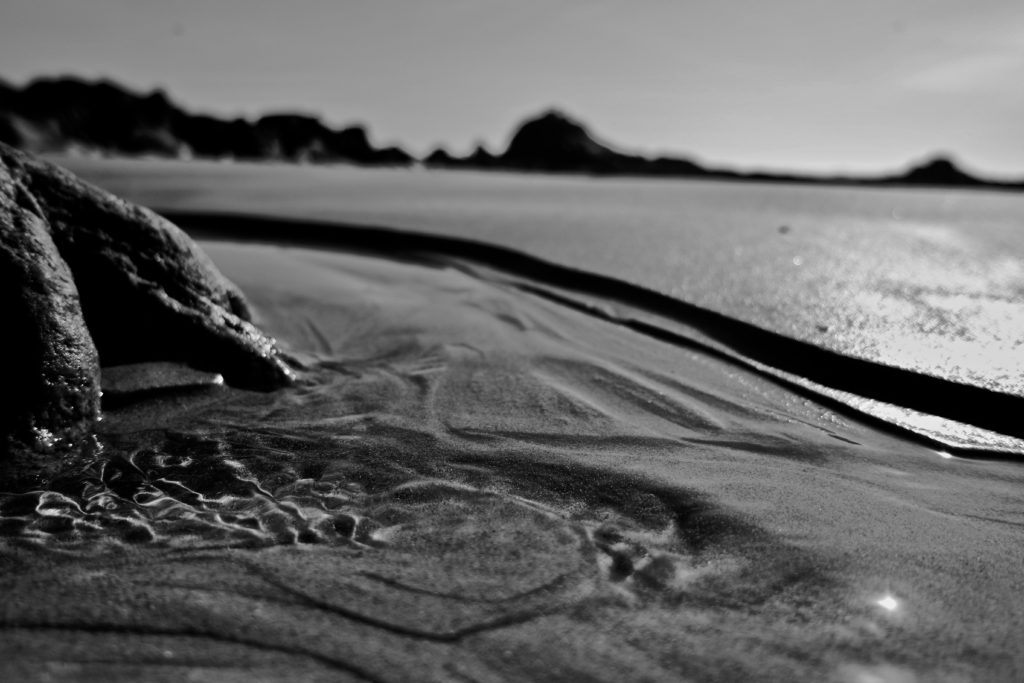
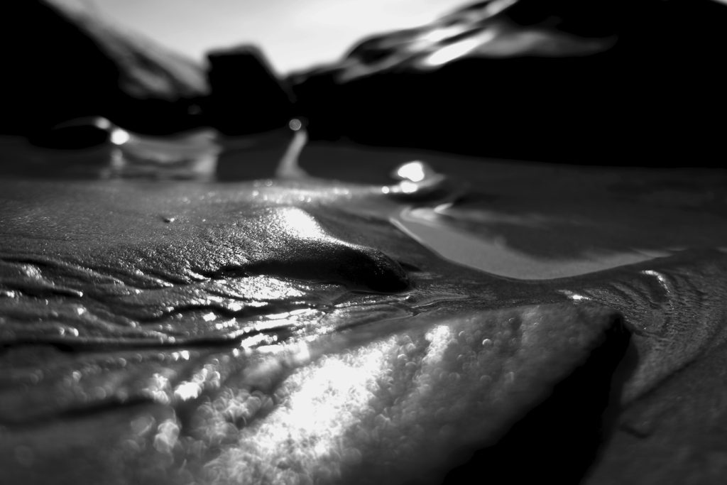
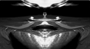
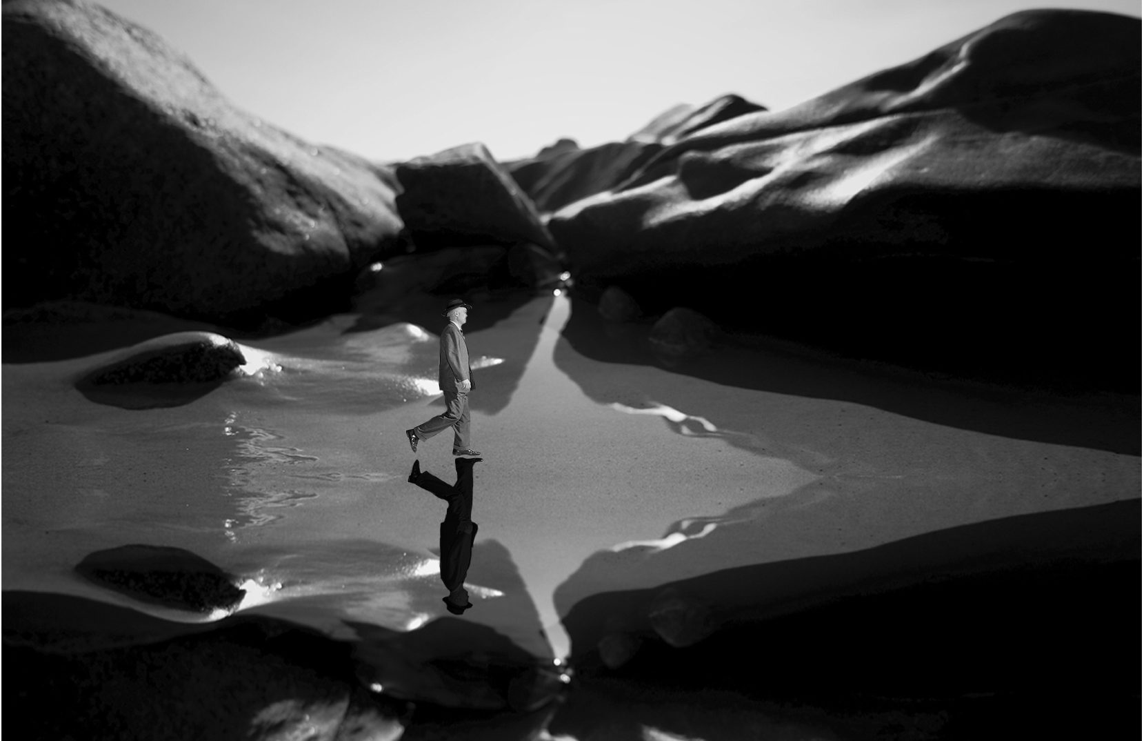
With this shoot I will develop the outcomes in two manners. The first being creating surreal pieces, editing the close-ups to have people and changing the perspective to the landscapes themselves, creating character. To do so I will probably over lap the images, and also edit the images themselves, into being black and white, to capture the tonal differences, from the light and more tonal shades. The second way in which I will develop this shoot, is from printing out some of the more clear landscape images, and pouring them in paint and liquids, in order to change the composition and the colouring of the art piece itself. This second composition idea, has a much more clear influence from the fine art outlook, and I believe it will be very different from the outcomes below, and less predictable. edits- to create a more fine art creative influence:
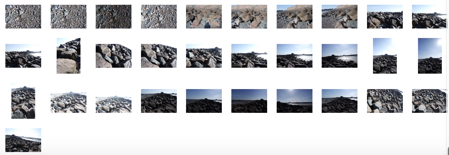
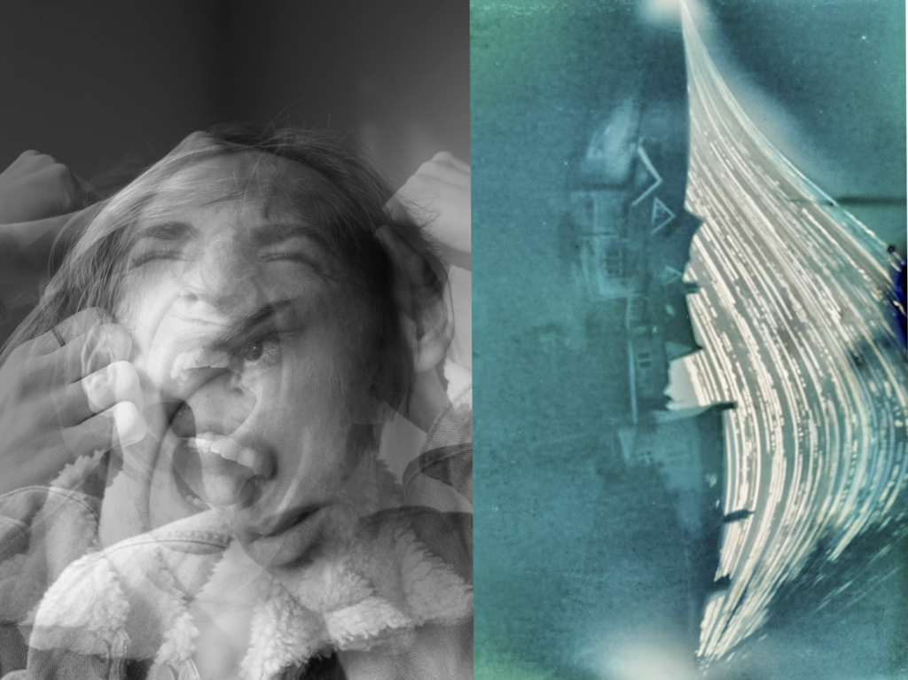
analysis: For this shoot and small edits, I wanted to show landscapes which could be further edited in order to show surreal elemnts. My main aim for these images, was to capture an element of fluidity, and softness of structure to the images. I wanted to get the reflection and the detail within the sand, and use this in order to change perspective and make it look as though the image is not close up but expands across a large-scale. When looking closer at the reflections and movement of the sand, I discovered that it looked as though it was a path, or something which was guiding a route for someone. Because of this, I thought to create a surreal image I would repeat the images, and make it appear as a wet pathway, and put someone and a reflection within the water. I chose A politician as then this both connects my theme of media into my work. It additionally creates a uncomfortability within the image. He looks out-of-place in his suite and with his surrounding, it creates contradictions within the image however, at the same time, still forming connections to surrealism. I added the shadow in order to give the piece an elements of realism. The second image, I too thought had elements which paved out a path. I decided to add more artistic looking fine art figurative people, running along the beach. However, I do not belive this is as successful as the previous, due to the composition and light.
PLANNING FOR FIRST 4 THEMED SHOOTS FOR VARIATION AND SIMILARITY

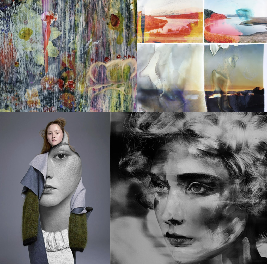
FIRST SHOOT:landscape manipulation shoot: within this shoot I have 4 different concepts that I would like to edit and experiment with when taking an manipulating the photos. The first I have recently looked up at and it is to take a more subsequently ‘normal’ landscape photo, yet cover the outcomes in a liquid and then use this development of the photo as the final. This liquidation, allows colours to move and leak and forms a new more interesting composition. Additionally this creates a clear transpire of artistic influence and forms a connection of fine art, and making it appear as if this photo was some what painted. The approach to this technique is: My second developmental idea for landscape shoots, is the editing process to make landscapes look as I have are paintings, or visa vera: Lastly I could use this same method in order to make portraits and other images, look as though they are painted, by doing thick brush stroke effects or making the image look more abstract and more filled with fine art effects. Additionally As spoken about previously, I want to believe the main version of this is taking pictures of thick paintings, possible inspired by van Gogh and Monet, and making it look as though they could be real people, or real objects. I think this is a very interesting method on how I could start developing my work. My third idea is surreal manipulation to a landscapes. I believe if I were to experiment with how landscape can be altered, in order to have more similar stylistic values to things such as paintings, or piece of more abstract contemporary work, it could be very successful. Surreal manipulation to a landscape to edit. I believe this could further link to making landscape look like altered realities and turned into abstract manipulated paintings. This again showing how far art has the ability to go. These abstract pieces come under many art categories and also shows an understanding of how to develop a piece to see a progression of artistic influence.

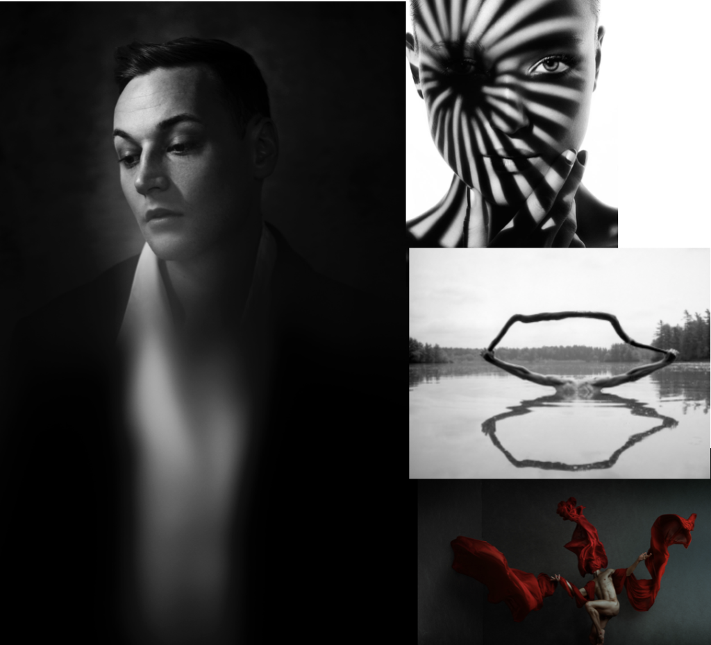
Studio shoot :To my mind the studio shoot is the shoot which I know what final outcomes I am really looking for, and even to the extent, this shoot will really help me to develop the rest of my imagery. I have divided this shoot into 5 subcategories of images, which I want to capture and further develop and how and why I believe these executions are the most important. The first is using a glass bowl, or jar, and using this in front of  a face in order to distort and stretch the face. Not only does this once agin show an interest of the element of fine art, but is almost connotes the elements of visible chaos, and showing a trauma to that persons personality. This can also be seen by the work of William Ye.  Another inspiration from Ye will be experimenting with using a flowing piece of fabric, in order to show a structure in the piece. I believe this effortless looking towel and the structure of the body, creates such a successful outcome, and connotes an overlooked power. This sentiment of chaos I believe can also be represented through the effect of people climbing on top of each other, and or forming together to make structures and new bodily forms. This shows a unity of people standing together, and also a combination of family. This leads me onto my representation of chaos, and the acts of people when pulled together in a group, yet still showing the effortlessness of how to form a new stature creating a new art piece.  The last idea which combines fine art, and the media that I can do within a studio, is the editing of faces onto peoples clothes, and using this to effect true feelings, and or editing on events which symbolise trauma or the past of peoples lives. This I believe has a certain contemporary art feel, yet is not done through a painting style. The combination of high fashion within this shoot, also symbolises the beauty industry and  how you have to look a certain why, and what is expected. These geometric shapes, create combinations of cubism and once again this whole shoot linked together with the interposing state of form, composition, and fine art media effect.

family and friends shoot: For the family shoot I  want to both approach this in both a journalism and  unconventional surreal manner. I wish to start off by producing images of many large groups of friends and family, or people who have a close net relationship. I then want to develop these into collages of smudges images, and faces covered and layered with effects, to create a distortion of  identity, but a similarity into the way which they are all covered. An extension from this process, could be family pictures, and portraits collages together, or patterns which have a significance to the families themselves. This could be, a flags or perhaps a pattern made by a grandparent. Anything which is texturised yet still causes a effect fro the family themselves, and an expression of themselves.

chaos: inspiration from the media: Chaos to my mind, is something which causes a feeling which depends an emotional response of panic and madness. It can mostly be seen throughout the media, through articles, fake news or even protests which go too far. These movements are all about conflict of peoples beliefs, because of this, I Believe if I were to layer images of people causing different facial effects, in order to show different emotional and a chaotic feeling expanding and becoming more abstract. This not only builds tension within the image but also shows expressions of human conflict within the images. Secondly a good example of variation and similarity, is watching peoples daily lives, and their own independent news. This could be caught and seen through peoples daily lives, and the activities which they get up too. Street photography is a great way to capture a reality of the people possibly not correctly expressed through the chaotic media, andI  belive this would be a very interesting way to reflect the society which we live within. Chaos can also be shown through more unconventional techniques, these being the light patterns of slow exposure, of perhaps even manipulating a person or landscape, to look or be presented in a unconventional way. This unique approach too seeing the worlds could count as a reflection of mediation and journalism, and the many dimensions which it is possible to see a story or event. You could even explore taking a picture from many different angles, and then experimenting with which angle tells the chosen story most successfully.

My Response to Lewis Bush/Michael WOLF

This shoot draws inspiration from Lewis Bush’s ‘Metropole’ as well as Michael Wolf’s ‘Architecture of Density’ and aims to show some of the repetition and symmetry in blocks of flats and offices whilst at the same time showing the difference in designs between buildings.  Going into this shoot I had the vision of photoshopping the photographs that result to create compositions that are full of patterns and are illusion-like.  Lewis Bush’s ‘Metropole’ came to me as an inspiration because it explores the fact that there are an increasing amount of large buildings for offices or flats taking away from green land and so the landscape in which we live is turning into a repetitive view of similar flats and offices leaving citizens with a feeling of monotony as everything is being redeveloped to serve the same purpose.  Bush’s work on ‘Metropole’ shows a lot of emphasis on the repetition between buildings and I have tried to replicate this in this shoot. Wolf’s work has inspired me as he essentially does what I am attempting to do in this shoot but on a much larger scale by photographing the density of high-riser apartments in Hong Kong.

One way in which I could develop on this shoot in the future is by looking at typology, which would involve me researching Bernd and Hilla Bechers, of high rise buildings in Jersey.  I could approach this by finding the 14 high rise apartment blocks in Jersey and photographing these in a similar style to this shoot and then creating a typology page of these different buildings.

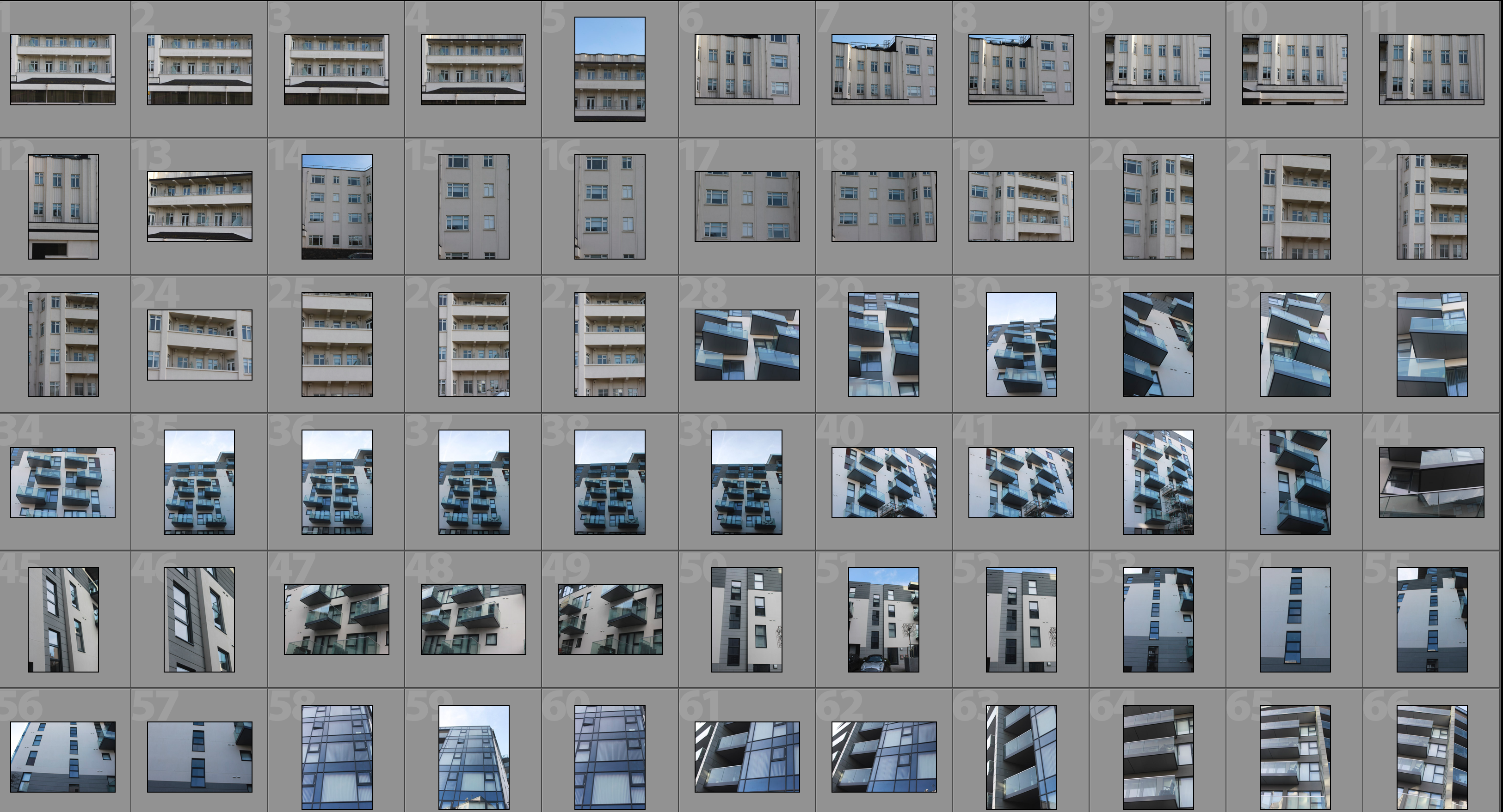
Contact Sheet

Edited Photographs

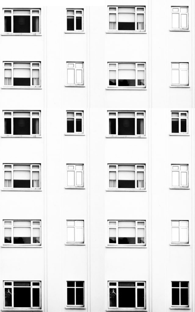
After going through all of the photographs that I produced on this shoot I selected some of the best that I could edit.  I edited these photographs by putting a black and white filter on in order to allow the viewer to focus on the shapes within the photographs rather than the colour.  I then used a perspective crop on the majority of the photographs in order to make the photograph completely straight on in order to further emphasise the symmetry and patterns within the photographs.  As well as the black and white filter I increased the contrast, used high highlights and whites, used low shadows and blacks and adjusted the exposure accordingly to create a composition that is mostly over exposed but the features such as the windows are emphasised to help the shapes within the buildings to come forward.

Edits

After editing the individual photographs I brought the photographs into a blank photoshop document and duplicated it.  After the duplication I then messed around with the layout of the multiple photographs to create illusions that show lots of repetition and some symmetry.  The result is montages that emphasise in blocky shapes and use a black and white filter to bring contrast into the photographs.

#1

#2

#3

#4

#5

#6

Analysis

I captured this photograph in a natural lighting in order to bring out the natural shadows and shapes within the building that I was photographing.  There is a wide tonal range due to both the nature of the building and my editing to the photograph.  The bright whiteness in the walls of the photograph contrasts greatly with the dark black shadows on the balconies.  I took this photograph on a bright day where there was plenty of sunlight so only needed to use a low ISO of 100 along with a shutter speed of 1/60 to capture this photograph.  The low ISO paired with the quick shutter speed allowed for the photograph to be as high in quality as possible as well as not being overexposed (even though I edited the photograph to increase the exposure.  I edited this photograph by using a black and white filter to bring out the shapes in the windows as well as the shadows and then I increased the contrast, highlights and whites whilst reducing blacks and shadows to create a composition that had high contrast between the black and whites.  A depth of field of f/16 was used to capture the photograph which can be seen as the whole of the photograph is in focus.  The photograph has a slightly cold colour cast to it due the bright whiteness throughout it.

I opted for a black and white filter over a colour photograph as it helped to bring out the details within the buildings, especially the contrasts as well as a wide tonal range to create a more dramatic composition.  Due to the deep shadows and edges within the photograph as well as the editing of the photograph the composition has a 3D effect as it appears to have different layers which bring the photograph to life.  There is also a lot of patterns and repetition within the photograph, which I aimed to create when setting out on this shoot.  I have placed the balconies on the two horizontal lines of the rule of thirds as I feel that they are the most interesting parts of the photograph so placing them along these lines creates a more interesting composition as well as helping with symmetry.

The aim of this shoot was to create a set of photographs that showed the repetition of shapes within blocks of flats and offices and how this repetition can be aesthetically pleasing.  The overall results shows how even though there is a lot of repetition within individual buildings, each building has its own unique characteristics and shapes and therefore have variance.  The inspiration for this shoot came from photographs of tall tower blocks in cities such as Hong Kong where each floor and flat are almost identical, which is perfectly demonstrated in Michael Wolf’s work as well as inspiration from Lewis Bush’s ‘Metropole’ in which he looks at the development of buildings through a double exposure technique to create a similar outcome to what I have done.

The concept behind this is that there are an increasing amount of these large and repetitive buildings that make way for office buildings or flats due to the ever rising population and urban migration.  The photographs resulting from my shoot show just how repetitive these buildings that are taking space from nature really are and reflect the idea that some residents may believe that the landscape of cities including Jersey is becoming repetitive and monotonous as lots of land is being taken to serve the same purpose of housing or offices.