Category Archives: Developing

Filters

Author:
Category:

Initial Experimenting with GIF’s

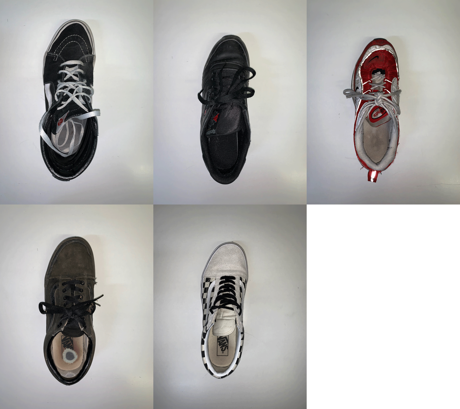
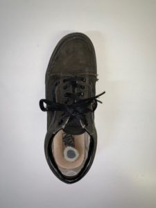
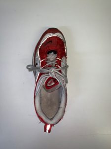
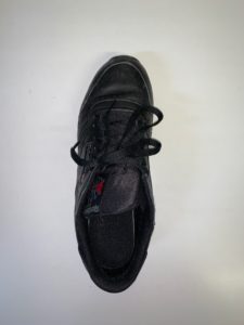
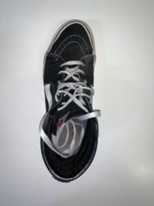
A GIF (Graphics Interchange Format) is a bitmap image format developed in 1987.  It is a widely used format on the internet as it is widely supported.  The format supports up to 8 bits per pixel for each image and supports animation.  The use of GIF’s in the context of photography can be extremely useful to display a range of photographs in a unique and interesting way.  In this instance I have shown different shoes in order to allow the viewer to compare the different shoes shown to see the different shapes and styles even though they are all only shoes.  Creating a GIF is a relatively easy and straightforward photograph – to create the GIF shown in this post I uploaded all of the photographs into photoshop and then loading all of the different files into a stack.  I then created a frame animation and made frames from the layers.  I then chose the time that each frame will be shown to be 0.2 seconds and so resulting in a fast moving GIF.

This use of GIF’s is extremely relevant to the topic ‘Variation and Similarities’ as it is an easily displayable way to demonstrate both variation and similarities between subjects.  I plan on experimenting with GIF’s and working them into my exam as I believe that it is a very effective way of displaying typologies of subjects, such as different high rise buildings/office blocks and the contents of peoples’ bags.  As I further develop my work on typologies I will explore photographing more styles of building and putting these into a GIF format in order to effectively show the similarities and differences between the buildings as I aim to do.  Below I have demonstrated an example of the type of work I could produce whilst incorporating GIF’s into my experiments – I will focus on building a wider portfolio of similar photographs in order to create a variety of GIF’s.

RESPONDING TO JOHN BALDESSARI’S WORK

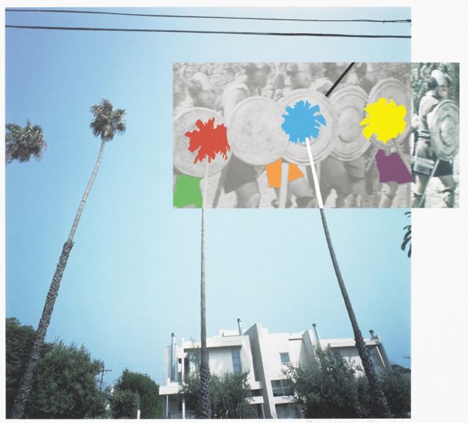
The Overlap Series: Palmtrees and Building, 2001:

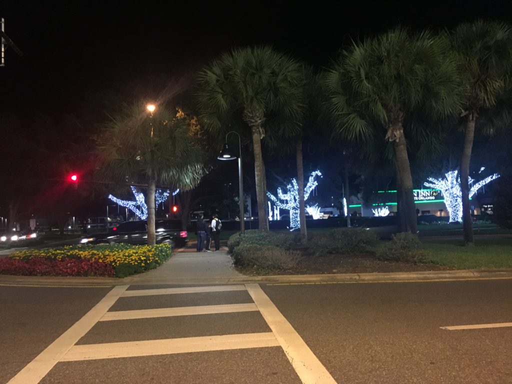
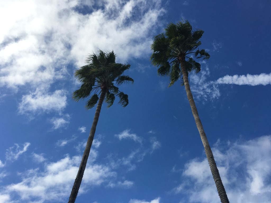
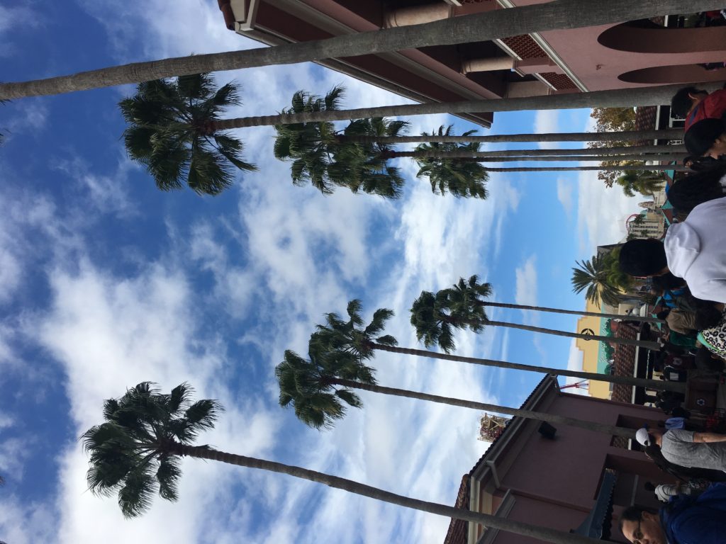
Part of Baldessari’s classic Overlap Series, this piece juxtaposes an urban view of palm trees and a sleek modern building—quite probably somewhere in Los Angeles—with a jazzed up black and white photograph of Vikings, the contemporary colliding with the historical. By extending the palm trees into the space of the smaller monochrome image, the artist ingeniously links the two pictorial surfaces—a classic case of Baldessari montage. I will be responding to this photograph with primary source images I have taken on a recent trip to Orlando, Florida. I was able to gain a collection of photographs of palm trees in Florida, with clear visual similarities to Baldessari’s 2001 Palmtrees and Building. I will be editing these photographs in a similar style using Adobe Photoshop CC.

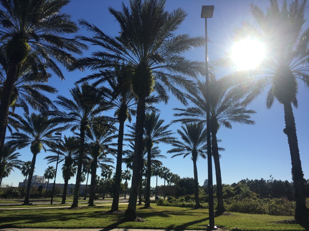
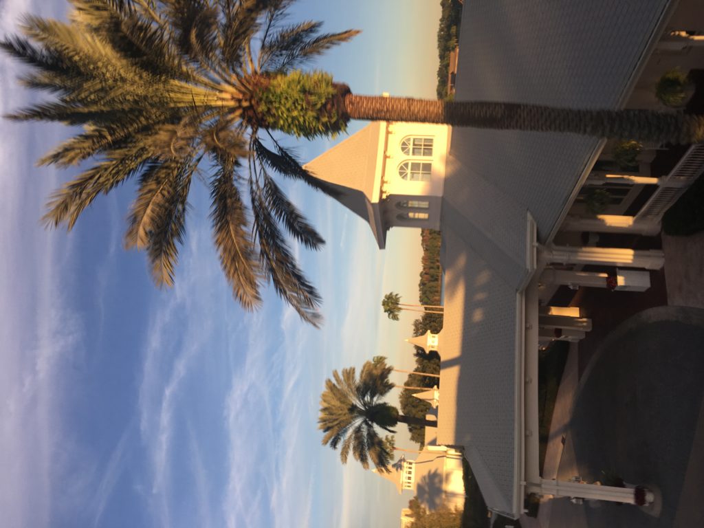
Primary source images:

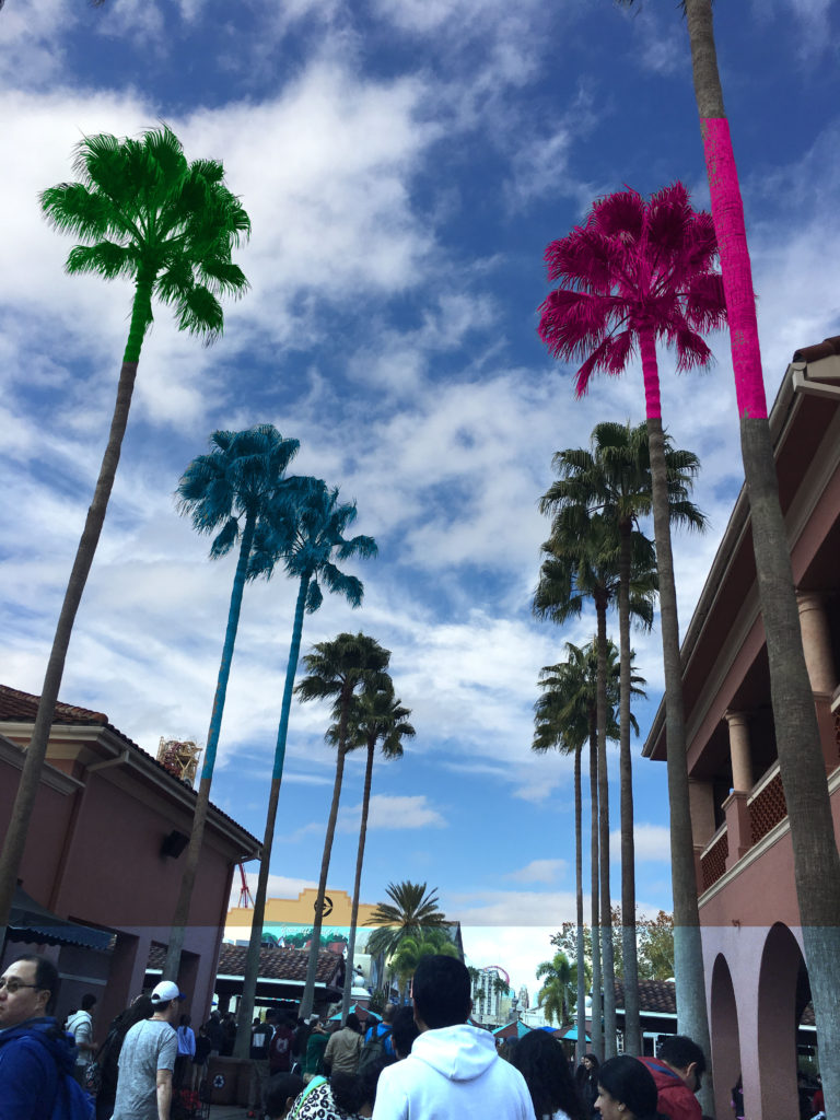
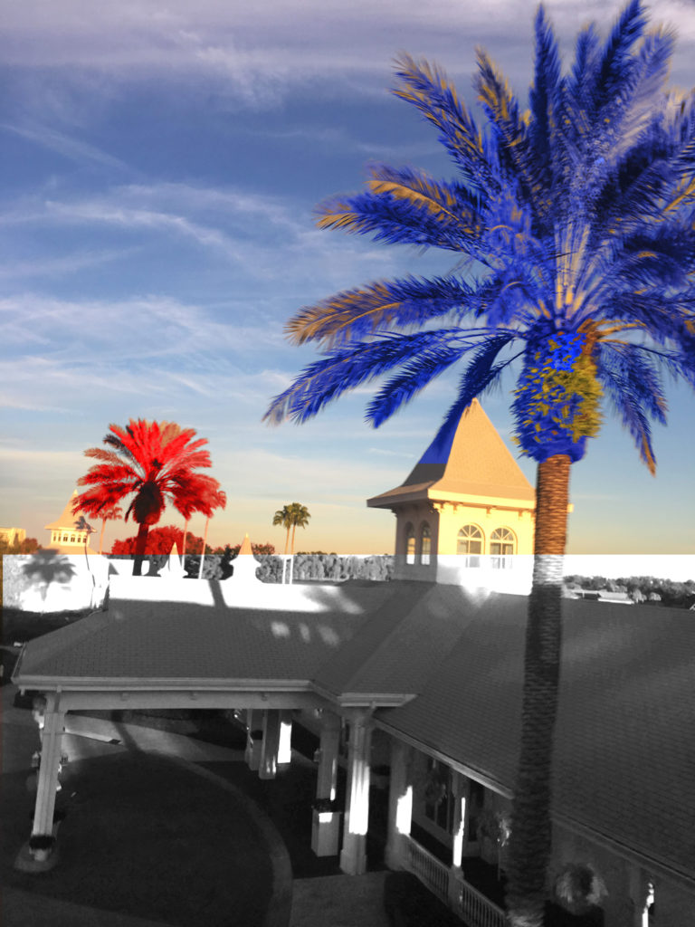
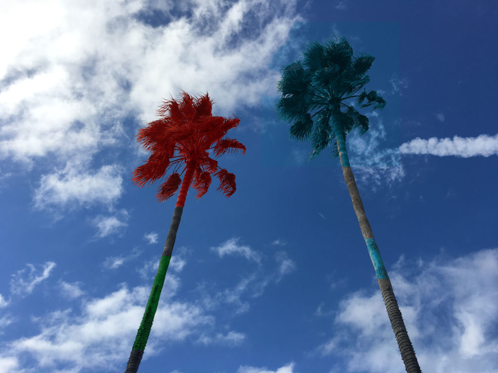
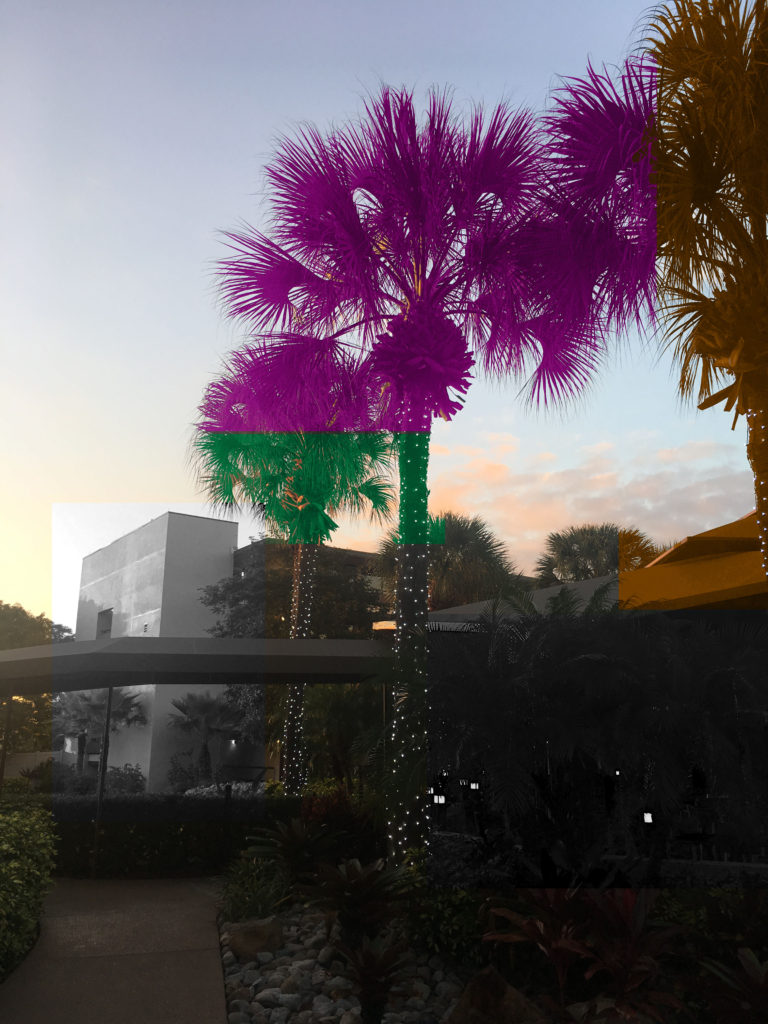
Editing process:

In order to edit my photos in the style of Baldessari, I used the colour replacement tool. I added bold, vivid colours of green, pink, blue, red and orange to 4 of my own photographs. To add the colour to only the select sections I wanted, I used the rectangle marquee tool and guided it over the area of the photograph I wanted. Like Baldassari, I also added multiple sections of monochrome to my images. As a first basis for my project, I am happy with my experimentation. The subject of palm trees correspond to my project aim of photographing the natural world and the variation and sublime beauty within it.

repetition – typology research

Explain your process and where your ideas came from RE  GIF –Making

the process of creating a gif: File, Script, Stack, Window- what file , add open files, Okay, Select all layers, Window, Open a timeline, Opens at the bottom, Click arrow to frame animation, Must click it, Me he box in corner, Create new make new, 0 seconds, A delay between frame, How long you want the gif, 0.2 secs, Forever as a loop like a standard gif, File, Export, Save for web legacy, Dialogue box preview, Check file size, 8mg on blog, Might need to trim, In image side bring it down.

•      Include your original images to show the starting point of your experiment

•      Define what a GIF is…it’s possibilities and limitations too

a lossless format for image files that supports both animated and static images.
“a GIF image”, a file in GIF format., plural noun: GIFs
The possibilities for a gif is to make an almost motion picture animation, and create a formation of separate images, almost forming a real life narrative. However it does have limitations of the way in which you take the image for the similarities to line up and look as though it could be real.

My typology gif

What is a GIF?


To make this gif, I took a series of images of different shoes as this was an object that are similar. I made sure that each shoe was the left shoe so that they were consistent. I took my images from a face on perspective to create the same type of image. My images I took are below:

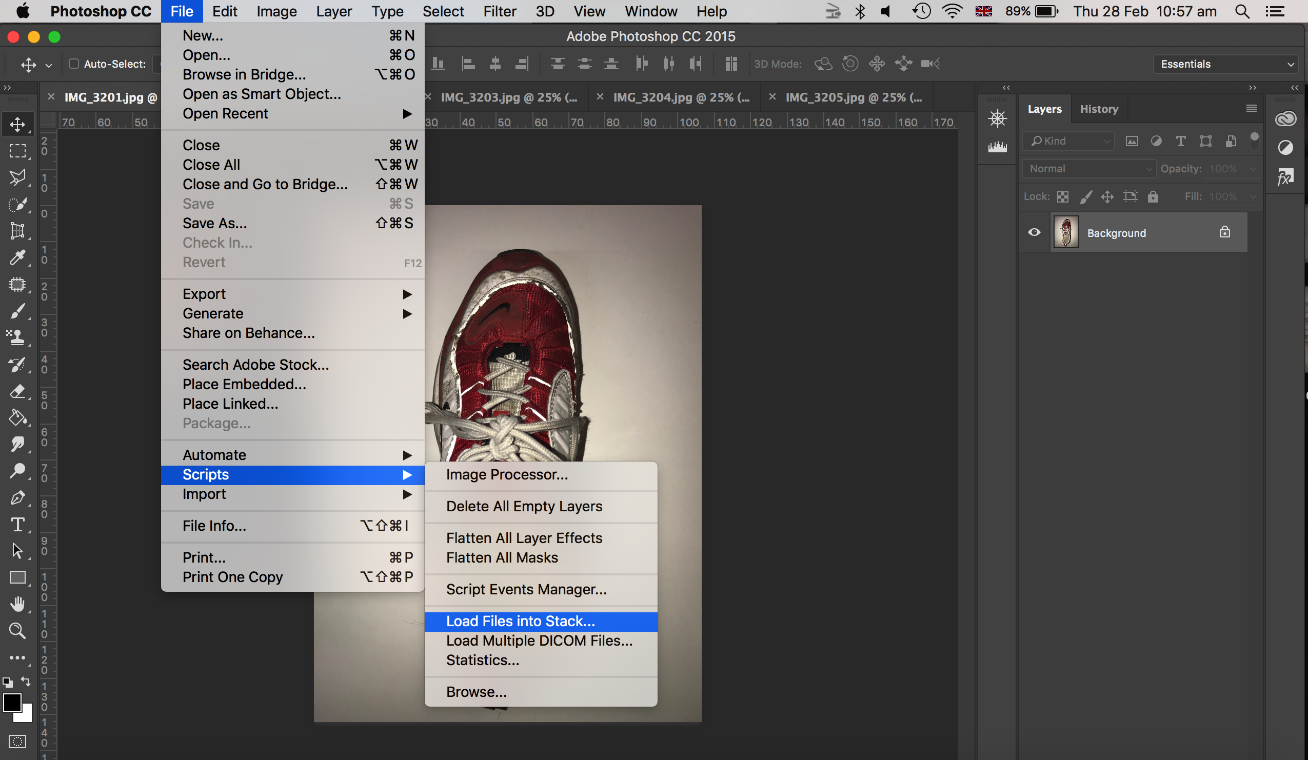
To make my gif, I first of all went to file, scripts, and selected load files into stack as shown in the image below.

Next, I went to window, and chose timeline, where this made my image appear on a timeline at the bottom of my photoshop screen.

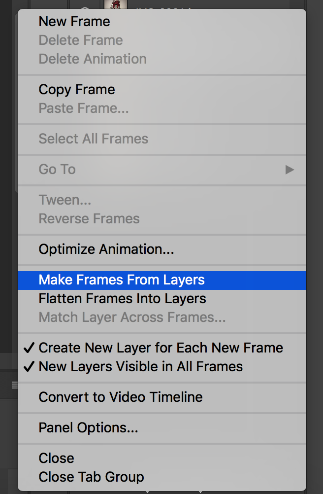
Then, chose the menu button at the top right hand corner of the timeline bar, and create new layers for each frame and then clicked the same menu button again and selected make frames for layers.

Finally, I chose each frame for each image to be 0.2 seconds (this meant there would be a 0.2 second pause in between showing the next image. I also chose to put my gif as forever, where this would play as a loop.

To export this image, I went to files, export, save for web (legacy).

My final gif


Bernd and Hilla Becher / Typology

Typology and the Bechers

The definition of ‘typology’ is “a classification according to general type, especially in archaeology, psychology, or the social sciences”.  Essentially it is the study of types.  The roots of Photographic Typologies is in August Sander’s 1929 portraits ‘Face of Our Time’ in which he documented German society between the two world wars.  Sanders’ aim was to create a record of social types and classes as well as the relationships between them.  Sanders was so successful in achieving this that the photographic plates were destroyed and his book was banned soon after the Nazis came into power.  Typology can be used to create a visual analysis of objects and the larger environment by extracting visual elements and presenting them in a consistent series and so forcing the viewer to compare the subjects.  The Becher’s and their style appeal to me because when exploring ‘variance and similarity’ I hope to create photographs that successfully show the differences and similarities in structures as the Bechers’ have done in a similar style whilst using the typology grids to emphasise the contrasts.

The term ‘Typology’ first came into use when used to describe the style of photography that Bernd and Hilla Becher were practicing.  The Bechers documented dilapidated German industrial architecture in 1959 – they described the buildings which they photographed as “buildings where anonymity is accepted to be the style”.  Each photograph in their collection of work was taken from the same angle and the same distance from the subject with the aim to capture a record of the changing landscape as these dilapidated buildings began to disappear.  The Bechers influenced generations of photographic typologists, such as Jeff Brouws and John Cyr.

Bernhard Becher (1931-2007) and Hilla Becher (1934-2015) were German conceptual artists and photographers who would work as a collaborative duo.  They are best known for their topographic images of industrial buildings in Germany, as discussed earlier.  The photographs were often organised into grids to show differences and similarities between the subjects photographed.  They are the founders of the ‘Becher school’ or the ‘Dusseldorf School’.  They have received multiple awards including the Erasmus Prize and the Hasselblad Award.  The Bechers’ worked outside of Germany as well including photographs of buildings in Great Britain, France, Belgium and the United States in 1965.

Their work on typology began as they first collaborated on photographing the disappearing German industrial architecture in 1959 – they were fascinated by the similar shapes in which certain buildings were designed, which is evident in their work.  After collecting thousands of pictures of individual structures they noticed that the different structures shared many qualities and were intrigued by the fact that so many industrial buildings were build with a focus on the design.  The Bechers would work with a large 8 x 10-inch view camera and would always use a straightforward point of view.  They would only shoot on overcast days in order to avoid shadows as well as only in the early morning during spring and fall.  A variety of subjects were photographed throughout their work including water towers, cooling towers, coal bunkers and gas tanks.  Often the Bechers would exclude any details that would detract from the central theme.  By photographing these structures the Bechers’ drew attention to the need of preservation of the buildings and some of them were designated as protected landmarks as a result of their work.

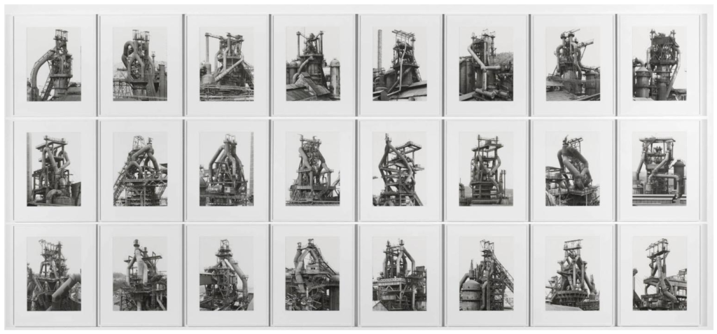
The Bechers decided to exibit their single-image gelatin silver prints grouped by subject, in a grid of six, nine, or fifteen and had come to the conclusion to present the images of structures with similar functions side by side to entice viewers to compare forms and designs based on the functions of the subjects.

The work of the Bechers were strongly influenced by the Weimar movement of New Objectivity in the 1920’s which was a movement in German art arising in the 1920’s as a reaction against expressionism.  The term ‘New Objectivity’ came to characterize the attitude of public life in Weimar Germany as well as the art involved in it. It was meant to imply a turn towards practical engagement with the world and ended in 1933 with the fall of the Weimar Republic and rise of the Nazis.  Some artists included in the movement in which the Bechers’ took inspiration are Karl Blossfeldt, August Sander and Albert Renger-Patzch.

In the Becher school they managed to influence a number of photographers including Andreas Gursky and Thomas Ruff; the work of their students also minimizes human presence and explore landscapes in a documentary style. Their school and work has had an impact on both Minimalism and Conceptualism art.  Their legacy can be seen through the work of Lewis Baltz who takes a similar approach with a more modern twist to it.  Their legacy can also be seen in the change in attitude to vernacular architecture – the Becher’s actively campaigned for protection of the structures that they photographed which led to the protection of industrial spaces.

Analysis

Image result for bernd and hilla becher

In this photograph natural daylight will have been used to capture it. You can tell because of the soft tones and natural contrast within the photograph. A low ISO of 100-200 will have been used for this photograph as the Bechers’ would be trying to ensure that noise within the composition was kept to a minimum.  A shutter speed of 1/60-1/150 will likely to have been used in this photograph – a shutter speed that is not too slow but not too fast to ensure that enough light could enter the camera lens from the overcast condition that the Bechers’ would shoot in.  A deep depth of field has been used at the whole of the photograph is in focus.  There is a warm colour cast to the photograph even though the photograph is in black and white – the warm colour cast reflects the comfort of the countryside in which the structures are based in.

There is no colour in the image as it is a black and white photograph. This shows that the viewer should be looking at the details of the subject instead of colours. There is a wide tonal range, ranging from the contrasting shadows of the structure to the over-exposed background. There is clear texture in the structures which makes the photograph more realistic to the viewer and gives it a slight 3D effect.  There is pattern and repetition in the beams of the structures which makes the photograph more aesthetically pleasing for the viewer.  The structures are placed in the centre of the photograph rather than using the rule of thirds as this photograph is part of a documentative-style approach in which the intentions were to show the form of the structures rather than to be aesthetically pleasing.

Bernd and Hilla Becher would document architectural structures all over Germany. They took photos of similar typologies and would make compositions of them all together. This is just one example of the work that they would do. They captured the pleasing aesthetics in the buildings deemed ugly and showed the country that there is more to it if they look closely. The Becher couple documented all sorts of structures and worked to open the countries eyes to what was right in front of them.  They described the buildings which they photographed as “buildings where anonymity is accepted to be the style” and aimed to capture a record of the changing landscape as these dilapidated buildings began to disappear.  The photograph is part of a collection of photographs intended to compare the structural qualities of different structures and would have been presented alongside another five or eight similar photographs of similar structures to allow the viewer to compare.

Repetition- GIF Experimentation

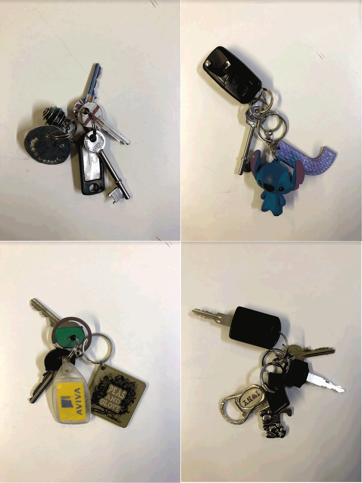
I first wanted to explore the idea of repetition by creating a gif in Photoshop to generate ideas for my project. I chose the subject keys for my gif as everyone has them but with different variations in appearance i.e key shape, key chains. I thought by creating a gif showing different types of keys people have is a good way to represent the same object but in different variations.

To create the gif in Photoshop I chose >File>Load Files into a Stack> and chose all the images of the keys i had taken. I then selected all the layers and chose the speed i wanted the images to change.

GIF

Stands for “Graphics Interchange Format.” GIF is an image file format commonly used for images on the internet for sending images, especially moving images

I think that the limitations of creating is that you cannot see the  movement in the image and only still objects if the timing of the images is slow, like the one I created above. Creating stop motion animations, if the timings were fast enough would  create the appearance of movement which is something I could explore in my project. Another limitation when creating gifs is that it’s hard to create the same lighting in all the images which could make the gif look disorderly. I could also display gifs of different objects with more images than the one i may above to create more variation with a faster changes.

Early Works of Repetition

Andy Warhol 

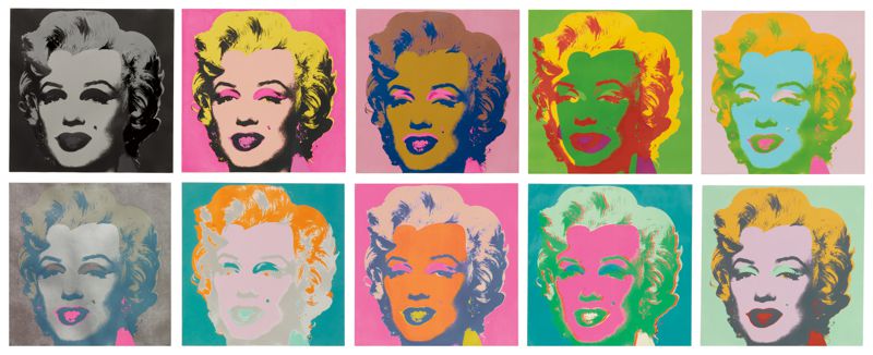
Andy Warhol has redeployed repetition as a device to alter our perception of a different type of society portrait – a portrait of celebrity. Warhol used an assembly line of silk-screened images of Marilyn Monroe as a metaphor for the loss of ‘self’ in the vicarious world of celebrity. Using silk-screening meant he could directly reproduce images already in the public eye, such as publicity shots or tabloid photographs. The technique also allowed him to easily produce multiple versions and variations of the prints.

He is known for his  bright, colourful paintings and prints of subjects ranging from celebrities, to everyday products such as cans of soup. Marilyn Monroe 1962 is perhaps one of Warhol’s most iconic works. The work is made up of two canvases, each featuring 25 Marilyns printed in a grid pattern. The rows of repetitive heads suggest postage stamps, billboard posters or, perhaps more fittingly, film strips.

Warhol’s life and work simultaneously satirized and celebrated materiality and celebrity. On the one hand, his paintings of distorted brand images and celebrity faces could be read as a critique of what he viewed as a culture obsessed with money and celebrity. On the other hand, Warhol’s focus on consumer goods and pop-culture icons, as well as his own taste for money and fame, suggest a life in celebration of the very aspects of American culture that his work criticized. 

My Interpretation of his Work

**

Hiroshi Sugimoto


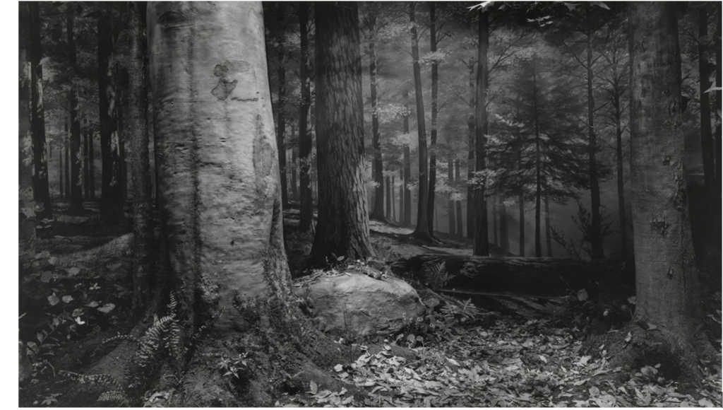
In 1980, Japanese photographer Hiroshi Sugimoto began working on an ongoing series of photographs of the sea and its horizon. From the English Channel to the Arctic Ocean, from the Norwegian Sea to the Black Sea, Tokyo-born artist has travelled the world to capture marine landscapes and create abstract canvas. Each black and white photograph is of the same size and cut directly through the center by the horizon line.

“Every time I see the sea, I feel a calming sense of security, as if visiting my ancestral home; I embark on a voyage of seeing.” says Sugimoto who describes his vision of sky and water as a form of time travel.

Sugimoto refers to his signature photographic style as “time exposure” experiments – playing with shutter speeds other photographers could never master. His goal through these “experiments” is to capture time through his images – creating time capsules that will last for eternity. Eternity is a constant focus of Sugimoto, who also worked on series that dealt with the issues of life and death – intrigued by the transience of human life.

Sugimoto has said that he draws much of his inspiration from sculpture artist Marcel Duchamp – famous for his sculpture of a urinal in the 1950s. Duchamp’s art dealt heavily with the Dadist movement of art. Sugimoto’s works are a unique combination of the Dadist movement as well as the Surrealist movement.

William Christenberry

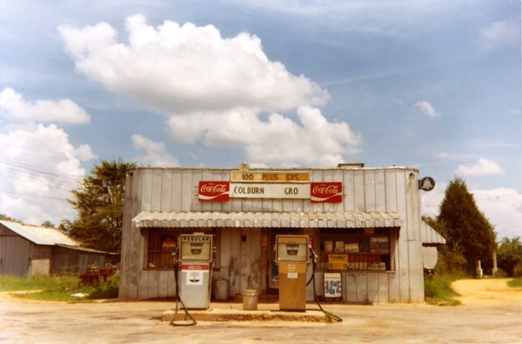
William Christenberry was an American photographer and artist who was known for simple, richly coloured photographs of decaying buildings in Alabama’s rural Hale county. Christenberry was considered a pioneer of fine colour photography, and his work carries a strong sense of both place and the passage of time. 

Christenberry showed Walker Evans some of his photographs, taken with a Brownie camera that Christenberry had been given when he was a child. He used the photographs at the time as guides for his paintings and sculptures, but Evans told him that the photographs were worthy of consideration as art.

Christenberry explores the effects of time on his boyhood home by choosing subjects such as buildings, signs, and found objects. Christenberry believes that all objects leave their individual mark on the landscape as time passes, even when the object is destroyed in reality.

Typology- Bernd and Hilla Becher

The German artists Bernd and Hilla Becher, who began working together in 1959 and married in 1961, are best known for their “typologies”—grids of black-and-white photographs of variant examples of a single type of industrial structure. 
The seemingly objective and scientific character of their project was in part a polemical return to the ‘straight’ aesthetics and social themes of the 1920s and 1930s in response to the sentimental subjectivist photographic aesthetics that arose in the early post-war period.
They overlooked beauty and the relationship between form and function. Both subjects addressed the effect of industry on economy and the environment.

 “I became aware that these buildings [blast furnaces] were a kind of nomadic architecture which had a comparatively short life—maybe 100 years, often less, then they disappear,” the artists said of their work. “It seemed important to keep them in some way and photography seemed the most appropriate way to do that.”

I think that Bernd and Hilla Becher’s work links to making gifs as they created series of images of the same objects in different areas. When making a gif I used different variation of the same obejct ‘keys’ aswell. Instead of displaying my work in a grid format though, i created a gif to only show image for a set amount of time.

Moodboard/Inspiration – buildings and collages

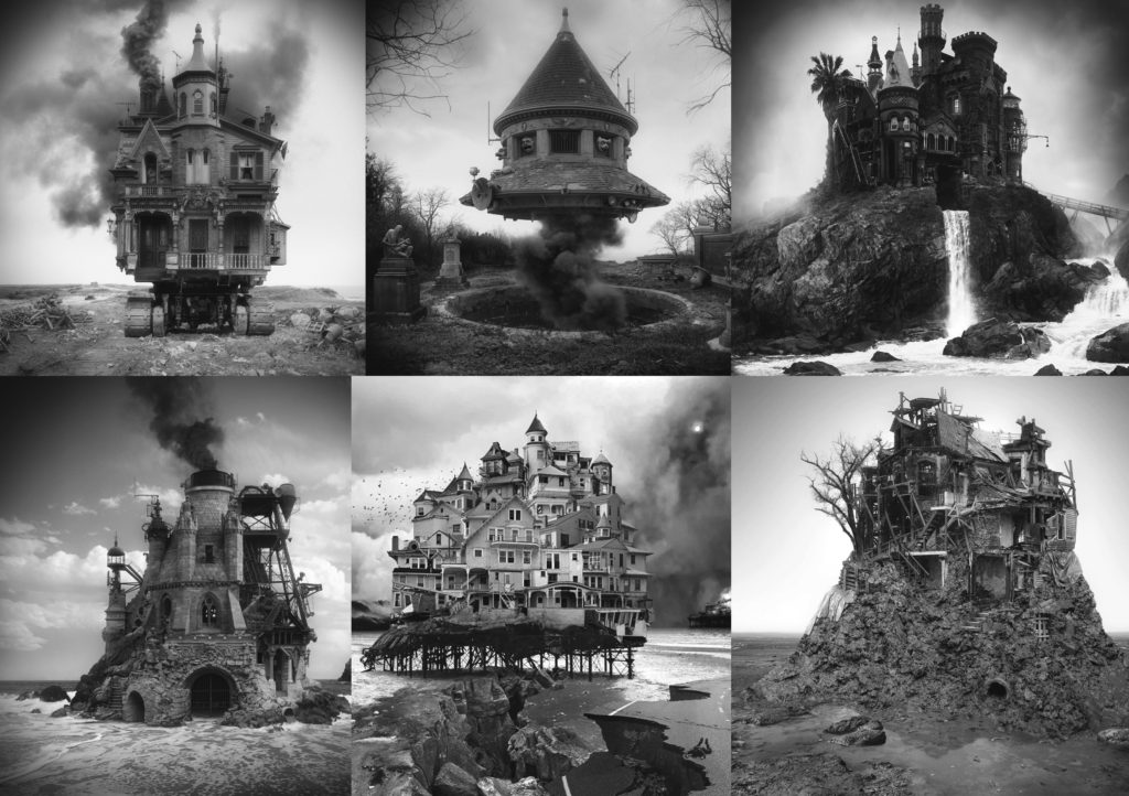
Work Of Jim Kazan –
“My images are digitally manipulated composites built from photographs I find online. The technique I use could be considered “hyper-collage”. I cobble together pieces from photos I find interesting and feed them into Photoshop. Through a palimpsest-like layering process of adding and subtracting, I gradually blend the various parts together. I am basically manipulating and assembling a disparate array of multiple photographic elements (sometimes more than 50) to produce a single homogenized image. I do not use a camera at any stage in the process. ” SOURCE
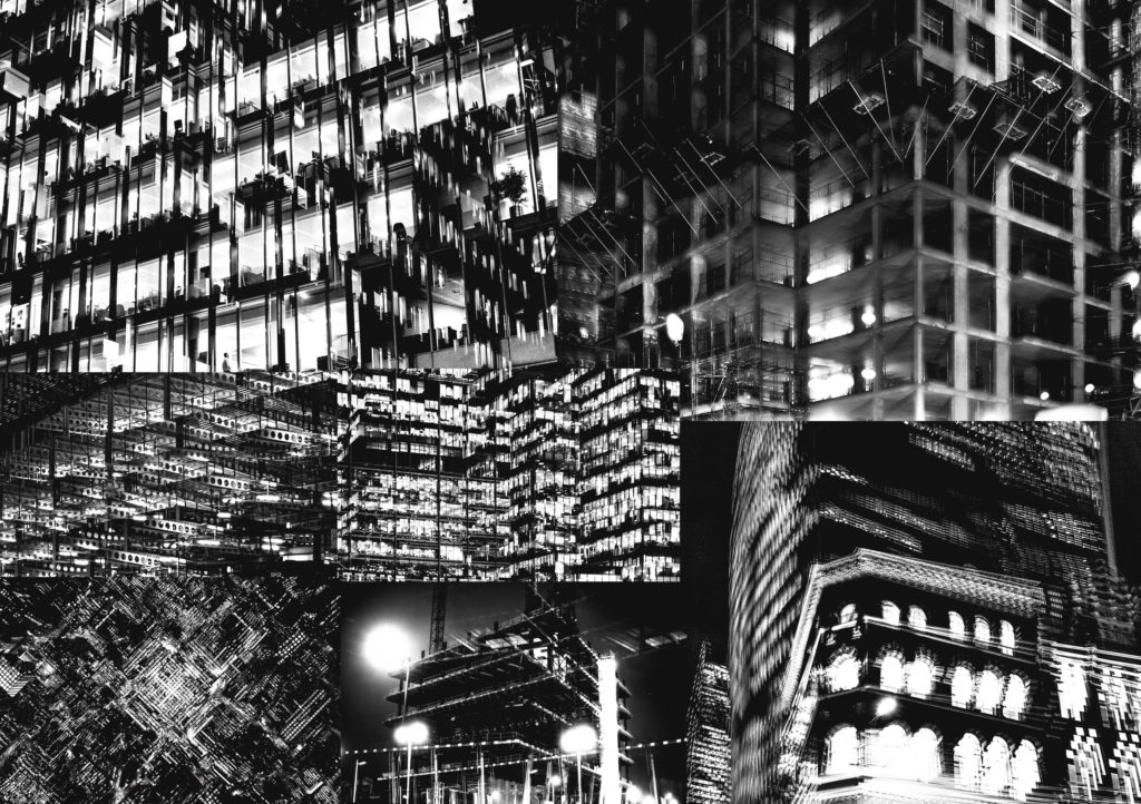
Work Of Lewis Bush –
” Metropole is an attempt to emulate my experience of feeling increasingly alienated from the city I grew up in. I’ve spent most of my life in London and when I was first becoming interested in photography I would spend hours wandering through the city, photographing it, in the process also becoming much better acquainted with its present and its past. Today I see much of what I love about the city being swept away by a huge glut of demolition and construction taking place under the guises of ‘development’ and ‘regeneration’, but which in my eyes are actually more a form of degeneration which is stripping away the essential character of London and forcing Londoners out of the city.  ” SOURCE
Work of Merve Ozaslan –
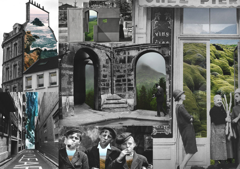
” My work shows the relationship between nature and humanity. I seek vintage photographs and combine them to natural ones, it explains how we are all part of the same environment. There is something magical that takes place in the present or the past, reinterpreting like if it were something new. Visual collages of stories that are narrated in the mind of the spectator. This shows us that photographs, like each of us, are part of a natural universe, taking on the theme of urbanization and mechanization of human beings, where colors and emotions are sometimes paralyzed from the clichés of city life. ” SOURCE
Work of Christopher Scott Richey –
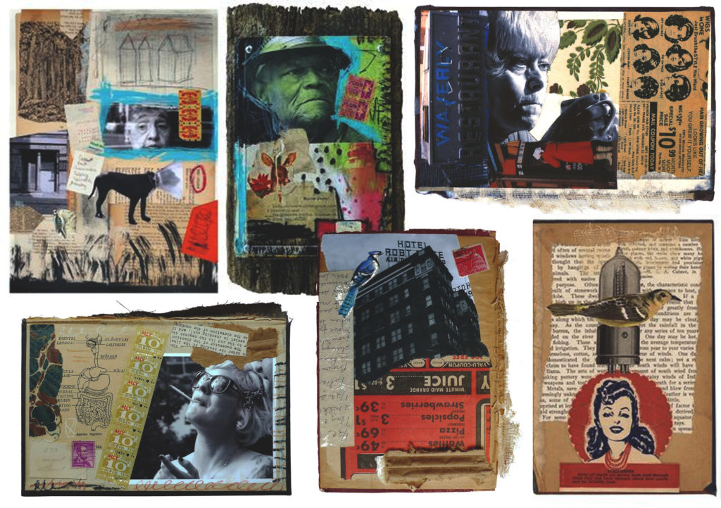
Creating unusual contrasts and juxtapositions, his work blends a variety of decades. Each image is a mélange of materials: black-and-white photography, printed wallpaper, scraps of letters, vintage stamps, excerpts from textbooks, and picture postcards outlined with rough brushstrokes of neon paint. These pieces create a visually stimulating analysis of time and memory merging on the page. Unique titles, often taken from one aspect of the image, give us a glimpse into the focus of each piece, sending the viewer on a visual game of hide-and-seek. SOURCE
Work Of Michael Wolf –
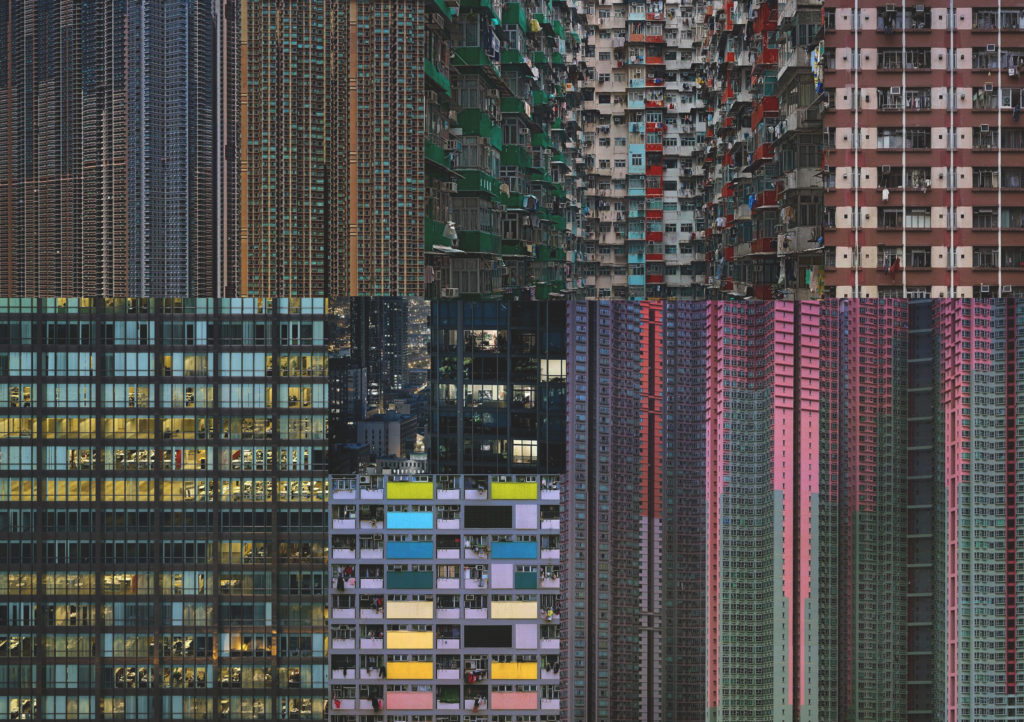
“I’ve lived in Hong Kong for 22 years, but I still feel like an outsider. Its back alleys have become my natural habitat as a photographer. I can spend 12 hours a day wandering the narrow walkways behind busy restaurants, housing estates and shops. They can be daunting – filled with broken furniture, electronic castoffs, cockroaches and garbage bags full of food that rots and smells. I’m still surprised by the strange things I come across – and I love that. I couldn’t imagine living anywhere else. “ SOURCE

Artist References – Group Work – Making connections between Photography and Fine Art

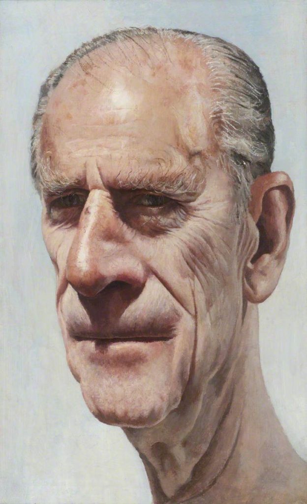
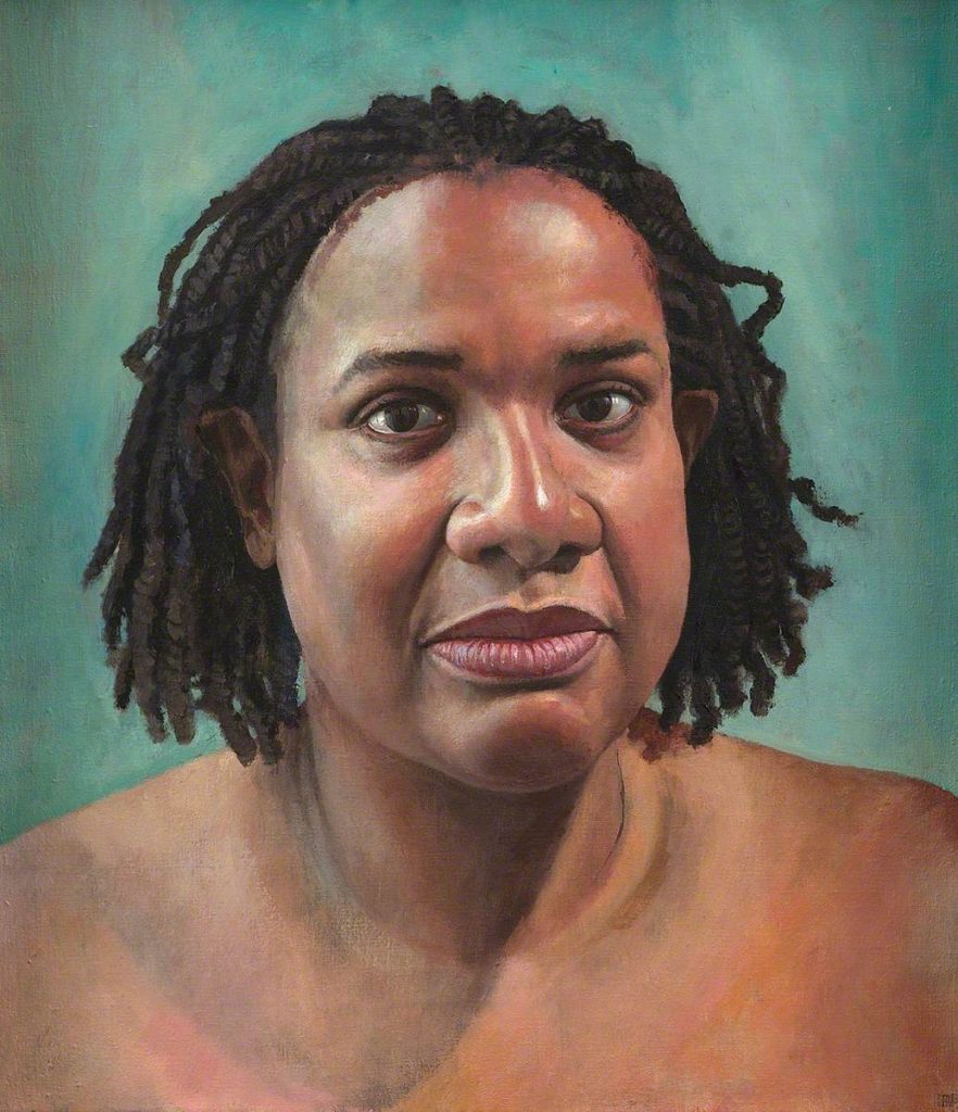
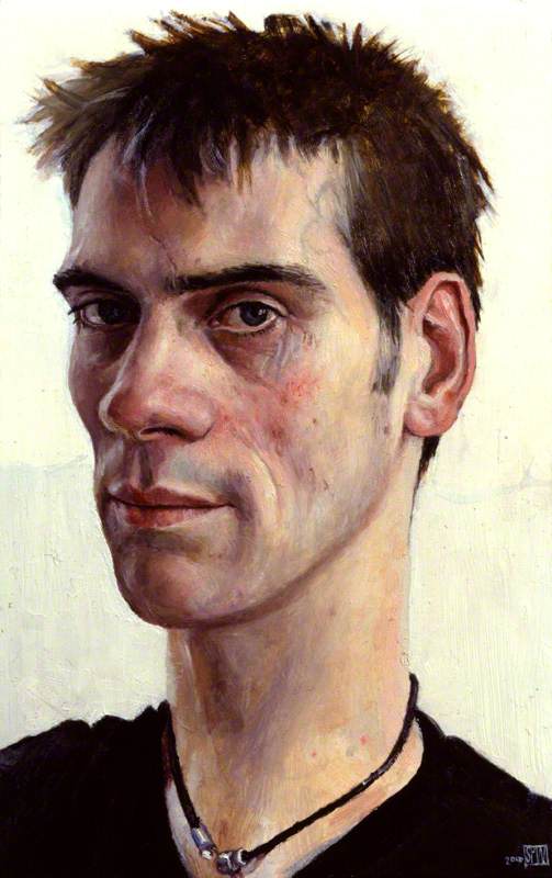
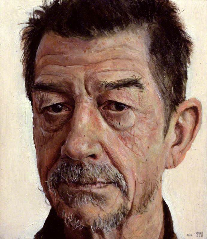
Stuart Pearson Wright

Wright plans a move away from portraiture, yet his projected subjects remain bound up with the enigma of his own identity and origins.

“People say I make my subjects look sad or old. I suppose I do instinctively either bring out of them, or project on to them, something rather melancholy.”

Wright explores identity of other people out of his own isolation. His obsession with portraiture formed out of never meeting his father, he was born as the result of artificial insemination.

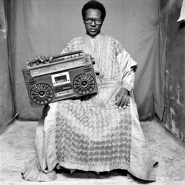
Seydou Kaita

https://www.all-about-photo.com/photographers/photographer/125/seydou-keita

https://www.guggenheim.org/artwork/artist/seydou-keita

‘Serving elite and middle-class patrons, his images often highlight the idealized or imagined socio-economic status of his sitters through the inclusion of props: cosmopolitan clothing and accessories, radios, telephones, bicycles, and sometimes his own car. To formalize the outdoor setting, Keïta regularly employed richly patterned backdrops that add movement and visual energy to his images and used a low vantage point and angular composition to highlight his clients’ confident facial expressions and relaxed postures. ‘

Rachel Whiteread

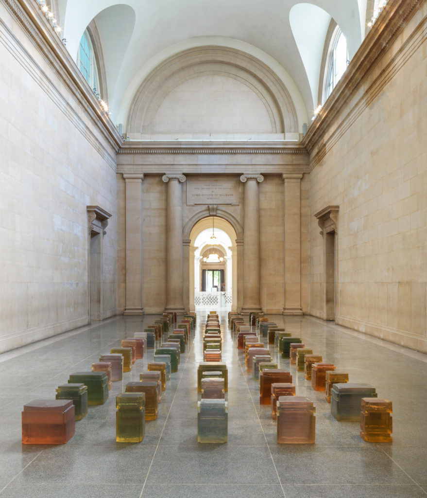
Rachel Whiteread, ‘100 Spaces’, Tate Britain, August 2017

https://www.theartstory.org/artist-whiteread-rachel.htm

https://www.tate.org.uk/whats-on/tate-britain/exhibition/rachel-whiteread

‘One of Britain’s leading contemporary artists, Whiteread uses industrial materials such as plaster, concrete, resin, rubber and metal to cast everyday objects and architectural space. Her evocative sculptures range from the intimate to the monumental. ‘

Mike Disfarmer

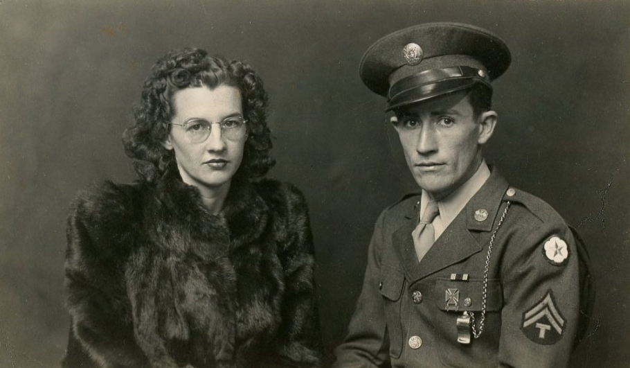
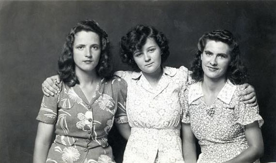
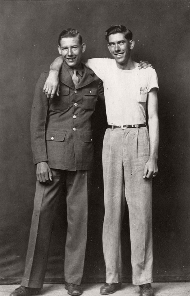
(1884–1959) Portrait photographer from Arkansas in America, he captures harsh realism is rural parts of the country for 40 year. He lived a reclusive lifestyle only making human contact when taking hid photos. After leaving his family farm and changing his name to Disfarm as a form of rebellion he taught him self how to take and develop photos even building his own studio. He would charge 25-50 cent for a penny portrait which people from the community would buy as tokens to give to family and friends. He photographs, individuals sometimes groups generally with a natural expression not posing or overly smiling. The overall collection creates a sense of identity for the time, rural location and people who occupied it.

PHOTOGRAPHY PROJECT FINAL CONCEPT, finding beauty of imperfections

I belive as this is my last photography project, I need to start creating photography out of my comfort zone, and images which evoke a true feeling and follow a successful narrative thought. I started to think about all the three concepts I have so far being: fine art, media and family. I have come to the conclusion that this could come under beauty in life, despite pain and suffering. I will do this project from my own personal persona of the world. I belive not only does this project become my first directly connected photography to my own emotions, but it becomes a reflective narrative of my own life. This creates a narrative and meaning to my work. I myself belive there is definitely more good in the world than not. I belive everyone should be grateful in their life, as we are surrounded by so much beauty constantly. Despite all the struggles, disappointments and pains throughout our time, there will always be a positive outcome or ending. Or however hard anything might seem, it is never permeant, and to still keep faith and see the positive aspects within the world. I believe that This way of living contributes to the concepts of buddhism, and a change in mindset of what the world is like. I will use a combination of my daily life, where I go, what I see and experience, and form these beautiful pieces with this positive mindset at hand, as I do belive it is possible to find beauty anywhere I go.

Much of the work that I have in mind to me that speaks positivity and a freeness of life, is work which is abstract, emotive, has bright vivid colour, strong happiness, lighting and finally has a movement to the piece. All of these aspects creating a happier image. The state of seeing happiness and beauty is a state of mind and consciousness that you have the power to control. The state to which your attitude  creates a whole new perception of what is actually in front of you. With the weather getting better, lighter and people being friendly and more united, this to my mind is the perfect time to study a project about my one positive relationships with others. As I will do this project from my own views of how I see beauty in the world, I will possible include myself in some images, in order to show a bonding of myself with the atmosphere, emotions and persona that I too share with the landscapes and objects. My feeling and self should be shown within the imagery and it should be a combination of my own self love, reflected within the work.

An artists work that I belive really inspired me was laura el tantawy, I will study her ideas and inspiration in my next blog post, but for now I see her work has a beauty , softness and elegance. Her images to my mind connote a reflection of peace at mind. And I believe even taking such beautiful images, will benefit my own self, and my thoughts and views of the world. Focusing on the good instead of the bad in the world, should be an ideal way which people should live. Through taking beautiful images and letting my emotions be vulnerably visible in these images, will only benefit myself, and become happier and more peaceful at mind. I believe throughout this project my images will gradually get happier and more positive, as I grow more apart of my project. This piece of art is a relation of family as its close combination with my own emotions and the close relationships with how people should have a close bond with themselves like family. Mental health problems that they view the world, it just as important as the close net relationships we have with others. The media always concentrates the way we think and should feel about ourself, this effect on our mental health, changes an creates prejudice in the way we see ourselves, the world around us and others.

I believe this project will have some undertones and connotations to mental health, This being due to how we view subject matters as a society, and people being very based off of our own thoughts. If we are depressed or anxious it becomes more fogged and harder to view the world in a positive way. My images will be a combination of landscapes, observations but focused on in a more abstract manner. I too believe positive is reflected within light, so lighting will be a large part of this shoot. Luminance and brightness, seen within artificial and real light is abstract. Perhaps I too will look into artists who just study and look at light and abstract work. Additional aspect which I belive I too believe have a large importance to what I am trying to achieve within my own work. People colour, nature Similarity people Dreamscapes, abstract imagery.

Videos, Throughout this project I want to make around 5 videos, showing a visible demonstration of my life, a direct observational of what I see, perhaps featuring myself.The fact of featuring myself is to be done to show and exposure my own insecurities and exposure my emotions to everyone, as this exposure of a real presentation of myself, should be compared to the world around me.  But mostly to show the journey of what I can see and perhaps a literal narrative and final outcome of why I belive this holds importance and beauty. These videos will be short, delicate and focus on small detail usually ignored. I believe I could even add music over some, which evokes a more meditative medium of peace to them, and music which I belive evokes happiness. I really ant this project to be a positive reinforcement of my own thinking, how I feel about myself, and also a sentiment for how people should think and view the world from a positive clean slate.

Beauty of imperfections, is not only a pivotal part of the world which we live in, but it is also learning to love yourself. It is so important to accept you are not perfect, and despite what you or many will think, no one is perfect. It is the people who are able to see their imperfections and still love themselves despite of this who are the most beautiful. Being vulnerable and possible showing myself in ways I don’t such as with no makeup, not dressed up and stripped down to a natural form, trying to show that despite this , it it still okay, I am still me and this should be accepted. with the current high social regard of the media and beauty standards perhaps me doing this is a pivotal point of importance to my work. my vulnerability of my body and my emotions within this project, is what will make it successful and bring it to the next level. My images being along side aspects of the world I view as beautiful literally pulls myself as part of my narrative, and highlights my own importance and a bonding with my project. Images of still life, landscapes close ups, myself, just beauty which is surrounding me, I will too edit and combine images to create more abstract imagery. I believe Finding beauty within the imperfections of life is such a infacturating concept, and such an important part to being happy. To know of all the bad and see through it, To view mortality as something worth living for and not taking life for granted, Rather than death waiting for us. I believe to view and create something beauty from nothing is such a hugely great and important aspect, and perhaps  my own imagery, will enable people to see the beauty they too live in but just haven’t noticed or seen yet. My project is the growth and decay in life, and finding the beauty within the bad and good. and my own personal exploration of my beyond, being and how i should and can view the world as something which is just beautiful and should be seen this way. I will look into some philosophies about how to capture the world in this light, and more asian methods of seeing beauty.

I do belive this project connects with the title similarity and variation, this is due to the first off the connection with fine art, family and media which I previously discussed are a few of the primary starting points for the project. Secondly variation and similarity discusses a-lot about DNA and what makes us who we are and our reality and how it is interesting as we as people are so similar yet so different. This being different in our views of the world our appearances, and are ability to seek happiness. I believe showing the individuality of myself and how I see the world is a pivotal point in this project. This is what really will successfully connect my project to the finished title.