Category Archives: Contextual Studies

Filters

Author:
Category:

Bernd and Hilla Becher / Typology

Typology and the Bechers

The definition of ‘typology’ is “a classification according to general type, especially in archaeology, psychology, or the social sciences”.  Essentially it is the study of types.  The roots of Photographic Typologies is in August Sander’s 1929 portraits ‘Face of Our Time’ in which he documented German society between the two world wars.  Sanders’ aim was to create a record of social types and classes as well as the relationships between them.  Sanders was so successful in achieving this that the photographic plates were destroyed and his book was banned soon after the Nazis came into power.  Typology can be used to create a visual analysis of objects and the larger environment by extracting visual elements and presenting them in a consistent series and so forcing the viewer to compare the subjects.  The Becher’s and their style appeal to me because when exploring ‘variance and similarity’ I hope to create photographs that successfully show the differences and similarities in structures as the Bechers’ have done in a similar style whilst using the typology grids to emphasise the contrasts.

The term ‘Typology’ first came into use when used to describe the style of photography that Bernd and Hilla Becher were practicing.  The Bechers documented dilapidated German industrial architecture in 1959 – they described the buildings which they photographed as “buildings where anonymity is accepted to be the style”.  Each photograph in their collection of work was taken from the same angle and the same distance from the subject with the aim to capture a record of the changing landscape as these dilapidated buildings began to disappear.  The Bechers influenced generations of photographic typologists, such as Jeff Brouws and John Cyr.

Bernhard Becher (1931-2007) and Hilla Becher (1934-2015) were German conceptual artists and photographers who would work as a collaborative duo.  They are best known for their topographic images of industrial buildings in Germany, as discussed earlier.  The photographs were often organised into grids to show differences and similarities between the subjects photographed.  They are the founders of the ‘Becher school’ or the ‘Dusseldorf School’.  They have received multiple awards including the Erasmus Prize and the Hasselblad Award.  The Bechers’ worked outside of Germany as well including photographs of buildings in Great Britain, France, Belgium and the United States in 1965.

Their work on typology began as they first collaborated on photographing the disappearing German industrial architecture in 1959 – they were fascinated by the similar shapes in which certain buildings were designed, which is evident in their work.  After collecting thousands of pictures of individual structures they noticed that the different structures shared many qualities and were intrigued by the fact that so many industrial buildings were build with a focus on the design.  The Bechers would work with a large 8 x 10-inch view camera and would always use a straightforward point of view.  They would only shoot on overcast days in order to avoid shadows as well as only in the early morning during spring and fall.  A variety of subjects were photographed throughout their work including water towers, cooling towers, coal bunkers and gas tanks.  Often the Bechers would exclude any details that would detract from the central theme.  By photographing these structures the Bechers’ drew attention to the need of preservation of the buildings and some of them were designated as protected landmarks as a result of their work.

The Bechers decided to exibit their single-image gelatin silver prints grouped by subject, in a grid of six, nine, or fifteen and had come to the conclusion to present the images of structures with similar functions side by side to entice viewers to compare forms and designs based on the functions of the subjects.

The work of the Bechers were strongly influenced by the Weimar movement of New Objectivity in the 1920’s which was a movement in German art arising in the 1920’s as a reaction against expressionism.  The term ‘New Objectivity’ came to characterize the attitude of public life in Weimar Germany as well as the art involved in it. It was meant to imply a turn towards practical engagement with the world and ended in 1933 with the fall of the Weimar Republic and rise of the Nazis.  Some artists included in the movement in which the Bechers’ took inspiration are Karl Blossfeldt, August Sander and Albert Renger-Patzch.

In the Becher school they managed to influence a number of photographers including Andreas Gursky and Thomas Ruff; the work of their students also minimizes human presence and explore landscapes in a documentary style. Their school and work has had an impact on both Minimalism and Conceptualism art.  Their legacy can be seen through the work of Lewis Baltz who takes a similar approach with a more modern twist to it.  Their legacy can also be seen in the change in attitude to vernacular architecture – the Becher’s actively campaigned for protection of the structures that they photographed which led to the protection of industrial spaces.

Analysis

Image result for bernd and hilla becher

In this photograph natural daylight will have been used to capture it. You can tell because of the soft tones and natural contrast within the photograph. A low ISO of 100-200 will have been used for this photograph as the Bechers’ would be trying to ensure that noise within the composition was kept to a minimum.  A shutter speed of 1/60-1/150 will likely to have been used in this photograph – a shutter speed that is not too slow but not too fast to ensure that enough light could enter the camera lens from the overcast condition that the Bechers’ would shoot in.  A deep depth of field has been used at the whole of the photograph is in focus.  There is a warm colour cast to the photograph even though the photograph is in black and white – the warm colour cast reflects the comfort of the countryside in which the structures are based in.

There is no colour in the image as it is a black and white photograph. This shows that the viewer should be looking at the details of the subject instead of colours. There is a wide tonal range, ranging from the contrasting shadows of the structure to the over-exposed background. There is clear texture in the structures which makes the photograph more realistic to the viewer and gives it a slight 3D effect.  There is pattern and repetition in the beams of the structures which makes the photograph more aesthetically pleasing for the viewer.  The structures are placed in the centre of the photograph rather than using the rule of thirds as this photograph is part of a documentative-style approach in which the intentions were to show the form of the structures rather than to be aesthetically pleasing.

Bernd and Hilla Becher would document architectural structures all over Germany. They took photos of similar typologies and would make compositions of them all together. This is just one example of the work that they would do. They captured the pleasing aesthetics in the buildings deemed ugly and showed the country that there is more to it if they look closely. The Becher couple documented all sorts of structures and worked to open the countries eyes to what was right in front of them.  They described the buildings which they photographed as “buildings where anonymity is accepted to be the style” and aimed to capture a record of the changing landscape as these dilapidated buildings began to disappear.  The photograph is part of a collection of photographs intended to compare the structural qualities of different structures and would have been presented alongside another five or eight similar photographs of similar structures to allow the viewer to compare.

JOHN BALDESSARI


I will not make anymore boring art”


http://www.baldessari.org/

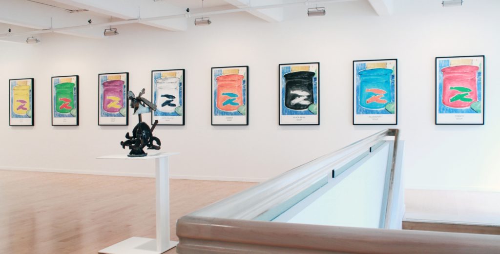
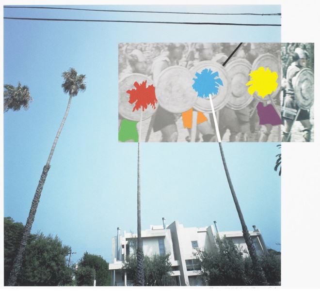
John Baldessari is renowned as a leading Californian Conceptual artist. Painting was important to his early work: when he emerged, in the early 1960s, he was working in a gestural style. But by the end of the decade he had begun to introduce text and pre-existing images, often doing so to create riddles that highlighted some of the unspoken assumptions of contemporary painting – as he once said, “I think when I’m doing art, I’m questioning how to do it.” And in the 1970s he abandoned painting altogether and made in a diverse range of media, though his interests generally centered on the photographic image. Conceptual art has shaped his interest in exploring how photographic images communicate, yet his work has little of the austerity usually associated with that style; instead he works with light humor, and with materials and motifs that also reflect the influence of Pop art. Baldessari has also been a famously influential teacher. His ideas, and his relaxed and innovative approach to teaching, have made an important impact on many, most notably the so-called Pictures Generation, whose blend of Pop and Conceptual art was prominent in the 1980s.

“I could never figure out why photography and art had separate histories.”

PHOTOGRAPHY PROJECT FINAL CONCEPT, finding beauty of imperfections

I belive as this is my last photography project, I need to start creating photography out of my comfort zone, and images which evoke a true feeling and follow a successful narrative thought. I started to think about all the three concepts I have so far being: fine art, media and family. I have come to the conclusion that this could come under beauty in life, despite pain and suffering. I will do this project from my own personal persona of the world. I belive not only does this project become my first directly connected photography to my own emotions, but it becomes a reflective narrative of my own life. This creates a narrative and meaning to my work. I myself belive there is definitely more good in the world than not. I belive everyone should be grateful in their life, as we are surrounded by so much beauty constantly. Despite all the struggles, disappointments and pains throughout our time, there will always be a positive outcome or ending. Or however hard anything might seem, it is never permeant, and to still keep faith and see the positive aspects within the world. I believe that This way of living contributes to the concepts of buddhism, and a change in mindset of what the world is like. I will use a combination of my daily life, where I go, what I see and experience, and form these beautiful pieces with this positive mindset at hand, as I do belive it is possible to find beauty anywhere I go.

Much of the work that I have in mind to me that speaks positivity and a freeness of life, is work which is abstract, emotive, has bright vivid colour, strong happiness, lighting and finally has a movement to the piece. All of these aspects creating a happier image. The state of seeing happiness and beauty is a state of mind and consciousness that you have the power to control. The state to which your attitude  creates a whole new perception of what is actually in front of you. With the weather getting better, lighter and people being friendly and more united, this to my mind is the perfect time to study a project about my one positive relationships with others. As I will do this project from my own views of how I see beauty in the world, I will possible include myself in some images, in order to show a bonding of myself with the atmosphere, emotions and persona that I too share with the landscapes and objects. My feeling and self should be shown within the imagery and it should be a combination of my own self love, reflected within the work.

An artists work that I belive really inspired me was laura el tantawy, I will study her ideas and inspiration in my next blog post, but for now I see her work has a beauty , softness and elegance. Her images to my mind connote a reflection of peace at mind. And I believe even taking such beautiful images, will benefit my own self, and my thoughts and views of the world. Focusing on the good instead of the bad in the world, should be an ideal way which people should live. Through taking beautiful images and letting my emotions be vulnerably visible in these images, will only benefit myself, and become happier and more peaceful at mind. I believe throughout this project my images will gradually get happier and more positive, as I grow more apart of my project. This piece of art is a relation of family as its close combination with my own emotions and the close relationships with how people should have a close bond with themselves like family. Mental health problems that they view the world, it just as important as the close net relationships we have with others. The media always concentrates the way we think and should feel about ourself, this effect on our mental health, changes an creates prejudice in the way we see ourselves, the world around us and others.

I believe this project will have some undertones and connotations to mental health, This being due to how we view subject matters as a society, and people being very based off of our own thoughts. If we are depressed or anxious it becomes more fogged and harder to view the world in a positive way. My images will be a combination of landscapes, observations but focused on in a more abstract manner. I too believe positive is reflected within light, so lighting will be a large part of this shoot. Luminance and brightness, seen within artificial and real light is abstract. Perhaps I too will look into artists who just study and look at light and abstract work. Additional aspect which I belive I too believe have a large importance to what I am trying to achieve within my own work. People colour, nature Similarity people Dreamscapes, abstract imagery.

Videos, Throughout this project I want to make around 5 videos, showing a visible demonstration of my life, a direct observational of what I see, perhaps featuring myself.The fact of featuring myself is to be done to show and exposure my own insecurities and exposure my emotions to everyone, as this exposure of a real presentation of myself, should be compared to the world around me.  But mostly to show the journey of what I can see and perhaps a literal narrative and final outcome of why I belive this holds importance and beauty. These videos will be short, delicate and focus on small detail usually ignored. I believe I could even add music over some, which evokes a more meditative medium of peace to them, and music which I belive evokes happiness. I really ant this project to be a positive reinforcement of my own thinking, how I feel about myself, and also a sentiment for how people should think and view the world from a positive clean slate.

Beauty of imperfections, is not only a pivotal part of the world which we live in, but it is also learning to love yourself. It is so important to accept you are not perfect, and despite what you or many will think, no one is perfect. It is the people who are able to see their imperfections and still love themselves despite of this who are the most beautiful. Being vulnerable and possible showing myself in ways I don’t such as with no makeup, not dressed up and stripped down to a natural form, trying to show that despite this , it it still okay, I am still me and this should be accepted. with the current high social regard of the media and beauty standards perhaps me doing this is a pivotal point of importance to my work. my vulnerability of my body and my emotions within this project, is what will make it successful and bring it to the next level. My images being along side aspects of the world I view as beautiful literally pulls myself as part of my narrative, and highlights my own importance and a bonding with my project. Images of still life, landscapes close ups, myself, just beauty which is surrounding me, I will too edit and combine images to create more abstract imagery. I believe Finding beauty within the imperfections of life is such a infacturating concept, and such an important part to being happy. To know of all the bad and see through it, To view mortality as something worth living for and not taking life for granted, Rather than death waiting for us. I believe to view and create something beauty from nothing is such a hugely great and important aspect, and perhaps  my own imagery, will enable people to see the beauty they too live in but just haven’t noticed or seen yet. My project is the growth and decay in life, and finding the beauty within the bad and good. and my own personal exploration of my beyond, being and how i should and can view the world as something which is just beautiful and should be seen this way. I will look into some philosophies about how to capture the world in this light, and more asian methods of seeing beauty.

I do belive this project connects with the title similarity and variation, this is due to the first off the connection with fine art, family and media which I previously discussed are a few of the primary starting points for the project. Secondly variation and similarity discusses a-lot about DNA and what makes us who we are and our reality and how it is interesting as we as people are so similar yet so different. This being different in our views of the world our appearances, and are ability to seek happiness. I believe showing the individuality of myself and how I see the world is a pivotal point in this project. This is what really will successfully connect my project to the finished title.

Video Art and Performance Art


Yoko Ono: early video works in the 1960s

https://youtu.be/lYJ3dPwa2tI

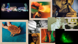
During the first 11 years of her career, Ono moved among New York, Tokyo, and London, serving a pioneering role in the international development of Conceptual art, experimental film, and performance art. Her earliest works were often based on instructions that Ono communicated to viewers in verbal or written form. Though easily overlooked, the work radically questioned the division between art and the everyday by asking viewers to participate in its completion.

In the above video Cut Piece, Ono confronted issues of gender, class, and cultural identity by asking viewers to cut away pieces of her clothing as she sat quietly on stage.

Yoko Ono and John Lennon collaborated on a number of works, often in response to global politics and conflict. At the end of the decade, Ono’s collaborations with John Lennon, including Bed-In (1969) and the WAR IS OVER! if you want it (1969–) campaign, boldly communicated her commitment to promoting world peace.

“I think that conceptual art – it works in many ways. What I think it does the most is when it opens up things within people’s mind. And they will follow it and do something that is conceptual – but it would create reality in their life.”

Bruce Naumann: early video works

https://youtu.be/D6LppuVHlus

Bruce Nauman was one of the most prominent, influential, and versatile American artists to emerge in the 1960s.   For more than 50 years Naumann has worked in every conceivable artistic medium, dissolving established genres and inventing new ones in the process. “I’ve always had overlapping ways of going about my work,” Bruce Nauman once remarked. “I’ve never been able to stick to one thing.”His expanded notion of sculpture admits wax casts and neon signs, bodily contortions and immersive video environments. Using his body to explore the limits of everday situations, Nauman explored video as a theatrical stage and a surveillance device within an installation context, blending ideas from conceptualism, minimalism, performance art, and video art.

Some of Nauman’s earliest work was shaped by ideas that arose in the wake of Minimalism in the late 1960s. In particular, the way he treated the body – often his own, shown on video completing repetitive tasks – and the way he related the body to surrounding objects show the impact of Minimalism’s new ideas about the relationship between the viewer and the sculptural object. Ludwig Wittgenstein‘s ideas about language have been an important influence on his work, shaping his interest in the way words succeed or fail in referring to objects in the world.

Much of Nauman’s work reflects the disappearance of the old modernist belief in the ability of the artist to express his ideas clearly and powerfully. Art, for him, is a haphazard system of codes and signs, just like any other form of communication. Aside from informing his use of words, it has also encouraged him to use “readymade” objects – objects that, unlike paintings or traditional sculptures, already carry meanings and associations from their use in the world – and to make casts of objects ranging from the space underneath chairs to human body parts.

Andy Warhol

In 1963 he acquired his first motion picture camera, a hand held 16mm Bolex, and shortly after he claimed an ‘abandoning’ of painting. Disingenuous this claim might have been but his expansion into filmmaking was no passing jaunt. Between 1964 and 1968 the artist was particularly prolific, producing literally hundreds of films of varying length and style. Nearly 650 films were produced, including hundreds of silent Screen Tests, or portrait films, and dozens of full-length movies, in styles ranging from minimalist avant-garde to commercial “sexploitation.”

Warhol’s films have been highly regarded for their radical explorations beyond the frontiers of conventional cinema. One such film, Empire 1964, his eight-hour, static-shot of New York’s most recognisable skyscraper, is included in the exhibition at Tate Liverpool.

Warhol began to take an interest in the avant-garde film in 1963 when it was at the height of the mythic stage. He quickly made himself familiar with the latest works of Brakhage, Markopoulos, Anger, and especially Jack Smith, who had a direct influence on him. On one level at least Warhol turned his genius for parody and reduction against the American avant-garde film itself.

The first film that he seriously engaged himself in was a monumental inversion of the dream tradition within the avant-garde film. His Sleep (1962) was no trance film or mythic dream but six hours of a man sleeping.

Planning Response

I plan on taking inspiration from these videos by producing my own video recordings of the same task everyday. I will then edit these recoding together so the video dress the theme repetition. I think by doing this I will develop more ideas for my project and will inspire me to produce more video responses. By recoding a task I do everyday will produce the same shot in different variations i.e. different lighting, compositions.

Video Art

Video art is an art form that relies on using visual technology as a way of creating a visual and/or audio medium.

One pioneer of video artists I found interesting is Bruce Nauman.

Bruce Nauman

Bruce Nauman is an American artist. His work ranges from creating sculptures, photography, neon, videos, drawing, printmaking and performance. He lives near Mexico and give up painting to focus his work on sculptures. A lot of his work is characterised by an interest in language, often involving itself in a playful, mischievous manner. He has a strong interest in setting the metaphoric and descriptive functions of language against each other. Nauman began working in film with Robert Nelson and William Allen whilst teaching at the San Francisco Art Institute. He produced his first videotapes in 1968. He describes the transition of film to video as: “With the films, I would work over an idea until there was something that I wanted to do. Then I would rent the equipment for a day or two, so I was more likely to have a specific idea of what I wanted to do. With the videotapes, I had the equipment in the studio for almost a year; I could make test tapes and look at them, watch myself on the monitor or have somebody else there to help. Lots of times I would do a whole performance or tape a whole hour and then change it. I don’t think I would ever edit but I would redo the whole thing if I didn’t like it.” Nauman uses his body to explore the limits of everyday situations. He explored video as a theatrical stage and used the camera as a close observation device. He was influenced to produce this video art through the experimental work of Merce Cunningham, Meredith Monk, La Monte Young, Steve Reich, and Phillip Glass.

Here are a few links to some of Bruce Nauman’s video art:


Another pioneer of video art that I have researched due to my interest of capturing something similar is Martha Rosler.

Martha Rosler

Martha Rosler was born in 1943 in Brooklyn, New York. Roster grew up in New York and was involved in poetry, as well as participating in civil rights and anti-war protests. Looking at the outcome of her career, a lot of Rosler’s art reflected her interest in consciousness and awareness, raising a variety of social issues. ‘A budding gourmet’ inspired Rosler’s first video piece, which features the silhouette of a woman describing how gourmet cooking facilitates a better and easier life. Her seminal feminist work, ‘Semiotics of the Kitchen’ (1975), expands upon these issues but is involved with more direct angst and frustration. In several videos that confront the viewer with a range of spliced scenes, Rosler critiqued the coercive and dishonest effects of the relationship between the media, politics, and the private society circle. Some examples of this work is: ‘Domination and the Everyday’ (1978) and ‘If It’s Too Bad to Be True, It Could Be DISINFORMATION ‘(1985).

Here is a link to one of Martha Rosler’s video art:

I want to experiment with video art in a similar way to Rosler as I want to portray an everyday task and routine that I do.

Photographers Research- Generating Ideas

Roni Horn

Dictionary of Water
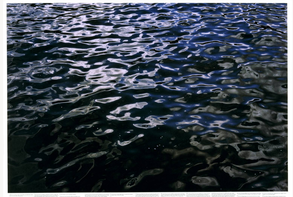
Still Water (The River Thames, for Example) is a series of fifteen large photo-lithographs of water, printed on white paper. Each of the images focuses on a small area of the surface of the river Thames. The colour and texture of these watery surfaces varies dramatically between images: colours range from black to blue and from dark green to khaki-yellow, and in each case the water’s texture is differently augmented by tidal movement and the play of light.

“The Thames has this incredible moodiness, and that’s what the camera picks up. [I]t has these vertical changes and it moves very quickly. It’s actually a very dangerous river and you sense that just by looking at it … [E]very photograph is wildly different – even though you could be photographing the same thing from one minute to the next. It’s almost got the complexity of a portrait.” (Quoted in ‘Roni Horn Interview: Water’)

Horn’s work, which has an emotional and psychological dimension, can be seen an engagement with post-Minimalist forms as containers for affective perception. She talks about her work being ‘moody’ and ‘site-dependent’. Her attention to the specific qualities of certain materials spans all mediums, from the textured pigment drawings, to the use solid gold or cast glass, and rubber.

Sigfried Hansen: Hold the Line  


Street photography exploring colour, shapes, geometry

Siegfried Hansen traces visual compositions from graphics and colours and creates street photography the main point of which is not body’s or faces, but graphic connections and formal relations. It shows the aesthetics of coincidence in a public area, which is full of surprises.

Siegfried Hansen’s Hold the Line is a playful examination of the city as a graphic playground of color, line, and form. Filled with bold geometric images and brightly colored pages. The book’s key design elements echo the graphic content of the images and give it rhythmic presence. Color pages are interspersed throughout, accentuating the bold colors that dot the city and contrasting the city’s monochromatic stone.

While people are present, this work is not entirely about the dynamism of the street and its inhabitants in a way that typifies classic street photography. Instead, it is about the city as a graphic force and how it not only shapes the way we move, but also frames what we see.

I chose this photographer to look at to generate ideas as his work reminds me of the photos I produced in the ‘Future of St Helier’ project where i focused on bold lines and bright colours. Looking at this photographer in this project could develop the style of work I was producing then, looking at industrial structures and the shapes they make to address the theme of variation and similarity in buildings.

Li Hui

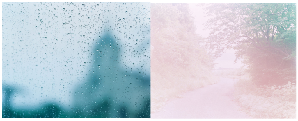
Li Hui is a young Chinese photographer based in the city of Hangzhou, capital of the province of Zhejiang, China. Since 2009 she has used photography to see a different world and get the courage to “explore things her own way.” Her images are a blissful mix of sensuality and purity that disclose a unique artistic sensibility. She expresses her feelings through her sensitive personality. Mostly influenced by cinema, music, nature and human body, this photographer keeps learning by experimenting the ideas that cross her mind.

The “leit-motif” in your work seems to be sensuality (through light, details and feminine lines). What motivates you to capture this subject and what do you want to say through it?

“I have a great interest in simply observing, I can be very quiet just looking at the sky, the water, a plant, or an animal for hours. I would like to motivate myself more to shoot this themes because they are just all around me. ”  I am mostly inspired by my natural surroundings, such as the patterns of a flower, the shape of the trees after a strong wind, thick clouds in the sky before a storm, the rain hitting the ground, the sun and the way its rays shine on my hand and the palm of my hand becomes transparent. I am touched by these subtle things. “- Li Hui

“I think watching films is a way to improve the overall aesthetic of my work. But music can also evoke images that float around in my head. Different types of music have different associations.”

She doesn’t show her models faces in her photos as she wants the viewer to find their own feelings and experiences in them. She says it’s ‘interesting to hear different opinions and what different people take away from the pictures’, leaving the story up to the viewers imagination. What people take away from an image depends on their personality and their own background.

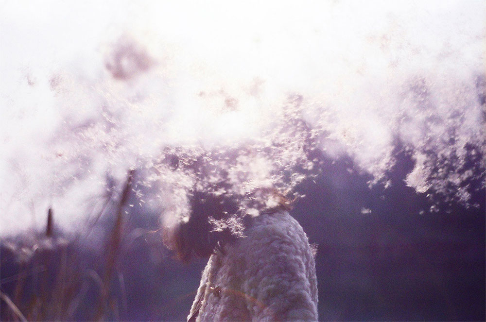
I particularly liked this photographer when I came across her work as I liked how she focused on beauty in landscape and her use of movement and light. If I were to take inspiration from her in my project I would focus on producing images that looked at light and delicate shapes that expressed a specific emotion.

Rinko Kawauchi


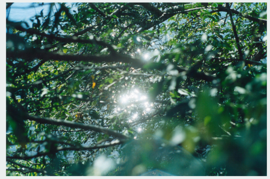
Rinko Kawauchi’s work is characterized by a serene, poetic style, depicting the ordinary moments in life.
Kawauchi’s art is rooted in Shinto, the ethnic religion of the people of Japan. According to Shinto, all things on earth have a spirit, hence no subject is too small or mundane for Kawauchi’s work; she also photographs “small events glimpsed in passing, conveying a sense of the transient. Kawauchi sees her images as parts of series that allow the viewer to juxtapose images in the imagination, thereby making the photograph a work of art[ and allowing a whole to emerge at the end; she likes working in photo books because they allow the viewer to engage intimately with her images.

Her attention to small gestures and coincidental details enables her to cast a gaze of enchantment upon her daily surroundings that is always fresh and new. With her camera, she captures elementary and casual moments, all with the same passionate concentration.
Rinko Diary is a visual diary that includes photographs of everything from sandwiches and Patti Smith to the poignant butterfly/flower/leaf set against a concrete pavement. 

I like this photographer and think I will take inspiration from her in my project as I like how she portrays casual moments with a lot of meaning. I also like how she views nature in her photos, emphasising the sunlight and beauty. She ‘creates compelling portraits of everyday life, rendering the mundane as sublime through her lens’ (ignant.com) which is an aspect I would like to interpret. Her works radiates a sense of fragility and emotion.

Artist Reference – Aaron Siskind

Who is he?

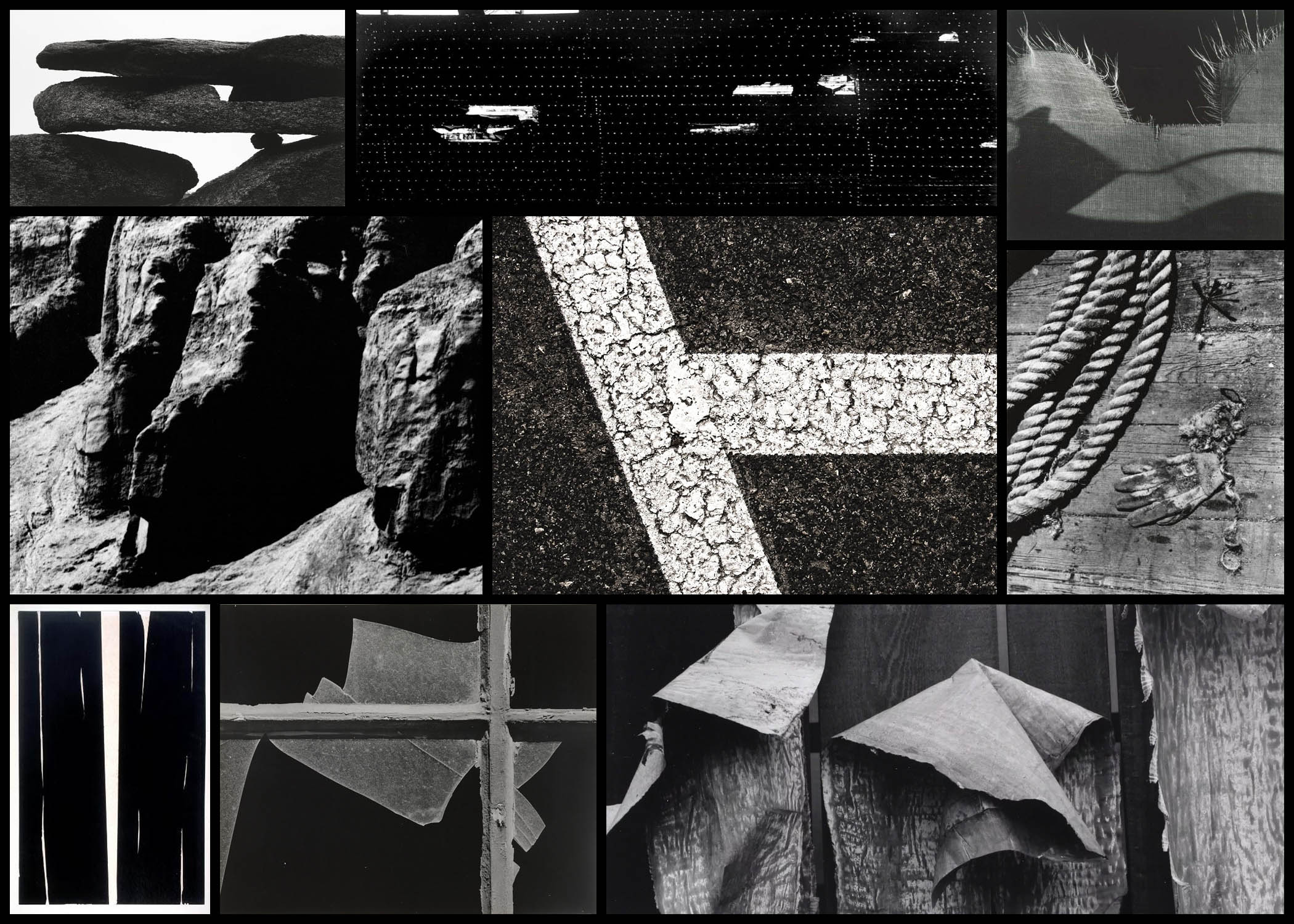
Arron Siskind was born December 4th, 1903, New York, dying in February 8th, 1992, Providence, Rhode Island. Siskind became an influential teacher, editor and photographer who is best known for his innovations in abstract photography. Starting 1932, as an English teacher in New York City he became a member of the Photo League, participating in projects designed to document neighbourhood life during the Great Depression. Siskind’s project Dead End: The Bowery and Harlem Document shows his concern for pure design rather than the subjects themselves. Because of this in the late 1930s he stopped photographing people and instead moved onto architectural photography, seen present in his book Old Houses of Bucks County, a book which looked at natural phenomena and still life. 

Siskind soon specialised in abstract work which he became best known for, where he expresses his own state of mind instead of recording the subject matter as it is. In the late 1940s textures and patterns became the core focus for him, looking at regular objects such as rope, sand and seaweed. Siskind’s inspiration came from Group f.64 who photographed the subject up close much like his own style, this led him onto photographing two-dimensional surfaces such as pavements, billboards and walls, especially the ones which had been decayed and worn out by the weather. This turned into his main theme that allowed for him to take photos of the ruins of Arch of Constantine in 1967, a piece that was not originally accepted by other photographers. However many artists liked this and Siskind’s was hung up alongside abstract expressionist paintings. 

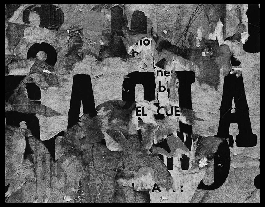
Most of his inspiration comes from various activities as a founding member of the Society of Photographic Education and as a co-editor of Choice, a literary and photography magazine. Overall his greatest inspiration was as a professor of photography at the Institute of Design of the Illinois Institute of Technology in Chicago, a post he held from 1951 to 1971. His final works consist of a 30 year anthology of his photographs, Bucks County, Photographs of Early Architecture and Places. Here are some examples of his work below:After looking over some examples of his work I decided that I would analyse one of his images, by doing this it would allow for a greater insight into how these photos are created and what makes them so effective. When looking over the photos it would give me the ability to incorporate the style into my own works, making them more effective as a result. The image I chose for this is called San Luis Potosi 16, a photo of a rotting billboard with deteriorating paper:
Visual: 

Visually the image is of a billboard that had been left to rot, and as a result has become this abstract piece in itself which hides the initial meaning meant to be put across by it. This is accompanied by the fact that the paper has been repeatedly stacked upon different posters underneath, because of this the writing seems to jump around the image rather than stick in one place. When looking at it I found that the different sizes of fonts really attracted my attention due to it breaking up the piece from becoming too generic and repetitive, allowing for your eyes to travel across it with ease rather than become eye-sore from a lack of contrast. Composition wise the use of placing the biggest text in the centre of the photo really creates the whole image, as it becomes the focal point for your initial glance and the source of it’s overall aestheticism. 

Technical: 

When looking over the image there is a use of high contrast, this is done so that there is a clear definition between the lights and dark present inside the piece, emphasising and changing the final outcome as a result. The photo has been taken using monochrome, this like the contrast increases the difference between the lights and dark whilst also honing in on specific details that may of not been previously picked up upon when looking at it in colour. A relatively normal exposure and shutter speed have been used as there is no sign of blur or one of he shades overpowering the other, instead capturing the billboard as it was seen at the time. 

Conceptual: 

The image itself is part of a series consisting of various billboards in and around cities, capturing their deterioration in an aesthetic and unusual way. When looking over the photo it is clear to me that it was taken at the peak of Siskind’s exploration and experimentation regarding various takes on the environment which makes us the surrounding area, using it to reflect what can be seen and expected rather than take portraits instead. By using a monochrome filter it brings out the aestheticism of the image, making it entirely possible to interpret the image purely on an aesthetic level. The reason for Siskind’s attraction to abstract takes on cities come from experimentation between photographing an object in an unusual way or photographing the people found in that area, after much time he decided upon using abstraction to express his opinion regarding his viewpoint of the surround place, making the viewer interpret his meaning through only visual appearance alone. 

Fine Art Reference

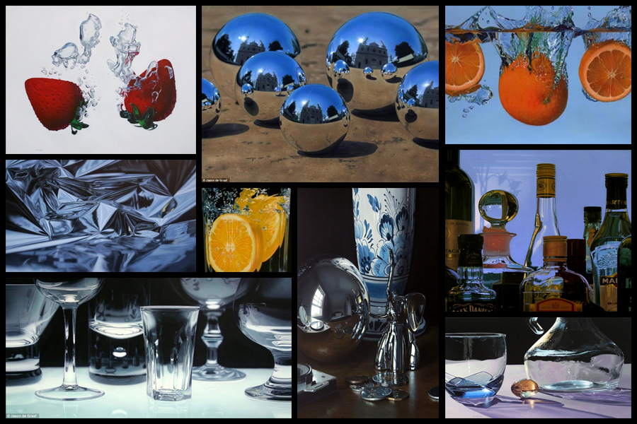
Before going ahead with a shoot and artist reference I decided that I would explore a fine artist that I could link into my future work. I would be looking at their composition and portrayal of certain everyday objects, whilst also looking at how their portray their vision of the landscape in new and creative ways. One particular artist that I found to be inspiring was the fine artist Jason De Graaf, someone who focused on reflections and objects that reflected as a means of enhancing the colour and vibrancy of the subject photographed. For me this was a unique way of seeing the subject photographed as he sets about using natural reflections such as splashes and sunlight to add contrast to otherwise boring everyday items such as fruit. Some examples of his work can be seen below:

I really liked his use of tinfoil to create abstract landscapes in a sort of surreal and conceptual way with no actual editing done. For me this gave rise to the idea of used a kaleidoscope when photographing my intended areas, further abstracting the subjects from their natural environment and instead producing it to the viewers as something up to interpretation regarding what it could be. When thinking about the use of textures and patterns and creating surreal landscapes with it I stumbled across the photographer Seydou Keita, a photographer who captured African culture through the subjects clothes and patterns present in their everyday lives.

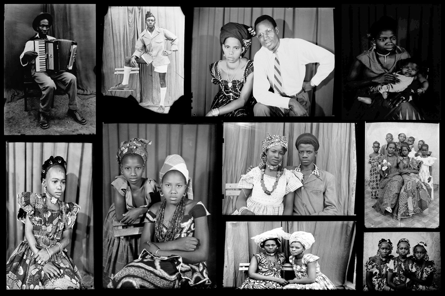
Seydou Keita was a self-taught photographer who in 1948 opened a studio in portraiture gaining a reputation for his skill throughout West Africa. Most of his photos and style are influenced by a great sense of aesthetics, dressing man young men European style clothing with customers bringing in items of clothing they wanted to be photographed in. Keita provided his own clothing and accessories such as watches, pens, radios, scooters, etc. which he often left inside his studio. Originally it was mainly women who came with their traditional robes that covered their legs and throats, only later shifting towards wearing Western outfits in the late 60s. Once again some examples of his work can be seen below:

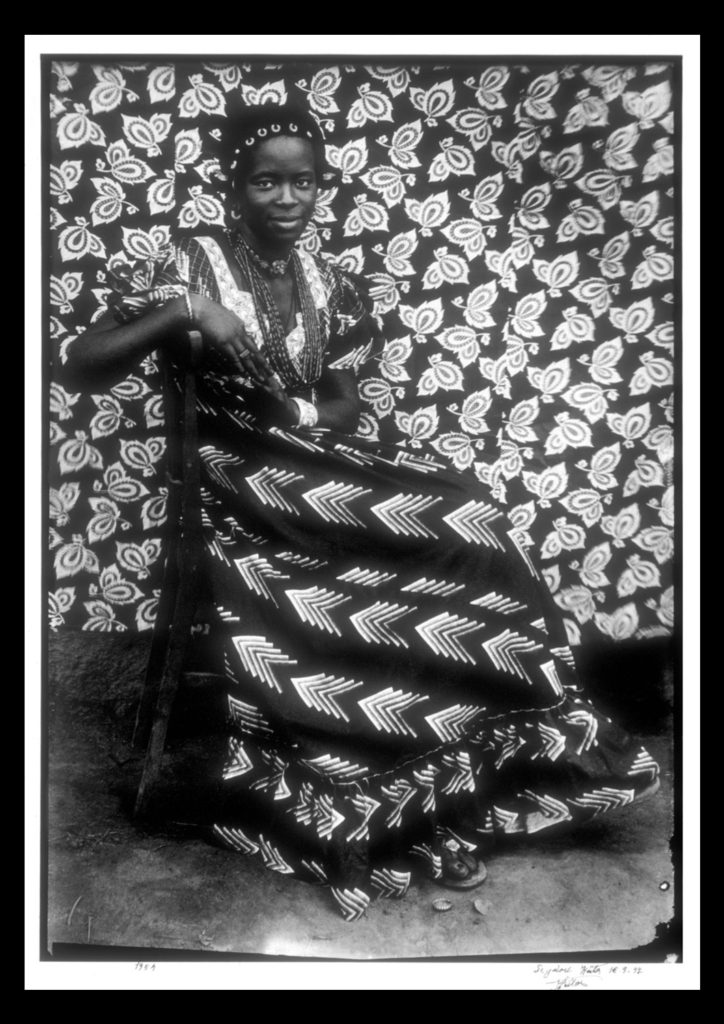
For future shoots I may consider taking objects out of my home into the natural landscape I have chosen and portray it in an abstract way which reflects a part of me rather than just the landscape itself. An alternative method which I could use would be to photograph the landscape on a more personal level, getting closer the to the subjects and capturing them in a more abstract way through up-close photography and their isolation from their surrounding environment. Some examples of this could consist of fences, horses, gardens and trees, all of these subjects play a part for something in society, whether it be work or just for relaxation, and so by portraying them in an unusual way which captures them in a light not previous used would as a result give viewers a new perspective. One of the image I found to be particularly effective for me is a piece by Seydou Kaita called Untitled [Seated Woman with Chevron Print Dress]:

Visual:

Visually the piece uses traditional African textiles and dresses as the main method of presenting aestheticism towards the viewer. What Keita does here is use two contrasting textiles which class in pattern not colour, as a result of this the opposing texture defines the women opposed to her blending into the backdrop. By leaving a section of the floor in it increases the effectiveness of the textures due to how it stops the entire image from becoming too eye-sore whilst also adding contrast between the predominantly white textiles, once again helping to define the figure of the women from the backdrop. Composition wise the women is centered in the middle of the photo, by doing this for me it immediately draws my eye to the subject as the contrasting clothing she’s wearing draws your eyes to the face in particular which is presented as a breaking point between subject and texture.

Technical:

When looking at the photograph you can see how the image was taken mid-movement, this is because of how the top right of the textile backdrop is motion blurred, this adds a sense of depth within the piece as it defines the women more due to her being photographed more crisply. An average exposure and shutter speed seems to have been used due to shades all being relatively normal without exaggeration, whilst the blurred areas provide me with evidence that the shutter speed is normal and has been unedited or untouched. The piece seems to use natural lighting as the light appears from all sides of the subject, not emphasizing or reducing the effect of the shadows, meaning that the image must have been taken outside of his studio.

Conceptual:

In the twentieth century, photography became a medium of expression that African artists began to draw upon to reflect on the world around them. One of the exceptional talents to emerge in this area has been the Malian photographer Seydou Keita (ca. 1921–2001), whose work has been admired on an international scale. Keita’s oeuvre consists of portraits that chronicle Malian life during the mid-twentieth century. His portraits are renowned for not only their masterful formal composition, but also their ability to capture the nuances of this important transitional period in Malian history. 

This portrait of an unidentified woman displays the signature pictorial style that made Keita the premier Malian photographer of his generation. Employing different backdrops and successfully combining pattern on pattern, the woman’s skirt is dynamically juxtaposed with the regularity of the floral motif on the backdrop behind her. Keita positioned the woman so the arrow design of her dress directs the viewer to her bodice, where light vertical elements of her blouse lead toward her smiling, confident face. The overall pattern on the backdrop holds the viewer’s attention while it gently repeats itself and simultaneously guides our eyes back down to her skirt.

EADWARD MYBRIDGE

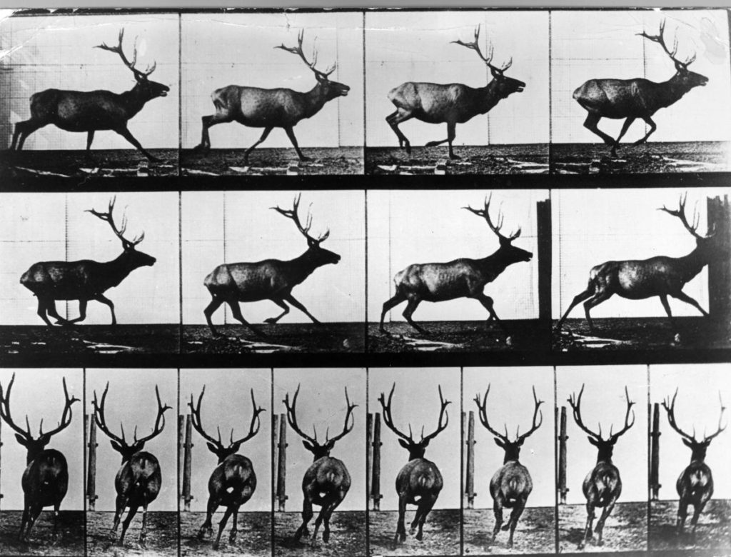
Eadweard Muybridge, (April 9, 1830 – May 8, 1904) was an English photographer important for his pioneering work in photographic studies of motion and in motion-picture projection. Muybridge’s photography of moving animals captured movement in a way that had never been done before. His work was used by both scientists and artists. He immigrated to the United States as a young man but remained obscure until 1868, when his large photographs of Yosemite Valley, California, made him world famous. Muybridge’s experiments in photographing motion began in 1872, when former California Governor Leland Stanford contacted him to help settle a bet. Speculation had raged for years over whether all four hooves of a running horse left the ground at the same time. Stanford believed they did, but the motion was too fast for the human eye to detect. In 1872, Muybridge began photographing a galloping horse in a sequence of shots. In 1877, he returned to California and resumed his experiments in motion photography, using a battery of from 12 to 24 cameras and a special shutter he developed that gave an exposure of 2/1000 of a second. This arrangement gave satisfactory results and proved Stanford’s contention.

In 1883, Muybridge was invited to continue his research at the University of Pennsylvania and for the next few years produced thousands of photographs of humans and animals in motion. Near the end of his life, he published several books featuring his motion photographs and toured Europe and North America, presenting his photographic methods using a projection device he’d developed called the Zoopraxiscope. Muybridge’s innovative camera techniques enabled people to see things otherwise too fast to comprehend, and his sequence images continue to inspire artists from other disciplines to this day. His work links to the idea of variation and similarity as he is capturing the slight, varying motions and movements of the one subject. His photographs explore similarity as despite the slight differences of motion within his images, the individual photographs are interchangeable. His work is extremely interesting and innovative and I will respond to it with my own photo shoot based around motion.

Variation And Similarity – Exploring Ideas

Before commencing with various shoots and photographic inspirations I decided that I would be suitable to research various ideas that I could use as my theme for the topics of variation and similarity. Here I will be exploring five different stances I can taken regarding the given subject, and how I could go about taking images of the intended areas and their uses, these are my choices:

Empty Spaces/Full Spaces: 

Here I could photograph empty/full car parks, using the lighting present there to create aesthetic and contrasted results. This can be done to more effect in enclosed parking areas such as the ones present in town, where a more cramped and urban feel is created. I could also make use of the empty car parks at night in the open, using the odd lamppost’s lighting as a means of casting an eerie feeling upon the surrounding area. A photographer who I could explore this with is Denis Felix, someone who explore the abandoned landscapes of areas in homes and buildings. Also done by photographer Johnny Joo, he capture the areas of society that have moved on, leaving natural to reclaim the land previously used. I could use monochrome photography for this as it could allow for a more unnatural feel to come across when viewing the photos.

Textures/Patterns:

For this idea I could explore the variation of patterns and textures within a variety of different objects present in different landscapes. By presenting everything as more abstract and aesthetic it could not just visually please the viewer but also provide an insight into the hidden world that can be portrayed by these surfaces, where you perspective can be warped depending on how you see the object. Photographers that I could use for this idea are Paul Sanders, someone who looks at the structure of objects and photographs them in an aesthetic and original way, and Edward Weston, a photographer who uses macro photography to capture textures and patterns of architectural and natural subjects, in both the environmental and man-made world.

Animals: 

Regarding the idea of animals I thought the variation of species would be a great topic due to Jersey having one of the worlds most famous endangered species zoos in the world, Durrell. By photographing a large variety of different species side by side it would provide a huge insight into how evolution has occurred and the different features and characteristics of each one. Some photographers that I could study for inspiration for this idea are the photographers Martin Bailey and Tim Flach. What I liked was their style of separating the subject from the backdrop using Photoshop or a black cover which really brings out the aspects of the animal they intend to capture.

Natural Formation Of Objects:

Here I wanted to explore how the formation of natural objects found in our everyday environment. By using macro photography it could highlight the hidden patterns in things that we view all the time, by photographing a variety of different plants etc like a topography it would give symmetry and aestheticism to the viewer who could see each image in a larger picture when compared to the other images taken the same way. The photographer Karl Blosfeldt I felt was a particular inspiration for me as he used topographics to capture the tips of plants using macro photography, which he would then display side by side so that they increased the overall interpretation of how the style of photography is viewed.

Abstract Landscapes:

Finally for this topic I wanted to look at how the various landscapes in Jersey could be viewed using abstract and unique perspectives regarding the formation of the area. Here I would have to look at the vivid colours and contrast them against more stark and ugly aspects of the area like concrete and walls, using telephone boxes, lines and brightly painted areas to do so. Some photographers that I would like to study for this are Sigfried Hansen and Ricardo Cases, who both use vivid colours to portray the landscape in a vibrant and interesting way that draws the viewer in through aestheticism and symmetry.

Overall when looking over the chosen ideas I found that the abstract stance of separating the subject from its environment really appealed to me the most as it presented me with alternative methods of showing my work, leaving the viewer to purely focus on that one subject. These are most evident in the topics of animals, natural formations and texture/pattern, giving me the opportunity to explore this style the most.