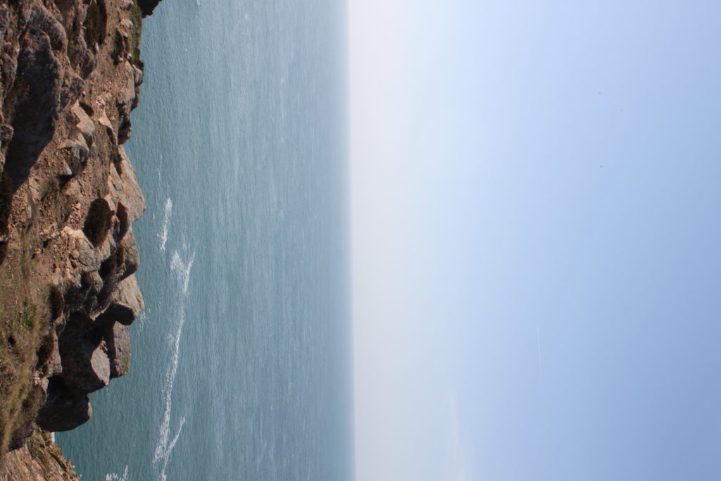
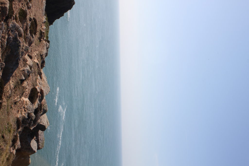
To create tiny planet images, you firstly need to take images. I took 55 images per planet, creating a 350 degree panorama as you can see below.

This is the step by step process of turning a panorama into a planet:
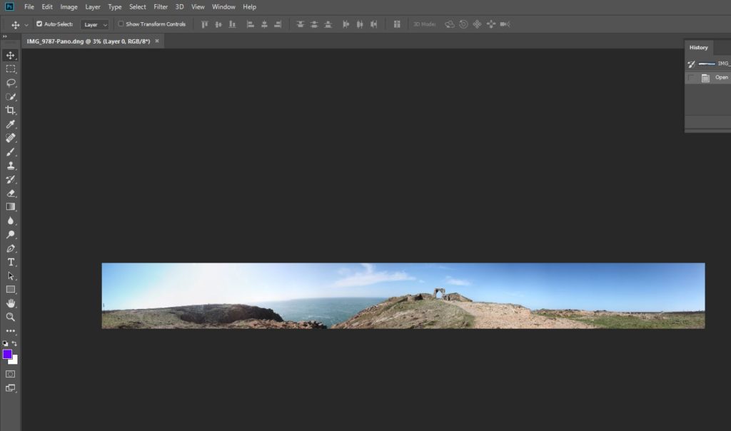

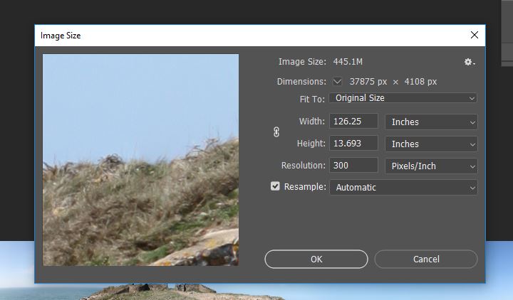
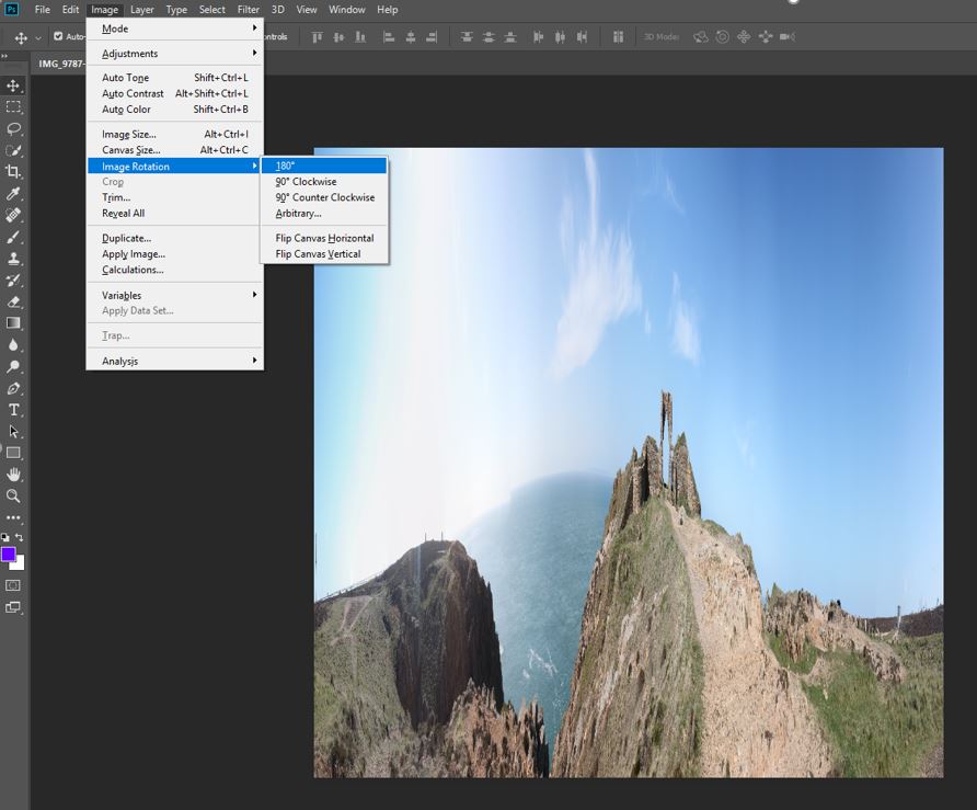
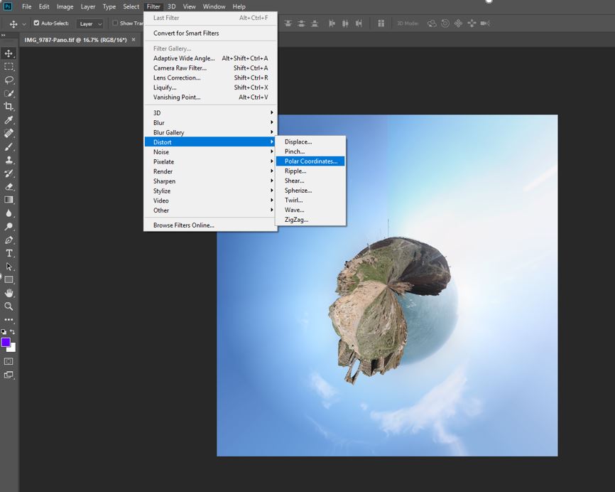
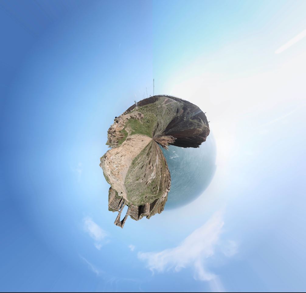
To create tiny planet images, you firstly need to take images. I took 55 images per planet, creating a 350 degree panorama as you can see below.
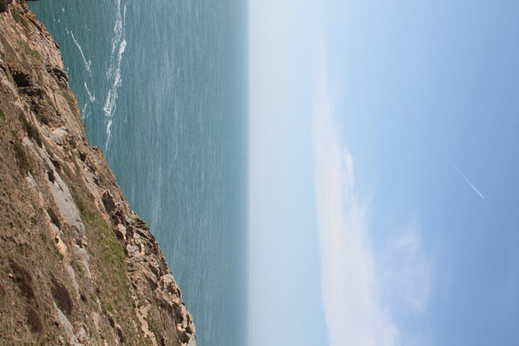
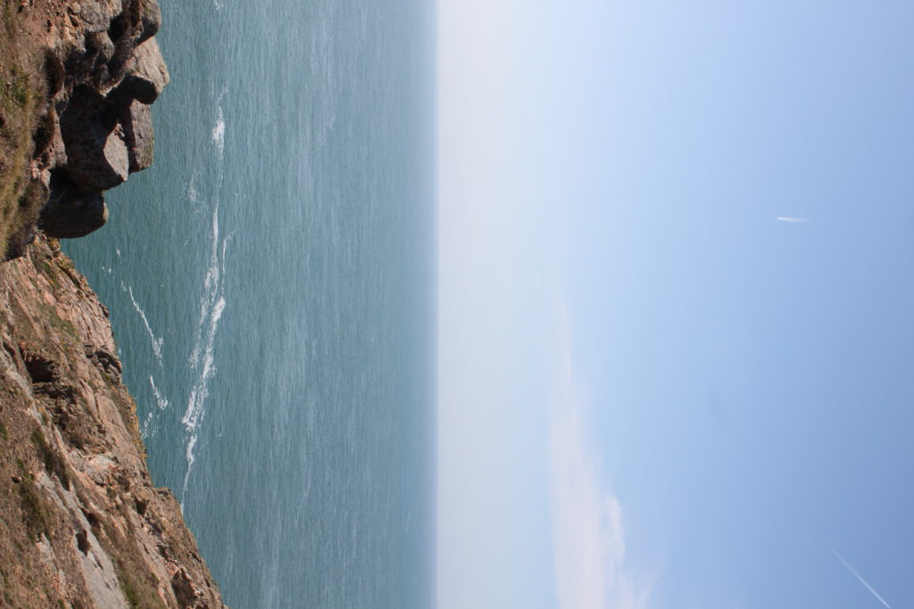
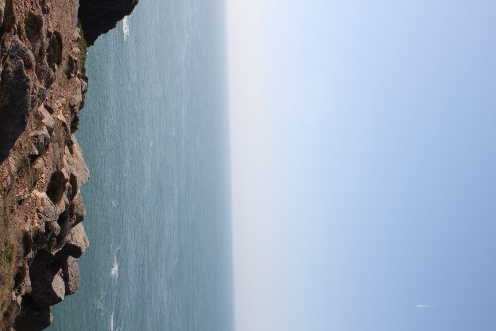
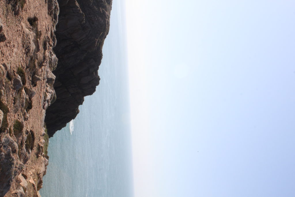

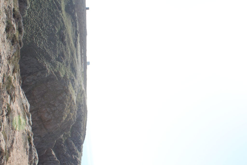
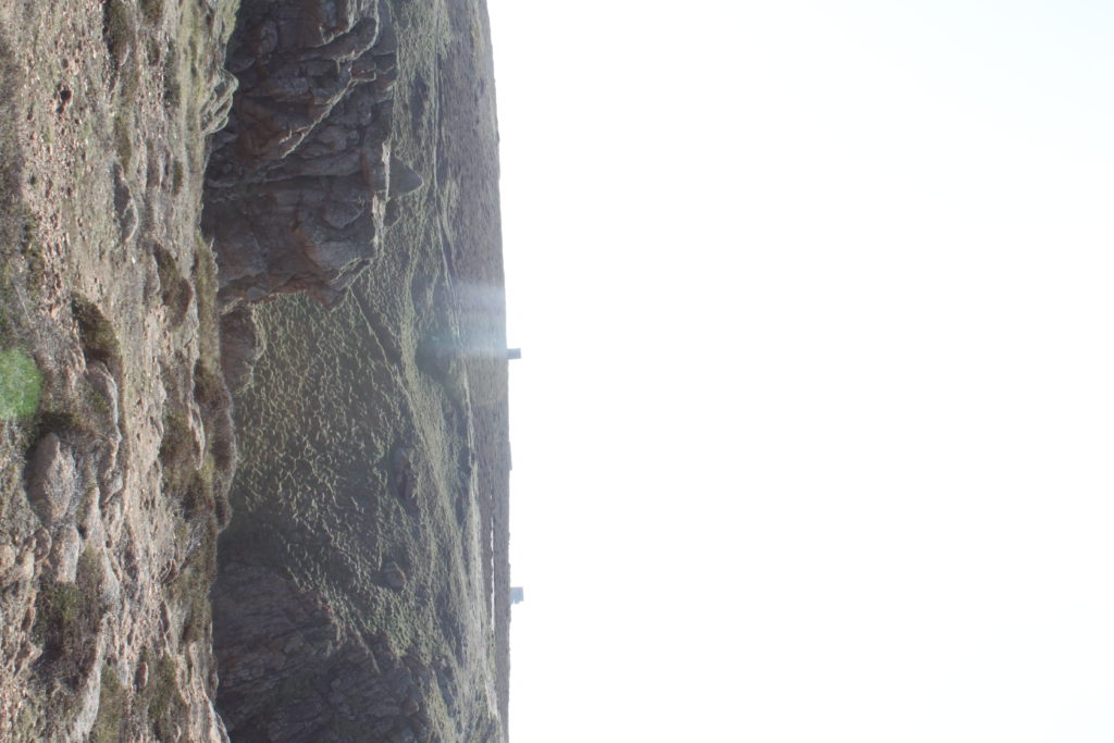
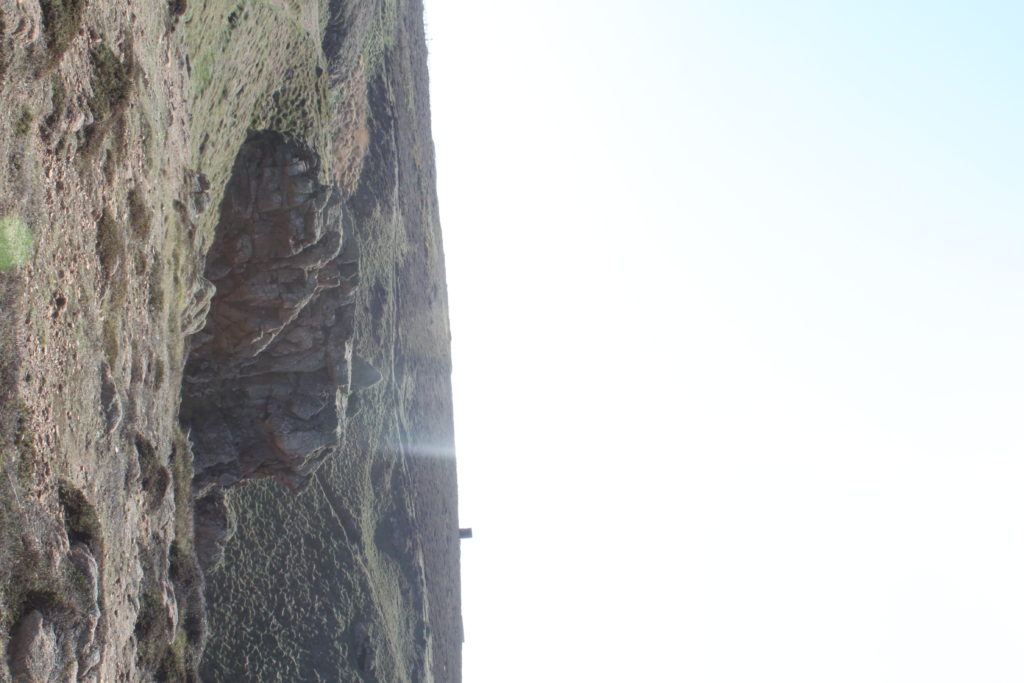
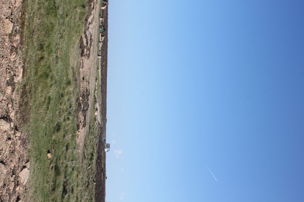
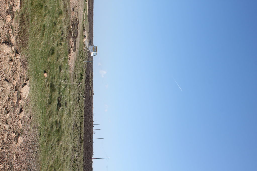
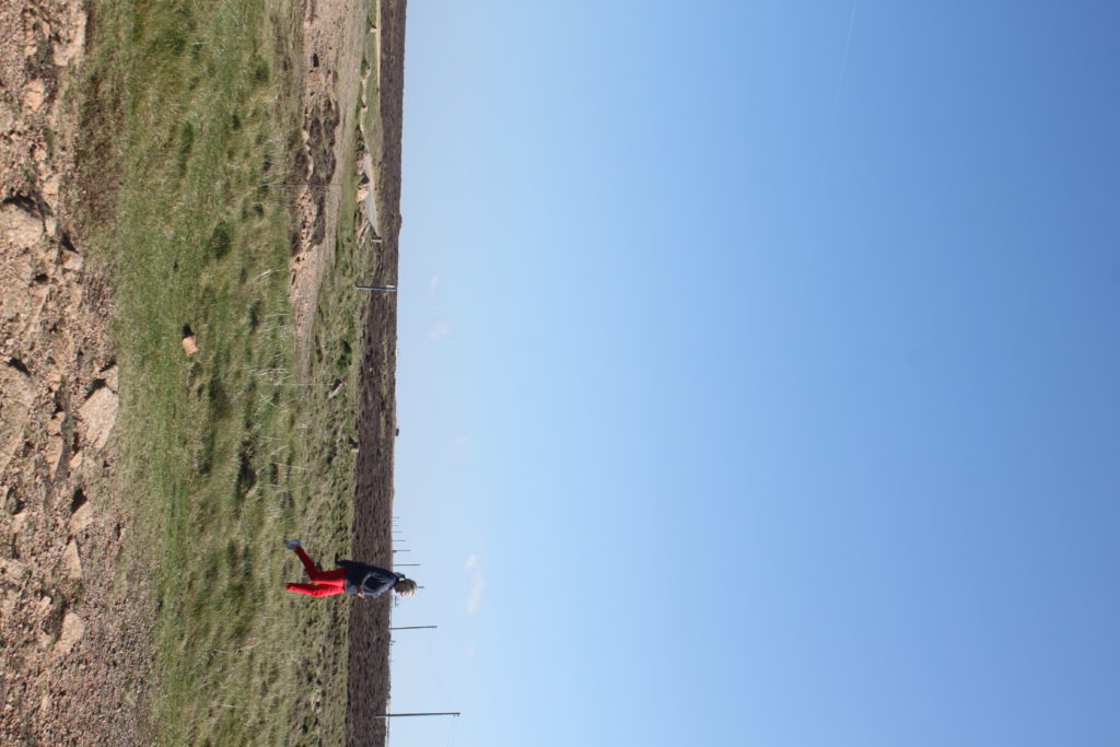

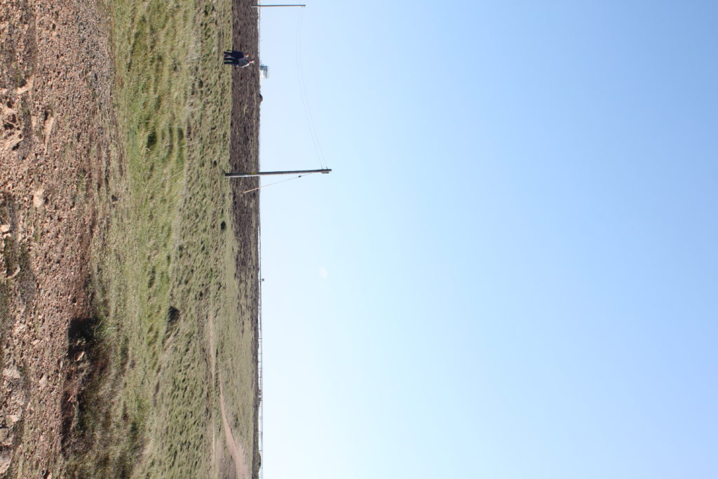
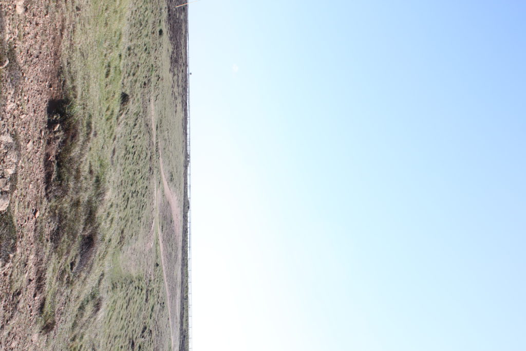

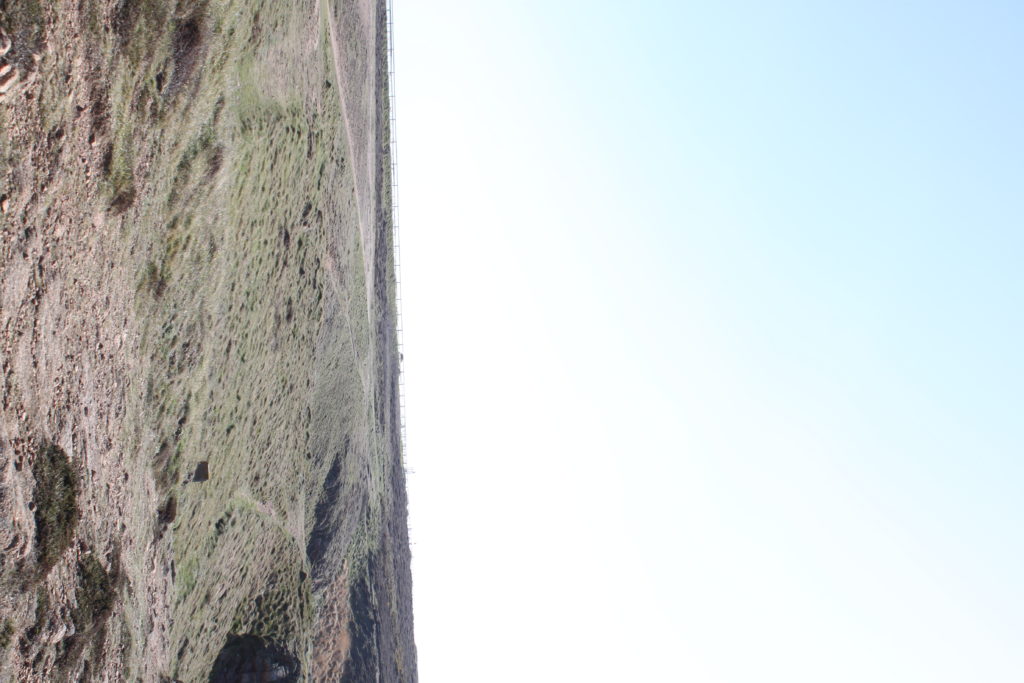
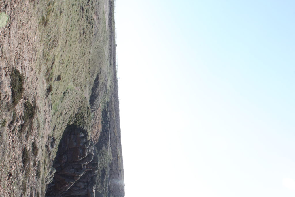
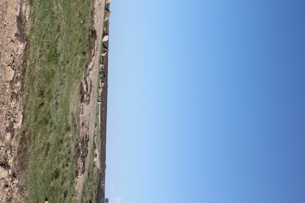
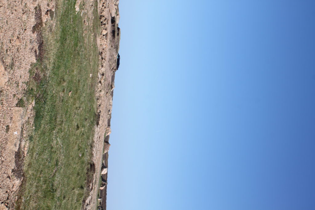
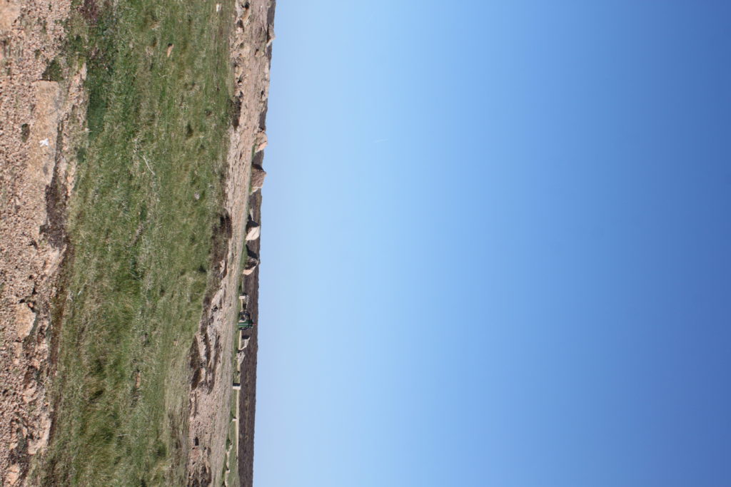
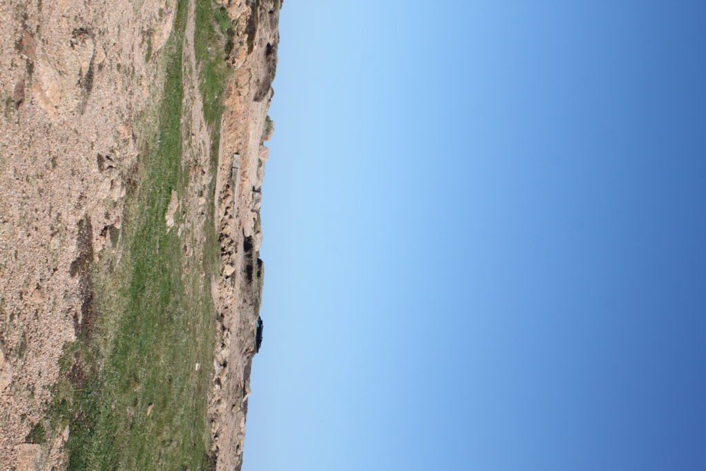

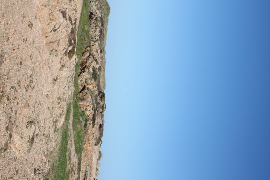
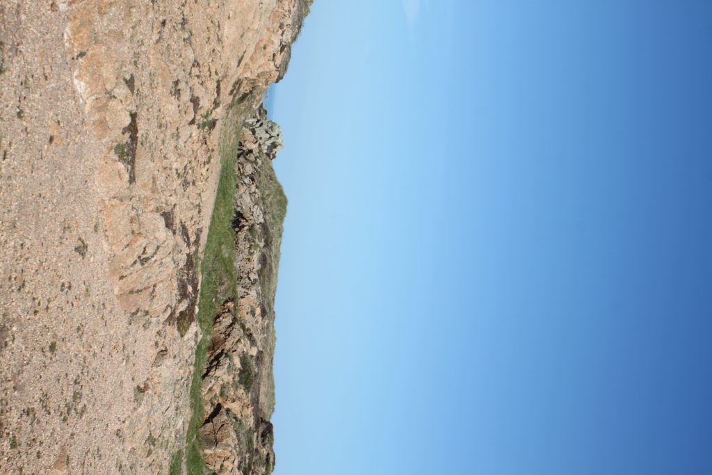
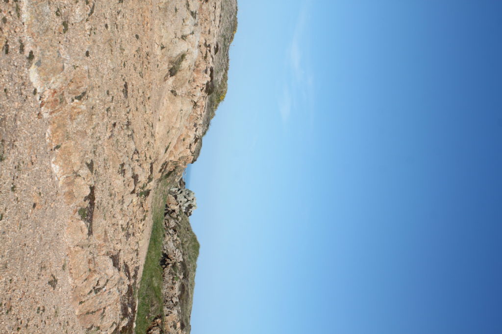
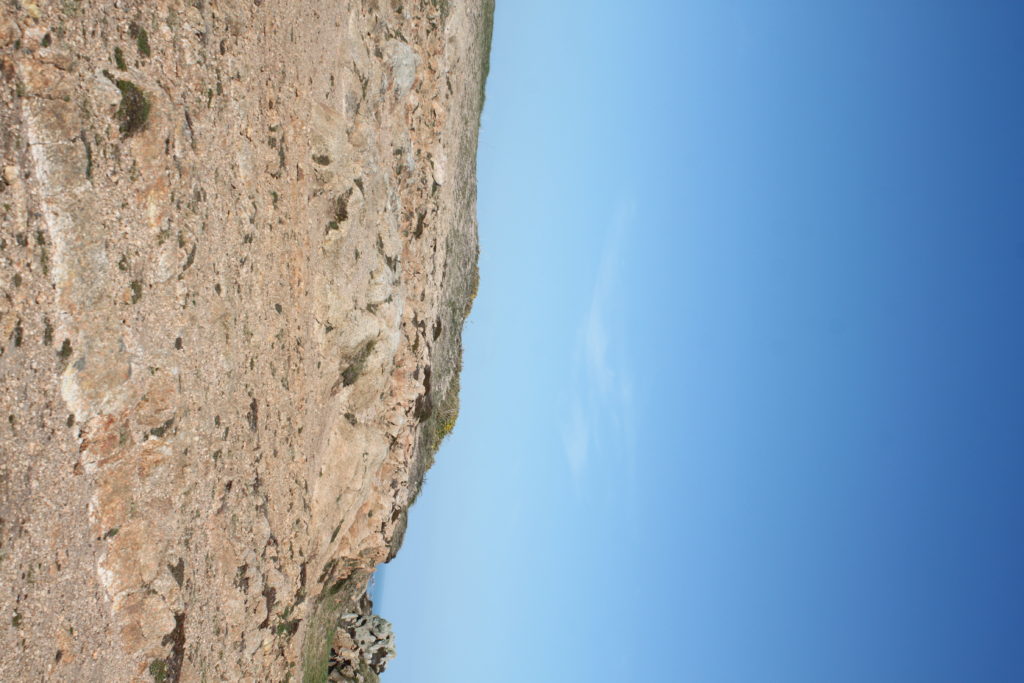
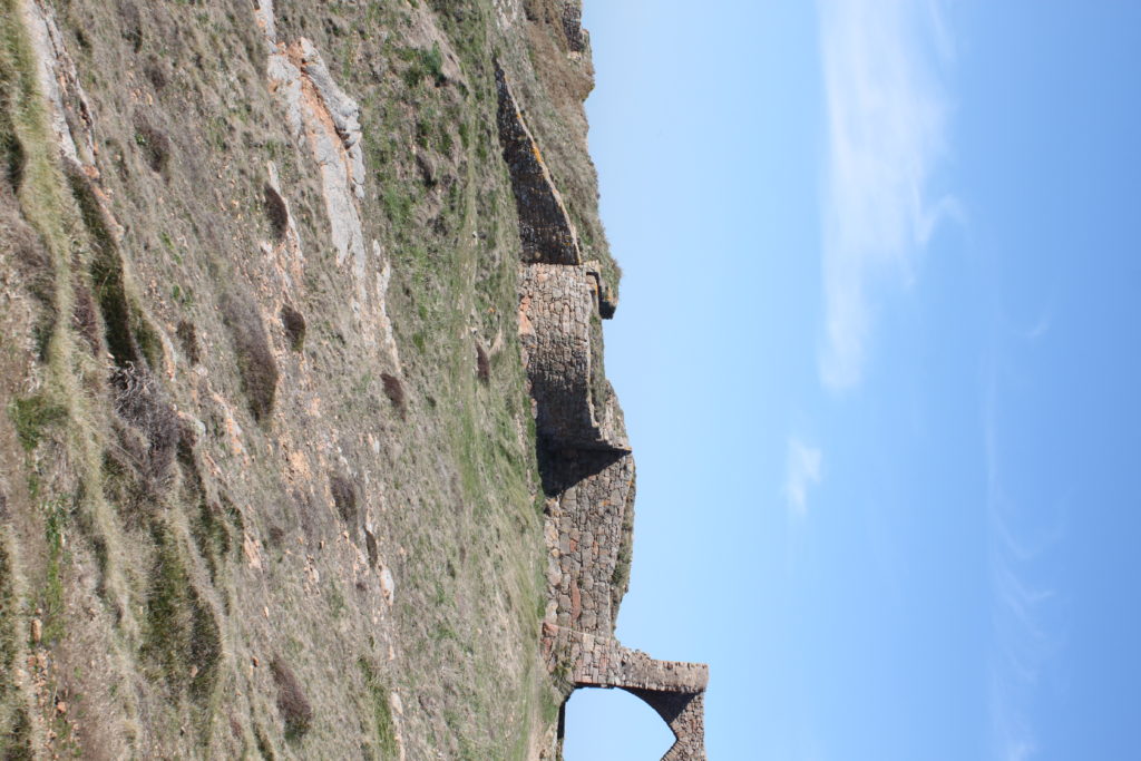
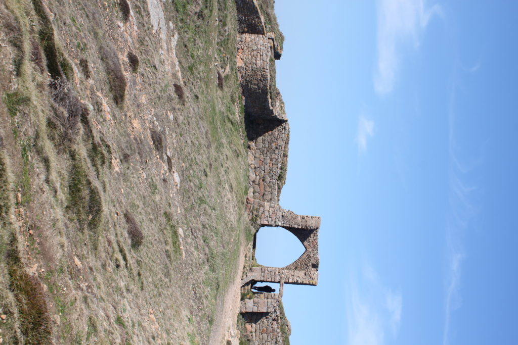

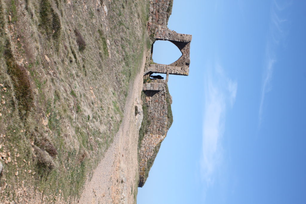
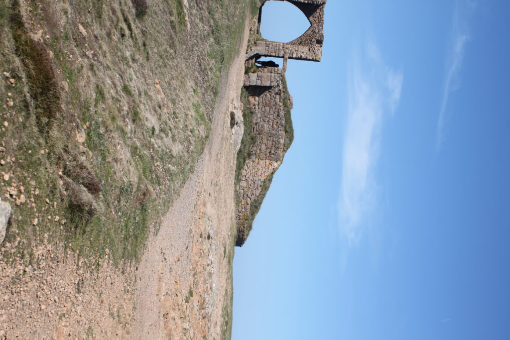

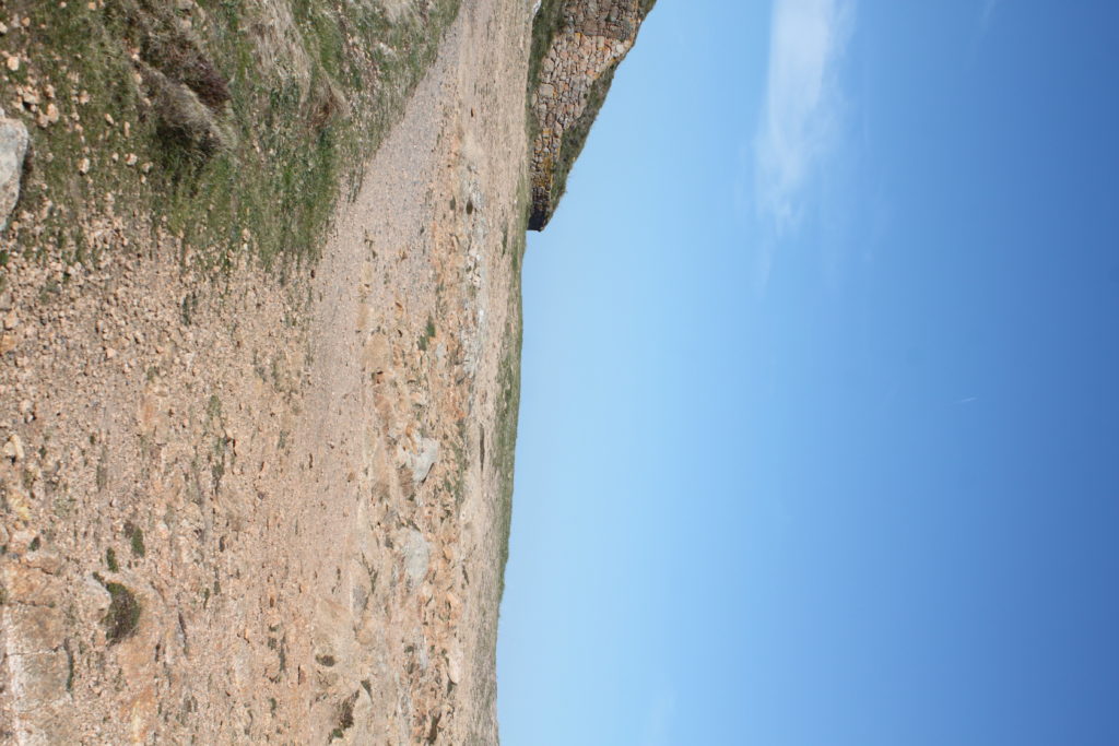
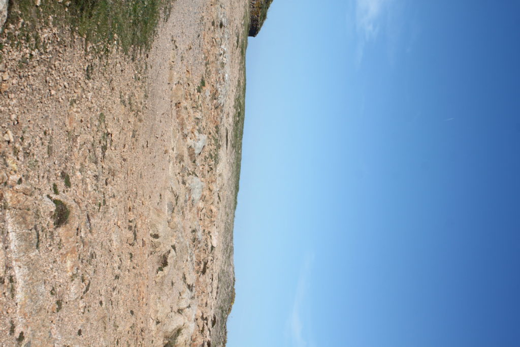
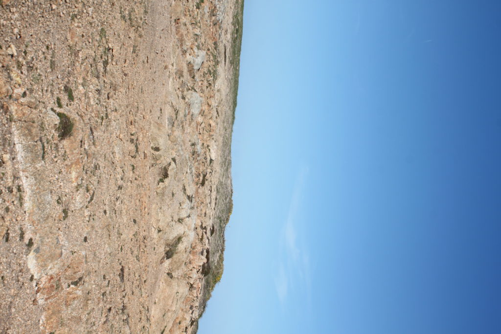
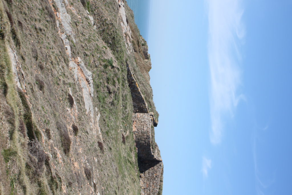
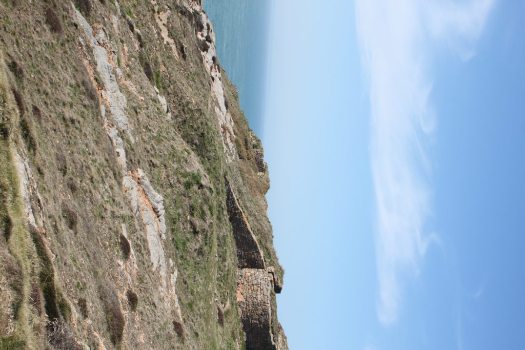
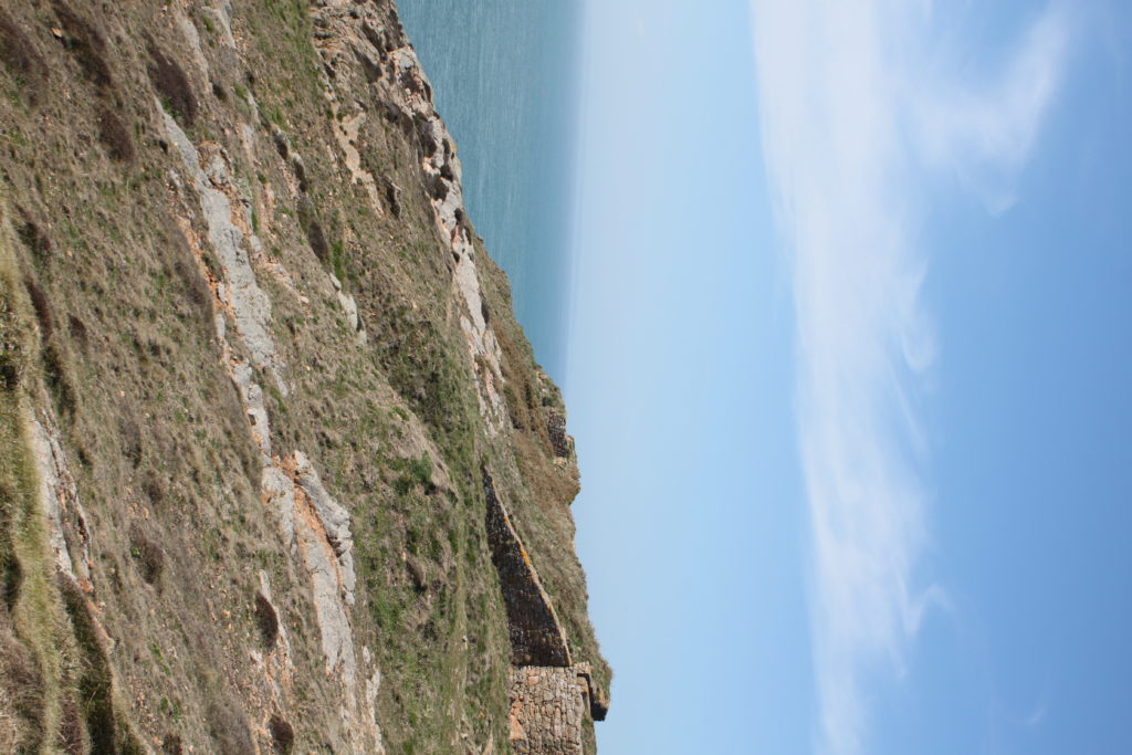
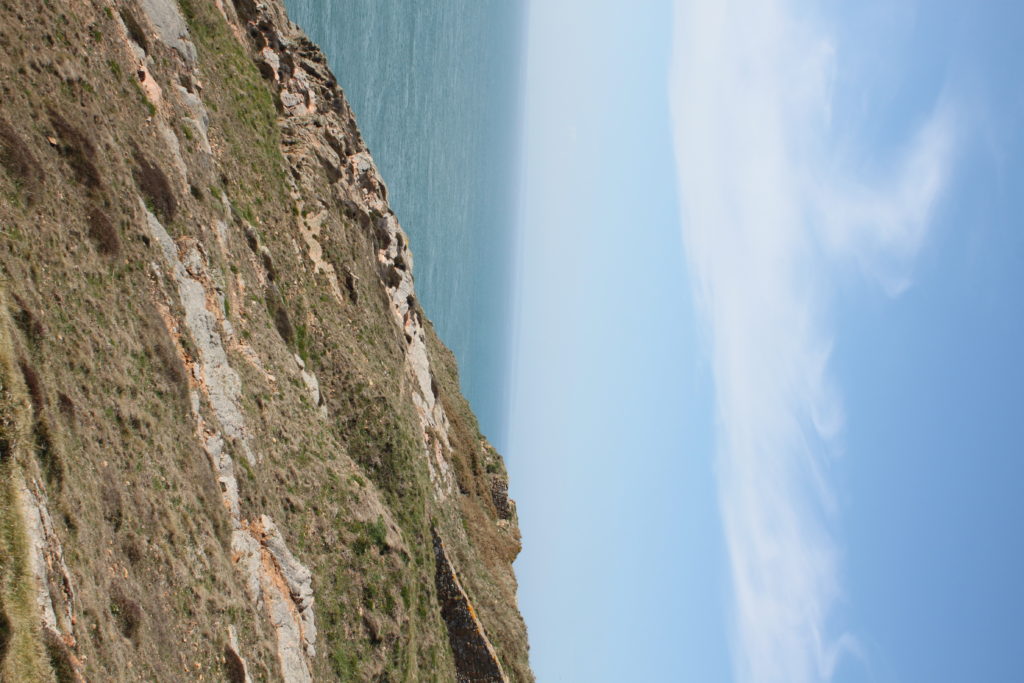
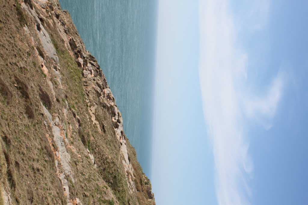
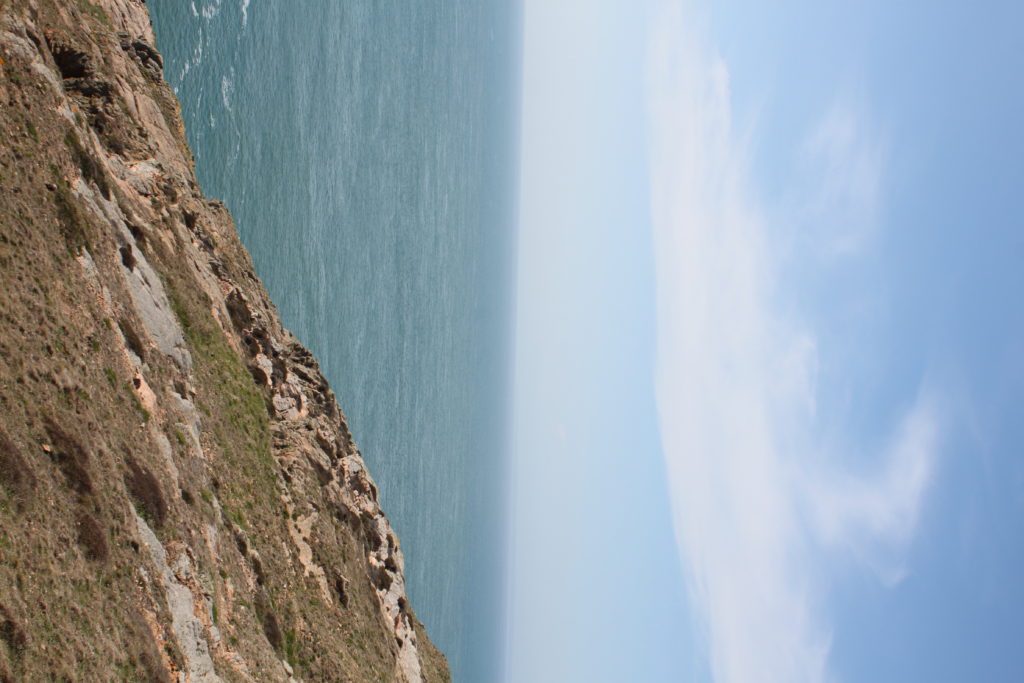
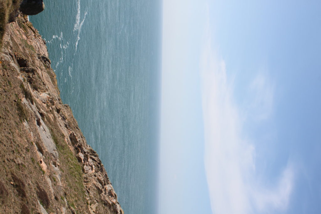

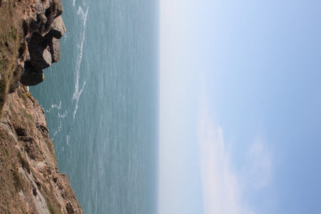
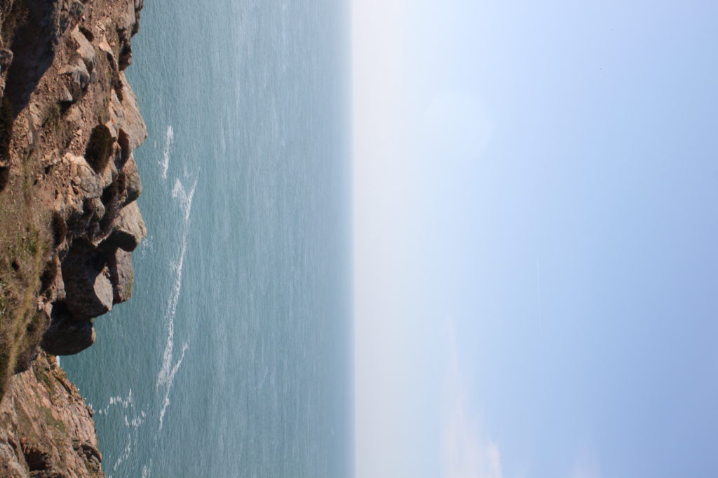
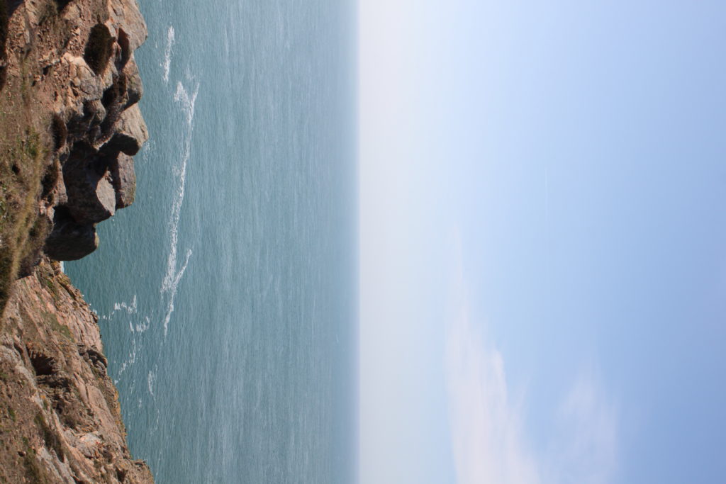

This is the step by step process of turning a panorama into a planet:


During the late 1950s and early 1960s in New York City, the dominant art movements were Abstract Expressionism, followed by Pop art, then Minimalism. In the mid-1960s, a far smaller movement of individual artists producing realistic paintings related to photography began to practice their craft, also in New York. This was labelled as Photorealism. Photorealism artists’ work depended heavily on photographs, which they often projected onto canvas allowing images to be replicated with precision and accuracy. The exactness was often aided further by the use of an airbrush, which was originally designed to retouch photographs. Photorealism complicates the notion of realism by successfully mixing together that which is real with that which is unreal. While the image on the canvas is recognizable and carefully outlined to suggest that it is accurate, the artist often based their work upon photographs rather than direct observation. Therefore, their canvases remain distanced from reality factually and metaphorically. Many Photorealists adamantly insist that their works are not communicative of social criticism or commentary.
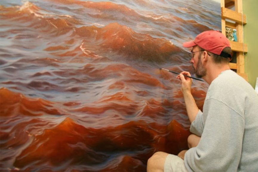

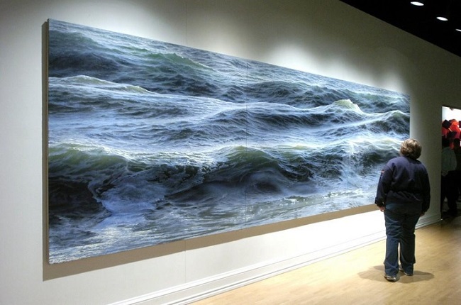
Since the origin of photography in the early-19th-century, artists have used the camera as a tool in picture making; however, artists would never reveal in paint their dependency on photographs as to do so was seen as “cheating”. In contrast, Photorealists acknowledge the modern world’s mass production and proliferation of photographs, and they do not deny their dependence on photographs. In fact, several artists attempt to replicate the effects of photography such as blurriness or multiple-viewpoints, because they favor the aesthetic and look. Therefore, while the resulting image is realistic, it is simultaneously one-stage away from reality by its dependence on the reproduced image. These works question traditional artistic methods, as well as the differences between reality and artificiality. The representation of light, as well as the interaction of light and color together has concerned artists throughout time. By using slide machines to project images onto bare canvas, Photorealism for the first time unites color and light together as one element. Furthermore, Photorealists, along with some practitioners of Pop art, reintroduced the importance of process and deliberate planning over that of improvisation and automatism, into the making of art, draftsmanship, and exacting brushwork.


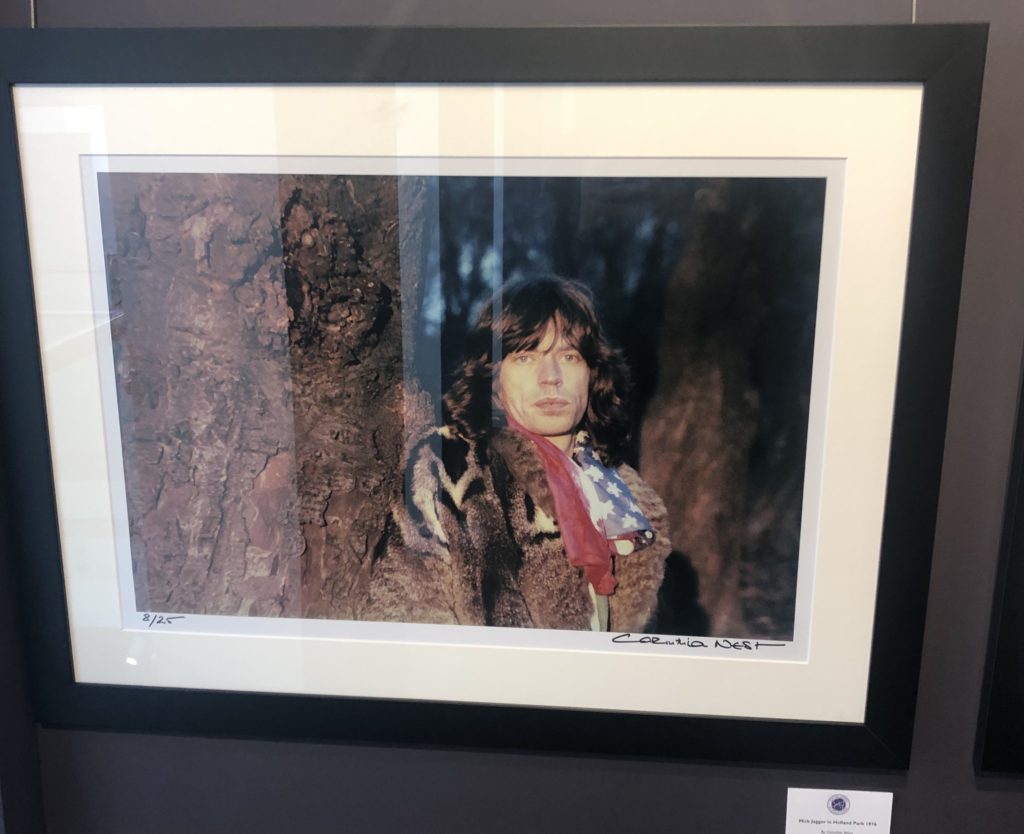
The CCA Gallery was an exhibition by Mike McCartney, Rupert Truman, and Carinthia West. The exhibition showed a range of alternative album covers for artists in the 60’s, such as Pink Floyd, as well as giving an insight into the lives of other 60’s icons, including Mick Jagger. The gallery had a documentative approach in the portrait styles, as seen in the photo of Mick Jagger
One photo which caught my attention was the Mick Jagger ‘double exposure in the tube’ piece by Corinthia West. I think this appeals to me due to the work that I have been experimenting with throughout my ‘Variance and Similarities’ project – I have looked a lot at the use of double exposure and layering photographs over eachother to create a disorientating effect or to add an element of excitement to a typically boring photograph.
Although liking this piece by West, the majority of the west of her work didn’t appeal to me as they were all plain and documentary-style portraits which did not have much to them other than the fact that the subjects were considered icons. As can be seen on the right photograph, her portrait of Mick Jagger is simply him stood next to a tree looking blankly at the camera – there is nothing to catch the eye or add an element of interest to it.
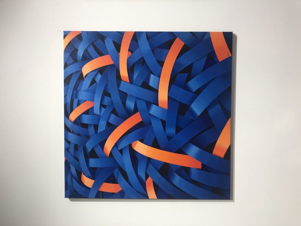
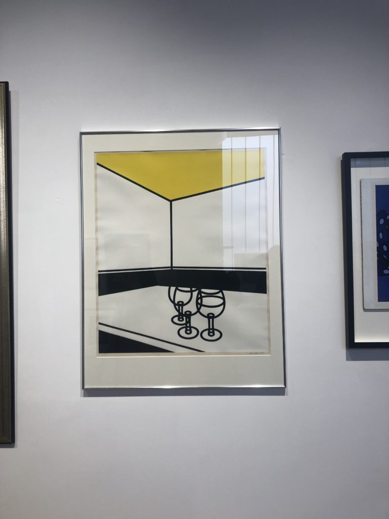
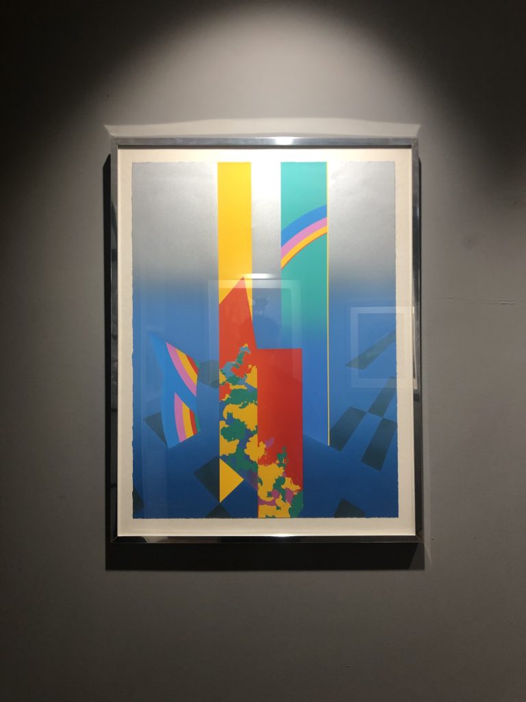
The private gallery contrasted greatly with the CCA gallery – the private gallery focused a lot more on the culture of pop art. The work consisted of lots of bright colours, abstract shapes, and represented the theme of mass customisation as Andy Warhol intended. The gallery was titled ‘Pop icons on the 20th century, Britain and American pop art’. The pop art movement was around in the 1950’s and peaked in the 60’s but is still widely recognised and practiced today. The work at this gallery had a very contemporary style to it – a lot of the work was art rather than photography but was still relevant as the themes and styles used can be transferred into photography.
One photograph from the private gallery that I particularly liked was ‘Homard Bleu’ by Nick Parlett. The photograph is an abstract painting of what appears to be shiny metallic pieces of metal all intertwined but the painting stemmed from a quick sketch of long grass by the beach side. The story of how the painting came to be really appealed to me because it shows how you can pull abstraction from anything you want to and turn something into something completely different whilst still keeping elements of it.
A photograph that didn’t appeal to me was ‘Black & White Cafe’ by Patrick Caulfield. I think this is because the photograph seems so empty and doesn’t have anything to draw attention to it other than it’s simplicity. Of course it would be harder to paint this composition than it seems but it seemed to lack skill and anything of interest – which I suppose was the idea behind it in the first place.
Who is he?
Franco Fontana was born in 1933 in Modena. He took up photography in 1961 and joined an amateur club. He held his earliest solo shows in 1968 in Modena, his native city, which marked a turning point in his career. He had published over severnty books with Italian, French, German, Swiss, Spanish, American and Japanese publishers. His photographs have appeared worldwide in over 400 exhibitions, solo and collective. His images are in collection in over fifty public and private, Itlaisn and international galleries. Many companies have asked him to collaborate on advertising campaigns, he had published photographs in The New York Times and various other major magazines, with Fontana being invited to hold photography workshops in various school, universities and institutes such as the Guggenheim Museum in New York. Every year he holds academic courses at the Politecnico di Torino, and the LUISS University, Rome. He is the director of the Toscana Fotoferstival and has collaborated with the Centre Georges Pompidou, the Japanese Ministry of Culture and the French Ministry of Culture.
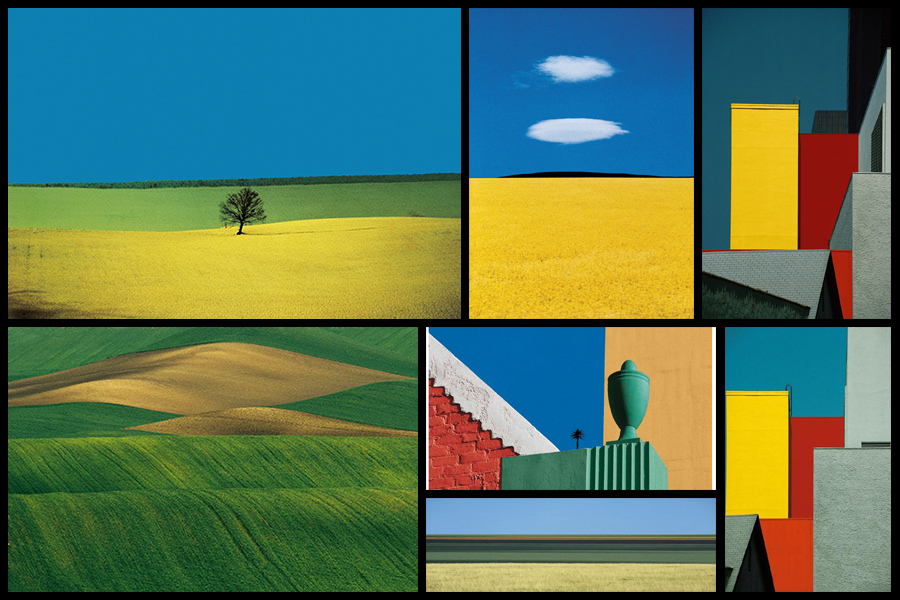
Fontans photography mainly depicts extremely aesthic portrayals of natural landscapes, using vibrant colours and a high saturation to link beauty to what would typically be seen in things such as flower, fields and the sky. What has inspired me is his use of aesthetics through a more unusually high saturation, depicting which would usually be everday scenes in a more visually appealing approach. Here I intend to go about photographing nature in a more aesthetic manner, using the textures and patterns found in each subject as a means of photographing a hidden viewpoint not usually seen to the everyday eye. Some examples of his work can be seen below:
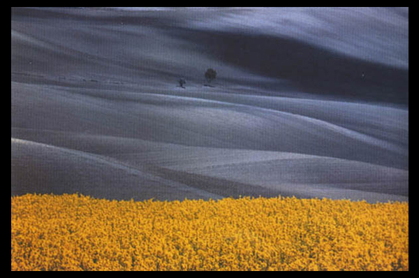
After looking over some of his works I decided that I would go onto analyse one of his images, by doing this it would allow me to have a broader knowledge regarding the techniques used to photograph the pictures and the more conceptual side of them. To do this I would have to look at three categories, technicality, visual and conceptual, the image that I have selected to study is called Paesaggio Basilicata, and was photographed 1990, depicting the use of minimalist styled composition of a agricultural landscape:
Technical:
Technically the image is composed using a very minimalist technique, capturing and using only the yellow crops and the contrasted black and white backdrop to provide the image with an overall very aesthetic product. The photo has been taken in two filters, one being coloured and the other monochrome, by doing this it really highlights the shadows that make up the layers of the hill seen in the background and as a result create an abstract like effect which in a way depicts them as waves. To stop the monochrome becoming too overpowering Fontana has included two small trees located in the center of the photo, including this allows for a more symmetrical and aesthetic looks as the continual gradients of the hill are broken up and separated. The yellow contrasts this due to it being a contrast to black and so allows the shades on the hillside to pop even more.
Visual:
Looking at the image its evident that a high saturation has been used to create the vivid colour of the grass which is depicted unnaturally yellow. This is also contrasted by the monochrome hills which by doing so allows for all of the hills to have a layered portrayal used by the darker areas which have highlighted and smoothed out the grass to create a more gradient effect as a result. Composition wise the placement of the trees in the center has definitely been thought about, this is because of how it breaks up the otherwise consistent pattern found throughout the photo, with the yellow flowers taking on about 1/3 of the image up so that it cant become too overpowering due to its colours.
Conceptual:
The style used for this photo is based on his on vibrant language, Photographic Trans-avantgarde, abstracting the landscape and its colours. By using things such as a higher saturation he aims to create ideals for people regarding the aestheticism of an area which is often over-exaggerated in order to push a certain mind-set onto the viewer.
I visited the CCA gallery which had an exhibition called ‘Behind the Lens’ by
Mike McCartney, Carinthia West and Rupert Trueman looking at Britain in 1960s-70s, pop/counter culture, sexual revolution, rock documentary.

This image stood out to me in this exhibition as the mirrors had been physically put into the landscape rather than being digitally manipulated in. I liked this as it shows nature in a different way to other images I’ve seen. I like how the landscape looks artificial, but still shows the natural waterfall and grass in the background and foreground of the image. I also like the simplicity of the image, and how the tree is the main aspect of the image, with the shadow along the floor.
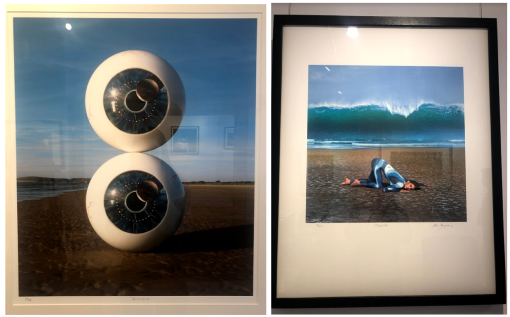
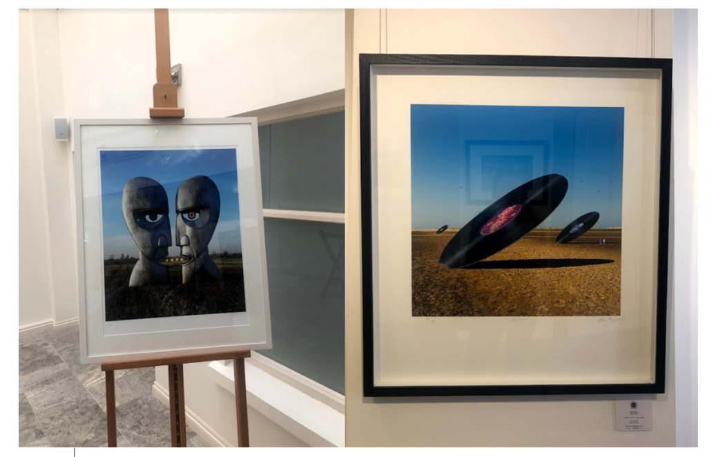
The second Private gallery I visited looked was called ‘Pop Icons’ and looked at Pop-art, reflecting on mass consumerism, advertising, celebrity culture, iconography. Artworks by Andy Warhol, Roy Lichtenstein, David Hockney, Peter Blake and other artists were displayed.
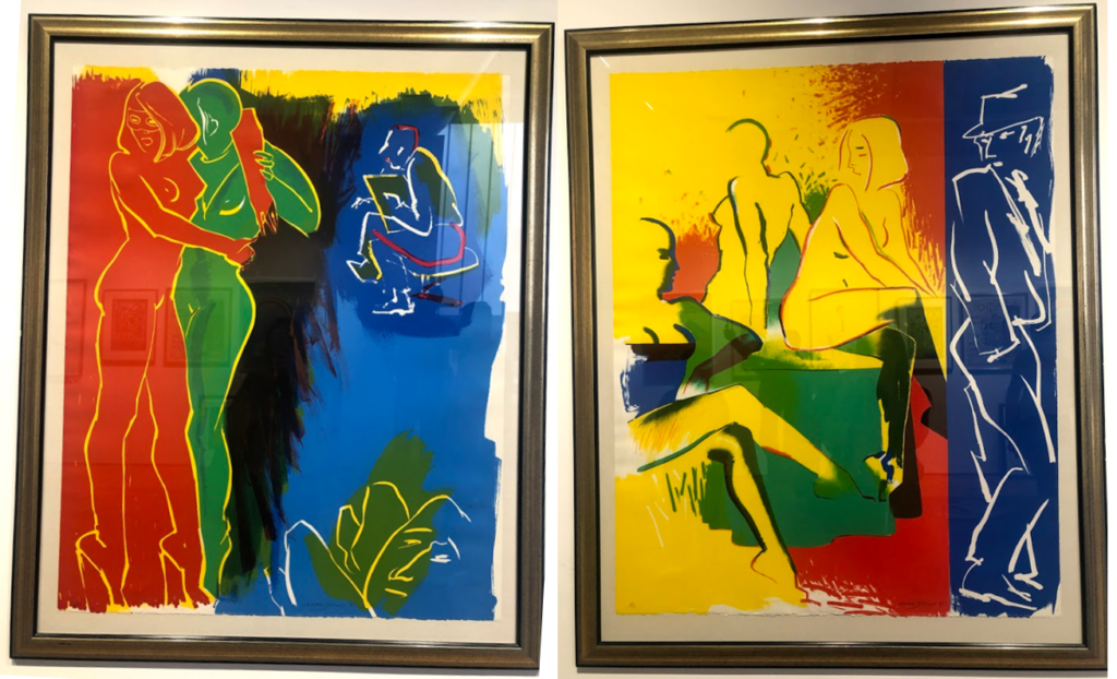
1950’s in Britain and late 1950’s in America, Pop Art reached its peak in the 1960’s and went on to become the most recognisable art form of the 20th century. It began as a revolt against the dominant approaches to art and culture and traditional views on what art should be. I particularly liked these two pieces above by the same artist because of their use of primary colours and the sections in which they’re divided into. I think i have slightly explored this in my project where i focused on block colours when editing the original images. Adjusting the colours in these images make them link to the work in pop art, although they are not a bold colours, this is something I could explore in my project further. I also like the use if cured lines and shapes representing the figures i the images as I think they relate to shapes and lines that you fins in natures and plants, linking to my projects.

Gallery Director Chris Clifford said, “Pop Art often takes imagery that is currently in use in advertising. Product labeling and logos figure prominently in the imagery chosen by pop artists, seen in the labels of Campbell’s Soup Cans, by Andy Warhol who is one of the artists featured in this exhibition. I also liked this image I displayed above as the repetition of the curved lines and colours, links to the theme of variation and similarity. I also liked how the patterns in the 2D images looked 3D like they wee coming off the image. In his image I thought that the blue colours linked to colours in nature and water, and the bright orange also links to my experimentation where I have included colour which arena normally found in nature within my images to make them stand out.

Feminism, representation of women artists in the art world, alternative voices etc.
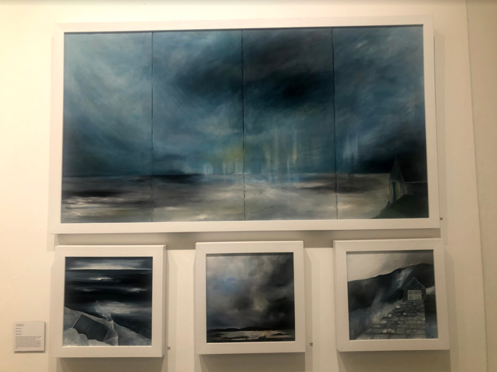
I think the this exhibition related well to this project as a lot of the work focused on nature, emphasising the representation of woman artists. This relates to my work as one aspect i am exploring is femininity in nature, looking at soft shapes that follow a stereotypical view of woman. I particularly liked these pieces above as I think that they represent ideologies of sublime, with the storm and dark clouds above the landscape, creating movement. The tones in the image are cool and emphasis the shadows, looking at the vastness in the scene. This relates to the work I am doing now as I have explored the ideologies behind sublime and beautiful, this type of image being something I could explore more in my project where I look at the other dangerous side to nature, rather than the fragility that i have focused on so far. So far i have explored warm, soft tones and colours in my images, this contrasts to these pieces where predominately cold dark colours are used, and is another aspect that i could look at in my work, contrasting cool and warm tones.
Who is he?
Born in Moscow in 1866, Wassily Kandinsky took up the study of art in earnest at age 30, moving to Munich to study drawing and painting. A trained musician, Kandinsky approached color with a musician’s sensibility. An obsession with Monet led him to explore his own creative concepts of color on canvas, which were sometimes controversial among his contemporaries and critics, but Kandinsky emerged as a respected leader of the abstract art movement in the early 20th century. In Munich, Kandinsky was accepted into a prestigious private painting school, moving on to the Munich Academy of Arts. But much of his study was self-directed. He began with conventional themes and art forms, but all the while he was forming theories derived from devoted spiritual study and informed by an intense relationship between music and color.
Color became more an expression of emotion rather than a description of nature or subject matter. He formed friendships and artist groups with other painters of the time, such as Paul Klee. He frequently exhibited, taught art classes and published his ideas on theories of art. He had already formed the New Artists Association in Munich; the Blue Rider group was founded with fellow artist Franz Marc, and he was a member of the Bauhaus movement alongside Klee and composer Arnold Schoenberg. Back in Germany after clashing theoretically with other artists, he taught at the Bauhaus school in Berlin and wrote plays and poems. In 1933, when the Nazis seized power, storm troopers shut down the Bauhaus school. Although Kandinsky had achieved German citizenship, World War II made it impossible for him to stay there. In July 1937, he and other artists were featured in the “Degenerate Art Exhibition” in Munich. It was widely attended, but 57 of his works were confiscated by the Nazis.
What is the book about?
The book acts as a reflection of anticipating “the spiritual turning-point” where Kandinsky looks at how this could occur within people. To do this Kadinsky looks at the artistic meanings of the psychology of colour, the compositional interrelation of forms etc. As a result of this her main goal as an artist becomes the constant search to find the very innermost necessity that can be found within the spiritual foundations of any individual. When looking through the initial pages of the book it is made very clear that Kadinsky is trying to anticipate the emergence of abstract art as the purest form of influence on the human soul, allowing many to view the future optimistically, foretelling the upcoming emergences of spirituality. Some examples of the book and its content can be seen below:
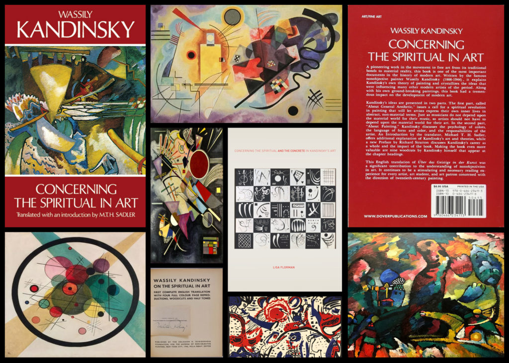
After reading through a bit of his book and looking over some of his artwork, I decided to go onto analyse a piece of his work that for me summed up his points stated in the book and his link between spirituality and the individual. The image I have selected is called ‘On White II’, and was created 1923:

Visual: The piece overall is very aesthetic through its contrasting bright colours and the use of negative space to create feeling within the blocks and random assortment of shapes jotted around. The bright colours for me draw a sense of happiness linked together with gloom, this is due to how the vibrant colours compliment each other bringing about a sense of joy, however contrasted to this is the darker greens and black which for me derives the image of its joy and instead implemented some underlying perspective of loss of gloom which could potentially be interpretted.
Technical: When looking over the image its clear that though the image looks like a random assortment of coloured shapes each piece has been carefully placed to be as effective as possible to that it can impact the viewer through its paint splatter like composition. The use of black within allows to break up the overlapping shapes which otherwise would have become too overpowering without a border. For me the use of the negative space occationally included with a few black lines adds to the overall effectiveness due to how it boxes in and compresses the piece so that it is only confined to one area making it as a result more minimalist.
Contextual: Kandinsky used an array of geometric shapes and lines in a colourful and riotous contemporary display, prompting many artists to imitate his style. On White II, is located at Georges Pompidou Centre, Paris, France. As the title suggests, white is predominant in this painting, including the background. Kandinsky used white to represent life, peace and silence. The majority of the geometric shapes are presented in a variety of colours, reflecting the artist’s love for the free expression of inner emotions. Striking through the kaleidoscope of shapes and colours are bold, spiked barbs in black, representing non-existence and death. Kandinsky liked to paint while listening to music, and On White II, is his interpretation of the music, as created by his inner consciousness. The abstract and possibly mesmerising display of shapes and colours can be compared with the complexity of a musical composition.


Sources:
What are field paintings?
Field painting was a term that originally was applied to the work from about 1950 of three American abstract expressionist painters, Mark Rothko, Barnett Newman and Clyfford Still. The words ‘colour field painters’ was the title of the chapter dealing with these artists in the American scholar Irvine Sandler’s ground-breaking history, Abstract Expressionism, published 1970.
From around 1960 a more purely abstract form of colour field painting emerged in the work of Helen Frankenhaler, Morris Louis, Kenneth Noland, Alma Thomas, Sam Gilliam and others. It differed from abstract expressionism in that these artists eliminated both the emotional, mythic or religious content of the earlier movement, and the highly personal and painterly or gestural application associated with it. In 1964 an exhibition of thirty-one artists associated with this development was organised by the critic Clement Greenberg at the Los Angeles County Museum of Art. He titled it Post-Painterly Abstraction, a term often also used to describe the work of the 1960 generation and their successors.
In Britain there was a major development of colour field painting in the 1960s in the work of Robyn Denny, John Hoyland, Richard Smith and others. Some examples of field paintings can be seen below:
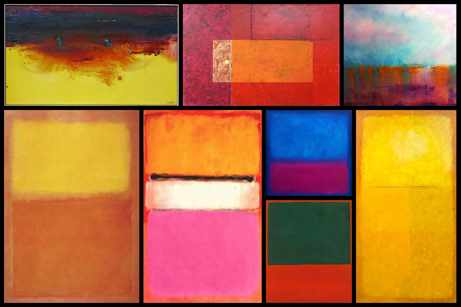
Color Field Paintings emerged out of the attempts of several artists in the late 1940s to devise a modern, mythic art. Seeking to connect with the primordial emotions locked in ancient myths, rather than the symbols themselves, they sought a new style that would do away with any suggestion of illustration.The style was championed most enthusiastically by critic Clement Greenberg, who acclaimed the advances it achieved in the realm of form and composition. Bemoaning what he saw as the increasingly imitative, academic qualities of some action painters, he argued that Color Field Painting represented the way forward. His advocacy of the style proved highly influential.
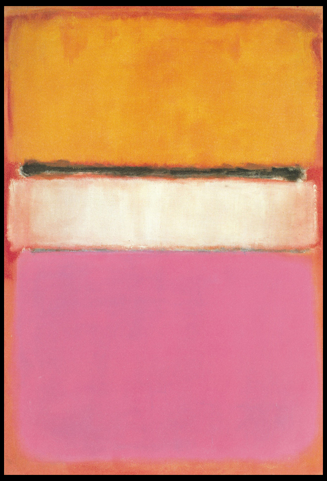
From here I wanted to explore the typical aspects that could be found within many field paintings. To do this I would need to analyse a painting and look at the technical, visual and conceptual ideas behind each brush stroke. By doing this I would like to take inspiration from this and use it towards a future shoot regarding Franco Fontana, using a highly saturation landscape to create abstract work which highlight the texture and patterns that can be found in everyday life regarding hills around the coast. The painting I have chosen to analyse is called White Center (Yellow, Pink and Lavender on Rose) by Mark Rothko:
Technical:
The painting, top to bottom, signifies Rothko’s multiform style of abstract painting. A rose ground, darker in color on top and paler at the bottom, holds a horizontal yellow rectangle, followed by a black horizontal strip. A white rectangular band is in the center of the painting, and the bottom is lavender. Several tones of the colors were used, establishing the effect of a wide range of mood and atmosphere. Whilst not being that technical, the lack of form or structure presents the viewer with a piece that becomes aesthetic to the eye, however its simplicity provides effectiveness from how it allows the viewer’s mind to wonder and interpret each painting to a more personal level.
Visual:
Mark Rothko continued to simplify the compositional elements of his paintings. In 1950, he began to divide the canvas into horizontal bands of color. Despite the frontal composition and absence of spatial illusionism in these works, the broad bands of color appear simultaneously to float in front of the picture plane and to merge with the color field upon which they are place, as in White Center (yellow pink and lavender on rose), 1950. A luminosity results from the repeated layering of thin washes of paint, which allows some underpainting to show through the upper coats. In each work of this period, Rothko sought only subtle variations in proportion and color, yet achieved within this limited format a broad range of emotions and moods. The photo at the top displays this painting’s supreme color choices, namely yellow, pink and lavender on rose.
Conceptual:
The piece represents Rothko’s love for reduction, colour, shape, balance, depth and composition, all of which are surrounded by cloudy edges against a undetermined backdrop. The idea behind the piece was to reduce the colours and the forms expanded in size, dwarfing the background which disappears behind the towering coloured forms. Many can interpret it as a dominance of colour using vivid and lush colours provide contrast and symmetry, for many it presents us with the idea that Rothko is enveloping the viewer and inviting us to contemplate and emotively respond to the space he has created.

This is an artist reference for my exam, as I am inspired by his cutlery images to create similar images experimenting with light and darkness to create shadows and other similar effects as the images he creates when exploring photography with cutlery. This artists fits into the theme variation and similarity because he is exploring cutlery (which is an everyday object), and he is focused on looking into the similarity between forks and spoons, but the variation in how they are perceived, using light as an important factor in order to create such unique and varied images. He experiments with different positioning’s of the cutlery, as well as a variation of camera perspectives he uses to capture these images.

This image by Luitad is intriguing due to how he has manipulated the background and lighting to create this unique shadow effect. He used what looks like two forks and one spoon to create the image above. He must have used a reflection of some sort (maybe a mirror) as you can see the reflection of the cutlery. I think this is very effective in achieving such a creative series of images. Luitad is using an artificial light to portray the forks and spoons as a sort of silhouette. I like how the sides of the forks and spoon are portrayed really dark due to how Luitad has positioned the lighting. This silhouette effect makes the image overall a lot more appealing.
Luitad’s images are inspiring me to do something similar. I want to do a shoot based on cutlery, where I would experiment with lighting to explore shadows and silhouette effects.
Romanticism “was an artistic and intellectual movement which took place in Europe between the late 18th and mid-19th centuries.” It started with the poets such as “William Blake, William Wordsworth and Samuel Taylor Coleridge.” It continued into the 19th century, with romantic poets coming into the scene. Romanticism can be seen as a rejection of the precepts of order, calm, harmony, balance and idealisation. Some other characteristics of romanticism is a “deepened appreciation of the beauties of nature a general happiness over reason, an emphasis upon imagination as a gateway to transcendent experience and spiritual truth and a predilection for the exotic, the remote, the mysterious, the weird, the occult, the monstrous, the diseased, and even the satanic“. In photography, it is known as the romantic period. It was a reaction to the social, political and aristocratic norms of the Enlightenment; Romantics celebrated the spontaneity, imagination, and the purity of nature.
Joseph Mallord William Turner, (born April 23rd, 1775 in London, England and died December 19th, 1851, London), was an English Romantic landscape painter whose “expressionistic studies of light, colour, and atmosphere were unmatched in their range and sublimity“. From 1792, he spent his summers touring the country in search of subjects, filling his sketchbooks with drawings to finish later on with watercolours. His early work is topographical (concerned with the accurate depiction of places). From 1796, Turner started to use oil paintings as well as watercolours. The first, Fishermen at Sea (1796), is a moonlight scene and was praised by a present critic as having the work “of an original mind.”
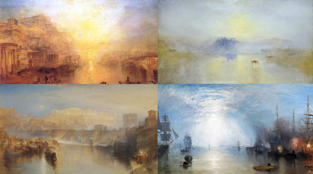
Turner’s work fits in with the theme variation and similarity because he explores light and colour and presents this throughout his amazing paintings. He uses light as a starting point to create his art work – he was an artist of the 18th and 19th century which is another stem of inspiration for my project. I like how Turner has created his work based on light, and has used colour to incorporate this idea into his paintings well. I am intrigued by this as I want to explore light and shadows, and on the light aspect of my project, I think I would like to take an approach like Turner, using colour to create unique images that are influenced with light (and shadows).