Category Archives: Contextual Studies

Filters

Author:
Category:

Rorschach Test

The Rorschach test is a psychological test in which subjects’ perceptions of inkblots are recorded and then analysed using psychological interpretation, complex algorithms, or both. Some psychologists use this test to examine a person’s personality characteristics and emotional functioning. It has been employed to detect underlying thought disorder, especially in cases where patients are reluctant to describe their thinking processes openly. The test is named after its creator, Swiss psychologist Hermann Rorschach. In the 1960s, the Rorschach was the most widely used projective test.

Using interpretation of “ambiguous designs” to assess an individual’s personality is an idea that goes back to Leonardo da Vinci and Botticelli. Interpretation of inkblots was central to a game, Gobolinks, from the late 19th century. Rorschach’s, however, was the first systematic approach of this kind. The ink blots were hand drawn by Rorschach.[

It has been suggested that Rorschach’s use of inkblots may have been inspired by German doctor Justinus Kerner who, in 1857, had published a popular book of poems, each of which was inspired by an accidental inkblot. Kerner pioneered Klecksography, the art of making images from inkblots. French psychologist Alfred Binet had also experimented with inkblots as a creativity test, and, after the turn of the century, psychological experiments where inkblots were utilized multiplied, with aims such as studying imagination and consciousness.

After studying 300 mental patients and 100 control subjects, in 1921 Rorschach wrote his book Psychodiagnostik, which was to form the basis of the inkblot test (after experimenting with several hundred inkblots, he selected a set of ten for their diagnostic value).

Popular Responses as according to various authors:

Inkblot 1: Beck: two humans (grey), Piotrowski: human figures (72%, grey), Dana (France): human (76%, grey)

Inkblot 2: Beck: bat, butterfly, moth, Piotrowski: bat (53%), butterfly (29%), Dana (France): butterfly (39%)

Inkblot 3: Beck: two humans, Piotrowski: four-legged animal (34%, grey parts), Dana (France): animal: dog, elephant, bear (50%, grey)

Inkblot 4: Beck: animal hide, skin, rug, Piotrowski: animal skin, skin rug (41%), Dana (France): animal skin (46%)

Inkblot 5: Beck: bat, butterfly, moth, Piotrowski: butterfly (48%), bat (40%), Dana (France): butterfly (48%), bat (46%)

Inkblot 6: Beck: animal hide, skin, rug, Piotrowski: animal skin, skin rug (41%), Dana (France): animal skin (46%)

Inkblot 7: Beck: human (orange), Piotrowski: none, Dana (France): none

Inkblot 8: Beck: crab, lobster, spider (blue), Piotrowski: crab, spider (37%, blue), rabbit head (31%, light green), caterpillars, worms, snakes (28%, deep green), Dana (France): none

Inkblot 9: Beck: animal: not cat or dog (pink), Piotrowski: four-legged animal (94%, pink), Dana (France): four-legged animal (93%, pink)

Inkblot 10: Beck: human heads or faces (top), Piotrowski: heads of women or children (27%, top), Dana (France): human head (46%, top)

Rorschach never intended the inkblots to be used as a general personality test, but developed them as a tool for the diagnosis of schizophrenia. It was not until 1939 that the test was used as a projective test of personality, a use of which Rorschach had always been skeptical. Interviewed in 2012 for a BBC Radio 4 documentary, Rita Signer, curator of the Rorschach Archives in Bern, Switzerland, suggested that far from being random or chance designs, each of the blots selected by Rorschach for his test had been meticulously designed to be as ambiguous and “conflicted” as possible.

The interpretation of the Rorschach test is not based primarily on the contents of the response, i.e., what the individual sees in the inkblot. In fact, the contents of the response are only a comparatively small portion of a broader cluster of variables that are used to interpret the Rorschach data. Other significant information can be gained from the time taken before providing a response for a card (taking a long time can indicate “shock” on the card) as well as by any comments the subject may make in addition to providing a direct response. 

Determinants and location are often considered more important than content, although there is contrasting evidence. Determinants are the factors that contribute to establishing the similarity between the inkblot and the subject’s content response about it. They can also represent certain basic experiential-perceptual attitudes, showing aspects of the way a subject perceives the world. Form is the most common determinant, and is related to intellectual processes. Colour responses often provide direct insight into one’s emotional life. Movement and shading have been considered more ambiguously, both in definition and interpretation. Rorschach considered movement only as the experiencing of actual motion, while others have widened the scope of this determinant, taking it to mean that the subject sees something “going on”. More than one determinant can contribute to the formation of the subject’s perception. Fusion of two determinants is taken into account, while also assessing which of the two constituted the primary contributor. For example, “formcolor” implies a more refined control of impulse than “colorform“. It is, indeed, from the relation and balance among determinants that personality can be most readily inferred.

Location refers to how much of the inkblot was used to answer the question. Administrators score the response “W” if the whole inkblot was used to answer the question, “D” if a commonly described part of the blot was used, “Dd” if an uncommonly described or unusual detail was used, or “S” if the white space in the background was used. A score of W is typically associated with the subject’s motivation to interact with his or her surrounding environment. D is interpreted as one having efficient or adequate functioning. A high frequency of responses coded Dd indicate some maladjustment within the individual. Responses coded S indicate an oppositional or uncooperative test subject.

“Popularity” and “originality” of responses can also be considered as basic dimensions in the analysis.The goal in coding content of the Rorschach is to categorize the objects that the subject describes in response to the inkblot.

Subject’s responses are categorised into one of 27 established codes. The codes include terms such as “human”, “nature”, “animal”, “abstract”, “clothing”, “fire”, and “x-ray”, to name a few. Content described that does not have a code already established should be coded using the code “idiographic contents” with the shorthand code being “Idio”.

Presentation of my Final Work

PART 1

What is included?

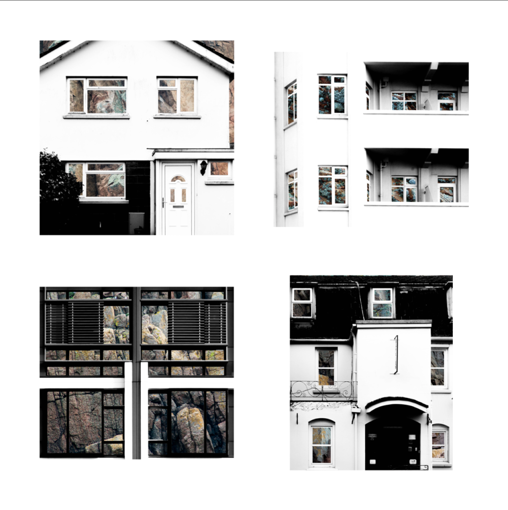
For the presentation of my final photographs in my exam I will be presenting the photographs in a typology grid. I believe that this method of presentation is very effective and appropriate because I have experimented with it throughout my project and have studied the likes of the Bechers’, who pioneered the use of typology grids. Originally, when planning on how to present my final work I had the below four photographs planned as my final four, as I was experimenting with the different layouts I found that it looked slightly off – I eventually decided that the photograph in the top left did not fit in well with the other photographs as it depicted a more brushed steel texture as opposed to the rusted texture in the other compositions. Saying this, I still thought that this photograph was very effective and aesthetically pleasing so I decided that I would include it by presenting it by itself as a side piece to the typology and replacing it in the typology with a more fitting composition. The resulting piece is a set of photographs in a typology grid that portrays how a standard house face can be so similar in features but at the same time can be completely different due to their own individual features. This idea is added to by the rusted steel layered over the building face as the steel represents how the materials used in house construction has changed over time from granite towards steel modern structures. The photographs will be printed as four A5 photographs and one A3 photograph.

My final typology layout
My final photograph

How will the photographs be laid out?

I plan to present the typology grid made from four photographs and the individual photograph on a foam board. One way in which I could present the photographs is by using a window mount method – in order to mount the typology grid I would first stick the photographs to a piece of white card and then tape it to the mount like an ordinary picture. I could also present the photographs on white card as shown below. After experimenting with both options on photoshop I believe that the most effective layout of the photographs would be to use window mounts and black card because the slight white border contrasts well will the black mount board, which also brings out the colours and shaped within the photograph. This contrasts with if I was to set it out on a white background as the contrast in colours and shades does not exist in this option, making it the weaker option. I have also experimented with which side to place the individual photograph and have come to the conclusion that I will place it on the right as I want the viewers attention to first come to the typology grid.

My decided final presentation

PART 2

The second part of my presentation will follow the same guidelines as the above presentation but will be made up of my compositions in which I layered building faces over granite. It will include four A5 photographs made into a typology grid along with a single A3 photograph all on one black window mount. The idea behind this presentation is the exact same as in part 1, except that the granite is replacing the steel by giving an insight into the internal structure of the houses to show what material they are based upon.

My Final Typology Layout

How will the photographs be laid out?

I will present these granite compositions in the same style as the steel compositions in order to ensure consistency in my work – I will window mount all the typology photographs onto white card and then window mount that card and the A3 photograph onto a larger black card.

Triptik Photo-book Inspiration – Robert Frank

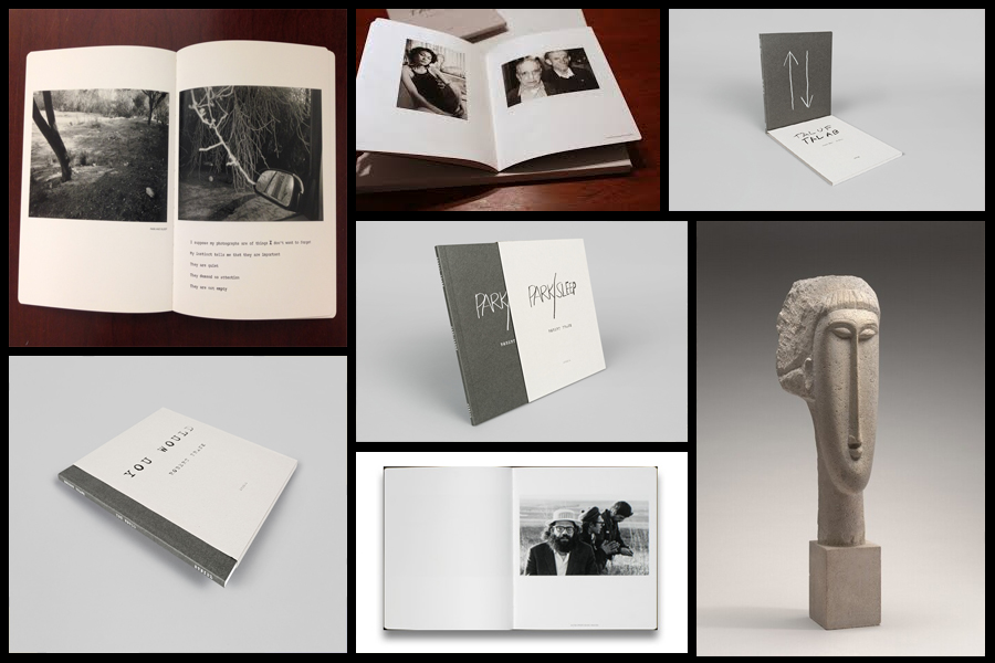
Before going a head and creating my three photo-books I decided to look at a photographer who had produced work in a style that was vaguely similar to the outcomes I desired. The books I found to be particularly inspirational were ‘You Would’, ‘Tal Of Tal AB’ and ‘Park Sleep’, what drew me to the designs in particular where how each was encased inside a brown cardboard folder which fitted the dimensions of each book perfectly. For me this was an idea I wanted to explore as I previously had aimed to produce the three books and store them in a hand-made sleeve so that could be viewed collectively but viewed individually. When looking over the books I found what drew me to them was their minimalist covers which only contained the title and authors name against a predominantly plain backdrop of textured grey card, this was very effective in regards to the book cover being a darker version of the grey which compliments the actual cover which as a result produces the impression of the binding of the sleeve being different. Some pictures of the books can be seen below:

Who is he?

Robert Frank, born November 9, 1924, Zurich, Switzerland, Swiss American photographer and director who was one of the most influential photographers of the mid-20th century, noted for his ironic renderings of American life. Frank became a professional industrial photographer at the age of 22 and in the 1940s became a successful fashion photographer for Harper’s Bazaar magazine in Paris. He felt, however, that the scope of the work was too limited. He abandoned fashion photography about 1948 and went to the United States and then to Peru to explore the expressive possibilities of the 35-mm camera. After photographing in Europe in 1950 and 1953, Frank returned to the United States. Between 1955 and 1956 he drove across the country, taking a number of photographs. Of those, 83 were ultimately published as The Americans, 1959, a French-language version, Les Américains, had first appeared in 1958. Photographs such as Chicago, 1956 in The Americans revealed Frank’s mature style, which was characterized by bold compositions and ironic, sometimes bitter, social commentary. Their publication established Frank as a major creative photographer, and the book was widely hailed as a classic. Examples of his photography can be seen below:

When making my books I would like to explore the use of composition carried about by using singular images over a two page spread which add to the overall effect of any image you want to exaggerate or over-emphasize. For me personally I would like to incorporate mono-printing to produce the cover of my sleeves, this is because of how it would create a newspaper effect where the font thickness and size would be inconsistent and slightly faded, which as a result produces an ink collage effect.

Before ordering and making the book I would need to consider the colour of both the sleeve and books front, this is because of how I want them to be colour coordinated so that they both compliment and contrast each other which creates a more aesthetic result.

Abstract Texture Shoot #2

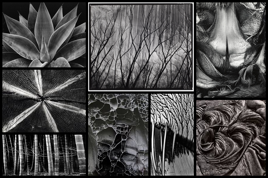
For this shoot I wanted to focus on the idea of abstraction through pattern especially in nature and the urban world. I really liked the idea of basing my photography around capturing everyday scenes of subjects in a new light which highlights the unseen patterns which are present in our everyday lives and the structures of things around us. A photographer I have looked at which I have got particular inspiration from is Brett Weston, someone who has devoted to focusing on natures pattern and the unseen world around us. The images that I found to be more inspiring were his images based around plantation and occasionally the effects of humans on the landscape such as footprints and man made intervention into the natural environment. His skills that I wanted to be able to transfer were surrounding his effective use of a low exposure to create a more dramatic scene surrounding everyday things through exaggeration of shades and tones. Some examples of his work can be seen below:

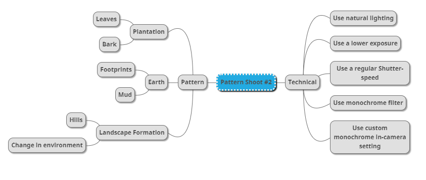
Once I had looked over some of his photos that I found were particularly inspirational for my shoot and its aims I then decided to go onto produce a mind-map. By making a mind-map it would allow me to jot down ideas and aims for the shoot and what I wanted to over achieve, this would also cut down on time wasted on the shoot as I would have a goal of what to produce on me and how to take it with it all the time directing my aims. Here are some of my ideas that I wish to use on the shoot:

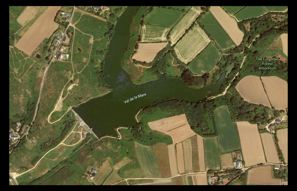
The place I have decided to take the images is called Val De La Mare due to its variety of different textures which can be found alongside the water and the trees. A map of the location can be seen below:

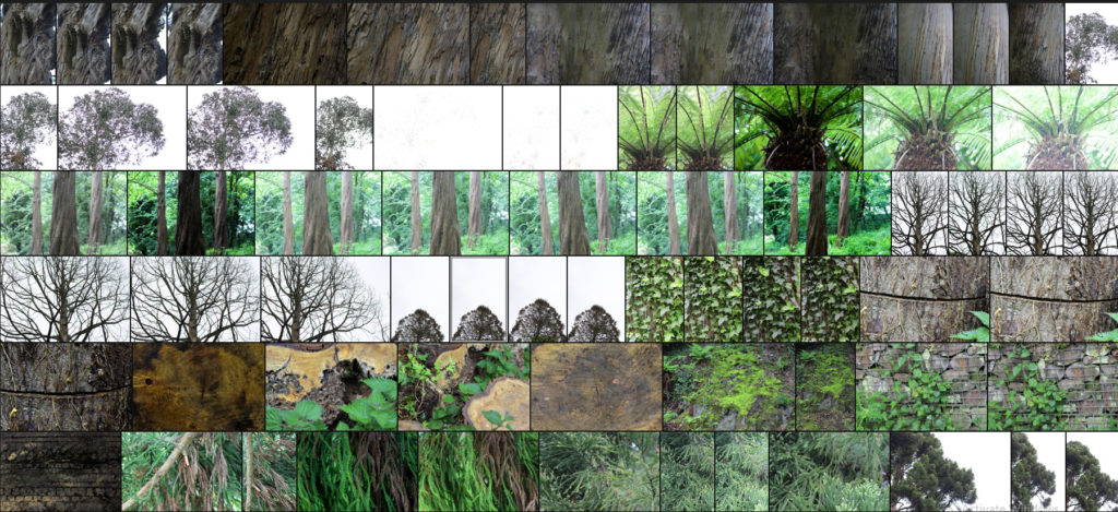
Here are the results of the shoot:

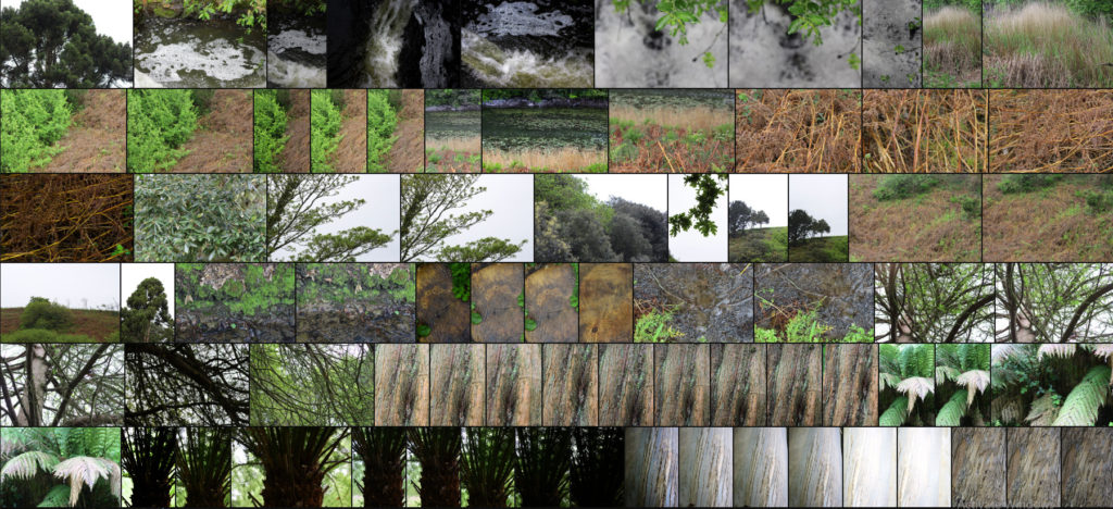
After finishing my shoot I decided to go onto edit the shoot down to only ten images, by doing this it would allow me to identify which were the images that were most effective from the shoot and reflected my intentions the most. Here are my decision on the top ten images of the shoot:

Once I had selected the ten images I then decided to go onto whittle them down once again to only five, by doing this it would allow me to further identify the images which were most effective from the shoot due to analysis in more depth, whilst also making it easier for me to choose an image which best sums up the entire shoot. Here are me selections:

I chose this image because I loved the overall sense of the browns which came through the decaying grass. For me the crushed plants added a cool texture which highlighted the contrasting yellow stalks compared to the rest of the brown leaves. What I particularly liked was how the leaves all faced one direction, allowing for a smoother look to the overall image due to how it all seemingly moves in continual way. Overall I found that the piece did relate to the topic of texture, however I was not too pleased with the outcome as I didnt think it carried enough contrast to emphasize the darkness.

What I really liked about this image was how the green leaves overlapped the darker grain of the wood below. When looking over the image I really liked how the leaves almost presented themselves as a frame for the grainy texture of the wood, preventing it from becoming a present throughout the image and turning into a eye-sore for viewers. As a result of this I found that the contrasting yellows which are emphasized in the wood through saturation really brings more tone into the photo due to it add variation to the texture and overall colours present in the photograph.

I chose this photograph because of the unusual line which had been cut across the base of the tree trunk. For me this added an extra sense of abstract to the piece due to the surface texture of the wood being disrubted by the cut mark making its way across the entire composition. What I found complimented this was the dying ivy growing down the side of the trunk, for me the lighter brown from this added that bit extra to the piece as it prevented a continual same colour presence throughout, instead breaking it up and adding variety. Overall I was really happy with the composition of the piece due to its unusual element through the cut, with the ivy and the different bark textures adding a much needed variation to the overall piece.

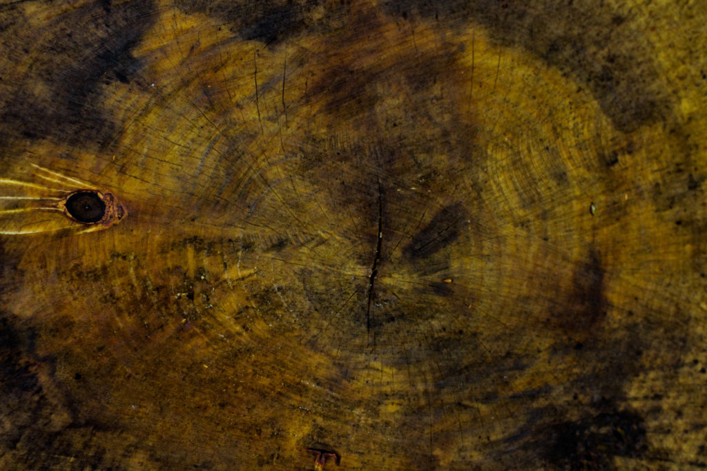
The reason I selected this image was because of it high contrast which highlights the grain and unseen colours really well. For me personally I really liked the variety of different browns and yellows present within the photo as it presents viewers with a different perspective regarding cut wood on a wet day as textures not previously seen are revealed when more closely observed. The grain knot I found broke up the composition and prevented it from becoming too overpowering and generic due to how the added black becomes an instant focal-point for anyone looking at the picture for the first time. As a result of this I am quite happy with the result due to how it provides an unseen insight into the textures present on trunks which previously would be unseen unless further inspected.

Finally I chose this because I think it really well summed up the idea surrounding the topic of texture through both its green and brown leaves branching out. Because of this I really liked the contrasting dead and lives leaves together as the texture stays the same but rather the colour changes, as a result of this I think it adds a much needed extra bit of texture due to it stopping the otherwise dominant green from becoming too much and detering the viewer. When looking over the image in regardings to the topic of texture, I found that it related well, however I was not too pleased with the overall outcome due to it lacking contrast behind the leaves which would have made it more defined.

Once I had looked at each image in more depth I decided it was time to move onto picking one image to sum up and represent the entire shoot. To do this I would have to consider looking at its visual aspects whilst also its conceptual ones and how well it related to my intentions and overall aims:

Overall when looking over all the images I found this one to be most effective regarding the topic of abstract textures. This was mainly due to the unusual cut mark made across the base of the trunk which for me added an extra sense of abstraction due to it looking a bit surreal and mysterious. This was complimented by the dying ivy which I definitely thought added that needed break between the continual texture and colour of the wood and the dark cut. For me I thought this image was executed the best due to how it represented my initial aims of the shoot whilst also taking into consideration my topic title of abstraction through texture (seen through isolating the subject from its surrounding environment).

Andreas Gursky

Andreas Gursky (born 1955) is a German photographer and professor and the Kinstakademie Dusseldorf, Germany which is the academy at which the Bechers’ taught him and influenced lots of art in the Minimalism movement. Gursky is known for large format architecture and landscape colour photographs (similar to the style in which Lewis Bush photographs in his Metropole project. Gursky studied at the Universitat Gesamthochschule Essen in visual communication, with classes led by photographers Otto Steinert and Michael Schmidt. Between 1981 and 1987 he attended the Dusseldorf Art Academy where he received training from Hilla and Bernd Becher which led to a similar methodical approach in his photography.

Image result for andreas gursky

Gursky would not digitally manipulate his images before the 1990s however has begun to rely on computers to enhance his photographs. A lot of Gursky’s photographs are taken from a high vantage point which gives an unusual but effective perspective. He tends to focus on large man-made spaces such as offices and high rise buildings. The photographs are printed to create huge panoramic colour prints which can be up to six feet high by ten feet long. Critic Calvin Tomkins described the experience of confronting one of his works in person as having “the presence, the formal power, and in several cases the majestic aura of nineteenth-century landscape paintings, without losing any of their meticulously detailed immediacy as photographs”.

Gursky’s photograph 99 Cent taken in 1999 was taken at a 99 Cents Only store in Los Angeles and shows the interior of the store as a wide composition of parallel shelves with a few white columns to separate up the photograph. The photograph represents all of the individual products as one wave of colour and blocky shapes rather than the brands and products on offer. The photograph supposedly depicts a stretch of the river Rhine outside Dusseldorf.
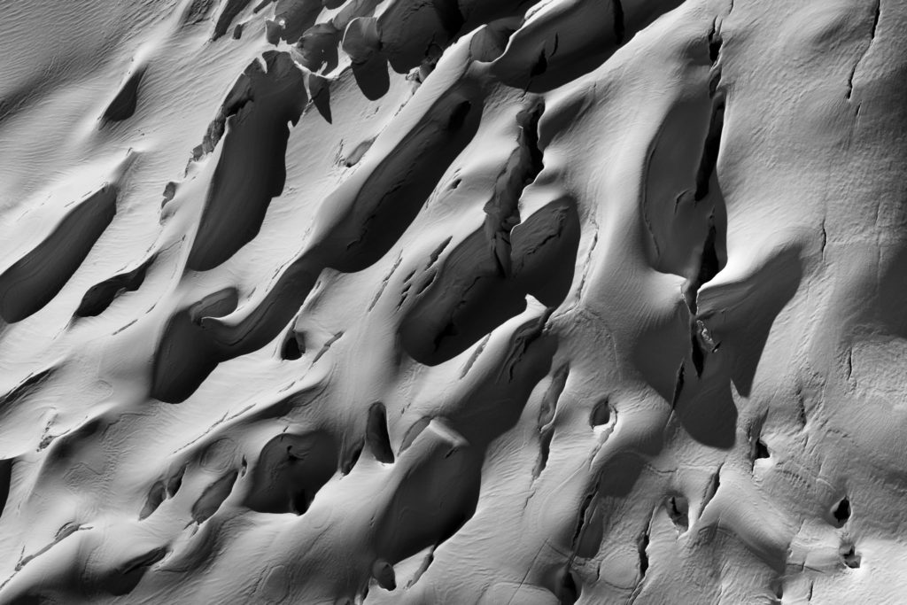
Andreas Gursky appeals to me because, similar to Bernd and Hila Bechers and Lewis Bush, he focuses on buildings and the patterns throughout them in order to create abstract and intriguing compositions. The photographs produced by Gursky often show the contrast and similarity between products and buildings through a typology approach without using a typology grid, for example in his photograph ‘99 Cents Gursky shows the contrasts and similarities between each of the products in the 99 Cents store. This is shown as the individual shapes of each product can be seen if you look closely but when looking at the photograph as a whole all of the products seem to be the same apart from the colour – the branding that the manufacturers pride themselves on are no longer important as all of the products blend together.

Image result for andreas gursky 99 cents
’99 Cents’

Sigmund Freud

Psychoanalysis was founded by Sigmund Freud (1856-1939). Freud believed that people could be cured by making conscious their unconscious thoughts and motivations, thus gaining insight. The aim of psychoanalysis therapy is to release repressed emotions and experiences, i.e., make the unconscious conscious. It is only having a cathartic (i.e., healing) experience can the person be helped and “cured.”

Psychoanalysis Assumptions

  • Psychoanalytic psychologists see psychological problems as rooted in the unconscious mind.
  • Manifest symptoms are caused by latent (hidden) disturbances.
  • Typical causes include unresolved issues during development or repressed trauma.
  • Treatment focuses on bringing the repressed conflict to consciousness, where the client can deal with it.

How can we understand the unconscious mind?

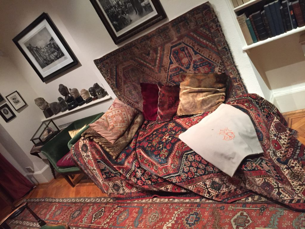
Psychoanalysis is commonly used to treat depression and anxiety disorders. In psychoanalysis (therapy) Freud would have a patient lie on a couch to relax, and he would sit behind them taking notes while they told him about their dreams and childhood memories. Due to the nature of defence mechanisms and the inaccessibility of the deterministic forces operating in the unconscious, psychoanalysis in its classic form is a lengthy process often involving 2 to 5 sessions per week for several years.

This approach assumes that the reduction of symptoms alone is relatively inconsequential as if the underlying conflict is not resolved, more neurotic symptoms will simply be substituted. The analyst typically is a ‘blank screen,’ disclosing very little about themselves in order that the client can use the space in the relationship to work on their unconscious without interference from outside.

Psychoanalysts use various techniques to develop insight into their clients behaviour and the meanings of symptoms, including ink blots, parapraxes, free association, interpretation (including dream analysis), resistance analysis and transference analysis.

– Rorschach ink blots:

The ink blot itself doesn’t mean anything, it’s ambiguous (i.e., unclear). It is what you read into it that is important. Different people will see different things depending on what unconscious connections they make. The ink blot is known as a projective test as the patient ‘projects’ information from their unconscious mind to interpret the ink blot.

– Freudian Slip:

Unconscious thoughts and feelings can transfer to the conscious mind in the form of parapraxes, popularly known as Freudian slips or slips of the tongue. We reveal what is really on our mind by saying something we didn’t mean to. An example of this is where a person may call a friend’s new partner by the name of a previous one, whom they liked better.

Freud believed that slips of the tongue provided an insight into the unconscious mind and that there were no accidents, every behavior (including slips of the tongue) was significant (i.e., all behavior is determined).

– Free Association:

A simple technique of psychodynamic therapy, is free association, in which a patient talks of whatever comes into their mind.  This technique involves a therapist reading a list of words (e.g.. mother, childhood, etc.) and the patient immediately responds with the first word that comes to mind.  It is hoped that fragments of repressed memories will emerge in the course of free association.

Freud reported that his free associating patients occasionally experienced such an emotionally intense and vivid memory that they almost relived the experience.  This is like a “flashback” from a war or a rape experience.  Such a stressful memory, so real it feels like it is happening again, is called an abreaction.  If such a disturbing memory occurred in therapy or with a supportive friend and one felt better–relieved or cleansed–later, it would be called a catharsis.

– Dream Analysis:

According to Freud the analysis of dreams is “the royal road to the unconscious.” He argued that the conscious mind is like a censor, but it is less vigilant when we are asleep. As a result, repressed ideas come to the surface – though what we remember may well have been altered during the dream process.

As a result, we need to distinguish between the manifest content and the latent content of a dream. The former is what we actually remember. The latter is what it really means. Freud believed that very often the real meaning of a dream had a sexual significance and in his theory of sexual symbolism he speculates on the underlying meaning of common dream themes.

ESA // Tidal Movement

The sea levels are continuously rising and lowering. A tide is a cycle of the sea level changing. The maximum water level is called the high tide, and the minimum water level is called the low tide. The tide between high and low tide is called the ebb or falling tide. The time between low and high tide is called the flow, flood or rising tide. The tide, similar to many things on Earth is impacted by the external gravatational forces. If we were to ignore the external fordes, the gravatiational force is directed towards the centre of the Earth, we would have no net lateral forces and therefore there would be no flow of water. The external forces that impacts the Earth, are the gravatational pulls of massive external bodies such as the moon or the sun. The primary changing gravatational field is the Moon. The secondary is the Sun. The sea level rises to the spot where the Moon is closest, and the sea level decreases on spots which are further away from the Moon. However, the Earth itself is also subject to the gravatational pull of the Moon. – (http://www.deltawerken.com )

“…the gravitational pull of the moon and the sun affect the Earth’s tides on a monthly basis. When the sun, moon, and Earth are in alignment (at the time of the new or full moon), the solar tide has an additive effect on the lunar tide, creating extra-high high tides, and very low, low tides — both commonly called spring tides. One week later, when the sun and moon are at right angles to each other, the solar tide partially cancels out the lunar tide and produces moderate tides known as neap tides. During each lunar month, two sets of spring and two sets of neap tides occur (Sumich, J.L., 1996).”

(https://oceanservice.noaa.gov/education/tutorial_tides/media/supp_tide06a.html)

CONTEXTUAL STUDY 3: ABSTRACT PHOTOGRAPHY

Abstract photography is a means of depicting a visual image that does not have an immediate association with the object world and that has been created through the use of photographic equipment, processes or materials. An abstract photograph may isolate a fragment of a natural scene in order to remove its inherent context from the viewer, it may be purposely staged to create a seemingly unreal appearance from real objects, or it may involve the use of color, light, shadow, texture, shape and/or form to convey a feeling, sensation or impression. The image may be produced using traditional photographic equipment like a camera, darkroom or computer, or it may be created without using a camera by directly manipulating film, paper or other photographic media, including digital presentations.

One of the key advances of abstract photography has been the realization that cameras are not required to make photographs. Since the early twentieth century, abstract artists have continually returned to the “photogram” – the cameraless photograph – as a medium allowing for uniquely self-reflexive and creative interventions into the photographic form. Rather than capturing an image by the passage of light through shutters onto photosensitive paper, the paper itself is directly manipulated and treated – often brought into contact with other objects – allowing for a potentially endless array of effects. As a general rule, abstract photography has tended to avert its gaze from extraordinary and arresting subject-matter. Instead, it focuses on the irregular forms and impressions which can be generated by representing familiar objects in new ways.

“THE MOST ASTONISHING POSSIBILITIES REMAIN TO BE DISCOVERED IN THE RAW MATERIAL OF THE PHOTOGRAPH”

László Moholy-Nagy Signature

Maija Annikki Savolainen

The series Paperworks, by Savolainen, is a study on the colors of sunlight and the photographic way of seeing. The images are made with a folded, white A4 sheet placed in direct sunlight at different times of the day and year. When looking at the picture at a distance, one might see a horizon line. When taking a closer look, it becomes clear that there is something strange about the view. The horizon appears to be a fold on a sheet of paper, the colors are reflections of sunlight on the white surface; a little bit of information makes the eye see something else than before. This series is a clear example of abstract photography linked to the natural landscape.

Abstract Colour Shoot #2

For this shoot I wanted to create a response to the work of Engleston due to his focus around the idea of tone and colour within urban and natural environments. What I found most interesting within his photography was how in most of them there is an overall sense of a single colour such as yellow or red, this has inspired me to create work that relates through the use of incorporating an overlay which can be vaguely seen in each picture. As a result of this I hope to achieve a new style of photography where I can this underlying saturation to produce outcomes for the photos and possible photography book in the future. Using Eagleston as my main source of inspiration I have decided to have a look at some of his works which I found to be of particular interest:

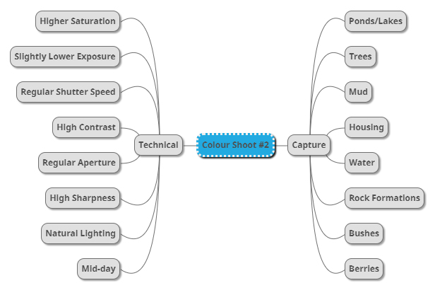
After I had looked over some of his more inspirational work I decided it was nearly time to go ahead with the shoot itself. Before doing this however I would need to create a mind-map, by doing this it would allow me to express my ideas and intentions of what I want to achieve in the shoot. Creating a mind-map not only would help direct my aims of the shoot but also reduce time wasted from deciding there and then what to do and take. Here are some of my ideas on what I want to produce during the shoot:

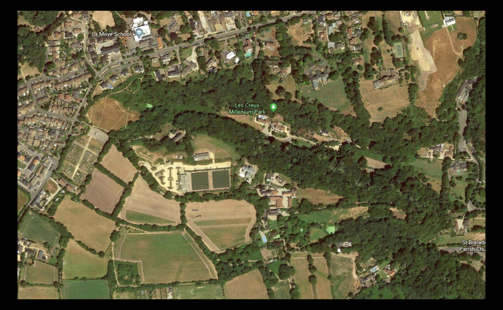
Once I had completed my mind-map I then decided that I would move onto the shoot itself. Using this my ideas noted above as the basis for my goals in the shoot I decided to photograph the area of Les Creux Millenium Park due to the huge range of landscape it possessed in the surrounding area, ranging from houses, fields and woods. A map of the area can be seen below:

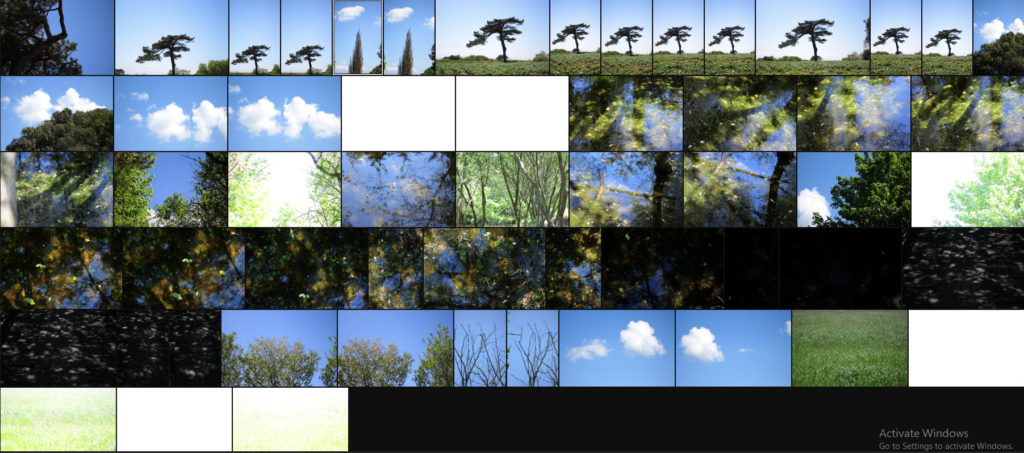
Here are the results of the shoot:

Once I had completed the shoot I then decided to go onto whittle the selection of images down to only ten. By doing this it would make it easier for me to identify which images reflected my intentions for the shoot the best and which ones had the best relevence for my topic. Here is my selection for the ten best images of the shoot:

After I had selected the ten best images I then decided that I would move onto choosing fives images that out of the ten reflected my intentions the most and had the best overall sense of aestheticism. To do this I would have to look at technicality, visual aspects and context. Here are my choices:

I selected this images because I really liked the defined contrast between the overly blue sky and the unusual shape of the tree. For me the green and dark browns contrasting the sky made the image the most effective due to how they are complimentary colours and so work well side by side producing an aesthetic reault. Composition wise I found that the tree being slightly on the left allowed for the end result to be more impacting because of the way it arches over the landscape filling more negative space in a more unusual way. In relation to the topic of variation of abstraction the image related well as I separated the tree from its surroundings allowed for a unique perspective to be viewed of it where it becomes isolated from its surrounding environment.

For this image the reason I selected it was because of how the blue sky and tree were complimented by the cloud which sort of transitions into the tree itself whilst merging into the blue around the corners. By the clouds taking over the negative space for me it allowed for a more effective use of the sky due to it otherwise being a bland and boring picture, however the inclusion of clouds prevents this and instead allows for an aesthetic result which could work well in a set of three. In relation to the topic the image goes well as it is evidently saturated too much which as a result produces a more abstract effect which in a way prevents viewers from seeing the tree as it once was, instead looking at it in a new light.

What I liked about this images was the contrasting overly saturated colours that overpower the image. For me this works really well as the image in a way is divided into two sections, one being the sky and the other nature, however I really liked the implementation of the cloud which breaks up the two dominant colour from becoming too overpowering and ruining the piece. As a result of this the cloud enhances the two colours creating an aesthetic result due to both the tree and the sky being in proportion to each others saturation. When looking at the image in regards to my topic of abstract variations I think that it goes well with the rest of the images taken due to how they all present a similar vision where there is a sense of overpowering colour which seem too surreal to be real.

What I loved about this image was its overall simplicity. This is done through a very minimal way where there are only three small aspects to the piece being the cloud, trees and sky. For me they all compliment each other nicely due to how the green and blue contrast with the symmetry of the cloud being in the centre adding too effect from a sense of artificial aestheticism that is created. Overall once again symmetry is the key aspect to this photograph as the cloud be placed directly in the middle adds to effect as its almost as if it was placed there from its unusual position. For me this links greatly to the topic as the colours are so enhanced combined with the weird composition which as a result ends in a abstract portrait of the sky in a block minimalist way.

Finally I selected this image because of the huge contrast between the pines and sky which create a silhoutte of the leaves, isolated it from its environment and portraying them in a way that makes them seem as if they were something else. This contrast for me works well with an image in the previous colour shoot which I think when looking towards planning a photo-book would work well due to its similar qualities. As a result this image relates well to the topic but has been selected really in relevance to how it can be linked to the previous shoot in which silhouette of trees can be seen against a harsh blue backdrop.

After looking over all five images it allowed me to come to a conclusion to which images worked well in relation to the topic of abstract variations (this shoot being colour). By looking in depth at each image it allowed me to sum up its qualities as a reflection of my intentions not only to the shoot but the overall topic. This is my final choice for the image that best represents the entire shoot:

The reason I chose this image as the best reflection for the overall intentions of the shoot is because of how I loved the way the composition of the piece induced a sense of an artificial landscape in which it seems almost too surreal to be real. For me the vivid colour combined with the symmetrical composition of the tree really tie the photo together as each aspect of the piece compliment each other which preventing the others from overpowering and ruining the picture from becoming too eye-sore.

Artist Reference – Eggleston

Who is he?

Since the early 1960s, William Eggleston used color photographs to describe the cultural transformations in Tennessee and the rural South. He registers these changes in scenes of everyday life, such as portraits of family and friends, as well as gasoline stations, cars, and shop interiors. Switching from black and white to color, his response to the vibrancy of postwar consumer culture and America’s bright promise of a better life paralleled Pop Art’s fascination with consumerism. Eggleston’s “snapshot aesthetic” speaks to new cultural phenomena as it relates to photography: from the Polaroid’s instantaneous images, the way things slip in and out of view in the camera lens, and our constantly shifting attention. Eggleston captures how ephemeral things represent human presence in the world, while playing with the idea of experience and memory and our perceptions of things to make them feel personal and intimate.

Color has a multivalent meaning for Eggleston: it expressed the new and the old, the banal and the extraordinary, the man-made and the natural. His non-conformist sensibilities left him open to explore the commercial printing process of dye transfer to see what it could contribute to picturing reality in color rather than the selling of lifestyles, concepts, and ideas. His brief encounter with Warhol exposed him to forms of popular photography and advertising, contributing to his experimental attitude toward the medium. Eggleston’s use of the anecdotal character of everyday life to describe a particular place and time by focusing either on a particular detail, such as an object, or facial expression, or by taking in a whole scene pushes the boundaries of the documentary style of photography associated with Robert Frank and Walker Evans’ photographs. His insider view allowed him to create a collective picture of life in the South, capturing how it transformed from a rural into a suburban society. Some examples of his work can be seen below:

The snapshot aesthetic provided Eggleston with the appropriate format for creating anecdotal pictures about everyday life. Its association with family photographs, amateur photography, as well as Kodak’s Brownie camera (which was useable by everyone) lent his work the proper proportions and personal attitude toward the impersonal everyday. I wanted to make colour one of my main focuses when photographing the selected areas, here I found that looking and analyzing an image would prove to be most effective as it would allow an insight for me into the technical, visual and conceptual aspects of the photo that make it so aesthetic through over-saturation. The image I have chosen is called “Cannon’s Grocery, near Greensboro, Ala” and was taken 1972:

Visual: Visually the image is very aesthetic from the amount of warm colours that are present within it such as the oranges, yellows and blues. For me these colour provide us with a sense of uniqueness as all supposedly contrast each other, however instead it compliments with the colours of the building reflecting the surrounding environment like the desert and sky. Overall the piece only consists of about four to five different colours making it very simplistic regarding what can be seen, however a filter has been used to enhance the yellows and blue and create an almost artificial environment of something that may be seen on a movie set. What draws me in is how out of place the building seems as it vibrant colours are perhaps the opposite of what the desert could be seen as, giving the impression for viewers of something that could be seen for miles due to it being so out of place from its surrounding environmental landscape.

Technical: When looking over the photograph it is clear to say that a filter has been used to create an artificial feel to the overall piece due to certain colours like yellow being implicitly present through the image. A regular shutter speed and slightly lower higher exposure has been used to create a crisp and in focus shot being devoid of overpowering shadows or motion blur. The photographer has obviously made the building the focal point of the piece due to how it instantly draws the viewers attention due to its randomness regarding the surrounding environment with the yellow sand being used as a way to stop the building from dominating the composition and being too overpowering. Finally the colours have definitely been taken into consideration due to how each one contrasts another colour within the photo providing an obvious sense of old school aestheticism due to how they aren’t as crisp as they could be.

Conceptual: The image was taken at a time when the art world shunned colour photography. The solo show the Eggleston but on at the Museum of Modern Art in 1976 broke through this black and white barrier as it paved the way for wider acceptance of art and making it the preferred medium. The photograph itself represents the exciting time period in photograph when an image’s tone was more provocative than its subject.