 Huang Qingjun is a Chinese photographer who has photographed families posing with their possessions amid China’s dash to become rich. He has spent nearly a decade travelling to remote parts of China to persuade people who have never been photographed to carry outside all their household possessions and pose for him. The results of this product are glimpses of the different lives and belongings of different families within China. The pictures have not been widely seen outside of China although some have been shown at exhibitions in Paris and New York.
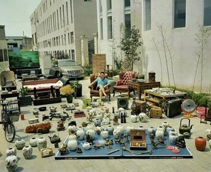 Huang was inspired as a teenager by an uncle when the typical hobbies for the Chinese youth were calligraphy and singing. The idea for the series about people’s material good, called ‘Jiadang’ (family stuff). first came in 2003 with some photographs that he took for the magazine Chinese National Geography but the project didn’t start properly until three years later, when Huang started travelling around China looking for suitable people. Huang says that “Most people thought what I was proposing was not normal” but most people understood the point at the end of it. Most of the people in these poor, remote areas did not have many possessions making the project both simpler and more interesting. Some of the projects took a couple of days whereas others took several months. Next year marks the 10th anniversary of the first photograph, and Huang plans to mark it by returning to the places he visited to see how they have changed. Huang also hopes to broaden the project’s range upon revisiting it by including people from a wider range of backgrounds, such as government officials.
Through this project Huang visited 14 of China’s 33 provinces, which gave him a broad perspective of how the country is changing in different areas. He is optimistic about the future of China, he says “In lots of Chinese villages, the government has delivered roads and connected them with electricity. This has been a huge change” but the biggest problems in rural areas now are how people can get better education for their children and healthcare.
I plan on responding to Qingjun’s work ‘Family Stuff’ by looking into the different items that people will regularly carry around on them, such as what they carry in their school bag or by looking at the variance between individual items that people carry on them such as their car keys or clothing. I chose to study Huang Qingjun in relation to ‘Variation and Similarity’ as through Qingjun’s work he shows how much the belongings from family to family can vary greatly due to factors such as personal taste and wealth. I will also be thinking about these factors when exploring a response to his work as these factors can easily be read just through someone’s belongings. Personality can also be seen through someone’s belongings – some people may be minimalists and keep everything clean in their school bag so will carry round the minimum whereas other may have food wrappers and unnecessarily items in their school bag showing that they are less organised. Ultimately the idea behind this is to show the unlimited variety of combinations of different belongings that people can own.
Analysis
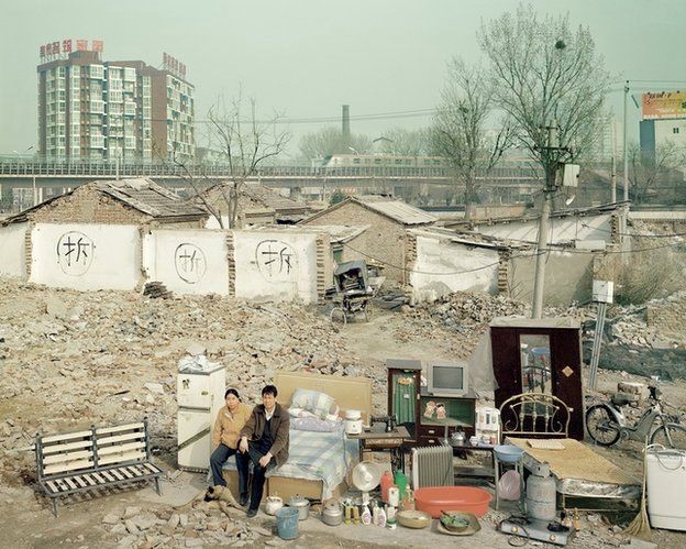
In this photograph the natural lighting of rural China has been used, the natural lighting highlights how polluted the air in the country is as well as the neutral colours that run throughout it. There is not much contrast in this photograph, partly because it is a documentary photograph in a tableaux style so does not attempt to create a dramatic composition. A deep depth of field was used for this photograph as the whole of the photograph is in focus which allows for all the details of the couples’ possessions to be seen as well as a glimpse of the city in the background. A shutter speed of 1/60-1/120 will have been used to capture this photograph along with a low ISO in order to allow enough light to enter the lens to create a correctly exposed photograph. The colours within this photograph are quite cold and grey which creates a downtrodden view of the area.
There is not much colour in the photograph – it is all greys and browns except for a few of the possessions. This lack of colour represents the lack of freedom for individuals to express themselves in this part of the world and shows how oppressed the world can be. There is not a wine tonal range in this photograph due to its documentary/tableaux style and lack of contrast – this further adds to the feeling of oppression. The foreground and background can clearly be made out in this photograph but there is no 3D effect as the different parts of the photograph seem the merge together as one to tell a story. There are lots of horizontal lines within this photograph which can represent the walls and division of society within China.
This photograph was part of Huang’s ‘Jiadang’ project in which he travelled to 14 of China’s 33 provinces to photograph and give glimpses of the lives of the ordinary Chinese who are not as exposed to modernisation as the rest of China. Huang waited for the couple in this photograph to move house in order to set up this photograph. The couples’ house had been slated for demolition to make way for tower blocks and offices along with millions of other homes. The wall behind them is marked with the Chinese character ‘chai’, meaning “tear down”.
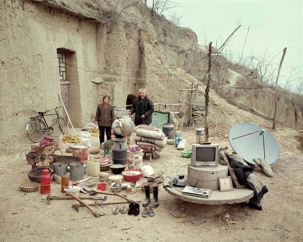
Through this photograph I believe that Huang is trying to show the range of exposure to modernisation across the different Chinese provinces due to the rapid modernisation of the big cities. At first the subjects within the photographs of the project do not appear to be swept up by the modernisation happening in the cities, but on a closer look the photographs also show the enormous social change that has come with generations, such as the photo of an elderly couple sat with a satellite dish. The set of photographs show how much people’s lives have changed throughout the different provinces.

