Category Archives: Contextual Studies

Filters

Author:
Category:

SECOND ARTIST: Yoav Horesh: Aftermath: CHAOS

Yoav Horesh, Sbarro Pizzeria, Jerusalem, August 2003, gelatin silver print, 18½ x 14¾”. Courtesy of the artist.

Horesh was a student in Boston during 9/11 and was struck by how different the American response, with its grounded planes and makeshift memorials, was from his own experiences in Israel. While the American impulse was to “never forget,” Israel’s urge was to erase. (Though curator Kristina Durocher sees a parallel between “America’s response to mass shootings as a new societal norm” and the “cultural fatalism” in Horesh’s photos.)The ghostly reflections in a Sbarro window gesture at what can’t be seen. There are no monuments here, as Horesh explains, because there would be a plaque on every corner. If Lee Friedlander’s The American Monument is a testament to monuments hiding in plain sight, Horesh’s Aftermath, also a book, is a mournful dirge for trauma swept under the rug in the name of “normalcy.”By evoking the uncomfortable gap between violence and the collective “cleanup,” Horesh leaves us space to contemplate. Who was the bomber? Who were the victims? What butterfly effect has been set in motion?

The work I am influenced by and analysing is from his project ‘Aftermath’ It nods to the traditions of street photography, photojournalism and the archival impulse, as well as photo books like Joel Sternfeld’s On This Site and The American Monument. Yet unlike Friedlander, Horesh can only capture the hum of ghosts. To paraphrase Robert Frank, Horesh’s compassionate eye listens before it looks. Yoav Horesh B/W and colour photographs have been dealing with conflict, human tragedy, memory and recovery in Europe, Asia and America since 2001. His deep interest in the history of “sites” led him to explore close and far locations in search for cultural clues and personal histories. His evolving practice has grown from “street photography” to large format landscapes, interiors and portraits that open up the discussion between present and history. His projects also took place in the American South-west, Germany, Laos, Israel, the Gaza Strip and Cambodia, where history still shapes and influences current events and life.
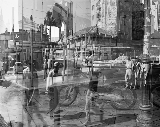
ANYLSIS: I chose to study Horesh, as a consequence from this image. I believe not only does this image show an encounter of our daily lives, but it is a perfect example of chaos. The many images being overlaid. creates a composition that is not messy, but almost works structurally as a whole. The element within each image fit s together and creates a new composition. Each image slipping into a different aspect creating interests of architecture, and new movements of present and past people. This is clearly a very organised and thought out image, and one he did not easily put together. This also symbolises a passing of time, it shows the impact of live, perhaps the evolution of the area, due to the consequences of events which occurred there.

The concept from this image was from a book called aftermath. it is a presentation to make a political point about the conditions and daily lives that are similar to many in poverty and living in this area. His work is a transgression of more complex pieces such as the one above, and also images of slow shutter speed watching the visibility of cars moving, people, and details and shadows and aspects usually unseen in an area. He not only successfully captures the attitudes of people so well, but he too demonstrates knowledge of how to show these emotions very personal to an individual through a piece from a location. he himself has said ‘For two and a half years I photographed over 100 different sites of the suicide bombings in Israel while I lived in New York. I would go to photograph at least twice a year while doing my research for official and non-official information I needed in the United States. The bombings were happening on a daily basis; I would turn on the computer or read the newspapers and obviously I was very worried about my family and friends. The thought that they could be taking a bus or walking down the streets and disappear from life within a blink of a second horrified me. Perhaps it was also the feeling of guilt that pushed me to start this project, to be in far New York while this was happening in Israel so frequently. Maybe this is my mechanism of dealing with trauma; Repeating the action, the visitation, photographing, like going back to “a crime scene” and trying to understand what has happened there psychologically and visually.’

why did I choose this artist: He not only successfully captures a narrative of chaos caused by suicide bombings, and a clear emotional responses to each and everyone of his photos, but also his ranges from teaching 4×5, colour, black and white, darkroom printing techniques to digital photography. His subject matter has always remained the same: life, family, our history and primary emotional responses to the world. Ut’s about how we interpret the world using photography and how we analyse and understand photographs in various contexts. I don’t think these things changed since the first camera was manufactured, only the tools changed. It used to be large format box camera and now you have your phone camera. His photography is not just about creating impressive imagery, but I think that with this project, he was  also trying to raise awareness about how life is made a series of random events that affects all of us tremendously. These places he photographed were mundane. They were dictated because of their traumatic history. There was nothing unique about these sites until history scarred them. They turned into significant sites of trauma that he reduced into pictures of the landscape, the city, trees, cafes or street corners.

 

PLANNING FOR FIRST 4 THEMED SHOOTS FOR VARIATION AND SIMILARITY

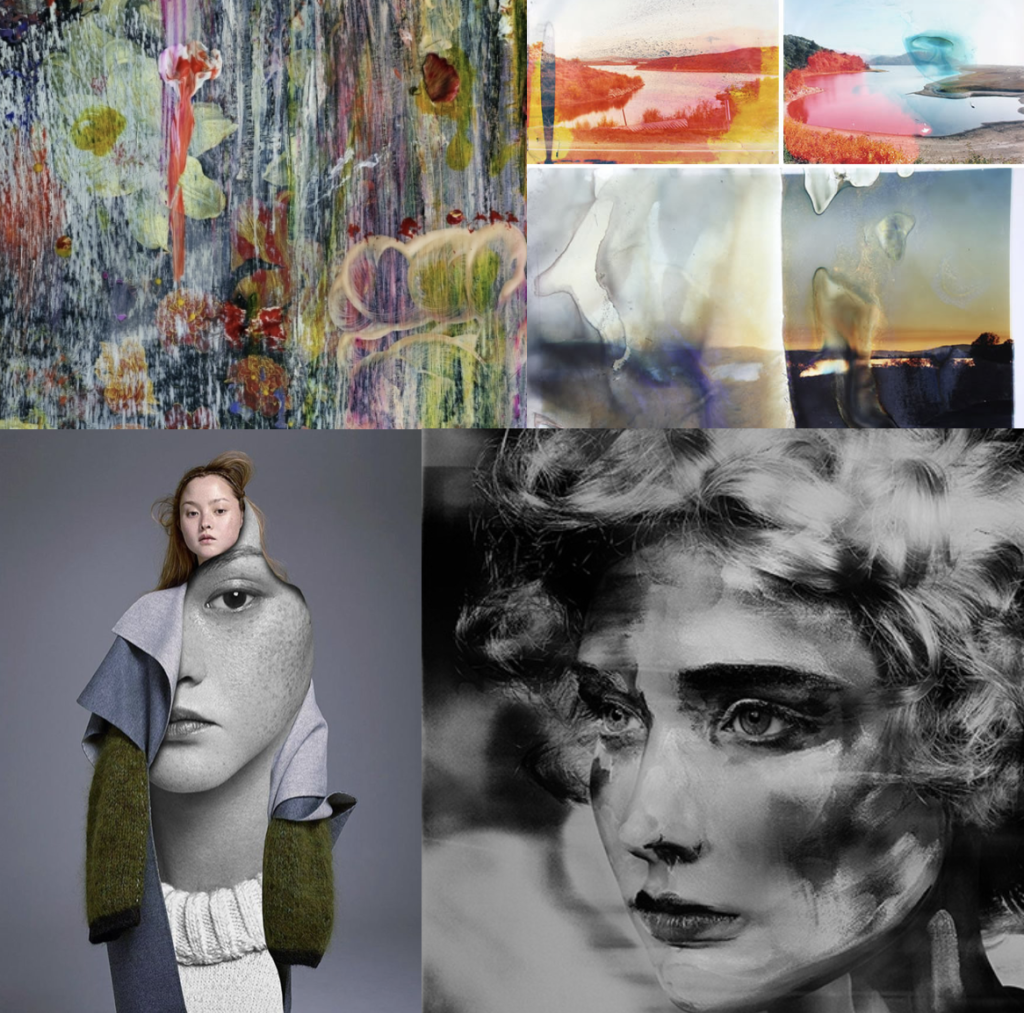
FIRST SHOOT:landscape manipulation shoot: within this shoot I have 4 different concepts that I would like to edit and experiment with when taking an manipulating the photos. The first I have recently looked up at and it is to take a more subsequently ‘normal’ landscape photo, yet cover the outcomes in a liquid and then use this development of the photo as the final. This liquidation, allows colours to move and leak and forms a new more interesting composition. Additionally this creates a clear transpire of artistic influence and forms a connection of fine art, and making it appear as if this photo was some what painted. The approach to this technique is: My second developmental idea for landscape shoots, is the editing process to make landscapes look as I have are paintings, or visa vera: Lastly I could use this same method in order to make portraits and other images, look as though they are painted, by doing thick brush stroke effects or making the image look more abstract and more filled with fine art effects. Additionally As spoken about previously, I want to believe the main version of this is taking pictures of thick paintings, possible inspired by van Gogh and Monet, and making it look as though they could be real people, or real objects. I think this is a very interesting method on how I could start developing my work. My third idea is surreal manipulation to a landscapes. I believe if I were to experiment with how landscape can be altered, in order to have more similar stylistic values to things such as paintings, or piece of more abstract contemporary work, it could be very successful. Surreal manipulation to a landscape to edit. I believe this could further link to making landscape look like altered realities and turned into abstract manipulated paintings. This again showing how far art has the ability to go. These abstract pieces come under many art categories and also shows an understanding of how to develop a piece to see a progression of artistic influence.

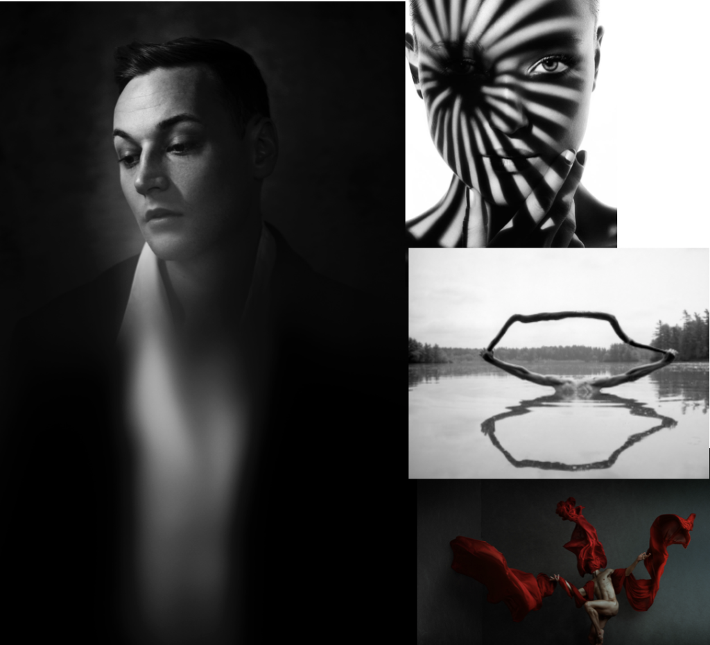
Studio shoot :To my mind the studio shoot is the shoot which I know what final outcomes I am really looking for, and even to the extent, this shoot will really help me to develop the rest of my imagery. I have divided this shoot into 5 subcategories of images, which I want to capture and further develop and how and why I believe these executions are the most important. The first is using a glass bowl, or jar, and using this in front of  a face in order to distort and stretch the face. Not only does this once agin show an interest of the element of fine art, but is almost connotes the elements of visible chaos, and showing a trauma to that persons personality. This can also be seen by the work of William Ye.  Another inspiration from Ye will be experimenting with using a flowing piece of fabric, in order to show a structure in the piece. I believe this effortless looking towel and the structure of the body, creates such a successful outcome, and connotes an overlooked power. This sentiment of chaos I believe can also be represented through the effect of people climbing on top of each other, and or forming together to make structures and new bodily forms. This shows a unity of people standing together, and also a combination of family. This leads me onto my representation of chaos, and the acts of people when pulled together in a group, yet still showing the effortlessness of how to form a new stature creating a new art piece.  The last idea which combines fine art, and the media that I can do within a studio, is the editing of faces onto peoples clothes, and using this to effect true feelings, and or editing on events which symbolise trauma or the past of peoples lives. This I believe has a certain contemporary art feel, yet is not done through a painting style. The combination of high fashion within this shoot, also symbolises the beauty industry and  how you have to look a certain why, and what is expected. These geometric shapes, create combinations of cubism and once again this whole shoot linked together with the interposing state of form, composition, and fine art media effect.

family and friends shoot: For the family shoot I  want to both approach this in both a journalism and  unconventional surreal manner. I wish to start off by producing images of many large groups of friends and family, or people who have a close net relationship. I then want to develop these into collages of smudges images, and faces covered and layered with effects, to create a distortion of  identity, but a similarity into the way which they are all covered. An extension from this process, could be family pictures, and portraits collages together, or patterns which have a significance to the families themselves. This could be, a flags or perhaps a pattern made by a grandparent. Anything which is texturised yet still causes a effect fro the family themselves, and an expression of themselves.

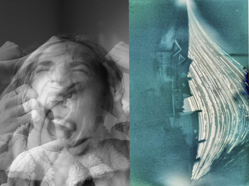
chaos: inspiration from the media: Chaos to my mind, is something which causes a feeling which depends an emotional response of panic and madness. It can mostly be seen throughout the media, through articles, fake news or even protests which go too far. These movements are all about conflict of peoples beliefs, because of this, I Believe if I were to layer images of people causing different facial effects, in order to show different emotional and a chaotic feeling expanding and becoming more abstract. This not only builds tension within the image but also shows expressions of human conflict within the images. Secondly a good example of variation and similarity, is watching peoples daily lives, and their own independent news. This could be caught and seen through peoples daily lives, and the activities which they get up too. Street photography is a great way to capture a reality of the people possibly not correctly expressed through the chaotic media, andI  belive this would be a very interesting way to reflect the society which we live within. Chaos can also be shown through more unconventional techniques, these being the light patterns of slow exposure, of perhaps even manipulating a person or landscape, to look or be presented in a unconventional way. This unique approach too seeing the worlds could count as a reflection of mediation and journalism, and the many dimensions which it is possible to see a story or event. You could even explore taking a picture from many different angles, and then experimenting with which angle tells the chosen story most successfully.

Variation And Similarity

Regarding the topic titles given to us for our exam , variation and similarity, the use of these binary opposites imply something like a topography, where the different types of a specific object are photographed. To broaden my understanding of the words variation and similarity I will be exploring the meaning behind each of the words.

Variation (noun):

  • A change or slight difference in condition, amount, or level, typically within certain limits. ‘regional variations in house prices’.
  • A different or distinct form or version of something. “hurling is an Irish variation of hockey”.

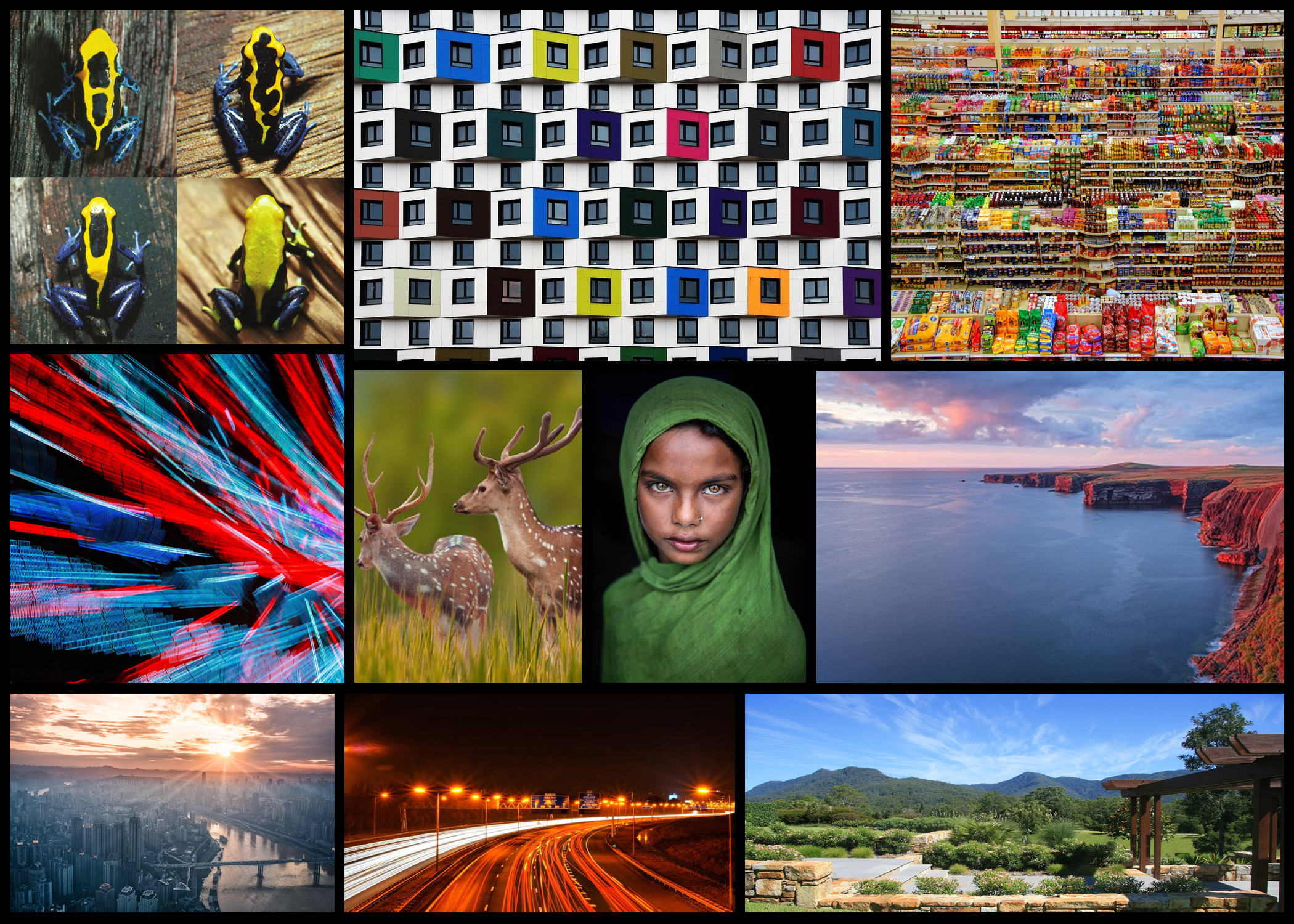
Here are some examples of types of variation I could explore in future photography shoots: Some of the ideas above consist of variation such as buildings, animals, shops, lights, people, city landscapes, coast landscapes, natural environments and roads. All of these topics for me would be accessible to photograph in Jersey due to its wide range of varying landscapes. Personally the appeal of variation in animals for me would be the most effective, especially since Jersey has a world-renowned zoo that looks after endangered animals.
Similarity (noun):

  • The state or fact of being similar. “The similarity of symptoms makes them hard to diagnose”
  • A similar feature or aspect. “The similarities between people of different nationalities”

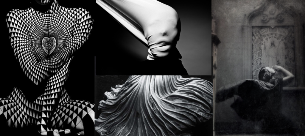
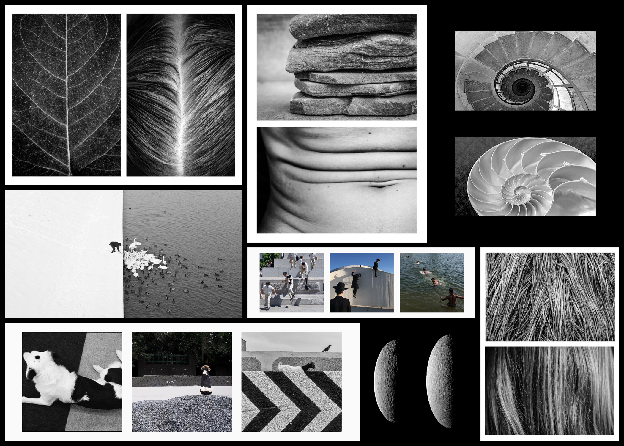
Like variations I will be exploring a few examples of types of similarities in photography to help broaden my perspectives regarding the topic. Here is a few images I have chosen to look at:Looking over the examples present the topics I found most interesting were comparisons between natural objects and the form of human bodies, natural objects and their influence of the man-made world and similarities between random objects and surrounding environments.
Overall I found the most appeal to come from variation of nature such as animals, and the similarities between random objects and the world around them. This is probably because of the huge variety of landscapes in Jersey which I could relate many objects and their uses too, linking it in with the different patterns that are present within these specific areas.

VARIATION AND SIMILARITY SECOND IDEA OF DEVELOPMENT

Connecting onwards from the fine art side Similarly from the themes of William Ye, I want to focus on the themes of media, and that of chaos. Chaos formed off the premis of fake news, mass inflictions of terror, criticism of others, lack of trust and the lack of equality and accurate representation fo people. This is a large subdivision for a photography perspective, however, in this blog post I purpose to break down how I found these ideas step by step and the way they too successfully link to fine art.

when I was further considering the themes which are very influential within the media, I began to think distancing myself from more of the chaos, and into more of the long danger causes and pains which the media has causes. The mediation of images which only portray the same similar and very limited appearance to look a certain way, and question the extent, should we and are we expected to look and act the same? this leads me onto thinking that mediation and online influence and if it has led us to the destruction of our own minds and capabilities, due to us being stuck thinking and limiting ourselves to certain consciousness. The media subsequently is taking a percentage of our voice, it is regardless to the balance which we need, its such a staged development of the world, this lack of variation has really inflicted peoples opinions, and thirst for success and personal health and mental health issues within themsleves. Media produces a sense of importance around flaws, faults and criticism of ourselves and others. The power overs girls online is something which is unjust, it gives confidence to have less humanity, and allows groups of people to produce their own  acts of terror and chaos and target others, without the fear of prosecution. Coincidentally this presentation of power can too be linked tho the effect of DNA on people and what they do when they have power. These acts of people could also be used as an act of experiment to see prejudice, racism and discriminatory behaviour, and the scientific reasoning of why these actions are still occurring in 2019. However ‘new media’ is giving people their own large platform on social media states, such as instagram , these influences have the power to promote whatever product of system they want onto larger demographics. Their influence had the ability to change peoples perception of themselves as they have unconventionally large beauty standards. And make their young influential audience believe They should too aspire to look like them, despite even them not looking, or having a life that they are being convinced to want. However, the main primary purpose of media is to be an informative news source, and in order to educate people on real life events and happenings across the globe.  These current events are divided into political, social and cultural issues. Huge monumental political movements at the moment can be found within the discussion of fake news, me too, black lives matter, and general movements of feminism and the stretch for equality. However it is interesting the way the media presents each and every one of these subject matters, and which they deem to be more important than others. The media is a huge part of almost everyones everyday lives, because of tis it also successfully links into the study of each individuals everyday and what their actions do and what their consequences are like.

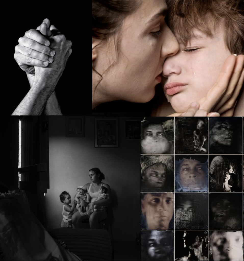
This then links to my next idea of expression of body and face and the relation and similarity seen between the stories and growth of a family. My final and third idea, links well again with the consideration of fine art, and political chaos, and it is the expression of body and face, and how we act towards and with our family, in groups of people. family is the first identity we are given, it is an almost extension of ourselves and who we are associated with for the first many years of our lives. Family is a primary example once agin our our DNA, and also a similarity we are also associated with having to others. Family should be a shared love of multiple support, however, I believe it is also a struggle of lifting and being there for each other. Family could be an investigation as to why and how forms and bonds are created, and more than just a genetic basis of variation .Artistic inspiration that I have found are the two following pieces, both link to the conceptions of media affecting out behaviour, genetics and have a fine art sentiment to them:

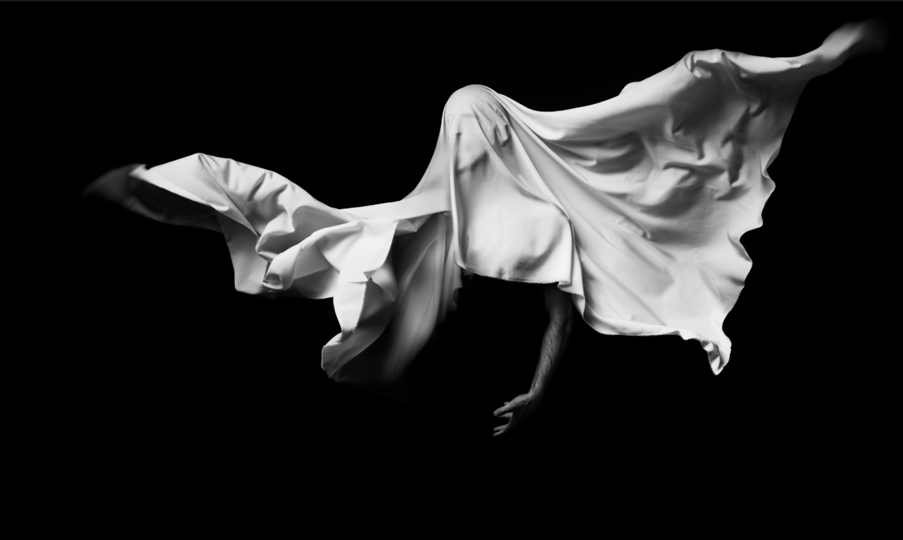
I chose this first piece as I belive it once again shows connotations to both a fine art element of abstraction and a clear artistic influence and quality to the photos. Secondly The element of community being all confined to one bonding image, and also how it forms a cohesion of family elements, and or a joined aspect of suffering in this case. It is a variation of a group of people experiencing the same effects of trauma. Additionally this trauma could have been caused by chaos within media. The effect of media fake news, and the reinforcing and constantly addressing of terrorism acts and focusing on the cruelties of the world, is what is seen within these images. A combination of individual views and variations on what they are seeing from the world. I love the effect that was used in these is, I believe it was over exposure, but covered In different fabrics and effects and then the image were near liquified, and formed into a more soft format of photos. 

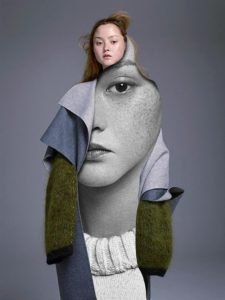
I chose this image as inspiration, due to many media related images or influencer images being concentrated on photoshoots with females looking to be the main idea of beauty. However I thought this piece was interesting as the high fashion and fine art feel comes through the interesting composition of clothes, the circular shape shows a fluidity to the images, much like many of the artists I have previously spoken about studying, additionally. The face using the eye for direct contact shows a true reflection of herself. Overall I will use these two development ideas for the effect of: combining all fo my three main perspectives, and use this to combine into five staged shoots. to begin my project.

Tim Booth

Tim Booth, born in 1963, began his interest and work in photography when he started using his father’s camera at the age of eight.  Booth was inspired by travel and photography to spend several years shooting freelance photographs for a lot of UK weekend magazines as well as newspapers in Africa, Pakistan and South East Asia.  Booth has exhibitions shot all over the world, for example ‘Into the Light’ shot in Africa.  Booth’s work ranges from portraiture to landscape work.  He was been voted the ‘No. 1 Black and White photographer’ working in the UK today by OneEyeLand.

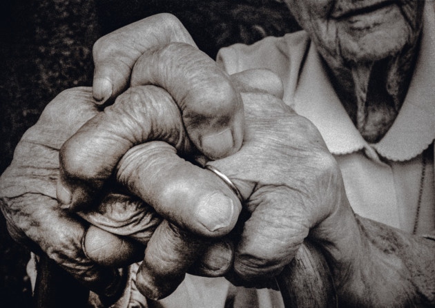
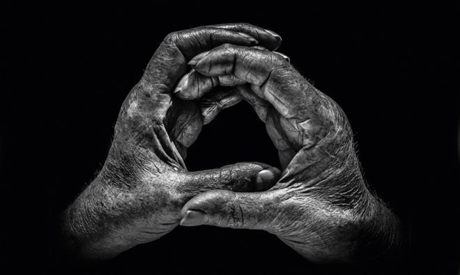
The book that brought him international recognition, which is also the piece of work that I am interested in, was ‘A Show of Hands’ which won awards.  The project spanned over twenty years and features hand portraits of hundreds of people whose hands are intrinsic to their contribution to the world – they show who they are and what they do.  Some portraits are of well-known celebrities and others are from working class people with everyday backgrounds.  Although there is a wide variety in people with their hands photographed,  all of the hands show an insight into the person’s lives and professions through the different markings, shaping’s, scars and lines.  The idea for this project came after he took a portrait of his 95-year-old grandmother’s hands – the photograph showed hands that had lives through two world wars, played the piano, went through art school, cared for the sick and played tennis for the county.  Booth said he was “sitting with my grandmother in her garden, and as always was struck by their arthritic pithiness.  The way they rested on her walking stick showing her wedding ring, so smooth against the rough skin, told a large part of her story”.  Booth says that it was his first ‘hands as a portrait’ and inspired him to carry out more hand portraits.  Booth decided that throughout the project he would shoot in black and white, in natural light and in half an hour wherever his subject found most convenient – I will also try to go by these standards as I seek to draw inspirations from this project.  Booth also says he has “always preferred black and white as a portrait medium.  It enables you to focus on all the detail and form, and not be distracted by skin colour, markers, blemishes and veins” which I completely agree with and believe that it will be vital in my response to this.  When picking his subjects booth would first think of a profession he wanted to feature and then who would best represent it.  In total there are about 115 pairs of hands in the exhibition telling hundreds of stories of people.
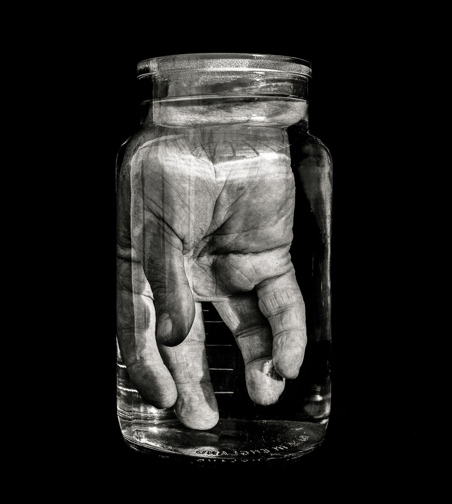
I have chosen to focus on hands, especially Booth’s “A Show of Hands” because a pair of hands tells multiple stories of a person’s life and who they are without having to show the features of their face, which many people may be insecure about.  I plan on responding to this work by producing close up photographs of hands in a similar way to Booth but without the props as I intend to create more of a typology style result with my response.  After the first initial response I may create further shoots in order to develop the idea by covering the hands in paints or inks in order to highlight the features within the hands and so a more interesting result.

Analysis

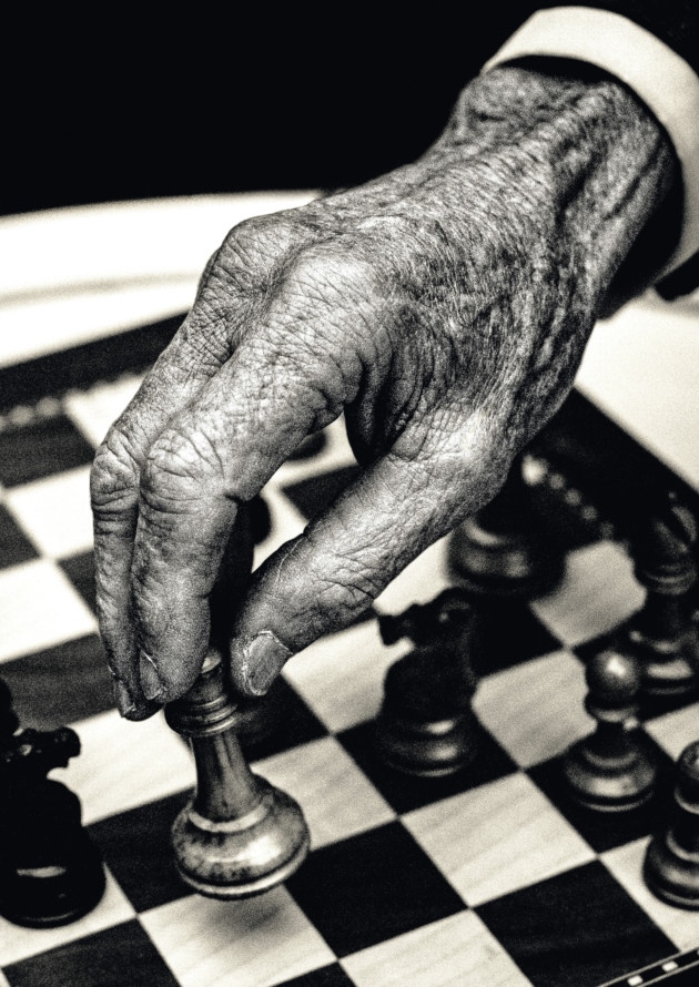
Booth would always use natural lighting in his hand portraits to create a type of photograph that allows the natural shadows and lines within the hands to be brought forward.  This photograph shows a very wide tonal range as there many dark tones throughout both the chess pieces and the crevices in the hands but at the same time there are contrasting light tones highlighted throughout the hand to create a strong contrast and therefore emphasise the features that Booth tries to capture within the hand.  This photograph has quite a lot of contrast due to this wide tonal range and is exposed just right to the point that this contrast in emphasised more.  A shallow depth of field was used to capture this photograph as can be told by how the hand is so sharp and in focus along with the chess piece that the hand is holding compared with the rest of the chess board in the background.  A low ISO will have been used in order to capture this photograph as the photograph is of very high quality – this low ISO paired with a shutter speed of around 1/60 allow for a technically correct photograph to be created.

There is no colour in this photograph – Booth has purposefully opted for a black and white colour scheme as he says he has “always preferred black and white as a portrait medium.  It enables you to focus on all the detail and form, and not be distracted by skin colour, markers, blemishes and veins”.  This rings very true in this photograph as it makes the details such as the veins and wrinkles in the hand pop in order to create a more interesting composition.  The black and white also allows the texture of the hands to come through more as well as the wooden texture of the chess pieces.  The wrinkled texture helps to create a 3D effect within the photograph, especially as the wrinkles begin to blur closer to the cuff.  The fingers and the chess piece sit on the bottom left cross-section of the rule of thirds and so create an aesthetically pleasing photograph as well as being technically correct.

This photograph is of Lord Carrington who is a renowned chess player.  Booth said that as soon as he got permission from Lord Carrington to carry out the shoot with him he knew that he wanted to bring an aspect of chess into the hand portrait.  Carrington and Booth sat in Carrington’s garden playing with different set-ups of the chess pieces and board eventually coming to a conclusion that they would move the Queen amongst the pawns as a joke as it is something a chess player would never do, especially someone of Lord Carrington’s level.  Booth would take these hand portraits on a Nikon F2 with a 55mm Macro lens on Tri-x (a grainy black and white film).  He set regulations within which he would work on this project – he would shoot in black and white, in natural light and in half an hour wherever the subject found most convenient.

When speaking on why Booth chose to focus on hands he said “My decision to focus on hands was also a deliberate choice. In a pair of hands you can see a whole life, a story if you will, that doesn’t require you to make a judgment about the person, which faces inevitably do.”  This statement can be clearly justified in this photograph as the chess gives an insight into what Lord Carrington does as well as the deep wrinkles and shapes within the hands showing the amount the he has lived through.  Booth aims to keep the photographs that he shoots simple; he says “I only have one goal really when shooting, and that’s to take a photograph that engenders a reaction in the viewer, making them not only remember the image, but want to see it again.”

Variations and Similarities – Theme Exploration


sources:


IDEA 1 DEVELOPMENT OF FINE ART: ARTIST: WILLIAM YE

The work of William Ye:

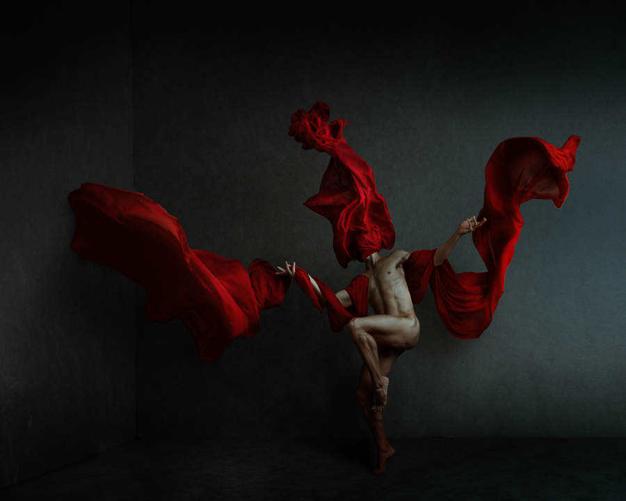
William Ye, 28-year-old multi International award winning portrait and fine art photographer based in Toronto, FAPA student and non-professional grand winner 2017/2018. His passion for fine art photography ignited 3 years ago, under the influences of famous contemporary artists and photographers of our generation, such as Annie Leibovitz, Erwin Olaf, JuliaHetta, Jennifer Thoreson (formerly Jennifer Hudson) and to name a few. Since then, he has worked hard to form his own photographic style and develop his own photographic vision, which ultimately rewarded him with several International photography awards. He has said ‘My favourite subjects are psychology, emotions and feelings. I cannot literally photograph them as they are highly abstract, non-visual and intangible concepts, so instead, I try to photograph the various imageries associated with these concepts to translate something abstract intangible visuals’ He uses photography as a medium of creation. his work is committed yet still limited due to the amount for schooling commitments e is also currently permitted too.The work seen above which I am mostly inspired by is from a collection called ‘ The Wounded’ It is a formation of the tragic events that have made international news, such as mass shootings in or lands everyday struggles that go unnoticed by most people except the sufferers themselves, such as drug addiction, STD, depression, self-loathe, etc. The LGBTQ community is often associated with parties, parades and glamour, but the reality is a lot of people are struggling. Struggle is like a wheel. It goes round and round, peeling of hope layer by layer, like trapped in a maze with no exit. Much of his other work was done by shooting though a beautiful polished glass jar, you see an incredibly distorted world.This is an abstract body of work that depicts daily personal struggle. The inspiration behind the work is Picasso’s painting Guernica, in which distorted forms are painted to stimulate the viewers’ imagination and encourage the viewers to picture together the war scene. His work is implicative and mysterious, which I admire. To create the distorted and abstract human form, I shot through several different glass jars. I found glass jars quite symbolic. It projects rainbows under the sun, but when looking through it in the dark, without too much glare on its surface, you see through it a distorted world. It reminds me of the Wounded series I previously worked on, in which my focus is on the further marginalized LGBTQ community members within the already marginalized community, who live through a lot of pains under the superficial “rainbows”.

Not only is his work a reincarnation of the principles of fine art, but the covering of the face, highlights the lack of identity and too shows an emotional neglect and abandonment. As spoken about in my previous post. I belive fine art is more then the extend to what you see, it is a arrangement of how far an artist can take their work in order to evoke a change or a substantial meaning for themselves and others. Because of this his work has such a strong inspiration of chaos and huge monumental moments in the news, this is interesting as it is a subject that applies to everyone in some matter of wanting change.  His work not only has clear definite links to my first thought of fine art, being inspired by people such as Picasso’s paintings. But this combination of artistic influences is moulded with what he sees and reads in the media, that he believes deserves more exposure and importance, due to the need to change.  His work is entitled chaos. It indefinitely links perfectly with my next influences for this project being, chaos within the media. His work as well as this link so clearly with fine art and the media of chaos, it also has a clear connection to variation and similarity. It focuses on people and spot still possess the use of showing the different ways to show DNA. The lack of individuality also shows the similarity between the outwardly presentation fo people, and the use of their actions that is what separates us as a group. Personally I chose his work as it inspired an artistic love for the effortless and grace which his images hold. The use of the a structured body combines with such a soft flowing wrap yet still make it look like one being or entity within the piece, is so successful. His other works too has such a strong abstract perception of what art is, and I believe I will definitely do shoots inspired by this work of William Ye.

contextual/critical references mentioned as inspiration for William Ye’s work ie. Leibovitz, Erwin Olaf, Picasso: In comparison to the artist Picasso, his work is very much structured in order to create a more mathematical presence of composition. Even the sheet and is an object meant to be fluid, he forms a more secure structure to the piece itself. Everything about this piece is almost mathematically measure out to fit together in a perfect manner. Ye clearly has a vivid influence in the way he too wishes to connote primary colours, in order to inflict and have the persons themselves posses a deemed amount of power. Also seen within his strong juxtapositions of lights and shadows within his other pieces. His demonstration of clear influences is also seen within the similar narrative of his work to that of Olaf, both of them find it important to present that narrative emotions and character of someone. Ye within the vast majority of his work never reveals the identity of  the persons, it is hidden within the fine art aspect of his work, Whereas Olaf is much more of a fashion iconography work. So capturing the emotions, and hidden persona of people within the same mysterious circumstances. Ye has a far reaching understanding of artists and how to combine aspects of chaos and mass media into his work. I believe If I too use many artists to inspire and form my own photography techniques that this will relay be highly beneficial to my own work.

VARIATION AND SIMILARITY INITAL IDEA DEVELOPMENT

My first initial thoughts for Variation and similarity could all fall under a possible three categories, that I could further expand and apply into one project as whole.

  • The first premises I have, consists under the inspiration of fine art. Fine art is the basis of how the beauty of life has evolved throughout time in many different forms and expressions. The work of artists such as Van Gogh and Monet represent a more romantic presentation of fine art however more modern innovators such as Damien Hirest and Marc Quinn, show a more possessive inventive exploration of humanness through their work. The common denominator of these artists illustrate a celebration of the wonder of natural diversity. Artists use their expression of form of work in order to create a significance and meaning to each object and person, inflicting their own personal emotions through their canvas. The large amount of monotony and self proclaimed metaphors through their work leads to form new social conventions and not just images of fine art. It shows how something which was once mundane, can now be used to express meaning and value.  This diversity within fine art and culture, led me to run off and see the connections between art and diversity based off individual DNA. As spoken about previously DNA is one of the defining factors which is both a variation and a similarity within everything living on the planet. This combination of formality and uniformity, could be used to define the formality or standards of what could and should be seen as art. This could be asked on an individual subject premises, or more of a formal experimentation to the meaning behind the DNA and why a piece of art was created, and for what purpose does it inflict and show social conventions. For this project I could either look into how far art has and can go for what reason, what the importance is individual and the relations people experience from an art piece due tot theirDNA, or the formality of myself photographing fine art piece and creating my own fine art piece. The study of fine art in photography, is usually categorised into bodily, landscape or more innovative pieces, which are piece of constructed fine art. Below I have separates some piece that I believe could really help with the further route of my images. The fine art piece themselves, this is a reaction to real art.

  • This development of my first ideas, revolve around work which has such a significance meaning  is no longer an image but is more contemporary piece of art. This means unlike more concept based photography, this work is so much more subjective and and shows attitudes of artistic fluidity and line throughout all of the pieces. One of the pieces that struck me the most is the first piece. It too was inspired by a Picasso cubism stylistic form, and the mould of the bodily from. The pattern and form is suggestive throughout the piece, it flows in and out creating a dynamic presentation of the human DNA. I started off looking into fine art by the influences of to what extent is art art. I believe expressing studies of photography in an arrangment of more abstract images which show shapes, almost mimics the way art has progressed to be more then just pretty pictures, but an intellectual statement from a point of view. Further research into the development of fine art and photography: My idea for the using artists such as Monet and van Gogh in order to show and explore how are has evolved. Is perhaps re creating some of their most influential paintings into photography, and perhaps moulding their techniques into mine. This first idea is developing a similarity to the fine art pieces, this being a  a sense of mimicry of the artistic piece themselves. I believe I could then use the style of the artist chosen and either paint or edit the image into that stylistic manner. For example If I was using van Gogh, I could take images of beautiful night skys, and sun flowers. Then further edit the piece to be light and use small strokes observing the artist. I could animate videos inspired by each artists, or even animate the images I have chosen to move in the same way as the painting look as though they would move if they could. I chose to move just parts of the photos, in the same manner, just in order to create a flowing necessity to the pieces themselves. I belive if I both mimic the feeling and then the style I could really develop feeling of the artists work. 
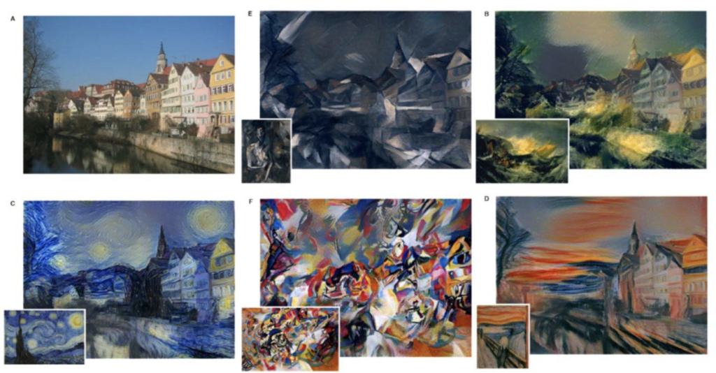
  • I was too inspired by these pieces. It too shows a further possible development in order to express a certain style to the images. I believe it would be very hard to edit these images, but it shows  the expression of how an art piece is painted, and changes the connotations and meaning behind the paintings. Overall with the following notions of developing both the concept of what fine art is, the conceptual meaning behind it, and turning and re creating my own work into such influential pieces, by developing their own stye and movement, will really achieve a sense of variation and similarity, being similar to the artists but still using my own imagery.
  • Use a tilt-shift effect to make paintings or drawings appear real, as in these photographs of Vincent van Gogh artworks by Serena Malyon: https://www.studentartguide.com/articles/creative-photography-ideas

VARIATION AND SIMILARITY

  • To start off this project I first want to expand on the ideas given to myself through the introductory exam spectrum, and additionally doing research into the meaning behind the words themselves, in order to achieve the most accurate representation of the topic I will be looking into.
  • variation  – is a change or slight difference in condition, amount, or level, typically within certain limits. ” regional variations in house prices” this could be further divided into the consideration for words such as: difference,  dissimilaritydisparityinequalitycontrastdisc-repayimbalancedissimilitudedifferentialdistinction. 
  • This portrayal of variation being something which many people have yet only a small occurrence of changes. To my mind, this is quite interesting as not only does variation symbolise change, but, it also must first have the premiss of belonging to a similar group.  Variation is also of great importance, as it has many different meanings dependent on the subject matter, such as; in science it is a difference between individuals, However in music it’s a formal technique repeated.The second way of consideration is: a different or distinct form or version of something., “hurling is an Irish variation of hockey” : variantformalternative, alternative form, other form, different form, derive, form, developmentadaptationalterationmodification, revision, revised version. This portrayal of difference and similarity of something that already exists could come under researching into different disorders which people have, and how this affects their personality traits. looking into the development of how people change and act dependent on their environment and the success or downfall of their upbringing. These small experiences and traits which have such a large control upon how people vary and change from each other.
  • Variation is considered to fall under the categories of human, species, biology, and evolution.The definition of similarity is: the state or fact of being similar, a similar feature or aspect.”the similarities between people of different nationalities” resemblance, likenesssameness, similar nature, similitudecomparabilitycorrespondencecomparisonanalogyparallelparallelismequivalence; “the similarity of symptoms makes them hard to diagnose”
  • Despite the clear oppositional differences between similarity variation, they are both depicted in the same manner. This being they both are established by the same defying  factors of humans, DNA and language. This means that both are deemed to be very scientific. However this does not mean to have this project has to remain scientific, if anything, it lends to be  more interesting to see the development of how these factors have the capabilities to change and evolve throughout the process.
Below are some artistic inspiration of possible effects which are artistic and I could too link to variation and similarity. 

like Matthew Brandtused by Sally Mann via Edwynn Houk Gallery: The artistic above are listed here, and I have also included some links of inspiration for my

project. http://www.houkgallery.com/news

Lewis Bush

Lewis Bush (born 1988 in London) is a British photographer, writer, curator and educator.  Bush studied history at the University of Warwick and gained a master’s degree in documentary photography from London College of Communication, where he lectures on photojournalism and documentary photography.  In his work bush seeks to draw attention to forms of invisible power that operate in the world – such as finance.  Bush has the standpoint that ‘power is always problematic because it’s natural resting state is arbitrary and untransparent’.  Bush’s projects tend to incorporate writing and he has written about photography for a range of national and international print and web titles.
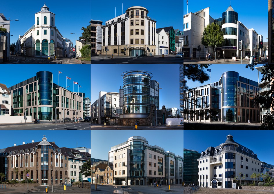
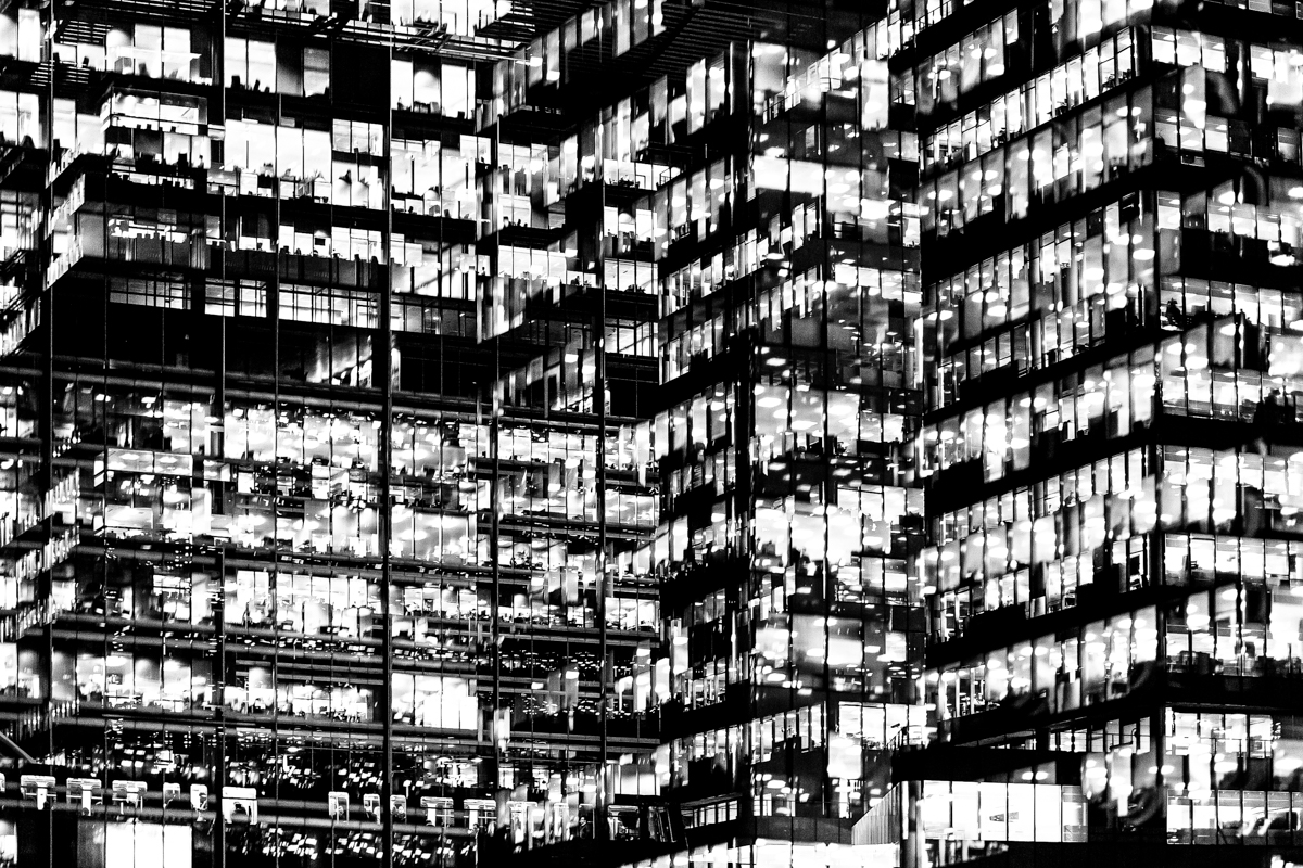
In Bush’s ‘The Memory of History‘ from 2012, he travels through a range of European countries to document the way in which the past was being politically manipulated in the context of the economic crisis and recession.

Bush is a photographer in residence at the Societe Jersiaise in Jersey where he is working on his project ‘Trading Zones‘ in  which he looks at the international finance industry.  It looks at the global economic crisis that began ten years ago and the resulting financial sector. Finance has been very unrepresented in documentaries due to its complexity and stature meaning that there is plenty of potential for investigation for documentary photographers such as Bush.  The project ‘Trading Zones’ is a result of six months spent as the 2018 Archisle photographer in residence at the Societe Jersiaise in Jersey, which is currently undergoing huge renovations in the financial sector.  Bush says he has used this time to “establish the foundations of what I anticipate will be a long term photographic inquiry into the financial services industry” as the project comes under documentary photography so this project will be ongoing over a long period of time.

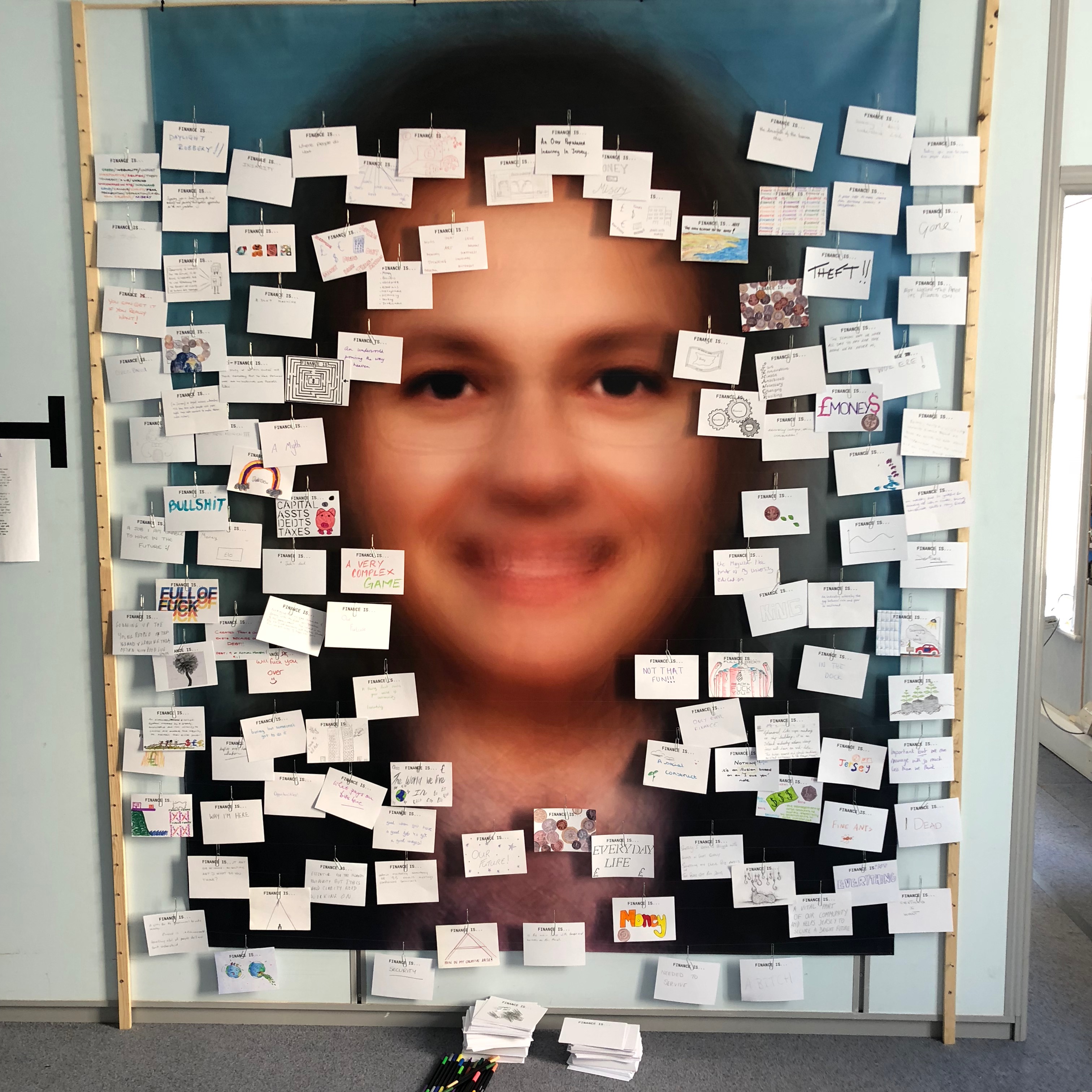
Bush’s work on ‘Trading Zones’ interest me as he had a section in the gallery in which he showcased cards showing what the public though of finance.  This idea drew inspiration from a project by EJ Major, who sent out cards asking ‘what love is’, expecting people to respond in whichever way they felt appropriate.  I could possibly respond to this idea as I have considered exploring the variety in people’s handwriting – everyone has their own unique style of writing and especially ways of drawing specific characters.  I believe that by asking multiple people to write down what ‘Variance and Similarity’ means to them I will be left with a collection of cards covered with unique handwriting styles and so will be able to show how characteristics as small as handwriting can show the differences in people’s personality traits.

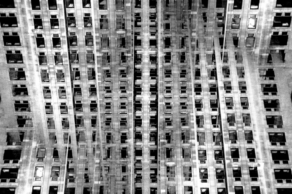
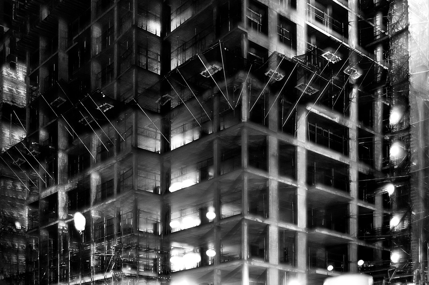
The main project by Bush that interests me is ‘Metropole’ in which he used a technique of double exposure.   The project looks at the collapse of the British Empire and how in its place globalised capitalism grew as London has been rebranded as “a city of demolition, cranes, and glittering new high rises”.  ‘Metropole’ aims to record the effect of this on London through the form of documentary photography.  This appeals to me and links to the theme ‘Variance and Similarity’ because it explores the fact that there are an increasing amount of large buildings for offices or flats taking away from green land and so the landscape in which we live is turning into a repetitive view of similar flats and offices leaving citizens with a feeling of monotony as everything is being redeveloped to serve the same purpose.  Bush’s work on ‘Metropole’ shows a lot of emphasis on the repetition between buildings due to his double exposure effect.  I intend to respond to this work by capturing blocks of flats or offices, both in day and at night and then altering the photographs in photoshop to replicate the buildings and create a pattern of repetition throughout the edits.  These edits will show how buildings can look different individually but a lot of them can be very boring and repetitive.
Analysis

In this photograph it appears that lighting from within the inside of the building was used in what is possible night photograph. The use of this light is used to Bush’s advantage advantage as he uses double exposures to layer building over building creating a disorientating viewing along with contrast between the over-exposed lights and the dark shadows within the building. There is a wide tonal range within the photograph thanks to the range of shadows and lights within the photograph – this wide tonal range makes the photograph interesting in whichever segment the viewer looks as it creates intricate shapes and shadows throughout.  The lights and shapes are very intense as the viewer has to try piece the photograph together in order to understand it. It is unclear whether a short or deep depth of field will have been used in this photograph due to the disorientating nature of it – this adds to the mysterious elements of the photograph. A fairly slow shutter speed will have been used along with a low ISO in order for enough of the light to enter the lens from the dark environment whilst keeping the quality of the photograph as high as possible.

There is no colour in this photograph – only black and white along with the shades in between. This black and white approach to the photograph is very effective as it allows you to focus on the structure of the photograph and the buildings rather than being distracted by colours. The black and white effect also adds to the disorientating effect of the double exposure technique. Another addition that the black and white effect brings to the photograph is more contrast between the tones – especially between the bright white lights and the black shadows. The bright lights may be representative of a light at the end of the tunnel due to their glow in comparison to their environment. The photograph seems to have the texture of a graphite drawing which creates a really interesting viewing as what the viewer is seeing seems almost surreal. There is quite a 3D effect to the photograph due to the blending of photographs in order to create platforms coming out towards the viewer from the building. This 3D effect is complimented by the wide range of tones within the photograph. There are two points in the photograph to which the eye is initially drawn – these are the bright heaven-like lights and the platforms extending from the buildings – this is due to the lights contrasting in tone to the rest of the photograph and the platforms providing different shapes to the rest of the image. The platforms are also placed along the higher horizontal line of the rule of thirds meaning they add aesthetic to the photograph.

This photograph was taken from Bush’s project titled ‘Metropole‘.  This project looked at the collapse of the British Empire and how in its place globalised capitalism grew. London has been rebranded from “an investment opportunity” to “a city of demolition, cranes, and glittering new high rises”.  ‘Metropole’ aims to record the effect of this on London through the form of documentary photography. The project is titled ‘Metropole’ as London was once known as the Metropole meaning it was the mother city at the centre of a vast empire. These photographs were produced “during numerous winter night walks through the city”.

On Bush’s website he says that he used double exposure to create “increasingly disorientating and threatening as the series progresses” in order to create the “sense of loss that many Londoners feel” in the big city. This theme of a feeling of loss within the city emphasises how cities such as London have changed with the arrival of these repetitive blocks of flats – possibly for the worse. Bush continues this theme in his work on ‘Trading Zones’ in which he studies the Jersey financial sector. I think that through this exploration of disorientation and change Bush is trying to show that people often feel that the world is moving too fast for its own good as people get lost in temporary trends and patterns of life, ultimately resulting in repetition.