Category Archives: Contextual Studies

Filters

Author:
Category:

Framing + Evaluation Of Final Pieces

Before going onto finishing my final pieces I had to make a selection of eight to nine images that I thought would work well together regarding each final mood-board composition. Throughout the project I have been using various techniques such as monochrome, gradients and motion blur to improve my overall skills and perspectives regarding my stance and intpretation of the topic of variation and similarity. When looking over my project it has allowed me to photograph subjects in a new light using techniques that I would not have previously used, the overall process that I have used for each shoot has given me a new understanding of how my composition can affect the viewers opinion and interpretation of situations whilst allowed me to explore new styles that I had not previously looked at. Here are my image selections for each moodboard composition and the final outcomes:

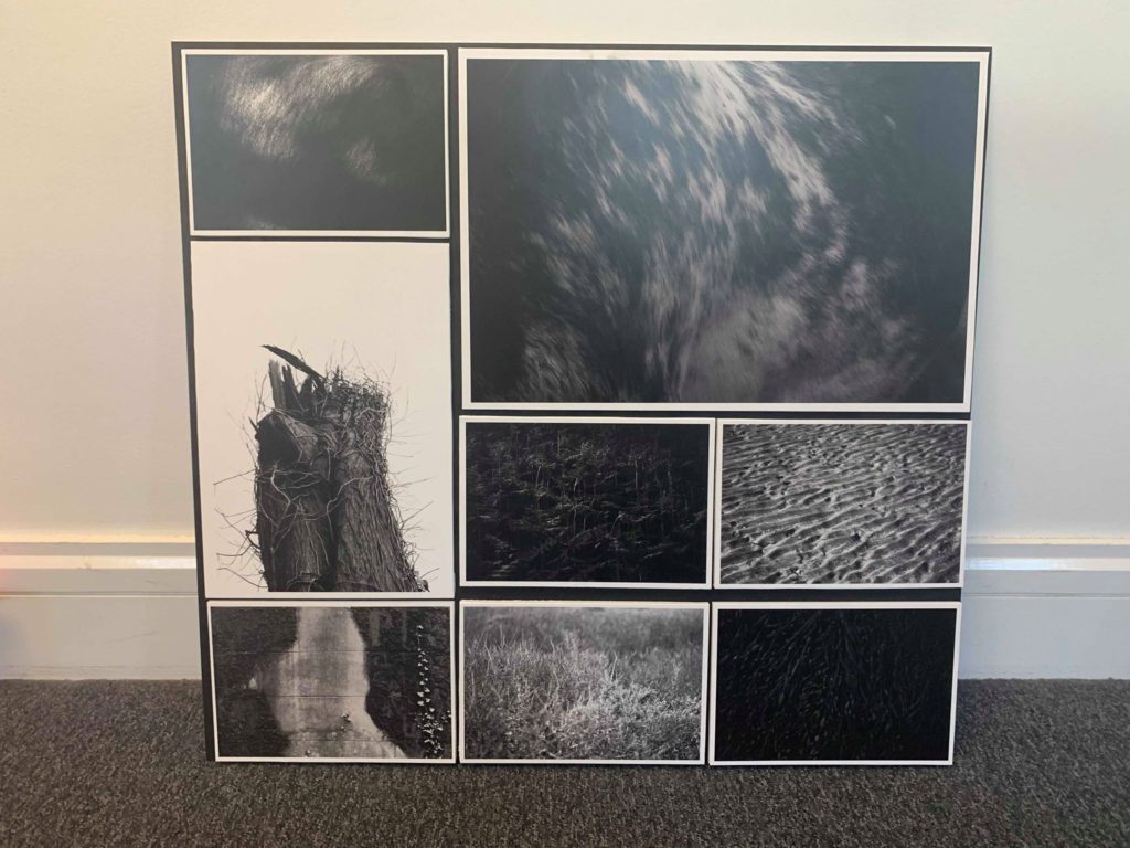
I was really happy with the outcome of this section regarding the themes of variation and similarity, this is mainly due to how I loved the use of tightly boxing in each photograph so that they emerged as a compact form which ever so slightly defined the individual images through the boxing in using white borders. For me the implementation of the borders was the key in creating the composition of the mood-board, this is because of how each photograph is taken using a monochrome filter and against a black backdrop it would render images pointless due to them merging into the background, by adding a white border not only did it make obvious the seperation between the board and images, but also defined what was in each border more due to the greater contrast now present.

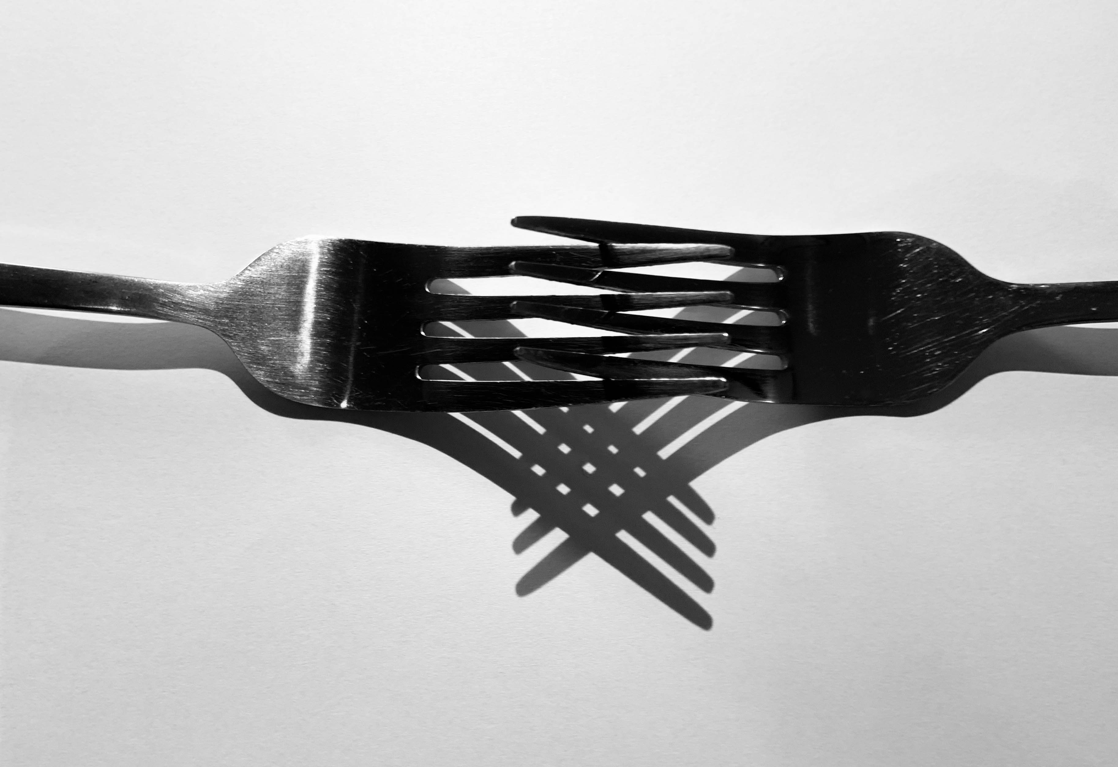
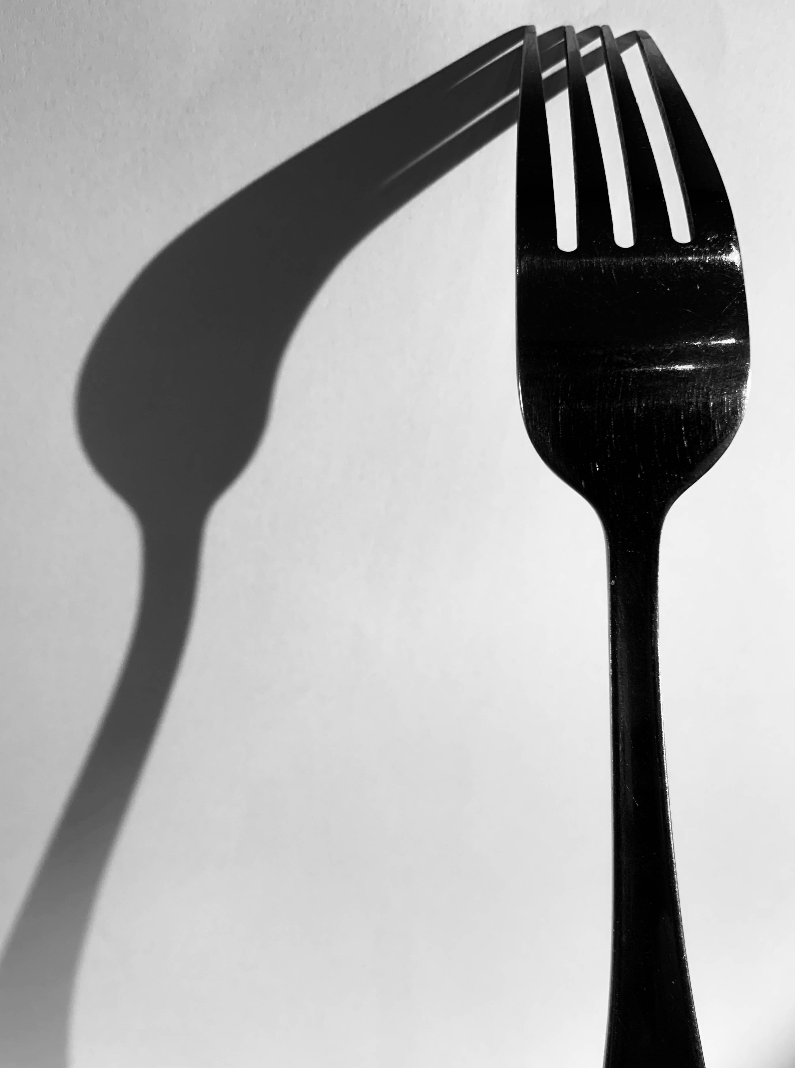
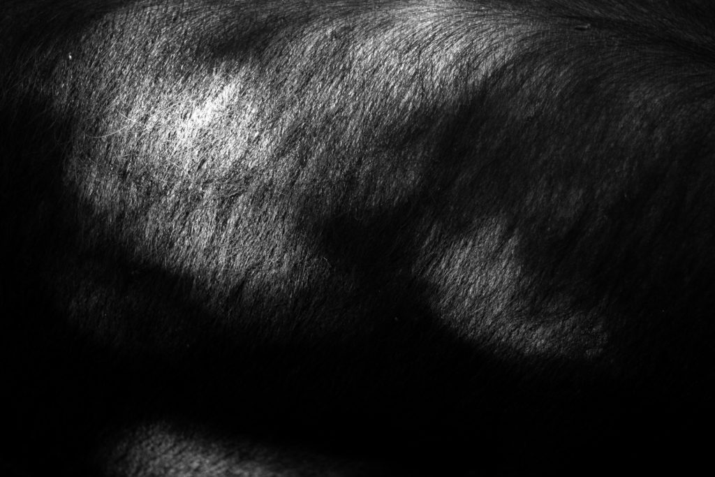
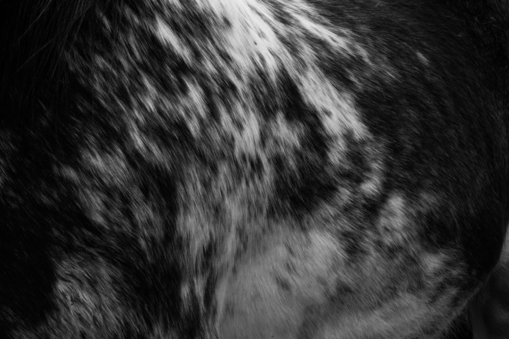
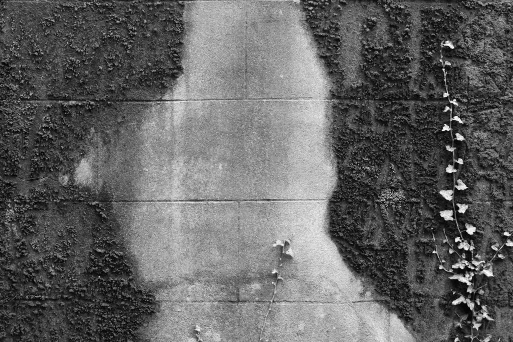
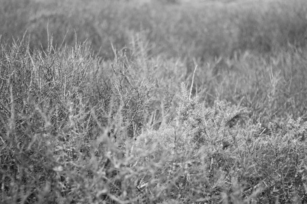
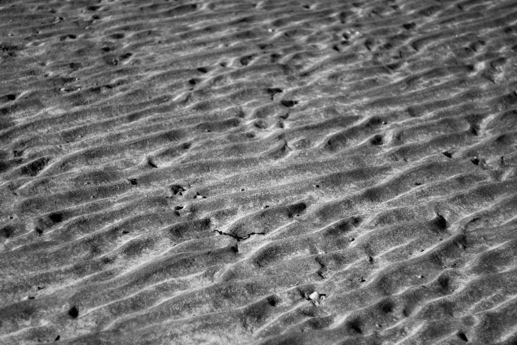
The images I selected for this mood-board are centered around the theme of abstraction through pattern. The reason I selected only monochrome pictures are because I found that they perfectly highlighted the everyday unseen patterns presented in our journies ranging from walls, animals and grass. I wanted to box these images together because I found they all related really well to each other regarding both visual and contextual aspect, seen through the varying shades present and up close representation of different subjects which are highly contrasting their surroundings.

Peronally this outcome came out well for me as I found the placement of images complimented each other through the transitioning of colours that went from one image to the next. When creating the mood-board I tried to create a sub theme within where I chose to focus on only a few certain colours such as yellows, oranges and blues, this way the outcome produced was visually aesthetically pleasing due to how the white boarders that accompanied each photo boxed it in, defining it in the process whilst the colours were brought out through its limited framing. Out of the three final layouts for the final pieces this was definitely the one I tried to experiment with the most seen through the must larger use of nagative space, the reason for this was that I wanted to allow more breathing space for the picture as it contained the more light hearted and beautiful photos out of the three themes

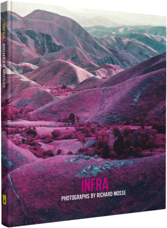
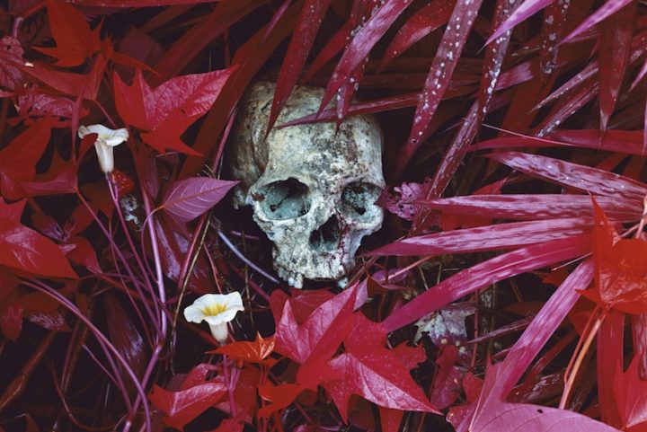
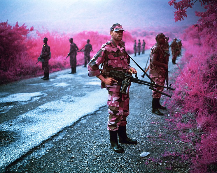
The overall topic for this board was abstraction through colour, here I wanted to provide the viewer with my interpretation of this through saturation. I decided on this because of how through saturation it allowed for the creation of landscapes that seem too colourful and surreal to be real, by photographing the entire landscape it allowed me to focus on not only on the subject but what the potential surrounding area would look like portrayed differently, something I changed to isolating the subjects like the other two themes.

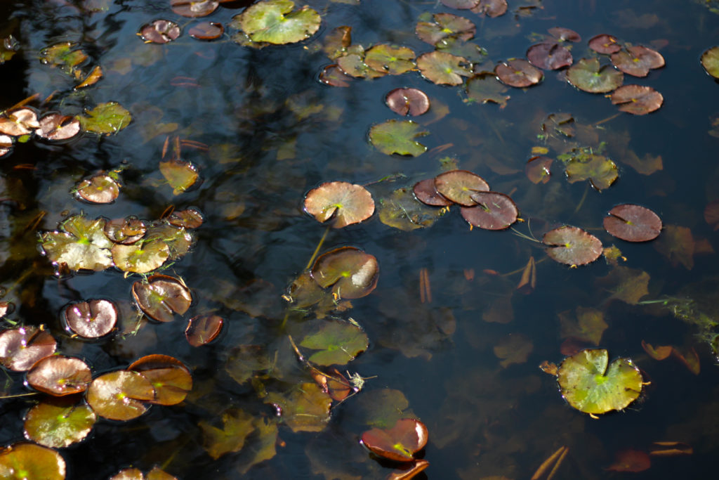
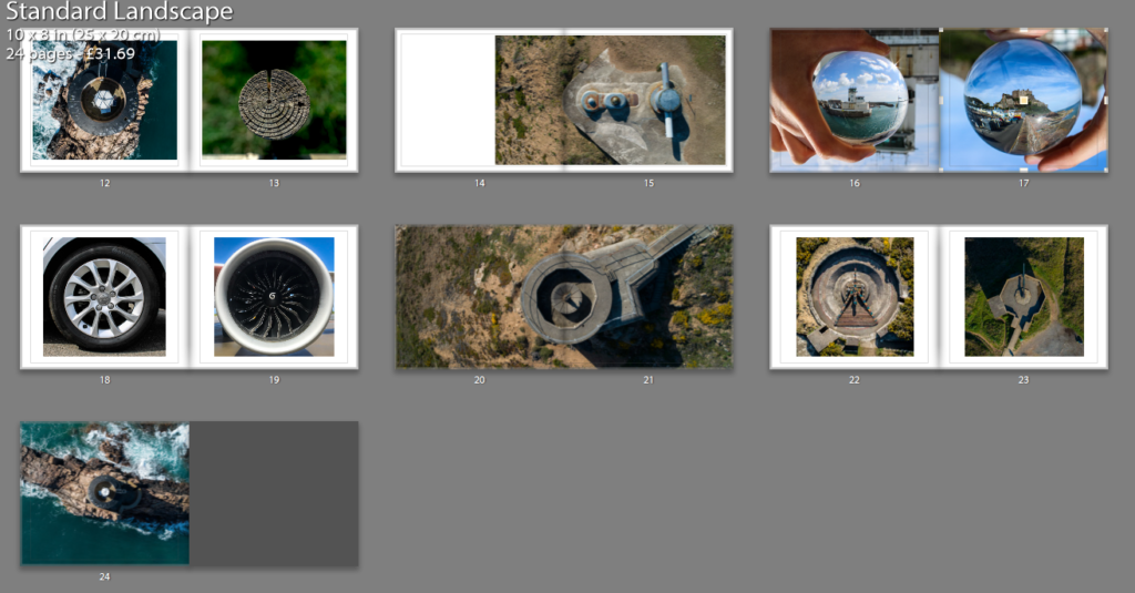
Finally for my last composition I wanted to create a larger mood-board than the other two made, consisting of ten images rather than eight. The reason behind my thought process for this is because of how there is such a variety of different textures present in each of the shoots that it would be much harder to present my process and results using only eight, through ten images it could allow me to create two different forms of texture five times, all whilst compacting them onto a singular piece of card. I tried to incorporate a lot of colour into this composition created from the natural forms of each subject (the difference was that I did not use any editing to create a saturated unreal environment), my intention behind this was to draw the viewers in through aesthetic textures that could be found in gardens and Jersey’s landscape.

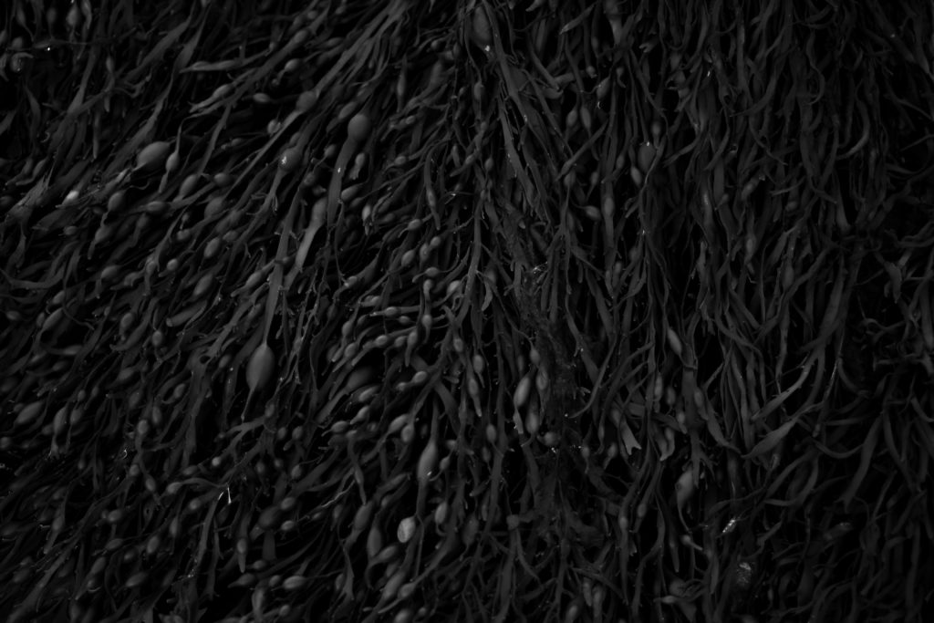
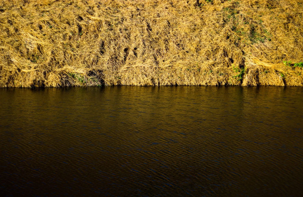
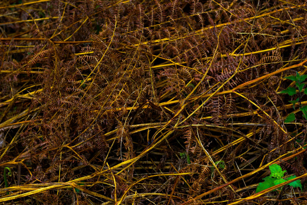
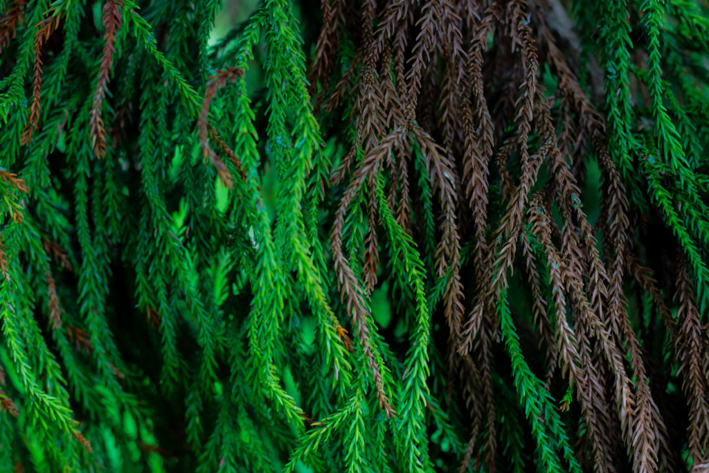
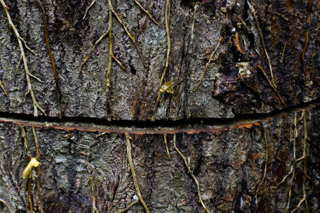
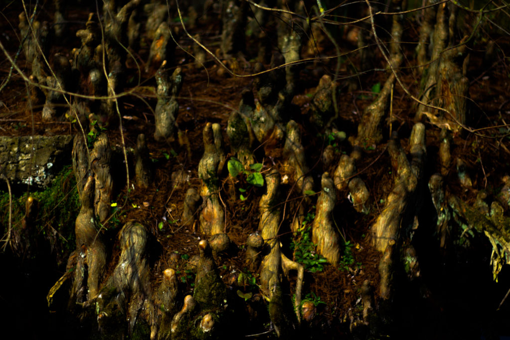
For this section I was mainly focusing on the topic of abstraction through textures in the natural environment. I mainly here wanted to focus on the form of subjects such as plantation and water due to them providing the largest amount of variation regarding how their surfaces could be warped and changed concerning their location and type. Much like the first mood-board I wanted to base the composition around tightly packed images being defined through the use of white borders which as a result increases their contrast. My aim here was to fill up as much blank space as possible so that the result would seem as though they were all linked, being serperated by small lines which create depth in the piece.

Overall I was really please with the three mood-board results as they reflected my intentions for the shoot perfectly, where you would need to see each theme as a collective rather than an individual item. I was particularly happy with how the compositions turned out and the definition created through the mounting of white foam board against the surface of black card, for me this complimented my imagery really well due to the majority of them being too dark or bright which could be stopped through the implementation of borders or black card.

Framing Ideas For Final Piece

After I had complete making the book I then wanted to go onto designing some layouts for prints which I could mount up on foam board and card. I wanted to incorporate eight to nine images from each theme of abstraction and present them in a mood-board fashion where the images can be viewed as individual collections. However before going a head with the actual framing up I decided that I would make some smaller mood-boards which I could possibly implement the photos into when scaling them up. Here are some of my ideas regarding how I could go about composing each composition:

I quite liked the idea of compacting all the photos together and so for this composition wanted to have only the images separated by a thin black boarder which would merge them all together into one aesthetic mood-board as a result. I really liked the idea of symmetry here and wanted to use that to have the more significant images on the outskirts with the middle having smaller images that linked to the larger ones through topics or themes of colour, topic or composition.

Here I wanted to try experimenting with the use of negative space on the mood-board, to do this I added larger gaps between each photo which I hoped would highlight the larger or more important images more. This mainly was based around the bottom of the board where I emphasized the three individual images compared to the rest of the photographs, this would allow me to use three images that had the closest theme together so that they would be presented as the focal point for the overall composition.

Finally for my last composition I reverted back to the compact theme of the first composition. However when designing this one I got rid of the symmetry, instead replacing it with a random order which slotted together like a puzzle, this way the board would not become too predictable therefore drawing in the viewers. I really liked the pairing of the four A5 images in the bottom left corner, this is because of how I think they provided order to the overall relatively disordered board.

Overall I am relatively happy with the outcomes I have produced for each of the mood-boards, as a result of this it is likely that I will use one of each for the three different photographic themes I have regarding abstraction. When making them I will probably be mounting them onto white foam board and then glueing them onto a black sheet of card so that it create a 3D illusion when looked at, before this however I will be adding a white boarder to each of the images so that it defines them more, allowed them to be identified easier.

Photobook Design | Final Draft

I am happy with this final design and I will send this to be printed. To start with, my title page and back page were designed to be eye catching yet simple and that’s why I chose those images. I used white text as it worked well with the background and a bold sans-serif font for effect. The back page is also simple and the circle contains text that explains the meaning behind the name ‘Latitude’.

The first image is Liberation Square in town (which happens to be a circle), the second set of pages represents the urban and rural contrast and also the differentiation of technique through the lens ball and tiny planet photography yet maintaining the circle shape, following out theme of Variation and Similarity. The next double page spread is La Hocq, then Noirmont bunkers, Janvrin’s tomb with a zoomed image, Batterie Moltke guns, tower to wood contrast between natural and man made structures. Then Noirmont targeting position, then lens balls of the harbor VTS and Mont Orgueil Castle, wheel and jet engine, Noirmont MP1, guns from Batterie Moltke and Lothringen and finally Noirmont Lighthouse.

I wish I had a larger variety of images however it was not viable due to cost but mainly because the book would seem overcrowded and maybe too jumbled, therefore I stuck to a basic set of images that worked together.

Images of mine similar to artists

My flower shoot was inspired by artists such as Takashi Suzuki, as she photographs studio images of objects, (like flowers, as well as sweets). Rinko Kawauchi was another artist; her illuminance book consists of images where my flower shoot created similar styles.

Takashi Suzuki’s style of photography:

Takashi Suzuki’s image

Images of mine similar to Suzuki’s:

Rinko Kawauchi’s style of photography:

Mood-board of Kim’s photography

Images of mine similar to Kim’s:

My architecture shoot was inspired by artists such as Ray K Metzker, Takashi Suzuki and Kanghee Kim.

Ray K Metzker style of photography:

Mood-board of Metzker’s photography

Images of mine that are similar to Metzker:

Mood-board of my images similar to Ray K Metzker

Takashi Suzuki’s style of photography:

Mood-board of Suzuki’s photography

Images of mine that are similar to Suzuki’s style:

Mood-board of my images similar to Suzuki’s

Kanghee Kim style of photography:

Mood-board of Kim’s photography

Images of mine that are similar to Kim’s style of photography:

Adding Cover To Books

Once I had looked at the compositions of the fonts and colour of the covers I came to a conclusion of the designs I wanted and proceeded to use them on all three books. Like the compositions I made sure to leave the overall theme of design the same throughout each of the covers as I wanted to enforce the idea of them containing a different style of photography with the same overall theme. Here are the results of the designs and my thought process behind them:

For the fonts on the covers I decided with Abril FatFace, this is because it created a formal font which contrasted well against the grey backdrop and produced an outcome that I had seen present in most of the minimalist abstract covers. Colour wise I went with a lighter grey to the grey used on the cover due to me wanted to blend them together to some degree and prevent the text from becoming too overpowering. This led to my choice of using font size 80 due to how it didn’t take up a huge amount of space in comparison to the rest of the page, but how it also made use of the negative space surrounding it which it used to its effect.

For the font for the authors name I once again went with the same font as the title being Abril FatFace. This is because I wanted consistency throughout the cover and matching all text to the same font was crucial to this. Regarding the font size I went with a size 18, this is because unlike the title I wanted to leave the authors name more or less unnoticed due to how it didn’t provide any relevant information on the subject within each book.

Finally for the backdrop I had created I’d used an enlarged grey square which stretched across the cover. To accompany this I experimented with a variety of colours such as blues and browns present in the books to discover what would work well against the title and fonts used. My outcome was a dark grey that was borderline black, I selected this because of how I found it to be relatively neutral in disclosing what would be inside the book with only the title giving it away, which as a result allowed for the books to work together as a trilogy, stopping designs clashing which could occur when putting them into sleeves.

Photobook Specification

Narrative: What is your story?
Describe in:

  • 3 words – Circles, Difference & Similarity
  • A sentence – Exploring circles in different environments and in different ways.
  • A paragraph – For this project I will be responding to circles. Maybe not that simple… I would like to explore a shape we rarely take notice of in our daily lives and I would like to use different techniques and environments to share what people miss so easily yet appear everywhere. The aim is to perhaps inspire people to look around and enjoy the world around them and take notice of the little details, like circles, that appear everywhere. The similarity being the shape, the differences; being the environment, location, angle, photographic technique and the urban/rural landscape.

Design: Consider the following

  • How you want your book to look and feel – Landscape, similar width to height, perhaps slightly longer width but only marginally, hard back and strong binding that doesn’t have much image lost in the gap.
  • Paper and ink – Not matte but not glossy, in between.
  • Format, size and orientation – Landscape, ever so slightly longer width than height.
  • Binding and cover – Visible binding, hard back with printed images on the cover.
  • Title – “Latitude” or “Meridian” or “Annulus” or “Ecliptic”
  • Design and layout –
  • Editing and sequencing –
  • Images and text – Little text other than title and all images will be the very best, not a huge amount, short but sweet.

Shoot 7 – Cutlery shoot

For this shoot, I wanted to capture forks and spoons and experiment with different angles of lighting, different positioning of the cutlery and different backgrounds to see the effect of light on cutlery – which is such a simple everyday object. The variation of shadows is produced as shown below:

Contact sheet

Edits

This shoot was inspired by Michael Luitad from his cutlery work, where I have already made a blog post on him and his work.

Deconstructing The Narrative of ‘Tal uf Tal AB’, ‘You Would’ and ‘Park Sleep’.

Book in hand: How does it feel?

The book’s cover and sleeve are created from card giving it a textures surface which feels dry to the touch, however the book itself is a more matte card surface giving it a smoother feel whilst adding a slight tint to the cover. This card texture is carried on throughout the layout of the book. The textured surface of the sleeve and book covers are repeated on each book.

Paper and ink: Use of different paper/textures/colour or B&W or both.

All of the paper inside the book are glossy matte textured being about the same thickness of ordinary photography paper. Within the book there are a few blank pages so that it adds breathing space when working your way through which adds to the overall effect of the photographers decisions. The only text is the ink which is in a small font in each corner of the pages to highlight what the title of each image is. The book overall is very consistent as there is a strong theme regarding composition and focus of the photographer throughout.

Format, size and orientation. Portraiture/landscape/square/A5, A4, A3/ number of pages.

The book itself it is a A3 size, slightly smaller than an A4 sheet of paper with an effective use of negative space throughout due to there being borders to each image boxing them in a result. This compliments his photography as the photos become easier to focus on especially as there are more dominant portraits within. Its hard to say how many pages there are due to there being no page numbers, but I would guess there are about 50 pages per book.

Binding, soft/hard cover. Image wrap/dust jacket. Saddle stitch/swiss binding/Japanese stab-binding/leperello.

The books use a paper card cover without any dust cover on due to there being no need through the use of sleeves. This as a result makes the book more visually pleasing as when opening it it directly links the cover page into the photography.

Title: Literal or poetic/relevant or intriguing?

Overall the titles seem to be more poetic rather than literal due to how the content inside each hardly reflects what the title suggests, instead being more around a different theme of family or location life in specific locations.

Narrative: What is the story/subject matter: How is it told?

There seems to be no narrative in the books but rather small sub sections where a few page spreads will be portraits with the next ones maybe be landscape shots or images about home life. This theme continues throughout the three individual books.

Design and layout: Image size on pages/single page, double-spread/images/grid, fold-outs/inserts:

Each photo inside the book tends to be the same size regarding whether it is landscape or portrait, with portraits tending to take up the entire page and the landscapes taking up about half of a page.

Editing and sequencing: Selection of images/juxtaposition of photographs/ editing process:

The images inside each book seem to have little editing done to them as each seems like they have come straight from the camera with in-camera editing techniques like low or high exposures. As a result of this the results seem to be more literal, portraying the photographers vision literally.

Images and text: Are they Linked? Introduction/essay/statement by artists or others. Use of captions (If any).

The books lack text as there are no page numbers or information about where the photographs are taken. However in each bottom corner of every page there are the titles of the photos present on each spread, this is complimented by the very occasional use of speech dialogue which can be seen on some pages which seem to depict a conversation between two random people.

New Topographic Seminal Exhibition

Image result for new topographics exhibition

In 1975 there was an exhibition of New Topographic inspired work – it was titled “New Topographics: Photographs of a Man-Altered Landscape” and was considered a point of turning in photography by many historians. The exhibitions consisted of the Bechers, Robert Adams, Lewis Baltz, Joe Deal, Frank Gohlke, Nicholas Nixon, John Schott, Stephen Shore, and Henry Wessel. The photographs revolved around typical typology themes such as abandoned buildings. What was appealing about this exhibition was how unusual they were compared to the traditional approach of photographing landscapes. The new topographic photographers were less concerned with displaying nature as an ideal haven and they prioritised showing how many has changed the landscape, possibly for the worse. The exhibition also brought around a change in the teachings of photography because all of the photographers involved were associated with academia as either students or professors, which was strange at the time as photography was not widely taught in schools. Stephen Shore’s photographs in the exhibition also showed a shift from the old belief that fine art and photography should be in black and white. Ultimately, the exhibition helped the idea of photography as fine art to gain traction. The exhibition was originally held in the George Eastman House but in 2010 was re-staged at the University of Arizona in which they chose over 100 photos from the original exhibition to include. The influence left behind from the photographers involved on photographers can be clearly seen in the photographs. Each photographer in the New Topographics exhibition was represented by 10 prints, all of which was in black and white except for Stephen Shore’s work. When introducing the exhibition, Jenkins (the curator) defined the common denominator of the show as “a problem of style: stylistic anonymity”, meaning an absence of style. The idea was that all of the photographs were stripped of artistic frills. For more detailed look at what the work of the New Topographic’s consisted of, please see my post on the Bechers.

The work of the New Topographic’s appeals to me because the work that I have been doing on ‘Variance and Similarity’ involves me photographing building faces in a documentary style similar to the work of Topographics, such as the Bechers. I believe that the strong and bold photographs that they have produced in an attempt to show how there is beauty in the ugly have a strong influence over the work that I have produced as I have been photographing buildings which are not conventionally attractive, as well as photographs of steel covered in rust, which is another typically ugly subject. The resulting photographs are abstract compositions that reflect the documentative and cold-cut style of the New Topographic work. I am also presenting some of my final pieces as a typology grid, which is a feature strongly associated with the Becher’s. The typology grid appeals to me because it provides a great way to compare and contrast between photographs as well as showing trends between them in a way that is simplistic but effective.

Photobook Study | Infra

71sac2LwNzL

Infra, Richard Mosse’s first book, offers a radical rethinking of how to depict a conflict as complex as the ongoing war in the Democratic Republic of Congo. Mosse depicts the rich topography, inscribed with the traces of conflicting interests, as well as rebel groups at war with the Congolese national army (itself a patchwork of recently integrated warlords and their militias). For centuries, the Congo has repeatedly compelled and defied the Western ideology. Mosse brings to this subject the use of a type of color infrared film called Kodak Aerochrome. Originally developed for military reconnaissance and now discontinued, it registers an invisible spectrum of infrared light, rendering the green landscape in vivid hues of lavender, crimson, and hot pink. The results offer a fevered inflation of traditional reportage, underlining the growing tension between art, fiction, and photojournalism. Mosse’s work highlights the ineffable nature of current events in today’s Congo. Infra’s photographic dialogue begins as an intoxicating meditation on a broken genre, but ends as a haunting elegy for a vividly beautiful land touched by unspeakable tragedy.

Image result for richard mosse infra book
Image result for richard mosse infra

Mosse’s photo-book ‘Infra’ was one I found very eye catching and appealing to me. I became instantly interested in his story and his images were compelling and told the story of his time in the Congo without using a single word. My book however is not following the same approach, my book aims to make people see the world in a different way and maybe be more observant of the world around them and circles are a shape that you can see everywhere, but nobody really takes notice. That is one similarity this book has with my idea, that nobody takes notice of the conflicts etc in countries we find ‘insignificant’ to us.

Image result for richard mosse

Richard Mosse (born in Kilkenny, Ireland, 1980) holds an MFA in photography from Yale University School of Art, and additional degrees from Goldsmiths, London; King’s College London, and the London Consortium. His work has been widely exhibited internationally, including at the Palais de Tokyo and the Tate Modern. In 2011, Mosse was awarded a John Simon Guggenheim Memorial Foundation Fellowship, with a supplemental stipend from the Leon Levy Foundation. Mosse is represented by Jack Shainman Gallery.