Category Archives: Analysis

Filters

Author:
Category:

Photoshoot 6- Photograms

Photoshoot Plan

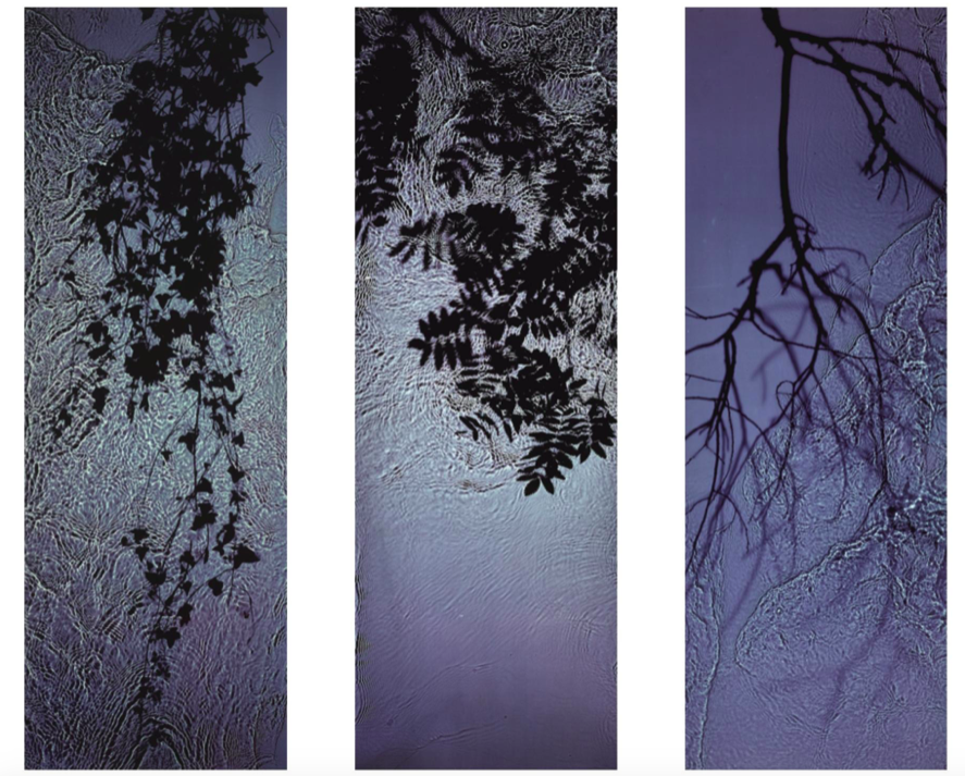
For this shoot I plan to experiment by creating images, like Anna Atkins, by using light sensitive paper and placing natural objects on top to create a print. I wanted to take inspiration from Anna Atkins as I think her images have a spiritual quality to them and I think by producing similar image, it will give my project a different type of photos, other than the landscape images, that will take my project further. I plan to see the outcomes of this experimentation and decide if i want to use them in my final outcome. If the outcomes aren’t as effective as I thought they would be, I plan to produce similar looking images from natural objects by editing, that have the same appearance of Anna Atkins images. I also think these images will reflect the work of Susan Derges as she also used light sensitive paper to create her images of the natural aspect water. I plan to take inspiration from both these photographer in my photoshoot.
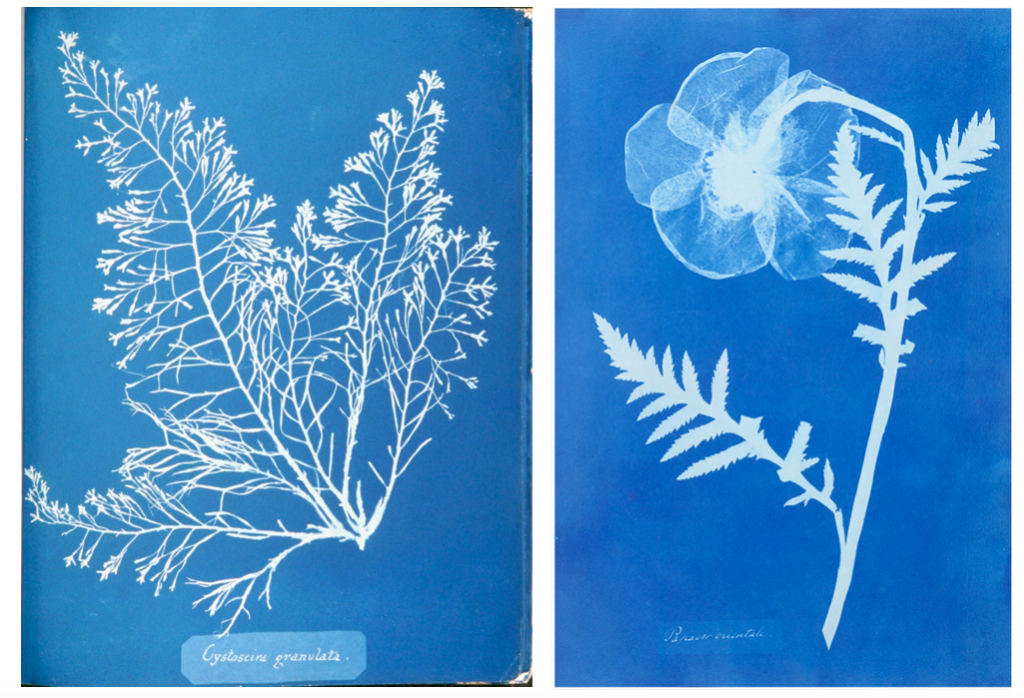
Anna Atkins
Susan Derges

Light Sensitive Paper Experimentation
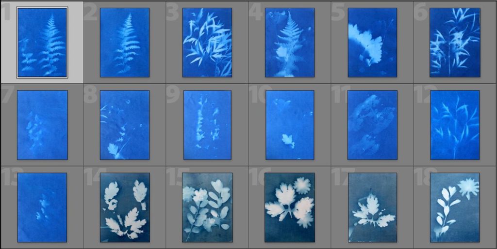
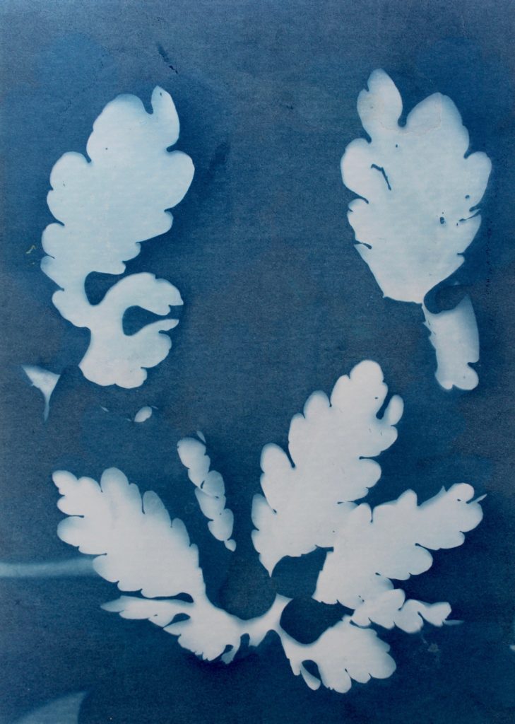
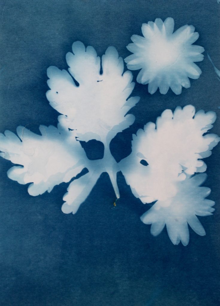
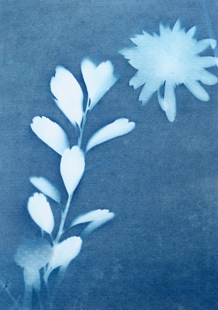
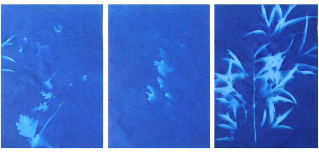
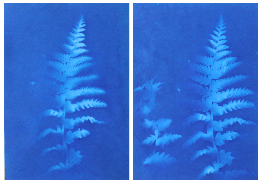
I think that these three photograms were the most effective in this shoot as they are the most clear and defined compared to others. I think this is specifically in the first image were I think that the shadows that were created by the plant on the paper were printed, making the outsides of objects on the paper darker, emphasising the brightness against the dark background. I like this as it makes the objects seem more 3D like they are coming out of the page. Other images in this shoot didn’t have this but were still effective. I also like how the specific rounded shapes of the leaves are precisely shown and noticeable against the blue background because i left it out in the sun for a long period so that the light sensitive paper had a long time to to change colour. I experimented in this shoot by leaving light sensitive paper out in the sun for different amounts of time and found that when I didn’t leave them for long, the outline of the object on the paper wasn’t as noticeable and as emphasised against the blue background. I think that both of these effects are successful as the blurred create a different look in comparison to the precise ones where I left them out in the sun for longer. I decided for some of the photograms, like the first one, to place multiple natural objects on the paper as I thought that this would create a more interesting composition when they printed. I also experimented with only one object and found that I preferred multiple.

In the second image the natural objects had moved because of the wind but because of this the plants have two different outlines, one being more faint than the other. I think that this was effective, not being as precise as the first one, as it adds different ranges of blue tones on the plants. It also creates a blurred effect making it look as though the plants are moving. I also like how in this photogram that some of the plants overlap each other, I did this to create a more interesting composition.
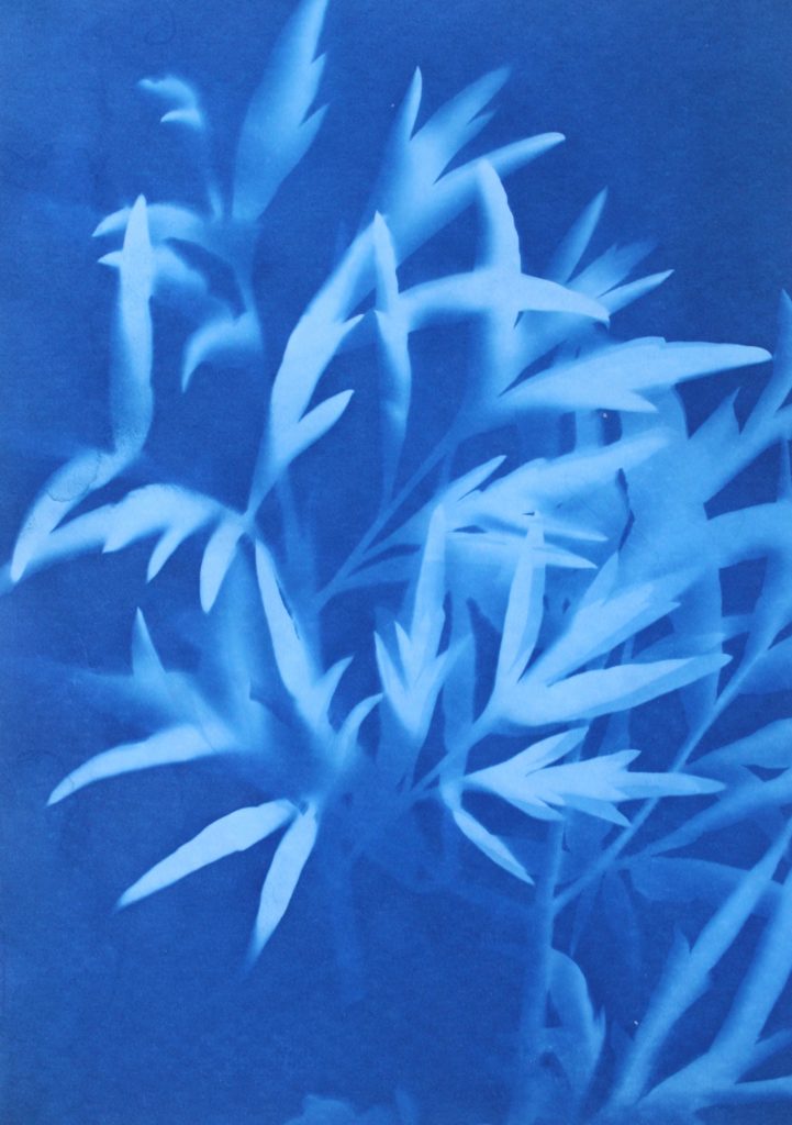
I also like this photograms as it has more shapes than any of the other ones because I used multiple of the same plant placed over each other, creating an interesting patterns against the blue background. By having the solid colours of the leaves more noticeable, it makes what the photogram is of more apparent. I like the smaller leaves that are coming from the stems as you can noticeably identify that they are leaves, linking to nature. The plants towards the top of the photograms are less clear than the ones in the middle, becoming more blurred as the edges. I think this is because the edges of the plant had started coming off the paper as it was left in the sun, but i think it’s effective as it focuses the audiences attention to the centre of the photogram. I think this is also emphasised by how it becomes darker towards the edges of the paper, highlighting the white colours in the middle. Another aspect I like is how the plant goes off the edges of the paper, as I think it contrasts nicely to the other photograms that are placed precisely in the middle or around each other. This is like Anna Atkins where she doesn’t let the plants she places on the light sensitive paper go over the edges. I thought that by doing this I would be creating my own interpretation of her work, but not directly copying the way she displays plants.
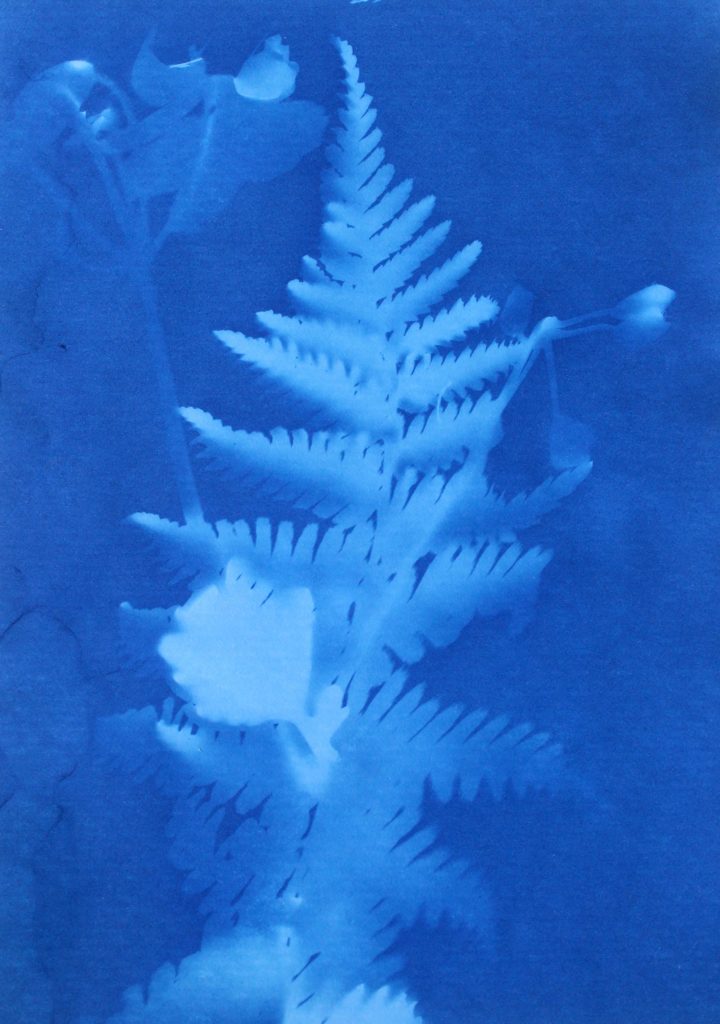
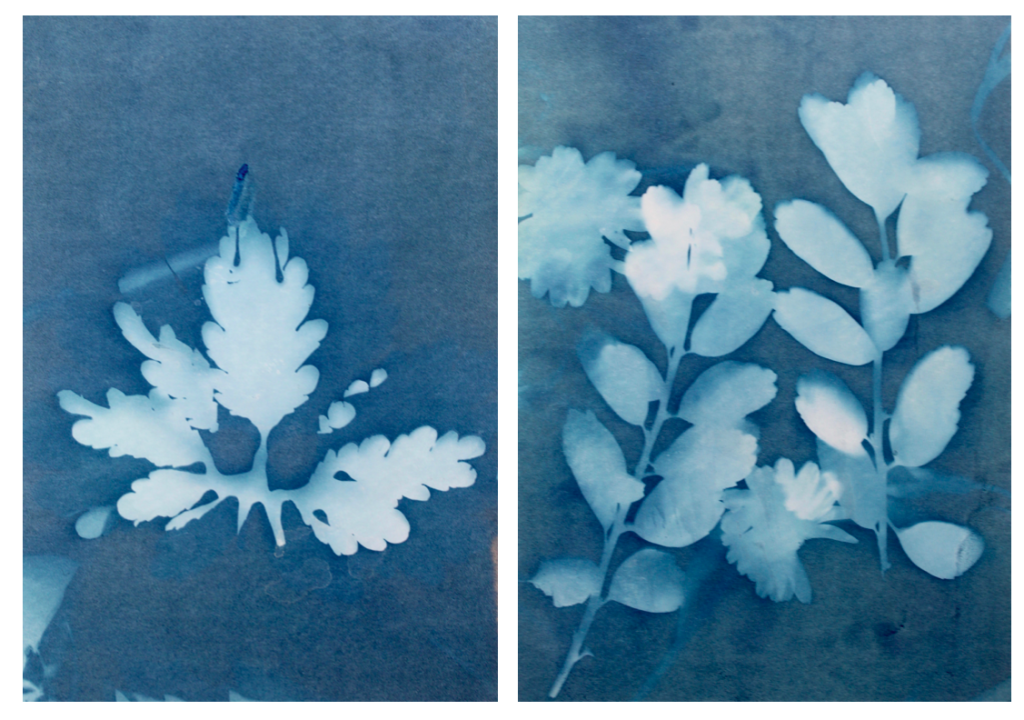
I tried to use a variety of different plants on the paper to create a range of different appearances and compositions. I tried to find plants that had interesting leaves and details so I could see the effect this created on the paper. I think this was effective as it means i could display all the photograms together and they will all be separate and contrast from one another. Also like in some photograms, like the first one displayed above, there are two plants on the paper, where one has printed clearly and the other hasn’t, creating a blurred effective in the background. I think this creates an interesting juxtaposition.

I also think that this experimentation looks at photograms in a different way to what people in the 1900s did where they were used in a scientific, analytical way. In my opinion those photograms in the 1900s still have a spiritual quality to them through the delicate lines and shapes. This is what I tried to interpret when creating my own by selecting plants with interesting shapes to highlight the intricate and delicate appearance even more.
Evaluation

Overall I think that I successfully interpreted the work of Anna Akins by experimenting with the same the technique to produce camera-less images that she did. I think that I will use some of these photograms as some of my final outcomes as I think they add another level to my work, contrasting to the landscape and close up images I have taken in nature with a camera. By including some of these in my final pints and photobook, I can emphasise nature with a different technique, still following the same theme as the other images. I will experiment by seeing how these photograms look alongside my camera images, and what they loo like separately to decide how I am going to display them.

Abstract Colour Shoot #2

For this shoot I wanted to create a response to the work of Engleston due to his focus around the idea of tone and colour within urban and natural environments. What I found most interesting within his photography was how in most of them there is an overall sense of a single colour such as yellow or red, this has inspired me to create work that relates through the use of incorporating an overlay which can be vaguely seen in each picture. As a result of this I hope to achieve a new style of photography where I can this underlying saturation to produce outcomes for the photos and possible photography book in the future. Using Eagleston as my main source of inspiration I have decided to have a look at some of his works which I found to be of particular interest:

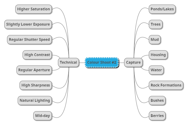
After I had looked over some of his more inspirational work I decided it was nearly time to go ahead with the shoot itself. Before doing this however I would need to create a mind-map, by doing this it would allow me to express my ideas and intentions of what I want to achieve in the shoot. Creating a mind-map not only would help direct my aims of the shoot but also reduce time wasted from deciding there and then what to do and take. Here are some of my ideas on what I want to produce during the shoot:

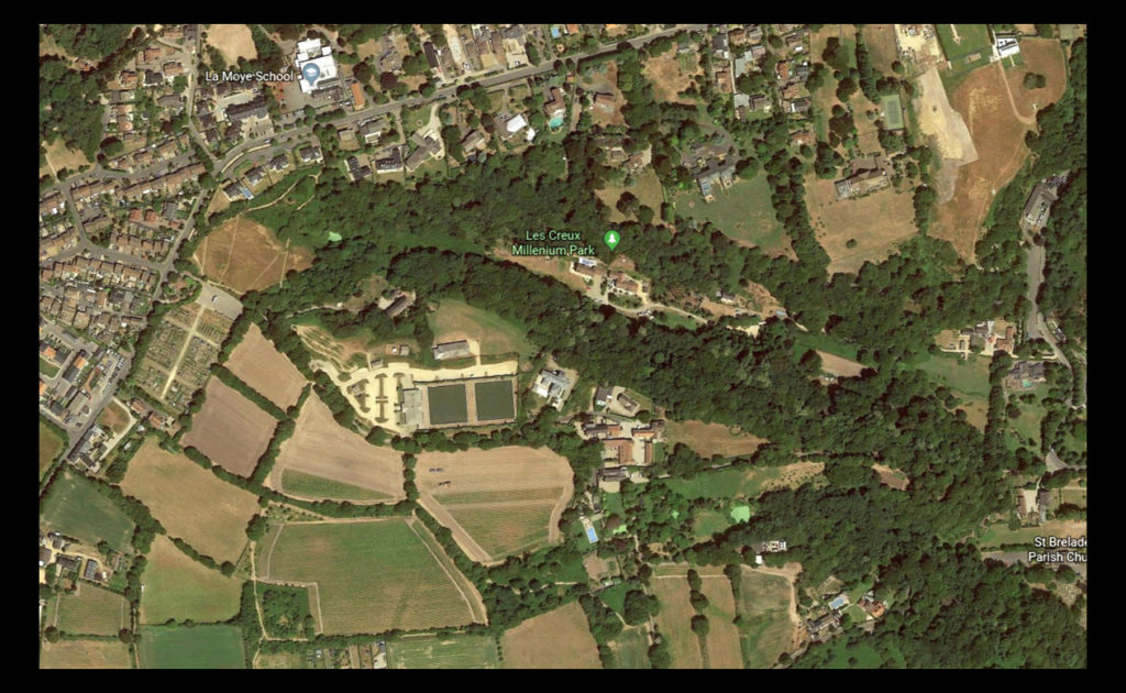
Once I had completed my mind-map I then decided that I would move onto the shoot itself. Using this my ideas noted above as the basis for my goals in the shoot I decided to photograph the area of Les Creux Millenium Park due to the huge range of landscape it possessed in the surrounding area, ranging from houses, fields and woods. A map of the area can be seen below:

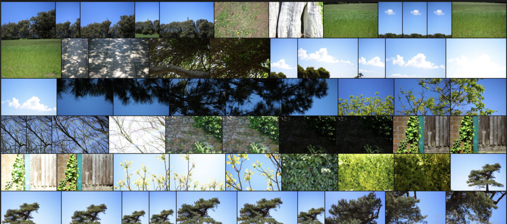
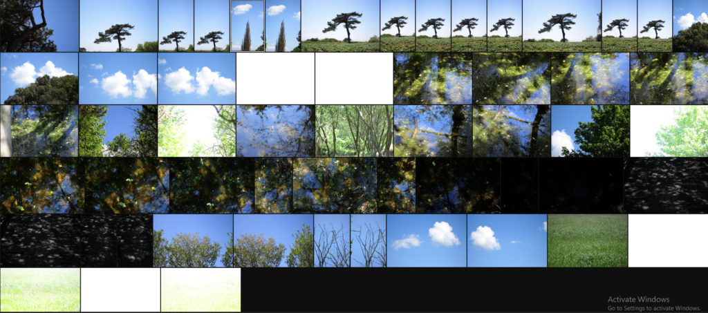
Here are the results of the shoot:

Once I had completed the shoot I then decided to go onto whittle the selection of images down to only ten. By doing this it would make it easier for me to identify which images reflected my intentions for the shoot the best and which ones had the best relevence for my topic. Here is my selection for the ten best images of the shoot:

After I had selected the ten best images I then decided that I would move onto choosing fives images that out of the ten reflected my intentions the most and had the best overall sense of aestheticism. To do this I would have to look at technicality, visual aspects and context. Here are my choices:

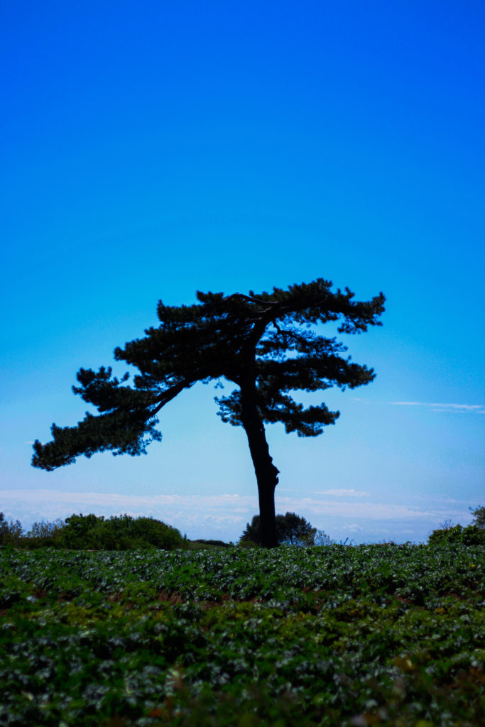
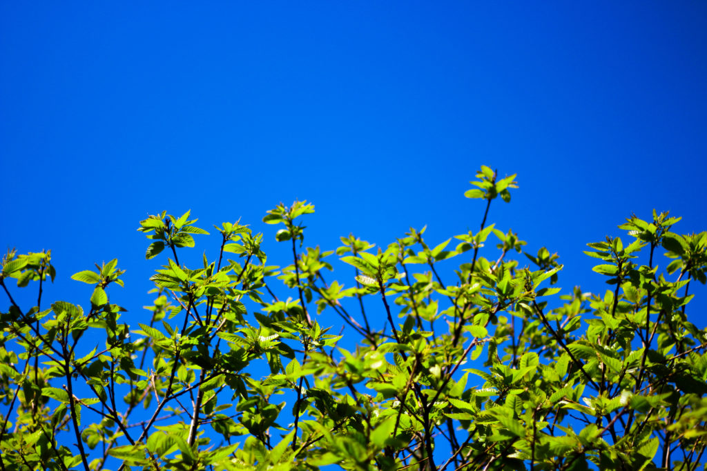
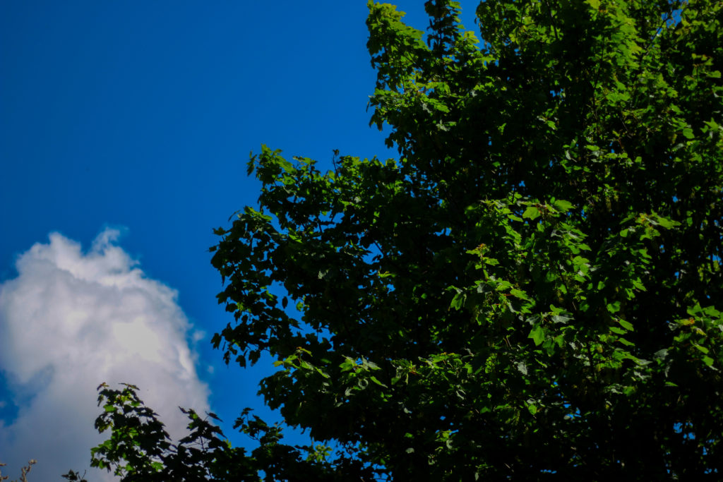
I selected this images because I really liked the defined contrast between the overly blue sky and the unusual shape of the tree. For me the green and dark browns contrasting the sky made the image the most effective due to how they are complimentary colours and so work well side by side producing an aesthetic reault. Composition wise I found that the tree being slightly on the left allowed for the end result to be more impacting because of the way it arches over the landscape filling more negative space in a more unusual way. In relation to the topic of variation of abstraction the image related well as I separated the tree from its surroundings allowed for a unique perspective to be viewed of it where it becomes isolated from its surrounding environment.

For this image the reason I selected it was because of how the blue sky and tree were complimented by the cloud which sort of transitions into the tree itself whilst merging into the blue around the corners. By the clouds taking over the negative space for me it allowed for a more effective use of the sky due to it otherwise being a bland and boring picture, however the inclusion of clouds prevents this and instead allows for an aesthetic result which could work well in a set of three. In relation to the topic the image goes well as it is evidently saturated too much which as a result produces a more abstract effect which in a way prevents viewers from seeing the tree as it once was, instead looking at it in a new light.

What I liked about this images was the contrasting overly saturated colours that overpower the image. For me this works really well as the image in a way is divided into two sections, one being the sky and the other nature, however I really liked the implementation of the cloud which breaks up the two dominant colour from becoming too overpowering and ruining the piece. As a result of this the cloud enhances the two colours creating an aesthetic result due to both the tree and the sky being in proportion to each others saturation. When looking at the image in regards to my topic of abstract variations I think that it goes well with the rest of the images taken due to how they all present a similar vision where there is a sense of overpowering colour which seem too surreal to be real.

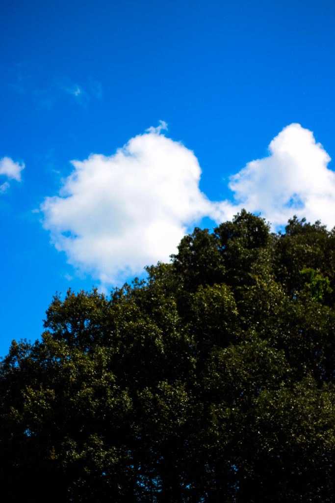
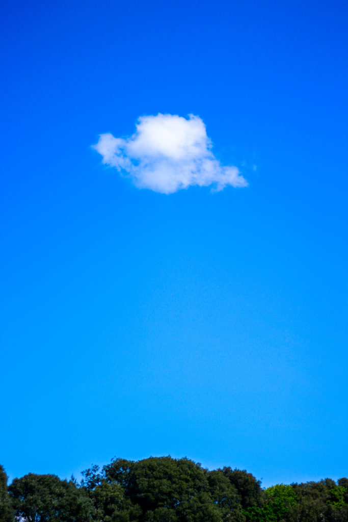
What I loved about this image was its overall simplicity. This is done through a very minimal way where there are only three small aspects to the piece being the cloud, trees and sky. For me they all compliment each other nicely due to how the green and blue contrast with the symmetry of the cloud being in the centre adding too effect from a sense of artificial aestheticism that is created. Overall once again symmetry is the key aspect to this photograph as the cloud be placed directly in the middle adds to effect as its almost as if it was placed there from its unusual position. For me this links greatly to the topic as the colours are so enhanced combined with the weird composition which as a result ends in a abstract portrait of the sky in a block minimalist way.

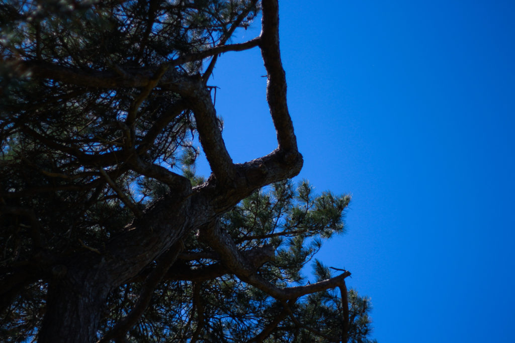
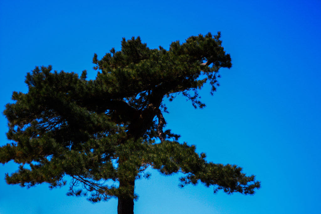
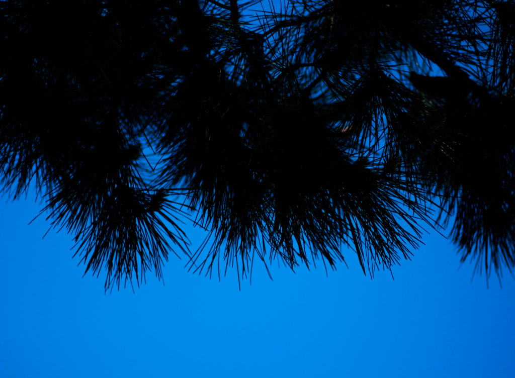
Finally I selected this image because of the huge contrast between the pines and sky which create a silhoutte of the leaves, isolated it from its environment and portraying them in a way that makes them seem as if they were something else. This contrast for me works well with an image in the previous colour shoot which I think when looking towards planning a photo-book would work well due to its similar qualities. As a result this image relates well to the topic but has been selected really in relevance to how it can be linked to the previous shoot in which silhouette of trees can be seen against a harsh blue backdrop.

After looking over all five images it allowed me to come to a conclusion to which images worked well in relation to the topic of abstract variations (this shoot being colour). By looking in depth at each image it allowed me to sum up its qualities as a reflection of my intentions not only to the shoot but the overall topic. This is my final choice for the image that best represents the entire shoot:

The reason I chose this image as the best reflection for the overall intentions of the shoot is because of how I loved the way the composition of the piece induced a sense of an artificial landscape in which it seems almost too surreal to be real. For me the vivid colour combined with the symmetrical composition of the tree really tie the photo together as each aspect of the piece compliment each other which preventing the others from overpowering and ruining the picture from becoming too eye-sore.

Artist Reference – Eggleston

Who is he?

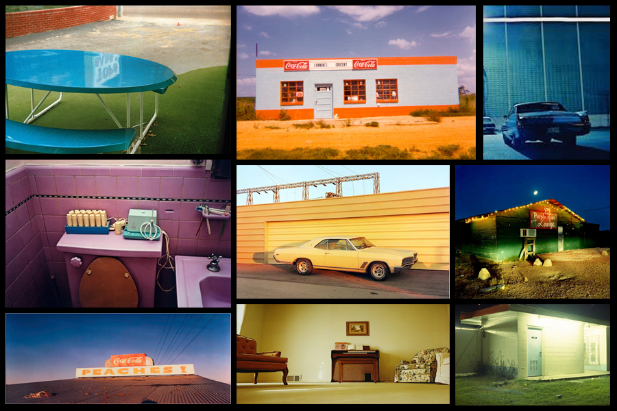
Since the early 1960s, William Eggleston used color photographs to describe the cultural transformations in Tennessee and the rural South. He registers these changes in scenes of everyday life, such as portraits of family and friends, as well as gasoline stations, cars, and shop interiors. Switching from black and white to color, his response to the vibrancy of postwar consumer culture and America’s bright promise of a better life paralleled Pop Art’s fascination with consumerism. Eggleston’s “snapshot aesthetic” speaks to new cultural phenomena as it relates to photography: from the Polaroid’s instantaneous images, the way things slip in and out of view in the camera lens, and our constantly shifting attention. Eggleston captures how ephemeral things represent human presence in the world, while playing with the idea of experience and memory and our perceptions of things to make them feel personal and intimate.

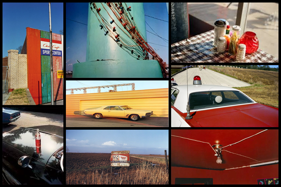
Color has a multivalent meaning for Eggleston: it expressed the new and the old, the banal and the extraordinary, the man-made and the natural. His non-conformist sensibilities left him open to explore the commercial printing process of dye transfer to see what it could contribute to picturing reality in color rather than the selling of lifestyles, concepts, and ideas. His brief encounter with Warhol exposed him to forms of popular photography and advertising, contributing to his experimental attitude toward the medium. Eggleston’s use of the anecdotal character of everyday life to describe a particular place and time by focusing either on a particular detail, such as an object, or facial expression, or by taking in a whole scene pushes the boundaries of the documentary style of photography associated with Robert Frank and Walker Evans’ photographs. His insider view allowed him to create a collective picture of life in the South, capturing how it transformed from a rural into a suburban society. Some examples of his work can be seen below:

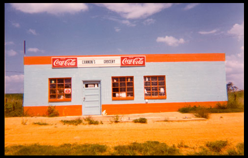
The snapshot aesthetic provided Eggleston with the appropriate format for creating anecdotal pictures about everyday life. Its association with family photographs, amateur photography, as well as Kodak’s Brownie camera (which was useable by everyone) lent his work the proper proportions and personal attitude toward the impersonal everyday. I wanted to make colour one of my main focuses when photographing the selected areas, here I found that looking and analyzing an image would prove to be most effective as it would allow an insight for me into the technical, visual and conceptual aspects of the photo that make it so aesthetic through over-saturation. The image I have chosen is called “Cannon’s Grocery, near Greensboro, Ala” and was taken 1972:

Visual: Visually the image is very aesthetic from the amount of warm colours that are present within it such as the oranges, yellows and blues. For me these colour provide us with a sense of uniqueness as all supposedly contrast each other, however instead it compliments with the colours of the building reflecting the surrounding environment like the desert and sky. Overall the piece only consists of about four to five different colours making it very simplistic regarding what can be seen, however a filter has been used to enhance the yellows and blue and create an almost artificial environment of something that may be seen on a movie set. What draws me in is how out of place the building seems as it vibrant colours are perhaps the opposite of what the desert could be seen as, giving the impression for viewers of something that could be seen for miles due to it being so out of place from its surrounding environmental landscape.

Technical: When looking over the photograph it is clear to say that a filter has been used to create an artificial feel to the overall piece due to certain colours like yellow being implicitly present through the image. A regular shutter speed and slightly lower higher exposure has been used to create a crisp and in focus shot being devoid of overpowering shadows or motion blur. The photographer has obviously made the building the focal point of the piece due to how it instantly draws the viewers attention due to its randomness regarding the surrounding environment with the yellow sand being used as a way to stop the building from dominating the composition and being too overpowering. Finally the colours have definitely been taken into consideration due to how each one contrasts another colour within the photo providing an obvious sense of old school aestheticism due to how they aren’t as crisp as they could be.

Conceptual: The image was taken at a time when the art world shunned colour photography. The solo show the Eggleston but on at the Museum of Modern Art in 1976 broke through this black and white barrier as it paved the way for wider acceptance of art and making it the preferred medium. The photograph itself represents the exciting time period in photograph when an image’s tone was more provocative than its subject.

Kodachrome and Autochrome

What is Kodachrome?

Kodachrome became the first colour film that made use of a subtractive colour method successfully mass-marketed. It was the successor of Autochrome and Dufaycolor which had been used for screenplating methods. Kodachrome has become the longest living brand of colour film due to its manifacture for 74 years in various formats to suit still and motion picture cameras including 8mm, super 8, 16mm. As a result of this Kodachrome can be appreciated due to its archival and professional market regarding dark-storage and longevity making its qualities desired by many professional photographers.

The brand name itself is for a non-substantive, color reversal film introduced by Eastman Kodak in 1935, becoming one of the first successful colour materials used for both cinematography and still photography. Over years Kodachrome was widely used for professional colour photography as the images produced were intended for publication in print media. However the film started to be sold process-paid in the US until 1954 due to legal ruling which prohibited this. Due to its growth and rising popularity of alternative photographic materials and complex processing requirments, widespread transition to digital photography resulting in Kodachrome to lose market share eventually leading to it becoming discontinued in 2009 with its processing ending in December 2010.

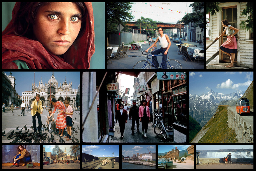
Some examples of Kodachrome and its photographic results can be seen below:

Over the years Kodachrome became a registered trademark of the Kodak company, with its method of colour transparency becoming more commonly known as a type of colour film the company started marketing in 1935. “Kodachrome” might sound familiar. Kodak eventually had at least three different processes that went by this new trademark, the first in 1914. In the early years of the twentieth century Eastman Kodak pursued the development of a simple color photography process that could be used by amateur photographers.

What is Autochrome?

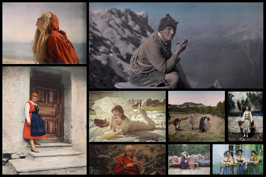
Autochrome, also known as Autochrome Lumiere was invented in France by the brothers Auguste and Louis Lumiere. Originally they presented their research into colour photography to the Academie des Sciences in 1904, with commercial manufacture of autochrome plates soon starting 1904. This led to the first autochrome process taking place on the 10th of June 1907 at the offices of the French newspaper L’Illustration. The process works by covering autochrome plates in microscopic red, green and blue coloured potato starch grains. When the photo is eventually taken the light passes through these colour filters to the photographic emulsion, with the plate becoming processed to produce a positive transparency. As a result this creates a full colour image of the original subject.

These processes were undertaken at the Limiere factory in Lyon, and included a complex process. Transparent grain was first passed through a series of sieves to isolate the grains between ten and fifteen microns in diameter. These grains are then separated into batches and dyed red, green and violet which are then once again mixed together over a glass plate coated in a sticky varnish. Charcoal powder is the spread over the plate to fill in any gaps between the grain and a roller is used to pressure the grain and flatten them out, and finally leaving the plate to be covered in a photographic emulsion.

Here are some examples of autochrome:

Overall the photos did not require much special apparatus as photographs could use their existing cameras, however they did have to remember to place their autochrome plate in the camera with the plain glass side nearest the lens so that light passed through the filter screen before reaching the sensitive emulsion. To view the image autochromes could simply be held up to the light, however for ease and comfort they were usually viewed using special stands called diascopes which incorporated mirrors. These gave the image a brighter result and allowed several people to look at the plate at the same time, they could also be presented using magic lanterns.

History Of Colour Photography

When photography was invented in 1839, it was a black-and-white medium, and it remained that way for almost one hundred years. Photography then was a fragile, cumbersome, and expensive process. In order to practice, photographers needed a lot of extra money and time, or a sponsor. In that early period, the people advancing photographic technology tended to focus not on achieving color photographs but on making improvements in the optical, chemical, and practical aspects of photography. For many, the goal was to make photography more suitable for portraiture—its most desired application. For that, photographic technology needed to be more stable, portable, and affordable, not more colorful. But people wanted color photos. (Portraits before photography were paintings—in full, glorious color.) By 1880, once the early technical hurdles had been overcome, portrait photographers began experimenting with color. They employed artists to tint photographers’ daguerreotypes and calotypes by hand.

British photographers introduced hand coloring photographs to Japan, where the practice became widespread and Japanese artists further perfected the technique. The refined, delicate hand coloring became a defining characteristic of Japanese tourist photography, the results of which were carried back to the West, influencing the art of hand coloring there. This wildly popular technique persisted in Europe and the Americas until twenty years later when Autochrome plates arrived. In Japan, hand coloring lasted yet another twenty years beyond.

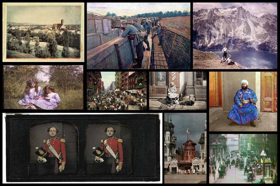
When first attempted in early 1840s people were trying to find a sort of chameleon substance which would be be able to assume the colour of any light falling upon it. The first results were typically obtained from projecting a solar spectrum directly onto the sensitive surface promising an eventual success, however a comparatively dull image would form in the camera required exposures lasting for hours or even days. The quality and range of the image colour were sometimes severely limited mainly due to primary colours, such as the chemically made ‘Hillotype’ process invented by America Levi Hill in 1850. Many others tried to experiment with other methods that prevented colours from fading over time such as Edmond Becquerel who achieved better results to some extent. Over about seven decades there was continuous experiments along these lines which would occasionally raise hopes but having no value at practical level. Here are some examples of early coloured photography:

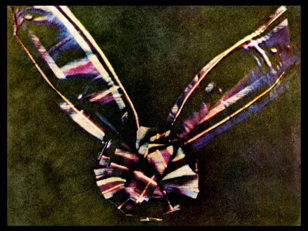
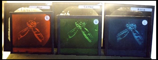
Regarding the first ever colour photograph it was taken as early as 1826 by Nicephore Niepce, however it took until 1861 to be developed by technology which could incorporate very basic colour. Overall though it was the Scottish Physicist and poet James Clerk Maxwell who produced the first true colour photograph that didn’t fade immediately or need colour adding afterwards by hand. The image can be interpreted as sinister and mysterious, this is because the colours red, green and blue have been used to take a still image of some tartan ribbon which had to be taken three times using different coloured filters each time. The technique itself was developed because of the theories about how the eye can process colour. This is the first non-fading coloured image:

The three-colour method, which is the foundation of virtually all practical color processes whether chemical or electronic, was first suggested in an 1855 paper on colour vision by Maxwell. It is based on the Young-Helmholtz theory that the normal human eye perceives colour because the retina is covered with millions of intermingled cone cells of three different types: In theory, one type is most sensitive to the end of the spectrum we call “red”, another is more sensitive to the middle or “green” region, and a third which is most strongly stimulated by “blue”. The named colours are somewhat arbitrary divisions imposed on the continuous spectrum of visible light, and the theory is not an entirely accurate description of cone sensitivity. Nevertheless, it coincides enough with the sensations experienced by the eye that when these three colors are used the three cones types are adequately and unequally stimulated.

In his studies of color vision, Maxwell showed, by using a rotating disk with which he could alter the proportions, that any visible hue or gray tone could be created by mixing only three pure colours of light red, green and blue in proportions that would stimulate the three types of cells to the same degrees under particular lighting conditions. To emphasize that each type of cell by itself did not actually see colour but was simply more or less stimulated, he drew an analogy to black-and-white photography: if three colorless photographs of the same scene were taken through red, green and blue filters, and transparencies made from them were projected through the same filters and superimposed on a screen, the result would be an image reproducing not only red, green and blue, but all of the colors in the original scene. Because Sutton’s photographic plates were in fact insensitive to red and barely sensitive to green, the results of this pioneering experiment were far from perfect.

Style EXPERIMENTATION – Long Exposures

What is a long exposure?

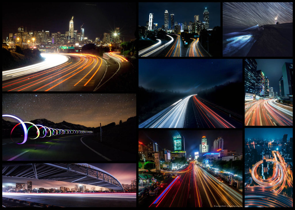
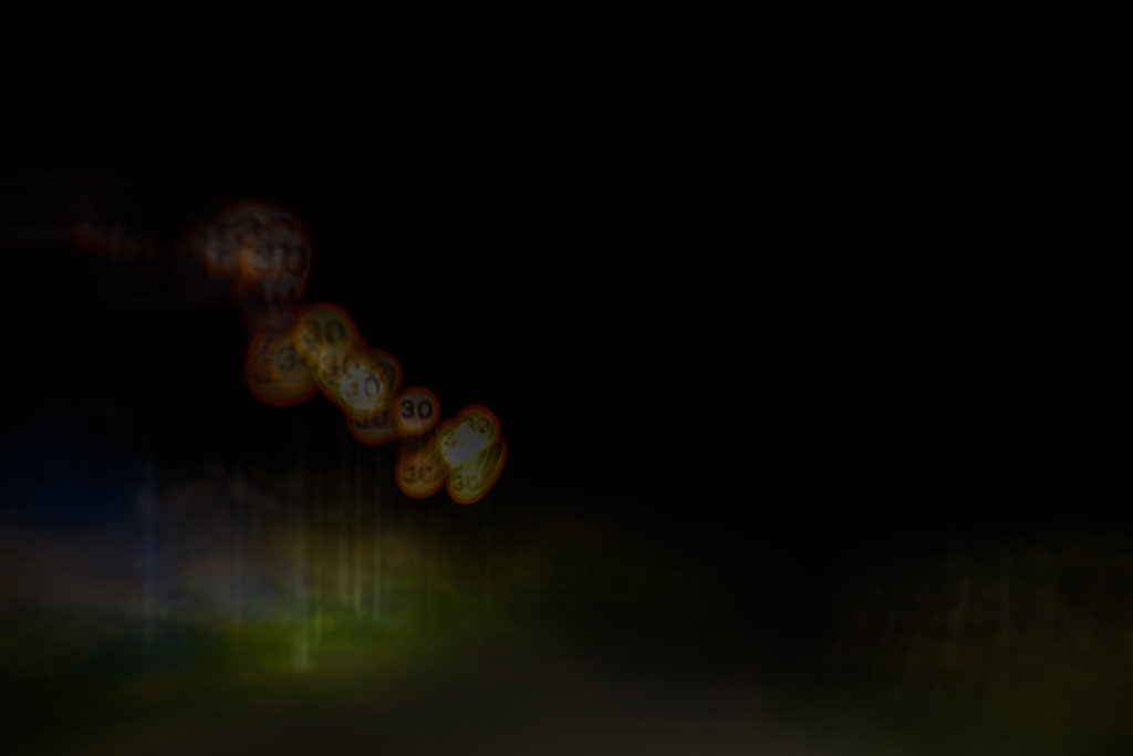
Long exposure photography is when we are using a much longer shutter speed, and it’s usually used as a specific technique to achieve a certain effect.  There’s no defined transition point at which a shutter speed becomes slow enough to define your shooting as ‘long exposure photography’.  Generally speaking, I tend to think of it as when we are talking about our exposure times in terms of seconds, rather than fractions of a second.  These kind of long exposure times (shutter speed is the same as exposure time), are often used to blur something in a photo, for example running water in stream, or the movement of stars across the night sky.  A long exposure helps us to trace the pattern of time and render things in a different way to how we are used to seeing them.  When we see things differently, it naturally fascinates us and that’s a significant factor in creating a compelling image.
In order to achieve long exposures during the daytime, it’s often necessary to use neutral density filters on a lens, which cuts down the light entering the lens.  With less light entering the lens, the shutter speed needs to be much longer to achieve the same exposure.  Neutral density filters can allow you to shoot exposures of several minutes long, even in bright daytime situations. Here are some examples:

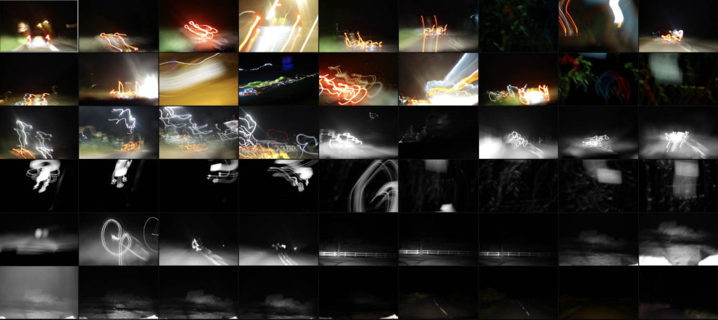
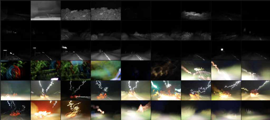
For this mini shoot I wanted to explore how the twisting roads of Jersey would create long exposure by focusing on cars and the variety of coloured lights that are created from them. I want to particularly look at the different textures and patterns I could make out of moving the camera whilst keeping the camera still. However when taking some of the photos I may try at experimenting with a monochrome filter to see if it would effect the outcome of the light trails looking at whether or not they blend the colours together. Here are some of the results from the shoot overall:
Once I had finished the shoot I decided to select ten images that I thought represented the shoot best whilst also reflecting my overall intentions behind what I wanted to achieve and have the outcome of photos look like. When doing the shoto I made sure to try a variety of things such as using a monochrome filter to produce some of the pictures, my aim behind this was to experiment and see whether by devoiding the image of colour if it would provide a smoother transition between shades. Here is my selection of my ten favourite images:

From here I wanted to then go onto whittle the selection down to only three images out of the mini shoot, by doing so it would allow me to analyse each of the image to more detail and understand the visual, technical and coceptual aspects behind the photos and my thought process behind selecting it. Here are my favourite three images:

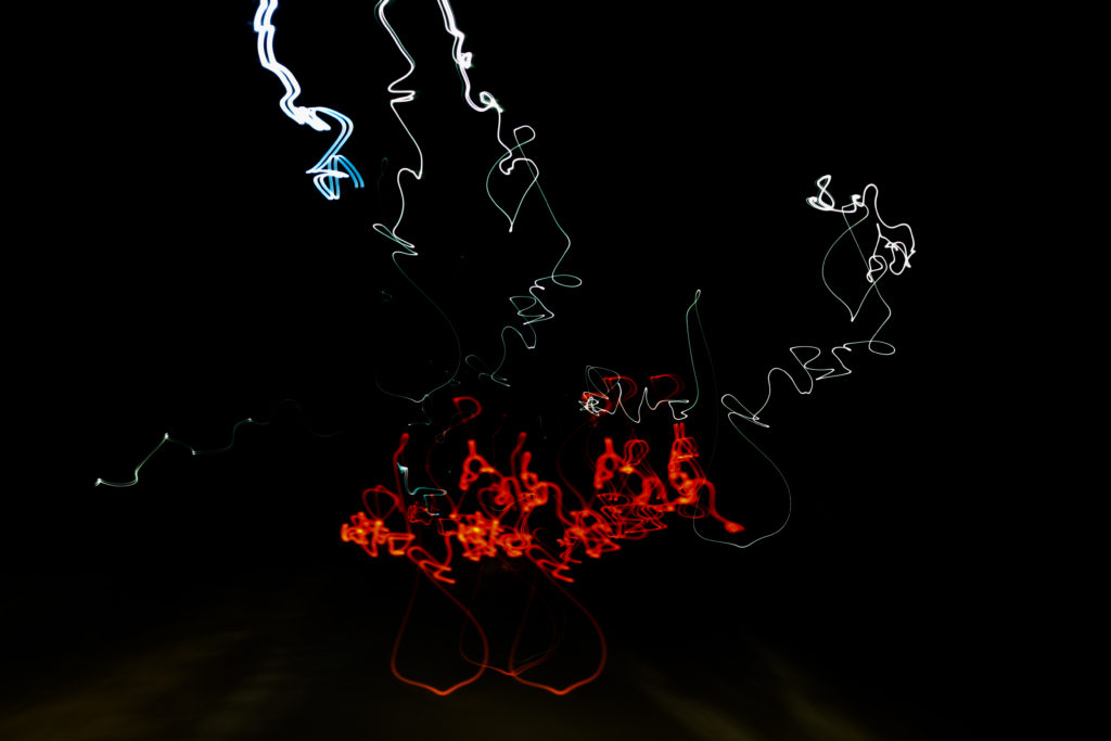
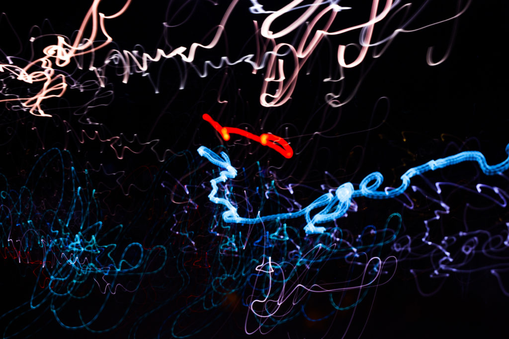
I selected this image because of how I really love the contrasting colours of red and white which also complimented each other against the emerging floor underneath. The image itself is of a moving car taken going over a speed bump during a long exposure, I really liked how its movement of bumping was captured through the pattern created with no actual goal of where its going. Overall I liked how the image relates well to long exposure as it creates an abstract pattern of the lighting, removing the car completely and leaving me with a series of lights with no coordination.

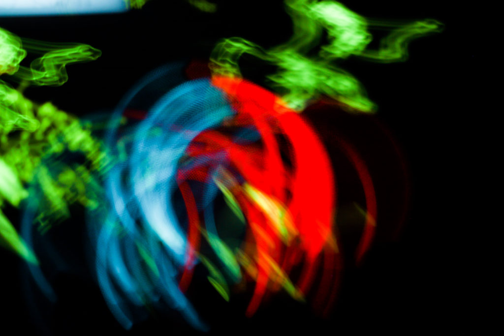
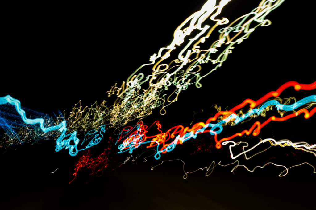
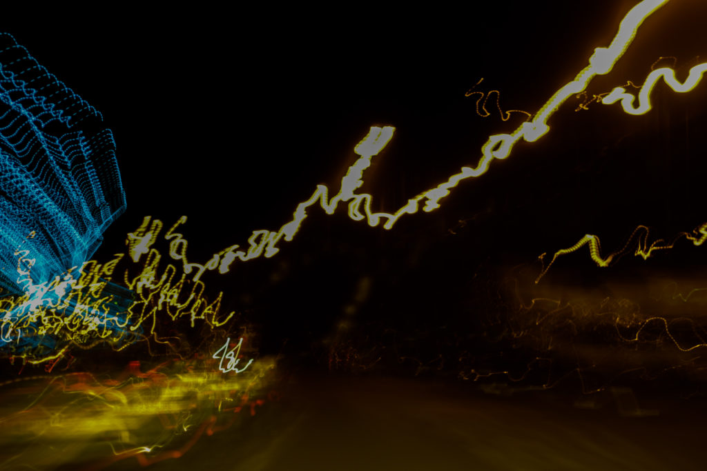
The reason I chose this image was because of the coordinated composition of the colours against the black backdrop. Personally for me I found that the lightings approach from the bottom left to top right of the photo created a great sense of aestheticism due to how the black space left behind in certain areas leaves enought room so that neither the lights or the darkness becomes too overpowering for the viewer. By mixing together a variety of different colours into the light sequence I found that it really stopped the lighting from becoming repetative and boring, as a result for me the added blues and reds emphasise the movement in the image.

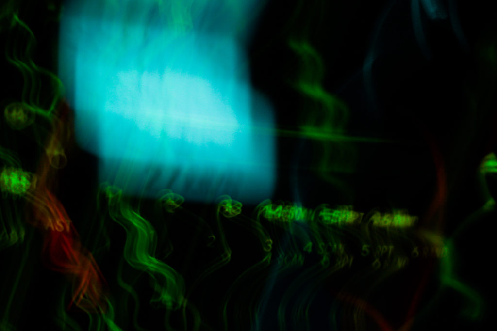
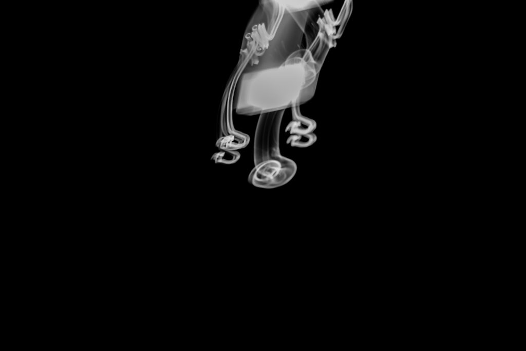
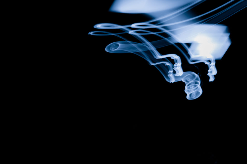
Finally I selected this image because of its simplicity, here I loved how the use of black negative space to highlight a smoke like effect created from a swaying lamp on a boat. What drew me to the image was the symmetry created from the light and how by using a monochrome filter on the image it puts arcoss the impression of smoke filtering down the screen. For what the image lacked I found it made up for it in contrast against the black backdrop with the ghost like lines presenting the viewer with a great sense of aetheticism.

Overall I found the shoot to go quite well as it highlighted the movement in our everyday lives but instead by removing the subjects and leaving on the light sources they have left behind. As a result of this all textures lights and landscapes are a direct reflection of our everyday transport to and from work or school.

Anna Atkins

Anna Atkins was an English photographer and botanist noted for her early use of photography for scientific purposes. Some sources claim that she was the first woman to create a photograph. She created the first book to contain photographs, and she paved the way for photography’s power to connect people. In particular, she was interested in the cyanotype process devised by Herschel in 1842, which can produce an image by what is commonly called sun-printing.

The substance to be recorded is laid on paper impregnated with ferric ammonium citrate and potassium ferricyanide. When exposed to sunlight and then washed in plain water the uncovered areas of the paper turn a rich deep blue. Eventually this process, known as blueprinting, was used mainly to reproduce architectural and engineering drawings.

Atkins learned directly about the invention of photography through her correspondence with its inventor, William Henry Fox Talbot. Although she owned a camera, she used only the cameraless photogenic drawing technique to produce all of her botanical images. With the assistance of Anne Dixon, Atkins created albums of cyanotype photogenic drawings of her botanical specimens. She learned the cyanotype printing method through its inventor, the astronomer and scientist Sir John Herschel. He had been experimenting with sun prints (or “photograms”) ie. cameraless and lenseless photographs.

She was so disappointed by the lack of illustrations of algae in a guide to British algae published in 1841 that she decided to do something about it. In the autumn of 1843 she began work on creating images of hundreds of different types. “Looking at Atkins’s book today, what is most striking is not the outlines of the algae, however beautifully and delicately they crawl across the pages; it is the glorious depth of the Prussian blue backdrop to the images. The Herschel method dyed the paper, resulting in every page of the book being a deep blue with the algae outlines in cream. (A byproduct of the process was the addition of the word “blueprint” to the English language.)”- The Guardian

‘Before Atkins’s book on British algae and the photographic process, botanical images would have been restricted to the traditional printing processes of engraving or woodcuts, although the art of nature printing was also in its early stages around Atkins’s time’ 

Before the invention of photography, scientists relied on detailed descriptions and artistic illustrations or engravings to record the form and colour of botanical specimens. Anna’s self-published her detailed and meticulous botanical images using the cyanotype photographic process in her 1843 book, Photographs of British Algae: Cyanotype Impressions. With a limited number of copies, it was the first book ever to be printed and illustrated by photography. The text pages and captions were photographic facsimiles of Anna’s handwriting. In some cases, lettering appears to be formed by delicate strands of seaweed. After her book on algae, she collaborated with Anne Dixon on at least two more botanical books, Cyanotypes of British and Foreign Ferns and Cyanotypes of British and Foreign Flowering Plants and Ferns.

“The difficulty of making accurate drawings of objects so minute as many of the Algae and Confervae has induced me to avail myself of Sir John Herschel’s beautiful process of Cyanotype, to obtain impressions of the plants themselves, which I have much pleasure in offering to my botanical friends.” Anna Atkins (1843, text accompanying the first photographically illustrated book)

Collection of her work:https://digitalcollections.nypl.org/collections/photographs-of-british-algae-cyanotype-impressions#/?tab=navigation

I want to take inspiration from Anna Atkins as I think that her images have a spiritual quality to them as they emphasises the delicate lines and shapes of the nature. To interpret her work I play to make my own cyanotypes by using light sensitive paper for experimentation. If this process does not turn out well I will produce images that interpret the appearance of her work through post editing. I also like the prussian blue colour that all of the cyanotypes have which I think fit well into my project where I have explored cool and warm colours. If my interpretation of her work was successful and I wanted to include the images in my final outcomes, I could contrasts the cool blue tones with the warm tones of other images from my project. I also think that i could use the physical photograms I make in my photobook, rather than just a picture of them, as it would allow the readers to physically hold them and would mean that those images would’ve truly been created without a camera. I also think the fact that the images are created without the use of camera links to my project as it just using nature to create and process i.e sunlight and plants.

Abstract Pattern Shoot #2

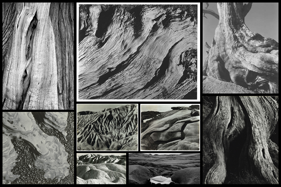
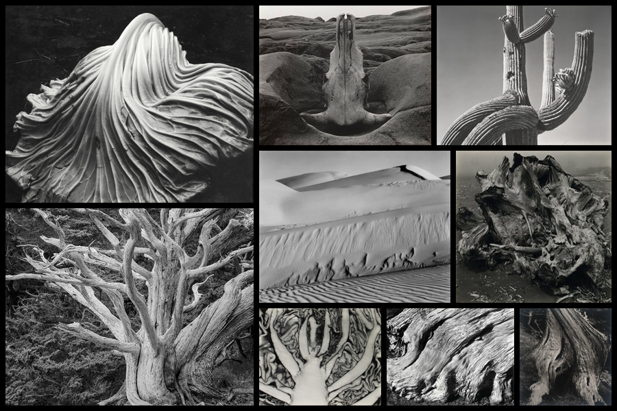
Regarding this shoot I wanted to respond to the works of Edward Weston due to his focus being mainly around the idea of capturing texture and pattern present within natural forms of the landscape. Overall what I found to be particularly interesting was his photographs surrounding trees and rock formations which use high aestheticism as the main form of attraction and the intricate beauty each resembles. This as a result has inspired me to go onto produce a shoot looking at the natural formations regarding textures of the landscape in the North of Jersey. From this I hope to achieve a new style of photography I can later go onto use to portray the environment in a new way and possibly go onto include them in my final prints and photo-book. Using Weston as my main source of inspiration I decided to have a look at some of his particular works that I thought reflected my mind-set of the shoot the most:

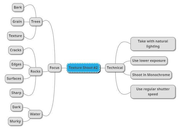
After I had looked over some of his works that inspired me the most I then decided to move onto creating a mind-map for my shoot. By doing this it would allow me to jot my ideas down for future reference whilst reducing the time wasted on the shoot. Not only would creating a mind-map prevent me from wasting time but it would also allow me to direct my intentions immediately during the shoot, instantly understanding what it was that I intended to achieve by the end of it and what I could focus on to get the results I wanted. Here are some of my ideas:

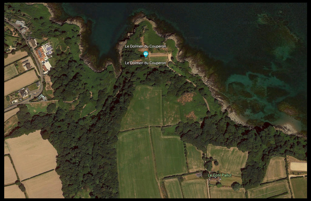
After looking at my initial ideas I decided upon going to the area of Le Dolmen du Couperon . I chose this location because of its wider range of different areas such as woodland and beaches, allowing for the perfect area to photograph my intended areas of focus. What drew my initial interest was how some of the woodland had been cut down and would have left behind stumps and ruined trees which would be great to photograph regarding the idea of bark and grain texture. Here is a map of the intended area to photograph:

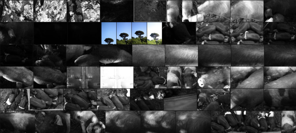
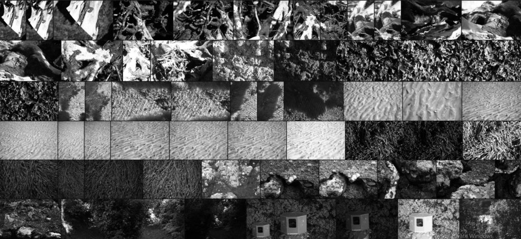
Here are the results of my shoot:

Once I had finished the shoot I then went on to whittling the selection down to only ten images, by doing so this would allow me to decide and make easier which image best reflected my overall intentions and goal of the shoot. Here are my ten best images:

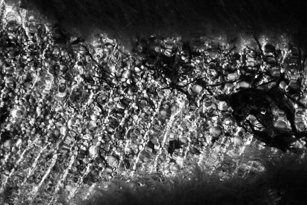
After I had done this I then decided to go onto further and whittle the selection down to only five images this time. By doing this it would allow me to analyze the images in more depth looking at the visual, technical and conceptual aspects of each. These are my choices for the five best images:

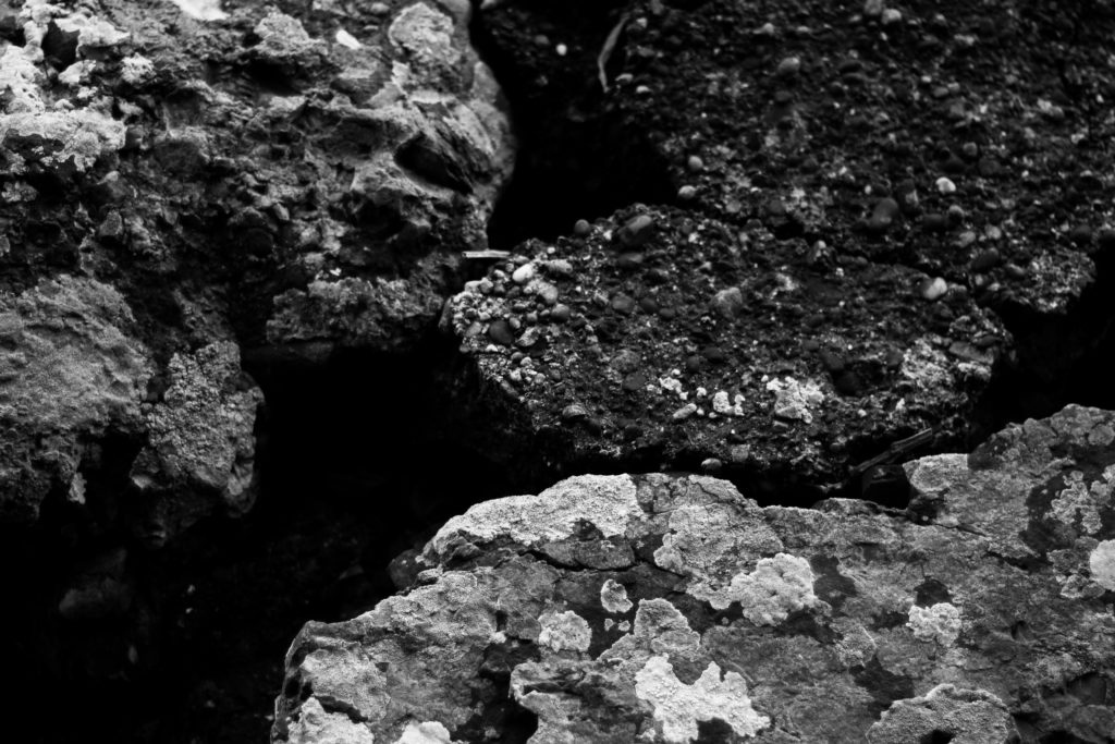
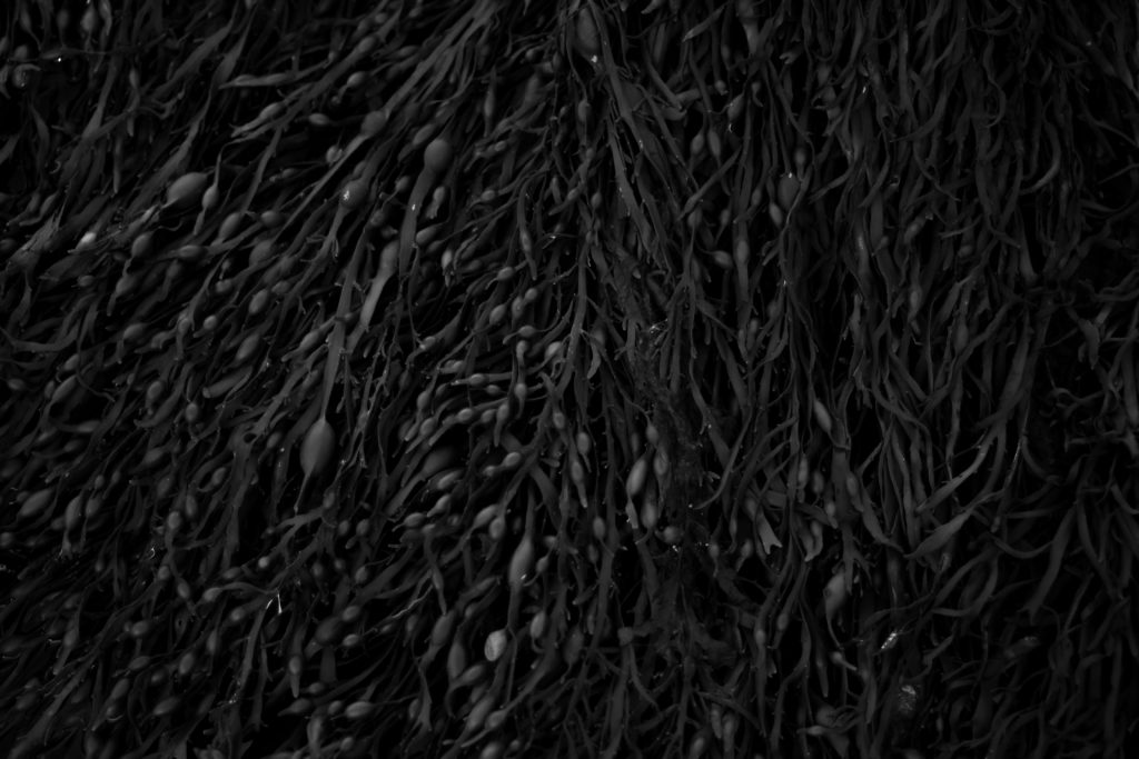
What I loved about this image was how the low exposure allowed for the over emphasis of the contrast between each piece of seaweed. For me the inclusion of highlights inbetween the pattern allowed for greater emphasis of the overdefined overlapping pieces as the monochrome filter perfectly captures this. Personally I found that the darker border around the pieces added to the overall affect, this is because of how it boxes the seaweed in and creates a great contrast which increases the aestheticism of the photo. Overall I thought the outcome was very effective as it captured exactly the subject as I wanted whilst providing the viewer with one of natures patterns.

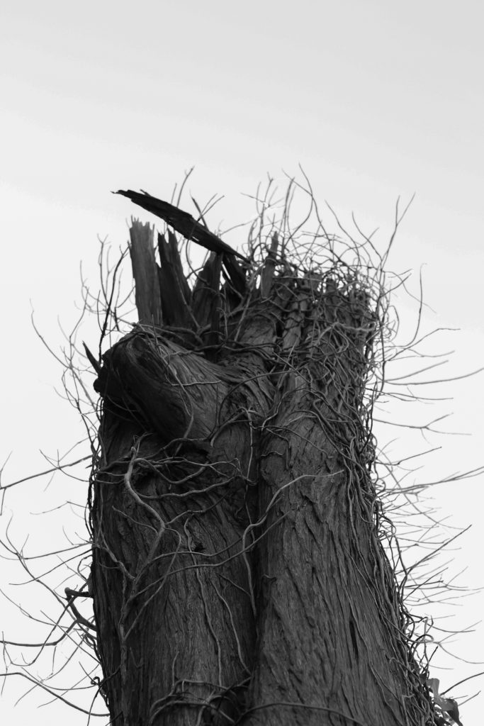
I selected this image because I loves how the dead tree branches out from the bottom of the composition with varying dead ivy producing from its side which provides a stark contrast to the overcast backdrop. By taking the image against a overcast backdrop for me it added extra definition to the subject as it over exaggerates the features whilst isolating the subject from its surrounding environment and limiting the viewers perspective of what it is. Personally I found this this piece came out really well as it provided me with the patterns desired from the outreaching ivy whilst also being close to my goal within my pattern mind-map stated above.

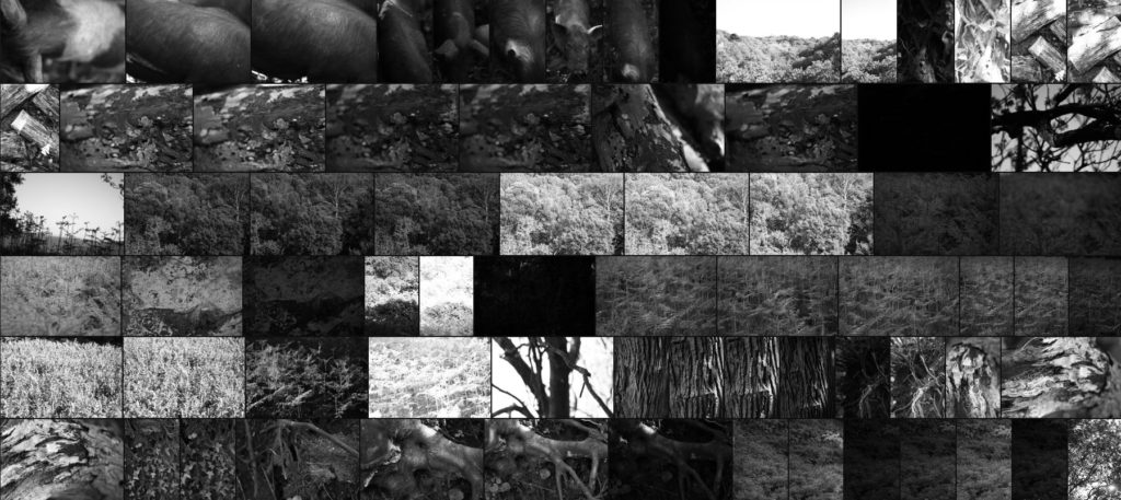
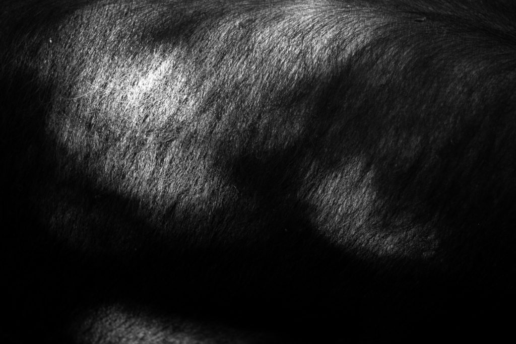
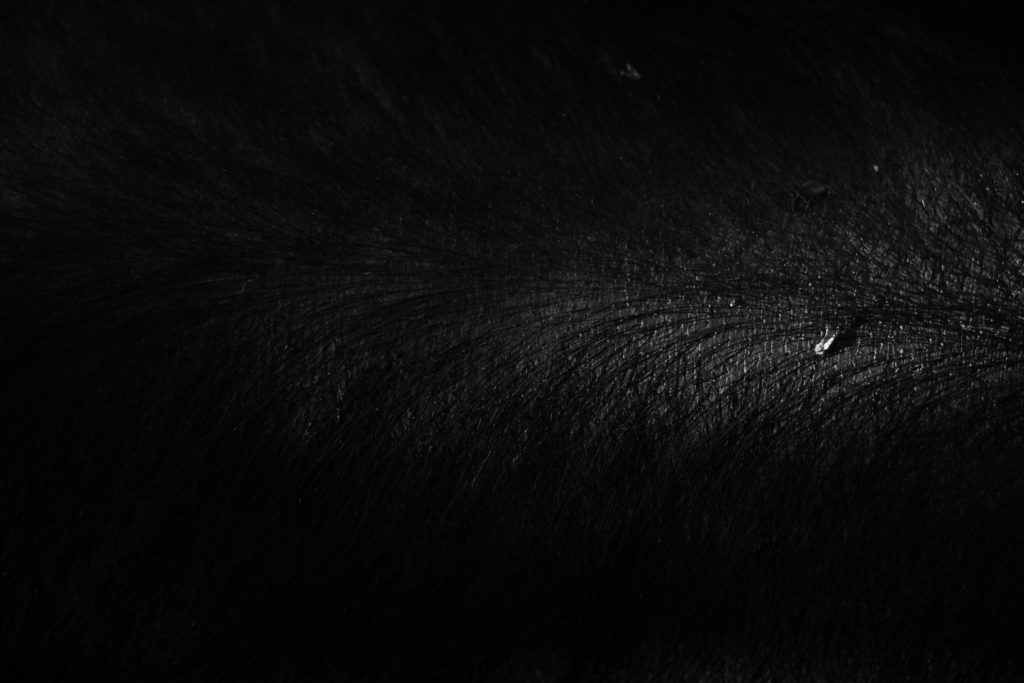
The reason I chose this was mainly due to its link to the previous pattern shoot which highlighted the mane of a horse instead. I selected this because I loves the huge contrast within the photo with the individual hair of the pig being highlighted by the limited amount of natural lighting from the sun. For me this adds a huge amount of character to the image as by limiting and abstracting the rest of the pig from view it makes you really look into the piece to further explore what could be hidden in the darkness. As a result of this I found this piece worked well and would be well suited to work with the other picture in the previous shoot which could be further used in a composition.

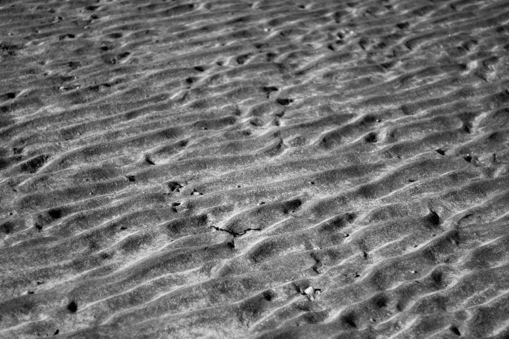
What made me choose this image was the pattern created from the sea going out and leaving behind the bumpy pattern that leads outwards for miles. By using a higher exposure I found that I was able to highlight certaom parts of the bumps leaving the rest of it in an exaggerated shadow which as a result creates the impression of a sort of sandy sea with various bumps overlapping or breaking up others. For me I really liked the result as it carries a sort of natural aestheticism where it makes the bumps seems too artificial to be true, therefore creating an almost surreal landscape as if from a birds eye perspective.

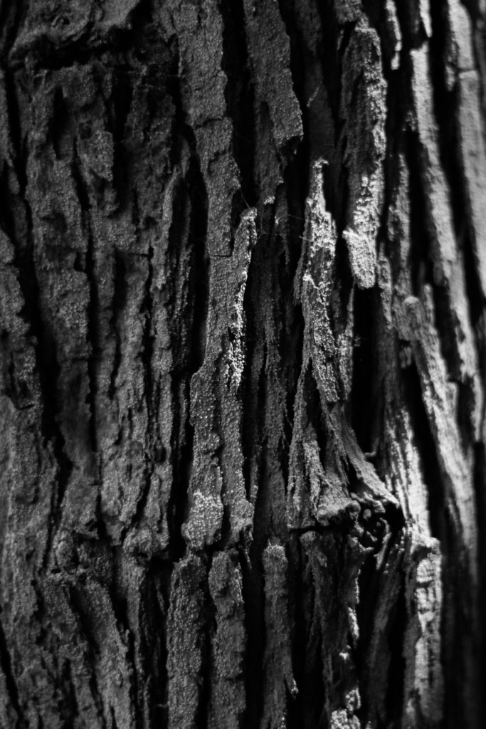
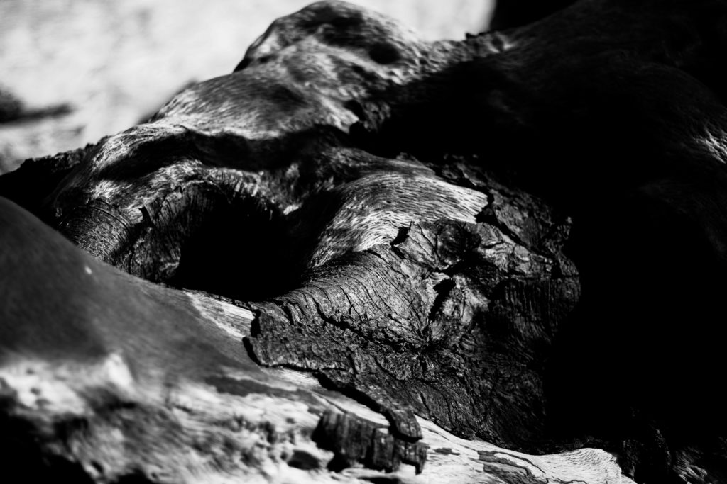
Finally I chose this image because I really liked the contrast between the dark and lighter aspects of the woods surface. When looking over the image I found that the clear contrast between the darker right side of the wood and the lighter left side added a much needed definition through how it induces a sense of mystery by removing most of what would be seen of the log. I also liked how the hole in the log adds a sense of depth through it removing the continuous grain present on the surface of the wood, instead breaking it up and becoming the main focal point of the image. As a result of this I was really pleased with this outcome as it reflected my intentions for the shoot whilst linking itself back to the topic of abstract patterns.

Once I had analysed each image I then decided it was time to move onto selected the best image that represented my overall aims and intentions of the shoot. This was my choice:

For me the image of the overly contrasted seaweed represented my aims for the shoot the most, this was because of how the overlapping pattern created when the tide goes out became really aesthetically pleasing for me due to the gaps of darkness inbetween highlighting the various shapes of the seaweed as it progressed along the composition of the photograph. Looking over the image for me it is clear that the small air sacks of seaweed add a very much needed aspect to the entire photograph, this is mainly due to how they tend to be a lighter shade from that particular area inflating and stretching the surface area as a result, whilst presenting them as more light and eye-catching to the rest of the piled seaweed.

Artist Reference – Edward Weston

Who is he?

Edward Henry Weston was born March 24th, 1886, dying January 1st 1958. Weston grew up in Chicago and moved to California when he was 21, from a young age he knew he wanted to be a photographer and initially his work became viewed as a typically soft focus on pictorialism which was a popular theme at the time. Within a few years of photography he abandoned his original style and went on to use one of the now regarded as most highly detailed photographic images. However in 1947 he was diagnosed with Parkinson’s disease and he stopped photographing soon after which led to his remaining ten years of his life overseeing the printing of more than 1,000 of his most famous images.

Currently Weston is known as one of the most innovative and influential American photographers, being regarded as a master photographer of the 20th century. Over his career he range of subjects to photograph had widened, photographing things like landscapes, nudes, still life, portraits and genre scene even including parodies. Weston today can be seen as creating what is quintessentially seen as American, especially Californian approach to photography, this is due to his focus on the people and places of the American West where in 1937 Weston became the first photographer to receive a Guggenheim Fellowship. Because of this he went on to produce up to 1,400 negatives using an 8 x 10 view camera which many of his famous photographs being taken of trees and rocks around the area of Point Lobos, California where he lived for many years. Some examples of his photograph can be seen below:

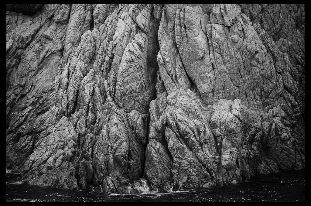
After looking over some of his images I decided to analyse one of them that I thought related best to my overall topic of variation regarding abstraction through different presentations. The image is called Point Lobos named after where it was taken where he photographed different rock formations using different compositions each time. By analyzing the image I can look into three sections, technical, visual and contextual, these will give me a greater understanding of how the image is taken and the underlying thought process beneath it.

Visual:

Visually the piece is extremely aesthetic due to its symmetry and use of different tones. What drew me to it originally was how the rocks mostly grey surface was complimented by the boarder of black waters and edges, for me this brought the photo together as it boxed in what Weston wanted to focus on, the texture of the surface. By using the divide between the two sides of the rock and composing it in the center of the image I found that it stopped the formation from becoming too overpowering and prevented it from becoming too bland and generic. For me this area of rock is effective because of how the darkened cracks all face the same direction whilst using the dark water as a gradient to eventually fade in and create an eerie result.

Technical:

When looking at the image its fair to say that a relatively lower exposure was used to create the darkened effect of the water and corners of the piece, allowing as a results for the areas where the sun hits to pop out against the rest of the composition. A regular shutter speed has been used as when looking at the water there is some slight movement blur which indicates that the photo was taken intentionally to capture its crashing against the rocks surface and as a result produce a greater transition between rock and water. It is clear when viewing the image that the composition has been greatly taken into consideration due to the placement of the dividing crack and the portion of the image taken up by the water.

Contextual:

During the late 1940s when this image was taken, Weston’s photography was becoming increasingly personal. He began to capture private picnics, trips in his car, and his family and friends—all of which were subjects he avoided in his earlier years. The beauty in this image derives from Weston’s overpowering sense of place at Point Lobos, the sharp lens focus, the flawlessness of a natural form, and the thorough attention to detail in his printing. This image, among many, illustrates how Weston often renounced the use of manipulation in his photographs in order to depict the realities of the world. This style of photography is referred to as “Pure and Straight Photography,” a term coined in the late 1800s when photographers began to create photographic prints that were not manipulated in any way. Weston will always be recognized for the simple, yet emotionally charged, clarity of his pictures. In viewing this photograph we find that Weston’s main goal was not to manipulate but rather merely to capture the beauty of Point Lobos.

Aesthetics in Art – Contextual Studies

Aesthetic comes under a branch of photography which examines the nature of art and our own personal experience with it. The term originally emerged during the 18th century in Europe, soon developing in England as philosophers grouped together images into fields of poetry, sculpture, music and dance. As a result of this they became all classified in art as one category which was called les beaux arts, or fine arts. From this philosophers have began to reason that no description could define or explain beauty. They argued that there were only some rational properties of it such as order, symmetry and proportion, however it is mainly regarded as an experience from an individuals perspective rather than a reason alone.

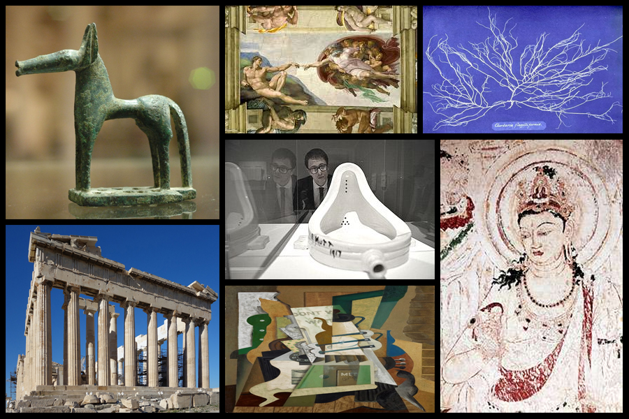
It is clear for us to say that through our understanding of intuition and experience with human feeling and emotion, aesthetic experience could include a mixture of feelings such as pleasure, rage, grief, suffering and joy. One particular philosopher named Immanuel Kant interpreted aesthetics as a field which gave priority to form over function, with him stating that beauty was independent of any particular figure which it was attached to. Today many historians and philosophers have argued that there is no such thing as aesthetics in art but rather there only being artists. Some of the earlier examples of aestheticism from different generations and cultures can be seen below:

The first use of the term aesthetics in something like its modern sense is commonly attributed to Alexander Baumgarten in 1735 with Francis Hutcheson marking the first systematic inquiries into aesthetics in the sense of them being a distinct branch of philosophy. Undoubtedly the 18th century saw the flourishing of inquiries into beauty, taste, the sublime, and genius, but few would be content to start a history of aesthetics in that century. For many centuries earlier, going back to ancient Greece, there had been philosophical reflection, even if only in a piecemeal fashion, on poetry, painting, music, and the beautiful, and these reflections had an enormous influence on later philosophizing. What is noticeable, though, is that prior to the 18th century it is not always clear where the boundary lies between aesthetics, as such, conceived as a distinctively philosophical inquiry into judgments of taste and the foundations of the arts and more general theorizing about art, including, for example, treatises on the arts often aimed at practitioners themselves.

Regarding a more modern approach to aesthetics it can still be seen as the basis for much of our societies development through our architecture to our art. Various examples can be seen below: