Category Archives: Analysis

Filters

Author:
Category:

Final Prints

I started experimenting with different layouts that I could display my final prints as, arranging the photos digitally. I found the by doing these experimentations I was able to try different pairings and combinations to plan what do when I framed my images. I experimented with pairing two images together to se what they would look like displayed, and also all my images together to see which ones look the best. I also found the artist Alexander Mourant to take inspiration from when racing my cyanotypes.
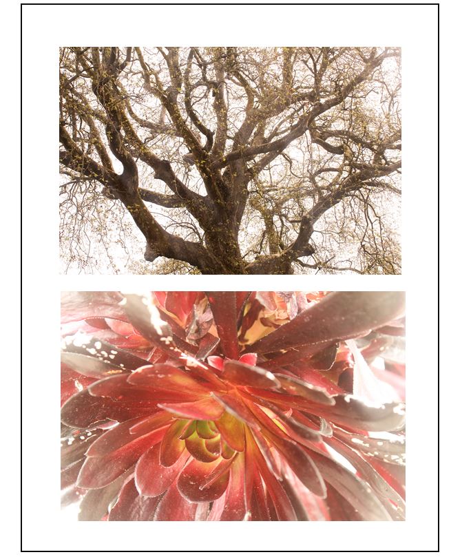
I thought that these two images worked well together as the warm tones in them both links them together. I also like how the they are both centered as the compositions complement each other. To me, the bottom image is the most powerful and stand out more than the top image through the bright natural red colour and the light yellow centre. This yellow connects to the top image, as it has yellow/brown tones throughout. However I think that this combination of images doesn’t show the audience enough about m project, because of this i won’t use this layout to frame my final prints.
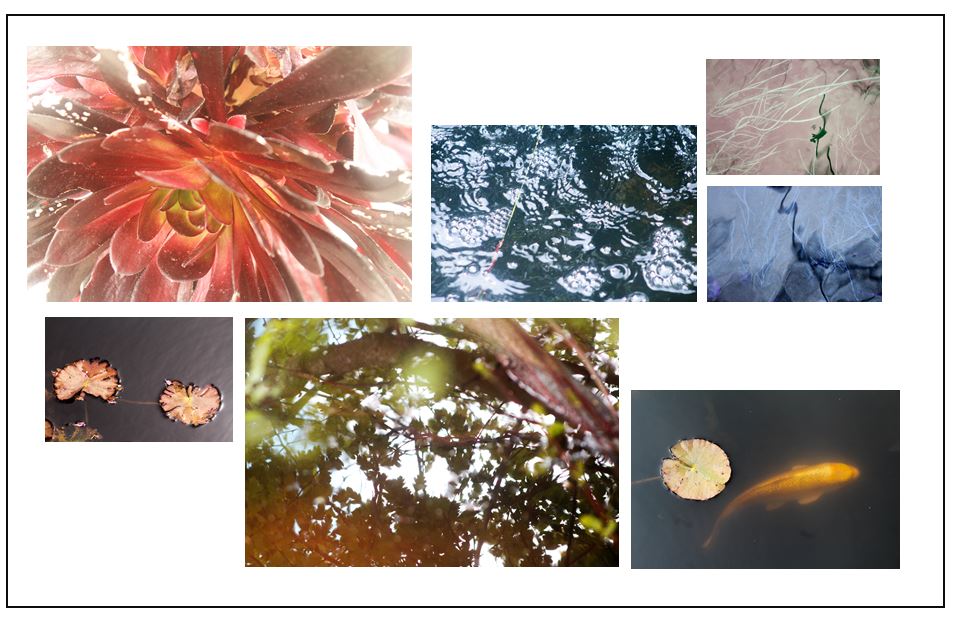
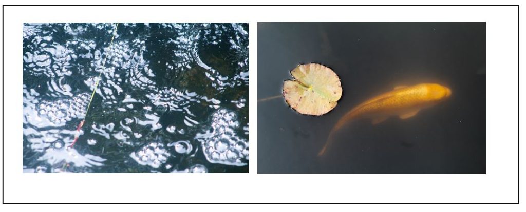
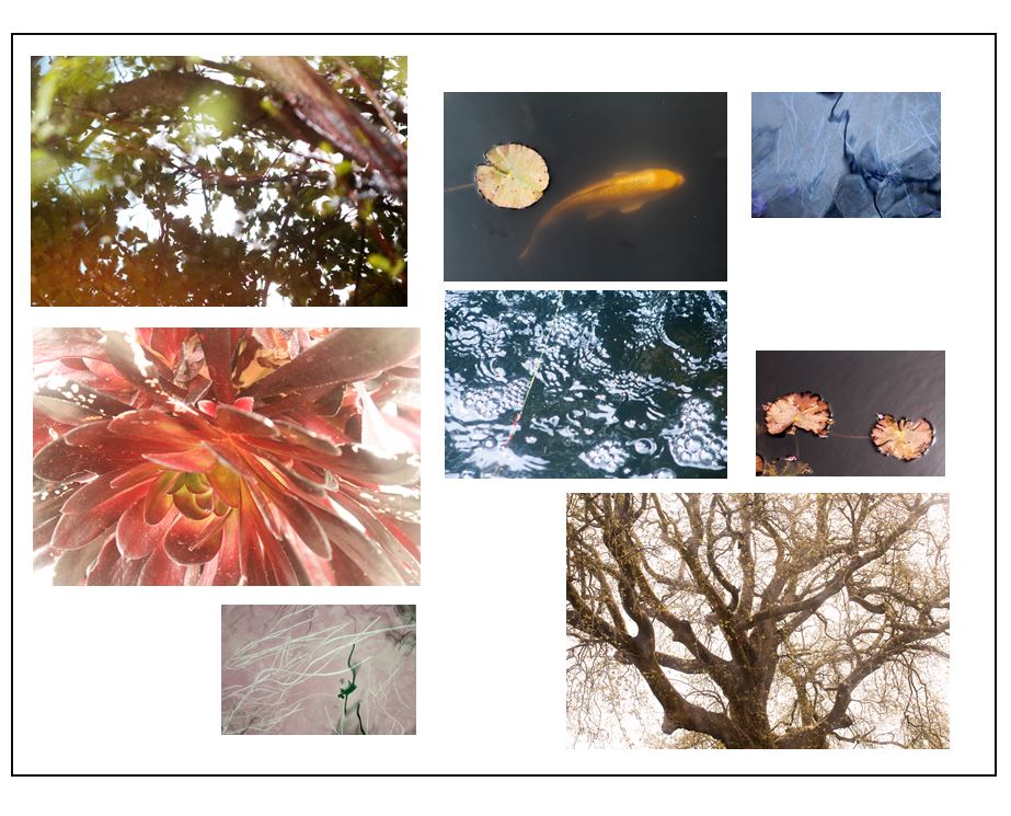
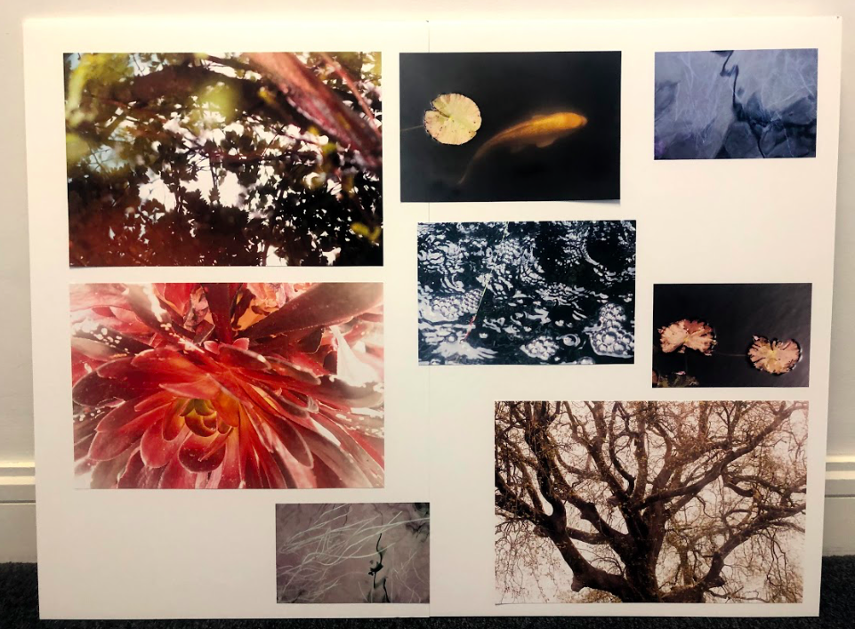
I think that by displaying my images all together on a board, the audience gets to look at the different aspects of nature i have explored, and an idea of what is inside my photobook. I placed the A3 images near the edges of the frame and fitted the A4 and A5 ones around the as I think this makes a good layout. I placed the A4 images of the koi fish and the bubbles next to each other as I think they make a good pair, where the textures contrasts to one another, but is still linked through the subject of water. I displayed two of the A3 ones together on the top left of the frame as I also think these two complement each other, through the warm tones and emphasis on light. I placed the A5 photos where I have manipulated the colours (blue and pink) near the edges of the frame as I think that spacing them out makes them more effective as images then together.

Alexander Mourant
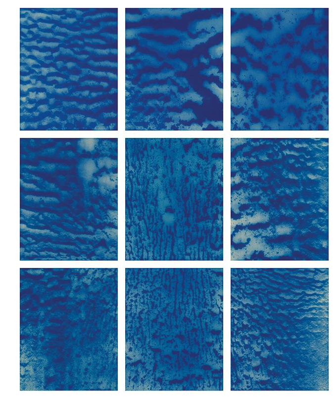
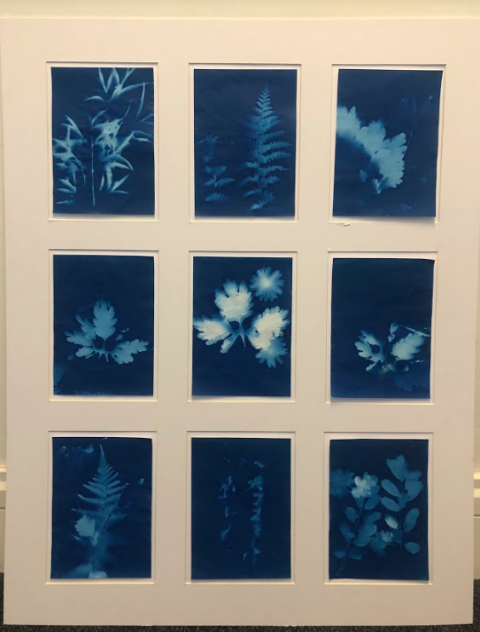
I am taking inspiration from the photographer Alexander Mourant and the way he displays his photography in grid format. I also want do this with the photograms i produced, displaying 9 of them together. I think this will be effective as it presents them in a way that they can be contrasted against one another, but still shows the variation and similarity between them. I think this also links to the scientific background of cyanotypes when I display them precisely. When I do this I want to make the cyanotypes coming off of the page slightly, to give them a more personal and authentic look, rather than placed flat against the background. I also want there to be a frame around them so will leave space between the outside of the cyanotypes and the frame board I will cut in a grid format, so thats there is a white space separating them. This will also makes them seem as though they coming off the display.

Final Prints
Photobook Design Experimentaion

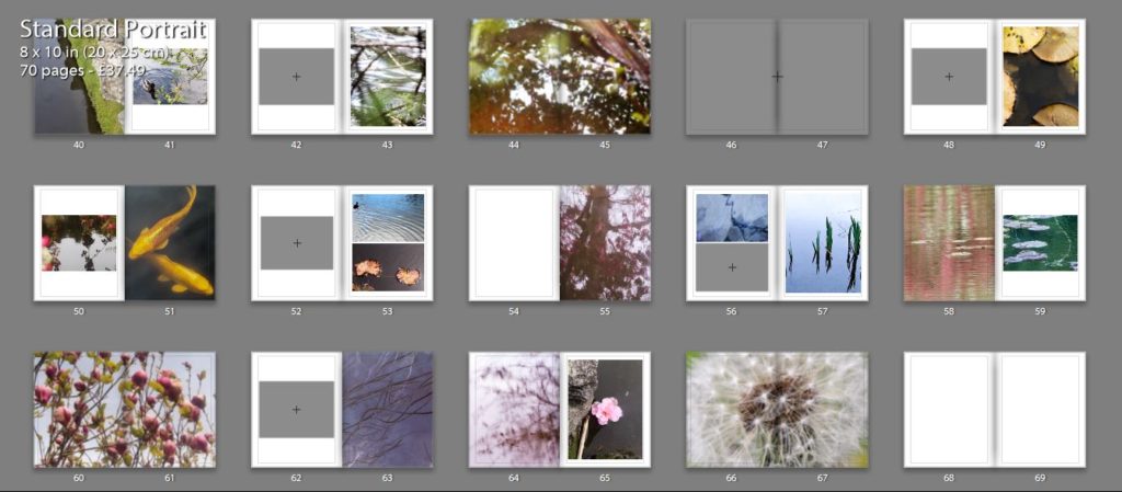
I thought that my close up image of the orange leaf would pair well with one of my koi fish images as both the main subjects in the images have orange tones which make them both connected. I experimented with two different koi fish images, one showing two fished overlapping each other and the other showing the movement of one fish through the ripples in the water. The first image is a calmer image, the water in the background being flat which gives it a more peaceful appearance. I like how the two fish are swimming near each other and are overlapping as they create an interesting shape in the water. This is contrasted to the second image which shows one fish coming to the top of the water, creating waves which i tried to emphasise when I edited the image. This image isn’t as calm as the first image and shows the texture of the water.

I think that the second combination is the best double page spread as the single koi fish swimming the water links better to the single leaf and has a similar rounded shape which is why I will use it in my photobook. Also the background of the images complement each other as they both reflect the light from the sun and have bright white sections, creating similar shapes on the water. I think hat this combination is the most effective and makes for the most interesting layout.

This double page I am planning to use as the first page in my photo book. I experimented by using a combination of two images on the pages, and a single image to see which was the best layout. The first double page with two images I like as the ripples in the water on the left side linking to the patterns in the second image of falling water. I like the first image as it draws on theories of abstraction through the bright red reflection of a person on the water that are warped and distorted. I also like how there are out of focus branches near the lens of the camera that add another natural aspect to the image and contrasting against the horizontal ripples of the water. This connects to the second image on the right page as there is also an section of a plant out of focus in the top right corner. The second double page is the single image of the water falling on the right side. I think that this is also effective as it focuses the reader onto that particular image so they aren’t distracted by the shapes the image that’s on the left of the other layout. I think this makes the appearance more peaceful which is why i am going to use the single image in my first page, and the image that was on the left on the page after. This is because both images are very detailed and think that they work best displayed alone.

I chose these two images to display as double pages as I think that the patterns are more detailed and noticeable when the image is filling the entire frame. I like how the first image has the bright red tones that range from right to dark, with the brightest pint being where the sun is hitting the leaves. I think this really links to my projects concept of spiritual qualities in nature emphasising the bright lights against it and the small patterns on the leaves.I also think that the second image is effective as a double page spread as there is a lot of detail in branched of the tree creating a very intricate pattern. I think this is why I will use it as a double page as I want to emphasises these aspects. I also think that this image links well to personal and spiritual aspects of nature through the yellow tones and the brightness of the image making it look peaceful and ethereal.

ESA // High Tide Photoshoot – Corbiere

These are the tidal times, and the times of first and last light, sunrise and sunset for the day that I am planning to take photographs.

What I would change/improve on for my next photoshoot.

I feel this photoshoot worked well, because it does clearly show the high tide surrounding the lighthouse and covering the rocks. However, I didn’t focus the image aorund the subject enough. There are too many objects within the foreground, and so for my next photoshoot I need to ensure that there is less cliff edge in the foreground and instead just focus on the tide.

Book Specification

Write a book specification and describe in detail what your book will be about in terms of narrative, concept and design.  Produce a mood-board of design ideas and consider the following:

Narrative: What is your story?
Describe:

A sentence

Spirituality and personal connections in nature.

A paragraph

My photo book is looking at personal connections and spirituality in nature, focusing on warm and cold colours, textures, and concepts of abstraction to express how the natural world had it’s own energy and can provoke emotions in humans. I also want to bring a scientific aspect into my photobook, looking at photograms and camera-less images in a spiritual and delicate way.

Title options:

Visceral:

-‘Relating to deep inward feelings rather than to the intellect.’

-‘Being or arising from impulse or sudden emotion rather than from thought or deliberation’

•Ethereal

-‘Extremely delicate and light in a way that seems not to be of this world.’

Transcendant

-‘Beyond or above the range of normal or physical human experience.’

Structure and architecture, Design and layout, Editing and sequencing, Images and text:

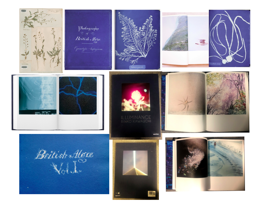
On some of the pages in my photo book I want to contrast the images where I’ve emphasised the warm colours, with images where I’ve looked at cold colours. I think this will be effective in making the images stand out and be more powerful. On other pages I want to use two images that have a link between them, whether than be through a shape or colour that are in both the images. Doing this links to Rinko Kauwauchi’s book Illuminance where on each of her double page spreads the two images are connected in someway. I think that this will create a more interesting photo book and will make it easy to look through, rather than having images that are not connected at all. I also want to physically include some of the photo grams that I created in my 6th photo shoot within my book. I want to do this by having them inside small envelopes on a few pages in the book. Because there won’t be many in the book, it will create a mystery for the reader to see what it is. This will make the reader have to physically open and take out the photogram to look at, creating a interactive quality. This is taking inspiration from Anna Atkins photo book ‘Photographs of British Algae: Cyanotype Impressions’ which is said to be the first photo book made. I think this will give my book more of a scientific appearance, looking at nature in a more objective way, that I can then contrast with my more personal and spiritual images. I want my photo book to be portrait and relatively small so it’s easy top pickup ad open. This means that the photograms inside the book will have to be small, which I think is effective as it will make them seem rare and precious, creating a more authentic and special appearance for them. I want the layout of my image to be simple as most of the natural images I’ve taken are quite detailed and patterned, but displaying them simply it would allow the reader to look at them without being distracted by other images if there were too many on a double page spread.

ESA // Low Tide Photoshoot – Corbiere

These are the tidal times, and the times of first and last light, sunrise and sunset for the day that I am planning to take photographs.

What I would change/improve on for my next photoshoot.

I think that for my next photoshoot I will be taking images with a less busy a chaotic foreground and try to take images that focus solely on the tide around the lighthouse. I also feel like some of the images didn’t show clearly that the tide was low, which was my primary aim.

Presentation of my Final Work

PART 1

What is included?

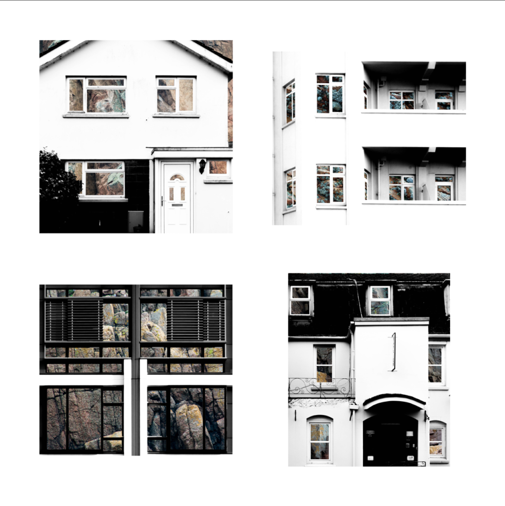
For the presentation of my final photographs in my exam I will be presenting the photographs in a typology grid. I believe that this method of presentation is very effective and appropriate because I have experimented with it throughout my project and have studied the likes of the Bechers’, who pioneered the use of typology grids. Originally, when planning on how to present my final work I had the below four photographs planned as my final four, as I was experimenting with the different layouts I found that it looked slightly off – I eventually decided that the photograph in the top left did not fit in well with the other photographs as it depicted a more brushed steel texture as opposed to the rusted texture in the other compositions. Saying this, I still thought that this photograph was very effective and aesthetically pleasing so I decided that I would include it by presenting it by itself as a side piece to the typology and replacing it in the typology with a more fitting composition. The resulting piece is a set of photographs in a typology grid that portrays how a standard house face can be so similar in features but at the same time can be completely different due to their own individual features. This idea is added to by the rusted steel layered over the building face as the steel represents how the materials used in house construction has changed over time from granite towards steel modern structures. The photographs will be printed as four A5 photographs and one A3 photograph.

My final typology layout
My final photograph

How will the photographs be laid out?

I plan to present the typology grid made from four photographs and the individual photograph on a foam board. One way in which I could present the photographs is by using a window mount method – in order to mount the typology grid I would first stick the photographs to a piece of white card and then tape it to the mount like an ordinary picture. I could also present the photographs on white card as shown below. After experimenting with both options on photoshop I believe that the most effective layout of the photographs would be to use window mounts and black card because the slight white border contrasts well will the black mount board, which also brings out the colours and shaped within the photograph. This contrasts with if I was to set it out on a white background as the contrast in colours and shades does not exist in this option, making it the weaker option. I have also experimented with which side to place the individual photograph and have come to the conclusion that I will place it on the right as I want the viewers attention to first come to the typology grid.

My decided final presentation

PART 2

The second part of my presentation will follow the same guidelines as the above presentation but will be made up of my compositions in which I layered building faces over granite. It will include four A5 photographs made into a typology grid along with a single A3 photograph all on one black window mount. The idea behind this presentation is the exact same as in part 1, except that the granite is replacing the steel by giving an insight into the internal structure of the houses to show what material they are based upon.

My Final Typology Layout

How will the photographs be laid out?

I will present these granite compositions in the same style as the steel compositions in order to ensure consistency in my work – I will window mount all the typology photographs onto white card and then window mount that card and the A3 photograph onto a larger black card.

ESA // High Tide Photoshoot – La Braye, Watersplash, l’Etach

These are the tidal times, and the times of first and last light, sunrise and sunset for the day that I am planning to take photographs.

For this photoshoot I am going to be taking photographs in three areas of the west coast; Le Braye, Watersplash and l’Etach. These images will be taken around 1700hrs, because the predicted high tide time is 1715hrs.

What I would change/improve on for my next photoshoot.

From this photoshoot I have learnt that I need to take more images from different angles so that I have a greater variety of images for my contrasts. I have also decided that for my next photoshoot, I am going to continue to photograph the distinct differences between the low tide and high tide, however, I am going to photograph some different areas of Jersey, including: Corbiere, Plemont Bay, Watersplash (but closer and photographing more of the beach). I am also going to ensure that I am photographing away from the sun as well, so that I don’t have any lens glare in my photographs.

Steel Shoot 2

In this shoot I have created more photographs of steel surfaces for me to work with in my edits. My previous photographs of steel surfaces were mostly of brushed steel and therefore there was not a lot of texture to add interesting features to the photographs. I have photographed more worn and rusted steel to provide character and more emphasis to the steel exposed over the building faces. This rust also hints at the age of both the steel and some of the houses, and links back to political landscapes due to showing how something can be changed over time through wear and tear.

Edits

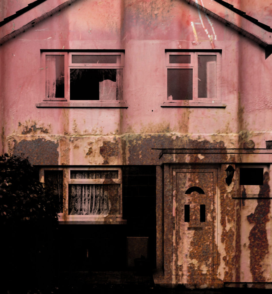
The below edits are edited in the same style as my previous double exposure edits. I did this through photoshop – I layered the photographs of the steel over the photographs of the building faces and used the ‘darken’ blending option in order to bring the rusted and ruined textures to the forefront resulting in double exposure edits that are more characterized and interesting than my previous edits due to more colour and layers.

Analysis

When capturing this photograph of a house face I used the natural lighting from the area, as I did when capturing all the other similar photographs of building faces in the shoot. This use of natural lighting allowed for the shadows and contrast to be displayed naturally within the image, which was helped by using a deep depth of field, shutter speed of 1/60 and an ISO of 200. These settings ensured that there was enough time to allow light to enter the lens but not so much time that the photograph became overexposed. There is a slightly cold colour cast in this photograph which matches to the metal structure layered over it (which have connotations to cold).

The photograph is in black and white it appears due to the natural silver of the metal face layered over the building face. This lack of saturation allows the shadows and contrasts to be brought forward in the photograph which leads to a wider tonal range and a more dramatic and effective photograph. The texture of the metal can also be seen throughout the composition as the metal bolts go up the side of the photograph whilst the lower half shows the texture of the brushed steel and brings the photograph to life. The photograph is set up so that the door is set along the lines of the rule of thirds which makes the photograph more aesthetically pleasing for the audience.

This photograph is from a set of compositions that I have made in which I have layered photographs of steel over photographs of building faces resulting in abstract compositions with texture. The idea behind this is that houses and office buildings are increasingly being built with steel structures in Jersey rather than the traditional granite base used. This steel gives a forecast into the future of housing and shows what will potentially be the base of houses as buildings develop and change. When this photograph is seen as part of a set it shows how buildings are all unique and different even when they are designed as batches.

ESA // Low Tide Photoshoot – La Braye, Watersplash, l’Etach

These are the tidal times, and the times of first and last light, sunrise and sunset for the day that I am planning to take photographs.

For this photoshoot I visited three different beaches along the west coast of Jersey; Le Braye, Watersplash and l’Etach. I also visited Plemont Bay briefly. I took photographs around the predicted time of the low tide, 1100hrs.

The images I took from this shoot:

I felt that some of these images worked well because of how clear the image showed that it was low tide, and that some of the images were very natural. However, in some images there was the issue of ‘clutter’ signs and cars were taking away from the natural landscape and leading the viewer’s eye away from the subject of the photograph.

I then visited the same areas from the same position as the first set of images at 1300hrs, to show a middle ground between the low and high tide.

I felt that these images weren’t as effective because the tide had now come in slightly but it was not significant enough to show a drastic change and therefore they weren’t as exciting to contrast with the other images in the shoot.

What I would change/improve on for my next photoshoot.

From this photoshoot I have realised that I need to ensure that my images don’t have unnecessary clutter in them, such as signs, vehicles and people who would distract from the focus of the images. For my next photoshoot, I am going to take photographs from more angles in order for me to clearly show the contrasts between high and low tide.

Triptik Photo-book Inspiration – Robert Frank

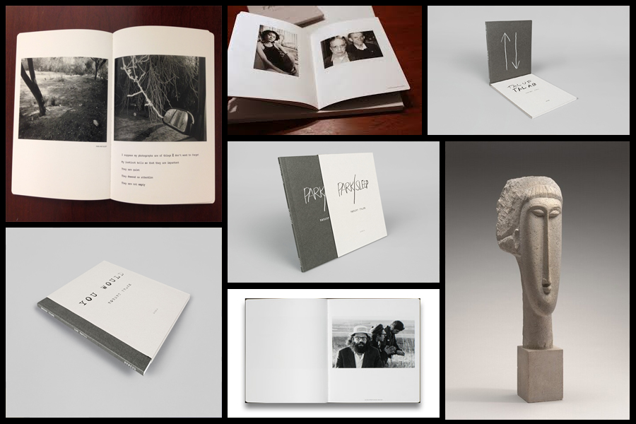
Before going a head and creating my three photo-books I decided to look at a photographer who had produced work in a style that was vaguely similar to the outcomes I desired. The books I found to be particularly inspirational were ‘You Would’, ‘Tal Of Tal AB’ and ‘Park Sleep’, what drew me to the designs in particular where how each was encased inside a brown cardboard folder which fitted the dimensions of each book perfectly. For me this was an idea I wanted to explore as I previously had aimed to produce the three books and store them in a hand-made sleeve so that could be viewed collectively but viewed individually. When looking over the books I found what drew me to them was their minimalist covers which only contained the title and authors name against a predominantly plain backdrop of textured grey card, this was very effective in regards to the book cover being a darker version of the grey which compliments the actual cover which as a result produces the impression of the binding of the sleeve being different. Some pictures of the books can be seen below:

Who is he?

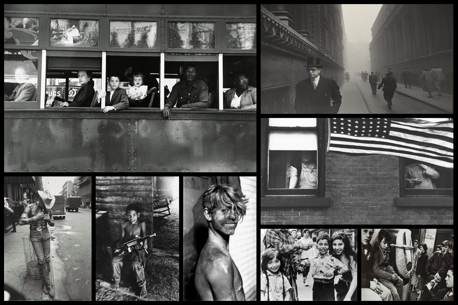
Robert Frank, born November 9, 1924, Zurich, Switzerland, Swiss American photographer and director who was one of the most influential photographers of the mid-20th century, noted for his ironic renderings of American life. Frank became a professional industrial photographer at the age of 22 and in the 1940s became a successful fashion photographer for Harper’s Bazaar magazine in Paris. He felt, however, that the scope of the work was too limited. He abandoned fashion photography about 1948 and went to the United States and then to Peru to explore the expressive possibilities of the 35-mm camera. After photographing in Europe in 1950 and 1953, Frank returned to the United States. Between 1955 and 1956 he drove across the country, taking a number of photographs. Of those, 83 were ultimately published as The Americans, 1959, a French-language version, Les Américains, had first appeared in 1958. Photographs such as Chicago, 1956 in The Americans revealed Frank’s mature style, which was characterized by bold compositions and ironic, sometimes bitter, social commentary. Their publication established Frank as a major creative photographer, and the book was widely hailed as a classic. Examples of his photography can be seen below:

When making my books I would like to explore the use of composition carried about by using singular images over a two page spread which add to the overall effect of any image you want to exaggerate or over-emphasize. For me personally I would like to incorporate mono-printing to produce the cover of my sleeves, this is because of how it would create a newspaper effect where the font thickness and size would be inconsistent and slightly faded, which as a result produces an ink collage effect.

Before ordering and making the book I would need to consider the colour of both the sleeve and books front, this is because of how I want them to be colour coordinated so that they both compliment and contrast each other which creates a more aesthetic result.