Overall, my project builds relationships between psychological theories and portrait images through colour. Images are paired with ink blot tests that reflect the mental processes of the people in the images, however the shapes are interpreted differently by each viewer who sees it. The entire project is completely up to interpretation, even subtle features in the subject’s faces can portray one emotion to one person and be viewed differently to someone else. The idea of variation is shown through changes in colour and shapes and emotion although similarity comes from us all being human.
Category Archives: Analysis
Filters
Final image choices
For my final outcomes, I wanted to group together certain images that were following the same photographical theme. 8 of my images link together as I put all 8 of these images into black and white – i felt this was more appropriate because of the style I was photographing in. Additionally, these 8 black and white images are involving shadows, (which is a big factor as to why I put these images into black and white). Therefore, this means they follow my light and darkness theme of the exam title ‘Variation and Similarity’ through my technique of capturing interesting shadows to portray light and darkness. My other 3 images I chose for my final choices were 3 images that I kept in colour. 2 of these 3 images are still involving shadows within their images, whereas the other 1 colour image has no shadows within its image; it is an image of several coloured glow-sticks that I captured in a dark room. I wanted to include some of my other dark room pictures in my final prints but a lot of these dark room shots included a model and I felt that having people in my final prints would take away the theme I was trying to follow as there is no people in any of my final choices of images. Overall, my theme for my final prints shows that I was interested in capturing shadows to show light and darkness in different areas and scenes. I kept my final prints more towards architecture, which included images from my beach shoot, my boat shoot, my architecture shoot of buildings, 1 image from my home shoot and 1 image from my dark room shoot. However, I experimented with different styles of photography to reflect light and darkness, such as seascapes, sand images, studio flower shoots and more dark room shots using long exposure to capture a moving person. After taking all these shoots, I realised my shadow images crated a more formal photographic look and matched my light and darkness title the best; this is why the 11 images I have chosen below have been picked.
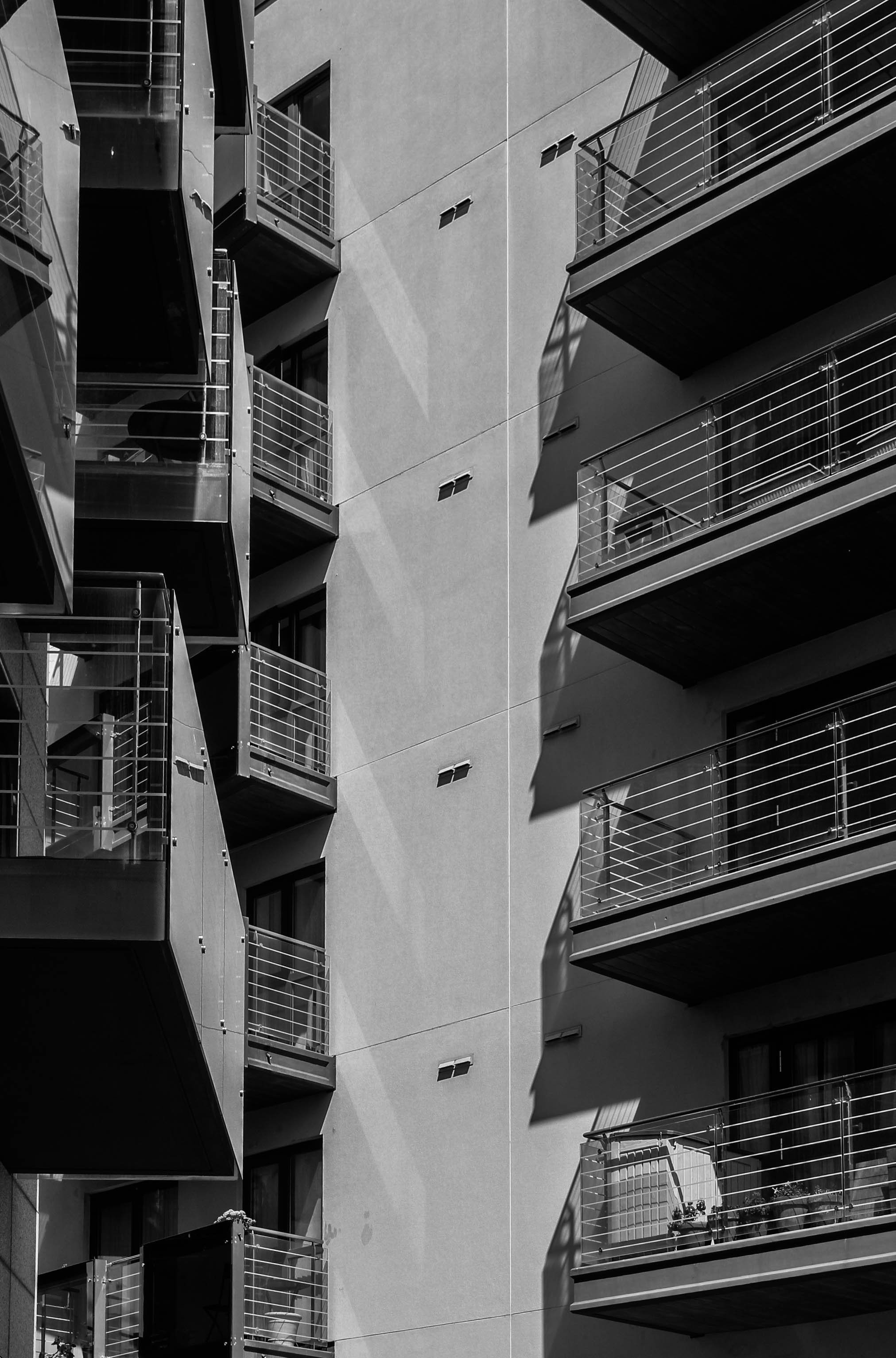
I chose this image as one of my final choices for my final prints because it is an image that clearly links to my interpretation of the exam title. I captured this photo from a face on perspective which really helped the image display its light and dark tones. I took it on a sunny day hence the shadows being reflected from the balconies of the building. I like how there is a clear structure to the image as there is a lot of repeated shapes included in this photo. The multiple straight lines and objects creates a sense of repetition which also fits in nicely with how the shadows are repeated at each balcony level. I thought this image looked best in black and white because the tonal range of the photo is varied and so, having a black and white effect made the photo more standard. Again, this links to the repetition aspect of this photo because all the tones in the image are linked together without any bright or out of place colours taking charge.
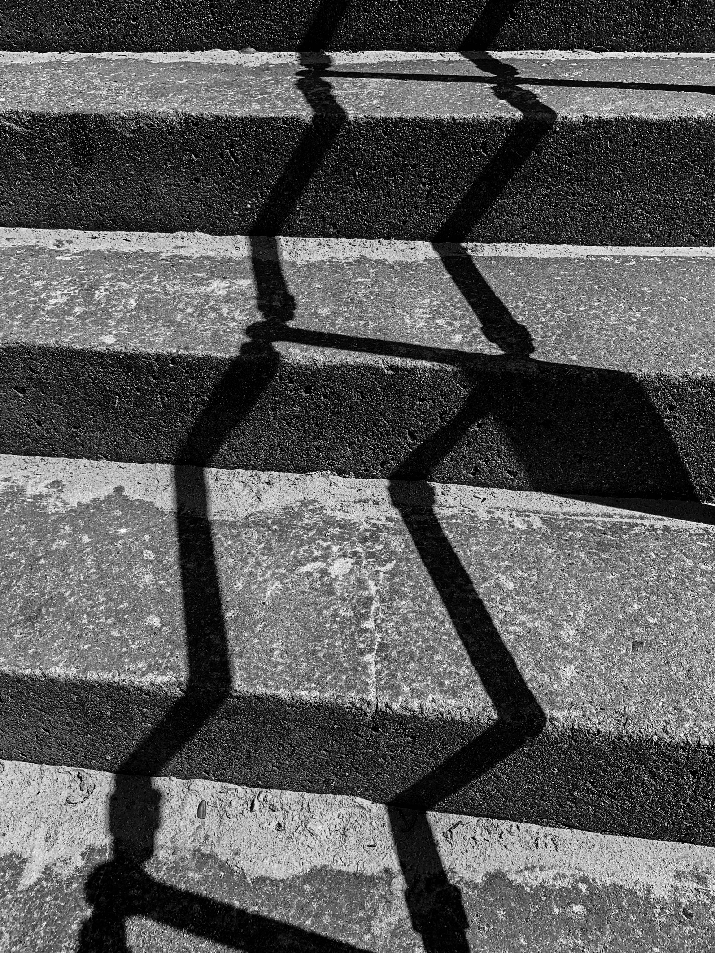
I chose this image as one of my final prints because the shadows the stair handles made is really structural and organised. I like how the shadows are straight lines but how they also go in a zig zag direction. It also links in well with the first image I chose, due to the way the photo has levels to it; the stairs in this photo have a great amount of texture in them which makes the photo have more light and dark tones to it.
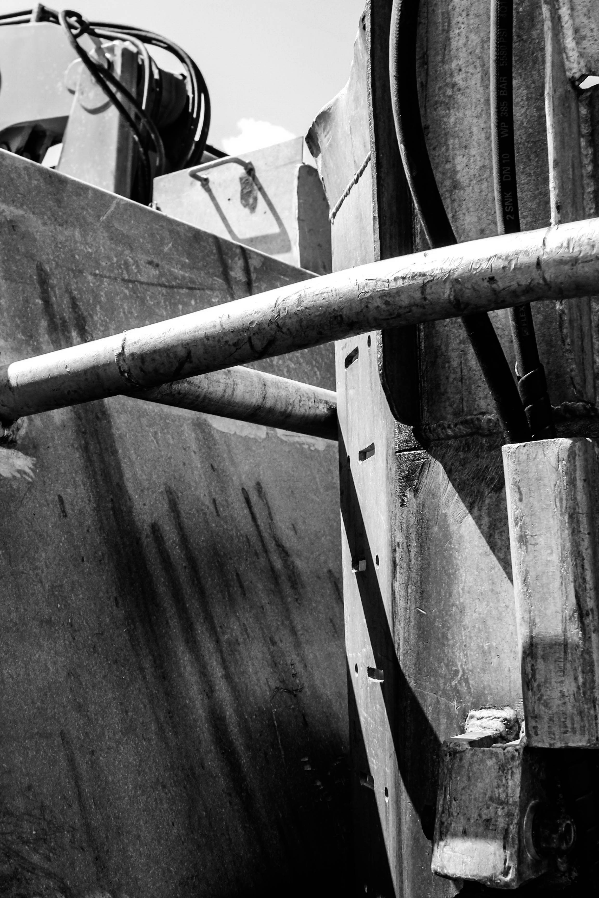
I chose this image for one of my final prints because the architecture of this large boat brought a lot of details and texture to it, due to the rust and various scratches and marks on the steel parts of the boat. Again, there is a few strong parts that have caused shadows onto the boat which really help build this image to become a strong factor into my light and darkness project for this exam.
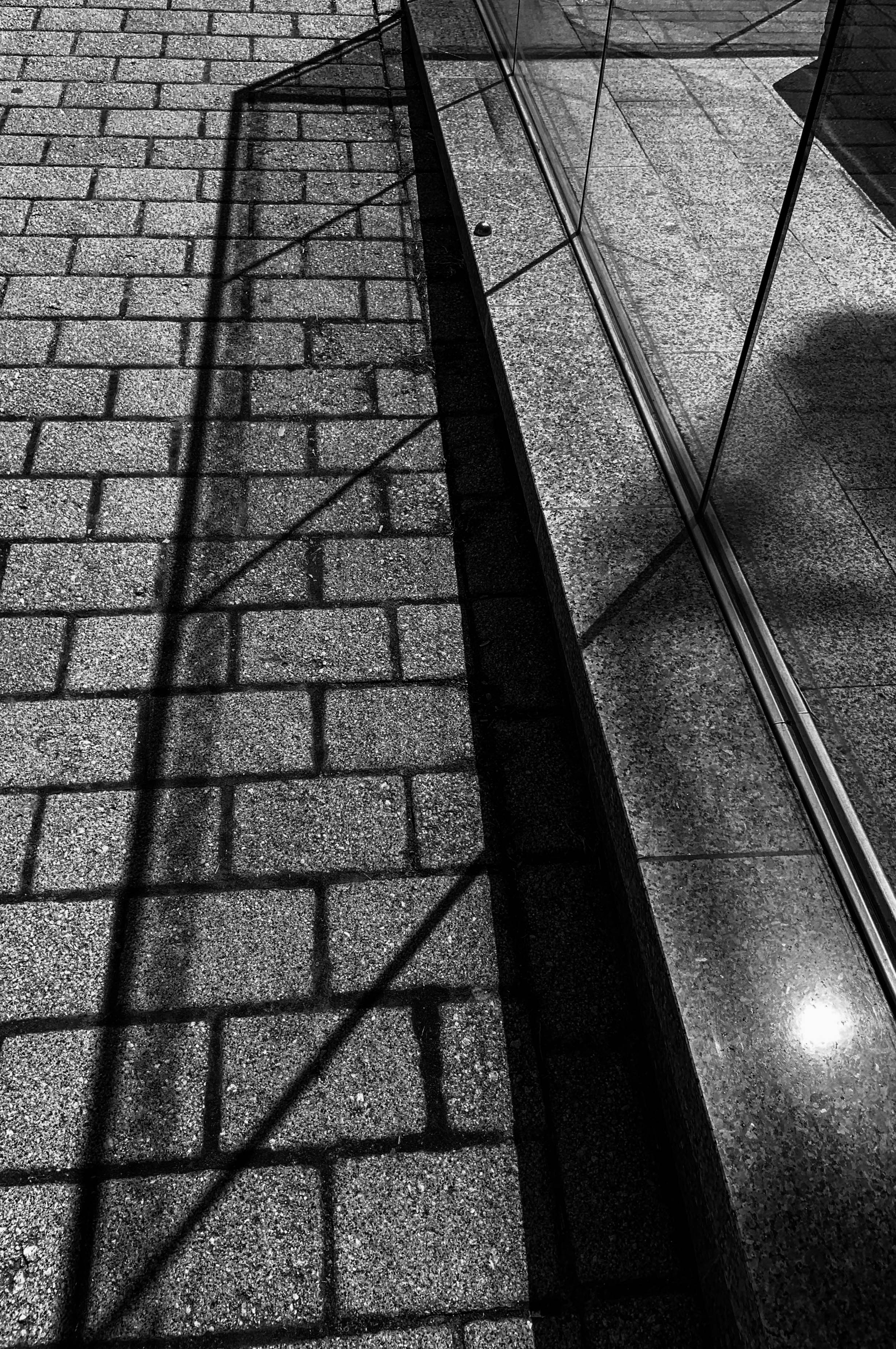
I chose this photo for one of my final choices because the shadows are really vivid and bold. I like how the you can tell there is a different tone in the shadow on the cobblestoned floor compared to the floor on its own without the shadows because of the glass pane. This fits in well with the first 2 images I have chosen above as there is a clear structure to the architecture as well as the shadows. With the straight lines, this again creates a repetition effect.
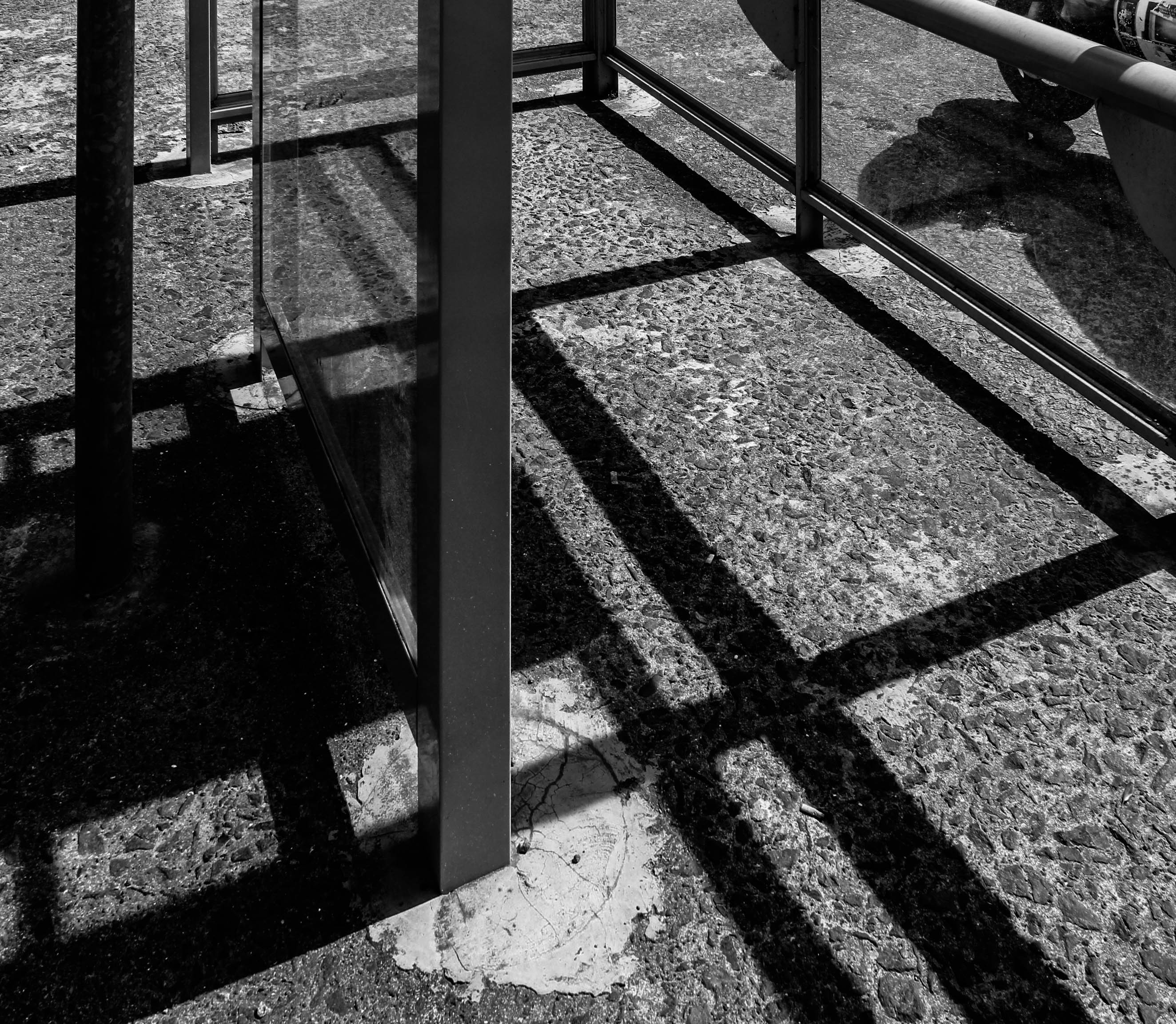
I chose this picture for one my final images because there is a bold completion of shadows that portray the structure of the bus stop surrounding it. I like how the floor is tarmac with stones on top. This makes the shadows more obvious as the stones in the floor differentiates itself from the shadows.
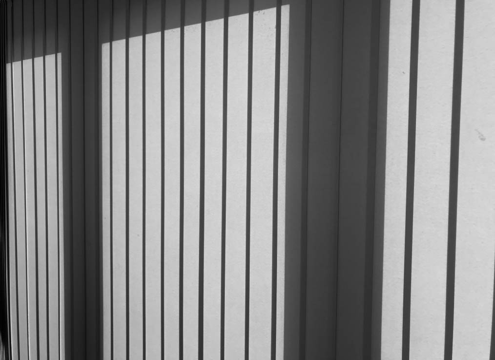
I chose this image for one of my final choices as it really shows the variation of light and dark tones. It is an image of the blinds on my garden doors – this is such a simple photo yet the sun from outside creates this interesting, unique effect of how easily light and darkness can be shown onto objects. I like how there is a repetition of the rectangular shapes of the blinds. Additionally, each section of the blind has a thin line of dark toned shadows which outlines how there are strong shadows in this photo. The thicker dark toned shadows almost border the image and give it this bold vibe.
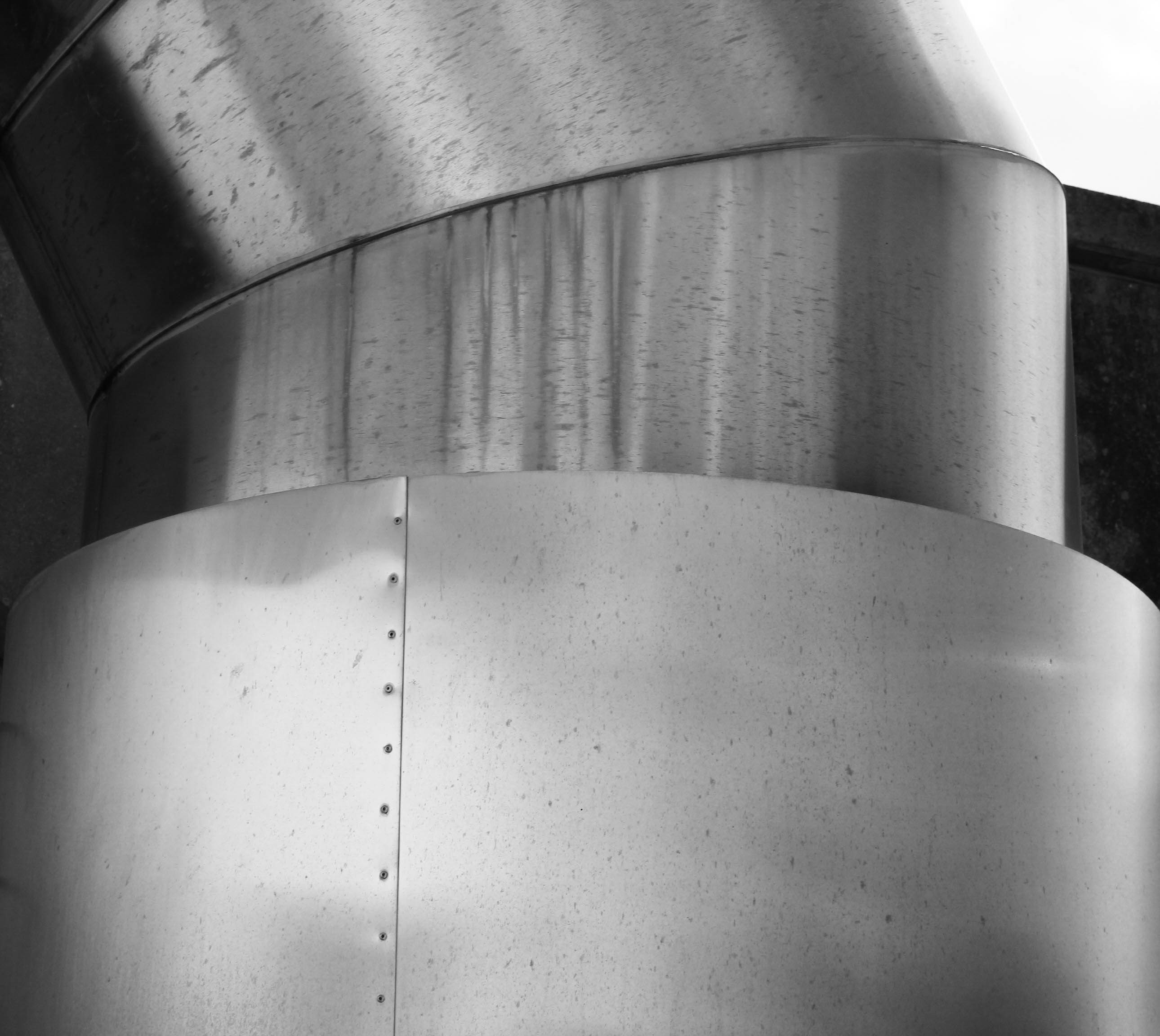
I chose this image for one of my final choices because the object I captured is unique and different to every other object and scene I have photographed. I like how I zoomed in on in the top half of this large steel pipe; this makes my photo more close up and shows how I focused on only one area of this object. I like how you can see the rust marks on the pipe – this creates a fine detail to it, similar to my 3rd image I displayed above from my boat shoot. There is a slight shadow to the far left and far right of the pipe. Yet, because the pipe is silver steel, the reflection of other objects onto it create darker tones on the pipe which means the main shadows didn’t need to be as big as the other shadows I have captured because overall, this image has a varied amount of light and dark tones within it.
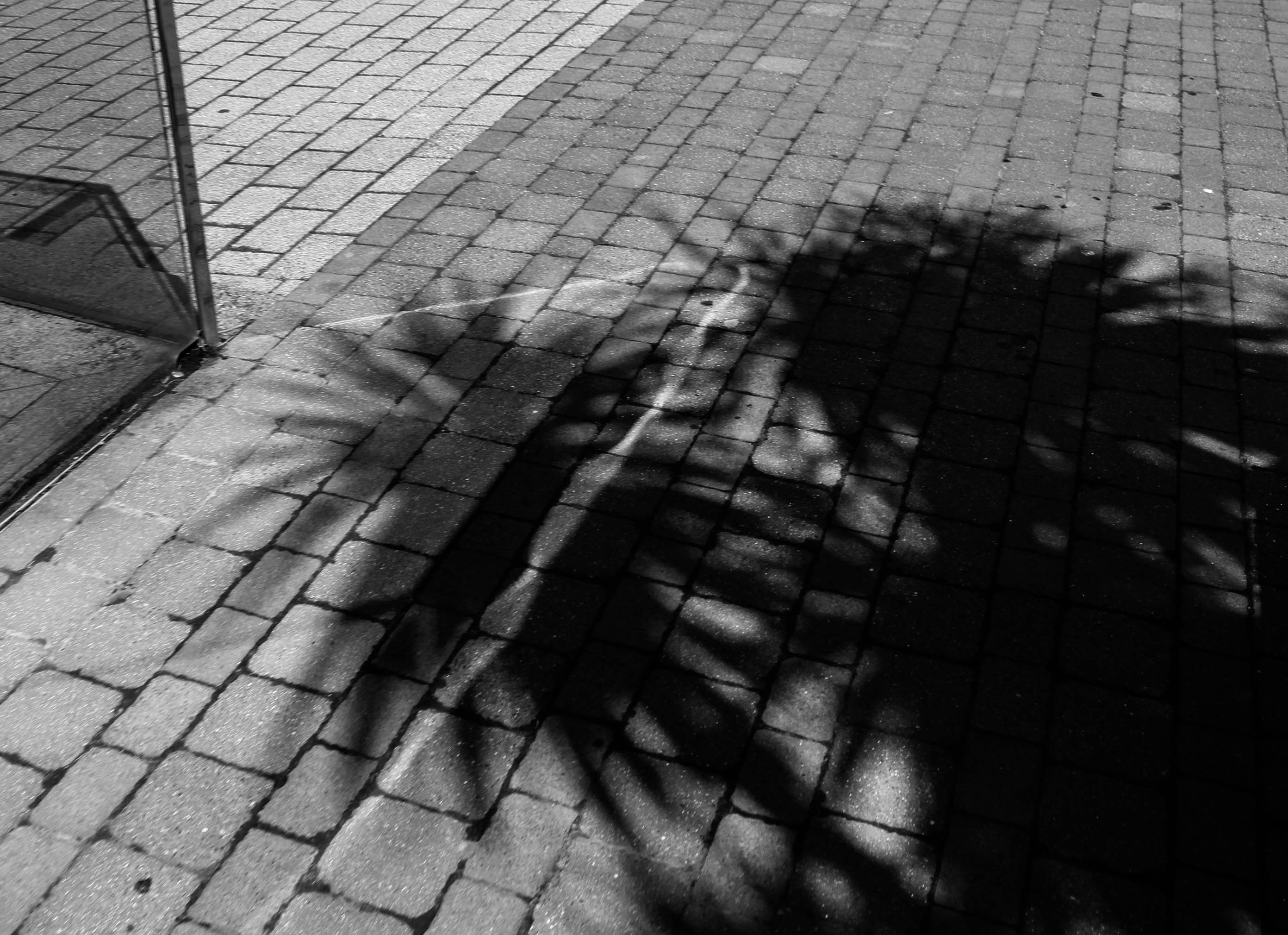
I chose this picture as one of my final prints because the shadow of the palm trees creates an intriguing shape on the floor. This image is so simple yet the big shadow with an interesting structure to it makes the photo different. It links in well with my other images I have chosen as it has a big shadow in the image which is the main focus of this particular photo.
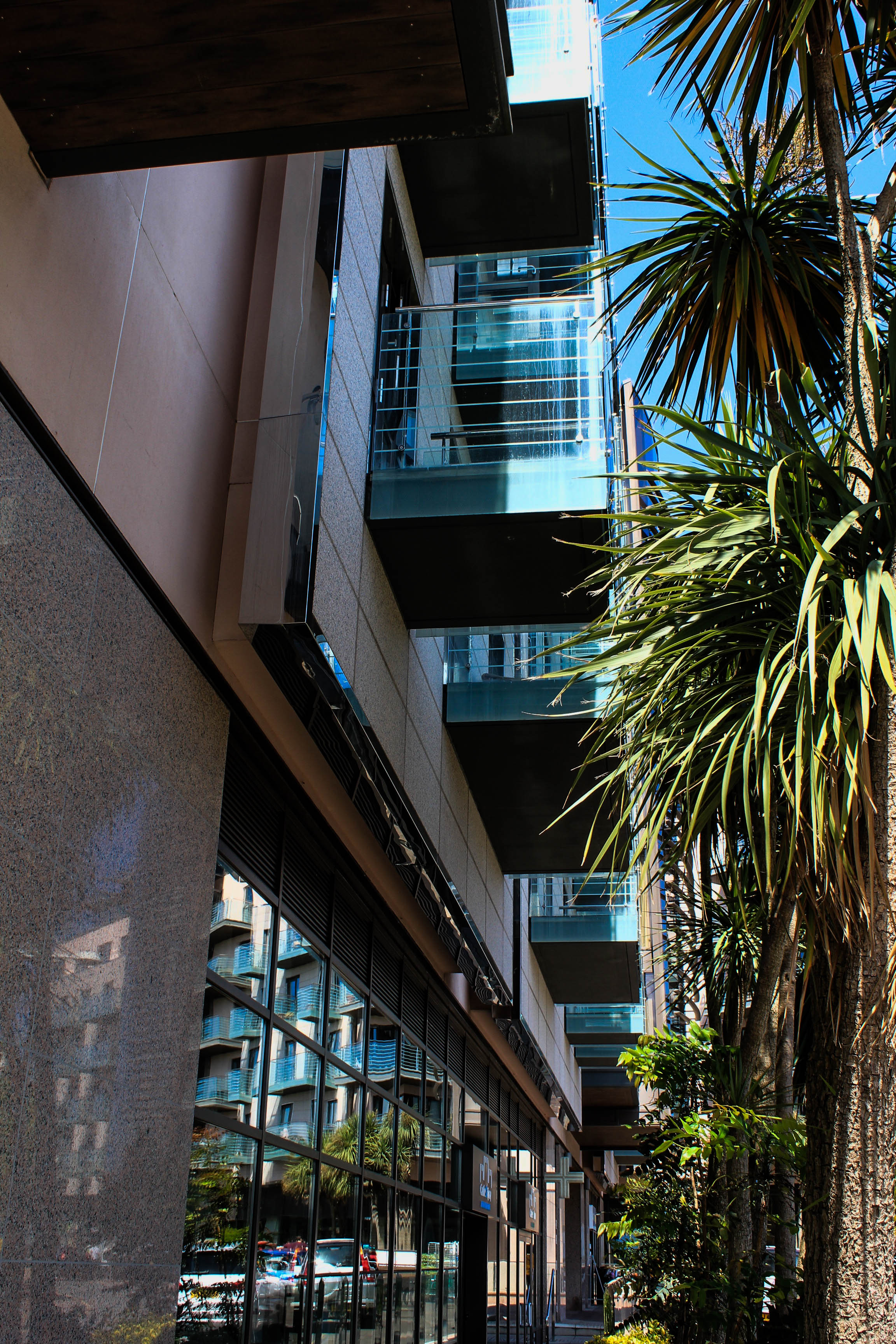
I have chosen this picture for one of my final prints because the architecture of this image is really full and clustered together with the palm trees. I chose to keep this image in colour because there was not many bold, strong shadows displayed and so the colourful tones of this photo was the main focus to what makes this image powerful. The reflection of the trees and cars in the windows and on the marble building create a sense of light and darkness within different aspects of the photo.
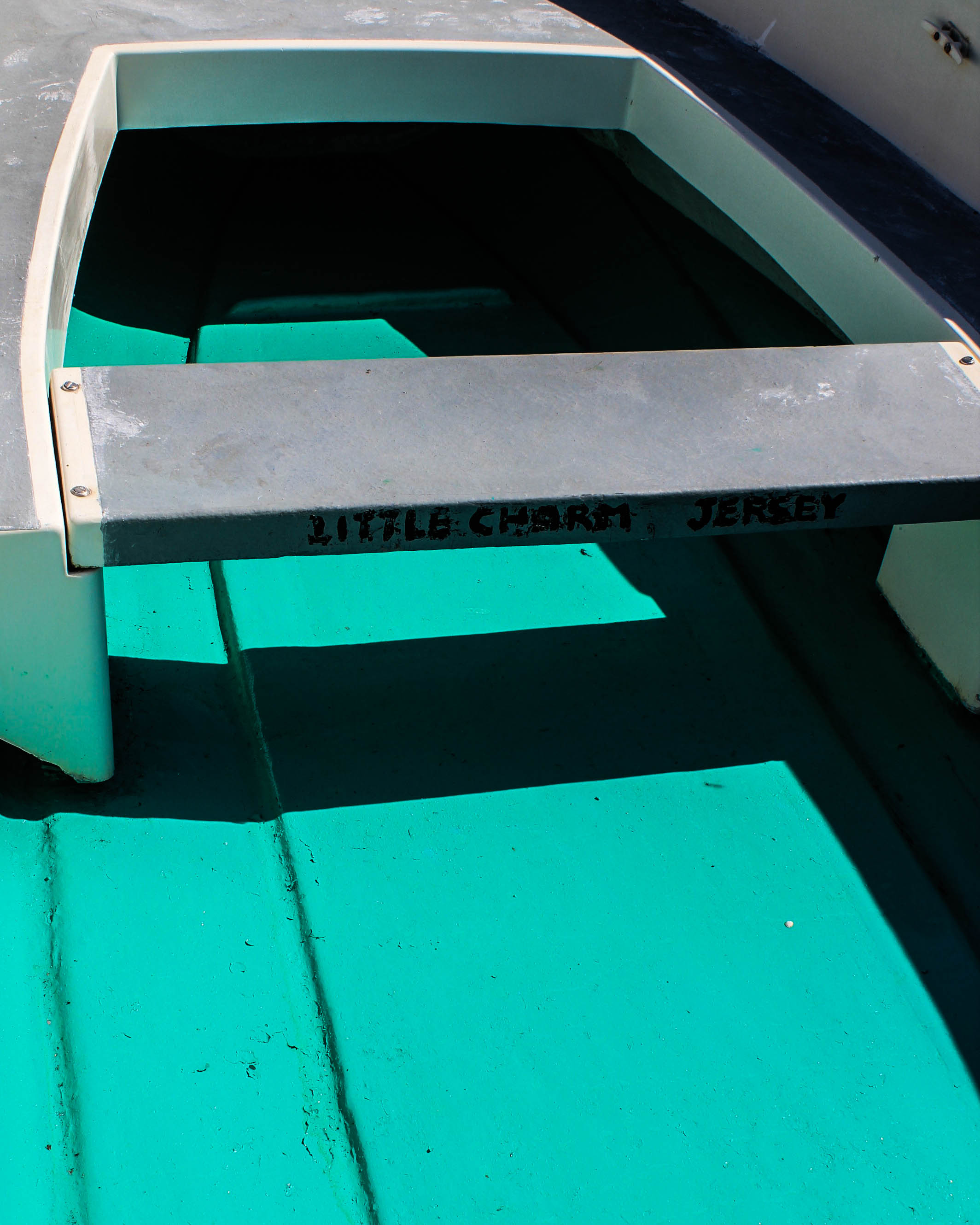
I chose this image as one of my final prints because it has an interesting focus; the way I captured this photo is so that there is no background around the frame of the image. I have clearly photographed just what is inside this boat – which could make it hard to tell what this object is. I like how there is strong shadows on the floor of the boat. Additionally, the bright blue colour of the boat is such a vivid colour which is why I thought that keeping this image in colour was best for this photo. The shadows were dark and bold enough that keeping the image in colour would still be effective to show this shadow effect, although I did adjust the contrast and shadows slightly to make the shadows stronger.
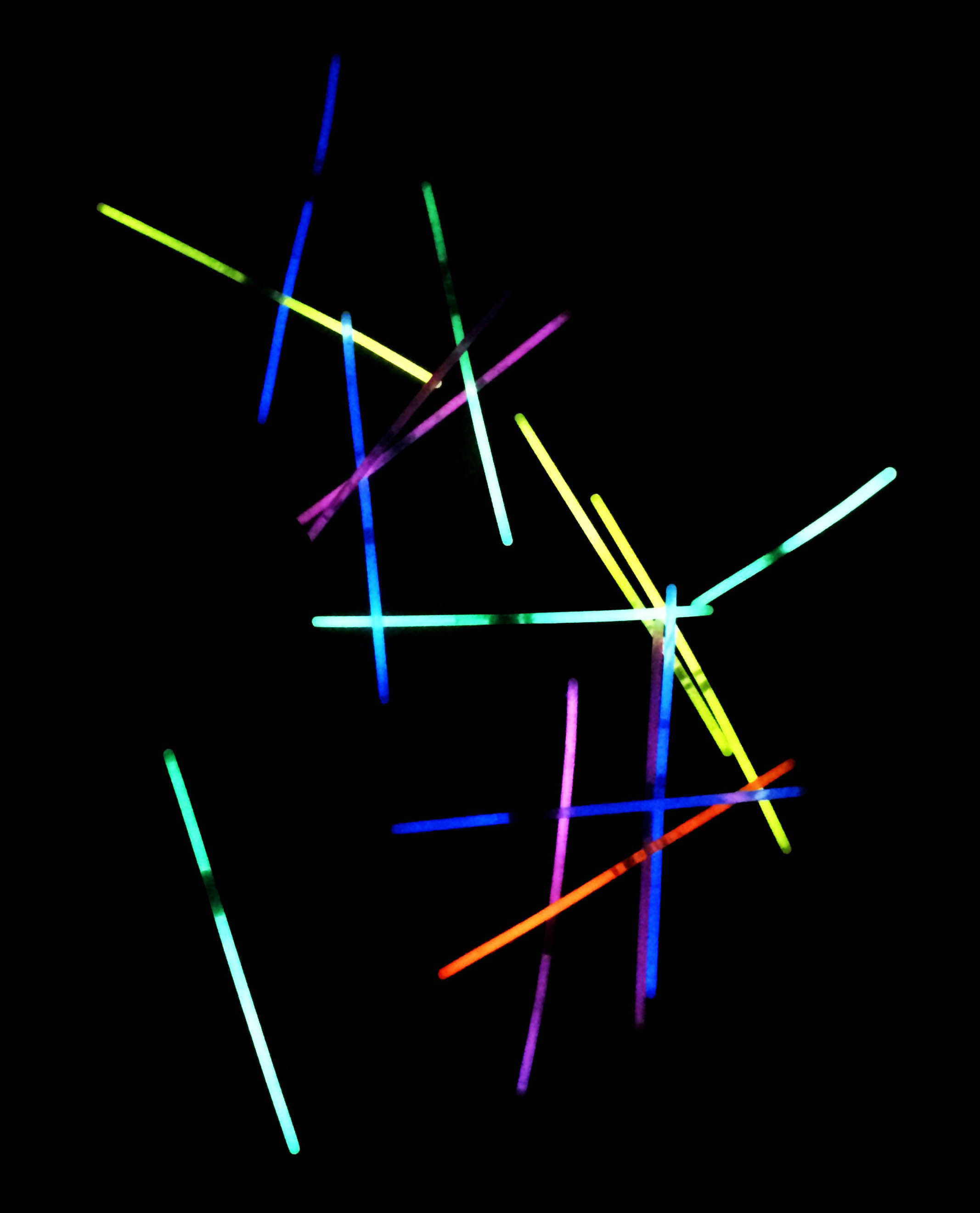
Finally, I chose this image for one my final choices because the bright colours of the glow sticks portray a strong contrast of the light and darkness of this photo. There is a sharp outline between colour and darkness due to how I used a dark room for this image. I like how the glow sticks are displayed as straight; this gives the image more of a structure to how the repetition of the straight glow sticks appear. I also like how you can see the detail of the dark tones in each glow stick as this gives the photo more balance between light and dark tones.
ESA // Edits
For my edits I decided against doing anything drastic with my images and instead I stuck to cropping the images and adjusting the angle of the images to ensure that the horizons lined up with the low and high tides.
For example without editing my images look like this:
There is a clear difference between the images, the lighthouse is darker on the high tide image due to the difference in natural lighting. I have also taken the image wihtout zooming in therefore the proportions are different and the bunker and cliff edge in the forground of the high tide image is more noticble and is the subject of the image which is leading the viewers eye away from the lighthouse. Although it is not an obvious difference there is a gap between the horizon in the low tide image and the horizon in the high tide image.
In order to have these images line up and ensure that the obvious and visible difference is the change in tides, I have edited the images so that you can see that the horizons line up and the images and more in proportion with one another. I have cropped the bunker and cliff edge in the foreground out to also ensure that the main subject of the images is the lighthouse and the tidal changes.
I repeated this process on my other images.

Before 
Before 
After 
After 
Before 
Before 
After 
After 
Before 
Before 
After 
After
Final Photo Analysis + Evaluation
Book Specifications
My topic in 3 words: Styles of abstraction
Topic described in a sentence: I will be exploring how three different categories of abstraction, colour, texture and pattern compliment and contrast each other when put together.
My Topic described in a paragraph: I will be looking at the topic of abstraction regarding three of the more dominant areas of it. I will firstly look at colour and the use of heavily saturated photography to isolate the subject from its surrounding environment. Texture is another theme I wish to explore through the almost unseen world present when looked at closer inspection and how natures pattern often are aesthetic and in huge variety. Lastly I will be looking at pattern and the idea of isolating once again a subject from its surrounding environment so that it becomes up to the viewers to interpret what it could be in regards to surface and look.
Design:
- Look and feel: I would like a matte cover which would produce a photographic but card like feel which would really compliment the material being used for my overall design and theme.
- Paper and ink: For the sleeve I would probably use printing ink to produce the title and author name, but within the book I would use glossy paper due to it producing a more detailed outcome.
- Format, size and orientation: The format would be three portrait books due to me wanting them to be able to fit into sleeves, I would probably make the size of them relatively small just below the size of A4 paper.
- Binding and cover: The cover would be the title of that topic of abstraction within the book such as saturated.
- Title: Each book will have a different title regarding the contents which can be found inside.
- Structure and architecture: The page layouts will mainly be one or two images to a spread with the occasional three images if I want to create the impression of a triptych.
- Design and layout: Once again the pages will mainly have one to two images per spread with the occasional three or four
- Editing and sequencing: I will be ordering the images into each book regarding which title they best fit into, saturation, texture or pattern. Each book will have the photos ordered into a way in which each compliment each other or have a greater overall theme.
- Images and text: I would like to keep the book very minimalist and so possibly would just have the location or word saturation with its number such as #1 or #2
FINAL PHOTOGRAPHS
I have decided on 4 final photographs for my project. Each one of shoots were different in subject focus i.e. light, water, green, trees, and were inspired by a varied host of artists and photographers. My final outcomes and edited photographs from each shoot vary distinctively from one another, but are all still interconnected by nature. My project aim was to look at the variation and similarity within nature, so I categorized my shoots into nature topics that I felt would allow me to look at nature from multiple viewpoints . I focused on capturing texture, line, shadow and tone in my capture points. I looked at multiple artists and photographers for each category of nature, allowing me to have a spectrum of photographs inspired by a collection of different photographers.
Final photograph 1:
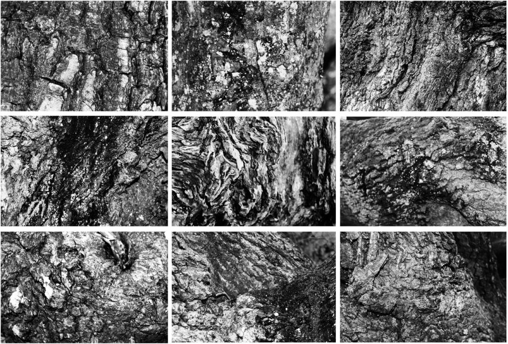
My first final photograph is from shoot 2, focused around ‘trees’. I aimed to look at trees from afar and very up close to capture the intricate detail and patterns of the tree bark. Final photograph 1 is a capture of 9 images arranged in a grid format, all of different angles and captures of numerous trees up close. I chose to arrange my photographs in this format as inspiration of Bernd and Hilla Becher who specialized in typologies and presenting multiple images of similar nature. All photographs from this shoot were edited into black and white individually as I felt the strong contrast of white and black, with shades of grey intertwined really emphasizes the tonal contrasts and shadows of my photographs effectively. My camera allowed me to present the complex detail of each curve, piece of moss, shape, bump and indent in the tree. I felt this linked back well to the idea of variation in nature as although each tree may look similar from afar, from up-close, it is evident that the detail differs greatly.
Final photograph 2:
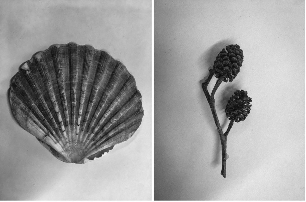
My second final photograph is from my second photographic shoot: natural forms. This photograph was taken in the style of botanical photographer Karl Blossfeldt. I photographed alternative natural forms as shown below rather than just flowers as I felt it was something different. I edited my images into monochrome and added ‘clarity’ and ‘sharpness’ to my images to emphasize the detail and tonal differences of the forms.
Final photograph 3:
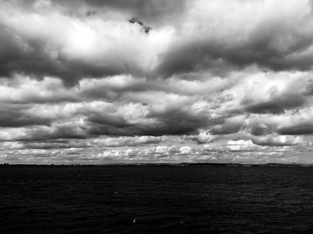
My final photograph 3 was taken in shoot 3, in response to cloudscapes. In this shoot, I took photographs in response to Alfred Stieglitz and John Day, two photographers with a very different visual style. This particular photograph was taken and edited by inspiration from Alfred Stieglitz’s Equivelents. Equivalents looks at dramatic black and white cloudscapes, an alternative viewpoint to many other photographers who photograph the sky in heavily saturated colour. In order to respond effectively, I edited this photograph in Lightroom CC, turning it into black and white then increasing the ‘contrast’, ‘clarity’ and ‘shadows’ to how I saw fit. This worked well and presented the billowing clouds as heavy and the image as very dynamic and bold. Cloudscapes can be looked at in many ways, exploring the serene and calm aspect of nature, or opposingly nature’s stormy and tempestuous character.
Final photograph 4:
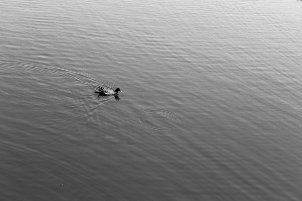
My 3rd final photograph comes from shoot 4, focused on the subject of water. I looked at Hiroshi Sugimoto’s work before this shoot, inspiring my style of response. This photograph looks at nature in an alternative way to my other photographs. This image is very simplistic and strips nature down to it’s most basic form, exploring the serenity and tranquility of how wildlife and the landscape come together to produce basic yet beautiful sights. There is little movement displayed in the water, only one single circular ripple where a raindrop has hit the water.
Final photograph 5:
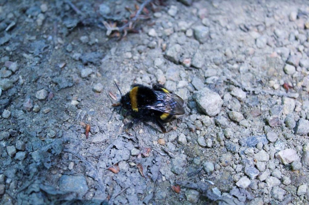
My second final photograph is from shoot 5, responding to Rinko Kawauchi. I got up-close to a bee to capture a very zoomed in look at nature’s produce. I aimed to capture the bee in detail, from it’s vibrant yellow colour, to the detail in it’s wings. The bee is the obvious main focal point of this photograph, situated centrally in the image; it contrasts well with the simplistic background of small rocks and stones.
Deconstructing The Narrative of ‘Tal uf Tal AB’, ‘You Would’ and ‘Park Sleep’.
Book in hand: How does it feel?
The book’s cover and sleeve are created from card giving it a textures surface which feels dry to the touch, however the book itself is a more matte card surface giving it a smoother feel whilst adding a slight tint to the cover. This card texture is carried on throughout the layout of the book. The textured surface of the sleeve and book covers are repeated on each book.
Paper and ink: Use of different paper/textures/colour or B&W or both.
All of the paper inside the book are glossy matte textured being about the same thickness of ordinary photography paper. Within the book there are a few blank pages so that it adds breathing space when working your way through which adds to the overall effect of the photographers decisions. The only text is the ink which is in a small font in each corner of the pages to highlight what the title of each image is. The book overall is very consistent as there is a strong theme regarding composition and focus of the photographer throughout.
Format, size and orientation. Portraiture/landscape/square/A5, A4, A3/ number of pages.
The book itself it is a A3 size, slightly smaller than an A4 sheet of paper with an effective use of negative space throughout due to there being borders to each image boxing them in a result. This compliments his photography as the photos become easier to focus on especially as there are more dominant portraits within. Its hard to say how many pages there are due to there being no page numbers, but I would guess there are about 50 pages per book.
Binding, soft/hard cover. Image wrap/dust jacket. Saddle stitch/swiss binding/Japanese stab-binding/leperello.
The books use a paper card cover without any dust cover on due to there being no need through the use of sleeves. This as a result makes the book more visually pleasing as when opening it it directly links the cover page into the photography.
Title: Literal or poetic/relevant or intriguing?
Overall the titles seem to be more poetic rather than literal due to how the content inside each hardly reflects what the title suggests, instead being more around a different theme of family or location life in specific locations.
Narrative: What is the story/subject matter: How is it told?
There seems to be no narrative in the books but rather small sub sections where a few page spreads will be portraits with the next ones maybe be landscape shots or images about home life. This theme continues throughout the three individual books.
Design and layout: Image size on pages/single page, double-spread/images/grid, fold-outs/inserts:
Each photo inside the book tends to be the same size regarding whether it is landscape or portrait, with portraits tending to take up the entire page and the landscapes taking up about half of a page.
Editing and sequencing: Selection of images/juxtaposition of photographs/ editing process:
The images inside each book seem to have little editing done to them as each seems like they have come straight from the camera with in-camera editing techniques like low or high exposures. As a result of this the results seem to be more literal, portraying the photographers vision literally.
Images and text: Are they Linked? Introduction/essay/statement by artists or others. Use of captions (If any).
The books lack text as there are no page numbers or information about where the photographs are taken. However in each bottom corner of every page there are the titles of the photos present on each spread, this is complimented by the very occasional use of speech dialogue which can be seen on some pages which seem to depict a conversation between two random people.
Evaluation of my Final Piece
Throughout my work on the topic ‘Variance and Similarity’ I took lots of inspiration from a variety of sources and my experiments and plans developed over time to give a final piece that is the result of trial and error. On first thoughts when approaching ‘Variance and Similarity’ I decided that my approach would be based on the comparison of similar subjects and characteristics.
My initial ideas were to show the difference between people through the individual hand creases bespoke to each person, to create a typology of different styles of buildings and to photograph the personal belongings of individuals to give an insight into personalities. After experimenting with photographing hands close up whilst taking inspiration from Tim Booth and John Coplans I decided that this approach was too limited and did not allow me to expand what I was photographing, and I found the same when photographing the personal belongings of individuals whilst taking inspiration from Huang Qingjun’s ‘Family Stuff’.
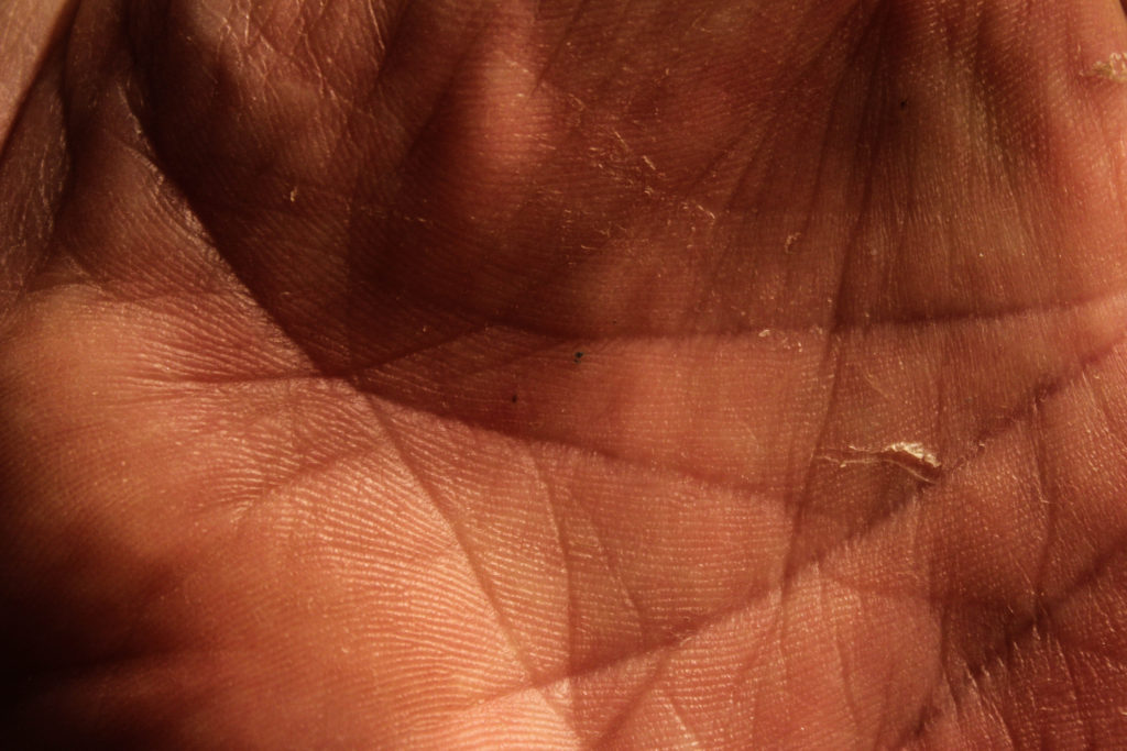
An outcome from my exploration of hands 
An outcome from my exploration of personal belongings 
A GIF produced from photographs of building patterns
Therefore I started exploring the patterns within buildings and the similarities between them – this took inspiration from Lewis Bush’s work on Metropole and Michael Wolf’s work. My initial response to these photographers layed the foundations for my final pieces as these photographs would be the base layers for the double exposure photographs that I would create later with photographs of textured steel. After researching the Becher’s I began to experiment with ways in which I could effectively display and compare photographs – I created both GIF’s and typology grids, and the grids became a key part of my project as I came to believe that they are a simple and effective way to compare photographs.

An outcome from experimenting with layering building faces over each other 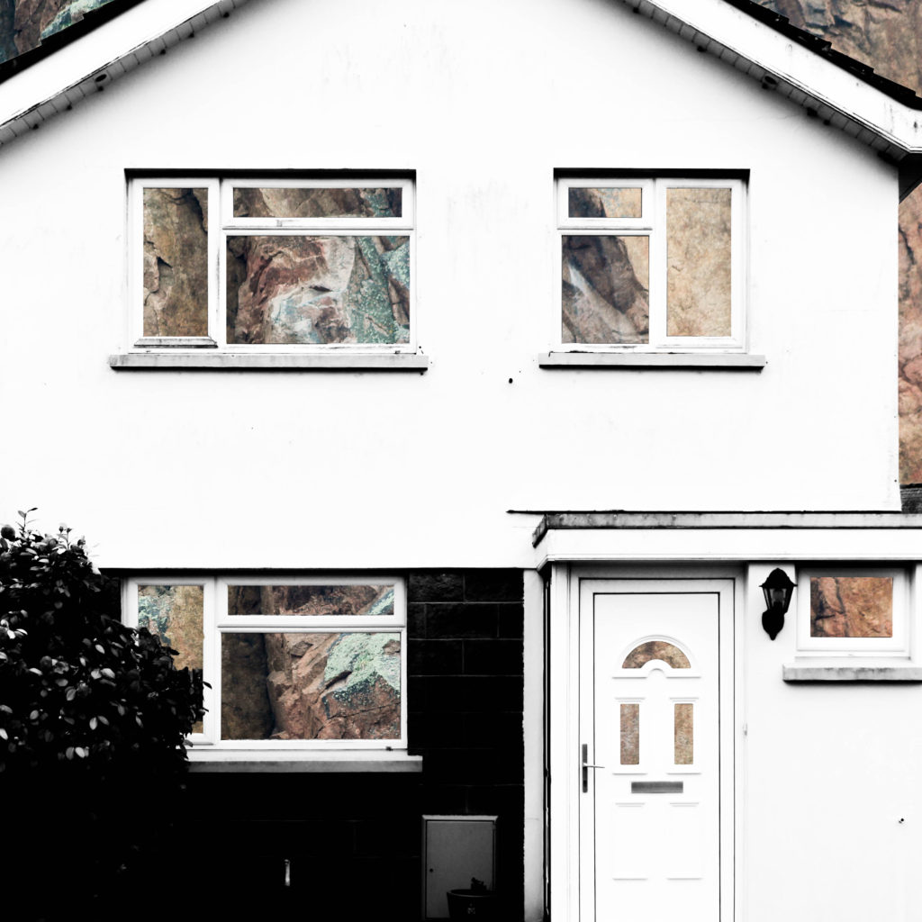
An outcome from layering building faces over rock face and removing natural frames

An outcome from layering building faces over steel and removing natural frames
An outcome from experimenting with layering photographs of building faces over steel surfaces
After beginning to pave a way for the route that my project would be taking, I researched John Baldessari and took inspiration from him in the sense of creating unusual abstract photographs, and his idea of putting coloured dots over faces led me to experiment with cutting out shapes in the building faces that I was photographing in order to reveal something else. At the same time I was experimenting with double exposure with inspiration from Lewis Bush’s ‘Metropole’. I decided to take a deeper search into the context of houses and buildings and so began to explore granite, due to it being an abundant resource in Jersey for building houses. This resulted in me experimenting with layering photographs of houses over photographs of granite and cutting out shapes of the natural frames to show the granite that is the base of the house. I found that this method was not as effective when working with photographs of steel so proceeded to create double exposure edits with the photographs of the steel and found that this created an abstract approach to show how buildings and materials change over time, whilst also incorporating steel due to the fact that more buildings are being built using it now more than ever. This double layering led to my final piece in which I incorporate typology grids inspired by the Bechers’ after I improved on the photographs of steel that I had photographed.
To conclude, I believe that I successfully fulfilled the exam brief and theme of ‘Variance and Similarity’ as my final outcome successfully shows the differences between different building faces whilst drawing comparisons between them, such as the common features including doors and windows. This comparison is aided by the use of a typology grid to show that the photographs are linked but individual. Therefore the photographs and presentation successfully show the variance and similarities between different building faces whilst drawing inspiration from a variety of photographs, but primarily from Lewis Bush, the Bechers’ and other New Typologists.
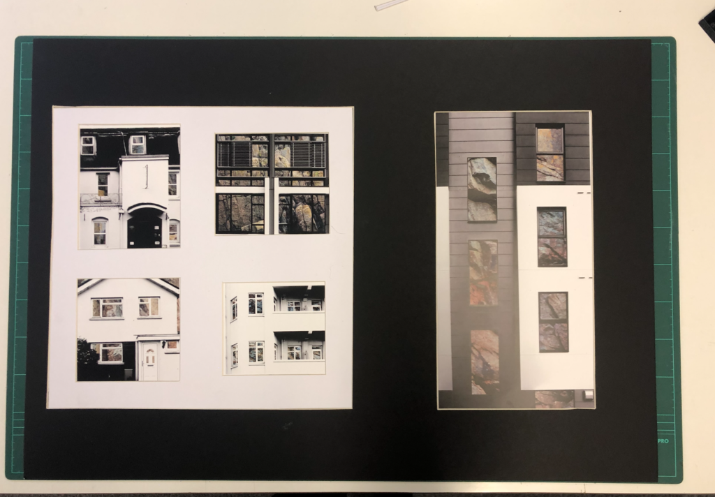
The final photographs produced have all been edited and captured in a way that ensures that they are technically accurate and aesthetically appealing. They were all captured with a natural lighting in order to ensure that all the natural shadows and contrasts were present in the photographs, as well as ensuring that a sufficient tonal range was present to create more contrast within the photographs. For the photographs in the typology grid there is a warm colour cast due to the rust of the steel – this contrasts with the composition on the left side which has a cold colour cast because of the cold nature of the steel layered over it. There is not a huge presence of colour in the final piece as the original photographs are in black and white but the steel layered over it is providing colours through the rust and textures within it. The final compositions are fairly two-dimensional as planned because I want to show the buildings as faces rather than as a whole structure. There is a strong sense of pattern and shapes throughout the composition due to the natural structure of houses – the windows and frames provide this sense of shaping which allows for the photographs to be contrasted. The context and idea behind this piece is that it gives an insight into changing trends. This is shown in the photographs as some of the building faces present are older and more of a traditional design, whereas others are newer estate houses. This typology grid allows the photographs included to be compared for what they are and they give an insight into how the design of buildings change, but also how the key components and shapes stay constant. The steel used also represents the changes occurring over time because previously houses in Jersey have been manufactured with granite being the base material, such as in cod houses. However, more recently with the occurrence of the high investment in the financial investment and a modern wave of house designs, steel is being used more often in houses and buildings, therefore the steel represents a variance in design and the rust represents the natural change in trends. For the composition including the granite edits the idea and context is very similar and is built from the same base (being the variance and similarities in buildings), however the granite represents an insight into what the structures of buildings are traditionally built with, compared to the steel that is more commonly being used. Together these two presentations show the variance and similarity of how buildings are built in both form and function and enable contrast to be drawn between buildings.
New Topographic Seminal Exhibition

In 1975 there was an exhibition of New Topographic inspired work – it was titled “New Topographics: Photographs of a Man-Altered Landscape” and was considered a point of turning in photography by many historians. The exhibitions consisted of the Bechers, Robert Adams, Lewis Baltz, Joe Deal, Frank Gohlke, Nicholas Nixon, John Schott, Stephen Shore, and Henry Wessel. The photographs revolved around typical typology themes such as abandoned buildings. What was appealing about this exhibition was how unusual they were compared to the traditional approach of photographing landscapes. The new topographic photographers were less concerned with displaying nature as an ideal haven and they prioritised showing how many has changed the landscape, possibly for the worse. The exhibition also brought around a change in the teachings of photography because all of the photographers involved were associated with academia as either students or professors, which was strange at the time as photography was not widely taught in schools. Stephen Shore’s photographs in the exhibition also showed a shift from the old belief that fine art and photography should be in black and white. Ultimately, the exhibition helped the idea of photography as fine art to gain traction. The exhibition was originally held in the George Eastman House but in 2010 was re-staged at the University of Arizona in which they chose over 100 photos from the original exhibition to include. The influence left behind from the photographers involved on photographers can be clearly seen in the photographs. Each photographer in the New Topographics exhibition was represented by 10 prints, all of which was in black and white except for Stephen Shore’s work. When introducing the exhibition, Jenkins (the curator) defined the common denominator of the show as “a problem of style: stylistic anonymity”, meaning an absence of style. The idea was that all of the photographs were stripped of artistic frills. For more detailed look at what the work of the New Topographic’s consisted of, please see my post on the Bechers.

Mobile Homes by Robert Adams 
Pier 24 by Stephen Shore
The work of the New Topographic’s appeals to me because the work that I have been doing on ‘Variance and Similarity’ involves me photographing building faces in a documentary style similar to the work of Topographics, such as the Bechers. I believe that the strong and bold photographs that they have produced in an attempt to show how there is beauty in the ugly have a strong influence over the work that I have produced as I have been photographing buildings which are not conventionally attractive, as well as photographs of steel covered in rust, which is another typically ugly subject. The resulting photographs are abstract compositions that reflect the documentative and cold-cut style of the New Topographic work. I am also presenting some of my final pieces as a typology grid, which is a feature strongly associated with the Becher’s. The typology grid appeals to me because it provides a great way to compare and contrast between photographs as well as showing trends between them in a way that is simplistic but effective.

My final presentation as comparison 
A typology grid by Bernd and Hila Becher
Photobook Study | Infra
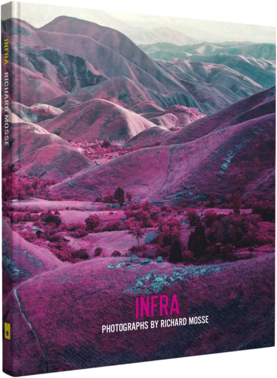
Infra, Richard Mosse’s first book, offers a radical rethinking of how to depict a conflict as complex as the ongoing war in the Democratic Republic of Congo. Mosse depicts the rich topography, inscribed with the traces of conflicting interests, as well as rebel groups at war with the Congolese national army (itself a patchwork of recently integrated warlords and their militias). For centuries, the Congo has repeatedly compelled and defied the Western ideology. Mosse brings to this subject the use of a type of color infrared film called Kodak Aerochrome. Originally developed for military reconnaissance and now discontinued, it registers an invisible spectrum of infrared light, rendering the green landscape in vivid hues of lavender, crimson, and hot pink. The results offer a fevered inflation of traditional reportage, underlining the growing tension between art, fiction, and photojournalism. Mosse’s work highlights the ineffable nature of current events in today’s Congo. Infra’s photographic dialogue begins as an intoxicating meditation on a broken genre, but ends as a haunting elegy for a vividly beautiful land touched by unspeakable tragedy.


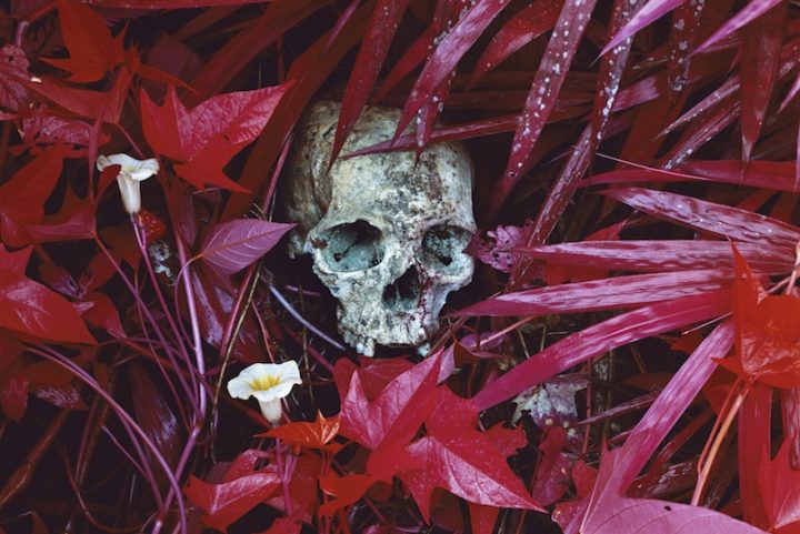
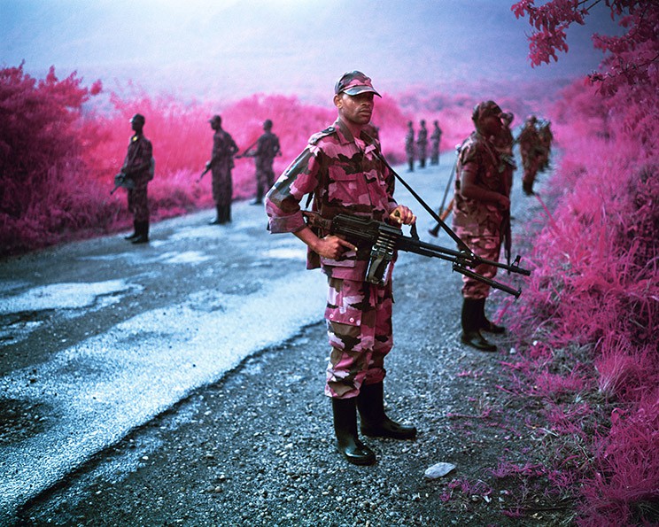
Mosse’s photo-book ‘Infra’ was one I found very eye catching and appealing to me. I became instantly interested in his story and his images were compelling and told the story of his time in the Congo without using a single word. My book however is not following the same approach, my book aims to make people see the world in a different way and maybe be more observant of the world around them and circles are a shape that you can see everywhere, but nobody really takes notice. That is one similarity this book has with my idea, that nobody takes notice of the conflicts etc in countries we find ‘insignificant’ to us.

Richard Mosse (born in Kilkenny, Ireland, 1980) holds an MFA in photography from Yale University School of Art, and additional degrees from Goldsmiths, London; King’s College London, and the London Consortium. His work has been widely exhibited internationally, including at the Palais de Tokyo and the Tate Modern. In 2011, Mosse was awarded a John Simon Guggenheim Memorial Foundation Fellowship, with a supplemental stipend from the Leon Levy Foundation. Mosse is represented by Jack Shainman Gallery.


