Category Archives: Analysis

Filters

Author:
Category:

laura el tantawy ARTIST REFERENCE FOR SECOND SHOOT

I chose el tantawy as my second artist think it is fascinating how she manages  to not only capture reflections within different mediums such as glass and water, but also using this with the addition of light. I believe the different uses of natural elements are an occurring  sentiment within her work.  I too want to capture a variation of daytime and njght-time imagery, yet still achieve the same effortless representation of people and emotions. Another area of her work that I belive is very fascinating is how she actually achieves such complex compositions without editing her photos to do so. An article that I found very interesting, was explaining tantawys inspiration throughout her work. It discusses how she finds moments of beauty and optimism even in the darkest places, and she is beyond the point where she sees nothing. ‘Growing up without a fixed place to call home, Laura El-Tantawy struggled with a fractured identity. Then she found liberation in the form of a camera, developing an impressionistic eye that helped her reconnect with her native Egypt.’ There’s a point I always return to when thinking about what photography means to me. I was studying journalism and political science at the University of Georgia when I took a photo class as an easy credit, just to have fun, and fell in love with it.’  She then continues to discusses her love of movement within her photos, and how this movement to her is a parrel between-her inspiration and movement towards wanting to be  in her home town. ‘ One of the first assignments was to photograph movement. I went to a dance performance, just playing around with my camera settings, not really knowing what I was doing.’
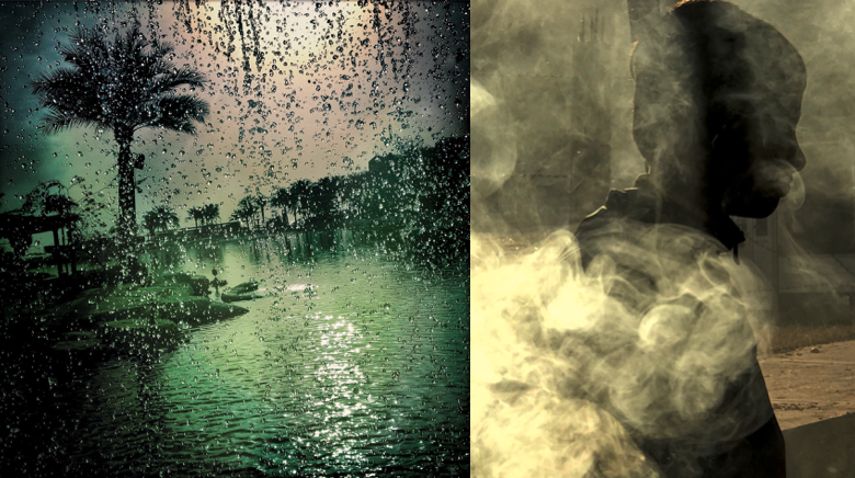
Much of her work has an impressionistic undertone that, looking back, it feels perfectly in tune with the path my work should take: Finding moments of beauty and optimism, even in the darkest places. But there was one editor who said, “You know what? You can take pictures just for you.” That’s essentially what I’ve been doing ever since. It’s not a selfish or egotistical thing. It’s liberating. I have no expectations whatsoever, only to take pictures that mean something to me in that moment.I was born in Worcestershire in 1980 and my parents moved back to Cairo when I was five months old. We were in Egypt until about 12 and then my father got a job in Saudi Arabia, so we lived there for about six years. Then I went back to Cairo for two years, moved to America for 10 years and I’ve been in the UK for almost a decade now.t gives me a space where there are no boundaries. But living all over the place means I’ve always felt like I’m looking for something and I don’t know where it is. That sense of constantly trying to connect gradually led to Beyond Here is Nothing, which is about the beauty and the tension of living somewhere you don’t really know.


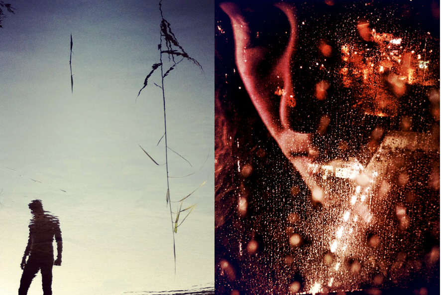
 This perception of seeing the smoke is perhaps one of my favourite images, this is due to the interesting composition. I believe the effortlessly of the lighting, and a habit which is deemed as dangerous and unhealthy, is almost presented as beautiful within this image. The lighting is almost embellished within the fluidity of the weaving smoke. And something which was once deadly she had now turned into art. I also think the use of the shadow instead of showing the whole man himself, also creates a more successful piece. it brings out a more occurrent resemblance of mystery within the work. Too the image on the left is a scene of a hardship, and flooding, it is once again something never seen as beautiful or perhaps even a sight portrayed as picturesc. Below i’ve added some quote and reasonings as two why the artist has created these images, and what they mean to her.’ Enclosed between four walls, the sound of silence never seemed louder. It’s claustrophobic. I wait for the phone to ring, check for emails obsessively, eat everything out of the fridge. The hunger remains. I feel like if I dig my hand deep into my soul, I will find nothing. The awareness I am experiencing is unspeakable. Faces change when we meet. Is their solitude reflected in mine? There is an awkward silence.’

The work above is from her work ‘Beyond Here Is Nothing’ is a photo-book object meditating on home. A place of belonging, a tranquil state of mind; a nostalgic memory or an imaginary destination – home is a perpetual possibility El-Tantawy is journeying to reach. Her personal experience growing up in contrasting cultures is the window to an intimate and emotive visual exploration of the unsettling feeling of rootlessness, the mental burden of loneliness and the constant search for belonging in unfamiliar places. Drifting between the physical and the whimsical, the book reveals itself through layers of images and words. A mirror of dispositions. A living object harmonising with time. I chose her work as  I see an angelic effect, I see her own narrative of relating her own feeling of love for somewhere else shown with her current environment. Her work looks as though it is a combination of overlapping images and edits, however, her work is a sight which was actually visible, This brings a certain respect of truth to her narrative, it is a reflection of real time. The way she uses colour in such a strong tonal way, yet still occur the sense of peacefulness is beyond what most photographers capabilities. The femininity and the soft touch to the images, create a very female orientated view.
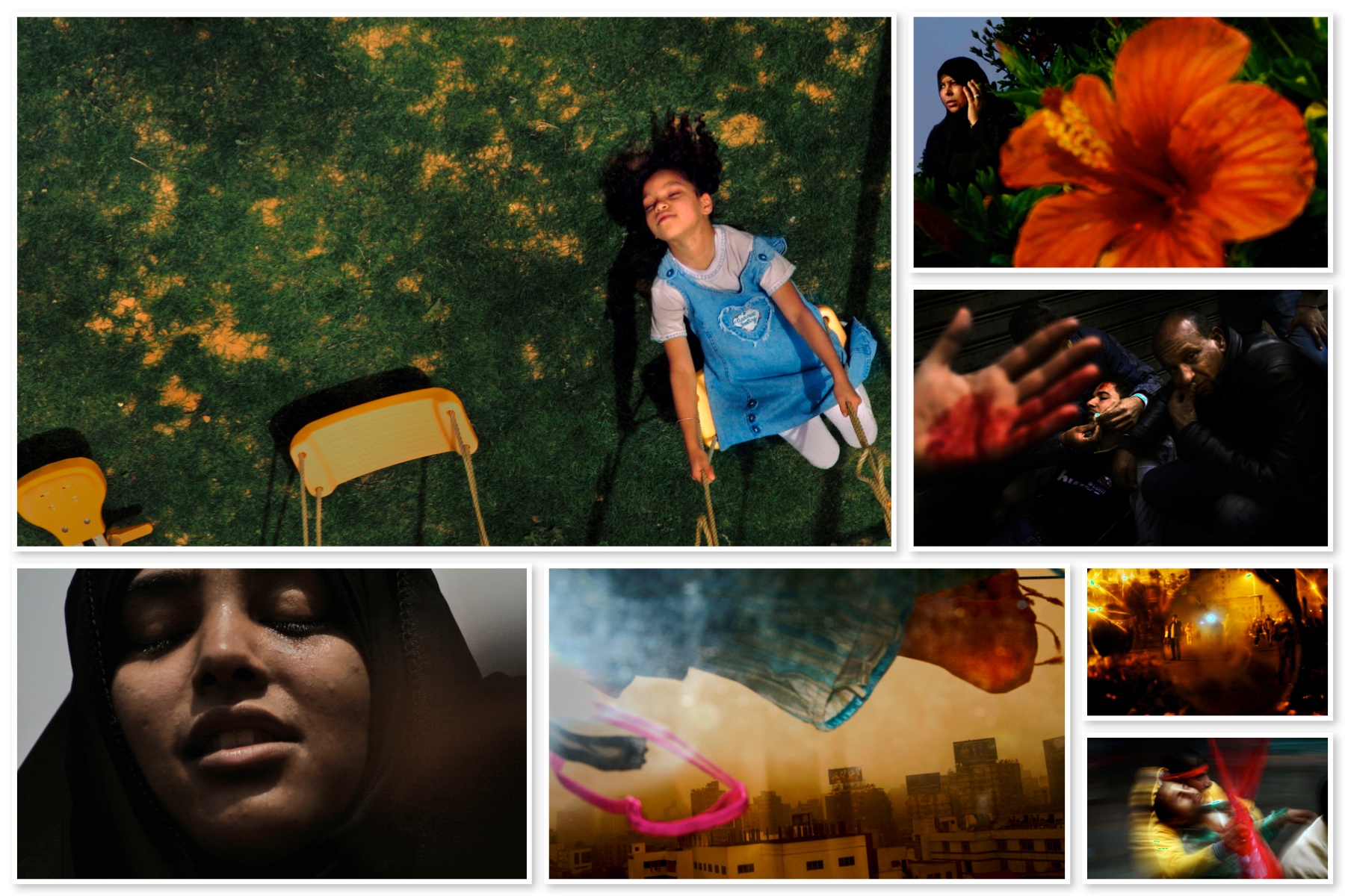
I believe through this composition and vision board of her images, you are really able to see the narrative development and artistic influence of abstraction. I like how she not only pictures nature and belongings but she presents people in such a disposition, that they too become part of her own narrative. I have spoken about for this shoot and using this artist as artistic inspiration, I will also use myself through the shoot. I believe it is fascinating how she can even display traumatic events, such as the middle right image, with boundlessness of beauty and see a complete depiction of her own life narrative. You can belive that these were all taken with the intention from being experienced by herself. The lighting in these images, brings a warmth and an aspect which I believe is the most successful part. Images analysis: conceptually all of her images have a conjoined narrative of wanting to show a beauty of her country in someone else’s country. I also believe through the more I see her work, and through the way it is composed, is how they are about beauty and tranquility. Her images still have so much colour and vibrancy within them. And this is an area which I too want to show and use throughout my work. Although her images do not necessarily carry the same theme, they all work so well together as a narrative group, and I believe this is evident as seen above.  My inspiration and how I will develop these concepts from her work, Due to her narrative being focused on her missing home, so creating abstract images full of beauty in order to resemble her love and beauty for her home, Perhaps my narrative journey should be aspiring  to see the beauty within myself and my environment. It should be the ability to see the happiness and capability within my life and my own actions. This is an article about shooting in black and white, however I still believe it shows pivotal demonstrations of capturing a beauty within street photography, and the construction of a narrative with people and the space around them.

 https://fstoppers.com/education/why-its-still-important-shoot-black-and-white-48141


PLANNING FOR SECOND SHOOT AND FINAL OUTCOMES

My concept for the beginning of this shoot was first to show a type of beauty within my personal daily life, I wanted this to be a reflection of the everyday and seeing beauty within the normal. I wanted to show both a combination of femininity but also a focus on how I could express this not only through a softer tonal scheme but a more vibrant colour. I wanted to show variations of both nature elements, and also more detailed areas that are looked over for being seen as beautiful. I not only wanted to from beautiful imagery but I too wanted to how a more abstract and interesting composition  to my work.

additional edits:

overall analysis:

repetition – typology research

Explain your process and where your ideas came from RE  GIF –Making

the process of creating a gif: File, Script, Stack, Window- what file , add open files, Okay, Select all layers, Window, Open a timeline, Opens at the bottom, Click arrow to frame animation, Must click it, Me he box in corner, Create new make new, 0 seconds, A delay between frame, How long you want the gif, 0.2 secs, Forever as a loop like a standard gif, File, Export, Save for web legacy, Dialogue box preview, Check file size, 8mg on blog, Might need to trim, In image side bring it down.

•      Include your original images to show the starting point of your experiment

•      Define what a GIF is…it’s possibilities and limitations too

a lossless format for image files that supports both animated and static images.
“a GIF image”, a file in GIF format., plural noun: GIFs
The possibilities for a gif is to make an almost motion picture animation, and create a formation of separate images, almost forming a real life narrative. However it does have limitations of the way in which you take the image for the similarities to line up and look as though it could be real.

Bernd and Hilla Becher / Typology

Typology and the Bechers

The definition of ‘typology’ is “a classification according to general type, especially in archaeology, psychology, or the social sciences”.  Essentially it is the study of types.  The roots of Photographic Typologies is in August Sander’s 1929 portraits ‘Face of Our Time’ in which he documented German society between the two world wars.  Sanders’ aim was to create a record of social types and classes as well as the relationships between them.  Sanders was so successful in achieving this that the photographic plates were destroyed and his book was banned soon after the Nazis came into power.  Typology can be used to create a visual analysis of objects and the larger environment by extracting visual elements and presenting them in a consistent series and so forcing the viewer to compare the subjects.  The Becher’s and their style appeal to me because when exploring ‘variance and similarity’ I hope to create photographs that successfully show the differences and similarities in structures as the Bechers’ have done in a similar style whilst using the typology grids to emphasise the contrasts.

The term ‘Typology’ first came into use when used to describe the style of photography that Bernd and Hilla Becher were practicing.  The Bechers documented dilapidated German industrial architecture in 1959 – they described the buildings which they photographed as “buildings where anonymity is accepted to be the style”.  Each photograph in their collection of work was taken from the same angle and the same distance from the subject with the aim to capture a record of the changing landscape as these dilapidated buildings began to disappear.  The Bechers influenced generations of photographic typologists, such as Jeff Brouws and John Cyr.

Bernhard Becher (1931-2007) and Hilla Becher (1934-2015) were German conceptual artists and photographers who would work as a collaborative duo.  They are best known for their topographic images of industrial buildings in Germany, as discussed earlier.  The photographs were often organised into grids to show differences and similarities between the subjects photographed.  They are the founders of the ‘Becher school’ or the ‘Dusseldorf School’.  They have received multiple awards including the Erasmus Prize and the Hasselblad Award.  The Bechers’ worked outside of Germany as well including photographs of buildings in Great Britain, France, Belgium and the United States in 1965.

Their work on typology began as they first collaborated on photographing the disappearing German industrial architecture in 1959 – they were fascinated by the similar shapes in which certain buildings were designed, which is evident in their work.  After collecting thousands of pictures of individual structures they noticed that the different structures shared many qualities and were intrigued by the fact that so many industrial buildings were build with a focus on the design.  The Bechers would work with a large 8 x 10-inch view camera and would always use a straightforward point of view.  They would only shoot on overcast days in order to avoid shadows as well as only in the early morning during spring and fall.  A variety of subjects were photographed throughout their work including water towers, cooling towers, coal bunkers and gas tanks.  Often the Bechers would exclude any details that would detract from the central theme.  By photographing these structures the Bechers’ drew attention to the need of preservation of the buildings and some of them were designated as protected landmarks as a result of their work.
The Bechers decided to exibit their single-image gelatin silver prints grouped by subject, in a grid of six, nine, or fifteen and had come to the conclusion to present the images of structures with similar functions side by side to entice viewers to compare forms and designs based on the functions of the subjects.

The work of the Bechers were strongly influenced by the Weimar movement of New Objectivity in the 1920’s which was a movement in German art arising in the 1920’s as a reaction against expressionism.  The term ‘New Objectivity’ came to characterize the attitude of public life in Weimar Germany as well as the art involved in it. It was meant to imply a turn towards practical engagement with the world and ended in 1933 with the fall of the Weimar Republic and rise of the Nazis.  Some artists included in the movement in which the Bechers’ took inspiration are Karl Blossfeldt, August Sander and Albert Renger-Patzch.

In the Becher school they managed to influence a number of photographers including Andreas Gursky and Thomas Ruff; the work of their students also minimizes human presence and explore landscapes in a documentary style. Their school and work has had an impact on both Minimalism and Conceptualism art.  Their legacy can be seen through the work of Lewis Baltz who takes a similar approach with a more modern twist to it.  Their legacy can also be seen in the change in attitude to vernacular architecture – the Becher’s actively campaigned for protection of the structures that they photographed which led to the protection of industrial spaces.

Analysis

Image result for bernd and hilla becher

In this photograph natural daylight will have been used to capture it. You can tell because of the soft tones and natural contrast within the photograph. A low ISO of 100-200 will have been used for this photograph as the Bechers’ would be trying to ensure that noise within the composition was kept to a minimum.  A shutter speed of 1/60-1/150 will likely to have been used in this photograph – a shutter speed that is not too slow but not too fast to ensure that enough light could enter the camera lens from the overcast condition that the Bechers’ would shoot in.  A deep depth of field has been used at the whole of the photograph is in focus.  There is a warm colour cast to the photograph even though the photograph is in black and white – the warm colour cast reflects the comfort of the countryside in which the structures are based in.

There is no colour in the image as it is a black and white photograph. This shows that the viewer should be looking at the details of the subject instead of colours. There is a wide tonal range, ranging from the contrasting shadows of the structure to the over-exposed background. There is clear texture in the structures which makes the photograph more realistic to the viewer and gives it a slight 3D effect.  There is pattern and repetition in the beams of the structures which makes the photograph more aesthetically pleasing for the viewer.  The structures are placed in the centre of the photograph rather than using the rule of thirds as this photograph is part of a documentative-style approach in which the intentions were to show the form of the structures rather than to be aesthetically pleasing.

Bernd and Hilla Becher would document architectural structures all over Germany. They took photos of similar typologies and would make compositions of them all together. This is just one example of the work that they would do. They captured the pleasing aesthetics in the buildings deemed ugly and showed the country that there is more to it if they look closely. The Becher couple documented all sorts of structures and worked to open the countries eyes to what was right in front of them.  They described the buildings which they photographed as “buildings where anonymity is accepted to be the style” and aimed to capture a record of the changing landscape as these dilapidated buildings began to disappear.  The photograph is part of a collection of photographs intended to compare the structural qualities of different structures and would have been presented alongside another five or eight similar photographs of similar structures to allow the viewer to compare.

PHOTOGRAPHY PROJECT FINAL CONCEPT, finding beauty of imperfections

I belive as this is my last photography project, I need to start creating photography out of my comfort zone, and images which evoke a true feeling and follow a successful narrative thought. I started to think about all the three concepts I have so far being: fine art, media and family. I have come to the conclusion that this could come under beauty in life, despite pain and suffering. I will do this project from my own personal persona of the world. I belive not only does this project become my first directly connected photography to my own emotions, but it becomes a reflective narrative of my own life. This creates a narrative and meaning to my work. I myself belive there is definitely more good in the world than not. I belive everyone should be grateful in their life, as we are surrounded by so much beauty constantly. Despite all the struggles, disappointments and pains throughout our time, there will always be a positive outcome or ending. Or however hard anything might seem, it is never permeant, and to still keep faith and see the positive aspects within the world. I believe that This way of living contributes to the concepts of buddhism, and a change in mindset of what the world is like. I will use a combination of my daily life, where I go, what I see and experience, and form these beautiful pieces with this positive mindset at hand, as I do belive it is possible to find beauty anywhere I go.

Much of the work that I have in mind to me that speaks positivity and a freeness of life, is work which is abstract, emotive, has bright vivid colour, strong happiness, lighting and finally has a movement to the piece. All of these aspects creating a happier image. The state of seeing happiness and beauty is a state of mind and consciousness that you have the power to control. The state to which your attitude  creates a whole new perception of what is actually in front of you. With the weather getting better, lighter and people being friendly and more united, this to my mind is the perfect time to study a project about my one positive relationships with others. As I will do this project from my own views of how I see beauty in the world, I will possible include myself in some images, in order to show a bonding of myself with the atmosphere, emotions and persona that I too share with the landscapes and objects. My feeling and self should be shown within the imagery and it should be a combination of my own self love, reflected within the work.

An artists work that I belive really inspired me was laura el tantawy, I will study her ideas and inspiration in my next blog post, but for now I see her work has a beauty , softness and elegance. Her images to my mind connote a reflection of peace at mind. And I believe even taking such beautiful images, will benefit my own self, and my thoughts and views of the world. Focusing on the good instead of the bad in the world, should be an ideal way which people should live. Through taking beautiful images and letting my emotions be vulnerably visible in these images, will only benefit myself, and become happier and more peaceful at mind. I believe throughout this project my images will gradually get happier and more positive, as I grow more apart of my project. This piece of art is a relation of family as its close combination with my own emotions and the close relationships with how people should have a close bond with themselves like family. Mental health problems that they view the world, it just as important as the close net relationships we have with others. The media always concentrates the way we think and should feel about ourself, this effect on our mental health, changes an creates prejudice in the way we see ourselves, the world around us and others.

I believe this project will have some undertones and connotations to mental health, This being due to how we view subject matters as a society, and people being very based off of our own thoughts. If we are depressed or anxious it becomes more fogged and harder to view the world in a positive way. My images will be a combination of landscapes, observations but focused on in a more abstract manner. I too believe positive is reflected within light, so lighting will be a large part of this shoot. Luminance and brightness, seen within artificial and real light is abstract. Perhaps I too will look into artists who just study and look at light and abstract work. Additional aspect which I belive I too believe have a large importance to what I am trying to achieve within my own work. People colour, nature Similarity people Dreamscapes, abstract imagery.

Videos, Throughout this project I want to make around 5 videos, showing a visible demonstration of my life, a direct observational of what I see, perhaps featuring myself.The fact of featuring myself is to be done to show and exposure my own insecurities and exposure my emotions to everyone, as this exposure of a real presentation of myself, should be compared to the world around me.  But mostly to show the journey of what I can see and perhaps a literal narrative and final outcome of why I belive this holds importance and beauty. These videos will be short, delicate and focus on small detail usually ignored. I believe I could even add music over some, which evokes a more meditative medium of peace to them, and music which I belive evokes happiness. I really ant this project to be a positive reinforcement of my own thinking, how I feel about myself, and also a sentiment for how people should think and view the world from a positive clean slate.

Beauty of imperfections, is not only a pivotal part of the world which we live in, but it is also learning to love yourself. It is so important to accept you are not perfect, and despite what you or many will think, no one is perfect. It is the people who are able to see their imperfections and still love themselves despite of this who are the most beautiful. Being vulnerable and possible showing myself in ways I don’t such as with no makeup, not dressed up and stripped down to a natural form, trying to show that despite this , it it still okay, I am still me and this should be accepted. with the current high social regard of the media and beauty standards perhaps me doing this is a pivotal point of importance to my work. my vulnerability of my body and my emotions within this project, is what will make it successful and bring it to the next level. My images being along side aspects of the world I view as beautiful literally pulls myself as part of my narrative, and highlights my own importance and a bonding with my project. Images of still life, landscapes close ups, myself, just beauty which is surrounding me, I will too edit and combine images to create more abstract imagery. I believe Finding beauty within the imperfections of life is such a infacturating concept, and such an important part to being happy. To know of all the bad and see through it, To view mortality as something worth living for and not taking life for granted, Rather than death waiting for us. I believe to view and create something beauty from nothing is such a hugely great and important aspect, and perhaps  my own imagery, will enable people to see the beauty they too live in but just haven’t noticed or seen yet. My project is the growth and decay in life, and finding the beauty within the bad and good. and my own personal exploration of my beyond, being and how i should and can view the world as something which is just beautiful and should be seen this way. I will look into some philosophies about how to capture the world in this light, and more asian methods of seeing beauty.

I do belive this project connects with the title similarity and variation, this is due to the first off the connection with fine art, family and media which I previously discussed are a few of the primary starting points for the project. Secondly variation and similarity discusses a-lot about DNA and what makes us who we are and our reality and how it is interesting as we as people are so similar yet so different. This being different in our views of the world our appearances, and are ability to seek happiness. I believe showing the individuality of myself and how I see the world is a pivotal point in this project. This is what really will successfully connect my project to the finished title.

Variation and Similarity

What is variation?

Variation is “a change or slight difference in condition, amount, or level, typically within certain limits.”

On googles dictionary, it also defines as “a different or distinct form or version of something.”

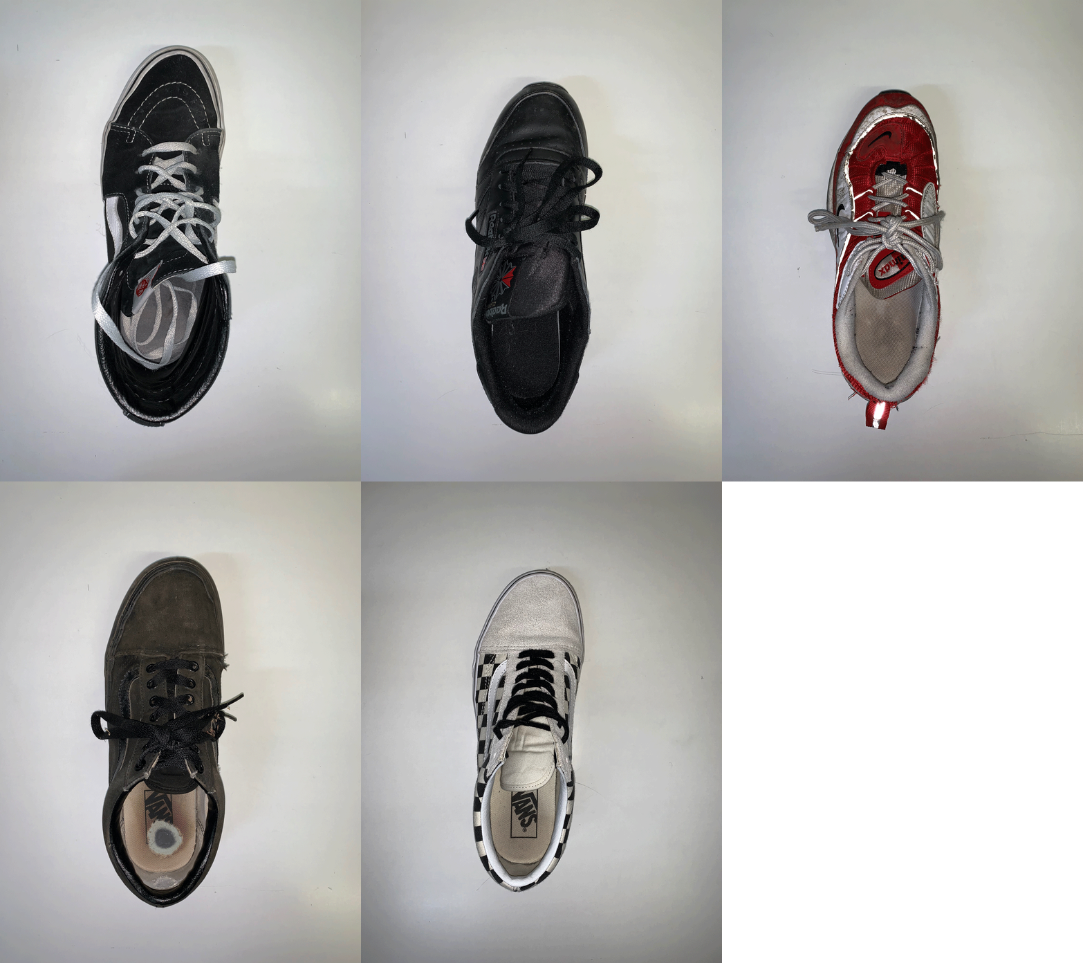
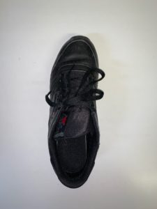
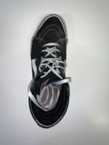
My first thoughts on how to approach this noun which appears as part of our exam theme, is to explore differences in objects or people. Straight away, I felt that I could base my exam on simple, everyday things, such as everyday routines that people do, as well as everyday objects, such as food, flowers, shoes and so on. Most people do similar things every morning, like brushing their teeth, eating breakfast, and travelling to school/work in a car, a bus or walking or cycling. This leads me onto the other part of the exam theme, which is ‘similarity’.

What is similarity?

Similarity is “a similar feature or aspect.” Google’s example of the noun in a sentence is “the similarities between people of different nationalities.”

I feel that similarity can be explored in many interesting ways; for example, people and families would be interesting due to how family have similar features, like face shape, skin and colour so taking a portrait approach would be intriguing. Additionally, people and bodies is another portrait approach that could be successful because everyone has the same body parts, yet linking to the other part of the exam theme ‘variation’, everyone’s body parts and features varies due to DNA.

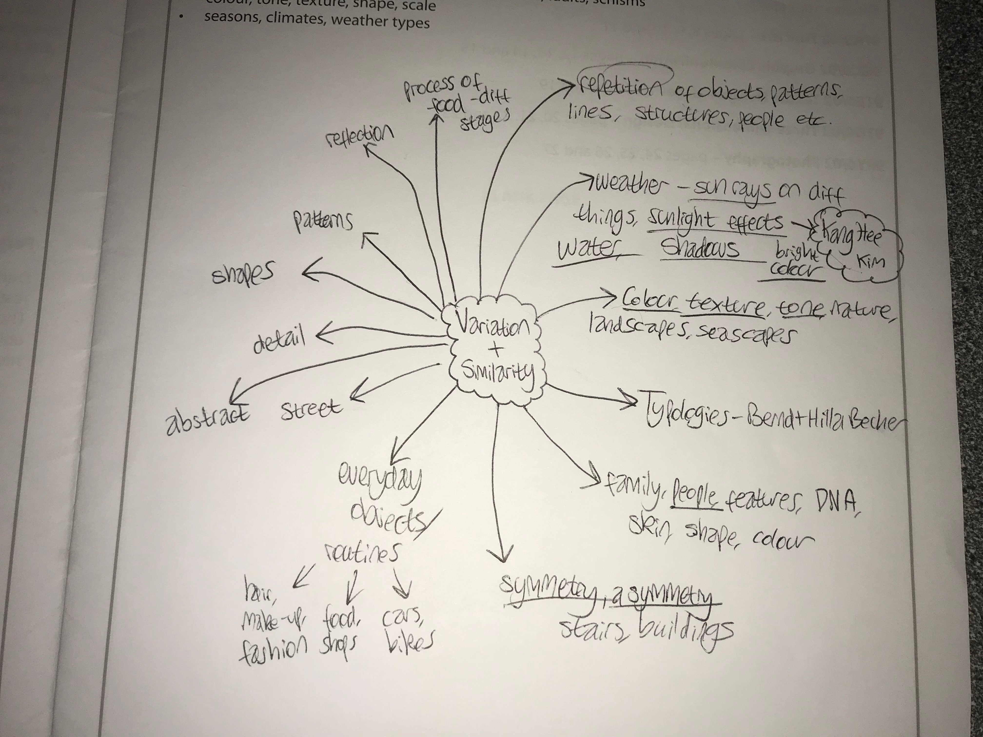
My broad range of aspects to focus in on for this exam is bringing me new ideas that I could explore. Below is a mind map of some ideas that I have come up with:

Artist Reference – Aaron Siskind

Who is he?

Arron Siskind was born December 4th, 1903, New York, dying in February 8th, 1992, Providence, Rhode Island. Siskind became an influential teacher, editor and photographer who is best known for his innovations in abstract photography. Starting 1932, as an English teacher in New York City he became a member of the Photo League, participating in projects designed to document neighbourhood life during the Great Depression. Siskind’s project Dead End: The Bowery and Harlem Document shows his concern for pure design rather than the subjects themselves. Because of this in the late 1930s he stopped photographing people and instead moved onto architectural photography, seen present in his book Old Houses of Bucks County, a book which looked at natural phenomena and still life. 

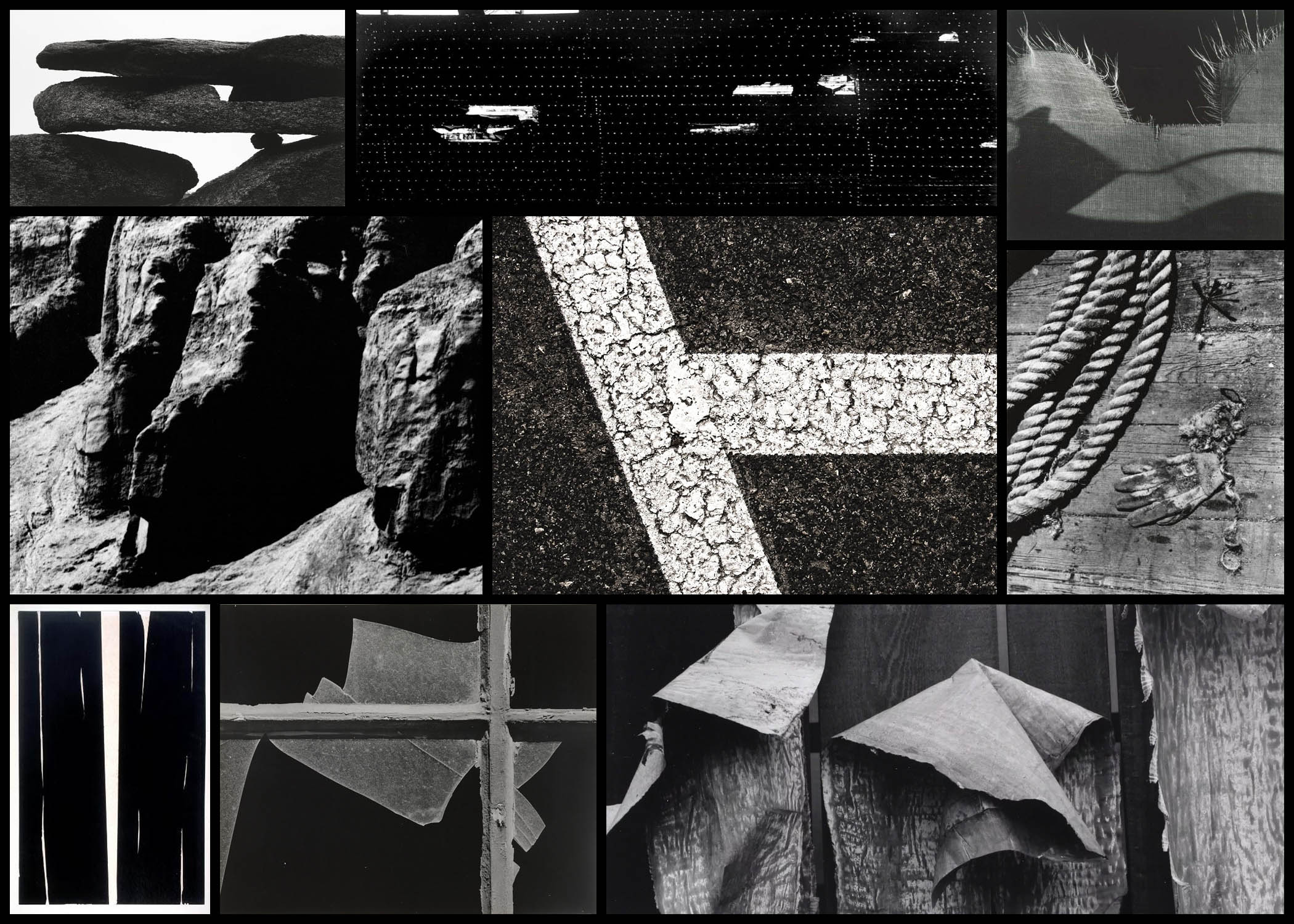
Siskind soon specialised in abstract work which he became best known for, where he expresses his own state of mind instead of recording the subject matter as it is. In the late 1940s textures and patterns became the core focus for him, looking at regular objects such as rope, sand and seaweed. Siskind’s inspiration came from Group f.64 who photographed the subject up close much like his own style, this led him onto photographing two-dimensional surfaces such as pavements, billboards and walls, especially the ones which had been decayed and worn out by the weather. This turned into his main theme that allowed for him to take photos of the ruins of Arch of Constantine in 1967, a piece that was not originally accepted by other photographers. However many artists liked this and Siskind’s was hung up alongside abstract expressionist paintings. 

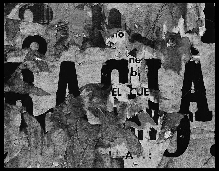
Most of his inspiration comes from various activities as a founding member of the Society of Photographic Education and as a co-editor of Choice, a literary and photography magazine. Overall his greatest inspiration was as a professor of photography at the Institute of Design of the Illinois Institute of Technology in Chicago, a post he held from 1951 to 1971. His final works consist of a 30 year anthology of his photographs, Bucks County, Photographs of Early Architecture and Places. Here are some examples of his work below:After looking over some examples of his work I decided that I would analyse one of his images, by doing this it would allow for a greater insight into how these photos are created and what makes them so effective. When looking over the photos it would give me the ability to incorporate the style into my own works, making them more effective as a result. The image I chose for this is called San Luis Potosi 16, a photo of a rotting billboard with deteriorating paper:
Visual: 

Visually the image is of a billboard that had been left to rot, and as a result has become this abstract piece in itself which hides the initial meaning meant to be put across by it. This is accompanied by the fact that the paper has been repeatedly stacked upon different posters underneath, because of this the writing seems to jump around the image rather than stick in one place. When looking at it I found that the different sizes of fonts really attracted my attention due to it breaking up the piece from becoming too generic and repetitive, allowing for your eyes to travel across it with ease rather than become eye-sore from a lack of contrast. Composition wise the use of placing the biggest text in the centre of the photo really creates the whole image, as it becomes the focal point for your initial glance and the source of it’s overall aestheticism. 

Technical: 

When looking over the image there is a use of high contrast, this is done so that there is a clear definition between the lights and dark present inside the piece, emphasising and changing the final outcome as a result. The photo has been taken using monochrome, this like the contrast increases the difference between the lights and dark whilst also honing in on specific details that may of not been previously picked up upon when looking at it in colour. A relatively normal exposure and shutter speed have been used as there is no sign of blur or one of he shades overpowering the other, instead capturing the billboard as it was seen at the time. 

Conceptual: 

The image itself is part of a series consisting of various billboards in and around cities, capturing their deterioration in an aesthetic and unusual way. When looking over the photo it is clear to me that it was taken at the peak of Siskind’s exploration and experimentation regarding various takes on the environment which makes us the surrounding area, using it to reflect what can be seen and expected rather than take portraits instead. By using a monochrome filter it brings out the aestheticism of the image, making it entirely possible to interpret the image purely on an aesthetic level. The reason for Siskind’s attraction to abstract takes on cities come from experimentation between photographing an object in an unusual way or photographing the people found in that area, after much time he decided upon using abstraction to express his opinion regarding his viewpoint of the surround place, making the viewer interpret his meaning through only visual appearance alone. 

GIF EXPERIMENTATION

G I F  E X P E R I M E N T A T I O N

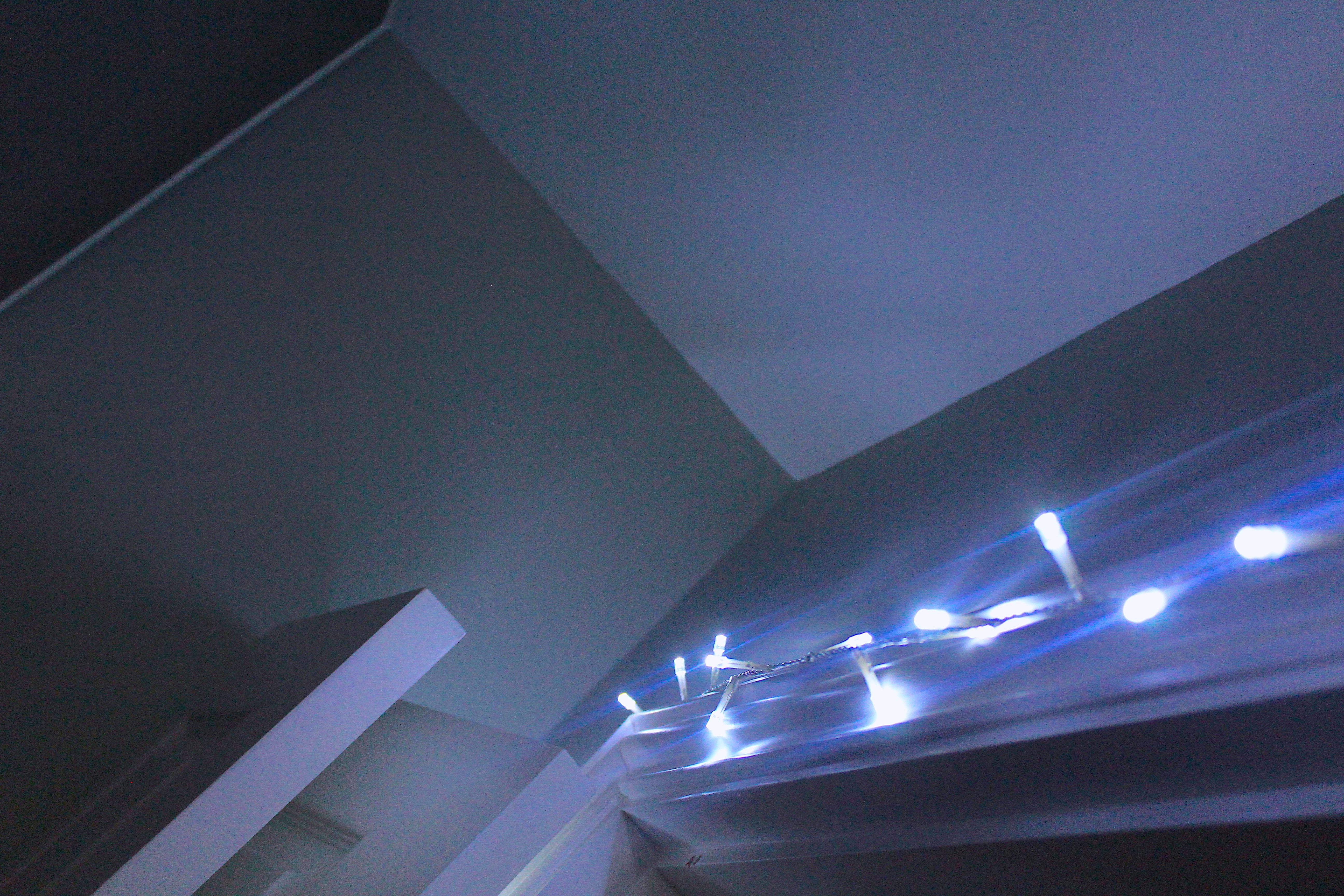
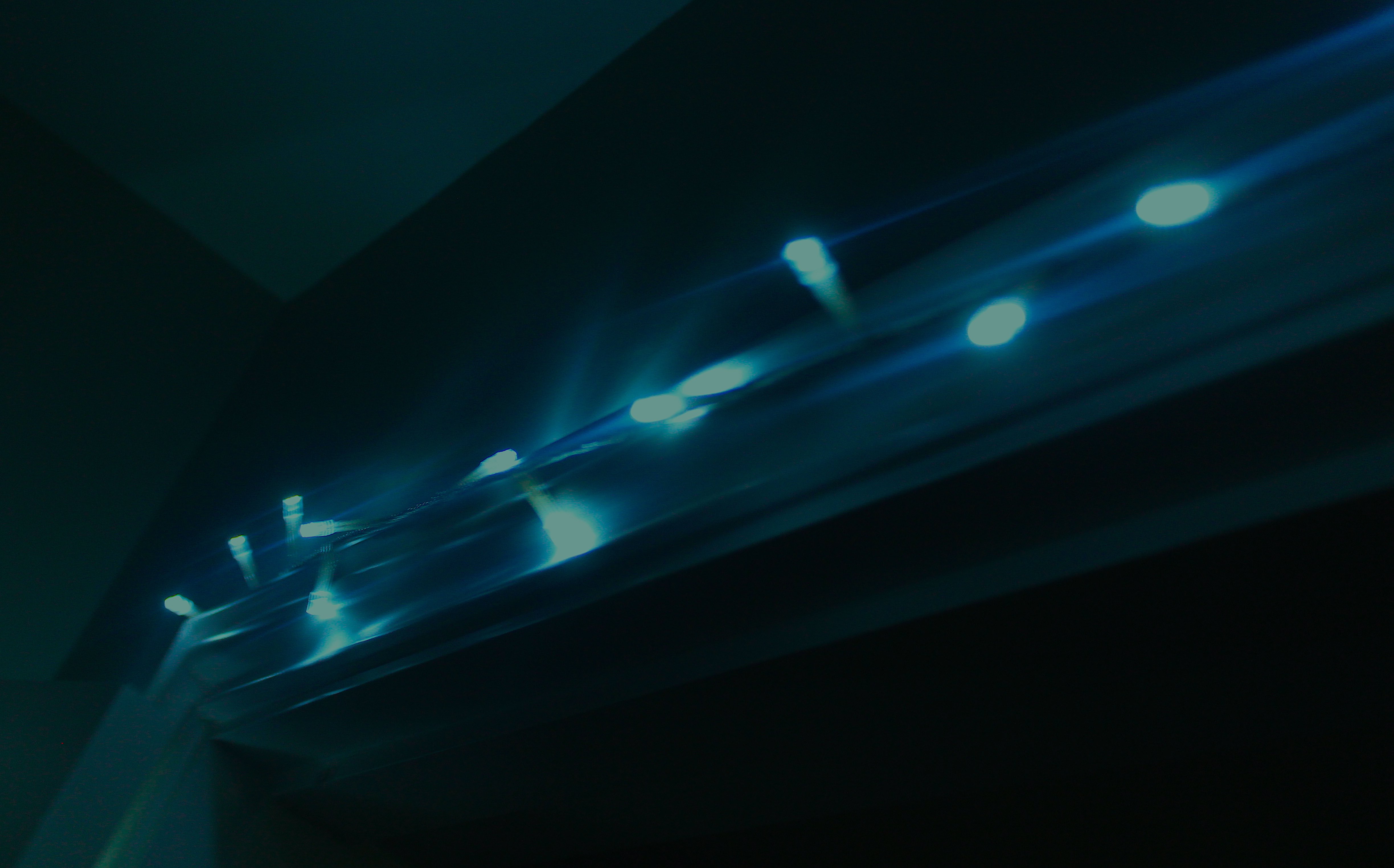
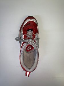
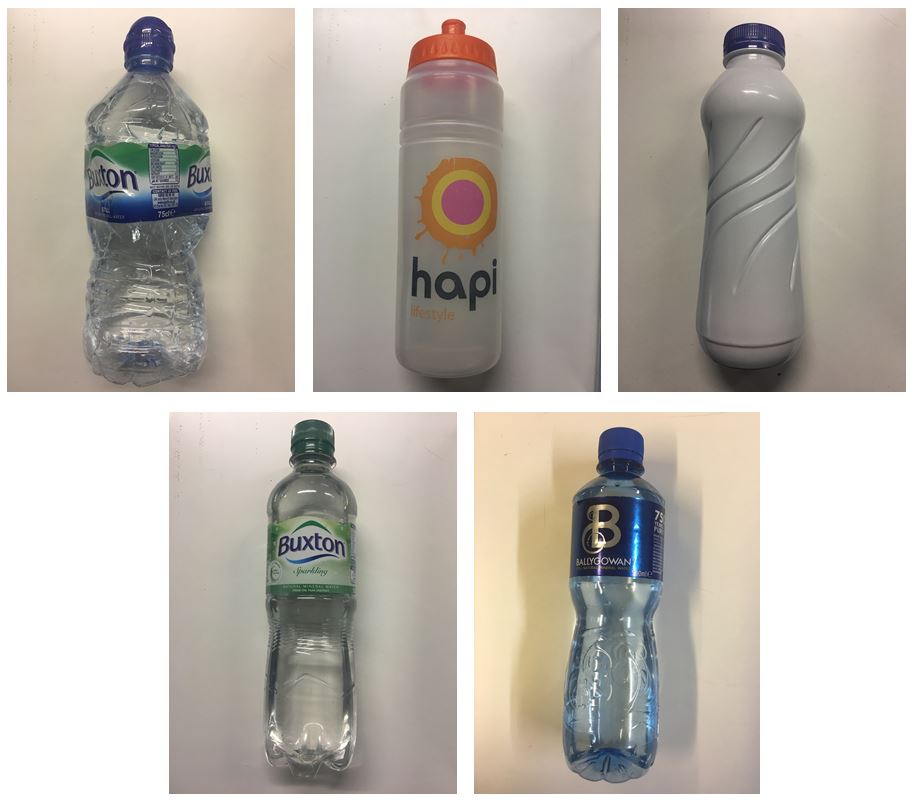
In order to experiment with moving image, a concept I would like to use during my Variation and Similarity project, I have experimented making a gif. A gif is: “a lossless format for image files that supports both animated and static images“. I have taken 5 photos of bottles, as a category of typology. Typologies, which I will furthermore research as a form of ‘similarity’  is the study of types, and a photographic typology is a suite of images or related forms, shot in a consistent, repetitive manner. Using Photoshop, I combined my images together into a timeframe motion, giving the photos movement. I used bottles as a basic experimentation though I will not be focusing on this item throughout my project. Gifs are a unique way of photo presentation, enabling photographs to come to life and show a sense of movement and variety.

  1. Open Adobe Photoshop, go to File> Scripts> Load files into stack
  2. Select images for the gif.
  3. Select Timeline under the Window tab.
  4. Select Create Frame Animation from the drop down in the timeline.
  5. Go to the menu button on the timeline and select Make Frames From Layers.
  6. Edit the image delay time.
  7. To export,  File> Export > Save For Web

Fine Art Reference

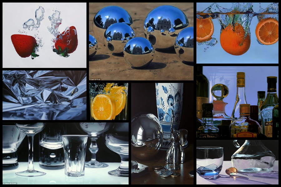
Before going ahead with a shoot and artist reference I decided that I would explore a fine artist that I could link into my future work. I would be looking at their composition and portrayal of certain everyday objects, whilst also looking at how their portray their vision of the landscape in new and creative ways. One particular artist that I found to be inspiring was the fine artist Jason De Graaf, someone who focused on reflections and objects that reflected as a means of enhancing the colour and vibrancy of the subject photographed. For me this was a unique way of seeing the subject photographed as he sets about using natural reflections such as splashes and sunlight to add contrast to otherwise boring everyday items such as fruit. Some examples of his work can be seen below:

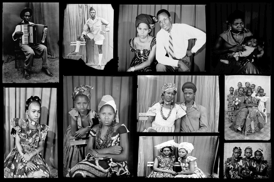
I really liked his use of tinfoil to create abstract landscapes in a sort of surreal and conceptual way with no actual editing done. For me this gave rise to the idea of used a kaleidoscope when photographing my intended areas, further abstracting the subjects from their natural environment and instead producing it to the viewers as something up to interpretation regarding what it could be. When thinking about the use of textures and patterns and creating surreal landscapes with it I stumbled across the photographer Seydou Keita, a photographer who captured African culture through the subjects clothes and patterns present in their everyday lives.

Seydou Keita was a self-taught photographer who in 1948 opened a studio in portraiture gaining a reputation for his skill throughout West Africa. Most of his photos and style are influenced by a great sense of aesthetics, dressing man young men European style clothing with customers bringing in items of clothing they wanted to be photographed in. Keita provided his own clothing and accessories such as watches, pens, radios, scooters, etc. which he often left inside his studio. Originally it was mainly women who came with their traditional robes that covered their legs and throats, only later shifting towards wearing Western outfits in the late 60s. Once again some examples of his work can be seen below:

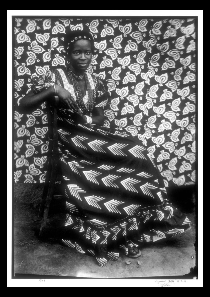
For future shoots I may consider taking objects out of my home into the natural landscape I have chosen and portray it in an abstract way which reflects a part of me rather than just the landscape itself. An alternative method which I could use would be to photograph the landscape on a more personal level, getting closer the to the subjects and capturing them in a more abstract way through up-close photography and their isolation from their surrounding environment. Some examples of this could consist of fences, horses, gardens and trees, all of these subjects play a part for something in society, whether it be work or just for relaxation, and so by portraying them in an unusual way which captures them in a light not previous used would as a result give viewers a new perspective. One of the image I found to be particularly effective for me is a piece by Seydou Kaita called Untitled [Seated Woman with Chevron Print Dress]:

Visual:

Visually the piece uses traditional African textiles and dresses as the main method of presenting aestheticism towards the viewer. What Keita does here is use two contrasting textiles which class in pattern not colour, as a result of this the opposing texture defines the women opposed to her blending into the backdrop. By leaving a section of the floor in it increases the effectiveness of the textures due to how it stops the entire image from becoming too eye-sore whilst also adding contrast between the predominantly white textiles, once again helping to define the figure of the women from the backdrop. Composition wise the women is centered in the middle of the photo, by doing this for me it immediately draws my eye to the subject as the contrasting clothing she’s wearing draws your eyes to the face in particular which is presented as a breaking point between subject and texture.

Technical:

When looking at the photograph you can see how the image was taken mid-movement, this is because of how the top right of the textile backdrop is motion blurred, this adds a sense of depth within the piece as it defines the women more due to her being photographed more crisply. An average exposure and shutter speed seems to have been used due to shades all being relatively normal without exaggeration, whilst the blurred areas provide me with evidence that the shutter speed is normal and has been unedited or untouched. The piece seems to use natural lighting as the light appears from all sides of the subject, not emphasizing or reducing the effect of the shadows, meaning that the image must have been taken outside of his studio.

Conceptual:

In the twentieth century, photography became a medium of expression that African artists began to draw upon to reflect on the world around them. One of the exceptional talents to emerge in this area has been the Malian photographer Seydou Keita (ca. 1921–2001), whose work has been admired on an international scale. Keita’s oeuvre consists of portraits that chronicle Malian life during the mid-twentieth century. His portraits are renowned for not only their masterful formal composition, but also their ability to capture the nuances of this important transitional period in Malian history. 

This portrait of an unidentified woman displays the signature pictorial style that made Keita the premier Malian photographer of his generation. Employing different backdrops and successfully combining pattern on pattern, the woman’s skirt is dynamically juxtaposed with the regularity of the floral motif on the backdrop behind her. Keita positioned the woman so the arrow design of her dress directs the viewer to her bodice, where light vertical elements of her blouse lead toward her smiling, confident face. The overall pattern on the backdrop holds the viewer’s attention while it gently repeats itself and simultaneously guides our eyes back down to her skirt.

SECOND ARTIST: Yoav Horesh: Aftermath: CHAOS

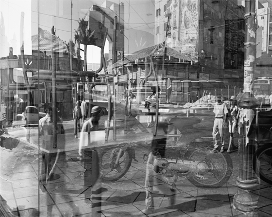
Yoav Horesh, Sbarro Pizzeria, Jerusalem, August 2003, gelatin silver print, 18½ x 14¾”. Courtesy of the artist.

Horesh was a student in Boston during 9/11 and was struck by how different the American response, with its grounded planes and makeshift memorials, was from his own experiences in Israel. While the American impulse was to “never forget,” Israel’s urge was to erase. (Though curator Kristina Durocher sees a parallel between “America’s response to mass shootings as a new societal norm” and the “cultural fatalism” in Horesh’s photos.)The ghostly reflections in a Sbarro window gesture at what can’t be seen. There are no monuments here, as Horesh explains, because there would be a plaque on every corner. If Lee Friedlander’s The American Monument is a testament to monuments hiding in plain sight, Horesh’s Aftermath, also a book, is a mournful dirge for trauma swept under the rug in the name of “normalcy.”By evoking the uncomfortable gap between violence and the collective “cleanup,” Horesh leaves us space to contemplate. Who was the bomber? Who were the victims? What butterfly effect has been set in motion?

The work I am influenced by and analysing is from his project ‘Aftermath’ It nods to the traditions of street photography, photojournalism and the archival impulse, as well as photo books like Joel Sternfeld’s On This Site and The American Monument. Yet unlike Friedlander, Horesh can only capture the hum of ghosts. To paraphrase Robert Frank, Horesh’s compassionate eye listens before it looks. Yoav Horesh B/W and colour photographs have been dealing with conflict, human tragedy, memory and recovery in Europe, Asia and America since 2001. His deep interest in the history of “sites” led him to explore close and far locations in search for cultural clues and personal histories. His evolving practice has grown from “street photography” to large format landscapes, interiors and portraits that open up the discussion between present and history. His projects also took place in the American South-west, Germany, Laos, Israel, the Gaza Strip and Cambodia, where history still shapes and influences current events and life.

ANYLSIS: I chose to study Horesh, as a consequence from this image. I believe not only does this image show an encounter of our daily lives, but it is a perfect example of chaos. The many images being overlaid. creates a composition that is not messy, but almost works structurally as a whole. The element within each image fit s together and creates a new composition. Each image slipping into a different aspect creating interests of architecture, and new movements of present and past people. This is clearly a very organised and thought out image, and one he did not easily put together. This also symbolises a passing of time, it shows the impact of live, perhaps the evolution of the area, due to the consequences of events which occurred there.

The concept from this image was from a book called aftermath. it is a presentation to make a political point about the conditions and daily lives that are similar to many in poverty and living in this area. His work is a transgression of more complex pieces such as the one above, and also images of slow shutter speed watching the visibility of cars moving, people, and details and shadows and aspects usually unseen in an area. He not only successfully captures the attitudes of people so well, but he too demonstrates knowledge of how to show these emotions very personal to an individual through a piece from a location. he himself has said ‘For two and a half years I photographed over 100 different sites of the suicide bombings in Israel while I lived in New York. I would go to photograph at least twice a year while doing my research for official and non-official information I needed in the United States. The bombings were happening on a daily basis; I would turn on the computer or read the newspapers and obviously I was very worried about my family and friends. The thought that they could be taking a bus or walking down the streets and disappear from life within a blink of a second horrified me. Perhaps it was also the feeling of guilt that pushed me to start this project, to be in far New York while this was happening in Israel so frequently. Maybe this is my mechanism of dealing with trauma; Repeating the action, the visitation, photographing, like going back to “a crime scene” and trying to understand what has happened there psychologically and visually.’

why did I choose this artist: He not only successfully captures a narrative of chaos caused by suicide bombings, and a clear emotional responses to each and everyone of his photos, but also his ranges from teaching 4×5, colour, black and white, darkroom printing techniques to digital photography. His subject matter has always remained the same: life, family, our history and primary emotional responses to the world. Ut’s about how we interpret the world using photography and how we analyse and understand photographs in various contexts. I don’t think these things changed since the first camera was manufactured, only the tools changed. It used to be large format box camera and now you have your phone camera. His photography is not just about creating impressive imagery, but I think that with this project, he was  also trying to raise awareness about how life is made a series of random events that affects all of us tremendously. These places he photographed were mundane. They were dictated because of their traumatic history. There was nothing unique about these sites until history scarred them. They turned into significant sites of trauma that he reduced into pictures of the landscape, the city, trees, cafes or street corners.