Category Archives: Analysis

Filters

Author:
Category:

Michael Wolf

Michael Wolf, born 1954, is a German artist and photographer who resides in and works in Hong Kong and Paris. Wolf’s work focuses on the daily life within big cities such as Hong Kong. Wolf one first prize in the Contemporary Issues category of the 2004 World Press Photo competition for his photographs of workers in several types of factories. His career began in 1994 as a photojournalist, when he spent eight years working in Hong Kong for German magazine ‘Stern’. Wolf says that a decline in the magazine industry led to photojournalism assignments becoming “stupid and boring” therefore he decided to work on only fine-art photography projects from 2003.
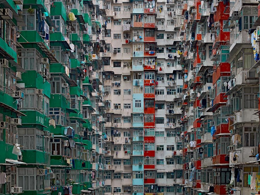
In Wolf’s series titled “Architecture of Density” he photographs Hong Kong’s tall buildings in order to show them as “abstractions, never-ending repetitions of architectural patterns” – the photographs excluded the sky and the ground and so emphasised the vertical lines and shapes within the buildings. The first book containing images from the series, Hong Kong: Front Door/ Back Door, was published in 2005 – in this book reviews noted how the photographs represented the overpopulation occurring in the city and the massiveness of the human presence.

I intend to take a lot of inspiration from Wolf’s work on ‘Architecture of Density’ as I believe that his work on this project brilliantly demonstrates the similarity within buildings through the patterns that are demonstrated within them as well as bringing light to how different the buildings all are, even though they all often contain very similar shapes and structures. I like Wolf’s work a lot due to the patterns and repetition within the photographs, I feel that they create a very intriguing and abstract appearance to the work as you are initially unsure at what you are looking at. Of course Wolf creates this work using much larger buildings and so can further dramatise these effects of massive repetitive buildings so in my responses to this work it will likely be necessary to use photoshop in order to create more repetition to achieve the same effect as Wolf has. Ultimately Wolf shows the repetition within the world we live in as well as showing the fact that even though there are so many buildings built for the same purpose, they all manage to have their own individualistic features.
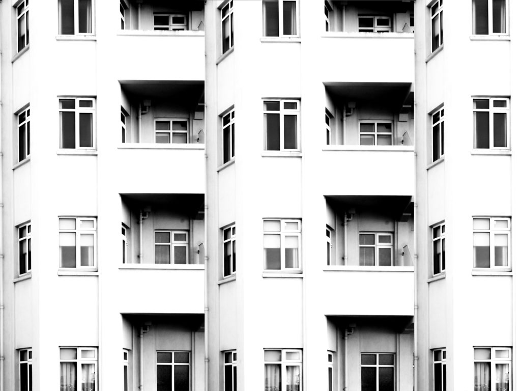
A response taking inspiration from Lewis Bush and Michael Wolf

Analysis

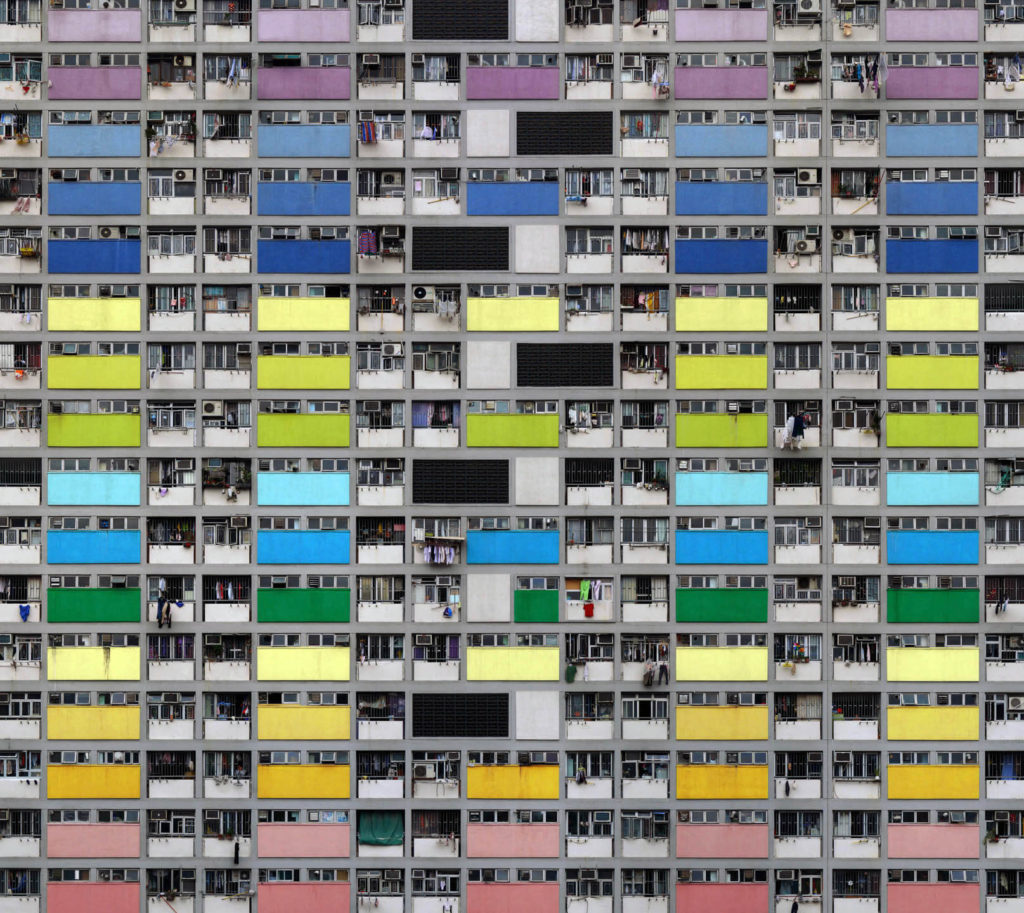
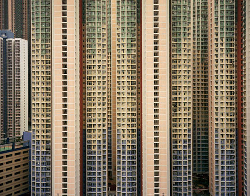
In this photograph from Wolf’s “Architecture of Density” he has used the natural lighting from the city of Hong Kong in order to capture a photograph of a repetitive and colourful high-riser apartment block. By using the natural lighting he has been able to capture the natural tonal ranges and contrasts within the building as well as being able to ensure that the image depicts the city of Hong Kong accurately. A deep depth of field would have been used to capture this photograph of the repetitive apartment block face; this is obvious as all aspects of the photograph are in focus in order to ensure that the viewer can look throughout the photograph and spot the continuing patterns. A fairly quick shutter speed, such as 1/80 will have been used to capture the photograph along with a low ISO of close to 100. This is because Wolf will have altered settings of the camera so that the correct amount of light was entering the lens from the city and that the quality of the photograph was as high and as noise-free as possible. This has led to a photograph that is corrected exposed and is visually pleasing to look at.

There is plenty of colour throughout the photograph due to the colourful panels placed across the apartment block; despite this there is not much saturation in the colours as they seem quite bleak and faded. To me this has been done on purpose by Wolf to suggest that this high-density, repetitive type of apartment block is not a sustainable or enjoyable way of living and represents how the population of Hong Kong feel about their living situation – it all seems quite bleak and boring as there is no room for innovation. There is a good level of contrast between the tones within the photograph as there are plenty of black tones within the shadows of balconies contrasting with the lighter tones of the coloured panels – this contrast increases the drama within the photograph to create a more striking composition. Due to the flat nature of the face of the apartment block there is a very 2D feeling to this photograph, but it does not take away from the effectiveness of the photograph as it further demonstrates the repetition and patterns shown throughout the apartment block.

This photograph is part of Wolf’s “Architecture of Density” in which he photographs Hong Kong’s tall buildings in order to show them as “abstractions, never-ending repetitions of architectural patterns”. The project included books published, including Hong Kong: Front Door/ Back Door which allowed Wolf to present the photographs collectively to prompt the reader to compare the structures, shapes and colours within the different Hong Kong high-risers and therefore demonstrated variance and similarity in his work. As a whole this work shows how over-populated and dense cities such as Hong Kong are and gives an insight into their lifestyle and possibly the bleakness of it. This work also possibly raises questions about what the human population are going to do in the future as human population constantly rises and we run out of space in these large cities. Property prices are inevitably going to rise as this unsustainable approach continues and it is just an amount of time until the demand for housing increases drastically past the supply of housing.

ESA // David Prentice

David Prentice was an English artist and former art teacher. He was born 1936 in Solihull and he was educated at Moseley Road Secondaey School of Art, Birmingham between 1949 and 1952, and Birmingham School of Art between 1952 and 1957. He died in 2014. In 1964 he was one of the four founding members of Birmingham Ikon Gallery.

His work features in the collections of the Victoria and Albert Museum, Birmingham Museum and Art Gallery, the Art Institute of Chicargo, the Albright-Knox Art Gallery in Buffalo, New York and the musuem of Modern Art in New York City.

Winter Beacon, 1998
watercolour on paper
Above Llanberis Lake,
Watercolour

The image of David Prentice “Above Llanberis Lake” uses a variety of blue and green shades. His work shows strong tone to create the shape of the lake and the valley that surrounds the area, this is supported by his use of shadows and light in his work. His uses the valley to tunnel the viewer’s eye to the horizon of the painting, this is where the main change in colour (from green to the blue, foreground to background) and the change in lighting is the strongest and most noticeable. The viewer’s eye is most drawn towards where the light emerges from the clouds as this is the lightest area of the painting which is followed through the sun rays.

  • Natural Landscapes
    • Sand dunes
    • Fields
    • Farms

John Baldessari

Mood-board of Baldessari’s work

John Baldessari was a leading Californian conceptual artist. Painting was important to his early work, but by the end of the decade he had begun to introduce text and pre-existing images to create riddles that highlighted some of the unspoken assumptions of contemporary painting. In the 1970’s, he abandoned his interest in painting and began to make a diverse range of media, though his interests were based on the photographic image. Conceptual art has shaped his interest in exploring how photographic images communicate. However, he works with light humor and materials and motifs that reflect the influence of pop art. He works with pre-existing images, arranging them in a way to suggest a narrative. He seems to distort his images – from cropping the images, to collaging them with unrelated images, to blocking out faces and objects with colored dots; this all forces us to ask how and what the image is communicating.

Image result for john baldessari
John Baldessari, 421 Artworks, Bio and Shows on Artsy

The image above is part of Baldessari’s approach to conceptual art during the 1970’s. This photo is of 6 people who seem to be dressed smart and professional. The image portrays normality, as it is a simple image of 5 men and 1 women that are staring out the window. Baldessari liked to incorporate into various features into his work, such as leaving us with questions about what the image is communicating and showing or trying to tell us. This aspect of the photo, where all the models seem to all be bunched near the slanted window creates this sense of uncertainty and leaves us wondering what are they all so attached on looking at? What is so interesting about what they can possibly see out the window? Additionally, Baldessari was interested in using parts of pop art in his work, as well as collaging his images with unrelated art or other images to block out objects or faces (as he has done in the image above). He has made these models faces invisible – so we don’t know what they look like, what their facial expressions are displaying, if they are talking with each other or where they are looking. Instead, he has used coloured dots to cover their faces which is similar to aspects of pop art, such as artists like Roy Lichtenstein and Andy Warhol., who use small coloured dots to make up their images. Again, this makes the us as an audience of his work, consider all these different factors that he his hiding from us. This is what makes his art and photographic images so intriguing, and why I was influenced to do something on a similar level to Baldessari.

My Response to Huang Qingjun

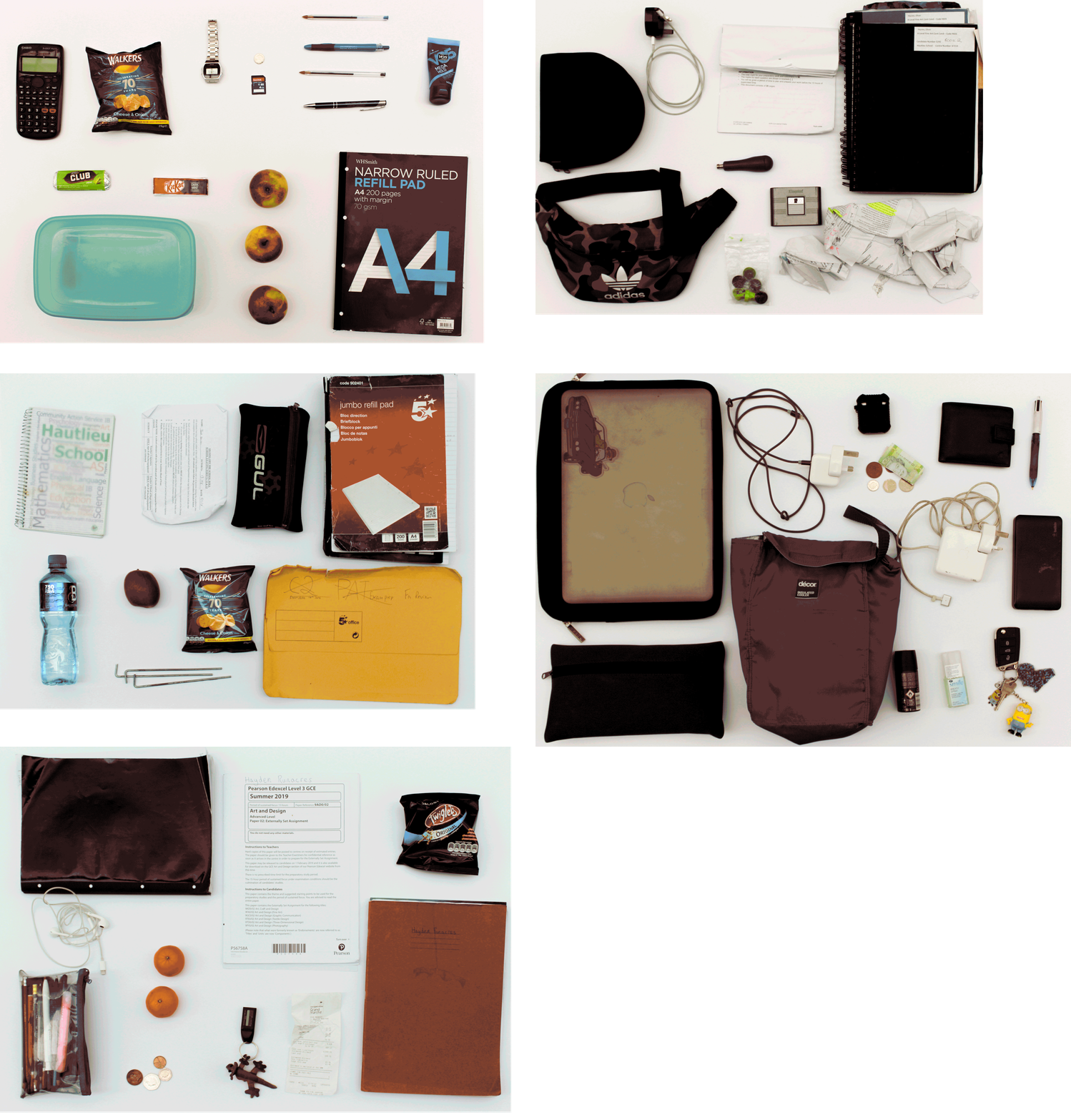
The idea behind this shoot is to explore the different items that people regularly carry around in their school backpack in order to look at the similarities and differences between the contents as well as giving a slight insight into who the person is and what their interests are.  Some of the bags that I took photographs of contained only the minimal indicating that the person may be very organised or may not like to carry much on them whereas other bags had lots of random items in them which may suggest they like to ensure they have what they could possibly need throughout the week on them at all times and may not mind having clutter in their bag.  This shoot relates to ‘Variance and Similarities’ as it can show how one standard thing that everyone does/has can vary so widely but then at the same time they will all have similar items within the bags, such as pencil cases or lined paper.  The shoot takes inspiration from Huang Qingjun’s ‘Jiading’ meaning ‘Family Stuff’ and shows an insight into the unlimited variety of combinations of different belongings that people may carry around with them.

In order to capture the photographs I would empty out the bags onto a blank sheet of white paper and arrange the items into a displayable arrangement with slight separation between each item in order to allow each item to be observed individually.  A would then photograph all contents from the same height facing the camera directly towards the floor.  I edited the photographs to create the outcome achieved by first editing the distortion of the picture and the perspective so that the photograph would be face-on to the camera and then I would crop it so that only the white background can be seen.  I then changed small features such as white balance, exposure and contrast to create a more visually aesthetic composition.  The idea behind the editing was that each photograph would have the same setup to allow the features to be compared side-by-side.

Experimentation with GIF’s

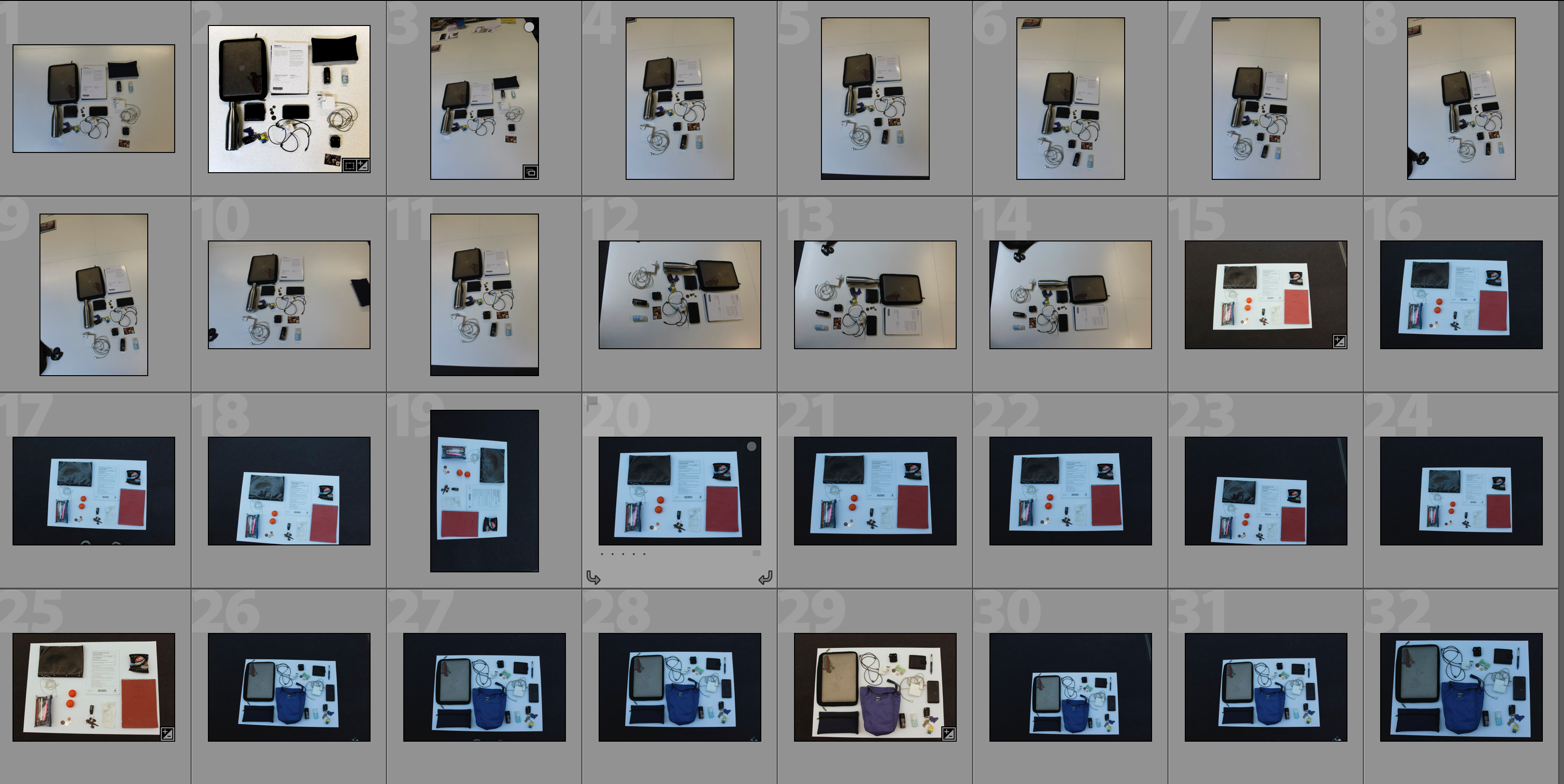
Below I have experimented with presenting my outcome in the form of a GIF.  The first GIF shows each frame for 0.2 seconds whereas the second GIF shows each frame for 0.5 seconds.  I have included both speed of GIF’s as I feel that they present the photographs in different ways – the faster GIF creates a more abstract approach where the viewer has to concentrate closely to pick apart the individual photographs whereas the faster GIF’s allow the viewer to focus more on each individual photograph and to compare the photograph’s features more.  The use of a GIF allows for quick comparison of the photographs in an interesting way and suggests how different each picture is even though they have a different layout because the first thing the viewer notices is shapes and colours and then they have to look closer to understand what the photograph is showing them.

Analysis

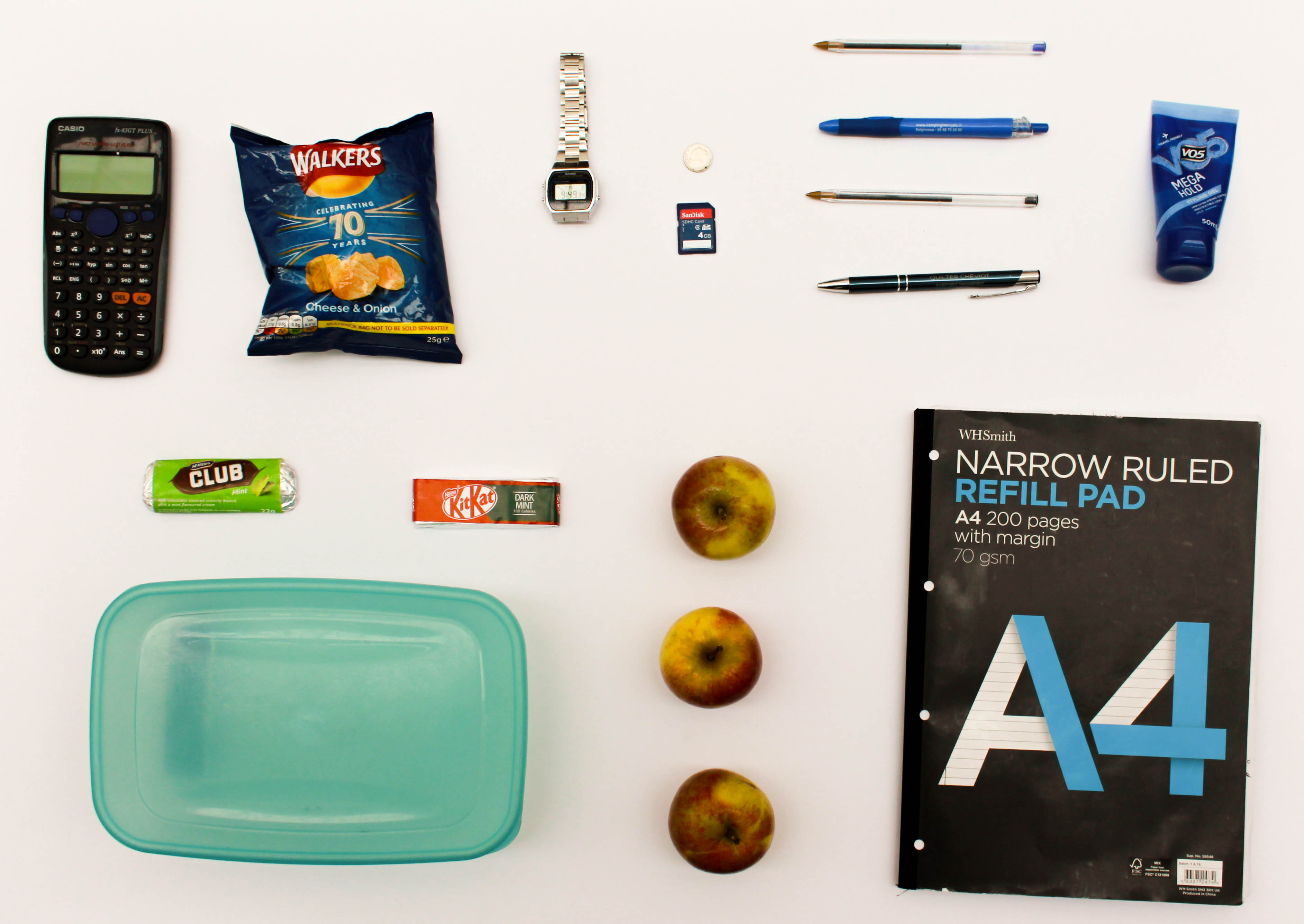
In this photograph I have used the natural lighting from the roof windows in order to ensure that a consistent light is spread across all of the items within the photograph.  The skylight also allows for the light to shine directly down onto the items from the bag and so reduce the shadows within the photograph to emphasise the difference between each item and the shapes within them.  Due to using a sharp white sheet as the background for this photograph there is a clear contrast between the items, such as the apples, and the background.  This has also allowed for the tones within the photograph to be more clearly defined.  I used a deep depth of field to capture this photograph as I wanted to ensure that all of the items featured in the photograph were clear and sharp because each item featured gives an insight into the personality and life of the person to which the items belong.  I used a shutter speed of 1/60 when taking this photograph as well as an ISO of 100.  The low ISO ensured that the noise within the photograph was kept to a minimal and that the photograph was as of high quality as possible – the 1/60 shutter speed paired with this to ensure that there was enough light entering the lens from the surrounding environment and that the photograph was correctly exposed.  There is a slightly warm colour cast to the photograph which reflects the fact that this shows items which everyone is familiar with, and so creating a warm feeling.

This photograph contains a wide variety of colours due to the fact that there are varying items that use different colour schemes to appeal to their target market, such as chocolate bars using colourful packaging and note pads using more subtle grey tones.  Using the white background to place the objects on has allowed the shapes of the items to be clearly defined as well as the textures within them – the shininess of the crisp packet and its creases can be seen for example.  There is also a slight 3D effect due to this reason and slight shadowing – this helps to emphasise the individual features of each object.  The objects have not been set out in any specific way or pattern; they were set out in a way that displays each of the objects individually therefore the layout is quite random and forces the writer to focus on each subject rather than as a collective.

The idea for this shoot comes from Huang Qingjun’s ‘Family Stuff’ project in which he would photograph the rural residents of China outside of their houses along with all of their personal possessions.  My work on this shoot links to this work by Qingjun as these contents of an individuals bags give an insight into who the owner of the bag is, in the same way as the possessions of the Chinese residents gave an insight into the way in which those people lived.  When the photographs in this shoot are paired together it creates comparison between the different contents of bags to show both variance and similarity between people and the objects that they tend to carry around with them in a school bag.  The variety of items that are carried in each bag show whether the person likes to carry either the minimum with them or carry clutter, as well as often showing an insight into their diet.  Small details such as these start to paint a bigger picture of who these people are.

ESA// Hiroshi Sugimoto

Hiroshi Sugimoto is a Japanese photographer and architect. He was born in 1948 in Tokyo, Japan. In 1970, Sugimoto studied politics and sociology at Rikkyō University in Tokyo. He retrained as an artist in 1974 and recived his BFA in Fine Arts at the Art Center College of Design, Pasadena, California. He later settled in New York City and soon started working as a dealer of Japanese antiquities in Soho.

He has spoken of his work as an expression of ‘time exposed’ or photographs that serve as a time capsule for a series of events in time.

In 1980 he began working on an ongoing series of photographs of the sea and its horizon, Seascapes, in locations all over the world, using an old-fashioned large-format camera to make exposures of varing duration (up to three hours).

The black-and-white pictures are all exactly the same size, bifurcated exactly in half by the horizon line. Many of his images lack any physical detail which would make the objects of his photographs easily distingushable , instead, he strongly focuses on lighting and textures in his work.

Aegean Sea, Pilion
photograph

This photo has been taken using natural lighting while being carefully positioned in order so that the horizon in the middle of the photograph. This taken rule of thirds seems to have been considered in terms of the shading differences in the background and foreground. There is a large tonal range of grey, where there is a gradual shade change, from the darkest point along the bottom of the image and the lightest being at the top. There is a very short depth of field considering that the photo is mostly blurred from the fog. However the foreground of the image is the only part to be in focus and where textures can be seen from the small ripples in the sea, although it is very still. The dark, grey/blue tones bring a cold temperature to the photograph along with the low light sensitivity where we can just about see the horizon in the middle of the image. Although the image is blurred and obscure there are no rounded or curved shapes. Everything is very straight but there are no outlines.

Sugimoto’s image brings a sense of romanticism in their evocation of landscape, related to Ansel Adam’s approaches to photography. This image shows how he sees nature. Sugimoto has said: ‘When I look at nature I see the artificiality behind it. Even though the seascape is the least changed part of nature, population and the resulting pollution have made nature into something artificial’.

Possible responses could be:

  • Seascapes
    • At dusk/sunset
    • At dawn/sun rise
    • On an overcast day to have a similar hue over the entire photograph

Origins of Conceptualism

Mood-board of various conceptual art

DEFINITION = Conceptual art is art where the idea (or concept) behind the work is more important than the finished art product/object.

It emerged as an art movement in the 1960s and the term usually refers to art made from the mid-1960s to the mid-1970s. When an artist uses a conceptual form of art, it means that all of the planning and decisions are made beforehand and this has greater importance that the artists final outcomes. Conceptual art can be anything – the overall visual aspects of conceptual art may be confusing, misleading or it could be boring or interesting. The reason that it became an art movement is because of its intriguing features – many people look at conceptual art and wonder why an artist has displayed something in this form. There are many artists that had made conceptual art, but it was only defined as a distinct movement in an article written by Sol LeWitt in 1967. The link attached shows many of the artists that have formed conceptual art, and many of their exhibitions. Some of these are Bruce Nauman, Martin Creed, John Baldessari and Bernd Becher and Hilla Becher. They all take approaches to this that have influenced many other artists and artworks. For example, Bernd and Hilla Becher focus their work on typologies.

Artist Study – Andy Warhol

Sources:

Hiroshi Sugimoto | Image Analysis

Image result for hiroshi sugimoto

This image of Sugimoto’s expresses his style. Evidently, the black and white theme continues but he uses animals instead of people or objects as his subject.  In the image, Hyenas, Jackals and Vultures appear to be fighting over something, likely a kill.  This fighting is a fine line where life meets death, the kill itself is represents the dark side of that spectrum. The weather also plays a vital role in exposing this theme which is only emphasized by the black and white. The horizon marks the border between the light and the dark, the margin that represents the border between life and death.

Despite the image being constructed post shoot, it looks very real and to the viewer, it creates a sense of fear perhaps and an exaggeration of the line between life and death. Visually, the image stands out by being unique and interesting with its wild subjects however the composition of the image itself increases the image’s likability. Being black and white, the image attracts a nice contrast between light and dark, linking to the theme of life and death that we see in the subject matter. Further,more, the sky has little structure and retains a rather smooth texture yet the shading adds a real depth to the image and almost sets the brightness of the entire image and creates an effect making the image appear brighter yet still having a meanness to it.

This image, despite using fake subjects, is quite a fascinating image when it comes to the taking of the image itself. It could appear that Sugimoto put himself in danger being so close to wild predators. He captures a lot of lives in that image and that fact even further expresses how fragile that can be as they fight over a kill. I would think that he used a wide angle lens at quite a close range, maybe only 5-10 meters from the subjects. I would believe he used a faster shutter speed and a medium ISO to capture the birds flying perfectly still but also having the light in the image to light the foreground but not too much to have the background (sky) to be over-exposed.

Variation and Similarity planning

We thought that this artist linked in well with page 8 of the exam booklet, which is the fine art response to variation and similarity. This response was based on the artists Nick Greaves and Bluegreen Pictures.

Eadweard Muybridge

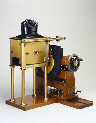
Eadweard’s photography of moving animals captured movement in a way that had never been done before. His work was used by both scientists and artists. He developed a miraculous process for capturing movement on film. This approach to photography influenced media and other motion animation industries to produce picture animation. In 1872, Muybridge began photographing a galloping horse in a sequence of shots. He eventually came up with a more complex method of photographing horses in motion. By 1879, he had proven that they do at times have all four hooves off the ground during their running stride. Over the next few years, he produced thousands of photographs of humans and animals in motion. Eadweard presented his photographic methods using a projection device he’d developed called the Zoopraxiscope.

Muybridge’s Zoopraxiscope, 1880
A picture disc for the Zoopraxiscope developed by Eadweard Muybridge (Wikipedia, 2015)

This image portrays several images of a pig running. The sequence of photos shows how the pig is moving. The colour isn’t natural because of the camera that Muybridge used. This old camera that was used in the 1800s creates a sepia, vintage effect. He usually uses images of horses, but in this particular image, he used a pig to show the contrast between the two animals, and how they move in a similar way. The repetition of the images shows the variance of each image, and how each photo differs from the others due to the pigs movement. The way they are produced in a grid makes it easier to compare all the images.

Nick Greaves

He studied geology and environmental sciences at the University of Aston in Birmingham, England. His passion and interest in Africa took him to Southern Africa in 1976. Greave’s interests in wildlife, conservation & photography originally developed independently, but slowly all these came together over the years, and he was able to combine all these passions into his current position as a multi-tasker, dividing his time as a professional safari guide, photographer and author. Nick’s love of wildlife and the outdoors quickly led to an interest in photographing the world around him, and over the years his photography has become a never ending search to capture the moods and wildlife of Africa and elsewhere. This interest has led to a full portfolio covering much of the flora, fauna, culture, and heritage of Southern Africa.

Corpinus Disseminatus Trooping Crumble Cap photograph, Nick Greaves

This image taken by Greave’s is portraying the mushrooms that appear as part of the wildlife’s nature in Africa. The repetition of the mushrooms that spiral up the branch of the tree trunk shows the variance between the mushrooms- although, they are all of a very similar size, shape and colour, which makes all the mushrooms seem very alike – this is similar to Murbridge’s work as they both take photos of the same object, yet they all vary in their own ways. In Greave’s photo, he only displays his repeated objects (mushrooms) in one single image, instead of in a grid format like Muybridge portrayed his work. Maybe this was because in Greave’s photo, the mushrooms were all bunched together already, so that it was easy for him to take his repetition photography in one image instead of putting them together in a grid layout like Muybridge did. This photo has a lot of natural colours, due to Greaves taking this image in 1996; the technology of cameras and online software at this time is obviously a lot more improved than when Muybridge took his series of images of animals in the 1800s.

John Coplans

This image has an empty alt attribute; its file name is 2002.31.jpg

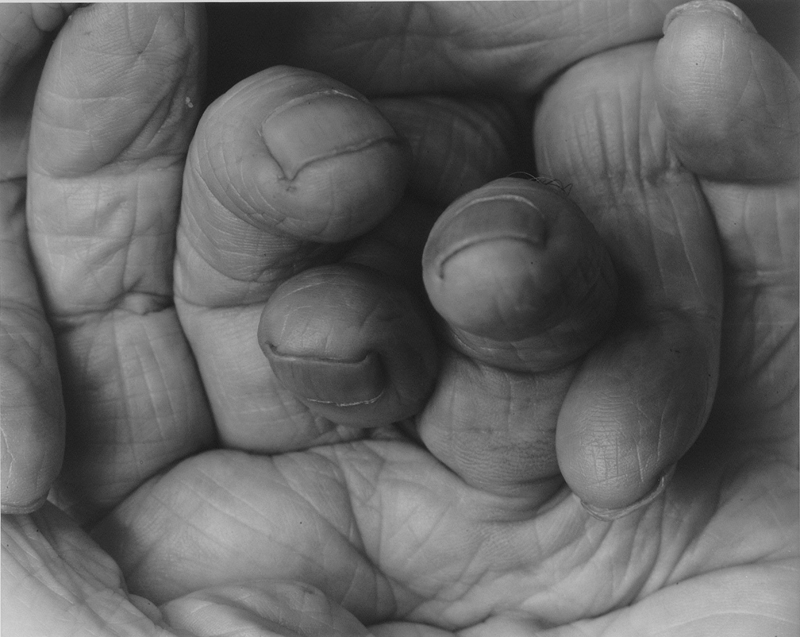
John Coplans (1920 – 2003) was a British artist, art writer, curator, photographer and museum director. Coplans is a veteran of World War II and emigrated to the US in 1960. He has exibitions in Europe and North America – including the Art Institute of Chicago, the San Francisco Museum of Modern Art and the Museum of Modern Art, NY. He is known for his series of black and white self-portraits which are a study of the naked and aging body. He photographed every part of his body but never his face as his photographs would not focus on a specific person or identity. Coplans’ photographs questioned the taboo of age through the forward style in which he addressed his body. Coplans stopped making paintings in the early 1960s and in 1979 took up photography; he says he decided to become a photographer because “I wanted to go back to being an artist. I had had enough of art history, critics, museology… I chose photography because I could not go back to painting… photography… is a medium to build an identity out of a composite personality, to find an artistic identity”.

“I have the feeling that I’m alive, I have a body. I’m seventy years old, and generally the bodies of seventy-year old men look somewhat like my body. It’s a neglected subject matter… So, I’m using my body and saying, even though it’s a seventy year old body, I can make it interesting. This keeps me alive and gives me vitality. It’s a kind of process of energizing myself to my belief that the classical tradition of art that we’ve inherited from the Greeks is a load of bullshit”

Coplans shows through this explanation that he believes just because he is older his body is not inferior to what a conventional body in its prime is – he believes that an aging body should be celebrated and documented for everyone to see. Coplans began to think about the body as being able to express a language through shapes and lines. The photographs produced by Coplans were always cropped tightly and dramatically enlarged. To capture the photographs Coplans would use a video camera and monitor to view parts of his body. Once he has selected an area, an assistant would take a photograph using positive/negative Polaroid film which would create an instant image as well as a negative used for later printing in large scale. The fragmentation of the male body and the manipulation to create ambiguous shapes recalls artistic classical sculptures such as the Belvedere Torso as well as sculptures by artists such as Franz Xaver Messerschmidt who would explore extreme expressions to create something away from the ordinary in the way that Coplans does.

Coplans/Tim Booth and ‘Variance and Similarities’

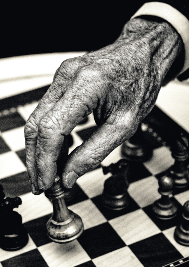
The work of Coplans is similar to the work of Tim Booth in ‘A Show of Hands’ in which he photographed portraits of subjects through their hands to show an insight into the subjects lives and professions through markings and objects related to the subjects’ lives, such as a chess piece for Lord Carrington’s portrait. Booth’s work explores the body in detail in the same way that Coplan does and brings emphasis to the small details and flaws within the human body and celebrates the details that make everyone individual. Both photographers also use a black and white filter in order to highlight the blemishes and veins rather than the viewer focusing on colours. These projects fit into the theme of ‘Variance and Similarities’ because they look at how each individual has unique marks, likes and shapes within their body that makes their body individual and unique to them – these may be features that the owner of the body believes is private to them or may be individual but obvious lines such as a person’s fingerprint. I believe that this is what Coplans is trying to show through his focus on his body; he wants to show that everyone has flaws and quirks in their body and they should embrace these individualities rather than feeling ashamed because of them. I plan on responding to both Booth and Coplans by conducting my own photoshoot focusing on the hands of the subjects – I will do this in a style more similar to Coplans than that of Booth’s as I believe that a more macro and close-up/abstract approach to the shoot could be the better option but I will be experimenting with both.

Analysis

In this photograph of Coplans hands and knees it appears that he has used a strong studio lighting to create dark shadows behind the wrists and in the space between the knees below the fingers, resulting in dramatic and contrasting atmosphere within the composition. This dramatic use of light to create shadowing creates a wide tonal range within the photograph ranging from the deep black tones underneath his kneecaps to the light grey of the background. A deep depth of field will have been used when setting up the photograph which can be seen as the whole of the photograph is in focus and both the hands and knees are clearly in focus allowing the viewer to pay attention to details as small as the hairs on his thighs. A quick shutter speed with an ISO as low as 100 will have been used in this photograph as to capture the highest quality photograph possible with correct exposure Coplans will have ensured that he kept the ISO as low as possible whilst having the shutter speed slow enough to allow plenty of light to enter the lens from the studio to create a composition that is correctly exposed. There is a slightly cold colour cast to the photograph which reflects the fact that Coplans doesn’t want to create compositions that are friendly and familiar – his work is about pushing boundaries and comfort zones.

For the same reason as using a cold colour cast to the photograph, Coplans has used a black and white colour palette as he wants to create a cold-feeling to his work. This black and white colour scheme also allows the viewer to focus on the small details within the hands and body, such as the veins and hairs, rather than focusing on the colours within the composition. Although this is a self-portrait, Coplans doesn’t show his face as he instead focuses on isolated body parts such as hands and feet, showing them enlarged and close-up, so that they seem at once familiar and unfamiliar – this leads to an interesting composition that sets his work apart from other artists that have explored the body, such as Tim Booth. The photograph was taken at the level of the knees, viewing them directly from the front. The skin at the joint of his knuckles appears stretched and the wrinkles can be clearly seen throughout the photograph, creating a textured, deep and dramatic composition. The image is tightly cropped, ending at the artist’s wrists at the upper edge and the bottom of his knees at the lower edge. A narrow margin of white background on either side of the legs frames the body. Due to the narrow margin of white background and the framing of the hands and knees there is a slight 3D effect to the photograph which, when paired with the textures and shadows within the photograph, brings the details out to the viewer.

Coplans believes that an aging body should be celebrated and documented for everyone to see. Through photographs such as the one shown, Coplans began to think about the body as being able to express a language through shapes and lines whilst creating an unfamiliar composition using familiar body parts in an abstract way. Coplans would set up the photograph and composition using a monitor and then use an assistant to take the photograph once it was to his liking. By using this style of photography Coplans wants to show that even a body of a seventy year-old man can be extremely interesting as the marks and folds show the events and life that the person has been through. Ultimately, Coplans is showing how individual and abstract the human body can be and that everyone has flaws/marks that they are either proud of or try to hide; but Coplans believes that the way forward is to put these individualistic features on show for the world to see.