Category Archives: Analysis

Filters

Author:
Category:

Artist Reference – Karl Blossfeldt

Who is he?

In 1881 Blossfeldt began his studies as an apprentice at the Art Ironworks and Foundry in Mägdesprung, Germany, where he studied sculpture and iron casting. He then moved to Berlin to study at the School of the Museum of Decorative Arts (Kunstgewerbemuseum). In 1890 Blossfeldt received a scholarship to study in Rome under Moritz Meurer, a decorative artist and professor of ornament and design. Along with several other assistants, Blossfeldt created and photographed casts of botanical specimens in and around Rome. He continued to work with Meurer through 1896 and traveled beyond Italy to North Africa and Greece to collect specimens. Beginning in 1898 Blossfeldt taught design at the School of the Museum of Decorative Arts (Kunstgewerbeschule), and in 1930 he became professor emeritus. There he established a plant photography archive that he used to teach his students about design and patterns found in nature.

Blossfeldt had no formal training as a photographer and used homemade cameras that he outfitted with lenses capable of magnifying his subjects up to 30 times their natural size. The use of magnification resulted in images of extreme detail and clarity. With the precision of a botanist, Blossfeldt photographed the natural world for scientific and pedagogical purposes and inadvertently became a modern artist. His work was considered the forerunner to Neue Sachlichkeit photography, which favoured sharply focused documentarian images. In 1926, when Blossfeldt was already in his 60s, his work was exhibited to the public for the first time at Berlin’s avant-garde Galerie Nierendorf.The works exhibited there were published in the book Urformen der Kunst (1928; Art Forms in Nature [2003]). The first of his three photo books (the other two were Wundergarten der Natur, 1932; and Wunder in der Natur, 1942, the last published posthumously), it was enormously successful and remains one of the most-significant photo books of the 20th century.

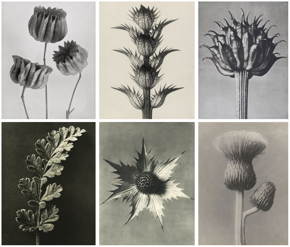
I was particularly inspired by how the textures and patterns created by these natural forms really highlighted minute details that could not usually be seen by the everyday eye. Some examples of his work can be seen below:
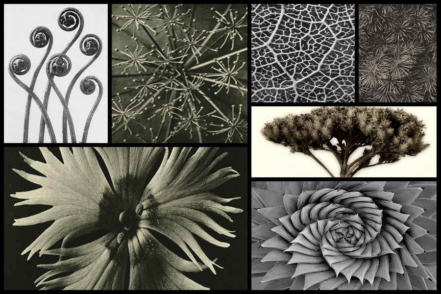
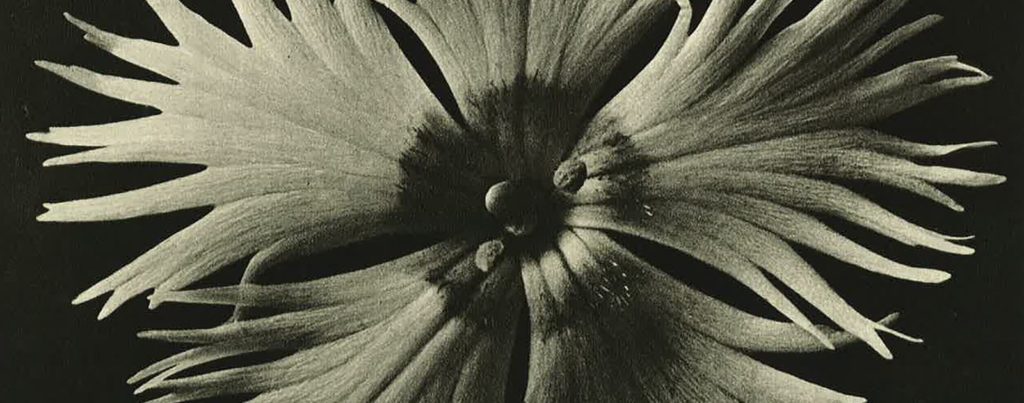
After looking at Blossfeldt’s work I decided to go onto analyse one of his images, here I would be looking at technical, visual and conceptual aspects of the photo. By doing this it would allow me to have a better understanding of how he goes about composing his imagery, and the composition he uses to do so. The image I have chosen to analyse is called Hordeum distichum and is part of his fine art series looking at textures and patterns within the structures of plants:
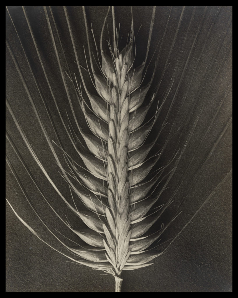
Visual: Visually the piece is extremely aesthetic, using contrast and a symmetrical appearance to highlight the various shadows and depth of the plant. By capturing the plant up close on a macro scale it essentially brings together the whole photo as it fills in a space that otherwise would be blank with symmetrical lines, using a high contrast to highlight the identity of the plant which seemingly unfolds from itself using predominantly darker shades to fill up any space which would contain negative space. The image itself has been taken on a closer level so that the viewer can become more personal with the plant, as seeing it up close presents the viewer with a perspective that might not have been traditionally provided for them. Because of this the photograph seems to make the plant into something completely different to its original appearance, as by singling one bud head out it casts a light onto it that maybe is not accessible when viewing them en mass.

Technical: The photo itself has been taken in black and white, using a black sheet of paper as a backdrop which highlights the structure of the plant, adding a sinister and symmetrical feel to the entire piece. Blossfeldt has made sure to capture only the head of the bud so that it may be presented in a overall symmetrical manner which leaves the end result more aesthetic for the viewers, as using an increased contrast making the different shades pop due to it greatly exaggerating the change in shade so that things like black are emphasized. When taking the image the shutter speed would have been relatively normal due to Blossfeldt not needing to capture any moving object due to the photo being taken in studio conditions, which as a result gives off a beautiful result which perfectly presents the head of the plant in a way not previously done before. Texture and pattern making up the majority of the piece as the photograph breaks up the plant so that it becomes more abstract, creating shapes that could not be previously seen due to a greater scope needed to see it.

Conceptual: Conceptually Blossfeldt can be seen taking this image in reference to fine arts, using a simple but effective camera angle and subject to produce a piece that is extremely aesthetic to the eye, emphasizing the shades so that they perfectly contrast each other and define the overall result of the photograph. The piece plays part in a series of photographs of bud which at the time were taken so that his students could use them to produce biology based work that could be used in class, however his passion for this kind of photograph led him to create more of the typographic styled method.

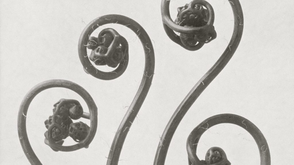
KARL BLOSSFELDT

Strikingly modern and inherently beautiful, Karl Blossfeldt’s photographs of plants, flowers and seed heads are as appealing today, as they were when they were first introduced to the public in his two landmark books Urformen der Kunst, (Archetypal Forms of Art), 1929 and Wundergarten der Natur, (The Wondergarden of Nature), 1932. From 1898-1932, Blossfeldt taught sculpture based on natural plant forms at the Royal School of the Museum of Decorative Arts in Berlin. In his lifetime Blossfeldt’s work gained praise and support from critics such as Walter Benjamin, artists of the Neue Sachlichkeit (New Realism) and the Paris Surrealists. The use of botanical specimens as photographic subject matter became popular in the early and mid-nineteenth century at the inception of the photographic medium.

What made Blossfeldt’s work unique was his extreme technical mastery of photography. He specialised in macrophotography to enlarge his plant specimens and even designed a camera for this purpose. As a result, everyday garden flowers are presented in such a way that their rhythmic forms are emphasised to the extreme and the plants take on new and exotic characteristics. Blossfeldt wanted his work to act as a teaching aid and inspiration for architects, sculptors and artists. It was his firm belief that only through the close study of the intrinsic beauty present in natural forms, that contemporary art would find its true direction.

Image analysis:

This particular photograph from Blossfeldt’s wide collection of monochrome botanical studies really looks into and highlights the idea of nature being a weird and wonderful thing. At first glance, this photograph doesn’t look like a natural form and instead looks a man made and altered object. The architectural-like structure and strange curves and bends presents the interesting side of simple things like plants that are overlooked as being boring or monotonous. The very zoomed in angle once again emphasizes the detail of the form, with very little negative space in the image so the background doesn’t take away from the main focus.


“IF I GIVE SOMEONE A HORSETAIL HE WILL HAVE NO DIFFICULTY MAKING A PHOTOGRAPHIC ENLARGEMENT OF IT. ANYONE CAN DO THAT. BUT TO OBSERVE IT, TO NOTICE AND DISCOVER OLD FORMS, IS SOMETHING ONLY FEW ARE CAPABLE OF.”


SHOOT 1 – TREES

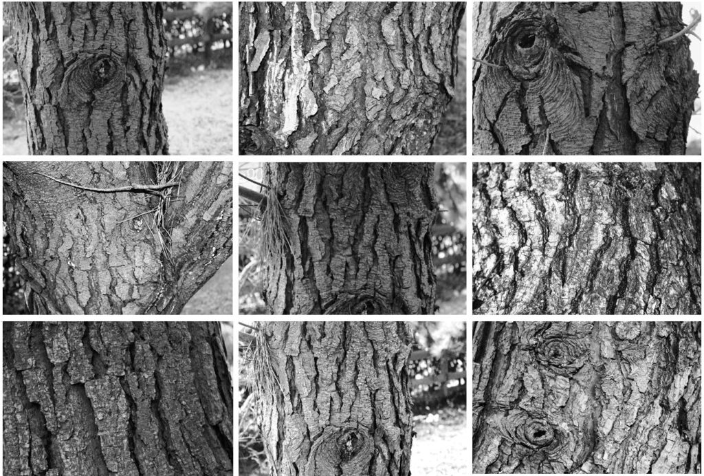
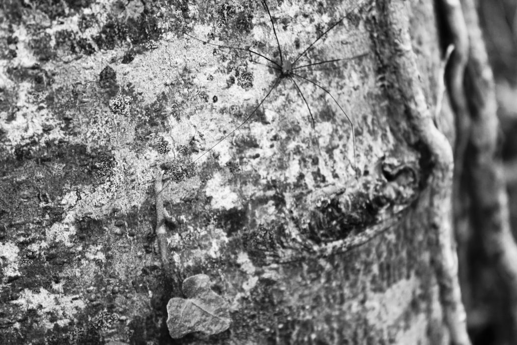
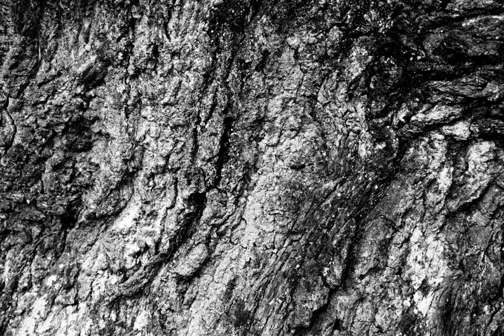
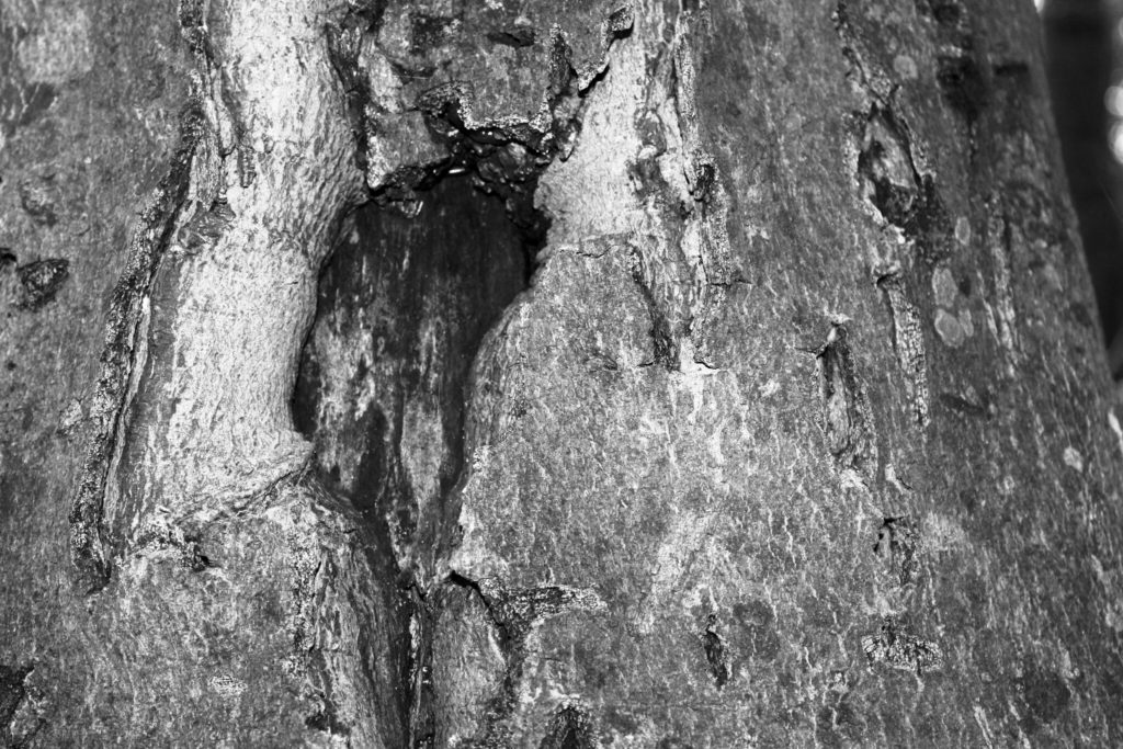
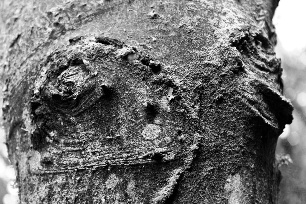
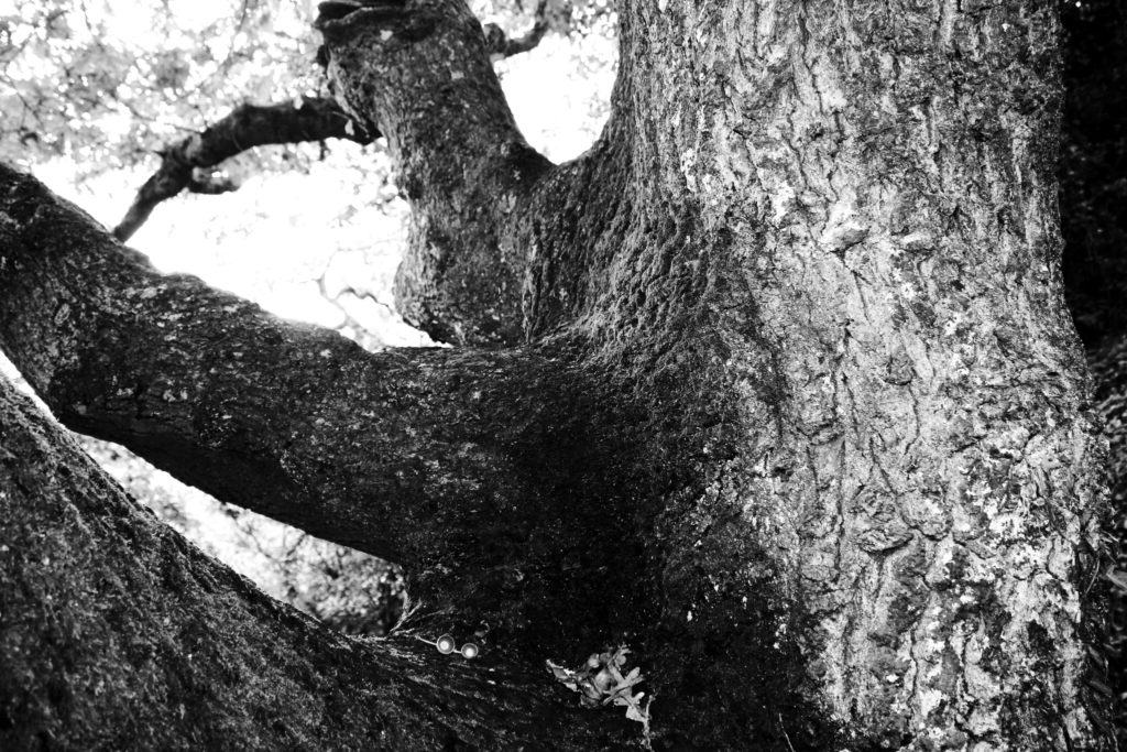
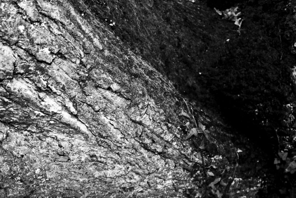
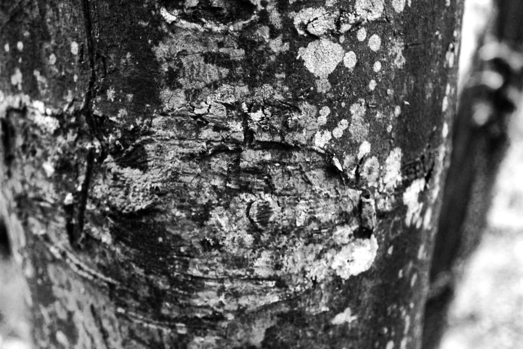
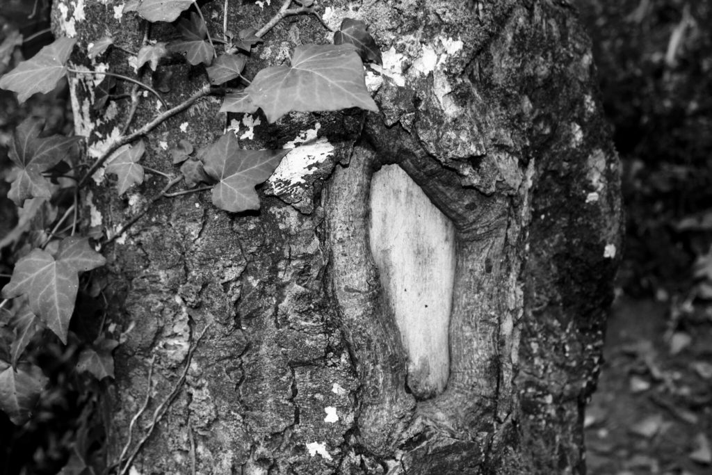
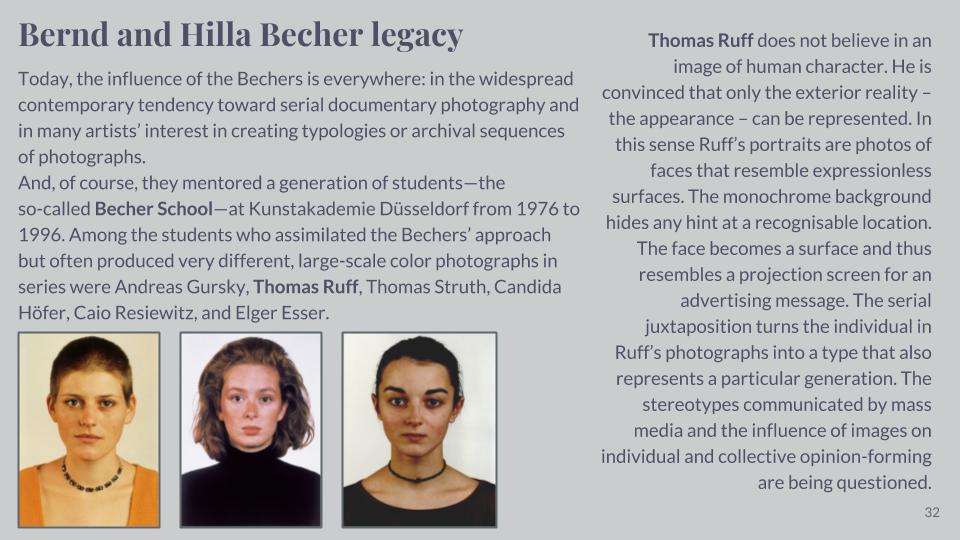
My first photoshoot for my Variation and Similarity project was based around trees. As trees come under the form of typologies, studied by Bernd and Hilla Becher, I have experimented with presenting my work in the style of these photographers. The basic yet effective grid format gives my photographs a clear presentation and shows a variety of my images side by side in one photo montage. Along with looking at the overall structure of trees, I have zoomed in on the closer features like bark patterns and colours, to explore my project route of variation within nature.


John Baldessari

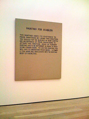
John Baldessari (born June 17, 1931) is an American conceptual artist living and working in Santa Monica and Venice. Baldessari was initially a painter with his early major works being canvas paintings that were empty but for painted statements coming from contemporary art theory. Baldessari’s work ‘Painting for Kubler’ presented the viewer with theoretical intructions on how to view it as well as the importance of the context within his previous works. referenced art historian George Kubler’s book ‘The Shape of Time: Remarks on the History of Things’.

In 1970 Baldessari and some friends burnt all of his paintings created over 13 years to create a new piece, titled ‘The Cremation Project’ and baked the ashes from the paintings into cookies then placed them into an urn leading to an art installation consisting of a bronze commemorative plaque with the destroyed paintings’ birth and death dates, as well as a recipe for making the cookies. Through this project Baldessari drew a connection between atistic practice and the human life cycle.

Baldessari began to experiment with bringing texts and photo into his canvases and then later began to work in printmaking, film, video, sculpture and photography in the 1970’s. His work shows the narrative potential of images and often incorporates language within his art. His art has been featured in more than 200 solo exhibitions in the US and Europe and has influenced artists such as Cindy Sherman.

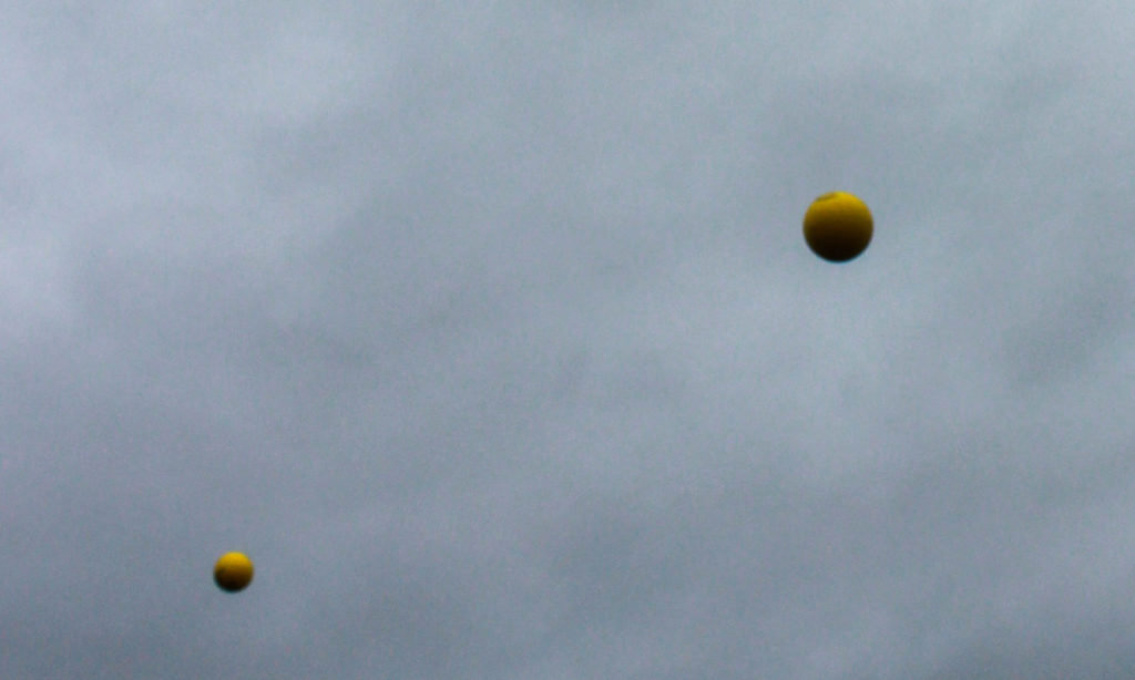
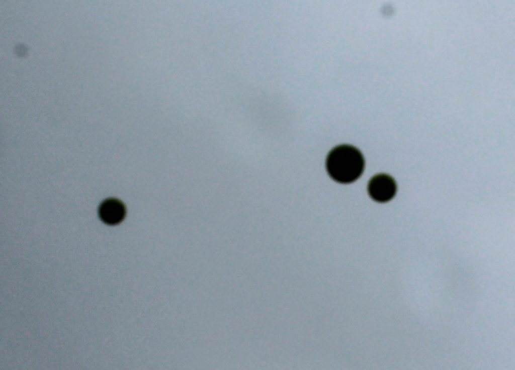
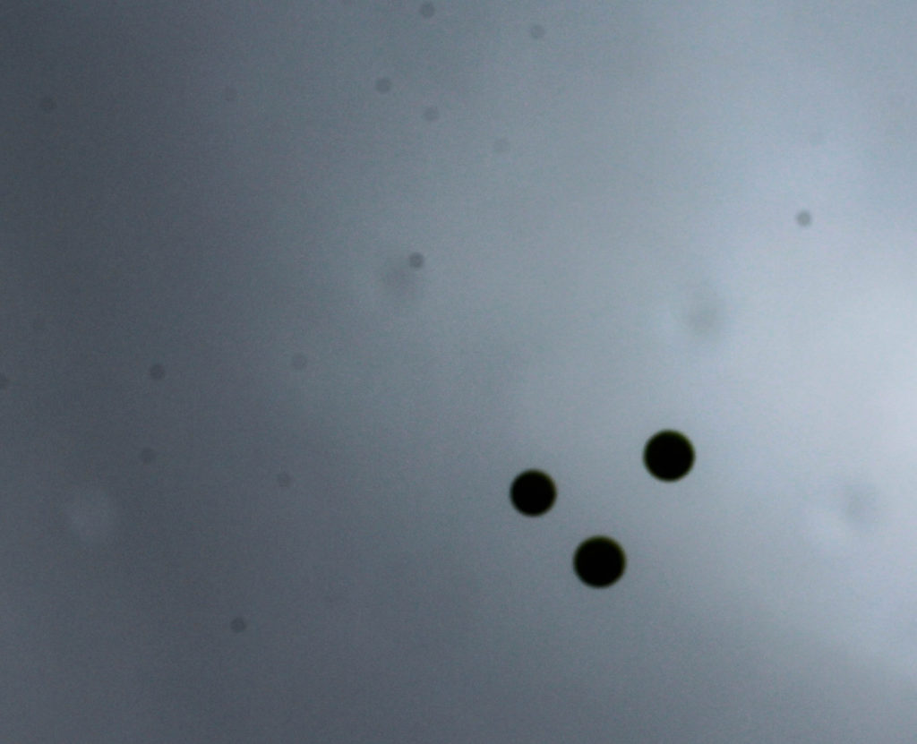
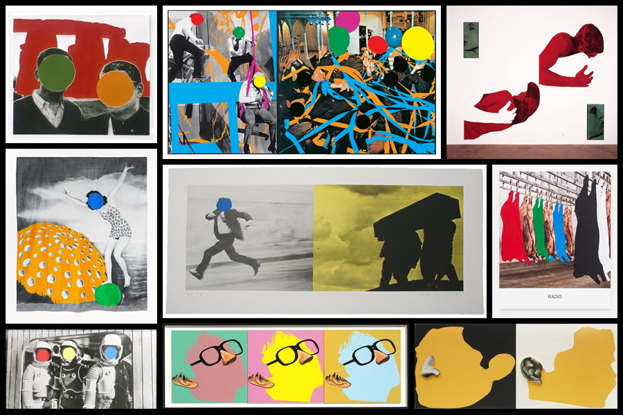
Many of Baldessari’s works are sequences showing attempts to accomplish an arbitrary goal – an example of this is Throwing Three Balls in the Air to Get a Straight Line (1973) in which Baldessari attempts to do exactly as the title describes and then photographed the results. This project is an early-example of post-conceptual art. Another example of Baldessari’s work that links to post-conceptual art is when he used circular adhesive dots to cover up the faces of subjects which led to him being known as ‘the guy who puts dots over peoples faces’ – the inspiration for this work came from the brightly coloured price-stickers seen on sale items. As part of an experiment coming under the title ‘Play’ I responded to Baldessari’s post-conceptual work; this experiment drew inspiration from both ‘Throwing Three Balls in the Air to Get a Straight Line’ and his work with brightly coloured dots as I attempted to capture three balls in a straight line as Baldessari did. I used the idea of throwing balls in the air to bring in inspiration from Baldessari’s work with brightly coloured dots by throwing a bright yellow dodgeball into the air to contrast with the dark grey sky in the background – this created the same effect as Baldessari’s work by creating an abstract composition that has high contrast between colours and backgrounds.
“Cutting Ribbon, Man In Wheelchair, Paintings (Version

On his work with placing colourful retail stickers over photographs, Baldessari says “I just got so tired of looking at these faces… If you can’t see their face, you’re going to look at how they’re dressed, maybe their stance, their surroundings” which supports the view that Baldessari’s motivations behind this work was to force the viewer to view the photograph or subject in an unconventional way, a feature often attributed with post-conceptualism. When asked why Baldessari only leaves the mundane parts of the photograph, as the face is the most interesting part, Baldessari responds “I think you really sort of dig beneath the surface and you can see what that photograph is really about, what’s going on”

Post conceptualism is an art theory that builds upon the legacy of conceptual art in contemporary art, where the concepts involved take a bit more priority over the traditional concern for aesthetics. The term first came into art through the influence of Baldessari in the 1970’s through his work Throwing Three Balls in the Air to Get a Straight Line. The movement focused on the idea behind the art and questioned the traditional role of the object.

Photoshoot 1

For my first photoshoot I went to St Catherines woods to explore repetition within nature, focusing on the fragility and rounded shapes that are created. I also wanted to focus on light and reflections, starting to take inspiration from the photographer Rinko Kawauchi .

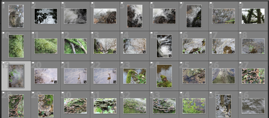
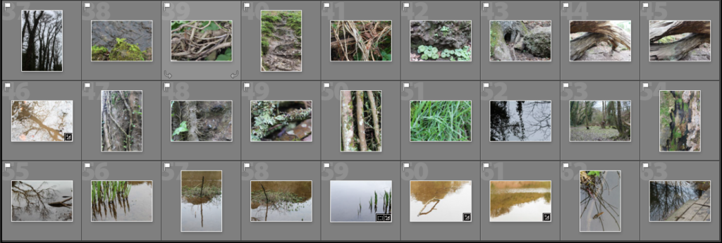
I narrowed down the 250 images i photographed to 63 and displayed them in a contact sheet below. I found that I liked the images that were close up of detailed patterns.

Reflection and Water

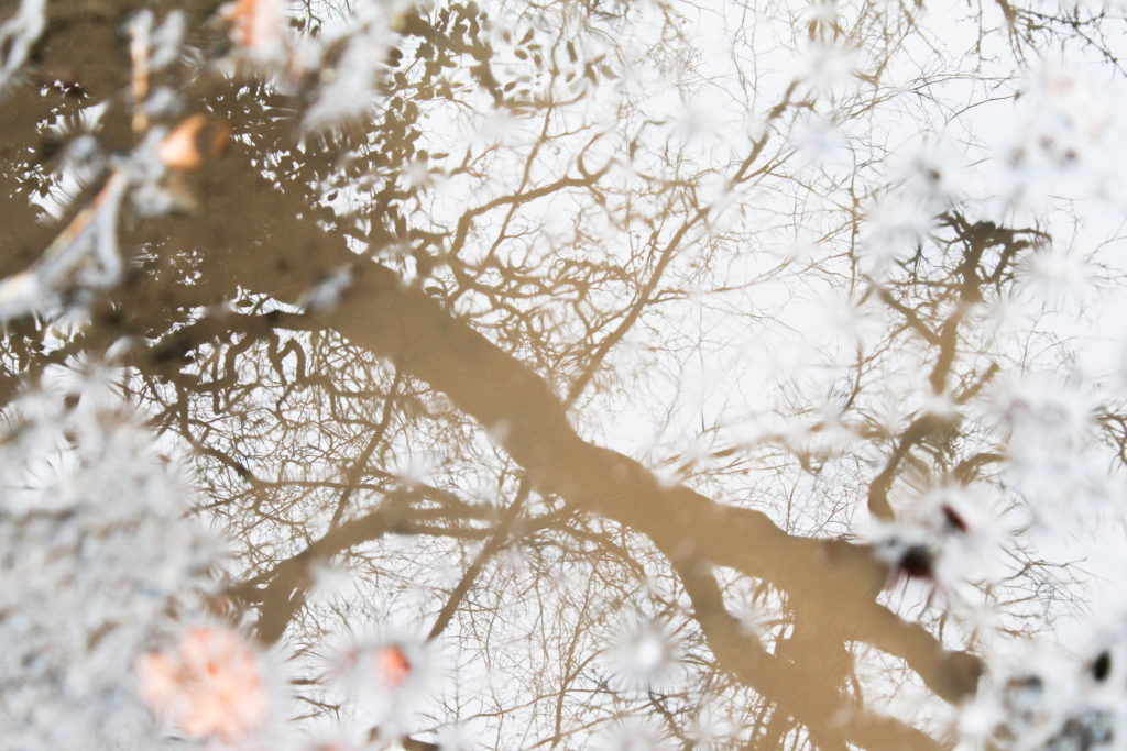
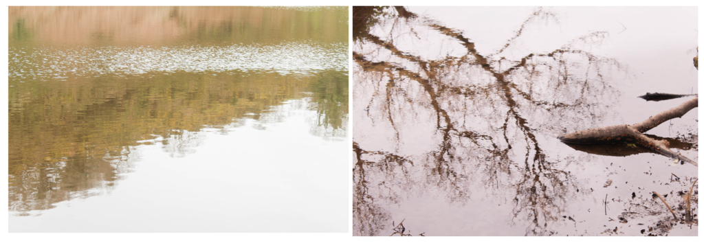
I particularly like these two images from my shoot because of the use of light in the reflections on the water. In the first image I emphasised the yellow tones of the landscape by photographing the reflection of a tree in muddy water. I tried to highlight the fragility and beauty of the tree and nature, even though it’s photographed through something that isn’t normally considered aesthetically pleasing. The mud in the water makes the reflection of the tree a yellow/brown tone which emphases the shape more. I decided to have my point of focus in the center of the image with the edges out of focus, this causes all the attention on the reflection rather than the floor around it. I also increased the exposure when taking the photo to emphasise the brightness of the sky and to interpret the work of Rinko Kawauchi. I think that this is a interesting image as instead of a straight forward photo of a tree, it uses another aspect created by nature to portray it. I also like how the tree trunk goes diagonally across, creating an interesting composition, with the detailed branches coming off the sides. I also displayed my other image below it as I think these two images work well together, both using light to emphasise the beauty of nature, both having increased exposure.

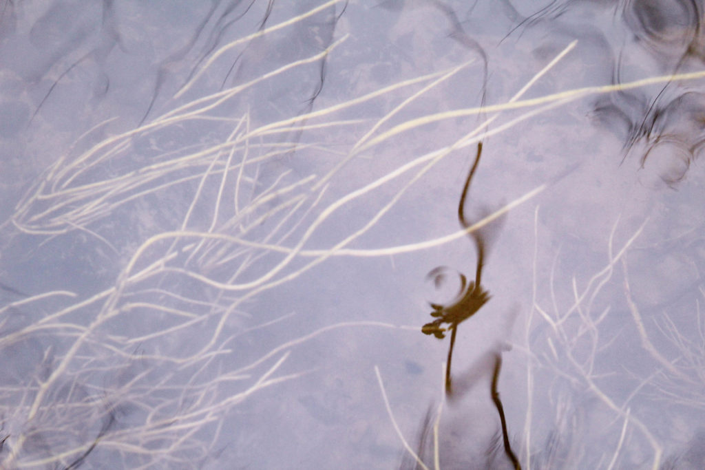
In the second image i focused on what was underneath the water and the colour of the plants, as well as the reflections of the surrounding plants. I like this image as the water moving in the stream makes the reflections of the plants blurred, creating interesting shapes. The slight reflections at the top of the image, frame the photo and create depth between the plants underneath the water. I also like how these plants are all growing in the same direction from the way the water is travelling down the stream, which is them contrasted to the reflection going vertically down at the top of the image. To me , the main focus point of the image is the darker reflection of the plant that off center. This is because its the closest aspect to the camera, and is the darkest point so is the first thing the audiences eyes are drawn to. Also because it is the only reflection that the audience can tell is a pant, as it closer and more of it is shown. I think that the nature in this image is emphasised as there isn’t anything man made, and portrays the plants how they have naturally grown. Another aspect i like is the drop of water that has created a ripple on the plant shadow as it also creates a blurred effect. In later photo shoots i could experiment with creating ripples like this on water. I think that both images take inspiration from Rinko Kawauchi but still look like my own style and interpretation. For further photo shoots I could look more into how Kawauchi takes her photos to interpret her style more.

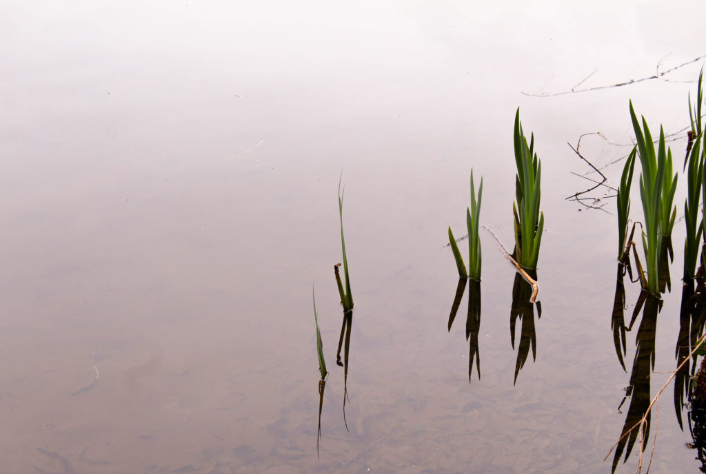
I also like this image because of how I used the negative space to make the plants and reflections stand out. When photographing, I tried to zoom in on just the plants in the water and to take out anything else. I chose this image to display as i like the reflections combined with the plants that make interesting shapes. I wanted to emphasise a feeling of calm by using the over cast weather that day to my advantage through the reflection from the sky on the water being grey/white. I like how the water goes from white at the top of the image, to darker grey/brown tones towards the bottom starting to show the ground underneath. This creates depth in the image emphasising another aspect of nature. The bright green colour of the plants is contrasted to the colour of the water, making it the first point the audience looks . To edit this image i could crop it so the space above and below the image is the same, creating a more aesthetically pleasing image. I could also experiment by changing the tones in the water to see if any other colours would go well with the green on the plants, as well as edit the water to all be the same tone so that there weren’t any darker areas. This would further emphasise my use of negative space.

Repetition

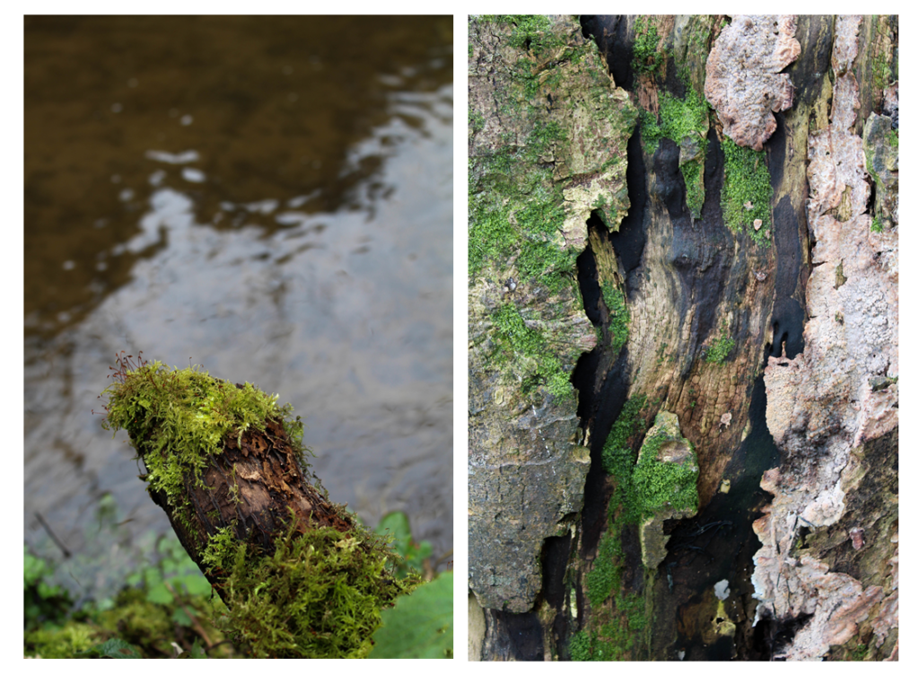
I also wanted to explore repetition and round shapes in nature as well as reflection. I think these images are completely different to the images of the first half of my shoot as i wanted to experiment by photographing in different ways to see if I prefer one technique over another, and to generate new ideas for my project.

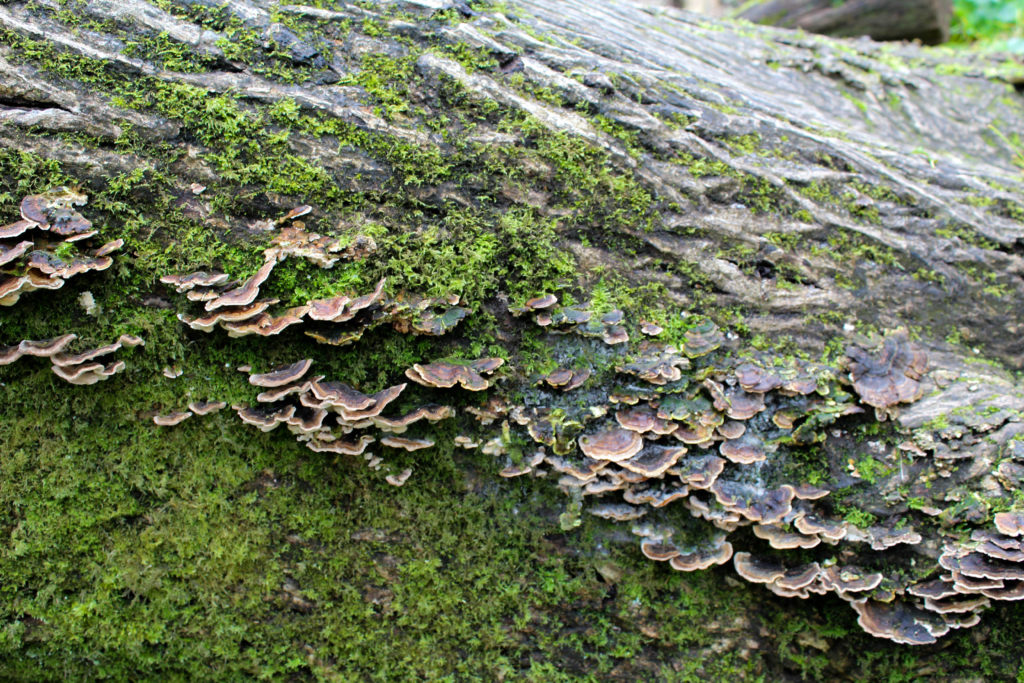
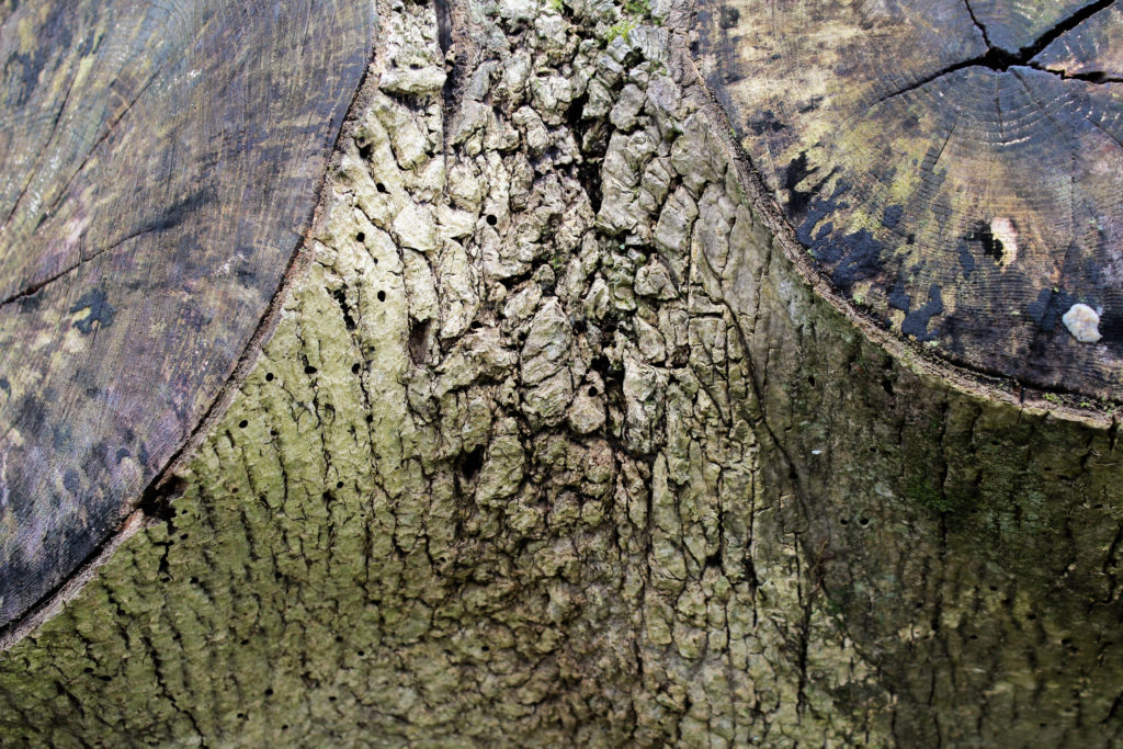
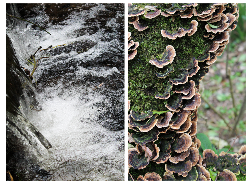
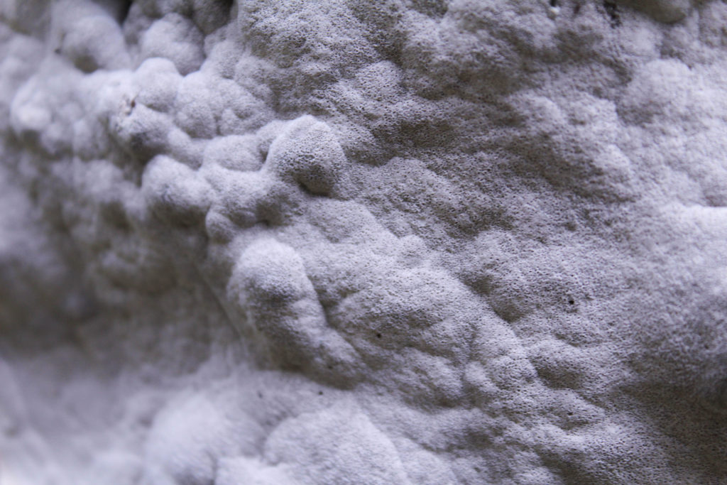
I found i was focusing on close up patterns of different textures as they look interesting when there’s more to look at. The first image is of a tree trunk on its side as I thought that the different sections of patterns create an interesting photo. The top part of the image is the pattern created from the bark on the tree. The detail is emphasised by the ranging dark to light colour, highlighting the curved lines. The center part of the image is of ” naturally grown, this section adds even more texture to the image and is a completely different pattern to the other parts of the image. These shapes interested me as they were different to any other shapes I found, the light to dark brown colours contrasting against the green on the bark adding more emphasis to them. The bottom section of the image is green and brown textured pattern which again contrast to the other sections. I like how in this image the pattern are diagonal across the image, emphasising on how the tree has naturally grown until it fell over. Overall I like this image and think that it would go well paired with another image if I were to use it in a photo book or display as the green/brown tones will complement or contrast well to other colours in nature.

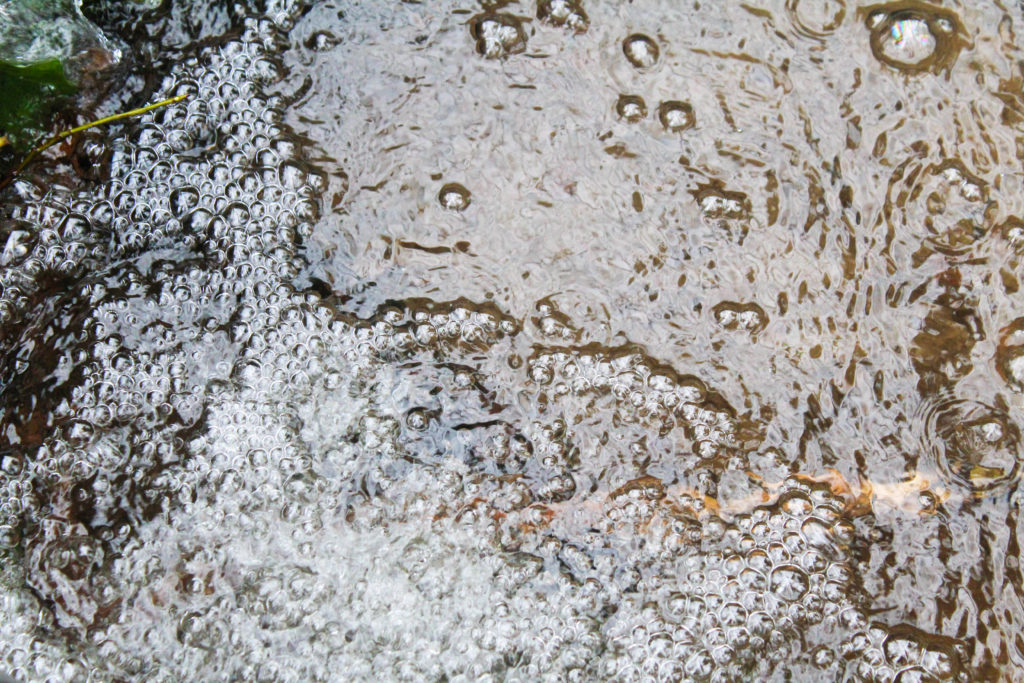
The second image I took of the bubbles creates by the stream where the circle pattern is repeated. I photographed the image so that this pattern took up just over half, which is then contrasted to the water with a different rippled pattern. I also tried to emphasise the white in the image, that is the white sky reflected on the water as I think this emphasises the shadows as there is more contrast. I like how theres a division between the bubbles and the rippled water from the shadows as it makes the patterns looks more textured and noticeable. In also like how the darkest point of the image is the right side, where the darker rock is beneath the water, which is then contrasted to the white bubbles in the center of the image, which is contrasted to the brown/white tones on the right side. This splits the image into three different sections and creates an interesting composition. I think that this image would work best displayed with another image, rather than by itself as I think that if it was contrasted to another pattern it would be more powerful.

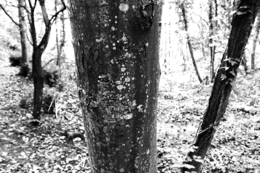
In the third image I focused on the patterns on the bark of a tree and the different tones that are portrayed . I particularly like the composition in this image as the two parts where a branch has been cut off are on the top and left corners, not showing the whole circle. I like this as it fills up the whole image with interesting patterns and create a symmetrical image. The image is not completely symmetrical as the branches have grown naturally as different sizes and in different places, emphasisng how nature is unpredictable. I think that the colour of the two cut off branch dark brown/green contrasts well with the colour of the light green bark. I focused the camera on the center section of the image as I wanted to emphasise the texture and shadows that the bark had created and the beauty within it.

Conclusion

Overall, I think this photo shoot went well and gave me more ideas the I can experiment with in future shoots. For my photo shoot where i look at the movement of water, i want to try and add more ripples to flat water, like in one of the image in this shoot to see the outcome. I also want to interpret the work of Rinko Kawauchi further by focusing more on light and perhaps focusing on fragility more in a feminine way. I think that the final outcomes from this shoot were good but i want to develop the concept of my project further and find the meaning behind the images other than my own personal appreciation fro nature. To do this I will research more artists and find inspiration from them.

Experimenting With Images – Colour

After looking over the works of John Baldessari I became inspired to create my own response regarding the colours used within his graphics used. I really liked his used of block colouring to create abstract effects within pre-taken images of people and landscapes, blocking out faces and aspects of the environment as a means of censorship. As a result of this it produces collages of different materials which contrast one another allowing for a aesthetically pleasing result. To create the intended results I would have to use software such as Adobe Photoshop to cut and paste in colour in the areas wanted, the photos I will be using are images I have previously taken in shoots regarding the topic of variation and similarity. Here are some examples of Baldessari’s work which I will be drawing inspiration from:

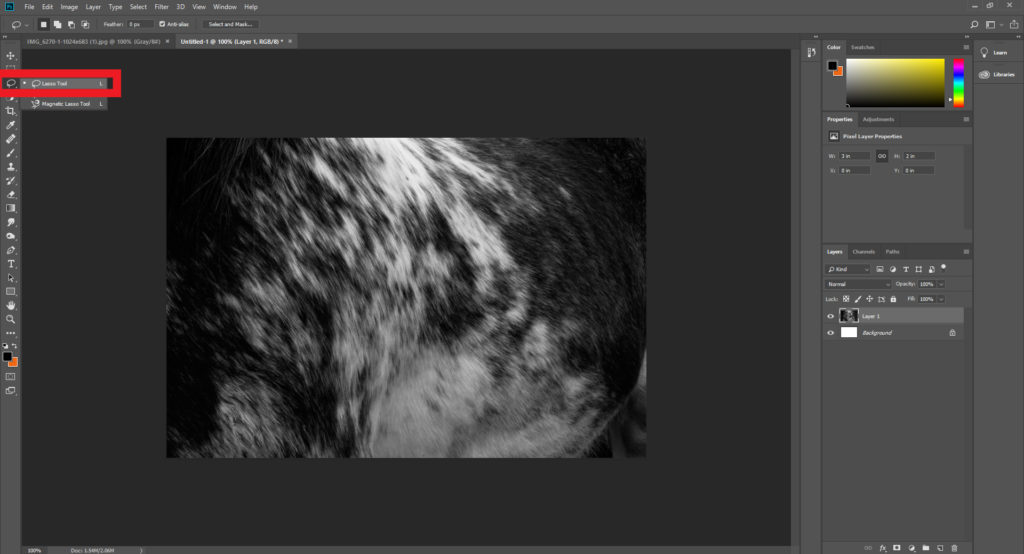
Once I had chosen some of the works which I would be using as a reference to create off I decided to go ahead and proceed to cut areas out which I thought would look more effective with varying ranges of colour. Using Adobe Photoshop I used the snipping tool to cut out and replace the different areas of each image with block colouring, looking back at Baldessari’s work as a reference to my structure of creating related works. Here is the process of me creating each image:

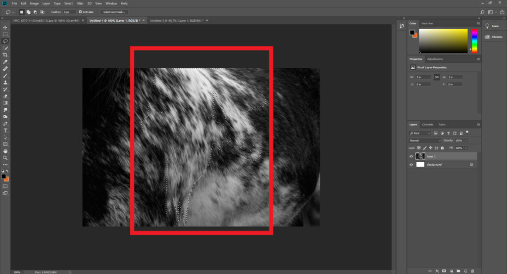
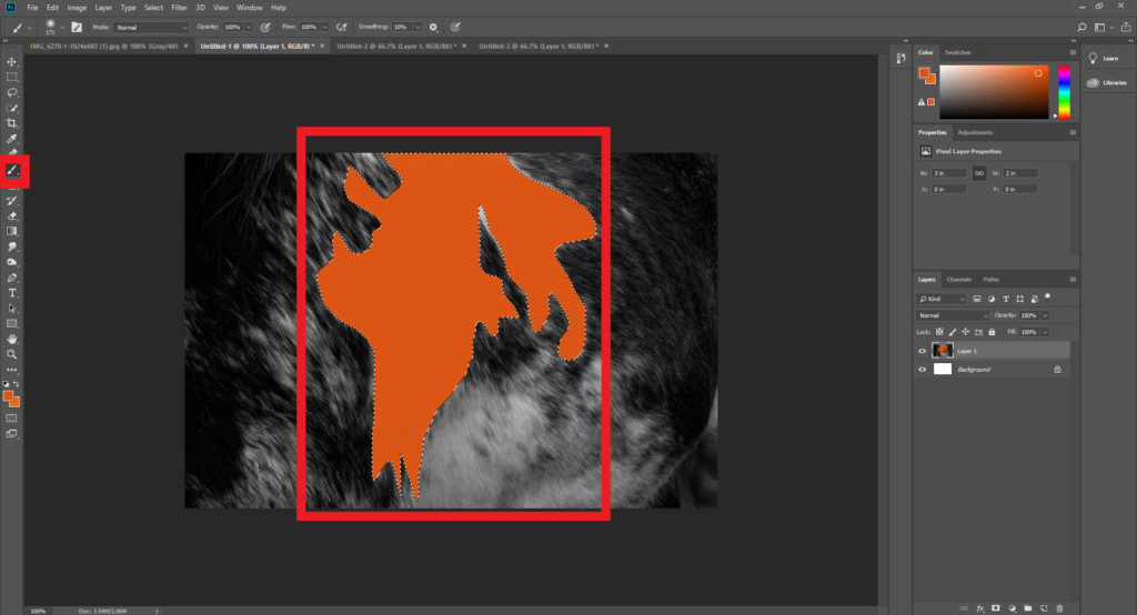
Step 1: Select the lasso tool located on the top left hand side of the tool bar and make sure the freehand option is chosen.

Step 2: Once you have selected the lasso tool draw out the desired shape of the area you intend to make a block colour out of, when doing it make sure to connect the end and the start point so that it does not ruin the layout.

Step 3: After highlighting the wanted area make sure to go on to chose the paintbrush tool next, located just under the lasso tool. Using the colour boxes select a colour that contrasts the piece well and paint it within the lassoed area, making sure to deselect the highlighted are once completed.

When I finished experiment with various designs I then chose four images that I best reflected the intended outcome of the process and inspiration towards John Baldessari’s work. These are the images I selected as the best outcomes of the experimentation:

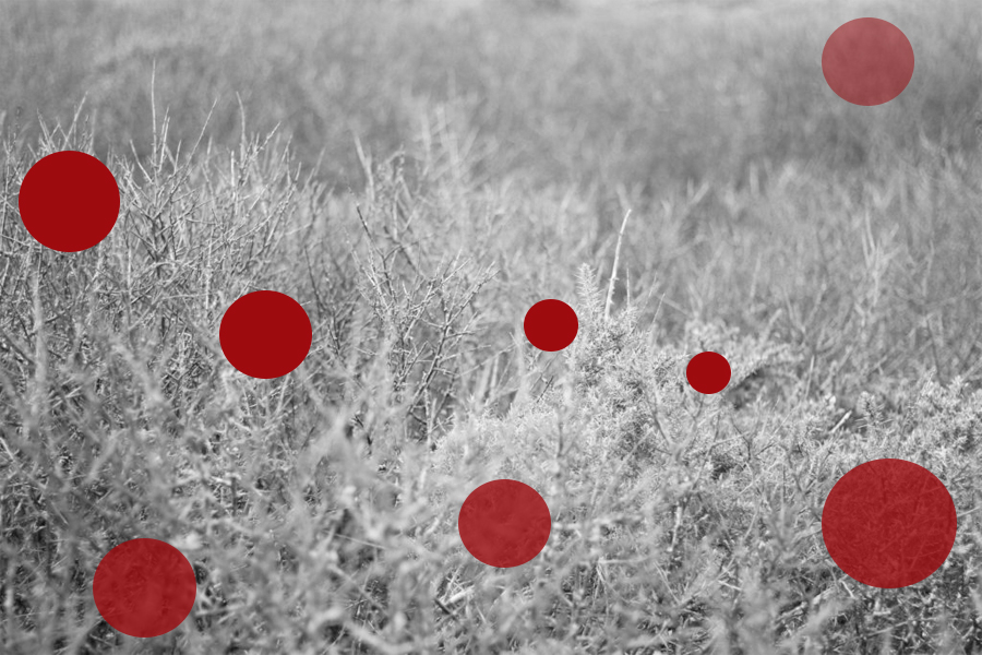
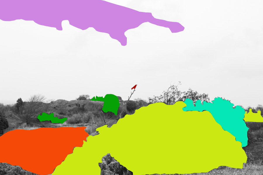
For this image I used red circles each with a varying opacity, by doing this it would create the impression of different depths of fields, with the more out of focused being the more faded shapes. When creating it I wanted to make sure there was still a natural feel to the piece, so limited the amount of shapes depending on the focus of the area so that they would not overpower and fill the entire piece.

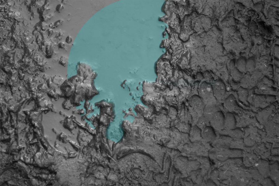
Here I wanted to capture a reflection of a shape within a muddy puddle. To do this I had to crop out the parts of the shape which touched the mud, this seemed a bit to complicated for a Baldessari’s work, however I liked the final outcome of how the lighter blue completely contrasted that of the surrounding black mud of the image.

When editing this piece I tried to block colour only the bushes and trees that were the most outstanding to the environment, allowing me to roughly cut out the area and replace it all with colour that contrasted but complimented each other so that it would not become eye sore. When placing the block colours I made sure not to have them grouped together so much as by clustering them together it would reduce the effect of the simplicity I wanted to put across, instead abstracting the photo too much.

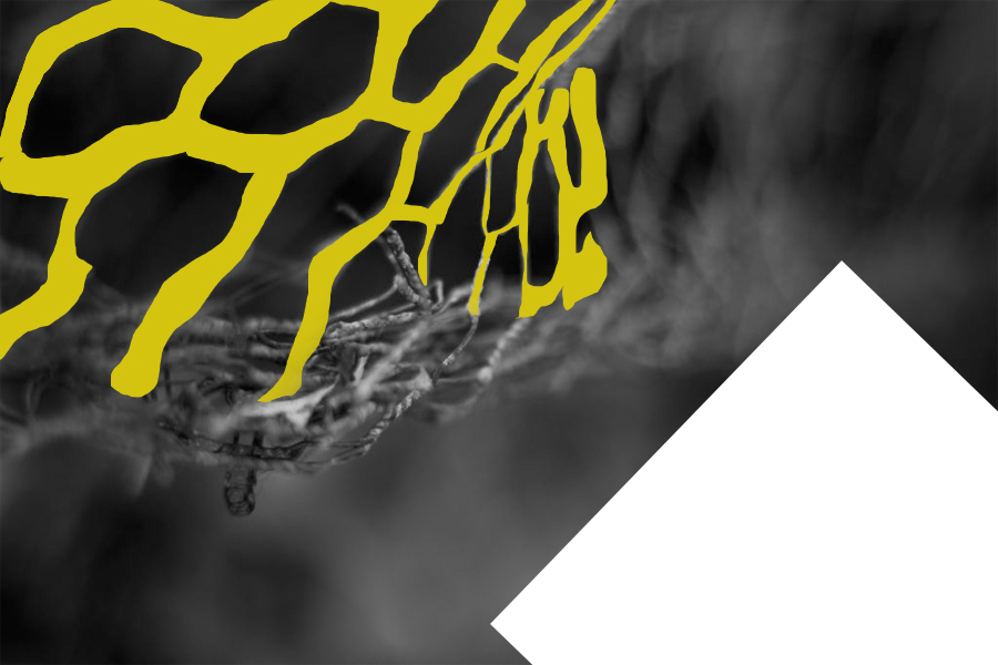
Finally I selected this image because I like the roughly cut out mesh wire which it replaced with a contrasted yellow which compliments the black which makes up the majority of the photo. By also adding the white rectangle I found that it brakes the piece up and instead stops the yellow from becoming too minimal and the black becoming too overpowering.

Artist Research – Bernd and Hilla Becher

Sources:

Bernd and Hilla Becher

Mood-board of typologies created by Bernd and Hilla Becher

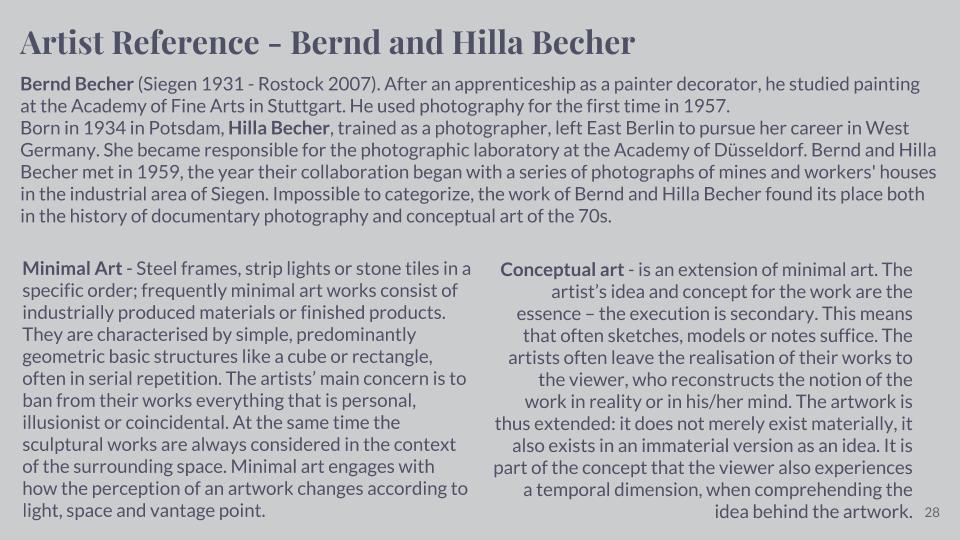
Bernd and Hilla Becher were German conceptual artists and photographers working as a collaborative duo. They are best known for their series of photographic images, (or typologies,) of industrial buildings and structures, often organised in grids. They influenced many documentary photographers and artists.

Bernd Becher was born in Siegen. He studied painting in Germany from 1953-1956, then typography (the art and technique of arranging type to make written language legible, readable, and appealing when displayed) from 1959-1961. Hilla Becher was born in Potsdam. After Hilla’s time studying photography at the Kunstakademie Düsseldorf from 1958-1961, she had completed an apprenticeship as a photographer in her place of birth. They both began working as freelance photographers (self-employed) for the Troost Advertising Agency in Düsseldorf, concentrating on product photography (advertising or commercial photography). The couple married in 1961. Bernd and Hilla Becher first collaborated on photographing and documenting the disappearing German industrial architecture in 1959. The Ruhr Valley, (where Becher’s family had worked in the steel and mining industries,) was their main focus. They were fascinated by the similar shapes in which the buildings were designed. After capturing thousands of pictures of individual structures, they noticed that the various large buildings, (of cooling towers, gas tanks and coal bunkers, for instance,) shared many distinctive formal qualities. In addition to this, they were intrigued by the fact that so many of these industrial buildings seemed to have been built with a great deal of attention towards its design. Together, the Bechers went out with a large 8 x 10-inch view camera and photographed these buildings from a straightforward “objective” point of view. They only did their shoots on overcast days, (to avoid shadows,) and early in the morning during spring and autumn. Objects included barns, water towers, coal tipples, cooling towers, grain elevators, coal bunkers, coke ovens, oil refineries, blast furnaces, gas tanks, storage silos, and warehouses.

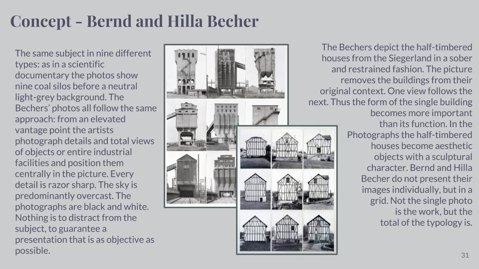
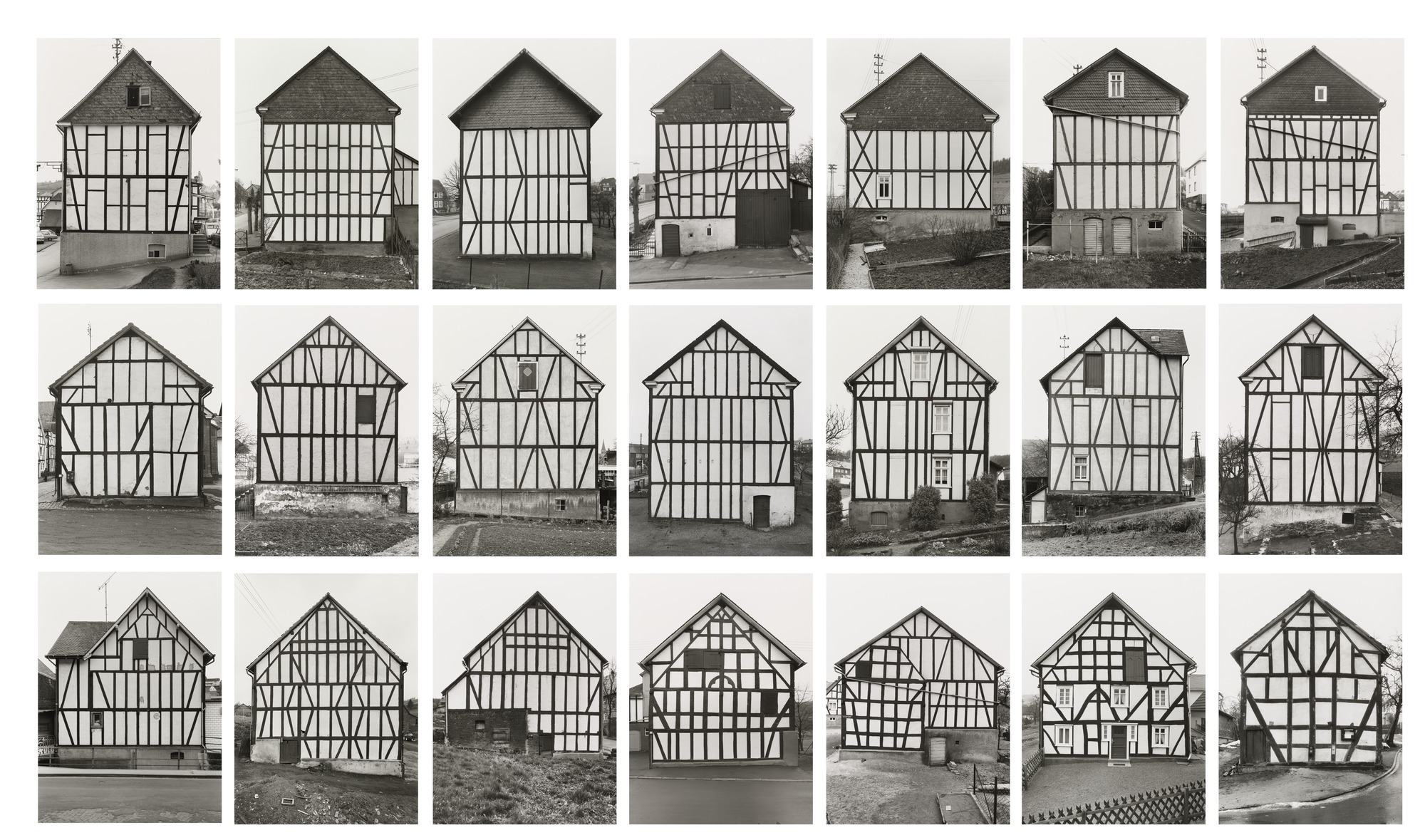
Bernd Becher, Hilla Becher Framework Houses 1959-73

This typology created by the Becher’s shows their objectives of conceptual art. They wanted to create a series of images where every object showed similar characteristics. These images were taken in Germany, as their images were based around the German industrial architectures. Each image is similar to the other, because of the repeated lines of wood that are used as part of each houses construction. This repetition effect is something that intrigues me towards these series of images. I like how each house has a triangular rooftop – the houses are a classic shape and although they seem like original shaped houses, they all have their own speciality that differentiates them from each other. For example, on the bottom row, second image from the right, this house appears to have 5 rectangular windows with a variance in how the panels for the window are displayed. The white panels all determine how many small squares there are inside of the window – some windows have 6 small squares, some only have 2 squares and 2 long rectangles. This same house has 1 door that has 2 slight windows either side of the door. This house is very different to the houses around it on the grid format, that the Becher’s used to create their typology. However, they all have similar shapes and objects that create the houses.

ESA // Linking Hiroshi Sugimoto and David Prentice

These two artists, David Prentice, and Hiroshi Sugimoto have a clear connection that can be linked through their work by the abstract approach to the landscapes. There is also the absence of man-made structures this, therefore, gives their work a lack of identity without the context of where the landscape is.

However, there is a strong contrast between the two artists. Prentice paints in a wide range and variety of colour. These colours are bright and portray the landscape and exciting and inviting, whereas Sugimoto uses more greyscale tones in his photographs and instead of colour, his focus is on the lighting, texture, and technique in his images.