Before going ahead with a shoot and artist reference I decided that I would explore a fine artist that I could link into my future work. I would be looking at their composition and portrayal of certain everyday objects, whilst also looking at how their portray their vision of the landscape in new and creative ways. One particular artist that I found to be inspiring was the fine artist Jason De Graaf, someone who focused on reflections and objects that reflected as a means of enhancing the colour and vibrancy of the subject photographed. For me this was a unique way of seeing the subject photographed as he sets about using natural reflections such as splashes and sunlight to add contrast to otherwise boring everyday items such as fruit. Some examples of his work can be seen below:
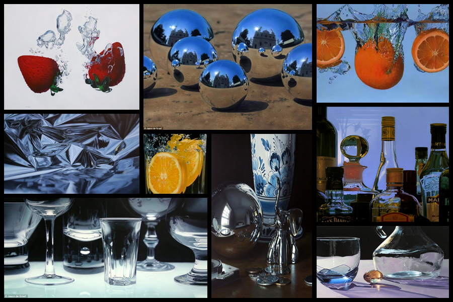
I really liked his use of tinfoil to create abstract landscapes in a sort of surreal and conceptual way with no actual editing done. For me this gave rise to the idea of used a kaleidoscope when photographing my intended areas, further abstracting the subjects from their natural environment and instead producing it to the viewers as something up to interpretation regarding what it could be. When thinking about the use of textures and patterns and creating surreal landscapes with it I stumbled across the photographer Seydou Keita, a photographer who captured African culture through the subjects clothes and patterns present in their everyday lives.
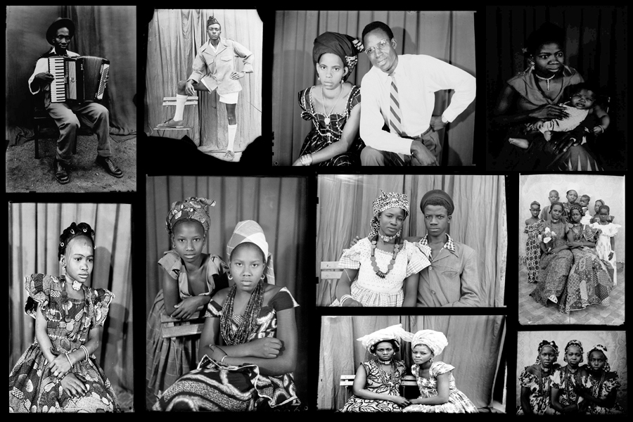
Seydou Keita was a self-taught photographer who in 1948 opened a studio in portraiture gaining a reputation for his skill throughout West Africa. Most of his photos and style are influenced by a great sense of aesthetics, dressing man young men European style clothing with customers bringing in items of clothing they wanted to be photographed in. Keita provided his own clothing and accessories such as watches, pens, radios, scooters, etc. which he often left inside his studio. Originally it was mainly women who came with their traditional robes that covered their legs and throats, only later shifting towards wearing Western outfits in the late 60s. Once again some examples of his work can be seen below:
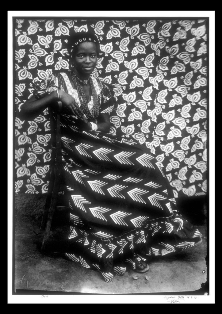
For future shoots I may consider taking objects out of my home into the natural landscape I have chosen and portray it in an abstract way which reflects a part of me rather than just the landscape itself. An alternative method which I could use would be to photograph the landscape on a more personal level, getting closer the to the subjects and capturing them in a more abstract way through up-close photography and their isolation from their surrounding environment. Some examples of this could consist of fences, horses, gardens and trees, all of these subjects play a part for something in society, whether it be work or just for relaxation, and so by portraying them in an unusual way which captures them in a light not previous used would as a result give viewers a new perspective. One of the image I found to be particularly effective for me is a piece by Seydou Kaita called Untitled [Seated Woman with Chevron Print Dress]:
Visual:
Visually the piece uses traditional African textiles and dresses as the main method of presenting aestheticism towards the viewer. What Keita does here is use two contrasting textiles which class in pattern not colour, as a result of this the opposing texture defines the women opposed to her blending into the backdrop. By leaving a section of the floor in it increases the effectiveness of the textures due to how it stops the entire image from becoming too eye-sore whilst also adding contrast between the predominantly white textiles, once again helping to define the figure of the women from the backdrop. Composition wise the women is centered in the middle of the photo, by doing this for me it immediately draws my eye to the subject as the contrasting clothing she’s wearing draws your eyes to the face in particular which is presented as a breaking point between subject and texture.
Technical:
When looking at the photograph you can see how the image was taken mid-movement, this is because of how the top right of the textile backdrop is motion blurred, this adds a sense of depth within the piece as it defines the women more due to her being photographed more crisply. An average exposure and shutter speed seems to have been used due to shades all being relatively normal without exaggeration, whilst the blurred areas provide me with evidence that the shutter speed is normal and has been unedited or untouched. The piece seems to use natural lighting as the light appears from all sides of the subject, not emphasizing or reducing the effect of the shadows, meaning that the image must have been taken outside of his studio.
Conceptual:
In the twentieth century, photography became a medium of expression that African artists began to draw upon to reflect on the world around them. One of the exceptional talents to emerge in this area has been the Malian photographer Seydou Keita (ca. 1921–2001), whose work has been admired on an international scale. Keita’s oeuvre consists of portraits that chronicle Malian life during the mid-twentieth century. His portraits are renowned for not only their masterful formal composition, but also their ability to capture the nuances of this important transitional period in Malian history.
This portrait of an unidentified woman displays the signature pictorial style that made Keita the premier Malian photographer of his generation. Employing different backdrops and successfully combining pattern on pattern, the woman’s skirt is dynamically juxtaposed with the regularity of the floral motif on the backdrop behind her. Keita positioned the woman so the arrow design of her dress directs the viewer to her bodice, where light vertical elements of her blouse lead toward her smiling, confident face. The overall pattern on the backdrop holds the viewer’s attention while it gently repeats itself and simultaneously guides our eyes back down to her skirt.


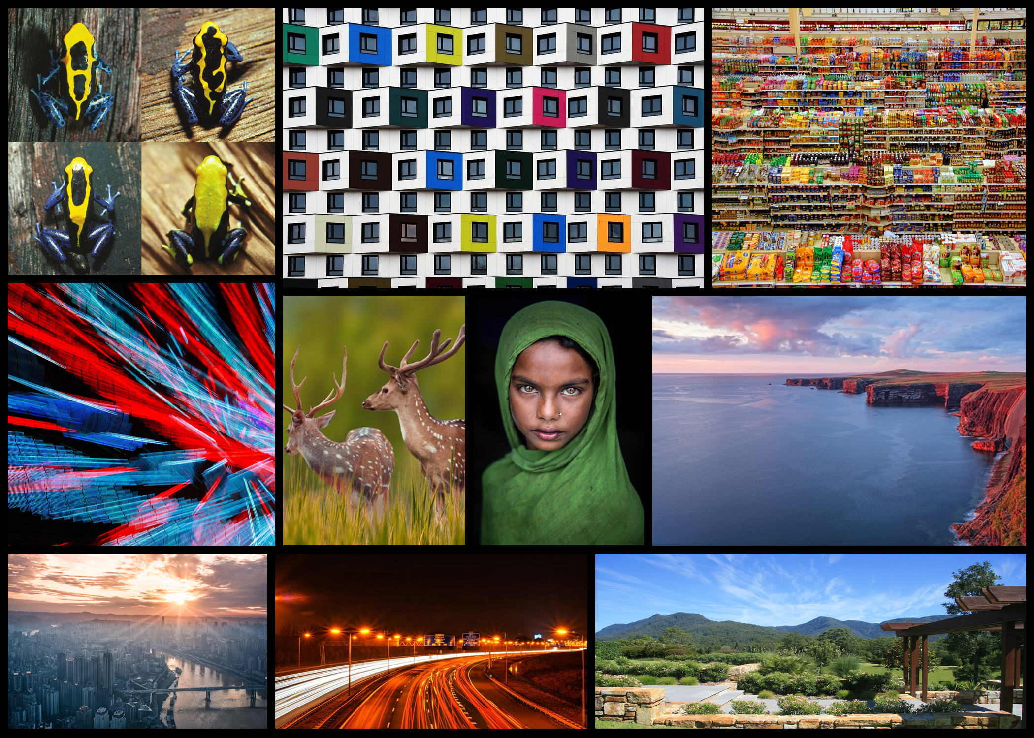 Some of the ideas above consist of variation such as buildings, animals, shops, lights, people, city landscapes, coast landscapes, natural environments and roads. All of these topics for me would be accessible to photograph in Jersey due to its wide range of varying landscapes. Personally the appeal of variation in animals for me would be the most effective, especially since Jersey has a world-renowned zoo that looks after endangered animals.
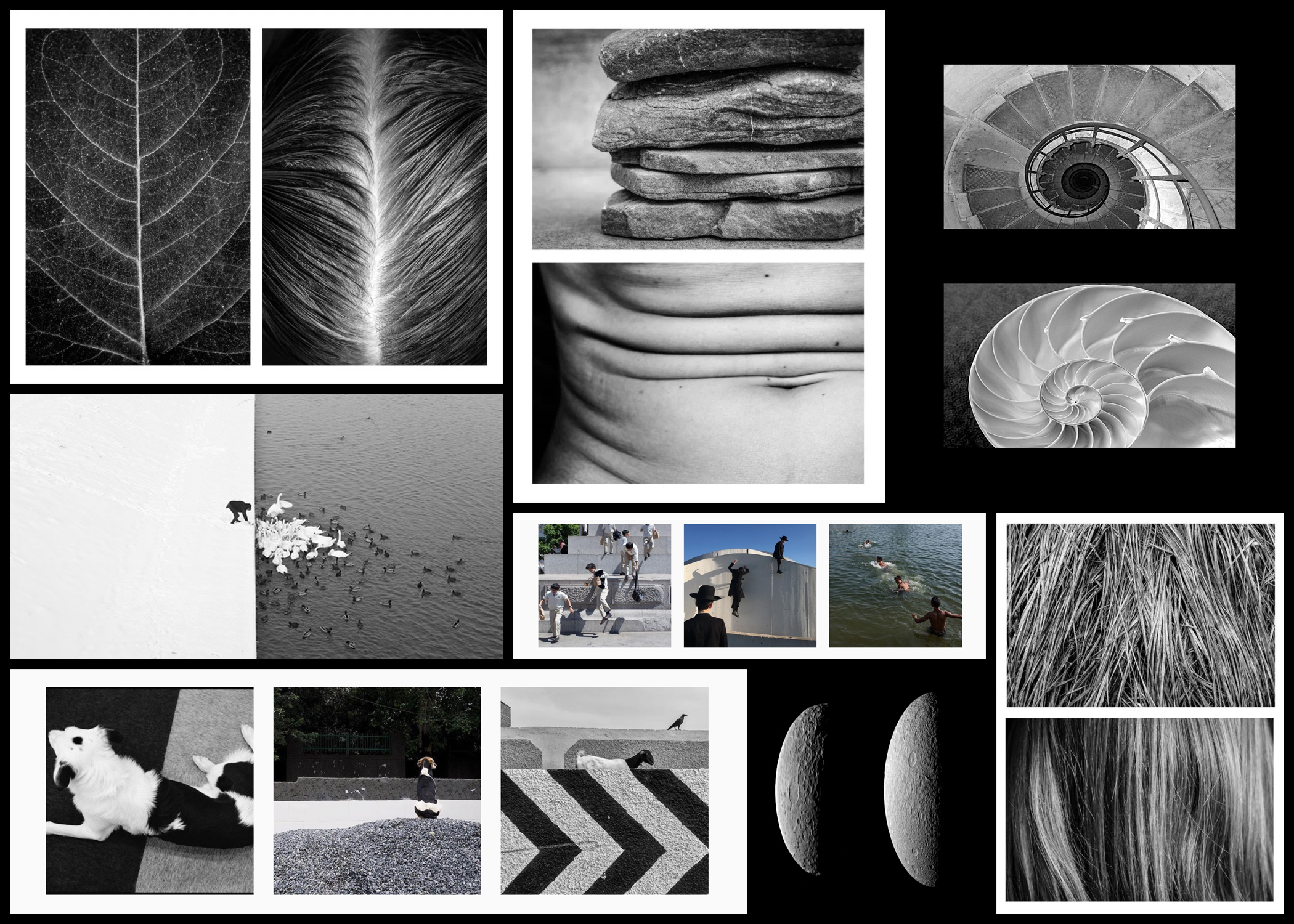 Looking over the examples present the topics I found most interesting were comparisons between natural objects and the form of human bodies, natural objects and their influence of the man-made world and similarities between random objects and surrounding environments.