All posts by Stanley Lucas

Filters

Author:
Category:

Abstract Pattern Shoot #2

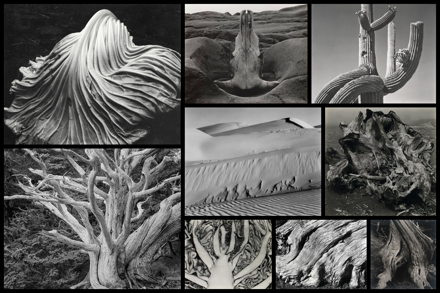
Regarding this shoot I wanted to respond to the works of Edward Weston due to his focus being mainly around the idea of capturing texture and pattern present within natural forms of the landscape. Overall what I found to be particularly interesting was his photographs surrounding trees and rock formations which use high aestheticism as the main form of attraction and the intricate beauty each resembles. This as a result has inspired me to go onto produce a shoot looking at the natural formations regarding textures of the landscape in the North of Jersey. From this I hope to achieve a new style of photography I can later go onto use to portray the environment in a new way and possibly go onto include them in my final prints and photo-book. Using Weston as my main source of inspiration I decided to have a look at some of his particular works that I thought reflected my mind-set of the shoot the most:
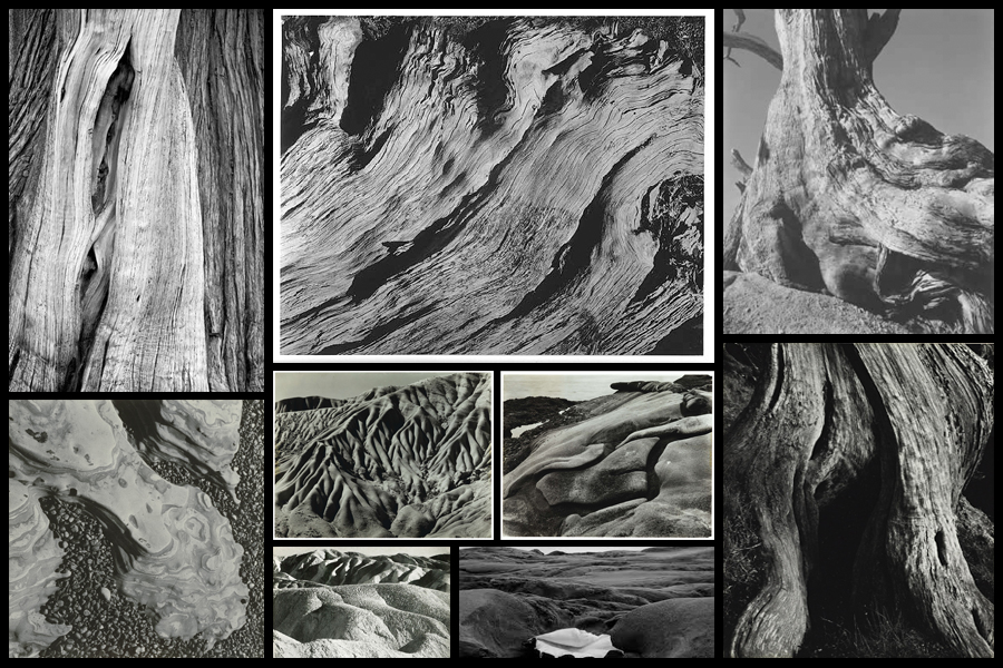
After I had looked over some of his works that inspired me the most I then decided to move onto creating a mind-map for my shoot. By doing this it would allow me to jot my ideas down for future reference whilst reducing the time wasted on the shoot. Not only would creating a mind-map prevent me from wasting time but it would also allow me to direct my intentions immediately during the shoot, instantly understanding what it was that I intended to achieve by the end of it and what I could focus on to get the results I wanted. Here are some of my ideas:
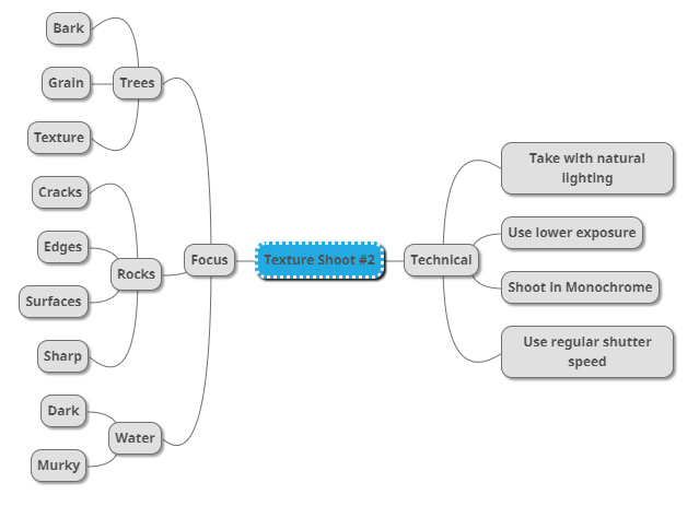
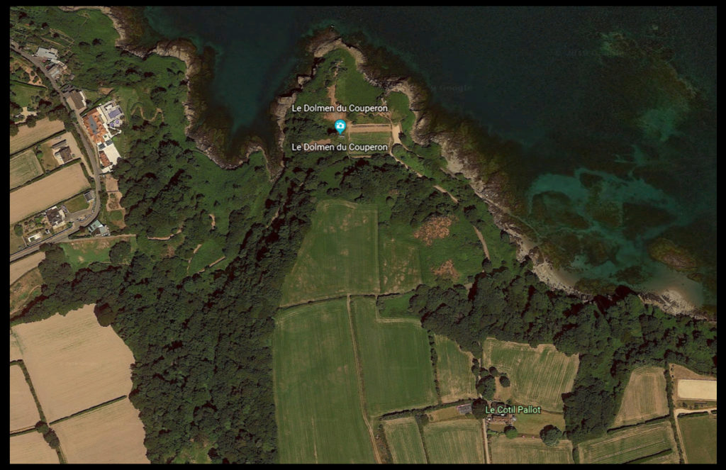
After looking at my initial ideas I decided upon going to the area of Le Dolmen du Couperon . I chose this location because of its wider range of different areas such as woodland and beaches, allowing for the perfect area to photograph my intended areas of focus. What drew my initial interest was how some of the woodland had been cut down and would have left behind stumps and ruined trees which would be great to photograph regarding the idea of bark and grain texture. Here is a map of the intended area to photograph:
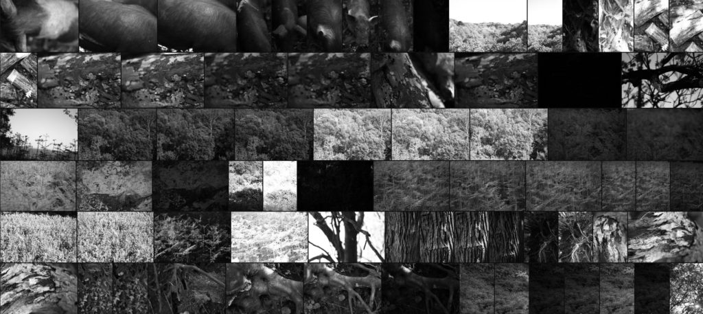
Here are the results of my shoot:
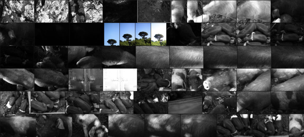
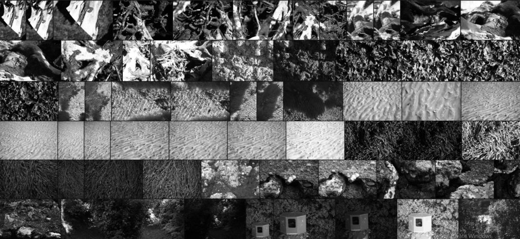
Once I had finished the shoot I then went on to whittling the selection down to only ten images, by doing so this would allow me to decide and make easier which image best reflected my overall intentions and goal of the shoot. Here are my ten best images:

After I had done this I then decided to go onto further and whittle the selection down to only five images this time. By doing this it would allow me to analyze the images in more depth looking at the visual, technical and conceptual aspects of each. These are my choices for the five best images:
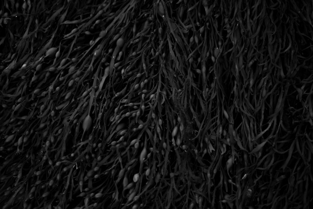
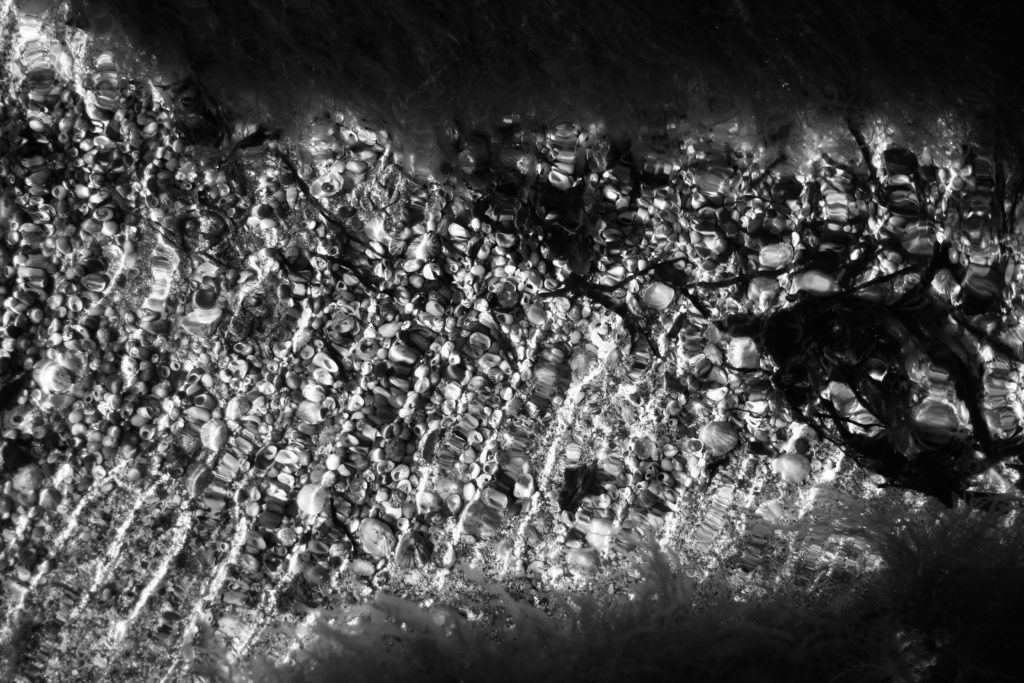
What I loved about this image was how the low exposure allowed for the over emphasis of the contrast between each piece of seaweed. For me the inclusion of highlights inbetween the pattern allowed for greater emphasis of the overdefined overlapping pieces as the monochrome filter perfectly captures this. Personally I found that the darker border around the pieces added to the overall affect, this is because of how it boxes the seaweed in and creates a great contrast which increases the aestheticism of the photo. Overall I thought the outcome was very effective as it captured exactly the subject as I wanted whilst providing the viewer with one of natures patterns.
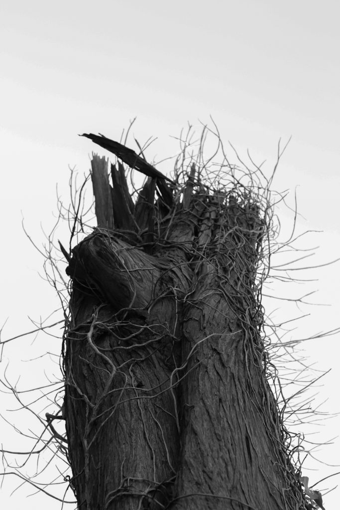
I selected this image because I loves how the dead tree branches out from the bottom of the composition with varying dead ivy producing from its side which provides a stark contrast to the overcast backdrop. By taking the image against a overcast backdrop for me it added extra definition to the subject as it over exaggerates the features whilst isolating the subject from its surrounding environment and limiting the viewers perspective of what it is. Personally I found this this piece came out really well as it provided me with the patterns desired from the outreaching ivy whilst also being close to my goal within my pattern mind-map stated above.
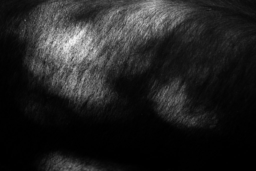
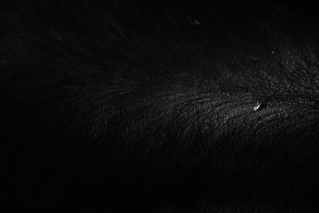
The reason I chose this was mainly due to its link to the previous pattern shoot which highlighted the mane of a horse instead. I selected this because I loves the huge contrast within the photo with the individual hair of the pig being highlighted by the limited amount of natural lighting from the sun. For me this adds a huge amount of character to the image as by limiting and abstracting the rest of the pig from view it makes you really look into the piece to further explore what could be hidden in the darkness. As a result of this I found this piece worked well and would be well suited to work with the other picture in the previous shoot which could be further used in a composition.
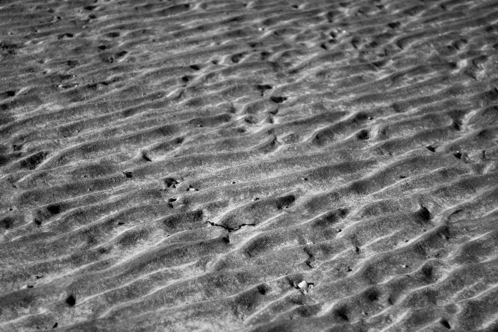
What made me choose this image was the pattern created from the sea going out and leaving behind the bumpy pattern that leads outwards for miles. By using a higher exposure I found that I was able to highlight certaom parts of the bumps leaving the rest of it in an exaggerated shadow which as a result creates the impression of a sort of sandy sea with various bumps overlapping or breaking up others. For me I really liked the result as it carries a sort of natural aestheticism where it makes the bumps seems too artificial to be true, therefore creating an almost surreal landscape as if from a birds eye perspective.
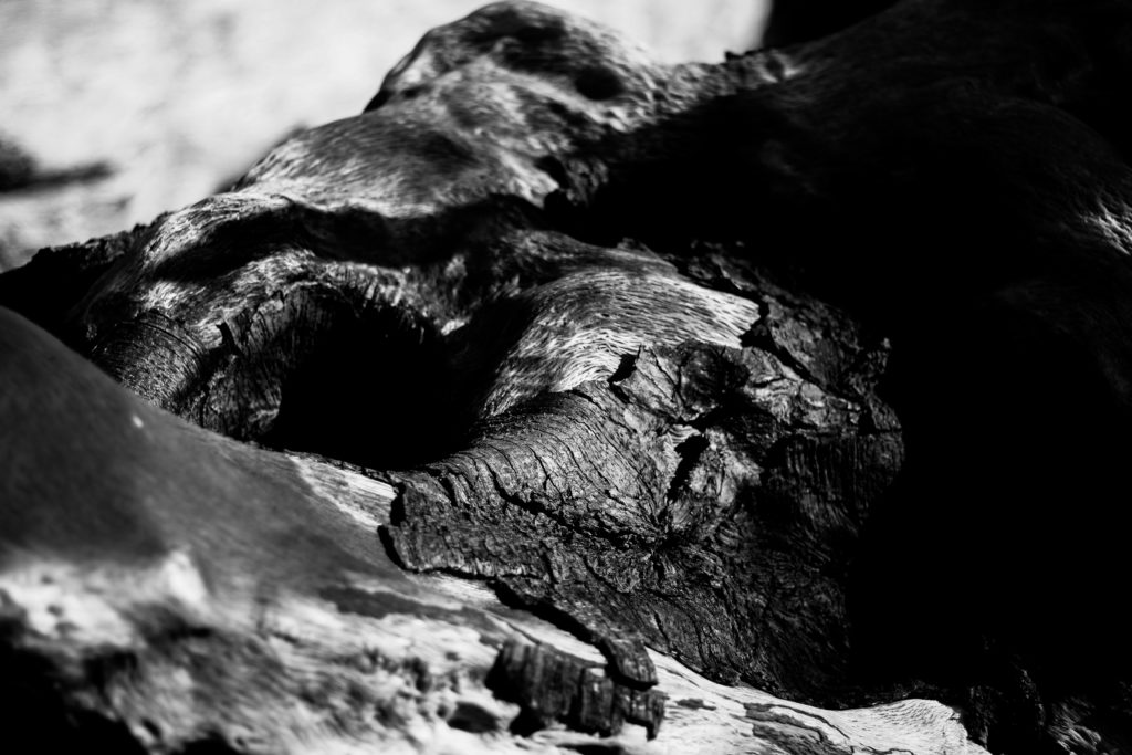
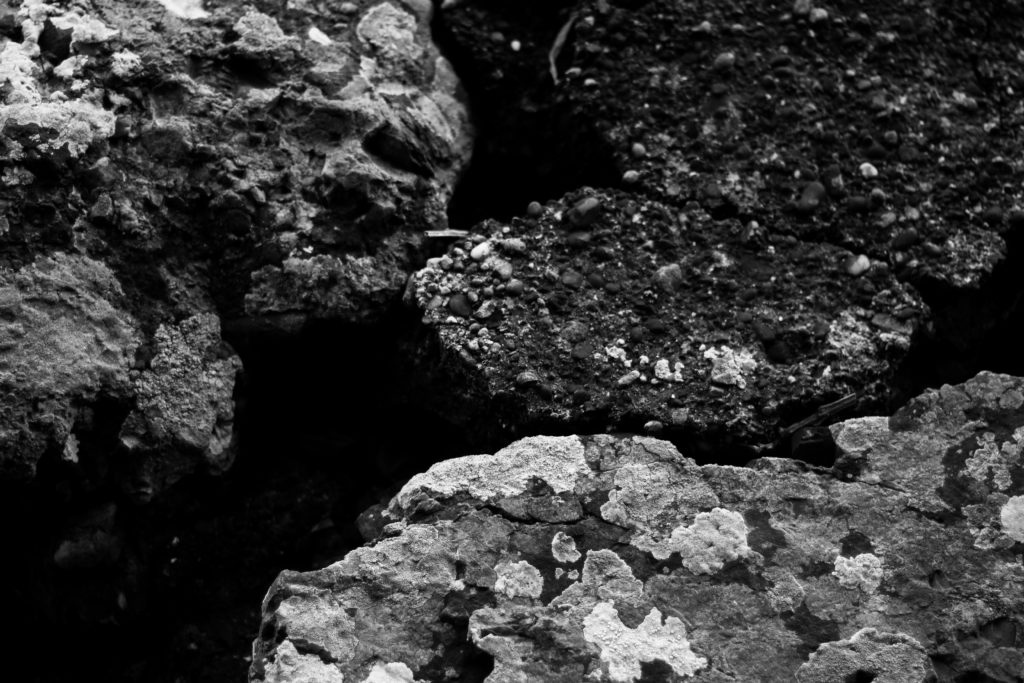
Finally I chose this image because I really liked the contrast between the dark and lighter aspects of the woods surface. When looking over the image I found that the clear contrast between the darker right side of the wood and the lighter left side added a much needed definition through how it induces a sense of mystery by removing most of what would be seen of the log. I also liked how the hole in the log adds a sense of depth through it removing the continuous grain present on the surface of the wood, instead breaking it up and becoming the main focal point of the image. As a result of this I was really pleased with this outcome as it reflected my intentions for the shoot whilst linking itself back to the topic of abstract patterns.

Once I had analysed each image I then decided it was time to move onto selected the best image that represented my overall aims and intentions of the shoot. This was my choice:

For me the image of the overly contrasted seaweed represented my aims for the shoot the most, this was because of how the overlapping pattern created when the tide goes out became really aesthetically pleasing for me due to the gaps of darkness inbetween highlighting the various shapes of the seaweed as it progressed along the composition of the photograph. Looking over the image for me it is clear that the small air sacks of seaweed add a very much needed aspect to the entire photograph, this is mainly due to how they tend to be a lighter shade from that particular area inflating and stretching the surface area as a result, whilst presenting them as more light and eye-catching to the rest of the piled seaweed.

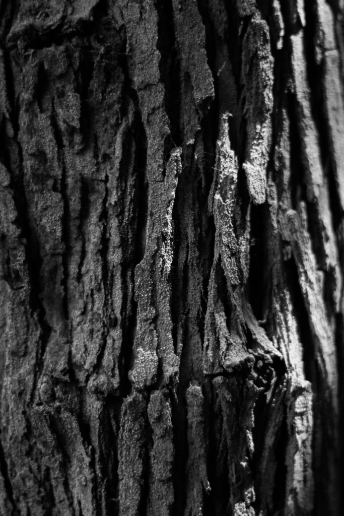
Artist Reference – Edward Weston

Who is he?

Edward Henry Weston was born March 24th, 1886, dying January 1st 1958. Weston grew up in Chicago and moved to California when he was 21, from a young age he knew he wanted to be a photographer and initially his work became viewed as a typically soft focus on pictorialism which was a popular theme at the time. Within a few years of photography he abandoned his original style and went on to use one of the now regarded as most highly detailed photographic images. However in 1947 he was diagnosed with Parkinson’s disease and he stopped photographing soon after which led to his remaining ten years of his life overseeing the printing of more than 1,000 of his most famous images.

Currently Weston is known as one of the most innovative and influential American photographers, being regarded as a master photographer of the 20th century. Over his career he range of subjects to photograph had widened, photographing things like landscapes, nudes, still life, portraits and genre scene even including parodies. Weston today can be seen as creating what is quintessentially seen as American, especially Californian approach to photography, this is due to his focus on the people and places of the American West where in 1937 Weston became the first photographer to receive a Guggenheim Fellowship. Because of this he went on to produce up to 1,400 negatives using an 8 x 10 view camera which many of his famous photographs being taken of trees and rocks around the area of Point Lobos, California where he lived for many years. Some examples of his photograph can be seen below:

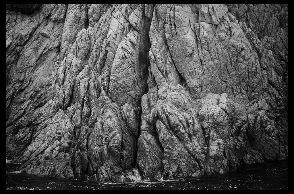
After looking over some of his images I decided to analyse one of them that I thought related best to my overall topic of variation regarding abstraction through different presentations. The image is called Point Lobos named after where it was taken where he photographed different rock formations using different compositions each time. By analyzing the image I can look into three sections, technical, visual and contextual, these will give me a greater understanding of how the image is taken and the underlying thought process beneath it.

Visual:

Visually the piece is extremely aesthetic due to its symmetry and use of different tones. What drew me to it originally was how the rocks mostly grey surface was complimented by the boarder of black waters and edges, for me this brought the photo together as it boxed in what Weston wanted to focus on, the texture of the surface. By using the divide between the two sides of the rock and composing it in the center of the image I found that it stopped the formation from becoming too overpowering and prevented it from becoming too bland and generic. For me this area of rock is effective because of how the darkened cracks all face the same direction whilst using the dark water as a gradient to eventually fade in and create an eerie result.

Technical:

When looking at the image its fair to say that a relatively lower exposure was used to create the darkened effect of the water and corners of the piece, allowing as a results for the areas where the sun hits to pop out against the rest of the composition. A regular shutter speed has been used as when looking at the water there is some slight movement blur which indicates that the photo was taken intentionally to capture its crashing against the rocks surface and as a result produce a greater transition between rock and water. It is clear when viewing the image that the composition has been greatly taken into consideration due to the placement of the dividing crack and the portion of the image taken up by the water.

Contextual:

During the late 1940s when this image was taken, Weston’s photography was becoming increasingly personal. He began to capture private picnics, trips in his car, and his family and friends—all of which were subjects he avoided in his earlier years. The beauty in this image derives from Weston’s overpowering sense of place at Point Lobos, the sharp lens focus, the flawlessness of a natural form, and the thorough attention to detail in his printing. This image, among many, illustrates how Weston often renounced the use of manipulation in his photographs in order to depict the realities of the world. This style of photography is referred to as “Pure and Straight Photography,” a term coined in the late 1800s when photographers began to create photographic prints that were not manipulated in any way. Weston will always be recognized for the simple, yet emotionally charged, clarity of his pictures. In viewing this photograph we find that Weston’s main goal was not to manipulate but rather merely to capture the beauty of Point Lobos.

Aesthetics in Art – Contextual Studies

Aesthetic comes under a branch of photography which examines the nature of art and our own personal experience with it. The term originally emerged during the 18th century in Europe, soon developing in England as philosophers grouped together images into fields of poetry, sculpture, music and dance. As a result of this they became all classified in art as one category which was called les beaux arts, or fine arts. From this philosophers have began to reason that no description could define or explain beauty. They argued that there were only some rational properties of it such as order, symmetry and proportion, however it is mainly regarded as an experience from an individuals perspective rather than a reason alone.

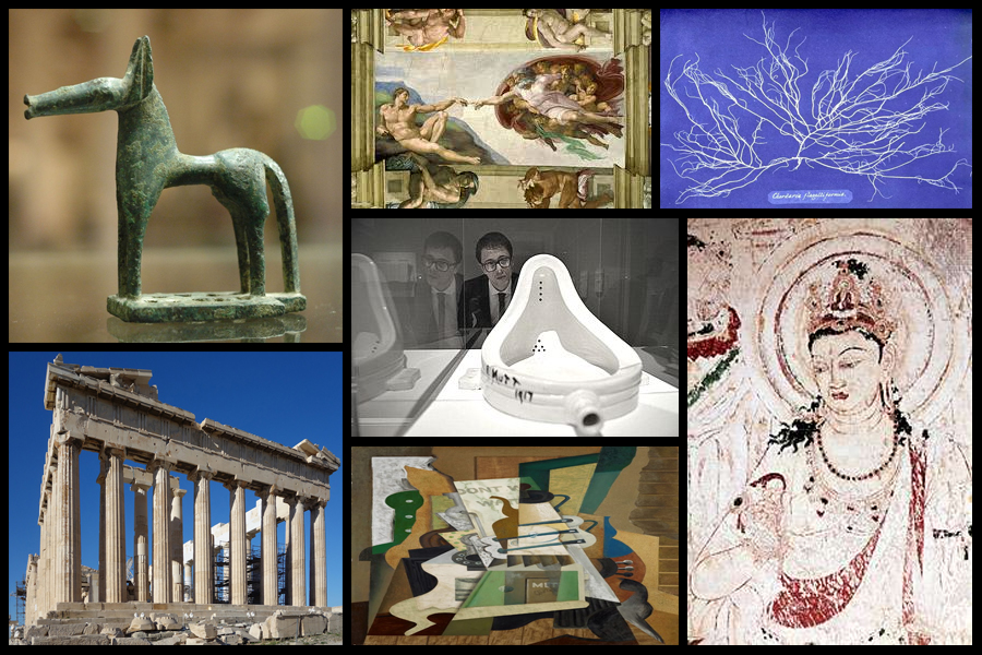
It is clear for us to say that through our understanding of intuition and experience with human feeling and emotion, aesthetic experience could include a mixture of feelings such as pleasure, rage, grief, suffering and joy. One particular philosopher named Immanuel Kant interpreted aesthetics as a field which gave priority to form over function, with him stating that beauty was independent of any particular figure which it was attached to. Today many historians and philosophers have argued that there is no such thing as aesthetics in art but rather there only being artists. Some of the earlier examples of aestheticism from different generations and cultures can be seen below:

The first use of the term aesthetics in something like its modern sense is commonly attributed to Alexander Baumgarten in 1735 with Francis Hutcheson marking the first systematic inquiries into aesthetics in the sense of them being a distinct branch of philosophy. Undoubtedly the 18th century saw the flourishing of inquiries into beauty, taste, the sublime, and genius, but few would be content to start a history of aesthetics in that century. For many centuries earlier, going back to ancient Greece, there had been philosophical reflection, even if only in a piecemeal fashion, on poetry, painting, music, and the beautiful, and these reflections had an enormous influence on later philosophizing. What is noticeable, though, is that prior to the 18th century it is not always clear where the boundary lies between aesthetics, as such, conceived as a distinctively philosophical inquiry into judgments of taste and the foundations of the arts and more general theorizing about art, including, for example, treatises on the arts often aimed at practitioners themselves.

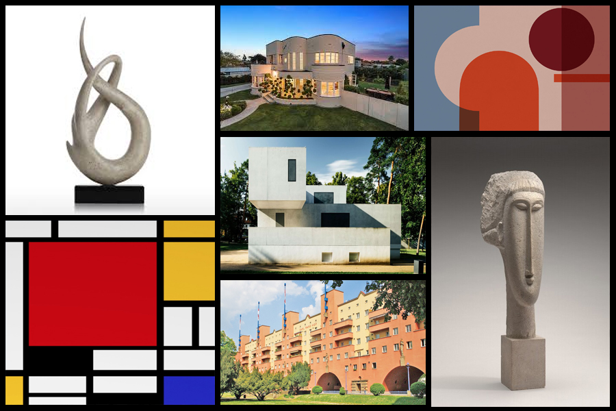
Regarding a more modern approach to aesthetics it can still be seen as the basis for much of our societies development through our architecture to our art. Various examples can be seen below:

Style EXPERIMENTATION – Bokeh

What is it?

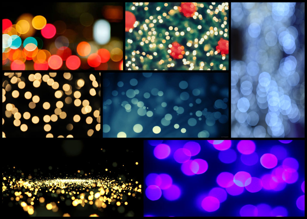
Named after the Japanese word for “blur” or “haze”, bokeh is an optical phenomenon that stamps the character of the lens on each photo in the way that bright out-of-focus elements are rendered. When out of focus, bright pinpoints become attractive, ghostly circles of light. Or at least they are circles with the right lens.Out-of-focus elements can be just as important to finishing the composition and can dramatically change the viewer’s perception of the piece. The key to using bokeh in a shot is to use a wide aperture on a close focused subject so that elements in front and behind the point of focus blur readily. If the lens has curved aperture blades, these will be reflected in the shape of the bokeh.
By tradition, bokeh hunters prize these circular shapes more. But straight aperture blades can create different shapes, such as hexagons if the lens has six blades and is used at a larger f-stop, such as f/8. These can be just as effective creatively. A more obvious way in which lens construction has influenced photographic trends comes with the zoom lens. The zoom-burst effect provides a way to guide the eye to the centre of the shot by turning the surrounding field into a blur of movement. The effect is easy to create although mastery takes a little longer.

The key is to focus on the centre of the image and during the shot quickly turn the zoom ring. It helps to have the camera on a tripod as this will minimise shake during the relatively long exposures needed to give you enough time to turn the zoom ring. Similar to creative use of bokeh, zoom bursts often work best with bright, colourful elements in the out-of-focus area. Although it needs a steady hand to pull off well, you can bring swirls into zoom-burst shots by holding the zoom ring and turning the camera instead. Here are some examples:

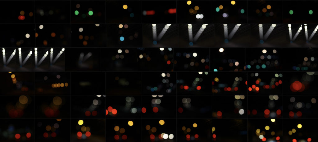
To ensure a clear image in the centre, photographers often combine the zoom burst with flash, using slow sync flash to fire extra light at the beginning or end of the exposure to freeze the subject. This can work extremely well in night-time city shots when you have streetlights to help emphasise the zoom effect. At the other end of the scale, zooming can be used to create extreme focus effects, particularly for macro shots. Even at high f-stops, it is difficult to capture a depth of field of more than a few centimetres of in close-up images. Here I wanted to explore a few ways in which I could experiment with the way I could take future shoots and so found walking around town at night was one of the best ways to do so. These were my outcomes:

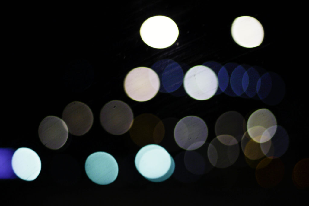
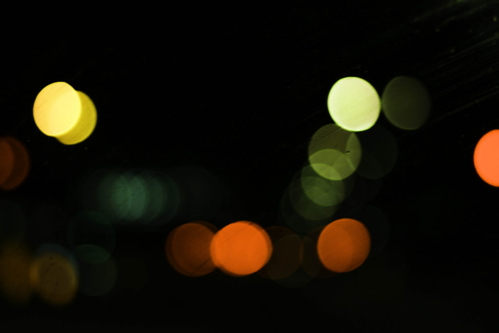
Once I’d experimented a little with the technique I decided to have a go at photographing the lights in tunnels and on car as they seemed to produce the best outcomes regarding variety of composition and brightness. When taking the images I really enjoyed taking into consideration a new style of composition not previously used where block lights could be overlapped or on their own. Here are three of my favourite outcomes from the experimental shoot:

What I liked about this image was the use of the mainly blue lighting fading out as it progressed through the photo. For me this effect created a great sense of aestheticism as it highlighted the dirt of the window it was taken from, this for me added extra texture to the image whilst also making use of the negative space so that it would not be predominantly black and leave the product as a bit of an eye sore. The shades of blue present within I found to cast an ambient light throughout, with the primary light source becoming the main focal point for viewers due to the sequence of other lights deriving from it.

Here I particularly liked the variety of different colours present which make use of the black backdrop which separates each light so that they become a sort of structured shape. Looking at the blues, whites and greys they all compliment each other so that they do not become overpowering, with the occasional different colour such as red or orange breaking up the pattern and adding more depth to the overall outcome. For me the blackness of the top right corner brings together the whole image due to how it adds a space and stops the continuous lights from overpowering the entire piece.

Finally what drew me to this image was the appearance of murky greens, reds and yellows which add a sense of eeriness to the photograph. These darker colours are complimented by the surrounding black which envelops each light merging them into the next whilst the sequence snakes off image. I particularly found the implementation of the reds and oranges to be of great effect due to how the prevent the mainly greens and yellows from taking over and making the image overall quite dull.

Overall for me this experimentation was useful as it broadened my stance regarding photography and the styles and techniques that could be used to take new and original perspectives of my surrounding environment. For a future reference I could combine certain bokeh images together to form a more abstract result combining patterns from both so that they merge and create something almost alien like.

Abstract Colour Shoot #1

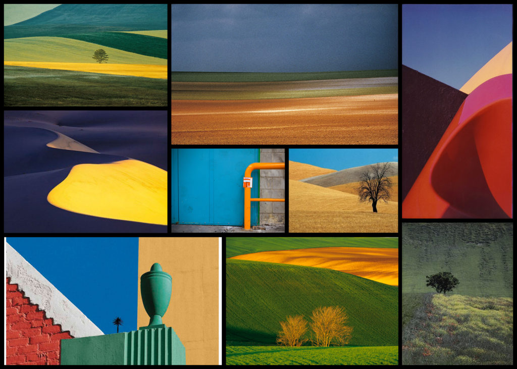
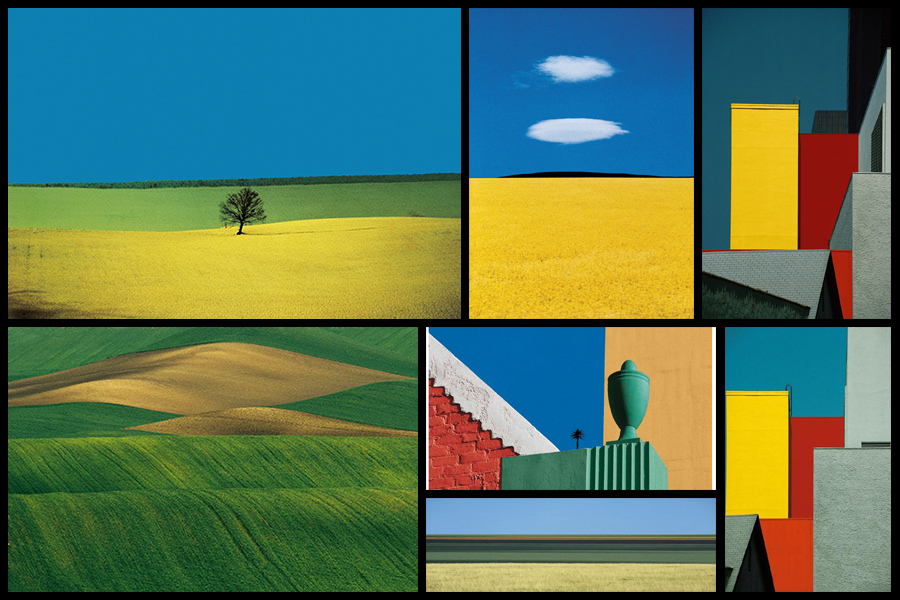
For this shoot I wanted to create a response to the works of Fontana as I really liked the simplicity created through his highly saturated images. What drew me to his imagery was his use of using the textures and patterns found in nature and man-made objects to create impressions of the landscape around him in a way which would not have usually been percieved. From this shoot I would aim to achieve a new style of photography which I could then go onto incorporate into possible future works especially the aspects of colours, something I don’t normally consider when doing shoots. To create the desired effect I would probably have to manually increase the contrast and saturation within my settings of the camera in order to produce the outcome for the photos I would like. Using Fontana as my main source of inspiration I decided to have a look at some of his works which I found to be of particular interest:

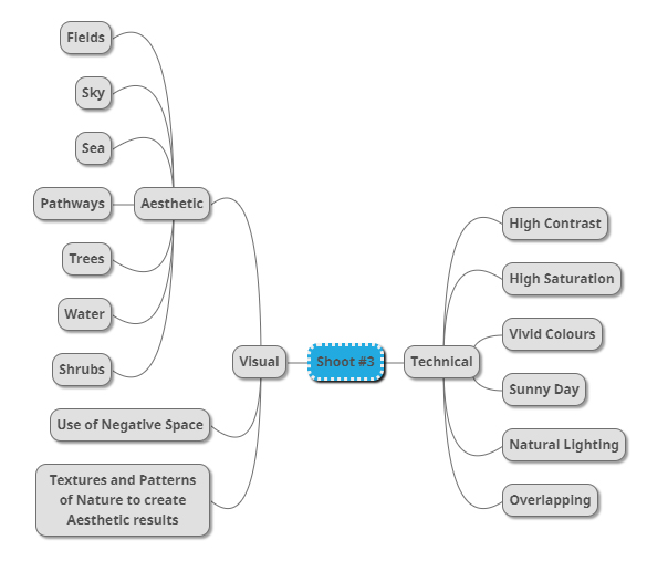
Once I had gone over a few of Fontana’s imagery I decided it was nearly time to go ahead with the shoot itself. However before doing so I wanted to create a mind-map for the goals when taking photographs, by doing so for me it would reduce wasted time as it would allow me to quickly identify what I wanted to capture in order to achieve the results needed. Not only would this stop wasted time but allow me longer to focus on the things that I may not have realised if doing the shoot there and then. Here are some of my ideas:

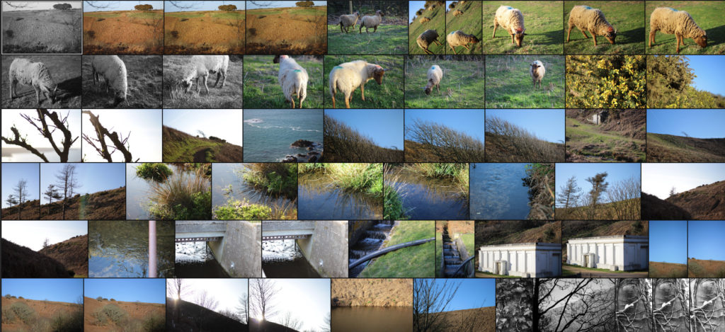
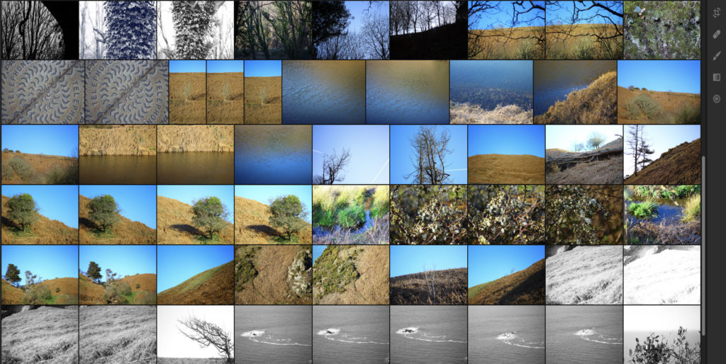
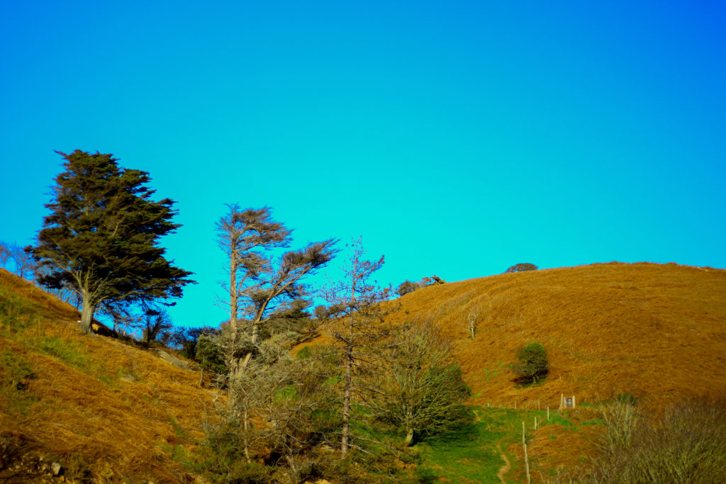
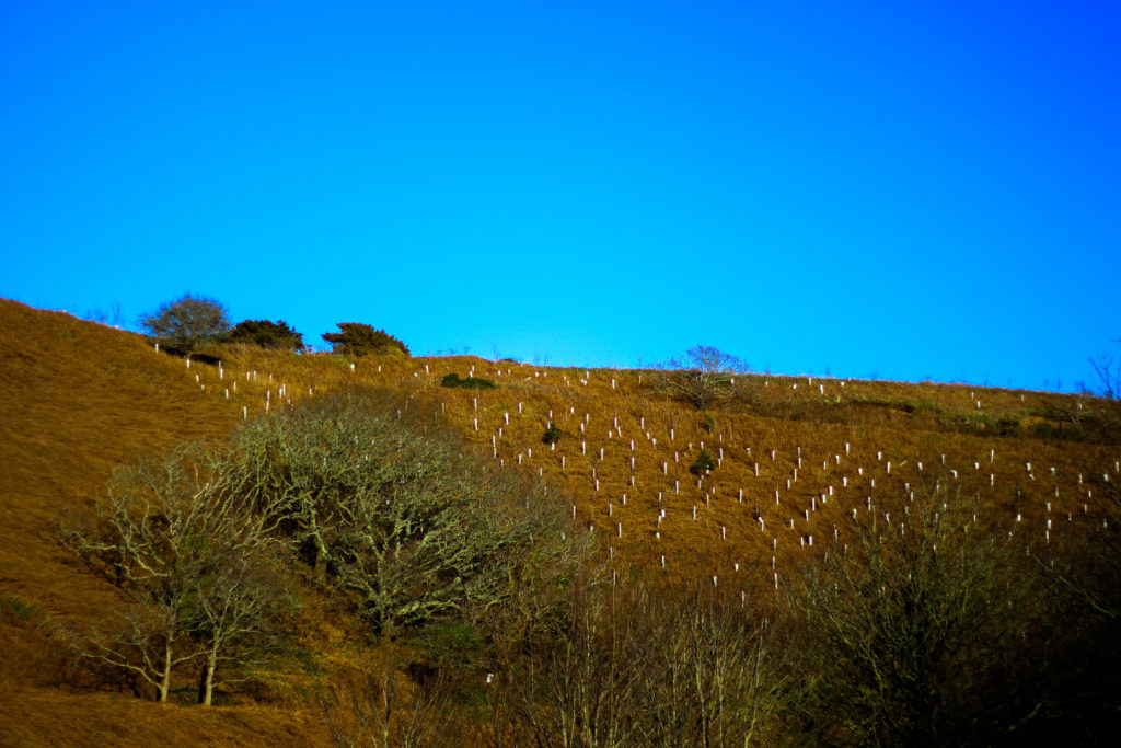
Once I had completed my mind-map I decided it was time to actually go ahead with the shoot. To do this I wanted to explore the area North of Jersey as this area had the highest number of agriculture out of Jersey as it would provide me with the subjects needed to achieve the aims of the shoot. Using my mind-map as my primary source of inspiration and ideas I explored the footpaths which surrounded the North coast looking at how the blue sky could contrast the hills. Here are the results of my shoot:

Once I had completed the shoot I then wanted to go onto select out ten images that I thought were most effective and related most to not only the topic title of textures and patterns but also saturation. By doing this it would allow me to reflect on each image and make in easier to choose out a selection of five from that so that I could later on pick one overall image that I thought best reflected my intentions for the shoot. Here is my selection for the ten images I thought were best suited to the topic of saturation regarding textures and patterns:

After I had selected the ten images that I thought worked best regarding the topic title I decided to then whittle them back down to five images, by doing this it would allow me to analyse each image in more depth looking at things such as the visual and technical aspect of the pieces that I thought made them work well and link back towards the title of saturation and make my overall choice of best image easier. Here is my selection of the five best images from my shoot:

I selected this image because I loved how the orange contrasted the blue sky with the tree breaking up the dominant two colours. What I liked about this was how the two main colours compliment each other, however to stop both colours from becoming to eye-sore to the viewer the use of a lighter shaded tree and its shadow provide us with an implicit focus to what we almost instantly draw our eyes to. I also really liked the symmetry present within the photo as the skyline and pathway with the tree line up against each other as it presented the viewers with an overall sense of aestheticism. When looking over the image I found that it related well in response to saturation evident through the orange grass and the overly blue sky, this sense of other-worldly colour for me gives the viewer the impression of an over exaggerated landscape which has certainly been edited.

What I really loved about this image was the over use of blue to create the impression of an artificial sky, complimented by the patterns created from the tree branches I found that this worked well due to the overcast impression it paints on the photograph. For me I found that the use of the negative space taken up by the blue really brought the image together due to how it prevents the pattern of branches from completely covering the entire composition. The image itself relates well to saturation from how the use of an overly blue sky creates the impression of something to perfect to be true, with the photograph linking to texture and pattern through the branches which grow in random directions that produce a hige sense of aestheticism against the blue sky.

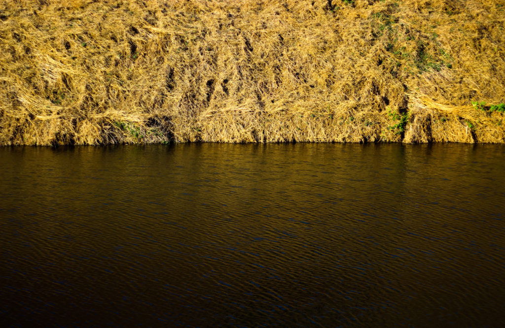
I chose this image because of how I loved the golden colours of the grass contrasted to the rippling water. For me this image represented two over exaggerated aspects of nature, especially as an island where we are surrounded by water presenting both the land and sea side by side in a sort of aesthetic and beautiful state creates the transition between the two as a natural mirror. I found that the gold presenting throughout the image as the main reason for choosing the photo due to it adding character to the water, reflecting the overlapping pattern of the grass as it grows. As a result of this I found that the two contrasting textures present in this image, being the rippling water and the overlapping grass as complimenting each other as one provides a more abstract representation for the other. The saturated golds in the piece also link it to the title through the coloured reflection that would not usually been seen by the everyday eye.

For me I selected this image because of its use of neutral space to create a more abstract impression of the landscape and whats in it. For me the tree against the blue sky was what brought the image together due to how it broke up the otherwise dull composition of the photo, what I found was how the messy texture of the grass completely contrasted the smooth matte texture of the sky which sorts of juxtaposes it. I liked how the composition that took into consideration the angle of the hill made use of the sky and contrasting orange grass surrounding it so that it would not become too overpowering. Overall I find this image did reference well regarding the topic of saturation, however looking at texture and pattern it did not serve a great load towards possible patterns except through grass.

Finally I selected this image because of the natural gradient created by the sun, sky and grass to produce this sort of golden natural film over the waters surface. For me this piece worked well because of how no real use of saturation editing was used due to how vibrant the surface of the water was on that sunny day with only a bit of cropping being needed. I really liked how the composition of the piece was based around a fifty fifty colour wise, with the golds taking the top and the blues the bottom, because of this for me the piece was well balanced with no aspect overpowering the other and creating an aesthetic product. However when looking over the image I did not find it had a great deal to do with saturation due to there being no actual reflection of a saturated landscape.

After looking over the visual, technical and conceptual aspects of the five selected images I was happy enough to come to a conclusion regarding which image would be best to reflect my intentions around saturated photography whilst also looking at the title textures and patterns. Here is my final decision towards the topic of saturation:

Final Image:

I chose this image as my final photograph to sum up my chosen topic because of the contrasting sides to the landscape it presents using highly saturated colours. For me the dominant use of yellows and golds in the photo bring about great aestheticism whilst highlighting how areas of our environment provide us with varying textures and pattern (such as ripples in the water and the overlapping of grass), something that the everyday eye would not take in unless looked upon carefully. Symmetry played a part in this decision due to how it presented the image as visually pleasing, stopping both the water and land from becoming too overpowering.

Artist Reference – Franco Fontana

Who is he?

Franco Fontana was born in 1933 in Modena. He took up photography in 1961 and joined an amateur club. He held his earliest solo shows in 1968 in Modena, his native city, which marked a turning point in his career. He had published over severnty books with Italian, French, German, Swiss, Spanish, American and Japanese publishers. His photographs have appeared worldwide in over 400 exhibitions, solo and collective. His images are in collection in over fifty public and private, Itlaisn and international galleries. Many companies have asked him to collaborate on advertising campaigns, he had published photographs in The New York Times and various other major magazines, with Fontana being invited to hold photography workshops in various school, universities and institutes such as the Guggenheim Museum in New York. Every year he holds academic courses at the Politecnico di Torino, and the LUISS University, Rome. He is the director of the Toscana Fotoferstival and has collaborated with the Centre Georges Pompidou, the Japanese Ministry of Culture and the French Ministry of Culture.

Fontans photography mainly depicts extremely aesthic portrayals of natural landscapes, using vibrant colours and a high saturation to link beauty to what would typically be seen in things such as flower, fields and the sky. What has inspired me is his use of aesthetics through a more unusually high saturation, depicting which would usually be everday scenes in a more visually appealing approach. Here I intend to go about photographing nature in a more aesthetic manner, using the textures and patterns found in each subject as a means of photographing a hidden viewpoint not usually seen to the everyday eye. Some examples of his work can be seen below:

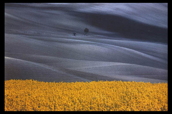
After looking over some of his works I decided that I would go onto analyse one of his images, by doing this it would allow me to have a broader knowledge regarding the techniques used to photograph the pictures and the more conceptual side of them. To do this I would have to look at three categories, technicality, visual and conceptual, the image that I have selected to study is called Paesaggio Basilicata, and was photographed 1990, depicting the use of minimalist styled composition of a agricultural landscape:

Technical:

Technically the image is composed using a very minimalist technique, capturing and using only the yellow crops and the contrasted black and white backdrop to provide the image with an overall very aesthetic product. The photo has been taken in two filters, one being coloured and the other monochrome, by doing this it really highlights the shadows that make up the layers of the hill seen in the background and as a result create an abstract like effect which in a way depicts them as waves. To stop the monochrome becoming too overpowering Fontana has included two small trees located in the center of the photo, including this allows for a more symmetrical and aesthetic looks as the continual gradients of the hill are broken up and separated. The yellow contrasts this due to it being a contrast to black and so allows the shades on the hillside to pop even more.

Visual:

Looking at the image its evident that a high saturation has been used to create the vivid colour of the grass which is depicted unnaturally yellow. This is also contrasted by the monochrome hills which by doing so allows for all of the hills to have a layered portrayal used by the darker areas which have highlighted and smoothed out the grass to create a more gradient effect as a result. Composition wise the placement of the trees in the center has definitely been thought about, this is because of how it breaks up the otherwise consistent pattern found throughout the photo, with the yellow flowers taking on about 1/3 of the image up so that it cant become too overpowering due to its colours.

Conceptual:

The style used for this photo is based on his on vibrant language, Photographic Trans-avantgarde, abstracting the landscape and its colours. By using things such as a higher saturation he aims to create ideals for people regarding the aestheticism of an area which is often over-exaggerated in order to push a certain mind-set onto the viewer.

‘Concerning the Spiritual in Art’ by Wassily Kandinsky

Who is he?

Born in Moscow in 1866, Wassily Kandinsky took up the study of art in earnest at age 30, moving to Munich to study drawing and painting. A trained musician, Kandinsky approached color with a musician’s sensibility. An obsession with Monet led him to explore his own creative concepts of color on canvas, which were sometimes controversial among his contemporaries and critics, but Kandinsky emerged as a respected leader of the abstract art movement in the early 20th century. In Munich, Kandinsky was accepted into a prestigious private painting school, moving on to the Munich Academy of Arts. But much of his study was self-directed. He began with conventional themes and art forms, but all the while he was forming theories derived from devoted spiritual study and informed by an intense relationship between music and color.

Color became more an expression of emotion rather than a description of nature or subject matter. He formed friendships and artist groups with other painters of the time, such as Paul Klee. He frequently exhibited, taught art classes and published his ideas on theories of art. He had already formed the New Artists Association in Munich; the Blue Rider group was founded with fellow artist Franz Marc, and he was a member of the Bauhaus movement alongside Klee and composer Arnold Schoenberg. Back in Germany after clashing theoretically with other artists, he taught at the Bauhaus school in Berlin and wrote plays and poems. In 1933, when the Nazis seized power, storm troopers shut down the Bauhaus school. Although Kandinsky had achieved German citizenship, World War II made it impossible for him to stay there. In July 1937, he and other artists were featured in the “Degenerate Art Exhibition” in Munich. It was widely attended, but 57 of his works were confiscated by the Nazis.

What is the book about?

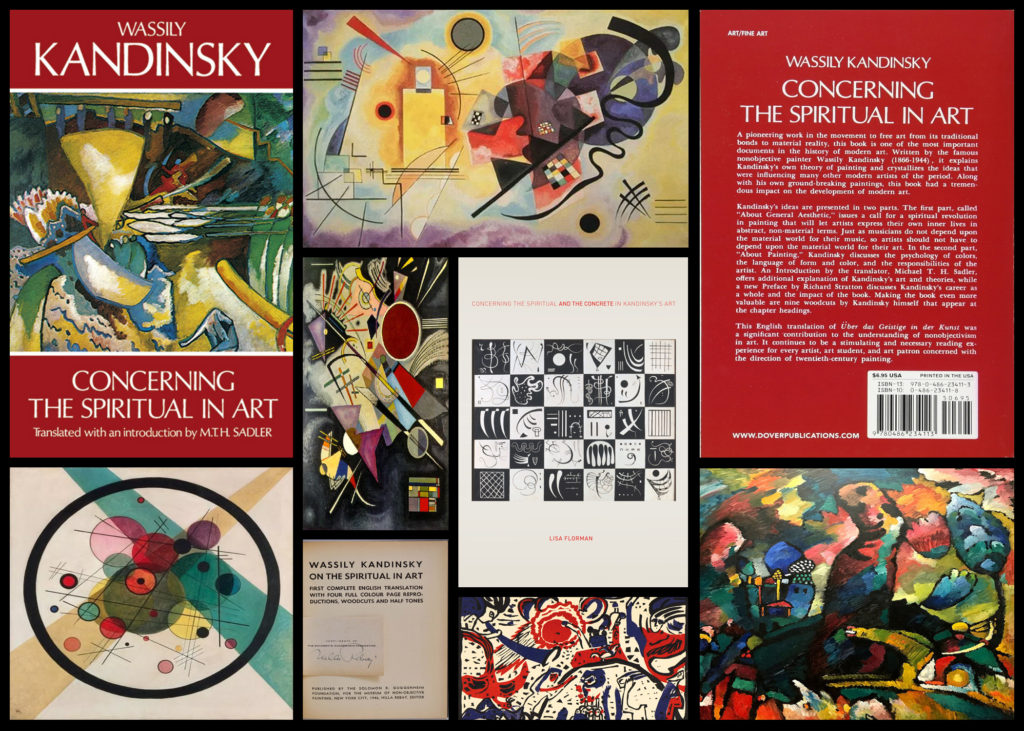
The book acts as a reflection of anticipating “the spiritual turning-point” where Kandinsky looks at how this could occur within people. To do this Kadinsky looks at the artistic meanings of the psychology of colour, the compositional interrelation of forms etc. As a result of this her main goal as an artist becomes the constant search to find the very innermost necessity that can be found within the spiritual foundations of any individual. When looking through the initial pages of the book it is made very clear that Kadinsky is trying to anticipate the emergence of abstract art as the purest form of influence on the human soul, allowing many to view the future optimistically, foretelling the upcoming emergences of spirituality. Some examples of the book and its content can be seen below:

After reading through a bit of his book and looking over some of his artwork, I decided to go onto analyse a piece of his work that for me summed up his points stated in the book and his link between spirituality and the individual. The image I have selected is called ‘On White II’, and was created 1923:

Visual: The piece overall is very aesthetic through its contrasting bright colours and the use of negative space to create feeling within the blocks and random assortment of shapes jotted around. The bright colours for me draw a sense of happiness linked together with gloom, this is due to how the vibrant colours compliment each other bringing about a sense of joy, however contrasted to this is the darker greens and black which for me derives the image of its joy and instead implemented some underlying perspective of loss of gloom which could potentially be interpretted.

Technical: When looking over the image its clear that though the image looks like a random assortment of coloured shapes each piece has been carefully placed to be as effective as possible to that it can impact the viewer through its paint splatter like composition. The use of black within allows to break up the overlapping shapes which otherwise would have become too overpowering without a border. For me the use of the negative space occationally included with a few black lines adds to the overall effectiveness due to how it boxes in and compresses the piece so that it is only confined to one area making it as a result more minimalist.

Contextual: Kandinsky used an array of geometric shapes and lines in a colourful and riotous contemporary display, prompting many artists to imitate his style. On White II, is located at Georges Pompidou Centre, Paris, France. As the title suggests, white is predominant in this painting, including the background. Kandinsky used white to represent life, peace and silence. The majority of the geometric shapes are presented in a variety of colours, reflecting the artist’s love for the free expression of inner emotions. Striking through the kaleidoscope of shapes and colours are bold, spiked barbs in black, representing non-existence and death. Kandinsky liked to paint while listening to music, and On White II, is his interpretation of the music, as created by his inner consciousness. The abstract and possibly mesmerising display of shapes and colours can be compared with the complexity of a musical composition.

Contextual Study – Colour Field Paintings

What are field paintings?

Field painting was a term that originally was applied to the work from about 1950 of three American abstract expressionist painters, Mark Rothko, Barnett Newman and Clyfford Still. The words ‘colour field painters’ was the title of the chapter dealing with these artists in the American scholar Irvine Sandler’s ground-breaking history, Abstract Expressionism, published 1970.

From around 1960 a more purely abstract form of colour field painting emerged in the work of Helen Frankenhaler, Morris Louis, Kenneth Noland, Alma Thomas, Sam Gilliam and others. It differed from abstract expressionism in that these artists eliminated both the emotional, mythic or religious content of the earlier movement, and the highly personal and painterly or gestural application associated with it. In 1964 an exhibition of thirty-one artists associated with this development was organised by the critic Clement Greenberg at the Los Angeles County Museum of Art. He titled it Post-Painterly Abstraction, a term often also used to describe the work of the 1960 generation and their successors.

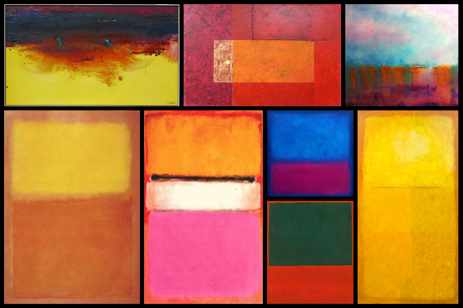
In Britain there was a major development of colour field painting in the 1960s in the work of Robyn Denny, John Hoyland, Richard Smith and others. Some examples of field paintings can be seen below:

Color Field Paintings emerged out of the attempts of several artists in the late 1940s to devise a modern, mythic art. Seeking to connect with the primordial emotions locked in ancient myths, rather than the symbols themselves, they sought a new style that would do away with any suggestion of illustration.The style was championed most enthusiastically by critic Clement Greenberg, who acclaimed the advances it achieved in the realm of form and composition. Bemoaning what he saw as the increasingly imitative, academic qualities of some action painters, he argued that Color Field Painting represented the way forward. His advocacy of the style proved highly influential.

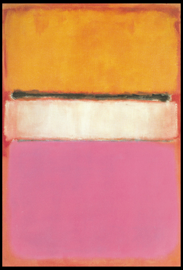
From here I wanted to explore the typical aspects that could be found within many field paintings. To do this I would need to analyse a painting and look at the technical, visual and conceptual ideas behind each brush stroke. By doing this I would like to take inspiration from this and use it towards a future shoot regarding Franco Fontana, using a highly saturation landscape to create abstract work which highlight the texture and patterns that can be found in everyday life regarding hills around the coast. The painting I have chosen to analyse is called White Center (Yellow, Pink and Lavender on Rose) by Mark Rothko:

Technical:
The painting, top to bottom, signifies Rothko’s multiform style of abstract painting. A rose ground, darker in color on top and paler at the bottom, holds a horizontal yellow rectangle, followed by a black horizontal strip. A white rectangular band is in the center of the painting, and the bottom is lavender. Several tones of the colors were used, establishing the effect of a wide range of mood and atmosphere. Whilst not being that technical, the lack of form or structure presents the viewer with a piece that becomes aesthetic to the eye, however its simplicity provides effectiveness from how it allows the viewer’s mind to wonder and interpret each painting to a more personal level.

Visual:
Mark Rothko continued to simplify the compositional elements of his paintings. In 1950, he began to divide the canvas into horizontal bands of color. Despite the frontal composition and absence of spatial illusionism in these works, the broad bands of color appear simultaneously to float in front of the picture plane and to merge with the color field upon which they are place, as in White Center (yellow pink and lavender on rose), 1950. A luminosity results from the repeated layering of thin washes of paint, which allows some underpainting to show through the upper coats. In each work of this period, Rothko sought only subtle variations in proportion and color, yet achieved within this limited format a broad range of emotions and moods. The photo at the top displays this painting’s supreme color choices, namely yellow, pink and lavender on rose.

Conceptual:

The piece represents Rothko’s love for reduction, colour, shape, balance, depth and composition, all of which are surrounded by cloudy edges against a undetermined backdrop. The idea behind the piece was to reduce the colours and the forms expanded in size, dwarfing the background which disappears behind the towering coloured forms. Many can interpret it as a dominance of colour using vivid and lush colours provide contrast and symmetry, for many it presents us with the idea that Rothko is enveloping the viewer and inviting us to contemplate and emotively respond to the space he has created.

Local Exhibition Study

After recently going to two exhibitions, the CCA Gallery and Public and Private, I was inspired through the works of the photographers regarding their pop art, graphics, album art, documentary photography and paintings. Looking back at the galleries I really liked how each artist’s work varied from the next, with each possessing their own unique perspective and style. The first gallery I visited was the CCA Gallery, exhibiting the works of Mike McCartney, Rupert Truman, and Carinthia West. Some examples from the gallery can be seen below:

Rupert Truman:

Storm Thorgerson founded StormStudios in the early 1990s where he worked as part of a creative team that included photographer Rupert Truman, who worked with him shooting 99% of the studio’s output.  Storm Thorgeson sadly passed away in 2013 but the Studio remains busy today creating ‘normal but’ designs and Rupert Truman has given us access to many works from the studio, including iconic props such as the heads used in the 10cc album,  Tenology, that will be included in our exhibition ‘The Eye Of The Storm‘ (Thursday 6th – Sunday 30th July 2017).
Rupert Truman is one of the leading photographers in the country and has shot images of bands from Pink Floyd to Muse. We’re delighted to announce that Rupert will be at For Arts Sake gallery Sunday 23rd July from 12-3pm talking about his art and signing copies of his book. In our interview with Rupert Truman he talks to us about his work, his time with Storm Thorgerson and the future for StormStudios.

Carinthia West:

Throughout her career as a model, actress and journalist, Carinthia West, 59, has always had her camera by her side, capturing carefree moments for her bulging scrapbooks. She remembers her great-grandmother being a keen photographer, and received her first camera – ‘a plastic thing; when you wound on the film it got caught in the sprockets’ – at the age of nine. But it was when she was given her Canon EF, a 35mm single-lens reflex camera, in the early 1970s, that she began experimenting with film and exposures while taking shots of her friends. West’s first exhibition, Hanging Out, has come about almost by chance. As a tribute to her parents, General Sir Michael and Lady West, last year she started organising a show of their extensive art collection – ranging from a Lowry, which her mother bought direct from the artist, to a Lichtenstein – at the Quay Arts Centre, a gallery that her parents had helped found and build in the Isle of Wight in 1975.

Mike McCartney:

Mike McGear is actually Paul McCartney’s brother; he changed his name in the mid-’60s shortly after the Beatles become famous, not wishing to be perceived as riding Paul’s coattails. He was a member of the Scaffold, who recorded some fairly successful comedy rock releases in the late ’60s (their “Thank U Very Much” and “Lily Pink” singles were big British hits). In 1974, he recorded a solo album with plenty of help from Paul, who wrote or co-wrote almost all the songs and sang backup; fellow Wings Linda McCartney, Denny Laine, and Jimmy McCullough also play and sing. The album, which unsurprisingly recalled Wings, attracted some critical notice, but sold poorly.

After visiting the CCA Gallery we headed over to the Public and Private gallery, they were currently holding an exhibition based around ‘Pop Icons of the 20th Century – British & American Pop Art’. Emerging in the mid 1950’s in Britain and late 1950’s in America, Pop Art reached its peak in the 1960’s and went on to become the most recognisable art form of the 20th century. It began as a revolt against the dominant approaches to art and culture and traditional views on what art should be.

Young artists felt that what they were taught at art school and what they saw in museums did not have anything to do with their lives or the things they saw around them every day. Instead they turned to sources such as Hollywood movies, advertising, product packaging, pop music and comic books for their imagery. Some of the artists who have the work exhibited are Andy Warhol, Sir Peter Blake and Patrick Caulfield. Some of their work can be seen below:

Andy Warhol:

Andy Warhol, original name Andrew Warhola, (born August 6, 1928, Pittsburgh, Pennsylvania, U.S.—died February 22, 1987, New York), American artist and filmmaker, an initiator and leading exponent of the Pop Art movement of the 1960s whose mass-produced art apotheosized the supposed banality of the commercial culture of the United States. An adroit self-publicist, he projected a concept of the artist as an impersonal, even vacuous, figure who is nevertheless a successful celebrity, businessman, and social climber. The son of Ruthenian (Rusyn) immigrants from what is now eastern Slovakia, Warhol graduated in 1949 from the Carnegie Institute of Technology, (now Carnegie Mellon University), Pittsburgh, with a degree in pictorial design. He then went to New York City, where he worked as a commercial illustrator for about a decade. Warhol began painting in the late 1950s and received sudden notoriety in 1962, when he exhibited paintings of Campbell’s soup cans, Coca-Cola bottles, and wooden replicas of Brillo soap pad boxes. By 1963 he was mass-producing these purposely banal images of consumer goods by means of photographic silkscreen prints, and he then began printing endless variations of portraits of celebrities in garish colours. The silkscreen technique was ideally suited to Warhol, for the repeated image was reduced to an insipid and dehumanized cultural icon that reflected both the supposed emptiness of American material culture and the artist’s emotional noninvolvement with the practice of his art. Warhol’s work placed him in the forefront of the emerging Pop art movement in America.

Sir Peter Blake:

Peter Blake was born in Kent and studied first at the Gravesend Technical College School of Art before continuing his studies between 1953 and 1956 at the Royal College of Art in London. At the RCA Peter Blake was at the forefront of British Pop, studying alongside Patrick Caulfield, David Hockney, Pauline Boty, Derek Boshier and Peter Phillips amongst others. He was awarded the Leverhulme Research Award in 1956, to study popular art. Between 1956 and 1957 he made an extended journey to Europe (France, Italy, Spain, Holland and Belgium), and in 1961 was awarded the first Junior Prize from the John Moores Liverpool Exhibition. In 1964 he was appointed a lecturer at the Royal College of Art in London and at the Walthamstow School of Art. In 1975 he was a founder member of the group of artists called The Brotherhood of Ruralists, and from 1994 to 1996 he was Associate Artist at the National Gallery in London. Blake became a Royal Academician in 1981, was awarded a CBE in 1983 and was knighted in 2002 for services to art. There have been multiple retrospectives of his work in Britain, with the most significant including those in 1983 at the Tate and in 2008 at Tate Liverpool. In February 2005, the Sir Peter Blake Music Art Gallery, located at the University of Leeds was opened by the artist with a permanent display of 20 examples of Blake’s album sleeve cover art, including the only public display of a signed print of the iconic Sgt. Pepper Lonely Hearts Club Band album cover.

Patrick Caulfield:


Patrick Joseph Caulfield, British artist (born Jan. 29, 1936, London, Eng.—died Sept. 29, 2005, London), was a member of the “New Generation” of 1960s British Pop and abstract artists. Caulfield’s bold paintings incorporated everyday objects in still lifes and ordinary domestic interiors and were defined by strong graphic design, black outlines, and bright, saturated colours. He later introduced elements of trompe l’oeil and photorealism into his painting. He also worked in other mediums, including graphic prints, tapestry, theatrical set design, and screen-print book illustrations. Caulfield was nominated for the Turner Prize in 1987 and shared the Jerwood Painting Prize in 1995. He was made CBE in 1996.

Experimentation With Images – Cutouts

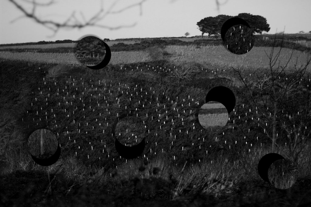
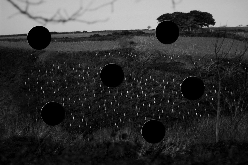
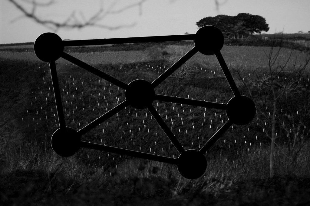
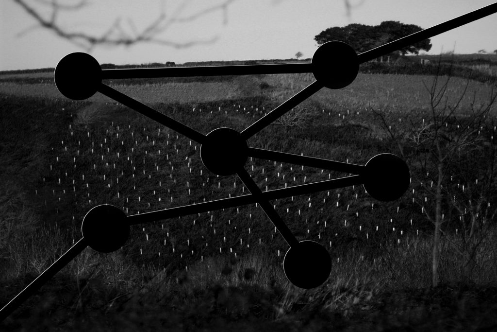
After my initial experimentation with images, using color to respond to John Baldessari, I decided to create another response in which I would become more practical with my ideas and actually cut out parts of the image itself. To do this I would need to use a small circular object which I could proceed to cut around as an outline for the areas of photo I wanted to take out. Using a Stanley knife and a small cup I traced the outline and cut around the outskirts of the edge trying to be as neat as possible, after cutting out wanted areas on all of the photos I went onto experiment with their presentation, linking areas and using the off-cuts to put back onto the photos. Once I had create four different layouts I photographed them against a black piece of card so that more definition could be created. Overall I decided to do this because I wanted to become more practical like Baldessari who would go out of his way to make certain scenes happen, and so by me creating a response like this it would allow me to be in control of the image taken completely, warping it so that it links into my intended outcome. Here are the final developed cut-outs of the photos taken and their various experimentation’s:

For my first edit I decided I wanted to make use of the parts cut out, this is because I loved the idea of placing parts of an environment that would not typically be seen in any other location elsewhere. I chose to use the circles as a theme because of how their repetition linked into Baldessari’s work that centered around figures and form, and so by placing things in usual ways presented aestheticism for the viewer who is drawn to how the locations don’t fit into where they are placed.

For this image I wanted to layout the basis for branching various ideas for designs off on, this could consist of various linking techniques towards each circle and where they could start and end. I selected the areas with the photo which I thought captured the essential patterns and textures seen such as trees, card, sky and fields. These three different areas of the environment make up the piece and so by taking a section of it out impacts the outcome much more than it initially did.

Firstly for this image I decided to link together each circle to one another, giving each three links with the exception of the middle one having five in order to connect it to every other one. The idea behind this was to essentially link together each of the different sections of the landscape together and present the piece with an abstract and unusual object within, making the viewer think about how each area impacts the next.

Finally for this last experiment I tried to randomize how the layout of the cut-outs experimentation look completely. To do this I randomly linked together various circles making sure that two circles had a link to the border of the photo. I tried to make sure the path of the links was completely uncoordinated leaving me to cross over various paths to make a form with no actual structure in the photograph.

Overall I found that my experimentation using the four images went well due to it pushing me to create more edits outside of software, making me more practical with my photographs whilst involving me more with the actual process and outcome of each piece. I chose to use this image as the experiment because of how I thought it presented the most diverse textures and patterns within a landscape found in most of my photos.