All posts by Stephanie J

Filters

Author:
Category:

Making GIFs – repetition

As I start to develop my ideas for the variation and similarity project I will experiment with some quick ideas that might help give me inspiration or starting points for my own idea. On the theme of repetition I will be researching and creating own GIFs.

A GIF is a file format which supports both still images and animations, it is a condensed file taking up less space than a video but working in a similar way. GIFs have been used for year in advertising but in 2015 Facebook begum to support them on their site and they grew in popularity on social media and creative outlets. They generally show cartoons, graphic designs or stop animations from photographs.
To create my own GIFs I started by choosing a topic or theme, I then took a variety of pictures of the shoes. I made sure to line up each shoe in the centre of the frame to make the GIF as smooth as possible. I then dragged each image into photoshop and onto a timeline where I set the duration to 0.1 seconds so it flicked through the images relatively fast. Using the same background with slightly different subjects it shows the variations and similarities between each photo.

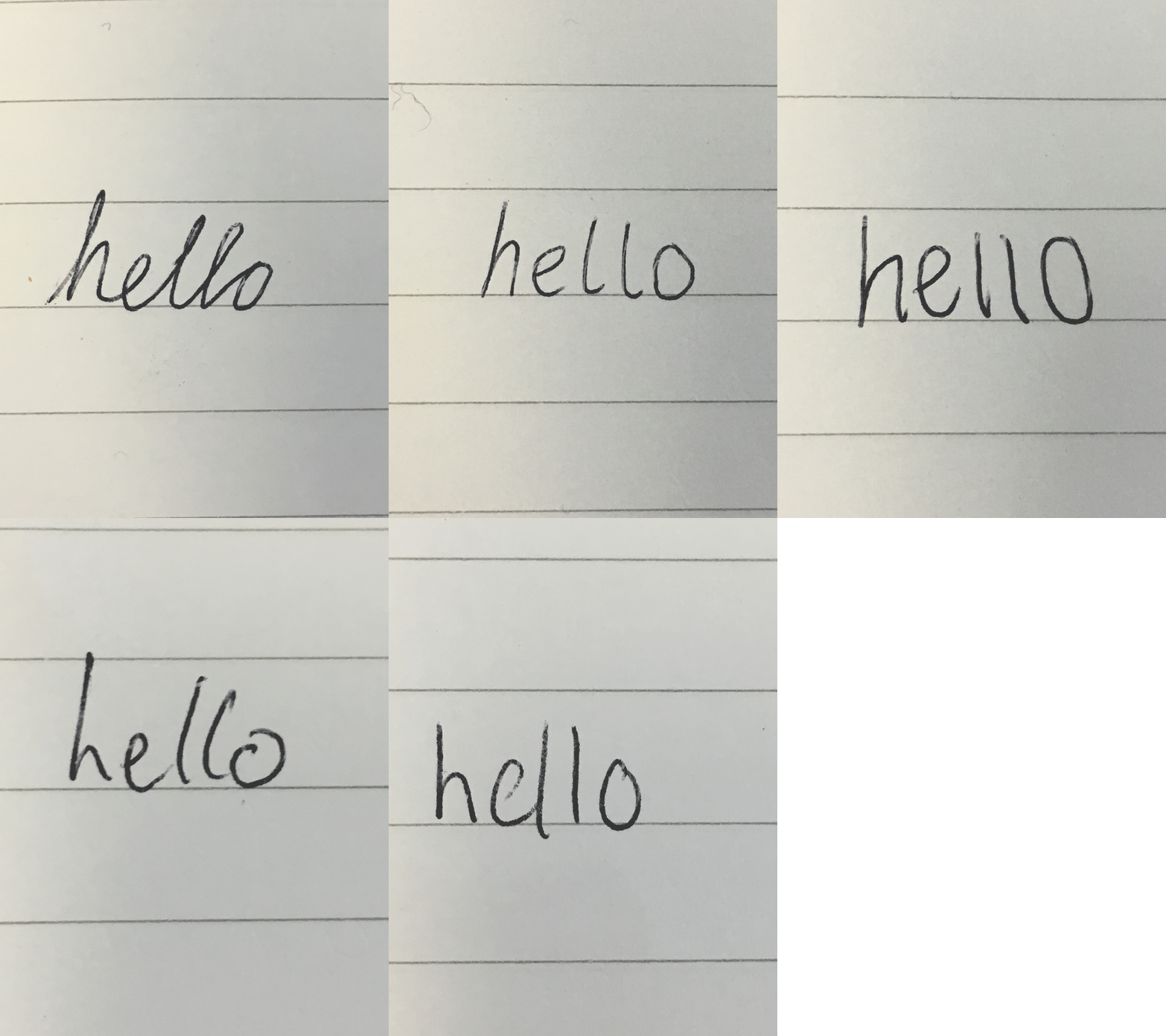
Photo-assignment

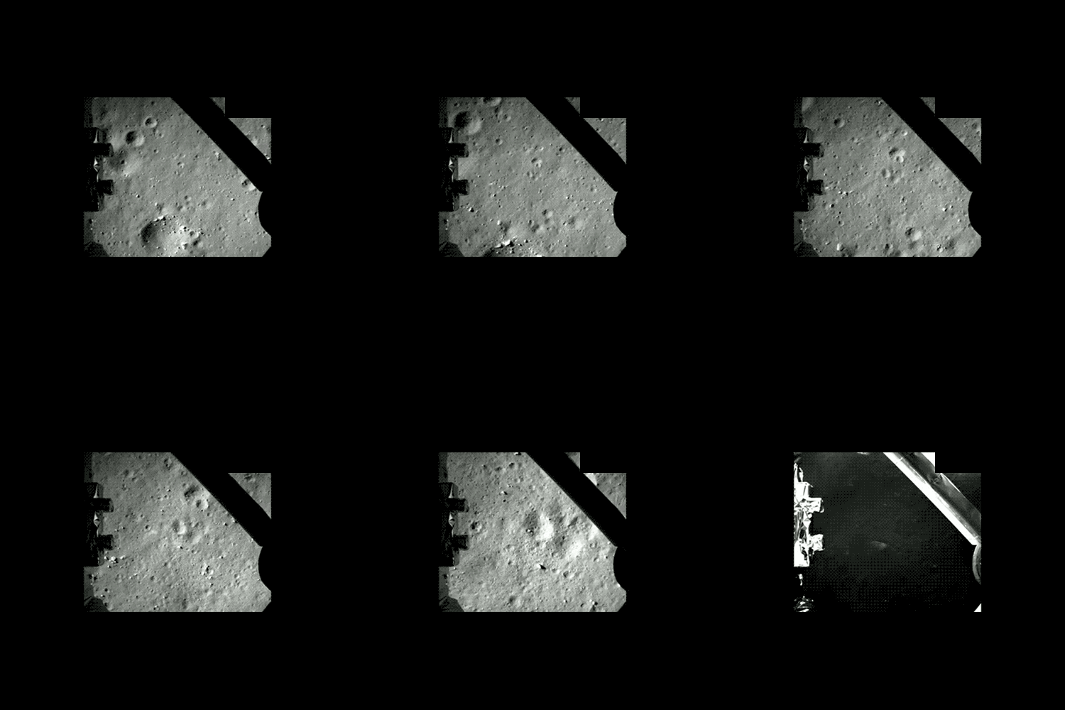
Everyday: I will record an activity or routine that I do/ repeat on a daily basis to help me develop and broaden my thinking when approaching this exam title of variation and similarity. I want to use video so I can explore motion and a different forms of media, I will also film using my mobile phone, this will allow me to film on the go and will not limit when I can capture the content. When thinking about an activity I do on a daily basis I though of walking, this could open up a large variety of imagery due to the variety of places I would walk in a day whether that is around the house, to the shops or on the beach. I though the perspective of looking down at the ground would be interesting because it would limit what you see in the frame, the view can not see where I am walking  only the ground under my feet which has to make them think more and imagine the rest of the scene. this concept also reminded me of the Forrest Gump running scene where the character famously goes on a continuously runs through through different settings. In the scene we see Forest from various angles some of the camera moving with him, others from a distance, for the film this give the audience a broader idea of what is going on around him however I want to to the opposite and limit what they can see. I will film it from a 1st person perspective as if it is what I can see and I hope to  line up the steps I take in each clip so they flow from one to the other.

Variation And Similarity

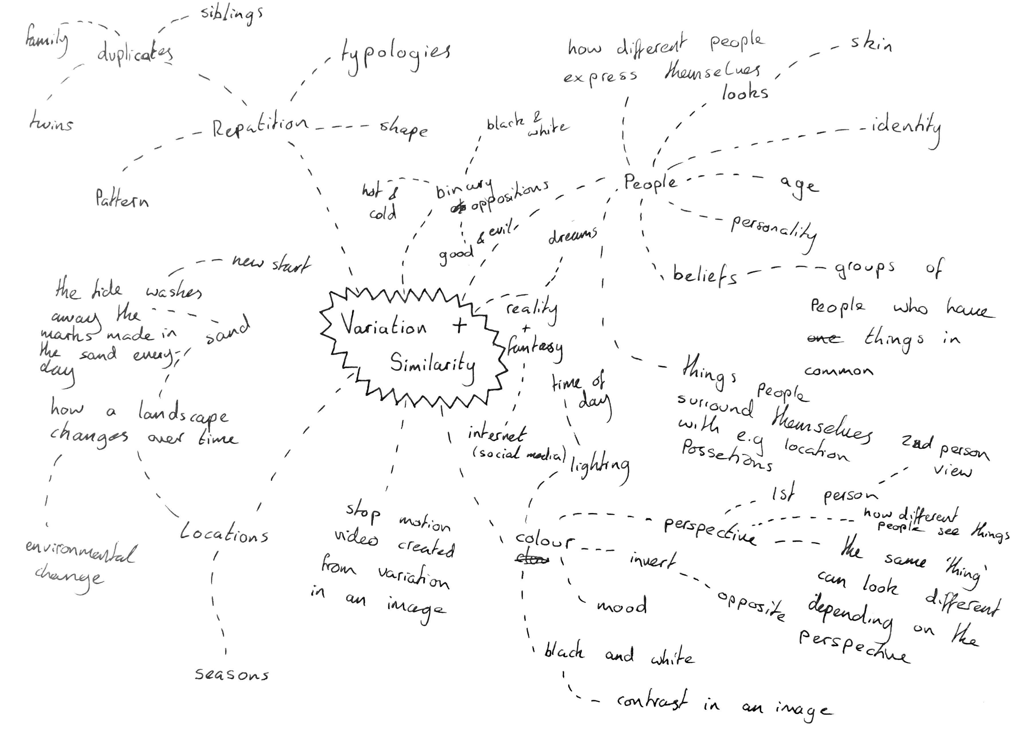
I will begin this project by looking through the exam paper and breaking down the initial title “variation and similarity” I will then look into the starting points given in the exam paper and brainstorming my own initial ideas to create a starting point for the project.

Dictionary Definition: 

Variation – A change or slight difference in condition, amount, or level, typically within certain limits. A change or slight difference in condition, amount, or level, typically within certain limits.

Similarity – The state or fact of being similar. Having a resemblance in appearance, character, or quantity, without being identical.

Synonyms: 

Variation – abnormality, alteration, deviation, discrepancy, disparity, divergence, diversity, difference, fluctuation, innovation, modification

Similarity – parallel, relationship, resemblance, closeness, comparison, connection, correlation, harmony, parity, relation,

when I first read this title I thought of variation and similarities between people, their looks, age, beliefs and backgrounds all the pieces that go together to give each human a unique identity. I would consider developing this idea further through the use of portrait images, close ups of skin and features which stand out on an individual. In an age where people are constantly trying to perfect themselves o think it would be interesting to look behind this to remind ourselves why it is so important that we show our differences.

I also instantly thought about work on typologies which I have previously studied, work by photographers such as Bernd and Hilla Becher who took photos of similar structures such as water towers and collated them together in a grid to show their subtle differences which would otherwise not be noticed or appreciated. This concept could be applied to anything, from packaging commenting on to issue of materialism to architectural structures showing the development of natural landscapes.