All posts by Stephanie J

Filters

Author:
Category:

Evaluation

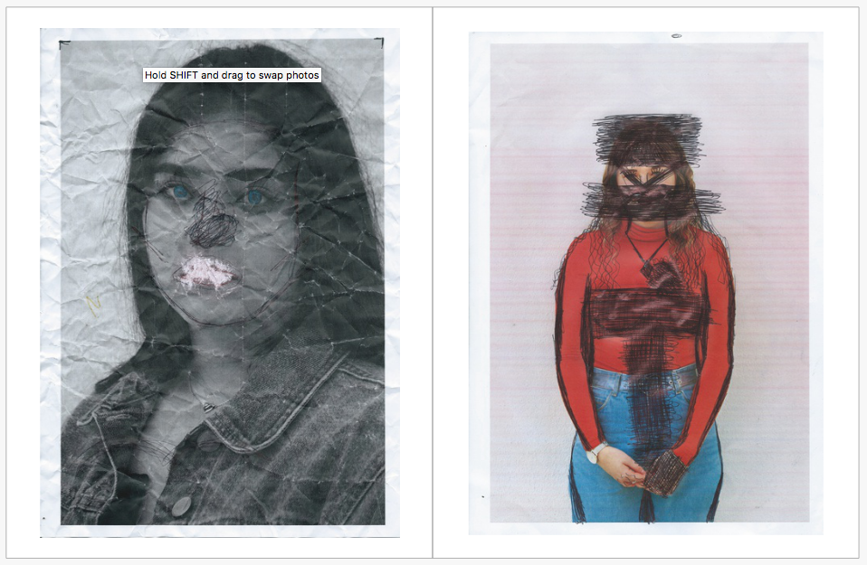
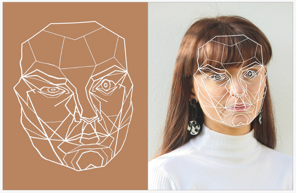
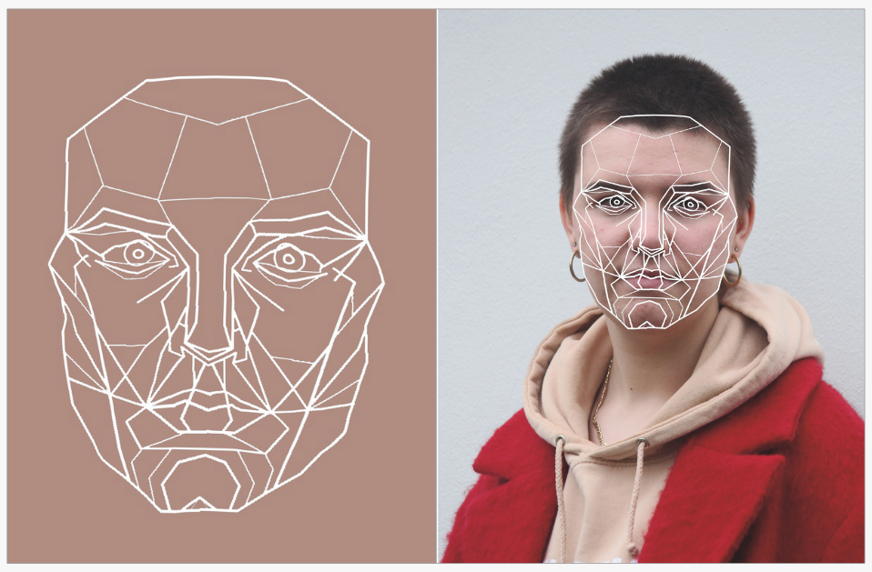
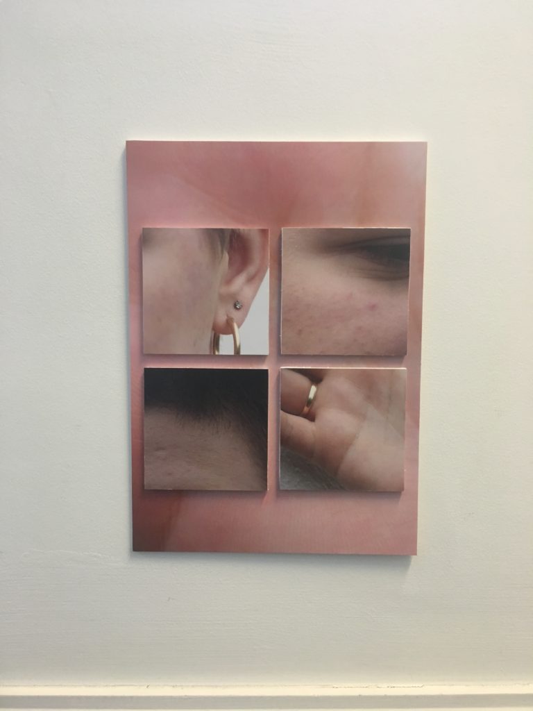
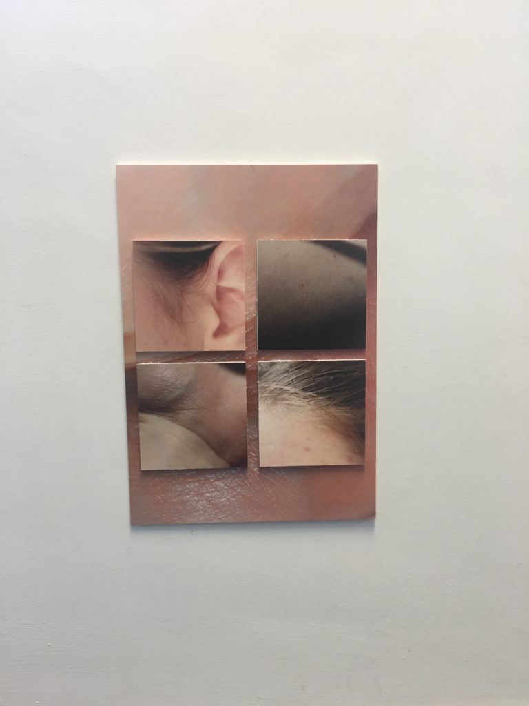
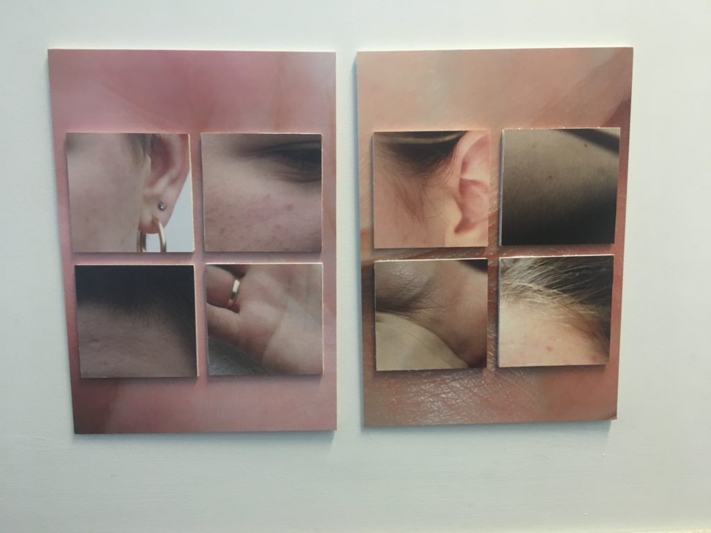
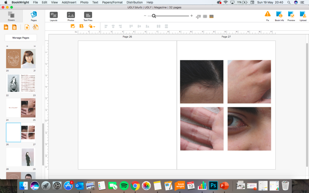
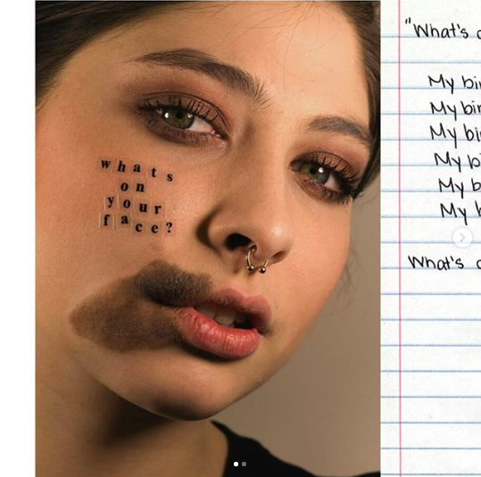
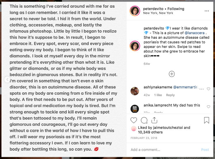
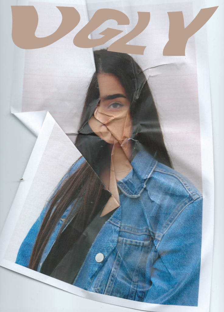
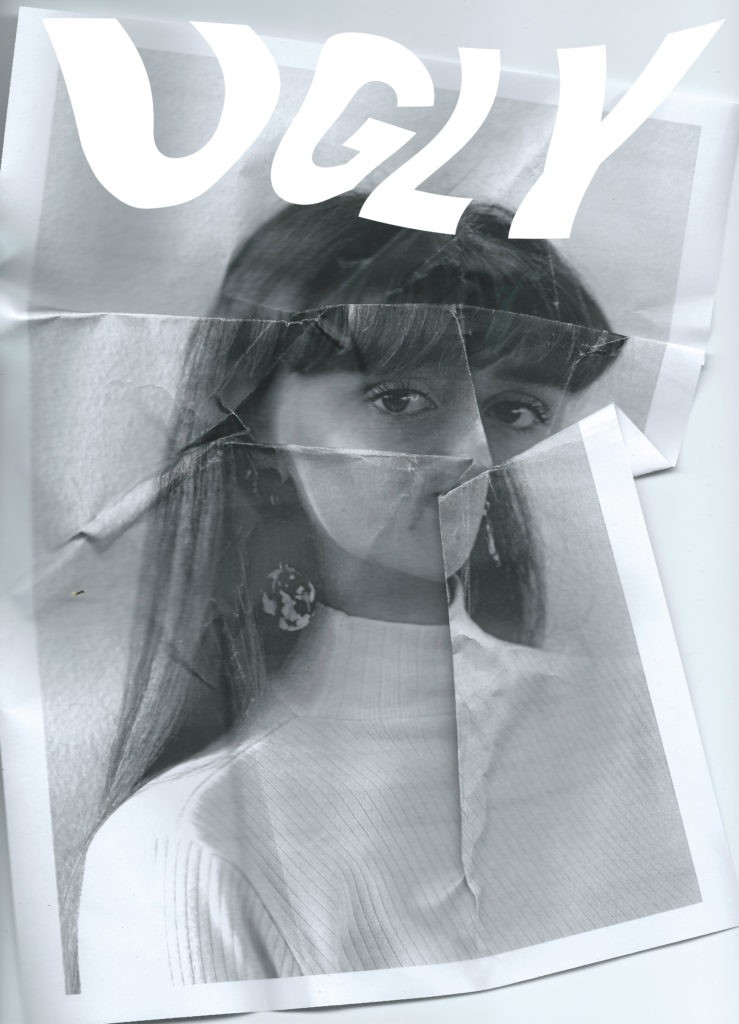
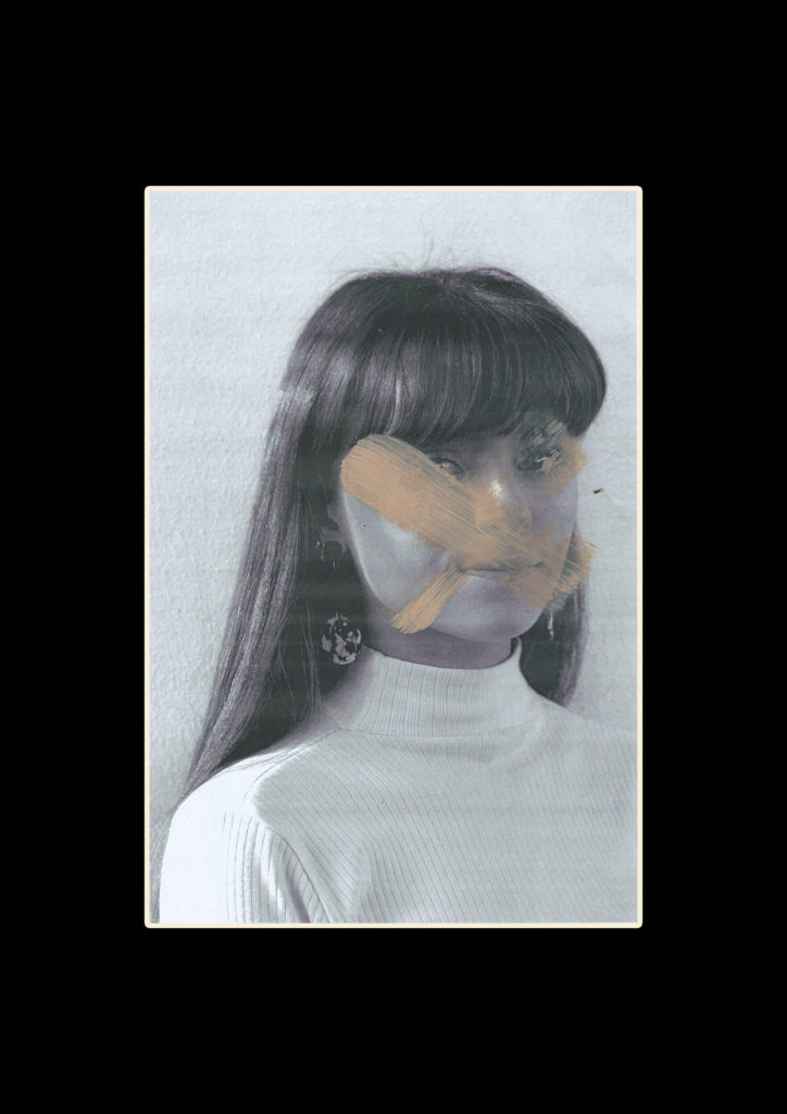
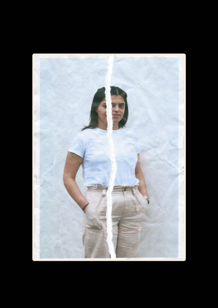
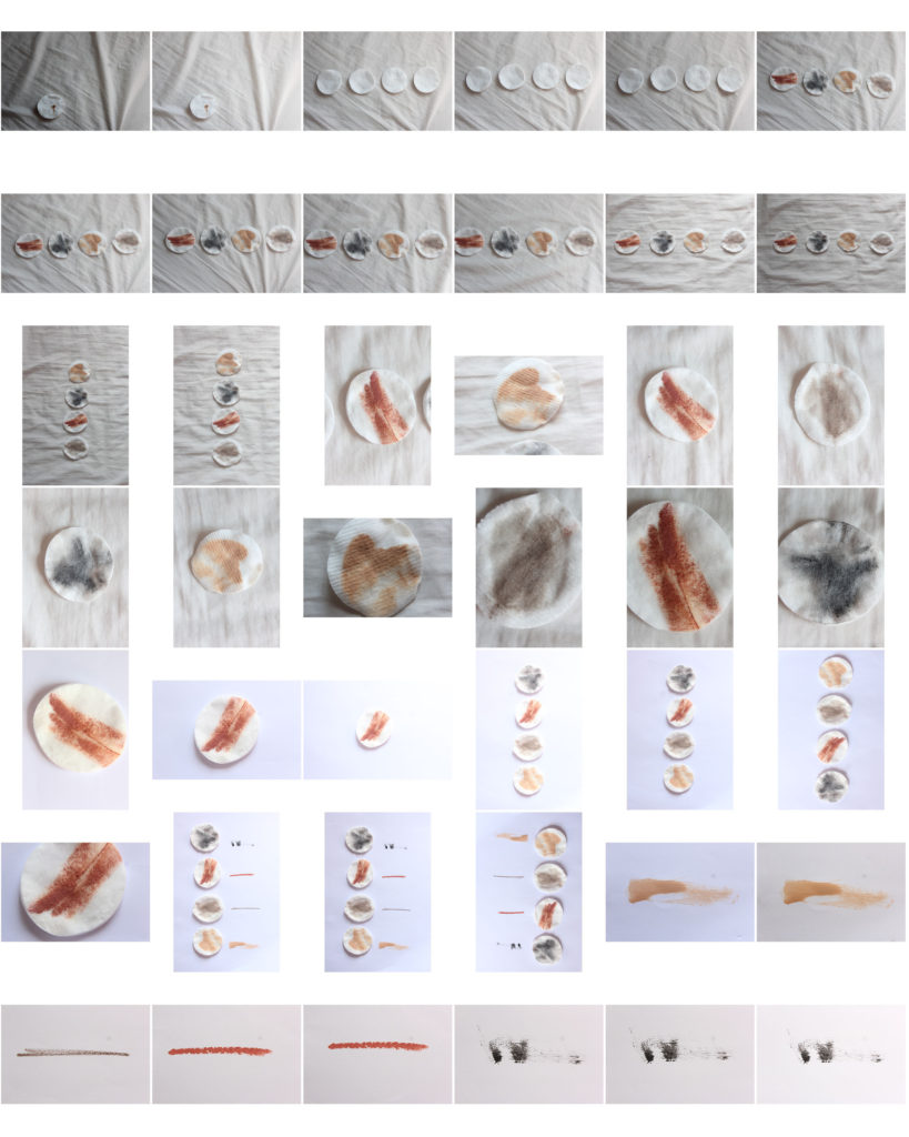
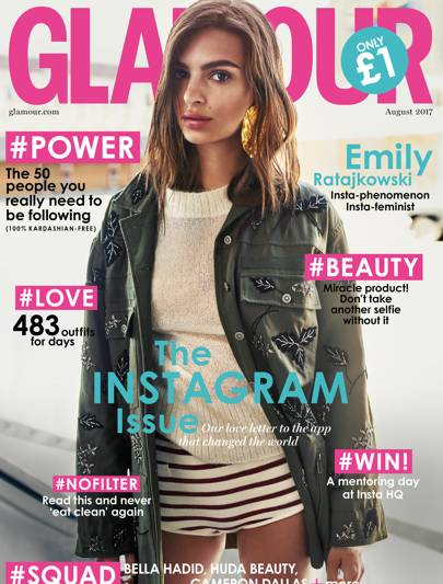
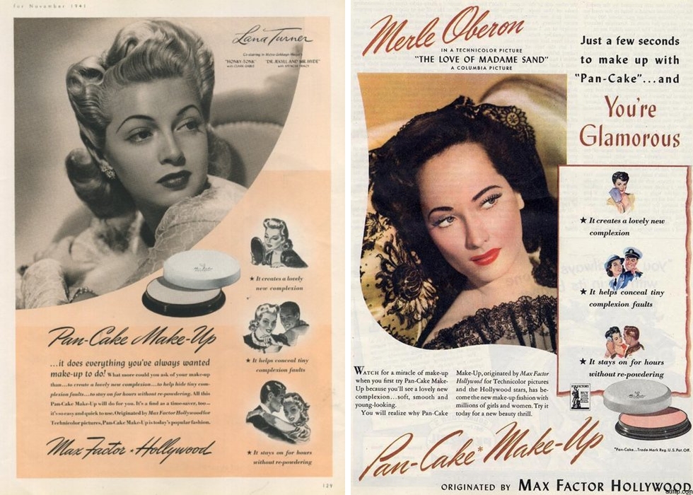
I found the exam unit very successful in the sense that I feel my project topic fulfilled the brief in a way that fits my personal style. The title of variation and similarity allowed me to explore portrait photography around beauty ideals in the modern world. I developed my ideas by first looking at the work of Erwin Blumenfeld one of the early fashion photographers who set the expectations of beauty in the industry. I then looked into some of his work involving mirrors and the idea of reality and fantasy within the world of the mirror, linking reflections with the idea of narcissism. Next I looked at the work of Nigel Tomm and the distortion of the perfect image portrayed within magazines and the media, I was inspired by this to experiment crumpling folding and re scanning existing images from magazines. I then went on to produce my own portrait images in a simple style which I could print and edit in different ways. I wanted these portraits to show variation in beauty rather than being of models who all look the same. After printing out these images in degraded quality I gave them back to the people I took photos of so they could destroy, adapt and and correct their insecurities. I also used these images for other styles of editing including some where I added an overlay to the perfect face structure used by modelling agencies and warped it to fit the real shapes of my models. This was meant to suggest that not everyone can conform to these expectations to be the same, we are all individuals who do not all appear ‘perfect’. I also took close up photos of peoples skin inspired by Peter Devito’s work on changing perception on skin conditions , these images were intimate and display people insecurities in a artistic way rather than the negative way they are often displayed in the media. I compiled all of these edits together into a magazine layout reminiscent of a clastic fashion a beauty magazine which would promote the ideal of perfection. Together they show an broad representation of beauty and question modern ideals and pressures that we all face.

The main links between the exam theme ‘variation and similarity’ and my final piece is in the sense that their should not be one view of beauty and perfection and everyone looking the same, instead a variation is good an natural for humans and should be embraced by modern media to help problems with negative self image and mental health.

The final prints I produced display key elements from the magazine I think the way I presented them compliments the photos and helps their individual details stand out and not become over complicated. The composition of the close up images layered on foam board was hard to get accurate because I could not draw on the background image however I think how I lined them up with the parallel edges looks neat and organised. The composition of the other images was simple I arranged to of the images with the same face structure overlay together, they were both taken from different angles which I think helps show their individual identity. improvements

If I were to do this exam unit again I would keep the same concept because I enjoyed developing these ideas and producing the final outcome however I would probably extend the photoshoots and produce a larger range of edits to extend the length of the magazine and make it a more quality product. I would probably also develop the text elements further creating articles or pieces of literature to accompany the images and narrative them in a a way. I would also extent the magazine by adding images in the style of product adverts which would normally be seen in modern media promoting beauty product which claim to solve people problems with appearance. These would ben in a sarcastic and humorous tone maybe including images opposing the general and expected idea of these advert styles. I could have then used these adverts as my final prints and printed them as posters or on product packaging. However for the time given I think my response to the exam title shows my ability and development of ideas and concepts to produce a final outcome.

Final Presentation of images

I got a selection of images from the magazine printed to show an alternative outcome. I started by cropping the printed images so there was only 1cm of white around them, this meant I wasted less foam board. I then used spray mount on the back of the all the close up photos and stuck them to a white foam board sheet before cutting the excess white areas off. I then layered the small square images on top of the large image, the foams board helped the stand out from the background and gave it a modern and clean look.

These two sets of images could be displayed individually however i think they create a greater impact when placed together helping to highlight the difference in details and tones. This set up could be with images of different people helping to display a broad range of ‘ real beauty’

For the other images I printed I decided to display them in simple black window mounts, they were already detailed images so I wanted to keep it simple and help to bring out the darker contrasting colours from the pastel images using thick dark frames.

I chose to put these two images together in a window mount because they have a corresponding themes of the white line face structure. The wide black frame again helps to pull out the dark areas in the image from the bright background.

For the final two images I decided to frame them separately due to them having different dimensions which would have stood out in a window mount. These images show are both re constructed images which have already been printed adapted and re scanned. Their quality is slightly distorted but this helps with the theme of questioning our need for perfection as humans.

Magazine plan and Layout

How do you want your book to look and feel? I want my book to look and feel like a common fashion, beauty and lifestyle magazine, with glossy pages and masthead on the cover.

Format, size and orientation: portraiture/ landscape/ square/ A5, A4, A3 / number of pages. I will have the format as a portrait Just smaller that A4 size with around 25-40 pages

Binding: soft/hard cover. Image wrap/dust jacket. Saddle stitch/swiss binding/ Japanese stab-binding/ leperello. It will have a soft gloss cover to fit the conventions of a popular magazine

Cover: linen/ card. graphic/ printed image. embossed/ debossed. letterpress/ silkscreen/hot-stamping. The cover will have a printed portrait images which is distorted similar to the other portraits inside. It will also have a masthead of “UGLY” which is a controversial word which is used as a label for people not seen to conform to beauty ideals. It will also have a cover line to introduce it and add context to the title.Title: literal or poetic / relevant or intriguing.

Structure and architecture: how design/ repeating motifs/ or specific features develops a concept or construct a narrative. I will repeat similar page structures throughout the magazine to give it momentum whilst looking through it. This will reduce the chances of it being repetitive.

Images and text: are they linked? Introduction/ statement / use of captions (if any.) I am creating text to overlay over some of my close up images, this text will have various meanings and will link ti the idea of perfection and beauty.

I have chosen this font for the repetitive text because it reminds me of computer code that is used to control and power phones and electronic devices. I have done this to comment on the idea that modern technologies have made pressures on beauty much worse for example social media enforcing ideas of on the ideal body image through influencers and celebrities.

Peter Devito

Peter Devito has become known for his work surrounding the issue of skin conditions recently on social media where his images have gone viral. Currently studying at the the Fashion Institute of Technology in New York City he has developed this project which has gained attention from bloggers and magazines. H became interested in photography in 2013 on a pre college program but still works in mix media including illustration. He uses his work to convey his perspective on the world, evoking deep thought in his pieces. He suffered from acne growing up and saw how self image involving skin conditions had affected many peoples mental health around him. By taking intimate, close up and unedited images of himself and other young people in similar positions, along with empowering and sometimes sarcastic humorous slogans he aims to turn the stigma around perfect skin on its head. He posts the art work on social media hoping to target the area where people can often feel most pressures to areas ‘flawless’.

https://i-d.vice.com/en_uk/article/zm8vme/the-photographer-shining-a-spotlight-on-people-with-skin-conditions

“After posting my unretouched acne images on social media, I received numerous messages from people with albinism, vitiligo, freckles and birthmarks asking me to make work that they could relate to,” he says. “I wanted to expand what I’ve been working on and give people with other skin conditions a platform to tell their stories as well. I hope this project will empower people and help normalise skin conditions.”

Peter Devito

When taking the project further he aimed to show that there was more to the subjects than their skin condition and they would not stand to be defined by them. Accompanying each portrait petter displayed a hand written note from each person about their experience living with a skin condition. One reads “My birthmark does not make me ugly,”

“Doing this project, I’ve learnt that things can only define you if you let them,” Peter continues. “I hope that doing this project will make people realise that we need more models with diverse skin. The more models people see with different complexions, the more normal skin conditions will become.”

Peter Devito

Link to Peter Devito’s website and portfolio

Photo Analysis: The above image is a macro of someones skin, with plastic lettering in the centre. This photo was probably taken in a studio with bright controlled lighting to illuminate the skin evenly and help the camera focus and capture the small details. The lighting has been controlled to look as natural as possible to fit with the aesthetic and aim of the image. A macro lens was most likely used to capture the fine details in the skin almost making it larger than life. The photo is predominantly a pink shade varying in light and dark tones, this makes it a very simple image to look at. The texture shapes and patterns in the photo are created through the skin ‘imperfections’ which are spread over the whole frame in a random and natural arrangement. The main focus of the text has been arranged in the centre of the image, it is the first thing we see and it is important that we read and understand the statement whilst viewing the whole image. The photograph has been cropped so that their is nothing else in the frame distracting us, for example and other body parts of background elements. This image was posted to Peter DeVito’s Instagram along with the majority of his work context of this image is, he explains that the photo if a autoimmune disease called psoriasis. Psoriasis is a common skin condition which speeds up the life cycle of skin cells, it is a chronic disease which can come can go over time showing red dry patches. Following the image is an account by the girl in the photograph, it explains her struggle being insecure about her skin from a young a age and how she has grown to embrace her her imperfections. The lettering in the image “I wear it like diamonds” suggests that instead of looking at the Psoriasis and seeing something ugly it that should be hidden and covered up she instead pretends it something stereotypically beautiful like glitter or diamonds. This could also link to the idea that diamonds last forever similarly to the disease there is no way of getting rid of them completely. Diamonds are one of the strongest known materials, this could link to the mentality of the model in this photograph who has been through a lot to get to acceptance. This photo as a whole is meant to portray something that would have previously been seen as a fault as a more beautiful and normal thing that shouldn’t be hidden. By sharing this photo Peter aims to create awareness about skin conditions in hope that people with the will feel less inlined to perfect them and hide them from the world.

Front Cover

For the front cover I wanted to test out a variety of image and text combinations to see which would suit the style and message best. With my title being “UGLY” I wanted to make the corresponding image relevant and obvious with the idea and theme. The title is a comment on what beauty and therefore ugly actually is, I hope that it will challenge the viewers perspectives and make them question these commonly used words and ideologies. I wanted to keep the clastic magazine layout with the bold masthead across the top of the portrait page, and oppose the stereotypes seen in beauty magazines in other ways.

This font is bold and clear, I sampled it in a skin tone shade taken from there background image because this corresponds with running theme throughout the magazine of neutrals, browns and pinks. I tested having the font in the foreground (over the image) or in the mid ground (appearing to be behind the model). I achieved this by changing the layer opacity and erasing the parts of the word covering the models hair. This image is already distorted and unconventional with the folds and corners of the paper showing, acting ads a new frame inside the border on the magazine page.

I also tried warping the text, I like the way this turned out and fitted with the idea of distortion and imperfection. I want to develop this concept further with different fronts, warp effects and background images to see which work best together. The front cover should be striking and give the viewer and idea of what to expect inside, it ultimately sells the magazine. However saying this I also want it to be elegant and subtle.

I continued to work with the same warped text over a different image, this one is more lightly distorted and has the printed page boarder cropped out making a more minimal and classic look to the cover. I made the text white and layered it offset with a coloured version of the text to look like a shadow, I made this shadow n the nude colour along with a black version which looked more bold but didn’t fit in with the interior of the magazine.

I continued to experiment with different texts, now over a black and white image. I tried black with a white shadow, and multiple layers of different nude shades stacked on top of one another as well as simple white

I used a font similar to what vogue and other big fashion and beauty magazines use, this is usually linked to a classy up market and professional style. I then warped the text similarly to the last text edit to give it a distorted look similar to the style and editing of the images inside. I also want to continues the style of the text on the cover throughout the magazine pages. I tried this style on top of this image because I like the faded colours and the way the text matched, the smudged foundation over he image created a blank canvas. I thought the black text was too heavy and the white blended in too much with the background. To solve this i added a subtle drop shadow behind the white text so it could be read better

Next I tried a text outline to give a more subtle look rather than the bold text. I experimented with this style in various ways adding nude colour layers and small drop shadows to help it stand out from the pale image.

Final Prints and Exam Mock Up

Along with the final outcome of the magazine I want to print a range off different edits which I can mount and display giving an overview of the project outcomes. For these two hand edited and re scanned images I want to simply frame them with a black window mount. I will use an A3 piece of black card and cut an A4 sized hole in the centre with a bevel cutter. I have chosen to do this so the editing and fine details stand out on their own, I also this the black boarder will help the slightly faded images look less washed out.

I want to do some more hand editing with these close up images, for the magazine I used photoshop to create a layered collage effect. I want to re create this in an A3 size using foam board as a backing. I am printing the background rectangular photos as A3 and the 4 square photos as slightly smaller than A5 allowing for a gap around the images for the background to show through. I will cut all the images so there is no white and back them on foam board o make them stand off the page, I will then Stick the 4 images onto the background image. Bellow i have made a mock up of what this might look like. The foam board will show slightly around each image helping to frame it. I will do this for both sets of images and once they are done I will review if they should be left as singles pieces or put together on another sheet of foam board.

Finally for these portrait images which I have printed as A4, I want to back then as a duo on white foam board. I think they are powerful images with complimentary colouring and look good next to one another. They are minimal but with the detailing on the faces I don’t want to distract by framing them with too many other images. The white foam board will match the white lines on the faces and some elements of the clothing whilst still showing up the grey faded background.

makeup photoshoot

I conducted an extra photoshoot to fill pages in the magazine and compliment my portrait images. I wanted to capture the idea of how people use makeup to correct their faces and make them look a certain way. These images have similar colour pallets of pastels and skin tones to the portrait images I have taken meaning they will fit the theme well

I decided to edit these by duplicating them and turning them into pattern backgrounds to created breaks from portraits in the magazine pages.

Magazine Ideas

I have started thinking about and end result for this project and want to develop the idea of making a magazine which opposes the stereotypical conventions of fashion and beauty magazines. Mainstream beauty magazines sold in most shops follow similar conventions, in the sense that they are traditional in their representation of perfect women. Most covers feature one full bleed photo of a model or famous personality such as an actress or internet star. They are generally smothered in cover lines about the contents of the magazine, tips, stories, and statements such as “Miracle product! Don’t take another selfie without it” This particular issue features a famous model who has been styled and posed in a fashion shoot specifically for the cover, this suggests that the image is a constructed reality, a lot of work has gone into making her look effortlessly ‘beautiful’. The colour scheme along with the casual language (#NOFILTER) has been chosen to specifically appeal to a young female audience.

I want to base by magazine on a more modern contemporary style of publication similar to i-D or Dazed which push the boundaries of magazine and beauty conventions whilst still appealing to a youthful audience. I want to incorporate some elements from the clastic magazine style in an ironic way for example advertisements and sponsors. I want to keep a minimal colour pallet and and house style with pastels and neutral colours. I have collected images of magazine covers which have inspired me, I think their minimal styles are modern and clean which I will work well for my magazine which will predominantly include photographs with small amounts of copy. By not having any cover lines it will allow the photos to stand out more. Similarly to these examples I want to play around with different fonts which could be used for the masthead, it should be a style which looks good in any colour so it could be adapted depending on the cover image. Boarders is another feature that some of these magazine covers have, rather than having a full bleed image it is framed with a chosen colour which could be complimentary to the photo.

Because my magazine will predominantly include photos I want to experiment with different layouts to make the pages more interesting rather than traditional portrait placing. I am looking to incorporate text in a more creative way rather than having articles in columns . These examples I have found show a variety of ways I could frame images and use text within them. I like the way multiple images have been placed on the page in these examples by layering and different arrangements on a white background. Various texts have been used for example the hand written style which give a more personal feel and the more abstract warped texts used to frame the images.

Title Ideas

Looking at existing magazine titles such as Vogue, Cosmopolitan, Glamour, Bazar and Elle they have statement titles which say something about their style. For my magazine I want the title to make a clear statement about the images it will display and the idea of beauty ideals and perfection within the mass media. I have considered having the title as ‘beautiful’ or ‘perfect’ in an ironic way to contrast and question with the stereotypical beliefs. I also thought of naming it ‘Ugly’ as a comment on the labels people are given if they don’t conform or appear to be perfect.

Advertising In The Beauty Industry

Old Fashioned Advertising

In the past messages about beauty ideals and perfection were obviously promoted to women in advertising for various products. To sell products companies link their brand with a desired look or lifestyle that their customer is looking to achieve, if they believe that buying this product will help them to reach their goals they are more likely to purchase it. Bold statements were used such as “this is no shape for a girl” “great look great body great lash mascara” “how attractive are you on the beach” to target the audiences insecurities directly and make a clear message about the benefits of the product. Although these are old methods of advertising that we would think are now outdated in many ways the same ideas are used in less obvious ways.

Modern Advertising

Modern advertising has a way of being incorporated into every aspect of out lives, there is almost no way to live without being impacted by the messages pushed at us through advertisements. Since the rise of the internet advertising techniques have changed drastically. whilst before they would have been printed in magazines, on posters, billboards TV and Radio they now now have ways of targeting individuals directly. Through the use of HTTP cookies, data is gathered when sent between the website and the users device. They were designed to remember information and interactions users make on the internet, recording their browsing history. this data is bought by advertising companies who use it to specialise and target products towards appropriate customers. Adverts will then appear on various websites, social media platforms and videos.

When looking on my own Instagram to see what products and services were being targeted towards me I found many adverts specific to where I live proving just how much information is collected and used. I also saw a lot of sponsored posts for clothes and beauty products such this teeth whitening kit. This style of modern advertising is more subtle, integrating it into your newsfeed often I will scroll past them without questioning the subliminal messages they are communicating about how purchasing these products is the answer.

On the other hand some commercials and campaigns have started to represent a more versatile group of people, due to the media companies are coming under more scrutiny to more on from traditional beauty ideal and show real people in their adverts.

Barbara Kruger

Barbara Kruger, an artist from New Jersey who worked as graphic designer and art director for various magazines created a collection focusing on power struggles mainly for women. By layering photographs she found in existing magazines with aggressive slogans such as “I shop therefore I am” written in white over red boxes to stand out from the black and white backgrounds. They are deigned to imitate the deigns and messages behind real adverts that shout messages at the consumer, and question the viewer about feminism, classism and consumerism. Her work has appeared on billboards, buscards, posters and train stations to further imitate the conventions of advertisements.

Extension rebellion

I also want to look into culturally relevant issues and how they are being publicised, Extinction Rebellion, a current movement against climate change, and the extinction of life due to biodiversity loss and ecological collapse. So far the activists from all walks of life have nonviolently protested in major cities around the world in hope to disrupt daily life and gain awareness from the public and government, some have taken extreme actions to get attention for the cause with over 1,000 people arrested so far. They have a bold memorable logo which is a mix of a cross and a sand timer to symbolise how time is running out for us to change our habit and reverse the effect of climate change. The colour green has been their focus for more of their posters and signs because of its clear links will nature and sustainability along with bold black writing reminiscent of Barbara Kruger’s work and similar persuasive adverts. The middle image shows how the group is using extreme emotive method to display the seriousness of the cause.

Personal Response

After looking at these various advertising methods used to persuade audience into purchasing product or believing in an idea I want to incorporate similar concepts into my work. I have considered adding emotive and brutal phrases into the magazine that go with the idea of beauty ideals and perspectives towards achieving perfection. I also want to create a series of images in the form of modern advertising for example, sponsored ads on social media, posters and product packaging. These will go alongside the magazine to display the idea of how we see messages around this ideal all around us on a daily basis.