Here is a link to my book ‘ Element’.
https://www.blurb.co.uk/bookstore/invited/8164132/dbcee53ba068b5cdd5db496ec33d2f1a5193d6d0

Here is a link to my book ‘ Element’.
https://www.blurb.co.uk/bookstore/invited/8164132/dbcee53ba068b5cdd5db496ec33d2f1a5193d6d0
I am very happy with the final outcomes of my exam project, I am happy with the way that the project had developed and how it has helped me as a photographer. At the beginning of the project I planned to look at the variety of landscapes with changes in the time, weather, and perspective but I feel that focusing on a harder topic such as the sublime pushed me further. At first I was struggling of how to go about photographing this concept and how to view the world in a different way. But then I found the photographer of Laura El Tantawy her work inspired me massively, with her unique perspectives on every situations. I really liked the boldness and how abstract but yet artistic her images where at the same time.
I then found the photographer of Rinko Kawauchi, who’s work really helped to shape the outcome of my project. Her images are very spiritual and purse and have this sense of delicacy to them which is very hard to convey in photographs but come very naturally to her. I mainly looked at her book ‘Illumiance’ to see her way of viewing the world.
I feel that the book focuses on the elements but within that is about stopping and viewing the beauty within the everyday world. But personally for me represent a journey for me not only as a photographer in regards to my photographic skills, but being able to change the focus of my images to a topic that I have never really looked at before. I feel that this shown in the book not only by the images themselves but through the visual stimulants in the book such as the boat, the plane, the sky and the trees as all of these things are growing or moving in some way.
If I were to do the proejct again I would look at more photographers in depth and do more photo shoots inspired by their works as I feel that it would have increased the diversity in the style of the images that I have taken. If I had started focusing on this idea from the beginning of the project I might had created a video to go along side the project and assist it in its overall meaning. But I am very happy with what I have created.


Over the course of the ‘variation and similarity’ I have taken inspiration from many different photographers and sources which I think has helped me to produce one of my best works. At first I was looking looking a variety in weather locations and different times of the day. However I didn’t feel as if the topic was push my photographic ability enough. So I felt my choosing a topic that delved into the realms of the sublime was the right choice for my final project as this was a project that I had never looked at before.
Looking back at my project I feel I have presented an interesting alternative insight of the elements/ nature. And how well they work with one another and the sublime beauty of them which would would miss if we didn’t take the time to stop and really look at what is in front of us. But I also feel that this book represents a sense of a journey and a sense of growth, I feel that all of the images are small passing events that one moment are there and the next are not which conveys a sense of movement, which I reflects the work of Rinko who I have been looking at for most of the project.
To conclude I think that my project reflects the topic of ‘variation and similarity’ as I have taken abstract stance of photographing the the elements and presented everyday landscapes in a way that conveys a sense of beauty and life and is a variation of the way that we normally look at the elements. And I have been able to find a similar link between the four elements and convey a sense of unity.
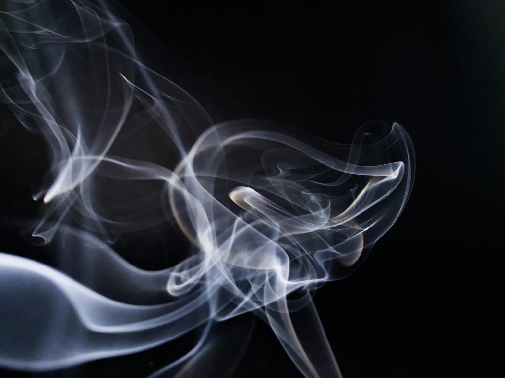
In this final display of my project I have chosen three water images, three earth images and two fire images and visually I thought that they worked well and connected together. I wanted this to be the main product of the project as well as the book. I feel as if the book is more of an in-depth view to the elements, where as this poster of the images is a summary and the smoke images are supporting the project. Looking at the images now I see that subconsciously I have picked the image that feature the colour blue very predominantly. I feel that the images work well as a group together due to the cool contrasting tones of the blue which flows throughout all of the image and in a sense connects them all together. All of them are different shapes and textures that work well juxtaposing each other are as well as complementing the other. I printed off the images at a range of different sizes as I thought that it would bring attention to the images which I wanted the onlooker to look at first and then they would get closer and see the small details in the images. In the central and smallest images, there is a bee pollinating a flower, I wanted this to be the center of all of the images, as I feel as if animals are the 5th element of the planet and I felt that it was a nice way to bring the project together
I feel that it was necessary to create a book as a final outcome because I think as the topic that I chose is quite abstract in its nature, it needs to have some depth and quality to the images when looking at them as a whole to understand the project. But also by creating a book I feel that it helps the viewer to engage more with the images, as they are able to take their time looking at each image and take on its meaning, rather to when they are displayed on a wall, I feel that the images become very felt and don’t have much depth in comparison to a photobook.
I really wanted the book to convey a sense of simplicity but at the same time the images to be really powerful and to make the viewer stop and really take in what they are looking at. And make them stop in their everyday life to see the beauty that is around them if they take the change to stop and look.
My main inspiration for the style and genre of my book was Rinko Kawauchi’s book Illuminance which has been the inspiration of the whole of the project. Her book is very simplistic in its nature and each images flows really well into the next one which really helps to make the project link together, due to the atheistic of each image and the colour texture and composition of the image.
Which is something that I wanted to be able to work into my book. Which is why I didn’t separate the book by element as that would get very boring. The narrative within my book is individuality, beauty and simplicity of each element and how different each one is but yet how each one is connected and dependent on the other to survive.
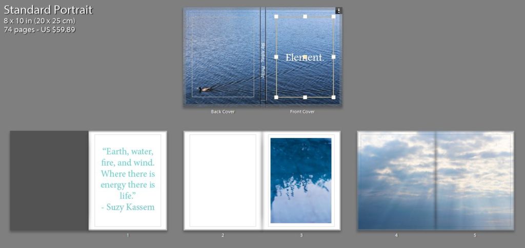
For the the front cover I wanted a image that would draw the view into the book, but wasn’t too busy so it would ruin the aesthetic of the rest of the book. I really like the cover that I chose, I think as the cool tones of the blue is calming and links my idea of the taking the image to stop and look at the tiny details, as the viewer has to stop and turn over the back to see the duck swimming across the page to see where the ripples in the water are coming from. I chose to have a big white title in the middle of the page as I think that this juxtaposes the blue and makes a bright and bold front cover which is calming at the same times as being able to draw in the viewer.
Most of my images are very colourful and the book as a whole is very contrasting in its colours, I wanted the viewer to be drawn in by the use of pastel colours. But I also wanted some images to juxtapose each other which why some but not many of the images are in black and white I also felt that is changed the sequence and flow of the book to help the viewer look at the images in a different light. I also felt that but some of the images in black and white helped to bring out the detail of them.
In the book there are different sections for each element but I wanted to make sure that each image had a connection to the image before and after it as this was a notable feature in Rinko’s work that I really liked also because I felt that it would help the viewer to understand the project more, and also create a sense of rhythm and structure for the book. However I didn’t want all of the image to be grouped together but element as I thought that this would become very boring and repetitive for the viewer.
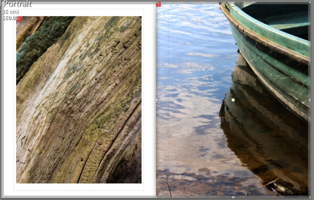
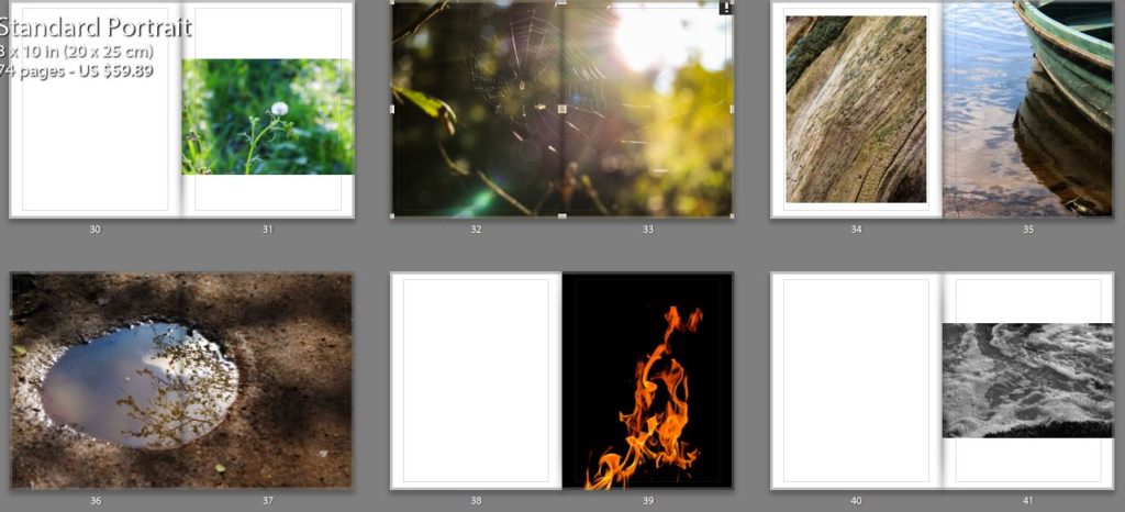
Below is an example of connections that I made between the images. One is an image is an unusual perspective of the bark of a tree, I but this image in the book as I feel that it is a visual representative of the idea that I wanted to get across of the beauty in everyday things. The other image is a close up of the side of a boast with the light reflection off the water onto the side of the boat. I decided put these two images together due to the texture and colours in the images and the lines in the boat and the lines in the bark.
Overall I think that this project has gone very as I have created a book that makes the viewer reflect on the way that they view the world and will hopefully make them some and look at the beauty that is around them which they are missing in their everyday lives. But I have also created a book that takes an in-depth look not only into the physical elements but the spiritual parts of the elements and the feelings that they convey.

Illumaiance is one of the book from a three part series called the ‘Utatane’ series, in which Rinko describes it as
‘Utatane re-creates a fragmentary and fleeting world in which every detail relates to notions of birth, life, death and the passage of time’. It focuses on the tiny elements of life that we would miss out on in out normal everyday life. The book has a female touch which is evident though the pastel and soft colours which is a running theme throughout the book. The book was published in 2011 and is £40. The book is very heavy to hold as it contains hundreds of pages of photos. Each of the pages are think in its quality which has helped to give the book and very professional feel to it.

Format, size and orientation:
The book is 11 x 8 1/2 inches, 163 pages, 144 four-color images. The book has been made as a cloth bounding a using Japansee binding to hold it together, due to this it gives the book a rough texture to the hands when it is held.
Rhythm and sequencing
The book focus of the book is a sublime and spiritual aesthetic that runs throughout the whole of the book. The book links together as a whole as each image links to the next one. Each image has a unique style which contains a spiritual element which Rinko is able to create easily. In the book there is the constant pattern flowing throughout the book of circles and the sense of moving, nearly on every page there is some form of circle weather it be tiny or small or the center focus of the image or just out of the frame. I think is meant to be a metaphor for the circle of life as Rinko said that the book is meant to ‘inescapable life and death and everything in between’. However some of the images that are presented next to each other are contrasting, its the contrast within them that works well together, such as the light and shadow and the line compared the circular shape.

Structure and architecture:
Her work is very much inspired by the religion of Shinto that all things on earth have a spirit, hence no subject is too small or mundane, which is evident in this book. I feel as if her book is a reflection of her view of the world, she is able to see more than the physical object such as a tree she sees the re marke able beauty in it. What inspired me most about her work, is how beautiful her images of everyday landscapes she has photographed in way that they appear beautiful. She is able to photograph the beauty in everyday life. Her images range from landscapes to portraits to abstract scenes, in her work she applies a soft touch to all of the images, so they look very relaxing and visually pleasing on the eye. Her work is very similar to the style of Laua El Tanaway, both of their work has a dream like feel to it, are very very bright and the colours in the images are very desaturated.
She brings a very contemporary and fresh feel to her work, she is breaking the conventional rules with her photography and shows her perspective of the world. The framing of her images are not always typical photography angles and would be sometimes consider incorrect but the way that she frames it and uses symmetry and patterns adds much more depth too her images, looking at her work as a viewer I am able to see Rinkos mindset and look on the world and I can tell that she views each work personality and emotion into each image and each image has a meaning and nothing is placed by accident, Which I hope that I have transferred into my work and a viewer of my work would be able to pick out these qualities in my book.
All of the images are 6x6squares that have been positioned on the top section of the page, this is consistence throughout the book
Narrative:
There is no narrative to the book in regards to telling a story, but there is this sense of flowing and everything come full circle. As the images are of everyday things and situations I think that these images must have been taken over a long period of time and then have been carefully selected to get this sense of connection between them.

Title:
The book is titled ‘Illuminance’,which is visually reflected in the images as all of the images are very light and look like they have been over exposed but Rinko had done it in a way which has given a nice aesthetic to the images which has become a trade mark style of hers.
Colour and B&W (or a mix):
All of the images are in colour but are very light and the tint of the colours to give them a certain look to them, almost as if they had been taken on a film camera but they had not.

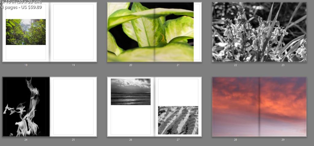
The final prints I chose I think display the best images that I took over a array of different shoots all displaying water, earth, fire and air in a different but similar way. I have decided to present the A3 and a4 images together on a card to represent a summary of the project.
Each of these image represent a different element Earth, Fire and Air as I fell as these images are the backbones of the project holding it up and I want to show the detail within the image clearly, however I have not chosen an image from fire as I feel as if its present in the project is not as important as some of the other work.


How you want your book to look and feel:
I want the book to be simplistic in its nature but yet convey a powerful message about the elements. I am processing the book through Blurb so it will be to a high quality and look very professional
Format, size and orientation:
Rhythm and sequencing:
There will be separate sections for each element in the book but images from different elements will be placed in these sections to make sure that the book flows and connects together. The aspect of the image that I have used to connect the images are the colour , shape, composition, depth of focus and shape. I want to make sure that with each image the image before and after it flow together as without this I think that the book will lack in it rhythm.
Structure and architecture:
Throughout the book there is a range of full bleed, single portraits, 3/4 pages, single landscape images of a double page spread to keep the book visually stimulating. ttrt
Narrative:
The book will look at the individuality, beauty and simplicity of each element and how different each one is but yet how each one is connected and dependent on the other to survive.
Title:
The book will not be given a title, as like Rorschach’s ink blot tests, in which there is no text, it is down to interpretation. I want the viewer to create their own relationship between the ink blots and the portraits partnered with them rather than be hinted at with the use of a title. The title of the book is Element, as the book is looking at the element, but I wanted the viewer to make their own connection
Images and text:
There is one quote at the begging of the book to give the viewer and insight of how I felt when creating the book, but mostly I have left it up to the viewer to create their own connection to the images and their own interpretation. ‘ Earth, water, fire and wind. Where there is energy there is life’ – Suzy Kassem
Colour and B&W (or a mix):
Most of the images are in colour only a view selected images are in black and white.
Paper and ink:
I have selected matte paper for the book as it will help to blend the flow of the images.
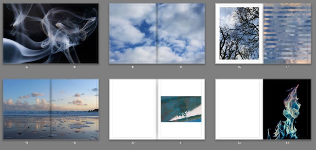
After reviewing all of the best image that I had taken over the course of this project I realised that I needed more for the element of Fire. I gean to think about that different ways in which you are able to photograph fire so the image don’t become repetitive. So I had the idea of photographing the sun as this is the biggest source of fire know to man. For this shoot I wanted to photograph the sun it creates the most interesting light which is at sunrise and sunset, as I have already done many shoots focusing on the sunset I decided to photograph the sunrise to see if the light produced was any different to that at sunset. For this this shoot I woke up at 4:45 and drove to st Catharines break water for 5;15as the sun was supposed to rise at 5:30 an I wanted to photograph the change in the light. Overall I think that this shoot went very well, I did get some image that are similar to others that I have taken, but in the images the light is very unique and different from any other image that I have taken.


The four elements also could be known as the Classical elements are Water, Earth, Fire and Air. These elements were proposed to explain the nature and complexity of all matter in terms of simpler substances.
However cultures have different names and different elements such as in Chinese culture. The Chinese Wu Xing system also known as Five elements, lists Wood (mù), Fire (火 huǒ), Earth (土 tǔ), Metal (金 jīn), and Water (水 shuǐ), as the basic elements, this order of presentation is known as the “mutual generation. t is a fivefold conceptual scheme that many traditional Chinese fields used to explain a wide array of phenomena, from cosmic cycles to the interaction between internal organs, and from the succession of political regimes to the properties of medicinal drugs. What I liked most about the Chinese theories surrounding the elements is that each element has it own set of attributes attached to it each and holds a different value in their society. Whereas in Western cultures connections to the elements are very basic eg fire, warthm, summer, the colour red.
Wood also sometime translated to Tree. is the growing of the matter, or the matter’s growing stage.[Wood is the first phase of Wu Xing. Wood is the most yang in character of the Five elements. It stands for springtime, the east, the planet Jupiter, the color green. The color blue also represents wood .In Chinese Taoist thought, Wood attributes are considered to be strength and flexibility, as with bamboo. It is also associated with qualities of warmth, generosity, co-operation and idealism. The Wood person will be expansive, outgoing and socially conscious. The wood element is one that seeks ways to grow and expand. Wood heralds the beginning of life, springtime and buds, sensuality and fecundity.
In Chinese philosophy, fire is the prosper of the matter, or the matter’s prosperity stage. Fire is the second phase of Wu Xing. Fire is yang in character, it relation to the Chinese philosophy of yin and yang. Its motion is upward and its energy is expansive. Fire is associated with Summer, the South, the planet Mars, the colour red, associated with extreme luck, hot weather, daylight. The element plays an important role in Chinese astrology and feng shui. Fire is included in the five elements in their yin and yang forms which combine with the 12 Chinese signs of the zodiac, to form the 60 year cycle.
Earth is considered to be the changing point of matter, it is also the third cycle in the Wu Xing cycle. Earth is a balance of both yin and yang, the feminine and masculine together. Its motion is inward and centering, and its energy is stabilizing and conserving. It is associated with the color yellow and the planet Saturn, and it lies at the center of the compass in the Chinese cosmos. It is associated with the turn of each of the four seasons and with damp weather. It governs the Spleen, Stomach, mouth and muscles. Its negative emotion is anxiety and its positive emotion is empathy. Its Primal Spirit is represented by the Yellow Dragon.
Metal is the fourth phase of the Chinese philosophy of Wu Xing, is the decline of the matter, or the matter’s decline stage.[Metal is yin in character, its motion is inwards and its energy is contracting. It is associated with the autumn, the west, old age, the planet Venus, the color white, dry weather.attributes are considered to be firmness, rigidity, persistence, strength, and determination. The metal person is controlling, ambitious, forceful, and set in their ways as metal is very strong. They are self-reliant and prefer to handle their problems alone. The metal person is also wise, business-oriented, and good at organization and stability.
In Chinese culture water is considered is the low point of the matter, or the matter’s dying or hiding stage.[Water is the fifth stage of Wu Xing, the five elements. Water is the most yin in character of the five elements. Its motion is downward and inward, and its energy is stillness and conserving. Water is associated with certain colors, with the planet Mercury, with the moon which was believed to cause the rise and fall of the tides, with night, with the north, with winter or cold weather. In Chinese Taoist thought, water is representative of intelligence and wisdom, flexibility, softness, and pliancy; however, an overabundance of the element is said to cause difficulty in choosing something and sticking to it. In the same way, water can be fluid and weak, but can also wield great power when it floods and overwhelms the land.What I found the most interesting about this system of elements is the lack of the element of air as to me this is vital element that is missing
Another element that I interested was the Indian system. In Indian culture they have a fifth element know as ‘aether/void’. Which is the material that fills the region of the universe above the terrestrial sphere. The concept of aether was used in several theories to explain several natural phenomena, such as the traveling of light and gravity. In the late 19th century, physicists postulated that aether permeated all throughout space, providing a medium through which light could travel in a vacuum, but evidence for the presence of such a medium was not found in the Michelson–Morley experiment, and this result has been interpreted as meaning that no such luminiferous aether exists. After finding out this information I wanted to challenge myself to see if I would be able to photograph the ‘void’. But how would I go about photography something that isn’t physically there. So I began to think about the connotations of what the word ‘void’ means. Below is the definition of ‘void’ if you search the word into google.
void/vɔɪd/adjective
noun
The main definition that sticks out to me is ‘completely empty’ I thought that I would be able to photograph this concept in two different ways. If the word is taken very literally I would experiment with taking pictures of different empty spaces, but visually I don’t think that would be very interesting. But if I took the phrase figuratively I think that I would create image that are significantly more interesting. Below is a mindmap of the connotations that I could think of connecting to the phrase.

What gave me the most inspiration was the colours of black and blue. As these colours are often connected to the feelings of sadness and emptiness. So I will try to incorporate this into my next photoshoot.
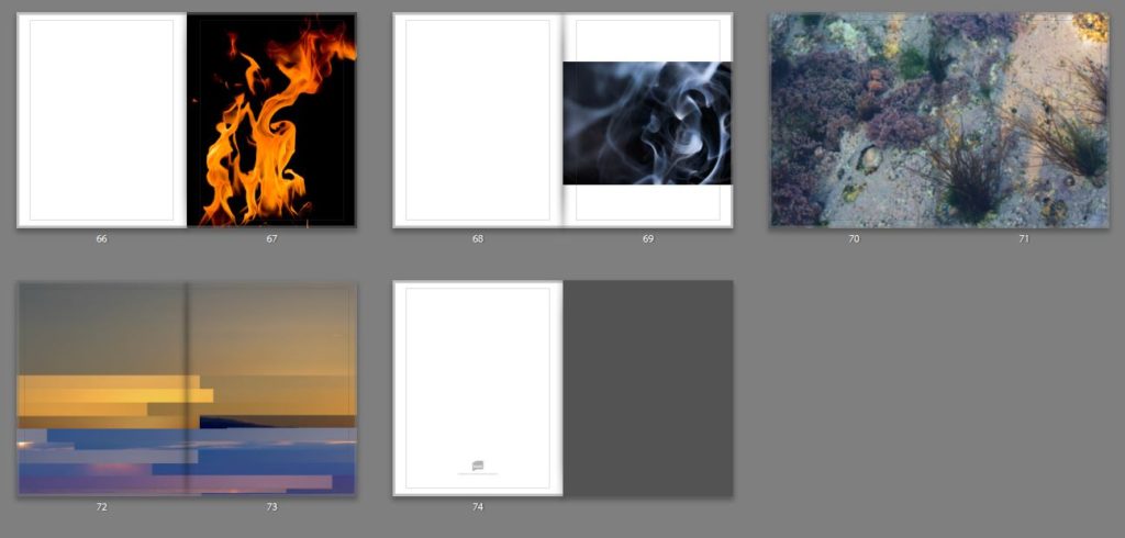
When I began this project I didn’t have any images of fire from previous shoots so I knew that this was going to be the element that I would have to work the hardest element on getting quality images. I did this shoot in my house, because the house that I live in is very old it has multiple fire places which I was able to use. What I liked about taking the image in my house meant that the fire was very small and contain because I feel that if it was any bigger I wouldn’t have been able to capture the image in a detailed way. I took these images on my Iphone once again as I would that my DLSR wasn’t able to capture the images quick enough to get the detail that was being created. I edited these image on my phone on the Lightroom app, I didn’t need to do much edited as the fire in the image was already very vibrant and sharp. The only editing that I did in post production was the increasing the levels of contrast and levels of low light in the image to isolate the the fire and reduce the visibility of the background. By doing this it increased the intensity and the colour of the fire which I think had improved the overall quality of the images greatly.


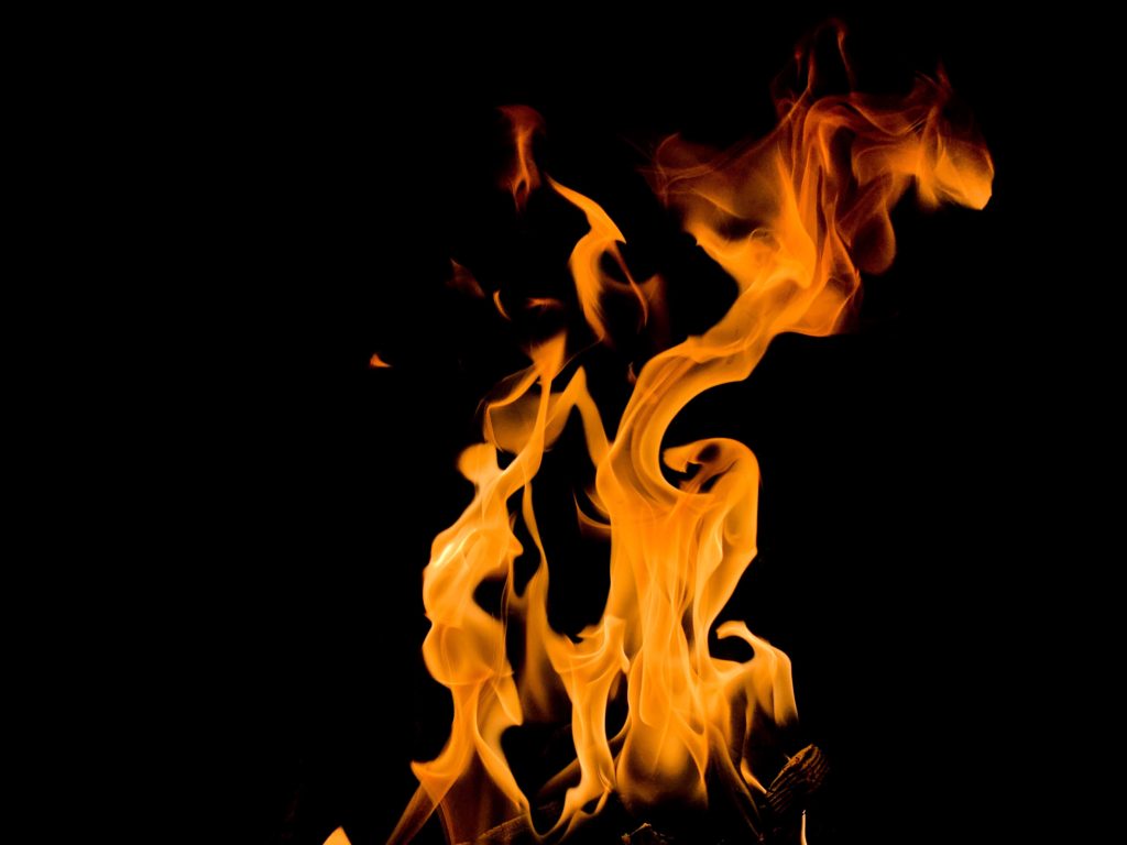


After editing the image from the shoot I found that the image became very repetitive and not that interesting, so I did some experimentation with the hue of the image but the image that I liked the most was the fire being monochrome.


