All posts by Ryan Taylor

Filters

Author:
Category:

A2 Photography Exam – Edit Set 2 -Opposing Colour Shapes Into Images

For this Set of edits, I have used the edits from the previous set to work on.

I have used influence from John Baldessari and the way he used shapes to cover peoples face and make the images he made more obscure to the eye.

I have tried to replicate this method through the application, sketchbook, of which I made circular overlays on top of the faces that are in my photos.

A2 Photography Exam – Edit Set 1 – Colour Balanced Filtered 3 Photo Images

For each of the edits that I have done in this set I filtered between 3 images, the beach shot on a shadow colour balance setting, the woods shot on a midtones colour balance setting and the car park shot on a highlights colour balance setting.

I then adjusted the opacity of the two images in front of the beach photo accordingly so that all the people in the shots were equal in visibility. After that I then adjusted the brightness and the contrast to increase the highlights and shadows within the images.

Then as a final touch I went to the vibrance tool and decreased vibrance fully and increased the saturation by 50% to create an almost burnt out look on some of the edges.


A2 Photography Exam – Action Plan

My Plan for my shoots and my edits are as follows:

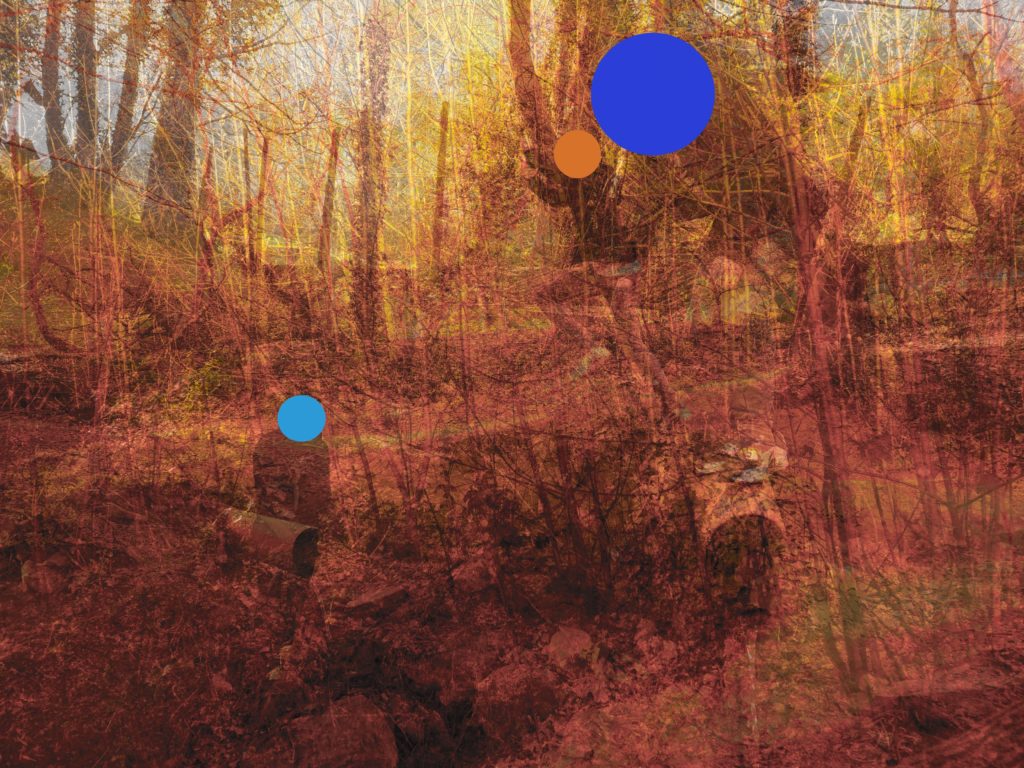
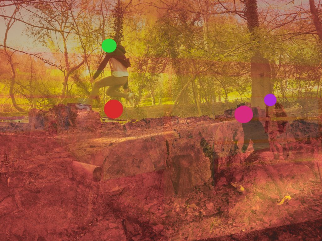
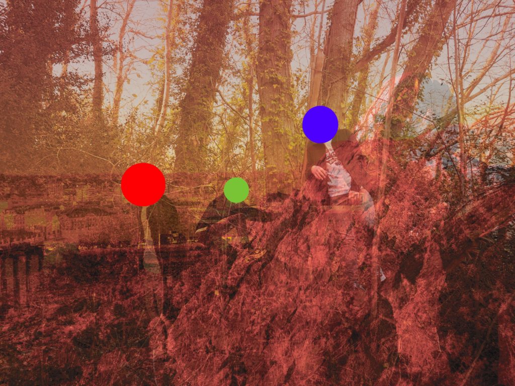
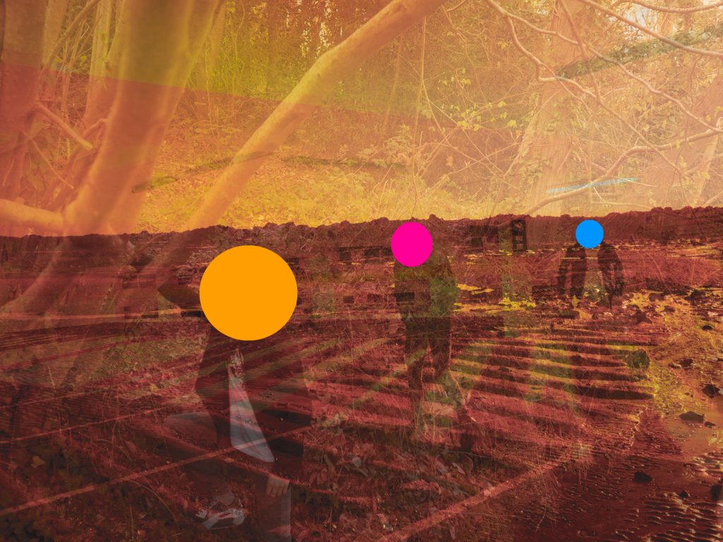
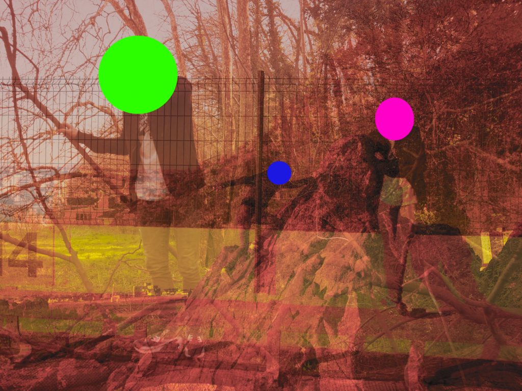
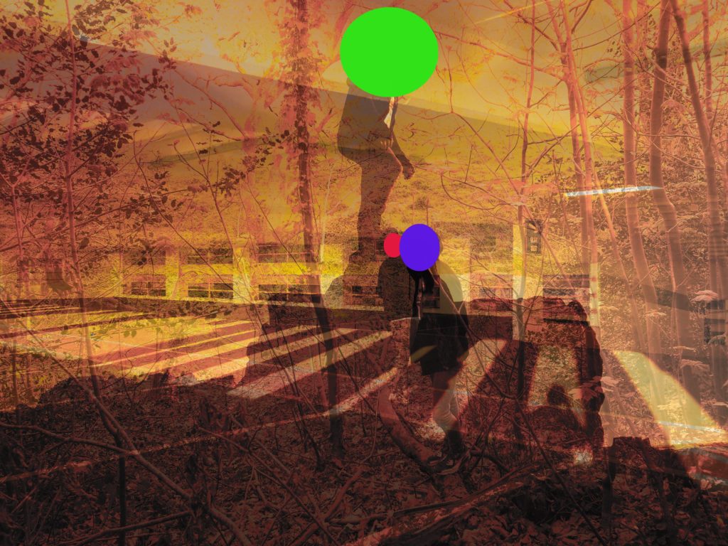
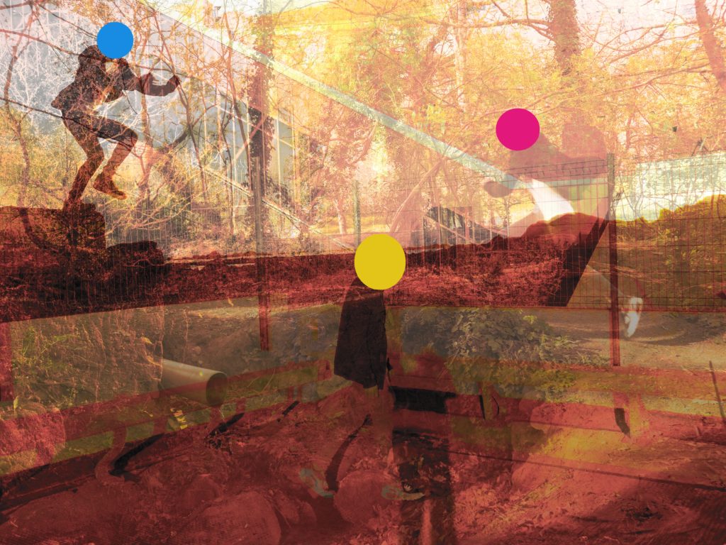
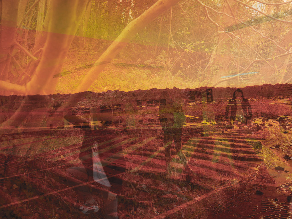
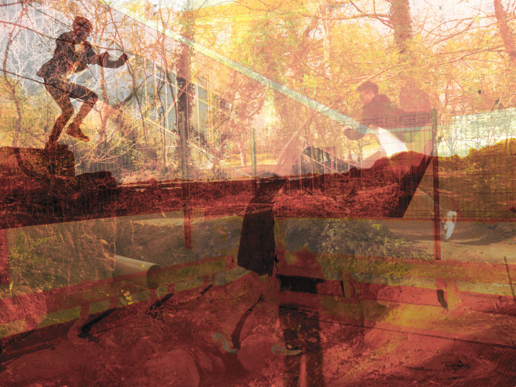
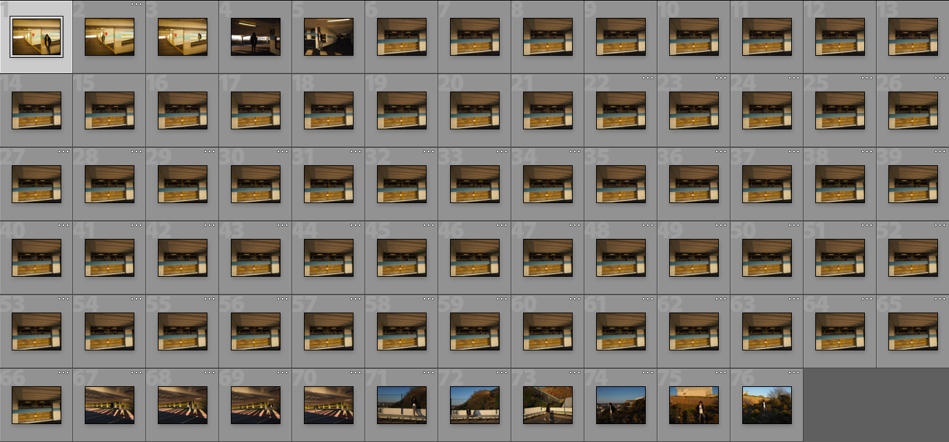
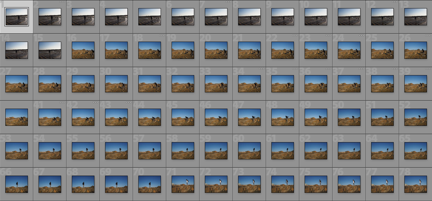
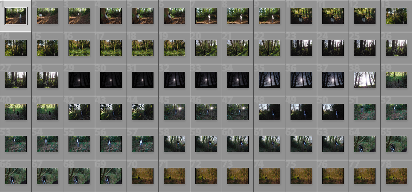
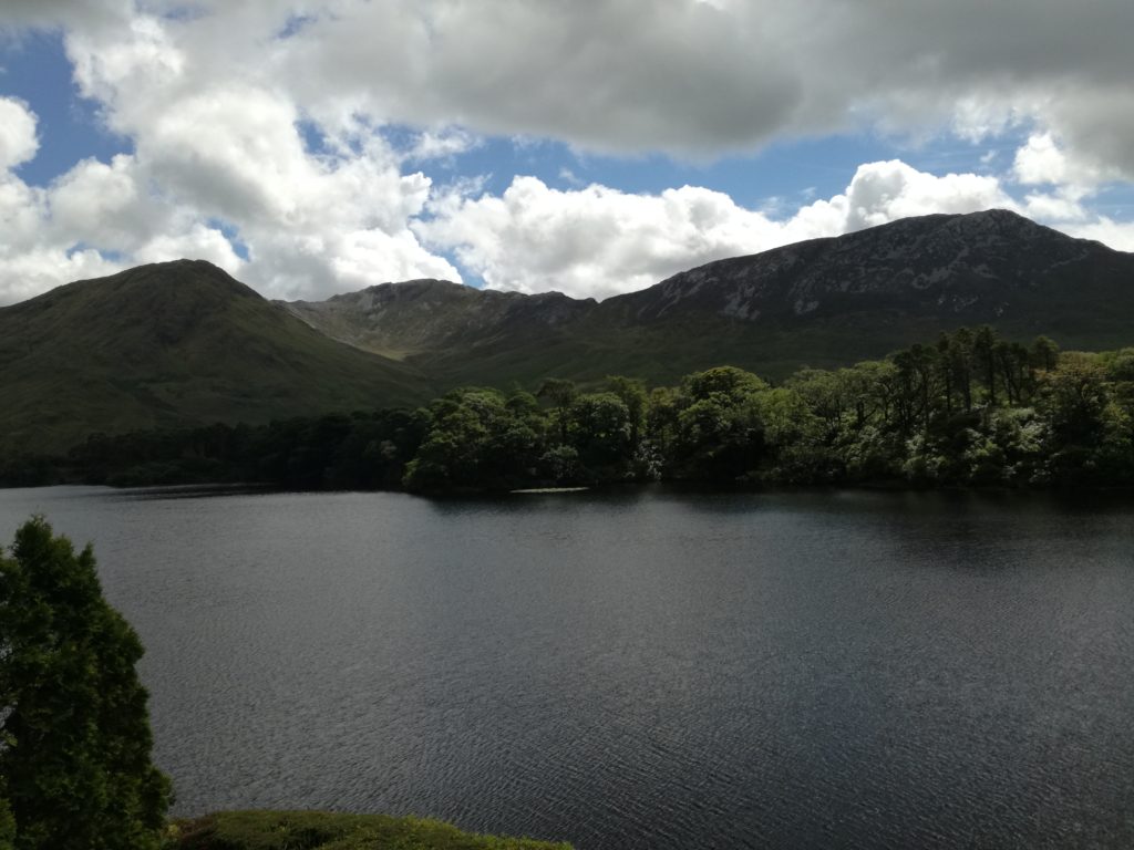
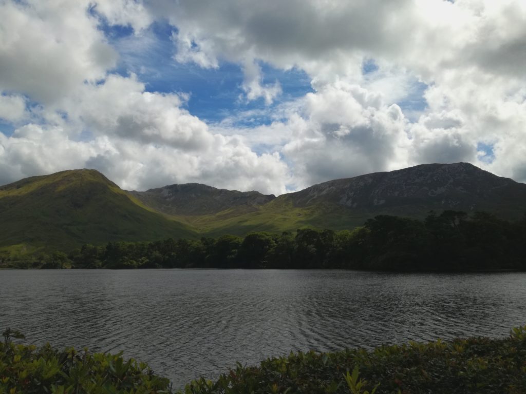
I am going to take 3 photoshoots so that I can use three different locations as I want to create my own landscapes by filtering 3 photos. The first location I am going to take photos at is the woods behind Longueville Manor known as Swiss Valley so I can catch twigs and branches in the top areas of my photos. The second location will be Le Mare beach so I can get a rocky area with some flat parts to provide a stable base for my edits. For the third location I want something modern to be a part of my edits so the natural things like trees look like they are growing in this place, so I will be going to Pier Road Car Park for the blocky effect I want in my edits.

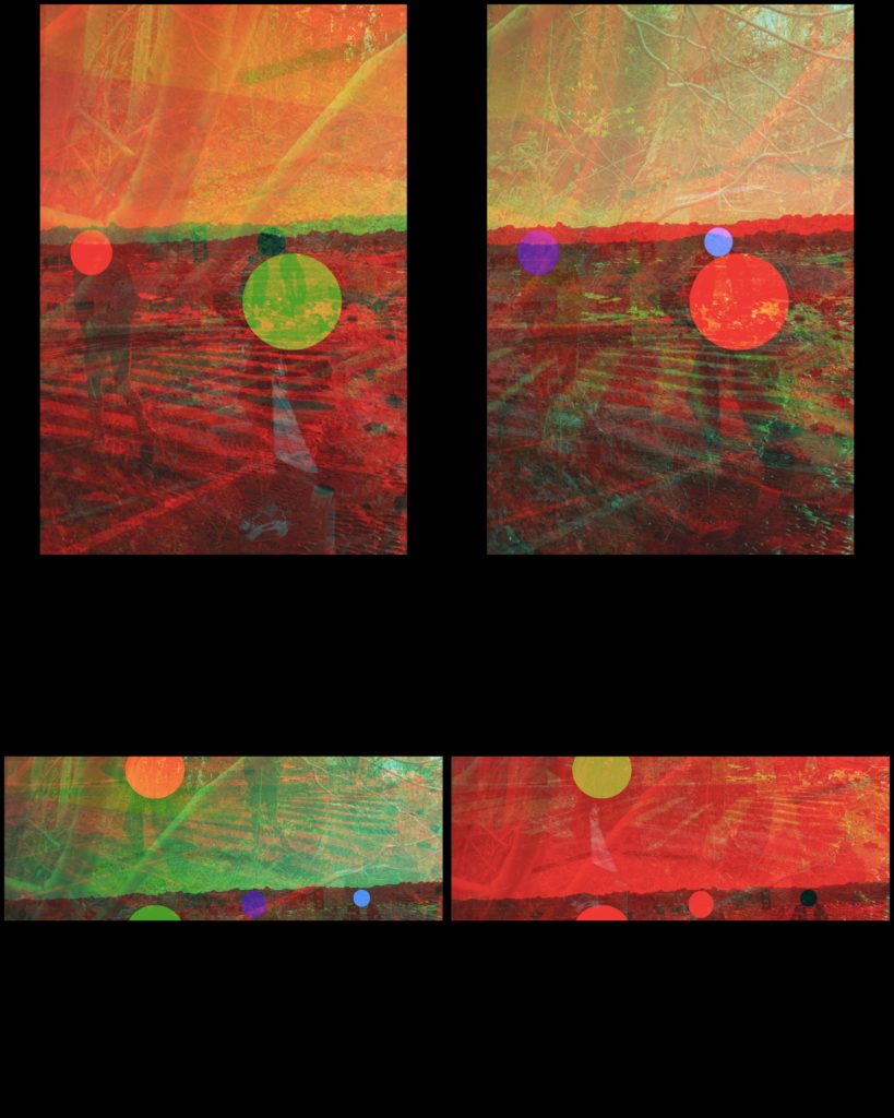
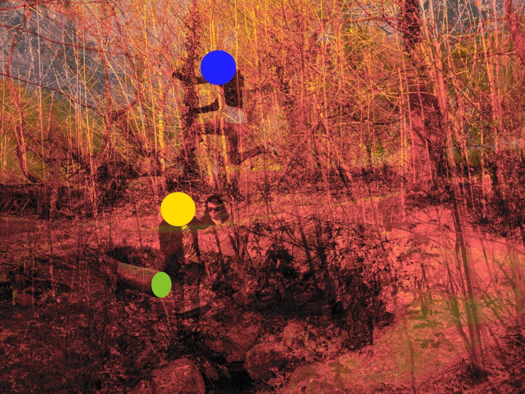
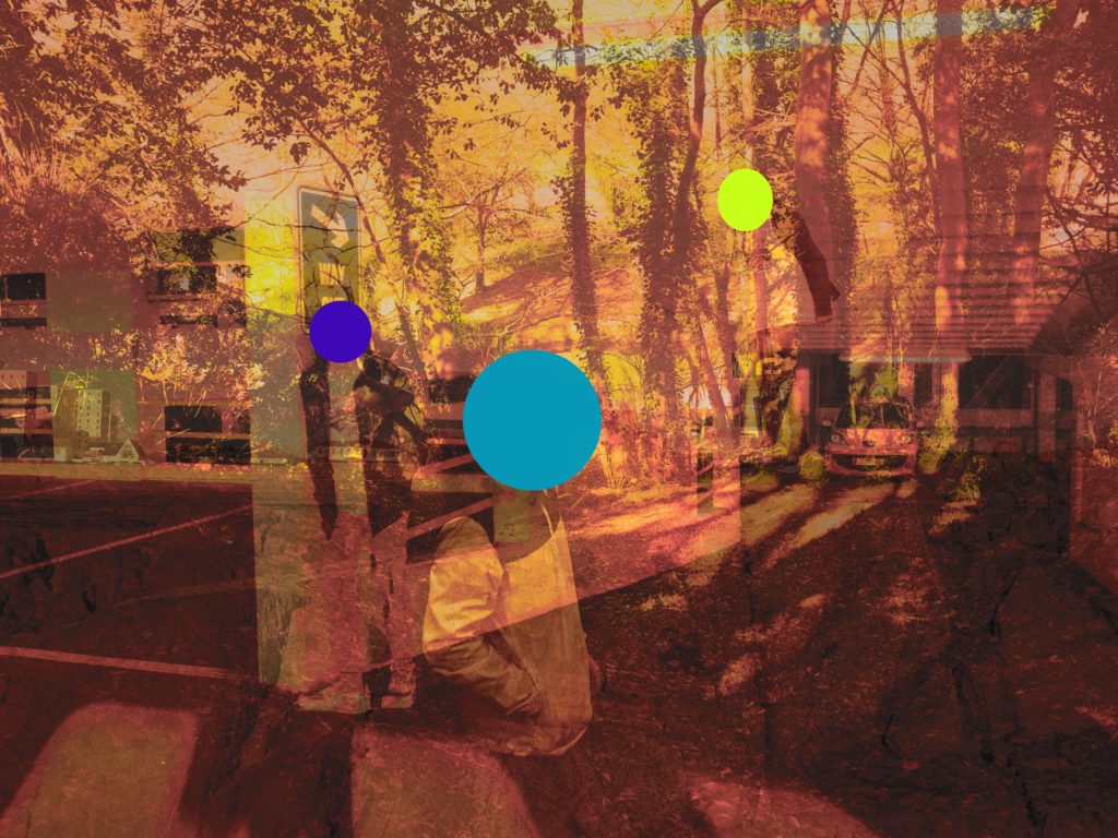
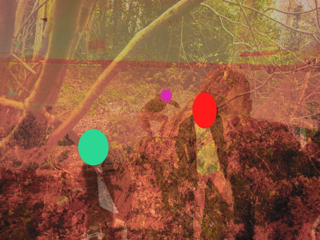
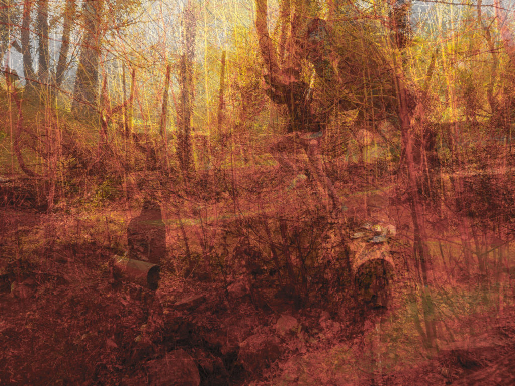
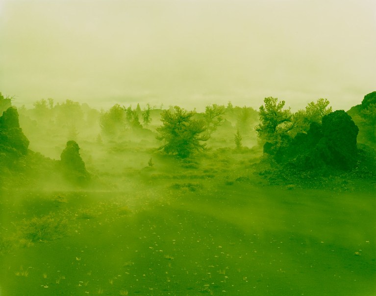
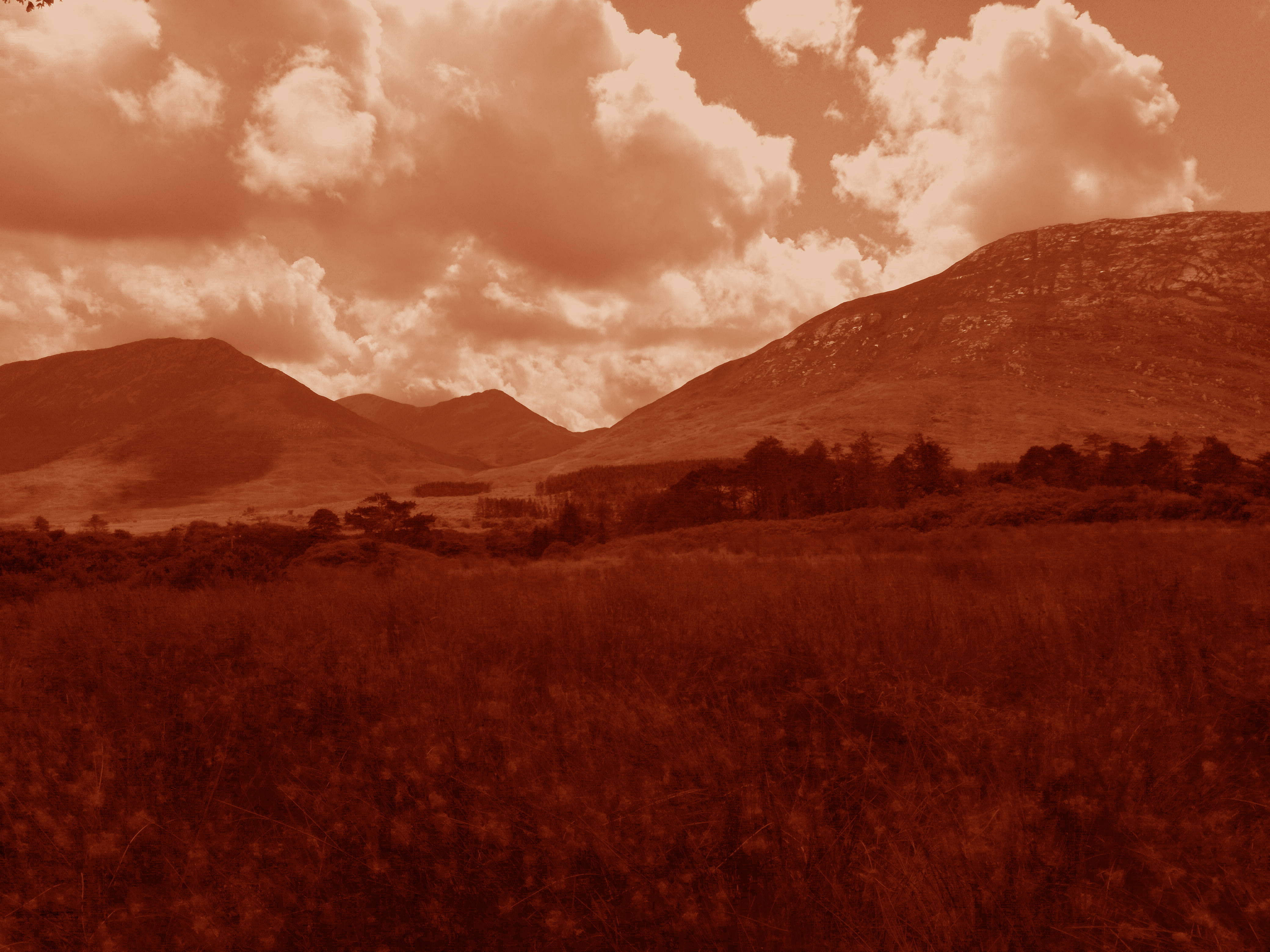
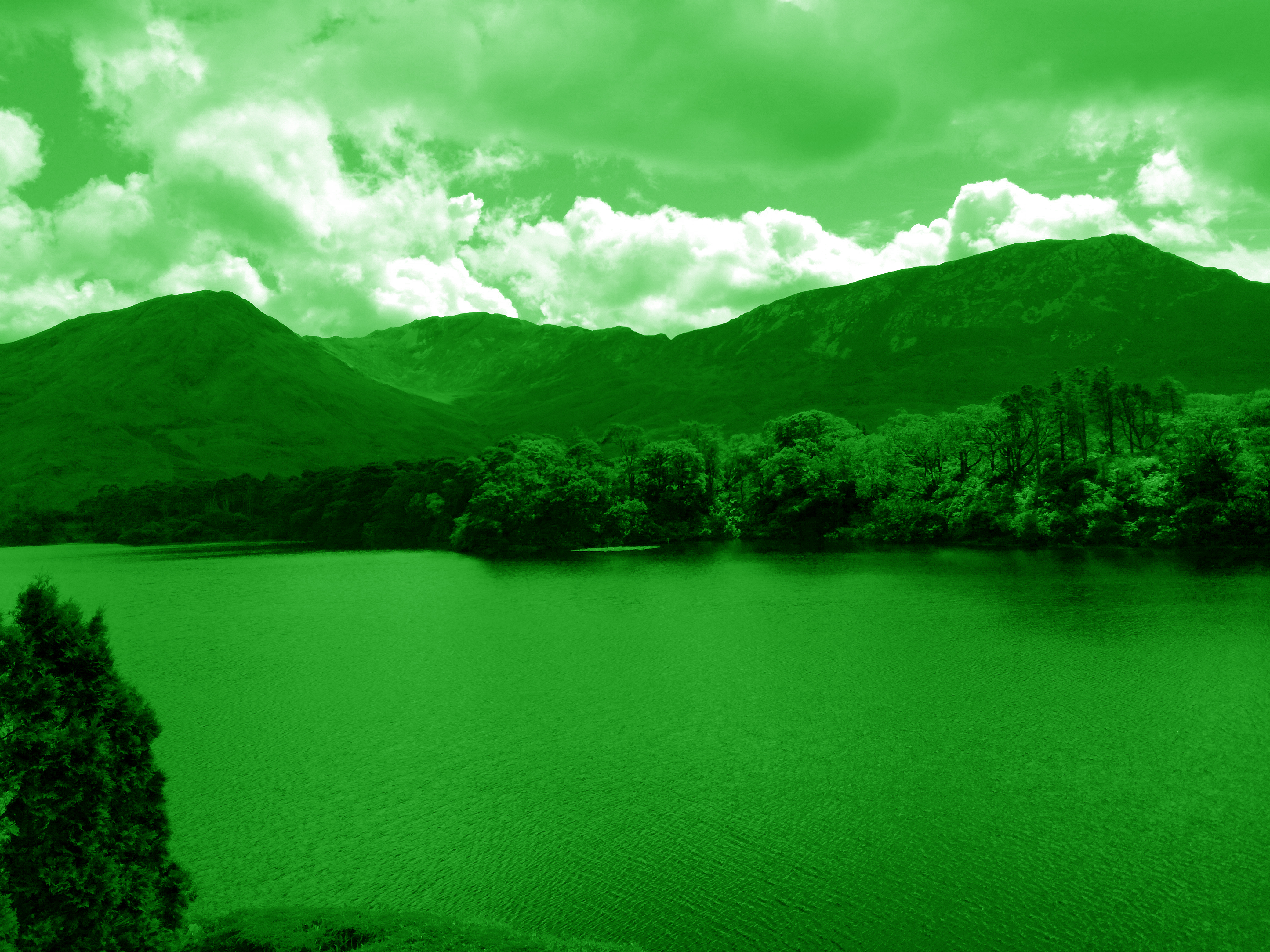
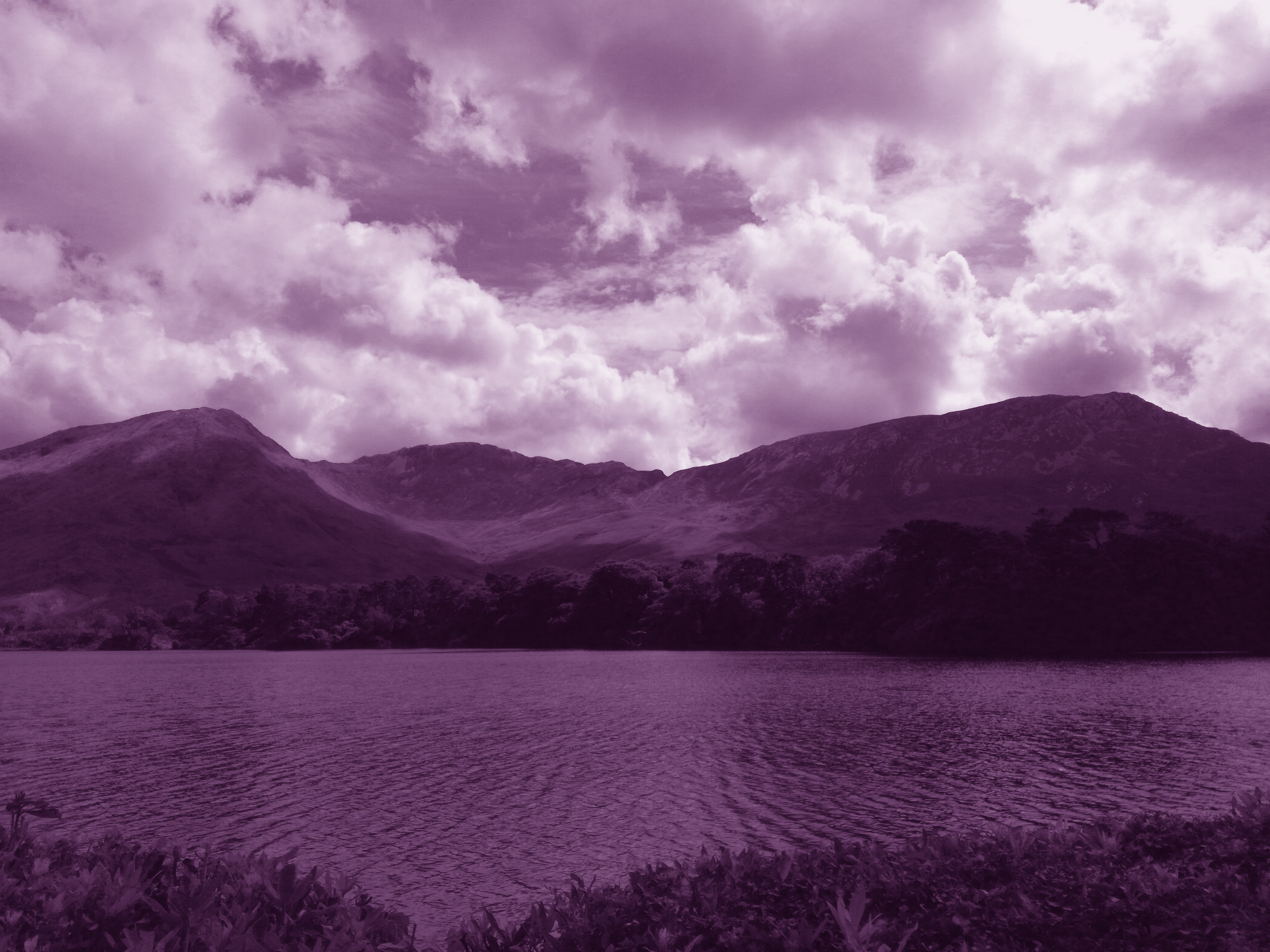
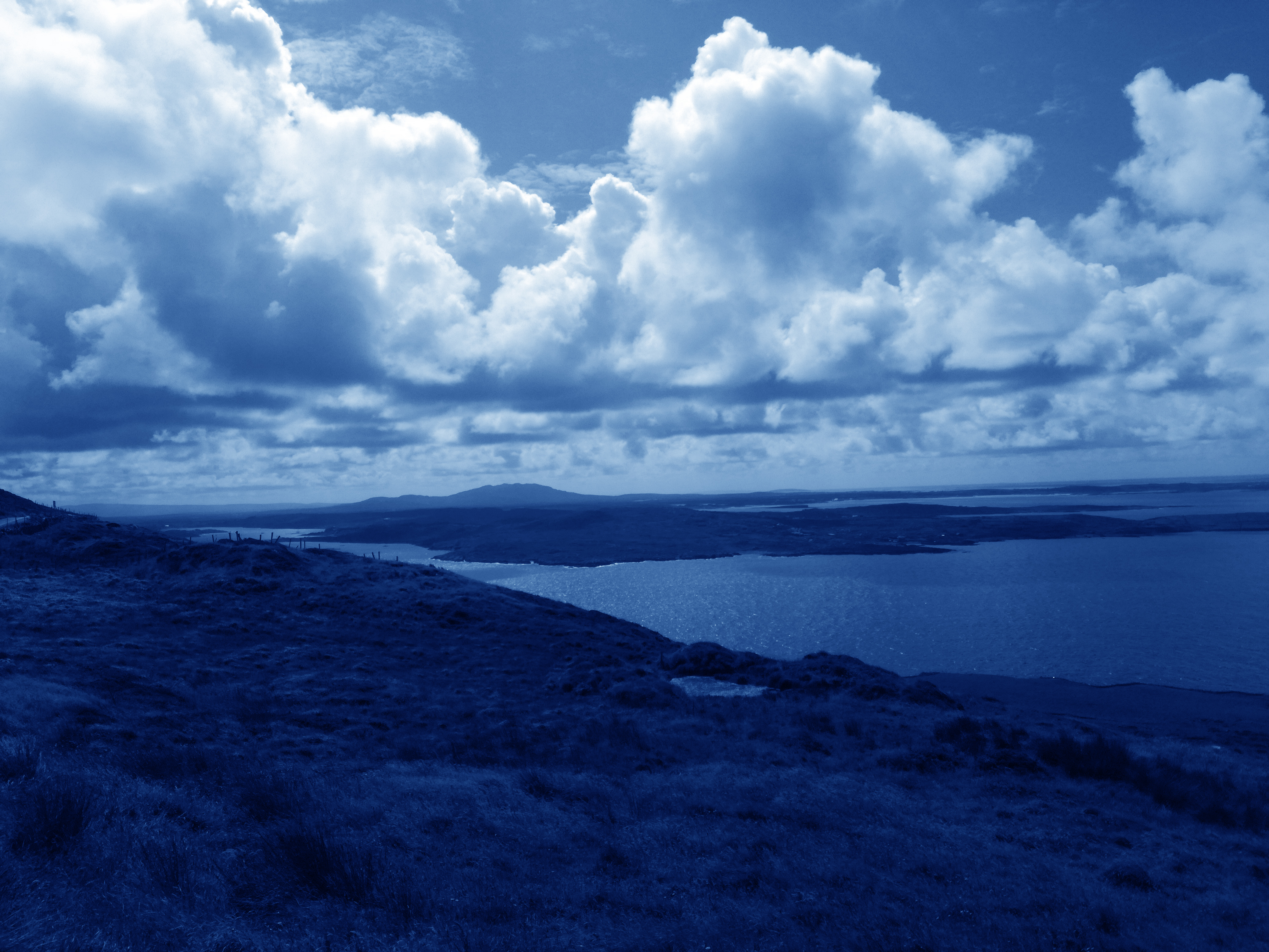
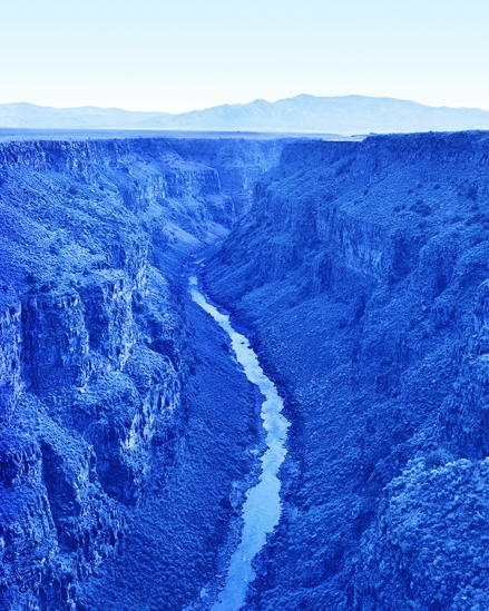
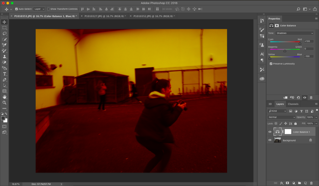
For my edits I will be doing images that comprise of 3 filtered images that have been colour balanced to a reddish yellow, using shadows, midtones, and highlights, and by adjusting the opacity accordingly and increasing contrast and brightness, so that all 3 images can be seen clearly.

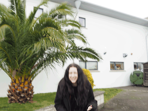
I will then be putting variating coloured circles over the faces that are in my photos using the app Sketchbook.

After that I will use the app XstereO Player to do my stereographs in landscapes and portraits, red and blue, and green and magenta. so I have many variations of colours and combinations.

Once I’ve done that I will start cutting my stereographed edits into tear like parts using the magic wand tool, so I can move them across to a black landscape base and create a collage like piece.

And finally after all that I will be using images from my shoots to turn into very contrast and brightness black and white images, to then overlay them on top of the cut images to add even more detail.

A2 Photography Exam – Artist Research – David Benjamin Sherry

David Benjamin Sherry is an American photographer who was born in Woodstock, New York, on the 14th of January, 1981, he is now based in Los Angeles. Majority of his work is large format film photography, of which he focuses on landscapes and portraits.

He went to the the Rhode Island School of Design and received his BFA in photography in 2003 and then went to Yale University and got his MFA in photography in 2007.

Most of his Landscapes don’t include modern or urban structures, but they all have a sense of bare landscape, which is something to do with the desert, rocky lands he photographs.

The signature trait of his work is the colours that are overlaid on top of his images that make them seem other worldly.

His work has been exhibited in places such as New York, Los Angeles, Moscow, Berlin, London and Aspen.

A2 Photography Exam – John Baldessari response

Dodging the Camera

Paragraph

Throwing a dodgeball in the air and creating a line with tennis balls

The process I went through to create this image started with open three different images and then colour balancing them with red and yellow.

One in shadows

Another in Midtones

And the last one in highlights

I then placed the three picture stacked on each other prepped for the fade tool so that all three could be seen

I used a fade of 35% on the shadow and midtone pictures so that the highlight photo could be seen underneath.

After that I went into brightness and contrast and reduced brightness by 25% and boosted contrast by 100

Then too make a final touch I went into Vibrance and reduced vibrance by 100% and boosted saturation by 50% so that it created a burnt out colour effect.