All posts by Ryan Taylor

Filters

Author:
Category:

A2 Photography Exam – Evaluation

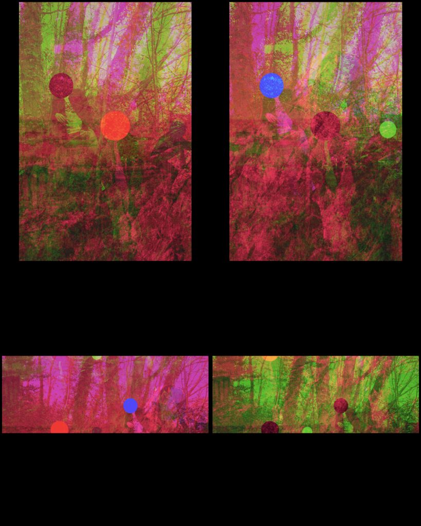
Overall my final images turned out exactly the way I wanted them too, as I followed what I put into my action plan to the word as I knew back then that these techniques would provide the details that I wanted.

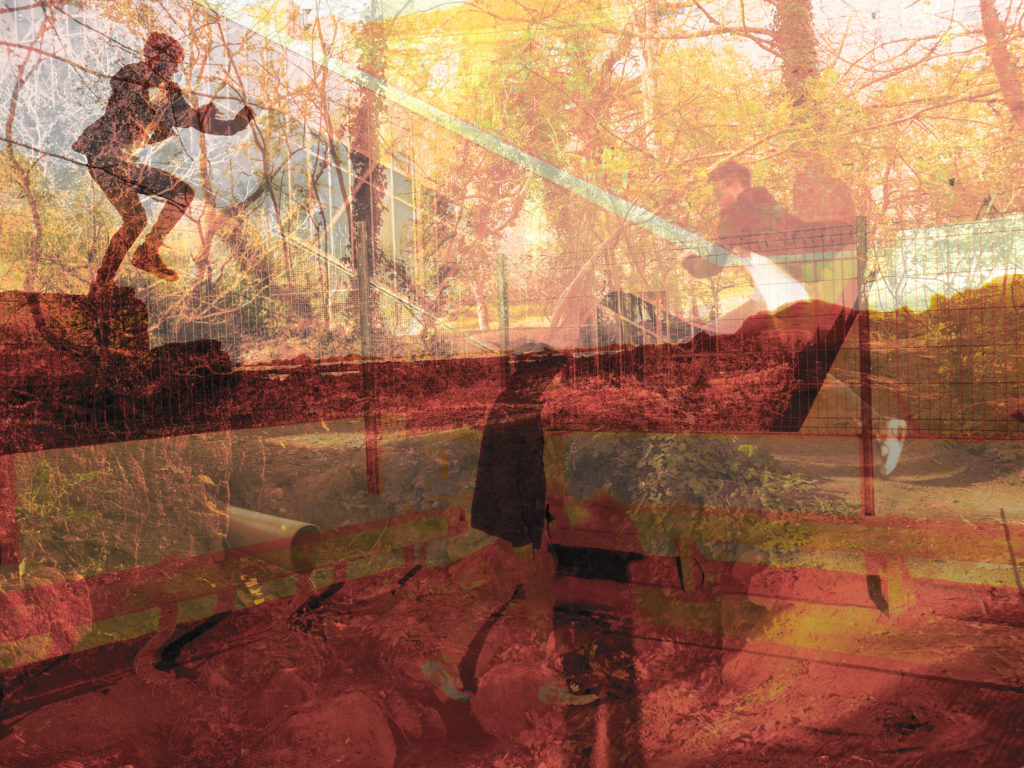
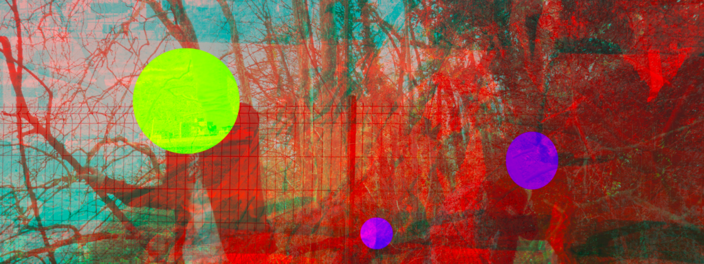
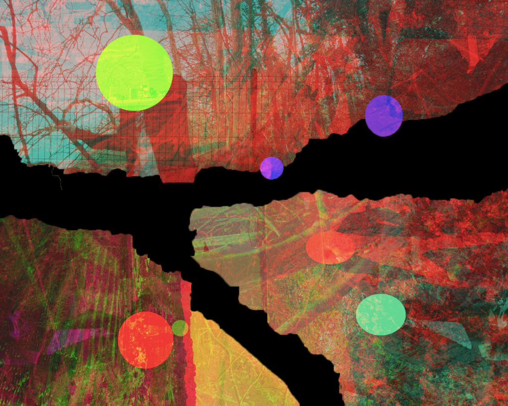
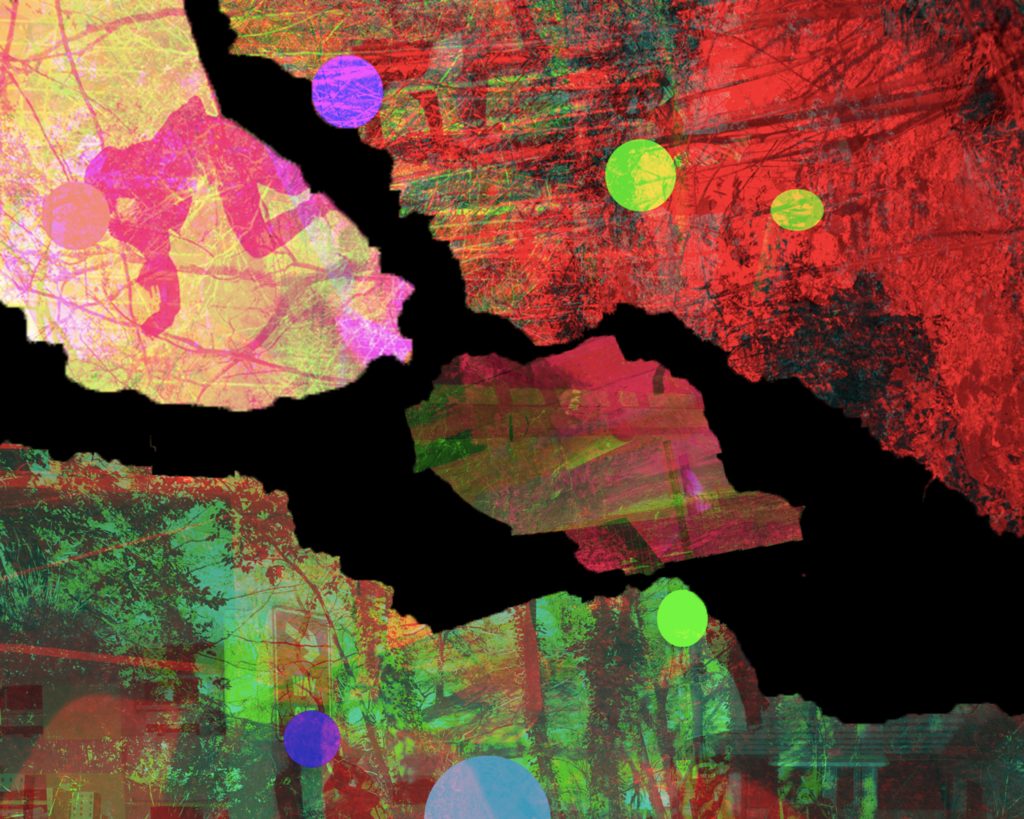
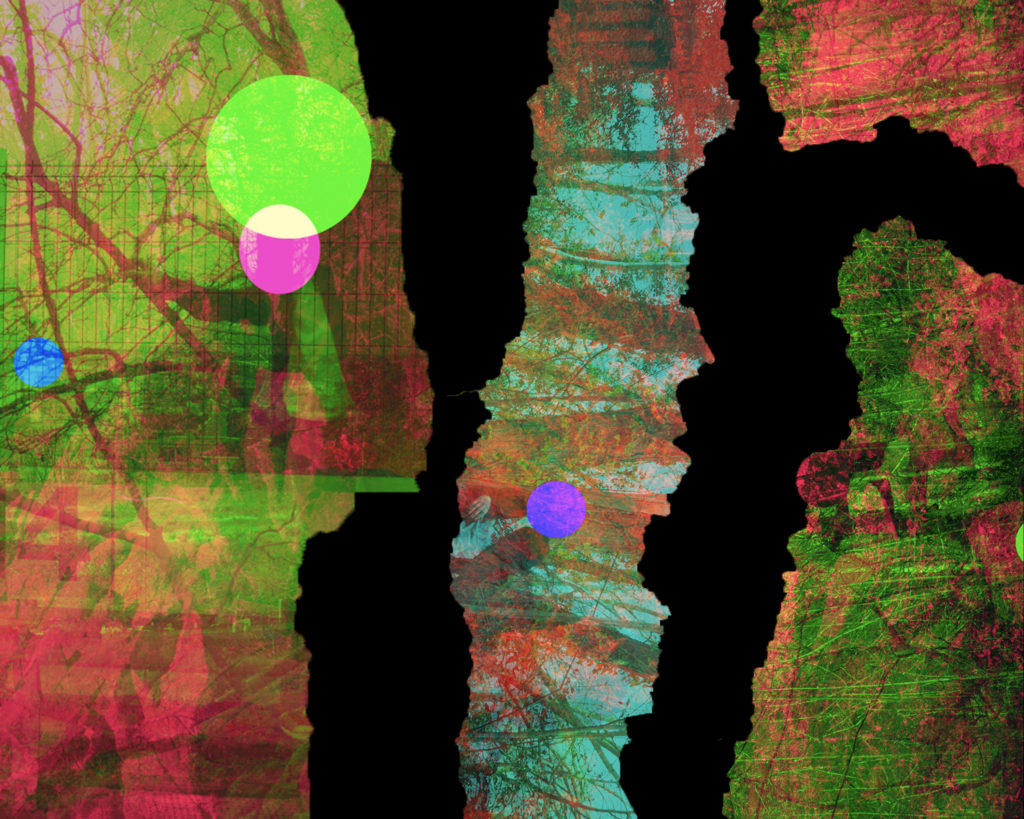
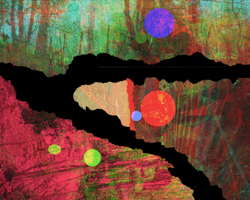
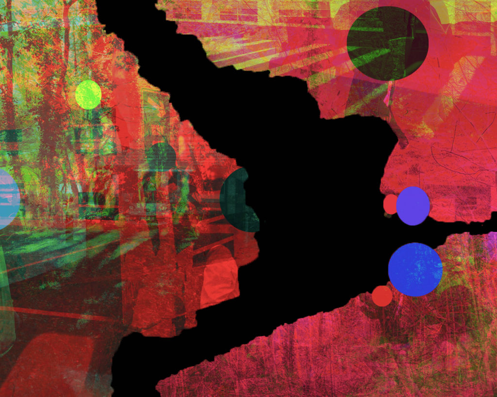
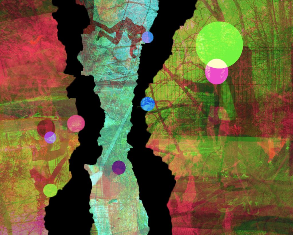
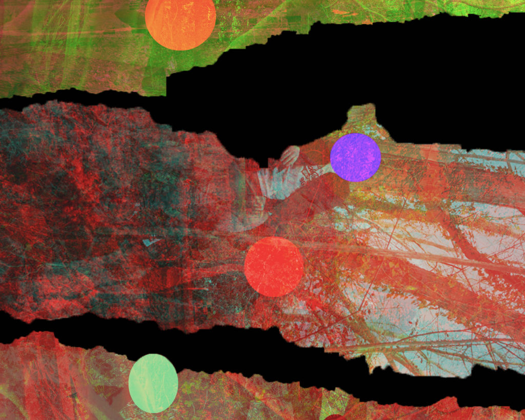
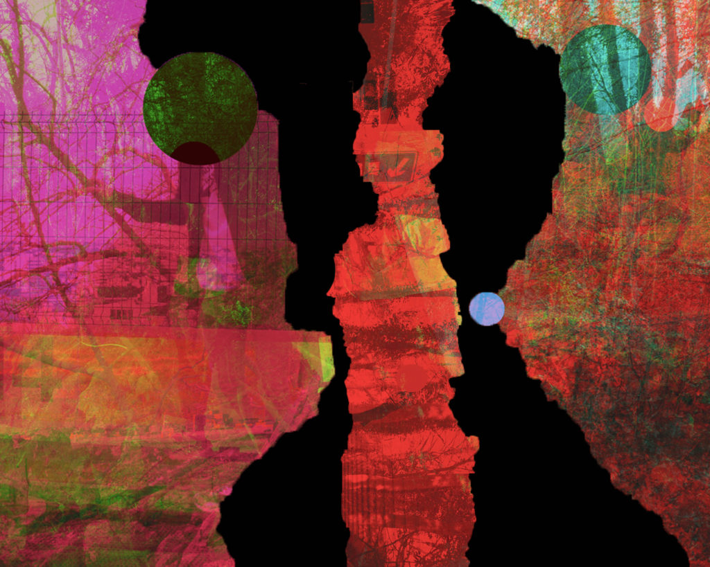
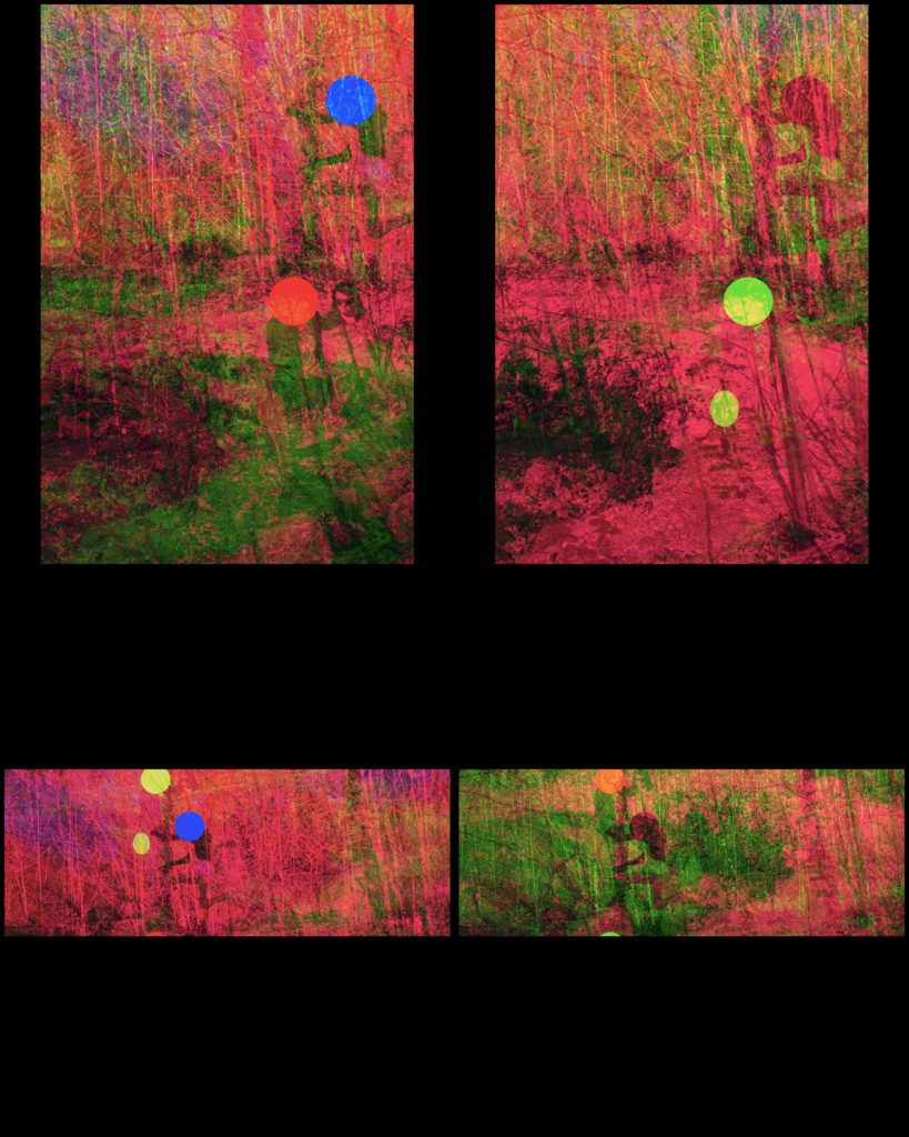
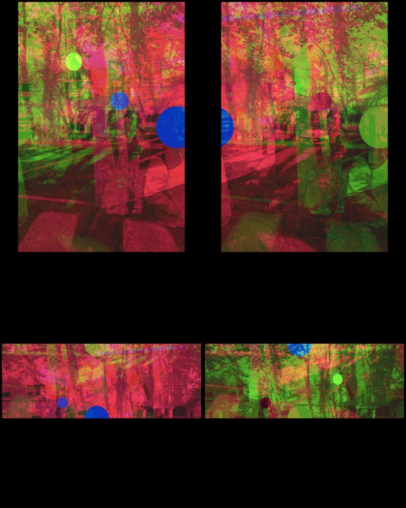
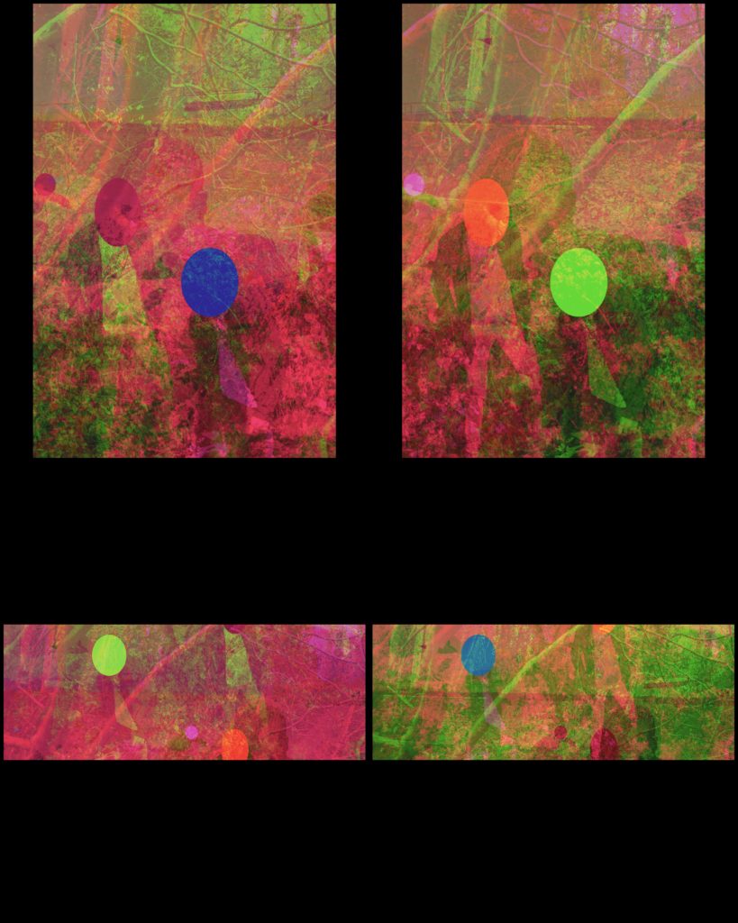
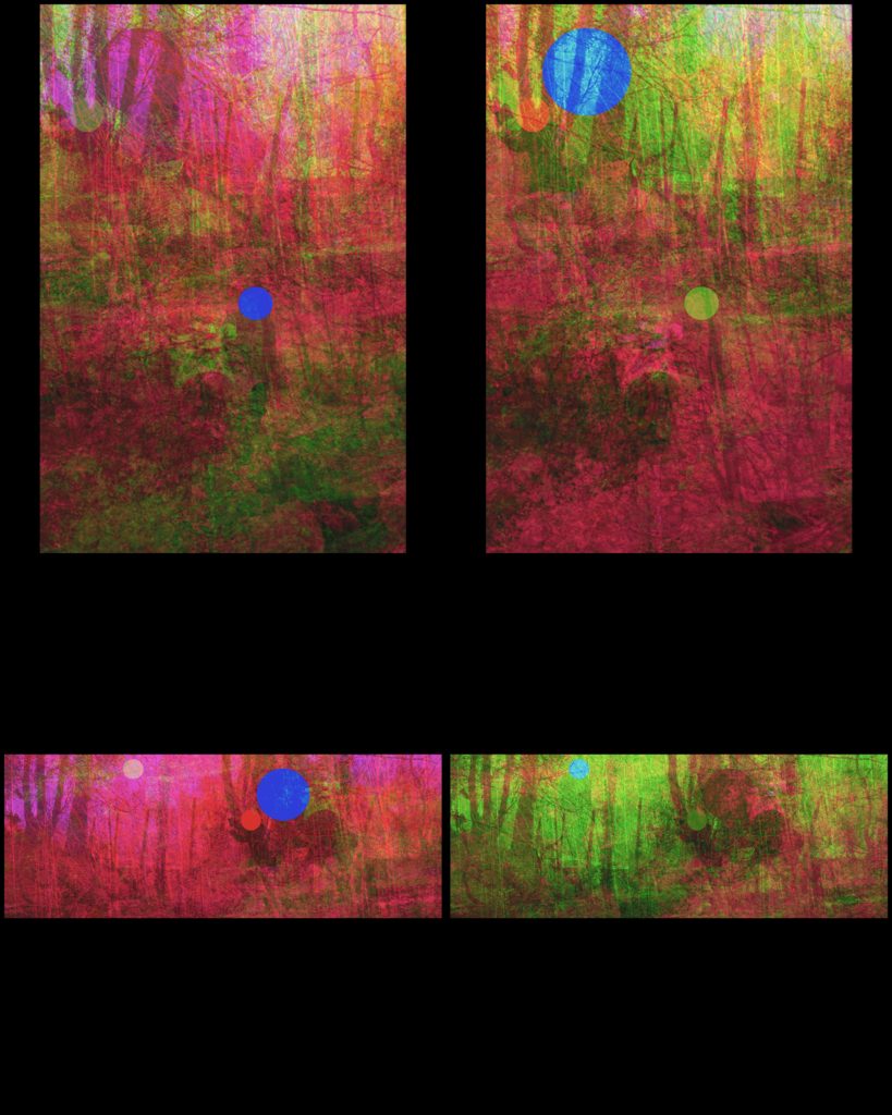
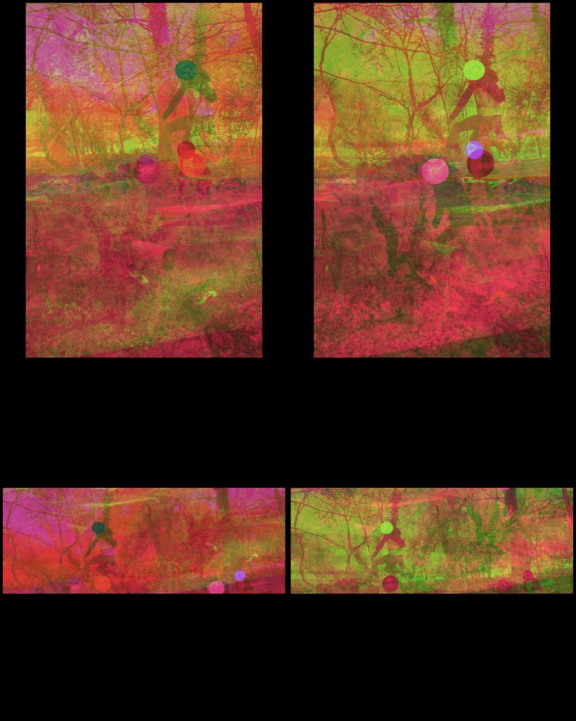
The photoshoots went exactly to plan and gave me more than enough material to play with in my edits, by using the figures and parts of the images such as branches and rocks to move around and space in my images.

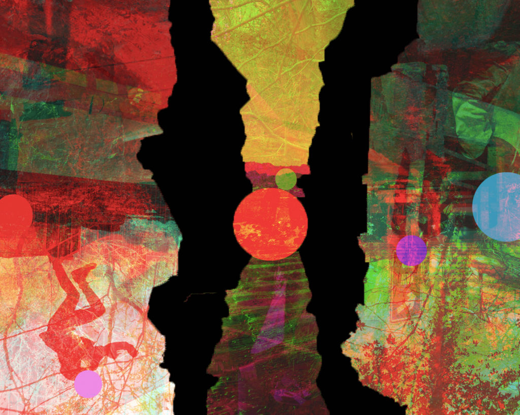
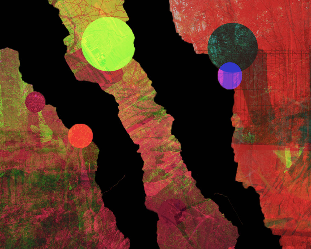
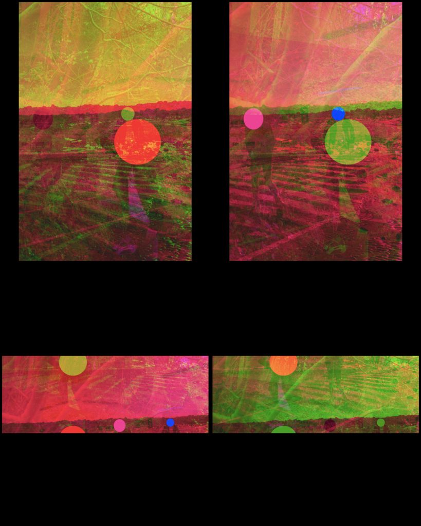
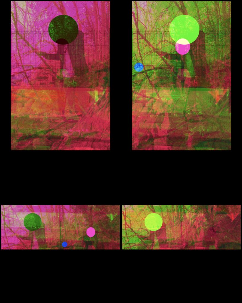
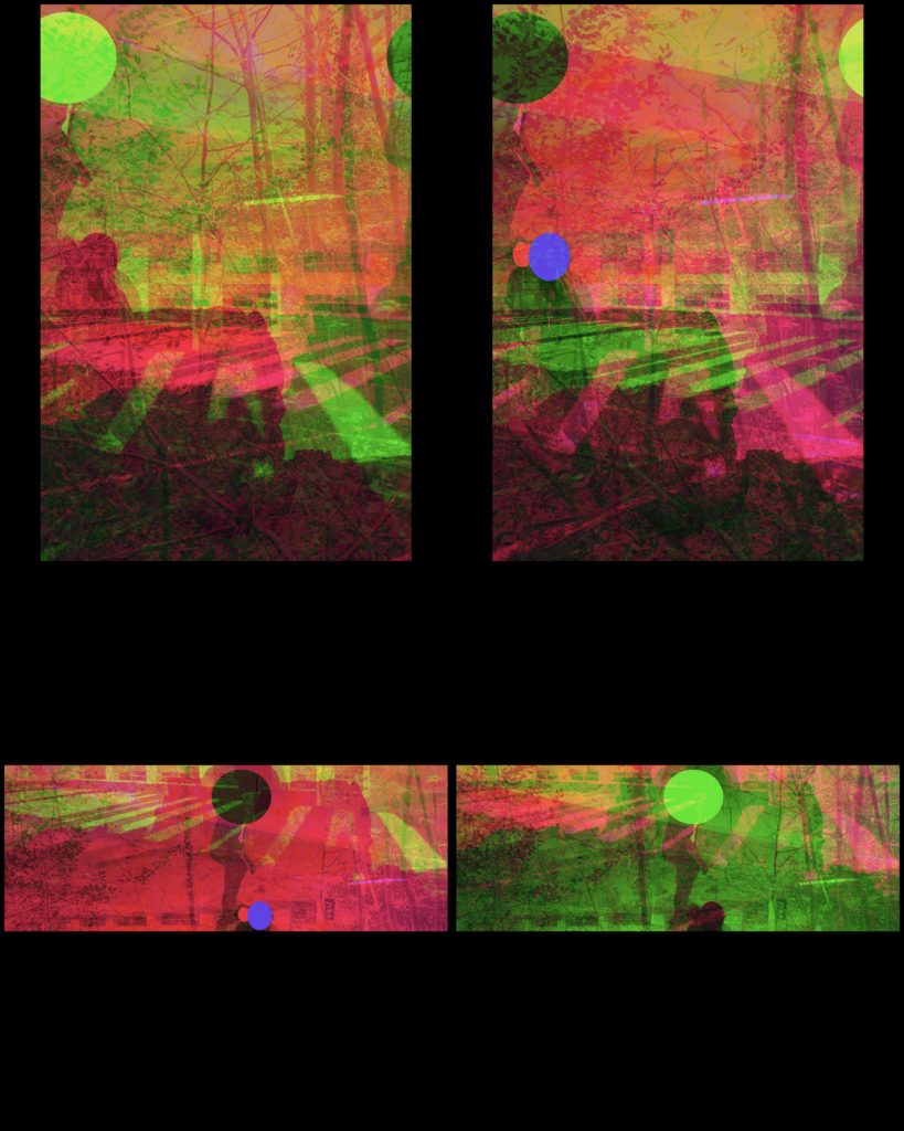
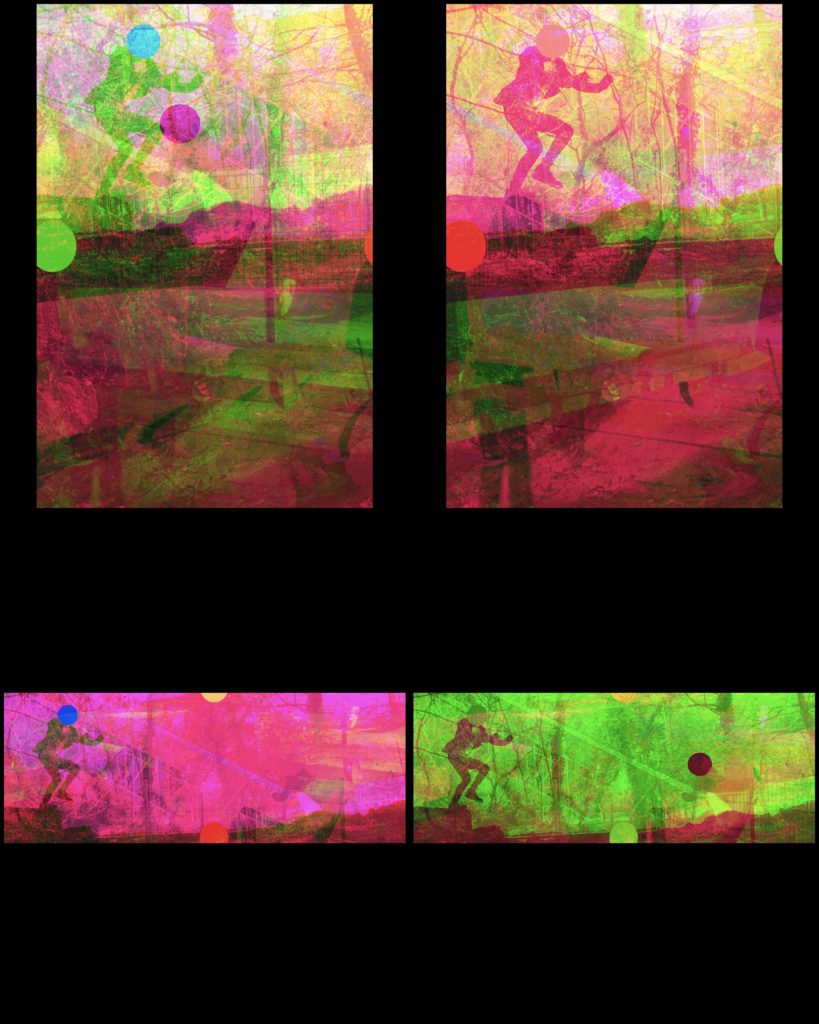
The shapes and 3d edits together provided the extra colours in my final images that weren’t expected from my action plan, but in my opinion this made my images better in terms of visual aesthetics.

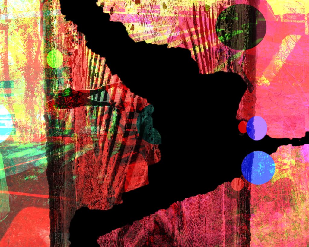
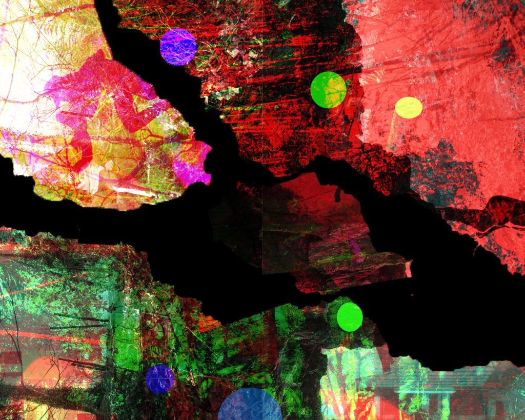
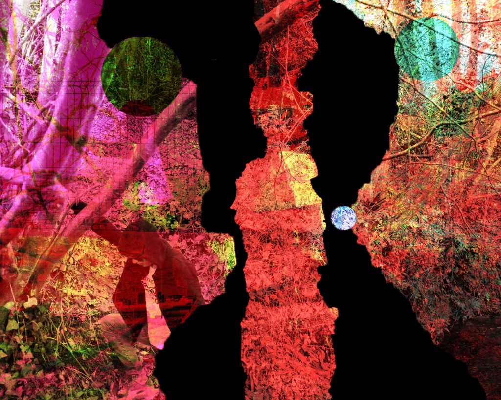
After doing those edits, creating the tear like cuts with the magic wand tool in photoshop worked perfectly and provided the exact details I needed for my images, if I were to have used straight line cuts it would have looked odd and out of place so i feel these worked well.

After these I overlayed some over contrasted and brightness, black and white images over the top of the cut edits to create even more detail over the already very detailed images I have made.

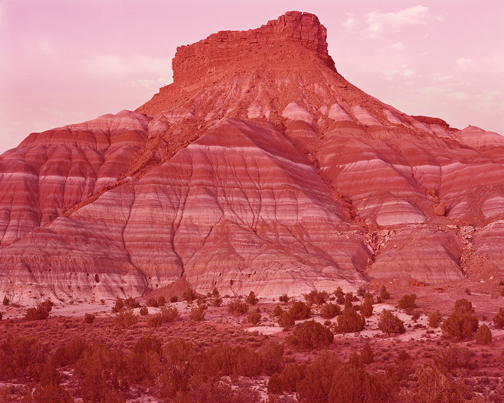
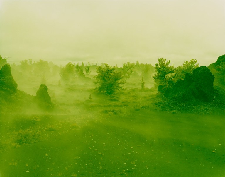
Finally my final pieces look exactly how I wanted them to look from my drafts, if not better as the space I have put in between the images has given the smaller images the space to show off those as well. But also as both final pieces are spaced in different orders it also provides an interesting layout for the viewer to look at.

A2 Photography Exam – Compare and Contrast – David Benjamin Sherry

David Benjamin also plays a key part in my influences, for without him, I probably wouldn’t have come up with the base layers for my images and the colour balancing I used on all of them.

I colour balanced each layer using yellows and reds, each layer dedicated to one of the categories, Shadows, Midtones or Highlights.

It is a similarity and a difference between our work, as I filtered 3 images where as he uses only one singular image, and also I used all parts of the colour balance where as he only uses the midtones on a black and white image to adapt the images without darkening or lightening the images too much.

A2 Photography Exam – Compare and Contrast – John Baldessari

John Baldessari was a key artist in terms of experimentation as he himself as an artist has produced many interesting and weird artworks due his quote ‘I will not make any more boring art’, This sparked his coloured shapes in his artwork. Those exact artworks are what influenced parts of my images .

I used the sketch book app to put coloured circles over the faces in my images, which in itself was interesting. But these actually gave me the base layer for more interesting colours in my images, for after my 3d edits and cuts, lots of different colours popped from the images.

Again as a contrast to his work, my work is overall a lot more colourful and full on where as the coloured shapes he uses are more obscure and pop out of the images that bit more.

A2 Photography Exam – Compare and Contrast – Civil War Stereography

The Civil war stereography was also a key influence in my work as the 3D anaglyph effect has provided my work with colours that were not originally there.

The 3D effect that were on the original civil war photos were added in reference to the distances they wanted the different parts of the photos to look as if it were looking through the human eye, as if they were there.

The effect I wanted to create was merely to move parts of my images in to different parts of the photos to create an extra detail, but also so that they were visually interesting to look at, which is the same reason that the civil war stereographs were made as well.

An obvious difference between my work and the civil war stereographs, is the fact that my work is in colour and theirs is in black and white, although they used plate cameras, this created small spots of extra natural detail to the photos, unlike my photos in which I had to manually create them through the app I used to create my stereographs.

A2 Photography Exam – Compare and Contrast – Dafna Talmor

As a key artist reference to my work, Dafna Talmor’s Constructed Landscape project has a been a massive influence to my final images and work in general. The way Talmor cuts up her images is a more manual way from what I did. She refers to her technique as slicing, splicing and merging. The way I created my images was through the use of the magic wand tool in photoshop, I made sure that I didn’t create straight line cuts and made very rough tear like cuts to replicate the process that Talmor did.

Also something I picked up from Talmor’s work, was the natural side to her work, in her actual images she’s taken photos in woods and on beaches. But to contrast her work slightly, I went to an urban landscape (carpark) and took photos for my images there too.

Another contrast to her work is that her work uses natural colours that fit in with her natural photos, and I used really vibrant colours to represent the combination of urban and landscape.

A2 Photography Exam – Presentation

For my presentation I have come up with three ideas per board, the ideas sometimes play off of the opposite boards.

The 1st board has 1 A3, 1 A4 and 2 A5’s.

The second board has 1 A3, 2 A4’s and 1 A5.

I have decided to use the ideas for Board 1.2 and 2.2 as I feel these will give me the most space and will show off the images the most, as the larger images won’t get in the way of the smaller ones.

A2 Photography Exam – Photo Selection

For my photo selection instead of using all 10 final edits I have done, I decided to weed out a couple of images I didn’t think would work on the presentation. I thought that numbers 8 and 10 wouldn’t work so well with the other images I chose to use, as they are darker in more areas than the rest are in the majority.

Edit 8
Edit 10

So for my final presentation I have decided to use Edits 1, 2, 3, 4, 5, 6, 7 and 9.