
Here is a link to my final book,
All posts by Orla Worthington
Filters
final evaluation of project, conceptual and visual
Final evaluation: Overall I believe this project has been my favourite throughout the past two years. It is unique, unlike anything I or anyone else has ever done previously, this innovation of colour, format and presentation creates a hyper realistic emphasis on the power of life. This godly narrative is so successful it subverts expectations of what I usually develop within my work. It is also the first project which has a successful narrative which really evolves throughout yet is linked and further connoted through the exponential editing. The power, delicacy and vibrancy seen throughout is something unexpected and I belive this is why it is so powerful.
How well have ideas developed? : I believe my project has developed incredibly well. I started off initially within the development of fine art, and the questioning of chaos within the media, this Further formed to create a clear distinction between what is important within life, and in what way does everything apply different to our own individual different lives. This having clear connotations between similarity and variation. Soon experimenting with beauty and presenting my own outlook in life I developed upon the idea of haiku and finding beauty within the reality of life, Focusing on beauty however, for myself, this was not enough of a narrative concept and did not allow me to form the type of narrative that I desired for my book. More so combining chaos and beauty The concept of the evolution of life became a clear indexical theme that further allowed more conceptual ideas and flames of inspiration to transpire. To do so I started developing more shoots of houses, objects and people in order to create a more diverse narrative. I achieved around 12 shoots in total, as I wanted this large index for me to be able to show a clear presentation of a long lifespan. I soon discovered much of life revolves around questions, asking how something was created, and or celebrating and worshipping around religion. God I believe is part of any peoples lives, so adding this impression of the story of creation and life and death, just adds in this other layer, which everyone has an understanding of yet is uniquely individual to us all, sensing the similarity and difference. I believe this concept was successful and I then started development for the better finish and narrowed down to achieve a much more successful concept throughout.
Are ideas explored and selective appropriate to intentions? : I believe all of these ideas explored were definitely appropriate intentions to my project and in the end I was able to use my images of beauty and chaos as they both accessed this level of life experience and religious identity throughout my project as a whole. It enabled me to also form a stronger personal connection to my project, adding in photos of family members and my own personal narrative when it forms to the view of religion and Catholicism.
Are they sustained and focused? Are they reviewed and refined?`: My shoot started off with basis of a chronological narrative following the story of creation, to do so I started off with what god was said to create first, images of land, nature and sea, so the basic elements of life, this then further explored to images of animals and people and then the outcomes of this soon evolved to objects, houses, and the forming of religion caused by this creation and belief in god. I wanted to create another narrative level however, this was to be using images of nature and the elements to also connote a human life, using water and underwater photograph to show a simulation of birth and sanctity, soon leading into darker tones throughout the book to show a demonstration of sin and decaying of the body.
How many responses/ shoots?Command of camera skills/ photographic techniques and processesUnderstanding of composition/ considering quality of light: I have done around 11-12 shoots, Around 8 of theme are perhaps visible within the book itself. Many of the shoots I put into one contact sheet if they had the same objective, such as the underwater and above water photoshoots. I needed to take a-lot of shoots to show this diversification and understanding of life, to experience things and elements which show a direct link and relevancy to everyones life around them. When photographing I was always looking for a different interesting dynamic of composition. This differed between macro images, Images of of landscapes, close up portraiture, slow exposure and fast shutter speed. This experimentation shows different feelings within each images and purposely done in order to create a dynamic representation. The quality of images was important, I wanted a clarity to be able to know what element everything holds, as this clarity is relevant to why it was created and the usefulness within everyone’s everyday lives. My editing process was unique, I looked at the composition of a piece and it’s main elements of interest and developed it in such a way to show a disposition of colours and light and contrast to create a whole image. This was my favourite part of the process, as it made all the images unique, dynamic, more abstract yet creates this angelic movement, and emphasised the understanding of the piece itself.
What are the overall quality of the images?: The quality of the images throughout the final presentations were very good. Despite being excessively large as an A1 presentation, the final outcome fo the piece. The images within my book are all in good detail, every details clips and the clarity is very good.
How do they respond to research?How do they relate to artists references?: Much of my research started off within looking at chaos, life, and then Catholicism and Christianity. I further looked into the practicality of black and white photograph and its accessibility and accuracy to get good photos. Looking into religion was a very important part, there is so much love yet chaos seen within the old testament, even the story of creation ends with falling and failure to live in a place which is anything but perfect. Because of this the essence of dying and the fous on sentiments which fits this narrative was a very important part of my research, because it was exactly what I wanted to take photos of. Looking at artist was personally My most effective part of my project as a whole, it not only enabled my original editing inspiration, but also exposed me to a type of photography I had never tried to do previously, and also conceptual meaning of how beauty can be found within chaotic and scary parts of life, such as death itself.:
How do the interpret exam theme? : The theme was evidently. variation and similarity. I believe this is shown within my project in a few levels. Firstly the similarity could be explored through the mimicking of editing processes throughout my work, and how this development of life is also just another way to show how may different images can combine into making this repeat exploration of silver and black narrative. Too simulation can be seen conceptually through the relevance of religion. Religion is an aspect fo life which has an affect on everyones, wether they are atheistic, Muslim, catholic and Christian. However the difference and variation is the beliefs and what religion means to them as an individual. When I was asking people about what they think to be beautiful, everyone had a different response, and I believe this to be the same with religion. It Independently varies as an individual yet repeated within the same religious construct. Another similarity the basis of birth and death, no one is able to escape this, it is something which is widely feared yet inevitable. However, I think the way in which you decided to live your life according to this is where it differs. If you choose to be stranded in fear of this you will never have a proper life, whether variation is found within what people choose to be with this information, life their life and seek freedom and independence of love, or not. The accessibility of my narrative is capable of everyone to find an element of relation and fascination, yet they will all receive a different message and final outcome from it. This is the variation and similarity
Finals book, print and video
I decided to make a short video, in order to introduce my project. It is just some film footage that I have developed to be the same tonal range as my prints and book, and also added the title. I wanted to create this as something extra to allow the explanation of the key narrative. This small introduction is sped up shots of the sky edited together in order to create a simulation of the title itself. Below is a youtube link in order to show the video itself. It is a mixture of three short clips of the sky cut together, all edited to be inverted into black and white. you are able to here the sounds surrounding myself, and the pathetic engrossing darkness following of the skyline with the tittle forming. This is meant to be an introduction of the creation story, forming the godly power and making the project seem worthy to watch or look into. Overall I think this video is just an intro to my project as a whole, I too edited some of the clips to be backwards and one of which to have engraved small circle, this done in order to form an ideological representation of the presence of god. Overall I think this video is an interesting interpretation of a scenario that was beautiful, and yet too is very in keeping within images and project as a whole.
https://www.youtube.com/watch?v=END4-y0gEXU&feature=youtu.be
Overall I believe my book was developed successfully. I managed to get a complete narrative concept and also an editing construct throughout the book as a whole. Below is the final link and pdf to view the finality of my book. Ascension as a concept links well within each and every aspect being finished within this project. I believe the Power that the words had is a command, yet still has the ability to almost show a sense of connection within the power itself. The objectivity and narrative throughout has been consistent and has a clear relation to that of variation and similarity. The progression throughout this project has is been my most successful, it has allowed my ideas to grow and become more specific, yet still creating a personalised project I have ever achieved and I belive this is very fitting within the brief and forming together everything needed to be accomplished.
3.how successfully you fulfilled the EXAM brief and realised your intentions: I believe through the progression of my project, I have been able to fulfil the title of this project more and more. when I thought of variation and similarity I thought of fine art and media, and how they are represented in the everyday. However, throughout the selection process, Variation and similarity is not only expressed throughout the same consistent editing process, but also the different connects of the narrative of life which everyone experiences, but the effect of religion and how this causes and individuality to the project and has the connotations for variation. I did not want to create a project which was so directly supported to the words and so enabled no conceptual construct and undertone of meaning. So allowing this detrimental physicality of life physically and emotionally to flow throughout, showing the first aspect of birth and leading to death has such a connection of repeating differences within everyones daily lives and importance.
links and inspiration between your final images and exam theme including artists references: I belive my links throughout each of my final evaluations have been fulfilled. My inspiration was evident throughout this project, there has a clear influence from the artists I chose, especially getting towards the latter half of my project. This is the use of narrative and similar editing through the black and white tones throughout. My artists book was Their photographs capture the commonplace such as water stains on asphalt, dust clouds and rays of light, and transform these into mesmerising frames – elusive fragments that evoke an imaginary creature, a milky way, a phosphorescent silhouette…Presented together, their combined voices lead us on a journey into unexplored territory, somewhere between the everyday and paranormal, between night and day. Amongst enveloping darkness, lightness is revealed, dazzling and miraculously caught by discerning eyes. I thought these unique magical and spiritual elements could really express life death and spirituality not in a way to cause destruction and concern but fragments of our shared identity.
analysis of final prints/presentation in terms of composition, lighting, meaning, concept, symbolism etc: My final print which are seen in this blog post all have a clear connections throughout, focusing on the same theme see examples. The progression of my shoot I believe has been monumental, I belive the additionally narrative of religion has really allowed me to expand on conceptual thought of life and death and how you can focus on darker subjects matters yet still perpetuate a meaning of beauty and purpose. The sheer size of my points and due to their tonal quality I believe this is what makes theme the most successful. I believe much like my prints I will print out my book in a large size, once more to get this huge iconicity and impact and visual overload when seen. Linking my project prints with the book is the introduction video, and something which I believe really links in conceptually the title and a brief endeavour as to what this project has to offer.


Here is my final print presentation. I decided not to do the additional 18 window mount as I thought already with the 8 a1 presentations and also the short video and clear visual overload form the book, it would come together and be too much and loose the specifically of the narrative that I already have. I think this final outline of this presentation is successful. here it is below:

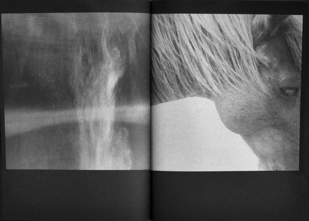
As spoken about previously, I wanted this presentation to have strength, and almost create a stimulation of the amount of strength god has. This power recognised within the sheer size and then imitated by the impact of the dark tonal colours is effective. Conceptually my favourite piece is the piece of the eyes, this is due to the division of both the black and the white seen throughout, also this combining division of tonal essences is mimicked through the two surrounding outsides of the trees within the foregrounding The echoes of different compositions throughout differing from more square lines to circular water motion. Much like my video the image of the waves is almost a a reversal of movement in order to create denotations to the sky. I chose this paradigm purposely to links every single one of my final presentations and to successful finish
Overall I believe my images alongside my narrative have used such a dramatic growth in order to enable a more personalised emotional connection and also to capture wanderings create a hauntingly beautiful dialogue. I took more and more shoots used to capture their everyday in an impulsive and almost obsessional way, documenting life from their doorsteps to far afield. The physiological factors present death as a common and less feared but an act of something much more spiritual, I belive my own personal connections allow a snese of bonding within this project and the reader, and how the sheer beauty within the inverted colours allow a successful finished project.
print presentation experimentation and final
The final prints that I chose are an array of different shoots focusing on body texture, nature and the objectivity of religion.


Doing this experimentation, has allowed me to visually see which is the best ordering and composition. I wanted to develop three Ways which I could show my images, in rows, columns and also possibly in a straight composition of many different levels and sizes.

I believe in a gallery space this piece would be the most effective, this is because It would enable me to experiment with even more prints, and also would allow strong lights to further emphasis the colour of the deep silver and black images already achieved.


My favourite presentation, and in my mind, the presentation I feel to be the most successful, is the first presentation, with two long rows, with the differing images of tonal qualities juxtaposing each-other. I wanted to show all different angles to see which perspectives best compliment the images and also access this narrative relevancy throughout. The choice of having eight also works better than my previous thought of 9 because it allows a sense of equality and evenness to the different stages throughout life and doesn’t give an abrupt ending to life and the book as a whole.
Development:
I have already printed, sprayed and placed my images onto card, and then cropping and trimming the images. After doing this basic development I need to discuss and develop the rest of my presentations. Due to all of the images being A1 I did not know whether I should Put them on a wall due to their sheer size. I want to use some type of developmental composition in order to see what in reality the huge impact it would be seeing physical side of the shoot.
Final display:

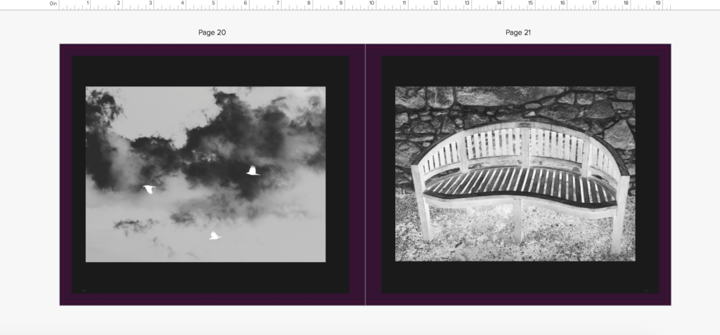
I believe seeing it as a reality is a very important aspect of the presentation itself. I wanted this large impact of black to juxtapose from the white wall and I believe this really is evident of the effectiveness within this presentation. It is not the same as what has been done before and the true largeness and amount of images portrays an ideology of an evolution, relating to that of my whole project, within its finality. I chose this order as I believe the variation is almost chronological with starting at a church scenario, and then exploring more to a naturalistic theme, then coming into the essence of people and lastly showing strong contrasting images of a movement of colour in order to connote the aspect of death. All of the images have such a different independent composition and this is why the presentation as a whole becomes interesting and meaningful, as there is not one image on its own holding up every other image.

Evaluation: Overall I definitely feel that these were the best images to choose, not only do they show a variation of many of my different shoots, but there is a clear connotation of the evolution of life and death throughout, and I think the details throughout each piece allow a clear connection throughout. The contrasting very light tonal prints to the ,much darker tonal colours creating a successful print. I decided in the end the best composition that would physically work and fit was The line of two rows. It allows this extended narrative of a line, but more clarity and visibility as it is narrowed down to one area. The two lines also allow the images above and to have a contrast or similar theme to have further connections within each other. Overall I believe this large scale presentations taking up a whole wall was definitely the best possible outcome for my design and really accentuates the true power this piece contains.
my work in comparison to artist, and analysis:
Astres Noirs


Much of this work is clearly focused on the actual entity of light and a presence of something such as otherness. The spirituality within these is so evident and an element which I tried greatly to access. The editing within my work you can see is very focused upon that of inverting to make the light much stronger., synthesising a flow to my images. This allowing the people and elements to be more heavenly and presented as a sacred entity. Within my work I was able to get these all the many specs of light by using refractions of water. I started to think about why I chose this artists’ work, and what specifically made me want to inspire my whole project behind it. And I think there are two main reasons as to why. I believe the use of the colour is definitely the first, it is so unique and they first photography book ever that seemed to almost glow within each and every image. Both the ink being silver heightened by the use of the black is something so unique and allowed both tonal colours to be heightened. The lighting helps accentuate the composition of the piece, also using the occasional black border to give the image a typology of light and darkness. The second part is the conceptual of why the photo was taken, not only is it to capture a sense of beauty but it is also about showing the element of life. Life is a subject which I believe to be such a specialised and yet open topic at the same time. Each element is so individual it is sometimes uncocenceivable. you are able to tell what exactly the image is of and I believe this is where its importance lies. The texture, elements and unique compositions shows an evolution of life, but in such a unique way. It is special and a book which really moved me.
I believe The work is reflected throughout my own. I first started off by developing the same strong tonal juxtapositions throughout, and then developing the narrative construct through the ordering of my images.
My work

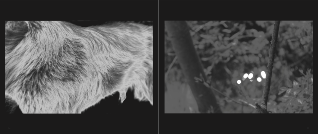
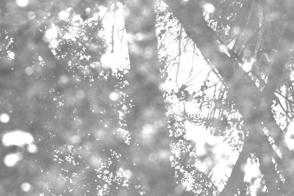
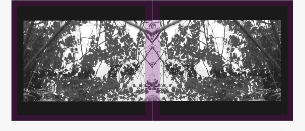
I decided to edit this image to just focus on a order of highlights, I did not want to show too much when it came to the complete contrasts of darkness and light. I thought that might remove the almost angelic effect from this image itself. The small white circles of the light bouncing off of the water, and the details within the flowers and branches show more delicacy to the image itself. The thick trees themselves bring a composition to the image and allow a division to the central image, and concentration to the surrounding elements. To my mind, this image is my own twist upon the elements of creation, showing a clear inspiration from the images they have of specs of light within the air. I could do possible further experimentation and editing to this image in order to show just white internal shades, despite the image still being inverted I did not want it to be continuous with the rest of the darker images throughout my book so far.

Within this imagery I wanted to show the deep contrasting colours that are shown above by the artist themselves. I believe that this image is definitely one of my favourites. Not only does it project my own narrative of religion and the evolution of life, but it too constitutes a very open yet complex composition. The use of different foregrounding and backgrounding shows a very interesting element for myself to this image, allowing the viewer to almost walk through the graveyard. I also think the different tonal ranging of the stone shows a bigger interest within the image. The little specs of the black too shows that essence of otherness and something quite beautiful. This foregrounding and backgrounding also builds up the image in order to have a stronger relevance to life itself. The strength and interest within the photo is why it has this power within. It would also look very good as a large print.

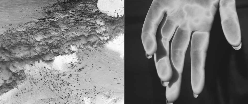
I thought it would be beneficial too to look at textures and elements found within real life, this is why this image is similar to the horse image. I like the way which you can see the movement within the hair itself, the different textures of softness combined with the different tonal shades of black and white. I didn’t add in the section of the eye like the artists’ image as I thought it would show a form of identity rather then the concentration of the texture itself.

Overall I think my work does have a clear chronological type of link to the artist, this type of narrative element of light being an ability to construct beauty. Once again the circular motion of the water is so interesting and an element which is beautiful yet seems to have a sense of clarity within it. Overall I belive all the pieces above have a clear inspiration from the book Astres nois. Not only this but my own personal narrative of the structure of the book also upholds these ideologies of the beauty of life, caught in such a beautiful way. I believe this artist, has really helped me to accomplish the best possible outcomes I could, and also to experiment with themes which I have never done previously, allowing myself to come out of my comfort zone when discussing how photography should be taken.
Book display development research
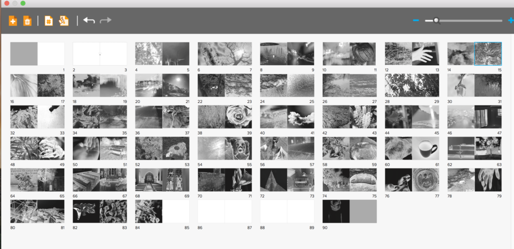
When developing my final book I wanted to have something unique, something I have never done before, and originality that meant my final presentations will be unlike any others. To do so I started off with developing the book. I Knew for my book I wanted to create a black and white tonal book. This soon transpired to having silver and black ink inverted to create glowing images. I also knew that for my narrative of life from birth to death, told through the story of creation, That I would need a long narrative. To do so I first off assigned myself 100 pages, then narrowing down only the best images to around 87 pages in total. Furthermore, to go in hand with his over exaggeration of visual overload due to the volume, I decided to have an image on every single page, so to go hand in hand with this large effect. In the end I was left with an array of different displays, differing from two full bleeds, to some with black boards to full double page spreads. The distorted array not being continually mimicked was very effective and something which Made the narrative of my book, perhaps, more enjoyable, as you are able to take your time when looking through each of the images. As spoken about previously the finality of my book was found within previous books such as Astres Noirs.
My final book layout:
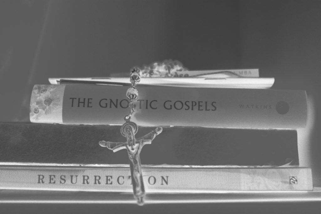
The paper used will be matte, I have chosen this as I have very deep blacks, it would be definitely better for the exposure and use of my colour tones. I then Decided on the front cover that I wanted an image wrap of one of my final prints, of white branches intertwining, This to my mind both perfectly combines that of tranquility and creation of heavenly light, with the fragility of life itself. The title of my book is called: Ascension. I chose this as it is a word which not only has clear indexical connotes to that of the story of creation, Adam and eve being created and ascending into earth, but too links in with the each part at the end of my narrative, and so forming a relation of going into heaven, or being carried up. The wrap around on the cover will not be fabric, as it is a more post-modern book focusing on themes such as religious sentimentality in the 21st century, I want this slick new feel to be evident within my cover, as this is what is to be found inside my book. A pivotal of My book is the primary source of my presentation, it has the majority of my images, and too combines a clear narrative experience throughout: My final layout:


presenting my work: Batia suter Lexicon Cycle of life research

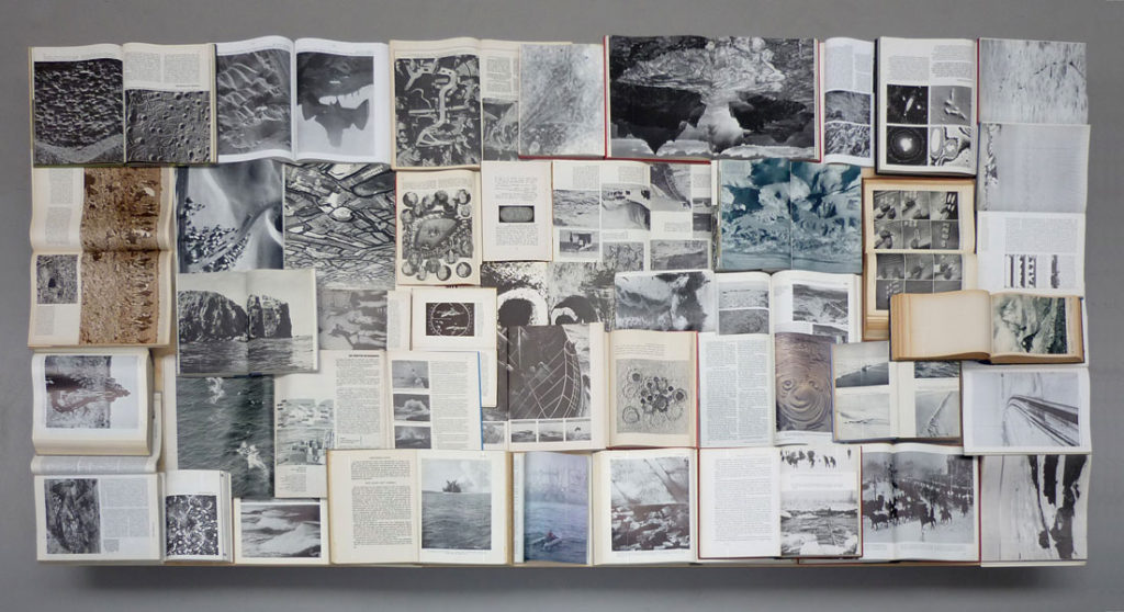
The imagery you can see above is based off of the historical relevancy within the book itself. so not all of these images are form her but the achieve itself. The combination of figurative and literary to my mind is interesting, as it allows myself to possibly think about something I could add into my project. Many of these images are objectivity and not a specific representation of a person themselves. I also like the way in which she chooses to have this sort of loose representation, to my mind this feeling of a scrapbook always has a clear presentation of thought about everything that the book itself contains. From the presentation purpose the huge size of the pieces themselves is something which I believe to be really effective and why I too want to show huge prints, similar to herself. I think using the turn in the wall is also effective, perhaps if I did rows of four within two on each side in the crease, it would allow a much more abstract presentation.

Every page from Sutlers book has a full sized image leaking over the ends of the pages, It both concentrates on this style of a lexicon with an overruling theme. She photographs everything which has some sort of relation through narrative. Due to the sheer size and effectiveness of her pieces, one on every page of full leak, it’s what allows myself to belive if you’re going to go and try to show this monumental representation of everything, you have to really go hard.
Biography:
Swiss-born, Amsterdam-based artist Batia Suter (b. 1967) studied at the art academies of Zürich and Arnhem (NL), and was also trained at the Werkplaats Typografie. Suter produces monumental prints of digitally manipulated images for specific locations, and works on photo-animations, image sequences and collages, often using found pictures. In 2007 she published Parallel Encyclopedia (Roma 100), followed by Parallel Encyclopedia #2 in 2016 (Roma 284), containing a large composition of images taken from books she has collected along the years. Surface Series (Roma 160), published in 2011, is an evocative montage of found images exploring the diverse resonances of geological landscape and visual surface. The underlying themes of Batia Suter’s practice are the ‘iconification’ and ‘immunogenicity’ of images, and the circumstances by which they become charged with new associative values. Her work intuitively situates old images in new contexts to provoke surprising reactions and significative possibilities. By this method, and with an attuned sensitivity to hidden harmonies and expressive accidents, Suter thus generates hypnagogic spaces where pictures can communicate by their own logic, in a force field of imaginative metamorphosis.
lexicon means a collection fo items all represent as though ti i . dictionary fo images. I felt as though ti was important to research this as my book is similar to a lexicon I the fact that it focuses on the narrative of life and death and everything that concerns it.

I decided through looking into how this artist presents her work, usually, having a continuous over-flowing page, I decided I should create a narrative which too allows my theme of black and yet too has these large strong images. I believe this presentation is the best and possibly the final,. I might start developing some new photo possibly with over ruling images and creating a new possibly more interesting composition, and possibly adding in more chaos photos of the pressed jar shoot.
FINAL PRINTS, presntation ideas
I chose these images as my final prints as I belive they have a narrative effect and also allow a aspect of tranquility within the contrast of the lights and darker tonal colours.

This is one of my favourite images for a few reasons. Conceptually the images clear religious connotations, there is an element of foregrounding and background, highlighting some areas such as the door, creating an indexical symbol to invite and enter the image itself, also demonstrating entering the after life. The clear invert of colours also shows nature having a prominent life, as well as the entry to the life of god. The contrasting texture throughout the image are too very interesting.

I chose this image due to the composition, I like the circular motion of the water mimicked throughout the image, and the central contrast of the lightness of the duck. It to also shows an element of life within the creation of god. The elements of the delicacy of the branches too shows a sense of heavenly beauty. I also chose this image as it is veery similar to one of my theorists images found within Astres Noirs, And I believe this is just an exciting image which clearly conveys the life of nature.

I wanted to use this image, as I believe there is a sense of illuminance and a real concentration of light, differing a very eye catching comparison to the others. To my mind the shapes and dimension too within the piece are very interesting and allow a much more successful literal glow to live, a symbol for prosperity.

This image has a fluidity of movement, and an identity within escapism yet a loss of personal identity. From terms of isolation this is a successful exposure of how you are able to see a figure yet have no personal judgments on the person. It is a significant gesture for that of how we might perceive god and the holy Trinity, the richness of the whites shows too a safety within the figure and an element of reliability. The long extension to the back of the piece shows a possible connection of narrative and character to the rest of the people and so on.

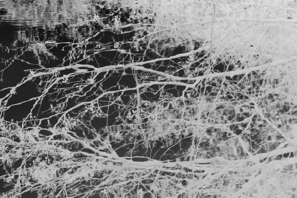
This is my favourite image and will also be the front cover. It reminds me of my previous experimentation within looking at the haiku and beauty within the everyday. I believe the lines and watery mirrored lines, re-creates something quite beautiful. The lines are dainty yet show a strength, there is an essence of purity and life within the image itself. I believe too, though much of the image is white, every aspects you are able to see all the details from within. With this image you would not be able to conceive how this is an element near where you live as it is, something so beautifully composed yet we take for granted. This comes under the creation story and the fact everything is created for a purpose, of unity of life. Due to the lines and heavenly colours I believe the title of ‘ascension’ is applicable as it shows the life of the branch raising above the water and as it connotes to the representation of life and death.

I decide due to my book being loud with large images with volumes of tonal integrity and inspiration of life and chaos, I want an interesting expressive and large way to which I can present my images themselves. My book is going to be a very large square with an image on every page, so I believe the huge effect of this book, needs to be mirrored with an innovative presentation. After looking at the artist Batia Suter, she prints off many of her images and sticks them across walls for her final presentation, without a frame to keep the feel to her work. I belive this too could be an interesting presentation for my work, However, Due to my not having available gallery space, their is no where that would be readily available for me to stick my work all over the wall. A similar theme I could use, Is printing off many large prints, and sticking on another to large A1 boards and creating a . large abstract narrative story telling piece. My second idea, is to print off every single image I have and create a window frame boarded with small pints showing the same narrative construct of my book itself, although this doesn’t have the huge size per image, it does have the effect of amount of imagery used.

Above is the type of presentation of my images I want, I believe I will print off 9 sets of three images each for my final all on A3, I will then apply foam board to the back of the images to make them come off of the wall slightly. I will see if there is a way I could get a large space to present my wrk here in school, if not I will find a space closer to home and create the presentation from there. I believe it is important that I do this as it goes with the narrative of my book, the size is the best way to see these images, and it shows an element of innovation to my project. I cold also expand this presentation idea to painting on a very large surface ad diving just one image up to around 6 parts, and do this multiple times for a more abstract feel. Below I am going to show the three rows of three an demonstrate which images I could have placed next to each-other.


Book development, narrative and presentation
I first started off the development of my book with the inspiration of three artists who all used silver and black ink and focused on a abstract and vivid interpretation of the world. I believed all of their books had an essence of life and a narrative journey within them. I started off my shoots for the book by concentrating on the beauty and birth of life itself in a religious manner. I took around 5 shoots inspired by the beauty found within nature, and placed these images at the beginning of the book as this will be the start of my narrative journey. I wanted to place the images next to another which had a contrasting and oppositional colour inversion, so a light and a dark tonal image next to each other, I believed this attracts the same attention to each image and creates a nice flowing narrative to the book itself.
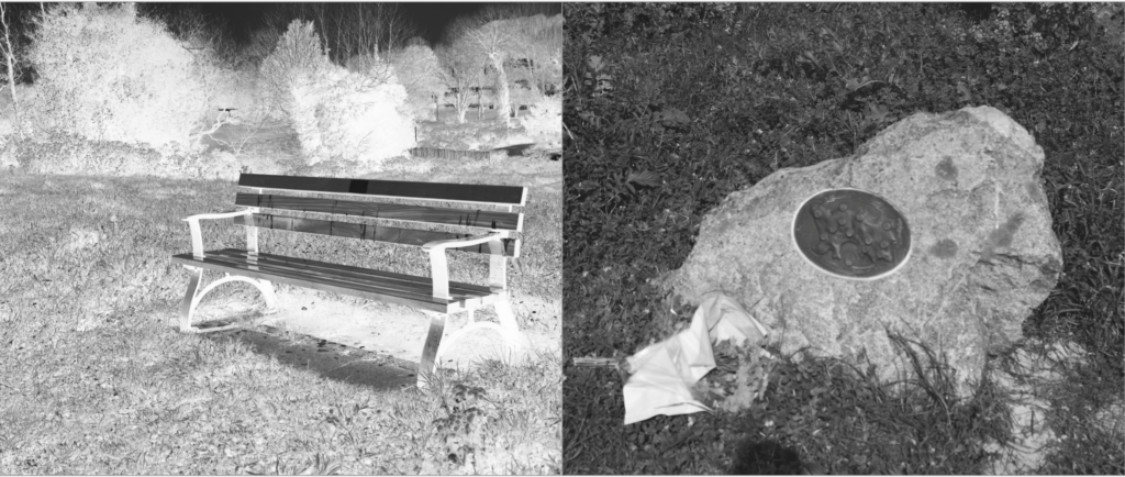
I had soon filled the first part of the book with images of life, I then wanted to show more abstract elements of religion that god was said to create, so showing direct imagery from underwater, animals, and light itself in a more creative manner. I not only wanted to show the world, But too wanted elements of myself to show the human chaos and soon destruction of the world, and the self growth and deterioration throughout the book. As the narrative is about the journey of life of people created and given by god. I decided to add objects which symbolised a life cycle and journey, such as houses, benches and mugs of tea, doing this also constitues a narrative of isolation and loneliness, and presents a sense of abandonment and getting towards the end of life itself. I soon added images from outside and in a church to not only symbolise the end of life, but an evolution of combining the end of life with the original creator itself, reflecting in both the individuals journey of life and religion itself. I also edited the images so they get darker throughout the church imagery towards the end, showing the tonal navigation of light to dark throughout symbolises a pathetic fallacy of death and foreshadowing the gradual end and decay of the book itself,.
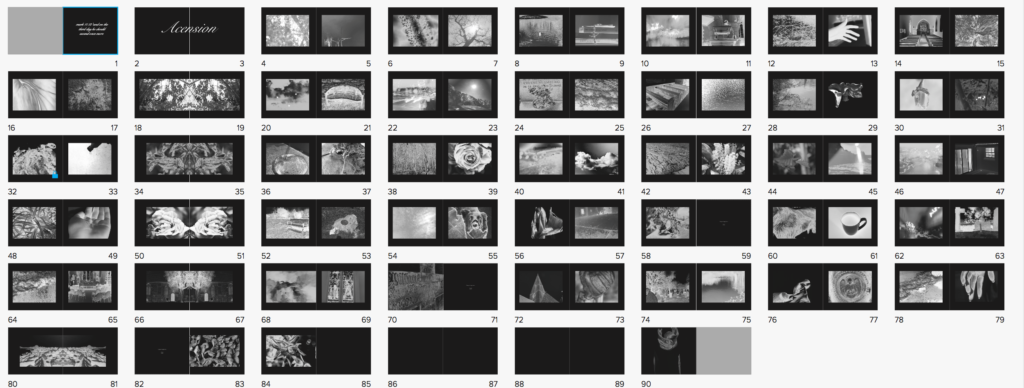
I had soon Finished applying all of the images to the book itself, having both people, nature, objects and a clear narrative both emotional, and chronological. However, after discussing with teachers, we decided to have the book this segregated wasn’t the most successful way in order to show the images, So I re arranged the narrative to show contrasting images, so rarely two nature images are together. I decided I wanted my book to be long in order to have such a strong effect, I also wanted this effect to be heightened by the image on every page always being the same proportion. I believe if you are going to do a book with such a strong concept colour-wise and story wise you need to carry on this strength and not stop the narrative at any-point. However, I thought it would be successful if like two of my artists I showed a continuous black border, which not only exaggerates the colour in the images themselves, but shows a clear narrative colour scheme throughout the book, and doesn’t make the images over-bleed continually on each page. The book itself has the layout of more of lexicon of life, and a clear chaotic feel, as life is not a simple route to the end. I the wanted to show a separating indexical icon throughout, so repeated one image across two pages every 8 pages, to segregate and keep attention throughout the length of the book itself.
ELDERLY PERSON SHOOT and edits
I wanted to do this shoot as I wanted to show a physical representation of the end of life, and show the complete evolution of what is the religious embodiment of the correct life cycle. When taking pictures for this shoot I wanted to be able to show lines and texture within the afce, and then be able to further emphasise this using the editing technique I have used all along.

When taking the images I did so in front of a window and on the setting of macro so I was able to see a clear transparent representation of the skin itself, and have the clarity of the light to further enhance the photo. I didn’t want to specifically tell her what facial expression to have or what pose, I wanted to have a more natural presentation of ageing, I allowed her to speak throughout and ensure I could show an aspect fo life still within her. As there are only two indexical representations of people within my book this being one, and the other being the boy wrapped in cloth to symbolise the coming of death and lack of identity with body and personality once you have died, I think this shoot really contrasts and also brings a sense of emotion and vulnerability.

SAMSUNG CAMERA PICTURES 
SAMSUNG CAMERA PICTURES


Throughout this observation I wanted to make sure I took images sectioned off to different places and areas on the face itself, I then wanted to crop and accentuate the areas which had the most amount of life and obvious lines throughout. My favourite image is the first, as the dividing from black to white resembles a really interesting and successful effective of their contrast between youth and age. it too symbolises a conceptual side of deterioration and the visual representation of slipping into death itself. Overall I think this shoot was successful and a good way forward to show the life cycle of youth.