Images to replicate
Edited Images
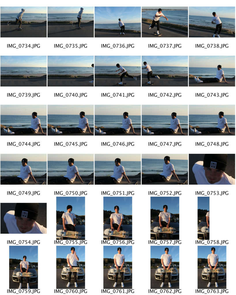
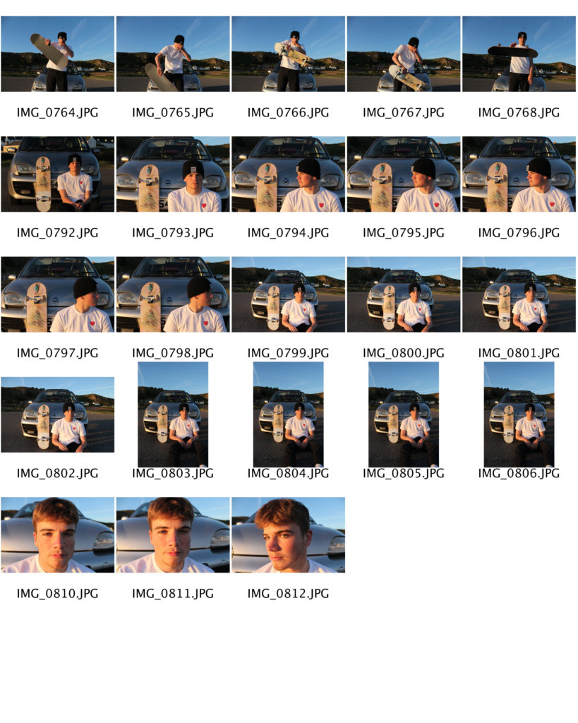
Images to replicate

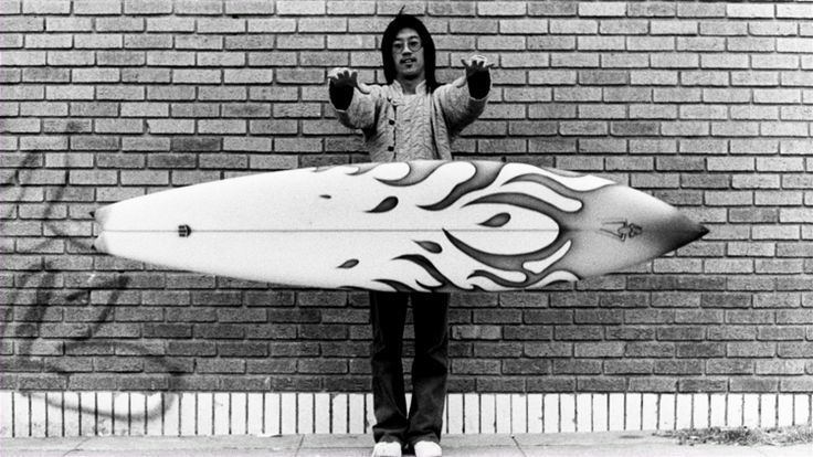
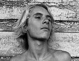
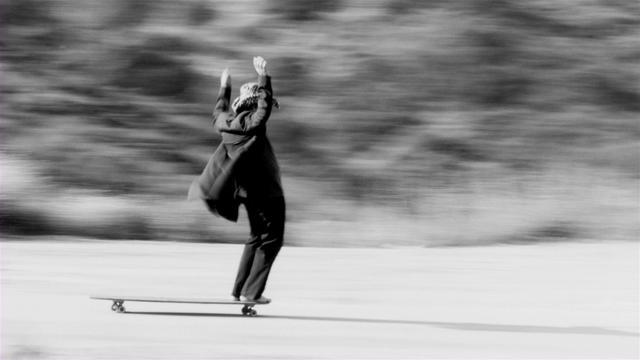
Edited Images
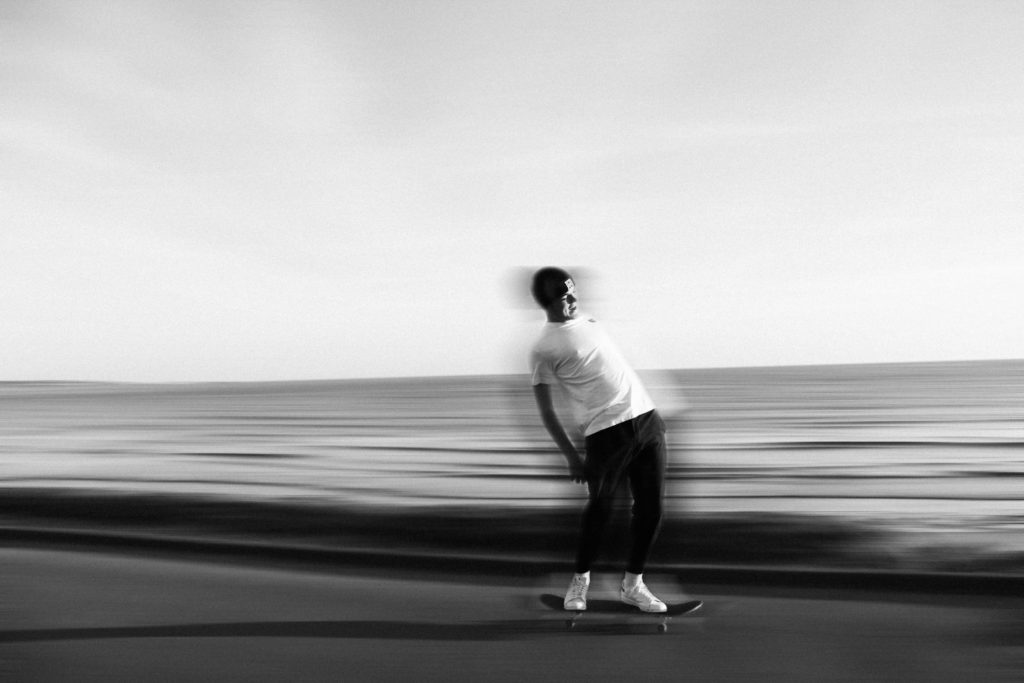
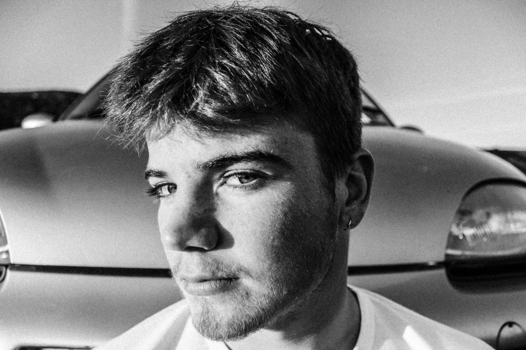
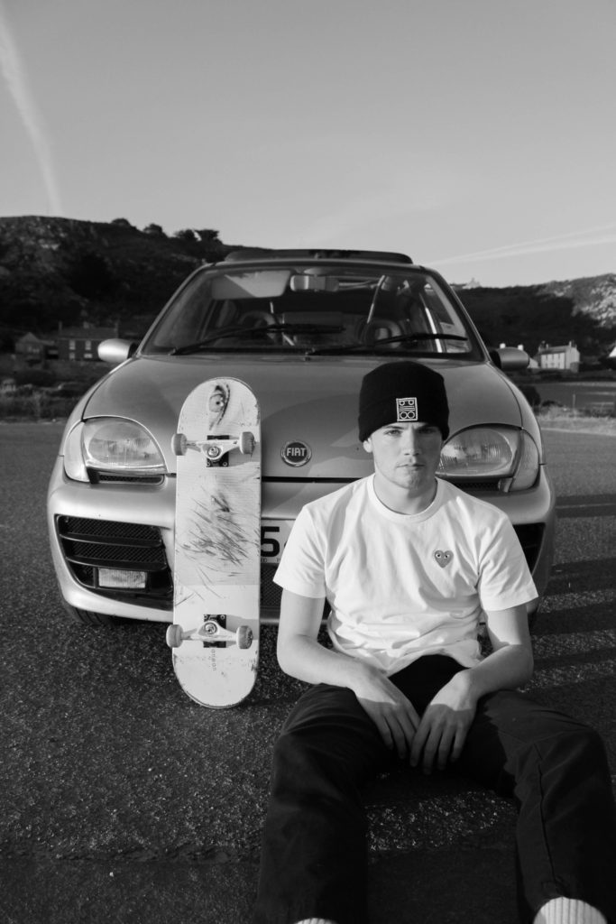

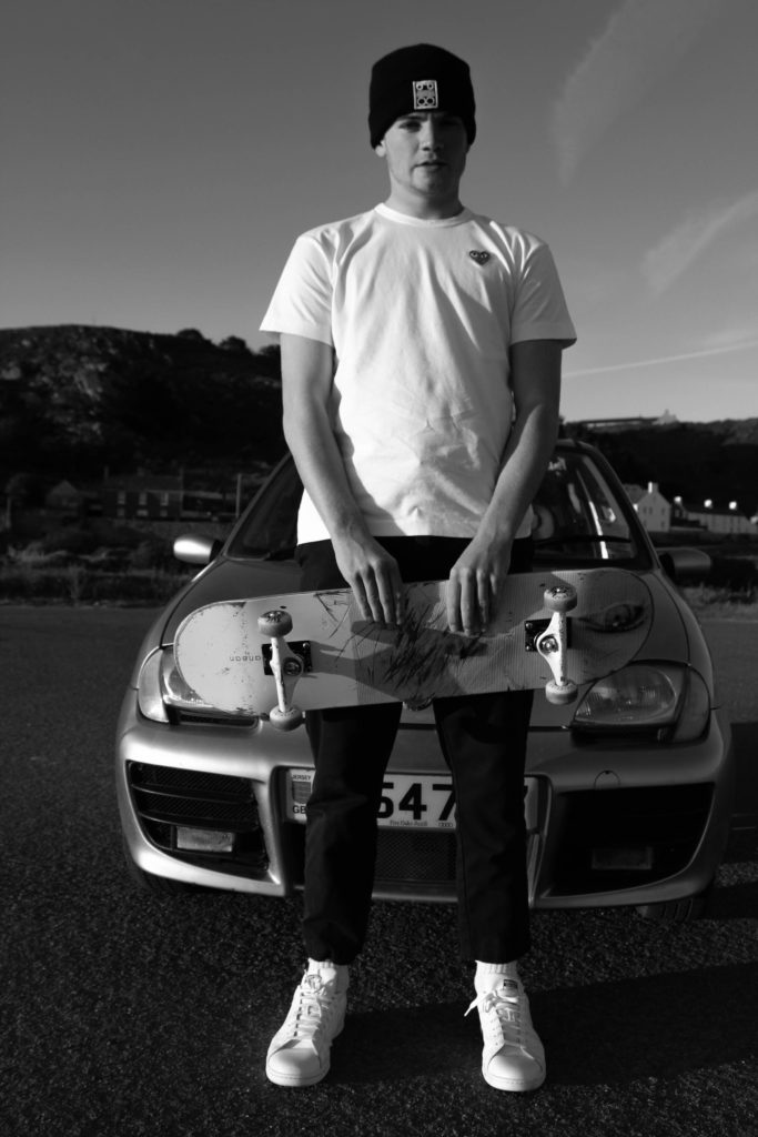
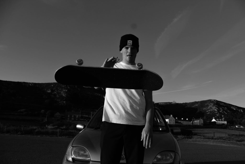
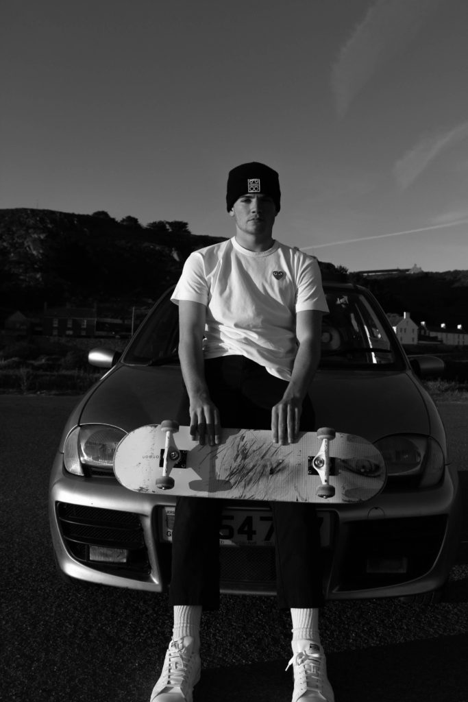
Shoot 1
Within this shoot I will be focusing on Larry Clark and I will focus on the skateboarders outside of the skatepark as I believe focusing on their lifestyle as well creates more of story behind the subjects I will be capturing. I believe that Larry Clarks images relate to the idea I want to capture in the sense that he also focuses on peoples lifestyles and I believe that the relation between my images and Larry’s with have significant similarities. I will be shooting in black and white on digital and on film. I will be using film as I believe creates a vintage feel to the images because of the grainy effect it creates.
Shoot 2
Within the second shoot I will be focusing on Larry Clark and I will again have the main focus on the skateboarders however within the skatepark and still focusing on their lifestyle. I will produce this shoot in colour as I want to capture the colours that can be seen ranging from the outfits to the gravitated walls which I believe will create a strong contrast with the black and white images. I will be shooting in colour film and on digital. I will be using film as I believe it will create a more raw feeling to each image which I believe will relate to the documentary side of this shoot.
Shoot 3
I will be focusing on trying to replicate images in the style of Craig Stecyk as I believe I can incorporate the skateboarding movement with portraiture in a strong way and I think I can come out with outcomes that will heavily juxtapose images from previous shoots. Craigs images are all taken in black and white and have a very raw feeling to them which I believe has connotations of documentary photography which I want to heavily focus on. Craigs images consists highly of both portrait and group images which I want to include throughout as I think creates a sense of variation throughout and it will have a contrast effect throughout. I will take these images on a digital camera in both black/ white and colour as It will able me to alter my final images in multiple different ways.


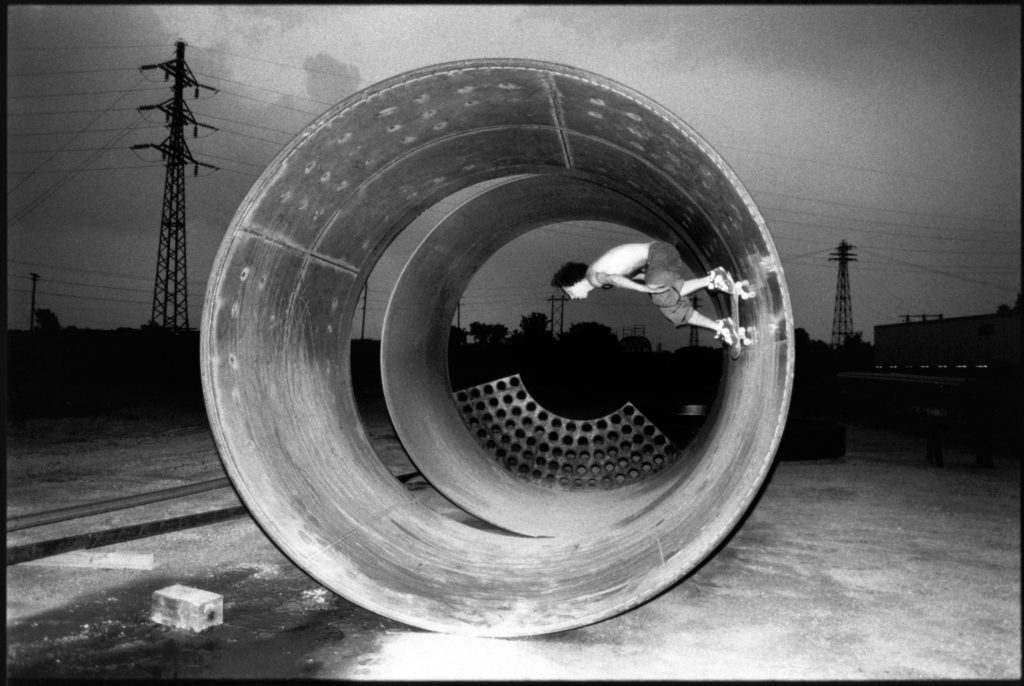

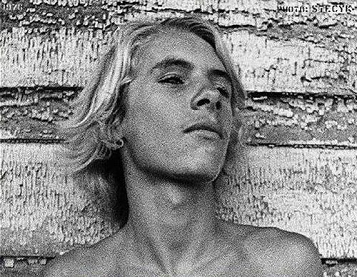
Craig Stecyk is an American artist, photographer and writer. He is mostly known for his conceptual art pieces of the 1970s and ’80s, and for documenting surfing and skateboarding culture in particularly via a series of influential articles for Skateboarder Magazine in the mid-1970s describing the innovative developments of the Z-Boys skateboarding team. Stecyk created designs for the skateboard brand Powell-Peralta, having coined the name of their team, the Bones Brigade, and produced advertizing photographs. Stecyk coined the phrase “Skate and Destroy.” Stecyk was also involved with the founding of the Jeff Ho Surfboards and Zephyr Productions surf shop in Santa Monica, California.

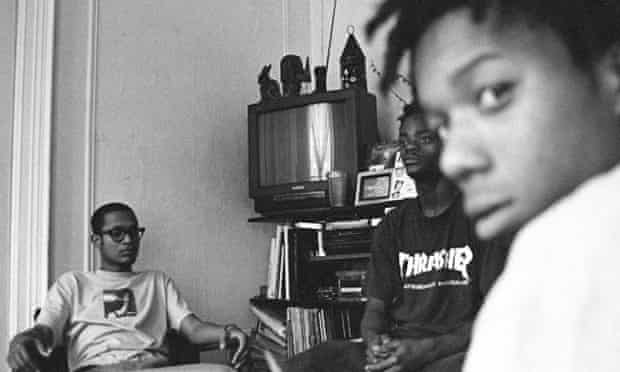
This black and white photograph is of group of skateboarders in the suburbs in New York. This gang image looks to be very grainy and raw which could suggest that this images was taken on film. This documentary style image captures these boys posing in front of the camera in the middle of the street which could suggest that they could be causing havoc whilst skating round. This would link to typical stereotypes of skateboard gangs as they are usually portrayed as causing trouble within populated areas due to skateboarding in areas where they shouldn’t. This image was taken with dull natural lighting due to the fact the the tones and shades of their surroundings are very dull and also the characters themselves. Furthermore, this image projects different races interacting with each other. The three dark skinned boys and the white boy look to be part of the same group which could possibly challenge typical stereotypes as white people usually think they are a superior race and don’t hang out with different races however it is not seen like that within this image as they look to be part of the same group. A fast shutter speed was used as within this image the subjects that have been captured are clear and are all in focus and allows for the reader to focus on more than just the main subjects at the front.


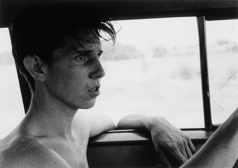

Larry Clark, born in Tulsa, worked in his family’s commercial photographic portrait business before studying photography with Walter Sheffer at the Layton School of Art in Milwaukee. Clark served in the military during the Vietnam War and has been a freelance photographer based in New York since 1966. During the 1960s, Clark documented the culture of drug use and illicit activity of his friends in Tulsa, and his photographs from those years were published as Tulsa in 1971. Considered shocking for its graphic portrayal of the intimate details of its subjects’ risky lives, the book launched Clark’s career. After Tulsa, he produced Teenage Lust in 1983, a series of photographs depicting adolescent sexuality and The Perfect Childhood. His work has been included in group and solo exhibitions since the early 1970s, and was the recipient of a National Endowment for the Arts Photographers’ Fellowship in 1973 and a Creative Arts Public Service photographers’ grant in 1980. Clark has also produced films; Kids (1994), based on his experiences with New York City teenagers and their culture of drugs, alcohol, and sex.
Larry Clark’s photographs in Tulsa are unflinching and portrays a difficult and often unsightly circumstances viewed through a participant’s eyes. Their first hand intensity, recollects the work of Danny Lyon and Bruce Davidson, but Clark’s raw voyeurism and insistent exposure of detail results in a apprehensiveness that differentiates his work from that of others in the early 1970s.
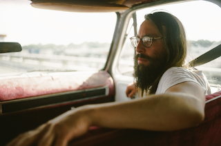
Images to replicate

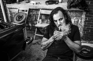

My Interpretations
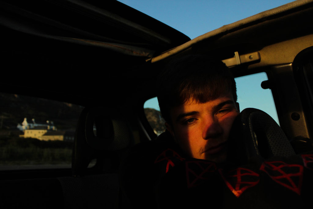

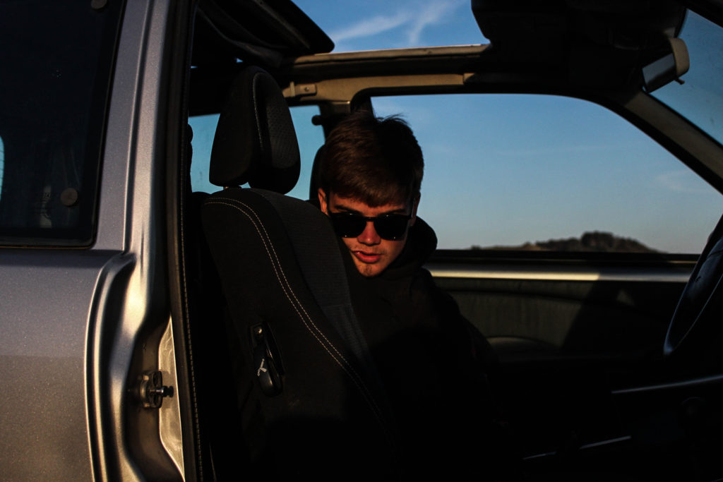
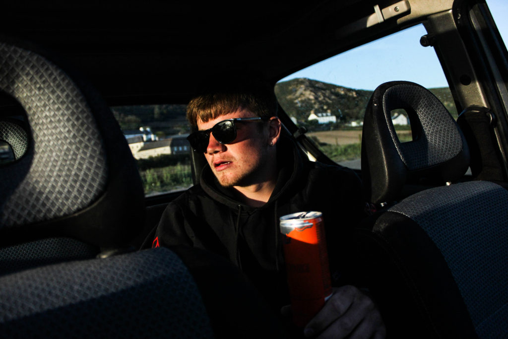
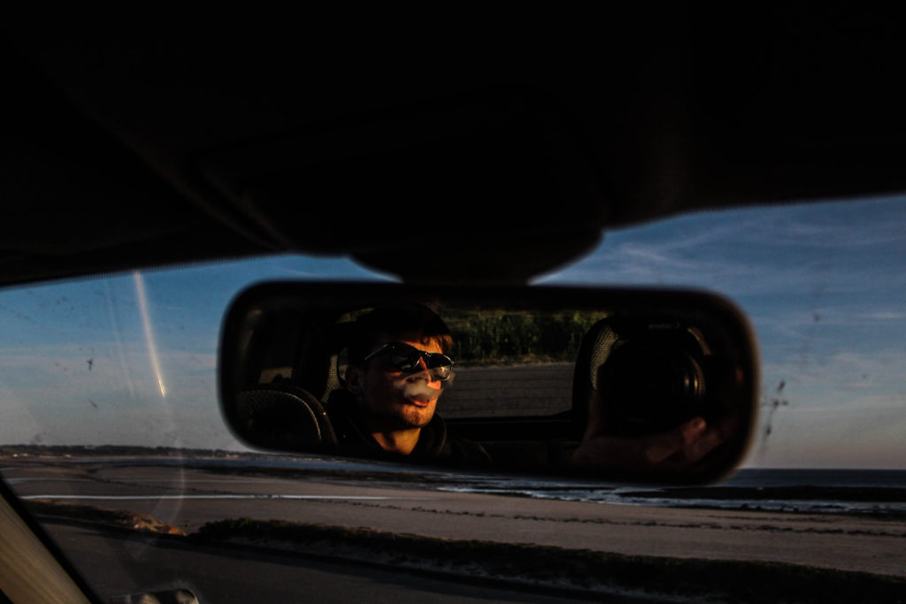
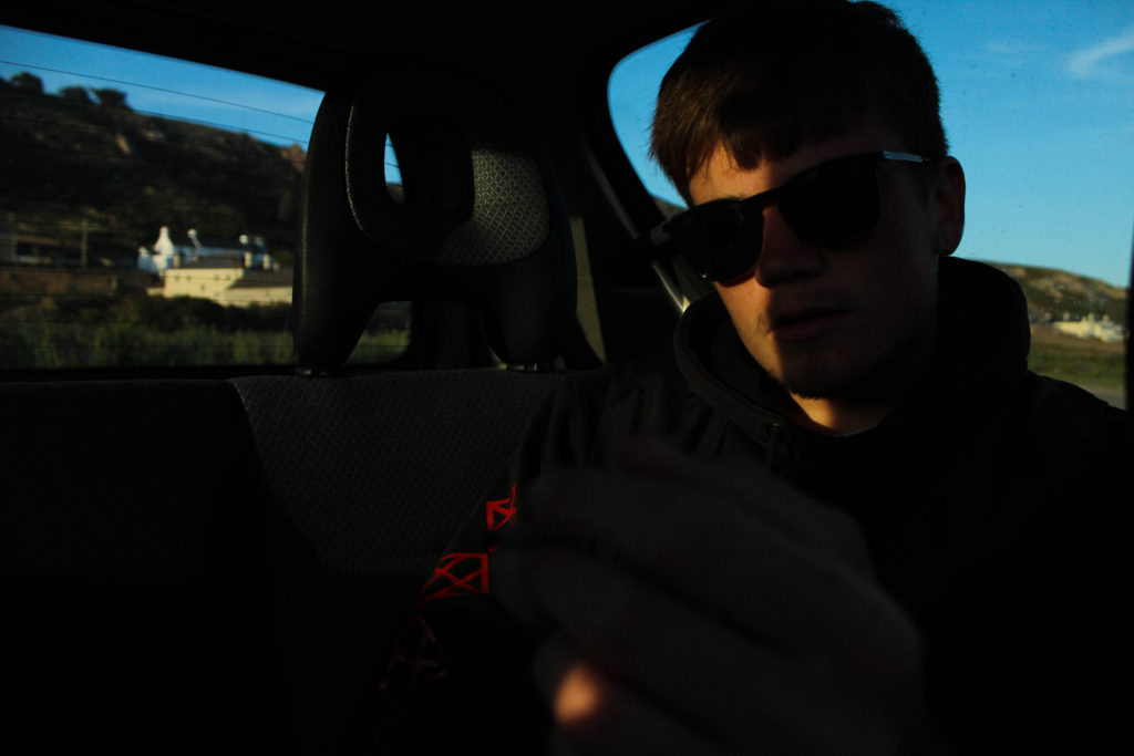
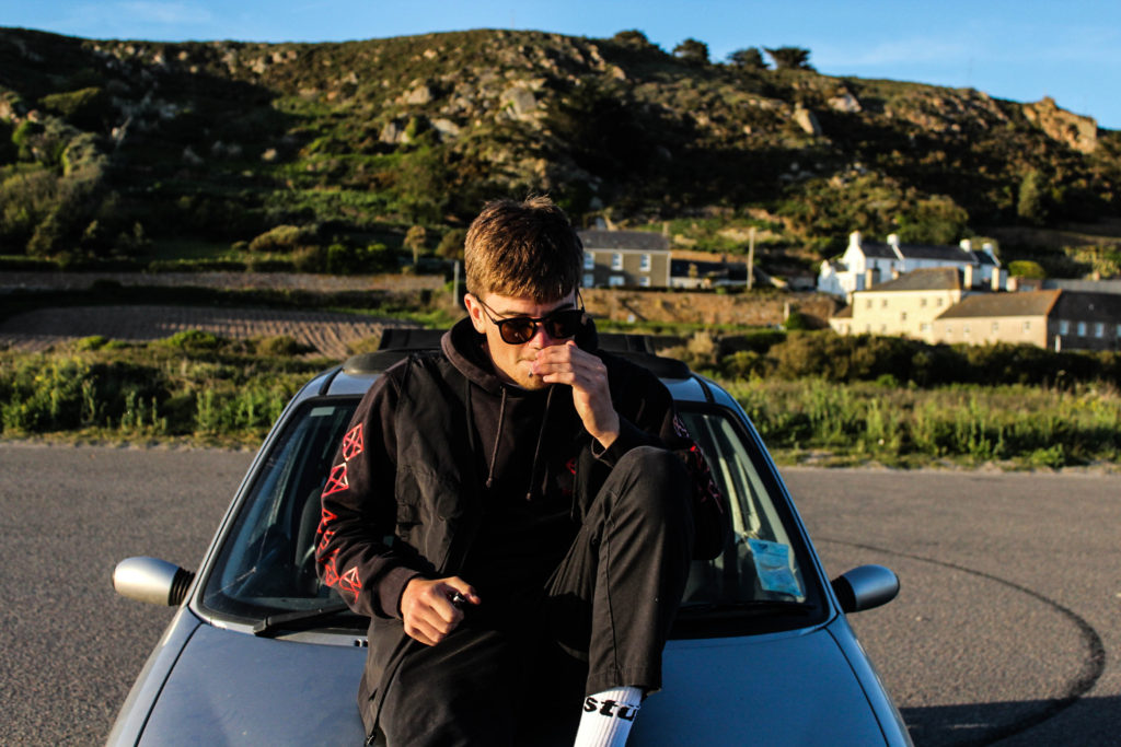
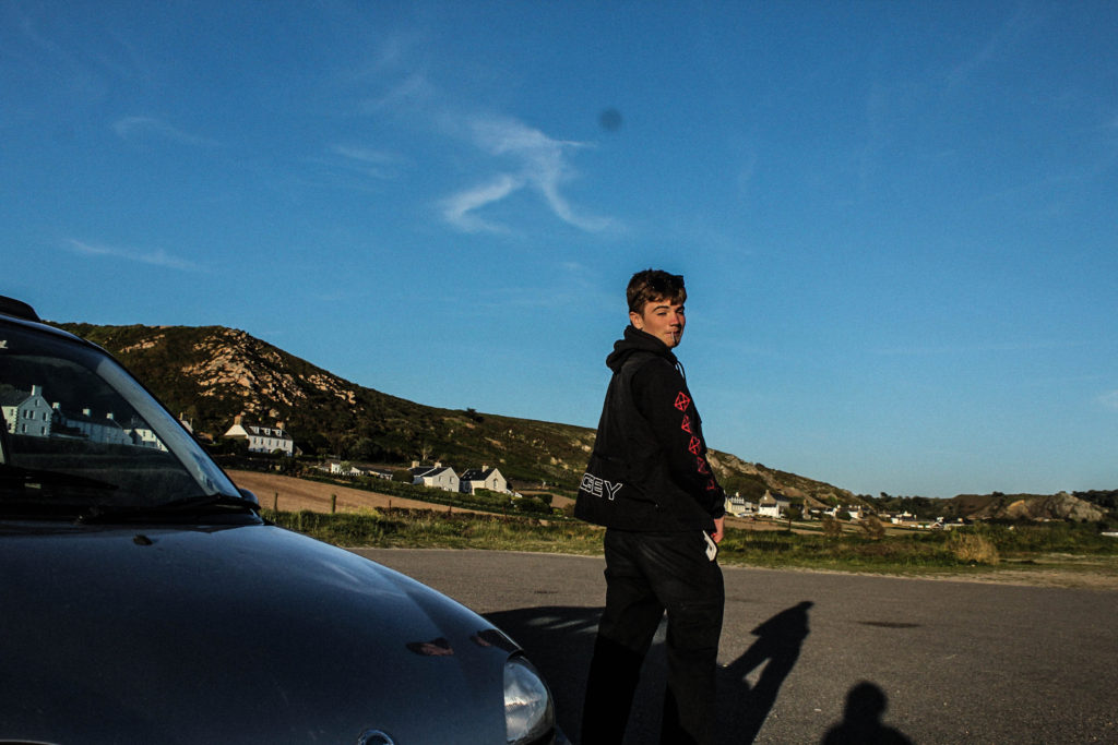
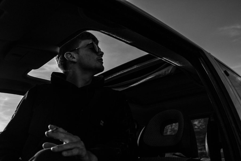
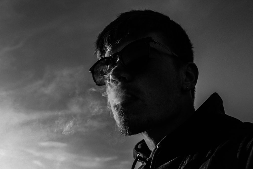

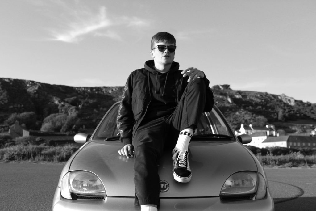
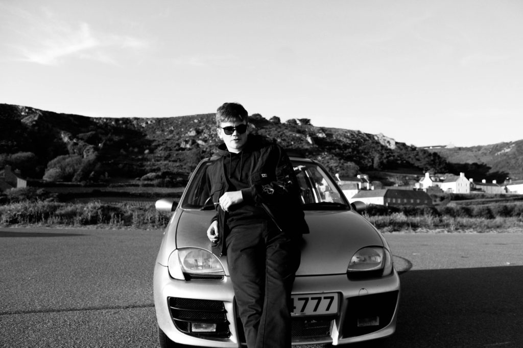

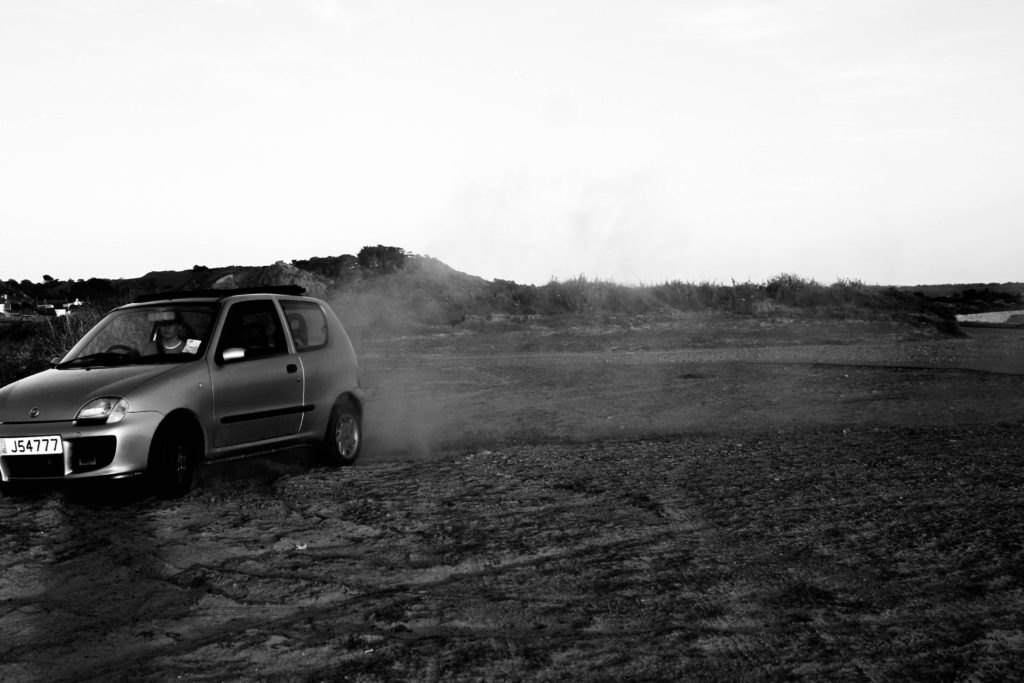
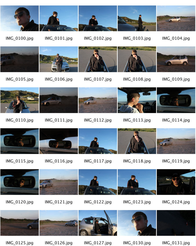
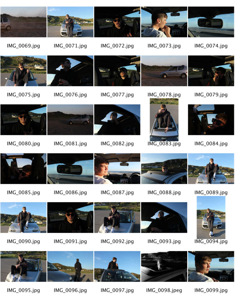
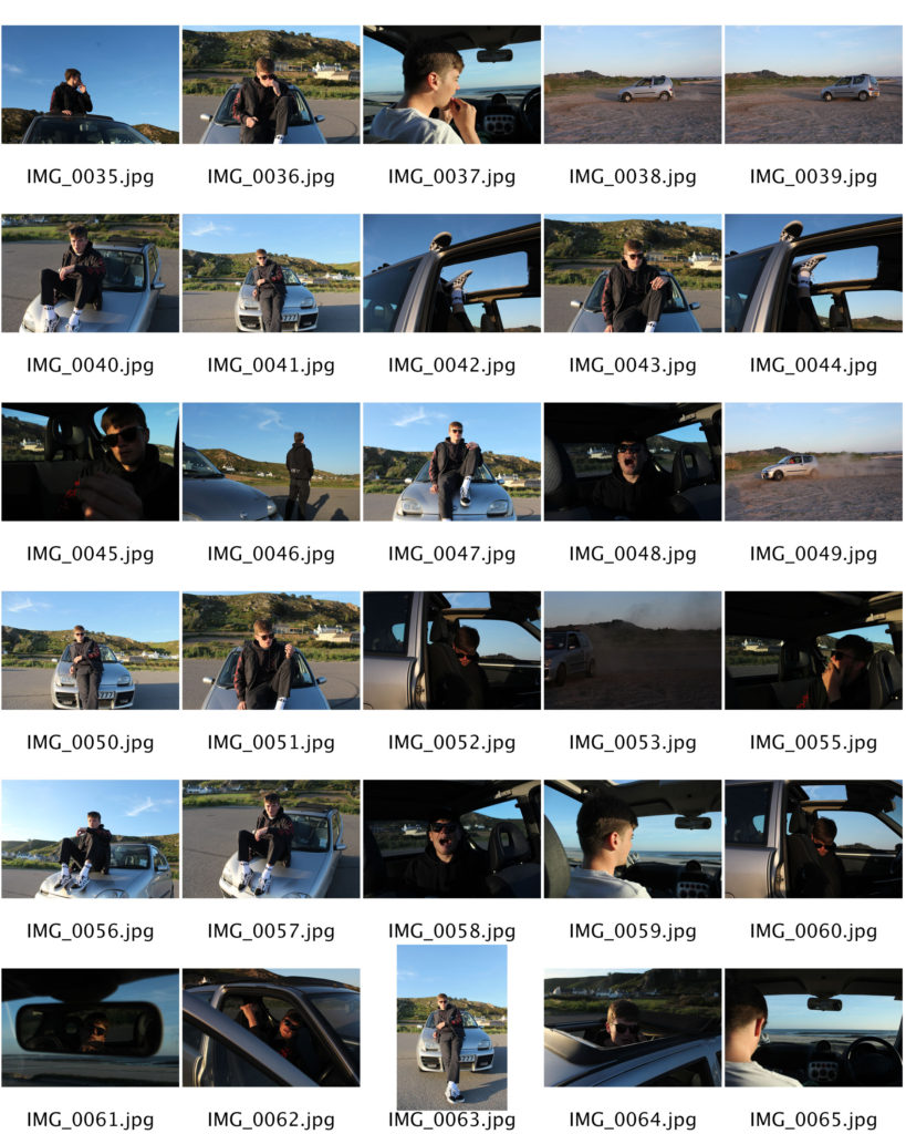
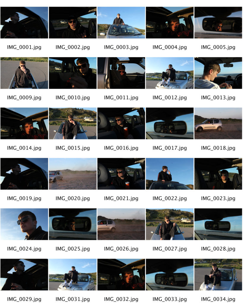
These images I took in the style of Theo Gosselin’s have significant relations towards my project as I believe that they fall into the lifestyle I want to capture. The high contrasts and dull hard lighting throughout creates strong shadows and silhouettes which I believe allows for these images to stand out greatly. As some of Theo’s images are in both black and white I also wanted to edit mine in a similar way. I felt that when editing these images Some where certainly stronger in colour and also in black and white due to the effects I wanted to create within each image; for example the shadows. Furthermore, as I was aiming to replicate some of Theo’s images I wanted to edit the images in a similar way to the specific ones I selected as I wanted my work to have specific similarities to his work. When taking these images I wanted to go out before sunset as the lighting I wanted to use wasn’t too harsh and bright which created perfect colours on the models face. This time is usually known as “golden hour”. I wanted to enhance these colours as I found the colours seen in Theo’s where strong and had a real effect on the models features. As I am focusing on lifestyle I wanted to have the main focus as the model, I believe by enhancing the colours and the background really allowed for the model and his features to really stand out over anything else.
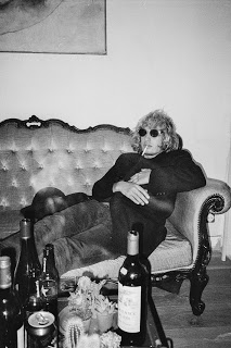
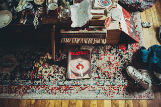
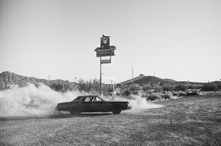
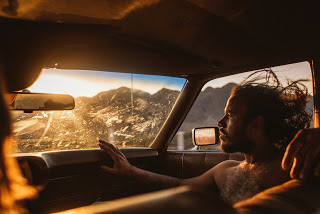
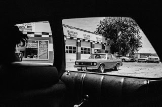
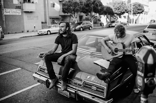
Gosselin’s photography reveals friends in the act of escaping from their regular lives into newly enticing and perilous modes of existence, ever in search of the persistent though elusive idea of freedom.
Gosselin was born near Le Havre in Normandy in 1990. Enthusiastic about drawing, music, and cinema, he chose a path through the art school, and graduated in 2012 as a graphic designer in Amiens. He started photography around 2007, and it Became a passion of his. He loves to capture the simple life, love, good and bad moments, his friends and his adventures. The subjects in Théo Gosselin’s images are friends rather than models, and the situations are not mythic constructions but glimpses of an underground lifestyle in a post-9/11 world in which social media has blurred the boundaries between public and private, and between being documented and simply being.
I chose to focus on Theo Gosselin as I saw that his work had significant relations towards my idea due to the fact that Theo’s work is taken in a documentary style way however, the images also focus on the lifestyle of the subjects throughout. The concept behind his images I believe linked towards my idea strongly too as a lot of Theo’s images are of drugs, alcohol and various other things that could easily be seen within a skateboard lifestyle. Furthermore, Theo’s image have a very raw feeling to them which gives me thorough inspiration towards the photos I want to capture as I believe having raw, gritty images have a stronger effect on the audience.

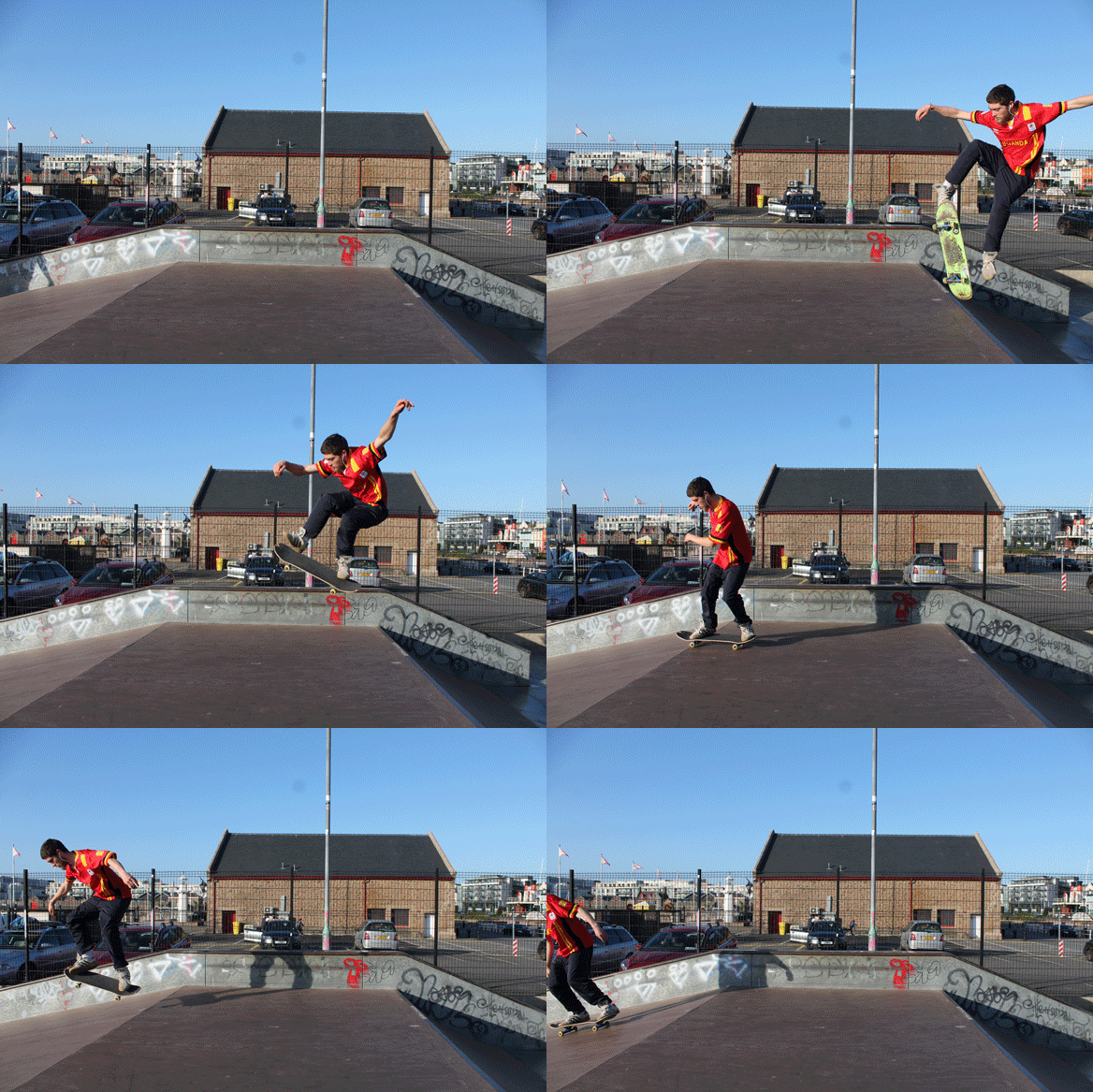
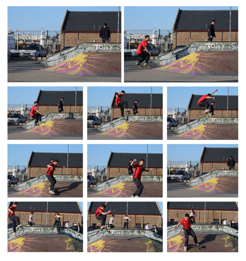
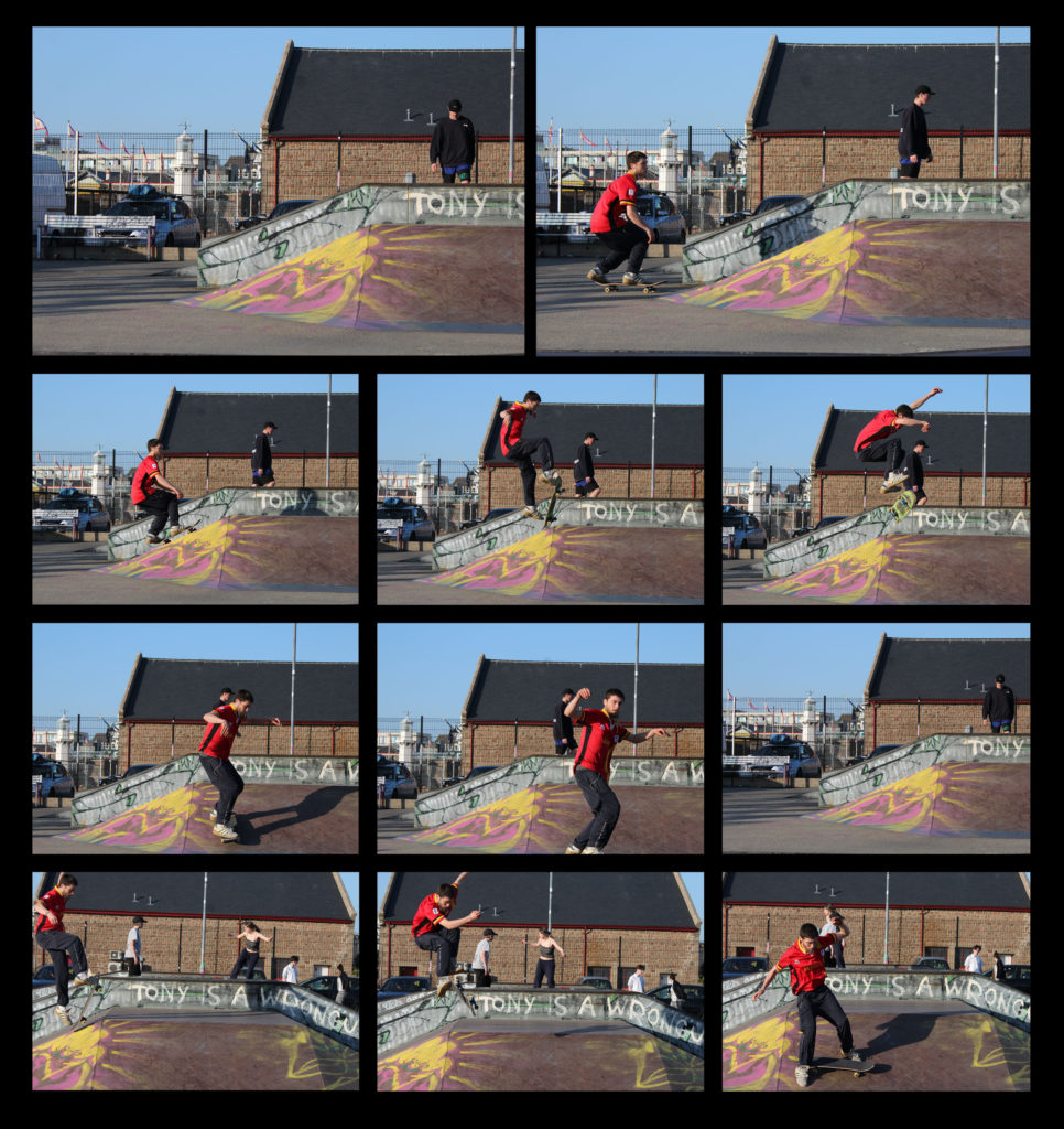
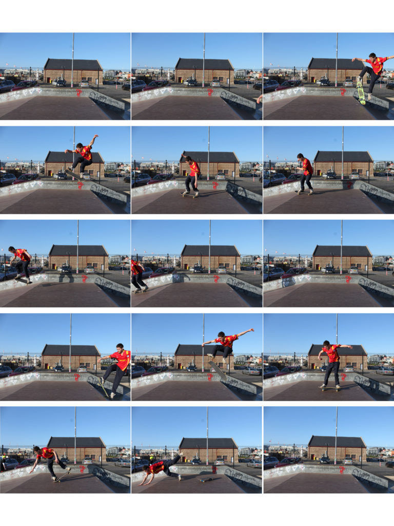
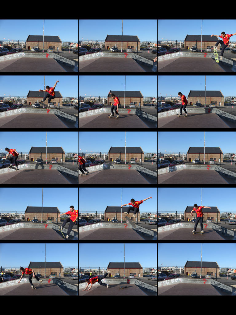
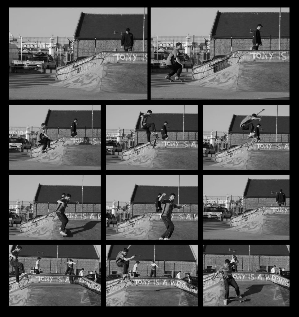
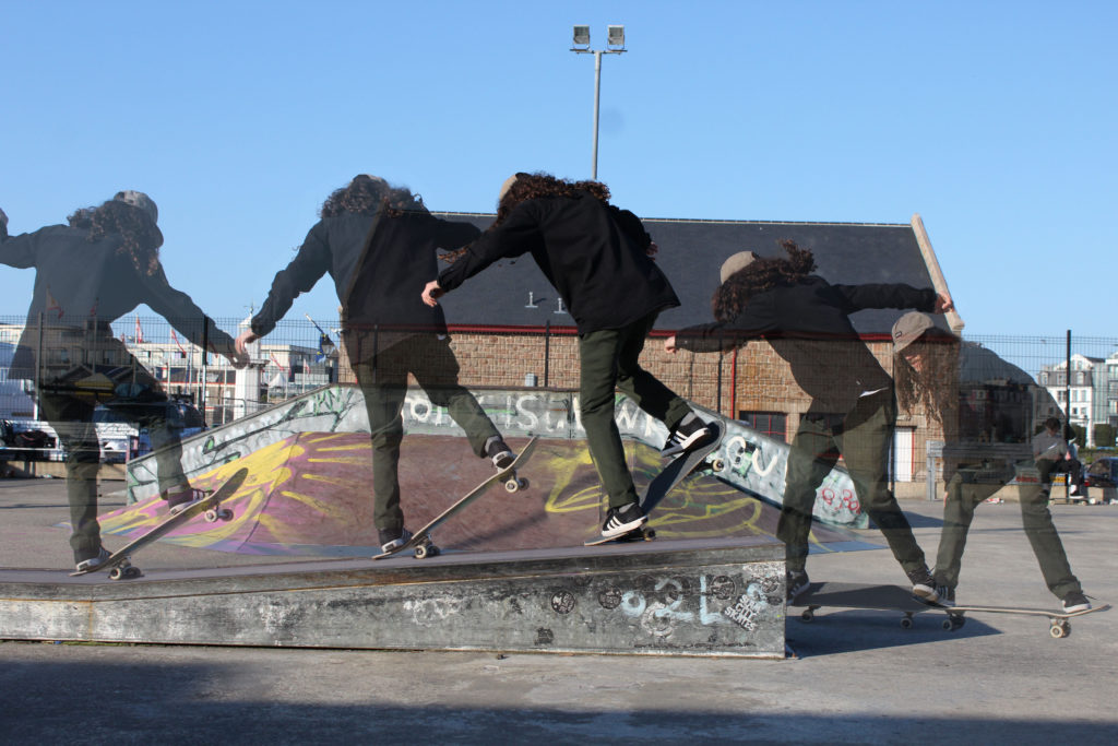
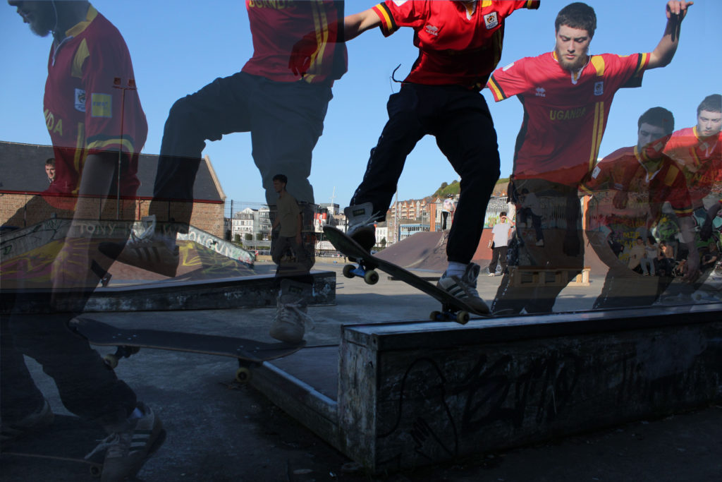
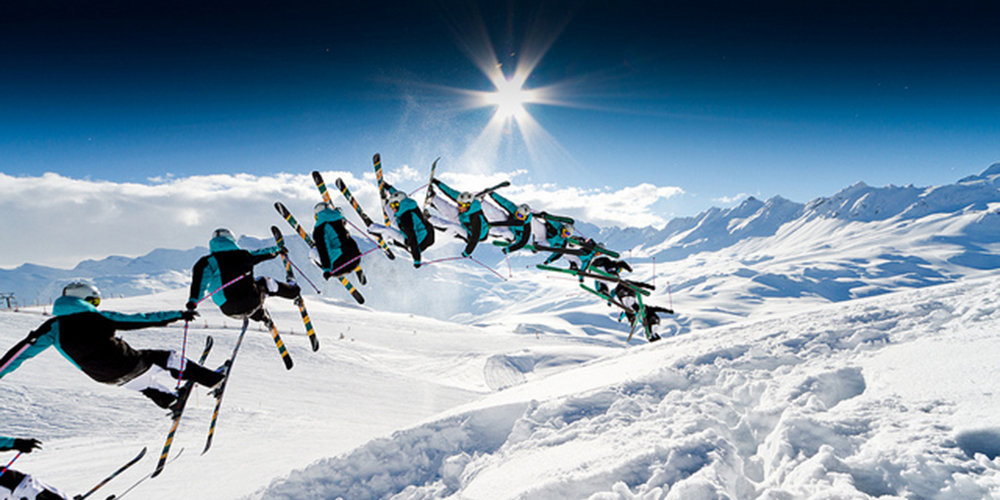
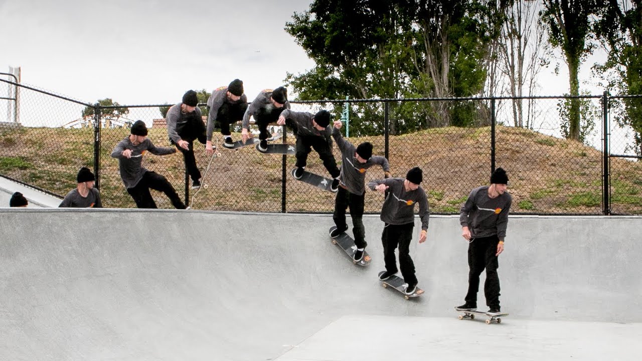
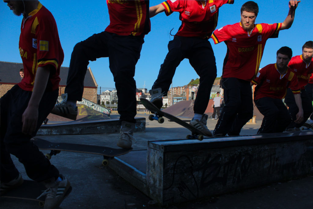
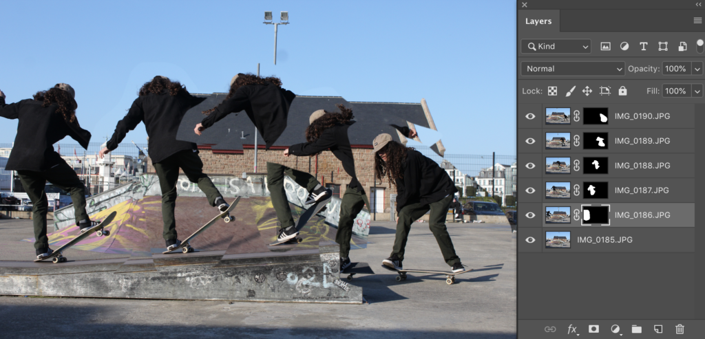
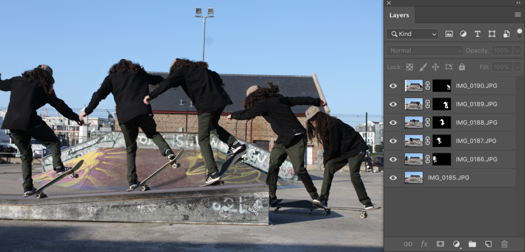
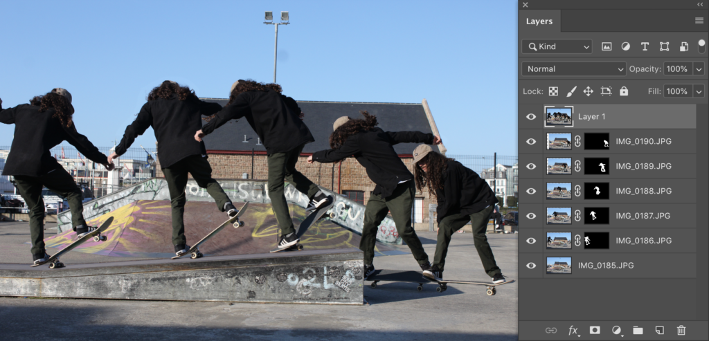
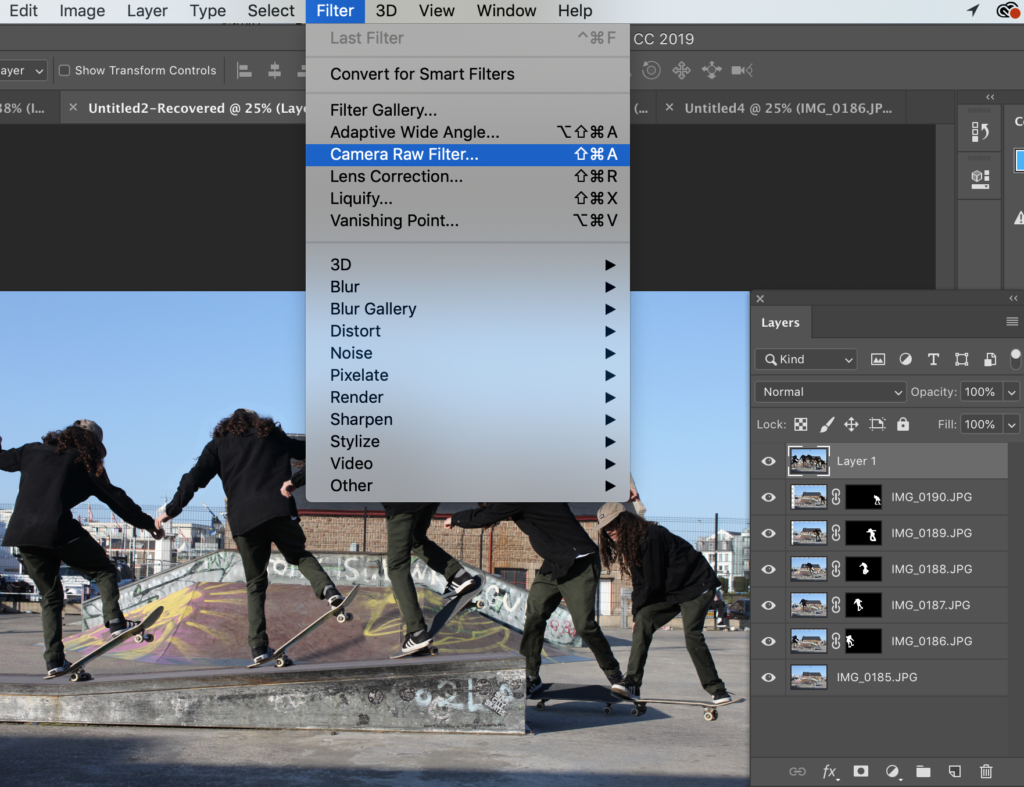
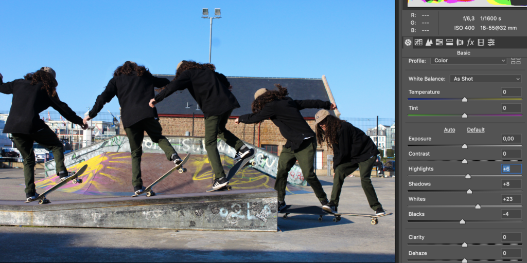
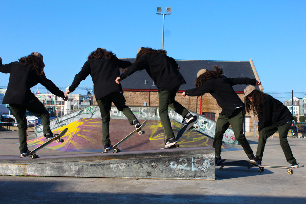
I experimented using different layouts, boarders and colours throughout this process of creating a set of images and displaying them in the style of Eadweard Muybridge however, I found they didn’t really represent his work clear enough. I changed the background colour from white to black which I found allowed for the images to stand out a lot more than they did on the white background. I looked further into his work and realised that all of his images where in black and white and mine where in colour and clearly didn’t have the same effect. I changed my images into black and white and found they looked significantly better especially on the black background. Having them in black and white I found created a more vintage feel to them, which I thought Eadweard’s work did also have aspects of that integrated within his work.

Changing opacity


Black and white
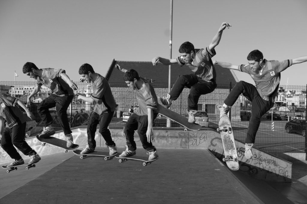
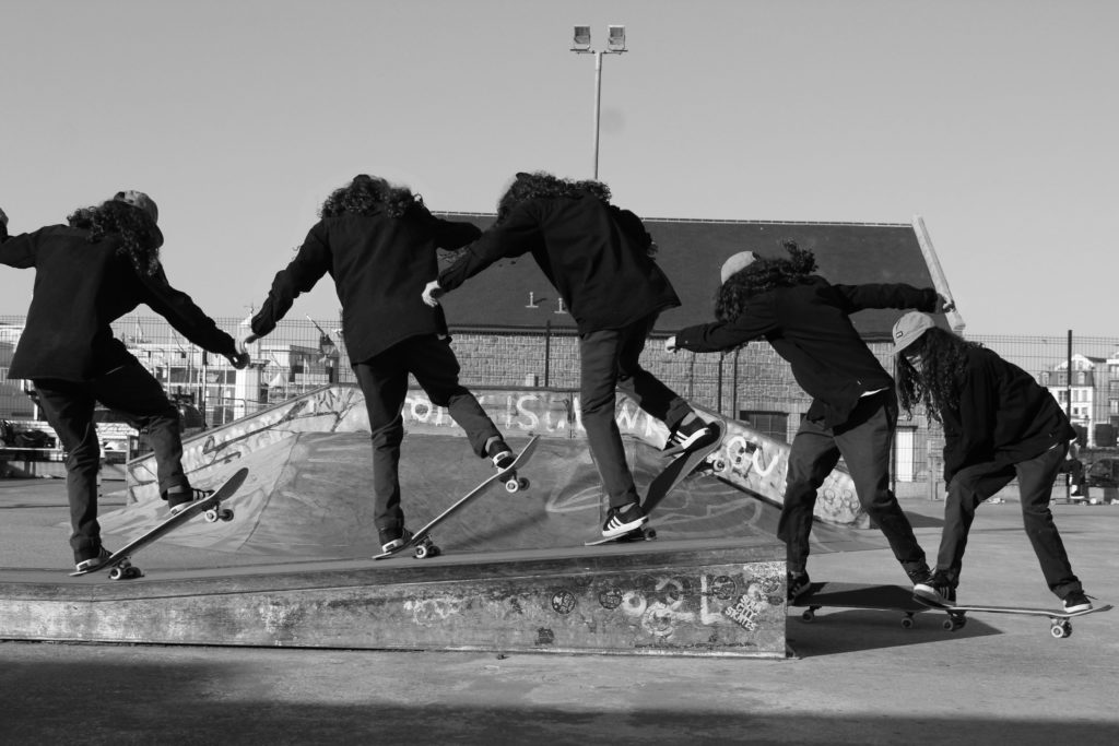
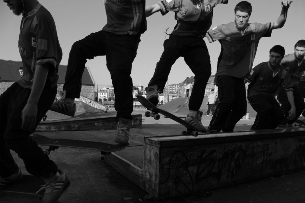
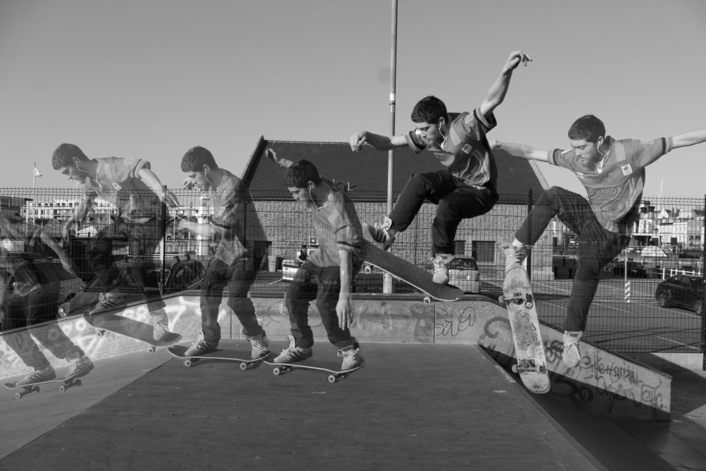
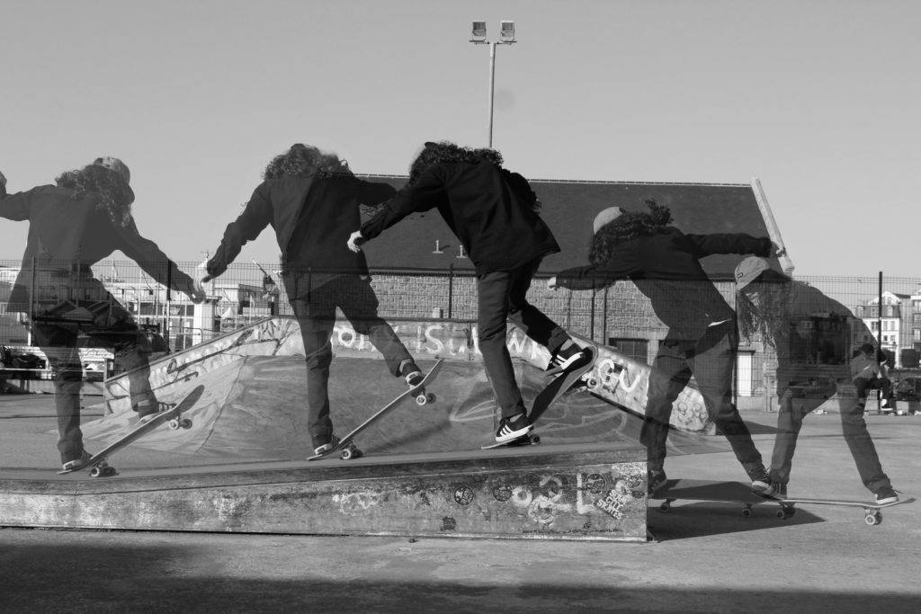

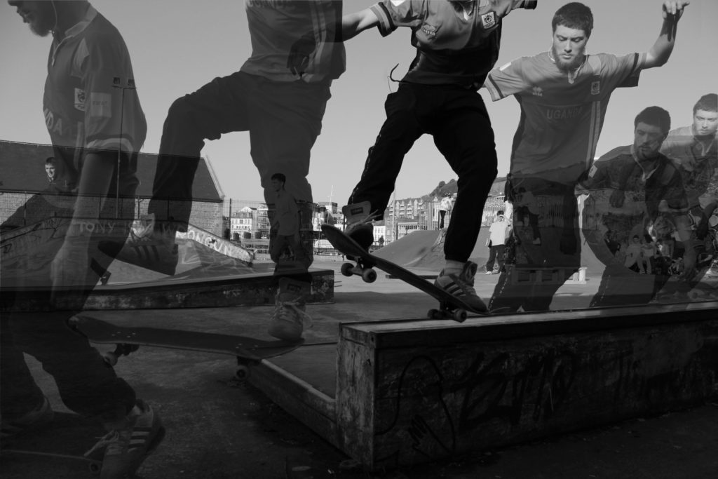
Once I came up with a final edit I thought that the images I created could be made more interesting and edited further. I decided on changing the opacity on every layer but leaving one of the layers at full capacity. I found by doing this not only related to Eadweard Muybridge’s work but created a stronger final image overall. I thought that it clearly displayed the movement of the subject within each image and represented my idea of movement more clearly. I then went on to further experiment with these images more by changing them to black and white and increasing the contrast on each image so the lower capacity images would stand out on the dull background. I found changing them to black and white created a strong effect on each image however I feel they didn’t have the same effect as the coloured images portrayed.
Inspiration

Contact sheets
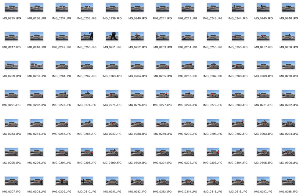

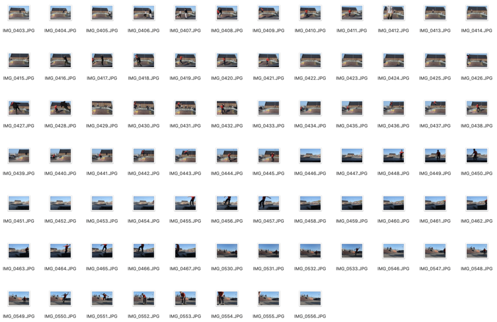
My Interpretations
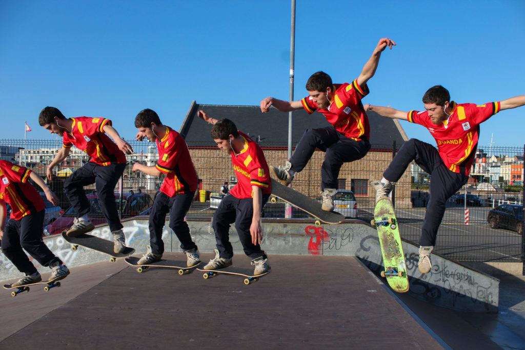
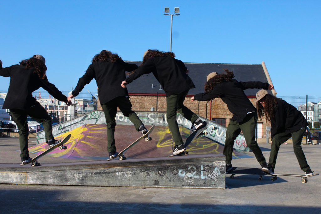
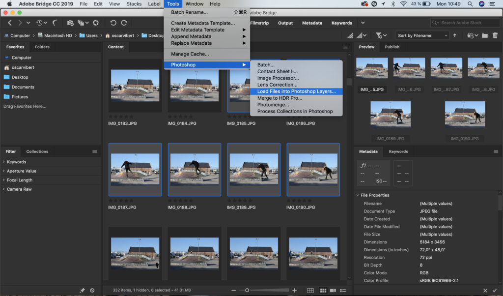
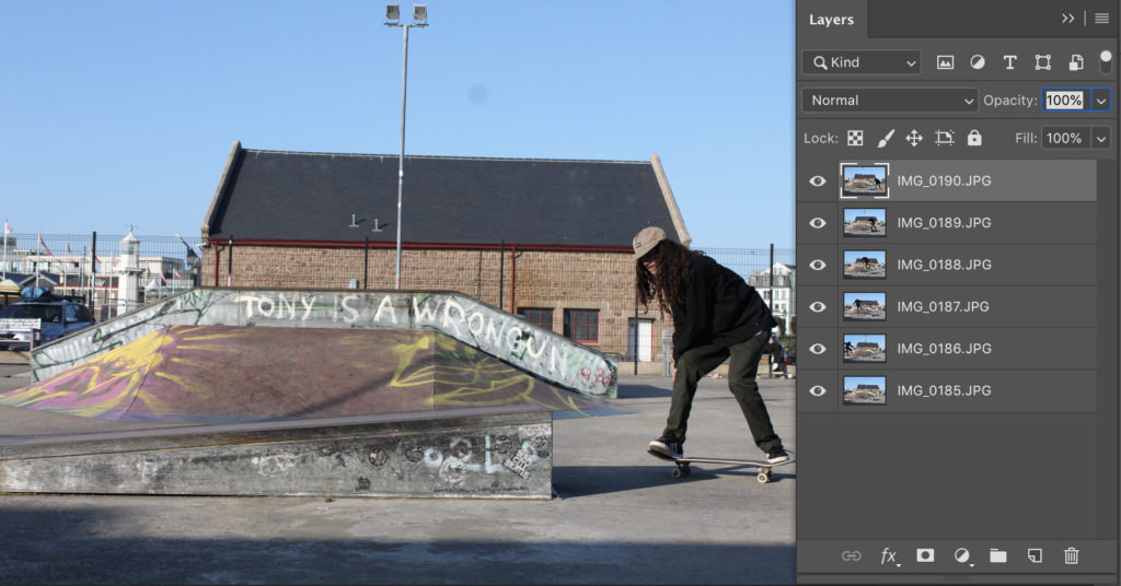
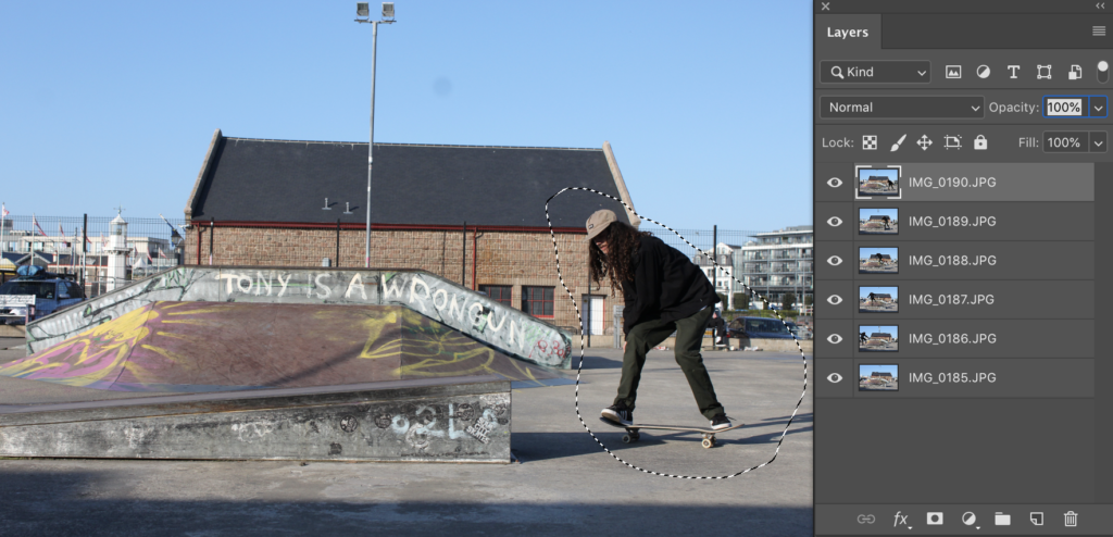
Editing process
Evaluation…